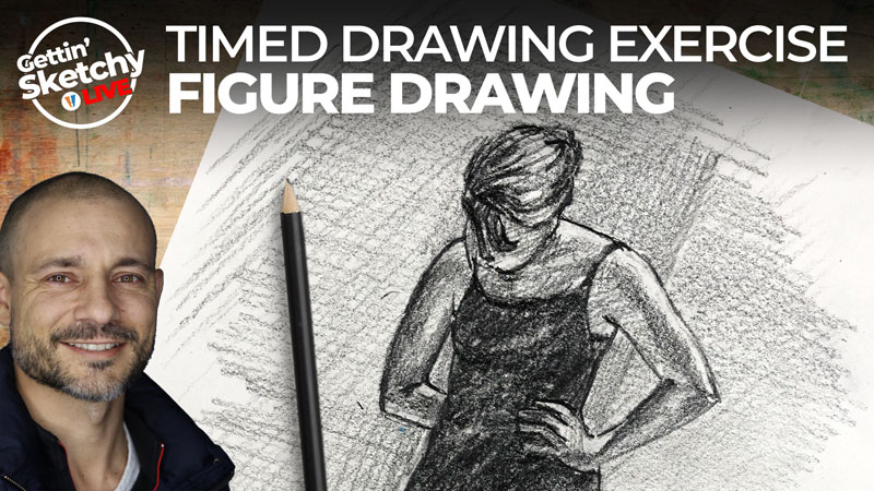
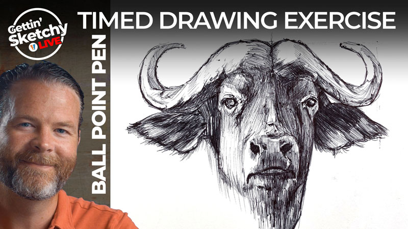
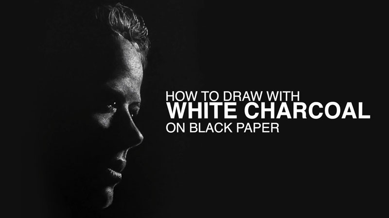
Gettin’ Sketchy – How to Draw a Person Playing A Guitar – Season 3 Episode 6
This episode aired live on YouTube on February 24, 2021.
Gettin’ Sketchy is a live drawing exercise, broadcast on YouTube. In each episode, a sketchy drawing is attempted within a 45 minute time period. Depending on the medium used and the chosen subject, some drawings are more refined and “finished” compared to others.
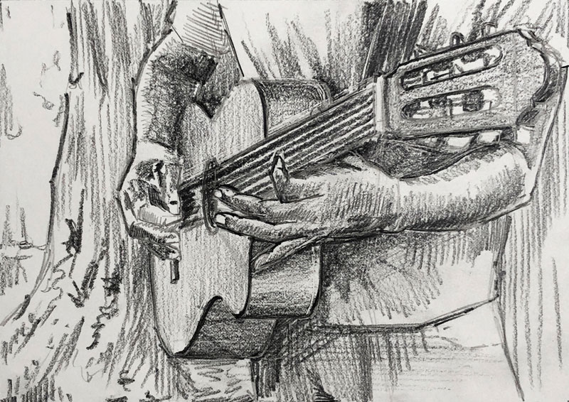
In this episode, Ashley attempts to draw an image of a person playing the guitar with graphite pencil. This particular subject presents several different challenges.
Here’s a look at the completed image…
The Drawing Challenges Faced in This Subject
There are several attributes about this subject that make it a particularly challenging subject, but as Ashley demonstrates, these challenges can be overcome.
The first challenge is the foreshortening. Foreshortening occurs when an object is viewed at an angle in which it comes towards or away from the viewer. Because of the manner in which we see things, the object is distorted. This distortion can be difficult to capture in a drawing.
In this case, the guitar protrudes towards the viewer which makes the end of the guitar appear considerably larger than the bottom. If this distortion isn’t captured in the drawing, then the accuracy of the drawing suffers and the results will look unrealistic.
See also: Foreshortening – Drawing the Figure in Perspective
Like most subjects we encounter when developing a drawing, the answer to this challenge is careful observation and comparisons.
The second challenge are the hands and the figure. The human figure is a difficult subject due to its complexity. The figure can be contorted into an infinite number of positions. This makes formulaic drawing especially difficult. As an added complexity, each figure is different as we all have different body shapes.
Here again, the answer to this challenge is careful observation.
Making Comparisons to Map Out the Drawing
Now that we’ve established that careful observation is so important to our success, you may be wondering how to observe. Observation is often recommended by drawing instructors, but how to observe is often overlooked.
There are many different ways to observe and each artist may approach subjects differently or use any combination of methods.
Construction
Perhaps the simplest method of observation is sometimes called “construction”. Construction is basically the process of simplifying complex subjects into basic shapes or forms. These basic shapes are pieced together to form more complex shapes.
The basics of construction are covered in the following lessons. Some of these lessons require membership…
- Drawing Basics – Construction
- 25 Days to Better Drawings: Drawing with Shapes (Membership Required)
- The Secrets to Drawing – Shape (Membership Required)
- Drawing Bootcamp (Membership Required)
By using construction, we can conquer complex subjects by simplifying them into easy to draw shapes.
Measuring and Mapping
A second technique for observation is called “measuring and mapping”. This technique requires the artist to use a measuring tool like a pencil, pen, or brush to compare lengths and angles on the subject and use this information to make marks on the drawing surface.
When this method is used, the measuring tool is held up at a consistent distance from the subject. This can be accomplished with a photo reference or a live subject. By sliding your thumb up and down on the measuring tool, relative measurements can be taken and applied to the drawing.
This technique is covered in greater detail in the following lesson…
- 25 Days to Better Drawings: Sighting, Measuring, and Mapping (Membership Required)
Consider Negative Space
A third technique for observation centers on the principle of positive and negative space (or shapes). Positive space generally refers to the space occupied within pictorial space that describes the subject or other elements. Negative space is the space that surrounds and frames the positive space. Positive space and negative space work together to communicate the subject.
Most of us focus on just the positive space when we create a drawing. For example, we may just observe the shapes of the guitar, body, hands, etc. in this subject. However, if we also consider the shapes made by the negative spaces in between the positive space we have more information. For example, in this subject, we may focus on and draw the space between the neck of the guitar and the forearm in order to frame the edges of each subject.
Sometimes, the negative spaces are easier to draw compared to the positive ones. This means that we may observe and draw the negative spaces in order to define the positive spaces.
The basics of positive and negative space are covered in the following lessons. Some of these lessons require membership…
- Positive and Negative Space
- 25 Days to Better Drawings: Positive and Negative Space (Membership Required)
Shading the Drawing
As we you may have noticed, the bulk of the 45 minutes for this sketch was devoted to careful observation and making comparisons. Very little time was spent developing the value (or shading). However, within this short period of time, the shading was added. Shading can be done very quickly (as we see here) or it can be a very slow and tedious process.
When values are developed quickly, the result is a looser sketch. When shading is developed with a slower approach, the result is more realistic and polished. Both approaches are perfectly acceptable and depend on the look desired (or the amount of time you have).
See Also: The Basics of Shading with a Pencil
No matter which approach you use, the range of value or tone is more important than the speed in which it is developed. We see the world in a full range of value. This means that we see the darkest darks, the lightest lights, and a broad range of values in between. Therefore, it’s important to include as many of these values as we can in our drawings. For example, a carefully rendered and accurate drawing that lacks the darkest darks will look unfinished and less realistic.
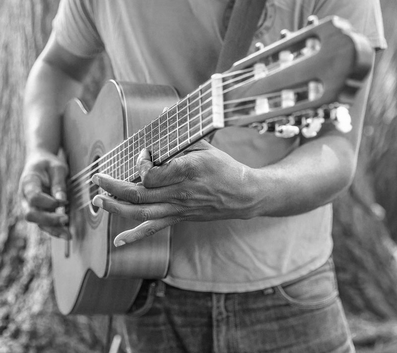
Photo Reference
A slightly edited photo reference was used to create this sketch. This photo is from Pixabay.com. The original image was cropped slightly and the color was removed.
Here’s a look at the photo reference…

Timed Drawing of a Person Playing the Guitar – Conclusion
This drawing was created quickly and definitely falls within the the category of a “sketch”. However, the techniques and approaches used by Ashley demonstrate many of the foundations of observation which are essential to accurate drawings. Practice is important in refining any skill and drawing is no different. Even though this drawing was created in just 45 minutes, the principles used in more developed, refined drawings are the same. By creating sketches like this one, we improve our drawing skills and by challenging ourselves with difficult subjects, our skills grow faster
If so, join over 36,000 others that receive our newsletter with new drawing and painting lessons. Plus, check out three of our course videos and ebooks for free.
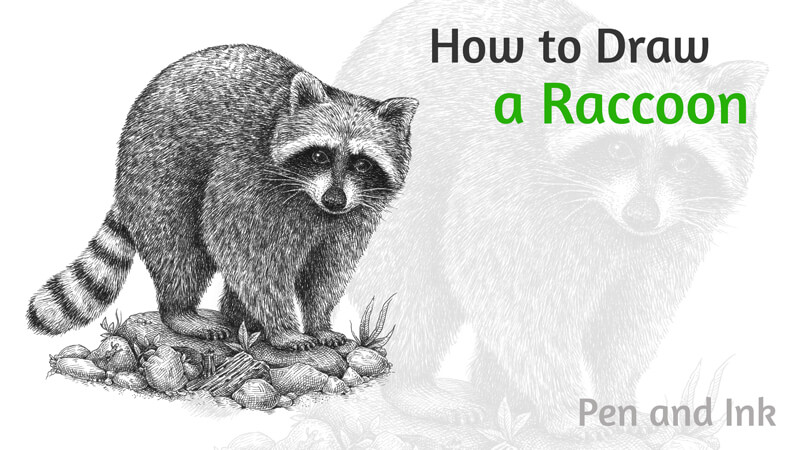
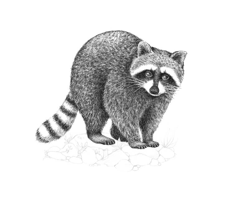
How to Draw a Raccoon with Ink Liners
The intelligence and memory of raccoons are also remarkable. Their average IQ level is just below that of a monkey! This brings raccoons considerably close to “human IQ” levels as well.
Raccoons are adaptive and learn from their experiences. They remember solutions to tasks for at least three years! These wonderful animals are also capable of solving challenges in various innovative ways.
It’s interesting to know that the English name for “raccoon” is derived from the Proto-Algonquian language. It translates as “one who rubs, scrubs and scratches with his hands.” Indeed, paws play an important role in the animals’ lives. They rely heavily upon their heightened sense of touch.
Compared with most mammals, raccoons have four to five times more sensory cells in their paws. This feature allows the animals to “see” an object with their hands without even looking at it. The tactile sensitivity increases when the paws are underwater.
Also, raccoons have vibrissae – specialized hairs that are located above their claws. Vibrissae help to identify objects before actually touching them.
I hope that these bits of information have made you excited to draw one of these wonderful creatures! Let’s continue our creative journey. We’ll learn more interesting facts along the way.
Supplied for Drawing a Raccoon with pen and Ink
I’ll be using three ink liners designated by the numbers 0.05, 01, and 0.3.
A combination of a dip pen and liquid black ink is also a great option for this project. Press harder on your nib when you need a wider line, and lighter for a finer mark.
We’ll also need a graphite pencil and an eraser to create an underdrawing.
My sheet of paper is of a relatively small A4 size. It has a smooth surface.
See also: All About Drawing Papers and Surfaces
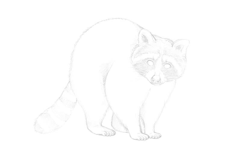
Drawing a Raccoon with a Graphite Pencil
With some animals, it’s crucial to have a precise knowledge of anatomy. Otherwise, it can be challenging to create a realistic drawing. However, there are special cases, and raccoons may be considered as such an exception.
Their fur and underfur coatings are very thick. Thus, we can present the body and limbs as a set of masses or general forms. This trick makes our task much easier. In the next steps, we’ll create a simplified framework of a raccoon.
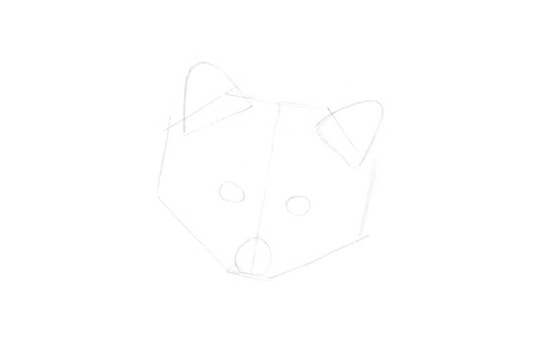
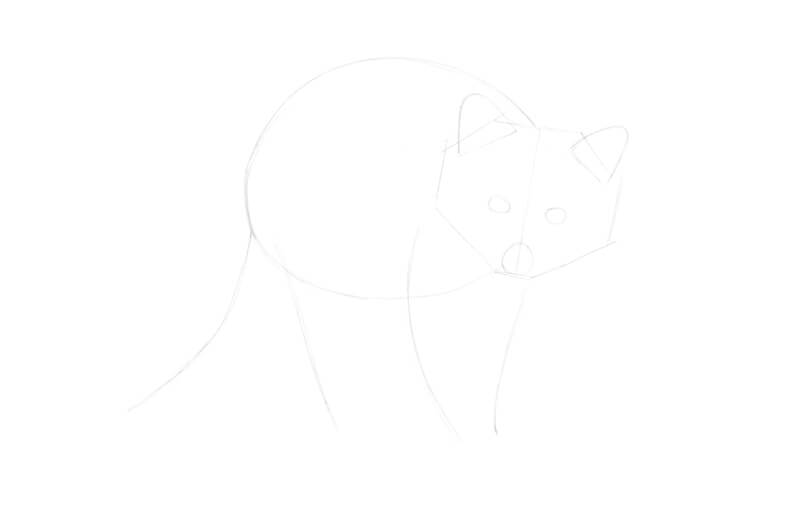
I start with the head, outlining its borders with several sketchy lines. The lower part is narrower than the upper and central sections. The front of the head is facing the viewer, as if the animal is making eye contact.
I add a subsidiary line that divides the main shape into halves. It will help us to check the symmetry. Keep in mind that the equality of the features on both sides is relative and approximate. The foreshortening of the body also affects the features.
I add the general shapes of the eyes, nose, and rounded ears.
Raccoons have a stocky, compact torso and short limbs. Their hind legs are longer than the front legs, giving the animals a hunched appearance.
Raccoons demonstrate plenty of poses for every artist’s taste. For example, they can stand on the hind legs, examining objects with the front paws.
The body of our raccoon is turned slightly to the side. I mark it with a big rounded shape.
Artworks can not only illustrate ideas or represent real-life objects, but they can also tell stories. I imagine that our raccoon was walking by the viewer and then suddenly stopped. Apparently, something caught the animal’s attention… What could it be?
Then I add the lines that show the direction of the tail and limbs. For now, I mark only the fully visible legs. The remaining one will be added later.
I add the rough shapes of the limbs, including the second hind leg. The smaller rounded shapes indicate the position of the paws. The shapes become narrower in the lower areas of the legs. The fur is shorter and less dense there.
The front paws are drawn close together to accent the charming clumsiness of the pose, as well as the compactness of the animal’s body.
I also add the stylized shape of a bushy tail.
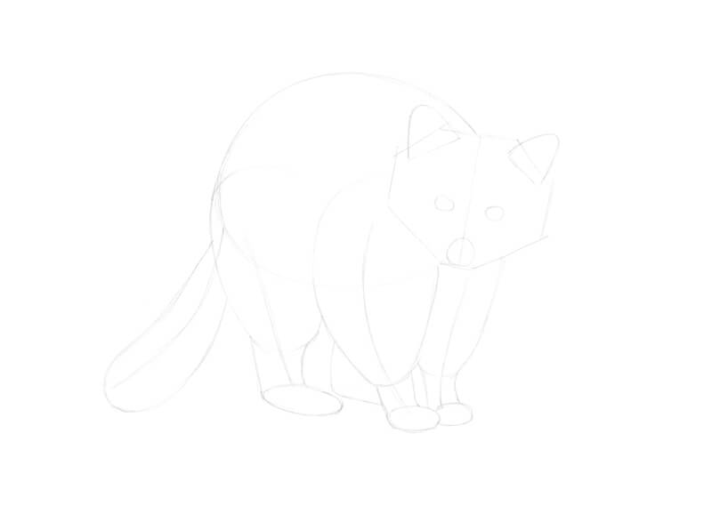
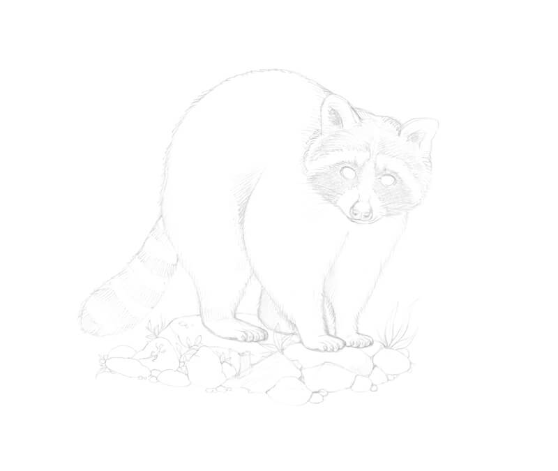
It’s time to refine the head. I mark the eyelids and ear openings.
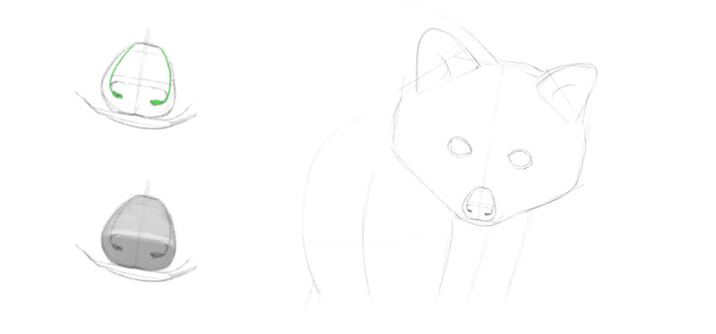
If we observe the nose in a simplified manner, we’ll see that it has two major planes. The top one has a horizontal direction and the lower one (where the nostrils are) is vertical.
A thin edge is joining the planes. The pattern of values depends on the lighting, but this edge often has a soft highlight.
You’ll find a stylized scheme of the nose in the image below. (See the lower illustration.)
The outer edges of the nostrils go up to the top of the nose, forming a interesting relief. The upper scheme in the image below illustrates the idea – pay attention to the green lines.
I also add the lower jaw and soften the overall contour of the head.
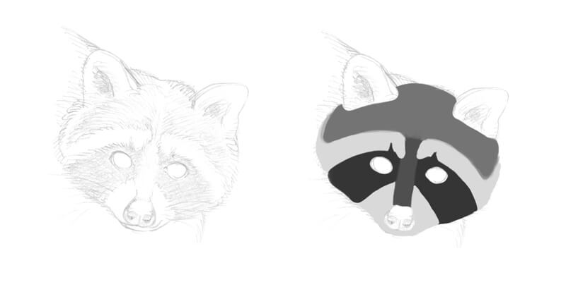
I divide the ‘face’ of our raccoon into sections, depending on the darkness of the fur. In the image below, you’ll find a simplified scheme that presents a four-value scale. Please note that the coloring of actual animals may have some deviations.
First of all, there is a recognizable black mask around the eyes. The nose bridge is quite dark, too, but it is still slightly lighter than the mask.
The upper area of the head may be considered as a midtone. Darker or lighter spots may exist within the section.
The mask is surrounded by contrasting white fur. In my scheme, these areas are marked with a light grey tone. The ears are bordered with white fur, too.
I add groups of whiskers on both sides of the muzzle.
It is reasonable to think that raccoons’ mask coloring serves a useful purpose. It helps to recognize the facial expression and posture of other raccoons. It may also reduce glare, enhancing night vision. Raccoons are awake mostly during the night, so this feature can be quite advantageous.
Raccoons have five toes on both the front and hind paws, so I add them. There is no opposable thumb.
The toes are quite long, but this foreshortening reduces the visual length. There are claws at the ends of the toes.
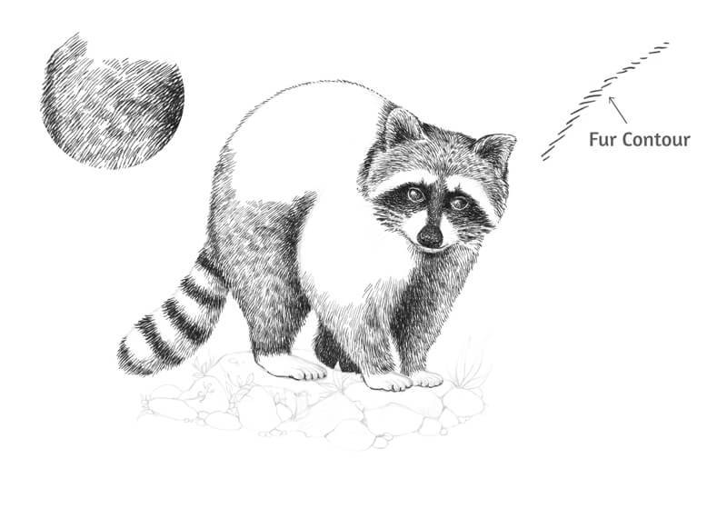
I refine the general contour of the body. To accent the unique feel of the texture, I go over the lines with a series of pencil hatches that imitate hairs.
I add some stones, a piece of wood, and plants to complete the underdrawing. The stones differ in size and shape.
A Quick Note on Drawing Fur with Ink
Before we dive into the inking process, let’s take a closer look at the main texture presented in the artwork.
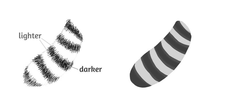
First, we should remember that fur consists of single hairs. They may have different lengths and directions. If we observe this texture in close up, we’ll notice that fur usually has a general direction and rhythm. At the same time, some hairs (or groups of them) may demonstrate a mild deviation from the main flow. Hairs can also overlap each other.
To create a credible illusion of the fur texture, we should convey this flow of hairs and show the overlap. A tonal variation helps to strengthen the effect of depth. It also creates a hint at overlay.
In the image below (a), you’ll find a fur sample. The main direction is diagonal. The hairs go from the upper-left corner to the lower-right one. Some of them are twisting, presenting a variation.
It’s possible to mark out a three-step value scale that forms this sample. The upper hairs or their overlapping fragments are lighter than the hairs beneath. The darkest areas convey the perceived depth and density of the fur.
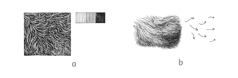
When we’re drawing an animal in full view, we usually don’t have to focus on single hairs in close-up. It’s quite the opposite. Excessive details of this kind may overload the image with too much visual information.
The best result is achieved when the lines repeat the general flow of fur with minor variations. In the image above (b), you’ll find an illustration of this principle.
Even if there is a high density of ink lines, we still can note tiny gaps of untouched paper. Those gaps give the texture a more natural look. The contrast creates a hint at overlapping hairs and accents the density of the coating.
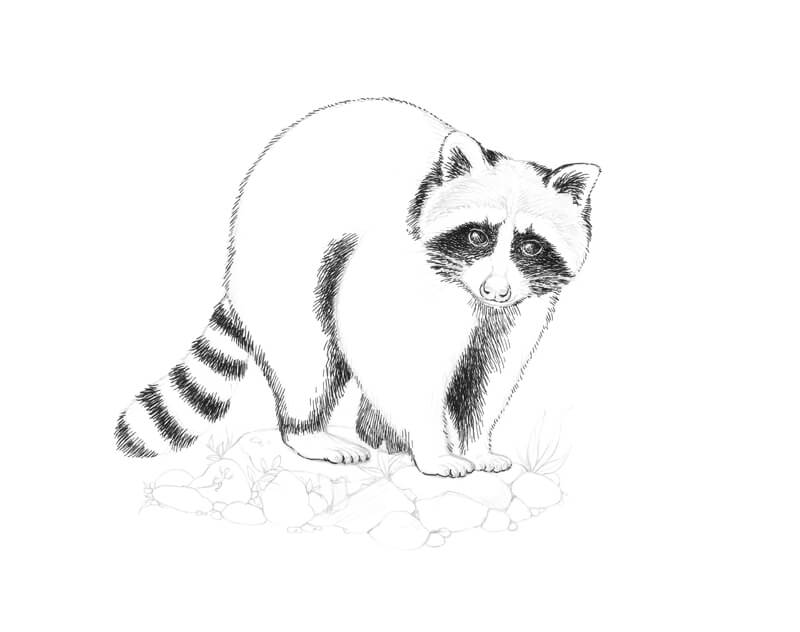
How to Draw a Raccoon with Ink
You may feel the need to soften the graphite marks with an eraser before applying ink. It’s also possible to remove them at the end of the process. I’m going to leave the pencil marks – they add a pleasant soft undertone.
I cover the eyes with rounded hatches, using the 0.3 liner. The marks repeat the eyes’ contours, accenting the volume of the form. I leave small areas of highlight in the upper parts of each eye.
I draw the dark mask. The lines go from the center of the head to its periphery. I also mark the fur of the ear openings.
I leave the whiskers untouched. If you accidentally draw over the whiskers with ink, don’t worry. It’s possible to recover them later with a white gel pen.
See also: How to Fix Mistakes in a Pen and Ink Drawing
I also mark the darker areas on the raccoon’s body. The lines conform to the fur direction.
I outline the contours of the nose and paws. With long hatches, I create the darker rings of the tail.
The tail provides a hidden challenge, so here are some additional thoughts.
There are areas of light and dark fur that slightly overlap each other. To a certain extent, they even blend into each other on the rings’ edges. Our goal is to convey this effect, avoiding the sharp cutout look.
I keep the middle parts of the black rings as dark and contrasting as possible. Only tiny white gaps are left. They imitate the subtle gloss that natural hair usually has. The edges of each black ring are lighter than the middle part, but the difference is minor.
In other words, I use more ink lines in the middle of each ring and fewer near the edges.
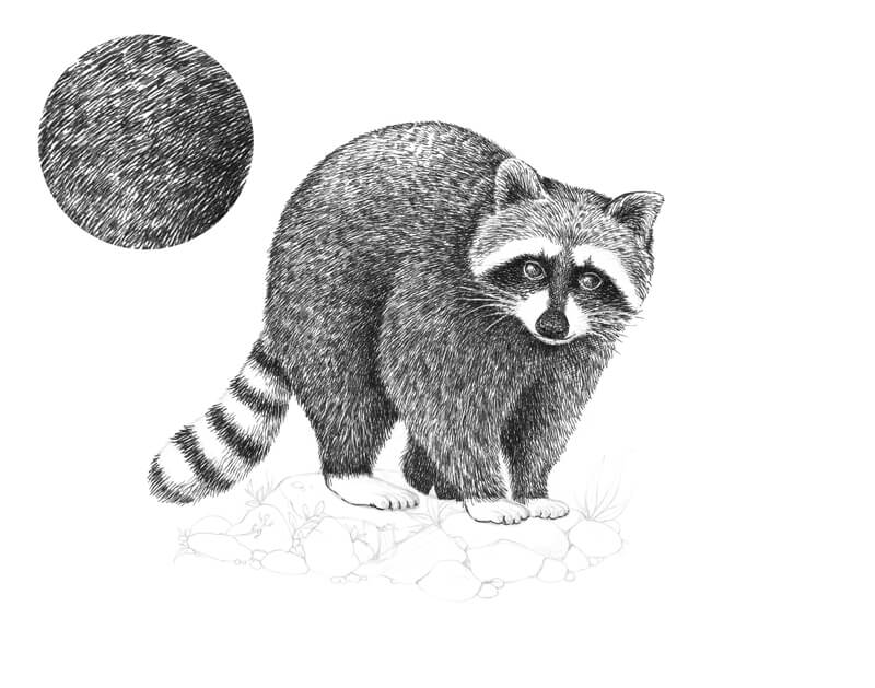
With 0.1 liner, I continue adding lines that imitate fur. The nose bridge is slightly darker than the upper part of the head. With groups of short hatches, I create variation in the texture.
I add hatching to the nose, making its lower part a bit darker than the rest of it. The difference is subtle because a real raccoon’s nose is very dark.
In our drawing, the nose should be approximately as dark as the mask. I add some dots there to create a hint at skin texture.
With ink lines of medium length, I mark the flow of hairs on the body. The density of hatches may vary, creating an effect of spotty, non-uniform fur. I use the 0.1 liner.
I leave shorter lines near the contours of the body. This trick helps to create an illusion that these areas are farther from the viewer.
The outer contours of the raccoon’s head, body, and limbs are created in this sketchy, fur-imitating manner. I don’t recommend using a single continuous line. With furry animals, such an outline will look unnatural.
I add the ink lines to the darker area of the tail that is near the body.
In the image below, you’ll find an enlarged sample of texture from the hip area.
In the same manner, I work on the raccoon’s body. I create tonal variety by making patches of denser ink covering in the fur. The upper part of the body (the back) has a lower density of marks. This difference helps to convey that light that is hitting this area.
Although fur has a noticeable general flow, there is a minor variation within each small area.
When working on the body, I make sure that the whiskers stay uncovered. The fur on the body is relatively dark, so the head contrasts against it.
Let’s work on the paws. They are quite light. However, there is a soft shadowing from the body, and we should keep that in mind.
I use both hatching and stippling to convey the form of the paws. Groups of rounded lines repeat the cross-contours of the limbs’ lower parts. This character of marks helps to create an illusion of volume. I still use 0.1 ink liner.
See also: Cross Contour Lines
And don’t forget to mark the claws!
With 0.05 ink liner, I add the lightest fur of the head and tail. The lines follow in the same direction of the hairs. In the areas of white fur, I leave much of the paper untouched. I use very short marks and dots near the nose.
I also darken the mask and the areas right around the eyes. The eyes’ highlights are too big and bright, so I reduce them.
Also, I darken the fur at the sides of the head to give it more volume.
With 0.1 liner, I outline the contours of the stones and other elements in the lower part of the drawing.
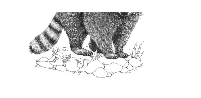
With 0.1 liner, I cover the stones with layers of hatching. Parallel hatching helps to convey the perceived smoothness of the stones’ texture.
The upper areas of stones are lighter than the lower ones, as they receive more light from the environment. However, there is also a cast shadow created by our raccoon. It mutes down the brightness of the stones near the paws.
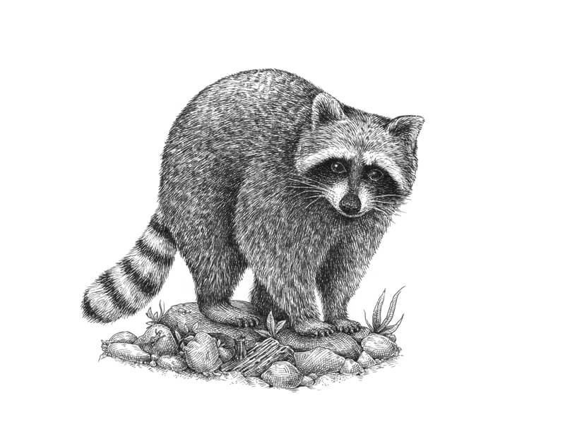
How to Draw a Raccoon with Pen and Ink – Conclusion
Congratulations – we’ve created a beautiful artwork! I hope that our creative journey was fun and enjoyable. Raccoons, much like other furry animals, are a joy to draw with a linear medium like pen and ink. Just keep your directional stroke making in mind and stay patient.
If so, join over 36,000 others that receive our newsletter with new drawing and painting lessons. Plus, check out three of our course videos and ebooks for free.
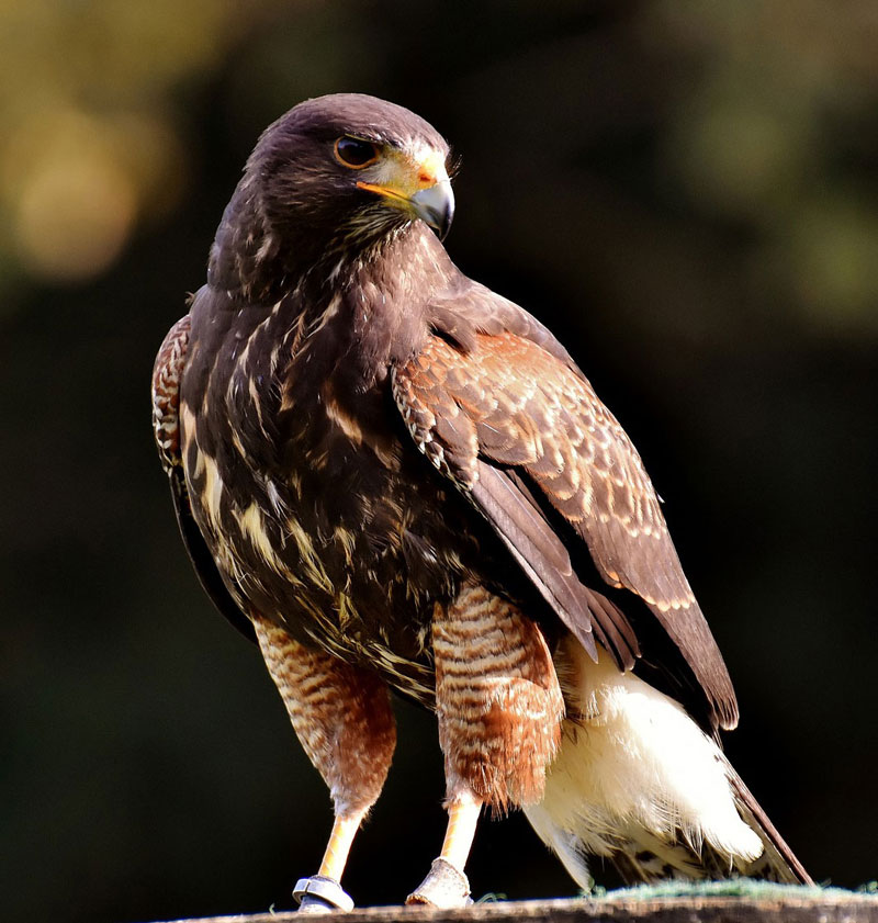
How to Draw a Hawk with Sepia Toned Pastels
Gettin Sketchy – Draw a Hawk with Sepia Toned Pastels and Charcoal – Season 3 Episode 5
This episode aired live on YouTube on February 17, 2021.
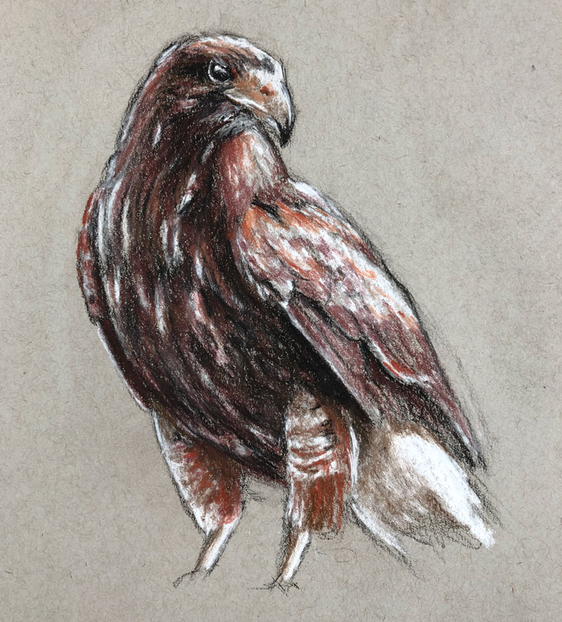
In this episode, we take a look at the process of sketching a hawk (mistakenly called a falcon by us “experts”) with sepia toned pastel pencils and black and white charcoal on gray drawing paper. Charcoal obviously gives us the opportunity to create a broad range of value with rich, dark blacks. White charcoal takes care of the highlights and lighter tones. The sepia toned pastel pencils provide a bit of color, but harmonizes the sketch with a limited color palette.
Here’s a look at the completed image…
Keeping it Sketchy
The first step in drawing the subject is to sketch the basic shapes and contours on the drawing surface. Charcoal is naturally a looser medium, so it makes since to keep our initial sketch rather loose. However, this would be true for any medium we choose to use. It’s usually a good idea to start with loose, sketchier marks and then refine the drawing as it develops. Charcoal makes sketching loosely a little easier since it’s easy to erase and manipulate.
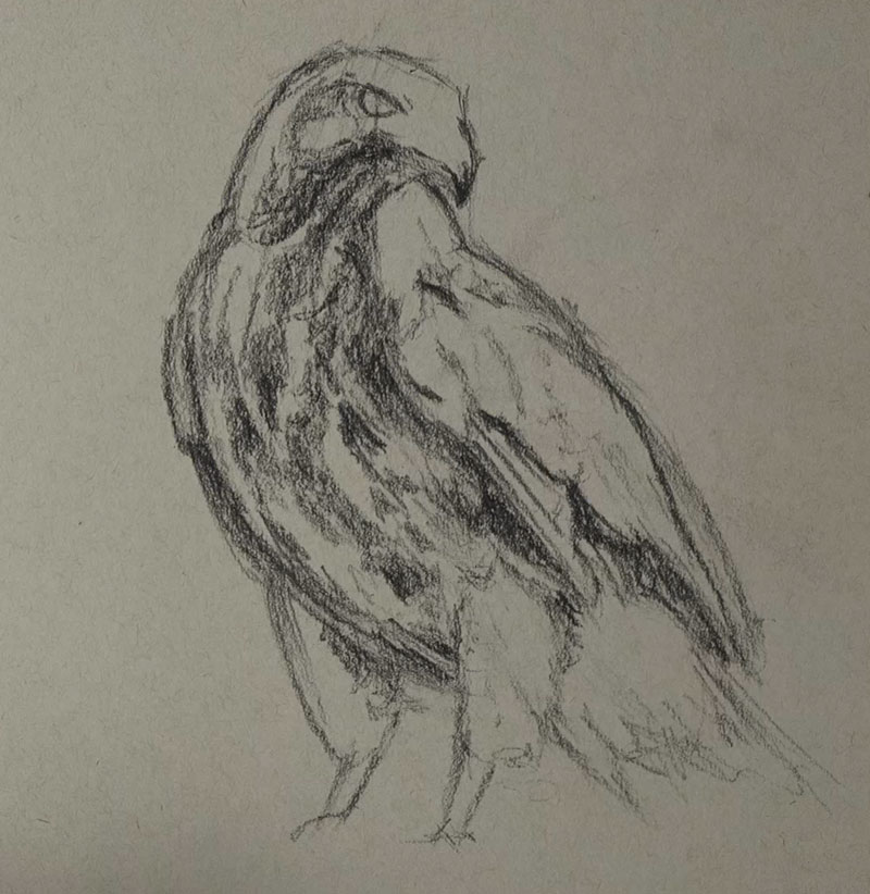
To make the drawing as accurate as possible, a bit of measuring is used. In this case, I used a printed version of the photo reference (a little further down this page) to take measurements. Using the charcoal pencil as a measuring tool, I took measurements and applied these measurements to the sketch. This ensured that the proportions of the bird were fairly accurate.
I also used the charcoal pencil to find the angles of different sections of the body. Laying the pencil over the printed reference made the angles, diagonals, etc. very clear and easy to see.
See also: Drawing 101 – Simplify for Success
Once the sketch of the basic shapes and contours were in place, I quickly blocked in some of the shadows and darker values. But before getting too carried away with the dark values, the lighter values needed to be addressed.
Adding the Highlights with White Charcoal
Next, the highlights and lighter values are preserved with a white charcoal pencil. Since we’re working on gray paper, we have the ability to push both dark and light values to produce a full range of tone. These lighter values are blocked in loosely, partly because of the time constraint but also to keep the drawing loose and fresh.
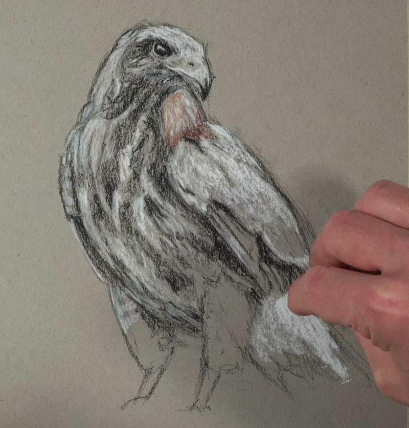
Be advised that in areas where the black and white charcoal interact, some cooler grays will develop. These cooler grays may help to create the illusion of natural shadow and add variety, but too many of them may take away from the limited palette. Since the sepia tones are warmer as well as the gray paper, we want to keep these cool gray areas at a minimum. To do this, we’ll simply leave a bit of the warmer gray paper visible in between the black and white applications.
Adding Sepia Tones
The term “sepia” simply refers to a reddish-brown color. This brownish pigment originally comes from the ink sac of the cuttlefish. Sepia is actually a genus of cuttlefish. In art, sepia can refer to a broad range of reddish-browns, including hues that are more red, brown, or even yellow.
Working with sepia tones allows us to add a little warmth to a drawing, while keeping the palette simple. Conté, a drawing medium similar to both charcoal and pastel, is produced in variety of earthy tones, including sanguine which is a reddish brown tone. Conté is inexpensive and can be found at most art stores.
In this drawing however, pastel pencils are used in place of traditional conté. A few reddish-browns were chosen from a set of Conté a Paris pastel pencils to use with this drawing.
After the lighter tones were mapped out, the addition of the sepia tones began with the pastel pencils. As you’ll notice some of the browns and reds were a little cooler, while others were warmer. This worked out great for our subject since both warm and cool varieties of the sepia tones were found on the hawk.
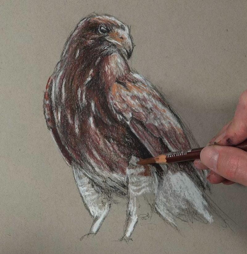
Much of the sepia tones were applied directly over the charcoal applications. With heavy pressure, the pastel pencils were able to mostly cover the charcoal applications. But with a slightly lighter touch, some mixing results. This allows us to create a variety of values of the sepia tones, resulting in darker browns and lighter red-oranges.
Photo Reference
A slightly edited photo reference was used for this drawing. This reference comes from Pixabay.com.
Here’s a look at the photo reference…
Materials Used in this Drawing Exercise
Both charcoal and “white” charcoal were used to complete the drawing. Pastel pencils by Conté a Paris were used to apply the sepia tones. The drawing was completed on Strathmore toned drawing paper. This paper is inexpensive and is a wonderful surface for sketching.
Here are a few links to pick up these materials… (The following links are affiliate links which means I make a small commission if you purchase at no additional cost to you.)
- Woodless Charcoal Pencils (Black)
- White Charcoal Pencils
- Conté a Paris Pastel Pencils
- Strathmore Toned Drawing Paper Paper
Timed Drawing of a Hawk – Conclusion
Most of us have plenty of experience drawing with a pencil on white paper, but branching out and trying new mediums opens us up to new possibilities. Using different mediums may also change the way that we make marks, leading to better artworks.
While pencils are used in this drawing, the way they are applied is different from how a graphite pencil would be used on white paper. Drawing loosely and quickly without compromising too much accuracy is a skill that every artist should develop. This combination of media helps us do this, all while developing a respectable drawing with a harmonized palette.
If so, join over 36,000 others that receive our newsletter with new drawing and painting lessons. Plus, check out three of our course videos and ebooks for free.

Draw a Bug with Colored Pencils – Timed Drawing Exercise
Gettin’ Sketchy – Draw a Bug with Colored Pencils on Black Paper – Season 3 Episode 4
This episode aired live on YouTube on February 10, 2021.
In this timed drawing exercise, we take a look at creating a colored pencil drawing of a bug with a limited palette of colors on black paper. This drawing was created in just under 45 minutes.
Limiting Colors
The colors of our world are beautiful, but they can be overwhelming when we try capture every color in a drawing or painting. Colors are complex.
It’s ironic, but limiting the colors that we use in a drawing often leads to better results. Then reason for this is two-fold.
Firstly, limiting our colors automatically creates harmony in a work. Using fewer colors actual ties the composition together.
See also: Composition in Art
Secondly, when we limit our palette of colors, it’s easier to concentrate on the values. Value, an element of art, is the darkness or lightness of color. When it comes to creating representational drawings and paintings, it is the most important element of art. Value tells us about the form of the object, the textures, and the light within the scene.
When we’re not distracted by all of the colors, we can focus on the darkness or lightness of the color that we are developing. Color doesn’t communicate the subject – value does.
In this drawing, Ashley has limited the colors and the result supports the above arguments. The work is completed on black paper, but only yellow and white are used. Here’s a look at the finished drawing…
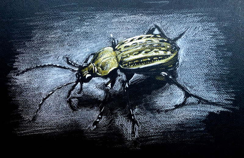
When we look closely at the finished drawing, we perceive that there are more colors there than just yellow and white. This is due to the accuracy of the values and the way in which the colors interact with each other.
The color of the paper is also affecting the perceived colors. Some areas even look a bit green. This is the result of the coolness of the black paper optically mixing with the yellow applications.
See also: Optical Color Mixing
The Black Paper Effect
Most of us are accustomed to working with a dark drawing medium on a white or light drawing surface. When we develop a drawing like this, we are focused on adding darker values, while relying on the white of the paper to influence the lighter values.
When we work on black paper, the way we approach values is reversed. Instead of relying on the color of the paper to develop light values, we use the paper to develop dark values. This means that we also add the lighter values with a light colored medium. In this case, Ashley uses the yellow and the white colored pencils for the lighter values and relies on the black paper for the shadows and darker tones.
See also: Drawing on Black Paper with White Media
For some, this shift in thinking and mark-making can be difficult. However, once you understand this concept and start making marks, it can be quite liberating. Most of us have more difficulty making a drawing as dark as it should be. But, when we work on black paper, it’s much easier to create the required range of value that we need.
See also: Papers for Drawing
The paper that Ashley works on in this drawing is also heavily textured. This heavier texture adds a bit of interest to the colored pencil applications and marries nicely with the looser drawing.
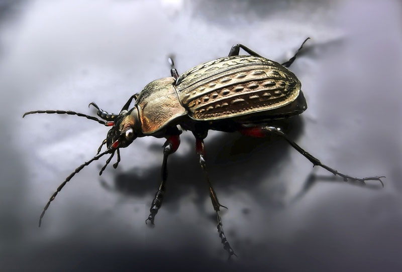
Photo Reference
The photo reference for this drawing exercise comes from Pixabay.com. When we examine the reference, we see that it is perfect for this media and surface combination. Here’s a look at the reference..
Drawing a Bug with Colored Pencils on Black Paper – Conclusion
This exercise is a reminder that we don’t have to have an extensive set of materials in order to create a successful drawing. We surely don’t need to include all of the colors that we see. Remember, value is the key. Even though this drawing is a quick sketch, it’s still quite refined. With just two colored pencils, the subject has been communicated accurately and also artistically.
If so, join over 36,000 others that receive our newsletter with new drawing and painting lessons. Plus, check out three of our course videos and ebooks for free.
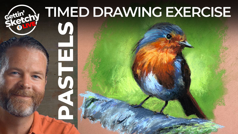
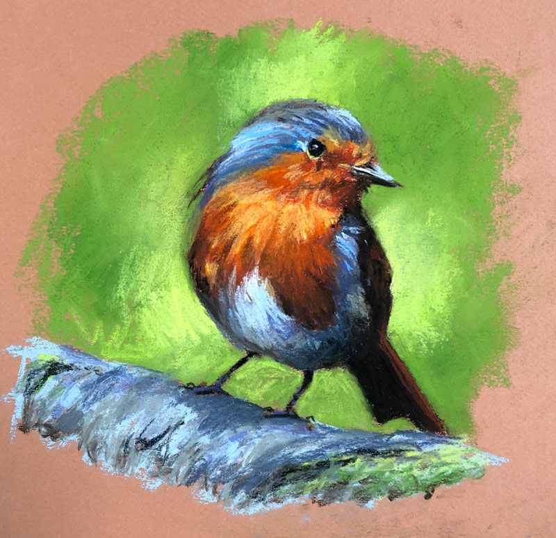
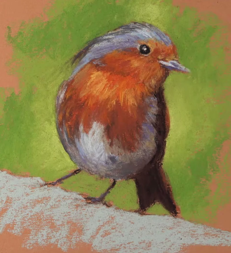
Pastel Drawing of a Robin – Timed Drawing Exercise
Gettin Sketchy – Drawing a Robin with Pastels – Season 3 Episode 3
This episode aired live on YouTube on February 3, 2021.
In this timed drawing exercise, we’ll take a look at drawing a colorful bird (a European Robin) with pastels and pastel pencils on orange Canson paper. We’ll work to complete the drawing within 45 minutes. This means that we’ll need to work quickly, blocking in basic shapes of value before developing details with the remaining time.
Here’s a look at the completed image…
Starting Sketchy and Loose
We’ll first need to sketch the bird and to do this – we’ll use a brown pastel pencil. You can use any color you wish to sketch out your subject, but I would recommend sticking with a neutral. However, Black can be too strong and white often doesn’t provide enough contrast. I have found that light to medium browns are often a good choice.
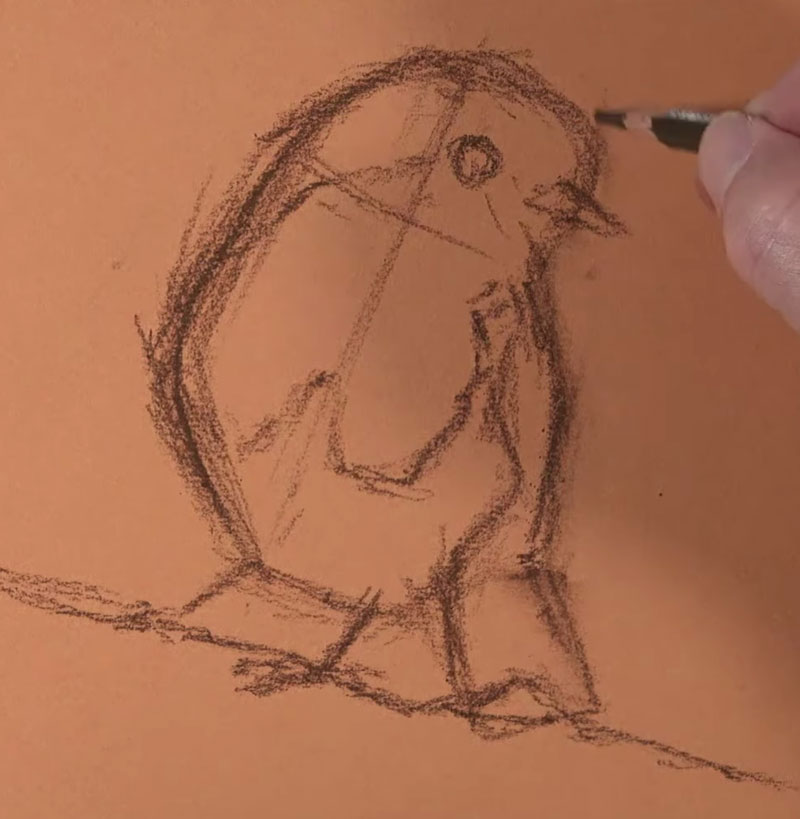
We’ll keep the sketch loose, holding the pencil lower on the shaft. Using a looser line helps us to find the “right” line. Pastels are naturally a looser medium, so be careful not to get too “tight” and controlled with your sketch.
See also: Drawing Basics – Construction
Blocking in Basic Colors and Values
Although pastels are clearly a drawing medium, finished works are often referred to as paintings. One reason they are referred to as paintings is the look of the finished work. Pastel works are very similar in appearance to traditional paintings created with opaque painting mediums like oils or acrylics. But more importantly, the thought process of the pastel artist is similar to that of the opaque painter.
Colors and values are often “blocked in”, much like an opaque painter would do. Since pastels are easily layered, we can cover previous applications or slightly alter them as more colors and values are added. This ability to layer and cover makes pastels more versatile than other color drawing mediums like colored pencils.
This means that we can make quick decisions and work loosely, even as we layer shapes of color. The details can be applied right over the top, much later in the process.
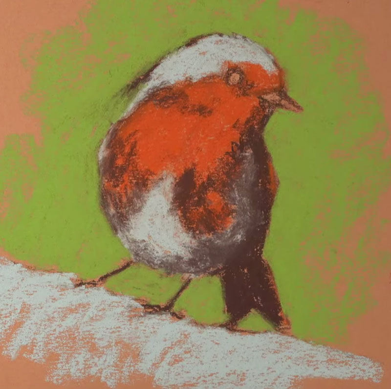
For this painting, I decided to simplify the bird into three or four basic shapes of color. A lighter blue-gray, a medium orange, and a dark brown were used to create these initial shapes. This was followed by a medium yellow-green for the background.
Variety within the Basic Shapes
With the basic shapes of color in place, we can gradually pull out the details. Details such as texture are developed by adjusting the contrast of values. By gradually layering additional shapes of similar colors that differ in value, we begin to pull out the details. We also add depth to the color as we layer.
For the light gray areas on the bird, light blues, purples, and dark grays are layered. For the belly of the bird, a bit of the dark brown is layered to create a shadow. On the breast of the Robin, lighter yellows are layered where the light is strongest. In the area of shadow, a darker, earthy red is layered. Some dark brown is also used here to deepen the shadow.
In the darkest areas, like the wing and eye, a black pastel pencil is applied. Black is an extremely strong color, so we must be careful that it doesn’t flatten the image by using it too liberally.
The background is also pushed by applying darker greens and lighter yellow-greens.
As we continue to layer related colors of different values, the image begins to make more sense and the details slowly emerge.
The Importance of the Paper
As is the case with any work, the surface is important. The surface is the foundation of your work and choosing a surface that limits your medium can have a detrimental effect on the finished work. Even though this image is a quick sketch, I choose to work on a quality surface.
In this case, the drawing was created on Canson Mi-Teintes pastel paper. This paper features two distinct surfaces that can both be used to apply pastels and other similar mediums. One side of the paper features a noticeably heavier tooth (texture). The other side of the paper is more textured than most drawing papers, but is less textured than the opposite side.
The texture of the paper is a good indication of how many layers of color you’ll be able to layer. Generally speaking, the heavier the tooth or texture – the more layers of pastel you’ll be able to apply. Since this drawing was a sketch, I choose to work on the less textured side. In this case, I knew I’d be limited in the layers I could add because of the time constraint.
See Also: All About Drawing Papers
Now you may be wondering why I choose orange paper. I often receive questions regarding paper color choice when the color of the paper is not your standard white or gray.
Generally, my choice of paper color is dependent on the color temperature I want the final drawing to have. In this case, the scene is very warm, with bright yellow-greens and oranges. Since I know that small bits of the orange paper are likely to show through the pastel layers, choosing an orange keeps the drawing “warm”.
People tend to overthink the choice of paper, so don’t dwell too long with it. When choosing a colored surface, other than a neutral, just think about color temperature. If you want a warmer image, choose a warmer paper color. If you want a cooler image, choose a cool paper color. If you’re unsure, or if you want to make this decision as the drawing develops, then consider a neutral surface.
See also: 6 Reasons to Draw on Toned Paper
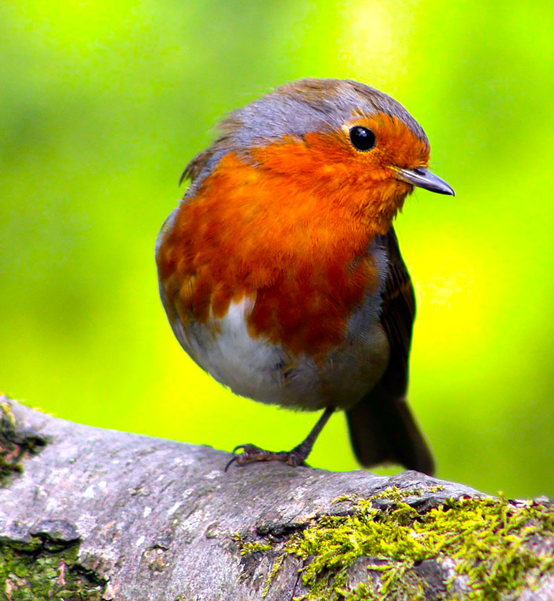
Photo Reference
The photo reference for this drawing comes from Pixabay.com. This image was edited by intensifying the colors and values in Photoshop. You’ll also notice that I choose to include the missing leg in the drawing. By leaving the leg out, as it is in the reference, the image wouldn’t translate in a natural way.
Here’s a look at the photo reference…
Materials Used in this Drawing Exercise
Pastels and pastel pencils were used to develop the drawing. As we have discussed before, Canson Mi-Teintes paper was the drawing surface. The pastels used are Rembrandt pastels. These pastels are pricey, but worth the extra price. The pastel pencils are by Carbothello. These pastel pencils are harder than traditional soft pastels but soft enough so that they can still be layered over. I also used a few NuPastels which are considered hard pastels.
Here are a few links to pick up these materials… (The following links are affiliate links which means I make a small commission if you purchase at no additional cost to you.)
Timed Drawing of a European Robin – Conclusion
Practicing is an important part of developing any skill and drawing is no different. For many of us, practice comes in the form of drawing with graphite pencils in a sketchbook. And while this type of practice does help to improve our skills, there are benefits in trying different mediums on different surfaces – especially those that require a different approach to drawing than we are used to.
Pastels are actually a wonderful medium for practice due to the speed at which a painting can be developed. They force us to analyze color/value and think in terms of shape which are skills that not only improve our drawing skills but also carry over to painting.
If so, join over 36,000 others that receive our newsletter with new drawing and painting lessons. Plus, check out three of our course videos and ebooks for free.
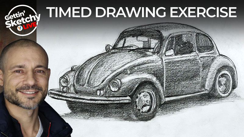
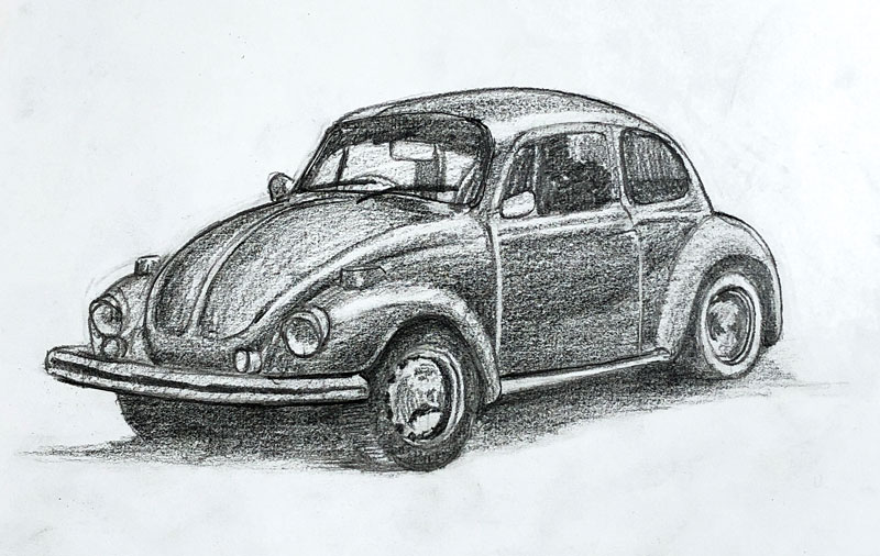
How to Draw a VW Beetle – Timed Drawing Exercise
Gettin Sketchy – How to Draw a VW Beetle – Season 3 Episode 2
This episode aired live on YouTube on January 27, 2021.
Think drawing cars is difficult? Well, any man-made object with curves and details isn’t a “walk in the park”. Ironically, if we loosen up with our initial marks and focus on relationships of lines and shapes, a complex object (like a VW Beetle) is quite a bit more manageable to draw. In this timed drawing exercise, Ashley demonstrates this concept as he completes a drawing of the classic car in just 45 minutes with graphite pencil.
Here’s a look at the completed image…
Mapping the Drawing with Shapes and Lines
Every drawing that we create is a series of decisions. Where should we place this mark? What should this shape be? How does this section relate to the one beside it?
Our drawing develops as we make these decisions, which are followed by the actual marks. The decisions that we make early in the drawing process are often the most critical.
This doesn’t mean that these early marks must be remarkably accurate. This is because many of the decisions we make are based on relationships and comparisons. Many times, we can’t make an informed decision on a specific mark without having a mark in place. With two marks or three or so on, we have more information for comparisons and as a result – our drawing becomes more and more accurate.
In the beginning stages of this drawing, marks are made quickly and loosely.
Ashley starts with a line to define the bottom edge of the car. This initial line establishes the approximate length and angle of the Beetle. From there, the angle of the front of the car is established, but only after comparing its length and slant to the first line. Then a line is drawn, parallel to the first, for the height of the door. This is followed by an additional parallel line for the height of the car.
These four simple lines become the foundation for the drawing that follows.
See also: Drawing Basics – Construction
Without the first line, the three that follow cannot be added with accuracy. So the drawing builds from here. Each line that is added – each shape that is drawn – becomes a measurement and comparison tool. Adjustments are made and the drawing slowly develops with a remarkable level of accuracy.
So as you can see, we need to be focused on getting information on the drawing surface that will help us make comparisons as quickly as possible. This may come in the form of basic shapes, loose lines, or more controlled lines like the ones Ashley drew as the drawing begins.
See also: Improve Your Drawing Skills in 6 Days
Once these initial lines are in place, the focus turns to drawing the body of the VW Beetle. We all know, and can clearly see, that a VW Beetle is a curvy car. But Ashley doesn’t jump straight to drawing curves. Instead, he continues with straight lines to define the outer boundaries of the vehicle. Why is this?
By drawing straight lines, Ashley is able to find the outer edges without being distracted by drawing challenging curves. These curved lines can be drawn once the basic shape of the car is defined. This leads to an even greater level of accuracy in the drawing. Angles are always important in accuracy.
Shading the Drawing
Most of the time was spent finding and drawing the basic shape and contours of the VW. The values were quickly added at the end of the timed session. Although the values were developed with quick shading, the car still reads rather well. This is mostly because a full range of value with a consistent light source is developed.
See Also: The Basics of Shading with a Pencil
The directional strokes that Ashley uses to add the shading also helps to communicate the form of the car. Each plane of the car affects the direction of the stroke of the pencil. This concept is often referred to as cross contour lines. Understanding cross contour lines helps the artist make decisions in regards to the direction of pencil and pen strokes as well as brushstrokes.
See Also: Cross Contour Lines
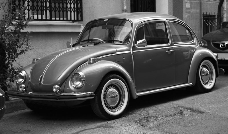
Photo Reference
This drawing was created by observing a photo reference. This photo is from Pixabay.com. However, it was edited to make it more suitable for drawing. The image was originally in color, but the color was removed to leave it in gray scale. This makes it easier to see the values. It was also flipped horizontally, making it easier to “read” from left to right.
Here’s a look at the photo reference…
Materials Used to Create the Drawing
This drawing was created using very basic drawing materials. A few graphite pencils (HB, 3B, and 8B) and standard 80 lb. drawing paper was used. A simple, pink rubber eraser was used for corrections.
See also: All About Drawing Papers
Timed Drawing of a VW Beetle – Conclusion
Although this drawing was created in a loose, sketchy manner and in just 45 minutes – there’s lots to learn here. Drawing is not just about making marks. It’s about making informed decisions that build upon prior decisions. These decisions begin with observation and end with marks. And part of being accurate with a drawing is the willingness to make marks that may not be “right” so that you can compare and alter in order to “find” accuracy.
If so, join over 36,000 others that receive our newsletter with new drawing and painting lessons. Plus, check out three of our course videos and ebooks for free.
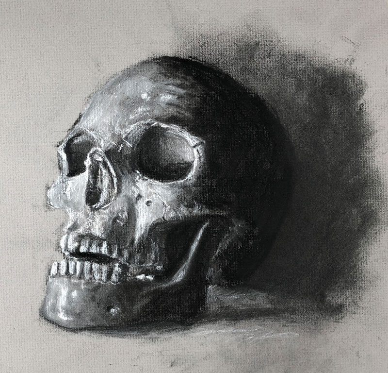
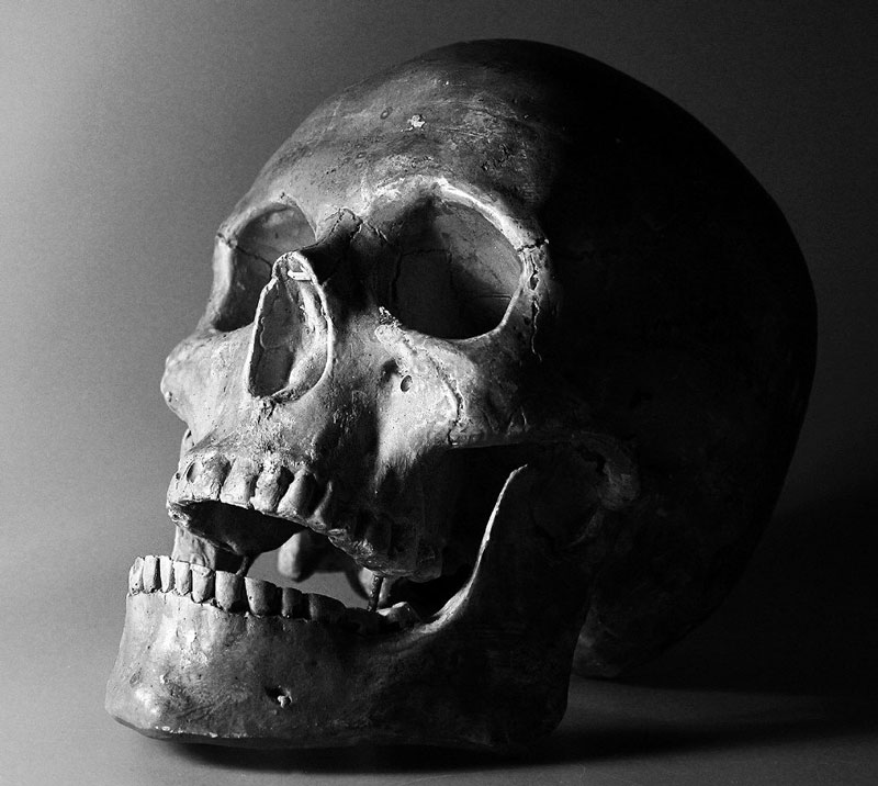
Charcoal Drawing on Gray Paper – Timed Drawing Exercise
Gettin Sketchy – Charcoal Drawing of a Skull on Toned Paper – Season 3 Episode 1
This episode aired live on YouTube on January 20, 2021.
In this timed drawing exercise, we take a look at drawing a skull with charcoal and white charcoal on toned gray charcoal paper. We’ll use several different forms of charcoal including vine, charcoal pencils (compressed charcoal), and “white” charcoal to complete the image.
Here’s a look at the completed image…
Drawing on Toned Paper
When most of us think of the process of drawing, we envision making dark marks on a white surface. Most of us learn to draw in this manner and it sticks with us. When we draw on white paper with a dark medium, we’re adding darker values and using the white of the paper to influence our light values and highlights.
This means that in order to create a full range of value in a drawing, we must work a little harder. With a white sheet of paper, we are essentially starting at one extreme of the value scale with pure white. As we add dark values, we gradually begin to broaden the range of value. But, we have to work a little harder to get a full range since we have to push the values to the darker side.
When we start with a gray surface (or any toned surface other than black or white), we begin somewhere in the middle of the value scale. This means that we can add both lights and darks to push the range of value. As a result, it’s easier to create a full range of tone since we’re not starting at one extreme end of the value scale.
See also: 6 Reasons to Draw on Toned Paper
Another benefit is that we are able to add the lighter values with a medium instead of relying on the white of the paper. This gives us more control over the lighter tones.
Obviously, when we work on a toned surface, we need to do so with a medium that allows us to add light tones. This means we need to work with a medium that has a “white” or at the very least – very light tones.
This is where white charcoal comes into play with our image of the skull. We can add the lighter values by applying white charcoal. We can control how much of the white charcoal blends and mixes with the black charcoal to control the value. The pressure that we place on the medium also influences the intensity of the application which also affects the value.
Using Charcoal Like a Painting Medium
While charcoal is clearly a drawing medium (since it is applied dry), the approach taken by the artist can be similar to that as a painter. Charcoal, like oil paints, is quite forgiving.
Vine charcoal, the softest form of the medium, is effortlessly manipulated on the surface and erases easily. This means that you can be very loose with your initial marks. Smear and smudge as much as you wish. Any stray marks are easily lifted away with a kneaded eraser. This attribute makes charcoal similar to oils and acrylics where initial marks may be loose but are eventually hidden.
As the drawing progresses and you become more confident with the information you have the surface, you can switch over to compressed charcoal or a charcoal pencil for more precision. Compressed charcoal is a darker and less dusty form of charcoal. Marks are more precise, but harder to erase.
See also: Charcoal Drawing Techniques
When working on a gray drawing surface, you can gradually increase the contrast as you progress from the softer vine charcoal to the harder, compressed form.
Photo Reference
A photo reference was used for this timed drawing exercise. This photo, originally from Pixabay.com, was edited to make it better suited for drawing with charcoal. The image was flipped horizontally so that the light source originates from the left. The contrast was enhanced and the composition was cropped.
Here’s a look at the photo reference…
Recommended Supplies for Drawing a Skull with Charcoal
As we discussed above, charcoal in various forms was used to complete the drawing. Vine, compressed charcoal (encased in a pencil), and white charcoal were all used.
The drawing surface is always important, which is often overlooked by beginners. The surface for this drawing was no exception. Aside from the tone of the paper, the texture also plays a role. The paper used for this drawing is charcoal paper, which features a laid patterned texture. This texture helps to grip the charcoal and hold it in place. This reduces the dust from the charcoal material while giving the artist a bit more control.
See also: All About Drawing Papers
Here are a few links to purchase charcoal and gray toned charcoal paper …(The following links are affiliate links which means we make a small commission if you purchase at no additional cost to you.)
Timed Drawing of a Skull – Conclusion
A skull is a wonderful subject for practicing drawing. There are so many different textures and light always creates interesting shadows and highlights. Like people, every skull is different and there’s always something new to discover. And when we bring in a bit of charcoal, we’re right back in art school again.
If so, join over 36,000 others that receive our newsletter with new drawing and painting lessons. Plus, check out three of our course videos and ebooks for free.
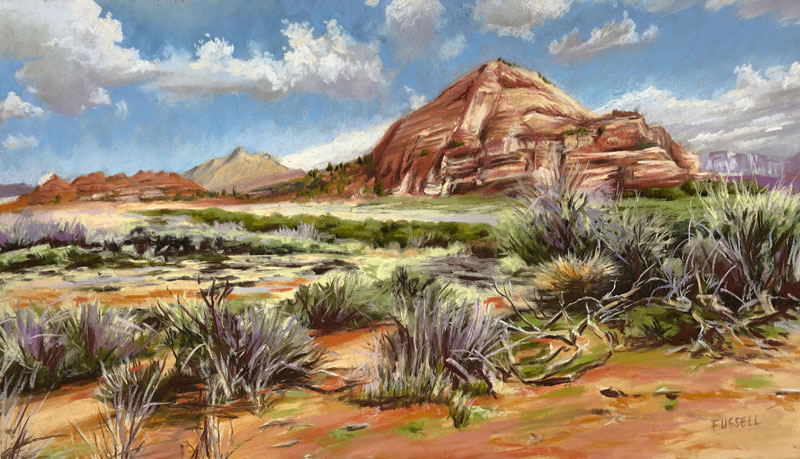
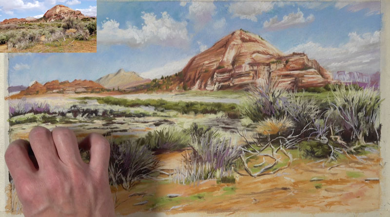
Desert Landscape Painting with Pastels
Painting a Desert Landscape with Pastels
In this pastel lesson, we’ll take a look at developing a desert scene with pastels on PastelMat paper. We’ll work in a specific order, addressing the background first, followed by the middle ground, and lastly – the foreground. Although we’ll mostly focus on local color (observed color), we’ll also pull out a color scheme of secondary colors to create additional contrast, while ensuring harmony.
Art Materials for this Lesson
Both traditional stick pastels and pastel pencils are used to complete the desert scene. Mostly pastels are used, but the pencils come in handy for details. Rembrandt pastels and Carbothello pastel pencils are used in this case, but any brand can be substituted.
This work is painted on PastelMat paper (light gray surface). This paper features a tooth similar to ultra fine grit sandpaper. As a result of the texture, colors can be easily layered while keeping the dust to a minimum. Keep in mind that the surface in which you choose to work is just as important as the medium. The surface has a huge impact on how the medium behaves and the final result.
(The following links are affiliate links which means that I make a small commission if you purchase without an additional cost to you)…
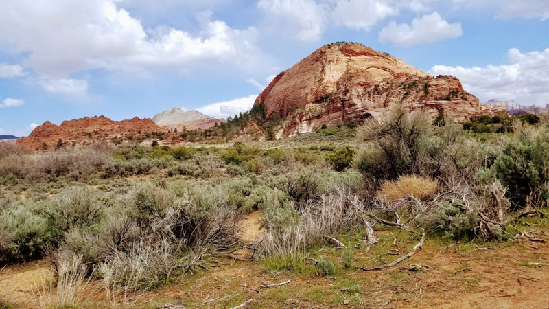
The Photo Reference
The photo reference used in this painting comes from Pixabay.com. As you’ll notice, we use the photo reference for the layout, textures, and value relationships. However, during the execution of the painting, changes are made and the reference is loosely followed. Our painting should not be a direct copy of the image, but rather an interpretation of the subject.
Here’s a look at the photo reference used in this painting…
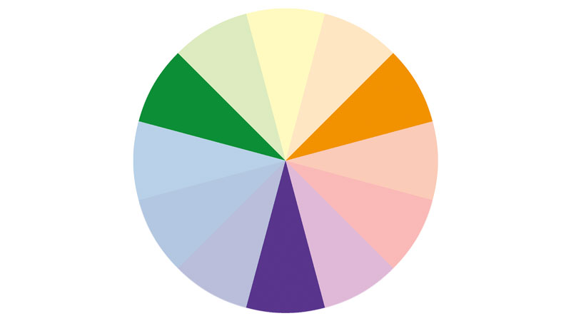
Pulling Out a Color Scheme
A color scheme is typically a limited palette of colors that have a defined relationship in terms of their locations on the color wheel. As you may imagine, there are lots of possibilities when incorporating a color scheme in a painting. The artist may choose to completely manufacture colors, but keep the values accurate. Or, the artist may choose to intensify certain colors so that they create a subtle, but noticeable color scheme.
In the case of our subject, we can clearly see that orange is already a dominant color. We also notice that green is present. And if we look closer, we can see hints of purple as well.
This means that a secondary color scheme of purple, orange, and green makes sense for this image. This will keep the image looking natural while increasing contrast and interest.
Start with the Background
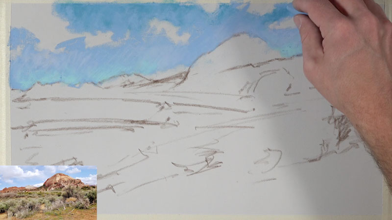
We’ll begin by first quickly sketching the composition using loose lines. At this stage, we want to map out the subject on the paper and have an idea how we plan on moving the viewer’s eye through the work. A dark brown pastel pencil is used to apply these marks. This is drawn quickly without regard to any details.
Once our loose sketch is in place, we can turn our attention to the background. Pastels are similar to the opaque painting mediums of oils and acrylics. Even though pastels are a drawing medium (since they are applied dry), the thought process of the artist is more closely related to that of painting. Pastel applications can completely cover previous applications. This means, that like with opaque painting mediums, we can work from the background to the middle ground and finish up with the foreground. Working in this manner, and in this order, ensures that we don’t have to work around objects in the foreground to develop the middle ground and background like we have to do with other drawing mediums like colored pencils or graphite.
In this case, our background consists of the sky. We’ll begin with a medium light blue, leaving open areas for the shapes of the clouds. A slightly darker blue is applied to the top of the sky, while a couple of lighter blues are applied adjacent to the horizon.
Once we have our initial applications of blue applied to the sky, we’re now ready to add the clouds. A very light blue is applied to define the shapes of the clouds. Although it may be tempting to use white for this, a light value of a color is a better choice.
Once the shapes of the clouds are in place, it’s time to develop the illusion of form by layering darker and lighter values. A few light grays are layered and blended in the core shadows. A bit of color is also mixed in. In this case, purple is added since it fits with our color scheme.
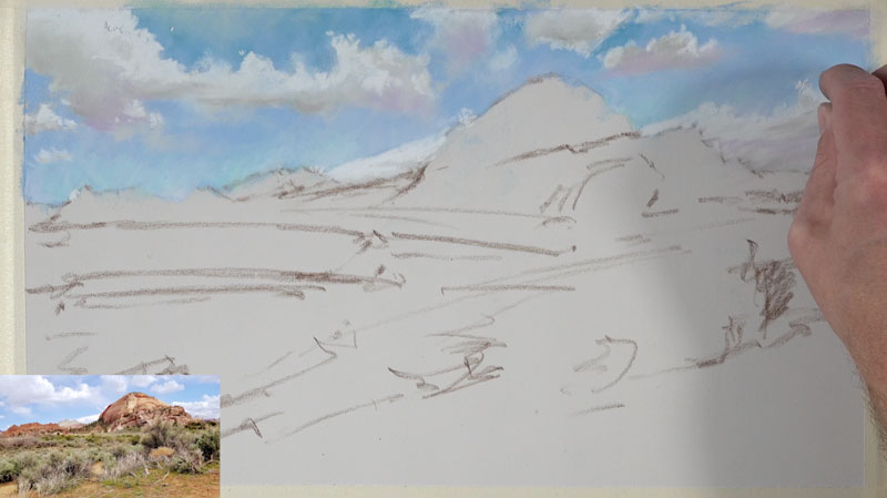
A light yellow is used to add highlights which is followed by a touch of white. Edge quality is important. Pay attention to the softer and harder edges of the clouds. In the areas where the edge is soft, use your finger or a blending stump to smudge.

Mountains and the Middle Ground
Once the sky is complete, we can move on to the middle ground. In our scene, the middle ground is made up of the distant mountains, the flat desert floor, and strips of multi-colored vegetation.
We’ll begin with the distant mountains, layering the color right over the sky. At first, just basic shapes of color are applied. A light yellow ochre and an earthy orange are used.
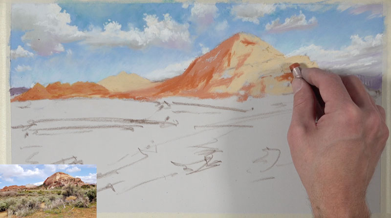
With an underlayment of basic colors in place, we can layer colors of similar hue, but contrasting values, to gradually develop the details and texture.
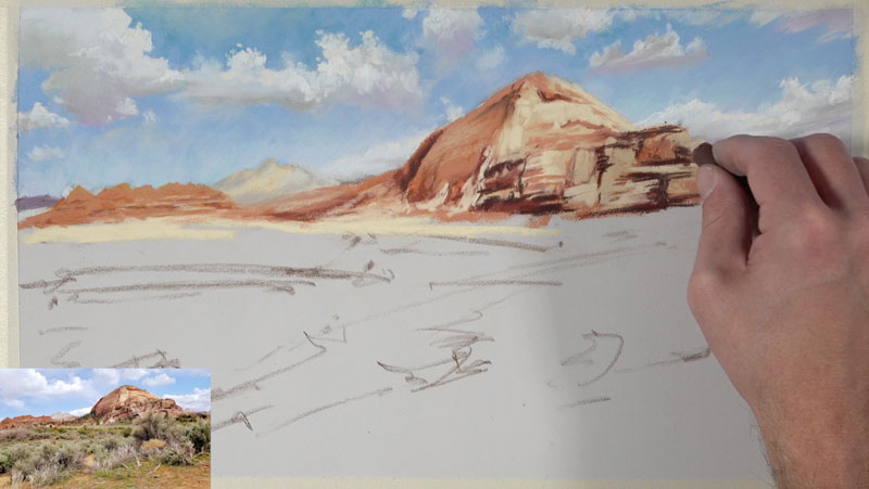
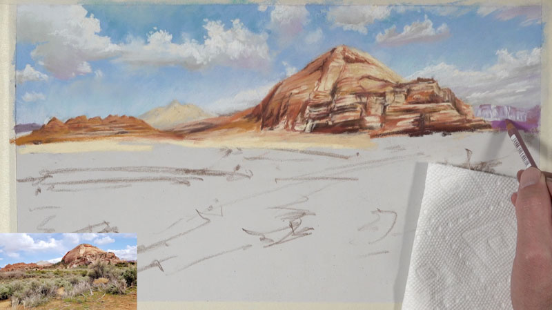
You’ll also notice that the shapes of a couple of purple mountains are added as well. These areas are enhanced with contrasting values of light and dark purple using the pastel pencils.
A few hints of trees are added on the distant mountains using a few greens (both dark and light) as we begin to transition to the lower portion of the picture plane.
We’ll begin layering strips of color as we work down into the heart of the middle ground. These strips of color are influential in the eye flow of the viewer. Since we want to encourage the viewer to move through the work, we’ll layer these marks in a slight diagonal. This will help to pull the viewer’s eye from the right side of the picture plane back to the distant mountains on the left side of the scene.
We’ll use the same greens that we used to indicate the trees on the mountains but add more variety by broadening the range of value. This means that lighter and darker greens are used here in addition to the greens used for the trees.
As we continue to work in the middle ground, we’ll patiently layer colors and values to develop the vegetation of the desert floor. Dark reds (to contrast greens) are used mostly in the shadowed areas while bright yellow-greens are layered over darker greens to create the highlights. Black is mixed in areas to make the values darker but not without some blending, while bits of the orange desert sand is allowed to peek through in areas.
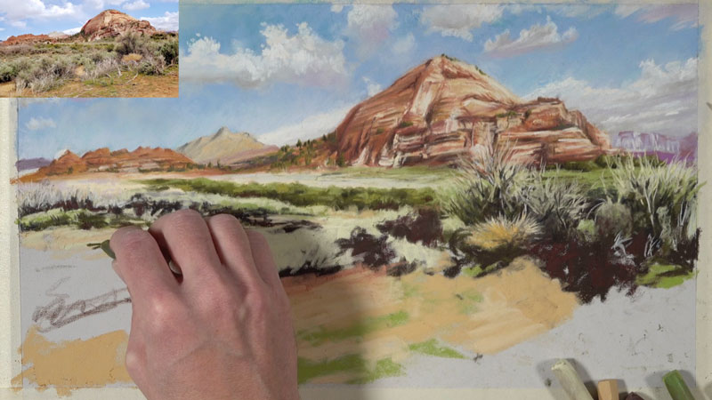
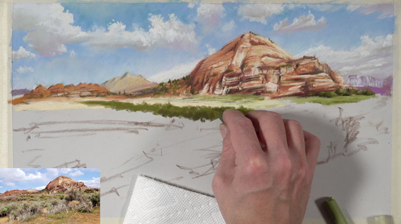
Working into the Foreground
As we work into the foreground of the desert scene, we’ll continue increasing the contrast in values. We’ll also incorporate a broader range of color. Objects that are closer to the viewer are typically stronger in value contrast.
As we layer the colors and values for the vegetation in the foreground, we’ll create a diagonal that leads the viewer up from the lower left of the picture plane to the right. From there, the viewer’s eye is lead to the distant mountains on the left side of the picture plane thanks to the diagonal we developed earlier in the upper middle ground.
Using light yellows and grays, we’ll pull up grass blades and withering branches over the darker tones. We’ll also add more variety to the oranges and browns of the desert floor. Here again, we’re following the reference loosely. Feel free to add or leave out as much information as you wish. Also, don’t be afraid to be bold with your use of color.
Pulling Out a Secondary Color Scheme
At this point, we have an ample amount of orange and green in our scene. This leaves us the opportunity to pull out more purples. Some of the dry vegetation is a lighter gray, but we can add a touch of purple that matches the value. By matching the value, we could add any color we wish. These light purple additions bring the work together and creates harmony while pushing contrast.
As we add bits of purple, we can continue to strengthen the contrast by layering darker browns and reds in shadowed areas. Highlights are also added to some of the branches to communicate a sense of form.
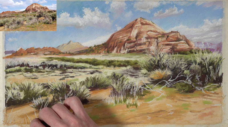
Desert Landscape Painting – Conclusion
The complete the image, we’ll add a few last indications of grass blades and brush to the foreground. Then we’ll return to where we started with the sky. Here, a few deliberate marks are added with our original light blue, making the painting slightly brighter.
Our completed pastel painting of a desert scene features a subtle color scheme of secondary colors while communicating the subject in an artful way.
If so, join over 36,000 others that receive our newsletter with new drawing and painting lessons. Plus, check out three of our course videos and ebooks for free.