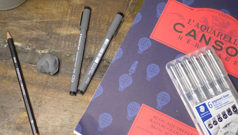
Materials for Drawing
Before we get into the drawing, let’s first have a look at the materials we’ll use for the first stage. For this drawing, we’ll work on hot press 140 lb. watercolor paper. This paper is smoother than its cold press counterpart which will allow us greater control over the ink applications. Canson paper is used.
Our light graphite drawing is created with a light 2H graphite pencil. This pencil will produce a very light – barely visible – sketch of the subject. Since this pencil is hard, we’ll take care not to place too much pressure, which could create grooves in the paper.
Our ink applications are made entirely with a .05 mm pen by Steadtler. Although this pen produces a very thin line, we’ll adjust the thickness as we apply it to develop a bit of variety.
Creating the Drawing
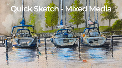
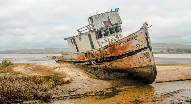
We’ll first take a look at the photo reference that we’re working from. In this case, the photo reference comes from pixabay.com. We’ll begin by analyzing the shapes and lines that we see and break the subject down into the most basic ones.
Here’s a look at the reference photo…
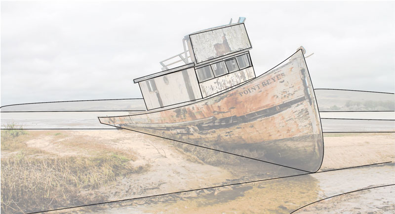
We’ll all see different shapes in the subjects that we draw and paint. These are some of the shapes that I see…
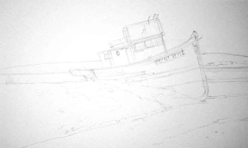
Using the 2H graphite pencil, we’ll draw the basic shapes that we’ve identified, paying close attention to the proportions and the positioning of the subject on the surface of the paper. We can draw using multiple, light lines. As we become more confident with our sketch, we can gradually add details such as the windows, doors, and some of the open shapes on the hull.
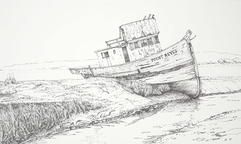
Here’s a look at the graphite sketch. (I’ve adjusted the contrast to make the sketch visible, since it was so light.)
Adding Pen and Ink
With our graphite sketch in place, we can begin adding the ink with the .05 mm pen. You are free to start anywhere that you wish. Since the boat is clearly the focal point in this image, I decided to begin here.
We’ll take the inking portion of the drawing in sections, working to completion in areas before moving on to the next section. For the most part, the contour lines (outlines) are defined first before adding shading and texture.
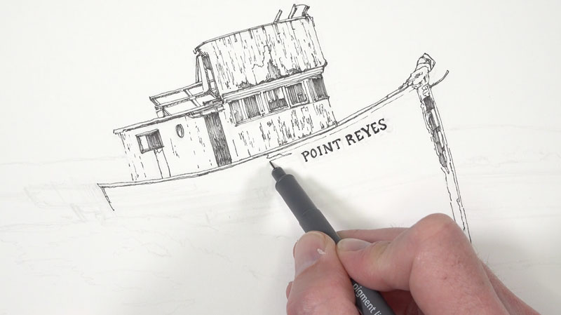
As we fill in some of the darker values, we’ll consider a couple of things. The first is the direction of the strokes. We’ll keep them fairly consistent, using hatching only. (Cross hatching may make the drawing too busy.)
We’ll also keep in mind that watercolor applications are to follow. This means that we need to be careful that we don’t make the ink drawing too dark. Adding too many lines at this stage would lead to a dark image and may look busy. We can always add ink to the image after the watercolor washes if we wish.
For these reasons, we’ll keep the ink applications to minimum. We want enough information to describe the texture, form, and some of the value, but we also need to keep in mind that the watercolor will do some of this work for us as well.
As we work our way outward from the top of the boat, we’ll add in the details on the hull. You’ll notice that the directional lines have changed here. Instead of vertical lines, the lines now flow along the form the hull, curving slightly as they make their way to back end.
For the openings however, we’ll return to vertical strokes to fill in the shadows. This change in direction will add some contrast to the mostly horizontal lines added around the hull. Even though these areas are very dark, we’ll still leave some of the paper showing through. Again, we’ll use the watercolor to complete the shadows later.
Then we’ll simply continue working outward and down into the middle and foreground. Looser, more organic lines are used here to mimic the textures of the grass, rocks, and water. Hatching is used sparingly along the bank. But even here, we still allow these lines to curve with the form of the shore. Directional lines not only inform us of the texture and value, but can also be used to describe the form.
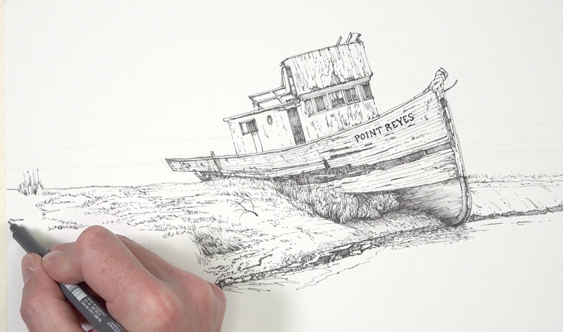
Many people mistakenly believe that pen and ink is a medium that requires you to stay stiff and deliberate. But by loosening up a little, you can add life and interest to a drawing. It’s okay to make lines that are a little squiggly or suggestive. Allow your marks to be your own and embrace the unique mark that you naturally make without trying to control it too much.
We’ll allow for some of these looser marks as we work down the bank. We’re using our reference as a reference only, instead of relying on it exactly. As we see little shapes and values we can add them to our drawing or leave them out. Be careful that you don’t become too reliant on the photo. You’re making a work of art and you’re not a photo copier.
Since the distant shore and hill are far off in the distance, we’ll only use a few broken lines to define them. Objects that are farther from the viewer are lighter in value and have less contrast.
We’ll work our way to the small patch of ground in the extreme foreground. Here again, we’ll rely on the texture that we observe for the directional strokes that we use. Grassy patches are defined with horizontal strokes, while the ground itself is developed with mostly horizontal marks.
As we continue to work our way down the bank and into the water, we add a heavier concentration of marks where the values are darker. In areas where the value is lighter, we’ll still add marks but leave more space between them. The marks that we add for each section of the drawing is dictated by the textures that we see there.
For example, for the grassy area in the lower left corner, vertical and diagonal strokes are applied with the pen. But along the shore, the marks are more horizontal and shorter.
The water is also addressed with ink. A few subtle ripples are added and the shapes for the reflections and shadows are also defined. In the darkest areas, a few loose horizontal hatch marks are made. The hatch marks used here are more fluid and less controlled. Looser marks help to better communicate the fluidity and movement of water.
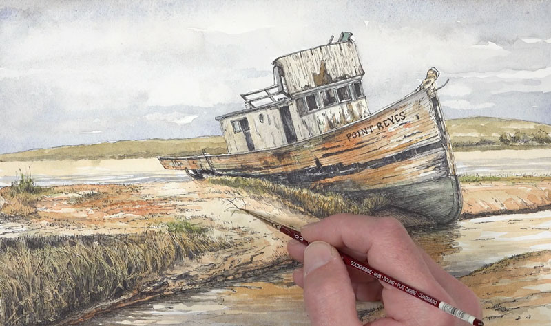
After adding a few last marks to the water, our pen and ink sketch is in place and we’re ready to move on to the watercolor washes. Here’s a look at the pen and ink drawing…
Watercolor Applications
Before we begin with our watercolor applications, we need to analyze the colors in our reference and decide what colors we should pull out. Of course, we can always just paint the colors that we see (local color) and not consider a color scheme. This image already has a nice color relationship, we’ll just need to make a slight alteration to make the painting more harmonious.
Just as we analyzed the shapes before we began drawing, we’ll also take a closer look at the colors. We’ll all see things differently here as well. (This is just one of the things that make us unique as artists.)
I see the strong red-oranges that are spread consistently throughout the image. Along with the red-oranges, we also have quite a bit of green. Orange and green are secondary colors and if we had a little purple to pull out, we could decide to go this direction for a color scheme. However, there isn’t any purple to be found and the oranges are leaning heavily towards red.
So instead of pulling out a secondary color scheme, it makes more sense to push our colors towards a complementary color scheme. To do this, we can allow our greens to lean towards blue, creating blue-greens in areas. We’ll accentuate the red-oranges and bring out a little more of the red. This will give us a near complementary color scheme of blue-green and red-orange.
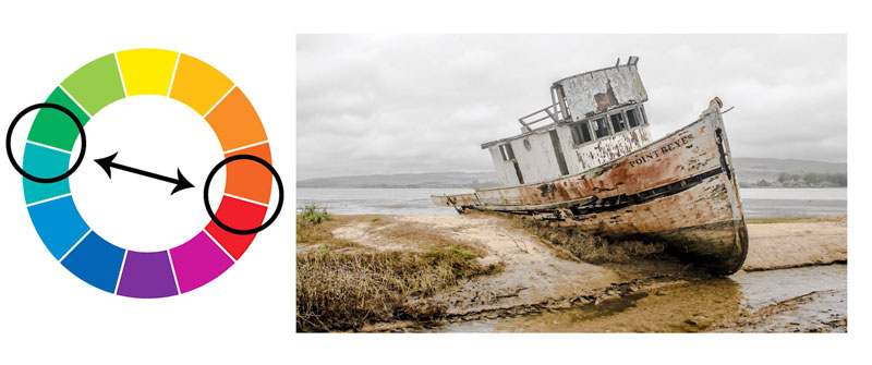
It’s important to note here that even though we are pulling out contrasting colors, our resulting painting will not be a complementary painting in the truest sense. We’re just using our knowledge of color theory to make the painting more interesting and to create additional “pop”. There are blues and yellows that will be incorporated in the image as well as some yellow-greens.
Materials for the Watercolor Painting
We’ll use a limited palette for the painting. This means that we won’t use all of the colors at our disposal. Instead we’ll mix colors from a limited few. Working with a limited palette helps to unify a painting. Sometimes there’s a little magic in simplicity.
For this painting, I’m working with my field watercolor set by Winsor and Newton. I’ve had this set of Cotman watercolors for several years and I love it. Although Cotman watercolors are considered “student grade”, they are of a very high quality and the pigment quality is “top notch”.
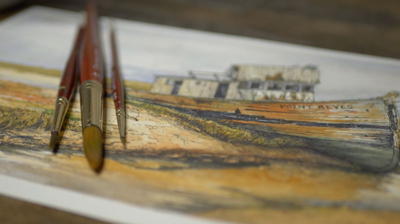
The brushes that are used are Grumbacher Golden Edge watercolor brushes. These brushes are my favorites for watercolor and gouache. The synthetic bristles are stiff, but flexible, and provide you with a ton of control. They are a little pricey, but well worth the investment. These brushes have lasted me for years and they’re still in great shape. (Part of this is because I take care of them.)
Even though three brushes are pictured above, only two of them were used. A #14 and #4, both rounds, are used in this demonstration.
Applying Watercolor Washes
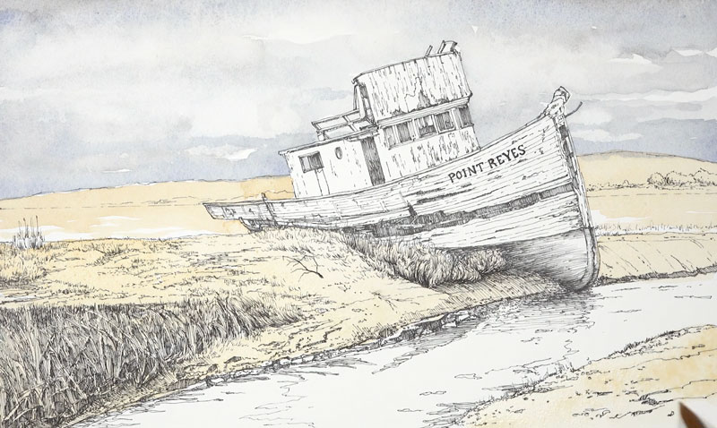
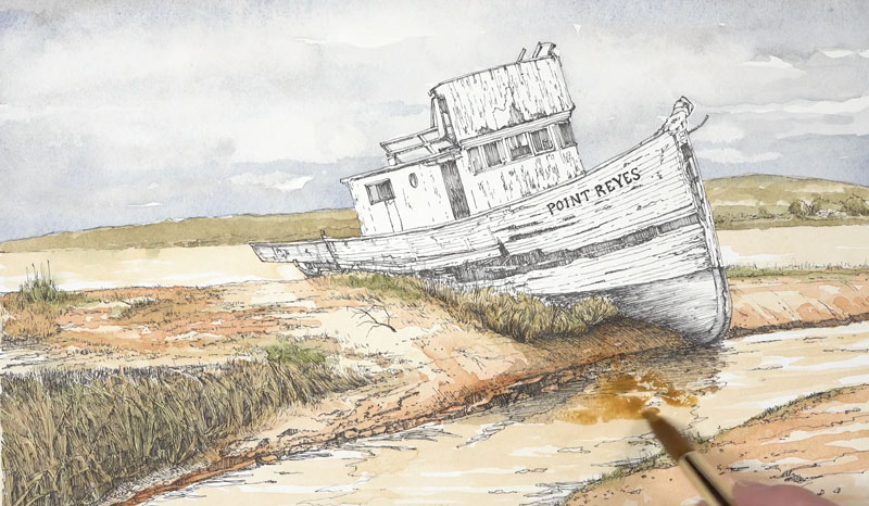
A watercolor painting is best approached by starting with light, translucent applications. As additional layers of colors are added, the values become gradually darker and the colors become more intense.
We’ll start with a light wash in the sky using a combination of Cobalt Blue with a touch of Burnt Umber (to mute the color). Leaving a few open spaces to indicate a few clouds, we’ll bring this wash down to the distant hillside adding a bit more blue close to the bottom.
Next a light wash of Yellow Ochre and Burnt Sienna is applied to a large portion of the remaining picture plane. A few open areas are left untouched in the water and the boat is completely avoided.
Next we’ll begin adding additional colors and begin the process of working darker. Burnt Sienna and Sap green are the major players in this next step.
We’ll add Burnt Sienna over portions of the shore and Sap Green to the grassy areas. These colors aren’t applied purely. Some Burnt Umber and Cobalt Blue is used to alter the value of these colors and to add variety. Yellow Ochre is also mixed and layered at times to gradually intensify the colors on the shore.
To make values darker, we can layer a combination of Cobalt Blue and Burnt Umber. For the grassy areas, the Cobalt Blue is allowed to dominate the mixture producing a cooler shadow. For the warmer areas, the brown is dominate resulting in a warmer shadow.
We’ll also pull some of the muted Yellow Ochre (mixed slightly with Burnt Umber) down into the water.
After we have layered a few washes over the distant hillside, middle ground and foreground, we can turn our attention to our main subject – the boat.
The boat can be described as “white”. However, when we look a little closer, we can see some subtle color. We’ll bring out some warmth on the planes of the boat that are receiving light and cool down the shadows.
A light wash of Cadmium Yellow Pale Hue with a touch of Burnt Umber is applied to entire body of the boat.
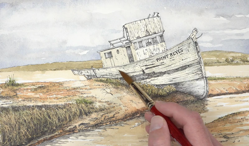
While the surface is still wet, we’ll begin adding some of the stronger colors. Burnt Sienna is applied as well as Viridian. A bit of Sap Green is added to the Viridian, just to make this green appear a little more natural.
We’ll allow these colors to flow into one another, creating interesting transitions and patterns.
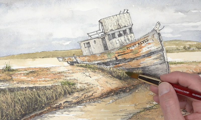
We’ll add a bit of our darker mixture of Cobalt Blue and Burnt Umber to the open spaces on the hull and continue the process of intensifying the relationships of red-orange and blue-green. We’ll also apply our blue-green to the bottom of the hull.
Once we’ve established a full range of value on the boat and we’re satisfied with the relationship of colors, we’ll finish off the water by adding a few shadows and reflections. A bit of muted blue is also added to the edge of the shadow and pulled upward into the yellow-orange right above it. A bit of our blue-green is added to the edge of the water to indicate the reflection produced by the color at the bottom of the hull.

Then it’s back to pushing the values darker in the shadows along the bank.
We’ll continue to push the value relationships in the painting, finding opportunities to make values darker where necessary. We’ll also add a cast shadow under the small twig growing up in the center of the picture plane.
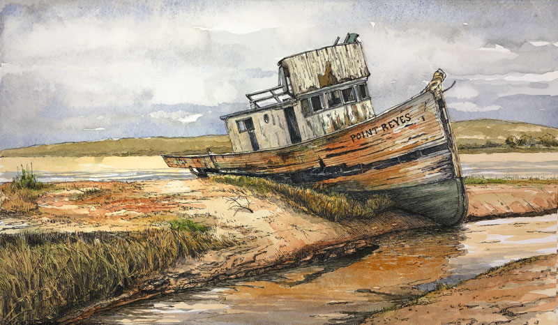
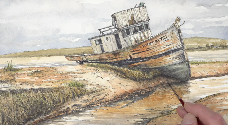
Conclusion
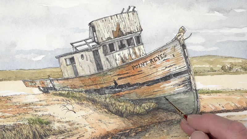
Now our painting is complete and we can gently pull the tape away, revealing our completed image. This one was a fun adventure and I’m happy with the results. Here’s another look at the completed painting…
If so, join over 36,000 others that receive our newsletter with new drawing and painting lessons. Plus, check out three of our course videos and ebooks for free.