Here’s the order in which we’ll apply the various mediums…
- We’ll first create a loose graphite sketch with a “F” graphite pencil.
- We’ll then create a minimal pen and ink drawing defining mostly the contour lines.
- Next, we’ll apply a few watercolor washes.
- We’ll then enhance the color with a bit of gouache (opaque watercolor).
- Lastly, we’ll ad a few loose marks with colored pencils.

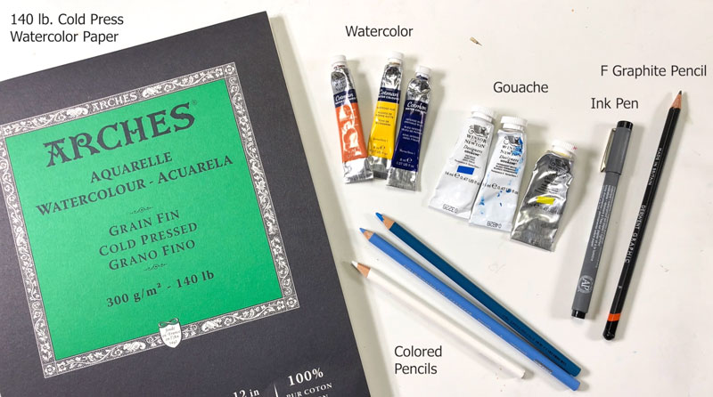
Materials Used in this Lesson
Some of the mediums that we’re using require some absorbency from the surface – namely the watercolor and gouache. For this reason, we’ll work on 140 lb. cold press watercolor paper. This paper will absorb much of the water from the applications without much buckling. (Some wrinkling of the paper is expected while the surface is wet, but once dry – the surface should return to being mostly flat.)
The Graphite Pencil
In some works, graphite marks may be welcome in the final image. In this case however, we’ll cover the graphite marks completely with the subsequent applications of media. For this reason, we’ll choose a pencil that is dark enough for it to be visible as the work progresses, but light enough to not be a distraction in the finished work. Any pencil in the range of “H” to “B” will work. This includes “H”, “HB”, “F”, and “B”. In this case, we’ll use an “F”.
See also: Graphite Pencils Explained
The Ink Pen
The coarse surface of the cold press watercolor paper affects the marks that are made with an ink pen. This rough surface produces a somewhat jagged mark. On coarse surfaces, a slightly thicker pen may be chosen to counteract this. If working on a smoother surface, a pen with a smaller tip may provide better control, but since our surface is not smooth, we’ll work with a .2 mm pen – still small, but larger than many pens at our disposal.
Watercolor Paints
We’ll use a simple palette of colors. The colors we’ll use here include…
- Burnt Umber
- Yellow Ochre
- Burnt Sienna
- Cadmium Red
- Sap Green
- Cadmium Yellow
- Ultramarine
Tube watercolors are used in this demonstration, but pan or cake watercolors will also work.
Gouache
Gouache is opaque watercolor. It can be used in a similar manner as watercolor with translucent washes or as a solid layer of color. In this case, we’ll apply it with solid applications and enhance the strength and intensity of color in areas.
Designer’s Gouache by Winsor and Newton is used with just a few basic colors…
- Primary Blue
- Titanium White
- Primary Red
- Primary Yellow
If you don’t have any gouache, you can still increase the intensity of colors by applying more opaque applications of watercolor. If this applies to you, you can also mix the color with Chinese White to create tints (lighter values) of the colors.
Colored Pencils
Wax-based colored pencils are used to enhance some of the colors within the image, but oil-based pencils will produce the same effect. Colored pencils can be applied directly over watercolor and gouache applications. Since the surface of the paper is coarse, the colored pencil applications also bring a bit of texture to the drawing as well.
Primsacolor Premiere colored pencils are used. The following colors are used in this demonstration…
- 10% French Gray
- Copenhagen Blue
- Chartreuse
- White
- 90% Warm Grey
- Sky Blue Light
- Moss Green
- Yellowed Orange
- Colorless Blender
The Photo Reference
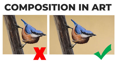
The photo reference we’ll use here is from the site, Pixabay.com. The reference is horizontal, but the decision is made to create a vertical composition in order the accentuate the vertical nature of the sailboats. Here’s a look at the reference photo…
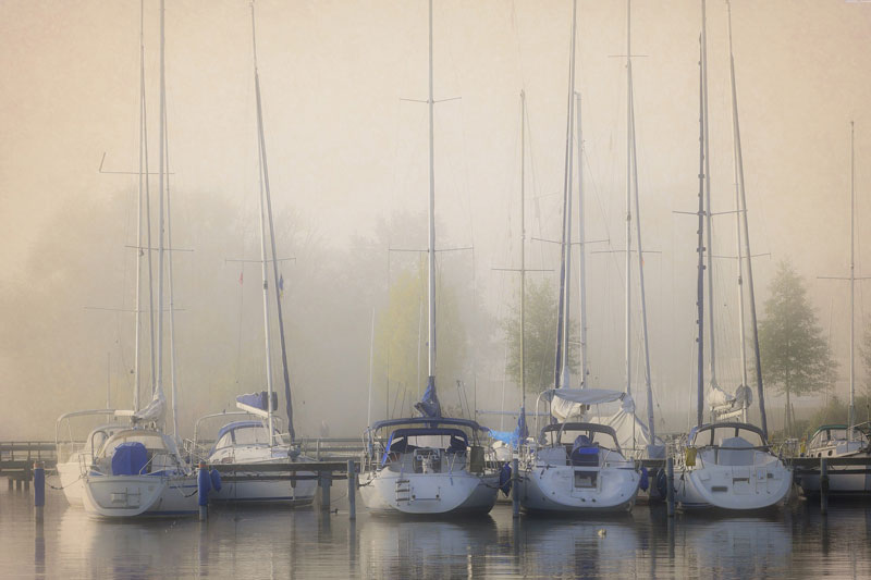
See also: Composition in Art
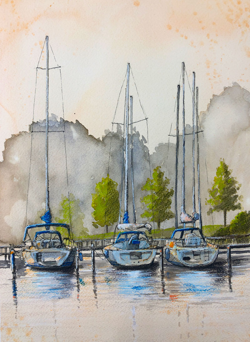
Step By Step – Mixed Media
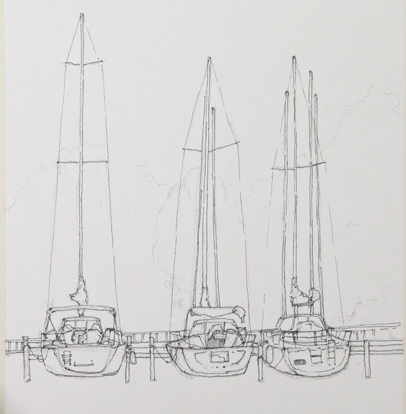
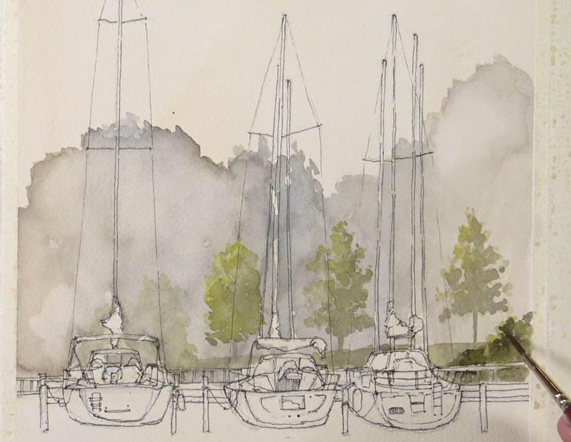
We’ll first define the horizon line, placing it in the lower half of the picture plane. Although it’s not visible in the reference photo, we still have a good idea of where it should be located. Once the horizon line is in place, we can begin to develop the graphite sketch using basic shapes for the boats.
Over the graphite sketch, we can develop a loose pen and ink sketch with a .2 mm ink pen. Mostly, the contour lines are defined since the development of the values and shading will fall on the watercolor, gouache, and colored pencils.
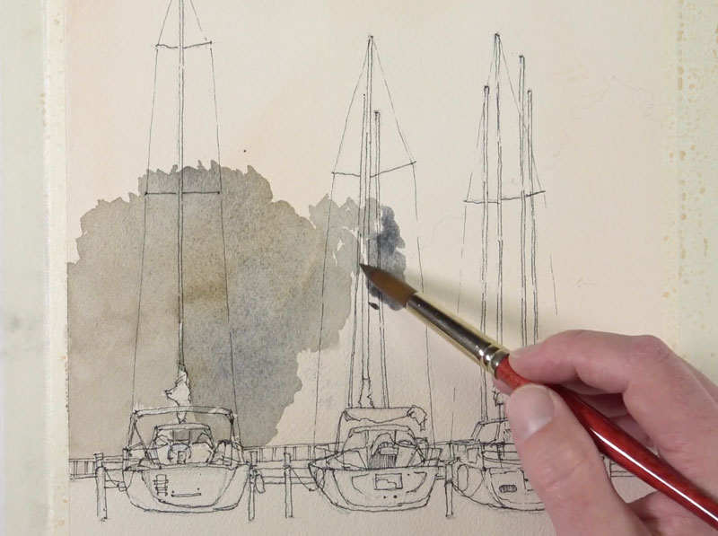
With our pen and ink sketch in place, we can proceed to applying the watercolor washes. We’ll first saturate the entire background with water using a large flat brush. In this case, a hake brush is used.
See also: All About Paint Brushes
A mixture of Burnt Umber, Yellow Ochre, Burnt Sienna, and a touch of Cadmium Red is applied the entire surface with a very translucent applications. The top and lower edges receive a second application, making the color slightly more intense in these locations.
While the surface is damp, we’ll begin developing the distant line of trees. A light mixture of Burnt Umber, Ultramarine, and a touch of Sap Green is applied initially.
We can then blot a few of the applications on the left side, closer to the light source to lighten some of the color. This creates a slight indication of highlights. We can enhance them by applying a light application of the “orange” that we mixed for the background. This creates a warmer indication of light.
We’ll then add a few of the trees and bushes that are slightly closer to the viewer with a mixture of Sap Green and Cadmium Yellow. While these shapes are wet, we can add a bit of shadow with a mixture of Burnt Umber and Ultramarine.
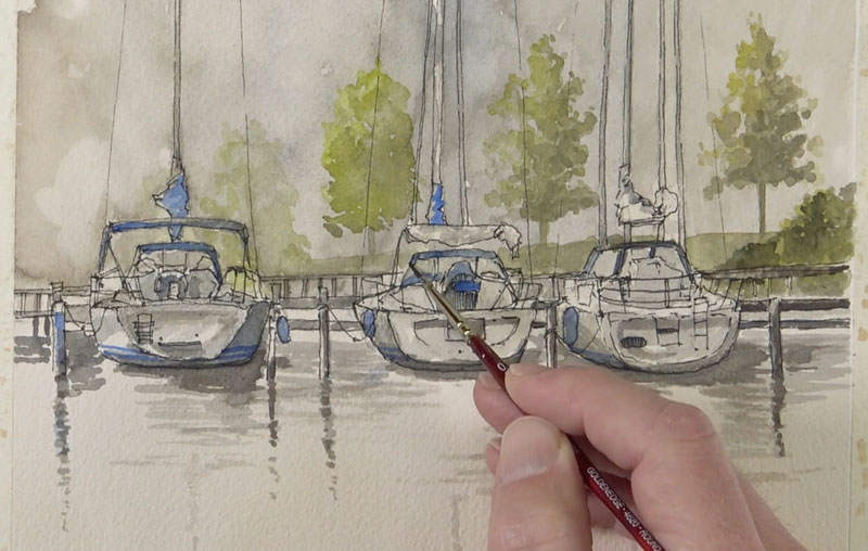
Then it’s time to move on to the boats and the pier. We’ll use the same mixture of Burnt Umber and Ultramarine to develop the shadows on each of the boats. This time, however, our mixture is dominated by the Ultramarine. This creates a cooler gray and translates as a cooler shadow.
Using this same mixture, we’ll add a few shadows to the posts, the masts, and fill in a bit of color on the distant pier. We’ll also begin to add a few of the reflections in the water using horizontal strokes.
We can then begin adding pops of color to the boats and posts with Ultramarine.
We could leave the watercolor applications as they are, but in this case, the color needs a bit more strength. To strengthen the color and to increase the contrast, we’ll layer a bit of gouache in areas. Gouache dries slightly darker, so several applications may be necessary to push the values lighter.
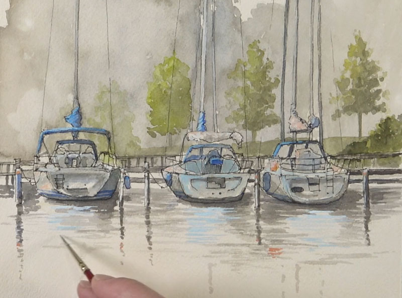
The gouache adds a bit more “punch” to the image, but let’s push it further with colored pencils. Copenhagen blue is used to enhance the blues on the boat. Bits of Yellowed Orange is also applied. White is used to strengthen the highlights along with 10% French Grey. Shadows are darkened with 90% Warm Grey. The intermediate trees also receive a few colored pencil applications – Chartreuse for the highlights, and Moss Green for the shadows. Some of the light blues are enhanced with Sky Blue Light.
Many of these colors are also echoed in the reflections of the water.
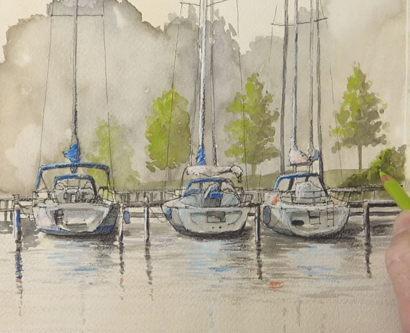
The colored pencils bring in a bit of texture because the surface of the paper is rather coarse. This additional texture is welcomed and adds a bit of variety to the image. In some areas, however, the texture is too strong, so a colorless blender is used to weaken it slightly.
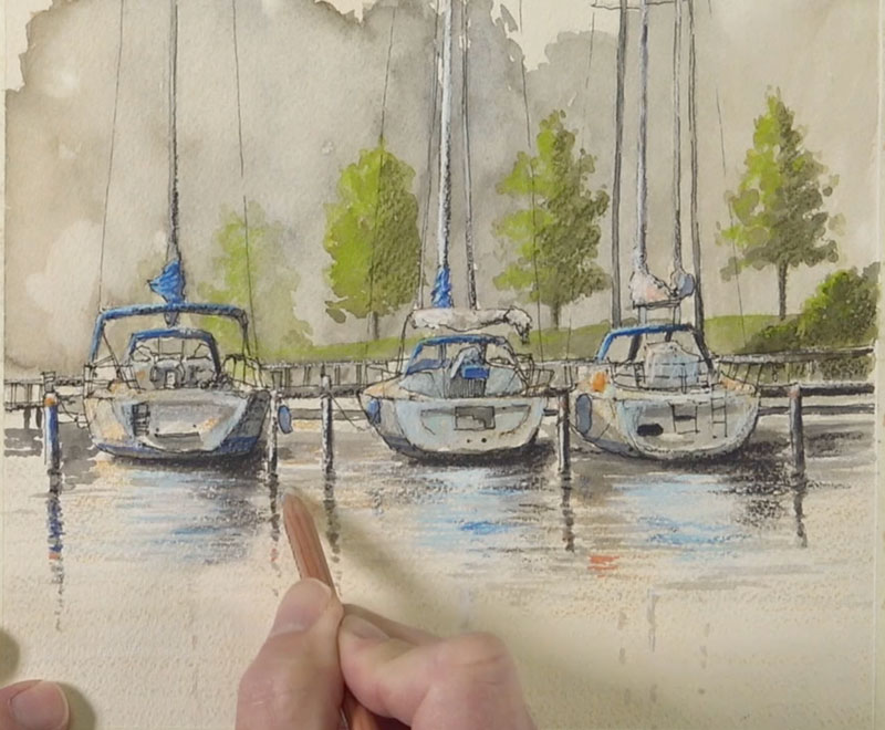
Lastly, a few paint faint paint splatters are added, mainly to the corners of the picture plane, to create a bit of additional interest.
If so, join over 36,000 others that receive our newsletter with new drawing and painting lessons. Plus, check out three of our course videos and ebooks for free.