
Pastel pencils provide the artist with a level of control that is often difficult to mimic with traditional soft pastel sticks. For those that want the painterly look of pastels in their drawings, but don't want to sacrifice details, pastel pencils may be the way to go.
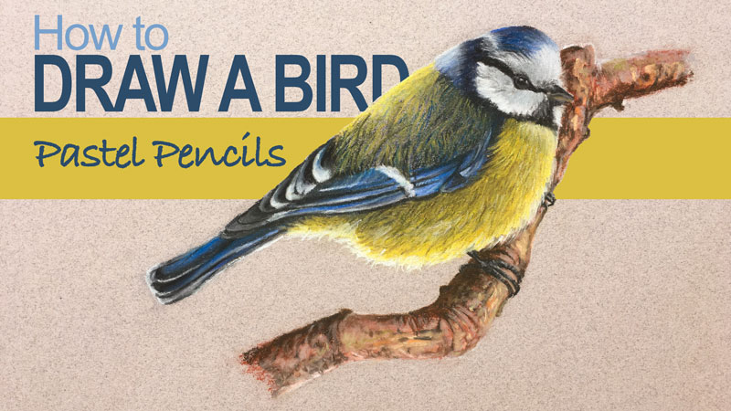
In this lesson, we'll create a drawing of a bird with Conte a Paris pastel pencils. The work is completed on the smoother side of toned Canson Mi Tientes pastel paper.
(Some of the following links are affiliate links which means we earn a small commission if you purchase at no additional cost to you.)
We'll begin the drawing with a loose sketch of the basic shapes of the bird. No matter what subject you are drawing, starting with basic shapes usually leads to greater accuracy. It's much faster to simplify the subject into basic shapes as well.
Related: Drawing 101 - Simplify for Success
The initial sketch is created with a white pastel pencil. Any color can be used for the sketch, however a black pencil may prove to be too strong and difficult to cover with subsequent applications of color. White is easily covered, but provides enough contrast.
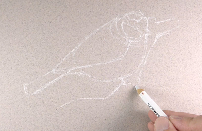
Once we have the basic shape of the bird sketched out, we can begin the process of layering colors. We'll also address the value range as we go, gradually increasing the contrast. Just like with traditional stick pastels, the details of the bird will be developed with each application of color. We'll begin with coverage applications and progressively become more refined as the details begin to take shape.
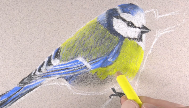
As each layer of color is added, the tooth or texture of the paper gradually becomes less visible and the applications of pastel become smoother. This allows us to begin to build up details over the solid areas of color. Once a solid amount of color is on the surface, blending naturally occurs with the pencil. A blending stump may be used if preferred but in many cases, it's not necessary.
For darker areas on the body of the bird, a dark gray is used instead of black. This dark gray is a more natural tone and does not create a flattened appearance.
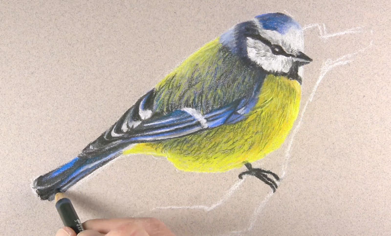
Textural strokes are added with various yellows and blues to the back and breast of the bird to create the impression of small feathers. To darken the value on the underside of the breast, a bit of dark brown is used. This dark brown darkens the value but keeps the temperature of the shadow warm.
Highlights and details are added to the eye while we continue to layer additional blues, yellows, and dark gray to the body. As each layer is added, the details of the bird become more pronounced.
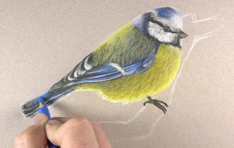
We'll next draw the branch that the bird is sitting upon. First, an application of a rusty red-orange is applied to fill in the shape of the branch. Over the top of this application, we'll add a bit of a cream color for the highlights and a darker brown for the shadows. In the darkest locations, dark gray is applied.
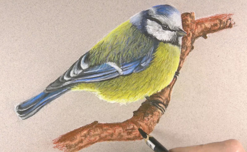
A light gray and a touch of yellow-green is also added to the branch to add more depth and a more realistic appearance.
After the branch is complete, the edges of the bird that overlap are refined. A few marks are added to give the impression of small feathers extending outward from the head and breast.
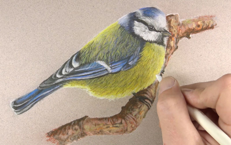
A bit of lighter gray and dark gray are applied to the talons to add a bit more detail. And lastly, the highlight around the bottom portion of the bird is strengthened with a heavier application of white.