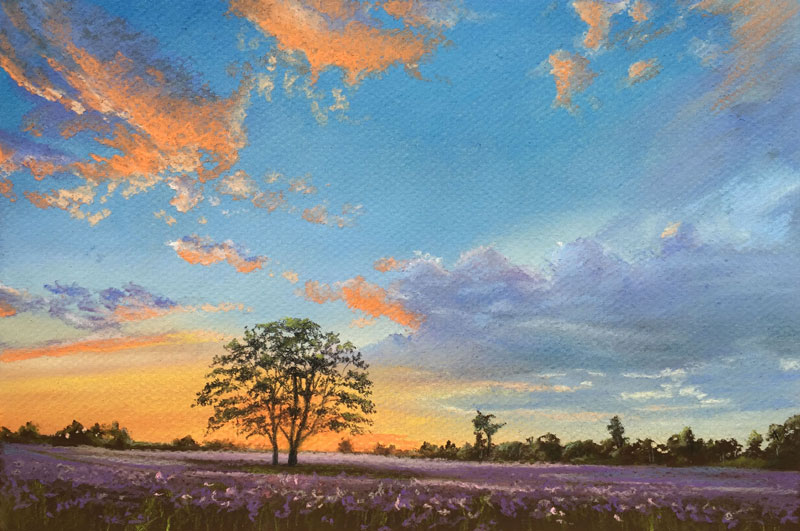
In this lesson, we take a look at painting a landscape with pastels that features a sunset. Following a sequential approach, the background is developed first before moving on to the middle ground and foreground. Multiple layers of colors are added to develop strong contrast and to heighten the illusion of light.

As is the case with any image that features strong light, our focus centers around color and value contrast. Silhouetted elements in the middle ground and foreground enhance the lighter tones in the sky. Blues, purples, and oranges provide color contrast and the strengthen the illusion of light in the background - the "star of the show".

One of the more appealing aspects of pastels is the immediate gratification of applying colors. There is no mixing of colors prior to application and colors can be quickly adjusted once they are on the surface.
Although we benefit from this characteristic, it's important to note that pastels are at their best when they are layered. Often it requires many layered applications to build up the color to level of complexity. This requires the artist to be patient as the painting develops, gradually adjusting as each layer is applied.
Some beginners make the mistake of ending the layering process far too early, discouraged by the look of the subject while in transition. It's important to work through and continue layering applications until the desired color and value is achieved. Many pastel papers are textured with a coarse tooth in order to accept many layers of color, so don't be afraid to build up colors as necessary.
Pastels can be applied with opaque applications, not unlike what we see with oils or acrylics. For this reason, we can make applications over the top of previous applications, covering them completely.
This allows us to develop a landscape sequentially. The background can be developed completely before addressing the middle ground and lastly, the foreground. In this case, we can start at the top of the paper and work our way downward, layering applications as we go.
Recommended Materials for This Tutorial
(Some of the following links are affiliate links which means we earn a small commission if you purchase at no additional cost to you.)
PanPastels
Colorfin Sofft Knife & Covers
Rembrandt Pastels
Canson Mi-Teintes Pastel Paper
Pastel Pencils
We start here with a base application of Ultramarine and bits of orange and yellow in the lower portion of the sky. PanPastels are used initially to cover the surface quickly. Over the top, a variety of blues are applied with pastel and blended with a finger. Darker blues are applied at the top of the sky transitioning to lighter blues at the bottom. A bit of light cream is applied at the bottom extreme to lighten the value even further.
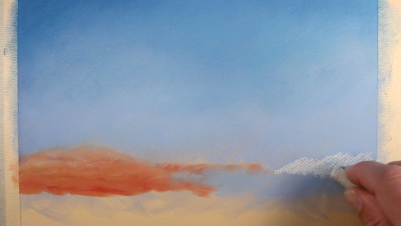
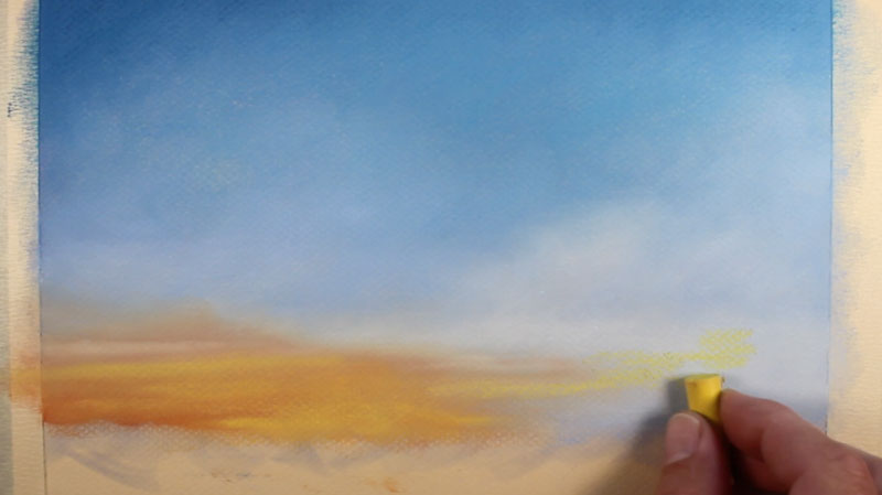
Layered applications of orange, yellow, and light cream follow in the area of strongest light. In the lower portion of the sky, colors are gently blended with a finger by pulling them horizontally.
With initial colors of the sky in place, our focus turns to developing the clouds and the light that they reflect. Beginning with a medium purple, the shapes of the clouds are defined and lightly blended with a finger. A bright orange is used to create highlights and a light purple is applied to ease transitions. A bit of blue is applied to add a bit of depth and complexity to the lower right cloud.
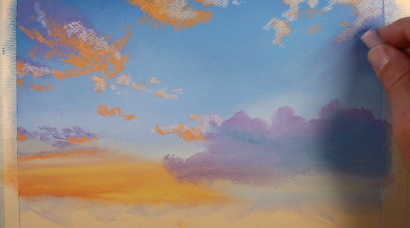
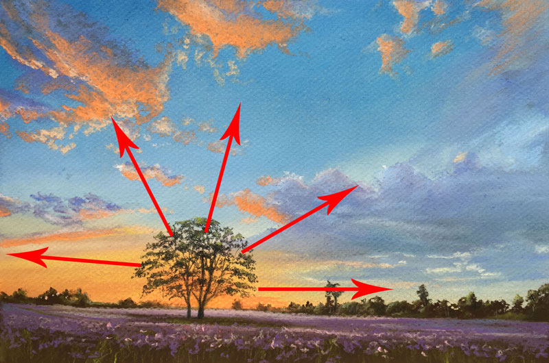
The light source is important in any work. In many circumstances, the light originates from above, producing highlights on the top of subjects and shadows underneath them. With a sunset, the light source is a bit more complex. Instead of originating from above, the light often originates from the horizon. This produces highlights on the underside of clouds and shadows on the upper portions.
We continue to patiently build up applications of light purples, blues, and oranges. Darker grays are applied in shadowed areas of the larger clouds to darken the value and strengthen the value contrast. Applications are gently blended with a finger to ease transitions and to smooth the texture. Detailed areas are blended with a blending stump for added control.
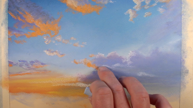
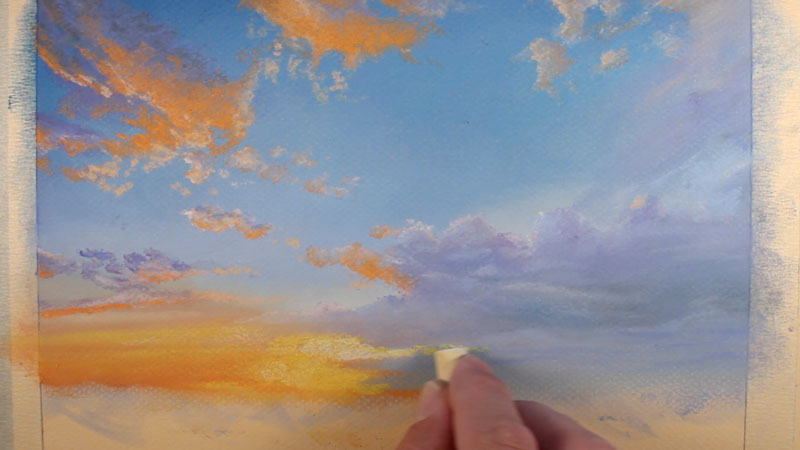
The light is intensified by additional applications of orange, yellow, and light cream. A few strokes of light cream are applied to indicate a few breaks within the cloud.
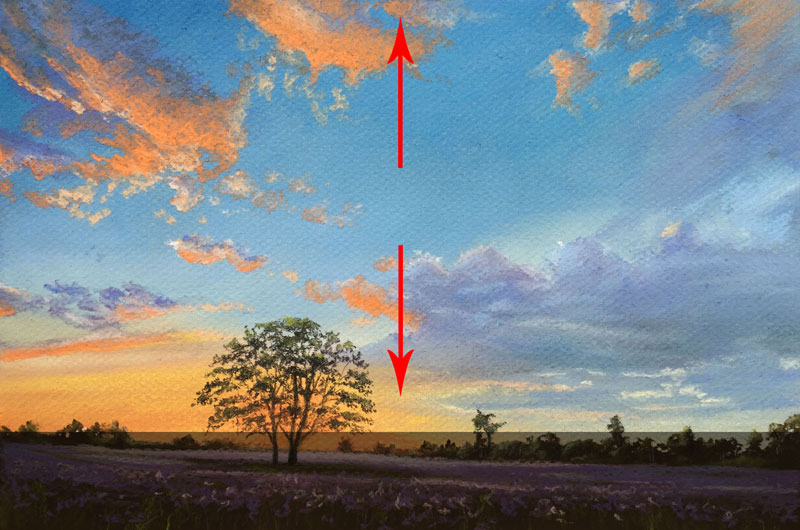
Since the work is largely about the sky, we'll limit the amount of space devoted to the middle ground and foreground. By placing the horizon in the lower portion of the picture plane, we make certain that the sky remains the main focus.
Dark Umber is applied and blended to define the horizon and ground plain. A few marks are added to indicate distant trees, before touches of light and dark yellow-green are applied with a pastel pencil. Purples and pinks are added with horizontal strokes, creating a field of flowers.
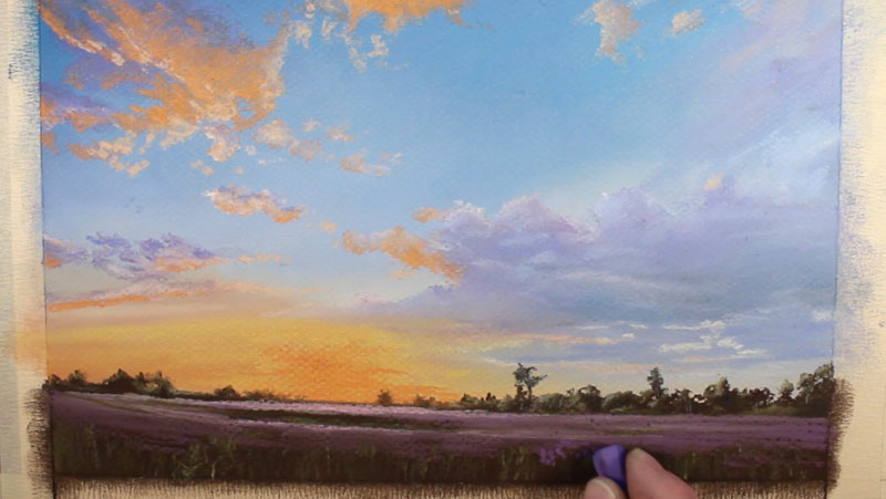
Stronger marks are applied for flowers closer to the viewer with the same purples and pinks. A white pastel pencil is used to lighten values closest to the light source.
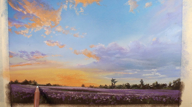
Using a light touch with a black pastel pencil, the trunk and branches of the tree are defined. Small circular strokes are applied for the leaves over the outer edges of each branch. Light yellow-green is used to add a bit of color, softening the strength of the black.
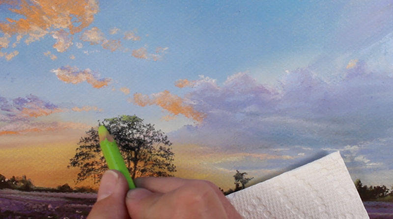
Additional strong applications of orange are added to the bottom of the clouds to complete the image.
