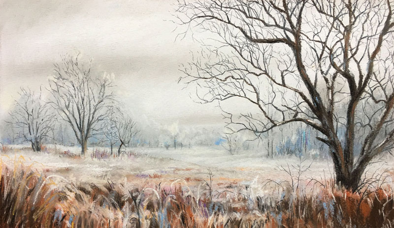
In this pastel lesson, we create a landscape painting of a winter scene. In this scene, the illusion of space is developed by adjusting the intensities of colors, values, and contrast. And while the scene is dominated by the "whiteness" of the snow, it is the color that steals the show.
Recommended Materials for This Tutorial
(Some of the following links are affiliate links which means we earn a small commission if you purchase at no additional cost to you.)
Canson Mi-Teintes Pastel Paper
Rembrandt Pastels
Conte A Paris Pastel Pencils
General's Pastel Pencils
While a toned surface is not a prerequisite for success, it does prove useful for evaluating colors and value relationships as they are added. For this reason, many pastelists prefer to work on a surface that is toned. Some artists prefer to allow some of the paper to show through applications, making the color of the paper an integral part of the work.
The texture (or tooth) of the paper should also be considered. Heavier textures allow for more layers of color, while smoother surfaces provide a bit more control over edges and details. Some texture must be present in order to accept the pastel applications.
The medium often determines the approach that the artist uses in a landscape drawing or painting. If the medium is opaque and is covered easily with subsequent applications then the artist can start with the background before progressing to the middle ground. If the medium is less opaque or does not cover easily, then the artist may choose to address areas within the scene that are closer to the viewer before tackling areas that appear further away.
Pastels are opaque and cover easily. For this reason, we can address the background completely before layering the middle ground over the top and then finally - the foreground.
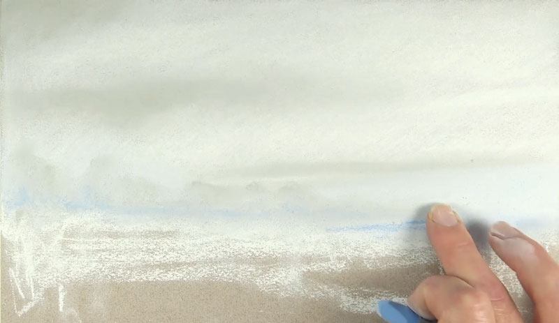
We'll start by applying white from the top of the picture plane to nearly the bottom. Bits of warm gray are added to indicate a few clouds. A light blue is used to add a bit of color to the sky as well. These applications are blended with a finger to smooth transitions.
The initial indications of the distant tree line are also added and gently blended. In order to create the illusion of space, the details of these trees are muted. The same warm gray and light blue are added for soft shadows.
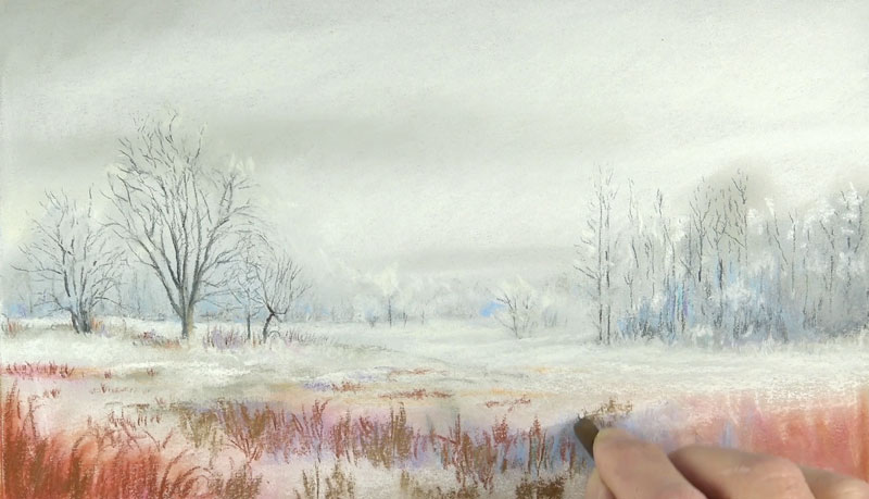
Subtle indications of far off trees are developed with a black pastel pencil before being muted with an application of a white pastel pencil over the top. Trees in the middle ground are added with slightly bolder marks, pulled upward with a black pastel pencil. A few bits of color are added with a Burnt Sienna pastel pencil underneath and around these trees. Additional colors are added in the foreground, including Burnt Sienna and Magenta and softly blended with a finger.

The trees found on the right side of the picture plane are added in the same manner, this time leaving out a great deal of detail. Light blue and a touch of purple are added in the shadowed locations.

Stronger colors are layered in the foreground. Blues and oranges are to be pulled from the scene, creating a dramatic contrast. Warm browns, Burnt Sienna, and light blue are all layered here and gently blended - serving as a base for more deliberate marks to follow.
Contrast and detail are strengthened in the foreground with applications of Yellow Ochre and white. Shadows are enhanced with touches of black and Burnt Umber. As you can see, bits of the brighter colors are still allowed to show through these applications.
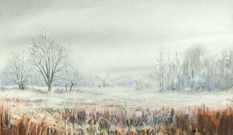
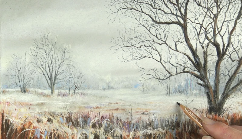
The larger portions of the dominant tree in the foreground are developed next. Strokes are pulled outward and upward, allowing them to taper at the end with Burnt Umber.

The branches of the tree are carefully and painstakingly added with a sharpened black pastel pencil. These branches extend and bend upward, toward the light of the sky. They are more concentrated along the upper portions of the tree. Including as many as possible will enhance the realism of the drawing.

Shadows on the tree are strengthened with a bit of black. Color is added on the trunk in the form of a lighter brown, Burnt Sienna, and light blue. A few final details are added underneath the dominate tree with a black pastel pencil. A smaller tree and indications of some brush at the base of the tree are included.
Even though the finished image is dominated by white, the color contrast between the warm Burnt Sienna and the cooler blues unifies the work.
One final note on this lesson...It is always important to give your works a chance. We often expect to see encouraging results right from the start of a drawing or a painting. The reality is that drawings and paintings must develop through multiple applications of medium and problem solving along the way. Don't give up on your work too early. Keep pushing. Things usually don't "come together" until the final stages.