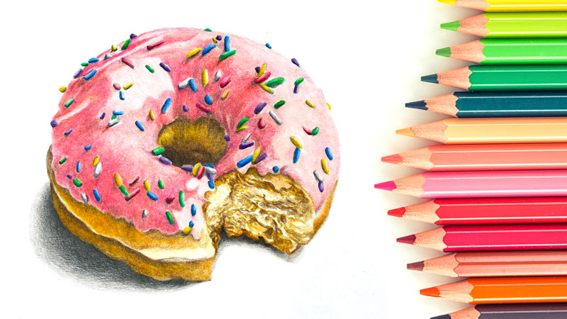
“How many colored pencils do I need?” is probably one of the most frequent questions that beginning artists have. Another popular question is “what colored pencils do I need?”
Possessing a large set of pencils may be emotionally pleasing. Gathered in a beautiful box, colored pencils look like treasured magic wands that immediately bring joy, excitement, and inspiration.
A wider range at hand often resolves the need to mix the right color yourself. (With colored pencils, mixing happens by layering the applications directly on the drawing surface.) You can pick a ready-made option on the spot, avoiding the preparatory color research.
Besides that, some colors are difficult or even impossible to mix. In such cases, you have to expand your collection of pencils. The more pencils you have, the more unique mixtures you can possibly create. No wonder that freedom of choice and technical convenience are highly appealing!
It’s tempting to believe that purchasing a better – more extensive or advanced – instrument will lead to a new level of artistic quality. And sometimes it’s not that far from the truth.
On the other hand, large sets of qualitative colored pencils are relatively expensive. The cost may be a big con, especially if this art medium is new and yet to be fully explored.
Another opinion is that resorting to a wide range of pre-made colors may lead to the underdevelopment of artistic skills. This assumption is more equitable for beginners. It is clear that relying on external tools too heavily is irrational. But a full set of pencils lets an artist avoid so many challenges! It makes the process more comfortable, giving the confidence that all possible colors are here, at your disposal.
The urge to find a shortcut may be irresistible. And yet, such color tasks are an important driver for curiosity, analysis, experiments, and improving knowledge. Challenges, if accepted, lead to the growth of mastery.
Restricting ourselves can force us to learn more about color. Also, it directs our attention to the important aspects of art, such as form and value.
So how many pencils is enough? It’s impossible to find a perfect answer. Every artist has a specific combination of preferences, skills, and goals. Some works are based on subtle color nuances and complex palettes. They require a wide range of pencils and, potentially, the inclusion of other art supplies.
Alternatively, it may be that you can easily get by with a set of twelve pencils. In some cases, three pencils presenting the primary colors are all you need. Making the most of the available resources is a useful principle – not only for art, but also for many other things.
There is no need to choose a single path. You can be fluent in mixing and, at the same time, enjoy your extensive collection of pencils.
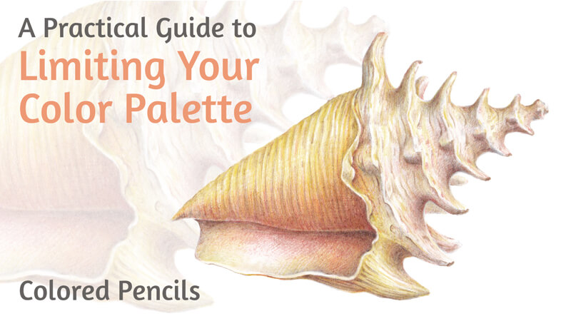
In this tutorial, we’ll explore the benefits of limiting the number of colored pencils per project. I’ll share several tips that help me to form a restricted color palette. For practice, we’ll create a quick drawing of a seashell.
Art Supplies for This Colored Pencil Project
We’ll need an H or HB graphite pencil to create an underdrawing. Keep an eraser at hand. I recommend a combination of both plastic and kneaded erasers for versatility.
See also: 9 Must Have Colored Pencil Supplies
I’ll be drawing on an A4 sheet of ordinary thick drawing paper with a subtle texture.
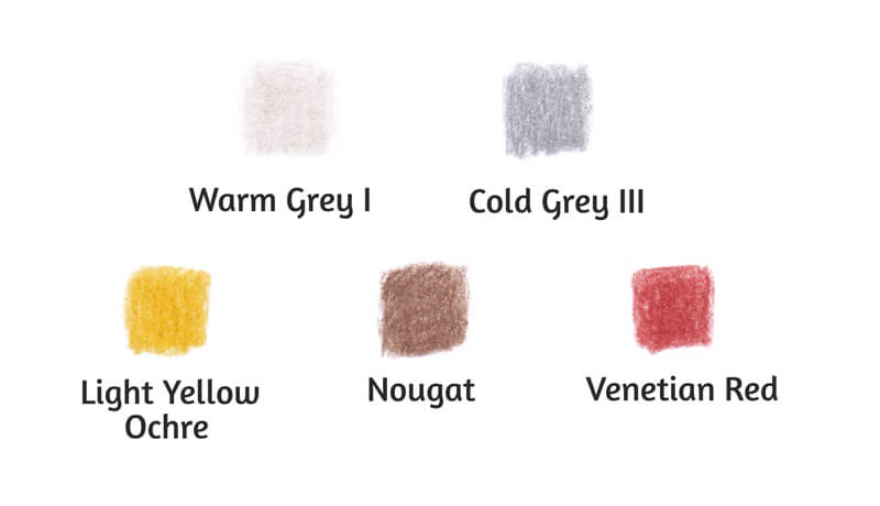
For this artwork, I’ve chosen only five colored pencils. They are from the Faber-Castell Polychromos set.
The Benefits of Limiting Your Color Palette
Before we dive in, let’s look at a few reasons why you may choose to work with a limited color palette when drawing with colored pencils.
Focus
The first advantage of working with fewer pencils is that you’re not spreading your attention too thin. Although a broad range of color options creates a sense of freedom, the necessity to choose may cause doubts. And doubts lead to frustration and wasted time.
Also, focusing on one task at a time helps to build a skill more quickly and efficiently. When your palette is limited, you digress from the subtle difference between the pre-made colors. It becomes easier to focus on forms and values. You’ll get a more unified, holistic perception of your artwork.
Chances are that you’ll become naturally disposed to see the positive and negative space and consider the composition more carefully.
Value
Problems with values and the lack of contrast are the most common stumbling blocks for the beginning artists. Correct values emphasize form and create an illusion of volume. Contrast determines the perceived depth. It also helps the viewer to define the objects and planes in their mind.
See also: Pushing Contrast in Value
Unfortunately, if the light values, midtones, and shadows are off, the artwork won’t seem credible – no matter how many colored pencils were used to complete the painting.
Working with a limited palette shifts your attention towards values, making you a more careful observer. If you’re drawing from a photo reference, it may be useful to convert it into a black and white image. You’ll get a tonal pattern without the distraction of hues.
Color
Working within a restricted color range may be considered as a middle ground between a monochrome drawing and artworks that present complex color palettes.
As I mentioned, color restrictions limit the number of possible decisions. This saves you time and effort. And yet, the resulting gamut is wide enough to create shades, tints, and cooler and warmer variations of the chosen colors.
You also practice mixing the colors, and the limited range gives you more control over the results. The fewer the components, the easier it is to find the repeating patterns in color behavior. Some mixtures will be worth remembering.
As the resulting colors are related, your artwork is more likely to be perceived as harmonious and unified. Related colors can help to convey the mood or exaggerate certain effects. Paradoxically, the color constraints may lead to greater freedom of expression.
If you’re just starting your journey into the world of color, limiting your palette may be a productive learning path. It’s also a great exercise for artists of any skill level.
How to Choose Colors for Your Limited Palette
Choosing the pencils for an artwork is a process of defining the right combination of colors. The colors you choose should conform to your creative vision and the artwork’s subject matter. And, of course, they should be harmonious together on the paper.
Every case is unique, but it’s still possible to outline several principles that may help you in the decision-making process.
Check the Colors
Evaluate the object that you’re going to draw. First, mark out its local color in the midtone area. Then, draw your attention to the object’s lighter and darker areas. Do you notice any shifts in color temperature?
With a restricted color range, the goal is to pick only the colors that play the “leading roles”. This may mean that this color takes up a significant amount of space in the image or forms contrasting accents.
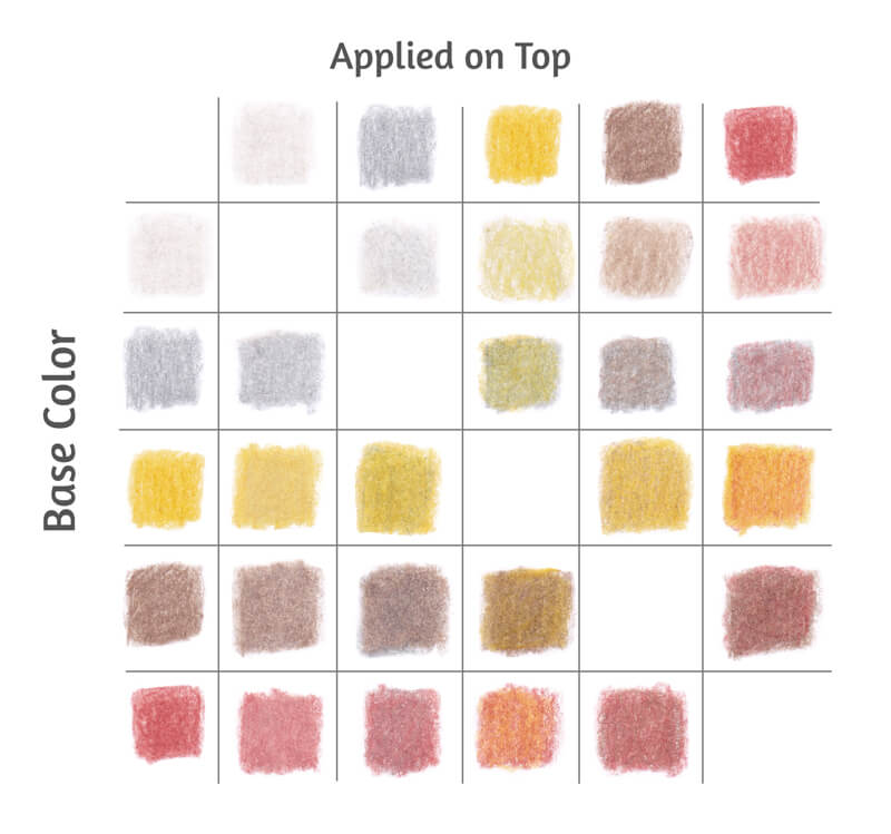
Even a small number of pencils can create a wide-enough color range. The table of swatches below illustrates this statement. I’ve made it with the five pencils that are chosen for the seashell project: Warm Grey I, Cold Grey III, Light Yellow Ochre, Nougat, and Venetian Red. You’ll find the mixtures at the intersection of each color pair.
And lastly, don’t include the colors that are too similar. Avoid the ones that you can easily mix from other ready-made options. For instance, yellow + red = orange or blue + green = blue-green.
The examples I’ve mentioned are obvious and simplified. But still, sometimes we miss a chance to experiment with fewer options to discover a hidden possibility.
Understanding color theory helps to envision the result of mixing.
Check the Values
In most cases, you’ll need a wide range of values to create credible works.
It’s possible to control saturation and value by layering new colors on top of the existing applications. Here are several examples:
- White (or any light-colored pencil) can increase the lightness of the underlying color;
- Grey pencils may be used to desaturate a color;
- Medium and dark greys decrease the value of the base color. The value of the resulting mixture depends on the value of both components.
Many brands of colored pencils have warm and cool families of grey. This separation provides additional control over the color temperature. In most cases, it’s useful to include pencils from both families into your limited set.
See also: Warm vs. Cool Grays
In the image below, you’ll find the swatches of Faber-Castell Polychromos warm grey family. (Point a.)
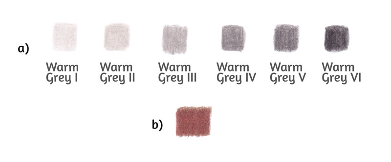
In terms of value, the principle “don’t add the color that you can mix” is also valid. As you can see, Warm Grey I and Warm Grey II are quite close. If you apply two or three layers of Warm Grey I at medium pressure, the result will be a close approximation of Warm Grey II as a single layer.
It’s also useful to mix your darkest colors beforehand to evaluate the lowest value that you can achieve. The darkness of the mixture depends on the value of the components.
In the image above (point b), you’ll find the result of combining Nougat and Venetian Red, which are the darkest colors from our list of supplies. These colors were applied in several layers at medium pressure. This shade isn’t very dark. But, keeping in mind that a seashell is a light-colored object, it fits the concept.
Now we’re ready to start practicing!
Drawing a Seashell with a Graphite Pencil
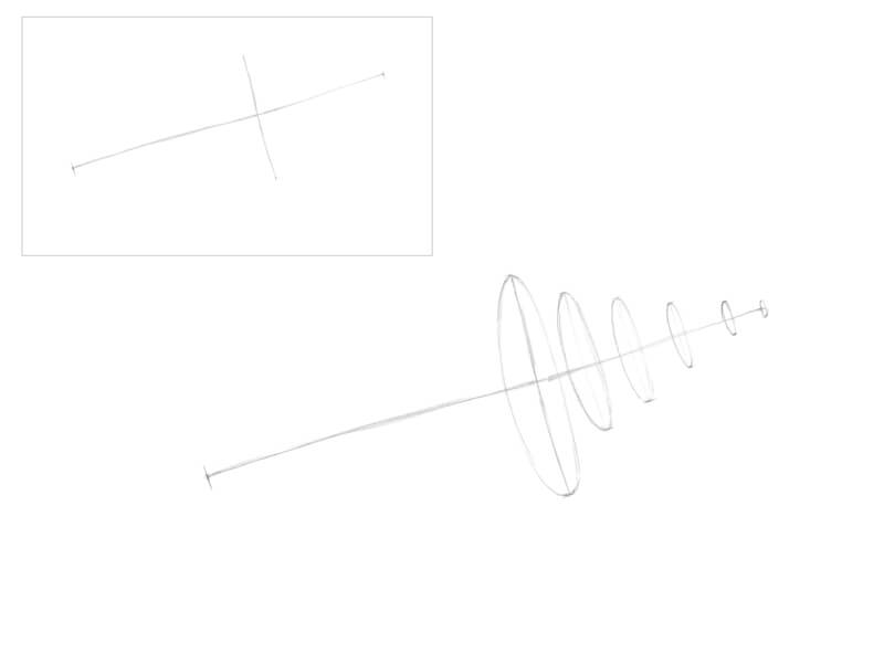
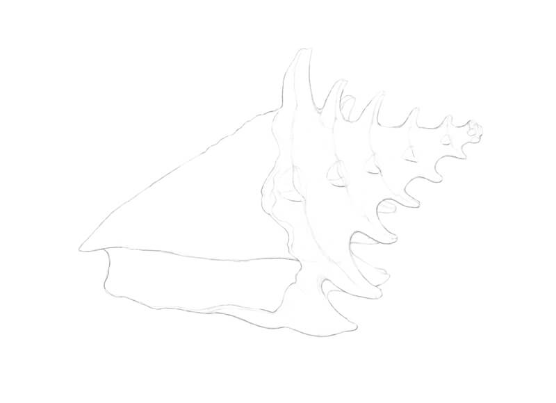
First, we’ll create an underdrawing. I start with an axis line that marks the direction of the shell. I also add the border between the two main parts of the shell.
A massive foundation with the body whorl and the aperture (opening) will be located to the left of this border.
On the right side, there will be the spire – it is the thinner, narrower part of the shell above the body whorl. In our drawing, the spire is pointing up.
You’ll find the miniature of this interim step in the corner of the image below.
I prefer to mark the whorls with ovals. This action is optional. In my opinion, subsidiary circles add a three-dimensional feel, helping to create an illusion of volume in the next steps.
Keep such supporting lines as light as possible. You’ll have to erase them later, and this can be harmful to the paper. Please note that I’ve intensified the graphite marks in the images for your convenience.
I draw the contours. For now, the foundation part is presented as a skewed conus. We’ll add the details – the lip and the aperture – in the next steps.
In the spire part, I join the prominent areas of the whorls with a line. It accents the interesting rhythm of the shell’s shape. The areas with subsidiary ovals form the wider areas of the spire.
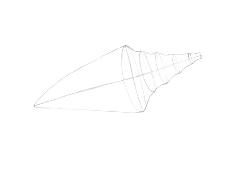
I add the thick horn-like ridges (the nodes) to the sides of the whorls. Some nodes are located in the central parts of the whorls, facing the viewer.
I mark the lip – the margin of the aperture. It envelopes the body whorl and joins the shell near the tip of the lower conus. This outer, enclosing form also has ridges.
Feel free to soften or erase the subsidiary marks that you no longer need.
I refine the line of the lip. Also, I slightly change the overall contour of the seashell. The curves become smoother.
I draw long organic lines that are going from one node to another, repeating this action for each whorl. They follow the form of the shell. These lines will help to differentiate the lighter and darker areas.
I also add several more nodes that are partially hidden behind.
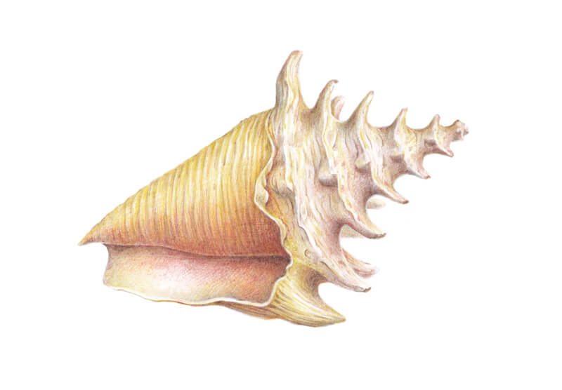
Drawing a Seashell with Colored Pencils
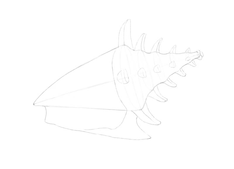
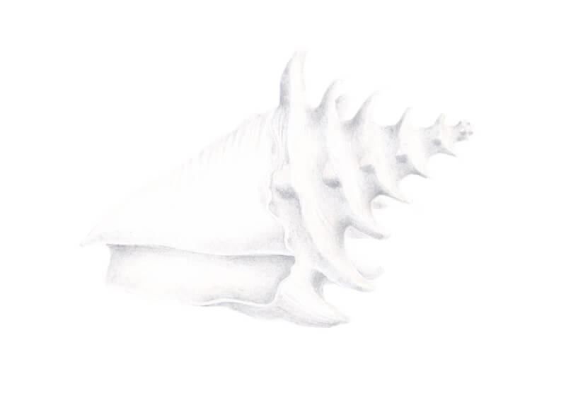
First, I soften the graphite marks with a kneaded eraser. This will keep our drawing neat and clean.
Now I’m going to mark the pattern of values. With Warm Grey I, I cover the lighter areas of the shell. Some parts may be left untouched. The pressure is light, so applications of this pencil are barely visible.
I reveal the subtle, ribbed relief of the spiral cords on the shell’s body and spire. Visually, spiral cords can be described as thin, long shapes that follow the cross contours of the shell.
With Cold Grey III, I cover the darker areas. The spire whorls present a repeating light-and-shadow pattern. I also accent the lower parts of the nodes. The opening and areas near the lip are darker too.
These two greys may overlap to create interesting effects.
Also, greys may be applied in as many layers as you need to create depth. However, don’t overdo the artwork. Our object is light, and we should leave enough “air” to add color nuances in the next steps.
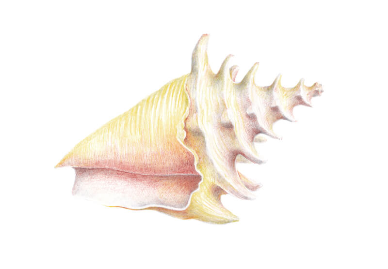
Let’s include some color! I add Light Yellow Ochre to the body whorl, especially its upper area, leaving out thin lines. The untouched areas indicate the prominent parts of relief.
The pressure is light. I also add this hue to the spire.
Seashells often have a pale red color near their openings, so I use Venetian Red at light pressure to create a gradient. I also add it to other areas of the shell. Pressure is very light.
Plain grey core shadows may seem dull and uninteresting. Including Venetian Red in the darker areas will help to deepen the shades.
These two colors may overlap and be layered on top of each other, too.
It’s time to increase the contrast. With Nougat, I strengthen the core shadows. I accent the spiral cords in the midtone areas and darken the aperture. The addition of this shade reveals the texture of the object.
Pressure on the pencil varies from light to medium. It’s important to control the intensity of strokes. A shell is a light-colored object, so we should be careful with the dark values.
I make the edge of the lip quite contrasting. There is a significant variation between lighter and darker areas. This change brings the lip closer to the viewer.
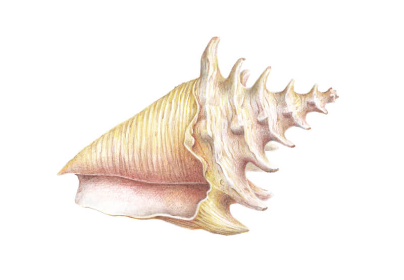
Now the drawing has a pleasant, delicate, airy feel – as if we used watercolor to paint this seashell. Although we could leave it as it is, I decided to add some finishing touches.

With Venetian Red, I make the color of the opening more solid. I also apply this hue to the whorls at very light pressure to unite the form.
I add some Light Yellow Ochre here and there to smooth down the relief of the shell’s body. I cover the reflective inner space of the lip to soften the light in this area.
Warm Grey I may be used to mute down yellows and reds – and to burnish the artwork, if necessary.
Drawing a Seashell with Colored Pencils – Conclusion
Congratulations – we’ve completed a wonderful project! I hope that you enjoyed the process of working with a limited color palette.
It is said that less is more. Indeed, some restrictions can be useful – they help to add a new dimension to your skills and experience.
If so, join over 36,000 others that receive our newsletter with new drawing and painting lessons. Plus, check out three of our course videos and ebooks for free.