The Importance of Value
We see the world around us because of light. Without light, we see nothing. So, it only makes sense that if we are to draw the world around us, then we must understand light as artists.
The manner in which light manifests in a drawing or painting is dependent on how the artist includes value in the work. Lighter values are used for areas in which light is hitting the subject. These “tints” are shown as highlights and areas of lighter value in the drawing. For example, a red object may have an area of pink (tint of red) on areas where light is landing. Conversely, darker values are used for areas in which light is not landing on the subjects, or is landing to a lesser degree. Again, with a red object, the “shades” will be created using a darker form of red.
The reality is that most of what we see consists of a complete range – the darkest “darks” and lightest “lights”.
It is the relationship of the dark and light values that create the illusion of light in the image, and ultimately the illusion of form that we are after. Considering this, it becomes clear just how important value is in the creation of a drawing or painting.
Adjusting the Perception of Value with Contrast
While a full range of value in artworks is important, it is the perception of the contrast in value that is ultimately what matters. As artists, we can control the perceived value of the color by juxtaposing contrasting values of varying degrees around the subject.
The contrast that results from these arrangements affects how our viewers perceive the value and ultimately the object in the work.
Take for example the following image in which two circles are positioned on different colored backgrounds…

While the two circles are the same value of gray, the perceived value is different because of the value around them. The dark background makes the circle appear lighter, while the white background makes the circle appear darker. Therefore, the contrast in value is important in how the object is perceived.
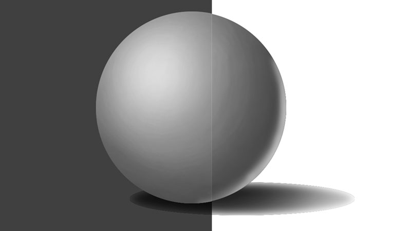
Here are a few more examples of how contrasting values can affect the perceived value of the object. In these examples, we’ll exchange the circle for a sphere that includes a full range of value.
In the first image, a white background is used. The contrast in value makes the sphere appear darker in overall value.

Next, we’ll add a neutral gray background to the same sphere and take a look at the perceived value. Notice how the sphere appears lighter than the first example, simply because the background is darker in value.

Now, for a third example. In this image, we’ll switch out the gray background for an even darker version. Now, the sphere appears very light in comparison…

The surrounding values clearly have an effect on how the value on the subject is perceived. When analyzing values in your subject, consider the background and surrounding values as the contrast in those values will play a role in how the light of the scene and the illusion of form are visually translated.
If so, join over 36,000 others that receive our newsletter with new drawing and painting lessons. Plus, check out three of our course videos and ebooks for free.