Understanding Warm and Cool Grays
What makes a gray “warm” and what makes a gray “cool”? To understand this fully, we must first take a quick look at color theory.
Color is such a vast subject. Because it is so vast, it can cause confusion for some. It doesn’t help that some manufacturers of art materials name colors in a manner that makes things more complex than it should be.
I receive many questions about color theory in general and with good reason. There is a lot of confusing information out there. Color theory, however, is not as complex as it may seem. It is actually quite simple if we understand colors as simple hues rather than pigments.
Warm and Cool Colors
Let’s first look at the color wheel and identify the “warm” colors and the “cool” colors. Perhaps you’re already familiar with warm and cool colors, but if not, let’s review.
The color wheel is the color spectrum bent into a circle. Certain color relationships occur as a result of this bending.
The warm colors are colors that we associate with things that are hot. For example, the sun is hot and we know that’s its color is yellow or orange. Fire is also hot and again its color is yellow or orange. Therefore, yellow and orange are warm colors.
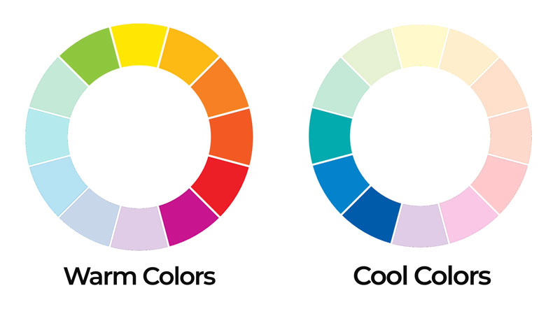
Cool colors are colors that we associate with things that are cold. For example, ice and snow is cold and the color of the shadows found in ice or snow is blue. Therefore, blue is a cool color.
This concept is referred to as color temperature.
Cool colors range from blue-green to blue-purple. Warm colors range from yellow-green to red-purple.
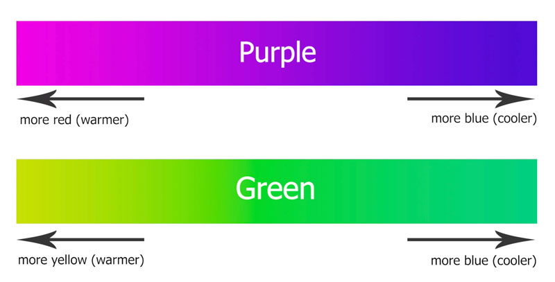
Green and purple can be considered transition colors. If the purple has more red in it, then it may be considered a warm color. If it has more blue in it, it can be considered a cool color.
Green is another transition color. If it has more blue in it, then it can be considered a cool color. But if it has more yellow in it, then it can be considered a warm color.
Ok, now that we’ve got that out of the way, let’s next look at how this information ties in with the color gray.
Gray is considered a neutral color. But as you’ll see in a moment – it may not be a neutral as you expect. Neutral colors are not found on the color wheel. Other neutral colors include black, white, and some browns (although most browns lean towards a color such as orange.)
Gray is mixed by combining white and black. White is not mixed – it is absolutely pure. But many blacks are mixed or can be mixed and this is how we manipulate the gray that is produced. The key is in the black.

How Black is Mixed
Black is a strong color. It is so strong that many artists decide to mix their own. By mixing a black, we have control over the color temperature and also the intensity. This often leads to a more natural looking black that doesn’t overpower an image.
Black is most easily mixed by combining a blue with a brown. Darker browns and darker blues clearly work the best.

For example, when mixing colored pencils (Prismacolor), Indigo Blue and Dark Umber create a wonderful black.
If you mix a black with a heavier concentration of blue, the result is a cooler black.
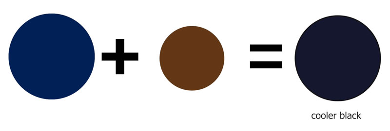
If you mix a black with a heavier concentration of brown, the result is warmer black.

Blue is clearly a cool color, while brown leans towards orange – a warm color. Brown can almost be considered as a dark value (shade) of orange.
Mixing Warm and Cool Grays
Now, if we mix the cooler black with white, the result is – you guessed it – a cooler gray.
If we mix the warmer black with white, the result is a warmer gray.
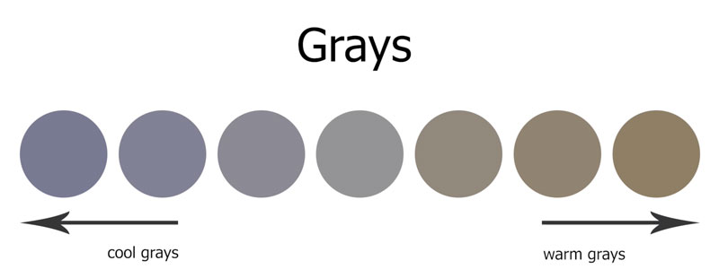
You can create a whole multitude of grays by using various pigments of blue and brown and mixing that mixture with white. Here’s a look at several different grays based on their color temperature…
This works with any medium that you choose to work with. Here’s a look at warm and cool grays mixed with watercolor.
In this case, Prussian Blue has been combined with Burnt Umber. In the first example, Prussian Blue dominates the mixture, resulting in a cooler gray.
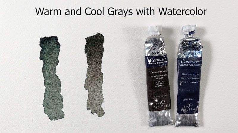
In the second example, Burnt Umber dominates the mixture, resulting in a warmer gray.
Here’s a look at warm and cool grays mixed with pastels. In this case, a darker blue is layered over a darker brown. This mixture is gently blended before layering a light layer of white over the top. The result is a cool gray.
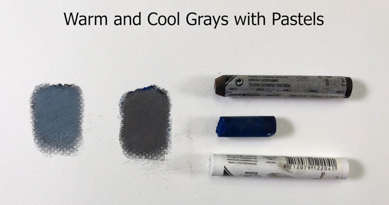
In the second example, the darker brown is layered over the dark blue, blended, and then layered over with a light application of white. The result is a warm gray.
Intensities of Warm and Cool Grays
Color intensity is affected when gray is mixed with a hue. For example, if we mix a gray with a blue, we get a less intense version of the blue. The color becomes duller as gray is mixed with it.
Some colored pencil manufacturers, like Prismacolor, produce gray colored pencils of warm and cool varieties of various intensities. They also do this with their markers. The intensity of the gray is expressed as a percentage.
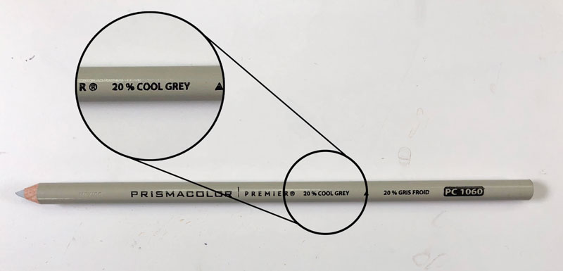
Here are the cool grays that Prismacolor produces…
- Cool Grey 10%
- Cool Grey 20%
- Cool Grey 30%
- Cool Grey 50%
- Cool Grey 70%
- Cool Grey 90%
They also produce the same intensities of grays as warm grays as well.
Here’s a comparison of some of the cool grays…

As you can see, the intensity of the gray increases based on the percentage designated.
When to use Warm and Cool Grays
You may be wondering when you should use cool grays and when you should use warm grays. There are no “rules” for this. Instead, you should first closely evaluate the gray that you’re seeing on your subject.
If the gray appears warmer, then it makes sense to use a warmer gray. If the gray appears cooler, then it logically makes sense to use a cooler gray.
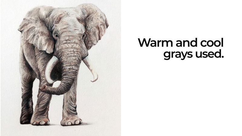
Grays can clearly be combined within an image. For example, both warm and cool grays were used in this colored pencil drawing of an elephant…
Want to see how it’s done? How to Draw an Elephant with Colored Pencils.
Sometimes, it makes more sense to use a cooler gray for shadows. In this colored pencil drawing of a frog, warm grays were used on the body, but cool grays were used for the cast shadow underneath. This simply creates more contrast between the subject and its cast shadow.
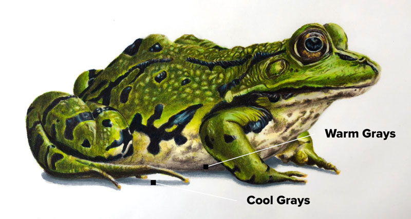
Want to see how it’s done? How to Draw a Frog with Colored Pencils (Membership required).
So now you hopefully understand the difference between warm and cool grays and have a better idea of when it’s appropriate to use them. Remember, don’t overthink things too much. If it feels right for your image – it probably is. Have fun, be creative, and just make art.
If so, join over 36,000 others that receive our newsletter with new drawing and painting lessons. Plus, check out three of our course videos and ebooks for free.
Lesson Discussion
Comments are closed.


Thank you, Matt. I must admit that I struggle with the application of warms and cools. I can recognize them and mix them, I just don’t always know how to use them. LOL! By the way, I don’t know for sure, but it looks like your beard is growing and it looks great. I am partial to abundant and extravagant facial hair on men. On women? Not so much… 😜. On that note, I love the movie “Gods and Generals”. 😊. Sorry about the rabbit trail…
Thanks Ginny! My wife likes the longer beard. It’s a bit of a pain – but for her – I’ll do anything!
Good man! That is why my husband has his, also. His is much more extravagant, though. LOL!
This explanation was so very helpful! Thanks for the information and the help.
Thanks Bobbie!
I was thrilled to see your post about this video. Thanks for making this so much clearer!
Thanks Patricia! Thanks for the inspiration!
Matt, I’ve been wanting to hear about the warm and cool grays for awhile, as I just seem to figure them out as I go along. Can you explain how French Grey fits in here, in particular as a Prismacolor has them as well?
Thanks and love your website and teaching.
Kirk
Hi Kirk,
French Gray is simply a very warm gray. It is a much warmer gray than the pencils listed as “warm gray”.
This warm and cool gray lesson was so helpful. Thank you!n
Thank you so much for simple,clear and helpful Explanations.
Varda
Hi Matt I really enjoy the way you explain things so much easier to understand. I would also like to understand about the greens. There is so many of them or any other of the colors. Could you also do a lesson on how to draw a tree it is something I have trouble with. Thanks again for all your lessons. This is the first time I have ever made a comment so a bit nervous to say the right thing.
Hi Coral,
Thanks! Have you checked out this lesson on drawing trees…https://thevirtualinstructor.com/how-to-draw-trees.html