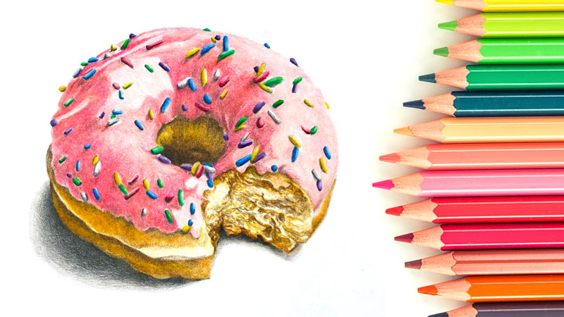
As artists, we may create the illusion of some actual texture like fur, grass, or wood on paper or canvas. If this illusion is produced correctly, the viewer associates it with a concrete physical object. The artwork seems credible and realistic.
Effective work with textures allows us to convey a variety of messages and evoke emotional responses from people. With the proper skill, you can direct the viewer’s attention to a particular area of your art. It’s no wonder that texture is a fundamental aspect of many drawings and paintings.
Texture is one of the seven elements of art.
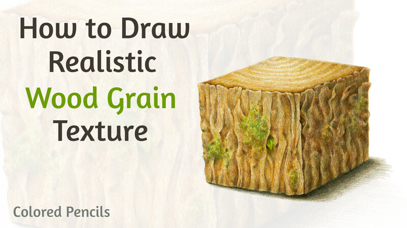
The focus of this lesson is to explore creating the illusion of wood grain texture with colored pencils. It’s quite a popular texture to explore with many concepts that involve depicting trees or related elements. Various man-made objects that present this texture are common too.
The Materials Used for this Exercise
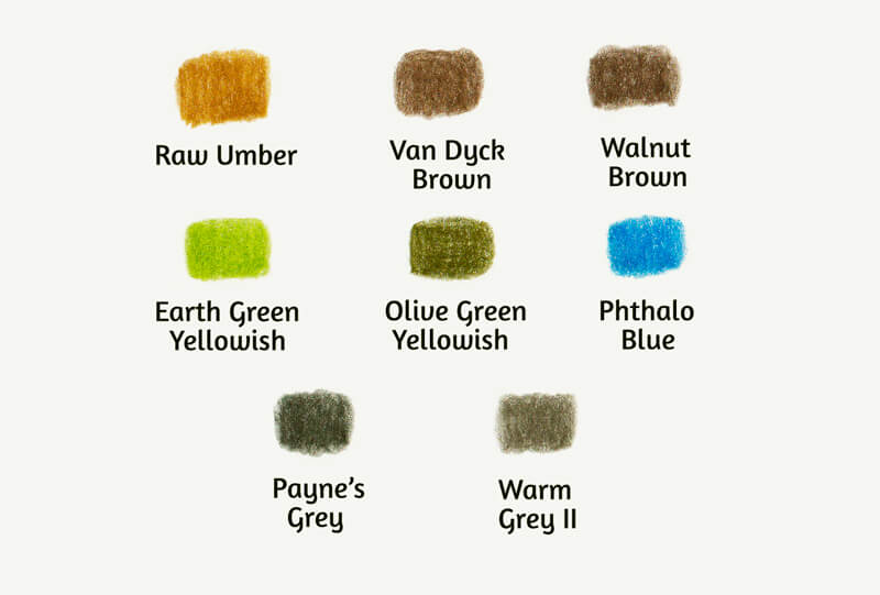
I’ll be using Faber-Castell Polychromos colored pencils. Feel free to use any colored pencils that you like. Actually, this texture study can be produced with any art medium, including watercolors, ink, or graphite pencils.
You’ll find the pencils that I’ve chosen for this project in the image below.
I recommend keeping a pencil sharpener at hand. When you’re working on the details, the pencil tip should be extra sharp.
We’ll also need an ordinary graphite pencil to create an underdrawing, and an eraser.
See also: 9 Must Have Colored Pencil Supplies
I’ll be drawing on an A4 size sheet of paper. It’s quite large for a single exercise, so we can fit two or even more texture cubes on the surface. The paper has some tooth – its surface isn’t completely smooth. It also has a subtle warm tint.
Analyzing Texture and Building Your Visual Library
In my experience, it’s best to analyze a texture by looking at a real, tangible, physical specimen. Qualitative reference photos may be useful too. However, I see them rather as a subsidiary tool that you can rely on after the initial contact with the actual texture.
I recommend using all of the information you can to build your visual library.
For example, if you’re outdoors, observe the trees. Don’t just look at their silhouettes. Come closer and study the bark. Here are some suggestions:
- Try to find the rhythm of the texture.
- Draw imaginary lines that create the pattern.
- Touch the tree to find out how the surface feels.
- Squint your eyes to get a unified impression.
- Then observe all the details, watch how they interact, building the whole object.
All these actions will help you to understand the texture and discover the best way to recreate it in a drawing.
After you have that pleasant feeling of the concept’s recognition, take a couple of photos. They will refresh your memory in the future. You can use them while creating studies and working on independent art projects.
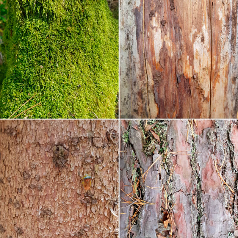
Natural textures are so broad that it’s difficult to get bored observing them. Each example of bark is unique. The same is true of the patterns of moss, lichen, or other organic “decorations” that may cover it. And the inner patterns of wood fibers may be surprisingly diverse as well.
Below you’ll find some photo examples of texture from my collection.
Drawing Wood Grain Texture with Colored Pencils
Let’s start with a simple study. It is a close-up fragment of wooden texture. I’ve put it here for demonstration purposes. We should understand the general principles of this exercise before we move on to the next one.
Exercise 1 – Flat Texture Study
We’re dealing with a flat surface, its pattern, and micro-relief. There’s no need to think about the entire form that this texture may be covering. It’s like looking at a tree very closely – we see the details of the surface and disregard the volume of the trunk itself.
The size of the texture sample may be quite small – for example, mine is only 4.5 × 3 cm. (About 1.8″ × 1.2″.)
Outline a rectangle, a square, or a circle with a graphite pencil. This shape will be the borders of our sample. Then, fill it with the close-up fragment of the chosen texture.
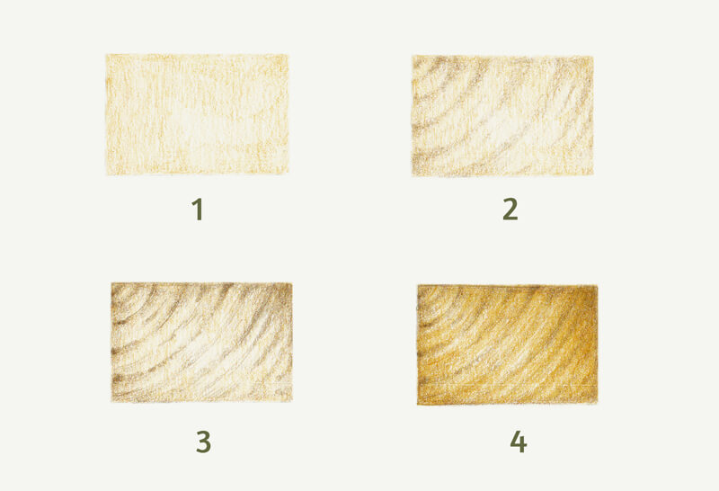
The process may be slightly different, depending on the case. In general, we start with the general values and color, gradually increasing the density of layers. Then come the details. As a last step, you can burnish your sample or apply some color on top to unify it.
Here is the process for the sample below:
- I created a base layer with Raw Umber.
- I marked the grain pattern, using Van Dyck Brown.
- With Walnut Brown, I added more lines, refining the pattern.
- I applied more strokes of Raw Umber to make the color more natural.
Exercise 2 – Texture Study on the Cube Model
Great news – our second task is more challenging!
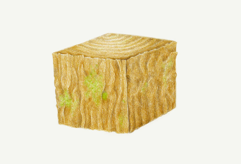
In the previous study, we dealt only with the relief and values of the texture itself. In this exercise, we’ll start with a primary form that will affect the appearance of the surface. It’s up to you to choose the form – it may be a cube, a sphere, a cylinder, or even something more complex.
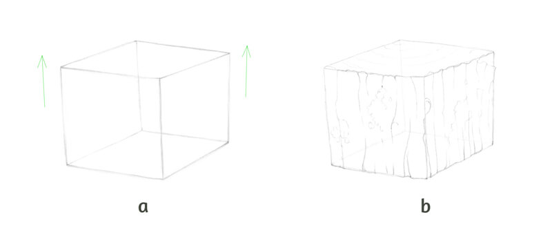
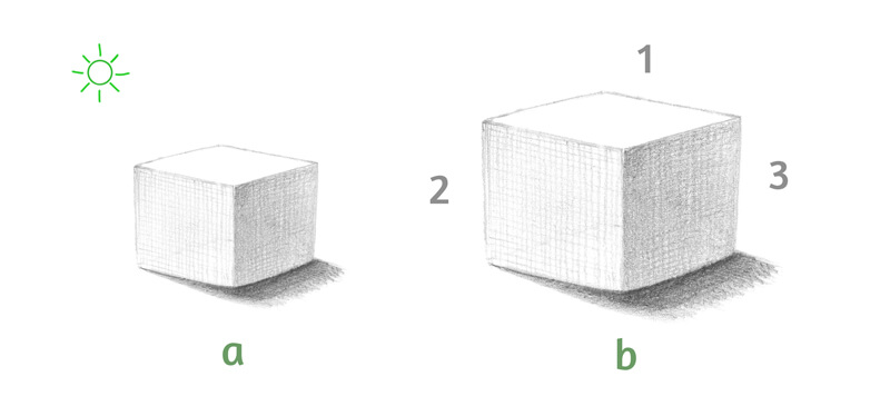
In this case, I’ll draw a cube. As you may notice, its vertical lines diverge slightly, as in a case with the three point perspective. (See the illustration “a” in the image below.) I like the effect of minor distortion – this adds a dynamic quality and interest. But if you prefer normal cubes that conform to the classical two point perspective, feel free to draw one.
Then I add the main details of bark to the vertical planes. There will be small areas of moss. The top plane will demonstrate the pattern of a cut tree trunk. (See the image below, illustration “b”.) Keep your pencil lines as light as possible.
It’s helpful to create a visual connection between the cube’s planes. For example, you can continue a pattern that has started on one of the other sides of the cube. These details help to unite the form.
Also, add some minor features that make the drawing more interesting – for example, small hollows or cracks. Pay attention to the main contour. In this case, it shouldn’t be too monotonous or mechanic.
Just for your reference: my drawing will be about 11 × 9.5 cm, including the cast shadow. It is approximately 4.3″ × 3.7″.
Now it’s time to talk about lighting. It’s necessary to determine where the light source is originating from before we move on. We’re dealing with a cube and the light affects its values. In turn, the light will also affect the texture.
Let’s agree that the light source is to the left of the cube and slightly behind it. The light is diffused, so the shadows will be soft, with blurred edges. (See illustration “a”in the image below.) With this information in mind, we can imagine what the tonal pattern may look like.
Also, it can be helpful to mark the planes of the cube with numbers, as shown in the image below. For illustration purposes, I’ll be referring to the planes using numbers.
- “1” – for the top horizontal plane.
- “2” – for the left vertical side.
- “3” – for the right vertical one.
Now we’re ready to proceed to colored pencils part!
First, soften all the graphite marks with a vinyl or a kneaded eraser. The latter is a better option in this case.
I first layer a base color, keeping light pressure on the pencil. The direction of strokes follows the direction of the planes. Make sure that you avoid the “moss” areas.
Plane 1 gets one layer of Raw Umber. plane 2 is slightly darker, so it needs two layers.
I add one layer of Raw Umber to plane 3, then cover it with a thin coating of Van Dyck Brown.
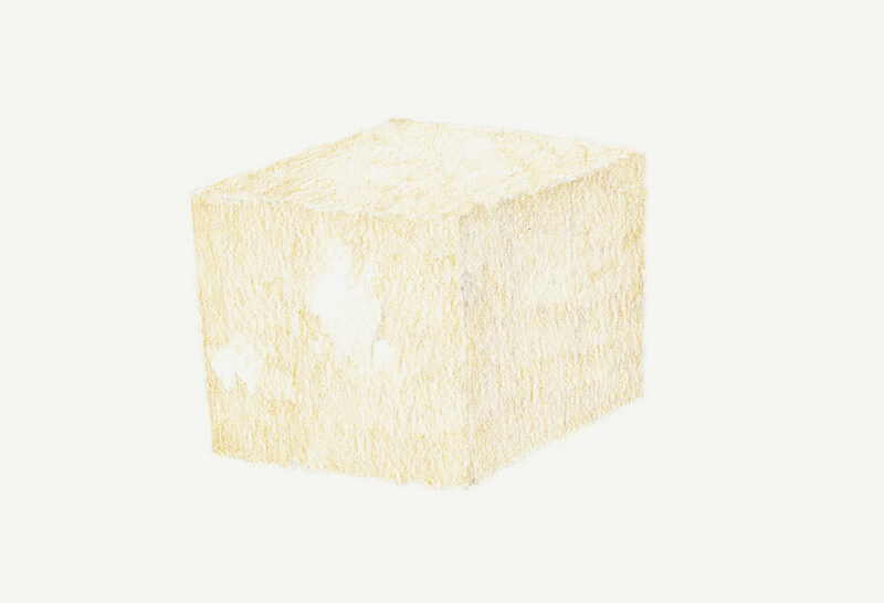
With Van Dyck Brown, I mark the darker areas. I reveal the details of relief and the rhythm of texture. I separate the planes visually with thin shadows.
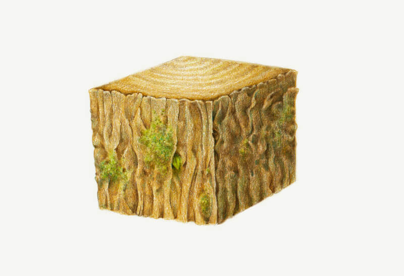
At this stage, we should be careful with darker colors. Don’t press too hard. It’s much easier to add another layer of shading later on.
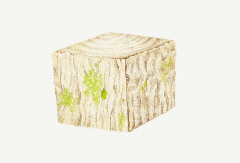
With Earth Green Yellowish, I draw the moss and small leaves in the hollow. The pencil is moving in small circles.
You can vary the pressure or work in a stippled manner to create a grainy effect. Leaving tiny gaps and allowing some irregularity of strokes is also an option.
To increase the density of color, I add more strokes of Raw Umber.
Some areas are left almost untouched – for example, thin lines of grain on plane 1. As we remember, the top plane is well lit.
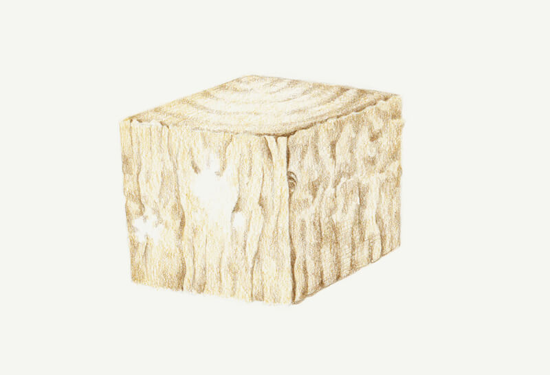
With Walnut Brown, I darken the gaps, hollows, and other details of texture. Don’t forget to sharpen your pencil before you start working on the finer details.
I also apply a thin covering of this color to planes 2 and 3. The vertical sides receive less light, so using this shade is justified. I work in a circling manner at low pressure.
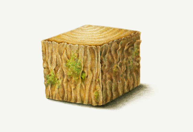
Note that plane 3 is the darkest one, so we won’t find high contrast there.
The bark has some thickness. There’s a thin shadow near the closest edge of the cube’s top, behind the protruding bark.
With Olive Green Yellowish, I create shadows in the moss. You can draw short lines, circles, or even dots to achieve a specific, yet varied effect.
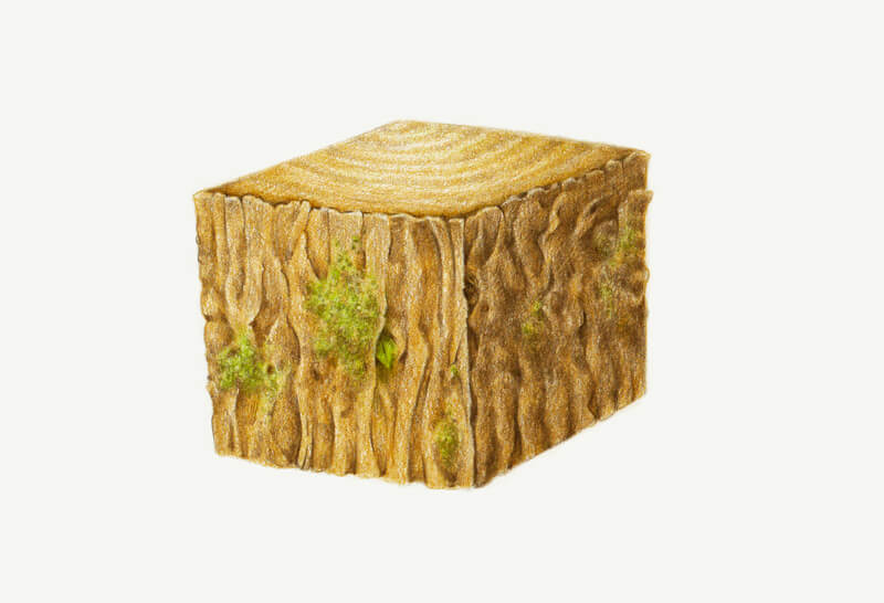
I add a thin covering of Phthalo Blue to planes 2 and 3. The pressure is so light that it is barely noticeable. However, pressure can be increased to mark the cracks.
This blue hue works wonders in the moss area. It affects the underlying colors, so they get a beautiful cool accent. I use it in the shaded areas of the moss.
I add a cast shadow, applying Payne’s Grey near the cube. I extend the shadow, using Warm Grey II.
I also apply Warm Grey II to planes 2 and 3 to desaturate them just a little.
Drawing Wood textures with Colored Pencils – Conclusion
Congratulations – we’ve done a great job! Hopefully, you see that creating complex textures with colored pencils is easier than you think.
Exploring textures can be truly exciting. I hope that you’re willing to continue this creative journey and encourage you to make your own studies of textures.
I wish you much inspiration and fun on your way to becoming a texture master!
If so, join over 36,000 others that receive our newsletter with new drawing and painting lessons. Plus, check out three of our course videos and ebooks for free.