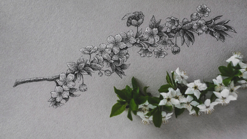
Let’s make the most of this wonderful time — it gives so many opportunities to observe, study, and hone our artistic skills. In this tutorial, I’ll show you my process of sketching cherry blossoms with ink on toned paper.
Supplies You’ll Need…
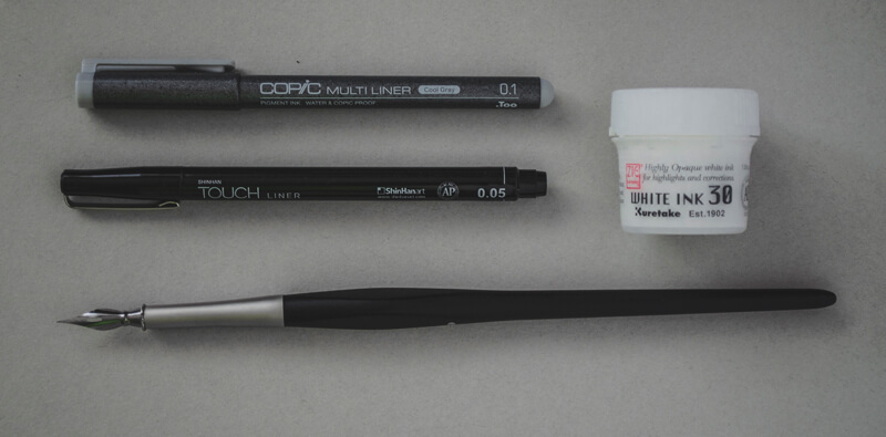
For this project, I’ll be using:
- A cool grey ink liner (0.1)
- A black ink liner (0.05)
- Liquid white ink
- A pointed nib pen for applying the white ink.
If you don’t have a grey liner, you can replace it with an ordinary HB or B graphite pencil. The pencil’s sharp point can create thin lines that imitate ink marks. Of course, the result will be slightly different, but still beautiful.
Likewise, it’s possible to replace white ink with a white gel pen. I prefer liquid ink because it allows for developing a dense, solid covering. If we combine it with a pointed nib used as an applicator, we’ll get sharp lines that are both crisp and thin. A gel pen’s lines will be wider, but sometimes this adds a more spontaneous feel to the sketch.
(The following links are affiliate links, which means we make a small commission if you purchase without additional cost to you.)
The underdrawing is created with a graphite pencil and an eraser.
Choosing a Toned Surface
When we consider drawing with ink, toned paper may not be first thing that comes to mind. However, for quick, expressive sketches, I recommend using toned paper. It creates a pre-made midtone base that saves time and effort, allowing us to complete the work faster.
Starting with a middle value for your “ground” allows us to push values outward from the center of the value scale. So instead of starting at one end, we begin in the center. This helps us to make evaluations regarding the value with more accuracy and helps us to create a drawing with wider variety of tone.
Many mixed media papers are suitable for this approach of working with black and white ink. These papers are thick enough to accept watery applications (if desired) without buckling and are also available in various tones.
(The following links are affiliate links, which means we make a small commission if you purchase without additional cost to you.)
See also: Six Reasons to Draw On Toned Paper
Find Your Flowery Inspiration
Unless you live in a place where no flowers are in bloom or if you’re allergic to pollen, I recommend that you go outside and take a close look at flowers. Do you see anything that sparks your creativity?
My inspiration was a twig covered with small white flowers. Cherry blossoms are a symbol that represents both the beauty and fragility of our life.
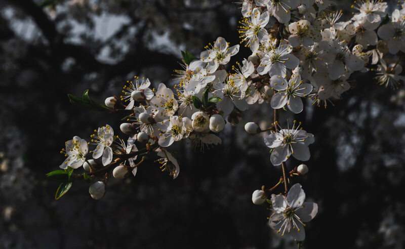
Of course, any type of flower (or even other objects) are suitable for this process. Floral motifs are a nice option because of their natural contrast and organic forms.
A tangible object provides more information than a photo. It’s possible to observe it from different angles, study in detail, rotate, or even smell this object. Drawing directly from a live object will improve your drawing skills faster than drawing from a photo.
See also: Is It OK to Draw and Paint From Photos?
After you’ve found your nature-inspired subject, pick a small fragment that is sufficient for drawing. Unsure of what type of flower you’ve chosen? There are apps that may help to determine the exact name of the flower based on a photo.
Observe and Sketch the Flowers with Graphite
Now the flowers are ready to be transformed into an artwork. Observe them carefully, find a position that you like and consider the composition.
While drawing, you can keep the flowers on the table, in a vase, or even hold them in your hand. While you observe the subject you may ask yourself a few questions…
- Can you simplify the object?
- Can you see the different values?
- Do you notice unique textures or shapes?
- What basic shapes are most prominent?

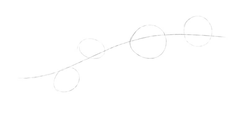
I create a quick graphite pencil sketch, based on a simplified framework of shapes. There are single flowers outside the clusters and groups of leaves as well.
At this stage, my goal is to position the elements as accurately as possible. However, their shapes remain rough and simplified.
I observe the physical cherry blossom twig as attentively as I can. Then I transfer some of the observations to the drawing. It is a constant back and forth process of observation and mark making.
It’s much easier to draw an object that is already familiar. A blank sheet of drawing paper may seem intimidating and puts additional pressure to get everything right on the first attempt. This is especially true if this paper has a pleasant texture and a pleasing or unusual color.
In this case, we’ll create a simple sketch of our subject with a graphite pencil on regular drawing paper or in a sketchbook. This preliminary step isn’t necessary, but it does help us become familiar with the subject.
Creating the Underdrawing
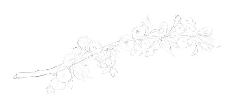
Now we’re ready to start our drawing on the toned surface. With a graphite pencil, I mark the contours of the cherry twig. It’s time to combine everything that I’ve learned about this object with fresh observations.
The outline of the twig and the main shapes of the flowers are drawn first. Once the basic shapes are in place, the details follow, resulting in a light contour line drawing. I pay attention to the direction of each shape of the flowers and the unique bending of the leaves.
Even though you may think there’s nothing more to see after creating a contour sketch, continue to observe the subject throughout the following steps.
It’s up to you how accurate to make your drawing. This drawing is a sketch where aesthetics are the goal, instead of a full-fledged botanical illustration. Feel free to exclude portions of excessive visual information and allow for some stylization.
To be honest, I felt that something is missing in this image. The flowers themselves are beautiful, but what if we add a hint of a story?
To make the drawing more interesting and to include a bit of story, I decide to include a small bee buzzing around the flowers.
See also: How to Draw a Bee with Pen and Ink
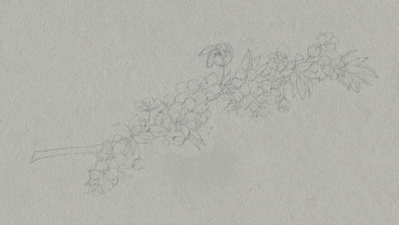
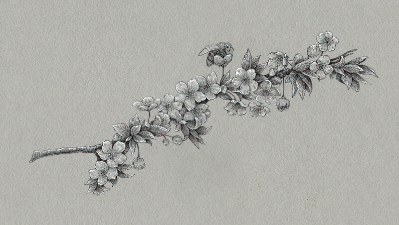
Drawing the Flowers with Ink and Liners
The color of our paper presents the middle of the value scale. The lines drawn with 0.1 grey liner are just a bit darker than the surface. This means that we can create a soft, subtle value transition in the midtones.
It is important to determine where the light comes from before starting the work. The light source will need to be defined by the positioning and strength of the values.
See also: Shading Basics
With fine lines, I mark the central areas of flowers, outline the contours of the twig, and give the flowers more volume by applying contour hatching. The petals are the lightest elements in the drawing, so I’m going to add fewer grey or black ink marks to them.
The leaves are darker — we can adjust the value and increase the contrast. I apply grey hatches to reveal the shadows here.
At this stage, our drawing has low contrast. Playing with values inside the midtone range allows us to develop the drawing gradually and push the contrast in values incrementally.
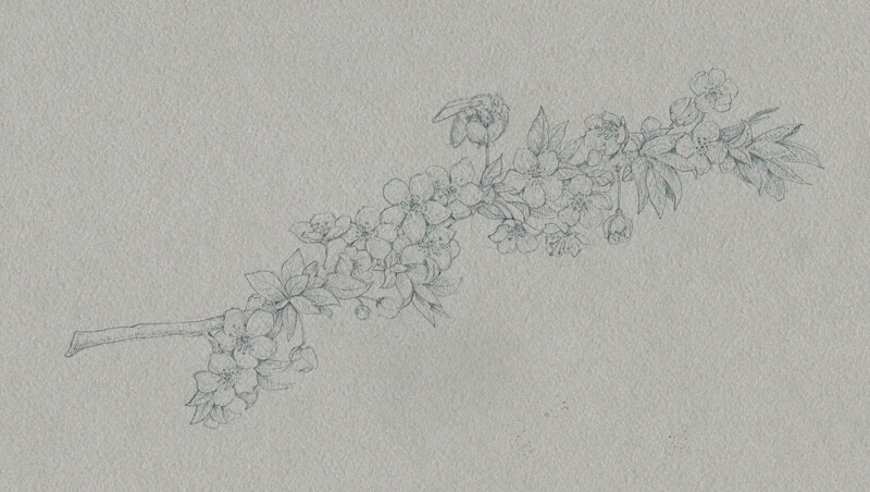
I start including darker lines made with 0.05 black liner.
I emphasize the contours, strengthen the shadows, and reveal the delicate textures of petals and leaves. Again, the flowers are the lightest elements in our sketch, so they should remain barely touched at this point.
For this step, I use both hatching and dots to create the desired effect of the petals’ soft texture. It’s important to be careful, work slowly, and not rush the process.
I continue working in the same manner, adding black marks to the sides of the twig (which were grey before now), and the core shadows.
I also increase the contrast on the bee by emphasizing the darker stripes on its body. The contours of the wings are marked with a minimum number of lines, keeping them light and transparent.
The sides of the twig (more precisely, the outer contours) still have lower contrast than the central part. This is done to attract the viewer’s attention to the most important elements, including the bee.
The sketch looks nice, but it lacks the lighter values and highlights.
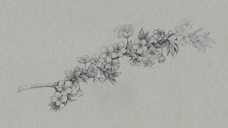
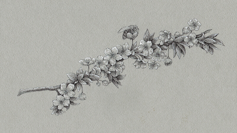
Adding Highlights with White Ink
I’ll mark the lightest areas with white ink, applied with a nib pen. The flowers will receive a heavier concentration of white marks in the drawing. White ink is applied to the tips of the flowers, accenting the soft folds.
I add some white ink to the upper part of the twig, to the leaves’ tips, and just a couple of thin lines to the wings of the bee. Keeping the relationships between the darks and lights in balance is important.
Sometimes, just a small dot of white is all you need. This is the case with the highlight in the eye of our bee.
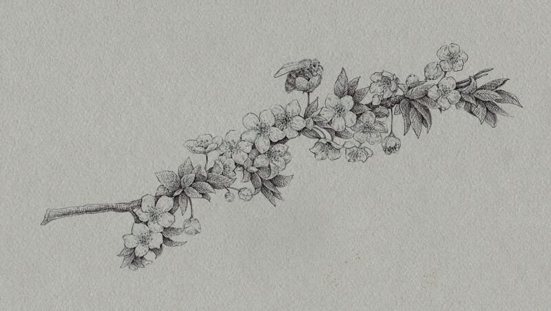
Finishing the Drawing of Cherry Blossoms
The sketch is almost complete, so let’s make a quick evaluation.
We can add more ink marks here and there if necessary. It’s up to you to decide which tool to use. You can include more grey, black, or white lines (or dots) to balance the values. The more midtones you include, the more subtle the light source will appear. Omitting midtones will result in higher contrast, which will make the light source appear stronger.
I decided to add just a bit more of black and grey to strengthen the shadows and create more variation in the midtones. The change is subtle, but it makes a difference.
Conclusion
Congratulations — we’ve completed our quick sketch! I hope you enjoyed working with inks of different values and toned paper.
Any season is full of inspiration and countless beautiful objects are waiting for you to draw. Let yourself be curious and draw everything and anything you like! Consider working on toned paper – even with ink. It speeds up the process and allows you to create a broad range of value.
If so, join over 36,000 others that receive our newsletter with new drawing and painting lessons. Plus, check out three of our course videos and ebooks for free.