Some art media are straight forward with regards to creating value. When working with graphite or charcoal, for instance, the artist uses pressure changes to adjust his/her values – light pressure creates light values while heavier pressure results in darker values. Therefore, shading with graphite and charcoal is intuitive.
However, not all drawing media is as straight forward as graphite and charcoal. A pen and ink drawing, for example, may use only black ink. Changing the pressure placed on the tool does not change the value. So how does one create a wide range with only black?
Fortunately, There are several well-established techniques used to create a range of value with ink. They are…
- Hatching
- Crosshatching
- Stippling
- Scribbling (or random lines)
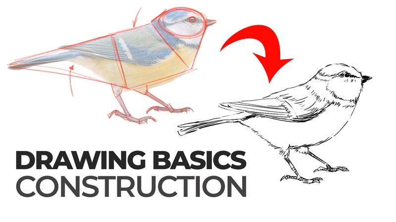
See also: Pen and Ink Drawing Techniques
In this lesson, we’ll focus on only the first technique listed above – hatching. Hatching is perhaps the most difficult technique for developing values with black ink alone. So mastering the techniques of hatching will carry over to the other techniques you could use.
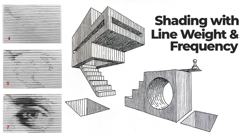
Hatching is shading with drawn lines, all traveling in the same general direction. These lines can be straight or curved. They can be close together or spaced apart from each other. When hatching, the artist has a couple of choices as to how he/she manipulates line to create a range of grays. These techniques are…
- Line frequency – the number/amount of repeating lines in a given space. Line frequency is sometimes referred to as line density.
- Line weight – the visual lightness or darkness of a single line. When using ink, line weight manifests through the thickness or thinness of the line. This is also sometimes referred to as line quality.
Both techniques rely on a visual phenomenon called optical mixing. Optical mixing occurs when colors appear to be a mix of two or more colors from a distance, but are actually two or more different colors. With hatching our “colors” are black and white. With a little distance, these colors appear to be mixed, creating the illusion of a gray.
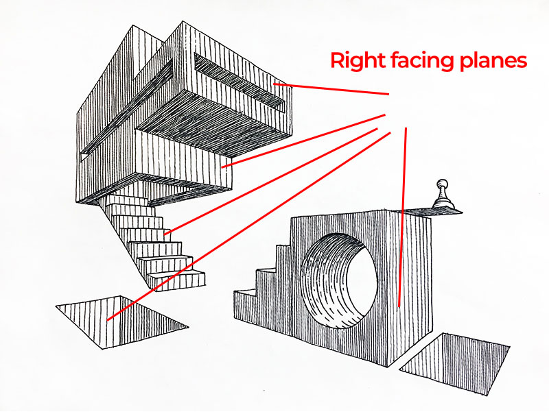
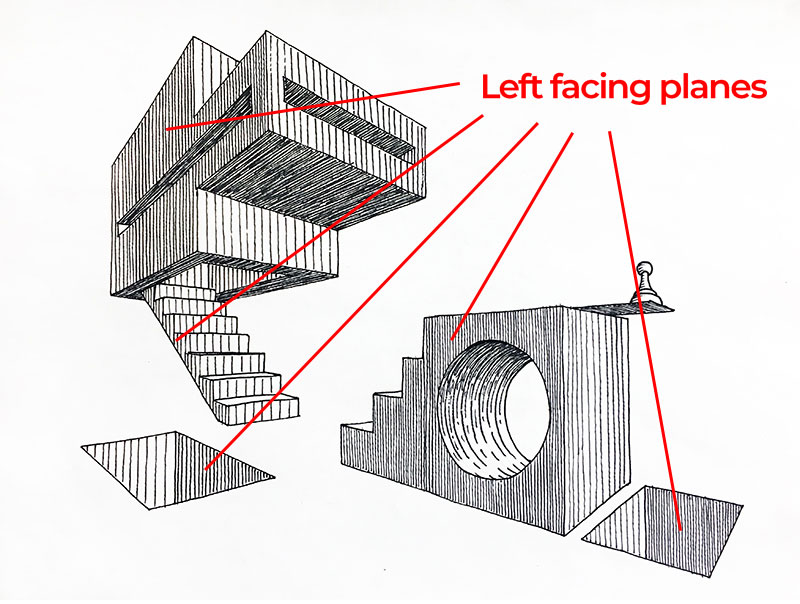
Shading with Line Frequency
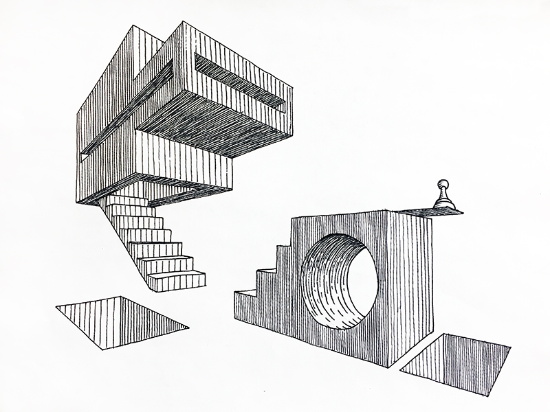
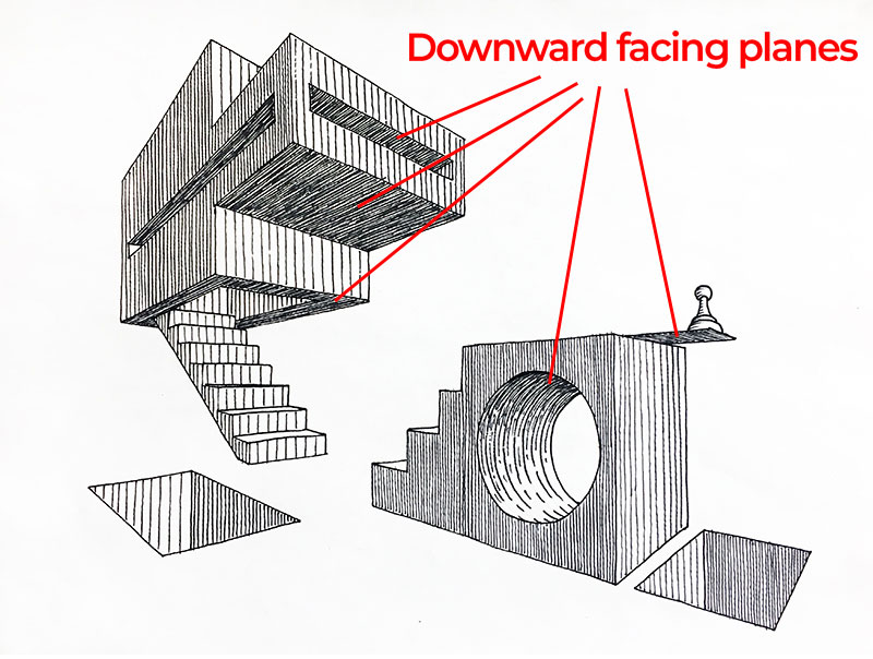
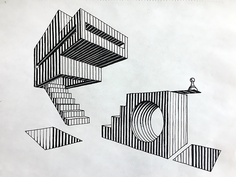
Look at the two point perspective image above. The forms in this image are made up of mostly flat planes that either face rightward, leftward, upward or downward.
Now look only at the planes that face to the right. Notice that the line frequency is the same for all planes that face this direction. In this case, the light is coming from the top-right, so these planes are lighter in value. Adequate space is left open between each of the hatching marks, allowing more of the paper to show through compared to the other planes.
The left facing planes are a medium value created by placing lines closer together. By placing the lines closer together, less of the white of the paper shows through, resulting in a darker tone.
The flat planes facing downward are in shadow. These planes are the darkest with the most densely packed hatching lines.

Planning a Drawing with Line Frequency in Mind
Using line frequency to develop values requires some planning. One must consider, before shading, how close together lines must be place in order to properly capture the desired contrast between planes. This is the case whether drawing simple, non-objective forms (as seen above) or complex, representational subject matter like cityscapes and portraits.
Hatching is not a forgiving technique. It is difficult to “correct” values once they are in place. Think about it. If the artist accidentally spaces his/her lines too far apart on a given plane, resulting in too light of a value, then the most intuitive solution would be to simply draw an extra line between each of those that were first put down. However, this solution would dramatically darken the value in question. That value now would now be twice as dark. So much for subtle adjustments.
See also: How to Correct Mistakes in a Pen and Ink Drawing
So, the question should never be, “How can I correct value created by hatching”. The better question is, “How can I avoid needing to correct my values in the first place”. The simple solution is to create a value scale and then assign values to individual planes before shading. Then, just follow the plan.
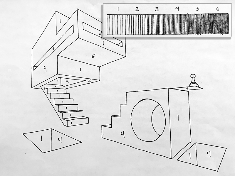
See how the value scale was used to plan where specific values belong. Assigning values to specific planes prior to shading prevents mistakes that might otherwise force an artist to start over.
Shading with Line Weight
Another approach to adjusting values with hatching includes varying the width of the line. The thickness or thinness of the line is called line weight and is sometimes referred to as “line quality”.
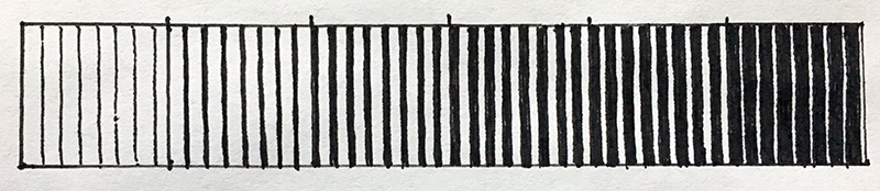
Take a look at the value scale above. See how the last block in the scale is an inversion of the first block. All of the squares that make up the value scale have the same number of lines per square. Therefore, each value has the same line frequency. The only change from block to block is the thickness and thinness of the lines.
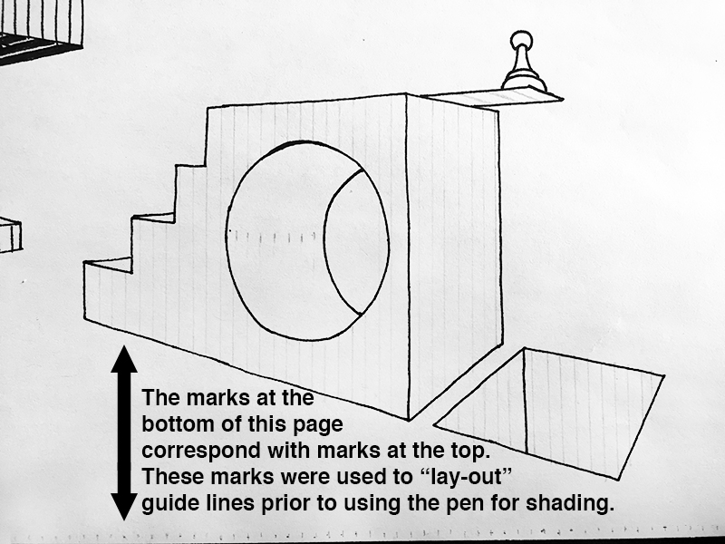
Once guidelines are in place, the artist should then use a values scale to assign appropriate values to specific planes. Inking each value one at a time is not a required part of the process but doing so does helps the artist to maintain consistency in the drawing.

Line Weight – The Next Level
Using line weight to render geometric forms is a great way to familiarize yourself with the concept. Taking the concept to the next level means applying it to organic forms – that is forms with irregular, natural contours. The process is the same as described above but with one clear distinction. Even a single line, itself, may have variable line weight. So planning ahead is even more important.
Look at the group of images below. The first image is, of course, a reference photograph. Image 2 is a light pencil drawing. The purpose of the initial drawing is to clearly define the shape of each distinct value that is observable from image 1. Four distinct values will be used to render the eye.

Both images 3 and 4 look just like the first steps used to start rendering the geometric forms from earlier in this lesson. See how, in the top left of image 4, the line segments inside of a single shape are slightly thickened. Those thicker segments represent the second lightest value in this drawing. All shapes that match that value should be thickened in the same way during this step.
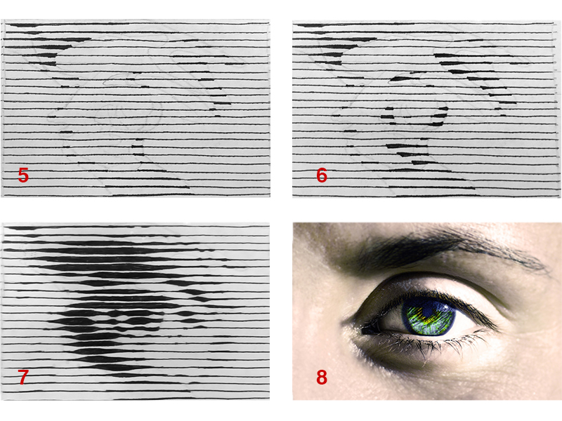
In image 5 (below), all shapes have the second to lightest value are complete and one shape in the top left has the third value in place. Notice that an attempt has been made to transition from one value to the next. In image 6, all values are in place except the darkest value.
Finally, image 7 shows the completed drawing of an eye rendered with only line weight. The drawing is small – possibly smaller than it may appear on a desktop or laptop computer. If you are viewing this image on a larger screen, then move farther back from the screen to see these lines work together to describe the undulating surface seen in and around an eye.
If so, join over 36,000 others that receive our newsletter with new drawing and painting lessons. Plus, check out three of our course videos and ebooks for free.