
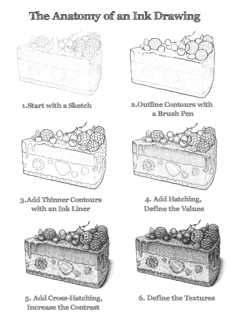
This lesson is designed mostly for beginners that want to get started with ink. I’ll share a sequence of digestible steps. You may consider them as the “building blocks” of an ink drawing.
We’ll observe an ink drawing in “layers”. Each new layer adds significant information to the whole artwork. By building upon each layer, the drawing slowly develops into the finished work.
Anything that seems complex becomes easier to understand if we see it as a process, not just as the finished product.
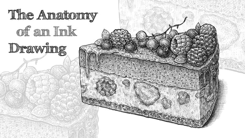
I’ve chosen a slice of a delicious cake with berries as a subject for our drawing. It is relatively easy to draw, even if you’re a total beginner. It has everything we need to look for in a subject – an interesting shape, beautiful value transitions, and varied textures.
I recommend considering this lesson as more than an ordinary drawing tutorial. Instead of just focusing on the steps involved, let’s focus on the principles that stand behind those steps. Once we have a strong understanding of the concepts and principles, we can apply them to any subject that we choose to draw.
It’s worth pointing out that the example shared here isn’t the one and only way to work on an ink drawing. It’s rather a single way to arrange your process that may help you be successful.
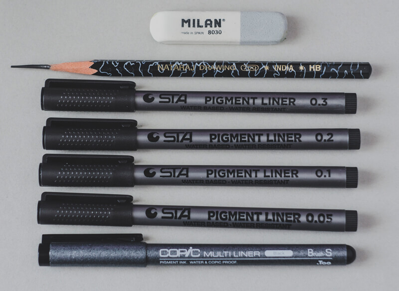
Art Supplies for This Project
I’ll be using an ordinary HB graphite pencil and an eraser to create sketches and an underdrawing. Several ink liners (0.05, 0.1, 0.2 and 0.3) and a brush pen are used for the inking process.
If you don’t have an access to all those width variations, it’s possible to get by just with the 0.1 and 0.3 pens and perhaps a brush pen. A brush pen could also be replaced with a nib pen.
Drawing a Piece of Cake with a Graphite Pencil
Before we dive into constructing the shape of the cake, it’s necessary to decide on the composition. In this case, our composition is rather simple and static with just one piece of cake. The interest will be developed in the textures and the complexity of the cake itself.
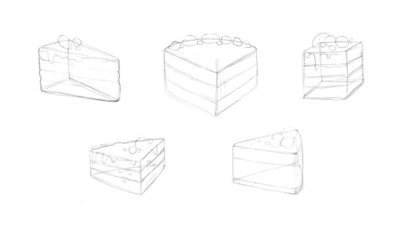
Developing the Idea
With a graphite pencil, I draw several models of a slice of cake, presenting it as a simple shape. The sketch in the second row, on the right side, is my favorite. It’s always good practice to draw several sketches. Your first idea is not always your best.
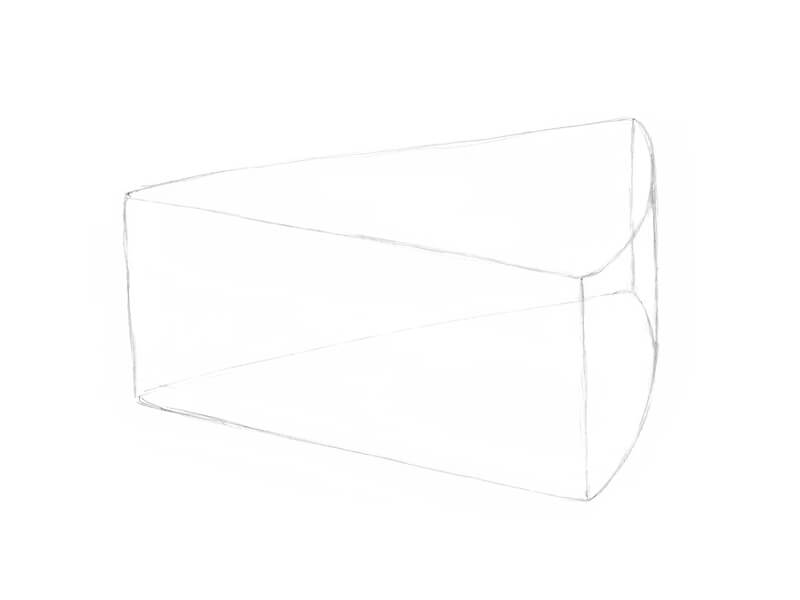
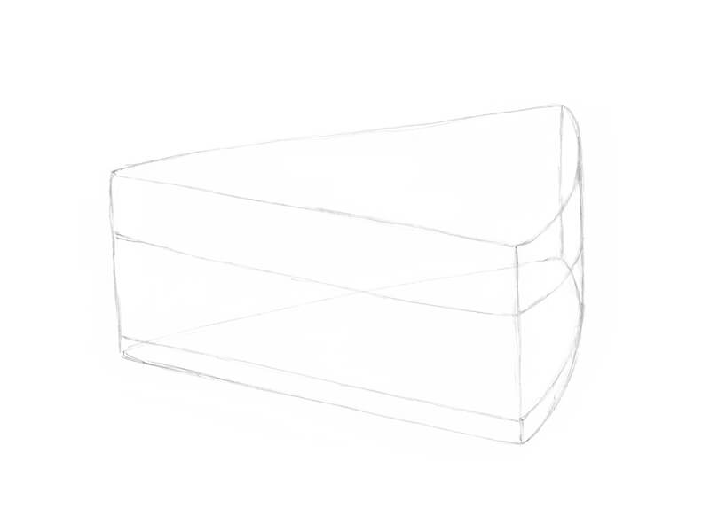
Create an Underdrawing
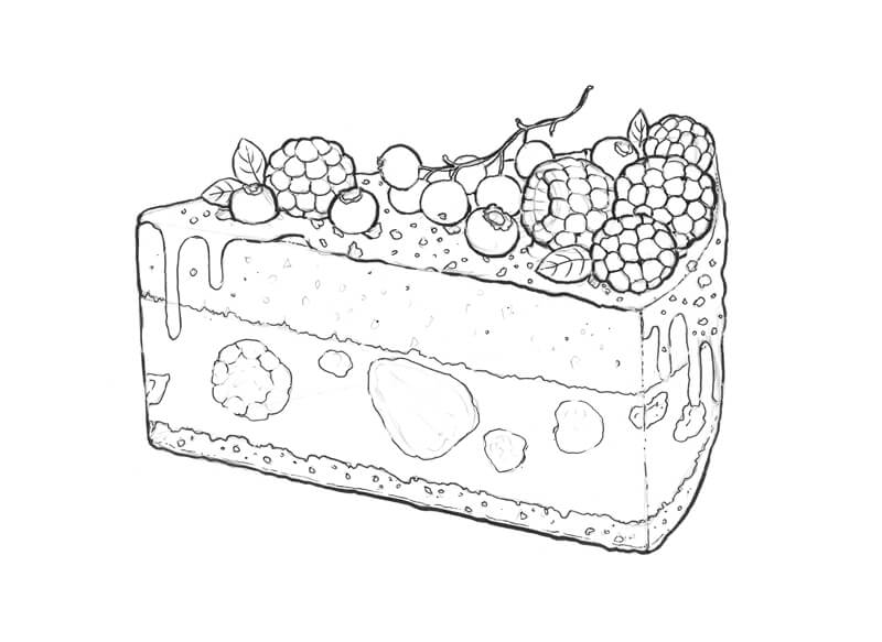
I’m ready to move forward now. With a graphite pencil, I sketch the basic form of the slice, constructing its sides and the top plane. Notice that the back side is slightly curved.
It’s helpful to draw an object with the structure in mind. You may choose to think of the object as a transparent subject, as if you can see through it. This helps you to better understand the form of the object.
Now it’s time to mark the borders between the cake’s layers. Let your imagination go wild – your cake may have seven layers or be completely solid!
I add several shapes to indicate the places where the berries will be located. Pay attention to where you place them. Each berry needs enough space on the cake’s top plane.

I’ve chosen to include currants, bilberries, blackberries, and raspberries for the cake’s decoration. We’ll elaborate on their details in the next step. Several small leaves will also adorn the cake’s top.
I’m going to add a delicious berry filling to the middle layer of the cake, so some stylized berry shapes are welcome there, too.
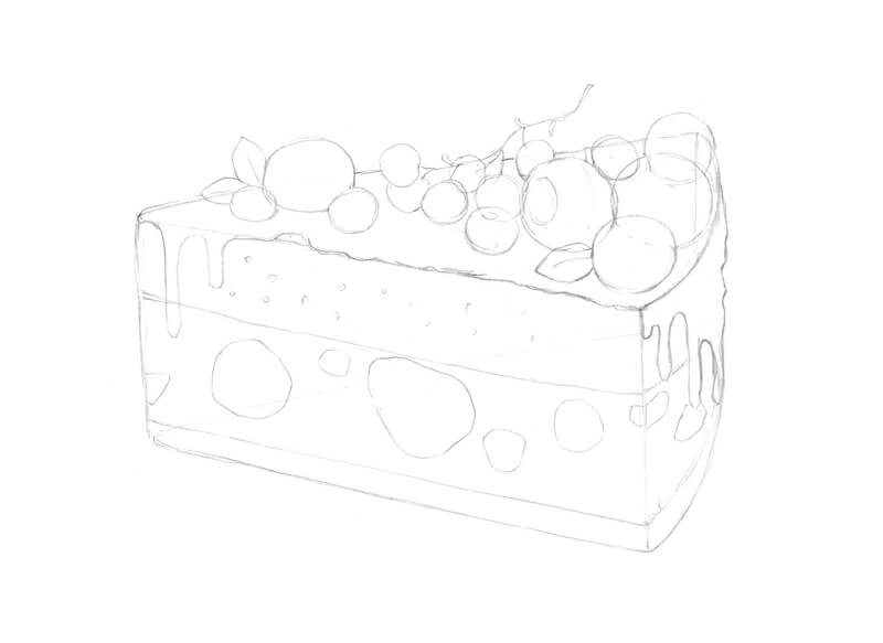
I draw the rows of shapes within each of the berries. The blackberries are made up of smaller shapes that are “squarish”, while the smaller shapes in the raspberries are more elongated.
I also add some sprinkles on top of the cake and accent some inner areas with a pattern of semicircles. When it comes to creating an underdrawing, a balance between detailing and simplicity is up to you.
At the end of this part of the process, it’s necessary to ‘see’ the artwork in your mind. Decide what objects are the darkest or lightest and how you’re going to handle the values.
Adding Ink to the Drawing
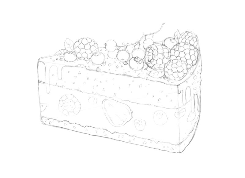
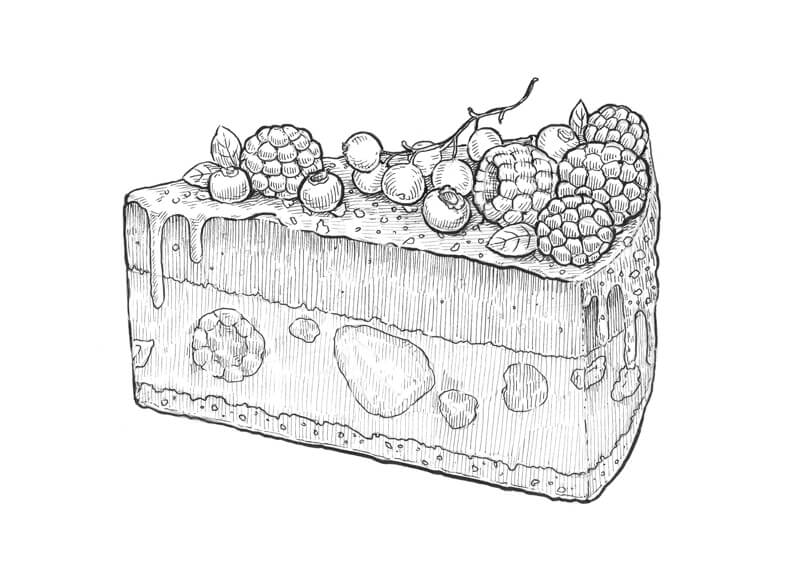
We’ll begin the inking process by first defining the contours or outlines.
Outlining the Contours
Contours are an important part of the drawing. They provide the external borders of the subject and the boundaries of each of the details.
Contours can be rigid or fluid, mechanical or organic, thick or thin, uniform or varied.
In other words, a contour is an expressive artistic tool just by itself. That’s why we should pay particular attention to the contours in our drawing.
To outline the main contours, I use a brush pen. This instrument is great for creating organic, varied lines! If you’ve never used a brush pen, take your time and explore all of the different ways it can be used to create variety in the line. Using a brush pen freely and naturally requires some practice, but it can be a great tool for developing variety in your stroke. Some brush pens can produce a thinner minimal line width than some technical pens.
I accentuate the bottom contour of the cake, making it slightly wider than upper contours. This creates the impression of a shadow underneath the subject.
As you can see, some contours, especially those belonging to the smaller objects, remained untouched. I’m going to cover them, using the 0.2 ink liner. If you feel like some contours need an extra accent, it’s always possible to broaden them with additional marks.
Tiny gaps in the contour lines or broken lines are perfectly acceptable. Broken lines can create the impression of light or highlights.
Ink liners produce marks of a relatively constant width. It’s important to include both thin and thick lines in your drawing to create variety and added interest.
Creating Values – Adding Hatching and Contour Hatching
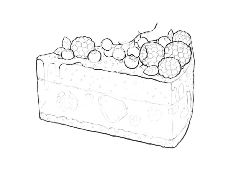
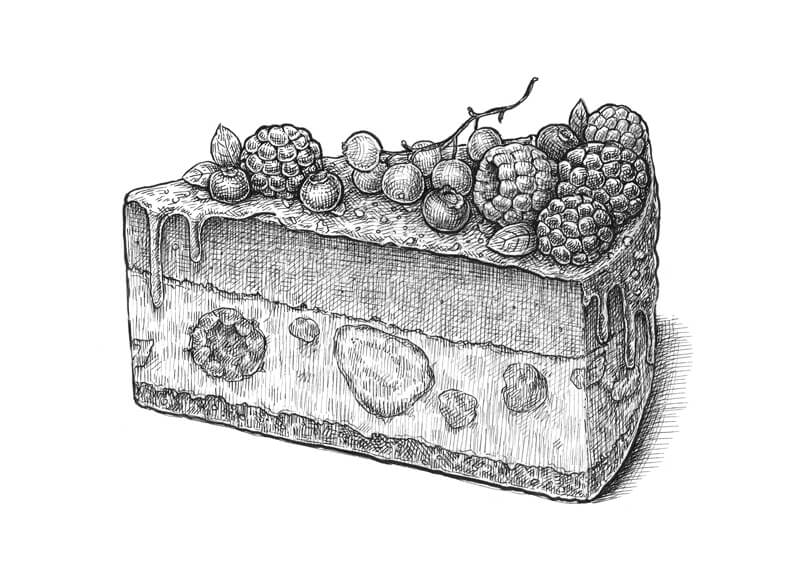
Now that we have all of the objects in place and clearly visible, it’s time to develop the lighter and darker values. Values are important because they define the form of an object, the light source within the scene, and the textures. They also create a sense of contrast.
I add hatching to the cake, following the direction of its planes. A deliberate hatch direction will help the viewer’s eyes in differentiating the sides and the top of the object.
See also: Pen and Ink Drawing Techniques
The details of the berries require a slightly different approach – I use short, rounded hatches that accent the character of each detail. This approach helps to create the illusion that our berries are three-dimensional.
For this step, I work with 0.05 and 0.1 ink liners. Thinner hatches are a better option for lighter or highlighted areas. In this case, the light source originates from above, so the top plane of the cake is catching more light than its vertically oriented sides.
The thinner 0.05 liner is a great tool if you like creating subtle value transitions. Hatching made with a fine liner may look like gradated shading from a distance.
Any form of hatching (cross-hatching, cross-contour hatching) that you feel necessary can be used in this step.
With the 0.05 and 0.1 liners again, I add some cross-hatching, deepening the shadows and increasing the contrast. Also, I add a cast shadow under the cake.
The blackberries and bilberries are the darkest elements of the drawing, so I apply more hatches there. Make sure to leave the highlights on the glossy berries!
It’s important to give some volume to the details, but each berry should be recognized as a whole object. To create this effect, I cover the individual berries with a layer of thin hatching, accenting the darker areas.
This step may take some time, depending on your style and the desired outcome so it’s important to be patient. It’s also useful to take breaks regularly – this way, you’ll have a chance to analyze your artwork and see what needs extra improvement.
Defining the Textures
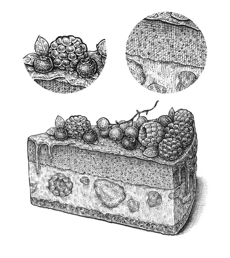
At this stage, the contours and the majority of values are in place. To make the drawing more believable and join all the visual information into a complete image, we need to develop the textures. Without them, our cake will look like a plastic, artificial model.
With the 0.3 ink liner, I create a pattern of semicircles inside the upper and bottom layers of the cake. Pastry usually has a rough, porous texture.
The texture of the cake’s middle layer is smoother, but I still add groups of small 0.1 dots here, too – just to create a bit of visual harmony.
Raspberries and bilberries have a velvety texture (compared to blackberries), so I accent this texture by adding small 0.05 dots to them.
Hopefully, the close-up image of the cake’s layers and berries below will help you to better understand the previous steps.
Conclusion
Congratulations! The drawing is complete. I hope that you enjoyed our creative (and delicious!) journey.
My goal was to show you that almost any ink project can be divided into steps. These steps include…
- Sketching out the subject.
- Outlining and developing the contours.
- Developing the values and contrast.
- Defining the textures.
This is just one approach. This is simply a guideline that may help you to get started with ink techniques, making the process clearer. You can work on all aspects simultaneously, invent your own “rules” and your own unique approach – you’re the creator!
I’ve gathered the process images of this lesson into one image. Feel free to pin it!
Thanks for joining me on this ink adventure. Happy creating!
If so, join over 36,000 others that receive our newsletter with new drawing and painting lessons. Plus, check out three of our course videos and ebooks for free.
Lesson Discussion
Comments are closed.
I am almost a beginner, your way of presenting and illustrating the lessons is really engaging, I would like to enroll in your courses but being I “color-blind” I would be interested only in the one with “pen and ink”, it is possible to register only for that and what would be the price, thank you