
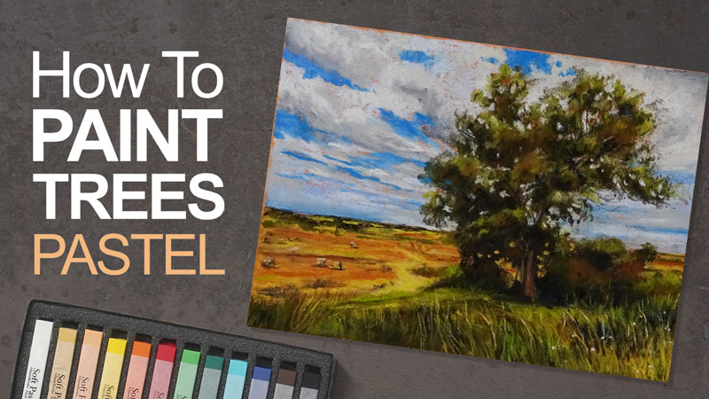
Materials for Our Pastel Landscape
We’ll work on the heavily textured side of Canson Mi-Teintes pastel paper. This versatile paper is great for accepting multiple, layered applications of pastel. The orange toned paper provides strong contrast against the blues used for the sky, but harmonizes with the dominant yellows and reds in the foreground.
Stick or traditional soft pastels are used for the bulk of the drawing, but details are added with pastel pencils. An assortment of Rembrandt soft pastels are applied to most of the drawing. You are free to use any brand that you prefer, but you’re likely to see better results with higher quality soft pastels.
The pastel pencils used in this demonstration are the harder pastel chalk pencils by General’s. These pastel pencils sharpen easily in a traditional pencil sharpener and produce sharp lines suitable for detail work. Because they are so hard compared to other brands, they are best suited for finishing touches rather than covering large areas.
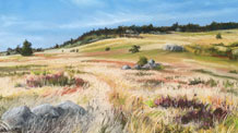
The Photo Reference
We’ll work from a photo reference from Pixabay.com. As you can see, the reference on its own is rather simple. We’ll pull out and exaggerate colors and use directional stroking to make our drawing more interesting than the reference.
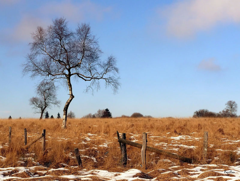
You’ll also notice that this is a winter scene with a few bits of snow visible in the foreground. We’ll leave out the snow in this case since it may not translate well in the finished work.
See also: Pastel Landscape Painting – Winter Scene
Begin with the Background
When applying pastels, the thought process is very similar to that of applying opaque paint. Colors can be applied directly over previous applications without the colors underneath showing through. This means that we can work the background, in this case – the sky, completely before moving on to the middle ground and foreground. Doing this prevents us from having to go back and fill in areas around the dominant trees which could lead to inconsistencies in the color of the sky.

We’ll begin by applying a base application of a light blue to the entire sky, bringing the application down past the horizon line. We’ll then blend this initial application with a finger or chamois.
The top of the sky is slightly darker, while the bottom portion is slightly lighter and warmer. To make the top of the sky slightly darker, we’ll apply a darker blue. We’ll bring this application to the middle of the sky, lessening pressure as we go. This application is also blended gently.
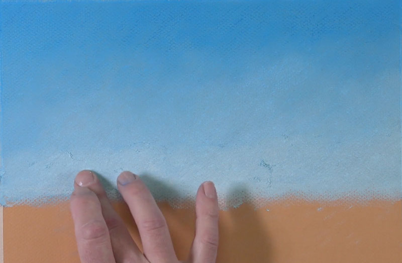
Using a much lighter blue, we’ll bring an application up to the middle of the sky, again lessening pressure as we work upward. A bit of a very light yellow is also applied to add a little warmth. Again, this application is gently blended to create a gradation.
Drawing the Clouds
The clouds are rather muted in this image and we’ll reflect this in our drawing. The upper right cloud has the most color associated with it, so we’ll start here.
A series of colors are added to gradually build up depth. Light pinks, grayish purples, light yellows, oranges, and grays are layered and gently blended. At this point, some experimentation is at play as we try to find the right colors for the work.
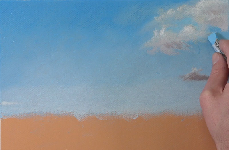
Keep in mind that clouds have volume. This means that we’ll see highlights on the side of the clouds that face the light source and areas of core shadow on the opposite side. Highlights are developed using the warmer yellows and oranges, while darker purples and grays are used for the shadows.
As we begin to define the shapes of these clouds, we can go back and refine the edges with the light blue that we used for the bulk of the sky.
With the clouds on the right side of the picture plane defined, we’ll work our way to the clouds on the left side. These clouds are very muted with very little contrast between them and the sky.
A middle gray is used to define the initial shape of each of the clouds. To create a sense of volume, we’ll add a slight highlight with a light yellow and a subtle shadow with a dark grayish purple.
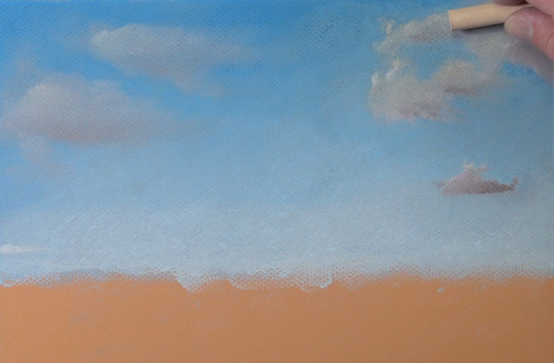
Then, we’ll revisit the clouds on the right side of the image and strengthen the highlight with a light orange.
After the shape of the clouds have been defined, we can go back to the sky and apply additional applications of light blue to refine the edges of the clouds. A light application is used here without much blending.
Drawing the Middle Ground
With the sky in place, we’ll move on to developing the middle ground. We’ll begin by first defining the horizon line with Burnt Sienna. Using this same color, we’ll fill in the entire middle ground and foreground to create a base application. This entire area is then blended.
Over the top, we’ll begin applying a variety of Yellow-Ochre, oranges, browns, and earthy reds and yellows.
Along the horizon line, we’ll define the shapes for some of the distant trees. A dark earthy green is used for the basic shape of each of the trees. A slight shadow is added on the right side of each of the shapes with a touch of black.
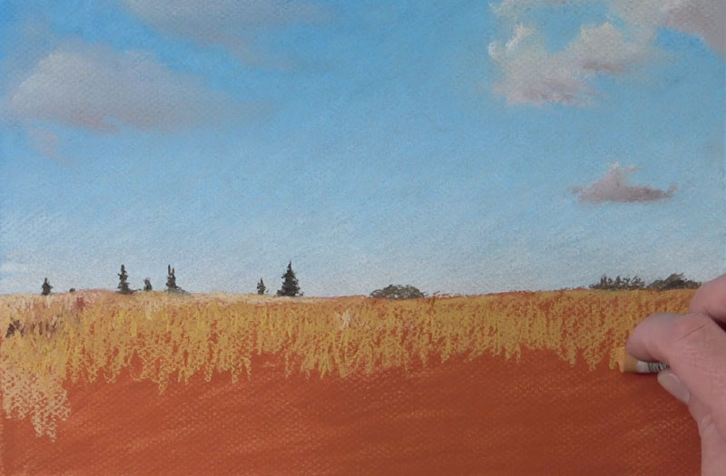
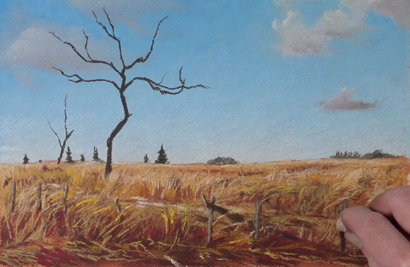
We’ll continue to work our way down the picture plane, adding additional yellows, browns, reds, and oranges. Vertical strokes are used for grass blades that are closer to the viewer, while horizontal strokes are used for the grass far off in the distance.
Once we’ve worked our way down a little, we can add the basic shapes for the two dominant trees in the middle ground. A dark brown is used to develop the trunk and larger branches of each of the trees. The side of the stick is used to pull up the strokes from the grassy field. We’ll hold off on the details for now and develop them later with a pastel pencil.
Considering a Color Scheme
When working with any color medium, the colors that you include in your work should be considered. Often, this begins by simply analyzing your subject. You may choose to use the colors that are observed without changing them at all. This is an acceptable approach.
Sometimes you may want to pull out certain colors, exaggerate them, or even change them completely. If you decide to do this, you may want to consider color theory and the relationships of the colors that you include.
Colors have relationships based on their positions on the color wheel. These color relationships, when used in a color drawing or painting, are referred to as color schemes.
I was first drawn to this subject because of its simplicity, but the color relationships were also important. This particular scene had nice contrast between the blues of the sky and the strong oranges in the foreground. On the color wheel, orange and blue are direct opposites. Colors that are opposite from each other on the color wheel are considered compliments. A complimentary color scheme provides high contrast and quite a bit of “pop”.
Initially, I thought that I would play up this color relationship. But as I worked, I began to notice the subtle reds and yellows in the foreground. As I chose stronger reds and yellows to exaggerate in the drawing, it became clear that altering the color scheme may lead to a stronger result with more interest.
I altered my approach and began to favor a color triad of primary colors instead of a strict complimentary scheme.
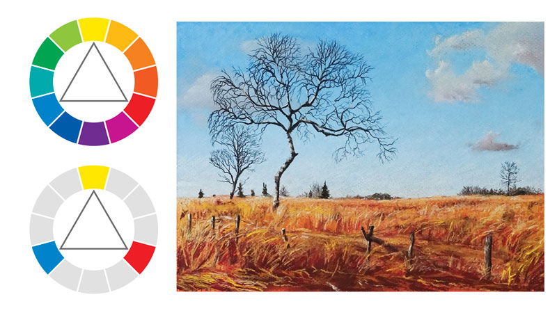
A color triad is a color scheme made up of three colors that are equidistant from each other on the color wheel. For example, the secondary colors of orange, purple, and green can be considered a color triad. The primary colors of red, yellow, and blue is another example of a color triad and this is the direction that I decided go with this work.
By using stronger reds and yellows in the middle ground, I could pull out a color triad without sacrificing the strong contrast provided by a complimentary scheme, thanks to optical mixing. With a little distance from the work, the reds and yellows have the appearance of being orange, which contrasts against the blue of the sky.
Drawing the Foreground
As we work our way closer to the viewer and into the foreground, we can begin to incorporate more of those reds and yellows. Darker values are added with dark browns while highlights are developed with light yellows and Yellow-Ochre.
As we add these colors and develop the grassy field, we should also consider the directional stroking that we use. To create additional interest, strokes are pulled upward and to the right. Not only does this create a sense of movement, but it also helps to create visual rhythm.
Creating Visual Rhythm
Rhythm is created in a visual work through repetition. By repeating marks, colors, shapes, etc., we create a more interesting work. Rhythm is a principle of art.
In this case, by pulling up strokes and tilting them slightly to the right, a sense of visual rhythm is created. When analyzing subjects, we can often find opportunities to exploit rhythm and include it in our works. Simply look for any elements that repeat. When you see a pattern, you may chose to exploit it and exaggerate it in your drawing.
Adding the Fence Posts
The remnants of an old fence are present in the composition. To add the posts, we’ll draw in the basic shape using the same dark brown that we used for the initial structure of the trees. To add a sense of form, we’ll add a light grayish brown on the left side to indicate a highlight.
Underneath the posts, we can continue to pull up strokes for grass blades that overlap.
Detailing the Trees
We’ll begin by adding a few highlights the left side of the dominant tree with the same light grayish brown that we used for the highlights on the fence posts.
Then, we’re ready to develop the details. Since control is very important here, we’ll switch over to using pastel pencils.
With a sharp black pastel pencil, we’ll patiently add the tree branches. These marks are pulled outward from the larger branches and trunk that we developed earlier.
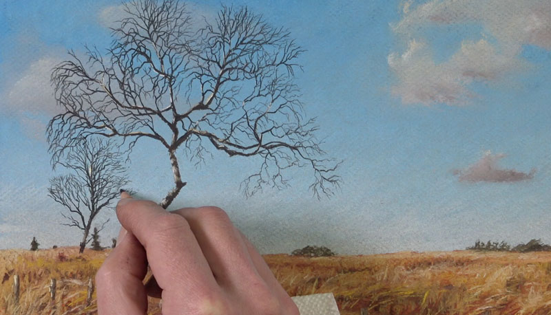
When drawing tree branches like these, it’s suggested to add more than you may think you need, but less than what is observed. If you add too few, the drawing may feel cartoonish, but if you add too many – the drawing may become too busy. It’s suggested to work in batches. Stop and analyze as you go. Remember, you can always add more branches, but removing branches may prove to be difficult.
See also: Painting Small Details – Tree Branches
Not all of the branches that we add are solid black. We’ll also add a few highlights with a white pastel pencil.
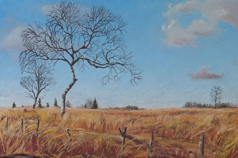
Finishing the Landscape With Patels
Our landscape is now almost complete, we just need to add a few finishing touches. We’ll add a few more indications of the trees along the distant horizon line using a Van Dyke Brown pastel pencil. We’ll also add a touch of shadow with the black pastel pencil.
A third tree is added on the right side of the composition. This additional tree helps to anchor the composition and adds a bit of balance. The black pastel pencil is used for its structure and a touch of white is added for a highlight.
Contrast is enhanced on the fence post by using the black pastel pencil to strengthen the shadows. Using just a few lines, a hint of the barbed wire is added with the black pastel pencil, connecting a few of the fence posts.
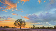
Conclusion
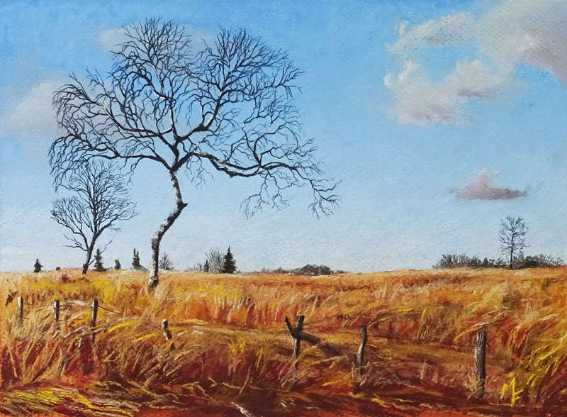
Now our simple pastel landscape is complete. Even with a simple subject as we have here, there are plenty of opportunities to create an interesting pastel drawing. In this case, we exaggerated colors in order to create a harmonious, primary color scheme. We also developed rhythm and movement by repeating strokes in the grassy field. Our completed image is bright, lively, and full of interest.
If so, join over 36,000 others that receive our newsletter with new drawing and painting lessons. Plus, check out three of our course videos and ebooks for free.

Lesson Discussion
Comments are closed.
So beautiful! I am inspired. 😀