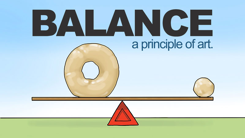
We all have our own inherent sense of visual balance as well. The way we landscape our lawns or arrange our furniture or compose our artwork reveal our feelings about visual balance. All people have similar feelings about what makes an artwork balanced or imbalanced, with small, personal variations of course.
Balance is one of the principles of art and design. The principles differ from the elements of art. The elements of art are the basic components that make up a work of art…line, shape, form, value, texture, space, and color. The principles deal with how the elements of art are arranged in a work of art. In essence, the principles of art deal heavily with composition.
See also: 5 Tips for Better Compositions
Balance refers to the overall distribution of visual weight in a composition. A well-balanced composition feels comfortable to look at.
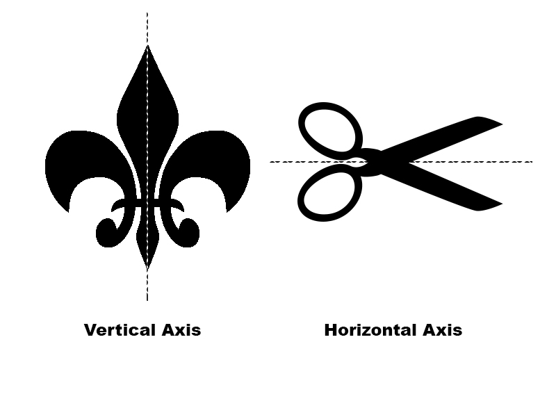
Each visual component of an artwork has visual weight. Different than actual weight, visual weight is not measured using a scale but must be observed instead. Visual weight balances around an artwork’s axis. The axis may be vertical, in which visual elements balance on both sides of the axis. Artworks may also balance around a horizontal axis, in which visual elements balance from top to bottom.
There are three types of balance: symmetric, asymmetric and radial. Symmetric and radially balanced artworks use formal balance. Asymmetric balance is quite different and is also referred to as informal balance. Let’s take a closer look at the three types of balance and then consider how to manage the feeling of balance in art.
Symmetrical Balance
Symmetry is a type of formal balance in which two halves of an artwork mirror each other. This type of balance is familiar and common. The human body is balanced symmetrically as is our planet, our cars, clothes, furniture etc. Symmetry imposes a strong sense of order and stability on both the composition and the subject.
Approximate symmetry is just symmetry with a touch of variety. When using approximate symmetry, elements on either side of a compositional axis are similar in size and shape and number but are not mirror images of one another.
Radial Balance
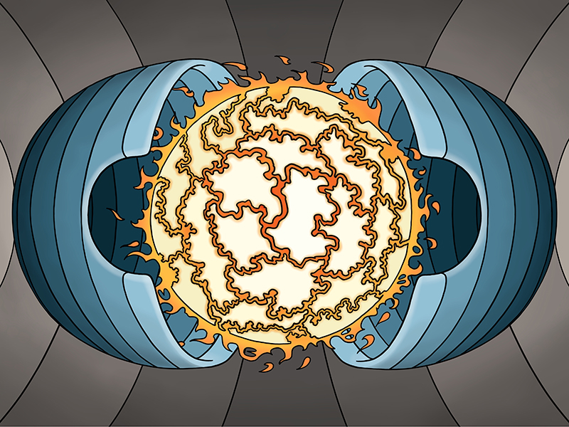
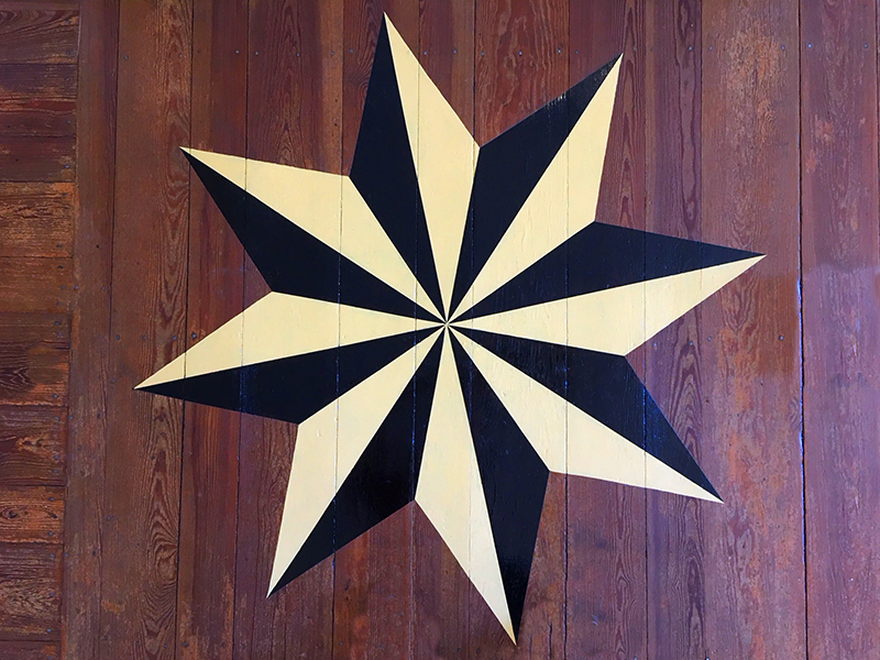
Radial balance is symmetry in several directions. Visual elements are arranged around a central point in the composition, like the spokes on a wagon wheel. Often, radially balanced designs are circular. Other shapes lend themselves to radial balance as well – squares, hexagons, octagons, stars, etc.
In nature, we most easily observe radial balance in the form of flowers.
Radial balance is prevalent in human design as well; car wheels, architectural domes, clocks, man-hole covers, a compass, etc.
Asymmetric Balance
Asymmetry is informal and seems less organized than symmetry. The two halves of a balanced asymmetric artwork do not look the same but have similar visual weights. Asymmetric balance is more subjective than both symmetry and radial symmetry. Asymmetry allows for more variety in a composition than symmetrically balanced designs. It provides the same “comfortable” feeling as symmetry without using like elements on each side of a central axis.
Many artists appreciate asymmetric balance because it feels less rigid and more realistic than symmetric balance. Although symmetry makes clear the artist’s desire to present a visually balanced image, asymmetric balance does not happen by accident, but instead requires planning and intention.
How to Create Balance in Art
Below are four variables that impact the balance of a composition. What follows is not an exhaustive collection of balancing forces, but these variables may serve as a starting point for exploring balance in your own art.
1. Size
Larger objects have more visual weight than smaller objects, all else being equal. If two objects of different sizes need to balance one another then the smaller object will need a boost in visual weight. This visual weight may come in the form of additional smaller objects or perhaps ample negative space around the object.
2. Color
Bright colors are visually heavier than dull colors. Beyond that, if two colors are of similar intensity, then the warmer of the two colors has more visual weight.
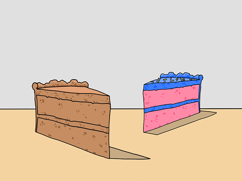
Consider the image below. The slice of cake on the left is closer and, therefore, larger in appearance. Both slices of cake are similarly arranged relative to the imaginary vertical axis that divides the composition. The large slice should outweigh the small slice except for the color. The brighter colors make up for the difference in size so the two slices have the same visual weight.
3. Position
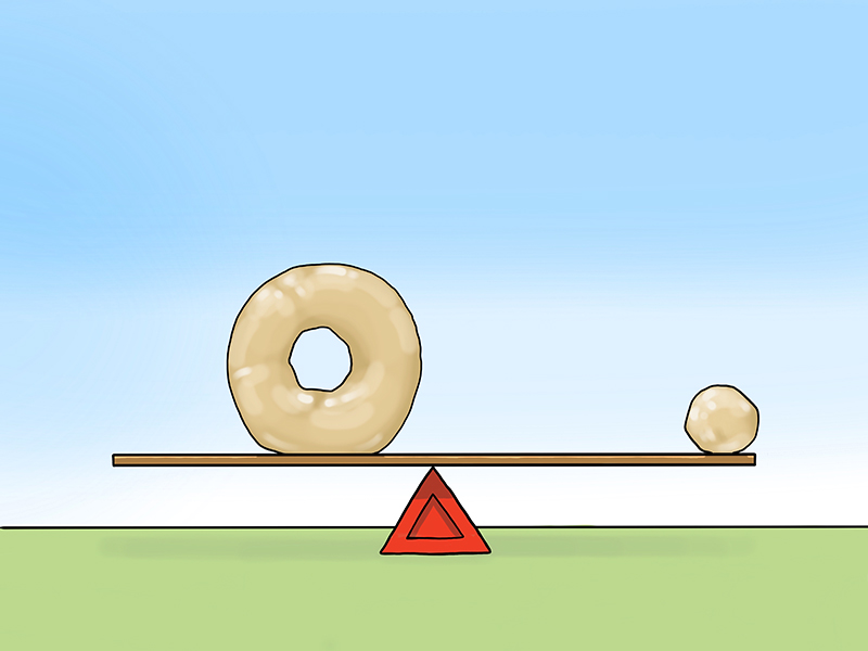
In at least one way, the two-dimensional arrangement of visual components is informed by our real-world experiences with weight and physics. Consider the playground see-saw. If two children on either end of a see-saw are the same weight, then they will balance each other.
However, if one child is larger than the other, then the larger child will need to move towards the center to balance the smaller one. It is the same in art. So, the closer a visual component is to the edge of a composition, the heavier it becomes visually. Likewise, the closer a component is to the center, the lighter it becomes.
Look at the image below. See how the smaller doughnut hole on the far right visually balances the larger doughnut just left of center.
It’s worth mentioning that even as a visual component becomes lighter near the center, it’s perceived importance may increase due to the more central location.
4. Texture and Pattern
Texture and pattern are similar concepts in art. Each is defined buy frequent changes in contrast, usually created through value (the lightness or darkness of a color). Texture and pattern add visual weight. You can tweak the balancing forces in art by either adding or reducing the amount of texture and pattern in a given area.
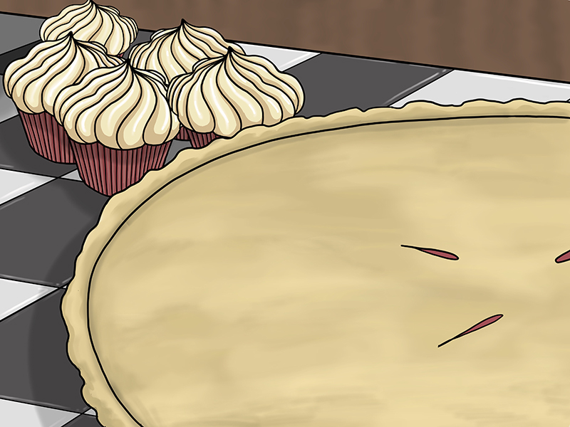
A large area of smooth, even values will balance with a small area of pattern/texture. Look at the asymmetric image below. The pie and the cupcakes are both rendered in colors of low intensity. Therefore, color is not a factor in their comparative visual weights. The size of the pie makes it visually heavy. The cupcakes and checkered surface balance the pie because their patterns add enough visual weight.
Conclusion
Once you are consistently creating balanced compositions you should consider what balance communicates to your audience. An imbalanced composition is not always wrong. Imbalance creates an unnerving feeling in the viewer that is sometimes appropriate when representing a frightening or dangerous concept such as war or uncertainty.
It doesn’t matter whether you prefer symmetric or asymmetric balance. Each has its own purpose in composing your artworks. What matters most is that you purposefully manage and use balance in your art, choosing the best form of balance based on your subject matter and message.
If so, join over 36,000 others that receive our newsletter with new drawing and painting lessons. Plus, check out three of our course videos and ebooks for free.
Lesson Discussion
Comments are closed.




Thousand thanks,Matt! I really appreciate your precious knowledge and teaching experience! Brilliant! Well done!
(Irina, Russia)
these articles by Ashley Hirst are really first rate and very easy to understand