In a story, the main character, sometimes referred to as the protagonist, is not hard to identify. In a book, the protagonist usually has the most dialogue while in a movie, the most screen-time. However, there is no dialogue in a painting and every pictorial element gets the same amount of screen time, or rather, “canvas” time.
So how do we, as artists, designate the main character in a painting? How do we get our audience to look where we want them to look?
The answer to those questions is emphasis. Emphasis is the principle of art that helps the audience put the story of a painting together in their own minds.
Any object or area of emphasis is called a focal point. The focal point is meant to be the part of an artwork to which the viewer’s eyes are first attracted. Artworks can have multiple focal points. The degree to which the focal points stand out determines the order in which the viewer notices them.

In the remainder of this article, we’ll explore a variety of ways to create emphasis.
Contrast
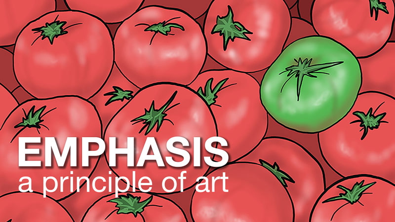
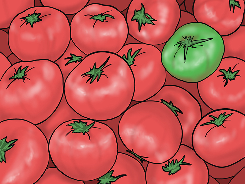
Take a look at the image of tomatoes below. The green tomato is mixed into the red tomatoes but does not get lost in the group. It is clearly the focal point because of a strong contrast of color.
Three elements of art: color, value, and texture, are useful in creating emphasis through contrast. Using texture in only one spot or placing a light object in an otherwise dark environment will attract the attention of the viewer.
Let’s take a closer look a how color creates emphasis.
Bright color is usually attractive. Road signs and traffic lights are brightly colored for a reason – to get our attention. Below are three specific ways you can use contrast to add emphasize in your own art.
- Complementary Colors
- Isolated Color
- Absent Color
Complementary Colors
Complementary colors are arranged across from one another on the color wheel. They are far apart. Compliments are as different in hue as possible. Examples include red/green, blue/orange, and yellow/violet.
Often complementary colors are used to organize an entire composition. They can also attract the viewer’s eyes to a focal point when place alongside one other. Complementary color relationships are visually, the loudest color relationship. The expression, “the squeaky wheel gets the grease” indicates that loudness draws attention – even if the loud “noise” is visual in nature.
Isolated Color
Isolated color is a color found in only one spot in a composition. An object with isolated color stands out because it does not harmonize with the rest of the color palette. Since this color is only found in one location, it draws our eyes to it.
Absent color
Similar to isolated color but more severe, a single-color note in an otherwise colorless artwork draws our eyes to it. There will be no doubt in the audiences’ mind what the artist means to emphasize if only one object is in color.
Isolation
Isolation is a straight-forward way to ensure the “main character” of a picture is noticed. Place an object of emphasis outside of a grouping and you will force your audience to take notice of it.
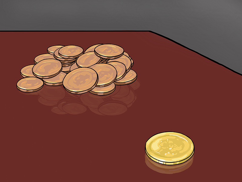
Look at the drawing of coins below. The large pile of coins on the left may be worth more than the single coin on the right, but the coin on the right seems more important simply because it is isolated from the rest.
Location
Using a bulls-eye as an example, the location of a compositional element contributes to our feelings about emphasis as well. The bulls-eye on a dart board is in the center for good reason. All things being equal, a viewer will look at the center of a composition first. Placing important objects or people near the center of a canvas will add to their emphasis.
A word of caution – Important objects should be placed near, but not directly in the center. If your focal point is in the exact center of a composition you will greatly de-emphasis everything else in the composition such that the viewer may not consider the entirety of the image.
Convergence
Lines and edges can work like arrows to indicate a focal point. Not only obvious lines work but implied lines (invisible lines) as well. For example, the direction of a person’s gaze can indicate to the audience where to look next.
Try it yourself. The next time you are standing outside with other people, just stare intently into the sky for a moment and others will begin to follow your gaze with their own.
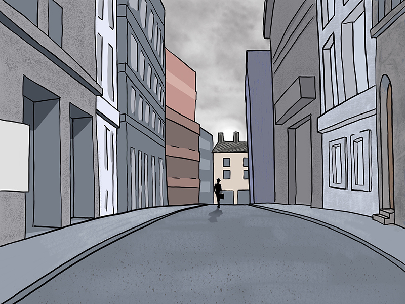
In the drawing below, the architectural features point towards, or converge, at the small figure in the road. Additionally, the figure is located near the center of the composition to help the audience find him.
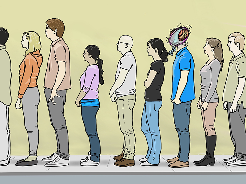
The Unusual
A fun way to create emphasis in a composition is to have one element stand-out because it is so different – a round object among angular shapes, a line of people with one facing the wrong way. Think of it as the “twist” at the end of a movie. If you are changing what the audience expects to something unexpected, then you will create a striking point of emphasis.
Look at the line of people in the illustration below. See how the person with the head of a fly just pops-out and demands your attention.
Level of Rendering
In reality, any one thing is as undeniably real as any other thing. People, trees, cars and buildings all share the same level of “existence”, the same “completeness”. In a painting or drawing however, the artist decides the degree to which various pictorial elements are rendered. Think of it as finished vs. unfinished or tight vs. loose. A sharp/clear area in an otherwise loose composition acts as a focal point.
Conclusion
By using Contrast, Isolation, Location, Convergence, the Unusual and Level of Rendering in your own artwork, you will begin to control how your story unfolds and control how your viewers interact with your art.
If so, join over 36,000 others that receive our newsletter with new drawing and painting lessons. Plus, check out three of our course videos and ebooks for free.