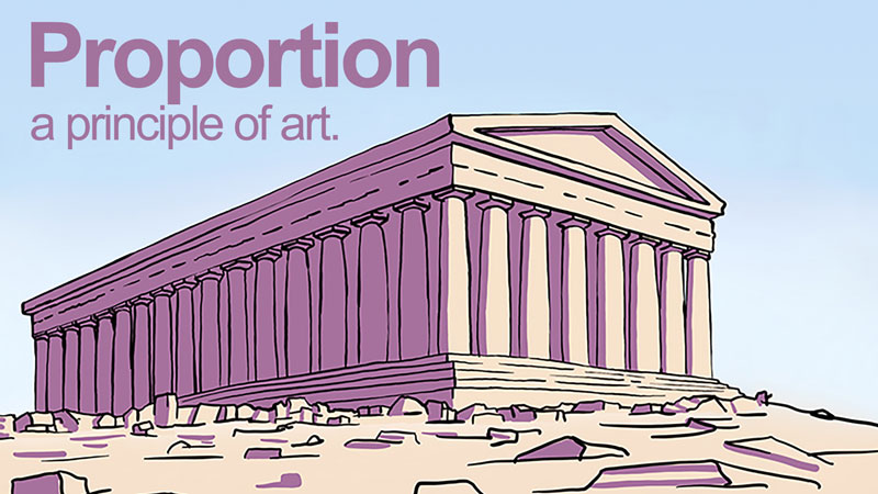
Proportion is largely about the relationship of the size of one element when compared to another. When drawing or painting realistically, proportion is important. If the proportions are incorrect, then the resulting image will look less realistic or abstracted.
Alternatively, artists can use proportion for effect. By manipulating proportion, the artist can make his/her subject seem strong, weak, funny, mysterious, etc. We can exaggerate proportions to emphasize a meaning or an element within the scene. For example, a caricature artist distorts proportion in order to create a stylized image of the subject.
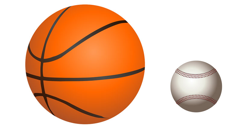
Before going forward, let’s define proportion as it deals with visual art. Proportion does not refer to overall size, but rather the relationship of the sizes of two or more subjects or elements. In art, the size of an element is referred to as scale. For example, a basketball and a baseball are different in scale but share the same in proportion.
Compositional Proportion
For a millennia, artists have sought the most aesthetically pleasing way to arrange visual components in a composition. From two-dimensional artwork to architecture, artists look for proportions (ratios) that please the eye. One popular concept was discovered by the ancient Greek mathematician, Euclid. He called this ratio the Golden Mean (The ratio expressed in numbers: 1.6180:1).
The Golden Mean is often illustrated as a line that has been divided at a particular point. The line is divided into two segments. The relative relationship of the one part is to the second part as the second part is to the whole – sounds confusing, right? The Golden Mean is best understood visually (see the diagram below).
To explain, C is to B as B is to A.
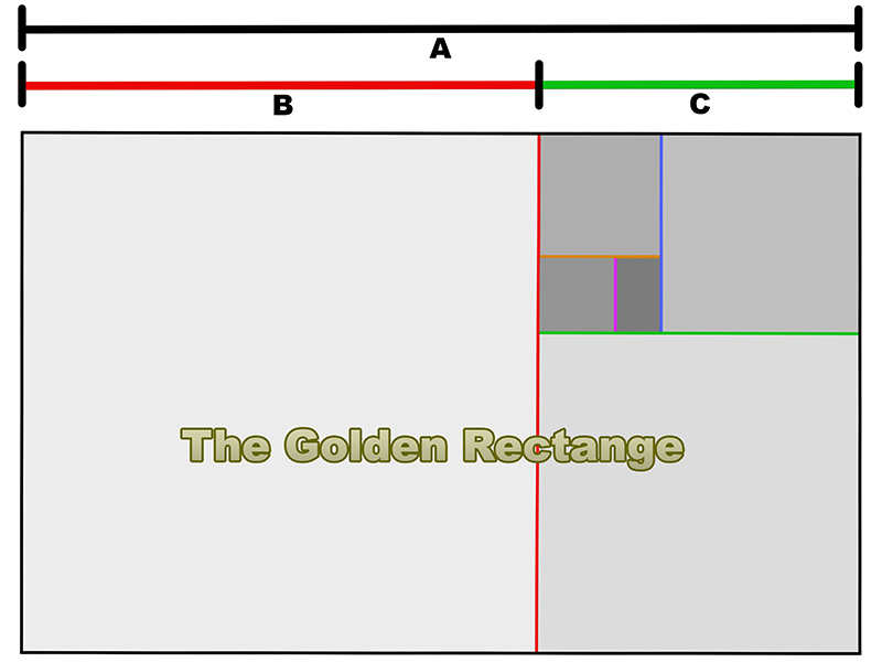
Euclid also applied this ratio to a shape and called it the golden rectangle. The process of dividing the rectangle by the Golden Mean is infinitely repeatable as the illustration demonstrates.
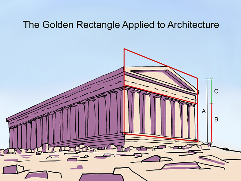
Artists have used the Golden Mean to help them make decisions about the the placement of important visual elements – not only in paintings – but also to direct the size and spacing of architectural elements.
We can use the Golden Mean to create visually pleasing artwork by placing important subjects based on the ratio in our art.
The Vitruvian Man
The Golden Mean appears in nature as well. In the first century, a Roman architect named Vitruvius studied proportion. He believed that the human body was aesthetically, the best example of proportion. He applied human proportions to his own architectural designs.
Building on the concept of a universally aesthetic proportion, Leonard Da Vinci attempted to illustrate the ideal human proportions laid out by Vitruvius centuries before. He called this the “Vitruvian Man”.
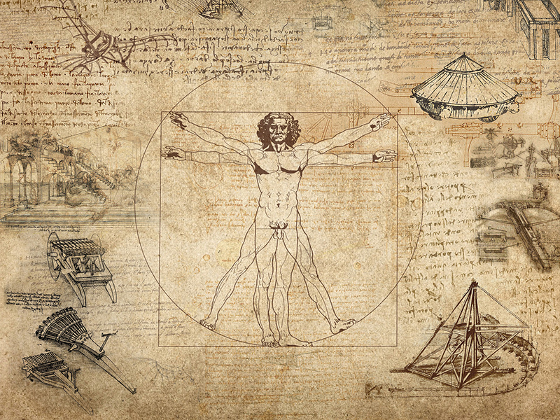
At the time, artists believed that if a perfect proportion were discovered and used, then their art would enjoy a special advantage and lead to certain success.
Proportions of the Human Body
There may or may not be an “ideal” human proportion. Realistic human proportions fall within a narrow range. That range accounts for the variety of observable body types. To be sure, lengths of arms, legs, and torsos may vary greatly but proportional variations are slight. A short individual has short arms and legs while a tall individual has long arms and legs. The arm length to leg length ratio is nearly the same for both persons, even though one is tall and one is short.
In art, we talk about human proportions in relation to the head. The variance in body size is greater than the variance in head size among humans. The average “height to head” ratio for humans is seven and a half to one. This means that the height of a person’s head divides into their overall height 7.5 times on average.
What are your proportions? Measure your head from the top to the chin then divide that measurement into your overall height. For example, I am 68 inches tall and my head is 9 inches tall. 68 divided by 9 is about 7.5. I am 7.5 heads tall, the average human proportion.
See Also: How to Sketch the Human Figure Quickly – Gesture Drawing
Two people can be the same height and have different proportions, just as two people can be different in height but have the same proportions. See the illustration below.

Proportions of the Human Face
Being familiar with the average proportions of the human face is beneficial for two reasons. First, knowing the average proportions helps to prevent the artist from making major mistakes when working from imagination. Second, the average proportions act as a baseline from which to judge individuals when capturing a likeness. How we differ from “average” is what makes us recognizable to one another.
- The human head is generally taller than it is wide.
- The face shape is approximately symmetric around a vertical axis.
- Eyes fall across an imaginary line that divides the head horizontally through the center.
- The bottom of the nose falls across a second imaginary line between the “eye line” and the bottom of the chin.
- The mouth is closer to the nose than the bottom of the chin.
Furthermore, on an average proportioned face, the space between the eyes is as far apart as one eye is wide. The nose is as wide or slightly wider than the space between the eyes and the mouth is as wide as the center of the eyes are far apart. See illustration below.
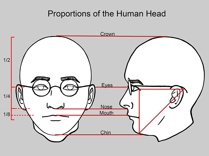
In profile, on an average human, the back of the ear is as far from the outer corner of the eye as the outer corner of the eye is from the bottom of the chin.
See Also: How to Draw a Face – The Basic Proportions of the Head
Unrealistic Proportions
Sometimes exaggerated or distorted proportions are purposefully used to convey a particular meaning or message. By widening, lengthening, shrinking, and bending parts of the human body, the artist can create a feeling or mood around the subject. Let’s consider two historically acclaimed artists and their respective styles – El Greco and Picasso.
Born in Greece, El Greco lived and worked in Spain. A large portion of his artworks are religious in nature. He chose to exaggerate the human figure in nearly all of his paintings. His method of exaggeration was elongation. El Greco felt that by “stretching” the human form, he was directing his audience to look upward and to think about God. His figures certainly stretched toward Heaven. Also, by elongating his subjects, El Greco lent them an otherworldly, spiritual sense of being.
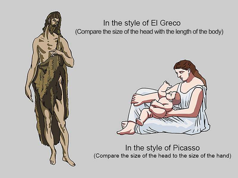
Picasso, also from Spain, worked in and pioneered several styles. In the early 1920s, he made a series of paintings about the relationship between a mother and her child. In this series, figures are thick and heavy looking. Picasso exaggerated the width of the body in comparison to the head, giving his figures a stable, sculptural feeling. This stable feeling communicates a secure, unshakable relationship between a mother and her child – the type of relationship he hoped his children would have with their own mother.
Conclusion
As artists, we can choose to use color or not. We can choose to use emphasis or not. There is, however, no escaping proportion. One simply cannot “leave it out”. Proportion is an important tool for the artist. With accurate proportions, we can create drawings and paintings that are realistic. By manipulating proportion, we can emphasize elements and communicate ideas. Proportion is a powerful principle that should be understood by every artist.
If so, join over 36,000 others that receive our newsletter with new drawing and painting lessons. Plus, check out three of our course videos and ebooks for free.
Lesson Discussion
Comments are closed.


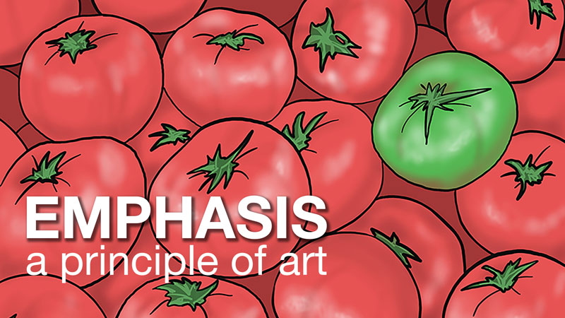


Proportion is the principle of`art that refers to relative size.
It’s true that manipulation proportion of artwork can create a different aura and physical appearance for painting or even sculptures. I don’t have any experience in painting and sculpting but I think proportion gives balance to the subject. I’m gonna be attending a sculpture museum next month for my research, and you just gave me an idea as to what to look for in terms of sculptures physical attributes.