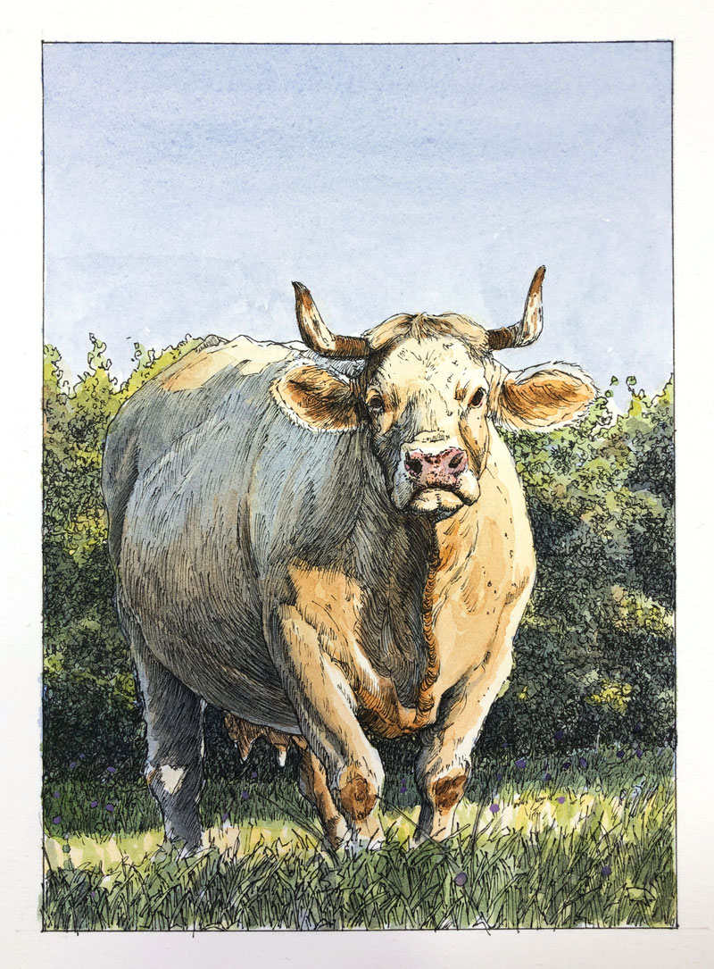
A “Cow” in a Field
In this lesson, we’ll create a drawing / painting of a cow basking in the morning light by combining pen and ink with watercolor. The ink applications will work to define the contours, create textures, and develop much of the value relationships. The watercolor washes will introduce color, expand on the value relationships, and harmonize the image.
Drawing and Painting Materials Used in This Lesson
This image is created with very basic materials. You’ll need a graphite pencil, watercolor paper (hot press), a technical drawing pen, watercolor paints and brushes. Gouache (or opaque watercolor) is used sparingly and is optional.
Here’s a look at the specific materials used to create the art. (The following links are affiliate links which means that I make a small commission if you purchase without an additional cost to you)…
- Graphite Pencil (2H and 6B)
- 140 lb. Hot Press Watercolor Paper (Canson)
- Cotman Watercolors
- Grumbacher Goldenedge Nylon Brushes (All round brushes, sizes 00, 4, and 14)
- Staedtler Technical Drawing Pens (Size .05mm)
- Gouache Paints (optional)
The Photo Reference
We’ll work from a photo reference to complete the image. The reference image comes courtesy of the site, Pixabay.com. Although we’ll stay fairly true to the reference, some deviation is encouraged. In this case, the background is altered and the colors are exaggerated.
We should always strive to create a work of art that is not only different from the reference, but also more interesting.
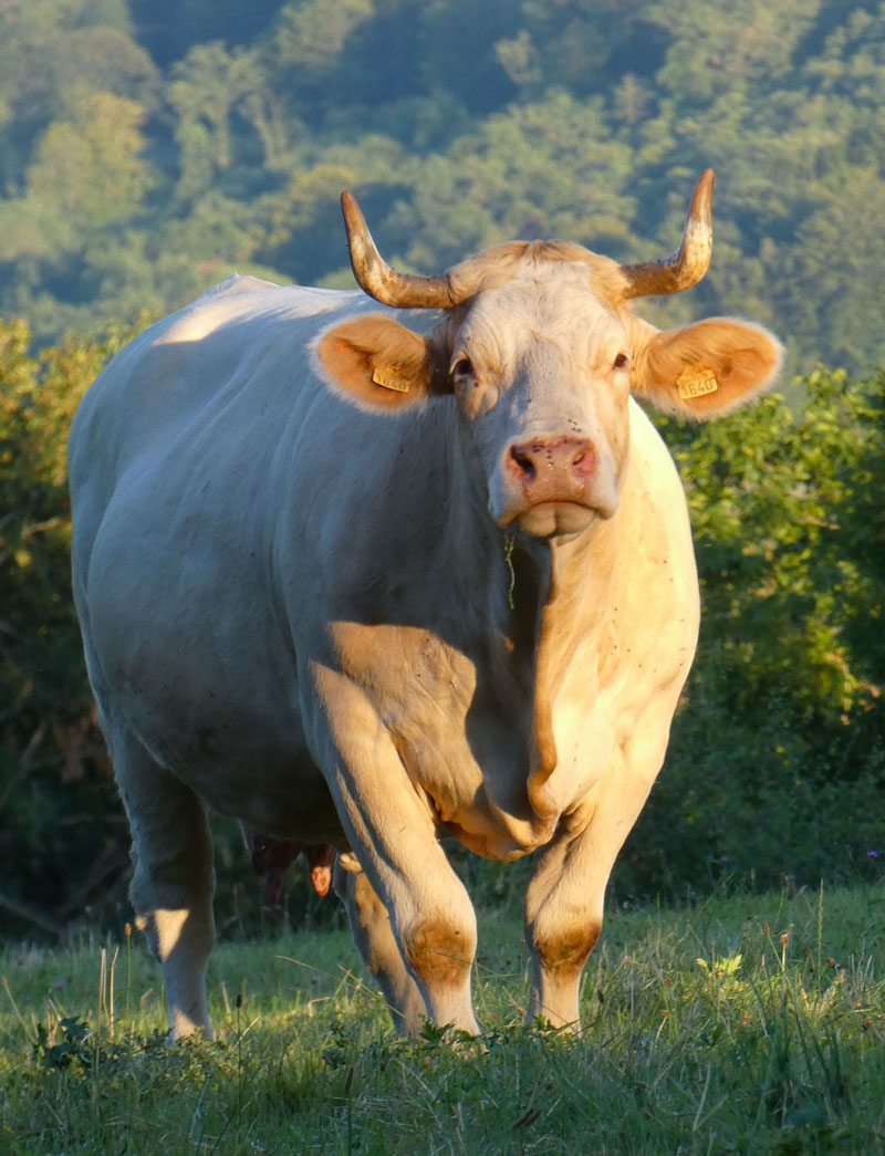 Image by Jan-martijn Verlaan from Pixabay
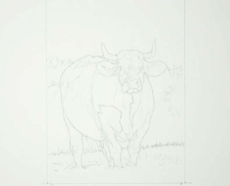
Transferring the Image
To save a bit of time and to ensure accuracy, we’ll use a graphite transfer to get the contour lines in place on the surface. This process is very easy to do and results in a faint reproduction of the contours on the watercolor paper.
To create a transfer:
- Apply soft graphite to the back of the printed photo reference. In this case, I covered the back of the paper with 6B graphite.
- Tape down the photo reference, facing upward, to the watercolor paper.
- Use a sharp tool, like a pencil or pen, to trace the contour lines on the front side of the photo reference. The pressure placed on the pencil transfers the soft graphite on the back to the watercolor paper.
- Once all of the contours have been traced, the photo reference is gently lifted, revealing a light reproduction on the watercolor paper.
After transferring the image, you’ll likely notice that you’ll need to do some additional drawing. You can refine the image and add details that were left out during transfer. If your transfer is too dark, you can use a kneaded eraser to gently lift some of the graphite. The pencil sketch should not be visible in the final image. The ink and watercolor applications should cover most of the graphite marks, but if they’re too dark, they may still be visible in the finished art.
Drawing the Cow with Ink
With the pencil sketch in place, we can begin with applications of ink. We’ll concentrate on developing the contours, textures, and a bit of the value relationships during this stage of the process. For this drawing, a .05mm pen is used exclusively.
You may begin with ink applications anywhere that feels comfortable to you. In this case, we’ll begin with the head of the cow and work outward from there.
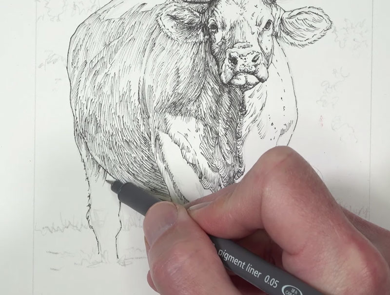
When working with pen and ink, the use of line is clearly important. Not only will we use line to create the outlines (contours), but also to develop the textures, values, and to communicate the form.
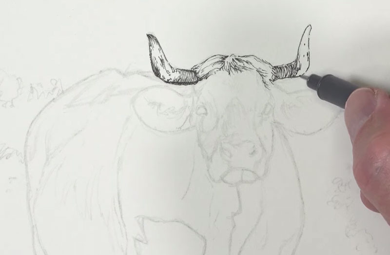
The directional strokes that are made with the pen can be used to communicate the form. Lines should flow around the form of the subject, changing direction as the form changes in space. We can see this concept at work on the horns. The line curves slightly since the horns also curve in space. This concept is referred to as “cross contour lines”.
See also: Cross Contour Lines
We’ll use mostly hatching in this drawing. Cross hatching is used only in a few areas to make the values slightly darker. Since watercolor applications are to follow, we should be careful not to push the values too dark, too quickly.
Working downward from the horns, we’ll next address the rest of the head. Again, directional stroking is important. Strokes are pulled in the same direction as the hair grows, changing direction according to the form of the face. Our goal here is to develop the shadows while communicating the textures and the form.
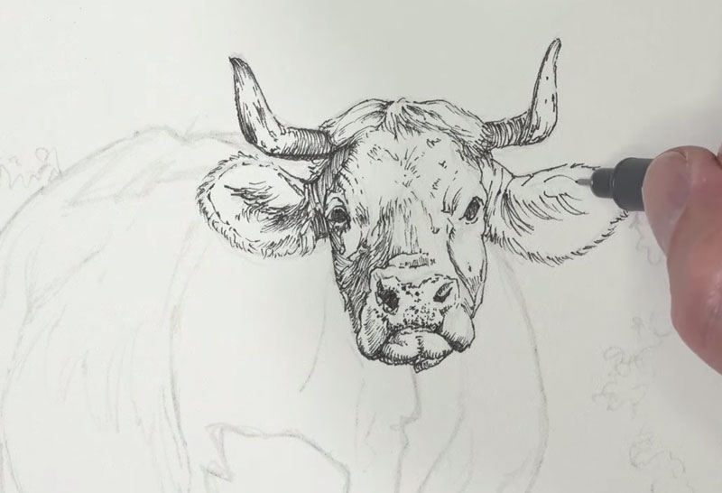
Even in the darkest areas of the eyes and the shadows within the nostrils, we’ll use hatching. Allowing a few specks of the paper to show through will create a more natural appearance as a flat area of black will make the drawing appear unnatural.
From the head, we’ll continue to work outward, next addressing the body. We’ll first define the contour lines before adding hatching for the shadows. In areas where the tones are darker, a denser concentration of marks are used. In areas where the values are lighter, more space is left between marks.
Again we’ll consider the direction of the strokes we make, allowing the stroke to curve around the body of the cow.
The light in this scene is strong, producing defined edges of light and dark. This strong light is reflected in our drawing.
The light source originates from the right and from a low angle. This produces strong highlights on the right and upper portion of the cow and strong shadows on the left. Even with this considered, we’ll still see a few areas of darker tone on the right side of the body. In these locations, we’ll mostly concentrate on drawing the textures, but also include the smaller, less frequent areas of shadows.
Once the body is complete, we’ll next turn our attention to developing the background and grassy field. We’ll begin with the field. First we’ll define the contour and then begin the process of drawing in the texture.
For the upper portion, strokes are pulled upward as the grass grows. We should include variety in the mark here, changing the direction slightly with each stroke. We can also create a bit of variety in the value as well, concentrating the marks in areas.
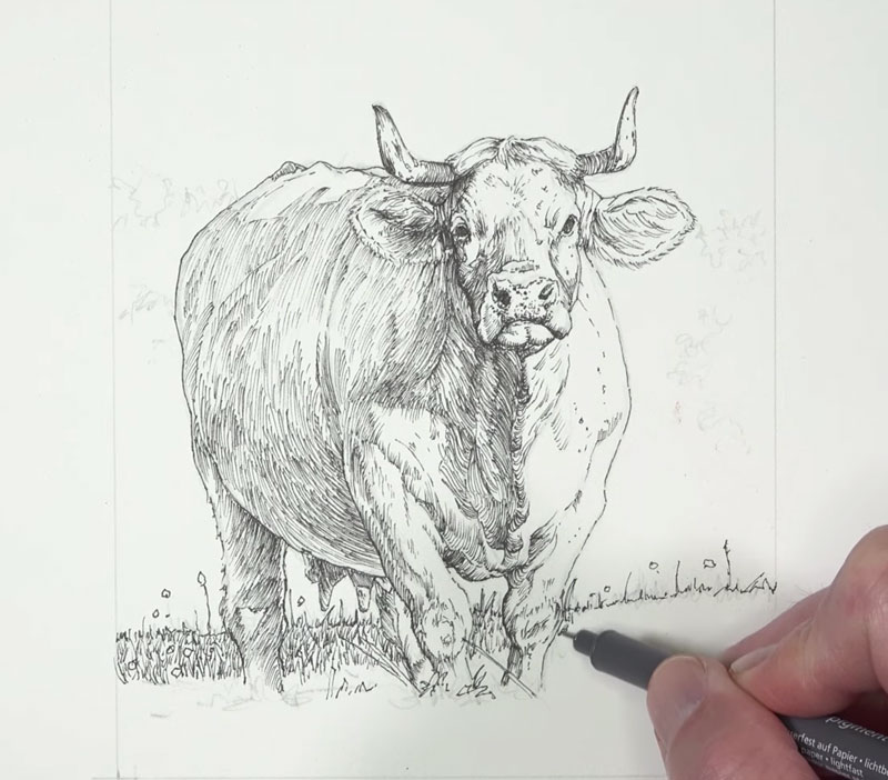
In the lower portion, underneath the highlight, the shapes of the grass blades are visible. For this section, we’ll define some of the grass blades with contour lines, instead of relying on the line alone. We’ll also include a few circular shapes for flowers.
Once we’ve filled in the textures of the grass in the foreground, we’ll next address the bushes in the background. Here again, we’ll define the contours first.
Then, using squiggly lines, we can begin creating the illusion of the textures of the bushes and distant trees. By concentrating these marks, we can develop areas of shadow while preserving the texture. For the lighter areas, less concentrated marks are applied.
See also: How to Draw Trees
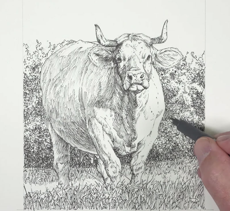
Once we’ve developed the textures of the background bushes and the grassy field of the foreground, our pen and ink drawing of the cow is complete.
We’re now ready to move on to the watercolor applications. But before doing so, you may erase any remaining graphite marks with a kneaded eraser.
Painting the Cow with Watercolor
While our pen and ink drawing could stand on its own as a completed image, we’ll now make it more interesting by introducing color. The watercolor applications that follow will not only add color, but also work to enhance the relationships between values.
We’ll begin by adding color to the sky and the shadows using the same mixed color. Ultramarine, with a hint of Payne’s Gray (to mute the intensity), is applied to the sky from the top down.
Consistent, horizontal strokes are applied to the sky to create an even application. A liberal amount of water is used in order to produce a less intense wash.
This same mixture is applied to the shadows in the background and foreground with the same intensity.
For the shadows on the body of the cow, we’ll use a slightly different blue. Instead of Ultramarine, we’ll apply a bit of Cobalt Blue.
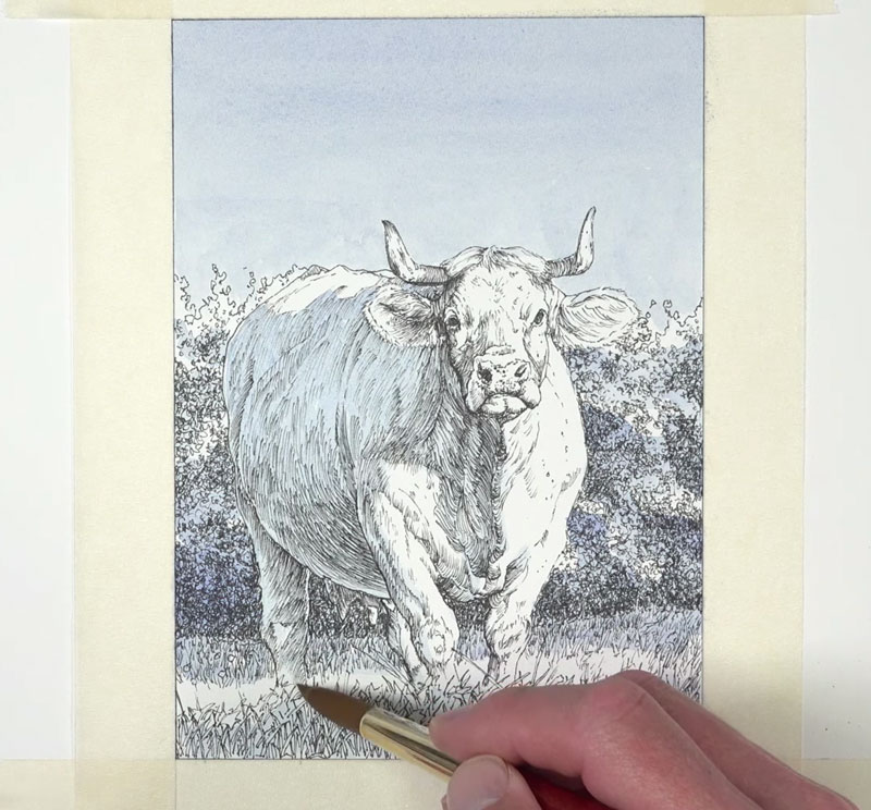
The shadows in this image are cool, but much of the scene is warm. So once we’ve established an underpainting of cooler undertones, we can begin adding some warmth.
A mixture of Yellow Ochre with a touch of Burnt Sienna and Burnt Umber is applied to much of the body as well as the highlighted sections of the background and foreground.
Then, with a heavier concentration of Burnt Sienna, we can begin adding the “oranges”, starting with the right ear.
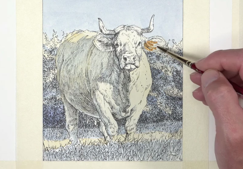
As we continue adding the warmer oranges, we’ll also start to introduce darker values. Values are slightly darkened by adding Burnt Umber to Burnt Sienna. For the darkest areas of shadow, Payne’s Gray is used.
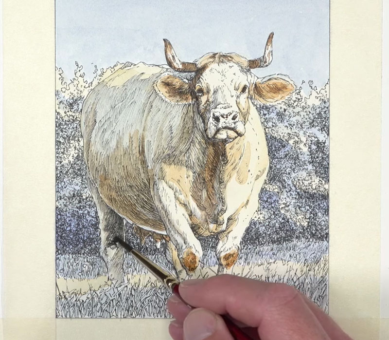
We’ll continue to gradually darken the value in the shadowed areas on the body. Multiple, translucent layers of progressively darker tones are added.

We can also add complexity to the color as needed. In this case, another layer of Cobalt Blue is added, strengthening the color in the shadow.
As the darker values are strengthened, the contrast increases. While we do want strong contrast in this image, we can push it too far, causing us to lose some of the color in the highlights. We can revisit these areas with a bit of Yellow Ochre and Burnt Sienna, slightly darkening the tone and increasing the color.
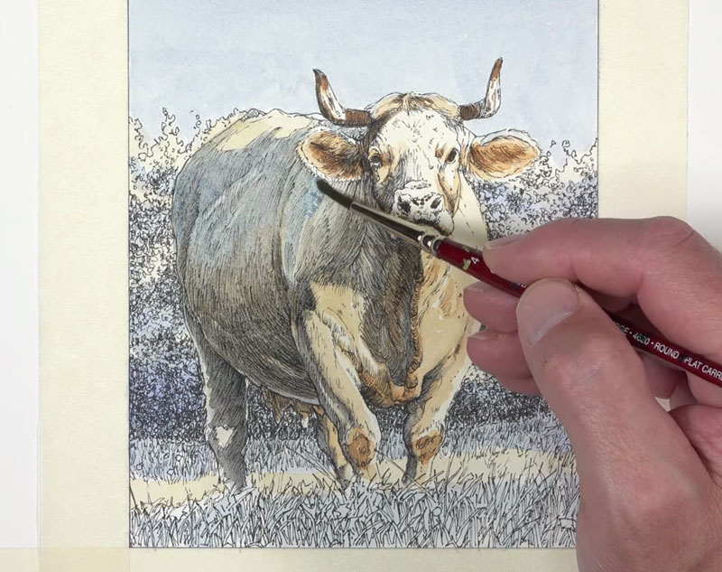
For the snout, a mixture of Cadmium Red Medium and Purple Lake is lightly washed.
Now we’re ready to add color to the distant trees, bushes, and grassy field. A light mixture of Sap Green, Cobalt Blue, Yellow Ochre, and Burnt Sienna is applied first.
Then to darken the shadows, Payne’s Gray is layered over the top.
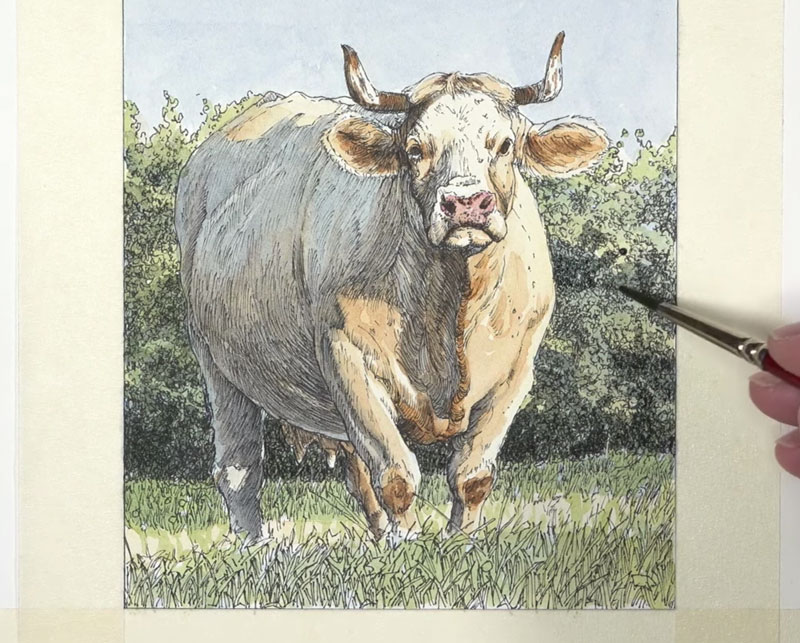
After the initial watercolor washes are applied to the background and foreground, we can enhance the colors. A bit of Cadmium Yellow is applied to the highlights along with touches of Burnt Sienna throughout.
Once the values and colors have been applied to the background and foreground, we see that we need to enhance the value relationships on the cow. We’ll return to the body, strengthening the shadows with a few translucent washes.
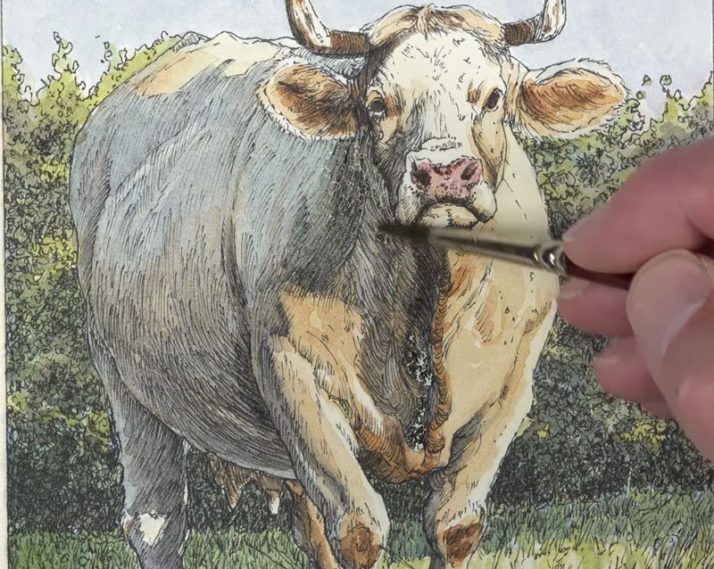
After adding a few purple flowers with gouache, the painting is now complete and we can remove the masking tape from the surface. To ensure that the tape doesn’t tear the paper, we can pull the tape away from the art at a 90˚ angle.
See also: Prevent Tape from Tearing Your Paper
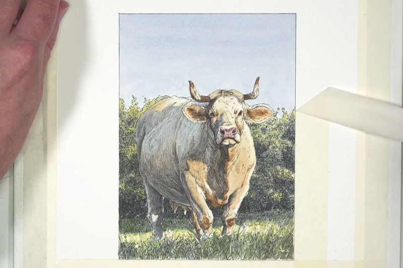
Here’s another look at our drawing / painting of a cow in a field with pen and ink and watercolor…
Conclusion
Although this painting is small, it still requires patience. You must trust the process and not get discouraged along the way. As you can see, the work goes through many stages. If you’re patient, and allow the work to mature, then you will be rewarded in the end with wonderful work of art.
If so, join over 36,000 others that receive our newsletter with new drawing and painting lessons. Plus, check out three of our course videos and ebooks for free.