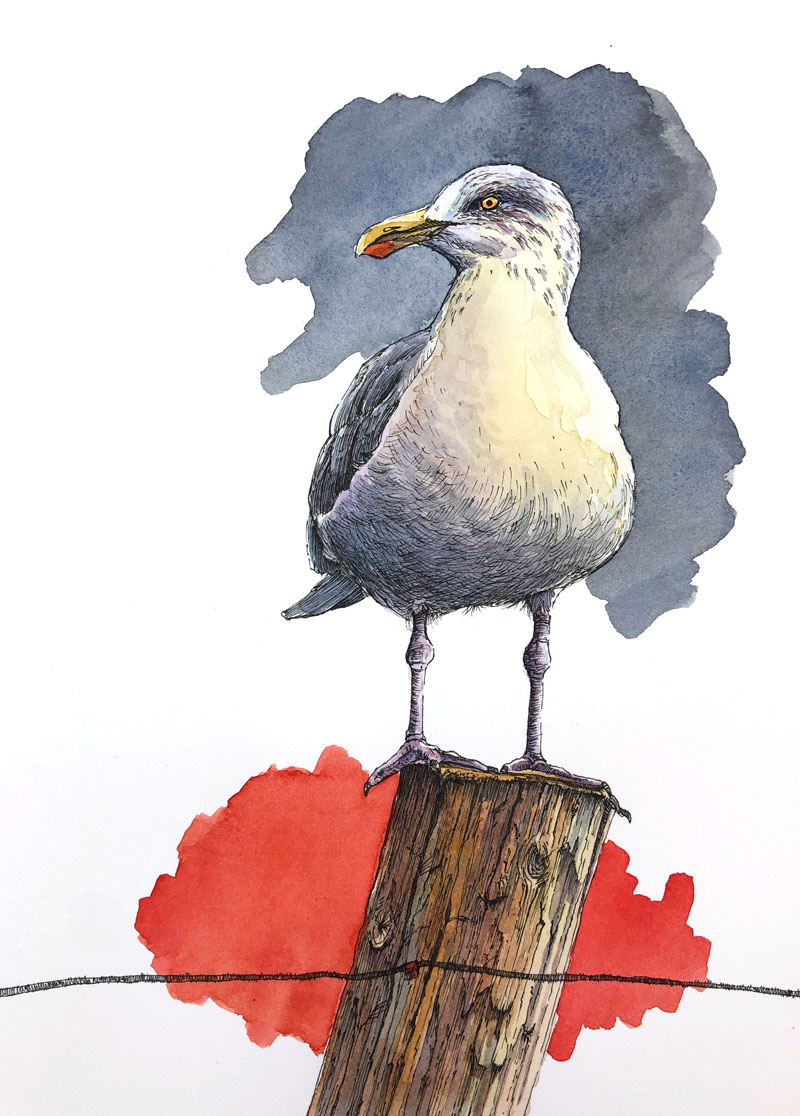
Combine Pen and Ink with Watercolor
In this lesson, we’ll combine pen and ink applications with watercolor washes to develop a colorful image of a seagull. We’ll keep the pen and ink applications rather minimal in this drawing and allow the watercolor washes to add pops of color and interest. We’ll also add a few design elements for additional interest and color contrast.
Materials For This Lesson
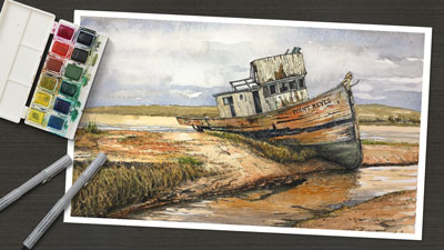
One of the more attractive benefits of working with line and wash is that you don’t need a lot of materials. A pen (with ink), a surface to work on, a few brushes, watercolor paints, and water is really all you need. All of the these materials fit neatly inside of a drawer and are easy to take with you and use on location.
This painting was created in the studio, but the same basic materials were used. Here are the specific materials that were used to complete the painting (the following links are affiliate links which means that I make a small commission if you purchase without an additional cost to you)…
- 2H Graphite Pencil
- 140 lb. Hot Press Watercolor Paper (Canson)
- Cotman Watercolors
- Grumbacher Goldenedge Nylon Brushes (All round brushes, sizes 00, 4, and 14)
- Staedtler Technical Drawing Pens (Size .05mm)
The Photo Reference
Like is the case with most drawings or paintings of animals, a photo reference was used to complete the image. In this case, the photo reference comes from Pixabay.com.
Many times, I will edit or alter the photo reference before creating the drawing. In this case, I used the photo reference as it is without any alteration. But as you can see from the finished painting, I did take some artistic liberties during the painting process.
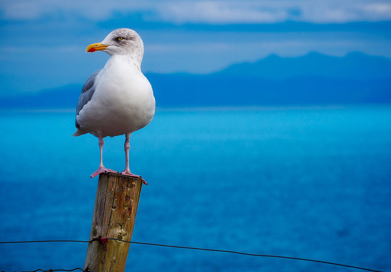 Image by David Mark from Pixabay
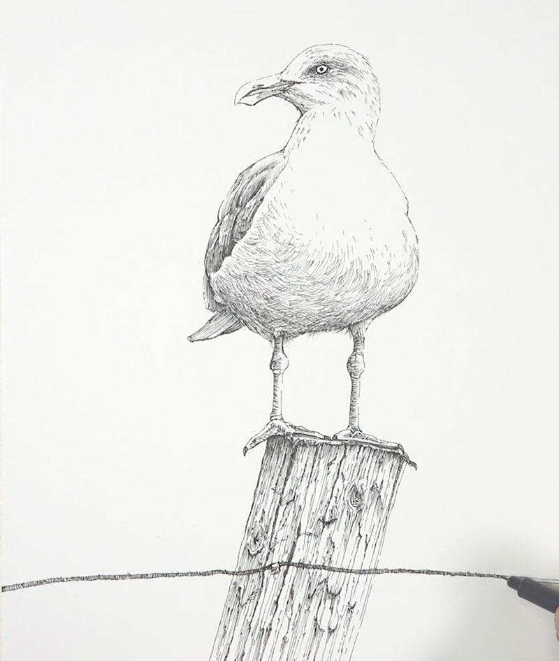
The Pencil Sketch
We’ll begin with a light pencil sketch of the seagull using a harder, but lighter 2H graphite pencil on 140 lb. watercolor paper. Be careful not to apply too much pressure on the pencil in these early stages. Placing heavy pressure on the pencil may result in small indentations in the soft paper which could be visible in the completed painting.
Our initial sketch is created by first concentrating on basic shapes. We can break down any subject that we wish to draw by identifying and drawing the most basic shapes that we see. This approach to drawing is called construction.
See also: Drawing Basics – Construction
When we approach drawing in this manner, we can draw any subject that we wish. In this case, our seagull is quite simple and the shapes used to draw it are simple as well. As these shapes are drawn, several loose, light lines are used.
After our initial shapes are in place, we can refine the contour lines and add a few details. Here’s a look at the pencil sketch (the image has been darkened to see the lines)…
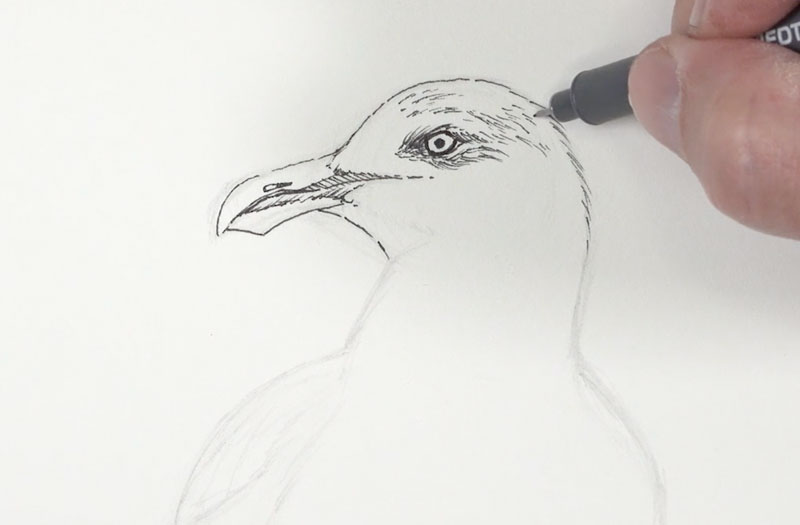
Drawing with Ink
When combining pen and ink with watercolor, there are two approaches you can take. The first option is to develop the pen and ink drawing first and then apply the watercolor over the drawing. The second approach is to develop the watercolor painting first and then create the pen and ink drawing over the top.
Either approach is acceptable and both approaches can lead to a successful result. Experiment with both approaches and go with the one that feels the most comfortable to you.
In most cases, I prefer to develop the ink drawing before adding the watercolor. This allows me to focus on the edges, textures, and values in one stage and the color in the second stage. This is the approach I took when developing this painting.
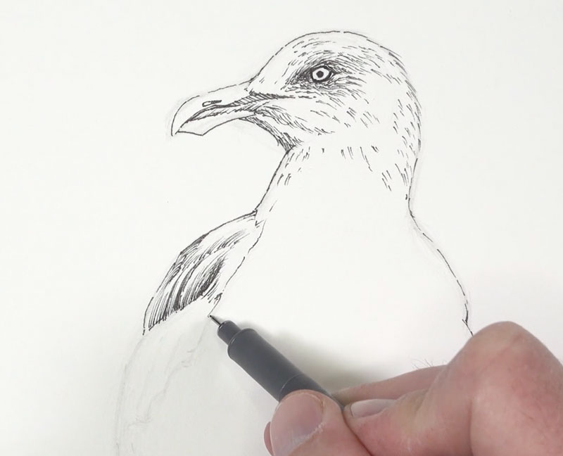
You can begin anywhere on the surface with your ink applications. In this case, we’ll begin with the head and work our way down. Using looser lines, we’ll define the contours of the head and a few of the details with a .05mm pen. In the locations of darkest value around the eye, a few textural marks are applied. Strokes are pulled in this section so that they flow with the direction that the feathers are growing. This helps to describe the texture as well as darken the tone.
From the head, we’ll simply begin working our way down to the body. In areas where the values are darker, a heavier concentration of marks are applied. We can see this happening on the darker feathers on the left side of the body.
See also: Pen and Ink Techniques
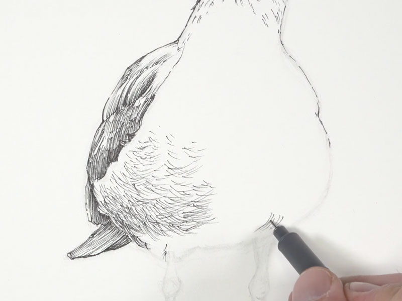
Here, mostly hatching is applied using strokes that flow in the same direction. These lines are fairly loose. It’s okay to make marks that aren’t overly controlled since this adds character and interest to your drawing.
Value is the darkness or lightness of color. It is the value relationships in a drawing or painting that describe the form and texture of the subject to the viewer. In this scene, our light source originates from the upper right. This produces an area of core shadow on the belly of the bird that is slightly stronger on the left side.
To communicate this shadow, we’ll use a series of cross hatched marks. These strokes curve slightly around the form of the body. So, not only do these strokes define the shadow, but they also help to communicate the texture of the feathers.
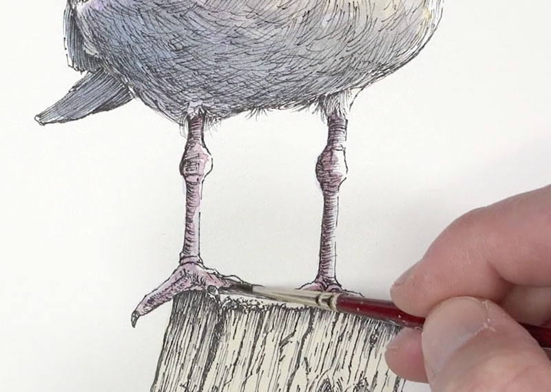
After gradually darkening the areas of shadow under the body with additional strokes, we’ll work our way down to the legs.
Here, we’ll apply mostly horizontal strokes that flow around the form of the each leg, concentrating the strokes where the shadows are stronger on the left side and right underneath the body.
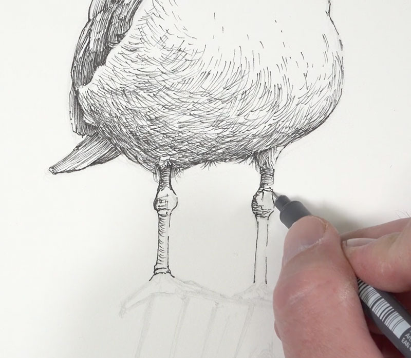
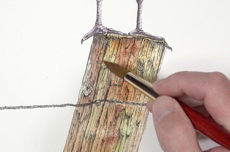
After adding a bit of texture to the feet and talons, we’ll continue working down the picture plane to the wooden post. Just as before, we’ll start by defining the contours and then dive into the texture and value.
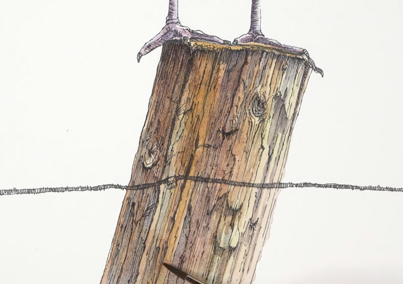
To create the illusion of the texture of wood, a variety of strokes are pulled downward at the same angle of the contours. However, some of the these lines are allowed to meander and a few are applied horizontally. Details, such as open cracks and knots, are also developed using a variety of directional stroking.
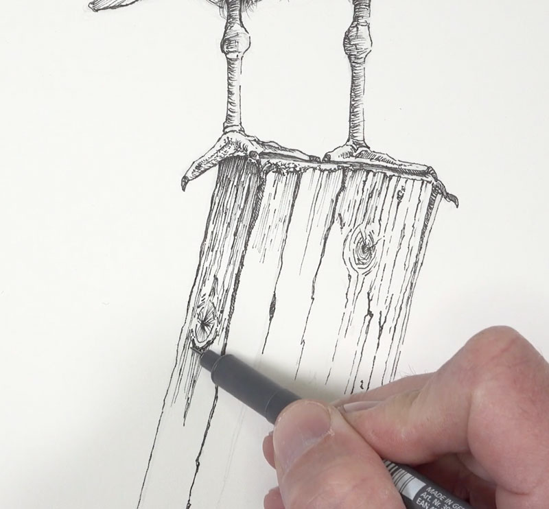
We’ll continue to add strokes to indicate small imperfections and details in the texture. Concentrated marks are added throughout, especially right underneath the top edge of the post and underneath the feet.
To complete the pen and ink drawing, a portion of the fence wire is added. This element helps to break up and contrast the vertical nature of the composition.
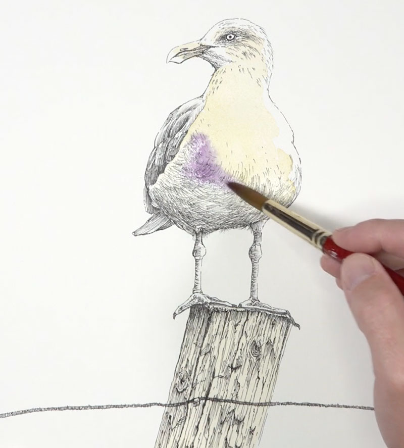
Watercolor Washes
With our pen and ink drawing in place, it’s time to add our color with watercolor. We’ll bring out a little more color than what is observed in photo reference.
We’ll start with a light wash of a Yellow Ochre with Cadmium Yellow Pale Hue over the breast, portions of the head, and the entire fence post. Even though the breast of the seagull is “white”, this color adds warmth and makes the white feel more natural.
While this application is still wet, a bit of blue-purple, mixed by combining Purple Lake and Intense Blue is applied to the shadowed locations on the underside of the body and around the eye.
Since these applications are applied wet, some blending occurs. This results in a natural transition from the cooler shadows and the warmer highlights.
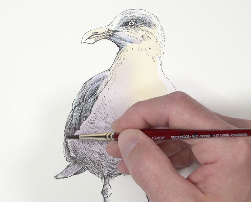
Using this same blue-purple, we can gradually darken the shadows on the head and the body. With the smaller, 00 round brush, we can add a few hints of the darker patterns on the back of the head.

With a touch of Payne’s Gray added to the mixture, we can also darken the colors on the feathers visible on the left side of the body. This darker value is also added to the underside of the body with very light washes, slowly darkening the value and strengthening the shadow.
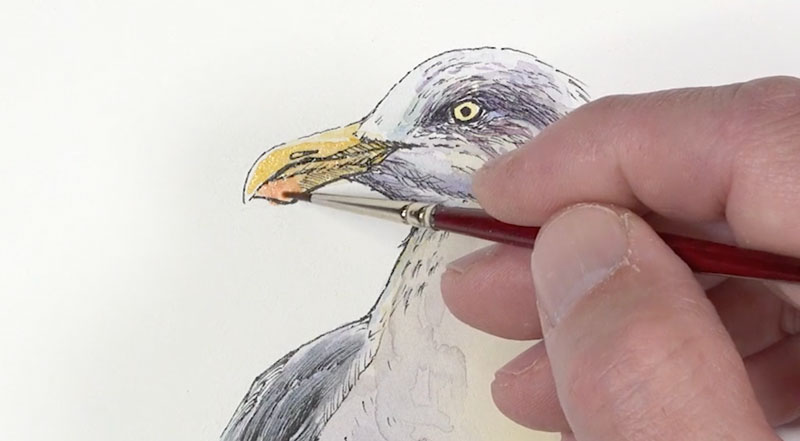
We’ll go back to the head and add a more intense yellow to the eye and the beak. An application of Cadmium Red Deep is added to the small red section of the beak. This color is washed on lightly at first. After allowing it to dry slightly, an additional application is made to intensify the color.
As we continue to work down the picture plane, we’ll next address the legs. A mixture of the mixed blue-purple with a touch of Cadmium Red Pale Hue is applied to the legs. A heavier concentration of this color is applied to the left side, where the shadow is strongest. The right side of the leg is mostly in light, so a lighter wash is used.
With the legs complete, it’s time to address the watercolor applications on the wooden post. We’ll start with a bit of Sap Green and Burnt Sienna. The green is applied first in areas, followed by the Burnt Sienna.
Since these colors are applied with watery washes, the colors blend together, creating nice transitions. We’ll continue to add colors while this section is still damp. Yellow Ochre, Burnt Umber, and Payne’s Gray are all layered in sections, creating variety in the color.
After allowing our initial watercolor washes to dry (or by drying with a hair dryer), we can add a few hints of shadow with additional applications of Burnt Umber and Payne’s Gray. We’ll also use a bit of Intense Blue to add some color to the shadows in areas.
Since our light source originates from the right, our colors are darker and more intense on the left side of the post.
Now we need to add a bit of contrast behind the highlighted side of the seagull’s head. By adding a darker value here, we can make the highlights appear lighter and pull additional focus to the head.
For this darker tone, I chose to use a mixture of Payne’s Gray with just a touch of blue. This created a cooler gray that contrasts not only the value of the head but also the color temperature.
Using the larger 14 round brush, we can fill in an abstract shape with a heavily concentrated application.
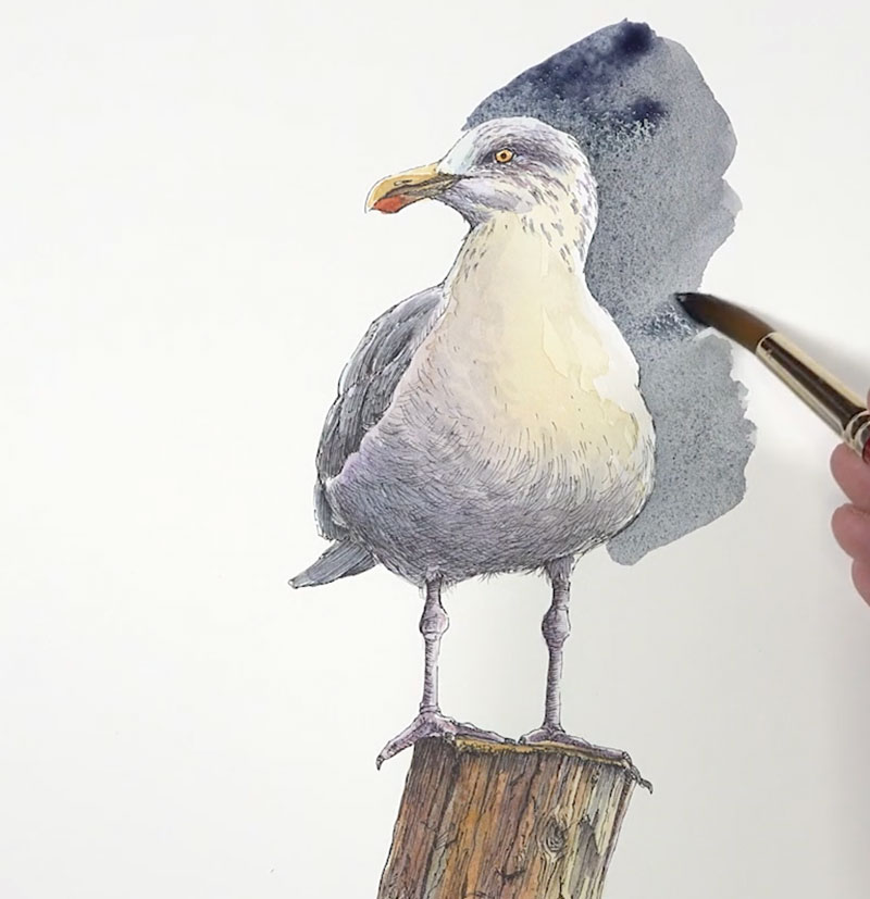
After filling in the darker shade behind the seagull, the composition felt too heavily weighted at the top. I decided to take an artistic risk and bring down some of the color from the beak and frame the wooden post. And with this last pop of color, the painting was complete.
Conclusion
As artists, we should never feel as though we are a slave to our reference photos or our subject. Photographs don’t usually produce the colors that we need to create an interesting painting. We often need to push colors or invent them entirely in order to produce an image that is successful. In this painting, we deviated quite a bit from the photo reference in order to make the subject more interesting.
If so, join over 36,000 others that receive our newsletter with new drawing and painting lessons. Plus, check out three of our course videos and ebooks for free.