- Less waste. Without a methodical approach to mixing neutral colors some mixture are sure to miss there mark. Unused colors are a wast of money, time and effort.
- Simplify the palette. Working with a smaller set of colors on the palette makes remixing colors simpler. It also imparts harmony among all the colors in a work of art. There is nothing wrong with purchasing a tube of paint brown paint. This author uses Raw Umber from time to time. Still yet, there is something quite right about developing the skills to mix specific browns.
- Become a better artist. Besides neutrals, the world is full of other dull colors. Being able to purposefully create colors of varying intensity is a required skill for representational artists. Those that are able to mix a range of browns can use the same approach to dull down other colors. Dull colors are important because they help the brighter ones to stand out in a work of art.
How to Mix Brown – The Short Answer
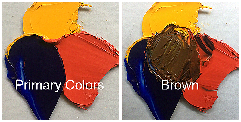
The three primary colors (red, yellow, blue), when mixed, make brown. It is the ratio, as well as the specific pigments used, that determine the specific neutral color these hues will make.
The Long Answer to Mixing Brown
The complete answer to mixing brown is complex and touches on several color theory concepts. Before diving into the rabbit hole that is color theory, let’s review a few terms…
VOCABULARY
- Primary colors are colors that can’t be mixed from any other colors. They are the reds, yellows, and blues.
- Secondary colors are the colors made by mixing pairs of primary hues. Oranges, greens, and purples are the secondary colors.
- Red and yellow make orange.
- Yellow and blue make green.
- Blue and red make purple.
- Complementary colors are pairs of colors across from each other on the colors wheel. Just as black and white are opposite values, complementary pairs are opposite colors. Side by side, complementary colors help each other to stand out and appear more intense. Conversely, when mixed, they are like positive and negative numbers, canceling each other out. They reduce the brightness (intensity) of one another. So, besides combining to make brown, complementary colors help the artist control intensity.
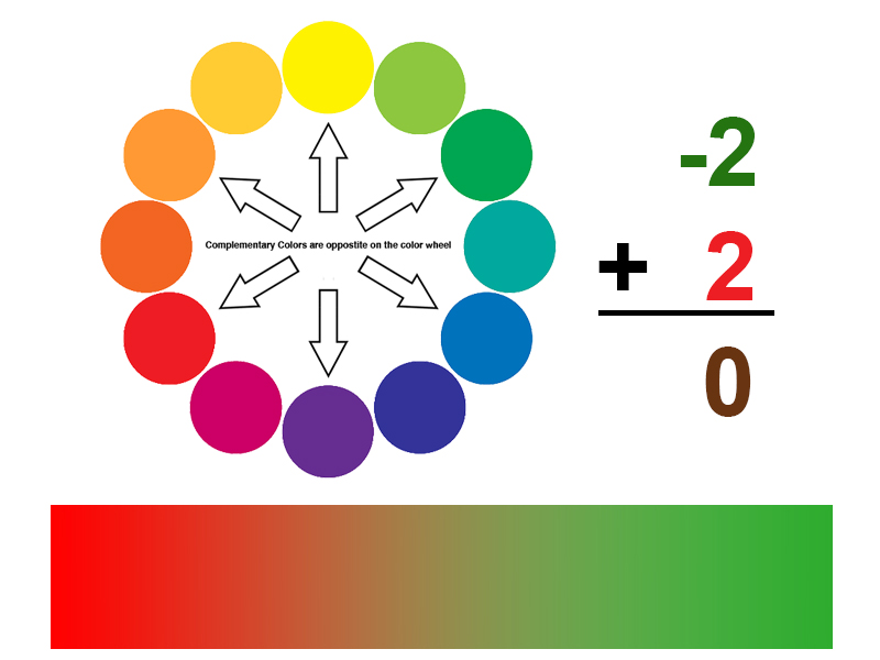
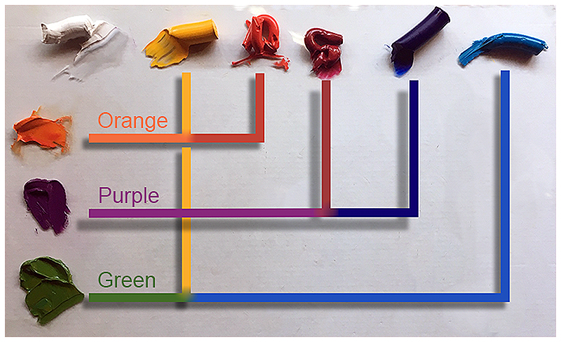
A variety of browns are made by mixing the different complementary pairs together. So, what are the complementary pairs:
- Blue and orange are the colors of the sky (blue sky and orange sunsets).
- Yellow are purple are the colors of royalty (kings wear gold crowns and purple robes).
- Red and green are the color of roses, strawberries, holly, tomatoes and yes, Christmas.
It is worth noting that the intermediate colors (also called tertiary) form three additional complementary pairs: red-orange/blue-green, yellow-orange/blue-violet and yellow-green/red-violet.

Think of brown as mixture of primaries and/or a combination of complements – two sides of the same coin. Since a secondary color is a combination of two primaries, and the complement to any secondary color is the primary color not used to make that secondary, then combining complementary colors is the same as mixing a third primary into the first two primaries.
The image below illustrates what happens when the three main complementary pairs are mixed together.
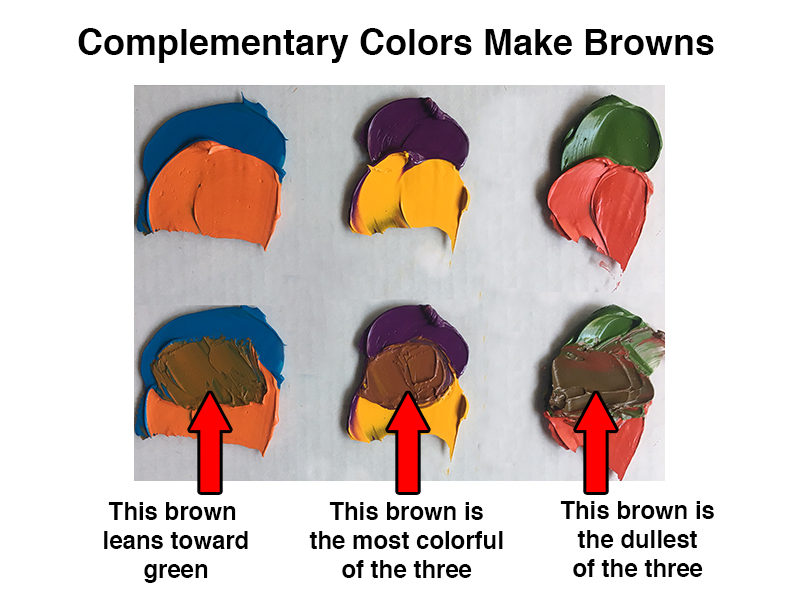
Notice that the complementary pairs above do not make the same brown. This is because the green, orange, and purple were not mixed from the same set of primaries.
See also: Color Theory
Using Warm and Cool Primary Colors
The palette below shows a set of primary colors only. Note that there are two reds and two blues – a warmer and cooler version of each hue.
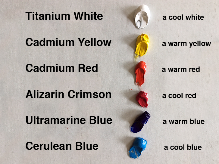
A cool red mixed with a warm blue make a brilliant purple. Here, Alizarin Crimson is the cooler red while Ultramarine Blue is the warmer blue. Color temperature is relative. Though blue is a cool color, within the family of blue hues, there are warm and cool variances.
Below are the pigment combinations used to create the secondary colors above.
Color Theory Bonus Knowledge
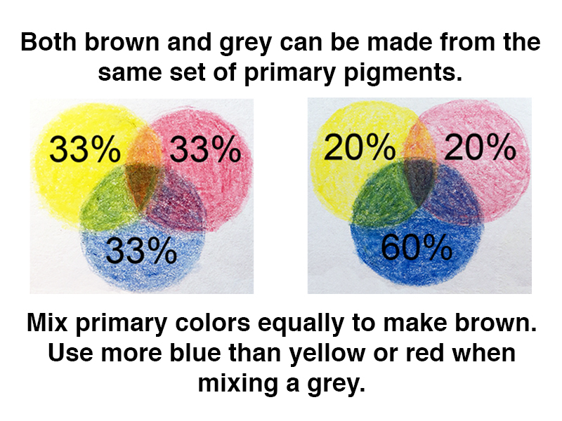
Brown and gray are close cousins. Just as brown can be thought of as the three primaries mixed together, so too, can gray. The color pencil illustration below demonstrates how a greater amount of blue in the mixture results in grey while a more equal combination of primaries makes brown.
In a perfect world, all tubes of paint would have the same, predictable mixing power and equal amounts of primary colors. When mixed, these colors would always make brown.
See also: Warm vs. Cool Grays
Unfortunately, the color mixing world is not perfect.
Depending on the grade of paint, some pigments may overpower others, requiring an adjustment to the approximate ratio used when mixing brown. This is common for “student” grade paints.
Optical Color Mixtures
Some media is less forgiving than others. Watercolor comes to mind. Many watercolor artists mix color in their paintings instead of on their palettes. This type of mixture is called an optical mixture. To do so, one must know what ratio of colors to use when optically mixing neutral. The stakes are higher.
See also: Optical Color Mixing
If an oil painter makes a mistake with a physical mixture of paint, then the paint is wasted. If a watercolor artist makes a mistake with an optical mixture of paint, then the artwork itself is a failure.
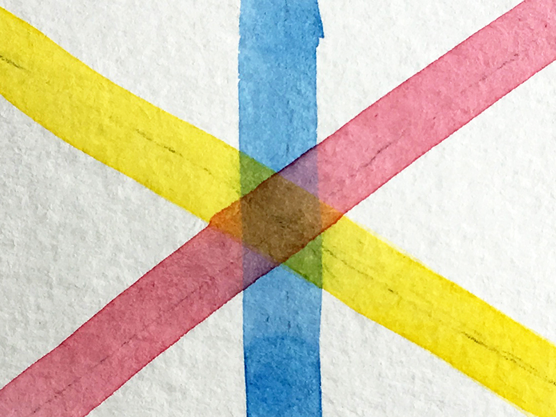
The watercolor illustration below is a great visual aid for understanding how these colors “add up” to brown. Can you see the small triangles of secondary colors around the brown hexagon in the center?
Conclusion
I have never heard anyone say, “My favorite color is brown”. But neutral colors like brown are clearly important. Much of the world is muted in color with only punctuations of intensity. Remember to use complementary relationships for better neutrals. Now get out there and paint the world brown!
If so, join over 36,000 others that receive our newsletter with new drawing and painting lessons. Plus, check out three of our course videos and ebooks for free.