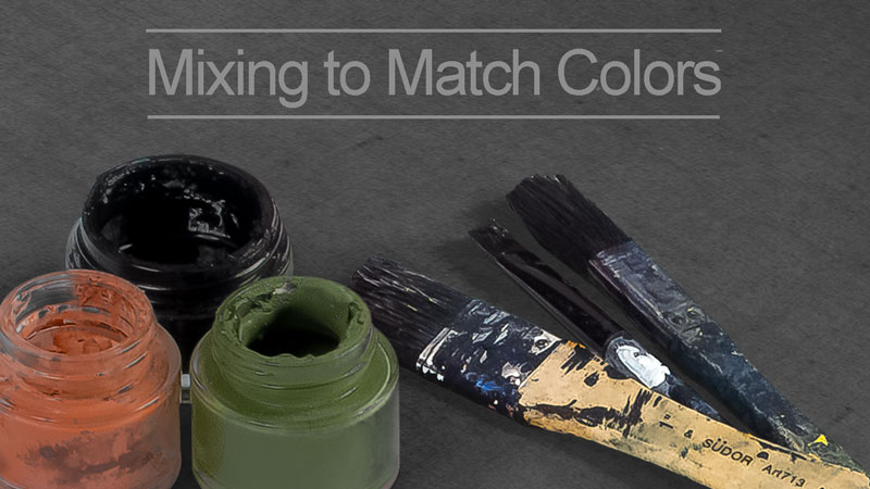
My work week would start with about three hours of color mixing and matching. Using the original painting as a guide, I premixed 15-25 colors in large quantities and saved those colors in metal tins. I would then paint all week, remixing those same colors the next week, until the order had been filled. The colors had to match perfectly from week to week. It was like an oil painting assembly line but the experience I gained was invaluable.
My hope is to share both what I learned then and what I’ve learned since about matching colors below.
Reasons to Match Colors through Mixing
There are several reasons a painter might need or want to mix an exact match.
- To repair a damaged painting.
- To complete an unfinished area from a previous painting session.
- To match colors from an observed subject.
- The subject of a painting has a distinct and familiar color.
Matching Paint to Paint
The first variable to consider when matching a color is the paint itself. For example, tempera and gouache paints dry lighter in value than they appear when wet. This characteristic complicates color matching. When using these paints, I prefer to repaint passages with a fresh mixture over trying to match wet color with dry color. If that’s not possible (in the case of retouching), then expect more trial and error with theses paints. Mix slightly darker values than desired. Wait for test swatches to dry before making adjustments to the mixture.
Dry acrylic and oil paint colors more closely correlate with their wet counterparts so they are less frustrating to match. (I use oil paint in the video below.)
Choosing Pigments
Starting with the right pigments is essential to matching colors through mixing. I like to have as few colors on my palette as possible. Less colors means that I am more likely to remember or even guess what I mixed together in the past to arrive at a certain color. This improves my chances of matching a color.
What works for me is using both warm and cool primary colors. A combination of warm and cool primaries offers enough options to match nearly any color. Using primaries simplifies the process and is a key to becoming a master of color control.
The pigments I recommend are as follows:
- Warm Primaries: Cadmium red medium, Cadmium Yellow Medium and Ultramarine blue
- Cool Primaries: Alizarin Crimson, Chrome Yellow and either Cerulean Blue (for landscapes) OR Phthalo Blue
Besides these primary colors, I keep Titanium white (the whitest white) on my palette. I try to avoid using any black at all.
*PRO TIP – each color added to a mixture results in a duller mixture. If, while attempting to match a color, the mixture becomes markedly duller than the target color, then the mixture is likely a failure and the artist should start over. Attempting to “bring a color back” often results in even greater waste. It is better to waste a little than a lot.
The Color Matching Process
Step to Matching Colors with Paint
- Identify the hue of a color from the color wheel. Each color is more or less like the 12 colors on the wheel. Even brown and grey colors lean toward a hue. Often browns lean more toward orange or red. Grays sometimes lean toward blue, green or purple. Forcing myself to name the hue that I see gives me a starting point. So if a brown leans toward orange, it is an orange in my mind. Start there.
- Mix the hue that you see from the primaries, if it is not a primary. Don’t use both the cool and warm options of a single hue in your mixture. That is, don’t use both Cadmium Red and Alizarin Crimson in the same mixture.
- As required, use white in your mixture to reach the approximate value of the color target.
- Once the base hue is identified and mixed, use the complement of that hue to manage/reduce the brightness of the mixture until reaching the desired color. The ability to use complementary relationships to control color intensity is the single most important skill to learn as a colorist. Complementary pairs are red/green, blue/orange, yellow/purple.
*PRO TIP – To better judge whether two colors match, those colors need to “touch” one another, whether on the palette or the canvas. Subtle differences are revealed as soon as two colors come together.
Matching the Color of the Subject
Matching a previously mixed color is one thing, but what about matching the color of a subject; a sky, a face, a piece of fruit? The disadvantage in this case, is that the artist cannot always touch their color mixtures to their target colors.
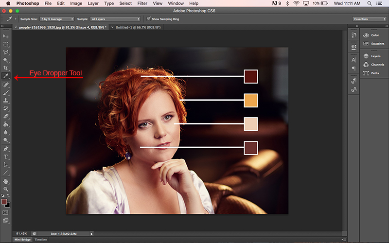
But I have good news – it is the twenty-first century. I believe in taking advantage of technology to advance my painting. Often, I’ll photograph my subject and import it into Photoshop (or another photo editing program). I’ll then take samples of the certain colors using the eyedropper tool. After printing these swatches, I’m then able to match my colors directly to those swatches (see the demonstration video above).
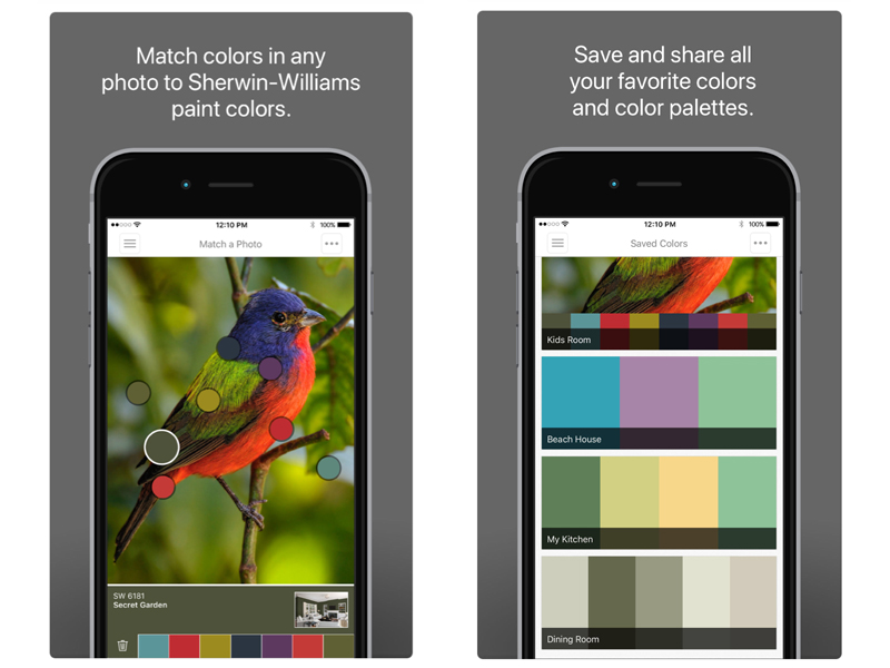
Sherwin-Williams created an app that does the same thing. The app matches the colors of a photograph to paint colors offered by Sherwin-Williams in an effort to sell their paints. To use this app and others like it with artist’s paint, just take a screenshot of the apps swatches, print the screen shot and start matching color.
The Relativity of Color
Remember, color is relative just like height. I like to stand next to shorter people to make myself look taller (I’m not tall). Similarly, the artist can manipulate a color’s appearance with its surrounding colors. If a color is matched well but looks wrong in the painting, then the problem could be the surrounding colors.
The Secret Weapon of Color Matching – Shhh!
Some opaque paints, like oils and acrylics, offer an opportunity for color correction even after the colors have dried. The technique for doing so is called glazing.
A glaze is a thinned down, transparent solution that acts as a filter over a painting. You can brighten a color by glazing over it with it’s own hue or dull a color by glazing over it with its complementary hue.
Conclusion
Color is like icing on a cake. It may add to the painting, but without it you still have a cake. Value is the cake. Without it you have nothing. So take some pressure off of yourself when it comes to color matching. Get your colors close but your values perfect.
If so, join over 36,000 others that receive our newsletter with new drawing and painting lessons. Plus, check out three of our course videos and ebooks for free.


