Use Photoshop to Experiment with Your Art
You’ve probably been there before. You dove headfirst into a drawing or a painting and completed the main subject and now it’s time to address the background. You know that you want the background to compliment the subject, but you’re not sure what to do. You’re afraid that your decision may ruin the work. As a result, you’re frozen with fear.
Of course, this common dilemma can easily be avoided by creating thumbnail images before you even start on the final work. Thumbnail sketches are recommended so that you can work out all of the composition problems, the balance of values, color relationships and so on.
But even though you may create thumbnails and have a solid idea of how the finished work will materialize, things change. It’s great to have a plan but sometimes we change our mind along the way. We may move a subject in the composition, use different colors, adjust values, or any other number of things that happen during the art creation process.

When these things happen, which they do quite often, we have to make adjustments to our original plan. Instead of guessing and hoping for the best, we can use a bit of technology to help us make the best decisions regarding composition, color, etc.
Photoshop and other photo manipulation programs are invaluable resources for modern artists. Obviously, these programs can be used to alter photos and even make art from scratch, but they can also be used as an “in-progress thumbnail machine”.
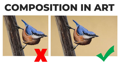
In a recent Live Lesson series, we ran into the issue of background color choice. My original plan for the work was to develop a neutral background (lighter cream color) after completing the details of the bird and the small tree he is perched upon. But during the painting process, I started to second guess that decision. I had already painted the majority of the body of the bird so it wouldn’t have made much sense to hop over to the background to “experiment” with colors.
I could have just stuck with my original plan of keeping the background neutral but my instincts were telling me that the work needed more contrast. The lighter background that I had originally planned may have washed out the subject and possibly a different color or darker value would be a better choice.
So, before I made the final decision, I jumped over to Photoshop to do a bit of experimenting. Using Photoshop, I was essentially able to create in-progress thumbnails so I could see how different color relationships would affect the finished work.
It doesn’t take very long to do this and the number of in-progress thumbnails that you can create is limitless.
If so, join over 36,000 others that receive our newsletter with new drawing and painting lessons. Plus, check out three of our course videos and ebooks for free.