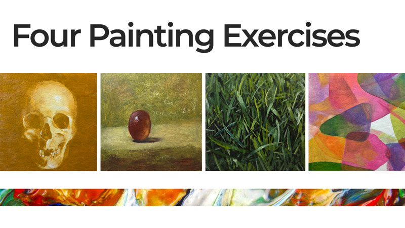
The Importance of “Art” Exercise
Exercise makes a person’s body strong. Painting exercises make your artwork strong.
When we exercise, we train our minds and bodies to perform when it’s time to perform. By practicing our art, we train our minds to see and understand the world as an artist should and we gain more experience with the medium of our choice. An added benefit comes in the form of experimentation. We are likely to be more open to experimentation when we know that what we are creating is meant for practice.
Exercise, or practice, should be a regular part of any artist’s routine. Most will agree that practice is important, but many folks simply don’t know how to go about practicing without creating a finished work. In this lesson, I’ll share four painting exercises that are meant specifically for practice.
Below are four exercises meant to strengthen the skills of painters at any level. The exercises target various skills and elements of art (line, shape, form, value, space, texture). Oil paint was used to complete the examples below but any opaque paint is suitable for these exercises.
The specific pigments used include:
- Titanium White
- Cadmium Yellow Medium
- Yellow Ochre
- Cadmium Red Medium (only used for the watercolor copy)
- Alizarin Crimson (only used for the watercolor copy)
- Indian Red
- Ultramarine Blue
- Phthalo Blue (only used for the watercolor copy)
- Ivory Black
All four painting exercises are small, measuring just 4 x 4 inches. They were completed on illustration board prepared with two thin coats of gesso. Each exercise took 1-2 hours to complete.
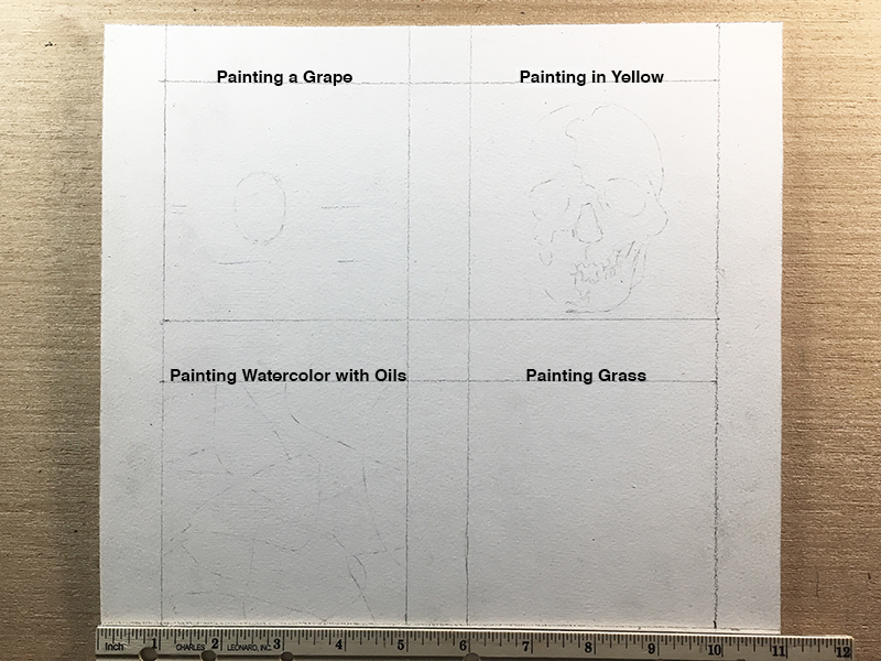
Painting Exercise #1 – Painting From Yellow to White
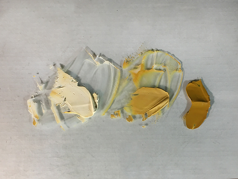
I remember the first exercise from when I was a student. My painting professor assigned our class a painting in yellow and white – yellow serving as a “black”. Yellow is the lightest of all hues. Using it in place of black requires the artist to squeeze the entire value scale into a narrow range.
How does this exercise benefit the painter? Creating realistic form in a narrow range of value requires accurately arranged values. This exercise teaches an artist to distinguish the smallest changes in value across a surface.
I chose to paint a skull for this exercise. Here’s a look at the reference photo…
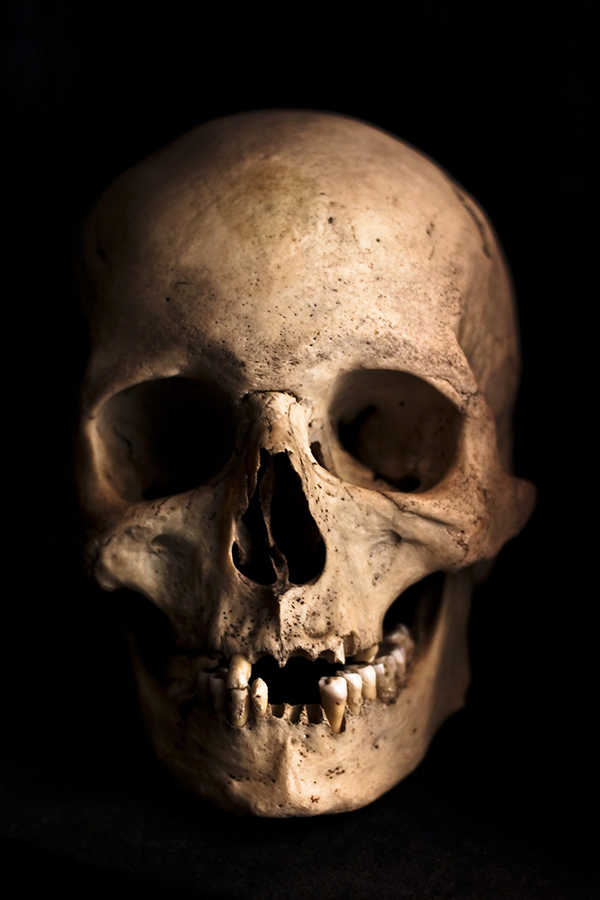
Any object or image with a full range of value (black to white) is suitable. Select a subject that is appropriate for your current drawing skills. Also, I chose to use Yellow Ochre instead of Cadmium Yellow. Yellow Ochre is the darkest yellow. Use Cadmium Yellow or Lemon Yellow to really challenge yourself.
Begin with three values – pure yellow, yellow lightened with white and white with only a touch of yellow. We will not use pure white until near the end of the painting exercise.
The first step is to simplify. Block in the darker values (not just black) with pure yellow. Next, paint all of the mid tones with the middle value shown on the palette above. Finish blocking in the painting with the lightest value, the one that is close to white. Three values are enough to start a three dimensional form.
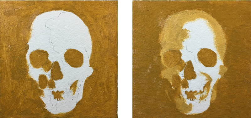
Once the painting is blocked-in, it’s time to reintroduce the complexity of the subject. Discover new values by blending the edges of the painted shapes together. To fine tune a color, paint the premixed values into one another. This is called wet-into-wet.
Finally, add pure white strokes only where you observe the lightest of values in your subject. On the skull, those places were in the forehead, around the eye on the right and on some of the teeth.

Painting Exercise #2 – Painting a Grape
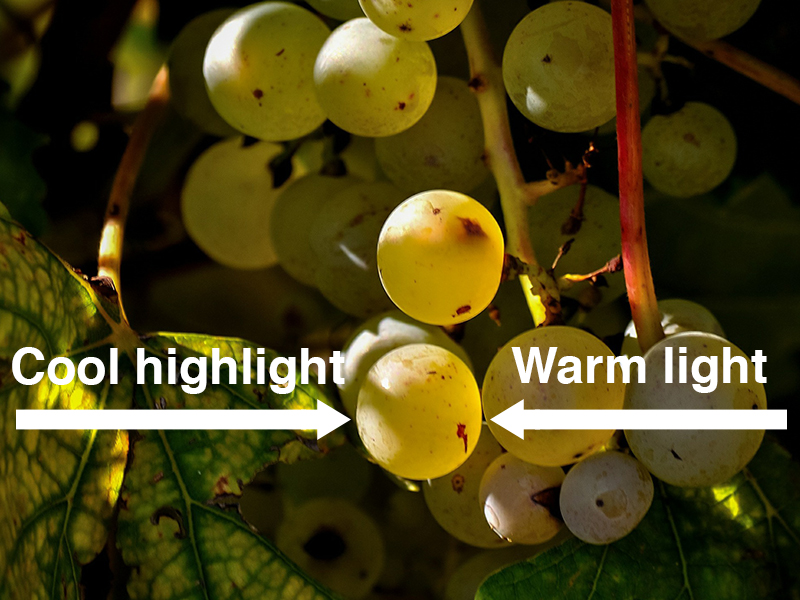
I first saw this next exercise in an old art book when I was a teenager. Painting a grape is less about a specific element of art and more about the mysterious illusion of translucency. This exercise is meant to take away some of that mystery. Additionally, this exercise gives the learner a chance to observe how using multiple hues on a monochromatic object can create a greater sense of light and realism.
Look at the photograph of grapes (below). Notice that there is light on both sides of the grapes. The light source is from the left, presumably the sun. The light produced by the sun is a cool white. The grapes are also light on the right side. Were these olives, the right sides would appear dark due the opacity of olives. Grapes, however, are subtly translucent. To create this illusion, one must replace the shadow with light. In the case of grapes, that light should be a warm instead of cool.
Begin by painting a loose environment, such as table top, for your grape. Paint the shape of a grape over your background using Indian Red. Alternatively, you can use Cadmium Red Medium with a touch of black. Add a cast shadow next to the grape. The shadow will eventually contribute to the illusion of transparency.
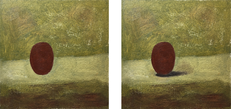
On the grape and next to the cast shadow, apply cadmium yellow where a shadow would ordinarily be located. Work the yellow into the red so that it is soft. Mix a small amount of blue with white and float a stroke along the top left of the grape. The cool light on the grape and the warm light in the grape capture the translucent quality that define grapes. Next, add the white highlight and use the end of your brush to loosen up its bottom.
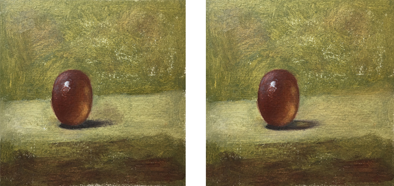
Now finish the cast shadow. Mix some of the background color into the center of the shadow to complete the illusion of light passing through the grape.
Painting Exercise #3 – Painting Grass
The third exercise gives painters an indirect approach to creating textures like grass, hair, tree bark, etc. Instead of trying to create realistic looking grass from the very first brush stroke, take the preliminary step of toning the background with a dark color first. Then, lighter values are used over the dark layer once it’s dry.
Here’s a look at the photo reference we’ll use for the third painting exercise…
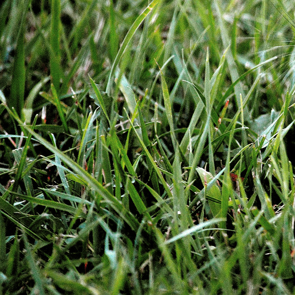
The dark color used for the background (mixed with black, brown, and deep green) will become the small irregular shadows created by the negative space between grass blades. I am using oil paint for these exercises, but the background color is acrylic because I wanted to paint over a dry layer of color and did not want to wait three days to do so (oil can go on top of acrylic but not the reverse).
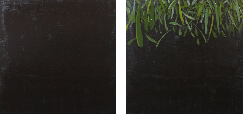
Next, begin in the top of the square (the area furthest away) and lay in strokes of green. Use medium to thin your paint as necessary. Be sure your marks vary in width, direction and color. Use white and yellow to vary the value and temperature of your grass blades. Before moving down in the composition, I used a soft, dry mop brush to soften and blur these brush strokes.
Continue to work in the bottom two thirds of the composition in the same way but only soften the brush strokes at the very bottom of the square with the mop brush.
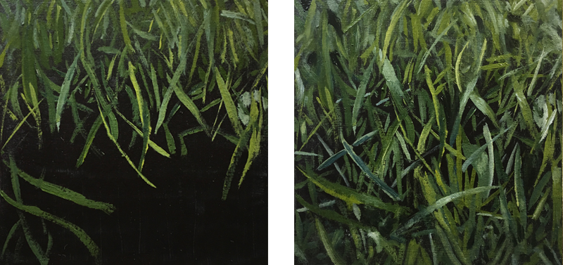
Once all of the grass blades are in place, pick out a few blades for highlights. Mix a small amount of white into the middle of those blades to create a quick gradation (see the blade in the lower center). You may also want to add or sharpen a few of the dark areas between the blades. I used ivory black to recapture some of those shapes.
Painting Exercise #4 – Mimic Another Medium
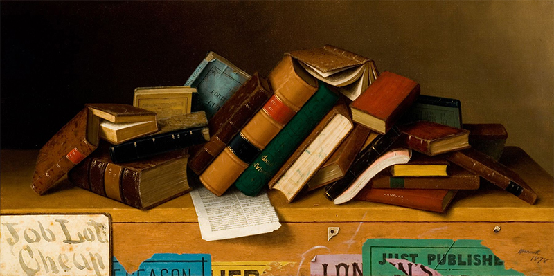
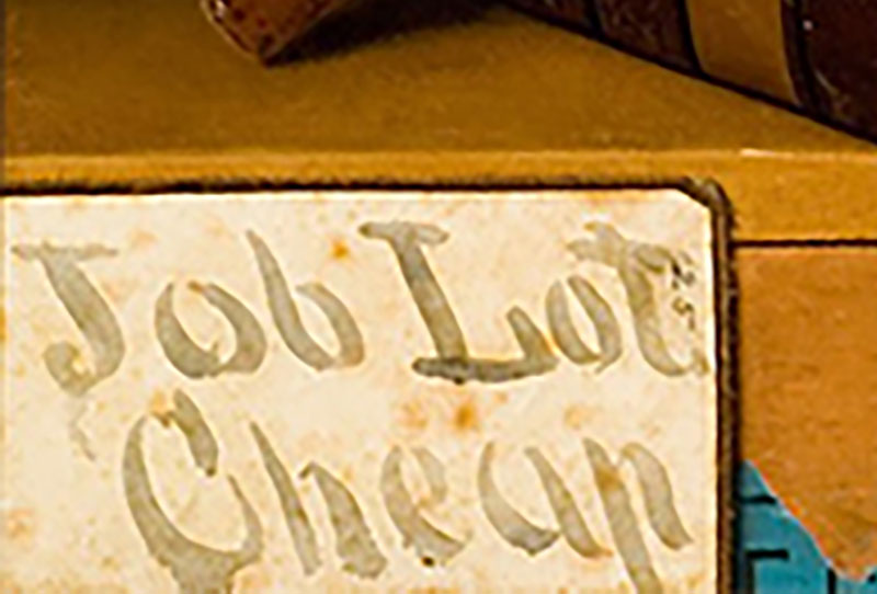
I have used the previously described painting exercises in the past but this last exercise is brand new to me. It was inspired by a painting by William Michael Harnett titled, Job Lot Cheap. Painted in 1878, the still-life depicts a grouping of books that are for sale. In the lower left of the painting is a sign that appears to be made from either a wash of ink or watercolor. Of course, this is an oil painting, but Harnett has masterfully manipulated his opaque paints to create a strong illusion. The ability to manipulate one’s medium to the extent that it appears a different medium is a mark of true mastery.
Here’s a look at the entire painting…
And here’s a closer look at the area discussed above…
This exercise is beneficial to the painter in several ways. Critical observational skills are strengthened by this exercise. The illusion of transparency requires an accurate arrangement of value and color. Also, the painter must focus on edge quality. Watercolor strokes can have extremely sharp edges and they can bleed themselves into oblivion when painted over a saturated surface. The painter must manipulate his/her strokes to recreate the mingling quality that defines the look of watercolor.
Here’s a look at the reference photo we’ll use for this exercise…
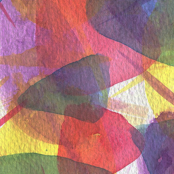
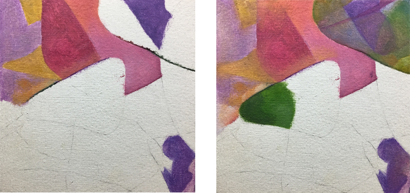
Start by mixing colors that are similar to those in your watercolor reference. My reference consists of non-objective color shapes. I began painting the shapes of color as they might have looked had they not bled together. Before beginning a shape, notice whether or not its edges are dark. One defining characteristic of watercolor is dark edges where pigment settles while drying. Paint those edges dark before painting the rest of the shape. This way, you can use the lighter color to sculpt and thin those dark edges so that they resemble watercolor.
When using watercolor, one color painted over another produces an optical mixture – a third color. To produce the same effect with oil paint you must, on your palette, physically mix the third color that two watercolor layers create. Then, paint that third, mixed color directly into the shape created by the first two overlapping colors.
As you paint, use your brush to soften edges that are blurry and blend colors to create gradation in color and value where appropriate.
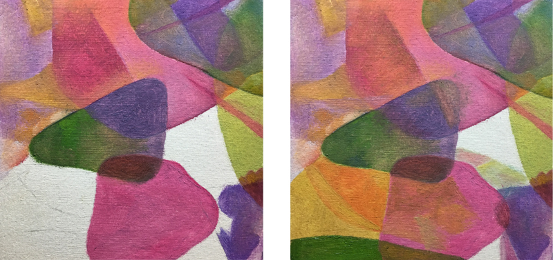
Note: For this exercise, I did not use any medium to thin the paint. By using no medium, the paint’s viscosity remained consistent throughout. This helps me to blend the colors into one another predictably, with each color matching the strength of the next.
Conclusion
Small painting exercises give a painter the same experience and practice as a larger, more complex artwork, but in less time and under less pressure. Strive to complete each square in one sitting. Use the references provided or enjoy finding your own. Most importantly, make the effort to incorporate practice time in your artistic journey. The benefits of doing so will pay off in your art and you’ll see improvement in your work in a much shorter period of time.
If so, join over 36,000 others that receive our newsletter with new drawing and painting lessons. Plus, check out three of our course videos and ebooks for free.