It would be no exaggeration to say that when we think about paper, most likely we have white paper in mind. It is a well-known, basic option. But there is a full range of other options. For example, muted beige, cool grey, midnight black, salad green or dusty pink colored paper. Our paper doesn’t have to be white. It may be any color we imagine. There is a whole world of paper tones, each full of creative potential!
A toned surface has its advantages. At minimum, it helps the artist to save a little time, broaden their horizons, and diversify their skill set. If you’re interested to learn more about the advantages of drawing on toned paper, check out this wonderful article:
Six Reasons to Draw On Toned Paper
The Art Supplies for This Project
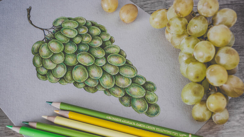
I’ll be using grey pastel paper with a subtle texture and Faber-Castell Polychromos colored pencils.
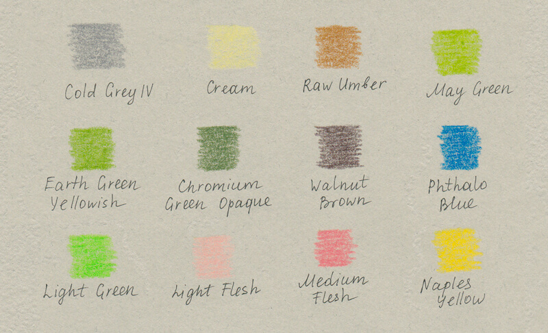
Before starting the drawing, I pick a limited range of colors to limit my palette and relieve my mind of excess thinking in the process. The selected pencils are:
- Walnut Brown
- Raw Umber
- Cold Grey IV
- Medium Flesh
- Light Flesh
- Chromium Green Opaque
- Earth Green Yellowish
- May Green
- Light Green
- Naples Yellow
- Cream
- Phthalo Blue
The applications made with this brand of colored pencil are often semi-transparent. Of course, some pencils provide denser marks and others produce applications that are almost translucent on paper. This depends on a variety of factors, including the quality of pencils, the binder used, and the color itself.
See also: Oil-Based VS. Wax-Based Colored Pencils
As long as we’re going to use a toned paper, it’s useful to try out the pencils beforehand.
The more layers of pigment we apply, the denser the covering will be. The paper can become a limitation and we’ll need to consider this. As soon as we run out of tooth, no further applications can be made.
Of course, the choice of colors depends on your subject and idea. I’m going to draw grapes that have a green hue as a base. If your subject involves depicting purple or black grapes, your set of pencils will obviously be different.
I also add some colors that will help to create visual harmony and beautiful, contrasting nuances – we’ll have a good look at those tips during the drawing process.
The choice of the brand (Faber-Castell Polychromos) is just my personal preference. Feel free to use any colored pencils you have or like.

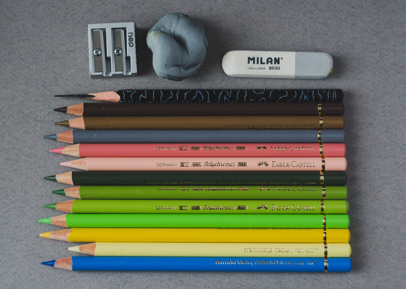
Also, I recommend having a kneaded eraser and a pencil sharpener at hand and some supplies for sketching (ordinary white paper, a graphite pencil – or a couple of them, and an eraser).
This project is closer to a sketch rather than to a fully complete colored pencil painting. I’m limiting myself deliberately because the goal is to complete the drawing in a reasonable period of time, enjoy the process, and learn something new.
Observing the Grapes
This chapter of the tutorial is optional. If you aren’t in the mood to do any preparatory work or feel confident enough, please skip it and proceed right to the colored pencil portion below.
There are different approaches to drawing. Some artists prefer depicting objects from life (even if it means spending days or weeks in attempts to find a perfect specimen), others enjoy using qualitative reference photos. There is also a way that involves combining both approaches and seasoning it with imagination. Which method is more attractive to you? Remember, you are the artist, and the choices that you make are yours!
I decided to go for an eclectic approach.
There are many wonderful, inspiring photos on the web – they allow us to observe grape bunches of different shapes and colors. While conducting this research, it’s helpful to ask yourself various questions.
- What peculiar features are inherent to a bunch of grapes as an object?
- What structure should it have to look realistic and recognizable?
- How does light behave on grapes?
- What size and shape of grapes will I choose for my drawing?
An attentive analysis will give you more answers and useful information than any instructions.
If you struggle to see the darker and lighter values, transform a colorful photo into a black and white one, using any computer software or mobile application.
Another step I undertook was to observe a real, tangible bunch of grapes. Sometimes, finding a model to study is just a matter of visiting a local shop or market! It’s so great to have the option to rotate the object, see it at different angles, and even smell it.
As the next step of this process, I made a couple of graphite pencil sketches. They can be rather quick and rough. The goal is to gather everything you learned from observing and transform it into a study.
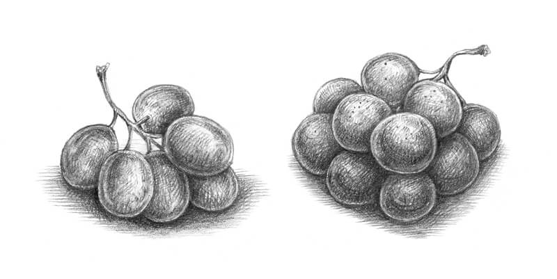
Now it’s time to decide on the layout and composition. I made several miniature sketches, playing with different options.
I mark the masses of grapes with ovals, keeping the silhouette and the negative space in mind.
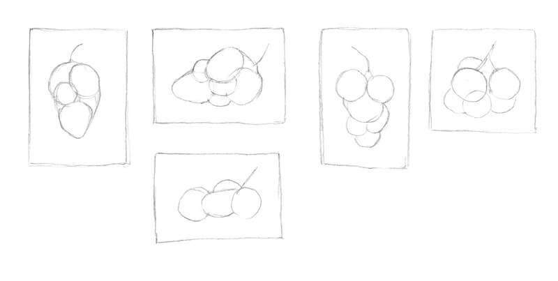
It’s also possible to go further and develop the sketch you like the most, adding the individual grapes and any details you find necessary. Try to find a rhythm within the bunches of grapes.
You’ll see my final concept at the beginning of the next chapter (in the corner of the first image). Consider this sketch as a preliminary version of the larger, finished version of the artwork.
Now we can proceed to the most fun part!
How to Draw Grapes with Colored Pencils
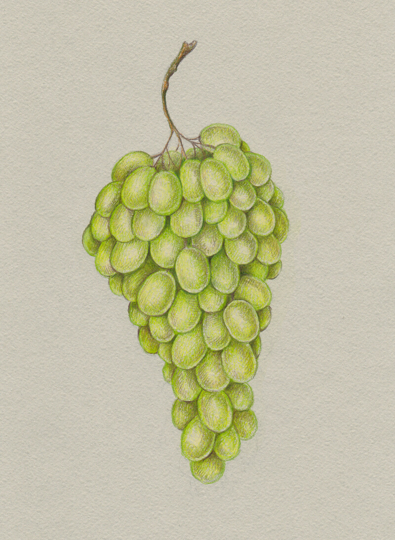
With Cold Grey IV, I outline the contours of the drawing. I use a pencil from the colored pencil set. Mixing marks made with an ordinary graphite pencil and colored pencils in one drawing may result in a muddy, unattractive image.
Keeping pressure on the pencil light saves the tooth of the paper. If your lines are too dark, soften them with a kneaded eraser.
We can see some of the grapes quite well, others are hidden under and behind their neighbors. This overlapping creates the illusion of volume and space to the drawing.
I ensure that the bunch looks harmonious on the paper and that no parts seem too “heavy” or monotonous. I also make sure that there is an interesting variation in the silhouette.
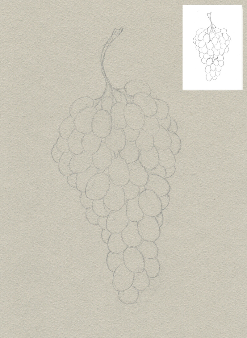
With Cream, I lay the foundation for the subsequent color applications. I apply the pencil with minor circular motions, which creates a soft covering without any clear linear marks. However, the paper is quite textured, so some of the roughness still shows through.
See also: 12 Colored Pencil Tips
I also touch the twig with Raw Umber. There are small parts of the twig visible within the grapes’ bulk.
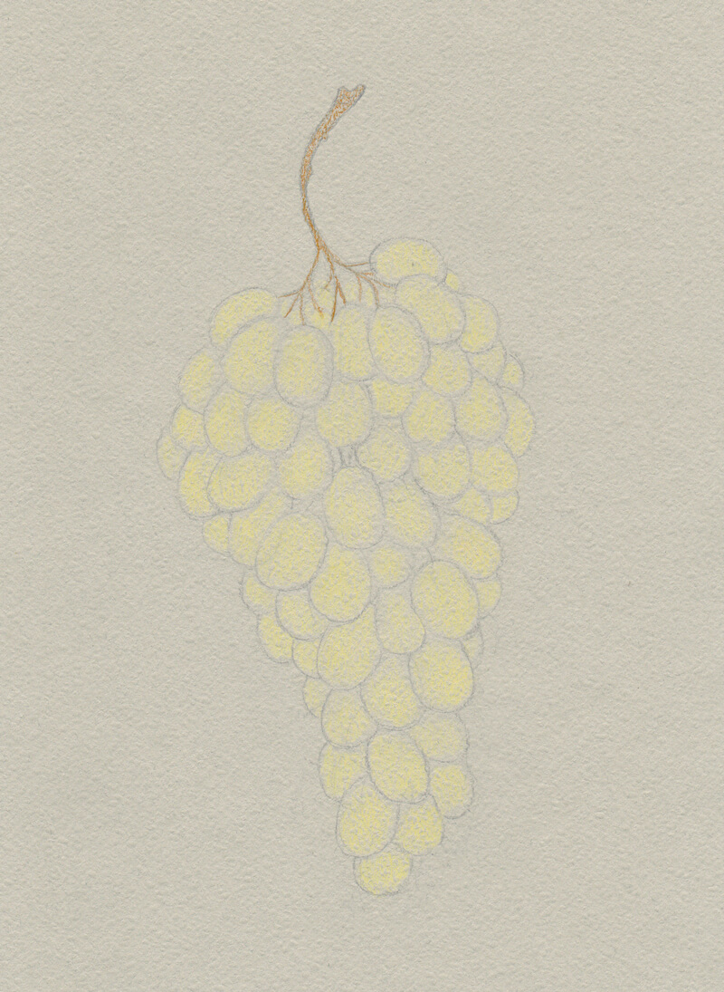
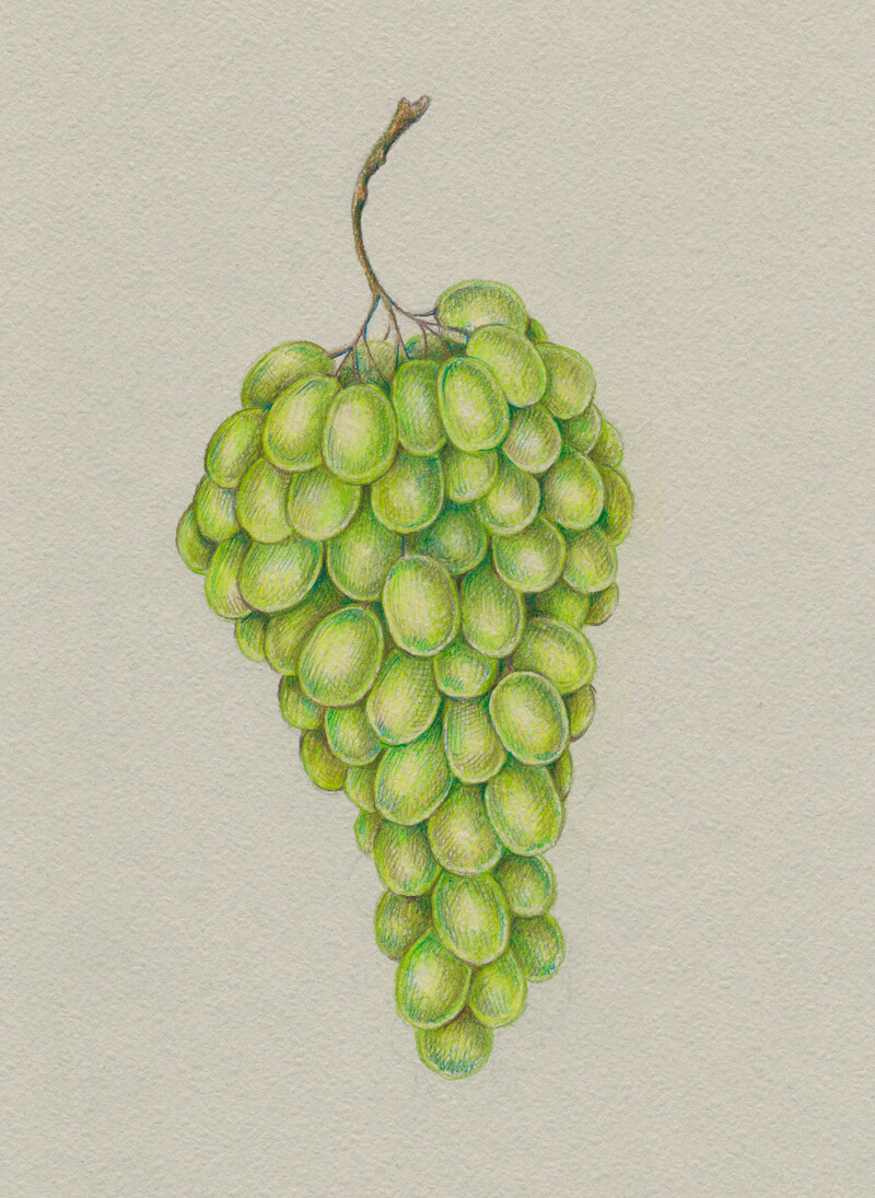
It’s time to add some green hues. With May Green and Earth Green Yellowish, I work on each grape, paying attention to the contours and the central areas of the grapes’ shapes.
A sharp tip of the pencil allows creating fine details. That’s why keeping a sharpener at hand is useful.
Both pencils are close in terms of color, but the subtle difference makes the artwork interesting, even in the early stages of the process.
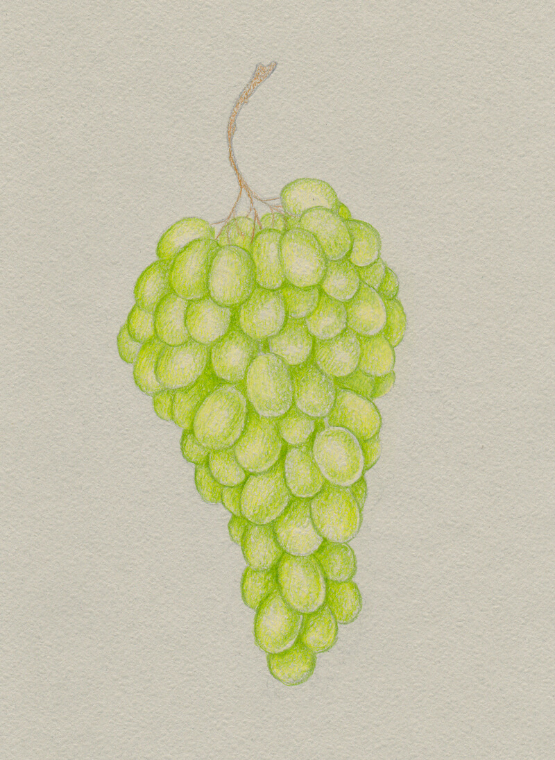
With Chromium Green Opaque, I increase the contrast, accenting the darker parts of the grapes. To make some grapes stand out, I mute their neighbors.
As we said, the surface of the paper is rough, but working with a sharp pencil is the key to creating accurate details. However, some texture showing through the pencil applications may give a charming feel to the artwork.
I also use Walnut Brown to accentuate the contour of the twig. It’s appropriate to apply this shade to the grapes, keeping a light pressure. It varies the uniformity of the greenish base.
Next, I add the brighter nuances with Phthalo Blue and Light Green, echoing colorful reflections on the grapes. Including a blue hue makes the shadows deeper.
Along with applications of uniform, soft covering, I create hatches using the sharp tip of the pencil. Those separate marks are quite noticeable, but it’s possible to blend (or polish) them later.
The artwork becomes vibrant!
With Medium Flesh, I add nuances to some of the grapes, creating small spots on their surfaces. Then, I burnish the applications with Light Flesh to achieve a softer color transition. The pinkish areas now appear contrasting, yet still harmonious.
See also: Colored Pencil Course – The Magic of Burnishing (Membership Required)
With Cold Grey IV and light pressure on the pencil, I slightly mute the grapes found on the periphery of the bunch. Our paper is grey, so adding a close greyish tint to the existing colored pencil applications will balance the artwork.
Next, I add a subtle yellow hue to some of the grapes, using Naples Yellow.
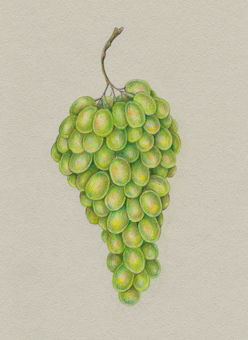
I burnish the grapes with Cream. The goal is to soften the transition between the hues. The reflections are just a bit too strong, so I need to blend them as well.
Burnishing is a wonderful technique and after a couple of burnishing sessions, a colored pencil drawing may have a similar appearance to that of an oil painting!
Some contours have lost their strength after the previous step. So I use Chromium Green Opaque to revisit them.
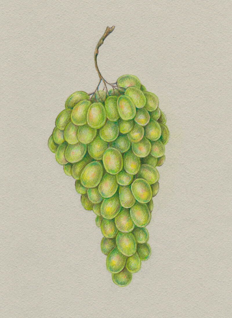
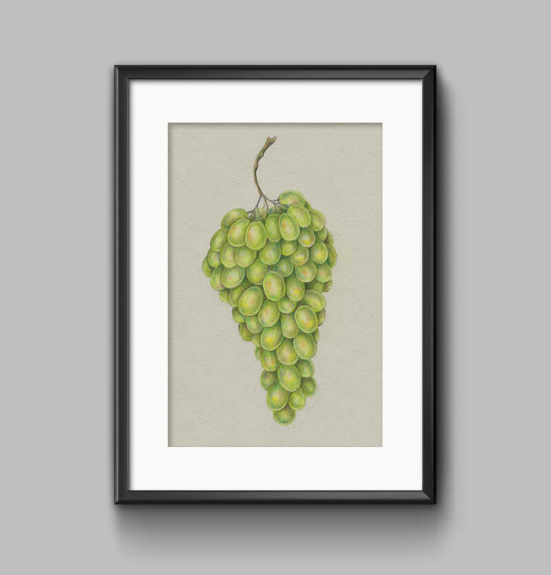
The drawing is now complete!
Conclusion
Congratulations! I hope you enjoyed the process of drawing with colored pencils on grey paper and thank you for being with me on this journey!
Let me suggest a final touch. Let’s frame it.
Sometimes we wait for some opportune moment to come (it almost never does, right?). Or perhaps we convince ourselves that only some special artworks deserve decorating our walls.
The truth is every artwork is unique and precious. The more we appreciate every step we take towards artistic growth, the easier it will be to build confidence and make time to practice in the future. This leads to new pieces of art, conquering new summits, and, of course, joy and inspiration in the process.
If you notice that some techniques presented in this tutorial aren’t familiar to you or you need an extra information on drawing with colored pencils, please check out the colored pencil course.
It has everything a beginner needs to know to get started with colored pencils! Also, this course reveals tips that may be a real asset even to an experienced artist. In many cases, we need to see or hear something three or seven times before we actually start implementing approaches in our workflow.
If so, join over 36,000 others that receive our newsletter with new drawing and painting lessons. Plus, check out three of our course videos and ebooks for free.