Gettin Sketchy – Draw a Hawk with Sepia Toned Pastels and Charcoal – Season 3 Episode 5
This episode aired live on YouTube on February 17, 2021.
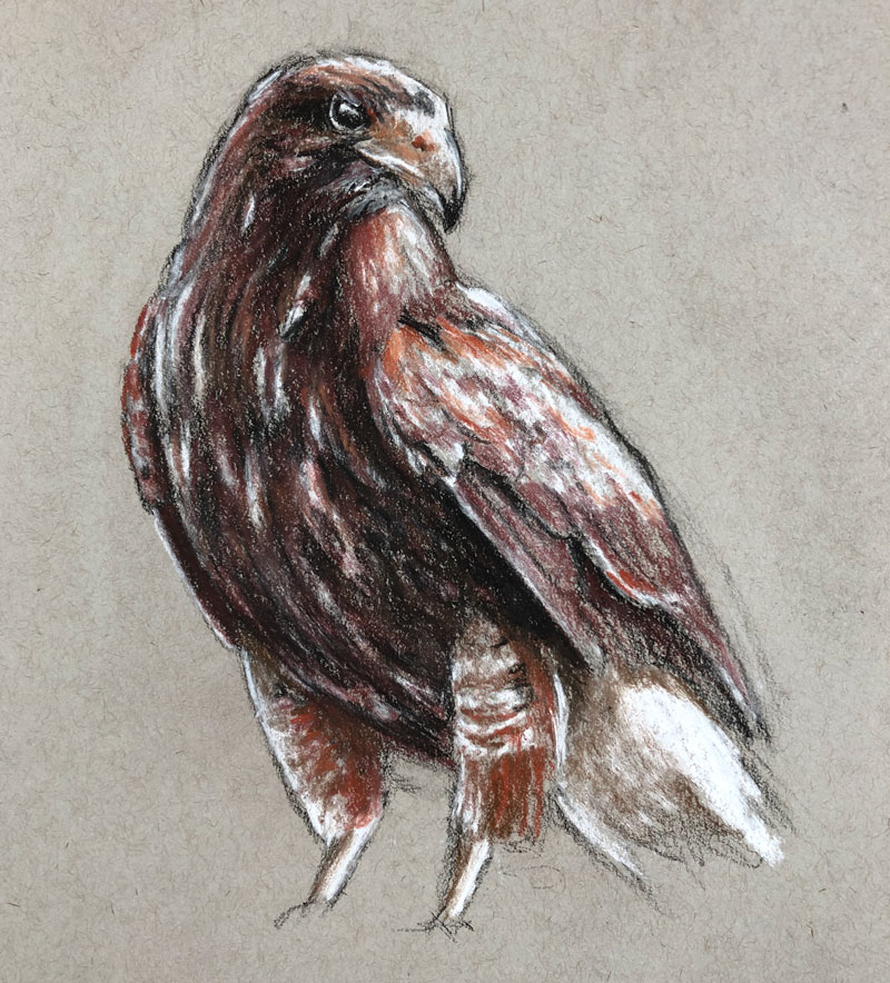
In this episode, we take a look at the process of sketching a hawk (mistakenly called a falcon by us “experts”) with sepia toned pastel pencils and black and white charcoal on gray drawing paper. Charcoal obviously gives us the opportunity to create a broad range of value with rich, dark blacks. White charcoal takes care of the highlights and lighter tones. The sepia toned pastel pencils provide a bit of color, but harmonizes the sketch with a limited color palette.
Here’s a look at the completed image…
Keeping it Sketchy
The first step in drawing the subject is to sketch the basic shapes and contours on the drawing surface. Charcoal is naturally a looser medium, so it makes since to keep our initial sketch rather loose. However, this would be true for any medium we choose to use. It’s usually a good idea to start with loose, sketchier marks and then refine the drawing as it develops. Charcoal makes sketching loosely a little easier since it’s easy to erase and manipulate.
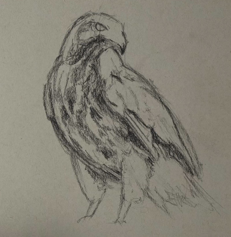
To make the drawing as accurate as possible, a bit of measuring is used. In this case, I used a printed version of the photo reference (a little further down this page) to take measurements. Using the charcoal pencil as a measuring tool, I took measurements and applied these measurements to the sketch. This ensured that the proportions of the bird were fairly accurate.
I also used the charcoal pencil to find the angles of different sections of the body. Laying the pencil over the printed reference made the angles, diagonals, etc. very clear and easy to see.
See also: Drawing 101 – Simplify for Success
Once the sketch of the basic shapes and contours were in place, I quickly blocked in some of the shadows and darker values. But before getting too carried away with the dark values, the lighter values needed to be addressed.
Adding the Highlights with White Charcoal
Next, the highlights and lighter values are preserved with a white charcoal pencil. Since we’re working on gray paper, we have the ability to push both dark and light values to produce a full range of tone. These lighter values are blocked in loosely, partly because of the time constraint but also to keep the drawing loose and fresh.
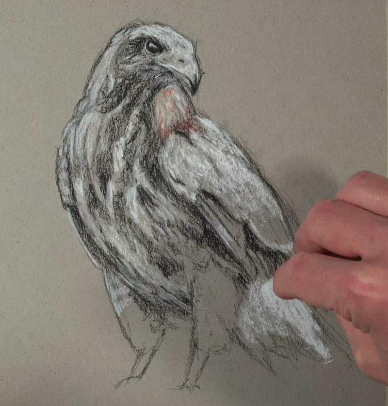
Be advised that in areas where the black and white charcoal interact, some cooler grays will develop. These cooler grays may help to create the illusion of natural shadow and add variety, but too many of them may take away from the limited palette. Since the sepia tones are warmer as well as the gray paper, we want to keep these cool gray areas at a minimum. To do this, we’ll simply leave a bit of the warmer gray paper visible in between the black and white applications.
Adding Sepia Tones
The term “sepia” simply refers to a reddish-brown color. This brownish pigment originally comes from the ink sac of the cuttlefish. Sepia is actually a genus of cuttlefish. In art, sepia can refer to a broad range of reddish-browns, including hues that are more red, brown, or even yellow.
Working with sepia tones allows us to add a little warmth to a drawing, while keeping the palette simple. Conté, a drawing medium similar to both charcoal and pastel, is produced in variety of earthy tones, including sanguine which is a reddish brown tone. Conté is inexpensive and can be found at most art stores.
In this drawing however, pastel pencils are used in place of traditional conté. A few reddish-browns were chosen from a set of Conté a Paris pastel pencils to use with this drawing.
After the lighter tones were mapped out, the addition of the sepia tones began with the pastel pencils. As you’ll notice some of the browns and reds were a little cooler, while others were warmer. This worked out great for our subject since both warm and cool varieties of the sepia tones were found on the hawk.
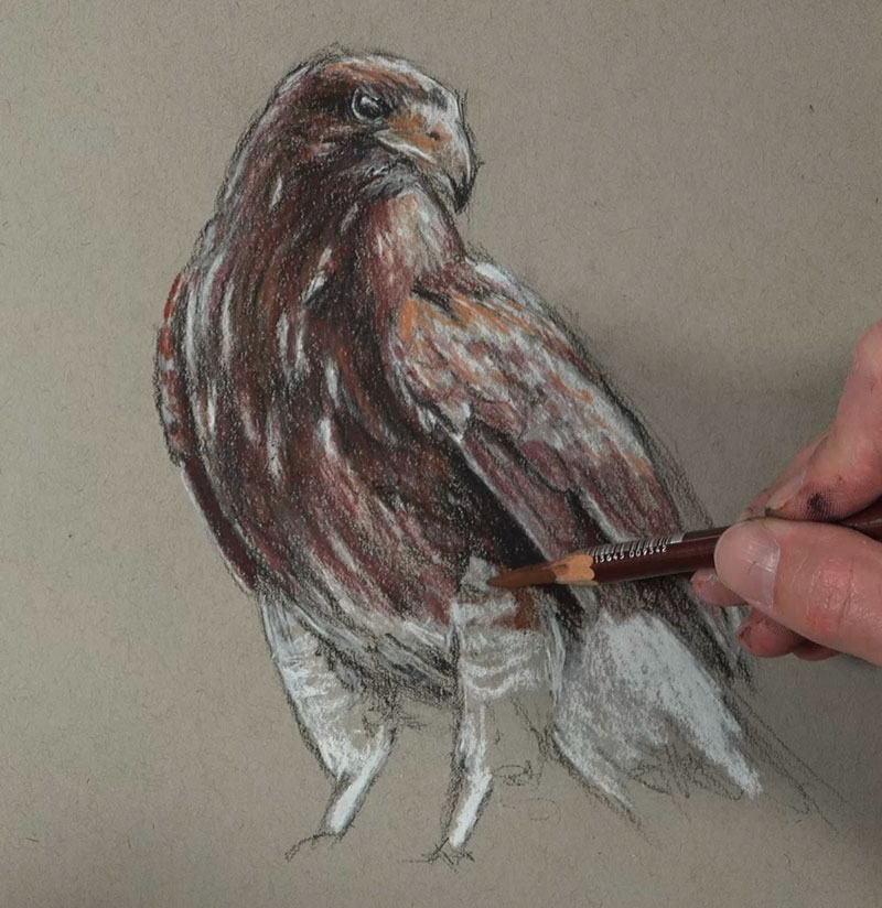
Much of the sepia tones were applied directly over the charcoal applications. With heavy pressure, the pastel pencils were able to mostly cover the charcoal applications. But with a slightly lighter touch, some mixing results. This allows us to create a variety of values of the sepia tones, resulting in darker browns and lighter red-oranges.
Photo Reference
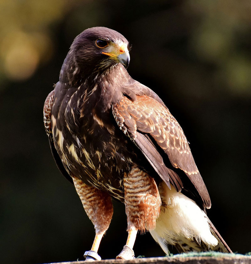
A slightly edited photo reference was used for this drawing. This reference comes from Pixabay.com.
Here’s a look at the photo reference…
Materials Used in this Drawing Exercise
Both charcoal and “white” charcoal were used to complete the drawing. Pastel pencils by Conté a Paris were used to apply the sepia tones. The drawing was completed on Strathmore toned drawing paper. This paper is inexpensive and is a wonderful surface for sketching.
Here are a few links to pick up these materials… (The following links are affiliate links which means I make a small commission if you purchase at no additional cost to you.)
- Woodless Charcoal Pencils (Black)
- White Charcoal Pencils
- Conté a Paris Pastel Pencils
- Strathmore Toned Drawing Paper Paper
Timed Drawing of a Hawk – Conclusion
Most of us have plenty of experience drawing with a pencil on white paper, but branching out and trying new mediums opens us up to new possibilities. Using different mediums may also change the way that we make marks, leading to better artworks.
While pencils are used in this drawing, the way they are applied is different from how a graphite pencil would be used on white paper. Drawing loosely and quickly without compromising too much accuracy is a skill that every artist should develop. This combination of media helps us do this, all while developing a respectable drawing with a harmonized palette.
If so, join over 36,000 others that receive our newsletter with new drawing and painting lessons. Plus, check out three of our course videos and ebooks for free.


