
This lesson highlights simple, yet effective, mark-making and blending techniques that you can use in your colored pencil work. We’ll also talk about the important variables such as pressure, pencil angle, and point sharpness. We’ll explore how these aspects affect the result. I’m excited to share plenty of helpful tips with you!
Some of the techniques, like layering or burnishing, are fundamental. It’s no wonder that you can find them in almost any article on drawing with colored pencils. Other options, such as embossing or creating a white underlayer, are less well-known.
See also: Colored Pencil Techniques
A broad range of techniques and mark-making styles provides more options to choose from. Theoretical knowledge can be multiplied by experience, giving you additional ways to achieve the desired effect. Greater creative freedom comes as a bonus!
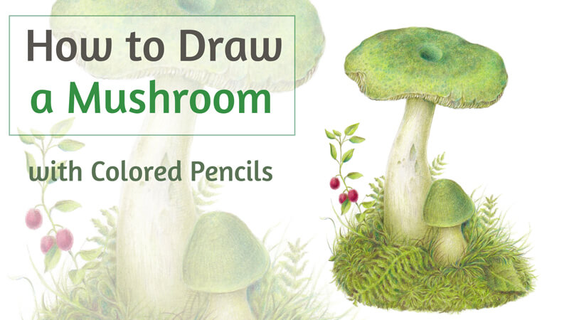
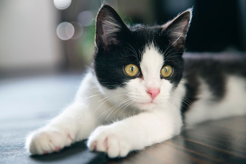
First, we’ll have an introduction that precedes a step-by-step drawing project. Our subject matter will be a juicy mandarin. In the practical part, we’ll apply our knowledge to create a convincing illusion of volume and nearly tangible textures.
Colored Pencil Supplies Used in this Lesson
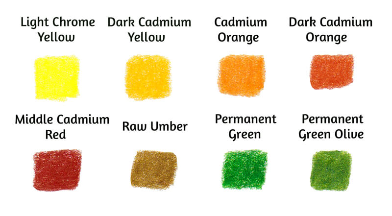
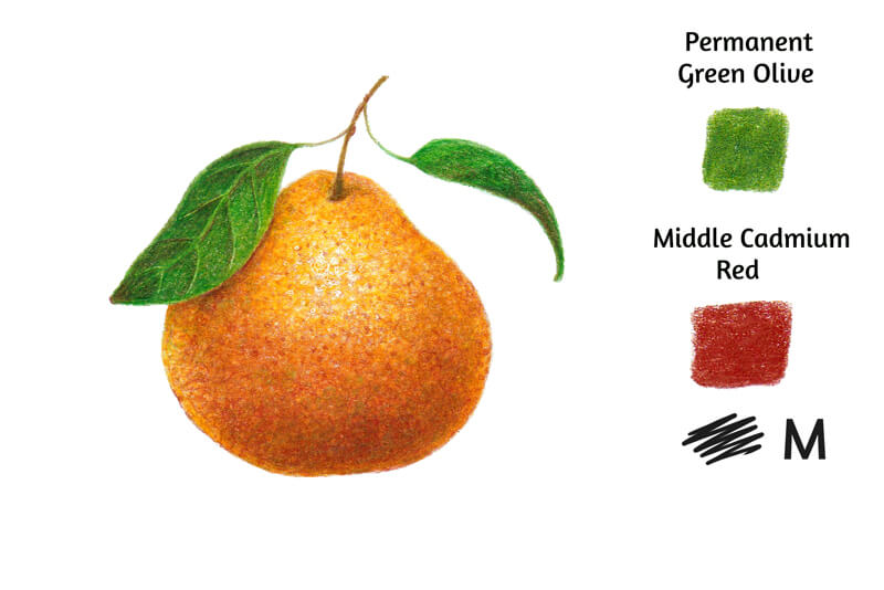
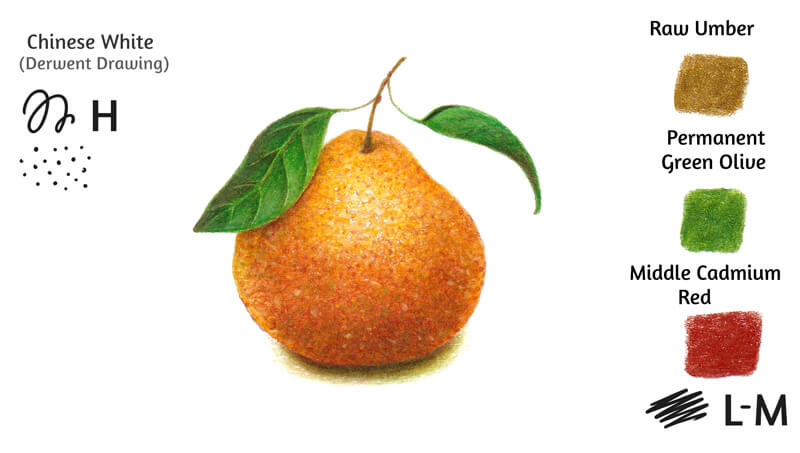
This project is focused on colored pencils. Please use any pencils that you like or have. Mine are oil-based Faber-Castell Polychromos. (You’ll find the swatches in the image below.)
See also: Wax-Based vs. Oil-Based Colored Pencils
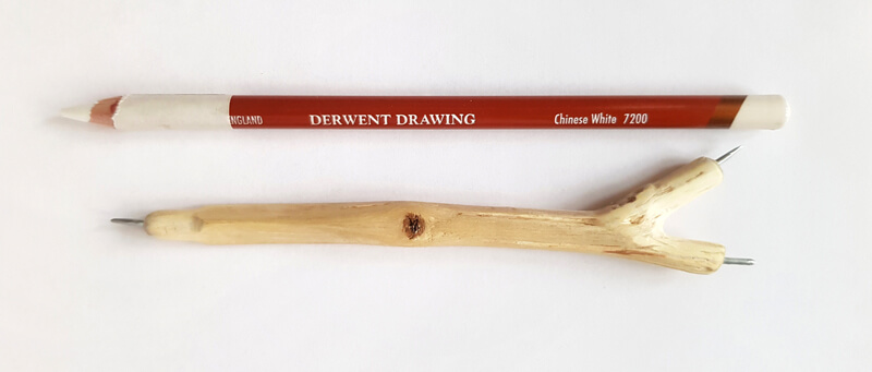
We’ll also need a white pencil. My choice fell on Chinese White from the Derwent Drawing set because creates a dense, solid covering at one go.
See also: Comparing Colored Pencils
As we’ll discuss embossing, it’s helpful to have a tool that allows indenting of the paper. There are various ready-made embossing tools available on the market. Mine is handcrafted – it is made of a wire and a piece of wood.
If you don’t have an embossing tool, feel free to use anything that imitates it. A pen with an empty refill or a thin needle may be a nice substitute.
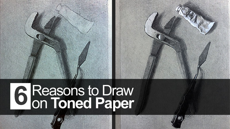
I’ll be drawing on an A4 sheet of ordinary drawing paper. Its surface isn’t completely smooth and there is a subtle texture. This moderate tooth will help the pigment found in colored pencils stick to the paper.
Choose your paper wisely – it affects the result as much as your drawing skills or the quality of your colored pencils. For example, rough paper makes it more difficult to add details and create an even, smooth covering, but allows for more layers.
See also: All About Drawing Papers and Surfaces
We’ll start with an underdrawing, so keep an ordinary HB graphite pencil and an eraser at hand.
Colored Pencil Techniques: Theory
Before we dive into the creative process, let’s refresh our knowledge on drawing with colored pencils. The character of marks and layer quality are among the aspects that determine the result, but let’s dig even deeper.
Pressure
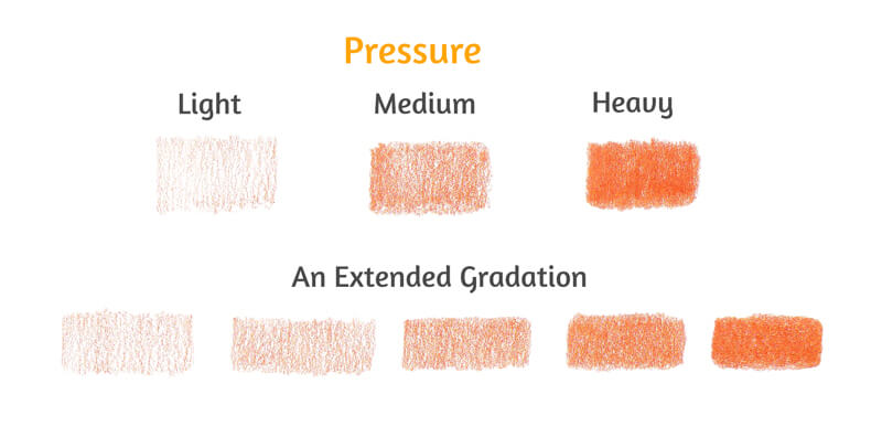
One of the important variables is pressure. It refers to the effort that we apply to the paper with our pencil. Pressure affects the value and intensity of the color.
It’s possible to mark out three basic levels of pressure: light, medium, and heavy. However, if you try pressing harder or lighter while drawing, you’ll discover that there are many more transitional levels. The pressure scale may be easily expanded to five or more steps.
It is commonly agreed that the best option is to start lightly. This principle is valid for the few first layers of color. If you press too hard right from the start, it may cause damage to the paper. As a result, the surface won’t be able to accept more applications.
With each subsequent layer of color, you’ll need to apply more pressure to make the pigment stick to the paper. Therefore, you’ll naturally change the level of pressure from light to medium or above medium.
Layering
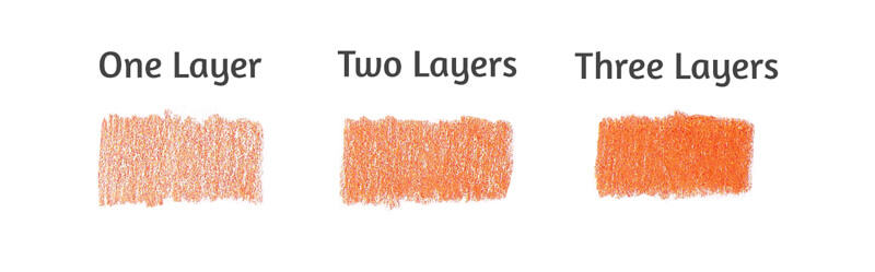
Applying heavy pressure isn’t the only option to get a dense, solid covering. (In the image below, you’ll find the proof.) All three samples were drawn with medium pressure, but the quantity of layers differs.
The more new strokes you add on top of the existing ones, the fewer specks of untouched paper you’ll see. Therefore, if you wonder why your artwork looks grainy, it may be a sign to apply more pigment.
You can layer different colors to create interesting effects. Colored pencil applications are somewhat translucent, so layering allows for blending and mixing.
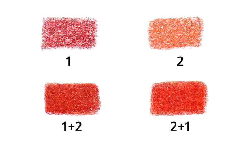
Even if you don’t have a large set of pencils, you can mix the color you need just by layering. The order in which you apply the colors does matter however.
In the image below, you’ll find two results of layering. In both cases, there are two layers drawn at heavy pressure, but the sequence of color application is different. Based on the experience, the underlying color is dominant.
Pencil Angle While Drawing
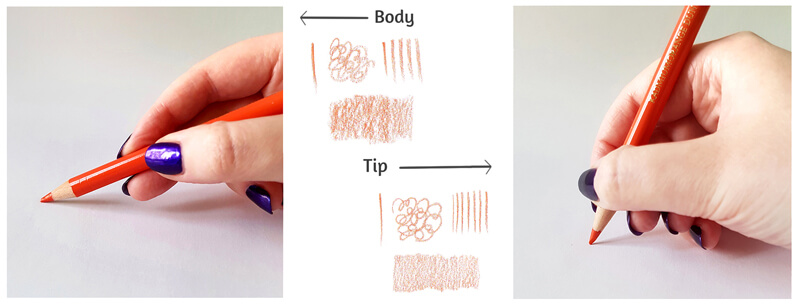
The way you hold the pencil matters too. If the pencil is positioned at an acute angle to the paper, the marks will be made with its core’s body.
This style of drawing makes the texture of the paper more evident – it will show through the pencil applications. The core’s body has a large coloring area, so the marks will be quite broad.
If your pencil touches the paper only with its tip and the angle is closer to 90°, you’ll get finer marks. As a result, the covering will be smoother with softer transitions – even if your pencil isn’t perfectly sharp, as in my example.
See also: 5 Grips for Holding a Pencil for Drawing
The Sharpness of the Pencil
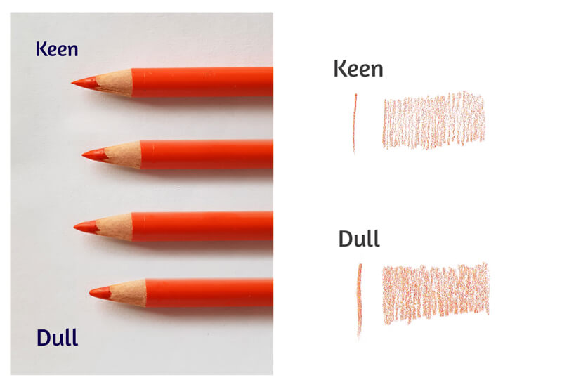
It is obvious that a pencil with a keen point produces thin lines. Therefore, if your goal is to create fine details, don’t forget to sharpen your pencils! Combine a sharp point with light pressure and a proper hand position, and you’ll get lines as thin as hair.
At the beginning stages of drawing, having a keen point may be an advantage too. A sharp pencil can overlay the tooth of the paper in a more efficient, qualitative way than a dull one. However, it may require a bit more time to cover a large area than a blunt core.
Also if your pencil is dull, most likely you’ll be pushing harder and harder to cover all those small spots of paper showing through. This can be quite harmful to the tooth of your paper.
In the image below, you’ll find an improvised gradation from a needle-like pencil tip to a relatively dull point.
I’d say that every artist should find their preferred and comfortable levels of sharpness. For example, I’ve concluded that 80-90% sharpness is acceptable in the majority of cases. It’s good to keep a piece of sandpaper at hand. It allows sharpening a pencil in a mild way when it feels necessary.
Colored Pencil Mark-Making
Colored pencils can produce a variety of marks. Organizing them into a cohesive system may be a challenging task.
If you read a dozen articles on this topic, you won’t find two classifications that look completely the same. Usually, they have just several terms in common. It’s also not unusual to find a mark-making technique named or described in a different way. If some drawing method doesn’t have an official title, it gets an invented one – artists often come up with their own names.
I find it easier to divide the mark-making techniques into three categories: directional lines, circling, and creative marks.
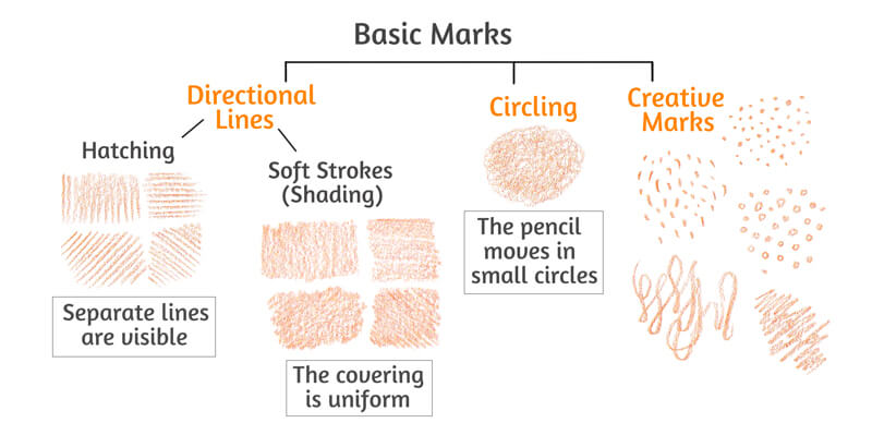
As the name suggests, directional lines flow in the same direction. It may be vertical, horizontal, or diagonal. The similarity creates consistency.
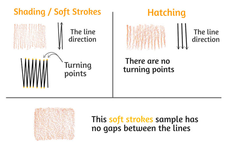
It’s possible to mark out two groups within this category: hatching and, what I call them, shading or soft strokes. From a visual standpoint, these groups may be considered as extreme examples of the same technique.
Hatching is a series of marks. Usually, they have the same direction and character. Hatches may be straight or curved. Each line is clearly visible. To create hatching, the pencil should be lifted from the paper after each mark and then placed down again to create a new one.
Applied on top of each other, layers of hatching create cross-hatching. Each layer usually has a specific direction. Combined, they demonstrate a net-like effect.
Hatching may give your artwork a sketchier, more stylized look.
Shading is a bit different because the pencil moves back and forth without leaving the surface of the paper. There are turning points where the pencil changes direction. This kind of movement allows creating a smoother, more unified look. The covering has a soft transition between the lines.
Multilayer shading, where each subsequent layer has a different line direction, usually has an extra smooth look.
If the marks are placed close together and there are no gaps between them, shading will be perfectly seamless. Drawing with a sharp pencil tip increases this effect.
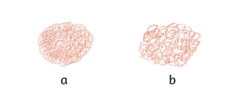
The second category is circling. This technique involves drawing small circles that overlap each other, usually at light pressure. The movement resembles continuous scribbling, but the marks are tight and uniform. To create a smooth covering, make sure that only your fingers are moving, and not your wrist.
Circling makes it easy to produce an even base with a gradual transition between colors and value. Working with a sharp pencil at light pressure strengthens this effect.
Larger gaps between the marks and increased pressure will give your sample a more stylized, textured look. The image below illustrates the difference in space between the circles that form the sample.
The third category is creative marks. In my vision, it includes stippling, random scribbles and zigzag lines, various patterns, and other marks of all kinds. The sky is the limit.
So if your goal is to create a texture or some special effects, feel free to draw in any manner that seems appropriate.
Colored Pencil Techniques: Practice
Now that we’ve had a look at a few of the basics, let’s dive into a practical application and create a drawing using these techniques.
Sketching the Mandarin
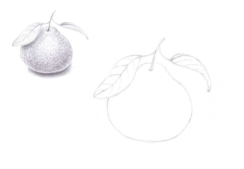
I start with an underdrawing with a graphite pencil.
My fruit has an unusual form – the upper part is slightly elongated. I also add a couple of leaves. They present a nice difference in terms of texture. The surface of a mandarin is rough and bumpy, and the leaves are smooth.
I highly recommend creating a quick value sketch before proceeding to colored pencil applications. Is the object lit from above or does the light come somewhere from the side? A preliminary sketch allows marking the lights and darks beforehand, so you can focus on the techniques, colors, and textures later on.
Softening the graphite marks with a kneaded eraser may be a good idea. Excess graphite can contaminate the colored pencil applications.
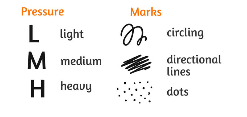
To make the following instructions more visual, I’ve developed notation keys. Each symbol has a meaning. Some indicate the level of pressure that I apply to a pencil. Others signify the mark-making techniques. You’ll find the legend in the image below.
Please note that the directional lines technique will be presented mostly as continuous, uniform shading, not hatching. The accent here is on the directional, parallel manner of the lines.
Embossing and Creating a White Underlayer
Some artworks require that a specific area should be left untouched. It may be a highlight zone or just tiny details like hairs or veins. One of the ways to preserve the original appearance is embossing. This technique may also be applied to an area that is already covered with pigment.
Embossing means pressing onto the paper with a pointed tool, creating indentations. It is quite difficult to access the indented areas with a pencil tip, so they will stay untouched.
The embossed marks can be of any length. It’s even possible to imitate stippling.
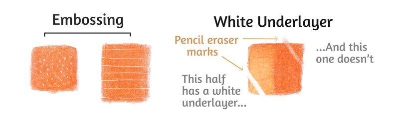
Another way to save the lightness of a zone is to cover it with white before applying any other colors. In this case, soft, creamy pencils work better than dry, chalky ones.
Another advantage of a white underlayer is that you can remove the upper layers of pigment with an eraser and restore the whiteness. In the image below, you’ll find an illustration of this effect.
To make the left part of the sample, I applied Chinese White first, then added Dark Cadmium Orange. The right half was created by applying Dark Cadmium Orange directly on the paper. Then it was the pencil eraser’s turn – I erased two lines on both sides of the swatch. As you can see, the white underlayer made it possible to fully restore white.
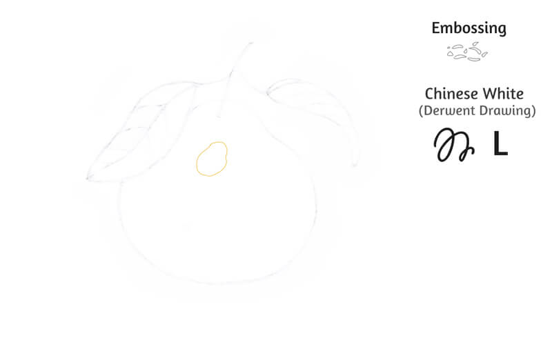
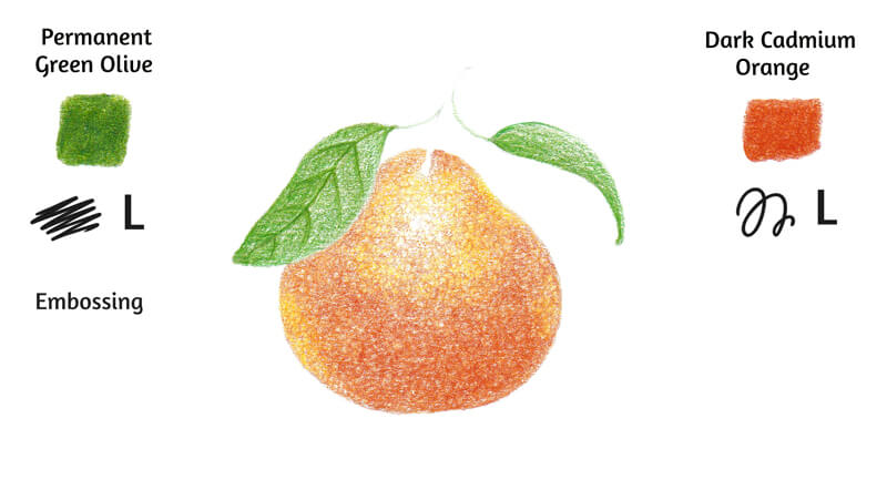
I’m going to create a highlight in our fruit’s upper part, using both embossing and a white underlayer.
Let’s start with the embossing tool. I work with short curved marks, pressing hard enough to create hollows. The indentations imitate the texture of a mandarin. In the image below, you’ll find a stylized scheme of my marks.
It is very hard to notice the area where I applied the embossing tool, so I marked it with orange color.
Then I add some Chinese White to the highlight zone, partially on top of the indentations. As the symbols show, I work using the circling technique at light pressure.
A white underlayer will create a pleasant variation in color and texture later on. The embossed marks will stay white as the paper and the white pencil strokes will affect the color of the subsequent layers.
Creating the First Layer of Color
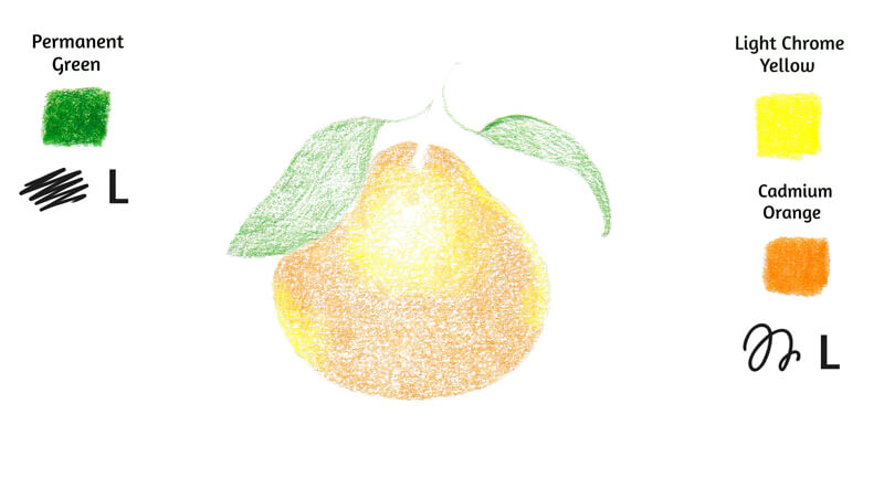
I apply Light Chrome Yellow to the area around the highlight. I also add this hue to the sides of the mandarin.
The remaining shape is covered with an even layer of Cadmium Orange. These two colors may overlap each other to form a seamless coating.
The goal is to create an illusion of the rough, uneven texture of our fruit, so I’ve chosen the circling technique. I keep the pressure light. The paper’s surface shouldn’t be worn out too quickly.
I also cover the leaf with Permanent Green, working in a shading manner. The marks repeat the direction of the leaf. The character and softness of marks will help to create an illusion of a smooth texture.
Layering
With Dark Cadmium Orange, I increase the density of the colored covering. The specks of white paper are gradually disappearing. The pressure is still light. The bottom part of the mandarin gets an additional layer of strokes. As you can see, the circling technique creates a textured effect.
I add Permanent Green Olive to the leaves, applying more pigment to the darker areas. The manner of drawing is still soft and directional.
I draw the veins of the leaves. At this step, feel free to increase the pressure slightly. After the veins become visible, I emboss them. These details will stay crisp, no matter how many layers of color will be added in the next steps.
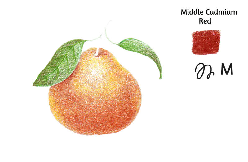
I add Middle Cadmium Red to the fruit’s core shadow, giving our mandarin more volume. I also apply it to the areas under the leaf and near the stem. This red accents the shift of color temperature, making the artwork look more realistic.
Now I have to increase the pressure because there are several layers of pigment already on the paper. However, the change is minor.
I also add Middle Cadmium Red to the darker areas of the leaves. Applied on top of each other, contrasting colors create a deep, muted, and realistic shade.

Burnishing – The First Phase
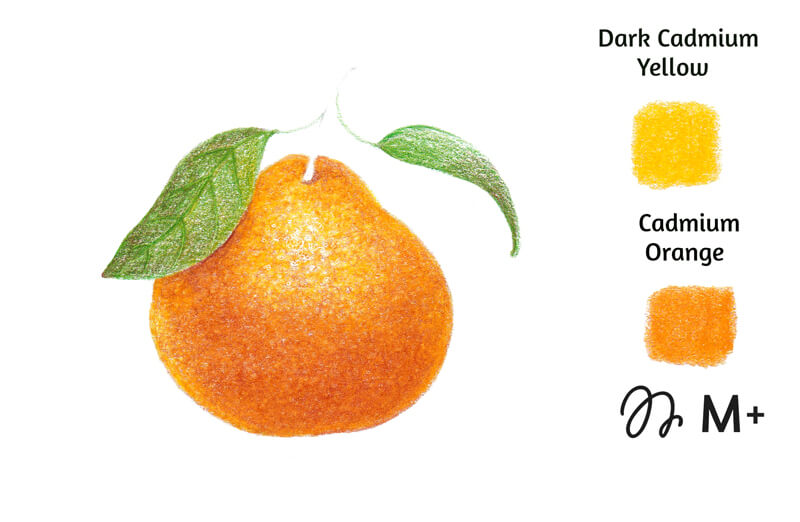
With Dark Cadmium Yellow and Cadmium Orange, I increase the density of color even more. It’s time to smooth the existing applications and get rid of unnecessary white spots. It’s also a good idea to reduce the highlight zone.
Now the pressure is from medium to above medium. We already have a decent amount of pigment on the paper and we can transfer the pigment locally, from one area to another, with a pencil tip.
It’s possible to say that we no longer layer the applications – we’ve started burnishing our artwork.
Burnishing is technically a blending method, but it is different from simply layering the colors. Burnishing means creating a solid area of pigment where no paper texture is showing through. With this method, you can add a polished feel to your artwork, so it resembles a painting.
This effect is achieved by applying a pencil, usually of a light color, on top of the existing layers at heavy pressure. Technically, you can use a pencil of some bright or dark color to perform burnishing too.
Other popular tools can create a polished effect – for example, a colorless blender or various paint thinners.
See also: How to Blend Colored Pencils
To burnish an area, both directional lines (in a continuous, shading manner) and circling are wonderful options. The pencil may be slightly dull. When heavy pressure is applied, it’s easier to break a fragile fine point.
It is generally recommended to consider burnishing as the top layer that you add to your artwork. This advice is legitimate, considering that burnishing involves an increased level of pressure. It may be that your drawing surface won’t be able to accept another layer of pigment later on.
However, each case is unique. It’s possible to perform two or three rounds of burnishing without damaging the paper. Try to feel your materials and experiment.
Additional Work on the Values and Textures
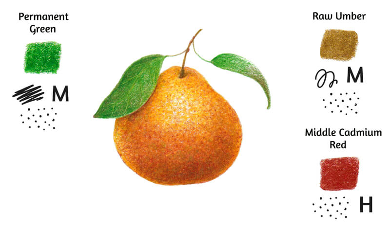
The fruit still looks a bit flat. With Raw Umber, I deepen the core shadow in the lower part of the mandarin. I work in the circling technique at medium pressure. Apply as many layers as you need to get a nice solid core shadow.
It’s also possible to leave some dots here and there to convey the texture.
With Middle Cadmium Red, I add dots and small circles to reveal the roughness of the fruit’s surface. The pressure varies from above medium to heavy. Keep your pencil point sharp enough when working on details!
I cover the leaves with Permanent Green, using directional lines. I add some green dots to the lower part of the mandarin to achieve the interesting effect of mixing contrasting colors.
With Permanent Green Olive, I work on the areas between the leaves’ veins. The strokes still repeat the direction of a leaf. I keep them smooth and soft.
I also add this shade to the cast shadow on the peel, under the leaf. This subtle addition not only indicates the proximity of a green object, but also deepens the shadow.
Then I apply Middle Cadmium Red on top of the leaves’ darker areas. The color becomes richer and more complex.
The Final Burnishing
The artwork is almost complete. With Chinese White, I burnish the upper part of the mandarin and its leaves. I focus on the areas with the unwanted specks of white paper. However, the visibility of the tooth adds to the textured effect, so it may be a good idea to leave some areas.
In the lower part of the drawing, I apply the white pencil only in a stippling manner. Dots and short strokes help to convey the texture.
As a final step, I create a cast shadow under the fruit. I start with Raw Umber, then apply Permanent Green Olive. Middle Cadmium Red acts as the top layer. I keep the pressure from light (at the shadow’s outer edge) to medium (right under the object.) Repeat this sequence or add any color that you find suitable.
A Practical Guide to Colored Pencils – Conclusion
Congratulations – we’ve created a beautiful artwork! I hope that you enjoyed every step of this practical guide.
I wish you lots of creative fun with your future colored pencil drawings!
If so, join over 36,000 others that receive our newsletter with new drawing and painting lessons. Plus, check out three of our course videos and ebooks for free.
How to Use Watercolor Markers
Watercolor Markers
In this lesson, we’ll take a look at using watercolor markers, a relatively new art making medium on the market. We’ll explore a few techniques and then create an image of a seashell that combines watercolor markers and pen and ink.
Watercolor is one of the most popular painting mediums. It is accessible, cleans up easily, and travels well. However, this doesn’t mean that watercolor is easy to use. In fact, I would argue that watercolor is one of the most challenging mediums to work with. This doesn’t stop the masses as many new to art gravitate to it thinking that it is a beginner’s medium.
In many cases, people quickly realize that watercolor, in its traditional form, is quite challenging. Manufacturers of art products know the challenges of watercolor and are also aware of its popularity. Considering this, it’s no wonder that there is a myriad of watercolor products on the market designed to make watercolor painting “easier”.
See also: How to Use Watercolor Pencils
This is why we see products such a water brushes, watercolor pencils, water soluble graphite, water soluble ink pencils, and watercolor markers. The purpose of these products, in my opinion, is to make watercolor “easier to use”. And in many cases, they do just that. But are watercolor markers worth adding to your tool box?
Let’s take a close look at them and find out.
Watercolor Marker Techniques
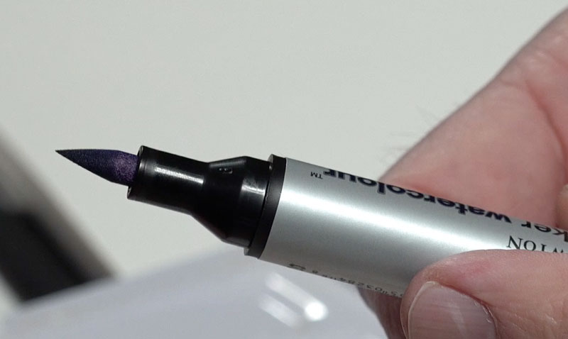
On the surface, watercolor markers appear similar to alcohol-based markers. The markers I experimented with in this lesson are the Promarker Watercolour markers by Winsor and Newton. There are many brands out there, but Winsor and Newton is a trusted brand in the art world.
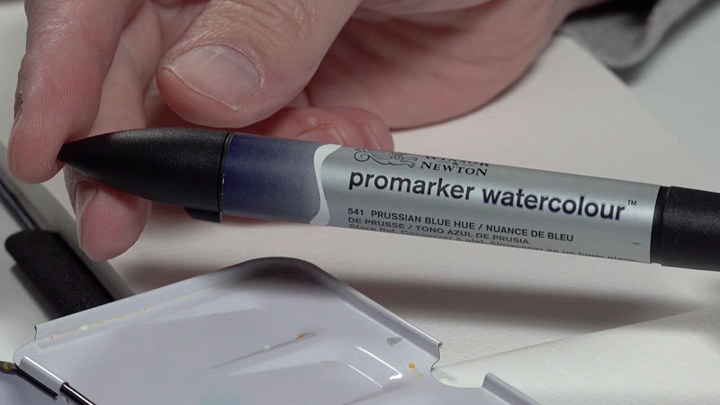
Like alcohol-based markers, these markers feature two district tips. One tip is stiff and narrow and clearly designed for precision or writing. The other tip is tapered like a brush and is softer. This is the tip that I preferred.
You can pick up Promarker Watercolour Markers by clicking on the link below. This is an affiliate link which means I make a small commission if you purchase at no additional charge to you…
Buy Promarker Watercolour Markers
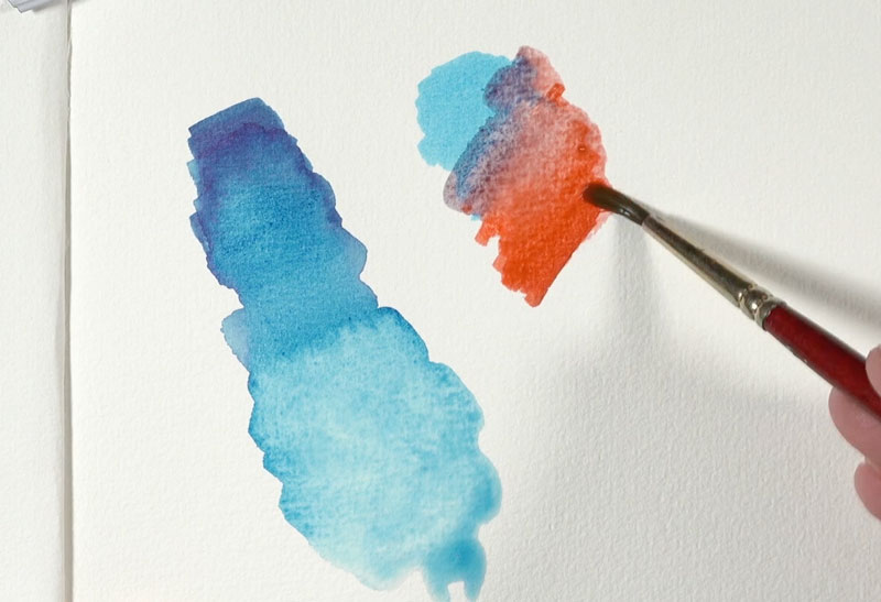
Direct Application and Activation
Before discussing each technique, it should be mentioned that watercolor markers are designed to be applied to the same surfaces as traditional watercolor. This means that traditional watercolor papers should be considered.
Perhaps the most obvious technique is to apply the watercolor marker directly to the surface. Without activation, the marker behaves like any other marker. But when water is applied (activated), the marker comes to life and behaves just like watercolor.
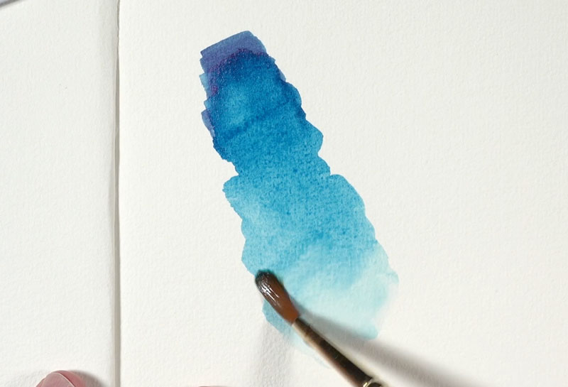
The pigment can be thinned with additional water and lifted with a paper towel. It can be manipulated and pulled around directly on the surface. But work quickly – once dry, the marker applications are difficult to manipulate.
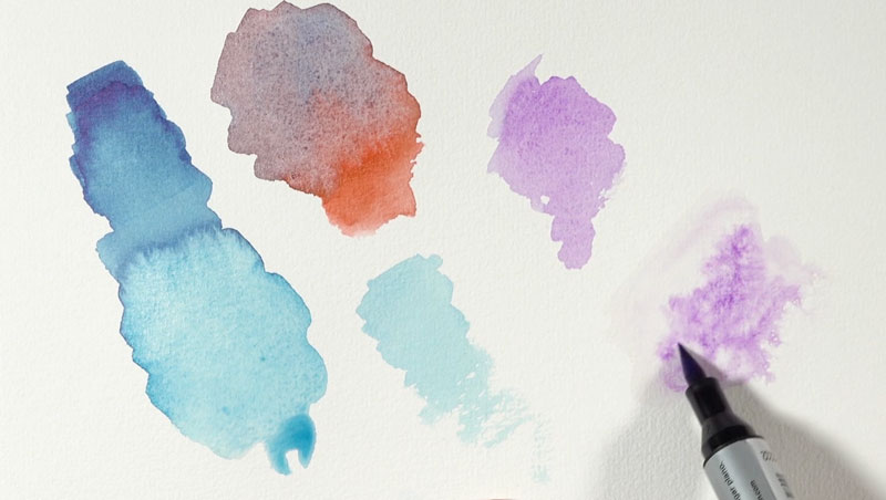
Mixing Colors with Watercolor Markers
Mixing colors with watercolor markers can be achieved in different ways. The most direct method of mixing occurs when two colors are applied to the surface and then activated with water. While this method is the most direct, it also comes with a bit of uncertainty.
A second method of mixing involves applying two or more colors to a water resistant palette with a marker and then bending the colors together to create a new one. This method produces a more predictable mixture but is more involved and requires a mixing palette.
Applying the Marker to a Palette
As alluded to above, watercolor markers can be applied to a water resistant palette. With a brush and a touch of water, the pigment can be lifted from the palette and applied to the painting surface. This technique produces lighter, but more controlled washes.
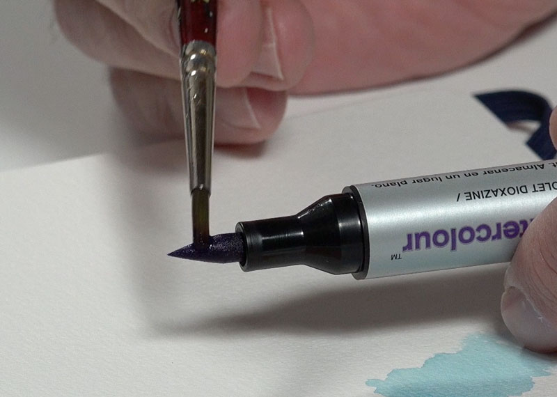
Applying Watercolor Markers from the Tip
One technique used with watercolor pencils is to lift color from the tip of the pencil with a wet brush before applying the color to the painting surface. This technique can also be used with watercolor markers. Simply add a touch of water to your brush and touch the tip of the brush to the tip of the marker. Then proceed to apply the “loaded” brush to the painting surface. This technique also results in applications that are less intense, but you do have more control over the application.
Applying Watercolor Markers to a Wet Surface
One of the appealing aspects of watercolor is the effects you can create with wet into wet applications. While these effects cannot be fully duplicated without using traditional watercolor, they can be somewhat replicated. To produce similar results, simply wet an area on the painting surface with water. Then apply the marker directly to the areas that are saturated with water.
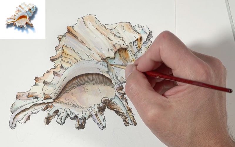
Watercolor Markers – Step by Step Painting with Pen and Ink
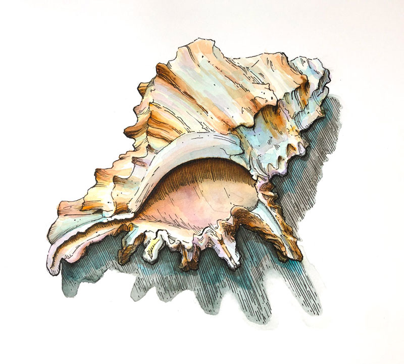
Let’s take a look at using watercolor markers by creating an image of a simple seashell. (I’m not sure if this would considered a painting or a drawing.) Traditional watercolor works exceptionally well when combined with pen and ink and watercolor markers seem to be a good fit as well.
Creating the Pen and Ink Drawing
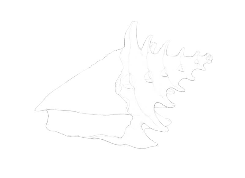
We’ll begin on 140 lb. hot press watercolor paper with a light sketch with 2H graphite. Since we’ll be applying pen and ink to the drawing, hot press watercolor paper provides a smooth surface for line work.
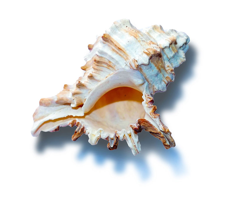
Here’s a look at the photo reference of a seashell we’ll be working from…
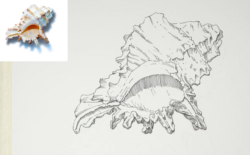
Once the loose pencil sketch is in place, we can begin with pen and ink applications. For this image, I used Staedtler Pigment Liners for the pen and ink applications.
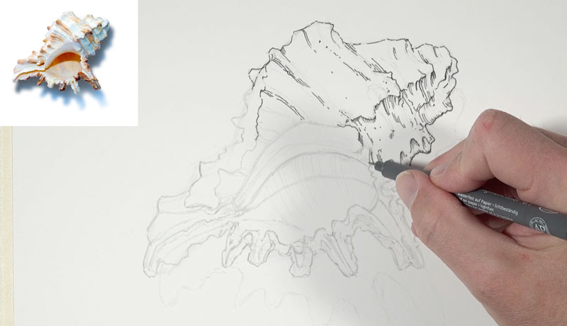
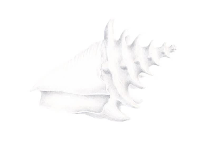
Our initial drawing with pen and ink focuses mainly on the contours with a few bits of shadow added through hatching. A few indications of the texture is also developed. It’s important not to “over do it” with the pen and ink, keeping mind that we are to add the watercolor markers. The watercolor marker applications will affect the values and we want to be sure we don’t get too dark with the pen and ink. We can always return with the pen and ink after the watercolor markers are applied.
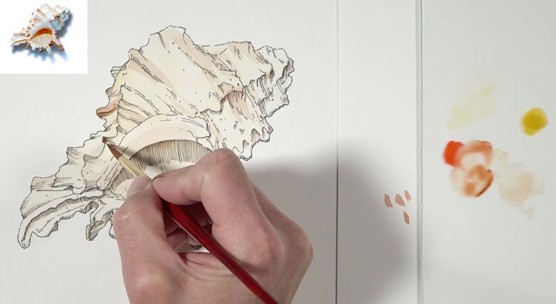
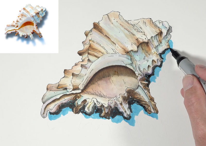
Applying Watercolor Markers to the Pen and Ink Drawing
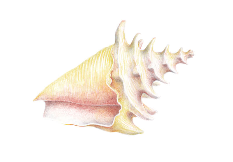
Just like with traditional watercolors, we must rely on the “white” of the paper to produce our highlights and also to affect the lighter values. This means we must be cautious of getting too dark with our applications too quickly. For this reason, we’ll start with less intense applications of color and work our way up to more intense applications.
To help control the intensity of the color, we’ll pull the color from a palette. After applying the watercolor marker to the palette, we’ll lift the pigment with a lightly loaded brush and apply it to the painting surface. We’ll begin with Yellow Ochre, covering the entirety of the shell. This is followed by applications of additional warm colors such as Burnt Umber and Cadmium Red Hue.
We’ll continue to slowly build up the intensity of the color and range of value by layering additional applications of these colors and mixtures of these colors.
Although the bulk of the seashell consists of warmer colors, we’ll begin adding some cooler colors for the shadows. This will create more contrast between the highlights and shadows and result in a more colorful seashell. Diaoxazine Purple and Cerulean Blue Hue are applied in the shadowed areas.
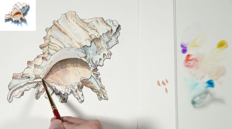
Gradually, we can begin increasing the contrast. As the contrast in vale is enhanced, the form of the seashell begins to make more sense. A touch of black is used in the darker areas to bump up the shadows.
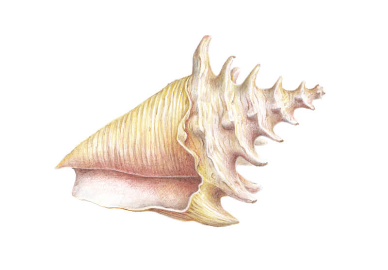
To push the contrast even further, we’ll next apply the marker directly to the surface and then activate with water and a brush. To do this, we’ll return with some of our initial warm colors – mainly with Burnt Umber and Yellow Ochre.
These more intense, darker applications are applied sparingly in selected areas.
After building up a range of value and color on the shell, we’re ready to address the cast shadow underneath. In this case, I wanted the cast shadow to be fairly strong so I started with direct applications of the watercolor markers directly to the surface. Cerulean Blue Hue is applied first, followed by Ivory Black.
As I began activating the colors on the left side of the shadow, the mixing was predictable. But I as moved across to the right side of the shadow, I noticed that the markers had begun to dry and activating and mixing became difficult. It became clear that watercolor markers, unlike watercolor pencils, had an “activation period”. This means that there is a limited amount of time that one can activate the watercolor markers before they dry. Once they are dry, they are very difficult to activate.
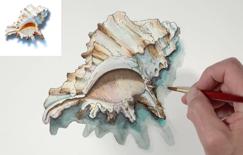
As you’ll notice in the image above, the left side of the shadow gradates as expected. But on the right side, the blue and black are segmented and there is little gradation.
To alleviate this, I decided to go back over the shadow with hatching. This harmonizes the image and helps to soften the lack of gradation of color and value. And as an added bonus, it strengthens the shadow as well.
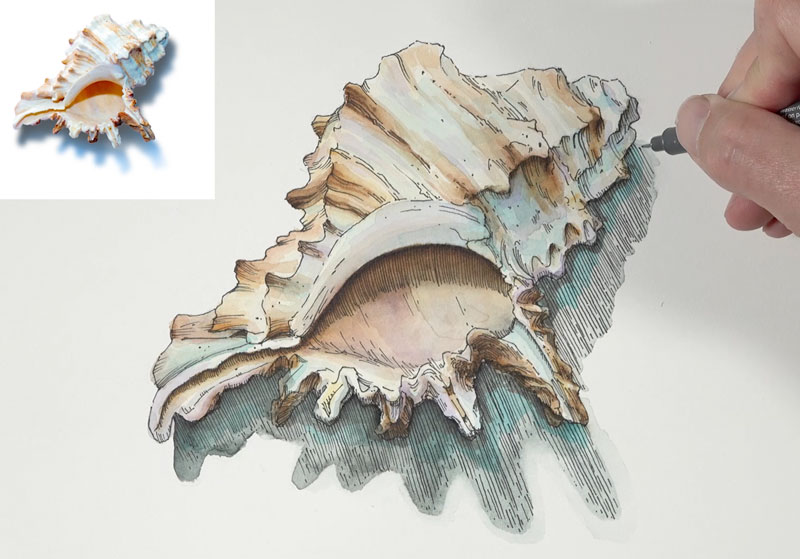
To further soften the transition, I also went over the shadow with a bit of black, taken directly from the tip of the marker.
To finish the image, some of the lines are strengthened and made slightly larger with the pen and ink. This subtle variety in line quality adds more weight to the seashell.
Watercolor Markers – Conclusion
Watercolor markers are an interesting medium. Some will find them an exciting addition to their collection of art materials. I can see the appeal and I enjoyed using them to create this lesson and the image of the seashell. It’s clear that the results are very similar to what we see with traditional watercolor, but in some cases extra steps must be taken to use them in this manner. They do travel well and can be used without the need to carry around watercolor pans or tubes. This makes them excellent for sketchbook work, which is what I see as their most appealing characteristic.
If so, join over 36,000 others that receive our newsletter with new drawing and painting lessons. Plus, check out three of our course videos and ebooks for free.

Blackwing Pencil Review – The Smoothest Pencil
The “$40” Pencil
In this lesson and pencil review, we’ll take a look at Blackwing pencils. I had heard of these pencils and wondered what the hype was all about. They are clearly expensive, but is this added expense over other pencil options worth it?
I decided to order a few pencils and give them a chance. In this post, I’ll share what I learned. But before I get into the review, I’d like to share a little back story regarding these pencils.
Blackwing pencils have been around for a while – well one pencil in particular – the 602 pencil.
When this pencil was temporarily discontinued in 1998, it was rumored to be sold on Ebay for upwards of $40 – for one pencil. (This is according to the Blackwing website.) Now, that’s a lot of money for one pencil. And if someone is willing to pay this much, there must be something to it.
Blackwing also reports on their site that famed illustrator, Shamus Culhane loved this pencil so much that he requested to be buried with it. Now, this must be one amazing pencil – right?
Pearl, Matte, and 602
I ordered a three pencil set which included a “Pearl” pencil, a “Matte” pencil, and the famed “602” pencil. This pencil set wasn’t cheap at nearly $28, and I wouldn’t recommend spending this much for just 3 pencils.
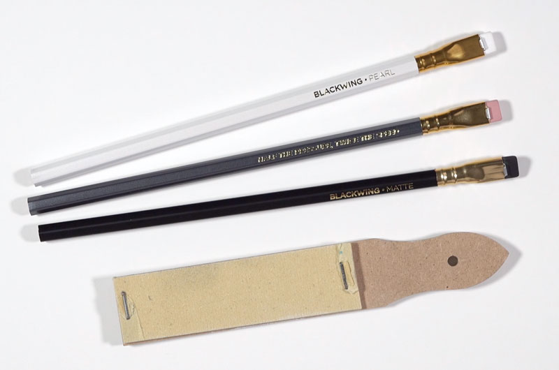
Each pencil features a hexagonal body of standard length with a flat eraser at the end. The wood inside of each pencil is sturdy and hard, making sharpening with a blade or standard pencil sharpener easy.
The eraser is flat, which makes erasing a bit more precise. The amount of eraser material is generous, but what makes the eraser even more unique is its ability to be replaced. The eraser can be removed and replaced with a new one when it is used up. While this is nice, you would need to do quite a bit of erasing to take advantage of this feature. I would venture to say that most people would use up the pencil before needing to replace the eraser.
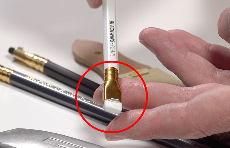
A drawback to this eraser shape is that pencil extenders cannot be used with Blackwing pencils. Because the eraser is flat, the end of the pencil simply won’t fit into a pencil extender. If you’re accustomed to using pencil extenders to prolong the life of your pencils, you’re out of luck with these pencils.
I tested each pencil on soft drawing paper and noticed some differences in each one. We’ll start by looking at the Pearl pencil.
The Pearl Pencil
The body of the Pearl pencil is white and the marks I was able to produce were similar to those that you would expect to see with an “HB” graphite pencil. Of the three pencils I tested, this pencil was the hardest. It kept a sharp tip for a longer period of time compared to the other pencils, but its range of tone was limited.
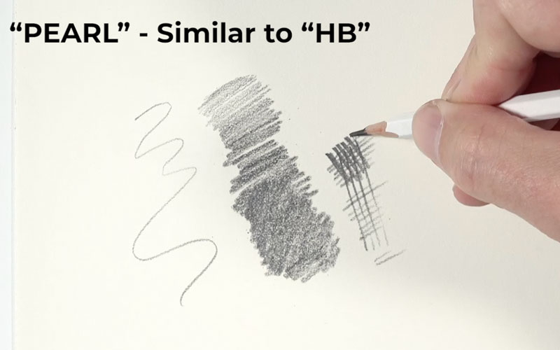
I could produce darker tones, but a bit more effort was required. Lighter marks were easier to produce, although I’d probably stick with an “H” or “2H” pencil for preliminary drawings over using the Pearl pencil.
See also: Artist Graphite Pencils Explained
The Matte Pencil
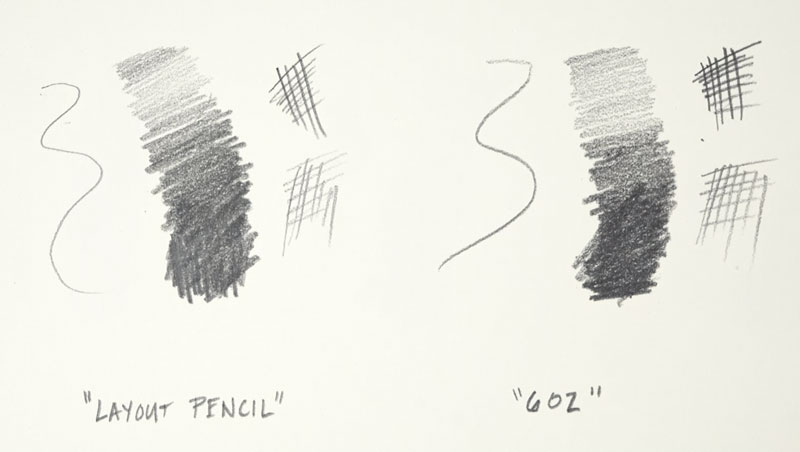
Of the three pencils, the Matte pencil was the softest. The Matte pencil features a black body and since the graphite is the softest, the marks were the darkest. This pencil is most similar to a “5B” graphite pencil. With heavier pressure, you can push the dark tones, but with lighter pressure, you can still achieve lighter marks.
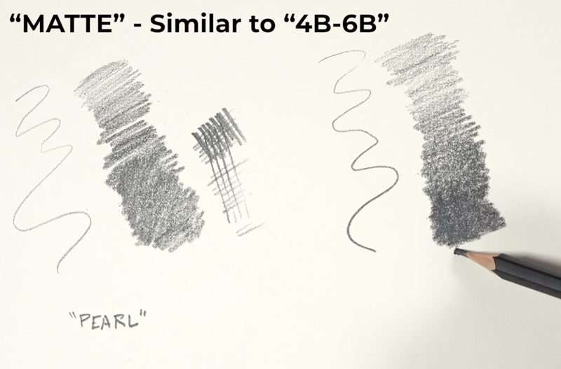
Since this pencil is the softest of the three, it dulls the fastest. However, compared to other 4B-6B pencils, the tip stayed a little sharper for a longer period of time. This suggests that the graphite is slightly harder than standard 4B-6B pencils but still capable of producing darker marks.
The 602 Pencil
While the Pearl pencil and the Matte pencil seemed quite ordinary to me, the 602 pencil was clearly different. (Remember, this is the pencil that was rumored to sell for $40.) The body of the pencil is painted gray and its range of value is quite impressive.
This pencil is able to produce fairly light marks with light pressure, but also darker marks as well. While the Matte pencil produced darker tones, the 602 pencil wasn’t far behind. You could easily create a polished drawing using just this one pencil. I would estimate that the range of value you can produce is between a “HB” and “5B”.
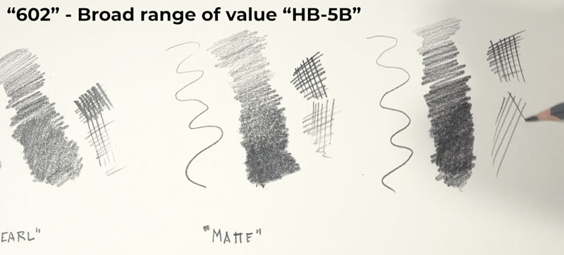
The versatility of this pencil is an advantage, but what stood out the most was the feel. Most artist’s graphite pencils have some inconsistencies in the graphite. These inconsistencies are usually noticed when pulling the pencil across the surface. You may feel a bit more friction when making marks when you encounter these inconsistencies.
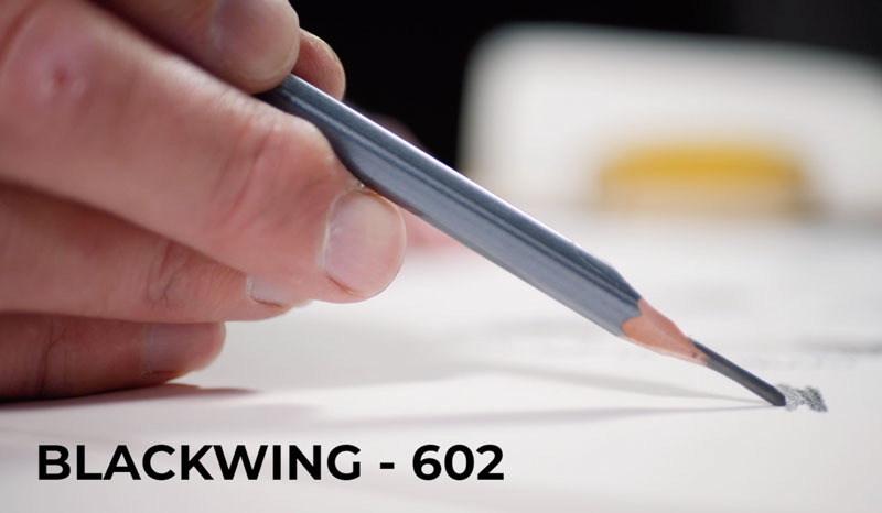
The 602 pencil felt super smooth. I didn’t notice any inconsistencies and the graphite felt smooth on the surface. I have used countless pencils, but I have never felt a graphite pencil feel so smooth on the drawing paper. The best comparison I can make is to a ball point pen. One of the reasons some artists love using ball point pens is the feel and feedback it provides when making marks. The 602 pencil felt similar to a ball point pen. While not exactly the same, it was fairly close.
See also: All About Drawing Papers
After using the 602 pencil, I could see why it has a devoted fan-base. It is a special pencil – especially if you’re looking for an “all around” great mark maker.
You can purchase the Blackwing 602 pencil through several online retailers. The following link is an affiliate link which means I make a small commission if you purchase at no additional cost to you.
Purchase Blackwing 602 pencils on Amazon
Another “All Around” Drawing Pencil
The 602 drawing pencil is fantastic, but it is expensive. Some will find it hard to rationalize spending approximately $3.75 for each pencil (when purchased as a dozen). But when you compare this to $40, it’s a bargain. All joking aside, you’ll easily spend this much on 4 graphite pencils of various grades. However, one Blackwing 602 pencil may be all you need.
The 602 pencil does remind me of another all around pencil that is much cheaper. This pencil is the General’s Layout pencil. Like the 602 pencil, this pencil is quite versatile. The General’s Layout pencil is capable of making dark marks but also light ones, all while keeping a fairly sharp tip for a longer period of time.
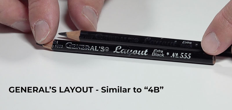
The General’s Layout pencil is not quite as dark as the 602 pencil and more gray. The 602 pencil is blacker which leads to more realistic darks in drawings. The General’s Layout pencil also has inconsistencies which are clearly noticed when making marks. There is considerable friction felt when making marks with this pencil.
I feel that the General’s Layout pencil is a fair alternative to the 602 pencil, but the 602 is clearly in another “class”. Pricing reflects this as General’s Layout pencils can be purchased at approximately $1.11 each, when purchased by the dozen.
You can purchase the General’s Layout pencil online or at many of the big box art stores. The following link is an affiliate link which means I make a small commission if you purchase at no additional cost to you.
Purchase General’s Layout pencils on Amazon
General’s Layout pencils are usually easily found at art stores, while Blackwing pencils may have to be ordered online. I have not seen the Blackwing pencils sold at any of the big box art stores.
A Drawing with Blackwing Pencils
After making a few marks with the pencils, I decided to create a proper drawing to evaluate them fully. This drawing was created as part of the course “Realistic Pencil Drawing”, which is available to members. In the series of lessons for this module of the course, I created a smaller drawing of a falcon on Canson Heritage Hot Press Watercolor Paper (140 lb.).
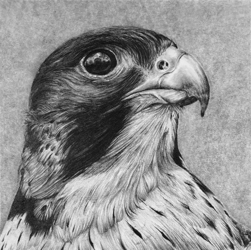
This soft paper worked exceptionally well with the Blackwing pencils. While all three pencils were used to create the drawing, I found myself favoring the 602 pencil. However, I was impressed with the Pearl pencil for dark marks that required precision.
Blackwing Pencils Review – Conclusion
Of the Blackwing pencils, I would consider the 602 to be worth the price. The Pearl and the Matte pencils were nice, but not worth the price in my opinion. I tend to use graphite in my drawings in different forms. Sometimes I prefer the traditional feel of a wooden pencil. Other times, I prefer to work with a lead holder with different grades of graphite. My choice depends on the subject, the surface, and my mood. For sketching, I prefer to use an “all around” pencil. For years, I have used the General’s Layout pencil for this. But moving forward, the 602 pencil by Blackwing will be my weapon of choice.
If so, join over 36,000 others that receive our newsletter with new drawing and painting lessons. Plus, check out three of our course videos and ebooks for free.
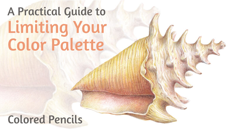
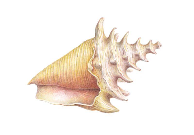
How to Draw a Seashell with a Limited Palette with Colored Pencils
“How many colored pencils do I need?” is probably one of the most frequent questions that beginning artists have. Another popular question is “what colored pencils do I need?”
Possessing a large set of pencils may be emotionally pleasing. Gathered in a beautiful box, colored pencils look like treasured magic wands that immediately bring joy, excitement, and inspiration.
A wider range at hand often resolves the need to mix the right color yourself. (With colored pencils, mixing happens by layering the applications directly on the drawing surface.) You can pick a ready-made option on the spot, avoiding the preparatory color research.
Besides that, some colors are difficult or even impossible to mix. In such cases, you have to expand your collection of pencils. The more pencils you have, the more unique mixtures you can possibly create. No wonder that freedom of choice and technical convenience are highly appealing!
It’s tempting to believe that purchasing a better – more extensive or advanced – instrument will lead to a new level of artistic quality. And sometimes it’s not that far from the truth.
On the other hand, large sets of qualitative colored pencils are relatively expensive. The cost may be a big con, especially if this art medium is new and yet to be fully explored.
Another opinion is that resorting to a wide range of pre-made colors may lead to the underdevelopment of artistic skills. This assumption is more equitable for beginners. It is clear that relying on external tools too heavily is irrational. But a full set of pencils lets an artist avoid so many challenges! It makes the process more comfortable, giving the confidence that all possible colors are here, at your disposal.
The urge to find a shortcut may be irresistible. And yet, such color tasks are an important driver for curiosity, analysis, experiments, and improving knowledge. Challenges, if accepted, lead to the growth of mastery.
Restricting ourselves can force us to learn more about color. Also, it directs our attention to the important aspects of art, such as form and value.
So how many pencils is enough? It’s impossible to find a perfect answer. Every artist has a specific combination of preferences, skills, and goals. Some works are based on subtle color nuances and complex palettes. They require a wide range of pencils and, potentially, the inclusion of other art supplies.
Alternatively, it may be that you can easily get by with a set of twelve pencils. In some cases, three pencils presenting the primary colors are all you need. Making the most of the available resources is a useful principle – not only for art, but also for many other things.
There is no need to choose a single path. You can be fluent in mixing and, at the same time, enjoy your extensive collection of pencils.
In this tutorial, we’ll explore the benefits of limiting the number of colored pencils per project. I’ll share several tips that help me to form a restricted color palette. For practice, we’ll create a quick drawing of a seashell.
Art Supplies for This Colored Pencil Project
We’ll need an H or HB graphite pencil to create an underdrawing. Keep an eraser at hand. I recommend a combination of both plastic and kneaded erasers for versatility.
See also: 9 Must Have Colored Pencil Supplies
I’ll be drawing on an A4 sheet of ordinary thick drawing paper with a subtle texture.
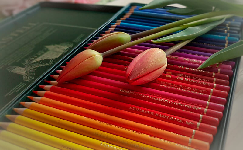
For this artwork, I’ve chosen only five colored pencils. They are from the Faber-Castell Polychromos set.
The Benefits of Limiting Your Color Palette
Before we dive in, let’s look at a few reasons why you may choose to work with a limited color palette when drawing with colored pencils.
Focus
The first advantage of working with fewer pencils is that you’re not spreading your attention too thin. Although a broad range of color options creates a sense of freedom, the necessity to choose may cause doubts. And doubts lead to frustration and wasted time.
Also, focusing on one task at a time helps to build a skill more quickly and efficiently. When your palette is limited, you digress from the subtle difference between the pre-made colors. It becomes easier to focus on forms and values. You’ll get a more unified, holistic perception of your artwork.
Chances are that you’ll become naturally disposed to see the positive and negative space and consider the composition more carefully.
Value
Problems with values and the lack of contrast are the most common stumbling blocks for the beginning artists. Correct values emphasize form and create an illusion of volume. Contrast determines the perceived depth. It also helps the viewer to define the objects and planes in their mind.
See also: Pushing Contrast in Value
Unfortunately, if the light values, midtones, and shadows are off, the artwork won’t seem credible – no matter how many colored pencils were used to complete the painting.
Working with a limited palette shifts your attention towards values, making you a more careful observer. If you’re drawing from a photo reference, it may be useful to convert it into a black and white image. You’ll get a tonal pattern without the distraction of hues.
Color
Working within a restricted color range may be considered as a middle ground between a monochrome drawing and artworks that present complex color palettes.
As I mentioned, color restrictions limit the number of possible decisions. This saves you time and effort. And yet, the resulting gamut is wide enough to create shades, tints, and cooler and warmer variations of the chosen colors.
You also practice mixing the colors, and the limited range gives you more control over the results. The fewer the components, the easier it is to find the repeating patterns in color behavior. Some mixtures will be worth remembering.
As the resulting colors are related, your artwork is more likely to be perceived as harmonious and unified. Related colors can help to convey the mood or exaggerate certain effects. Paradoxically, the color constraints may lead to greater freedom of expression.
If you’re just starting your journey into the world of color, limiting your palette may be a productive learning path. It’s also a great exercise for artists of any skill level.
How to Choose Colors for Your Limited Palette
Choosing the pencils for an artwork is a process of defining the right combination of colors. The colors you choose should conform to your creative vision and the artwork’s subject matter. And, of course, they should be harmonious together on the paper.
Every case is unique, but it’s still possible to outline several principles that may help you in the decision-making process.
Check the Colors
Evaluate the object that you’re going to draw. First, mark out its local color in the midtone area. Then, draw your attention to the object’s lighter and darker areas. Do you notice any shifts in color temperature?
With a restricted color range, the goal is to pick only the colors that play the “leading roles”. This may mean that this color takes up a significant amount of space in the image or forms contrasting accents.
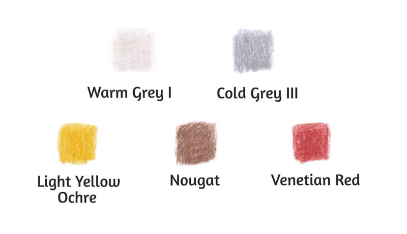
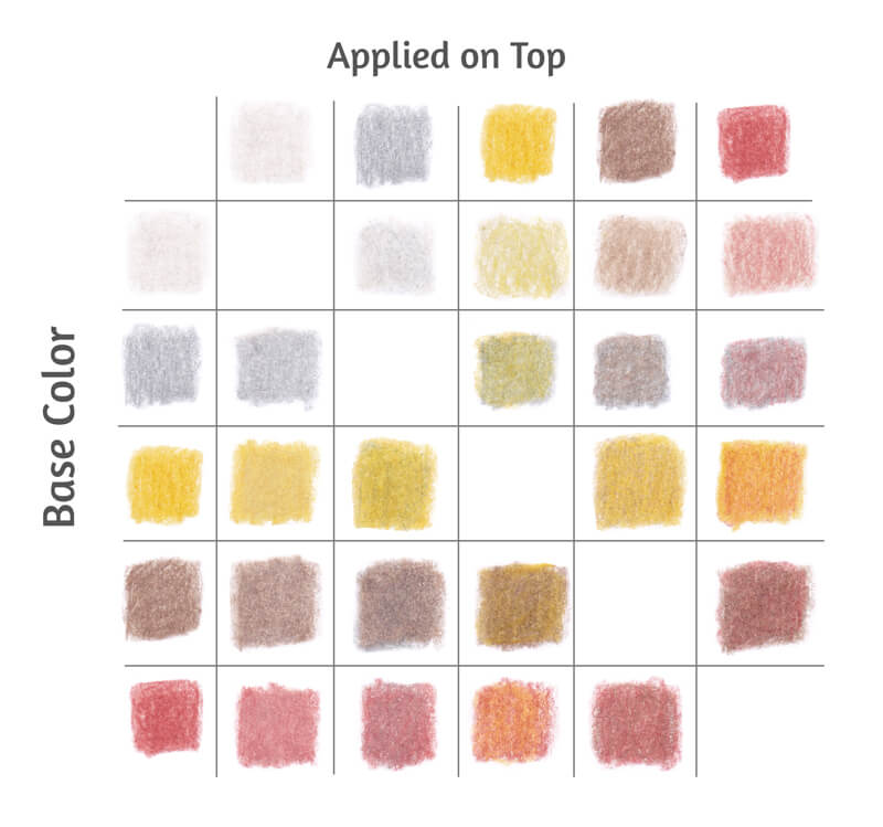
Even a small number of pencils can create a wide-enough color range. The table of swatches below illustrates this statement. I’ve made it with the five pencils that are chosen for the seashell project: Warm Grey I, Cold Grey III, Light Yellow Ochre, Nougat, and Venetian Red. You’ll find the mixtures at the intersection of each color pair.
And lastly, don’t include the colors that are too similar. Avoid the ones that you can easily mix from other ready-made options. For instance, yellow + red = orange or blue + green = blue-green.
The examples I’ve mentioned are obvious and simplified. But still, sometimes we miss a chance to experiment with fewer options to discover a hidden possibility.
Understanding color theory helps to envision the result of mixing.
Check the Values
In most cases, you’ll need a wide range of values to create credible works.
It’s possible to control saturation and value by layering new colors on top of the existing applications. Here are several examples:
- White (or any light-colored pencil) can increase the lightness of the underlying color;
- Grey pencils may be used to desaturate a color;
- Medium and dark greys decrease the value of the base color. The value of the resulting mixture depends on the value of both components.
Many brands of colored pencils have warm and cool families of grey. This separation provides additional control over the color temperature. In most cases, it’s useful to include pencils from both families into your limited set.
See also: Warm vs. Cool Grays
In the image below, you’ll find the swatches of Faber-Castell Polychromos warm grey family. (Point a.)
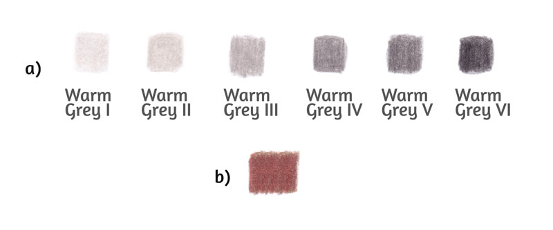
In terms of value, the principle “don’t add the color that you can mix” is also valid. As you can see, Warm Grey I and Warm Grey II are quite close. If you apply two or three layers of Warm Grey I at medium pressure, the result will be a close approximation of Warm Grey II as a single layer.
It’s also useful to mix your darkest colors beforehand to evaluate the lowest value that you can achieve. The darkness of the mixture depends on the value of the components.
In the image above (point b), you’ll find the result of combining Nougat and Venetian Red, which are the darkest colors from our list of supplies. These colors were applied in several layers at medium pressure. This shade isn’t very dark. But, keeping in mind that a seashell is a light-colored object, it fits the concept.
Now we’re ready to start practicing!
Drawing a Seashell with a Graphite Pencil
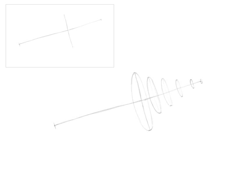
First, we’ll create an underdrawing. I start with an axis line that marks the direction of the shell. I also add the border between the two main parts of the shell.
A massive foundation with the body whorl and the aperture (opening) will be located to the left of this border.
On the right side, there will be the spire – it is the thinner, narrower part of the shell above the body whorl. In our drawing, the spire is pointing up.
You’ll find the miniature of this interim step in the corner of the image below.
I prefer to mark the whorls with ovals. This action is optional. In my opinion, subsidiary circles add a three-dimensional feel, helping to create an illusion of volume in the next steps.
Keep such supporting lines as light as possible. You’ll have to erase them later, and this can be harmful to the paper. Please note that I’ve intensified the graphite marks in the images for your convenience.
I draw the contours. For now, the foundation part is presented as a skewed conus. We’ll add the details – the lip and the aperture – in the next steps.
In the spire part, I join the prominent areas of the whorls with a line. It accents the interesting rhythm of the shell’s shape. The areas with subsidiary ovals form the wider areas of the spire.
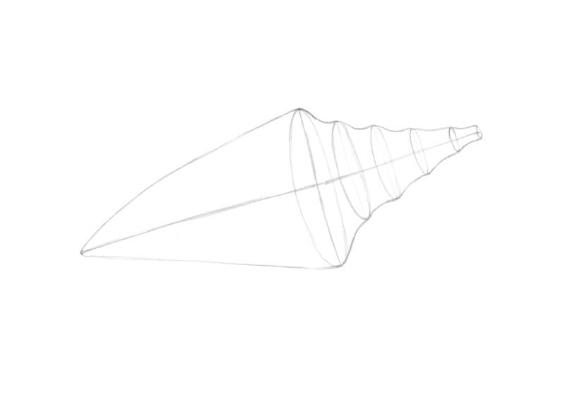
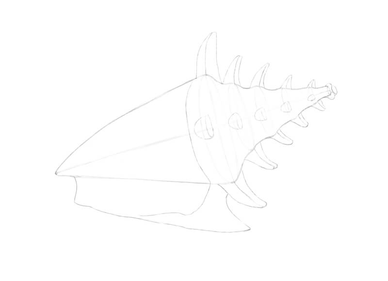
I add the thick horn-like ridges (the nodes) to the sides of the whorls. Some nodes are located in the central parts of the whorls, facing the viewer.
I mark the lip – the margin of the aperture. It envelopes the body whorl and joins the shell near the tip of the lower conus. This outer, enclosing form also has ridges.
Feel free to soften or erase the subsidiary marks that you no longer need.
I refine the line of the lip. Also, I slightly change the overall contour of the seashell. The curves become smoother.
I draw long organic lines that are going from one node to another, repeating this action for each whorl. They follow the form of the shell. These lines will help to differentiate the lighter and darker areas.
I also add several more nodes that are partially hidden behind.
Drawing a Seashell with Colored Pencils
First, I soften the graphite marks with a kneaded eraser. This will keep our drawing neat and clean.
Now I’m going to mark the pattern of values. With Warm Grey I, I cover the lighter areas of the shell. Some parts may be left untouched. The pressure is light, so applications of this pencil are barely visible.
I reveal the subtle, ribbed relief of the spiral cords on the shell’s body and spire. Visually, spiral cords can be described as thin, long shapes that follow the cross contours of the shell.
With Cold Grey III, I cover the darker areas. The spire whorls present a repeating light-and-shadow pattern. I also accent the lower parts of the nodes. The opening and areas near the lip are darker too.
These two greys may overlap to create interesting effects.
Also, greys may be applied in as many layers as you need to create depth. However, don’t overdo the artwork. Our object is light, and we should leave enough “air” to add color nuances in the next steps.
Let’s include some color! I add Light Yellow Ochre to the body whorl, especially its upper area, leaving out thin lines. The untouched areas indicate the prominent parts of relief.
The pressure is light. I also add this hue to the spire.
Seashells often have a pale red color near their openings, so I use Venetian Red at light pressure to create a gradient. I also add it to other areas of the shell. Pressure is very light.
Plain grey core shadows may seem dull and uninteresting. Including Venetian Red in the darker areas will help to deepen the shades.
These two colors may overlap and be layered on top of each other, too.
It’s time to increase the contrast. With Nougat, I strengthen the core shadows. I accent the spiral cords in the midtone areas and darken the aperture. The addition of this shade reveals the texture of the object.
Pressure on the pencil varies from light to medium. It’s important to control the intensity of strokes. A shell is a light-colored object, so we should be careful with the dark values.
I make the edge of the lip quite contrasting. There is a significant variation between lighter and darker areas. This change brings the lip closer to the viewer.
Now the drawing has a pleasant, delicate, airy feel – as if we used watercolor to paint this seashell. Although we could leave it as it is, I decided to add some finishing touches.
With Venetian Red, I make the color of the opening more solid. I also apply this hue to the whorls at very light pressure to unite the form.
I add some Light Yellow Ochre here and there to smooth down the relief of the shell’s body. I cover the reflective inner space of the lip to soften the light in this area.
Warm Grey I may be used to mute down yellows and reds – and to burnish the artwork, if necessary.
Drawing a Seashell with Colored Pencils – Conclusion
Congratulations – we’ve completed a wonderful project! I hope that you enjoyed the process of working with a limited color palette.
It is said that less is more. Indeed, some restrictions can be useful – they help to add a new dimension to your skills and experience.
If so, join over 36,000 others that receive our newsletter with new drawing and painting lessons. Plus, check out three of our course videos and ebooks for free.
How to Draw a Zebra – White Charcoal – Timed Drawing Exercise
Gettin Sketchy – Drawing a Zebra with White Charcoal on Black Paper – Season 2 Episode 11
This episode aired live on YouTube on November 4, 2020.
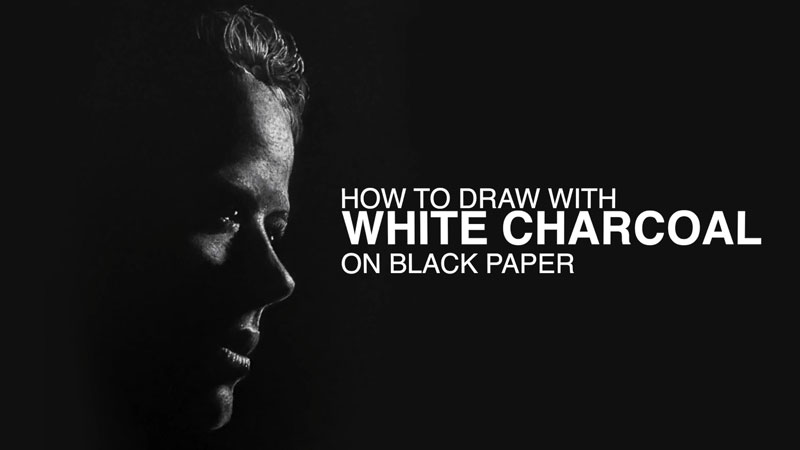
In this timed drawing exercise, we take a look at drawing a zebra with white charcoal on black paper. This drawing presents a different type of challenge. White charcoal applied to black paper is a quick process, but the challenge lies in adding lighter values instead of darker ones.
White Drawing Media on Black Paper
In nearly every case, we first learn to draw by making dark marks on lighter surfaces. For example, graphite is a dark gray material and in most cases, we apply it to white or nearly white drawing paper. This means, in terms of value, we add all of the darker tones to complete the drawing.
Most of the drawing process is adding darker tones, relying on the white of the paper to affect the middle and lighter tones. We may use the eraser to lighten up areas, but for the most part, we are adding the darker values and adjusting the pressure placed on the pencil to create mid-tones. This process is completely reversed when we use white charcoal on black paper.
Instead of adding the darker tones, we should be adding the lighter values. And instead of relying on the paper for our lighter values, we rely on the paper for our darker tones. While this may seem simple, it’s a bit more of a challenge since our brains are already conditioned to apply darker tones when we draw.
To understand this, think of a chalkboard. (Some still exist out there.) Chalkboards are usually either green or black. In this case, imagine a black chalkboard in your mind. Now consider drawing a representational drawing on the chalkboard with white chalk.
Where would you start?
In a typical drawing, we would likely start by defining the shapes and then the contours. This is fine we when draw on a light surface with a dark medium. Outlines (or contours) are fine when they are dark against a white background. But with a black surface and a white medium, we have to think a bit differently. White contours (or outlines) don’t really make a lot of sense.
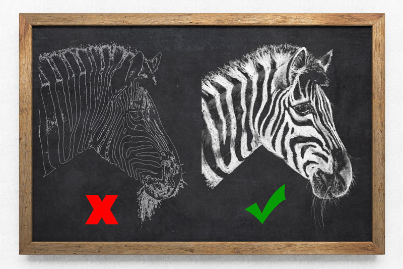
So when we begin a drawing with white drawing media on black paper, we should be aware that the contour lines should be drawn very lightly. The edges of the subject will be defined by the contrast in value, not by a line. (This should be the case in any drawing. But when we are new to drawing, we tend to define subjects with defined outlines.)
As you can see, a zebra naturally has strong contrast in value due to its wonderfully patterned skin.
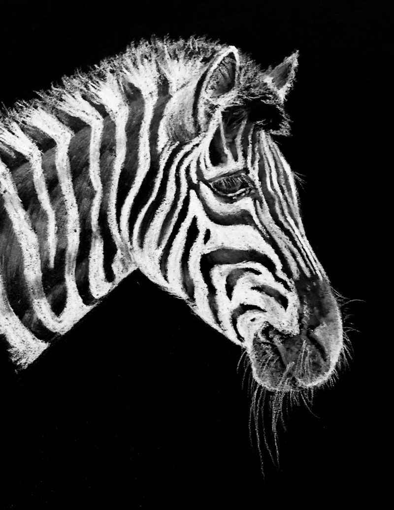
Here’s a look at the completed drawing of a zebra…
White Charcoal
While the medium used in this drawing is called “white charcoal”, its name is a little misleading. Charcoal is burnt organic material and doesn’t naturally occur as the bright white we see in white charcoal products. Pigment has been added to the medium making white charcoal more similar to white pastel or conté.
Of course, it can be used interchangeably with traditional black charcoal varieties like vine charcoal and compressed charcoal. It blends very well with these materials and is as powdery as compressed charcoal.
Just like traditional charcoal (black), white charcoal is easily blended or smudged with a finger or blending stump, allowing for smooth transitions of tone. It can be erased, but not without some effort. Heavier applications are harder to erase, while softer applications are removed with ease, although some residue may remain.
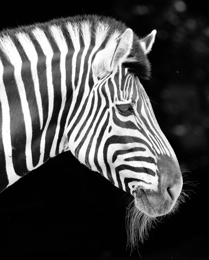
Photo Reference
The reference photo for this exercise comes from Pixabay.com. The reference provided below has been altered to strengthen the values. The image has been cropped and all color information is removed. All of these edits were completed in Photoshop.
Here’s a look at the photo reference…
Recommended Supplies for This Zebra Drawing
Aside from white charcoal, I also used a few blending stumps and a kneaded eraser. The drawing was completed on black Artagain paper by Strathmore. Like with any drawing or painting, the surface is very important. This particular surface is rather smooth but has enough tooth to accept the material. The paper is very black compared to other brands and produces nice contrast.
Here are a few links to purchase white charcoal and Artagain Black Paper …(Some of the following links are affiliate links which means we make a small commission if you purchase at no additional cost to you.)
I highly recommend drawing with lighter media on black paper. This exercise reinforces the concept that we add values to a drawing. It’s not about “shading” – it’s about developing a full range of value. We often overlook the importance of highlights and light values, but this exercise forces us to focus our attention on them.
If so, join over 36,000 others that receive our newsletter with new drawing and painting lessons. Plus, check out three of our course videos and ebooks for free.

Colorful Cat with Oil Pastels – Timed Drawing Exercise
Gettin Sketchy – Drawing a Colorful Cat with Oil Pastels – Season 2 Episode 10
This episode aired live on YouTube on October 21, 2020.
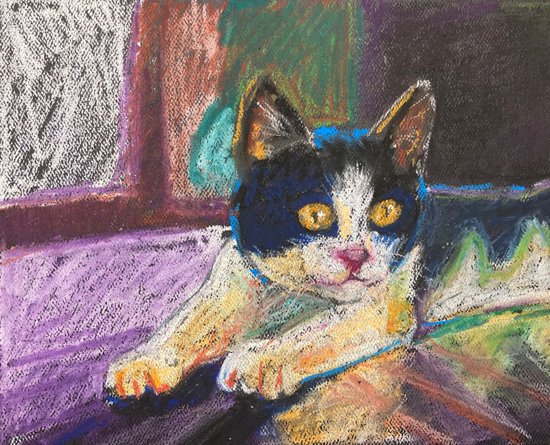
In this timed drawing exercise, we explore drawing a colorful cat with oil pastels on black paper. Instead of copying local colors (observed colors), Ashley uses creative colors to make the drawing more lively and interesting. We had some fun with this broadcast, to say the least.
Getting Creative with Colors
The natural world around us is full of wonderful colors. And when realism is our goal, we often try to match the colors and values that we see. Matching colors (or coming close to matching colors) and more importantly – values, often leads to realistic results. However, many artists find natural colors limiting and are more excited by pushing color relationships in a drawing or painting. In this drawing, Ashley takes this route, incorporating exciting colors to an oil pastel drawing.
Matching colors in a drawing or painting is fairly straight-forward. You see a color and then either use a matching pre-mixed color or mix your own. Of course, adjusting the value and intensity is also important in accurate matching. When you branch out and create your own colors as substitutes, the process can be a little mysterious – but there is a little secret.
This little secret lies in value. Value is the darkness or lightness of a color. It is the most important of the seven elements of art since it communicates light, form, and texture. If we match the values close to the subject, then the color matters less. This gives us the freedom to choose any colors we wish as long as the values are accurate.
This opens us up to choose specific colors based on their positioning on the color wheel. These relationships are usually referred to as color schemes. Some of the most popular color schemes include complementary, analogous, and color triads.
Here’s a look at the completed oil pastel drawing of a cat…
Working with Oil Pastels
It is a misconception that oil pastels function in the same manner as traditional soft pastels. In fact, even though both mediums share the word “pastel” in their name, they are uniquely different.
Like traditional soft pastels, oil pastels are manufactured in small sticks. But unlike traditional soft pastels, oil pastels layer and mix differently. The order in which colors are layered and applied must be considered since mixing will occur.
Oil pastels feature an oil binder which never fully dries. This means that oil pastels remain “workable” without any dust. However, oil pastels can still create a mess, but less so compared to their dusty counterparts.
Liquids can be used to act as solvents for both forms of pastel. Water can be used with traditional soft pastels, while solvents used for oil painting should be used with oil pastels.
As you can see, although these two mediums are both referred to as “pastels”, they are clearly different from each other.
Photo Reference
The reference photo for this exercise comes from Pixabay.com. When we compare the photo reference to the completed oil pastel drawing, we can see how much Ashley deviated from the local, observed colors of the subject. Here’s a look at the photo reference…
Recommended Supplies for Drawing with Oil Pastels
Like other art materials, there is a broad range of quality with oil pastels. However, fairly decent oil pastels can be had without much investment. They can be purchased at any art store and are often found at office supply stores as well. If you’re looking for professional oil pastels, like those produced by Sennelier, then you may have to order them.
Oil pastels can be applied to many different surfaces including canvas. Most artists apply oil pastels to a textured paper, like pastel paper, in order to build up layers of color.
Here are a few links to purchase recommended oil pastels and surfaces …(Some of the following links are affiliate links which means we make a small commission if you purchase at no additional cost to you.)
- Sennelier Oil Pastels (Recommended for professional results.)
- Cray Pas Impressionist Oil Pastels (Recommended for better results.)
- A drafting brush (Used to brush away oil pastel bits without smearing).
- Canson Mi-Teintes Pastel Paper (Textured paper that features two distinct sides – one with a heavy texture and one with a slightly smoother texture.)
Oil pastels are a wonderful medium for creating works fairly quickly. Mixing happens on the surface, so colors can be built up quickly. There is a bit of forgiveness, but loosening up is a must. The finished look of an oil pastel drawing can resemble one created with traditional soft pastels – but since these mediums differ so greatly, they should approached in different ways.
If so, join over 36,000 others that receive our newsletter with new drawing and painting lessons. Plus, check out three of our course videos and ebooks for free.
How to Draw a Duck with Ink and Water-Soluble Tinted Graphite Pencils
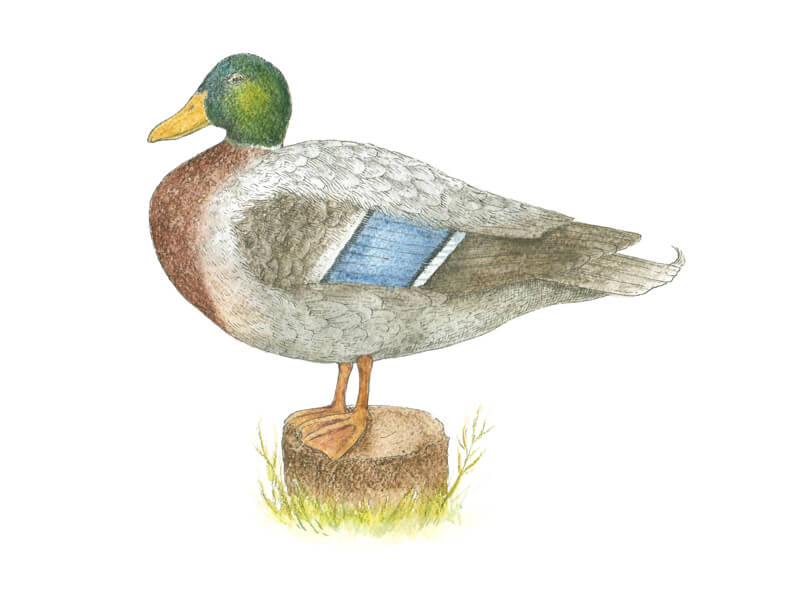
Technically, there is no such thing as some general or average duck. Numerous species of them exist! In this tutorial, we’ll create a stylized drawing of a male mallard duck. It’s interesting to know that mallard ducks are the ancestors of almost all other varieties of domestic ducks.
A Couple of Words About Mallard Ducks
This species of duck features a significant difference in appearance, depending on whether the bird is male or female. The male mallard duck is also called a drake.
The plumage of a mallard drake changes during the breeding season. The head acquires a glossy iridescent green color with a white collar. The breast becomes chocolate brown with a subtle inclusion of purple. The wings are gray and brown, and the belly is pale gray.
After the breeding season, the plumage of male ducks becomes similar to the one of females. They wear it for about a month as their new feathers grow. During that time, they are flightless and more vulnerable to predators. In this period, drakes prefer to stay in isolated areas or flock together for protection.
The coloring of female mallard ducks doesn’t change much during the year. Their plumage is duller, relatively uniform in colors, and mottled. The colors vary from beige or pale orange to dark brown.
Both male and female mallards have distinct iridescent blue speculum feathers edged with white.
The main body structure of both male and female mallard ducks is similar, but males tend to be larger. Also, drakes have bigger heads and thicker necks. You can draw a female duck, relying on the following instructions, just remember about the difference in plumage coloring.
Art Supplies for Drawing the Duck
This is a mixed media artwork. Each art tool presents a unique set of features, so we can combine different supplies to our – and our artwork’s – advantage.
I’ll be drawing on watercolor paper with a rough surface. I also recommend that you keep a couple of sheets of ordinary printer paper at hand.
We’ll need a graphite pencil and an eraser. They are necessary to create sketches and an underdrawing for the finished artwork. I recommend using an H or HB drawing pencil.
A black 0.1 ink liner will help us to create crisp outlines and details of texture.
In the image below, you’ll find water-soluble tinted graphite pencils. The unique feature of this medium is the pleasant, enchanting naturalness of colors. They are deep and yet slightly subdued.
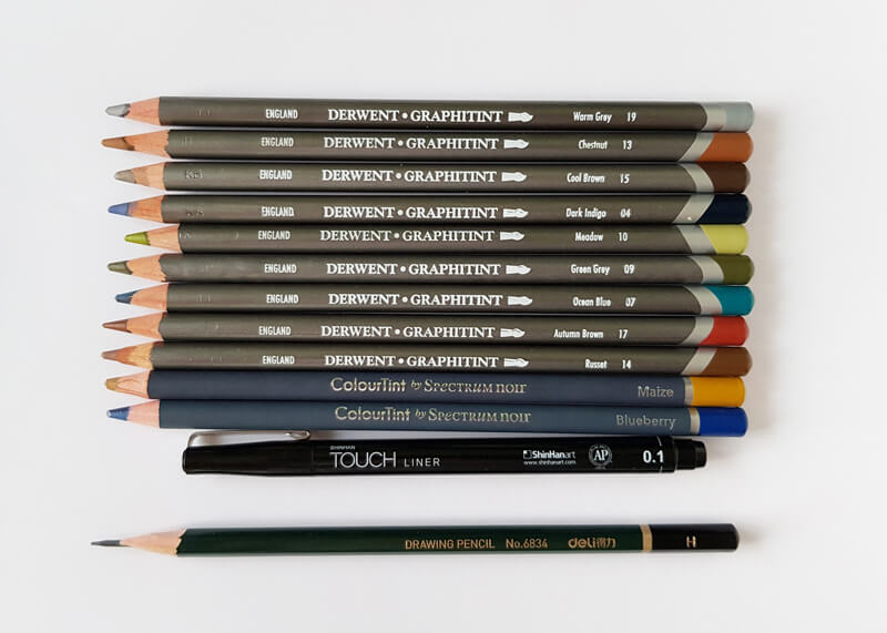
The majority of these pencils are Graphitint by Derwent, which probably is the most well-known brand of tinted graphite pencils.
Two additional colors are from ColourTint by Spectrum Noir. I’ll use Blueberry to add color to the speculum and Maize for the beak and feet. Their pigments are closer to the color scheme of a real mallard drake. The color range of Graphitint pencils is beautiful, no doubt about it. But, in my view, yellows and oranges are somewhat under-represented.
Here’s a list of the materials that we’ll use…(The following links are affiliate links which means we make a small commission if you purchase at no additional cost to you.)
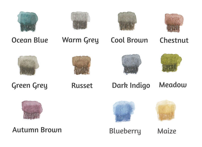
In the image below, you’ll find swatches of the chosen pencils. I’ve applied water to the top areas of the swatches to activate the pigment. The colors have become more vibrant there. After activation, water-soluble graphite behaves similarly to watercolor or ink wash.
The lower areas of each swatch demonstrate the strokes in a dry state.
If you don’t have water-soluble graphite pencils or your set lacks some colors, no problem. Use watercolor or watercolor pencils instead!
We’ll also need a brush to apply water and a water container. I’ll be using a generic soft round brush.
See also: All About Artist Paint Brushes – Hair Types, Shapes, Marks, and Parts
When you choose the size of your brush, base the decision on your preferences. Keep in mind that graphite strokes require enough water to be activated, and they dry quite fast. That’s why I recommend avoiding tiny brushes.
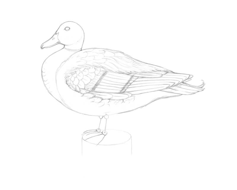
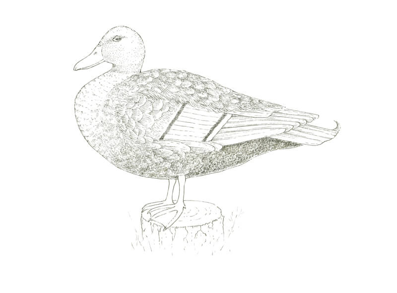
Drawing the Duck with Graphite Pencil
My suggestion is to put the watercolor paper and water-soluble pencils aside for a moment. Now we’re going to examine the duck’s anatomy. Some erasing and reworking is inevitable ao it may be harmful for the delicate surface of watercolor paper. Let’s create a preparatory sketch on a sheet of sketch paper.
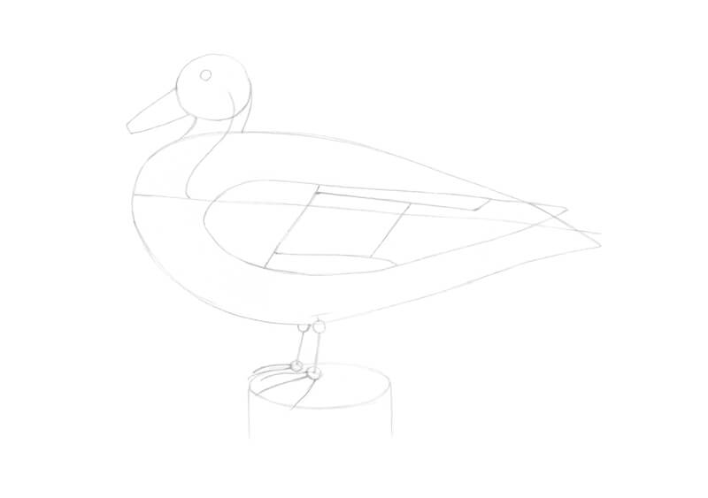
First, I outline a rough shape of the duck’s head. I add a long line that marks the direction of the body. It’s the body’s improvised axis. I connect the head and body with a curved core line of the neck.
In this ruffled up pose, the head is drawn closer to the body, which makes the breast come forward slightly.
The body is elongated. As a stylized shape, it resembles a drop that is lying on its side. Be sure to leave some space for the duck’s feet!
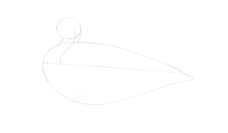
I mark the eye and the rough shape of the beak. The length of the beak is slightly smaller than the width of the head.
I outline the visible part of the folded wing. We’ll consider the wing’s structure in a moment.
Then I add the short feet. They are almost aligned with the middle of the body. I mark the joints with circles. There are three front toes and a small back one.
To complete the composition, I add the framework of a tree stump under the bird’s feet.
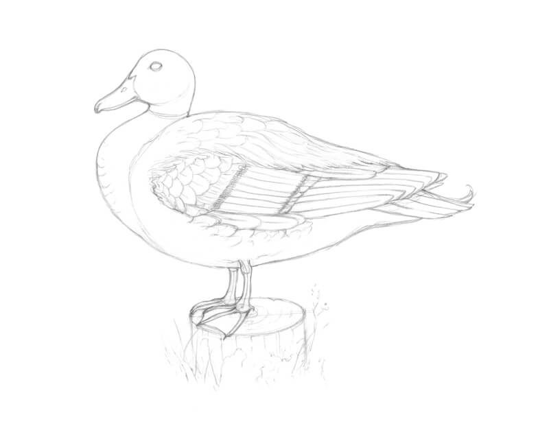
The Anatomy of a Bird’s Wing
Now let’s examine the simplified anatomy of the duck’s wing. It’s easier to distinguish between different parts and sets of feathers when the wing is spread.
By the way, ducks have to flap their wings about ten times per second to keep their relatively large bodies in the air. These birds are capable of reaching great heights and flying just as high as airplanes. And they have waterproof feathers! Even when a duck dives underwater, the layer of feathers right next to the skin will stay dry. Isn’t that incredible?
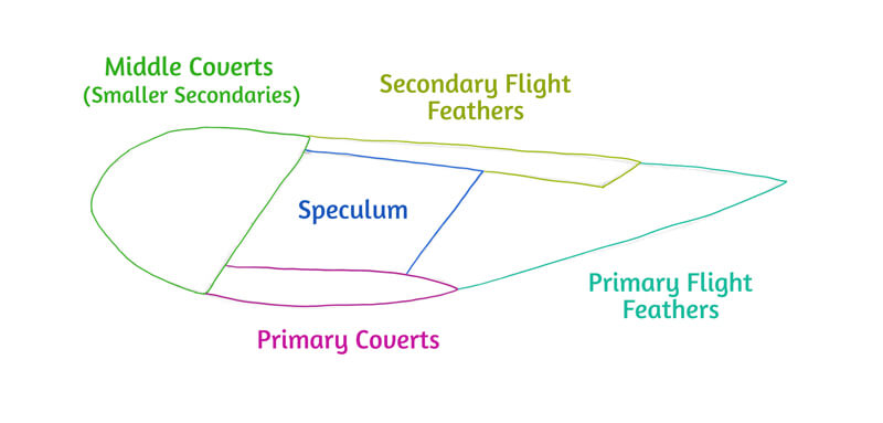
Ducks’ wings are long, pointed in shape, and small in size. (The image below illustrates the following explanations.)
Primary feathers are the outer feathers that are furthest from the body. The primary feathers spread out to allow air passage during the flight. If they have been cut off, like in the case with domestic birds, the duck will stay grounded.
Secondary feathers are the inner wing feathers. They force air up from the wings, providing lift. Secondaries create the speculum – a beautiful insertion of bright color. It can be iridescent green, blue, purple, or white, depending on the duck species.
Wing coverts can be found in the wing’s upper part. They keep the bases of primary and secondary feathers covered on both sides of the wing. Their function is to create a smooth surface for optimal airflow.
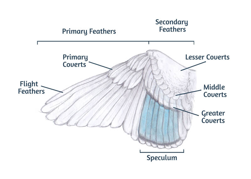
When the wing is folded, feathers are folding, too. Below is a simplified illustration that may help you to identify different groups of feathers. This scheme is based on the wing’s position in our artwork.
Note that the appearance or ratio of the visible segments may change. It depends on the pose and other factors. Ducks lift or compress their plumage in various ways to dive underwater, regulate body heat, and express emotions.
With the scheme in mind, I add the segments to the wings. Note that speculum is located approximately above the duck’s feet.
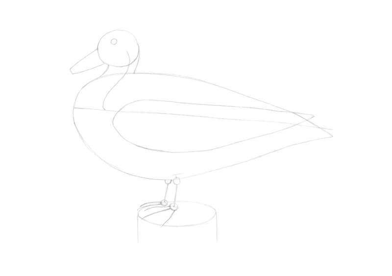
I refine the head of our drake. The line of the forehead becomes sharper. I add the nostril and a so-called nail at the tip of the beak. The beak is slightly extending beyond the line of the bird’s breast.
By the way, ducks’ beaks are highly sensitive – they have many touch receptors, similar to those in human fingertips.
Feel free to erase the unnecessary lines as you go.
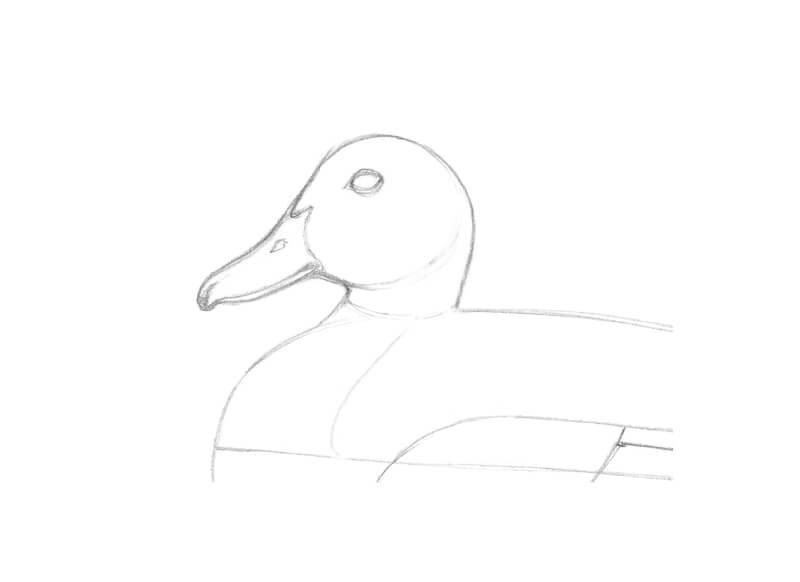
I refine the contour of the breast, making it steeper. Then I mark the location of the white collar in the duck’s feathering.
I add the rows of scapular feathers in the upper part of the bird’s body. They slightly cover the wing’s top edge.
Then I draw the short and round middle coverts, longer primary coverts, and speculum. I also add a hint at secondary flight feathers in the upper part of the wing, under the scapular feathers.
The lower part of the wing is partially covered by the body feathers.
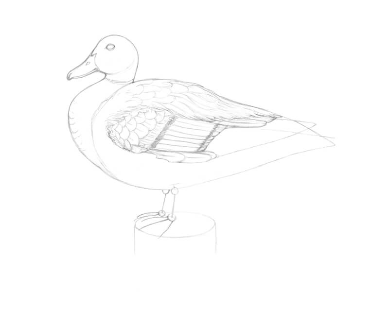
I complete the wing by adding the long primary flight feathers. Then I draw the tail feathers. They act as a rudder, helping the bird to stabilize and control flight.
There are peculiar twisting feathers at the end of the body – these are so-called drake feathers or curls. As the name suggests, this feature is inherent to male ducks.
I also adjust the lower contour of the body.
I refine the feet of the drake, adding the outer contours. The feet are webbed for paddling in the water. There are claws at the ends of the toes.
By the way, ducks’ feet have no nerves or blood vessels. So ducks don’t feel the cold with their feet!
I also add some features of bark texture to the stump and several grass blades around it. The sketch is complete!
How to Draw a Duck with an Ink and Tinted Graphite Pencils
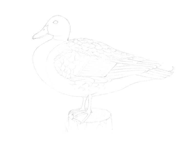
Now I put the watercolor paper on top of my sketch and place them together on the window pane. I trace the main contours and the most important details. (Using a light table or carbon paper is also an option.) I recommend keeping the initial sketch at hand in the process, so you can refer to it.
If some pencil lines look too heavy, lift the excess graphite with a kneaded eraser.
Important: the process I’m showing you isn’t the only option to create a mixed media work with these materials. As an alternative, you can start with tinted graphite pencils, then wash the strokes, and apply ink as the last step.
Either way, if you’re going to add water, always do a prior water-resistance test. Draw several lines with your ink pen, let the ink dry completely, and try to wash the lines with a wet brush. If they don’t bleed, this pen is suitable for the task.
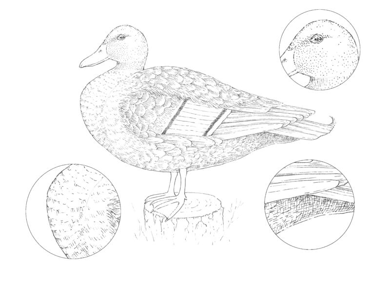
With 0.1 ink liner, I draw the outer contours, allowing some interruptions in the line.
I use mostly dots and groups of short hatches to create an illusion of texture. The direction of marks conforms to the direction of feathers. I create soft shadows between the feathers.
The black areas in the speculum are the darkest parts in the drawing so far.
There is a soft shadow under the tail so I apply cross-hatching to deepen it. In the image below, you’ll find several samples of texture in close-up.
At this stage, the drawing shouldn’t be perceived as either three-dimensional or complete. If we place too many black lines right now, the artwork will look overworked. So let’s create just a subtle ink base and proceed to the tinted graphite applications.
I apply Warm Grey to the upper part of the duck’s body, and Green Grey to the underside. The difference between these two grays is subtle, especially in the dry state.
However, after we add water, the delicate green hue found in Green Grey will become more evident. I use it to create an impression that a green-colored reflected light affects the bird’s lower side – as if there is grass under the drake.
My pencil is slightly dull. The lines repeat the direction of the drake’s body. The pressure is relatively light as we should avoid indenting the surface of the paper. With heavy marks, it becomes much harder to wash out the pigment completely.
I apply additional layers of pigment to the darker areas. Some feathers in the upper part of the body are left untouched.
I add Chestnut to the drake’s breast. There are subtle shadows in the lower part of this area and under the bird’s head. They require an additional layer of color.
With Russet, I cover the stump. Its vertical sides get less light (assuming that the scene is lit from above), so I make this plane darker.
I cover the wing plumage with Cool Brown. As you can see, the paper’s texture affects the result – the strokes look grainy at this point.
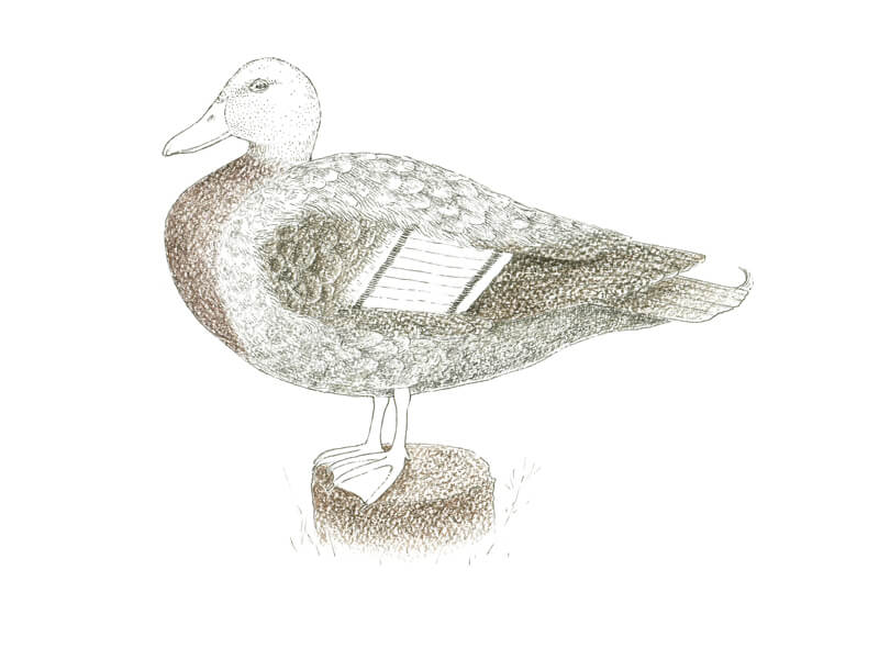
I add Blueberry to the speculum. Then I work on the head. I apply Dark Indigo closer to the edges. Ocean Blue covers the whole area of the head. Meadow is added to the central zone, under the bird’s eye and beyond.
I create a thick covering of colors there. The more pigment you have on the paper, the more intense the colors will be after applying water.
I draw some grass blades near the stump with Meadow.
With Maize, I cover the beak and the feet. The beak should have a yellowish-orange color with a black tip.
I also add some Autumn Brown to the feet, especially to the webbing. I place the strokes on top of the yellowish base.
Real mallard drakes have bright orange feet. Unfortunately, we can’t find the exact color within the available range of tinted graphite pencils. Even a combination of them won’t get any close results. However, the artwork will look nice even with those limitations of color. Let’s take a creative approach!
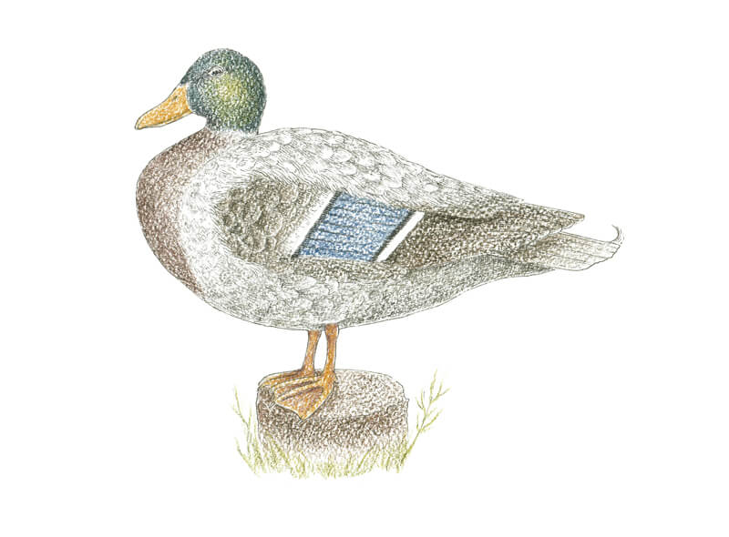
With a moderately wet brush, I wash the colored applications. Sometimes it’s necessary to run the brush over an area several times to wash out the visible pencil strokes.
If you don’t want to mix colors in some of the adjacent areas (like bark and grass, grey and brown parts of the duck’s body), work on them separately. Let an area dry completely before moving to the neighboring one. Layering the colors will produce a an effect as if the colors were mixed.
You can lift the pigment with your brush and transfer it to another area of the drawing. For example, I’ve included some blue-green from the drake’s head to the grass and some orange from the feet to the underside of the body.
I’m going to add more colored details to the artwork. The most basic option is drawing directly with pencils and then washing the strokes – just as we did before. Be sure that the existing layers have dried before applying the pencils again. When the paper is still wet, it can easily be damaged.
Another option is to make an improvised palette. Draw several strokes with a chosen pencil on a spare piece of paper. (Pressure should be from medium to hard, ensuring that you’ll get enough pigment.) Then, moisten the swatch with a wet brush. Now you’re ready to paint!
Now I prefer the second option because it gives better control over subtle color nuances.
My brush is just slightly wet. I add more Ocean Blue and Dark Indigo to the drake’s head. In a diluted state, these colors may be applied to the light grey and brown areas, and even to the lower part of the beak.
I add more Chestnut to the breast, bark, and some of the wing feathers. This unites the drawing in terms of color.
With Cool Brown, I make the darker areas of the wing more solid.
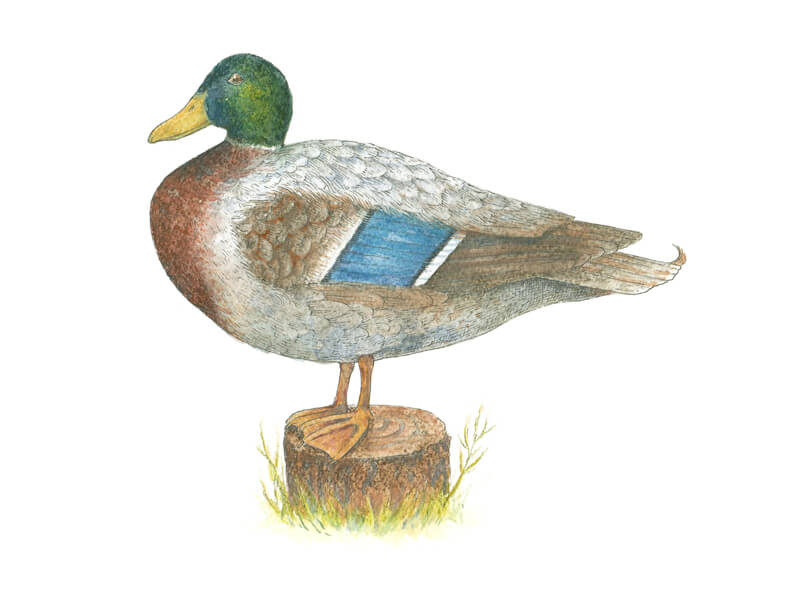
At this stage, the artwork looks slightly dull. It lacks contrast. With 0.1 ink liner again, I restore the texture and deepen the shadows.
I start with the head and upper part of the duck’s body. In the head, neck, and breast areas, I work mostly in a contour-hatching manner to create an illusion of volume.
When it comes to the smaller and softer feathers, I don’t outline their outer contours. I create shadows between them with sets of parallel lines.
The longer flight feathers allow for using sharper outlines.
I also darken the eye, leaving a small highlight in its upper part, and the tip of the beak.

With groups of ink hatches, I create a deep shadow on the bird’s belly. This area’s local color is light gray, but the lighting and the form of the body significantly affects the value. I also accent the shadow under the tail feathers.
I broaden the contour line in the lower part of the body to accent that this area is in shadow. Also, this makes the figure look more stable. I extend the lower contours of the feet as well.
As a finishing touch, I add some details in the bark and grass.
The artwork is now complete!
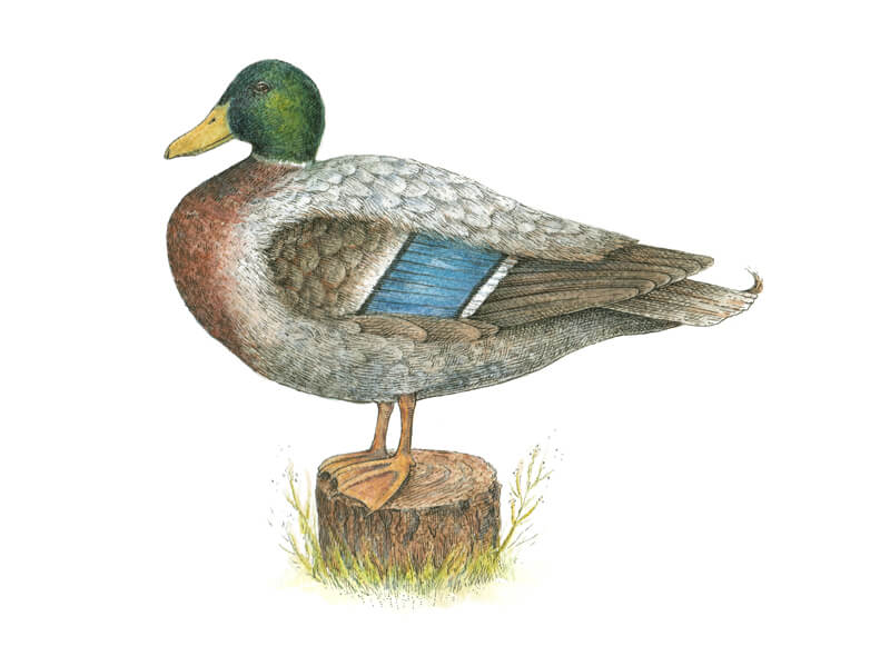
Conclusion
Congratulations – we’ve created a wonderful drawing! I hope that you’ve enjoyed working with water-soluble graphite pencils and ink.
The exploration of nature through art can take endless forms. Using rich, deep, beautifully subdued colors that tinted graphite pencils provide is just one of the possible routes that you can take.
I wish you much inspiration for your future art projects!
If so, join over 36,000 others that receive our newsletter with new drawing and painting lessons. Plus, check out three of our course videos and ebooks for free.
Draw an Autumn Leaf with PanPastels and Colored Pencils
Gettin Sketchy – Draw an Autumn Leaf with PanPastel and Colored Pencils – Season 2 Episode 9
This episode aired live on YouTube on October 14, 2020.
In this timed drawing exercise, we take a look at combining PanPastel with colored pencils to create a colorful drawing of an Autumn leaf. PanPastel allows us to layer colors quickly and provides a nice base for colored pencil applications. The colored pencils provide us with precision and additional depth in color.
Layering Colors
With most color media, layering plays an important role in developing depth and realism. And although this specific drawing was created as a timed “sketch”, we were still able to build up quite a bit of depth in a very short period of time. This depth was achieved due to the combination of media that was used and the surface in which it was applied.
While colored pencils provide the artist with a high level of control and precision, they can be time-consuming to use. In order to build up the required depth in color, several layered applications are usually required.
PanPastel, on the other hand, can be quickly layered on the surface but lack much precision or control. Several layers can be applied in a very short period of time. This results in substantial depth in color without much effort.
It’s easy to see how the combination of these two mediums results in depth of color without sacrificing precision and detail. The drawing that we have created here is small and was developed in a very short period of time but if you slow down a bit, the results could be quite impressive.
The Drawing Surface Matters
For any drawing, the surface that you work on makes a difference in the final appearance. Many times, we are so anxious to begin making marks that we overlook the surface in which we work upon. Keep in mind that the drawing surface is the foundation of your work and how it interacts with the media that we use greatly affects the results that you can achieve.
See also: All About Drawing Papers
For this drawing, PastelMat paper was the paper of choice. This unique paper features a distinct tooth (texture) that accepts both pastels and colored pencils. This made it a perfect surface for our combination of PanPastel and colored pencils. Produced in many different colors and shades, this wonderful surface has a texture that is similar to fine sandpaper. This rigid texture helps to lock the dusty pastel material in place, while providing enough tooth for multiple layers of both pastel and colored pencil material. This paper is expensive compared to other pastel papers, but well worth the price.
More on the Drawing Materials Used – PanPastel and Colored Pencils
The mediums and surface used in this timed drawing exercise may be a bit exotic to those of you that are new to drawing. Perhaps you’ve never heard of PanPastel or PastelMat paper. The colored pencils that were used for this drawing are oil-based which is also different from the more common, wax-based colored pencils.
See also: Oil-Based vs. Wax-Based Colored Pencils
Although the names of these mediums may be unfamiliar to some, their behavior is not so foreign.
Here are the materials used for this drawing…(Some of the following links are affiliate links which means we make a small commission if you purchase at no additional cost to you.)
PanPastel is simply a form of traditional soft pastel. While soft pastels are produced in sticks, PanPastels are produced as small pans (like watercolor). Special applicators, resembling makeup applicators, are used to apply the color to the surface. This makes the process of applying PanPastel similar to painting with a brush. The material is soft as it is applied and easily blended.
See also: Landscape with PanPastel
The colored pencils applied over the top of the PanPastel are oil-based, Polychromos pencils by Faber-Castell. Oil-based colored pencils differ from the more common, wax-based colored pencils due to their oil-based binder. This makes them behave in a slightly different manner than their wax-based cousins. Oil-based colored pencils often require more layers to build up a solid application. While this may seem like a disadvantage, it encourages multiple layers which leads to better results.
Photo Reference
We worked from a photo reference to create this drawing. This was simply a colorful leaf I found on a morning run. When drawing simple objects like this, I like to place the object on a clean, solid surface and photograph it with one dominant light source. Here’s a look at the photo reference…
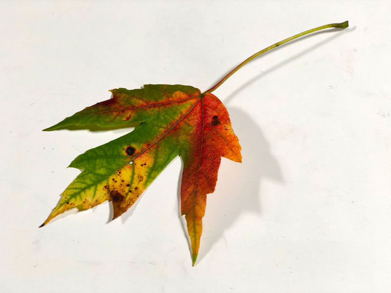
The Benefits of Combining Mediums
Not all drawing mediums can be combined with success. However, some combinations work very well together. For example, alcohol-based markers and colored pencils work extremely well together while oil pastels and soft pastels together are quite the disaster. PanPastel and colored pencils do work well together when used on the appropriate surface (one with a heavy enough tooth) and when applied in the correct order (PanPastel followed by colored pencil applications).
For those new to drawing, branching out and trying new mediums – especially expensive ones – can be intimidating. But there are often rewards waiting for us just outside of our comfort zones.
If so, join over 36,000 others that receive our newsletter with new drawing and painting lessons. Plus, check out three of our course videos and ebooks for free.