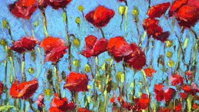
Expressive Brushstrokes with Oil Pastels
In this pastel lesson, we’ll take a look at drawing a landscape with oil pastels. Oil pastels can be used in a number of different ways and each approach affects the look of the finished work. In this lesson, we’ll use the medium to create defined “brushstrokes” to create an image that looks as if it was created with thick applications of oil paint.
Materials for this Lesson
The brand of oil pastels that we’ll use for this image is especially important. Oil pastels, like all art media, is produced by a variety of manufacturers. Each manufacturer has a different approach which leads to a broad spectrum of characteristics across the same medium. For example, oil pastels made by Sakura (Cray Pas) behave differently from those made by Sennelier. Some artists will prefer the control they get from Sakura oil pastels while others will prefer the painterly look produced by Sennelier.
Both brands of oil pastel mentioned above are capable of producing a “painterly” look. However, Sennelier oil pastels produce an almost impasto surface texture, with the material raised off of the drawing surface. This characteristic exaggerates the look of brushstrokes and it’s for this reason we’ll work with Sennelier oil pastels to complete the landscape.
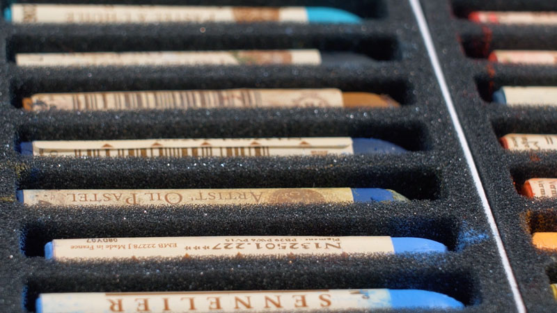
The surface that we’ll work on is also important. For this image, I’ve decided to work on Canson Mi-Teintes pastel paper, applying the medium to the heavily textured side of the paper. The extra tooth or texture of the paper will allow us to make multiple layered applications of oil pastels. A paper with a weaker tooth would hinder us from making so many layers. An orange surface will give the image warmth as small specks of the paper will still show through in areas.
See also: All About Drawing Papers
Here are the specific materials used to create the art with links to purchase. (The following links are affiliate links which means that I make a small commission if you purchase without an additional cost to you)…
The Photo Reference
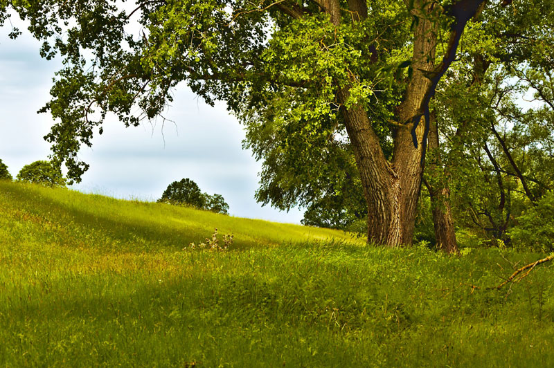
We’ll work from a photo reference to complete the image but make a few alterations during the process. So instead of copying the reference exactly, we’ll alter the art to make our painting more interesting.
Here’s a look at the photo reference used in this drawing…
Blocking In Initial Shapes
We’ll begin the drawing by loosely blocking in the shape of the tree with a very dark brown. Light pressure is used to apply the oil pastel in this early part of the process.
Once a looser indication of the shape of the tree is in place, we can block in the sky behind it. First, a light blue is applied. Over the top, a white follows, mixing with the light blue as it is applied.
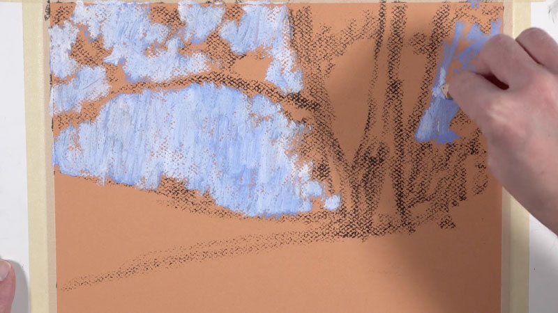
With the sky established, we can go over the lighter applications of dark brown with a heavier application. This time, we’ll add collections of leaves and smaller shapes, further refining the overall shape of the tree.
Next, we can refine the shape of the main tree and the smaller trees behind it. Gradually, we’ll begin pulling up the value by layering slightly lighter versions of yellow-green over the darker shapes of the tree established in the previous step.
As we develop the value and color, our tree begins to make more sense as a form.
Adding Texture to the Tree
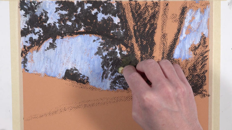
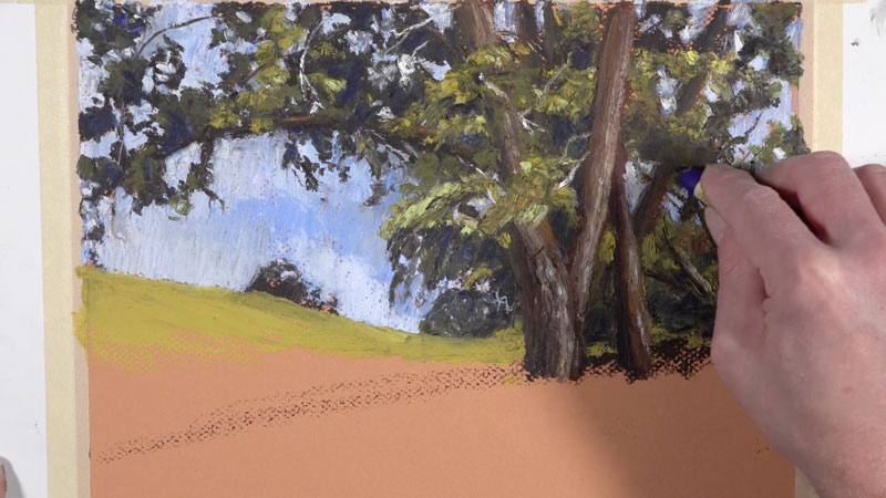
Next, we’ll begin work on the trunk of the main tree. Layering is important as it will add complexity to the color. We’ll begin with a dark reddish-brown, establishing the shape of the trunk and larger branches. Then over the top, we’ll apply dark brown in the shadowed locations. Grays and light creams are added on the side of the trunk receiving the majority of light.
Mostly vertical, directional strokes are made – working their way up the form of the tree to create the impression of texture. These applications are just the beginning as we will return to the trunk throughout the process.
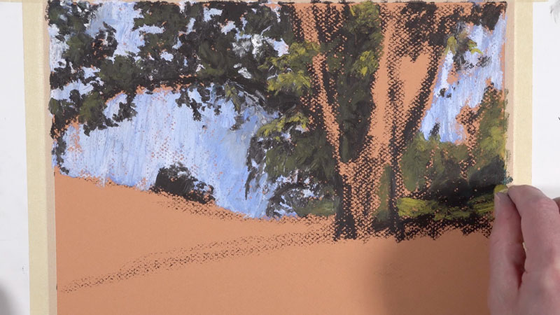
Adding More Variety to the Leaves and Smaller Branches
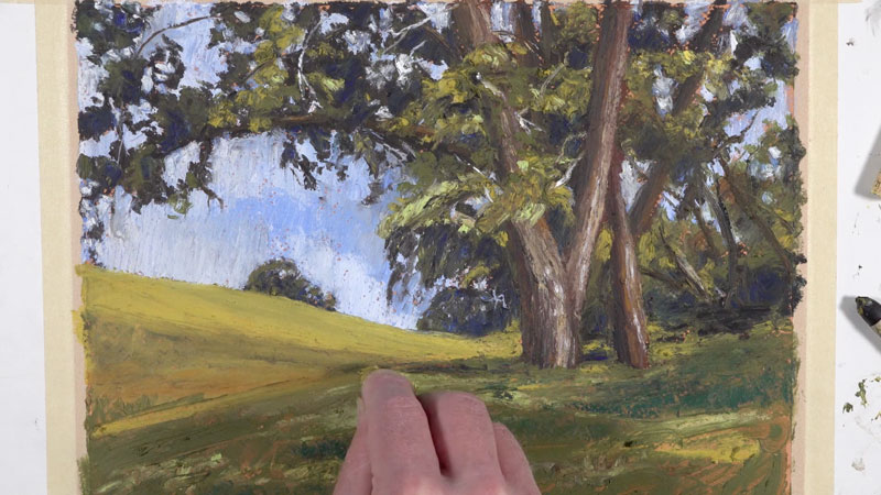
We’ll continue layering a variety of yellow-greens as we continue to pull out the forms of the collections of leaves. These collections overlap the branches and the trunk, further creating the illusion of space and depth.
We’ll also pull out a few smaller branches within the canopy of the tree. The back edge of the pastel stick allows us to create these lines with an otherwise bulky material. Both dark brown and white branches are added for variety and a sense of realism.
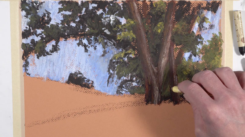
Pushing Color
We’ll continue to add sections of progressively lighter yellow-green applications to the leaves as well as additional layers of oil pastel to the trunk and larger branches.
We can also bring in additional interest with a bit of color. By adding a bit of blue to the shadowed areas within the canopy of the tree, we can add a little “punch” to the image. A darker blue, similar to Ultramarine, is used to add some color to the shadowed areas within the tree. This color mixes with the darker tones underneath which mutes it.
In the same way, yellow can be applied over some of the highlighted sections, making the light feel warmer and the highlights more colorful.

Adding the Field of Flowers
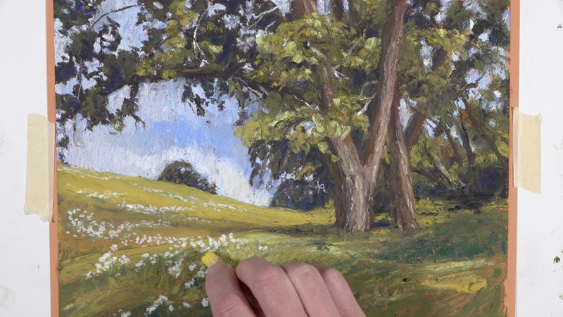
Working down the picture plane, we’ll now turn our attention to the field. As you may have noticed, our reference doesn’t feature any flowers. But to make our drawing a bit more interesting, we’ll add groupings of flowers in the field. The addition of the flowers will not only make the art more interesting but will also help to create the illusion of space while pulling the viewer’s eye to the main focal point – the large dominant tree.
We’ll begin by filling in the distant field with a light yellow-green. As we work down the picture plane, closer to the viewer, we’ll add more variety by introducing different greens, natural yellows, and blue-greens.
Once we’ve developed some variety in the foreground, we’ll return to the distant field, adding small marks with white to indicate the groupings of flowers.
As we work to the foreground, the flowers become larger, with more space between each flower. Details are still suggested, even though the flowers are closer to the viewer. Variety in the marks made in the foreground help to insinuate details without rendering them completely.
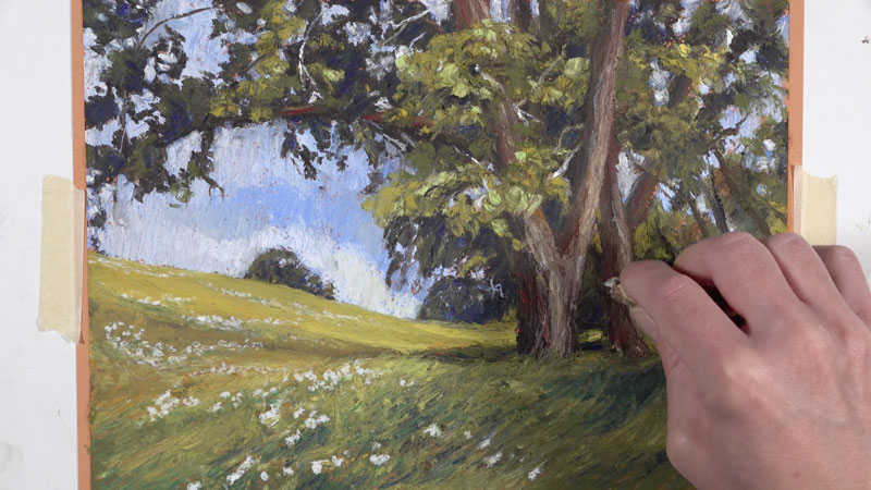
After we have the flowers in place, we can add the finishing touches to the image. We’ll continue to layer additional greens in the foreground, pulling strokes in the same direction as the grass grows. In the shadowed areas, blues and blue-greens are applied. In the areas that are saturated with sun, lighter yellow-greens are applied.
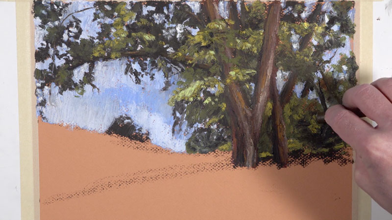
On the trunk of the tree and on the larger branches, we’ll add a bit of color with an intense red. The addition of this red contrasts the greens around it and brings additional focus. The red on its own, however, is too strong. To mute it slightly, a dark brown is added on top, while still allowing some of the color to show through.
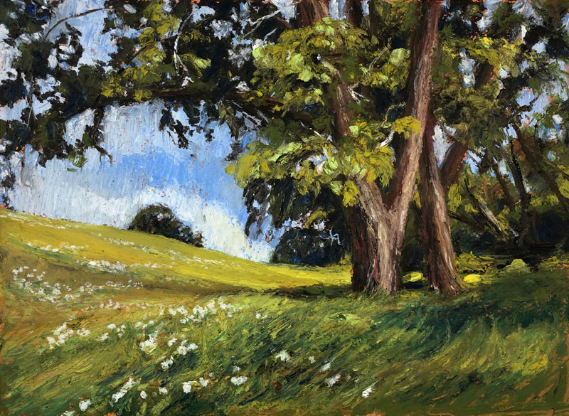
After the final applications are made, our oil pastel landscape with bold expressive “brushstrokes” is now complete…
Expressive Landscape Drawing with Oil Pastels – Conclusion
Oil pastels are a unique medium. They behave in a completely different manner than their soft pastel cousins. When used in the manner that we’ve covered here, they are capable of producing the look of an oil painting, complete with expressive “brushstrokes”.
Thanks for joining me on this artistic adventure and I wish you the best in your own oil pastel creations.
If so, join over 36,000 others that receive our newsletter with new drawing and painting lessons. Plus, check out three of our course videos and ebooks for free.