Impressionistic Landscape with Oil Pastels
In this lesson, we’ll draw a looser landscape of a field of Poppy flowers with oil pastels on Canson Mi-Teintes pastel paper. We’ll focus mainly on capturing shapes of color and value instead of developing details. All while developing thick, layered applications which translates as a painting, rather than a drawing.
Materials for this Lesson
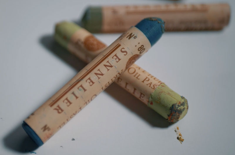
We’ll use two different brands of oil pastels for this drawing – Sennelier and Sakura “Cray Pas” Expressionist oil pastels. Sennelier oil pastels are very soft and buttery and are considered professional, artist quality oil pastels.
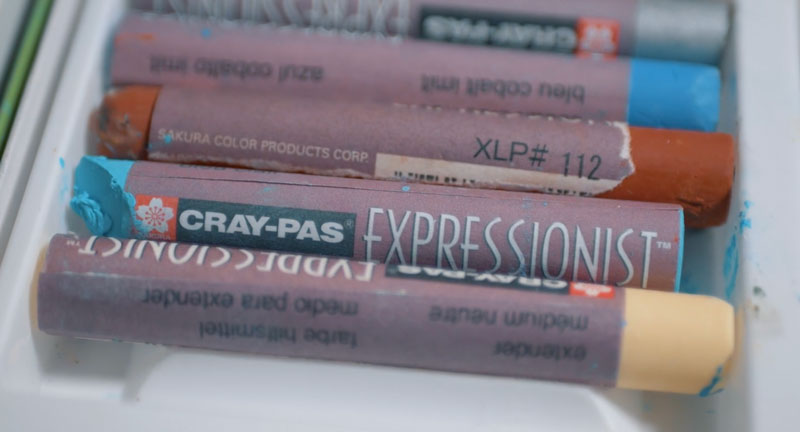
Expressionist oil pastels are also of high quality, but are less expensive, harder, and are considered a “step down” from “artist quality”. However, despite missing the label of “artist quality”, I have found these pastels to be suitable for professional work as well.
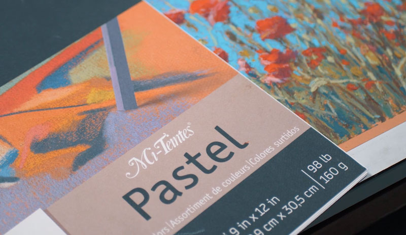
The surface used is Canson Mi-Teintes pastel paper. This paper is fantastic for many different forms of pastel – the heavier textured side being most suitable for oil pastels. (Since oil pastels are at their best when layered, the more tooth your surface has – the better.)
More on drawing papers…All About Drawing Papers
Here’s a look at the specific materials used to create the art. (The following links are affiliate links which means that I make a small commission if you purchase without an additional cost to you)…
The Photo Reference
We’ll work from a photo reference (from Pixabay.com) to complete the image. The reference is used purely as a “reference”, meaning that we aren’t creating an exact copy. We are using it only for color and value information. This allows us to stay looser, creative, and spontaneous with our mark making and color selections.
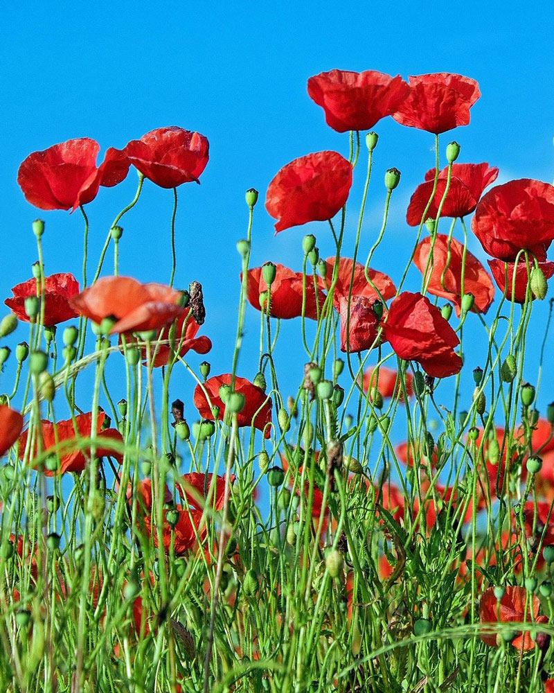 Image by
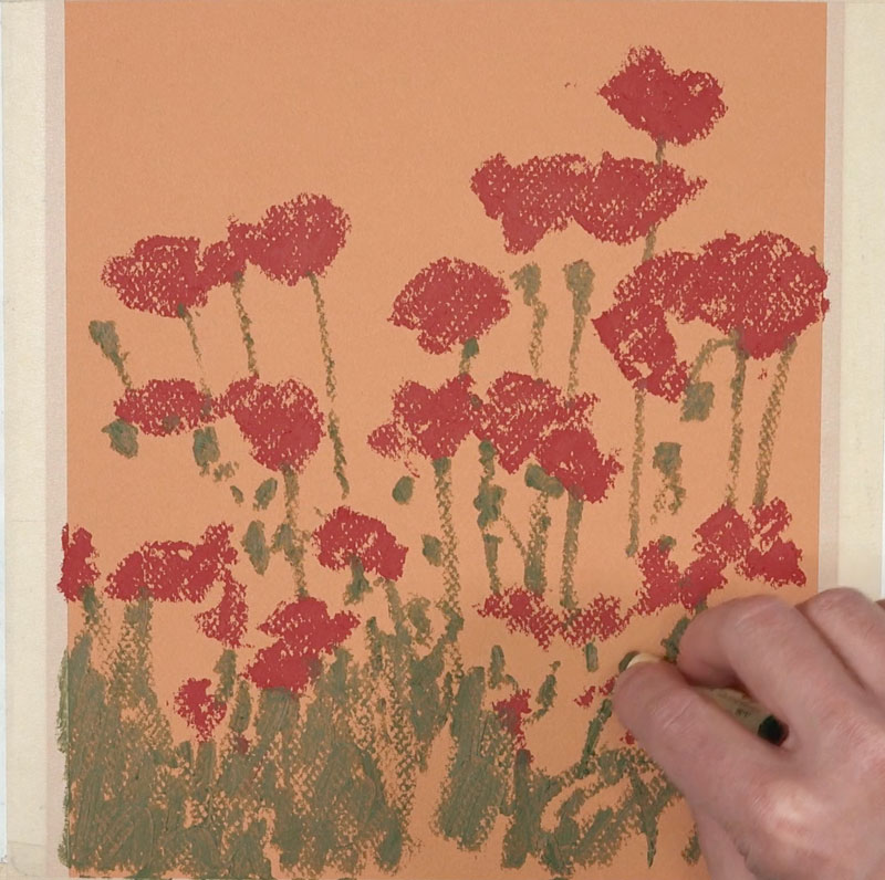
 Painting in the Shapes of the Flowers and Stems
We’ll begin by painting in the shapes of the flowers and stems with broad, deliberate applications of a deep red and dark, yellow-green. Instead of working with background first, as we would with another opaque medium, we begin with the foreground and middle ground. This allows us to add the sky around these shapes later in the process. And as we add the sky, we define the shapes of the flowers and stems in the foreground.
Painting in the Sky
With our basic shapes in place, we next add the first applications of light blue for the sky. We’ll work up to the edges of the flower shapes, defining the shapes with the blue.
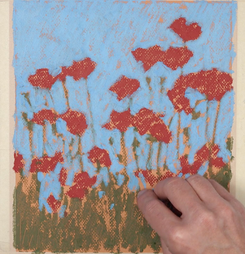
We’ll also add specks of blue showing through the stems of the flowers in the foreground.
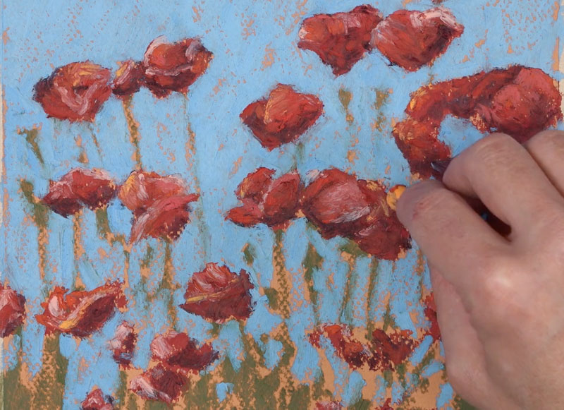
Adding Highlights and Shadows
Now we can focus on developing the illusion of form and space within the scene. We’ll do this by focusing on the shapes of light and dark values that are observed on the flowers and stems.
We’ll use a dark red, which leans close to brown, to develop the shadows on each flower. For the highlights, we’ll layer a variety of light reds, pinks, oranges, and red-oranges. Don’t get overwhelmed with the details. Instead, simplify what you see and concentrate only on the shapes of color and value. The viewer will fill in the details on their own.
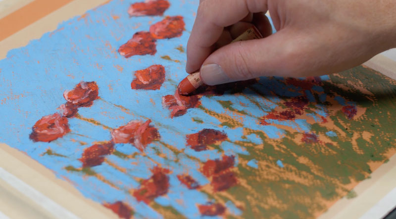
We’ll add a bit of warmth to the highlights on each Poppy with a strong, warm yellow. This color is spread throughout the work to ensure harmony and unity.
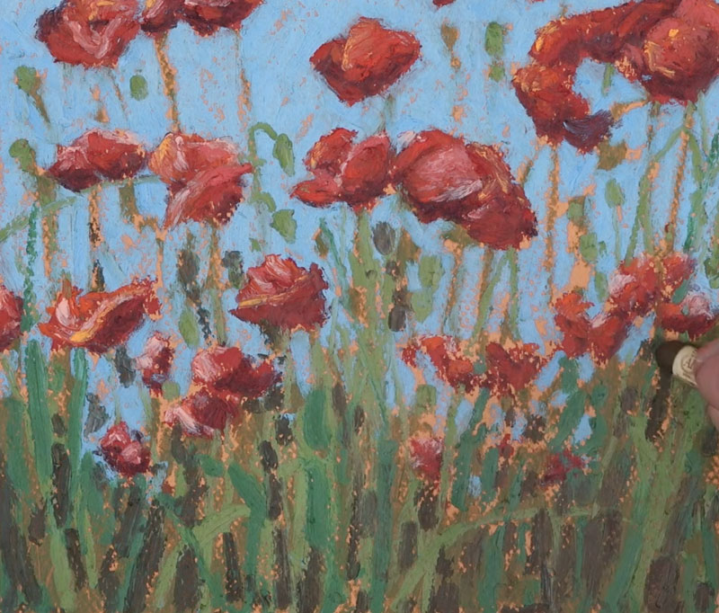
We’ll then work down to the foreground, adding bits of shadow in between each of the stems. A dark, muted brown is layered over the greens, using vertical strokes. Bits of dark blue are also layered to create a more natural shadow in areas.
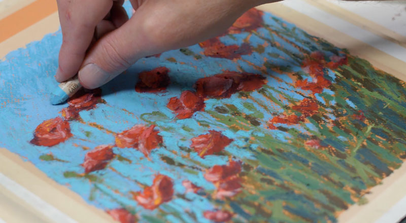
We’ll then go back to the sky and create a transition from dark to light. We’ll begin at the top of the picture plane with a slightly darker blue. At the bottom of the picture plane, we’ll use a lighter blue and bring this color up. To ease the transition, we’ll layer the original blue over the top.
Using a variety of lighter yellow-greens, we’ll add a few more hints of highlight on the pods and a few of the stems. We’ll progressively add lighter and lighter applications, allowing the middle values underneath to show through in areas.

Then we’ll switch over to the harder, Expressionist pastels to add a few additional stems. Since this brand of oil pastel is much harder than the Sennelier oil pastels, these marks are easily applied. In some cases, these applications may dig into the softer applications underneath.
Using the edge of the pastel stick, defined lines are easily made. A dark brown is applied first, followed by a light yellow-green.
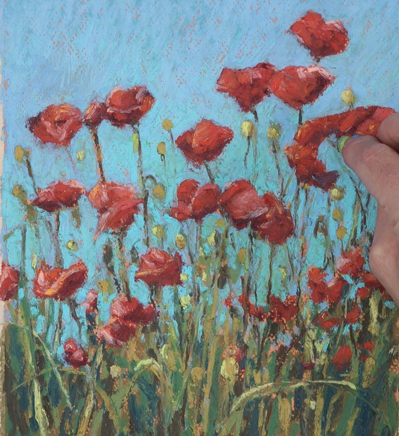
A few more hints of red Poppies are added, mainly to the lower portion of the picture plane. These flowers can be seen peaking through the stems of the flowers in areas.
A few final applications are made to the sky with light blue. These final applications clean up the image and further define the edges of each of the flowers and stems.
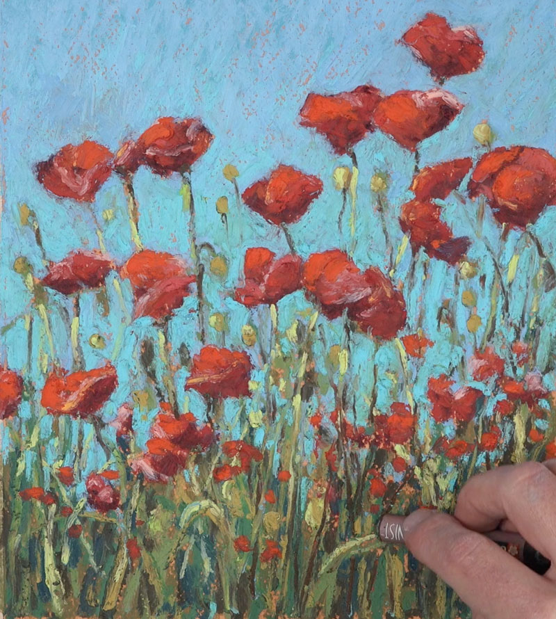
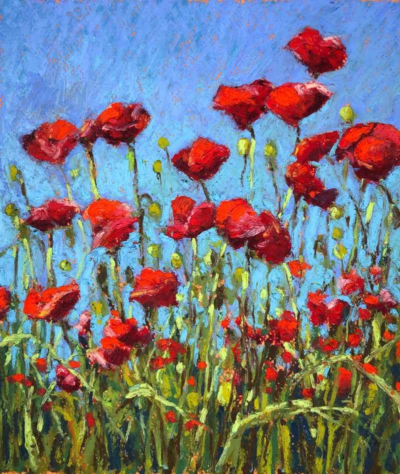
And after these final applications, the oil pastel landscape painting / drawing is now complete.
Landscape Painting with Oil Pastel – Conclusion
Oil pastels are a medium that fall somewhere between drawing and painting. Although the process is clearly drawing, the thought process we need to apply is clearly one of a painter. Details are implied in an image like this. Marks are loose and painterly. Allow yourself to let the values do the work and let your viewer fill in the details.
If so, join over 36,000 others that receive our newsletter with new drawing and painting lessons. Plus, check out three of our course videos and ebooks for free.