
Materials for this Drawing
For this lesson, we’ll use the softer, Prismacolor Premiere colored pencils. These buttery colored pencils layer exceptionally well and make burnishing a breeze. They get a bad reputation for breaking easily, but it’s a sacrifice that’s worth it considering how soft they are.
We’ll work on toned Canson Mi-Teintes pastel paper. This paper features a course texture on one side and a softer, less textured surface on the other. Both sides are suitable for accepting multiple, layered applications of colored pencils. For this demo, we’ll use the softer, less textured side.
A toned surface helps us to establish value relationships quickly. As we add colored pencil applications to the surface, we can make better decisions regarding the value since we already have a neutral midtone on which to work.
Capturing Reflection and Transparency with Colored Pencils
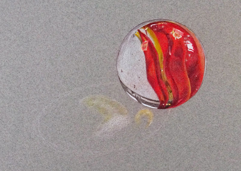
Capturing reflection and transparency in a drawing or painting is dependent on the use of value. Value, one of the seven elements of art, is the darkness or lightness of a color. The manner in which we develop and position values in a drawing is what ultimately leads to the illusion of light, form, and texture. Value is perhaps the most important element of art that we use in our drawings.
Reflective surfaces feature high contrast in value. We’ll often see dark values positioned right next to light values. This is especially true in areas where we see strong highlights. If we manage to recreate this relationship of values in our drawing, then we have a good chance of creating the illusion of a reflective surface.
Our marble is also partially transparent. The key to creating this illusion is also dependent on the positioning of values. In the case of our marble, we have several bands of color that meander through the middle. Since these bands fold slightly, we see subtle changes in value. These gradual folds create gradations of value and areas of shadow where they overlap. We’ll also notice that these bands of color do not extend all the way to the top edges of the marble. Instead, we see a small band of a more neutral color along the top edge of the sphere.
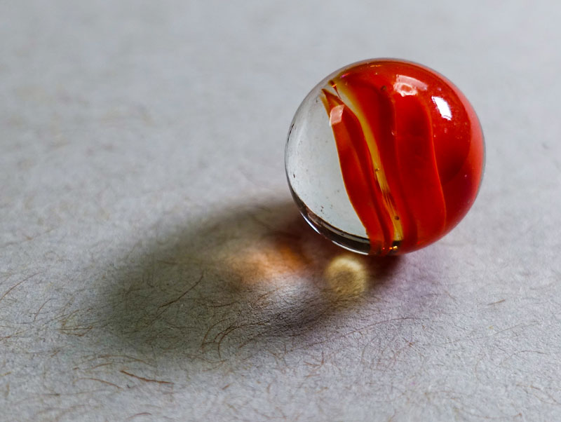
Here’s a look at the photo reference…
We also have strong light that passes through the marble’s core. Because the marble is glass, this light is intensified as it passes through. In this case, this produces two distinct highlights on the surface behind the marble. These strong highlights are found within the core shadow and reflect the colors found within the marble itself. A core shadow still exists since parts of the marble are not transparent.
See also: How to Draw Water Droplets
Draw the Contours
We’ll start by first drawing a circle. If you have trouble drawing a circle freehand, you may use a circular object and trace a circle in place. In this case, I used a lid from a container of acrylic gel medium, but any circular object will do.
We’ll use White or 10% French Grey to lay in the contours with a light touch. Be sure to apply a light touch so that you don’t create indentations in the surface of the paper or make marks that may prove difficult to cover later. White is easily covered with subsequent applications of colored pencils if a light application is made.
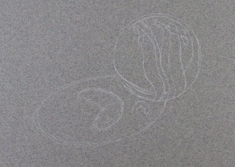
With the circle defined, we’ll lightly define the shapes of color within the marble as well as the shapes of highlight and shadow with contour lines. After we’ve established these shapes, we’ll draw an elliptical shape for the cast shadow and add the shapes for the strong highlights.
If you don’t feel comfortable drawing the contours freehand, you can always transfer the information from the reference using a graphite transfer.
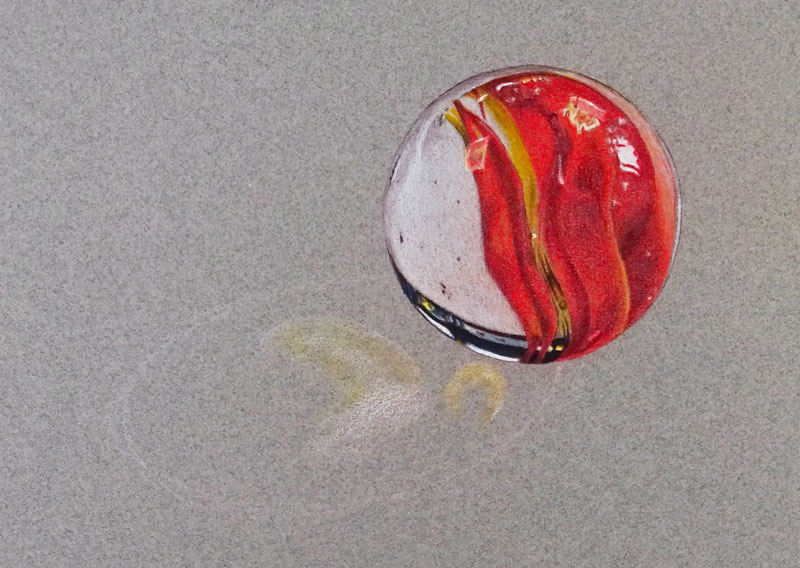
Layer Initial Colors
Starting with Scarlet Lake, we’ll carefully begin filling in the local color in the red areas of the marble. As we do so, we should be careful not to overlap our locations of strongest highlight. These areas should be preserved so that our highlights remain strong and pure when they are added. The applications are light at first, using medium pressure to apply the color.

The yellow areas receive an application of Sunburst Yellow. Again, as this color is added, the highlights are avoided. Some of the Sunburst Yellow is applied over the bands of red to create additional interest and depth to the color, mainly in the areas where the value is slightly lighter. Sunburst Yellow is also applied within the strongest highlights found within the cast shadow.
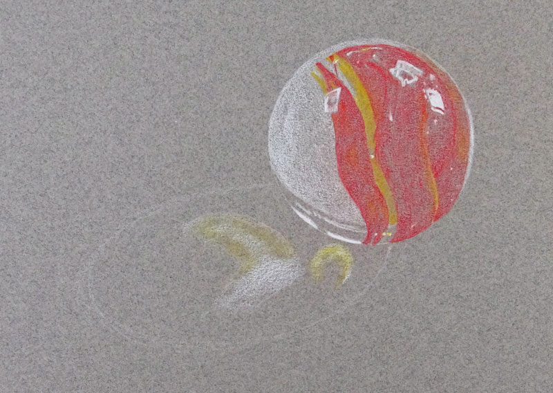
With our initial reds and yellows in place, we can add the strong highlights with White. Heavier pressure is used in locations where the highlights are at their strongest. White is also applied within the strongest highlights found within the cast shadow.
A combination of White and 10% French Grey is applied to the body of the marble on the left side.
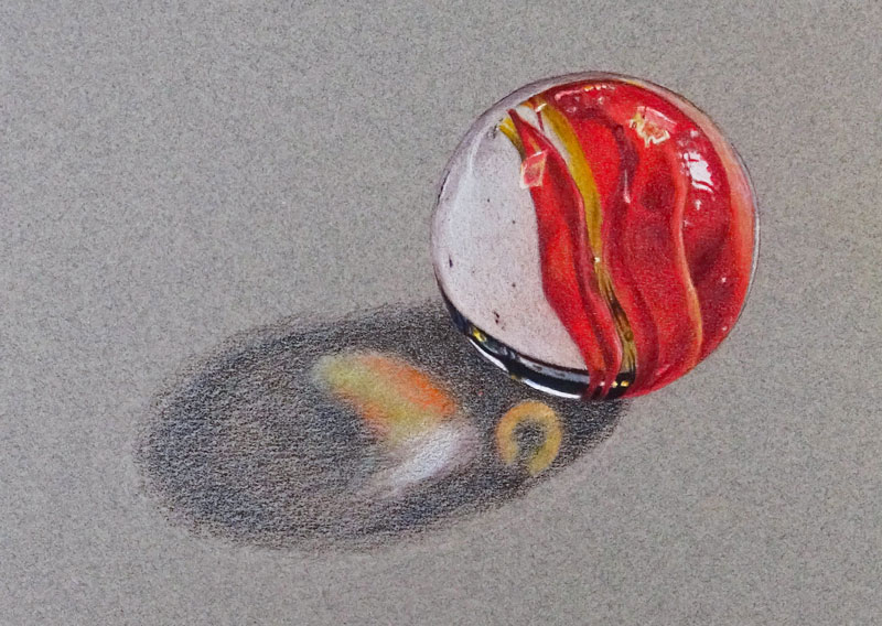
Strengthen Colors
Now that our initial colors are in place, we can begin intensifying the color. In the darkest areas within the red bands, we’ll add Tuscan Red. Once the Tuscan Red is in place, we’ll go over the red bands again with another application of Scarlet Lake. In the lighter areas within the red bands, another application of Sunburst Yellow is applied. As we add these layered applications, we can refine the shapes of color and add any nuisances that we see.
The tooth or texture of the paper is suitable for accepting multiple applications of color but produces a grainy texture. The surface texture of the marble should appear smooth. We can soften the texture to a degree by burnishing the applications that we have in place with a colourless blender. A colourless blender is simply a colored pencil void of pigment. When it is applied, the wax from the pencil blends and smooths the color already on the surface. It helps to eliminate the grainy appearance by working the medium into the texture of the paper. Using medium to heavy pressure, we’ll burnish the colored pencil applications in place with the colorless blender.

Increase the Contrast
Now we can turn our attention to broadening the range of value and increasing the contrast. To do this, we’ll begin adding Dark Umber to darken the shadows within the bands of color. Dark Umber is a dark brown and is chosen to keep the shadows warm. Black is avoided, since it tends to make colors appear flat and unnatural.
Dark Umber is also used to reinforce the outer contour and to establish a base application within the darkest area on the lower left quadrant of the marble. A few specks of darker tone are also added with Dark Umber to communicate a few imperfections within the glass of the marble.
After applying the Dark Umber, we can intensify the color further and brighten the red bands. Poppy Red is applied over the red bands with a medium to heavy pressure.
We’ll also apply another application of 10% French Grey and White over the left side of the marble. After these applications are made, they are burnished again with the colourless blender, lessening the grainy appearance produced by the texture of the paper.
Additional Contrast
As mentioned before, we are avoiding using black. Black, when used on its own in a color drawing, can flatten a drawing and command unwanted attention. Dark Umber on its own however, is too warm for some of our darker values. Fortunately, we can combine Dark Umber with Indigo Blue to produce a more natural “black”. This combination also adds a bit more flexibility. If we want the black to appear cooler, we’ll allow Indigo Blue to dominate. If we want the black to be warmer, we’ll simply allow the Dark Umber to dominate.
Using Indigo Blue, we’ll go over the darkest portion on the marble in the lower left quadrant where we previously applied Dark Umber. If you find that this application produces a result that is too cool, simply add another layer of Dark Umber.
The strong highlights within this area of dark value are not without a hint of color. A light application of Indigo Blue is applied over portions of the highlight with a light touch before applying another layer of White. A touch of Sunburst Yellow #917 is applied over the warmer sections of highlight in this area as well.
Drawing the Cast Shadow
Now we’re ready to begin adding colors to the cast shadow. We’ll start by first adding additional colors to the highlighted portions. A bit more of Sunburst Yellow and White is added first, followed by a touch of Orange.
Next we’ll add Dark Umber to the rest of the shape, applying more pressure to the pencil in the darkest areas of shadow. Over the top, we’ll apply Indigo Blue #901 in the areas where the shadow is at its strongest.
The shadow slightly fades around the outer edge, so the pressure that we place on the pencil should also reflect this.
Darkening the Cast Shadow
We’ll continue gradually and patiently layering applications of Dark Umber and Indigo Blue to progressively build a darker tone. We’ll allow a bit more of the texture of the paper to show through in this case, so that it can contrast the smoother texture of the marble. Nonetheless, we’ll still burnish these applications with the colourless blender, allowing the blues and browns to mix. The blender is also used to soften transitions from dark to light where the darkest values meet the lighter highlights.
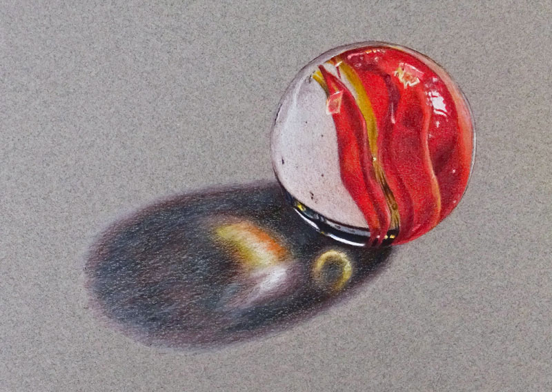
I like to include a bit of color in cast shadows. In this case, I’m allowing some of the Indigo Blue to dominate portions of the cast shadow. By doing so, the cast shadow contrasts with the warmer colors of the marble. This is simply an artistic decision.
Finishing the Colored Pencil Drawing of a Marble
Lastly, we need to increase the contrast within the cast shadow. Working in from the outer edges of the shadow, we’ll add a medium application of 20% Warm Grey. This lightens the value slightly and also smooths the texture a bit more. We’ll also apply this color around the entire outer edge of the cast shadow to help smooth the transition from shadow to raw paper.
In the darkest areas of shadow right underneath the marble, a bit of 90% Warm Grey is applied to darken the tone further.
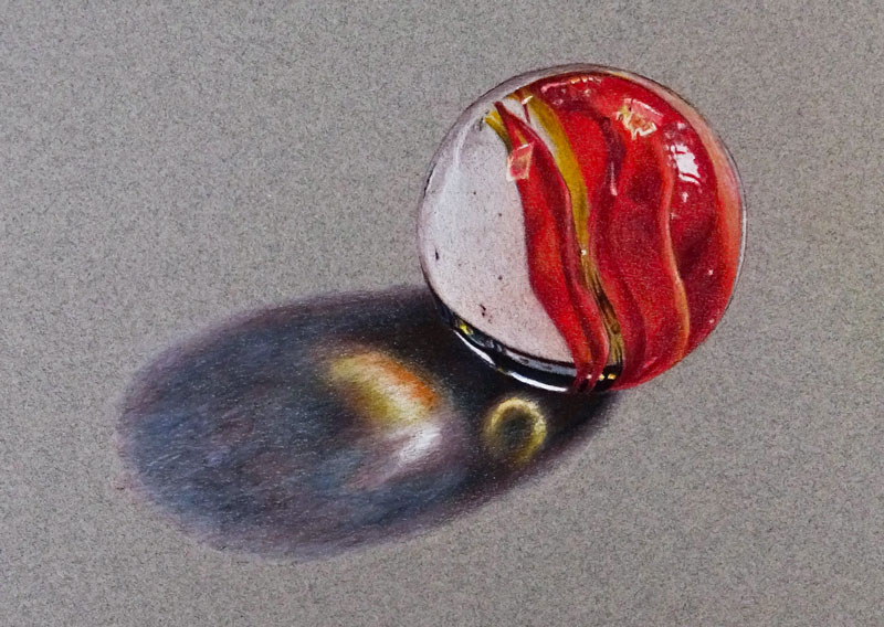
Now our drawing of a single marble is complete.
If so, join over 36,000 others that receive our newsletter with new drawing and painting lessons. Plus, check out three of our course videos and ebooks for free.

Lesson Discussion
Comments are closed.
Hi,
I enjoyed reading how to work with colored pencils. I wonder if the same technique can be used with pastel pencils, if the background has an under painting of a neutral to allow burnishing. I would like your opinion on this.