Gettin Sketchy – How to Create a Monotype – Season 2 Episode 8
This episode aired live on YouTube on October 7, 2020.
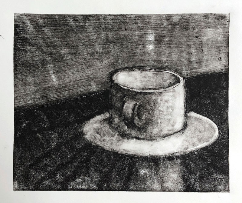
In this timed drawing exercise, we take a look at creating a monoprint of a coffee mug on standard white drawing paper. This interesting printmaking process is relatively quick and fun and the resulting appearance is unique.
Creating a Monotype
It should be noted that the terms “monoprint” and “monotype” are often used interchangeably, however they are technically different. A monoprint can refer to one print made with any printmaking process, while a monotype is specific to the process we are discussing here. Ashley and I use the term monoprint, but technically, monotype would be more accurate.
As the name suggests, monoprinting (also called monotyping) is a printmaking process that results in one print. Sometimes you can get a second “ghost” print, but mostly this process results in only one usable image.
This means that this printmaking process differs from the others where we typically expect to get several prints. Generally speaking, printmaking is an art-making process that utilizes an altered support to transfer ink (or other pigmented medium) to paper or fabric. With other printmaking processes, several prints are usually produced where each one is considered an “original”. But monoprinting is special since only one print is produced.
Monotyping also differs from other forms of printmaking since it does not fall into the categories of relief printmaking, intaglio, screenprinting or lithography.
Here’s a look at the completed print…
Thinking in Reverse
Most of us become accustomed to adding dark media to a light surface when we first learn to draw. For example, we often start with a pencil and make marks on a white sheet of paper. This trains our mind to look for dark tones on our subjects and add them to the drawing surface.
With monotyping, the process is reversed. Since we start with a solid application of ink and remove the ink to create the image, we must consider the tints (or lighter values) as we develop the image.
The resulting print is also in reverse. We must consider this, especially if text is included in the scene.
The Process of Creating a Print
A few surfaces can be used as the matrix for a monotype. This could be a zinc or copper plate, but acrylic surfaces or a pane of glass is a bit more accessible.
Oil-based ink is spread on this surface and then gradually removed using a cloth, cotton swab, toothpick, or any other tool. Oil-based ink must be used so that it doesn’t dry before the ink can be removed. This process will not work with water-based ink.
With a transparent surface, like an acrylic or glass pane, a sheet of white paper can be placed underneath so that you can better evaluate the image as the ink is removed.
Ink is removed in the areas of lighter tone. Gradually, an image develops.
Once you are happy with the image produced on the pane of glass, a sheet of paper can be placed over the inked pane. Pressure is then applied to the back of the paper to transfer the ink to the paper. A wooden spoon or a baren can be used to apply pressure.
Once adequate pressure has been applied to the surface, the print can be gently pulled away.
In our demonstration, Ashley used regular white drawing paper, however printmaking papers that are 100% cotton may produce better results.
Photo Reference
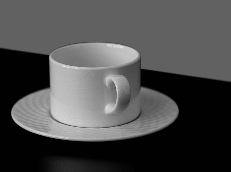
The reference photo for this exercise comes from Pixabay.com. This reference was heavily edited for simplicity and much of the background information along with the color was removed. Notice how the photo reference is in reverse when compared to the final image. Here’s a look at the photo reference…
Supplies for Monotypes
One of the advantages of creating a monotype is that it doesn’t require a full printmaking studio to create one. With other printmaking processes, like intaglio, a printing press is preferred. But with monotyping, one is not required. In fact, minimal tools and materials are required to be successful. In our demonstration, Ashley uses very basic tools.
Here’s what you’ll need to create a monotype of your own…(Some of the following links are affiliate links which means we make a small commission if you purchase at no additional cost to you.)
- A plate to apply the ink. This can be an acrylic or glass pane.
- Oil-based printmaking ink
- A brayer (to apply the ink).
- Tools to remove the ink. This can be anything that makes marks (pencils, pens, a cloth or paper towel, golf tee, etc.)
- Paper to print on. Regular drawing paper will work, but you may find greater success with printmaking paper that is 100% cotton (commonly called “rag” paper.)
- A wooden or metal spoon, or a baren.
While the process of creating a monotype is clearly a printmaking process, this fun exercise can also influence your drawing and painting skills. Working in a new or different medium that is outside of what you’re accustomed to forces you to think about image making in a new way. This carries over to the processes that you are familiar with, making you a more well-rounded artist. An additional benefit is how quickly these images can be created. These prints can be created in a short period of time and produces imagery that is unique with a full range of value.
If so, join over 36,000 others that receive our newsletter with new drawing and painting lessons. Plus, check out three of our course videos and ebooks for free.
Timed Drawing Exercise – Ball Point Pen Drawing – Cape Buffalo
Gettin Sketchy – How to Draw a Cape Buffalo with Ball Point Pen – Season 2 Episode 7
This episode aired live on YouTube on September 30, 2020.
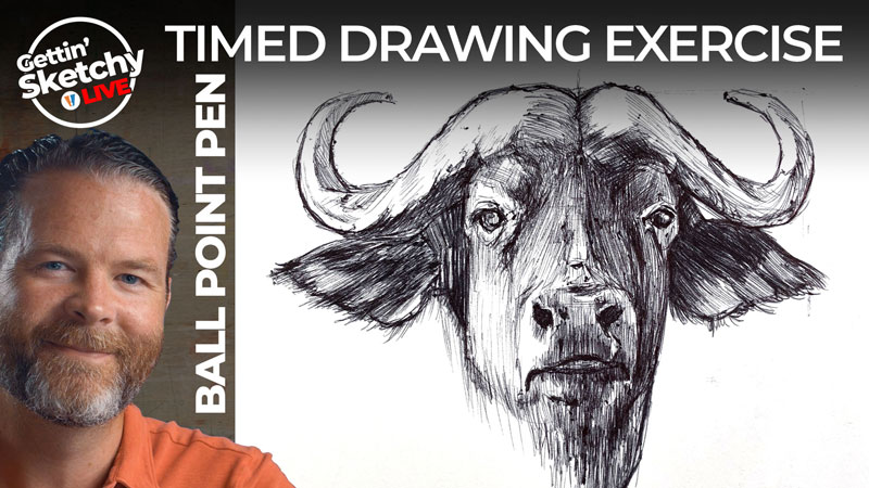
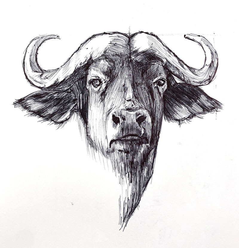
In this timed drawing exercise, we take a look at drawing a Cape Buffalo with ball point pens. To increase the challenge, we’ll work only with ink and draw the image without a graphite under drawing. Fortunately, ball point pens are rather forgiving compared to traditional inking techniques.
Drawing with Ball Point Pens
Ball point pens are literally everywhere. You probably have a few laying around in a drawer. But just because this common medium is so accessible to just about anyone doesn’t mean that it can’t be used to create impressive works of art. Today, there are a number of artists using this medium to create highly realistic drawings, especially on a large scale.
Unlike traditional technical drawing pens and nib pens, ball point pens can be used to create gradations of value and tone by adjusting the pressure placed on the pen. Traditional inking tools typically rely on techniques such as hatching, cross hatching, and stippling to create subtle changes in tone. This unique characteristic makes ball point pens an excellent medium for sketching and planning ideas in a sketchbook. As a bonus, most of us have used a ball point pen at some point in our lives which means this medium is already quite familiar.
But, even though this medium possesses many positive characteristics, it’s not perfect. For one, ball point pens are not consistent when applied to the surface. It’s not uncommon for splotches of ink to be a part of the drawing.
Here’s a look at the completed drawing…
Accuracy In a Ball Point Pen Drawing
As I mentioned before, this drawing was created with only ball point pens. Since graphite was not used, accuracy in the early stages was important. If a graphite under drawing was to be used, I could erased remaining pencil lines after the ink was applied. But since no graphite was to be used, I didn’t have this option.
In most cases, I like to begin drawings using a construction technique. When this technique is used, looser shapes are drawn initially. These shapes are pieced together to create the overall shape of the subject. However, since only ball point pens were used, I had to take a different approach.
See Also: Drawing Basics: Construction
In this case, I relied on sighting and measuring to ensure accuracy. Sighting and measuring is a process of making comparisons between subjects, shapes, and negative spaces using a common measuring tool. In most cases, this tool is simply a pencil, pen, or paint brush. For this drawing, I simply used the ball point pen as my measuring tool.
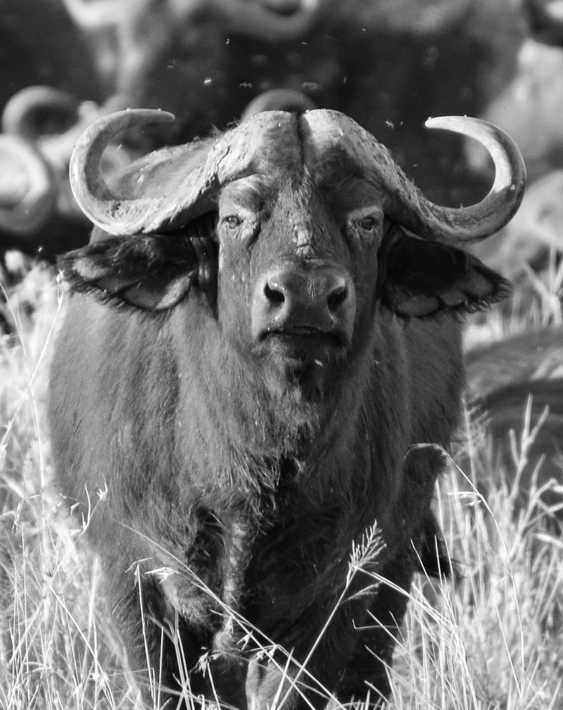
On a separate computer screen, I had the reference image of the Cape Buffalo visible from drawing table. I held my arm outstretched and held the pen up using my finger and thumb to find measurements. Using these measurements, I was able to position the important elements of the buffalo in place on the drawing paper.
We cover this approach to ensuring accuracy in the course “25 Days to Better Drawings”. This specific lesson is Lesson 19.
Drawing with a ball point pen is slightly different from drawing with traditional pen and ink forms, but there are many similarities.
If you’re interesting in continuing with pen and ink, here are a few good places to start…
- The Pen and Ink Experience Course
- Subjects with Pen and Ink Course
- How to Draw a Bee with Pen and Ink
Photo Reference
The reference photo for this exercise comes from Pixabay.com. This reference was edited by cropping and the color and contrast were adjusted. Here’s a look at the photo reference…
Timed Drawing Exercises Will Improve Your Drawing Skills
It doesn’t really matter what medium you use to practice drawing. As we see here, common writing tools like a ball point pen can be used for effective drawing practice. What matters most is that you simply take the time to practice.
Timed drawing exercises like this one can be quite effective. When we restrict the amount of time we devote to a sketch, we are more likely to set time aside to actually do it. Just a little bit of practice everyday (even just 45 minutes) can lead to substantial improvement in your drawing skills.
If so, join over 36,000 others that receive our newsletter with new drawing and painting lessons. Plus, check out three of our course videos and ebooks for free.
Timed Drawing Exercise – Vulture with Charcoal
Gettin Sketchy – How to Draw a Vulture with Charcoal – Season 2 Episode 6
This episode aired live on YouTube on September 23, 2020.
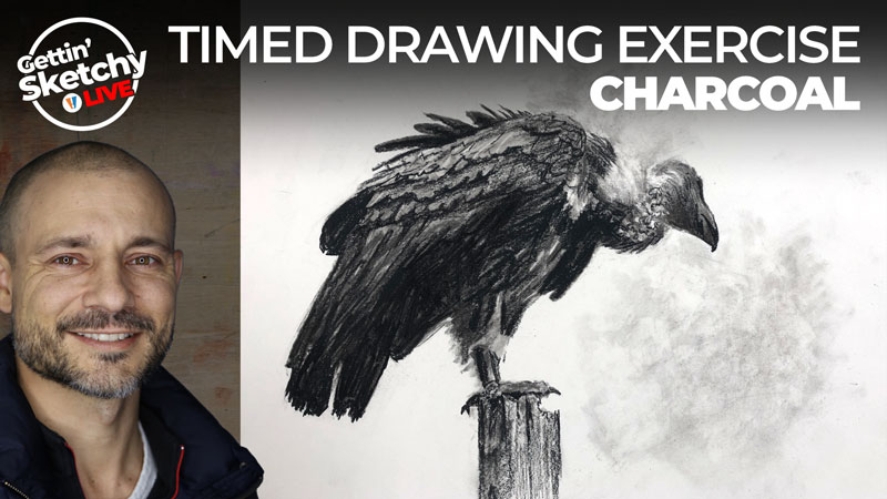
In this timed drawing exercise, we take a look at drawing a vulture with charcoal. With just 45 minutes allotted for drawing time, every mark counts. In this lesson, we see the versatility of charcoal as a drawing medium and watch an unloved bird turn into a beautiful drawing.
Drawing with Charcoal is Similar to Painting
Compared to other drawing mediums, charcoal is very forgiving. Vine charcoal is easy to erase and manipulate on the surface. Blending is effortless and the rich darkness of charcoal makes it easy to develop a full range of value in a drawing. A full tonal range leads to a more realistic appearance. Charcoal also has a matte finish, unlike graphite which is rather shiny.
Despite these wonderful characteristics, some people avoid working with charcoal and unfortunately miss out on its fantastic qualities. Some folks avoid charcoal due to its powdery consistency which can make it a messy medium to use. For the detailed oriented accustomed to working with a precise pencil or pen tip, charcoal can be frustrating.
This is exactly how Ashley approaches the drawing of a vulture in this drawing exercise.
See also: Charcoal Drawing Techniques
Here’s a look at the completed drawing…
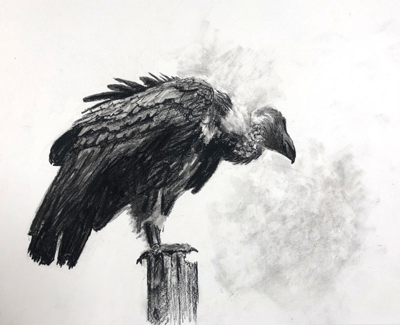
Only after the larger shapes are in place do we see him begin to pull out details. And these details are created through the positioning and relationships of values.
When we see the drawing as a whole, it makes perfect sense to our minds, but if we look closely – the details melt into each other, becoming only shapes of value.
Materials for this Charcoal Drawing
Charcoal is an inexpensive medium to work with. Vine charcoal, compressed charcoal, and charcoal pencils are all affordable and accessible. This drawing is created on regular 80 lb. drawing paper which is also inexpensive and can be purchased at any art store. (The following links are affiliate links which means I make a small commission if you purchase at no additional expense to you.)
Charcoal is at its best when it is both added and removed from the surface. A broad range of value can be developed in a drawing when a kneaded eraser is used.
If you’re interesting in continuing with charcoal, here are a few good places to start…
Photo Reference
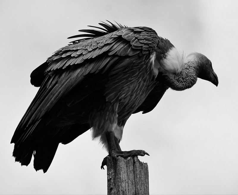
The reference photo for this exercise comes from Pixabay.com. Here’s a look at the photo reference…
Drawing is a Skill That Takes Practice to Improve
Many people believe that drawing is a skill that you are born with. They mistakenly assume that it takes talent in order to draw well. Fortunately, drawing is a skill that anyone can learn and develop. It simply requires knowledge and practice to be successful. Like with any skill, the more that you practice, the more you will improve.
For some of us, finding the time to practice is the biggest challenge. A timed drawing exercise like this one can be a solution. If we know that we’re to spend a defined amount of time on our drawing practice, we’re more likely to fit into our busy schedules. Most of us can easily find 45 minutes a day for practice. Having a time constraint also forces us to improve our speed, so there’s more than one benefit.
Draw as much as you can and enjoy the process as you watch your skills improve.
If so, join over 36,000 others that receive our newsletter with new drawing and painting lessons. Plus, check out three of our course videos and ebooks for free.
Painting a Field of Red Flowers – Oils
Painting a Small Landscape of a Field of Flowers with Oils
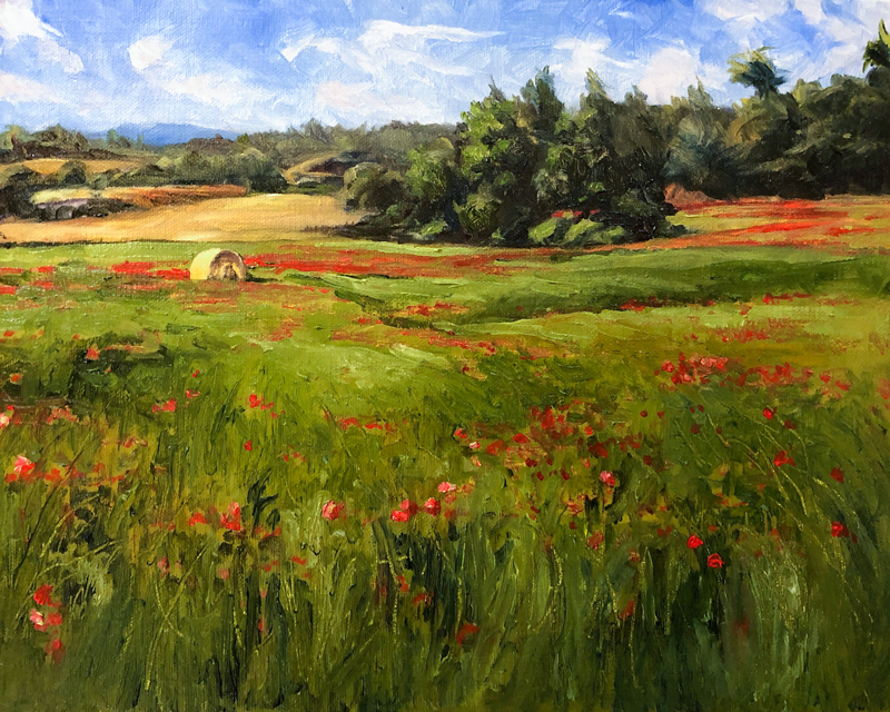
In this painting lesson, we’ll use water mixable oil paints to create a painting of a landscape that features a field of red flowers and a lone hay bale.
In this lesson, we’ll use expressive brushstrokes, relying on the relationships of color and value to communicate the subject. We’ll incorporate guiding lines in the composition to pull our viewer’s eye to the focal point and we’ll exploit the complementary colors of red and green to create contrast and “pop”.
Materials for this Painting
Of all of the painting mediums, oils are perhaps the most forgiving. Due to it’s slow drying time, oils can be manipulated on the surface until the desired color and value relationships have been achieved. However, one deterrent to working with oils are the fumes produced by thinning solvents like turpentine. When used in small spaces without adequate ventilation, this can be a major problem.
Thankfully, an alternative to traditional oils is available in the form of water mixable oils. Water mixable oils, as the name suggests, do not require harsh solvents for cleaning brushes and thinning of the paint. Instead, when water mixable oils are used, the artist benefits from the slow drying times of traditional oil paints, but instead of harsh solvents, water can be used for cleaning brushes and thinning paints.
Traditional solvents and mediums can still be used with water mixable oil paints. In this lesson, I use Winsor and Newton Artist’s Painting Medium to enhance the fluidity of the paint.
These days, I almost never use traditional oils to paint in the studio since water mixable oils are such a great alternative. In this lesson, Artisan Water Mixable Oils by Winsor and Newton are used to complete the painting.
Water mixable oils can be used on any painting surface that traditional oil paints are used. This includes gessoed masonite panel, canvas, cardboard, heavy papers, etc. In this lesson, a 10″ by 8″ oil-primed linen board is used.
(The following links are affiliate links which means that I make a small commission if you purchase without an additional cost to you)…
Palette of Colors
I probably could have used less pigments for this painting. Olive Green and Sap Green could have been mixed and Yellow Ochre could have been the only yellow I used. However, the colors I ended up using to complete this painting include…
- Sap Green
- Olive Green
- Titanium White
- Burnt Umber
- French Ultramarine
- Cadmium Red Medium
- Cadmium Yellow Pale Hue
- Yellow Ochre
- Burnt Sienna
The Photo Reference
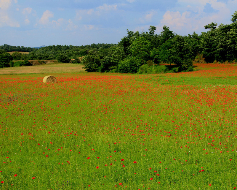
A photo was used as a reference for the painting. In this case, the reference image comes from Pixabay.com.
Here’s a look at the photo reference used in this painting…
Blocking in Darker Values
We’ll begin the painting by loosely blocking in some of the darker tones for elements around the horizon. If dominant elements existed in the foreground, these objects would have been addressed in the same manner.
These initial shapes are addressed using a mixture of French Ultramarine and Burnt Umber. This mixture creates a deep, dark tone that can be manipulated to “lean” either cooler or warmer. If a warmer mix is desired, the Burnt Umber should dominate. If a cooler mixture is desired, then the Ultramarine should dominate.
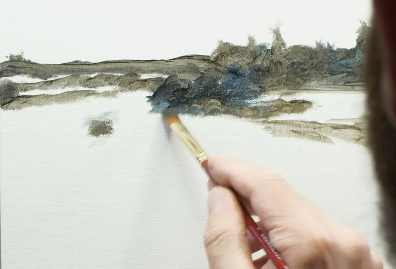
Although this is not a complete underpainting, it helps the artist to better understand the composition and lays the groundwork for layers of color to follow.
See also: Composition in Art
Starting with the Background Sky
Since we’re working with an opaque painting medium, where colors can be over laid, we’ll begin with the background. Our background, in this case, is the sky. And since the emphasis of the composition is on the foreground and elements of the middle ground, our sky is a supporting element, rather than a dominate one.
We’ll use a mixture of French Ultramarine and Titanium White for the sky, allowing the French Ultramarine to be more intense at the top and transition down to a less intense version, dominated by white, at the bottom.
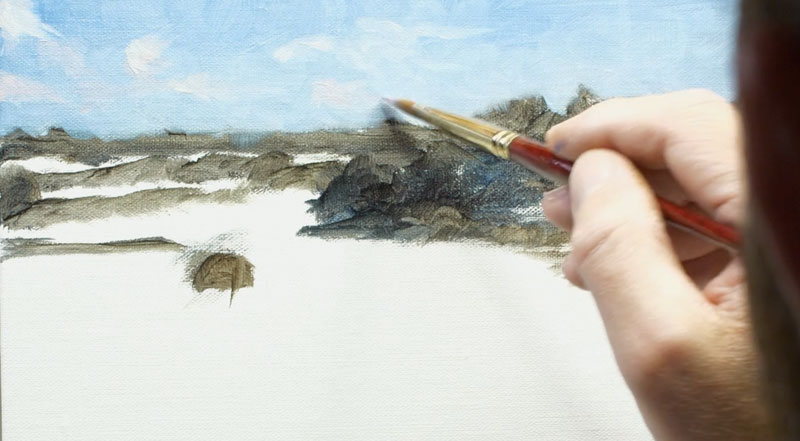
Loose shapes are added for the clouds over the top using a mixture of Titanium White with touches of Yellow Ochre and Cadmium Red Medium.
Working Down to the Middle Ground and Foreground
After the sky is complete, we can progress down to the middle ground. We’ll begin with the distant trees and field on the left side of the picture plane, layering applications directly over the underpainting we created in the previous step.
Since these elements are father away from the viewer, we see less contrast in value and colors that are desaturated. White is used to desaturate and lighten the values. A variety of mixed greens are used for the trees while earthy yellows are used for the fields. French Ultramarine and Olive Green are used for the shadow shapes on the trees while lighter, warmer colors are used for the highlights.
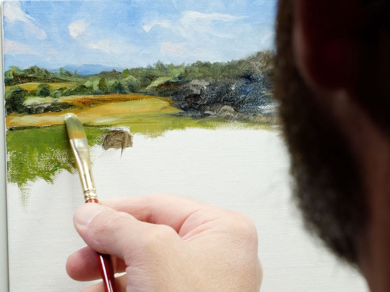
Brushstrokes used to describe the fields are pulled in a horizontal motion contrasting the strokes used for the trees.
I continue to play with dark and light values to develop the form of the trees in the middle ground. We are relying on the contrast of value and color temperature to communicate the trees instead of defining specific details.
At this point, I decide to bring in a bit of Cadmium Yellow Pale Hue in order to brighten some of the greens. When this color is introduced by mixing with Sap Green, the light within the scene changes. In order to ensure harmony, this color is used throughout and incorporated in the greens used for the field.
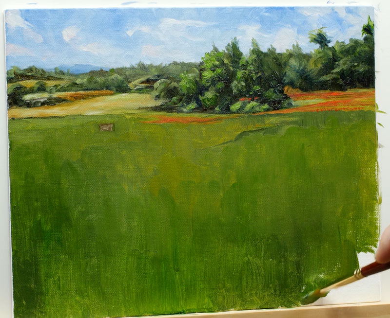
A variety of greens are mixed and applied to the foreground, filling up the remaining bits of canvas that are still visible.
Painting the Flowers and the Hay Bale
With a base layer of green applied to the field, we can add the more exciting elements. This includes the bright red flowers and the lone hay bale, which will eventually become our focal point.
The lone hay bale is fairly simple. First, a dark shape for the shadowed side of the hay is added using a mixture of Burnt Umber and Yellow Ochre, dominated by the Burnt Umber. The same combination of colors with the addition of Titanium White and dominated by Yellow Ochre, is applied to the highlighted side of the hay bale.
These colors are moved around and manipulated until a rough version of the hey bale is in place. A cast shadow of darker green is pulled out with a horizontal stroke behind the right side of the hay.
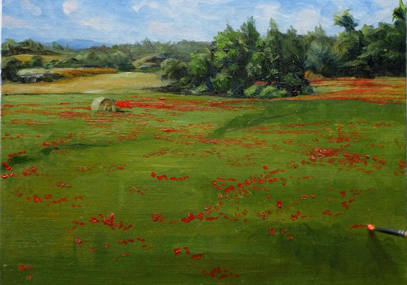
Even though our flowers will appear as red specks within a sea of green, we still need to develop a range of value. Even though these flowers are small in the painting, they still need to communicate a sense of form. To do this, we’ll create a variety of reds using Cadmium Red Medium, Burnt Umber (for darker tones), Titanium White (for lighter tones), and Yellow Ochre (for variety in color). Using a small round brush, or a small flat brush, we’ll begin dotting the landscape with a variety of reds.
The flowers that are closer to the viewer in the foreground are more spread out, but as we work up towards the horizon, the individual flowers become streaks of horizontal strokes.
Developing a Strong Focal Point in the Landscape
Our field is now speckled with red and our hay bale stands out only because it is alone. We can now begin developing the texture of the grass and in the process, make our focal point stronger. A nice side effect is the feeling of movement that will result.
We’ll begin this process by mixing a variety of greens for our field. Green can be manipulated in a many ways to create variety. Warmer greens can be created by adding yellows. Cooler greens can be mixed by adding blues, which also darkens the color. Greens can be darkened by adding colors such as Payne’s Gray or Burnt Umber and lightened with white and bright yellows like Lemon Yellow. In this case, we’ll use the blues and greens on our palette to adjust the greens.
Keep in mind that we see more contrast in value closer to the viewer, so more variety in the color is developed for these locations. Using looser strokes, colors are pulled upward as the grass grows in the extreme foreground. Higher up on the picture plane, these strokes transition and become horizontal.
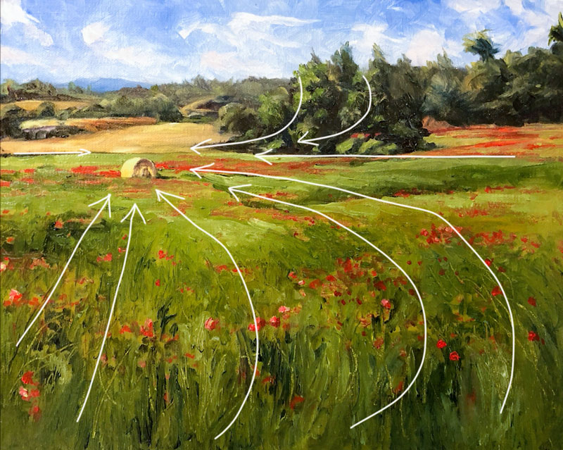
As we develop the texture of the grass, we can begin to place emphasis on our focal point, the lone hay bale. One of the ways we can do this is through guiding lines (or implied lines) within the scene. These guiding lines can be created through brushstrokes, textural marks, contrast or shapes. In this painting, we’ll try to pull the viewer’s eye to the focal point mostly through textural marks and brushstrokes.
Once the texture of the field is complete and we’re happy with the result, we can return with a variety of reds to re-establish some of the flowers in the field.
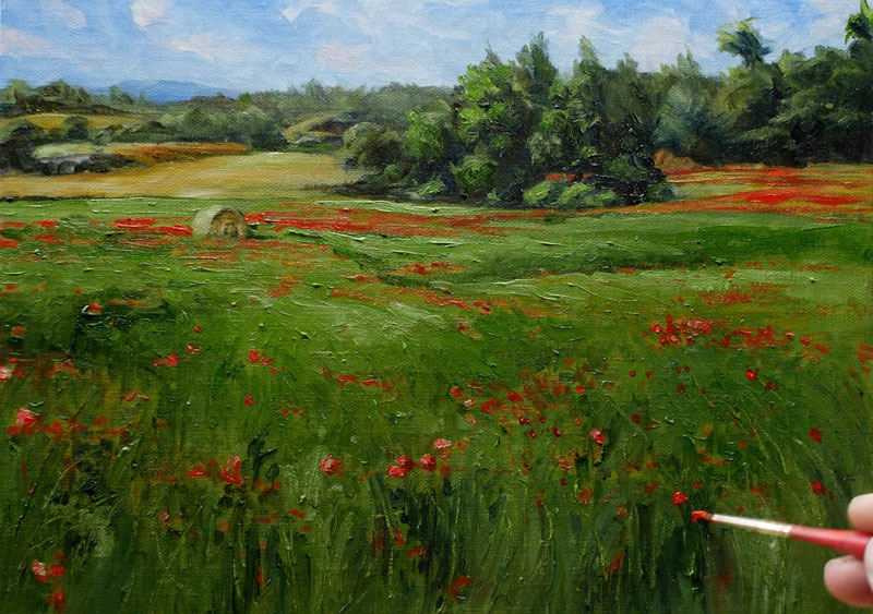
Painting a Field of Red Flowers – Conclusion
The finish the painting, we’ll return to our focal point – the lone hay bale. A few adjustments are made to the light side – making the light stronger and a touch more colorful. A bit of Burnt Sienna is added to the shadowed side for more variety in color and the highlights are enhanced.

Once these final adjustments are made to the hay bale, the painting is complete.
If so, join over 36,000 others that receive our newsletter with new drawing and painting lessons. Plus, check out three of our course videos and ebooks for free.
Timed Drawing Exercise – Bell Pepper with Pastels
Gettin Sketchy – Drawing a Bell Pepper with Pastels – Season 2 Episode 5
This episode aired live on YouTube on September 16, 2020.
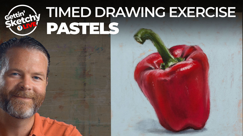
In this timed drawing exercise, we take a look using soft pastels on PastelMat paper to create a drawing of a bell pepper. This sketch is limited to just 45 minutes from start to finish. Due to the nature of soft pastels, I was able to complete the drawing just under the allotted time constraint.
Blocking Colors and Value
The medium that you work with often determines the approach that you take to complete the art. The process of drawing with pastels is very similar to the process of painting with an opaque medium like oils or acrylics. Since pastels can be layered and colors can be covered completely, we can be more liberal in our initial applications. Colors can be blocked in quickly and then refined through additional layers throughout the process.
Blending can be also be used to create smooth transitions of tone and color if so desired. With pastels, it’s perfectly acceptable to use your finger for a quick transition or smudge. However, it should be noted that the paper used for this drawing is PastelMat paper which has a shallow, but strong, tooth. This texture helps to hold the pastel material in place when it is applied, limiting the amount of pastel dust but also the ease of blending.
The Pastel Stick is a Brush
After a rough sketch is completed with a darker pastel pencil, the process of blocking in colors begins. We start with the local observed colors (reds) and then begin pushing the range of value. By layering light and dark tones over our base applications, we can slowly begin creating the illusion of form.
A pastel stick is wide and bulky, especially compared to precise tip of a pencil. It’s best to think of the pastel stick as a brush instead of the tip of a pencil. Typically, a pastel stick is held between the forefinger and the thumb and applications are made using a similar stroke as one would make with a paint brush. Instead of thinking in terms of line, think in terms of shapes of color and value. If you successfully position and match the tone and color, then your resulting drawing will closely resemble your subject.
Here’s a look at the completed drawing…
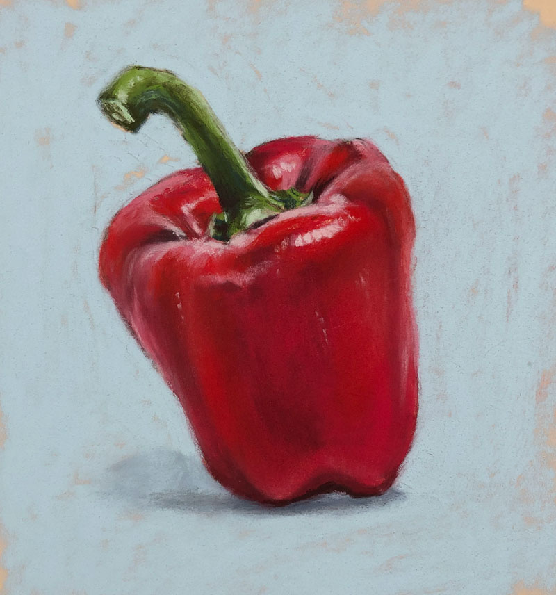
Materials for this Pastel Drawing
Just like with any drawing or painting medium, there is a broad spectrum of quality when it comes to soft pastels and pastel surfaces. The quality of the medium and surface that you choose to work with does make a difference in your potential success. In this exercise, premium materials are used. Rembrandt soft pastels are used on PastelMat paper. (The following links are affiliate links which means I make a small commission if you purchase at no additional expense to you.)
There are less expensive alternatives to the materials used in this lesson, but keep in mind that your results will also be different. However, if you’re just starting out and you’re not quite ready to invest in more expensive materials, the following materials are a great place to start…
If you’re interesting in continuing with pastels, here are a few good places to start…
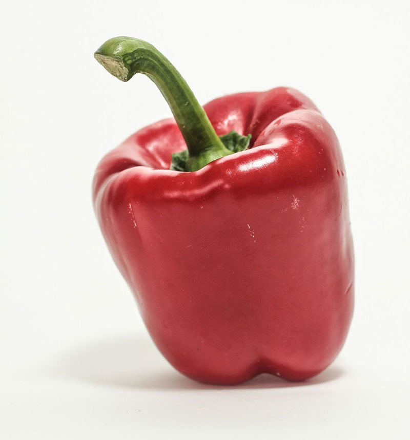
Photo Reference
The reference photo for this exercise comes from Pixabay.com. Here’s a look at the photo reference…
Practice Sketching as Much as You Can
We all know that “practice makes perfect”. For some of us, finding the time to practice is the hard part. We may have the desire to sketch and improve our skills, but finding a little space in a busy schedule can be a challenge. This is where a timed drawing can be your best friend. By setting a defined time frame, you have a better chance of making it work in your schedule. If you don’t finish your drawing in the allotted time, it’s no big deal – at least you got a little practice in. Plus, you can always return to the drawing later and finish it.
So, schedule a little time for yourself, set the timer and get to it. Every drawing that you create is a small step closer to your goal.
If so, join over 36,000 others that receive our newsletter with new drawing and painting lessons. Plus, check out three of our course videos and ebooks for free.
How to Draw an Autumn Leaf with Colored Pencils
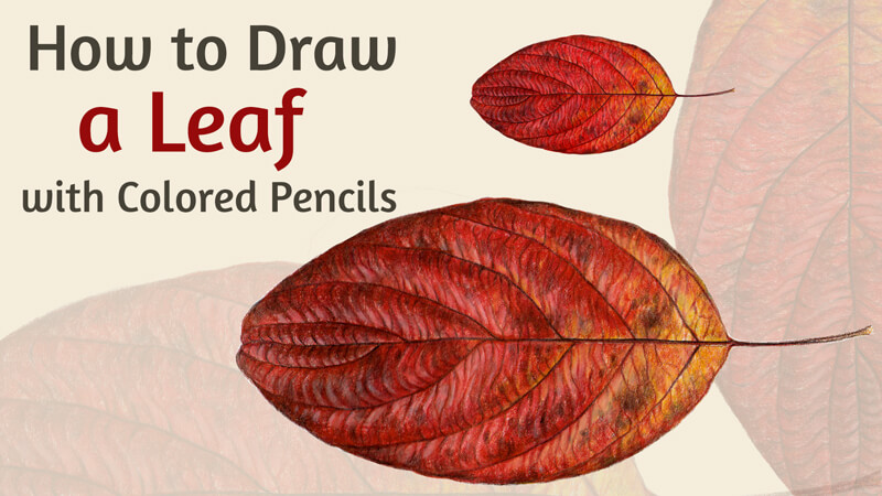
In September, leaves turn into the warm colors of red, orange, and yellow. They represent a variety of shapes and textures. Why don’t we celebrate the start of this beautiful season with a themed colored pencil drawing?
For this colored pencil lesson, I recommend that you choose a real leaf as a model. Drawing from direct observation allows you to see details that may be missed in a photo. Also, it gives you the opportunity to learn more about the subject matter. You can rotate the object, study it from different angles and notice all the nuances.
Or, feel free to use my photo (below) as a reference. I’m going to keep the main features of the leaf and present them in a slightly stylized manner.
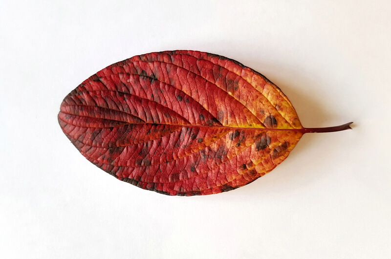
Consider this project as a study. I’ll show you my way to analyze the model, its structure and texture. The resulting conclusions and experience may be applied to larger, more ambitious artworks.
It’s up to you to decide how much time to spend on this project. In my case, the drawing that you see here required about seven hours to complete. If you strive for greater realism and more detailed elaboration, you may need to invest even more time in the process. Colored pencils are a rather slow medium, so be deliberate and patient. In any way, the investment of time will pay off.
Depicting a fragile botanical object may be challenging. Fallen leaves are no exception – they crumple and fade quickly. To save your model without any substantial changes in form or color, use a simple trick. Moisten the leaves that you gathered outside, but make sure that they are just slightly wet.
Then, interlay the individual leaves with a paper towel, just as you would do if you intended to dry them in a flat state. The leaves should be smooth and straightened. Cover the upper and lower ones with a piece of paper towel, too.
Now, put the resulting arrangement into a freezer. The leaves will keep their initial colors and texture for a long time – enough to create dozens of botanical drawings. In my experience, frozen foliage saves its artistic value for up to seven months.
Colored Pencils and Materials
I’m going to use Faber-Castell Polychromos colored pencils to create this botanical study. The only exception is the Chinese White pencil from a Derwent Drawing set. This pencil creates a strong and solid white covering. However, don’t feel pressure to purchase any special tools. Just work with the pencils that you have or prefer if you wish.
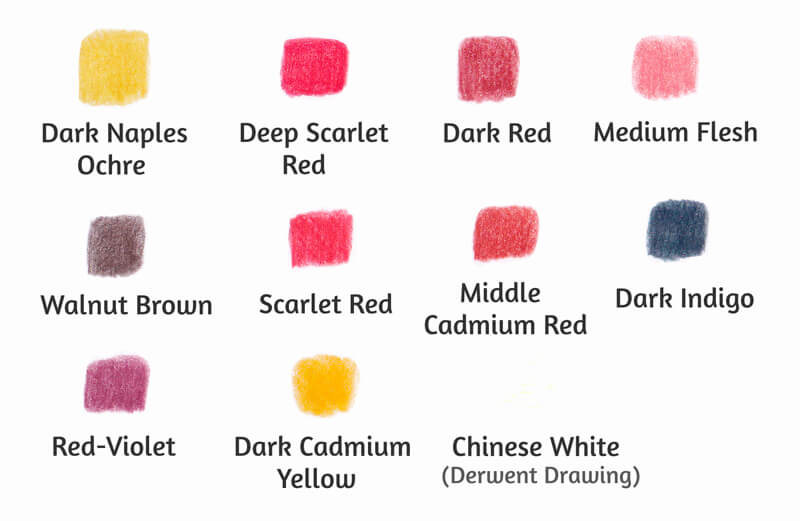
Please note that the range of colors can be reduced. In the image above, you can find four reds that are relatively close in value (Deep Scarlet Red, Dark Red, Scarlet Red, Middle Cadmium Red). Using them together gives you more options in creating subtle color nuances. However, if your set of colored pencils is not that varied – no problem. Use two reds instead – for example, Dark Red and Middle Cadmium Red.
Follow your artistic gut – it is much more important than the number of pencils that you own.
My paper is heavy enough to accept multiple layers of colored pencil applications. Its surface is rather smooth. I don’t recommend using paper with a heavy tooth for this drawing. On a coarser surface, it may be difficult to achieve the desired detailing. However, feel free to experiment!
See also: All About Drawing Papers and Surfaces
We’ll also need a graphite pencil to create an underdrawing. I recommend an H or HB. Keep a pencil sharper and an eraser at hand.
Analyzing the Structure and Texture of the Leaf
Before we start drawing, let’s observe the leaf close up. (In the image below, illustration a.) If you’re using a real leaf as a model, you can follow this process of analysis with your subject.
Now, pay attention to the midrib, or the primary vein that divides the leaf into two halves. Observe the veins that diverge from it and notice the pattern that they create. Do you notice the symmetry? As you can see, the secondary veins of my leaf don’t share their starting points.
Also, note that the veins are not just perfectly straight lines. There are soft twists along the entire length.
For your convenience, I’ve marked the midrib and the secondary veins with a bright green color. See the illustration b in the image below.
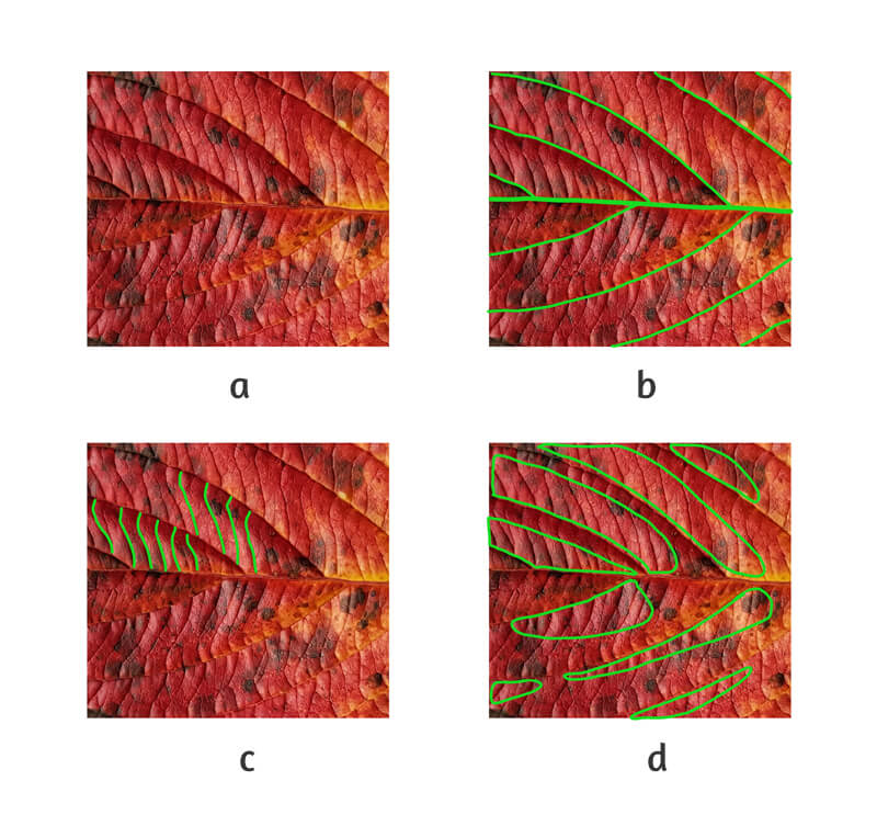
Now observe the tertiary veins that fill in the space between the secondary ones. The pattern is quite complex, so try to find a rhythm. Imagine drawing repeating lines in your mind that mimic this pattern. (Illustration c in the image above.)
Put aside the spots on the leaf’s surface – just mentally, of course – and find the lighter areas. Try to see them as simplified shapes. Is there any consistency in this pattern? (Illustration d)
As a final step, evaluate the texture of the leaf. Is it smooth, soft, velvety, or slightly glossy? Try to describe it.
Now we’re ready to pick up a pencil and start drawing.
Drawing a Leaf with a Graphite Pencil
I start with a rough sketch of the leaf with a graphite pencil. The goal is to find and record the general shape of the object.
At this step, keep your lines as light as possible. I’ve intensified the graphite marks in my drawing for your convenience.
See also: 7 Drawing Techniques For Accuracy
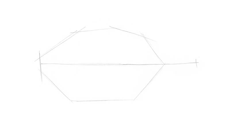
Next I refine the main contour of the leaf, the midrib, and the petiole (the stalk of the leaf.)
My model is right before my eyes and I observe it carefully.
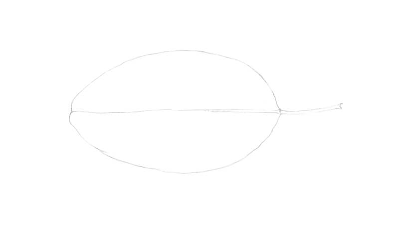
I add the secondary veins that branch from the midrib.
The leaf’s halves are inconsistent in the veins’ starting points. Some pairs begin almost from the same spot on the midrib. Others have a relatively large gap between the veins’ foundations.
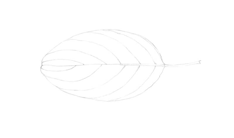
I add the tertiary veins, stylizing and simplifying the pattern of the real leaf. Our goal is not to create an accurate botanical illustration, so we have some room for interpretation.
Don’t try to add all the tiny details unless it’s something that you want to do. We’ll start the next part of the process by softening the lines with an eraser. Excess graphite may contaminate the colored pencil applications, so we should make sure it’s removed. There is a risk that some of the slightest marks will be lost completely.
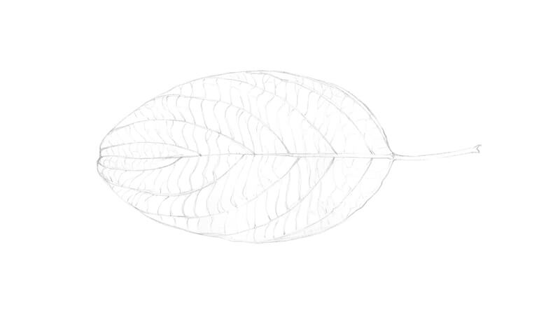
Drawing A Leaf with Colored Pencils
As was mentioned above, our first step is softening graphite marks with an eraser. A kneaded eraser is the best option, but if you don’t have one, an ordinary soft vinyl eraser will work just fine. The graphite lines should be barely visible.
Let’s create a base of colored pencil applications. I use Dark Naples Ochre for the yellowish areas. Deep Scarlet Red and Dark Red help to cover the red areas. The latter pencil is used to accent the darker areas of the leaf.
My pencil moves in small circles, but using directional lines is also an option.
I ignore the darker spots that we see on the model at this point. The goal is to create an even underlayer of local colors. The applications of different pencils can overlap each other.
I recommend that you keep light pressure on your pencils. By pressing too hard too soon, it’s possible to wear off the paper’s tooth before you get enough layers of pigment.
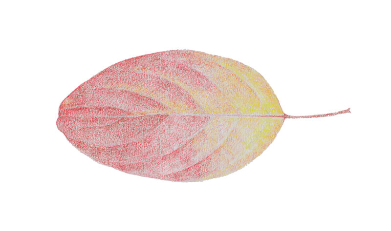
With a sharpened Walnut Brown, I draw the veins and the petiole. Keep in mind that the midrib and the long secondary veins are not perfectly straight lines. Let them be more natural and organic.
I also add the darker spots using a circling technique. The spots have blurry edges and intense cores, so I vary the pressure and the number of layers to build these areas.
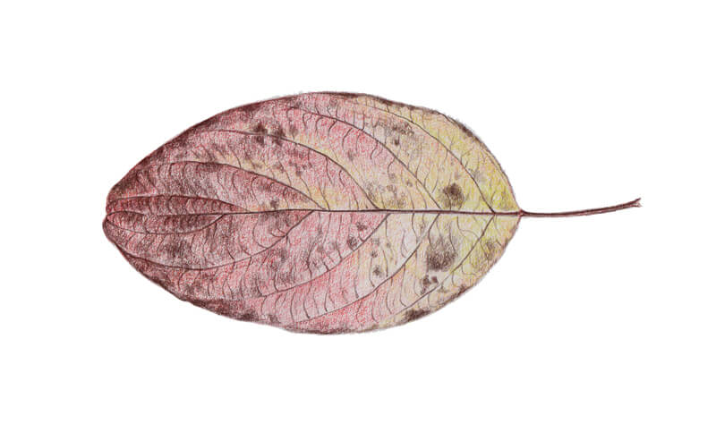
It’s time to deepen the colors. I cover the lighter areas of the leaf with Scarlet Red, and the darker ones with Middle Cadmium Red. A small area of yellow that is close to the petiole remains untouched.
Also, I leave thin segments within the red areas uncovered. This is done to create a hint of light hitting the surface of the leaf and imitate the unique texture of tertiary veins.
I work within the sectors created by the secondary veins. Avoid smudging these important lines with a pencil tip. The necessity to be accurate makes the process more time-consuming, but the result will be worth the effort.
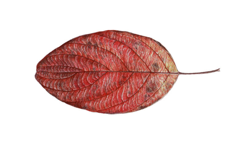
With a sharp Red-Violet, I accent the midrib and the secondary veins. Then I add more details, such as a few new tertiary veins and small spots. I apply this shade to the existing spots too.
The darker areas will also benefit from the inclusion of this color.
To liven up the yellow areas of the leaf, I cover them with Dark Cadmium Yellow.
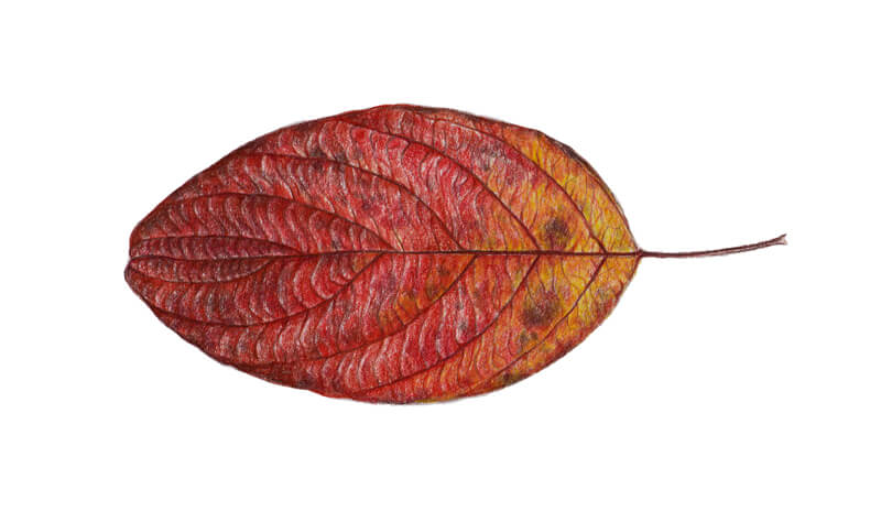
I cover the leaf with additional layers of Scarlet Red and Dark Red. The goal is to make the colors appear more solid. Also, we need to remove the majority of small specks of white paper that are still showing through.
Please note that it’s much easier to access and cover these tiny white spots if your pencil is sharp.
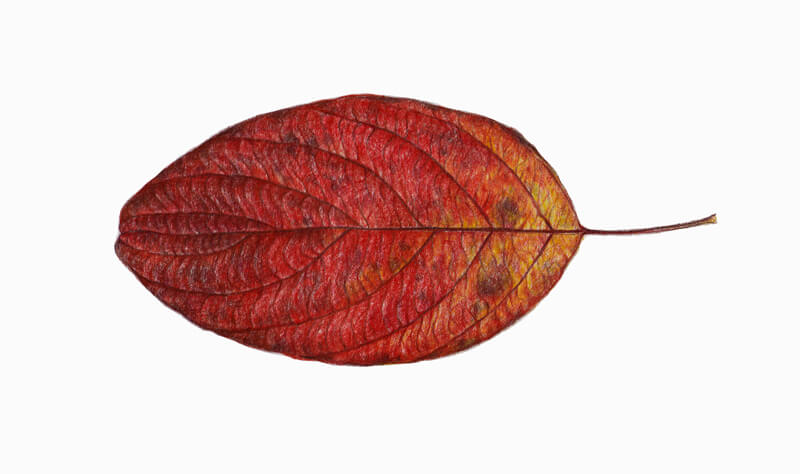
I add Dark Indigo to the darkest sections of the leaf. The spots and some of the veins become accentuated. It’s possible to add new speckles to make the texture more interesting.
To achieve a more natural look in these areas, apply Walnut Brown over the dark blue strokes.
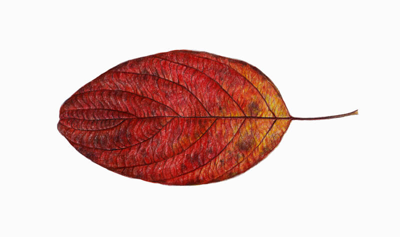
I burnish the red parts of the leaf with Medium Flesh. Again, avoid smudging the veins with a pencil. I also use Dark Naples Ochre to work on the yellow areas.
My pencil moves in small circles with a medium pressure. At this stage of the process, the majority of white spots (the signs of untouched paper) should disappear.
As the pencil develops a whitened tint of red, some areas may become slightly lighter.
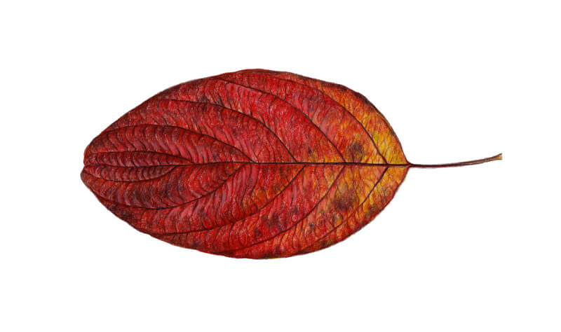
I use Chinese White from Derwent Drawing set to create the highlights. The shapes of the highlighted areas follow the shapes of the smaller veins. Together, they form long areas of light that are adjacent to the secondary veins.
Squint your eyes and look at your drawing. Are you be able to identify the lighter areas?
I also use Middle Cadmium Red and Dark Red to strengthen the darker parts of the leaf. This makes the relief of the leaf more prominent. This also increases the contrast in our drawing.
I observe the leaf again. The goal is to find the parts of the leaf that require some additional applications of white or red.
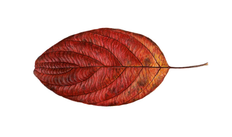
As a finishing touch, I intensify the dark spots by adding another layer of Walnut Brown. (Red-Violet is also an option.) I accentuate the edges of the leaf in some areas.
If you start and complete this project within the same drawing session, I strongly recommend taking a break before you call this artwork completed. Come back with fresh eyes. Chances are that you’ll find something that you can improve. For example, it may be a good decision to increase the contrast or additionally burnish some areas.
As for me, I decided to add Dark Naples Ochre to some red parts of the leaf, especially the lighter ones.
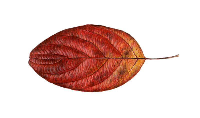
Bonus – Changing the Background
I enjoy the magnificent, vintage style botanical illustrations. Usually, the subject is presented on a tinted background of some warm color. Our leaf is drawn on a sheet of white paper, but it doesn’t mean that we can’t change the color of the backdrop. Graphics editing software is at our disposal!
I usually use Adobe Photoshop for such actions. If you are a beginner interested in learning more about this program, check out this course:
The process that I describe below isn’t complicated. And yet, basic knowledge of this editor’s tools will help you to achieve the same results. It’s best to start this bonus part with at least some experience with Photoshop under your belt.
First, we need a scanned and edited version of the leaf. Scanners usually distort the color and contrast of the original image, so it’s necessary to make some adjustments. Unfortunately, no one can point out what specific tweaks are required without seeing your image, bit to make the necessary changes, put the original drawing before your eyes and try to reconcile the scanned image with the desired result.
I create a new file and paste the edited version as a new layer.
Then I choose the Magic Wand Tool (it’s shortcut key is W on the keyboard) and click anywhere on the white space that surrounds the leaf. Make sure that the Contiguous checkbox is on. You’ll find my settings in the image below.
A glowing border of selection will appear around the leaf and on the perimeter of the artboard.
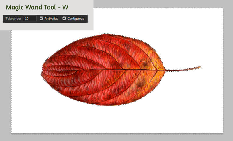
Next, choose a foreground color in Color Picker. It can be found on the left vertical toolbar. (See a in the image below.)
The Color Picker will open a window (b) where you can set the new color for the image’s background. My choice fell on #f8e7b9.
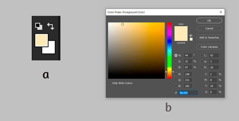
With the selection still active, I hit the G key to access the Paint Bucket Tool. I click with my left mouse button anywhere within the selected area. Now the color of the background is changed.
Ctrl + D will deselect the area. The image is complete – don’t forget to save it!
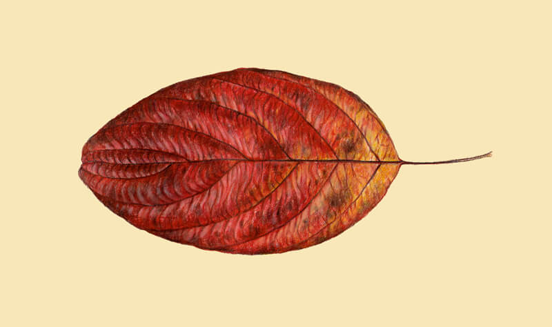
Drawing a Leaf with Colored Pencils – Conclusion
Congratulations – we’ve created a wonderful colored pencil drawing! I hope that the process was fun and interesting to follow. I wish you much inspiration for your future nature-inspired projects!
If so, join over 36,000 others that receive our newsletter with new drawing and painting lessons. Plus, check out three of our course videos and ebooks for free.
Timed Drawing Exercise – Figure Drawing – Ballerina
Gettin Sketchy Figure Drawing a Ballerina – Season 2 Episode 4
This episode aired live on YouTube on September 9, 2020.
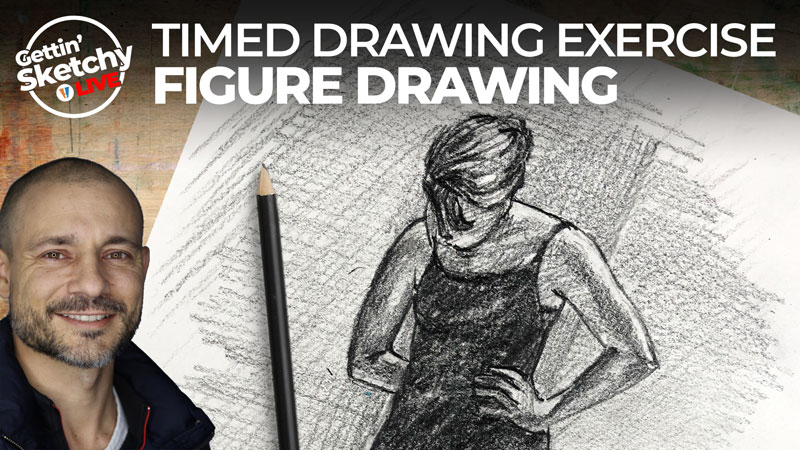
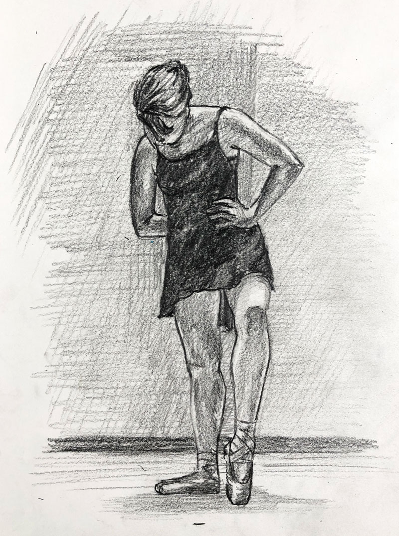
For the timed drawing exercise in this episode, Ashley creates a sketch of a ballerina in 45 minutes using graphite pencils on white drawing paper. Watch and learn as Ashley takes a structured approach to finding the proportions of the dancer before adding shading to finish the sketch. Negative shapes play an important role in his approach.
Art Product Recommendation
The featured art product for this episode are Blackwing pencils. Ashley uses the matte black pencil by Blackwing to complete the sketching exercise. These premium pencils are pleasure to work with and provide the artist with a broad range of tone.
You can pick up your own Blackwing pencils on Amazon here…Buy Blackwing pencils
(The above link is an affiliate link which means that we make a small commission if you purchase without any additional expense to you.)
Drawing a Ballerina with Graphite – 45 Minute Timed Drawing
In this episode’s timed drawing challenge, Ashley creates a sketch of a ballerina dancer with graphite on white drawing paper within 45 minutes.
Here’s a look at the completed drawing…
The Importance of Proportion
Since this drawing is a figure, proportion is very important. For those new to drawing, capturing the figure can be a challenge. In this demonstration, Ashley first finds the gesture of the figure and draws a light structure. This ensures that the entire figure fits on the drawing surface and establishes the scale. With a structure in place, he next builds the drawing by observing and replicating the contours of the figure.
An essential part of his process is observing and capturing the negative shapes. By capturing the negative shapes, like the ones observed between the arms and torso, the drawing process is faster and more accurate. Instead of concentrating just on the positive shapes of the arms and torso, drawing the negative spaces in between essentially leads to accuracy in the positive spaces as well.
More resources to explore…
Photo Reference
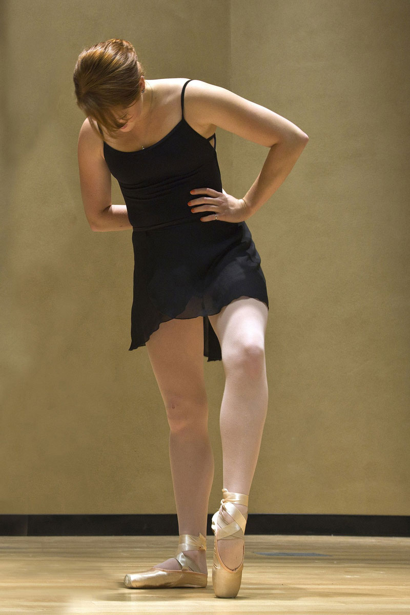
A photo reference was used for this timed drawing exercise. In this case, it comes from Pixabay.com The reference has not been altered.
Here’s a look at the photo reference…
What’s In Your Sketchbook?
Drawing is a skill that anyone can learn and develop. But, like any other skill, it should be practiced. Sketching, a less formal form of drawing, is how we practice these skills. A sketchbook and a regular practice of sketching is important if you wish to progress as an artist. Observational drawing is the fastest route to seeing improvement.
Challenging yourself by tackling subjects that may seem difficult is also important. The human figure is one of these challenging subjects. One of the reasons it is so challenging is because we are so familiar with it. We notice small inconsistencies and proportional issues that may not be noticed with other subjects. With other subjects, such as landscapes, we can be less accurate and it doesn’t affect the success of our work quite as much.
Therefore, drawing the human figure will help you improve your drawing skills quicker than other subjects since we are forced to be more focused on our accuracy.
If so, join over 36,000 others that receive our newsletter with new drawing and painting lessons. Plus, check out three of our course videos and ebooks for free.
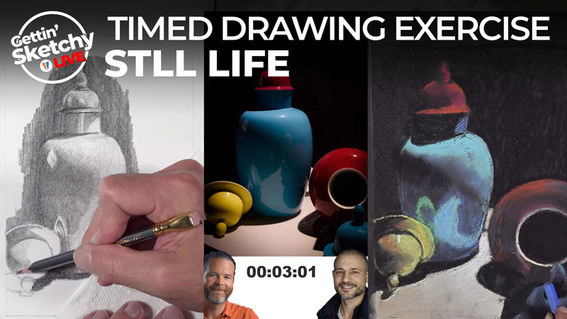
Timed Drawing Exercise – Still Life with Graphite and NuPastels
Gettin Sketchy – Dual Still Life Drawing – Season 2 Episode 3
This episode aired live on YouTube on September 2, 2020.
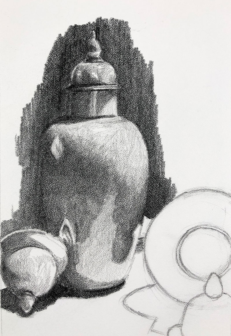
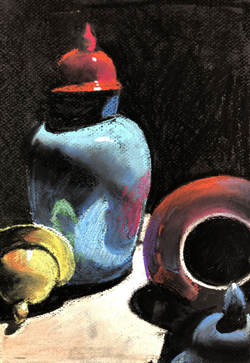
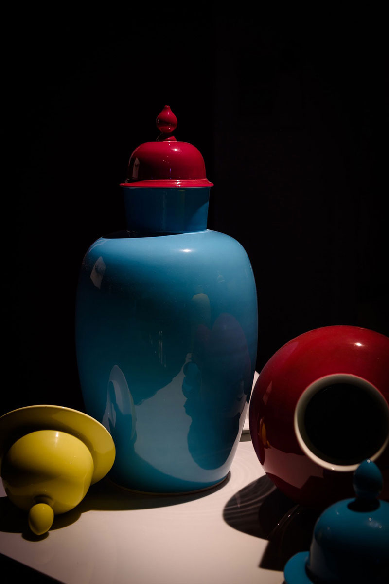
In this episode, I reveal my #5 in our countdown of our top five artists of all time. Ashley and I create timed drawings from the same photo reference but use different drawing mediums. I use graphite on Bee Paper Company’s Stipple paper while Ashley uses NuPastels on black Canson Mi-Tientes pastel paper.
Art Product Recommendation
The featured art product for this episode is Stipple paper by Bee Paper Company. Other than a few test marks, this is the first time I have ever used this paper but I was quite impressed. This paper features a pronounced tooth that gives the drawing a “smokey” or atmospheric look.
You can pick up this paper for yourself on Amazon here…Buy Stipple Paper by Bee Paper Company
(The above link is an affiliate link which means that we make a small commission if you purchase without any additional expense to you.)
Drawing a Still Life with Graphite and NuPastels – 45 Minute Timed Drawing
In this episode, both Ashley and I drew the same subject but used different mediums. This exercise allows you to see two different approaches to drawing with extremely different drawing media.
Although I didn’t get finished with my drawing within 45 minutes, I did really enjoy drawing on this surface. Here’s a look at what I was able to complete within the time limit…
Ashley was able to get more information on the surface mostly due to the looser medium and the ability to make broader strokes. The color, mostly consisting of a primary color scheme, helps quite a bit and contrasts nicely against the black background. Here’s a look at what Ashley was able to complete within 45 minutes…
Media and Materials
Clearly, the medium that you use to create a drawing greatly impacts the approach that you take. You simply cannot approach different mediums in the same manner. This is illustrated in this exercise as Ashley and I both take completely different approaches.
Graphite drawing generally requires a more precise approach, especially when a pencil is used. Pastels, on the other hand, can be spread quickly and rely more on the relationships of values and colors to communicate the subject.
More resources to explore…
Photo Reference
The photo reference used for this drawing exercise is from Pixabay.com. If you’d like to try this timed exercise for yourself, you can use the reference included below…
Practice Makes Perfect
Every drawing that you create doesn’t need to be a polished masterpiece. Every time you create a sketch, no matter how rough or unrefined, you’re honing your drawing skills. Sketching is a form of practice. The more that you sketch, the better you will get at recognizing shapes and forms in the subjects that you draw. Timed drawing provides you with a starting and stopping point, making the practice of sketching easier to “fit into your schedule”. It also improves your speed and over time – your confidence.
If so, join over 36,000 others that receive our newsletter with new drawing and painting lessons. Plus, check out three of our course videos and ebooks for free.

