Lettering also presents a beautiful way to express an idea. You can give it a unique visual form and create a design that evokes emotion.
At the same time, this art is ancient. Some of us may recall the use of decorative capital letters in illustrated books of years past.
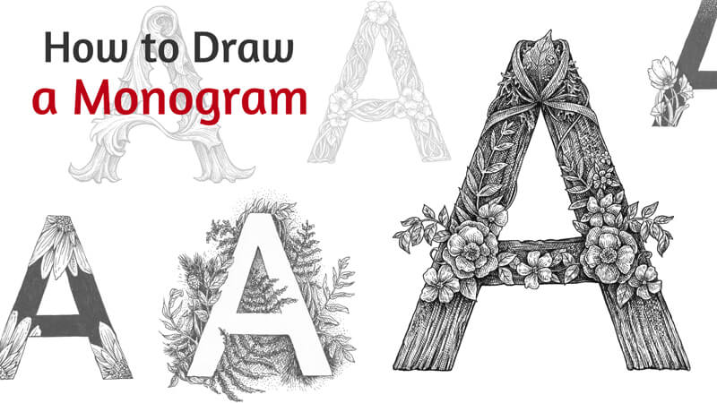
In this lesson, we’ll draw a single letter – a monogram. Usually, this word refers to a design consisting of two or more alphabetic letters that are combined or interlaced. However, a monogram can consist of a single emblematic or decorative letter too.
We’ll be using an HB graphite pencil, an eraser, and a couple of ink liners. The numbers of liners are 0.1 and 0.3. The size of the paper is A4.
You can use any drawing paper that you like. Ordinary printer paper is also an option. Access to a printer is a nice bonus, but it’s not required.
You don’t need any knowledge of typography terminology to follow along with this tutorial. I did my best to simplify the instructions so that anyone can do this project, even without previous experience in lettering.
I’ve chosen the letter “A” because it’s the first letter of the alphabet. If this project sparks your imagination, it may become the beginning of a wonderful art series!
However, feel free to depict any alphabetical symbol that you like. It can be the first letter of your name or just any capital letter that inspires you.

How to Draw a Letter – The Tracing Method
The easiest way to create an outline of a letter is through tracing. Beginners in lettering often prefer this way because it ensures that the result will have the right proportions. Tracing may be the first step that you take to practice drawing letters.
If you don’t have access to a printer or just don’t like to trace, feel free to skip this step. In the next part of the tutorial, I’ll show a way to draw a letter from observation.
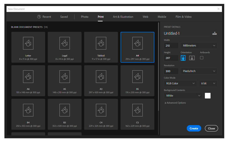
First, create a model for tracing using any graphic editor of your choice. I use Adobe Photoshop, so you’ll find some brief instructions for this program below. If you need more information on how to transform Photoshop into the greatest ally of your creative workflow, check out this course.
In Photoshop, create a new document. The print size of your file should conform to the size of your paper. In my case, it’s A4. Set the resolution at 300 pixels per inch which is an optimal resolution for print.
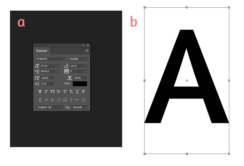
Then, add a letter, using the Type tool (the shortcut is T) on your keyboard.
In the Character palette, you’ll find numerous fonts to choose from, along with some other options. I like a font called Amaranth. If you can’t find that palette, go to Window menu – and select Character.
Don’t spend too much time searching for the “right” font. All we need is a nice silhouette as a starting point.
If necessary, move and resize the letter, using Free Transform (Ctrl+T). Press and hold Shift while resizing to keep the proportions in tact.
In the image below: a) Character palette, b) the letter with Free Transform bounding box.
Now you’re ready to print that document!
There are several ways to trace a letter. You can put a sheet of blank paper on top of your printout and trace it using a light table or a window pane during the day. If you use thin computer paper as a top layer, you won’t even need much additional light to see the silhouette of the printed letter.
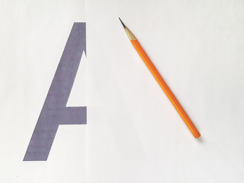
Alternatively, you can use carbon paper. To do so, put a sheet of carbon paper between your printout (on top) and blank paper (below all) and trace the contours with a pencil.
Now trace your letter.
The next part of the tutorial is dedicated to another method of drawing a letter without a printed model, if you have decided that tracing is not the way you want to go.
How to Draw a Letter – Observational Method
Drawing anything freehand (without tracing) is more advanced and requires good observation skills. Of course, your results get better with practice. But, even if you don’t have experience in hand-lettering, drawing letters from observation is not rocket science. Below you’ll find some tips that make the process easier.
Analyze the Letter
You need a model of the letter that you’re going to draw. It may be a file on your computer, an image in the browser or a printed sample. Put it before your eyes.
Analyze this letter. Try to divide its shape into two, three or four parts. How do these parts interact?
Then, try to see the framework of the letter. The framework is located inside the letter’s shape. If the silhouette is “body” or “clothing”, what does its “skeleton” look like?
The image below illustrates my point.
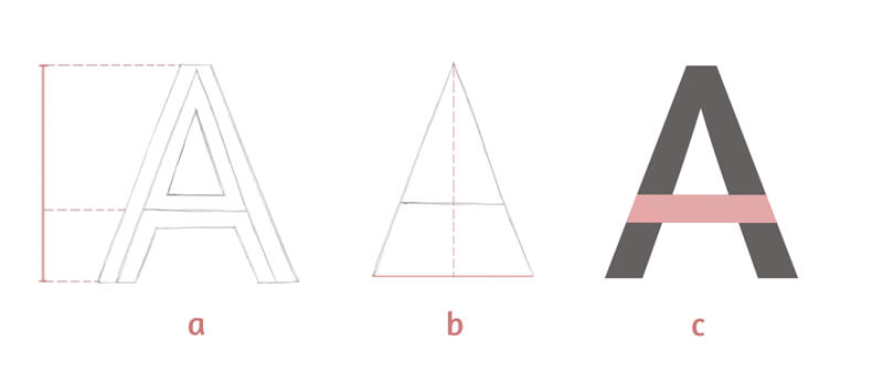
a) The height of my capital A letter can be divided into two parts. The central line of the letter’s crossbar indicates the border between these parts. The upper part is twice as long as the lower one. This note is useful – it’ll help me to keep the right proportions!
b) I can draw a vertical descending line from the top point of the letter’s framework. That’s how we get the lower point that helps us to check the symmetry. The distances on both sides should be equal.
c) Here’s how I see the pattern of shapes that is inherent to this letter. I’ve marked them with different colors for your convenience.
How to Draw the Letter
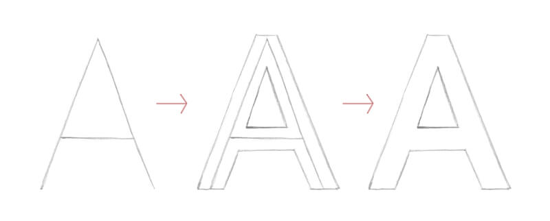
Start with the letter’s framework and draw it as you would write it. Look at your model and do your best to keep the initial proportions. Or, if your goal is to create a derivative version, feel free to distort them.
As you’re drawing freehand, your lines may be slightly uneven. You can strengthen them with a ruler later or leave them just as they are, embracing the imperfection.
The next step is adding weight and the contour lines of the letter. I see them as clothes wrapping around the framework, widening or expanding the letter.
And the last step is erasing the lines of the framework.
The Result of Our Work
It doesn’t matter what way – tracing or drawing from observation – you’ve chosen to create the letter’s outline. Now we have a template and are ready to add decorations.
Please note that this initial outline is just a starting point. We can change its shape in some areas, distort it, or add new elements in the next steps.

But before we dive into embellishing the monogram, let’s observe several examples. I hope they’ll inspire you and help you to generate some ideas for your artwork.
Silhouette, Contrast, and Decorations in Lettering
I’ll provide you with six examples that I’ve prepared for this tutorial. Brief explanations are here to indicate the important features of each monogram’s decorative style.
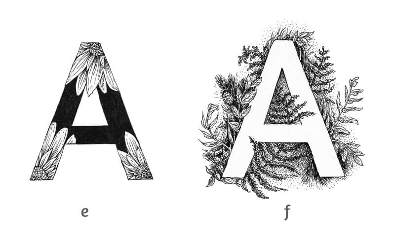
Organic, floral motifs are the common theme of this set of letters.
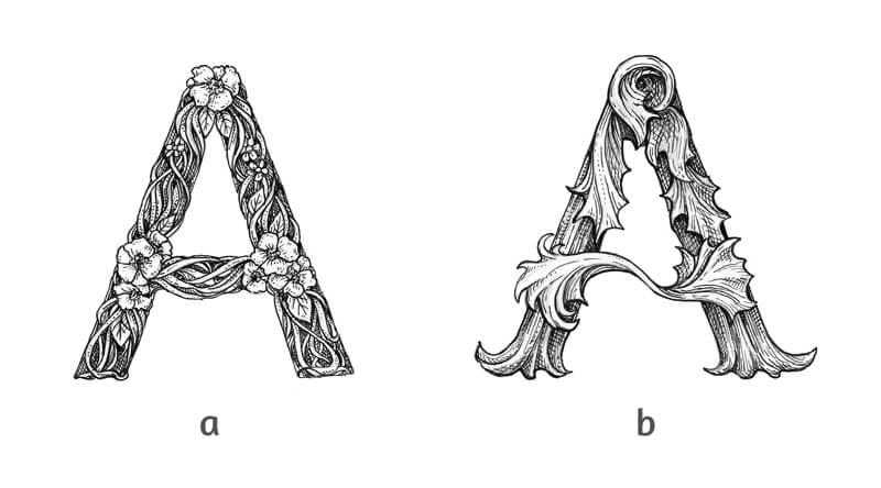
a) The groups of flowers serve as focal points here. Other elements are rather small – they accent the floral adornments. It’s important to find a balance between smaller and larger objects.
b) This letter somehow reminds me of a vintage style. At the same time, these whimsical elements look like crumpled fall leaves. The interplay of thinner and thicker lines give the monogram more volume. Fine hatching and cross-hatching are used to create shadows and relief.
See also: Line Weight (Quality) and Cross Contour Lines
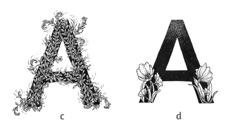
c) In this image, we won’t find a single element that draws our attention. Thin twigs intertwine, covering the whole shape of the letter, but we still can see it due to a contrasting black covering. Some twigs pass beyond the silhouette’s boundaries, but the letter is still legible.
d) The upper area of this example is created in a stippled manner, so the contours are blurred. The flowers look very contrasting against a solid ink background. They go beyond the silhouette of the letter, but the result looks accurate and easy to identify. In other words, we can clearly see that it’s an “A”.
e) This example is contrasting and expressive. Some floral elements stay inside the shape of the letter. One petal breaks the silhouette.
f) This monogram is a clever use of negative space. The floral adornments decorate the artwork while the letter itself remains untouched, attracting the viewer’s attention.
See also: Positive and Negative Space
Let’s review:
- Define the general theme or style of your letter and its adornments.
- Keep the letter readable.
- Use contrast wisely.
- Balance the larger and smaller elements.
- Allow yourself to be creative.
Before we proceed to our finished artwork, it may be useful to make some rough miniature sketches. Play with various styles or themes of adornment.
Do your research, if necessary. Pinterest has an infinite number of stunning examples for your inspiration.
Adding Decorations with a Graphite Pencil
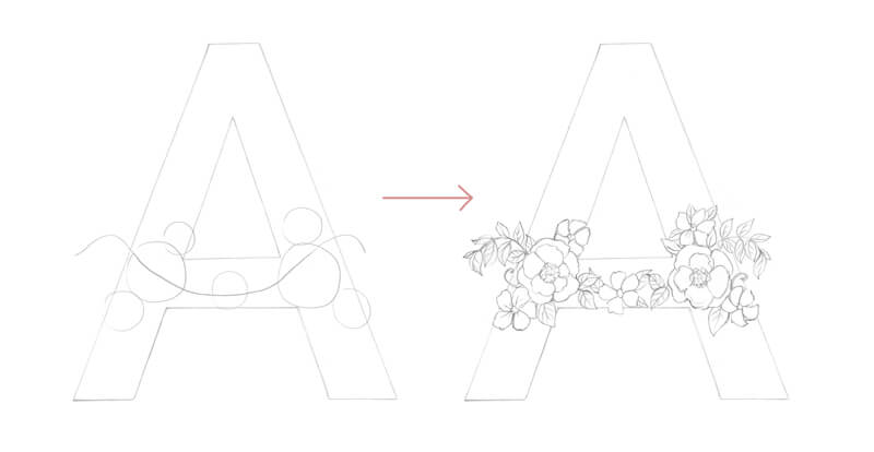
Let’s enhance our template. I decided to continue with the floral theme in my decorations.
First, I allocate the groups of flowers, marking them with rough shapes. The flowers will be the larger, eye-catching elements.
I draw a curved line that follows the crossbar to indicate where the flowers and leaves should go.
Then I draw the separate elements in detail.
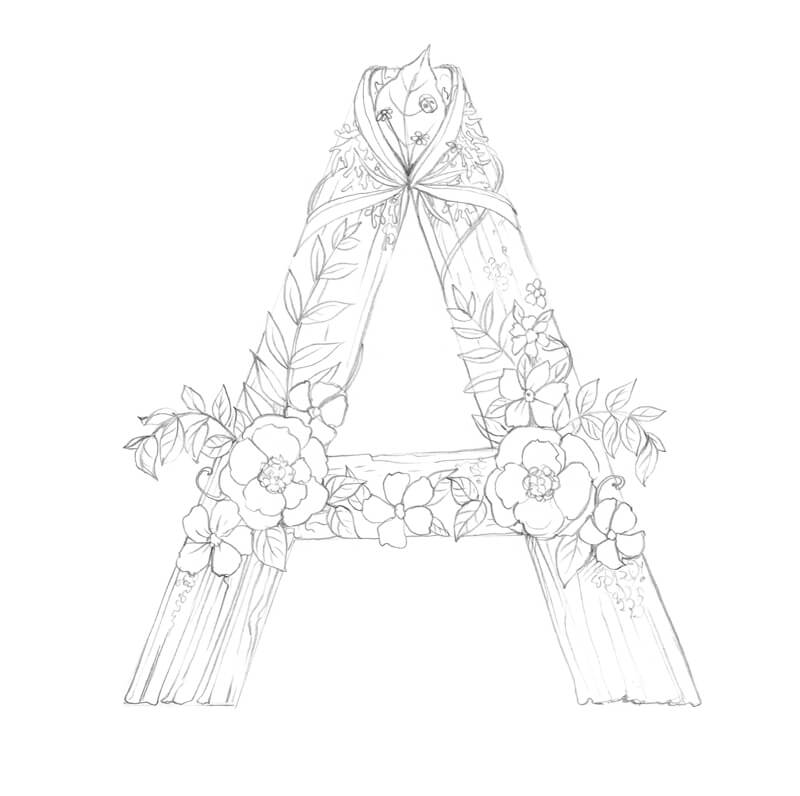
Now I add some ribbons, grass blades, a big leaf, and a ladybird to the top of the letter.
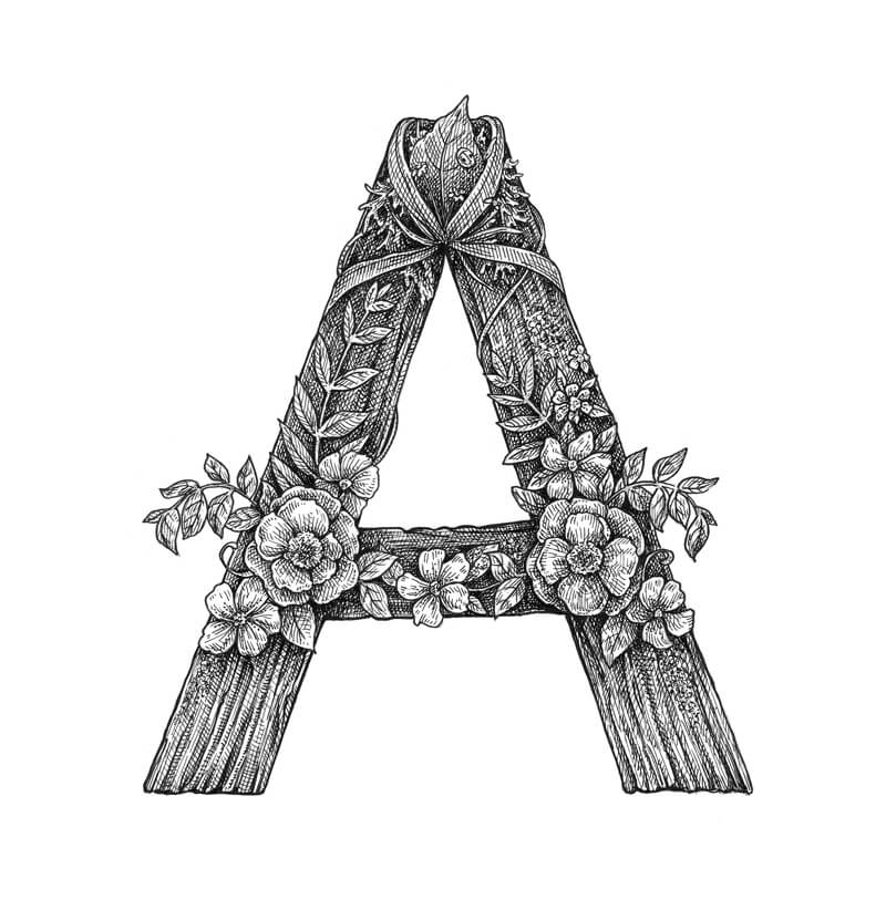
I decided to give my letter a wooden texture. This relief adds charm and fits within the natural theme. Small areas of moss are shown here and there to create variety and added interest.
I also add more leaves and small flowers to fill in the shape.
Adding Ink
I start the inking with a 0.3 liner, outlining the significant elements. The outer contours of the letter should be thicker. Let’s help them stand out!
I strengthen the lower contours of the monogram once again to give it some weight.
After the outline is complete, I erase the unnecessary graphite pencil marks.
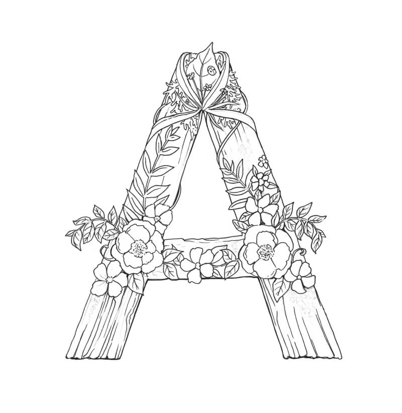
With a 0.1 liner, I add hatching to convey the relief of texture. Then I apply additional layers of hatching to deepen the shadows.
See also: Pen and Ink Drawing Techniques
The flowers remain relatively light. They look contrasting against the backdrop.
If you need more information on my approach to drawing a wooden texture with ink, this post may help you: Drawing with Ink Liners: Natural Textures
I complete the remaining half of the letter in the same manner.
I make sure that the artwork looks balanced in terms of contrast. The floral elements are lighter than the letter’s textured shape, but they aren’t too clear-cut.
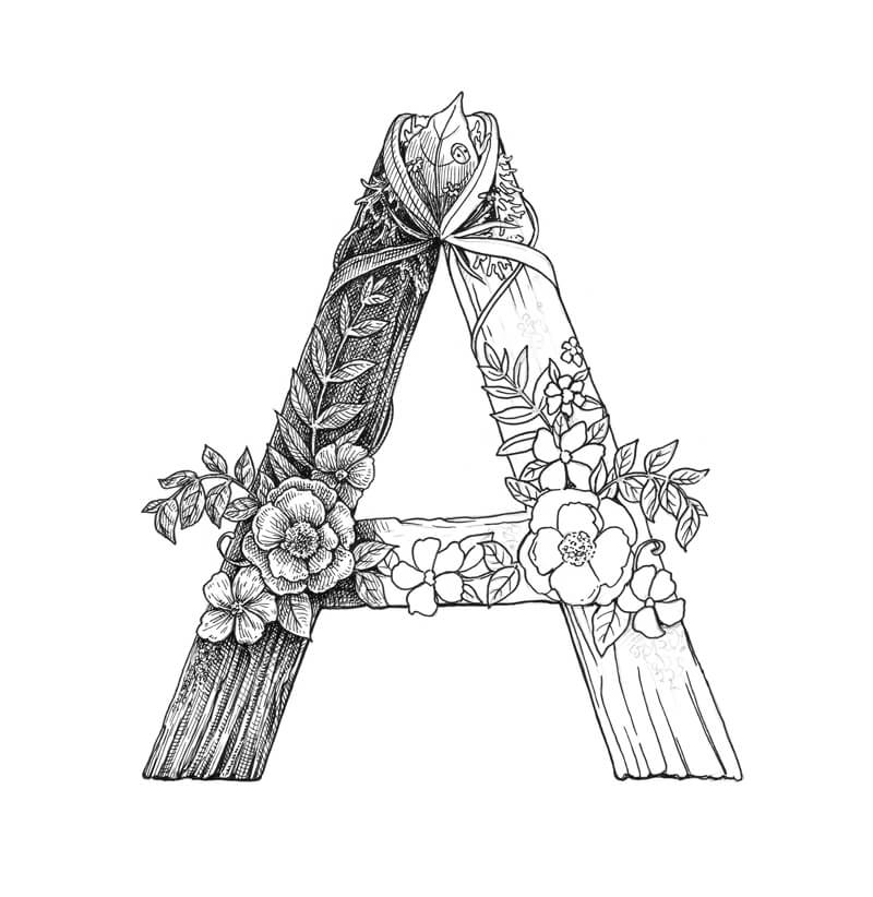
Decorative Lettering – Conclusion
Congratulations – we’ve created a beautiful monogram! I hope that you enjoyed both the process and the result.
I wish you much inspiration on your way of mastering hand-lettering. Have fun!
If so, join over 36,000 others that receive our newsletter with new drawing and painting lessons. Plus, check out three of our course videos and ebooks for free.