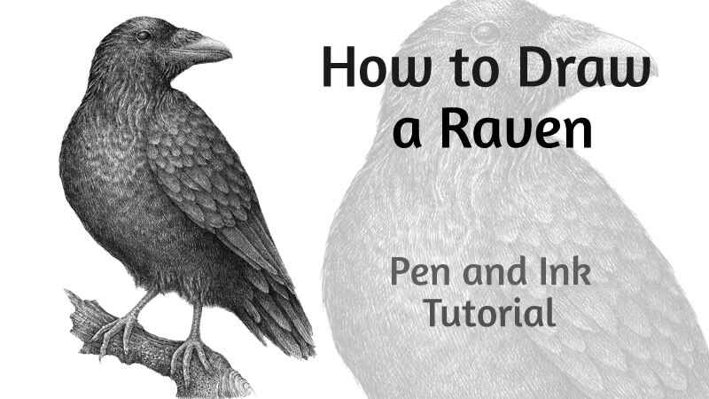
Over the centuries, ravens have been the subject of mythology, folklore, art, and literature. They’re a symbol of prophecy and insight. Also, there’s evidence that ravens are unusually intelligent.
This lesson is dedicated to these mysterious creatures. Ravens, with their all-black appearance and glossy feathering, provide an interesting challenge for any pen and ink artist. Let’s explore how to achieve the desired effects of contrast and texture in this drawing.
For this project. I’ll be using two black ink liners (technical drawing pens) – 0.1 and 0.05. Feel free to use a nib pen if you prefer. The principles we’ll discuss are quite flexible and apply to either type of pen.
We’ll begin with an ordinary graphite pencil to create our sketch. You’ll also need an eraser to remove the graphite marks once the ink has dried.
Sketching the Raven with a Graphite Pencil
Before we get in to the ink, let’s begin with a graphite sketch.
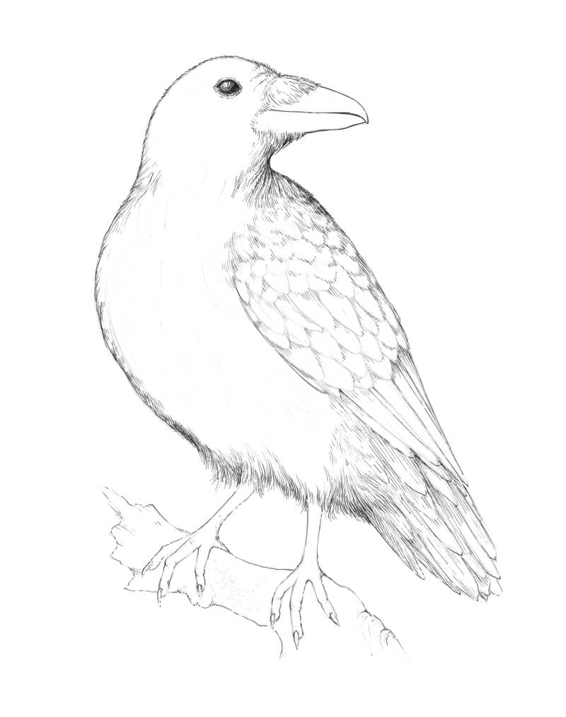
We’ll first decide on the pose and positioning of the raven. I create several small, rough sketches. They don’t have to be perfect – the goal is to convey the mood and lay out the general composition.
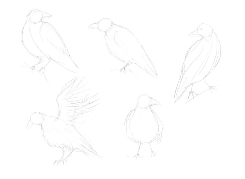
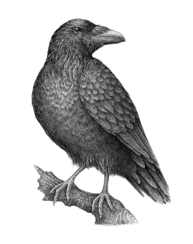
After making a few sketches, I decide to depict a raven that is sitting on a piece of wood, with its head turned to the side.
Now that we’ve decided on the composition and pose, let’s move on to our final surface.
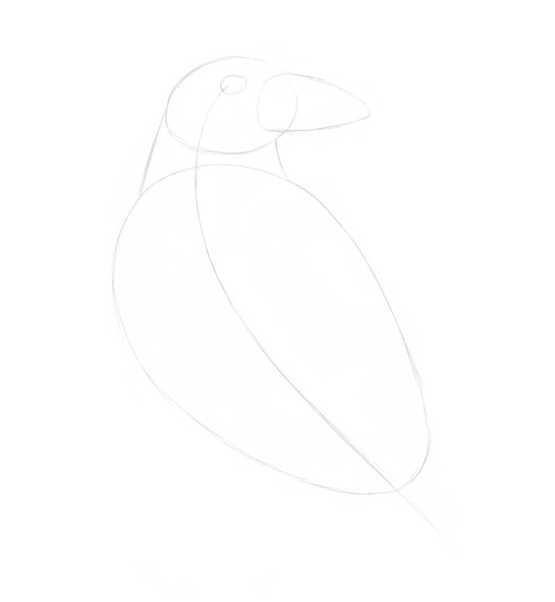
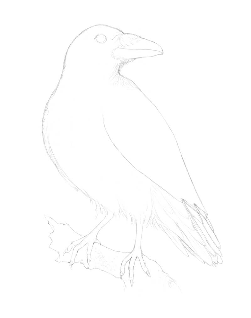
I mark the general shape of the head using light marks with the graphite. Then I add the rough shapes of a massive beak and large body. The head and body are joined, forming the neck. The feet and tail feathering will be added in the next step, so leave some space for them.
An improvised core line that runs through the body helps to construct this basic framework.
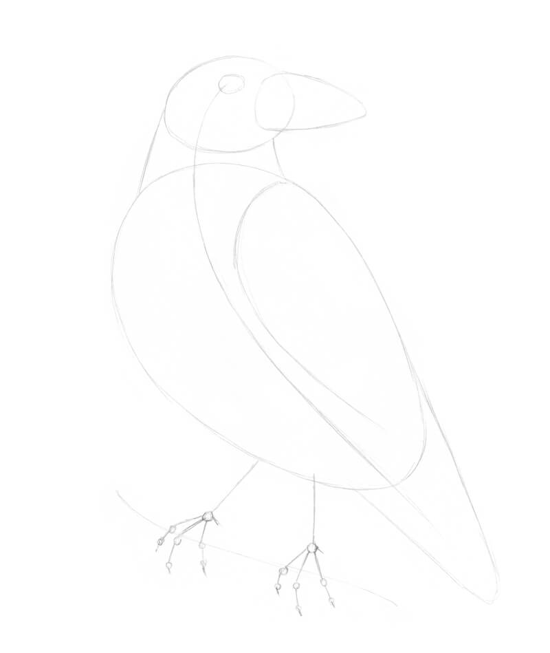
I add the shape of the wing, tail feathers, and the framework of feet. The small circles mark the joints. There are three front toes and one more toe is facing backwards.
I also add a line that indicates both the direction and position of the wooden piece on which the bird will be standing.
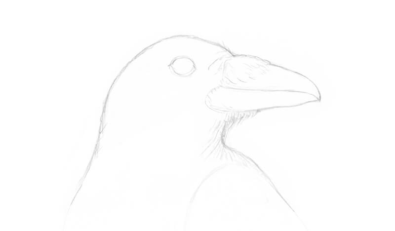
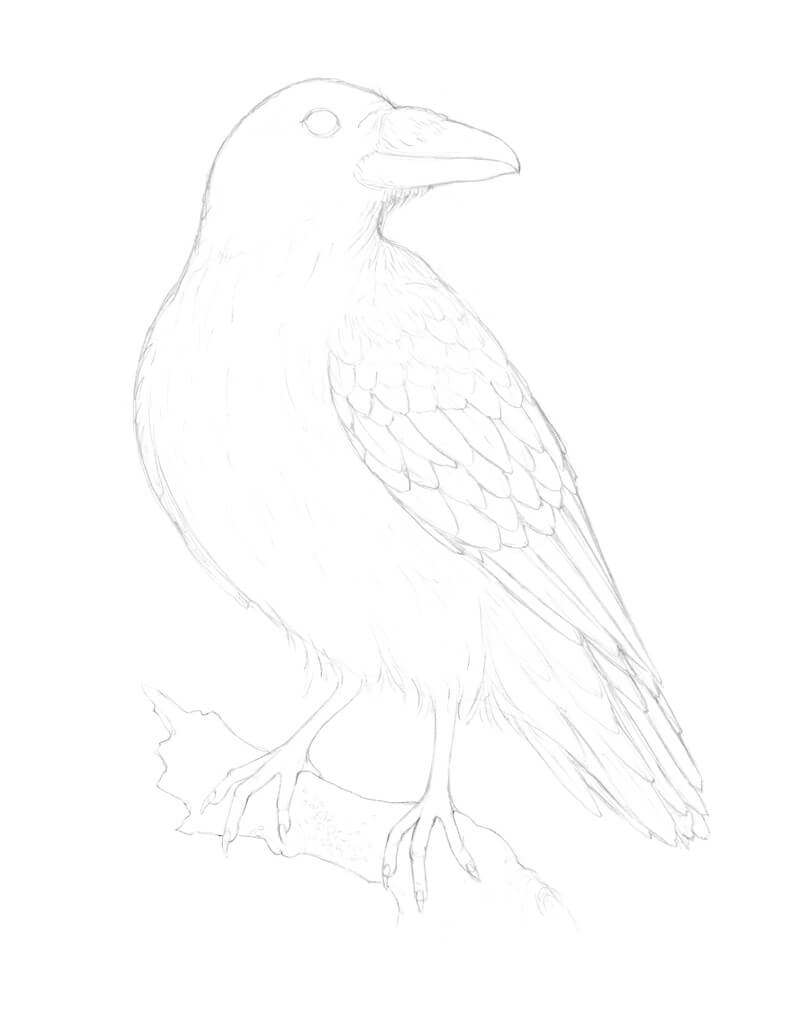
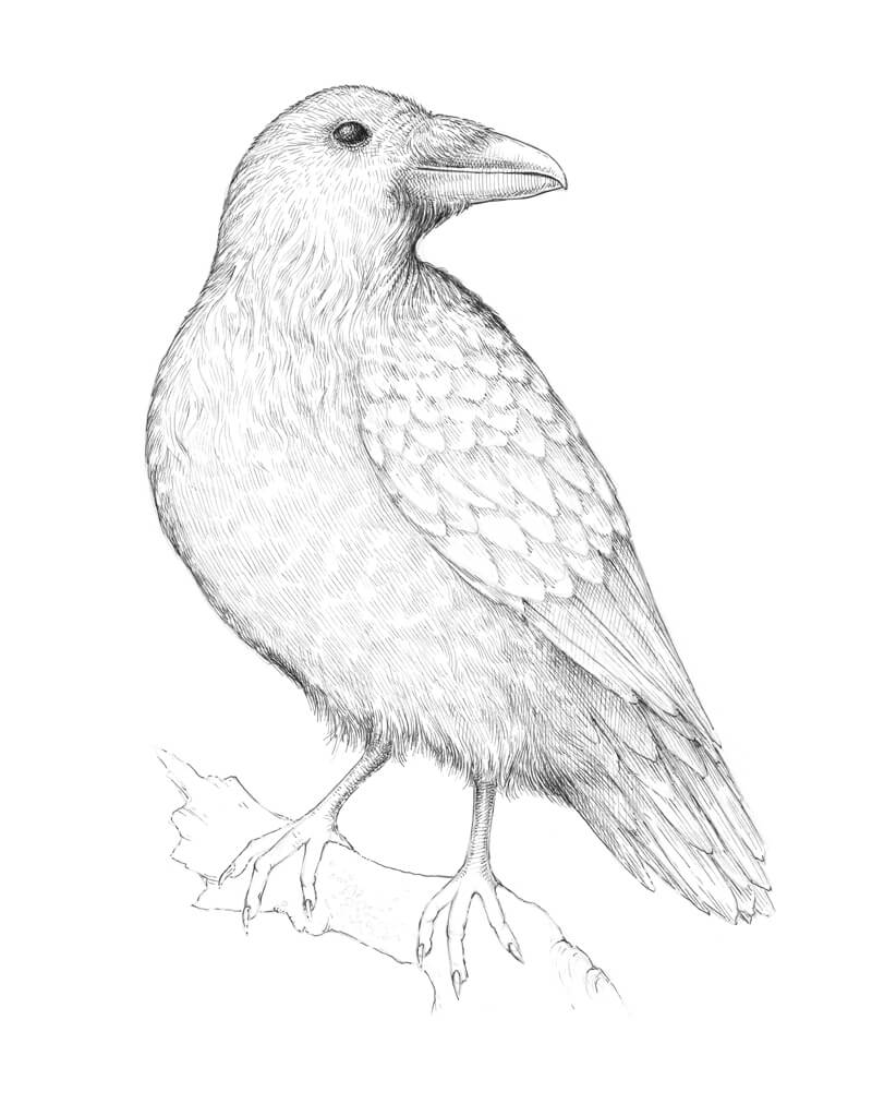
It’s time to refine the head of the raven. I change the contours of the eye and the beak, making it sharper, curving the line downwards.
I also mark some shaggy feathers around the throat and above the beak.
It’s time to refine the body. I draw the long tail feathers, taking note that they have a sharp and rigid look. The feathers on the body are softer. To communicate this in the drawing, I use curvy organic lines.
I refine the feet, adding long talons at the end of each toe. The contours of the branch under the bird are also added in this step.
To finish the sketch, we’ll add the pattern of the wings. The feathers in the upper part of the wing are soft, short, and relatively small. The feathers in the middle of the wing are longer and have clear contours. Lastly, the feathers in the lower part of the wing are the longest with sharp tips.
Adding Ink to the Drawing of a Raven
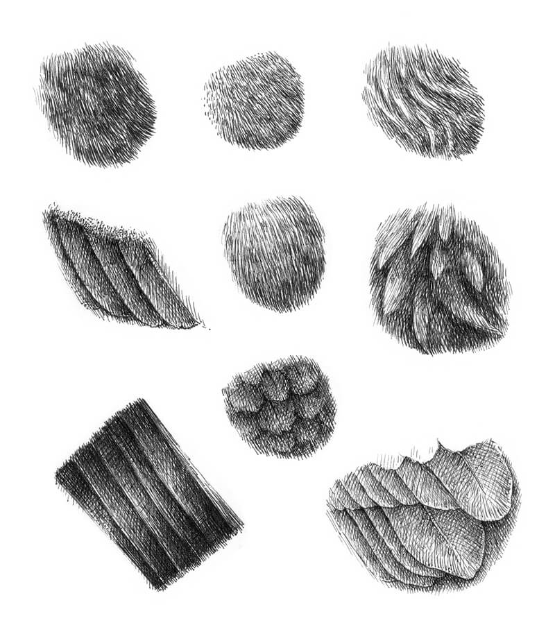
Sometimes I find it useful to make several sketches of texture before proceeding to the final artwork. Take your time and experiment with techniques to find the best fit for your subject. These exploratory sketches may be quite quick and rough.
In the image below, you’ll find my examples. I analyzed various types of raven feathers. In some ways, the softer feathers look just like short hair or fur — we can imitate this texture with a deliberate use of hatching.
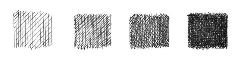
In this case, our raven is a subject that has a deep, dark color. How many layers of ink hatching do we need to achieve this density? The answer may be “quite many” depending on the tool that you use. Thicker pens will require less layering, but may sacrifice precision and complexity. Smaller pens will require more layers, but with an added level of control.
It will be easier to get a relatively solid black covering faster if we use a liner of medium width, like 0.3 or 0.5. But the result may look rough because of the thicker lines.
See also: Pen and Ink Drawing Techniques
We’re now prepared and ready to move forward. With a 0.1 ink liner, I mark the general contours of the raven. Just keep in mind that feathers create an uneven line of the silhouette, so be sure to replicate this in your drawing.
To achieve a more realistic look and to communicate form, the ink lines should correspond to the direction of feathers. When it comes to distinguishing the feathers, especially in the wing area, I find that groups of hatches work better than just a ‘border’ created by a single line.
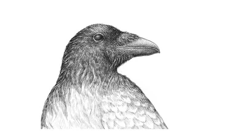
I darken the eye with rounded hatches that give it more volume. Of course, there should be a small highlight in the eye, so preserve this as you add the ink.
Let’s work on the basic texture. With a 0.05 ink liner, I apply hatching to the raven’s figure. There are long, soft, curly feathers in the neck and breast area — the character of lines accents this feature.
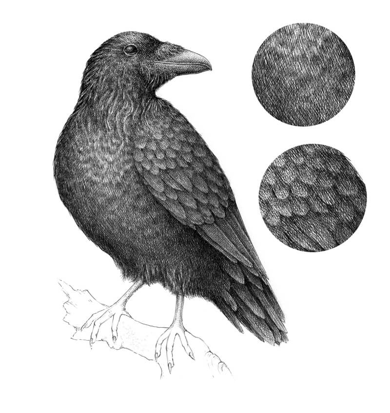
The feathers in the belly area are smoother, so groups of parallel hatches are a nice choice here. I add some cross-hatching to the darkest areas (for example, under the wing and to the tail feathers).
I apply more ink marks to the beak, darkening the whole area except the small spot in the upper portion, where the light is stronger.
I give more volume to the legs, adding rounded hatches to their sides. The raven’s legs usually are a bit lighter than the body, so don’t overdo them.
The reason why I recommend using a thinner liner for this step is that it creates fine marks that translate as a “gray”. They have a soft look that doesn’t overload the artwork. If you need higher contrast and more depth, you can always add more ink marks.
Now, it’s time to increase the contrast in the drawing. Let’s start with the raven’s head.
With a 0.1 liner, I add several layers of hatching on top of the existing ink lines. Stippling can be used as well if the goal is to create an illusion of soft, short feathering. Dots and smooth transitions of value definitely are friends.
The eye and the beak are as dark as the feathering. I use stippling here to darken the values.
The upper part of the head gets more light from above, so I use fewer ink lines there. The sides of the head receive special attention. I want them to be as dark as possible while still maintaining a sense of volume.
In a similar manner, I start darkening the body. The hatching is dense. The process of achieving this kind of depth and darkness with a liner or a nib can be time-consuming, but it’s worth the effort.
Pay attention where you place new marks. Aim for the gaps in between the existing lines.
Some areas, like the feathers in the neck area, remain lighter. Feathers of a raven have a glossy look when they catch the light. The lower part of the body is in shadow, so we can’t see many details there. Also, I make the core shadows in this area even deeper.
I add some long, streamlined hatches to the tail feathers to accent the texture.
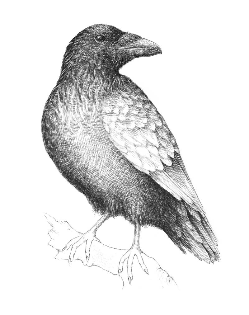
With a 0.1 liner, I add new layers of dense ink hatching to our raven. As I said, this process requires patience, so take your time.
I’d like to have more variation in the feathering, so I add a subtle pattern created by groups of short parallel hatches to the belly area.
When it comes to the wing feathers, I leave the ‘bodies’ of visible feathers slightly lighter than the shadows that divide them. The upper parts of the wing get more light, so the feathers there will be slightly lighter in value.
In the image below, you’ll find two samples of texture. The upper one is from the belly, and the lower one represents the wing texture.
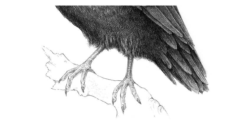
With a 0.1 ink liner, I work on the legs of our raven. They feature a unique ribbed texture. Rounded, horizontal hatches are used to replicate this texture.
The legs should be quite dark at the top (where they are joined with the body) since the large body of our raven casts a shadow on them.
Everything in our artwork is almost complete but the wooden support remains. I mark the main lines of texture and draw some lichen that grows on the bark. Then I darken the whole shape so it is harmonious with the bird.
See also: Drawing With Ink Liners: Natural Textures
Let’s not forget the shadow under the bird’s feet. I add some ink marks to the feet and a few more right underneath the talons.
It’s important to step aside from your artwork now and then. Take breaks. I find that this is especially important with dark, contrasting drawings.
Go for a walk or do something that has nothing to do with art. Then, come back with a fresh look. Chances are that you’ll notice something that needs additional touch.
Now, our drawing of a raven with pen and ink is complete…

Conclusion
Like with any pen and ink drawing, it’s important to be patient. Be sure to take the time to prepare before starting on your drawing with preliminary sketches and texture studies. Work slowly as you add each layer of hatching, analyzing the texture and contrast as you go.
Remember, although we drew a raven in this lesson, the concepts that we explored apply to any pen and drawing that you create.
If so, join over 36,000 others that receive our newsletter with new drawing and painting lessons. Plus, check out three of our course videos and ebooks for free.