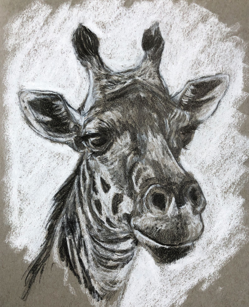
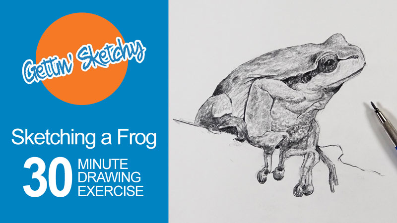
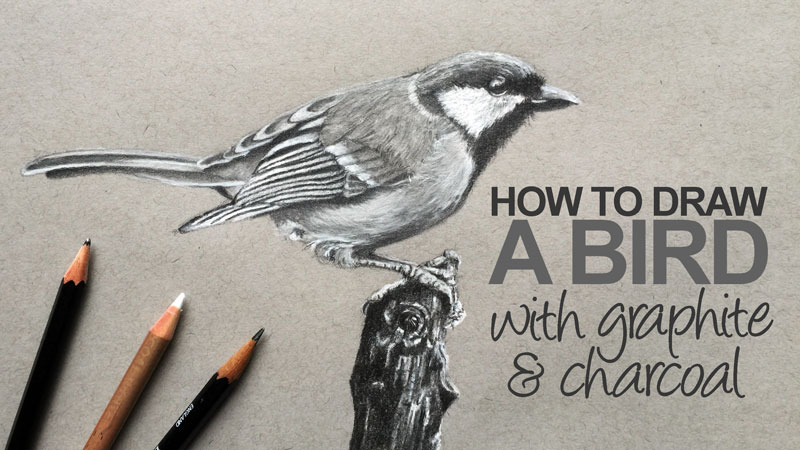
Gettin Sketchy – Giraffe with Graphite and White Charcoal – Season 2 Episode 2
This episode aired live on YouTube on August 26, 2020.
In this episode, we take a quick look at General’s white charcoal pencils which are used in this timed drawing exercise. For the timed drawing exercise, Matt creates a sketch of giraffe in 45 minutes using a combination of white charcoal and graphite on toned paper. This one is a challenge, filled with lots of texture and complex shapes.
Art Product Recommendation
The featured art product for this episode are white charcoal pencils by General’s. These pencils make a great compliment to darker drawing mediums such as charcoal and graphite – especially when used on toned paper. Using a white medium allows us to quickly push the range of value in the drawing and produce a variety of grays.
You can pick up a set for yourself on Amazon here…Buy General’s White Charcoal Pencils
(The above link is an affiliate link which means that we make a small commission if you purchase without any additional expense to you.)
Drawing a Giraffe with White Charcoal and Graphite – 45 Minute Timed Drawing
In this episode’s timed drawing challenge, Matt creates a sketch of a giraffe with graphite and white charcoal on toned gray drawing paper within 45 minutes.
Here’s a look at the completed drawing…
Materials for this Drawing Exercise
Since a combination of white media and dark media are used, toned paper is essential. In this exercise, we use toned gray sketch paper. This allows to start at the center of a value scale and push values outward, resulting in a full range of tone and value.
Aside from the white charcoal, a 4B graphite pencil is used along with a kneaded eraser.
More resources to explore…
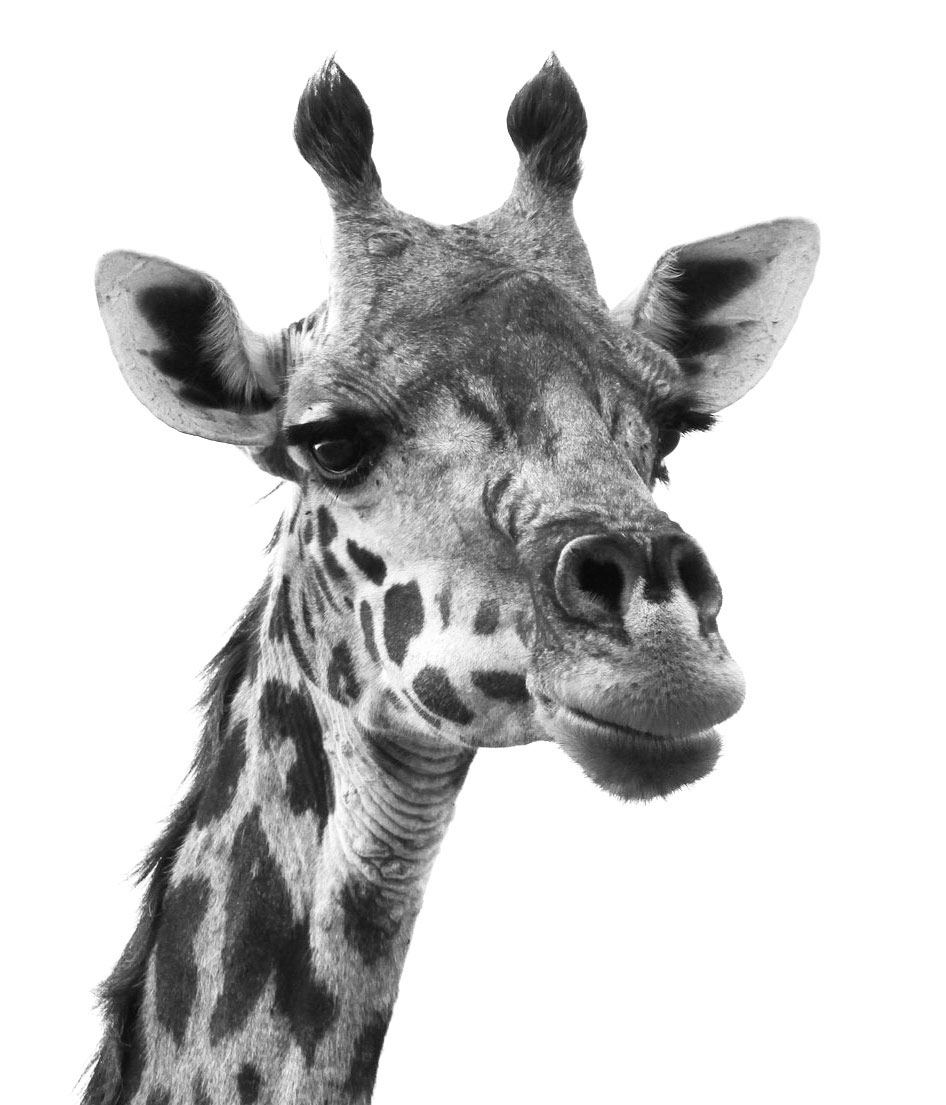
Photo Reference
The reference photo for this exercise comes from Pixabay.com The color has been removed from the image, leaving just the values which makes the drawing process a little easier.
Here’s a look at the photo reference…
Sketch Every Day
Drawing is a skill and like any other skill – it should be practiced. Sketching is a form of drawing practice. If you want to improve your drawing skills, then you should be sketching as much as possible. The more you sketch, the more you will see your drawing skills improve. Every sketch you create won’t be great – some will be better than others. But this isn’t the point. The point is practice. Make time to sketch every day if possible and watch yourself improve.
If so, join over 36,000 others that receive our newsletter with new drawing and painting lessons. Plus, check out three of our course videos and ebooks for free.
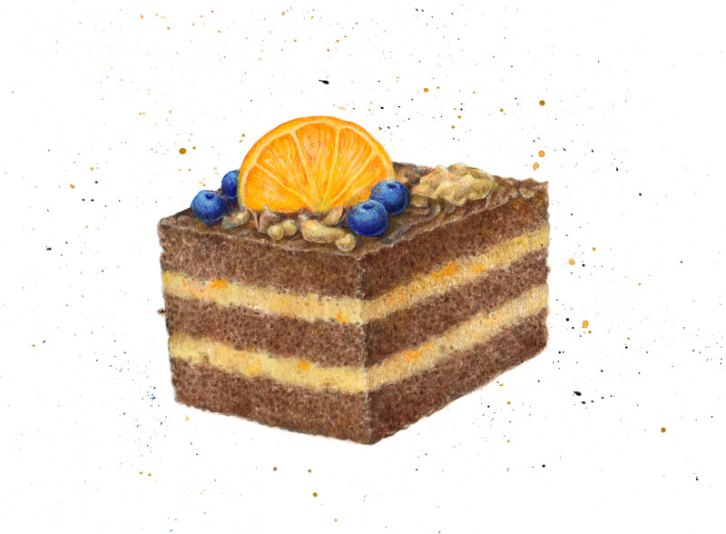
How to Draw a Cake with Watercolor and Colored Pencils
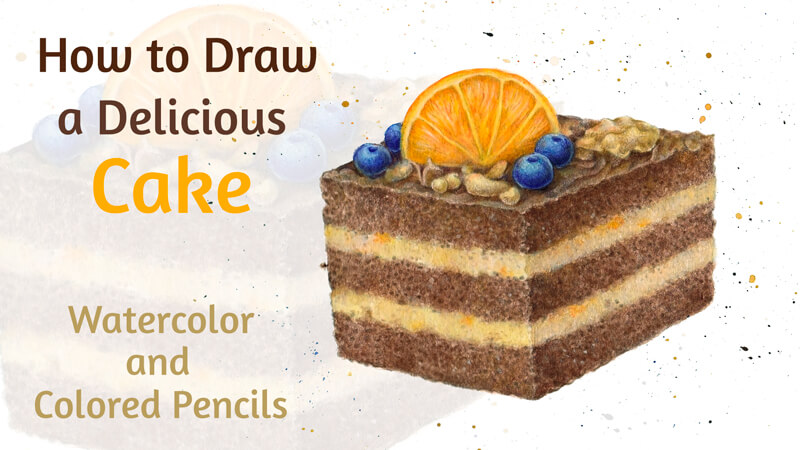
This is a mixed media project since we’ll use a combination of art supplies to create this art. Watercolor is used to create an under layer while colored pencils are used to develop texture and details.
In this lesson, I’ll also show you my process of designing an illustration of food, incorporating a color scheme with a logical decision-making process.
Art Supplies for this Project
I’ll be working on an A4 sheet of watercolor paper. Its surface has a rough texture which is a feature that can be used to our advantage.
We’ll need a graphite pencil to create an underdrawing. I recommend using an HB or H pencil. Softer options produce heavier lines which would be difficult to erase. Keep some erasers at hand – a kneaded and vinyl eraser are the perfect set for this project.
See also: 9 Must Have Colored Pencil Supplies
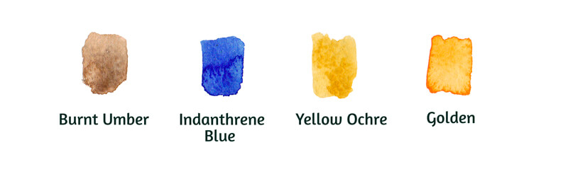
My watercolor paints are White Nights by Nevskaya Palitra. (Feel free to use any brand that you wish.) I’ve chosen only four colors, but this range is more than enough for our art.
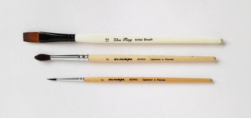
We’ll also need some brushes to apply the watercolor. The primary tools that I’m going to use are round squirrel brushes sized 2 and 5. There is also a synthetic bristle brush used to create expressive watercolor splashes.
The majority of my colored pencils are Faber-Castell Polychromos except for one. Chinese White is from the Derwent line. I prefer this white pencil because it produces a dense and solid covering. It makes it easier to create highlights.
Note that this pencil is very soft, so its tip becomes dull quickly. A pencil sharpener will help to keep your pencils sharp and ready for precise mark-making.
Below you’ll find the names and swatches of the chosen colored pencils.
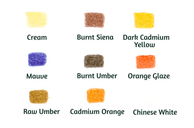
Details and Colors for the Cake Drawing
I strongly recommend developing a concept before we start drawing. What should your cake look like? Will the shape of its foundation be close to a triangle, a square, or a rectangle? Will there be any adornments on the top plane of the cake?
The easiest way to get a ready-made concept is to use a qualitative reference photo. Also, you can check some existing cake recipes with illustrations and find one to continue with. However, I suggest a different approach. I’m going to use my memory and imagination to make decisions. The first step is to create an image in your mind.
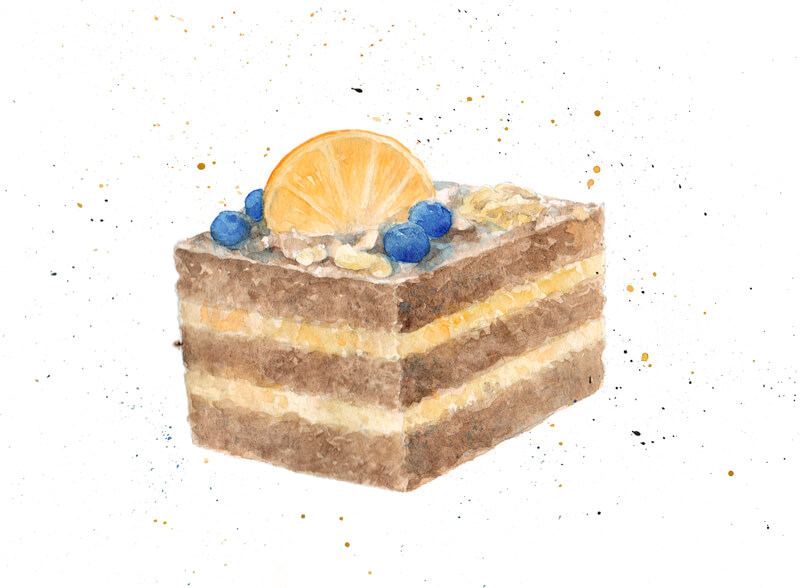
Let’s say that my piece of cake will resemble an elongated cube – or, more correctly, a rectangular cuboid.
There will be three brown biscuit layers with light-colored cream in between. The top plane of the cake will be covered with chocolate frosting. Additionally, it will be decorated with blueberries, nuts, and a slice of a tangerine.
Why a tangerine and not an orange? The answer lies in the compatibility of ingredients and personal preference. I believe that a tangerine is a better choice with berries in terms of taste.
The imaginary “recipe” is up to you. Take a moment to think about your favorite desserts. It may be useful to write down or sketch your ideas. You’ll find my quick sketch in the image below (illustration a.)
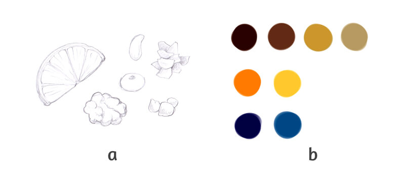
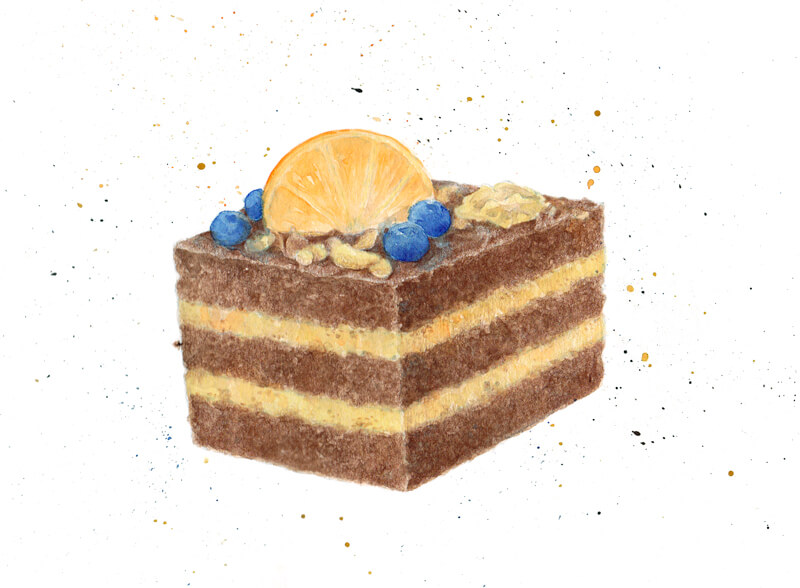
Along with the ingredients, we should decide on the colors. The cake itself will be in the range between light yellow-orange and dark orange. The saturation of colors can vary.
Also, I’m going to include some pure orange and yellow-orange accents. The tangerine slice will have the strongest intensities of these colors.
To make the art more interesting, I’m going to add several blue elements – the berries. On the color wheel, orange and blue are opposite of each other. A minor addition of the complementary color will create a pleasant color contrast. To ensure that the berries fit harmoniously into the general color scheme of our artwork, I’m going to shift blue towards blue-violet in the shaded areas.
The process of making color decisions can happen inside your mind. Or, if you wish, jot down some options, using pencils, paints, or digital software. Do you like the resulting palette?
My color map is presented in the image above (illustration b.)
See also: Color Theory – The Elements of Art
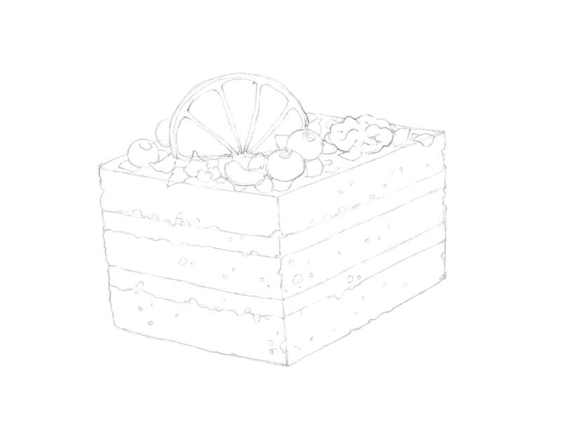
Drawing a Cake with a Graphite Pencil
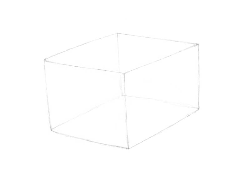
Let’s start with the framework of our cake. The form is close to a cube, but is slightly elongated. The vertical lines diverge to a minor extent, which strengthens the impression that we’re looking on a cube from above. This also adds a dynamic feel to the artwork.
Keep your graphite marks as light as possible. Please note that I’ve intensified the lines in my process images for your convenience. Your lines may be barely visible.
As we decided in the previous step, the cake should have three biscuit layers with cream sections in between. Keep the principles of perspective in mind while marking the borders!
With the form in place, I add the rough shapes of the tangerine slice, nuts, and blueberries that decorate the top of the cake.
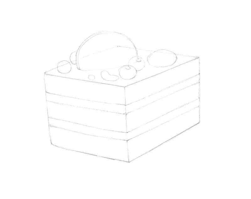
I refine the elements on the top plane. I also add some chocolate shavings to fill the space between the nuts and berries.
With an eraser, I soften the borders between the layers. Straight lines don’t look natural – they should have some twists and turns. The same is true for the outer edges of the cake and the general contour line.
You can add some details of texture – a piece of cake usually has a porous look and feel. Vary the hollow openings so that you have some smaller and larger ones. However, don’t overload the drawing with too much visual information.
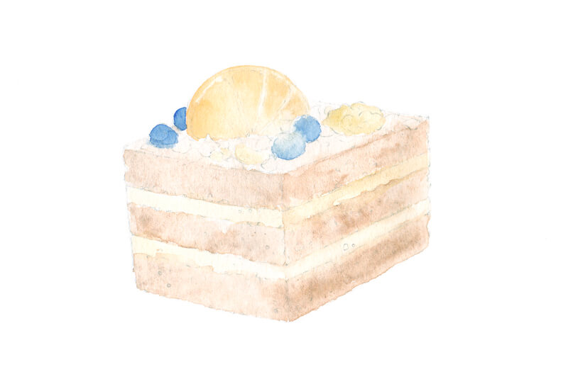
Painting the Under Painting with Watercolor
With our sketch in place, we’re ready to create a tinted underlayer of watercolor. This step will help us to save time before we proceed to colored pencils. The great advantage of watercolor is that it quickly covers the surface, so no specks of white paper are showing through the applications.
Using watercolor may be intimidating for some artists. It’s no wonder since this medium requires skill and practice to create more or less complicated art pieces. If that’s true for you, don’t worry. Everything that we’ll be doing in the following steps is beginner friendly.
See also: Watercolor Painting Lessons
First, soften the graphite marks with a kneaded eraser. It is almost impossible to remove excess graphite after the watercolor is applied and dried.
I start with the darker layers of the cake. With the larger round brush, I moisten the area with clean water before applying the paint. Burnt Umber is my choice for the biscuit layers, the top plane of the cake, and the chocolate shavings.
I apply Yellow Ochre to the lighter cream layers. The paint is heavily diluted with water so the value is very light. I address the nuts with this color too.
I moisten the borders between the lighter and darker layers of the cake to create a soft transition.
I cover the tangerine slice with Golden. Then I add Indanthrene Blue to the berries. Be careful – allow the surrounding areas to dry before applying the contrasting blue paint to prevent bleeding and desaturation.
As you can see, the first layers of paint looks faded and light.
Next I’m going to repeat the same actions as in the previous step. The exception is that the paints won’t be as diluted. The brush is moderately wet. This time however, I don’t moisten the area before applying the watercolor.
I make the vertical planes of the cake slightly darker than its top, adding more Burnt Umber and Yellow Ochre respectively. I assume that the upper surface is well lit, and the right vertical side is the darkest. The location of the light source and the character of lighting in your image is up to you.
I use the smaller brush to leave dots or separate strokes while the area is still wet. This trick helps to create a grainy or porous texture of the biscuit layers.
I cover the berries with another layer of Indanthrene Blue. When lightly applied, this color can be a nice addition to other areas of the artwork.
With Golden and a small brush, I refine the details of the tangerine. I also add some strokes of this color to the lighter layers of the cake.
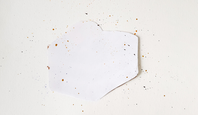
Now the under painting is complete. However, I have an idea of how to add a painterly feel to our artwork. We’ll create expressive paint splashes!
First, we’ll need a protective stencil that roughly repeats the shape of our cake, including the adornments on top. You don’t have to be completely precise with its size and silhouette.
The easiest way to make a stencil is to put a sheet of thin (printer or tracing) paper on top of your artwork. Such paper has a level of transparency, so you’ll see the silhouette of your drawing through the upper layer. Outline the rough contour with a pencil and cut it out. Then put the stencil on top of the cake.
In the image below, you’ll find my artwork covered with the stencil. With the stencil in place, the cake is protected from being stained. As you can see, the stencil is doing its job successfully!
After the stencil is in place, take a bristle brush and dip it into water. (It may be a good idea to change the water in your container to make sure it’s clean.)
Then, pick up some paint of any color and press the bristles with your finger as shown in the image below. Adjust the position if necessary.
When you release the bristles, they’ll spring back and the paint will fall onto the paper, spontaneously creating a pattern of splashes. The size and location of the watercolor spots depends on the size of your brush and the way you hold it.
I recommend that you try different positions beforehand. Try to vary the pressure on the bristles, the angle relative to the paper, and the amount of water on the brush.
I used all four color options of watercolor paint to make the splashes.
Drawing the Cake with Colored Pencils
With our under painting of watercolor in place, we’re ready layer colored pencils over the top. With Cream, I cover the lighter elements in the drawing, including the nuts and some areas of the tangerine slice. The pencil moves in small circles and the covering is even and thin.
I apply Burnt Siena to all brown areas. The top plane remains lighter than the vertical sides of the cake. I create a tonal distinction between the vertical planes by darkening the right side of the cake.
You can work in a circling manner to accent the porous feel of the texture. Directional lines are also an option. The colored pencil applications interact with the rough surface of the paper and create a texture as well.
I add a thin layer of this shade to the darker areas of the nuts to unite the objects in terms of color.
With Dark Cadmium Yellow, I refine the tangerine slice. The peel and the inner elements become more vibrant and contrasting.
I also create small touches of this color within the cream layers of the cake. Let’s imagine that the cream has tiny bits of tangerine as an ingredient.
With Mauve, I add a blue-violet hint to the darker areas of the berries. I also apply a thin covering of this color to the cast shadows under the blueberries.
With Burnt Umber, I add more dots in the brown layers to strengthen the illusion of a rough and porous texture.
I also accent the shadows between the chocolate shavings and below the nuts. The core shadows of the nuts will benefit from the inclusion of this color too.
I add this shade to the darker areas of the blueberries to harmonize the colors.

With Orange Glaze, I accent the color of the tangerine peel. You can add this hue to the pulp to create a pleasant variation. This will make the texture more believable.
I also add this hue to the nuts and the orange areas in the cream layers. The goal is to create just a subtle hint of the color, so keep light pressure on the pencil.
I cover the brown areas with Raw Umber. The previous layers are still showing through, but now the color is closer to the actual color of pastry.
Then, I add a thin layer of Raw Umber to the cream layers of the cake.
I continue with Raw Umber, developing more variety of color in the tangerine slice. It needs a modest desaturation. Toning down the inner segments helps to make this section more realistic.
The upper part of the tangerine remains slightly lighter to create the illusion that light is shining through the pulp.
I add some Cadmium Orange on top of the tangerine to shift the hue towards orange while deepening the intensity.

I add small dots to the cake’s layers, using Chinese White. These marks accent the irregularity of the texture and make it even more varied.
I use this pencil to burnish the berries and nuts. Some areas, such as the frosted top of the cake, the look is grainy, so I burnish them as well.
See also: 12 Colored Pencil Tips
I avoid pressing too hard because the pencil is very soft. If the applications became too light after burnishing, restore the color and value with the appropriate pencil – for example, Burnt Siena or Burnt Umber.
I cover the lighter cream layers with Chinese White to unify them. Now we have an interesting contrast of rough and smooth textures.
I leave visible strokes in the upper part of the tangerine to create the illusion of shine on the citrus pulp.
Now evaluate the art. Feel free to add any details if necessary.

How to Draw a Piece of Cake with Watercolor and Colored Pencils – Conclusion
Congratulations! We’ve created a delicious looking piece of art.
I don’t know about you, but I’m experiencing the strongest urge to have a piece of cake. This should be a sign of success!
If so, join over 36,000 others that receive our newsletter with new drawing and painting lessons. Plus, check out three of our course videos and ebooks for free.
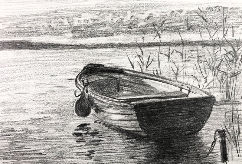
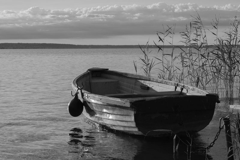
Timed Drawing Exercise – Row Boat – Gettin’ Sketchy Live
Gettin Sketchy – Row Boat Drawing – Season 2 Episode 1
This episode aired live on YouTube on August 19, 2020.
In this episode, we take a quick look at Steadtler Pigment Liner drawing pens and Ashley creates a sketch of a row boat on water with graphite on drawing paper in a 45 minute timed drawing exercise.
Art Product Recommendation
The featured art product for this episode are Steadtler Pigment Liner drawing pens. These pens keep a strong tip for a longer period of time with plenty of ink to last for many drawings. The functional packaging and the higher quality sets them apart from other disposable drawing pens on the market.
You can pick up a set for yourself on Amazon here…Buy Steadtler Pigment Liner Drawing Pens
(The above link is an affiliate link which means that we make a small commission if you purchase without any additional expense to you.)
Drawing a Row Boat with Graphite – 45 Minute Timed Drawing
In this episode’s timed drawing challenge, Ashley creates a sketch of a row boat with graphite within 45 minutes.
Here’s a look at the completed drawing…
Materials for this Drawing
The materials used for this exercise are very simple. All that is required is standard drawing paper (a sketchbook is fine) and a few graphite pencils of various softness. A kneaded eraser or a rubber eraser is also helpful to have within reach.
More resources to explore…
Photo Reference
A photo reference was used to complete the drawing. This reference comes from Pixabay.com and has been altered by removing the color in Photoshop. Removing the color leaves only the values, making observation a little easier.
Here’s a look at the photo reference…
The Benefits of Sketching
Sketching is usually a quick process of drawing loosely while simplifying details. When creating a more refined drawing, an artist may work much slower and control the medium to a higher degree.
However, sketching flexes the same mental muscles that we would use if we were to create a longer, more refined drawing. Sketching is essentially a form of practice that improves the artist’s observation skills which carries over when creating longer drawings.
See Also: The Difference Between Drawing and Sketching
Sketching, of course, is also beneficial in planning out your composition or preparing for a more refined drawing or painting. It is our belief that sketching from observation daily is one of the fastest and most effective ways of improving your drawing skills.
If so, join over 36,000 others that receive our newsletter with new drawing and painting lessons. Plus, check out three of our course videos and ebooks for free.

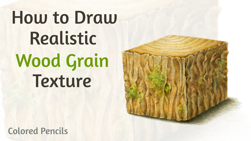
How to Draw Realistic Wood Grain Texture with Colored Pencils
As artists, we may create the illusion of some actual texture like fur, grass, or wood on paper or canvas. If this illusion is produced correctly, the viewer associates it with a concrete physical object. The artwork seems credible and realistic.
Effective work with textures allows us to convey a variety of messages and evoke emotional responses from people. With the proper skill, you can direct the viewer’s attention to a particular area of your art. It’s no wonder that texture is a fundamental aspect of many drawings and paintings.
Texture is one of the seven elements of art.
The focus of this lesson is to explore creating the illusion of wood grain texture with colored pencils. It’s quite a popular texture to explore with many concepts that involve depicting trees or related elements. Various man-made objects that present this texture are common too.
The Materials Used for this Exercise
I’ll be using Faber-Castell Polychromos colored pencils. Feel free to use any colored pencils that you like. Actually, this texture study can be produced with any art medium, including watercolors, ink, or graphite pencils.
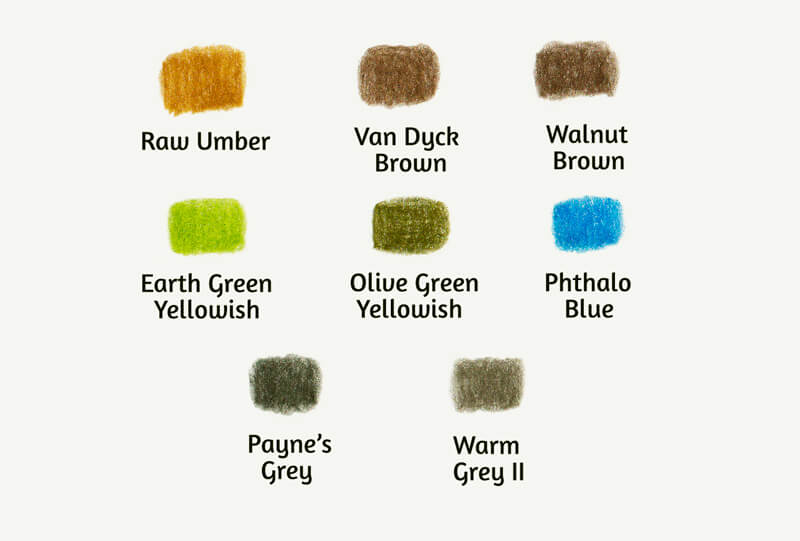
You’ll find the pencils that I’ve chosen for this project in the image below.
I recommend keeping a pencil sharpener at hand. When you’re working on the details, the pencil tip should be extra sharp.
We’ll also need an ordinary graphite pencil to create an underdrawing, and an eraser.
See also: 9 Must Have Colored Pencil Supplies
I’ll be drawing on an A4 size sheet of paper. It’s quite large for a single exercise, so we can fit two or even more texture cubes on the surface. The paper has some tooth – its surface isn’t completely smooth. It also has a subtle warm tint.
Analyzing Texture and Building Your Visual Library
In my experience, it’s best to analyze a texture by looking at a real, tangible, physical specimen. Qualitative reference photos may be useful too. However, I see them rather as a subsidiary tool that you can rely on after the initial contact with the actual texture.
I recommend using all of the information you can to build your visual library.
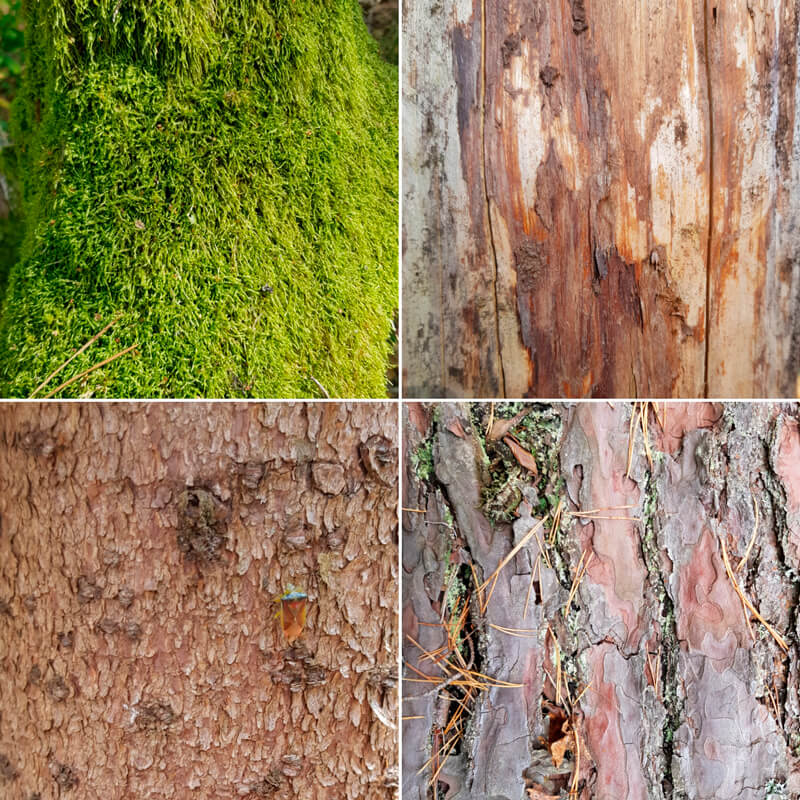
For example, if you’re outdoors, observe the trees. Don’t just look at their silhouettes. Come closer and study the bark. Here are some suggestions:
- Try to find the rhythm of the texture.
- Draw imaginary lines that create the pattern.
- Touch the tree to find out how the surface feels.
- Squint your eyes to get a unified impression.
- Then observe all the details, watch how they interact, building the whole object.
All these actions will help you to understand the texture and discover the best way to recreate it in a drawing.
After you have that pleasant feeling of the concept’s recognition, take a couple of photos. They will refresh your memory in the future. You can use them while creating studies and working on independent art projects.
Natural textures are so broad that it’s difficult to get bored observing them. Each example of bark is unique. The same is true of the patterns of moss, lichen, or other organic “decorations” that may cover it. And the inner patterns of wood fibers may be surprisingly diverse as well.
Below you’ll find some photo examples of texture from my collection.
Drawing Wood Grain Texture with Colored Pencils
Let’s start with a simple study. It is a close-up fragment of wooden texture. I’ve put it here for demonstration purposes. We should understand the general principles of this exercise before we move on to the next one.
Exercise 1 – Flat Texture Study
We’re dealing with a flat surface, its pattern, and micro-relief. There’s no need to think about the entire form that this texture may be covering. It’s like looking at a tree very closely – we see the details of the surface and disregard the volume of the trunk itself.
The size of the texture sample may be quite small – for example, mine is only 4.5 × 3 cm. (About 1.8″ × 1.2″.)
Outline a rectangle, a square, or a circle with a graphite pencil. This shape will be the borders of our sample. Then, fill it with the close-up fragment of the chosen texture.
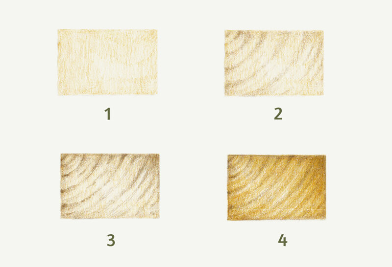
The process may be slightly different, depending on the case. In general, we start with the general values and color, gradually increasing the density of layers. Then come the details. As a last step, you can burnish your sample or apply some color on top to unify it.
Here is the process for the sample below:
- I created a base layer with Raw Umber.
- I marked the grain pattern, using Van Dyck Brown.
- With Walnut Brown, I added more lines, refining the pattern.
- I applied more strokes of Raw Umber to make the color more natural.
Exercise 2 – Texture Study on the Cube Model
Great news – our second task is more challenging!
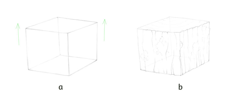
In the previous study, we dealt only with the relief and values of the texture itself. In this exercise, we’ll start with a primary form that will affect the appearance of the surface. It’s up to you to choose the form – it may be a cube, a sphere, a cylinder, or even something more complex.
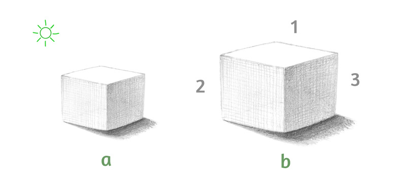
In this case, I’ll draw a cube. As you may notice, its vertical lines diverge slightly, as in a case with the three point perspective. (See the illustration “a” in the image below.) I like the effect of minor distortion – this adds a dynamic quality and interest. But if you prefer normal cubes that conform to the classical two point perspective, feel free to draw one.
Then I add the main details of bark to the vertical planes. There will be small areas of moss. The top plane will demonstrate the pattern of a cut tree trunk. (See the image below, illustration “b”.) Keep your pencil lines as light as possible.
It’s helpful to create a visual connection between the cube’s planes. For example, you can continue a pattern that has started on one of the other sides of the cube. These details help to unite the form.
Also, add some minor features that make the drawing more interesting – for example, small hollows or cracks. Pay attention to the main contour. In this case, it shouldn’t be too monotonous or mechanic.
Just for your reference: my drawing will be about 11 × 9.5 cm, including the cast shadow. It is approximately 4.3″ × 3.7″.
Now it’s time to talk about lighting. It’s necessary to determine where the light source is originating from before we move on. We’re dealing with a cube and the light affects its values. In turn, the light will also affect the texture.
Let’s agree that the light source is to the left of the cube and slightly behind it. The light is diffused, so the shadows will be soft, with blurred edges. (See illustration “a”in the image below.) With this information in mind, we can imagine what the tonal pattern may look like.
Also, it can be helpful to mark the planes of the cube with numbers, as shown in the image below. For illustration purposes, I’ll be referring to the planes using numbers.
- “1” – for the top horizontal plane.
- “2” – for the left vertical side.
- “3” – for the right vertical one.
Now we’re ready to proceed to colored pencils part!
First, soften all the graphite marks with a vinyl or a kneaded eraser. The latter is a better option in this case.
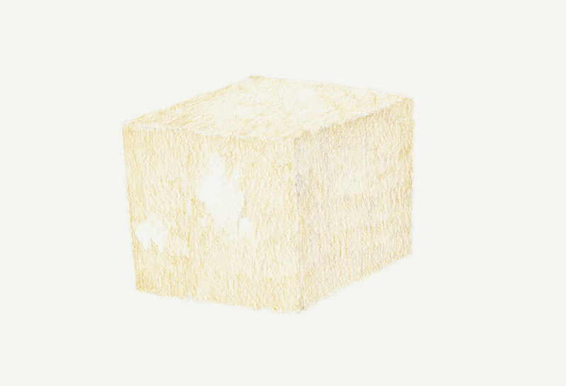
I first layer a base color, keeping light pressure on the pencil. The direction of strokes follows the direction of the planes. Make sure that you avoid the “moss” areas.
Plane 1 gets one layer of Raw Umber. plane 2 is slightly darker, so it needs two layers.
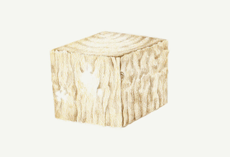
I add one layer of Raw Umber to plane 3, then cover it with a thin coating of Van Dyck Brown.
With Van Dyck Brown, I mark the darker areas. I reveal the details of relief and the rhythm of texture. I separate the planes visually with thin shadows.
At this stage, we should be careful with darker colors. Don’t press too hard. It’s much easier to add another layer of shading later on.
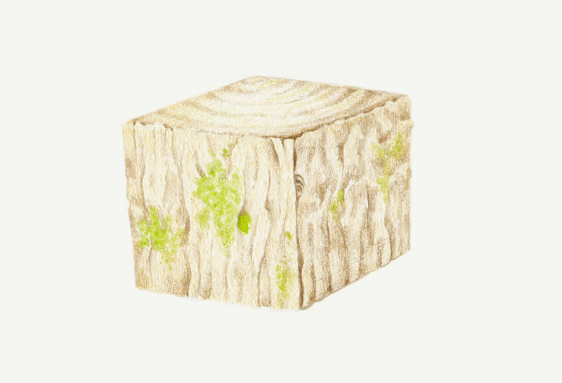
With Earth Green Yellowish, I draw the moss and small leaves in the hollow. The pencil is moving in small circles.
You can vary the pressure or work in a stippled manner to create a grainy effect. Leaving tiny gaps and allowing some irregularity of strokes is also an option.
To increase the density of color, I add more strokes of Raw Umber.
Some areas are left almost untouched – for example, thin lines of grain on plane 1. As we remember, the top plane is well lit.
With Walnut Brown, I darken the gaps, hollows, and other details of texture. Don’t forget to sharpen your pencil before you start working on the finer details.
I also apply a thin covering of this color to planes 2 and 3. The vertical sides receive less light, so using this shade is justified. I work in a circling manner at low pressure.
Note that plane 3 is the darkest one, so we won’t find high contrast there.
The bark has some thickness. There’s a thin shadow near the closest edge of the cube’s top, behind the protruding bark.
With Olive Green Yellowish, I create shadows in the moss. You can draw short lines, circles, or even dots to achieve a specific, yet varied effect.
I add a thin covering of Phthalo Blue to planes 2 and 3. The pressure is so light that it is barely noticeable. However, pressure can be increased to mark the cracks.
This blue hue works wonders in the moss area. It affects the underlying colors, so they get a beautiful cool accent. I use it in the shaded areas of the moss.
I add a cast shadow, applying Payne’s Grey near the cube. I extend the shadow, using Warm Grey II.
I also apply Warm Grey II to planes 2 and 3 to desaturate them just a little.
Drawing Wood textures with Colored Pencils – Conclusion
Congratulations – we’ve done a great job! Hopefully, you see that creating complex textures with colored pencils is easier than you think.
Exploring textures can be truly exciting. I hope that you’re willing to continue this creative journey and encourage you to make your own studies of textures.
I wish you much inspiration and fun on your way to becoming a texture master!
If so, join over 36,000 others that receive our newsletter with new drawing and painting lessons. Plus, check out three of our course videos and ebooks for free.
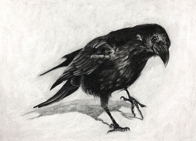
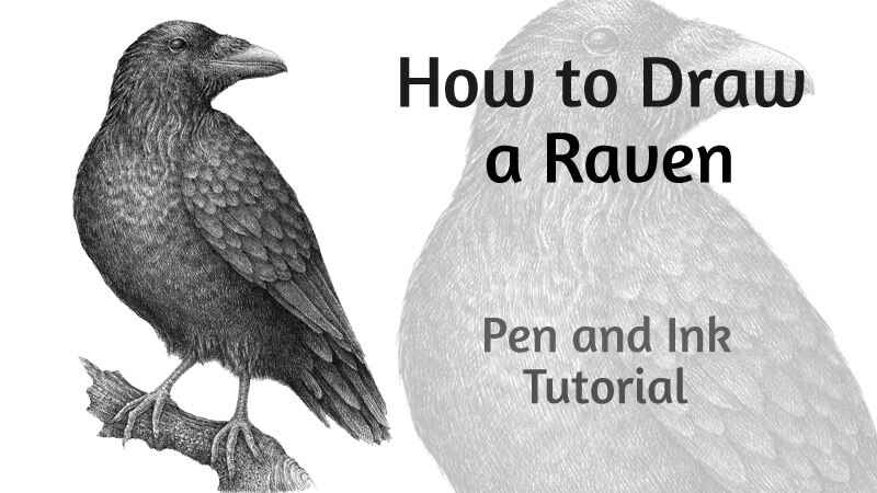
Charcoal Drawing Lesson – Raven
Combining Different Forms of Charcoal
In this charcoal drawing lesson, we’ll combine vine, compressed, and white charcoal to create a drawing of a Raven on gray charcoal paper. We’ll begin with looser applications and slowly build up the details while expanding the tonal range.
Patience is important since charcoal can be a difficult material to control – if you’re not used to it. But you’ll see that while charcoal is dusty, it can be controlled and shares characteristics with opaque painting mediums.
Materials for this Drawing
Charcoal is considered a foundational drawing medium. In virtually every introductory, college-level class, you’ll find yourself working with charcoal. Charcoal is very forgiving and is a natural transitional medium for anyone interested in painting.
In this lesson, we’ll use a variety of forms of charcoal to complete the drawing. Vine charcoal, compressed charcoal (charcoal pencil), and white charcoal are all used. Blending stumps and a kneaded eraser are also used.
See also: Charcoal Drawing Techniques
(The following links are affiliate links which means that I make a small commission if you purchase without an additional cost to you)…
The Drawing Surface – Gray Charcoal Paper
Charcoal paper is a drawing surface specifically designed for drawing with charcoal. The surface features a distinctive laid pattern that is designed to lock the powdery medium in place, making it suitable for pastel drawing as well. The paper is very thin and delicate but is one of the best surfaces for drawing with charcoal. Most charcoal papers are colored buff (slightly off white), but can also be found in an assortment of colors and tones.
See also: All About Drawing Papers
Gray charcoal paper may be difficult to find. Most art stores do carry it, but you’ll likely have to purchase in larger sheets and cut it down to size if necessary. Look for it in the speciality papers section of the art store.
The Photo Reference
A photo was used to complete the drawing, but was edited before making marks. In this case, I used the camera raw filter in Photoshop to adjust the exposure, contrast, and to remove color.
Here’s a look at the photo reference used in this drawing…

Loosely Sketching the Raven
The drawing begins with a loose sketch using vine charcoal. Vine charcoal is very powdery and smears easily. Lifting it and erasing is a breeze, making it suitable for sketching. The basic shapes of the raven are sketched out using quick motions while holding the charcoal stick between the thumb and forefinger.
It’s okay for the sketch to smear slightly and lack details. We’ll clean up and refine the drawing as we layer compressed charcoal applications later in the process.

Once the basic shapes of the raven have been defined, we’ll use the vine charcoal to begin establishing the darker tones and middle grays. Vine charcoal is applied over the majority of the body and then softly blended using a broad blending stump.
See also: Do You Really Need Blending Stumps
This is not dissimilar to the process of painting in a solid shape of color with an opaque painting medium like acrylics or oils.
Details and Value
Over the blended vine charcoal, we’ll begin layering compressed charcoal using charcoal pencils. We’ll begin with the eye since it is a natural focal point, applying white charcoal with a pencil.
Here, the highlights in the eye and the small feathers are highlighted.

We’ll then begin working our way down the body towards the tail, taking care to keep the palm out of the way. We’ll gradually develop a broader range of value as we add both dark and light applications. A blending stump is used to soften the texture produced by the paper as we go. This also produces areas of gray where the white and dark compressed charcoal mix.

Patiently, but loosely, we’ll continue this process. Details gradually emerge as we push the tones lighter and darker. We don’t have to spell out all of the details as the relationship of the different values often provides enough information for the viewer.
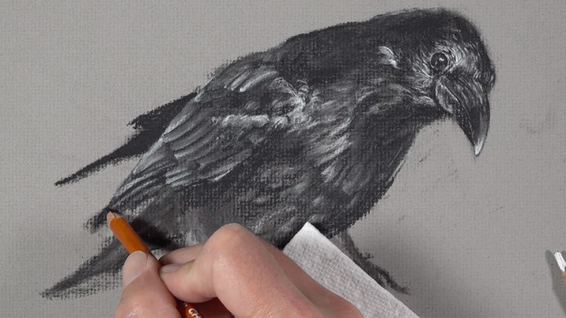
Due to the forgiving nature of charcoal, we can layer white charcoal over darker areas to make them lighter if desired. The same is true if the opposite is required. This versatility is similar to what we see with opaque painting mediums.
Defining the Background and Refining the Edges
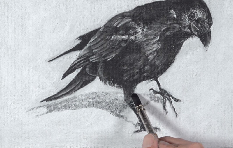
After adding highlights and shadows to the legs and talons of the raven, the bird is mostly complete. At this point, the contrast is not quite strong enough and the edges of the drawing are loose and undefined. We’ll use white charcoal to both clean up the edges of the raven and to define the background.

A white charcoal is pencil is used first around the edges of the bird. The pencil provides the precision that we need, but is too time intensive to use for the entire background. Instead, a white charcoal stick is used to fill in the remaining parts of the background.
Adding a Cast Shadow Under the Raven
Now our drawing is a bit cleaner, but our raven is floating. We’ll add a cast shadow underneath the body with vine charcoal to ground the subject. Light to medium pressure is used as the dark, soft charcoal is applied right over the white charcoal. A gentle blend with the blending stump makes the cast shadow appear more natural.

Finishing Touches
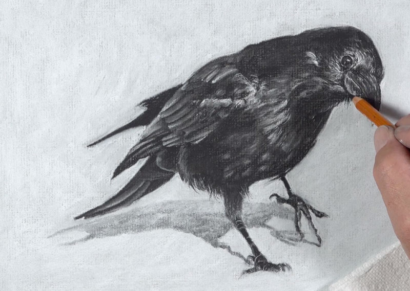
With a sharpened black charcoal pencil, we’ll revisit the outer edges of the bird, adding a few stray feathers. It’s okay to exaggerate these lines a little.
Drawing a Raven with Charcoal – Conclusion
Now our drawing of a raven with charcoal is complete.
There are a few things we can learn here. The first is that charcoal is a forgiving medium. It’s quite easy to push values darker or lighter. The second thing to note is the similarities that charcoal shares with opaque painting mediums. Charcoal is easily layered and covered by subsequent applications, making it a versatile drawing medium. The third take away is that we don’t have to be overly detailed with a charcoal drawing. As long as the shapes of values and their relationships are somewhat accurate, then our drawing will likely be successful.
If so, join over 36,000 others that receive our newsletter with new drawing and painting lessons. Plus, check out three of our course videos and ebooks for free.
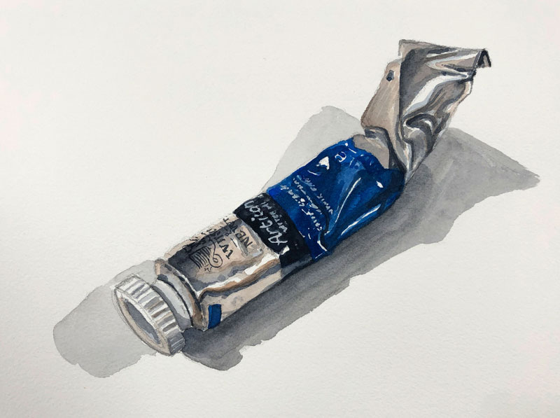
Watercolor Painting – A Paint Tube
An Unexpected Challenge
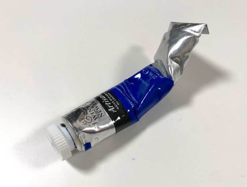
In this watercolor painting lesson, we’ll take a look at painting a simple paint tube. Although this subject may seem simple, we find unexpected challenges such as the reflections, wrinkles, and text. We’ll explore how to handle these challenges with watercolor and see how basic subjects such as these can greatly improve your painting skills.
Materials for this Lesson
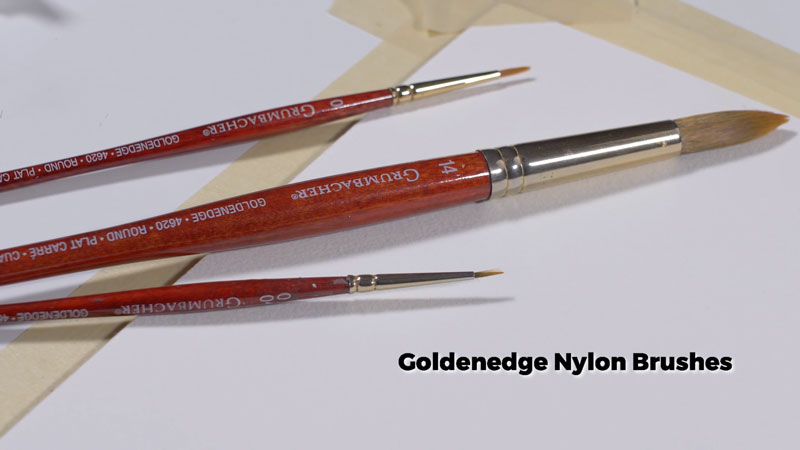
The materials used for this demonstration are basic. All you’ll need to follow along is cold press watercolor paper, a graphite pencil, a few watercolor paints, a bit of white gouache, and a few round nylon brushes.
It’s not necessary to use the same brands of materials that we use here. This lesson is designed to be an exercise, so think of this as practice. But if you do want to use the same materials, here are a few links to purchase these products…
(The following links are affiliate links which means that I make a small commission if you purchase without an additional cost to you)…
- Cotman Watercolor Paints
- 140 lb Cold Press Watercolor Paper (Arches)
- Grumbacher Goldenedge Nylon Brushes
The Photo Reference
We’ll work from a photo reference for this painting. In this case, I set up the paint tube so that it is at a diagonal which makes the composition a little more interesting. I also bent the tube to create a few more interesting wrinkles.
See also: Composition in Art
Here’s a look at the photo reference used in this painting…
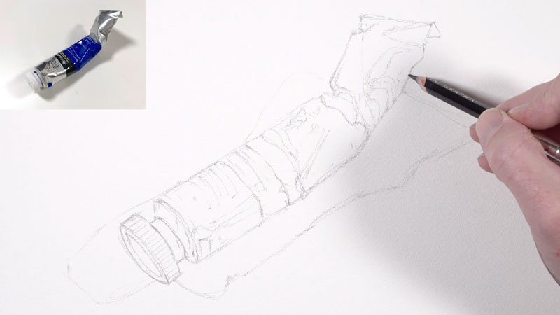
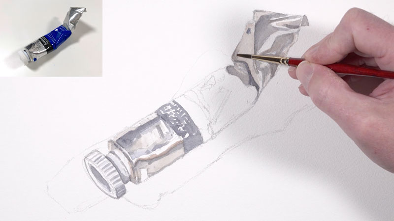
Start with a Sketch
We’ll begin with a loose graphite sketch of the paint tube on watercolor paper. This sketch is rather loose and completed with an “H” graphite pencil. This lighter pencil ensures that the majority of the graphite marks will be hidden in the final painting.
It’s ok to draw with several different lines. Don’t feel as though you need to make “perfect” lines and include all of the details.
Establishing the Grays
Our paint tube consists of a reflective surface and shiny surface. With exception of the strong blue section on the label and a dark band, the majority of the tube is made up a various grays and neutral colors. We can see both warm and grays in these areas.
See also: Warm vs. Cool Grays
We’ll first address the cool grays by mixing Payne’s Gray with a touch of Ultramarine. Payne’s Gray is a cool gray on its own, but adding a bit of blue cools it even further.
We’ll apply light, translucent applications of our cool gray to portions of the top and bottom of the tube, taking care to leave open spaces for the strong highlights.
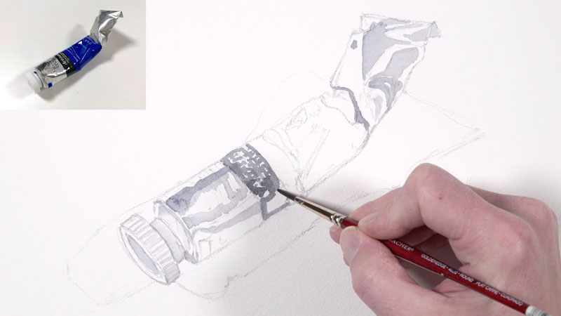
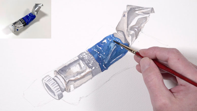
Next we’ll mix up a bit of warm gray and begin layering it over the top of the cool gray areas but also in open areas. Our warm gray is mixed by combining Burnt Sienna with a bit of Payne’s Gray.
When the warm grays are added, we can clearly see the contrast in color. Next to each other, the cool grays look very blue, while the warm grays appear orange.
Pushing Values
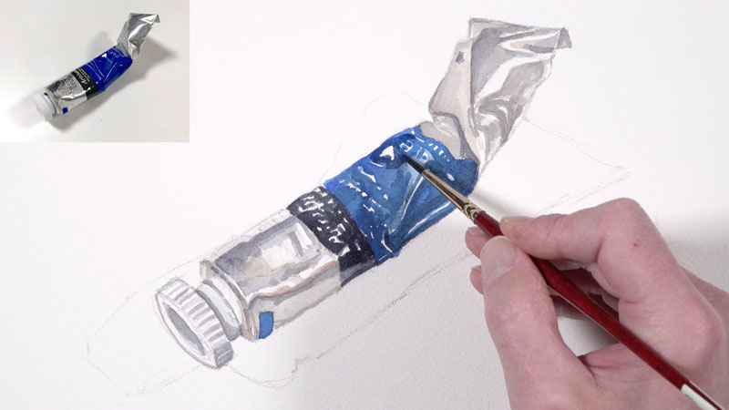
With our initial applications of watercolor in place, we can begin layering darker values over the top, gradually extending the range of value. At the same time, we’ll add some of the bolder colors like the deep blue on the label. This blue is simply a mix of Cobalt Blue and Ultramarine. As this color is added, care is taken to preserve some of the text and the strong highlights.
Using Payne’s Gray, values are made darker and layered over in the areas of shadow. The form of the tube begins to make more sense as the range of value is extended.
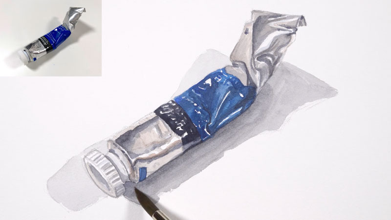
Once most of the colors are in place on the tube, we’ll add a couple of cast shadows underneath. Since we’re dealing with two light sources, we’ll see this cast shadow on both sides of the paint tube. The light originating from the left is a bit stronger so the cast shadow on the right front is darker. The second cast shadow behind the tube is weaker.
Painting Details
Now we’re ready to add the detailed text. This step may seem intimidating, but as long as you have a paper towel at the ready to lift mistakes, you can proceed with confidence. Since the text is rather small, we’ll use the 0 brush and tilt the board so that we can “write” in a more natural manner.
We’ll start with the dark text, using mainly Payne’s Gray.
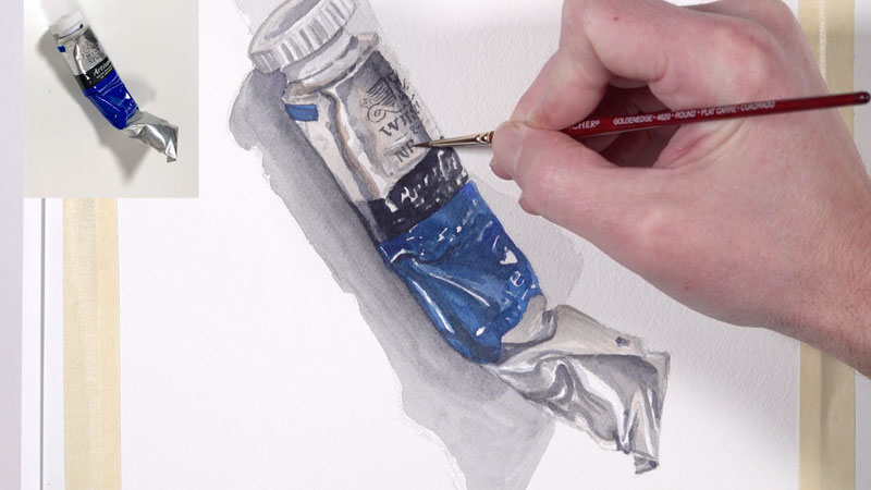
Then it’s on to the white text. Ideally, we would have left open all of the areas of white text. In this case however, we need to add the text with a bit of gouache. Gouache is opaque watercolor and layers nicely over the color already in place.
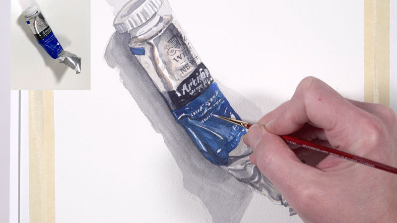
Finishing Touches
All that’s left at this point is to clean up the painting a bit. Using a darker mixture of Payne’s Gray and Ultramarine, we’ll refine the darker areas around the white text and add a few more touches of darker tone to enhance the contrast.
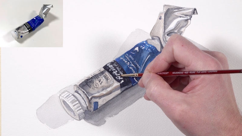
Painting a Watercolor Paint Tube with Watercolor – Conclusion
As you can see, this subject is full of unexpected challenges. The wrinkles, text, and details each contribute and make this simple paint tube a little more interesting than it may seem at first glance. But by taking on challenges, like those presented by this subject, we grow as artists and our skills improve.
Thanks for joining for me in this watercolor adventure.
If so, join over 36,000 others that receive our newsletter with new drawing and painting lessons. Plus, check out three of our course videos and ebooks for free.
Drawing With Water Soluble Crayons
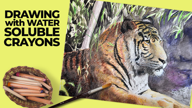
In this lesson, we’ll take a quick look at this interesting medium, see why these are not your “ordinary crayons”, and create a drawing.
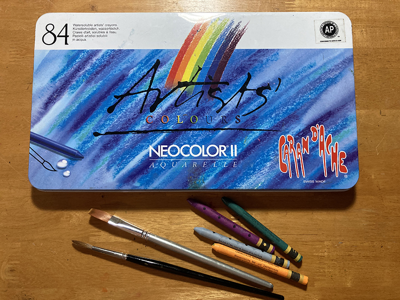
Variety of Marks with Water Soluble Crayons
These crayons can be used in a variety of ways. You can use them on dry paper or wet. You can use them as a painting medium or as a drawing medium. You can use them on fabric instead of paper.
Finished artworks created with this medium can take on the look of traditional, transparent watercolor, an oil pastel drawing or even a mixed-media piece. In this lesson, we’ll develop a work of art that reaches for as much variety as this medium has to offer.
The Versatility of Water Soluble Crayons
Water soluble crayons offer versatility because they travel well. You can use them in the studio or on location. A brush and a few ounces of water is all one needs to carry into the field. Or skip the brush and water until returning to the studio.
These crayons are slick, creamy and full of rich, bright pigments. Sets range in size from 10 to 84 sticks and are priced accordingly. There is an option for every budget, since you can mix colors through layering and activation with water.
Water Soluble Crayons in Action
Now, let’s take a look at how these crayons behave. Besides the crayons themselves, other materials used during this product test include:
- A 3/4 inch flat nylon brush
- A round sable brush
- A natural sponge
- Water
- 140 lb hot press watercolor paper
The following link is an affiliate link which means we make a small commission if you purchase…
Buy Water Soluble Crayons On Amazon
Since this is a new medium to me, I did a quick test (below) just to wrap my mind around the capabilities of this medium.
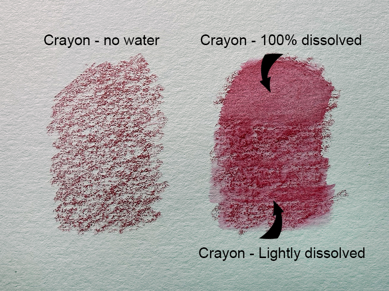
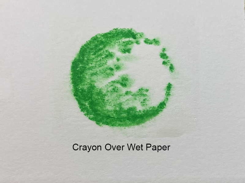
In the first test, I applied the crayon without any activation (adding water). You can see, in the image below left, that the texture of the paper is very evident.
To the right, you can see that I activated the crayon by layering water. The top of this swatch is fully saturated, eradicating much of the visible texture of the paper. Half-way down, I lessened the amount of water added. This resulted in a texture that was somewhere between the two. The texture of the paper is still visible, but to a lesser degree. This result is very similar to what we see with watercolor pencils.
See also: How to Use Watercolor Pencils
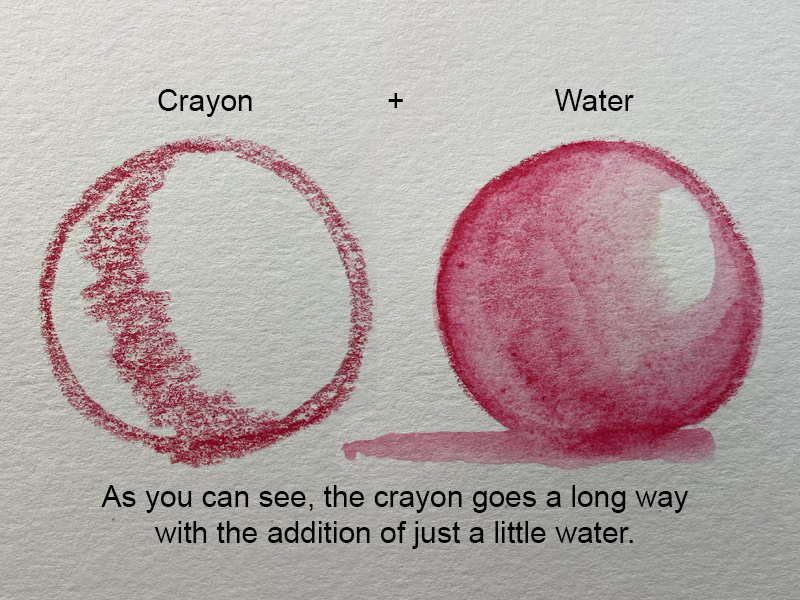
In my second test, I wanted to see how far I could extend the medium with water. I decided to draw a sphere. As you can see below, I only added the crayon medium to area of core shadow on the sphere. Using a bit of water, I was able to extend the medium to cover much more of the surface.
You can see from the above swatches that the crayons, when used without water, create a broken mark typical of traditional wax crayons. Using a brush dipped in water, one can entirely dissolve the individual marks or, with a delicate touch, only soften the marks made using the dry crayons.
Besides using a brush over the dry crayon marks, one can draw with wet crayons and/or draw on wet paper. Look at the green marks below. The top mark has the look of traditional crayons while the middle line, made with a wet crayon, looks darker and richer in color.
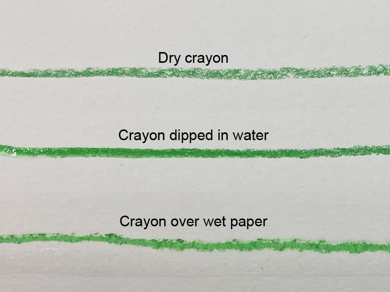
The bottom line, perhaps the most unique of the three, was made across wet paper. This line, compared to the other two, is irregular. Like the middle line, it’s more solid than the “dry” crayon line.
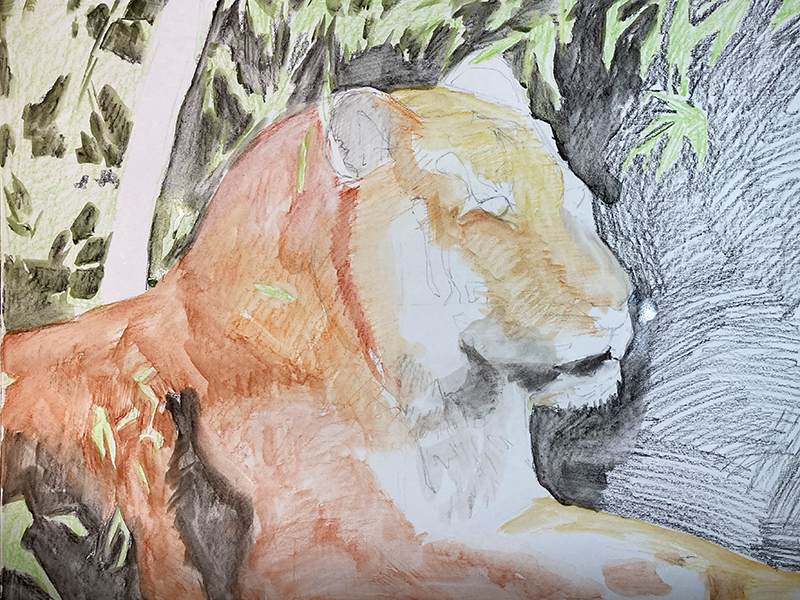
Drawing with Water Soluble Crayons
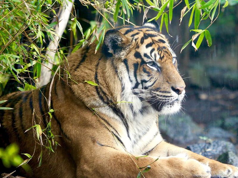
For this drawing, I worked on hot press (smooth) watercolor paper. The selected reference is a photograph of a tiger (below). The image is perfect for a secondary color scheme, so I used the oranges, greens and purples as well as a wide selection of neutrals from the 84-stick set.
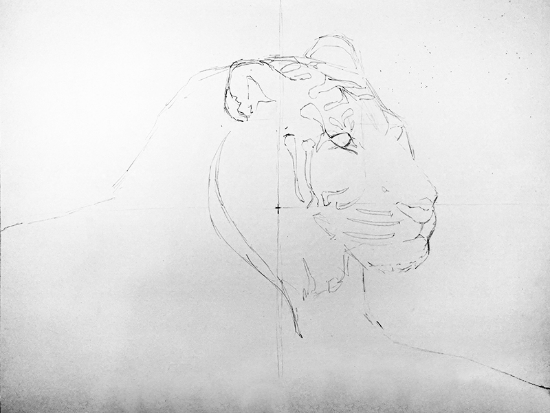
Step One – Line Drawing with Pencil
Though not a requirement, I chose to make a basic line drawing with a pencil before moving on to the crayons. Having a line drawing in place helps us to keep the image “tight”. The water soluble crayons are somewhat of a looser medium.
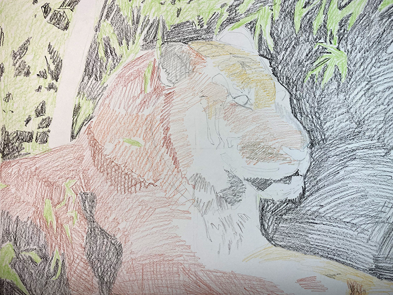
Step Two – Initial Applications with Water Soluble Crayons
Using the crayons, general colors were applied to the dry surface. From my test swatches, I knew that the application of water over lightly applied crayon would darken the values so I was careful to keep my first applications light. The tiger stripes, being dark, were entirely ignored in this initial application of crayon.
Step Three – Water Washes
Using the 3/4″ brush and water, I completely dissolved the crayons. Usually, from the very start of a watercolor painting, the artist must carefully preserve the white of the paper to act as highlights. I ignored that convention since I knew I could add white or light marks at the end given the covering power of these soft sticks.
Step Four – Building Up a Range of Value
The next step was all about building value. I basically repeated steps two and three until the values were closer to those observed in the reference image. A layer of crayon was applied and then dissolved. Once that layer dried, another layer of crayon was applied and dissolved. I began to purposefully manipulate my brush strokes while dissolving the crayon, at times working the brush in the same direction as the tiger’s fur.
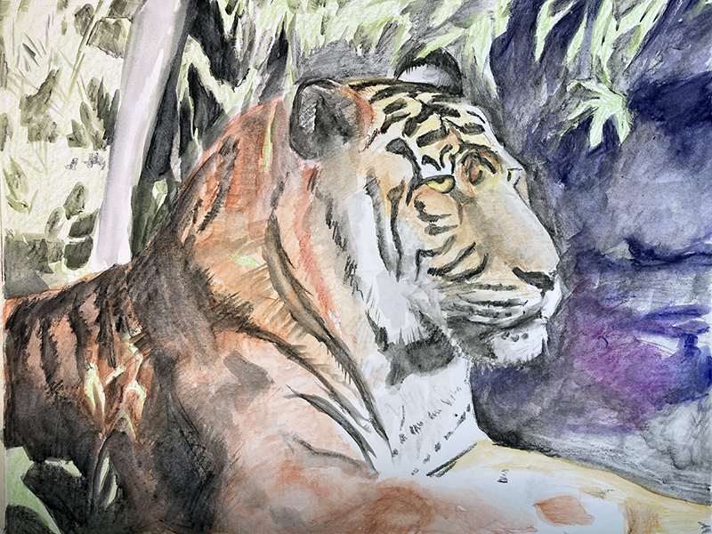
As my applications of crayon became bolder, I was able to actually paint with the wet pigment. That is, I could pick up color from one area and mix it into color in another area.
Step Five – Layering Dry Marks
My intention all along was to complete the project as I had begun – by drawing. I wanted to create some space in the artwork by separating the tiger from the background through a contrast in detail. To accomplish this, I began to draw over the painting using distinct marks meant to simulate the texture of fur. During this stage, I still worked around the tiger but continued to homogenize the background with a wet brush.
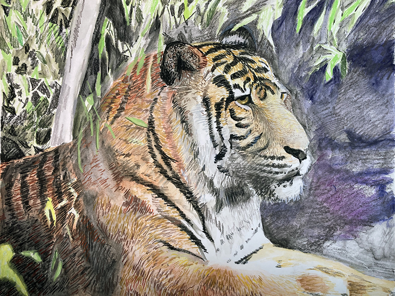
Step Six – Adding Details
The small linear details – like the tiger’s whiskers and the stems of the leaves, had been ignored up to this point. It was time to see if a wet crayon would indeed “float” these light details over the darker colors without losing their brilliance.
During this late stage of the painting, I was visually overwhelmed by the crayon marks that were drawn over the painted tiger in step five. I felt like, in some areas, the bold, staccato marks of the crayons were too distinct. My solution was to use a wet, natural sponge instead of the brush. I dabbed the wet sponge over the tiger in places, giving the sponge a couple of degrees of twist with each dab to further blur and soften the crayon marks.
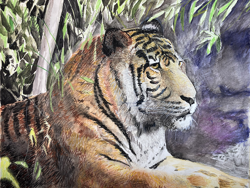
Protecting the Work
A completed water soluble crayon artwork is delicate and should be protected like a watercolor painting or a pastel drawing. That means having it framed behind a piece of glass. As an alternative, you can also seal it a couple of layers of floor wax. When using the floor wax method be sure to employ a soft, wide brush and try to cove the painting with as few strokes as possible to avoid disturbing the crayon marks underneath.
Working with Water Soluble Crayons – Conclusion
As you can see, this medium is quite versatile and provides the artist with a variety of ways it can be used. It’s unique but reminds me a bit of watercolor pencils. The methods and approaches are quite similar, as are the results.
If so, join over 36,000 others that receive our newsletter with new drawing and painting lessons. Plus, check out three of our course videos and ebooks for free.

How to Draw a Mushroom with Colored Pencils
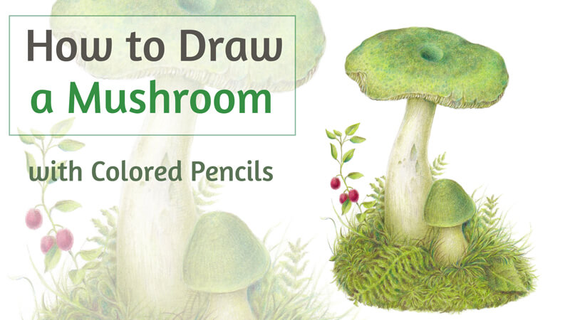
The mushroom that I’m going to draw is similar to a green russula. However, this project isn’t a botanical illustration in the truest sense of this genre. We can stylize the form, change the colors, and add or remove some details.
My goal for this drawing is to create an illusion of various organic textures. We’ll be dealing with two groups of objects – mushrooms’ caps and surrounding plants. They feature different textures but are similar in color. We’ll need to make a distinction between these two types of life so that the artwork looks interesting and varied while still harmonious.
Art Supplies for Drawing the Mushroom
To create an underdrawing, we’ll need a graphite pencil. I recommend an H or HB. Avoid using soft pencils since it may be difficult to erase their marks completely. Hard pencils may create indentations in the surface of the paper that will show when colored pencils are applied.
It will be useful to keep a sharpener at hand, and a couple of erasers (vinyl and kneaded).
I’ve chosen a sheet of thick drawing paper.The surface has some subtle texture, which is a great fit for colored pencils.
If you wish to make your artwork resemble a vintage-style botanical illustration, consider drawing on toned paper. A subtle beige or creamy tone is a wonderful option for this project.
See also: 9 Must Have Colored Pencil Supplies
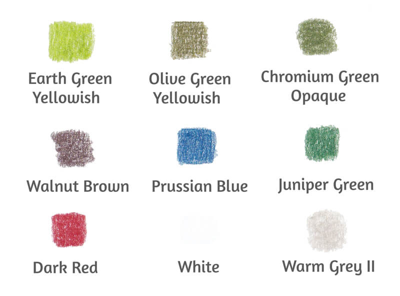
My colored pencils are Faber-Castell Polychromos (Affiliate Link), but feel free to use any colored pencils you like. Below you’ll find the colors that I’ve chosen for this project.
Draw the Mushroom with a Graphite Pencil
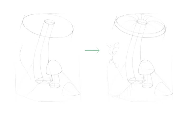
Before we start working with colored pencils, it’s necessary to create the outlines (or contours). I recommend planning your composition beforehand. Create a miniature sketch or just draft a rough model of the image in your mind. Will there be any secondary objects like leaves, twigs, or berries? Now is the time to make these decisions.
First, I mark the boundaries of the drawing and set the composition. I decided to go for a couple of mushrooms instead of just one, but the second fungus will be smaller. It is supporting its larger and older neighbor.
I add a couple of guiding lines that mark the floral elements. I also mark a stylized shape of the leaf in the lower portion of the drawing.
As you can see, I’m presenting the mushrooms as a set of forms that have some volume. This positioning helps to create a more credible, realistic drawing.
Note that the cap of the larger mushroom has a specific relief. There is a shallow hollow in the middle of the cap’s top, and the cap is bending downwards along its edges.
You don’t have to draw all of these imaginary ovals and core lines, but these marks help me to create a structure for the drawing. Keep your lines as light and few in number as you can. My outline is relatively heavy for a colored pencil drawing in order to demonstrate the construction process. It may be helpful for some beginning artists to see these steps.
See also: Drawing Basics – Construction
At this step, ask yourself if you like the composition? Are you pleased with the general impression of your basic sketch? If yes, let’s proceed. However, if there is something that needs to be changed, take your time to make those tweaks. Having a balanced composition is extremely important.
See also: Composition in Art
Next I refine the mushrooms. I change the shapes of the caps and stems. The contour lines should be organic, just as the objects are that we’re drawing. I erase all the unnecessary graphite marks as I go.
I mark the hollow in the cap of the bigger mushroom. The younger fungi usually don’t have this feature.
I draw the details of the cap’s underside, indicating the gills.
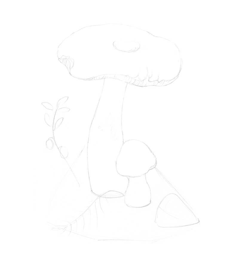
I add the surrounding elements. I draw the sphagnum moss, applying short lines that go in different directions. There are several moss-like elements of varied sizes, resembling small fern leaves. It’s good to have some variation of shapes in order to add variety and create a more natural appearance.
I refine the twig of the red whortleberry, adding more leaves. Note the direction of the upper leaves – they guide the viewer’s attention to the larger mushroom.
The leaf gets some veins as well. Remember, you don’t have to outline all of the details – only the ones that you feel are essential.
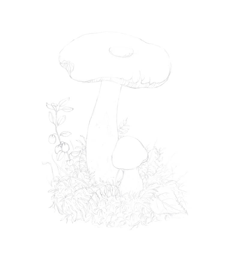
Drawing a Mushroom with Colored Pencils
Before making marks with colored pencils, let’s first evaluate the intensity of the graphite pencil marks. Excess graphite left on the surface can contaminate the colored pencil applications. Lift any bold marks with a kneaded eraser.
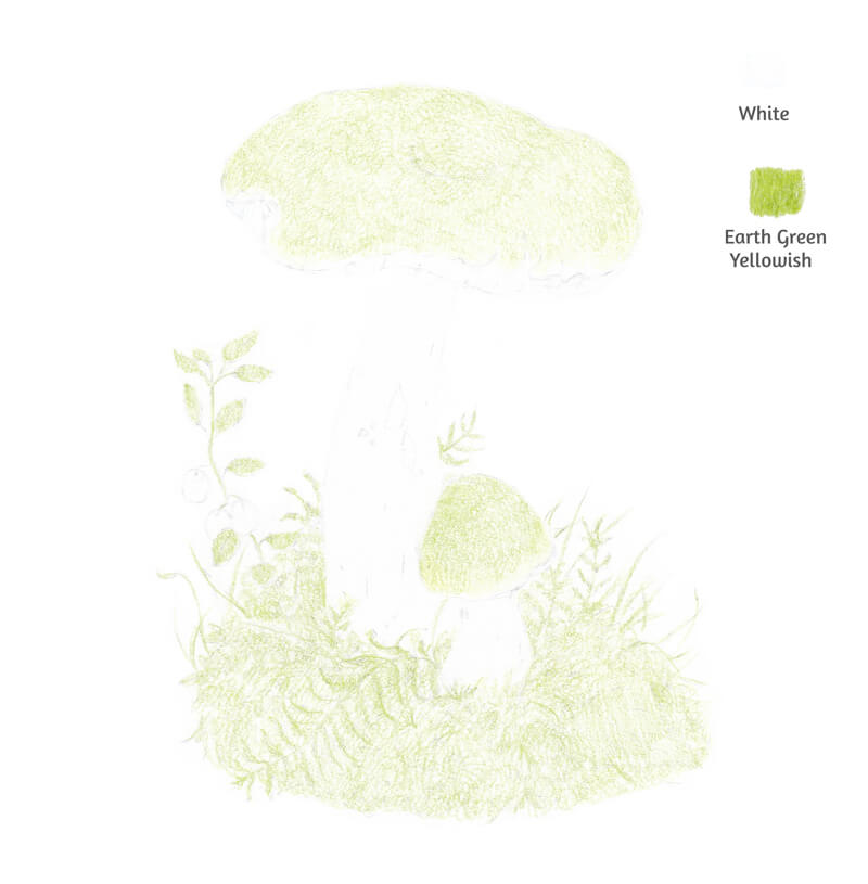
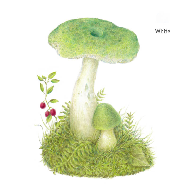
We’ll first do some work to preserve some of the lighter values. I cover the mushrooms’ stems and the undersides of the caps with White. A white layer will show through the subsequent applications, affecting their value and, less significantly, the hue. A white under layer makes it easier to restore a light tone, if so required later in the process.
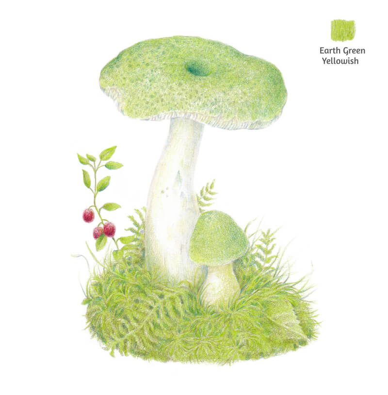
Then I cover the caps with Earth Green Yellowish. I also add this color to the floral elements around the mushroom, creating a base layer.
Keep the pressure light on your pencil. You can create small circles or directional lines – the technique is up to you. When working on grass and moss, I recommend that your marks flow in the same direction as the plants grow.
See also: 12 Colored Pencil Tips
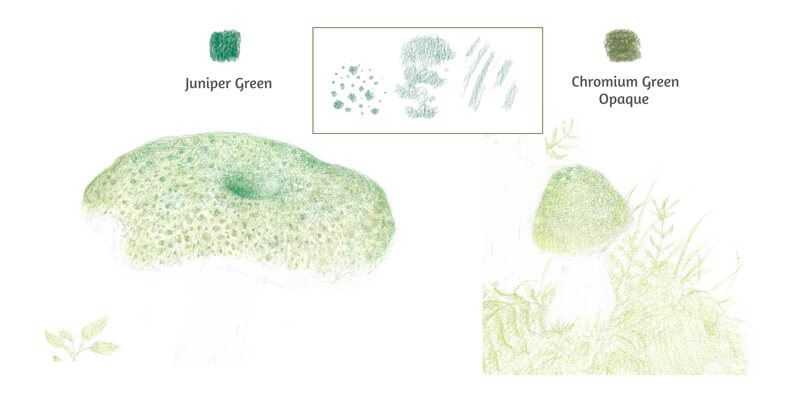
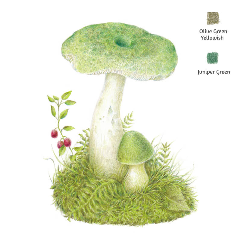
Now it’s time to start creating the pattern on the mushrooms’ caps. I work with Juniper Green and Chromium Green Opaque. These colors belong to the green family, but their perceived temperatures are quite different. The first color is cooler and the second one is warmer. Using them together creates variety.
You can choose to use the cooler hue mostly in the lower part of the cap and the warmer one in the top area. Or, apply them interchangeably.
The pattern consists of separate rounded shapes of different sizes. Some areas get a uniform covering – this is especially true for the central parts of the caps. You’ll find my samples of marks in the image below.
Young fungi usually have a less pronounced texture, so I avoid drawing too many separate spots on our smaller mushroom.
I also mark the hollow in the center of the bigger mushroom’s cap.
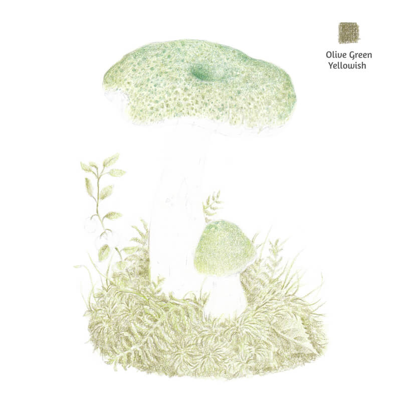
I add Olive Green Yellowish to the bottom part of the drawing. I mark the darker areas, including the gaps between the grass blades and in the moss. Inspect your drawing at this point. Your marks should conform to the pattern of shadows. However, the moss texture is quite forgiving, so developing a rough interplay of lighter and darker areas will get you a suitable result.
This green has a pronounced inclination to a dark, muted yellow sub hue. Using it to draw the floral elements will make the artwork more realistic.
Also, I intend to influence the caps and surrounding plants so that they differ in terms of color temperature. In my mind, the caps should be slightly cooler than the grass and moss.
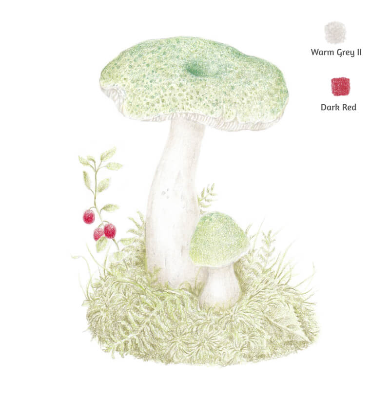
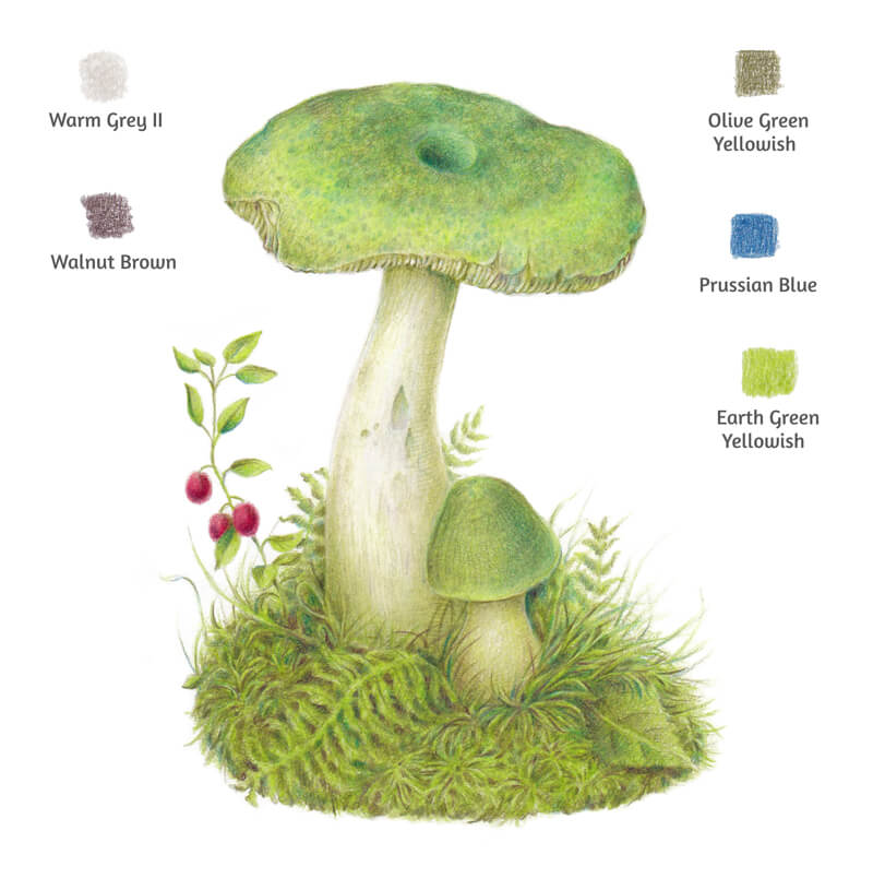
With Warm Grey II, I develop the core shadows on the mushrooms’ stems. The texture isn’t completely smooth so feel free to add some details of relief – for example, small cuts, bumps or hollows.
I also draw the gills on the larger cap’s underside. When you’re working on details, keep the tip of your pencil sharp for added control and precision.
I cover the red whortleberries with Dark Red. The shadowed areas get additional layers of color – making the color richer and darker.
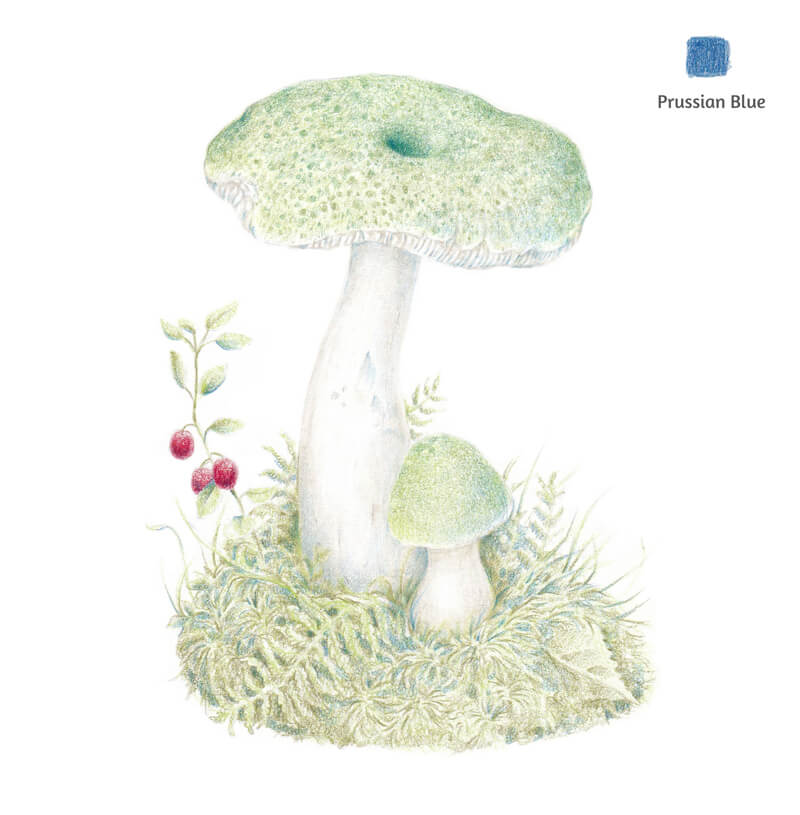
I add some Prussian Blue to the shadows. Be careful and keep the pressure at a minimum, especially when working on the lightly colored areas.
Too much of this blue hue may look unnatural. In small amounts, it gives the shadows a natural feel.
At this point, we still see too much of the paper showing through the drawing. The artwork looks slightly raw and rough. It’s time to increase the density of color.
I add another layer of color to ensure solid coverage with Earth Green Yellowish. The caps, leaves, moss – everything becomes much more saturated. All of the existing applications of color still show underneath, increasing the complexity of the color in the drawing.
Now we can increase the pressure on the pencil. (But just slightly!)
With Juniper Green, I make the pattern of the caps more noticeable while also strengthening the darker areas.
I apply Olive Green Yellowish to the floral environment. I like the existing bright green hue, but it needs to be muted down to look more realistic. At this step, the tip of my pencil is very sharp.
I also add this green to the mushrooms’ stems. There are cast shadows that the caps cast on the stems – we should intensify them. Some strokes of this color may be added to the caps as well.
Optionally, you can add more strokes of Earth Green Yellowish to the environment. Use this pencil if the layers of color are still lacking the desired intensity.
Now we have enough pigment on the paper – it’s time to burnish our drawing. I’m going to use the White pencil to complete this process. Burnishing smooths out any remaining surface texture produced by the texture of the paper. This step will make the drawing look more like a painting.
I pay particular attention to the mushrooms’ caps and stems. The goal is to polish the surface so that no tooth grain is showing through. Burnishing moves the pigment around, so some areas may appear slightly lighter after this process.
Using White for polishing the artwork is not the only option. If you’re a more experienced user of colored pencils, I suggest burnishing some areas of the caps with Warm Grey II and Earth Green Yellowish to create more variety.
The drawing is almost complete. All that’s left are a few minor changes that will enhance the result.
With Olive Green Yellowish, I enhance the details of the larger cap’s underside gills. In order to develop these details, the pencil tip is super sharp! I also add this shade to the darker areas of the stems, carefully applying the pencil with short hatches.
With Warm Grey II, I mute the brightest areas of the stems.
I add just a bit of Prussian Blue to the shadows in the moss. I also use Walnut Brown to increase the contrast in this area. You can apply the pencil in a soft shading manner or draw single lines that simulate grass or moss elements.
Lastly, I evaluate the drawing once again and make sure that there are no specks of white paper showing through. Earth Green Yellowish may be used to fill in any remaining specks of white.
How to Draw a Mushroom with Colored Pencils – Conclusion
Thanks for joining me on this journey. As you can see, it doesn’t require a ton of colors to create complexity in a colored pencil drawing. Even a simple subject, like this mushroom, can lead to a rather complex colored pencil drawing. Be sure to start with a solid graphite sketch and patiently layer colored pencil applications. Most importantly, enjoy the process.
If so, join over 36,000 others that receive our newsletter with new drawing and painting lessons. Plus, check out three of our course videos and ebooks for free.