In this step by step painting lesson, we’ll look at the decisions that go into starting a realistic still life of vegetables and the steps taken to complete such a painting with oils.
Choosing Your Subjects for Still Life Painting
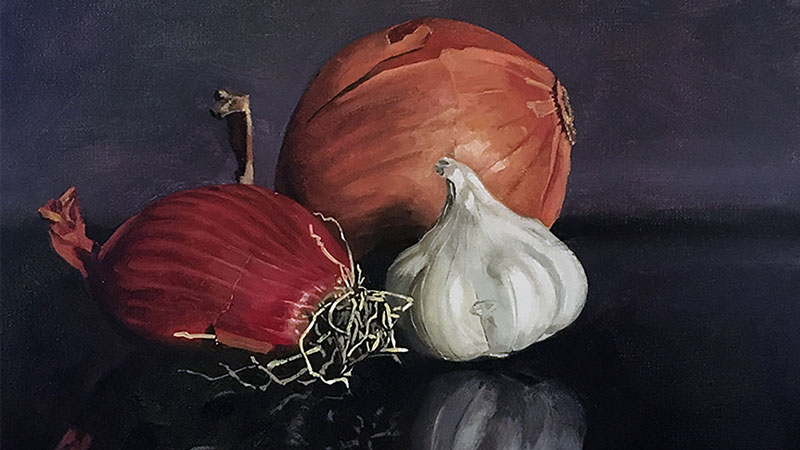
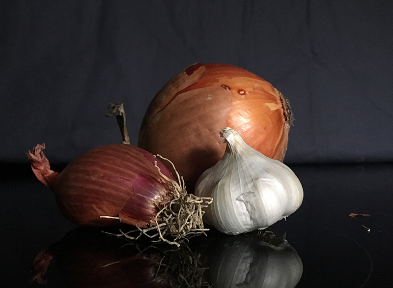
Although still life arrangements don’t have to be made up of related objects, choosing a collection of related objects does add to the harmony of the painting. For this reason, we’ll choose a group of fruits or vegetables that relate in some way. In my example, I chose to paint garlic and onions. Their flavors are often paired together, at least in some of my favorite recipes.
How else might fruits or vegetables relate? You could choose all citrus fruits or vegetables from a specific region. Color could be the driving factor in your selection.
After choosing my vegetables, I noticed that the two onions had an analogous color relationship. So, I chose a background color that was analogous as well – the red onion, orange onion, and purple background are all analogous to red because purple and orange are made with red.
So, my vegetables relate in two ways – flavor and color.
Choosing an Arrangement
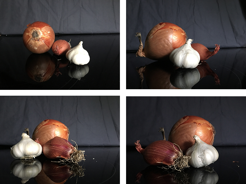
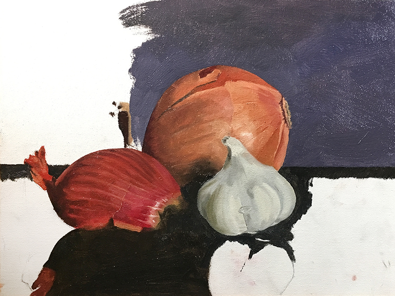
When choosing your arrangement or the positioning of the subjects, don’t just set them down and start painting. I only have three items in my composition but I arranged them in numerous ways and took six reference photos. Then, looking at two at a time, I compared photos and eliminated options until I had one reference left that felt like the best composition.
See also: Composition in Art
The option I chose was actually the last option (see below, bottom right). Had I gone with my first arrangement, I would have been less satisfied with the final painting. Take your time with this step and you won’t be disappointed.
Choosing Colors for Still Life Painting
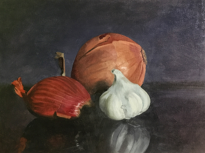
Take a closer look at the reference photo I selected (below). I used the colors in the reference photo to help me choose my pigments prior to mixing.
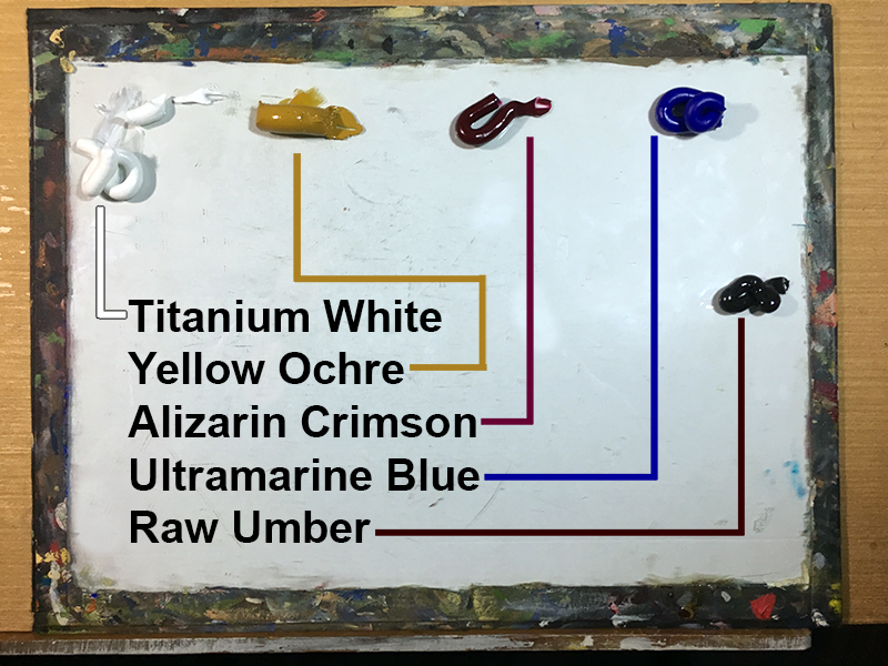
When I paint, I use the three primary colors plus white and sometimes brown. Among the primary colors, there are many pigments from which to choose. Remember, there are different yellows, reds, and blues.
For my yellow, I chose Yellow Ochre because I didn’t see any really bright yellows in the reference photo. Yellow Ochre is a dull “earthy” yellow. For my red, I chose Alizarin Crimson because of the very cool red area near the roots of the onion.
Since the cloth in the background is a dull purple, I chose Ultramarine as my blue. Ultramarine is considered a warm blue, which means it leans toward purple rather than green. Therefore, it will make a suitable purple.
You’ll see that on my palette below, I have raw umber, but no black. I like to make a dark value by mixing Ultramarine and Raw Umber and use this color as my “black”. Doing so results in tighter, cleaner mixtures. Black is strong and so dark that it often stands apart from the other colors. It can also make your painting appear flat or unnatural.
If you’re not sure what pigments to use for a particular subject, then you may try a warm and cool version of each primary color and make your choices based on your mixing experiment. The more experience you have with painting, the better suited you are to make decisions regarding the colors you’ll need on your palette.
Painting a Still Life With Oils
If you’re following along, you’re free to use any opaque medium you prefer. In this example, I’m working with oil paints and using medium to thin the paint.
Step One – Mixing Colors
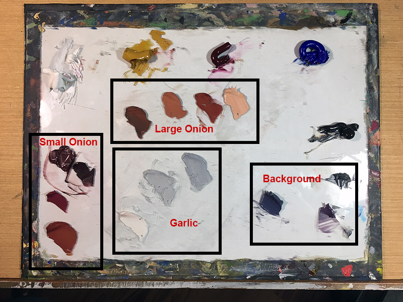
I like to premix my colors before I start painting most of the time. Doing so gives me a chance to critically analyze the colors as I see them before switching my focus to modeling form and measuring proportion and so forth.
You’ll notice in the reference photo that each vegetable is really two subtle colors and not just one color. The garlic is not only white. Some of it is a weak yellow. Look at the big onion. See how the right half is more orange than the left half. These small details are important and you can address these nuances in this first step by mixing multiple colors for each vegetable.
Step Two – Drawing the Subjects
Next, we’ll begin lightly drawing the subjects. Be careful though and don’t draw too much. This is a painting and you must save the details for the paint. Drawing the details will not make the process easier and you’ll just get frustrated because your brush won’t fit into the tiny details you drew with a sharp pencil.
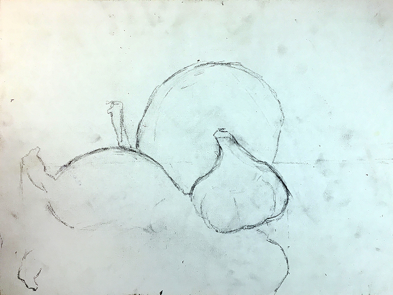
Instead of drawing all of the details that you notice, focus on the hard edges instead. See how I didn’t even draw the bottom of the smaller onion. That’s because I can’t actually see it. I also ignored the pattern on the onions and will save that for the painting process.
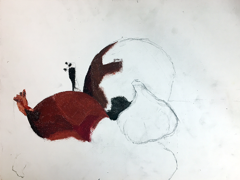
Step 3 – Blocking In With Paint
The block in stage is simply painting in the premixed colors in an effort to cover the canvas. See the smaller onion in the example below. You can block in the entire painting before moving to step four or you can bounce between steps three and four. You’ll see that what I have done is the latter.
Step 4 – Model the Details
In this case, we’ll model the subjects as we block in the colors. Modeling is basically the process of changing the value of the color to create the illusion of form and texture. Highlights are typically rendered using a tint, or lighter value of the color. Shadows are developed using a shade, or darker tone of a color. The positioning of the darker and lighter values, along with the mid tones, leads to the illusion of form.
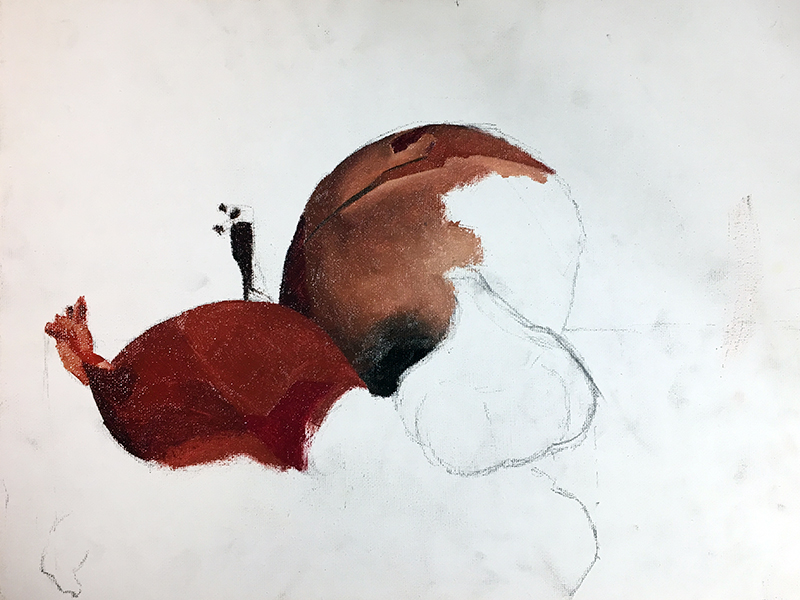
Of course, the details are captured during this step as well. I captured the detailed patterns on the onions while they were still wet. I was able to drag the lighter and darker colors through one another to create the stripes. Had I painted the stripes as a second layer over dried paint, it would have been more difficult to get the stripes to look like they are part of the onion skin and not just stripes on top of the onion skin.
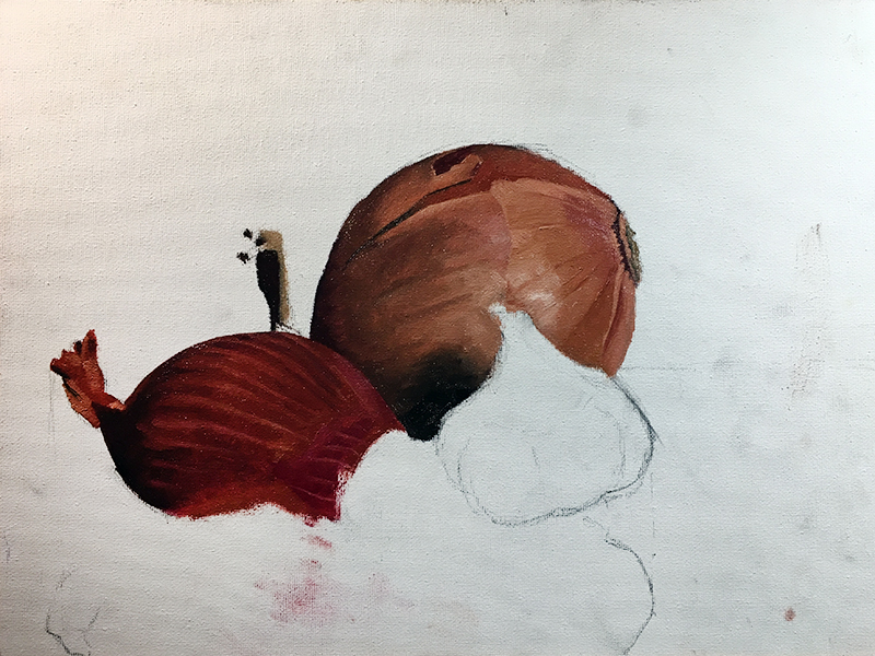
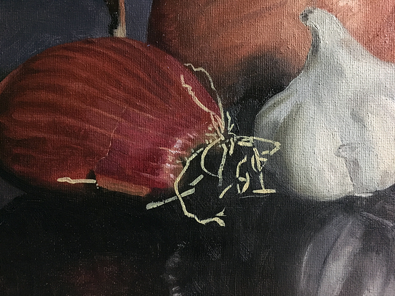
Step 5 – Planning for the Onion’s Roots
The onion features a few distinctive roots. These roots create interesting lines and add variety to the painting. I decided to finish the red onion behind where the roots will be before addressing the roots. The roots themselves are such a crisp, fine detail that it will be easier to paint them over a dry layer. I’ll finish the onion completely before returning to the onion roots.
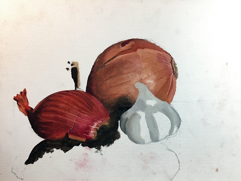
Step 6 – Using Negative Space
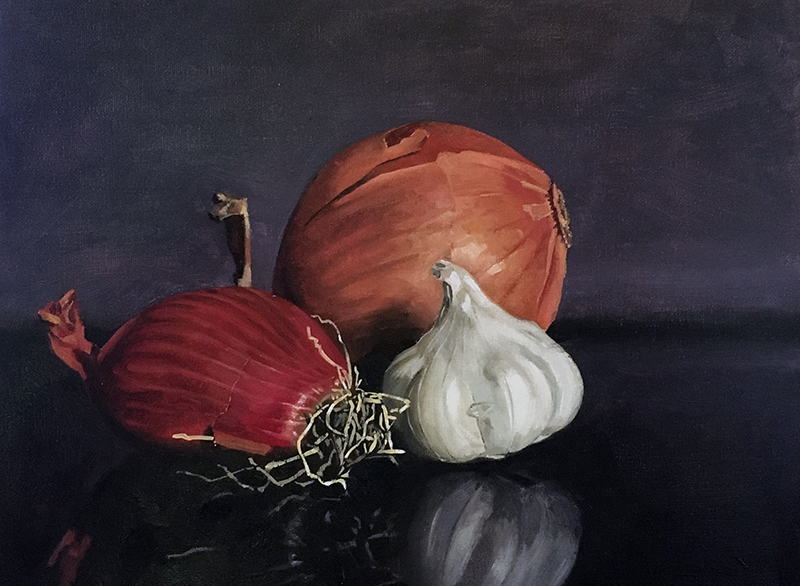
You’ll notice that the vegetables were nearly finished before starting the ground plane and the background. I like to paint these surrounding elements last because it gives me a chance to refine and adjust the contours of my subject. In this case, I am considering these areas to be the negative space within the scene.
I carefully work around the edges of each of the vegetables within the scene, adding a muted purple to the background. The foreground is darker and more neutral, using a mix of Raw Umber and Ultramarine. For added realism, allow for a bit a variety in your mixes in both sections.
Step 7- Final Touches
The onion roots and subtle reflections are the final touches that are left to be added. At this point, the painting is nearly dry to the touch and I can paint the roots without my colors mixing with the layer underneath.
As with the vegetables, I premixed more than one color before starting the roots. Look at the detail below. Compare it to the reference and you’ll see that I painted all of the lightest values in first, skipping over the darker, grayer roots. They were painted after a basic shape was developed, then a few, very light and dark marks were added for variety.
You’ll also notice the subtle reflections in the dark foreground underneath the subjects within the scene. These subtle reflections are added with light applications of the same colors used on the subjects. They should be less intense and in this case, darker than their sources.
Vegetable Still Life Painting – Conclusion
Fruits and vegetables are traditional subjects for still life painting for good reason. They feature a variety of colors, values, textures, and forms that can challenge the artist. However, since the contours are usually fairly simple, you can concentrate on painting sooner without spending lots of time drawing. If you’ve never had the pleasure of painting fruits and vegetables, then give it a try. They make great models and everyone will relate to your subject.
If so, join over 36,000 others that receive our newsletter with new drawing and painting lessons. Plus, check out three of our course videos and ebooks for free.

Landscape With Oil Pastels – Expressive Marks
Expressive Brushstrokes with Oil Pastels
In this pastel lesson, we’ll take a look at drawing a landscape with oil pastels. Oil pastels can be used in a number of different ways and each approach affects the look of the finished work. In this lesson, we’ll use the medium to create defined “brushstrokes” to create an image that looks as if it was created with thick applications of oil paint.
Materials for this Lesson
The brand of oil pastels that we’ll use for this image is especially important. Oil pastels, like all art media, is produced by a variety of manufacturers. Each manufacturer has a different approach which leads to a broad spectrum of characteristics across the same medium. For example, oil pastels made by Sakura (Cray Pas) behave differently from those made by Sennelier. Some artists will prefer the control they get from Sakura oil pastels while others will prefer the painterly look produced by Sennelier.
Both brands of oil pastel mentioned above are capable of producing a “painterly” look. However, Sennelier oil pastels produce an almost impasto surface texture, with the material raised off of the drawing surface. This characteristic exaggerates the look of brushstrokes and it’s for this reason we’ll work with Sennelier oil pastels to complete the landscape.
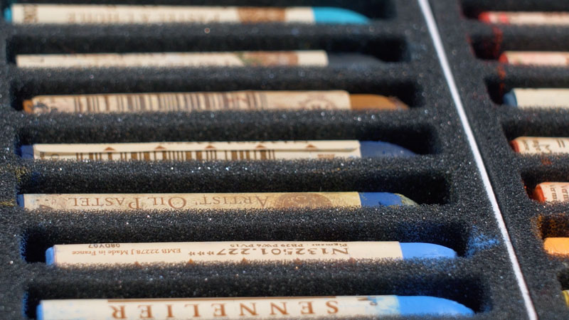
The surface that we’ll work on is also important. For this image, I’ve decided to work on Canson Mi-Teintes pastel paper, applying the medium to the heavily textured side of the paper. The extra tooth or texture of the paper will allow us to make multiple layered applications of oil pastels. A paper with a weaker tooth would hinder us from making so many layers. An orange surface will give the image warmth as small specks of the paper will still show through in areas.
See also: All About Drawing Papers
Here are the specific materials used to create the art with links to purchase. (The following links are affiliate links which means that I make a small commission if you purchase without an additional cost to you)…
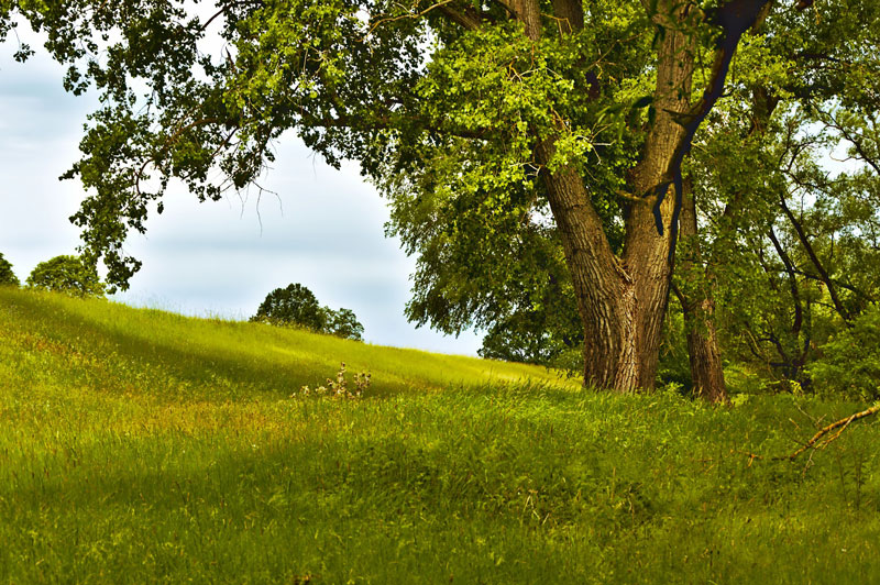
The Photo Reference
We’ll work from a photo reference to complete the image but make a few alterations during the process. So instead of copying the reference exactly, we’ll alter the art to make our painting more interesting.
Here’s a look at the photo reference used in this drawing…
Blocking In Initial Shapes
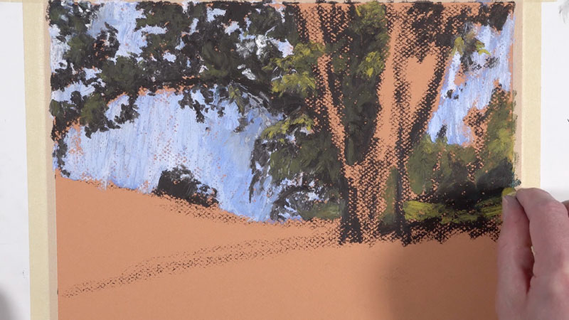
We’ll begin the drawing by loosely blocking in the shape of the tree with a very dark brown. Light pressure is used to apply the oil pastel in this early part of the process.
Once a looser indication of the shape of the tree is in place, we can block in the sky behind it. First, a light blue is applied. Over the top, a white follows, mixing with the light blue as it is applied.
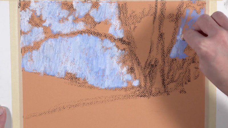
With the sky established, we can go over the lighter applications of dark brown with a heavier application. This time, we’ll add collections of leaves and smaller shapes, further refining the overall shape of the tree.
Next, we can refine the shape of the main tree and the smaller trees behind it. Gradually, we’ll begin pulling up the value by layering slightly lighter versions of yellow-green over the darker shapes of the tree established in the previous step.
As we develop the value and color, our tree begins to make more sense as a form.
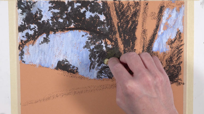
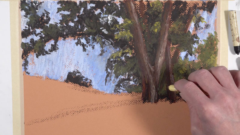
Adding Texture to the Tree
Next, we’ll begin work on the trunk of the main tree. Layering is important as it will add complexity to the color. We’ll begin with a dark reddish-brown, establishing the shape of the trunk and larger branches. Then over the top, we’ll apply dark brown in the shadowed locations. Grays and light creams are added on the side of the trunk receiving the majority of light.
Mostly vertical, directional strokes are made – working their way up the form of the tree to create the impression of texture. These applications are just the beginning as we will return to the trunk throughout the process.
Adding More Variety to the Leaves and Smaller Branches
We’ll continue layering a variety of yellow-greens as we continue to pull out the forms of the collections of leaves. These collections overlap the branches and the trunk, further creating the illusion of space and depth.
We’ll also pull out a few smaller branches within the canopy of the tree. The back edge of the pastel stick allows us to create these lines with an otherwise bulky material. Both dark brown and white branches are added for variety and a sense of realism.
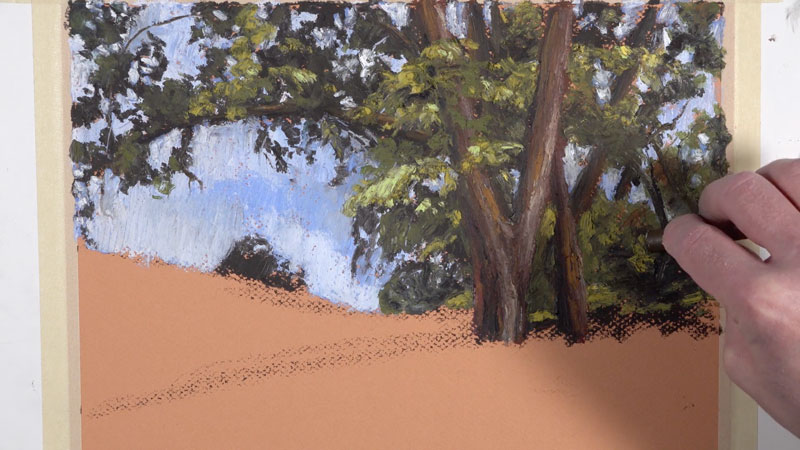
Pushing Color
We’ll continue to add sections of progressively lighter yellow-green applications to the leaves as well as additional layers of oil pastel to the trunk and larger branches.
We can also bring in additional interest with a bit of color. By adding a bit of blue to the shadowed areas within the canopy of the tree, we can add a little “punch” to the image. A darker blue, similar to Ultramarine, is used to add some color to the shadowed areas within the tree. This color mixes with the darker tones underneath which mutes it.
In the same way, yellow can be applied over some of the highlighted sections, making the light feel warmer and the highlights more colorful.
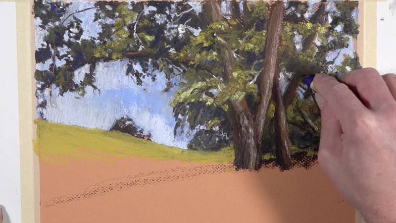

Adding the Field of Flowers
Working down the picture plane, we’ll now turn our attention to the field. As you may have noticed, our reference doesn’t feature any flowers. But to make our drawing a bit more interesting, we’ll add groupings of flowers in the field. The addition of the flowers will not only make the art more interesting but will also help to create the illusion of space while pulling the viewer’s eye to the main focal point – the large dominant tree.
We’ll begin by filling in the distant field with a light yellow-green. As we work down the picture plane, closer to the viewer, we’ll add more variety by introducing different greens, natural yellows, and blue-greens.
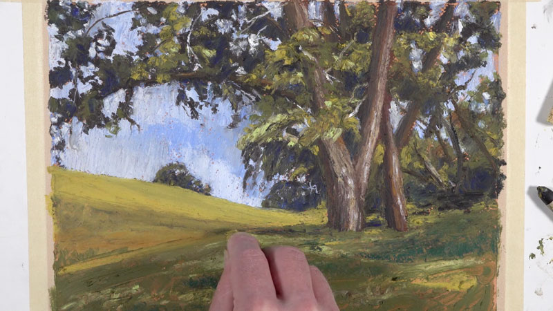
Once we’ve developed some variety in the foreground, we’ll return to the distant field, adding small marks with white to indicate the groupings of flowers.
As we work to the foreground, the flowers become larger, with more space between each flower. Details are still suggested, even though the flowers are closer to the viewer. Variety in the marks made in the foreground help to insinuate details without rendering them completely.
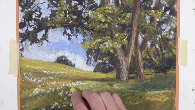
After we have the flowers in place, we can add the finishing touches to the image. We’ll continue to layer additional greens in the foreground, pulling strokes in the same direction as the grass grows. In the shadowed areas, blues and blue-greens are applied. In the areas that are saturated with sun, lighter yellow-greens are applied.
On the trunk of the tree and on the larger branches, we’ll add a bit of color with an intense red. The addition of this red contrasts the greens around it and brings additional focus. The red on its own, however, is too strong. To mute it slightly, a dark brown is added on top, while still allowing some of the color to show through.
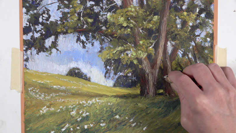
After the final applications are made, our oil pastel landscape with bold expressive “brushstrokes” is now complete…
Expressive Landscape Drawing with Oil Pastels – Conclusion
Oil pastels are a unique medium. They behave in a completely different manner than their soft pastel cousins. When used in the manner that we’ve covered here, they are capable of producing the look of an oil painting, complete with expressive “brushstrokes”.
Thanks for joining me on this artistic adventure and I wish you the best in your own oil pastel creations.
If so, join over 36,000 others that receive our newsletter with new drawing and painting lessons. Plus, check out three of our course videos and ebooks for free.
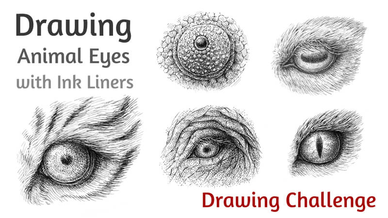
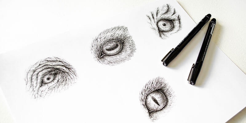
How to Draw Animal Eyes with Pen and Ink
The Challenge – Animal Eyes with Ink
In this pen and ink lesson, we’ll take a look at drawing several different animal eyes. Each set of eyes is extremely different from the rest making this a wonderful drawing challenge.
You’re probably familiar with at least several art challenges out there that people have devised. Some of them are large-scale and social. They may be conducted in a particular month, prompting people all over the world to draw and share their creations.
This kind of activity usually requires a commitment to complete some sort of work over a specific period, often with some level of regularity. Art challenges encourage us to focus our attention on a particular topic or medium. But an art or drawing challenge can be individual endeavor as well – centered around specific medium or subject – or better yet – a specific subject AND medium.
Anyone can create a plan for an individual art challenge. Here are several questions to ask yourself when planning your own art challenge…
- What’s your goal or desired outcome of this challenge?
- What are you going to draw – what’s the subject?
- What art medium is optimal for your challenge?
- How many drawings should be in the complete series?
I’ve decided to create my own little art challenge, exploring the subject of animal eyes with pen and ink. These drawings are just a starting point since there is so much diversity out there pertaining to this subject.
We’ll draw five examples of eyes together. If this subject inspires you, feel free to continue the series and make it your own art challenge as well.
Drawing Materials
I’ll be using an HB pencil and an eraser to create underdrawings. A 0.05 and 0.1 ink liners are used to complete the drawings and develop the texture and value. Each drawing is small, only about 6×7 cm, so all five of them can easily fit onto a single sheet of drawing paper. But keep in mind – the larger your drawing, the more details you can add to it.
What Can We Observe?
Let’s take a quick look at several aspects to consider when drawing animal eyes.
1. Notice the position of an eye. Compare the size of the eye with the size of the head.
When it comes to drawing a small part of a complex object, it’s easy to lose sight of the bigger picture. The eyes are located on the head of an animal, and the specifics of the anatomy of the head greatly influences the appearance of the eye.
The eye sockets of some animals are quite large in comparison with the size of the skull. Usually, this is true for creatures that are active at night. Larger eyes have evolved to allow the animal to see better at night.
Eyes that face forward on a skull suggest that the animal is a predator. Such eyes allow for better judging of depth, which helps to track and pursue prey.
If eyes are located on the side of the head, it may be the sign of a prey animal. This kind of placement allows for greater peripheral or side vision. This helps the animal see predators approaching from the side or from behind.
2. Observe the shape of the pupil.
The shape of the pupil is closely related to the animal’s size and whether it is a predator or prey. There are three most common shapes of pupils:
- Vertical
- Horizontal
- Round
Of course, there are exceptions and not all animal eyes will fall into one category. For example, the pupils of a Cuttlefish resemble the letter “W” and dolphins have pupils shaped like crescents.
Animals with vertical pupils are most likely ambush predators. Such pupils allow for accurately judging the distance to the prey.
However, this rule is true only if the animal is short, so its eyes aren’t too high off the ground. A clear example of this principle is the difference between house cats and their lager relatives. Small cats have vertical slits, but the pupils of tigers or lions are round.
Round pupils usually can be found in taller hunters that actively chase down their prey.
Prey animals are very likely to have horizontal pupils. This kind of shape provides an animal with a panoramic view, so they can scan in all directions for danger.
3. Note the features of the eyelids, eyelashes, and other details.
There’s clearly more to drawing the eye than the eye itself. We must also consider the areas that surround the eye including the eyelids, skin and/or fur. The eyelids, in particular, can be quite varied.
For example, camels have three eyelids. These complex eyelids help to protect their eyes from sand. Their eyelashes can measure up to 10 cm long!
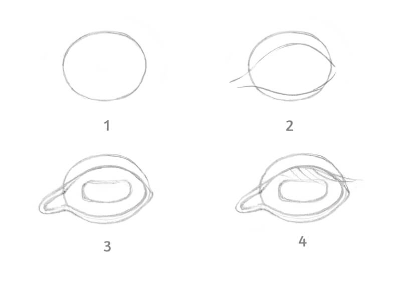
A Process for Drawing an Animal Eye
We’ll first need to gather reference photos or a tame animal to draw from life. Remember, drawing is at least 50% observation, so we’ll need something to observe!
No two eyes are exactly the same. For this reason, it’s impossible to develop one process that will work for every eye that you encounter. However, there are a few general steps that will help you as you go through the process of observing and drawing.
If we try to determine any specific steps, the sequence may look like this:
- Start with a rough shape of the eye.
- Add the approximate contours of the eyelids.
- Refine the eyelids and add the pupil.
- Add the significant details, such as the eyelashes.
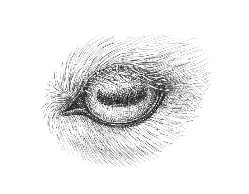
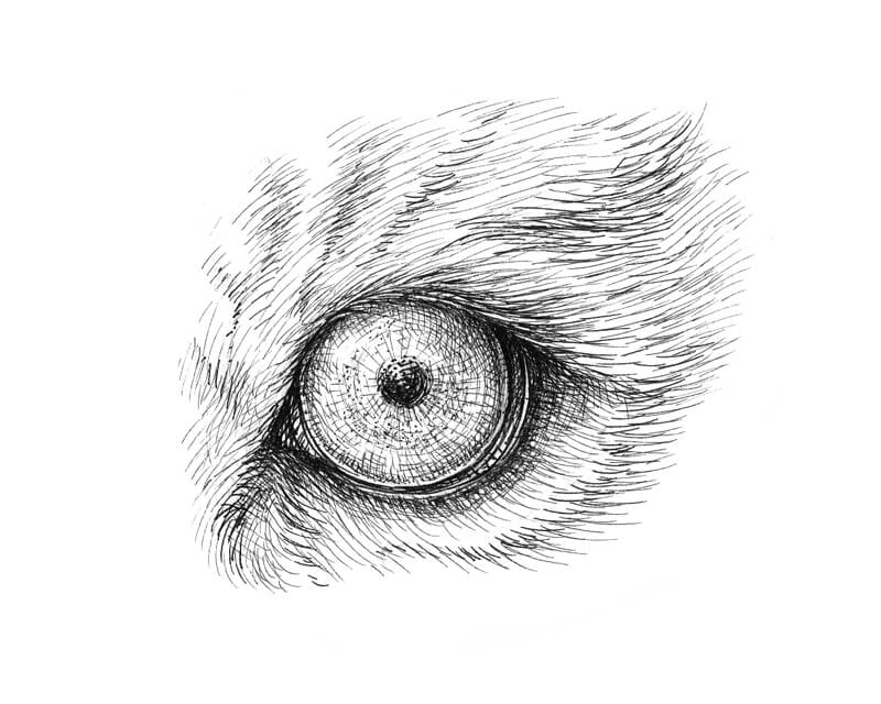
Elephant Eye with Pen and Ink
Let’s get to it and draw a few animal’s eyes. We’ll start with the eye of the elephant.
I start sketching with a graphite pencil. I outline the main contours of an elongated eye, the eyelids, and some wrinkles around it. I darken the corners of the eye and also add long eyelashes to the upper eyelid.
Eyes of an elephant are small in comparison with the size of the head. These animals have limited peripheral vision due to the position and size of the head. Elephants have poor eyesight and can only see for short distances of up to 20 meters.
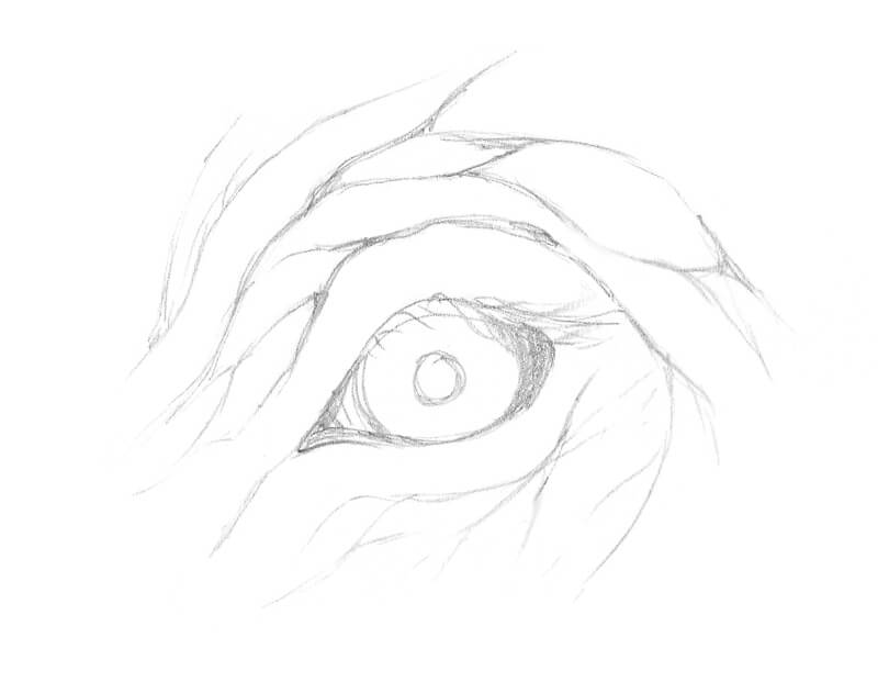
With 0.1 ink liner, I outline the contours of the eye and then mark the wrinkles and the eyelashes.
I darken the pupil and the corners of the eye. The edges of elephant’s pupil seem blurry and are not hard-edged, so I add dots to soften the edges.
See also: Pen and Ink Drawing Techniques
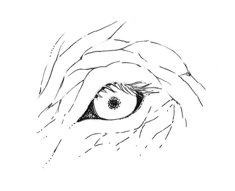
With a 0.05 liner, I add hatching to accent the relief of the skin. Some wrinkles near the eye are quite deep so the value here is dark.
I give more volume to the iris by applying fine, rounded hatches. Notice how the eyelashes cast a subtle shadow on the iris. Don’t overdo the eye at this step and be sure to leave some space for the highlight.
I also add some dots to the area around the eye using a 0.1 liner. Stippling on top of hatched layers helps us to create the illusion of the texture of the skin.
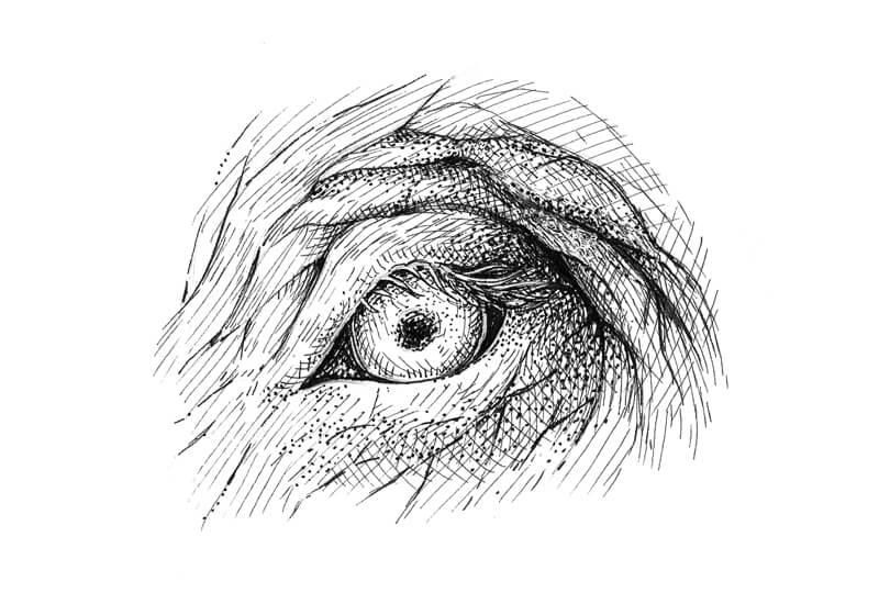
I add more hatching using the 0.05 liner. I keep the pressure light while drawing to get the finest lines possible. Thin ink hatching can create beautiful, smooth transitions of value – even resembling graphite shading from a distance.
I also add more dots with a 0.1 liner. I work on the texture of the skin and deepen the shadows. Then, I draw smaller wrinkles and extend the sketch by adding a larger area of skin.
If you accidentally “lose” the eyelashes, it’s possible to recover them with a white gel pen. You can also add some white dots to the skin to make the texture more interesting. However, using a gel pen is completely optional and can take away from the purity that comes from just using black ink.
See also: How to Draw an Elephant with Colored Pencils
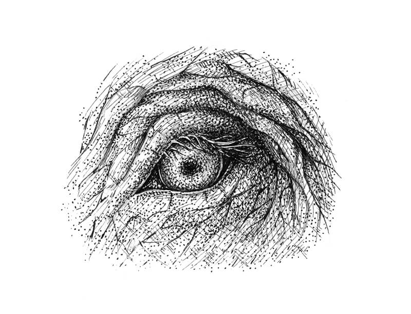
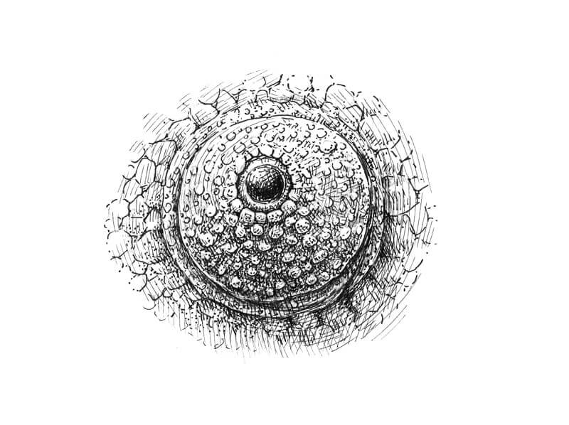
The Eye of a Chameleon
A chameleon can move each eye independently of the other. This feature allows the animal to look in two different directions simultaneously with a full 360-degree view. Just like a camera lens with zoom, a chameleon can focus its eyes and enlarge the object in which they are looking.
The eye protrudes and the eyelids are joined to protect the eye. There is just a small opening for the pupil to peer through.
The eyelid is covered with small elements and there are folds of skin around the eye. I add some scales to create a hint of the head’s texture.
With a 0.1 ink liner, I outline the main contours and mark the smaller elements. Note that the contour of the eye’s opening is not perfectly smooth or round.
I darken the lower part of the pupil, leaving some space for the highlight. I also mark the shadows in the folds of the skin with additional lines.
With a 0.05 liner, I add layers of fine hatching to give the drawing more volume.
We’ll assume that the light is coming from above. The lower part of the eyelid (the area under the pupil) should be in shadow. The small protruding elements are lighter than the eyelid itself, but they need some short hatches too.
I also create a shadow inside the eye’s opening and add more ink marks to the pupil, reducing the brightness and size of the highlight.
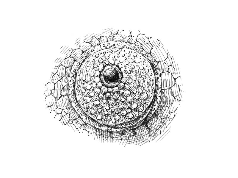
I increase the contrast by adding another layer of cross hatching, using the 0.05 liner. The shadows become more intense. It’s also important to mute some areas that are too light – for example, the folds of skin.
I add dots with a 0.1 liner to communicate the unique texture of the chameleon’s skin. Stippling also helps to create smoother transitions of value.
Drawing The Eye of a Goat
The pupils of a goat resemble horizontal rectangles. Remember what we learned about this kind of pupil? They give animals a wide field of vision, helping them to scan the horizon for predators.
I draw the eye and hairs surrounding it with a graphite pencil. The eyelids are quite thick and the eyelashes are long.
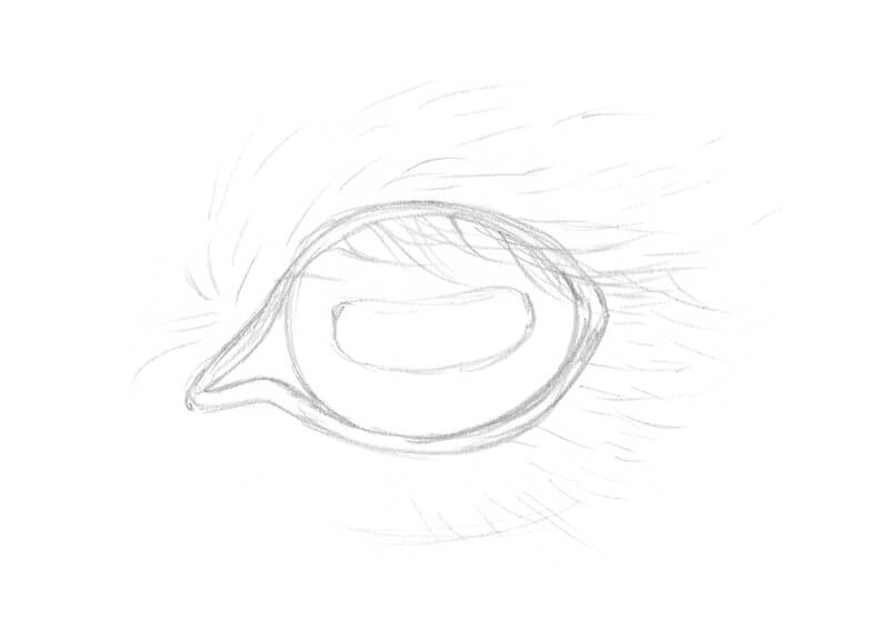
With a 0.1 liner, I apply cross hatching to the pupil and the inner corner of the eye. Don’t forget about preserving the highlight.
I mark the direction of the hair growth with long organic lines and outline the eyelashes.
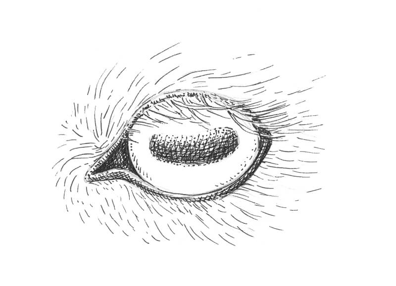
With a 0.05 liner, I add more hatches to create the illusion of the texture of fur. I create a subtle shadow in the hairs below the eye.

I also darken the eyelids and the iris. The rounded lines repeat the object’s contours leading to the impression of form. The eyelashes are light, so the area right below them remains almost untouched.
The pupil needs some more fine hatches too.
With a 0.1 liner, I increase the contrast in the drawing. The eyelashes and the hairs near the eyelids become more visible and stand out with additional contrast.
I expand the area of fur with additional lines, using both 0.1 and 0.05 ink liners.
Drawing a Cat’s Eye
Cats are excellent examples of predators with forward-facing eyes. Their pupils look like vertical slits. This kind of pupil helps the animal to estimate the distance to its prey. Their peripheral vision is ideal for hunting since cats’ eyes have almost 285 degrees of sight!
Cats also have a third eyelid, also known as the nictitating membrane. This retractable membrane is located in the inner corner of each eye, closest to the nose. Usually, we don’t see a cat’s third eyelid because it’s hidden inside the corner of the eye.
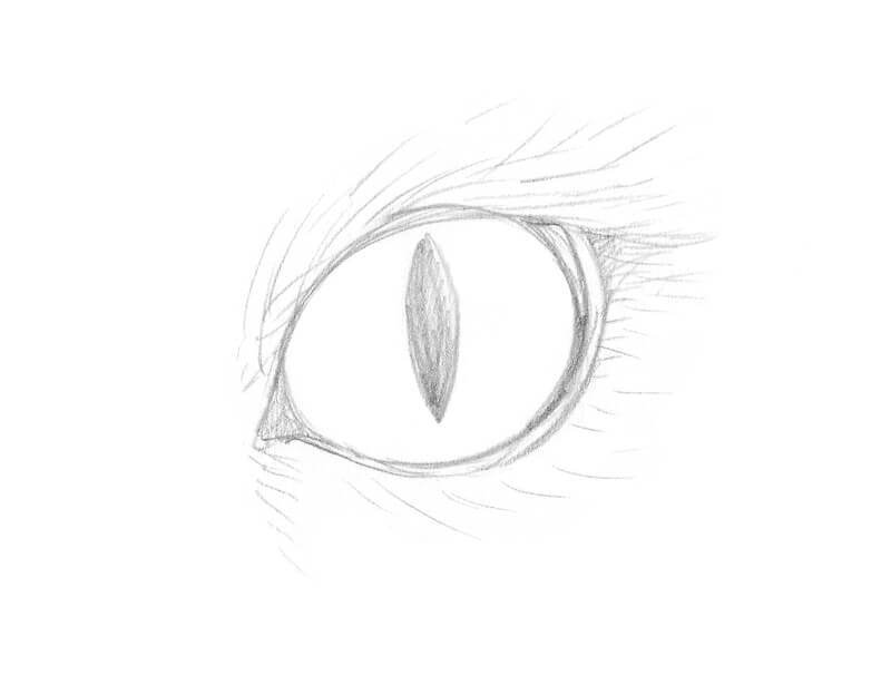
With a 0.1 liner, I darken the eyelids and the pupil, especially at the bottom.
Then I mark the direction of hairs that are growing around the eye.
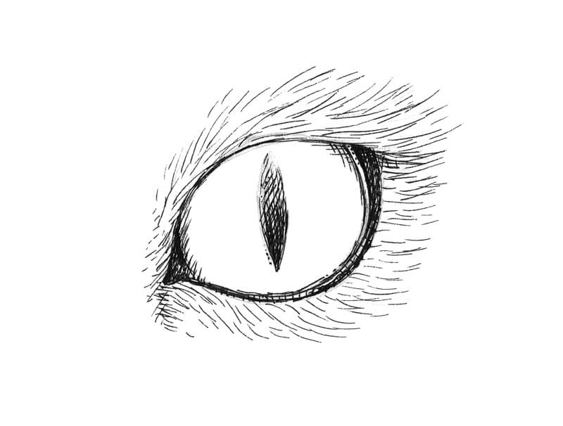
I add more hair-like lines, using a 0.05 ink liner. They help to create the illusion of fur. I also work on the eyelids to soften the transition from skin to hair.
Groups of rounded hatches are pulled from the periphery of the iris to its center. This is done to make the eye more three-dimensional. Apply as many layers of hatching as you need to get the desired result. I add some dots and random lines to vary the texture of the iris.
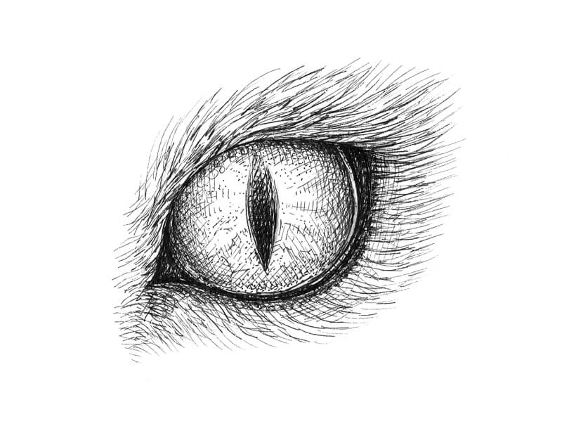
I add more dots to the iris, using a 0.1 liner. The upper area near the pupil remains lighter in tone to suggest a highlight.
I also darken the gaps in the fur to give the texture a more realistic look. The area near the eyelids is made darker too. This increases the contrast and creates a stronger accent on the eye.
See also: How to Draw Cat Eyes with Colored Pencils
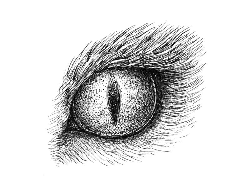
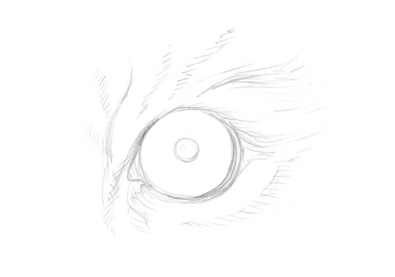
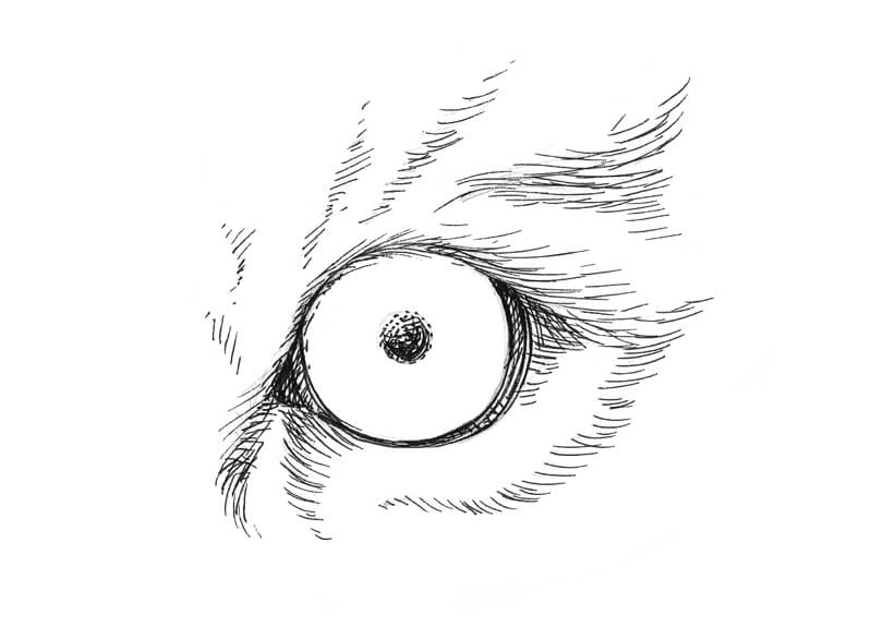
Drawing a Tiger’s Eye
While domestic cats have vertical slits, their larger, taller relatives – tigers – have round pupils.
To begin the drawing, I outline the tiger’s round eye with a graphite pencil, then mark the darker stripes of fur around the eye.
With a 0.1 liner, I darken the eyelids and the pupil. In the pupil, short hatches transform into dots near the shape’s edges.
Then I add some long lines to the areas of black stripes. The marks mimic the direction of hair growth. I vary the direction and character of lines to make the texture more realistic.
With a 0.05 liner, I work on the iris, adding groups of round hatches that repeat the form of the object. I also add some dots to the iris to create a pattern.
Remember that an eye is not a circle – it’s a sphere that has some volume.
The eyes of a tiger are bright, so it’s important to get the right balance of lighter and darker areas without overdoing the sketch. Don’t forget to leave a highlight.
I apply long hatches to create the illusion of white or lighter fur around the eye.
With a 0.1 liner, I accent the darker stripes on the fur.
Then I strengthen the shadow that the hairs cast on the eye.
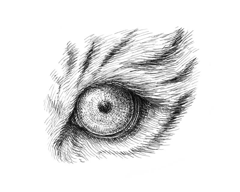
See also: How to Draw Tiger’s Eyes with Colored Pencils
Drawing Animal Eyes with Pen and Ink – Conclusion
Congratulations – we’ve created five ink drawings of animal eyes! I hope that you’ve enjoyed every step of our artistic journey and inspired you.
As you can see, there are some similarities in the way that we can approach drawing different animal eyes. The steps are very similar – only the shapes, directional marks, and value change.
If so, join over 36,000 others that receive our newsletter with new drawing and painting lessons. Plus, check out three of our course videos and ebooks for free.
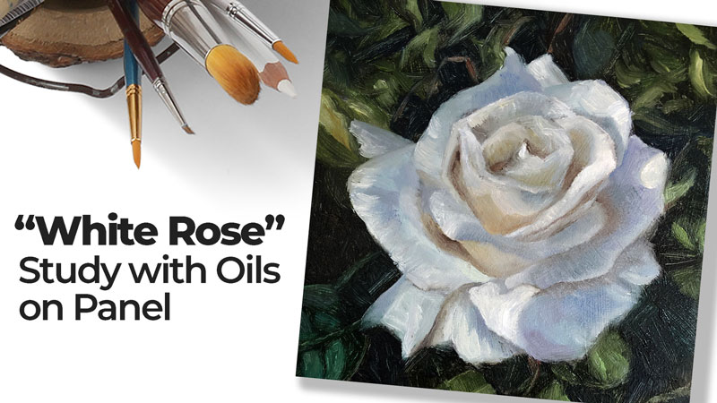
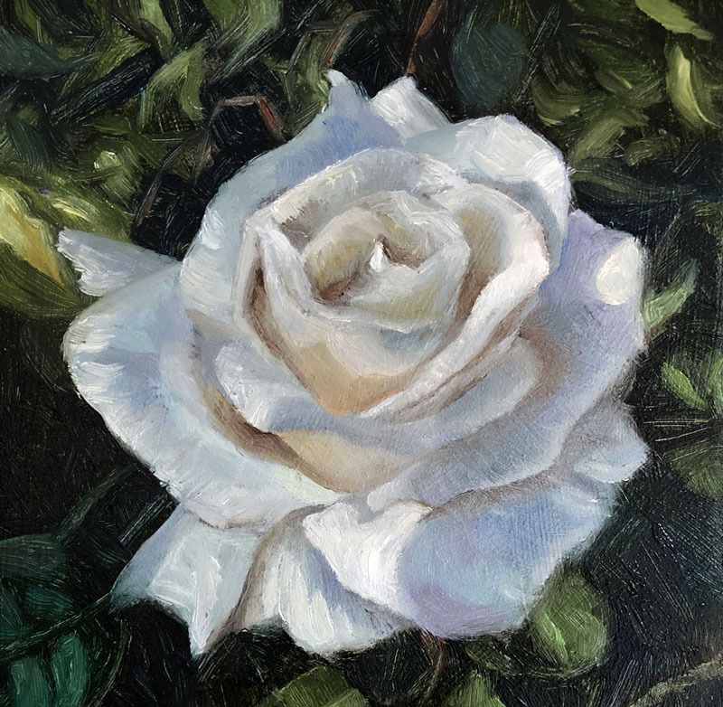
White Rose with Oils – Small Painting Study
Painting Small
In this oil painting lesson, we’ll take a look at creating a small painting study, measuring just 4″ by 4″. This looser painting of a white rose is both a pleasure and a challenge. Let’s dive in.
Materials For This Painting
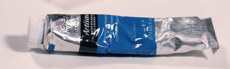
We’ll use water-mixable oils for this painting, combining the advantages of traditional oils with easy clean up with soap and water. Water-mixable oils share slow drying times with their traditional cousins, but with less mess and perhaps less fumes as well. In this lesson, we’ll use Artisan water-mixable oils by Winsor and Newton.
Our palette is relatively simple, utilizing just a few colors. Here are the colors that are used…
- Titanium White
- Burnt Umber
- Burnt Sienna
- French Ultramarine
- Sap Green
- Olive Green
- Viridian Hue
- Cadmium Yellow Medium
- Dioxazine Purple
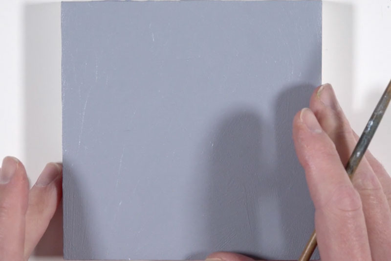
We’ll complete this painting on panel prepared with a base application of acrylic paint. Payne’s Gray and Titanium White were mixed to create a cooler, medium gray which was applied to the surface with strong brush strokes. This near neutral base provides contrast for both light and dark applications to follow.
Reference Photo of a White Rose
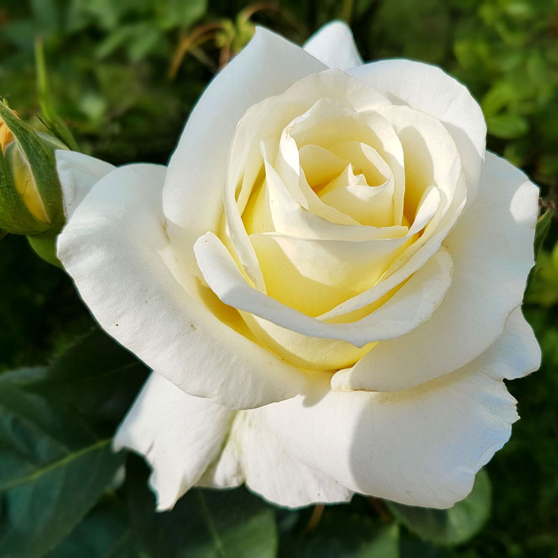
We’ll work from a reference photo for this painting, but as you’ll see there is quite a bit of deviation. The reference photo is from pixabay.com, however it has been altered from its original state to fit in a square format. The colors have also been slightly enhanced.
Here’s a look at the photo reference as it was used…
Start With a Sketch
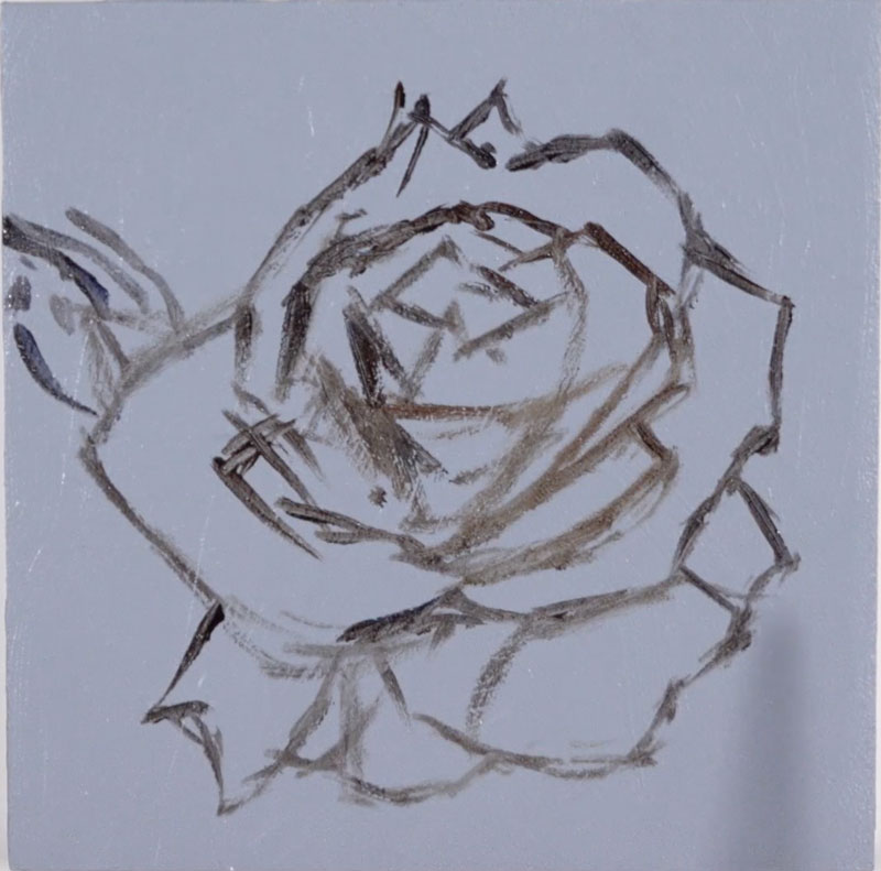
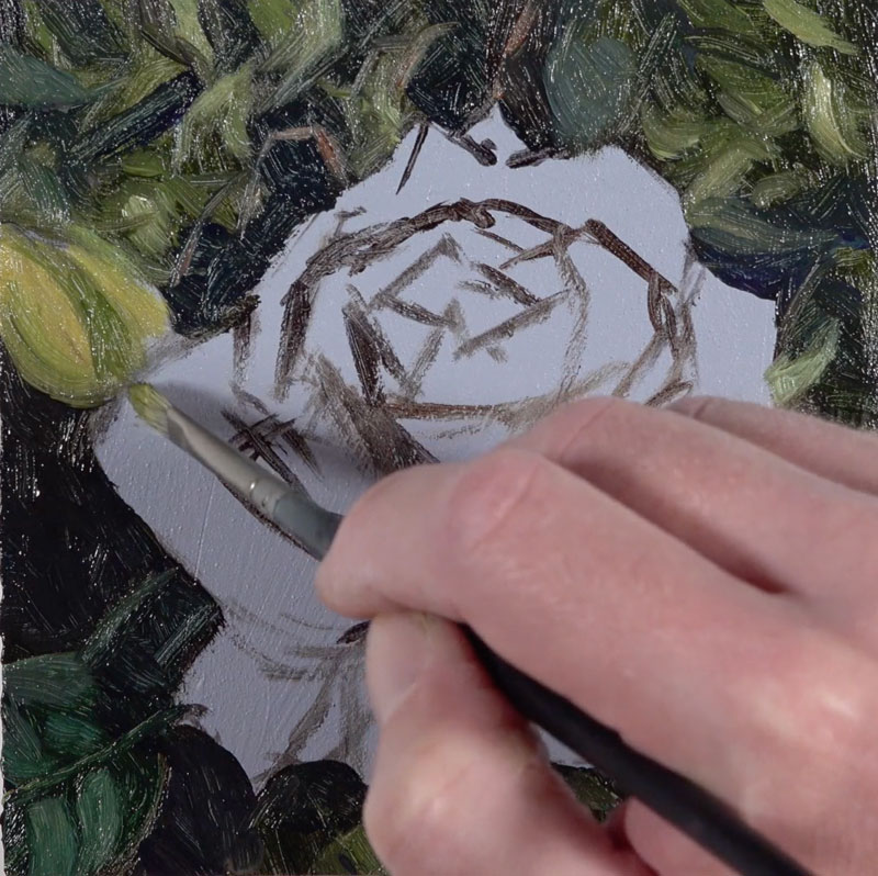
We’ll begin by sketching out the contours of the rose with a mixture of Burnt Umber and Ultramarine. This mixture of colors produces a dark value that contrasts nicely against the gray ground. This mixture is thinned slightly with Artist’s Painting Medium by Winsor and Newton. By thinning the mixture, the paint flows much easier, allowing us to create defined lines.
See also: How to Draw a Rose
Our initial oil sketch is loose and developed using a small flat brush.
Painting the Background
With our basic sketch in place, we can begin work on the background. For the most part, we’ll develop the background completely before moving on to addressing the rose.
We’ll begin by addressing mostly the darker values and tones with a mixture of Olive Green, Burnt Umber, and Ultramarine. The Olive Green on its own is quite dark and leans towards brown. The addition of Burnt Umber and Ultramarine darkens the color even further.
These two colors also allow us to create a bit of variety. We’ll allow the Ultramarine to dominate in areas where the shadow is a little cooler and the Burnt Umber to dominate in areas where the shadows are a little warmer.
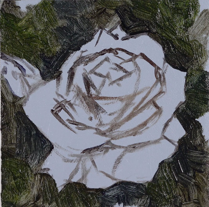
With many of the darker tones in place, we’ll begin to push the value range and slowly bring out the looser shapes of the leaves. Sap Green, a much lighter and warmer green, is mixed with Cadmium Yellow and Titanium White to create a lighter versions of green. This color is applied using brush strokes that mimic the shapes of the smaller leaves.
As we continue to broaden the range of value by adding lighter and darker tones, we’ll also begin to create contrast between warm and cool versions of green. Viridian, a much cooler version of green, is added in areas behind the rose – especially in the lower left portion of the picture plane where a dark cool leaf is found.
And just as we did for the yellow-greens, we’ll continue to push the range of value by adding lighter and darker versions of the cooler green.
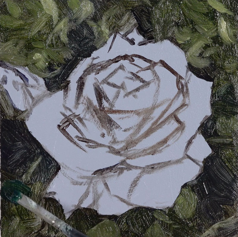
Add the Bud
Once we’re happy with the background, we’ll add the small bud that’s found slightly behind the upper left corner of the rose. This bud helps to break up the rather static composition.
A mixture of Cadmium Yellow, Sap Green, and a touch of Titanium White is added to the shape before darkening and muting with a bit of Burnt Umber. The leaves that surround the bud are added with the same mixture, only dominated with Sap Green. Then the leaves are darkened by adding Burnt Umber and Ultramarine to Sap Green.
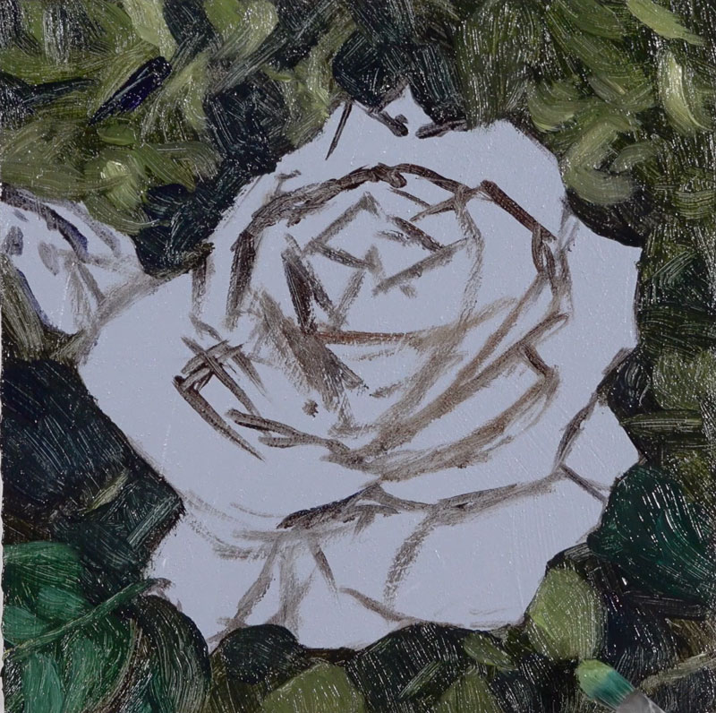
Painting the Rose
Now that the background is in place and the small bud is complete, we can turn our attention to the body of the rose. We’ll begin by blocking in the shape of the flower with a mixture of Titanium White with a touch of Cadmium Yellow and a subtle hint of Sap Green. Be sure to avoid using pure white as this will leave little room for pushing the values and lead to an unnatural appearance. We rarely see pure white in reality.
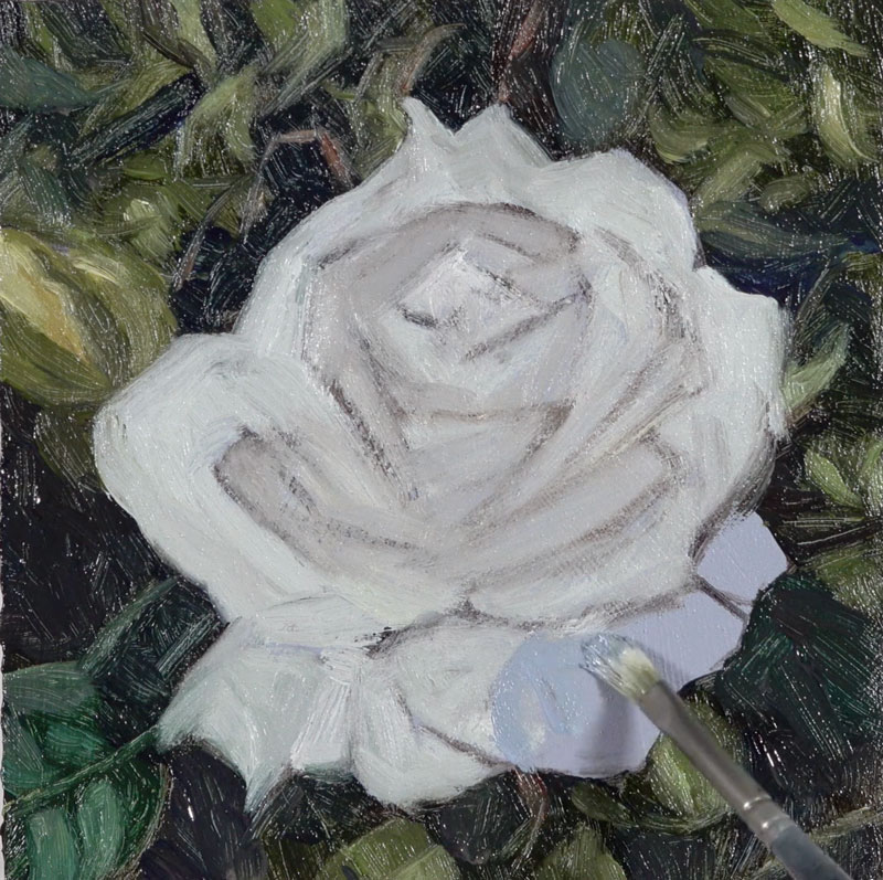
We’ll now begin the process of adding the subtle shadows and highlights to develop the form of the flower. We’ll begin by adding some of the cooler shadows. Ultramarine with a touch of Burnt Umber is added to Titanium White to create our first shadow color.
This color is added to the rose petals on the opposite side of the light source. Since our light source originates from the upper left, most of these shadow areas are found on the right side of each petal.
We can add a bit of variety to the shadows by bringing in a little warmth. Dioxazine Purple is added to our blue-gray shadow color to bring in a little of this warmth. This purple will also contrast the warmer yellow highlights and shadows that we’ll add later.
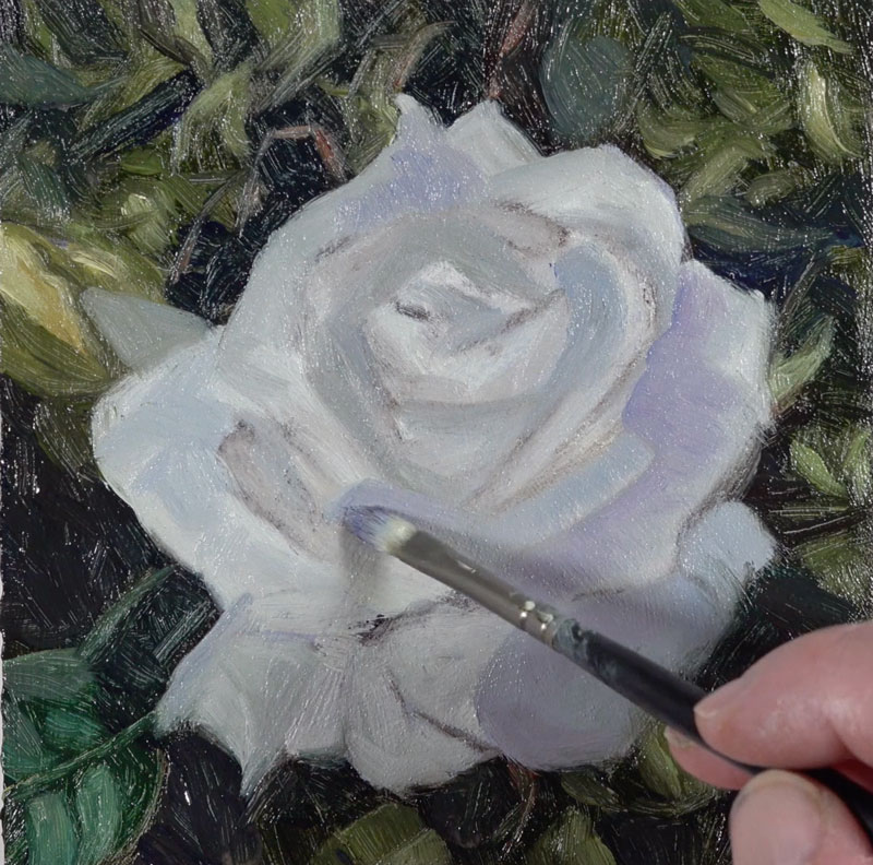
Value is not the only way that we can create contrast. We can also create contrast through the use of color temperature. Warm colors will contrast against cooler ones, even though the value may be similar. We’ll next begin bringing in some of the warmer highlights and shadows.
We’ll create the warmer tones by combining Cadmium Yellow, Titanium White, and Burnt Umber. In areas on the rose, light is making its way through the flesh of the petal, radiating light rather than being a shadow. Near the center of the flower, the shadows are stronger so Burnt Umber dominates.
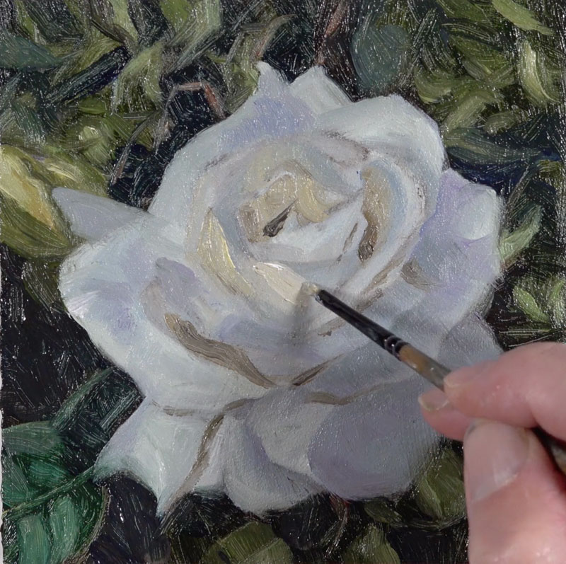
As we add the warmer shadows, we’ll also begin pushing the lighter values where light is landing on the petals of the rose with some intensity. As we add both darker and lighter tones, the form of the flower and each petal begins to make more sense. The more we broaden the range of value, the stronger the light appears in the painting.
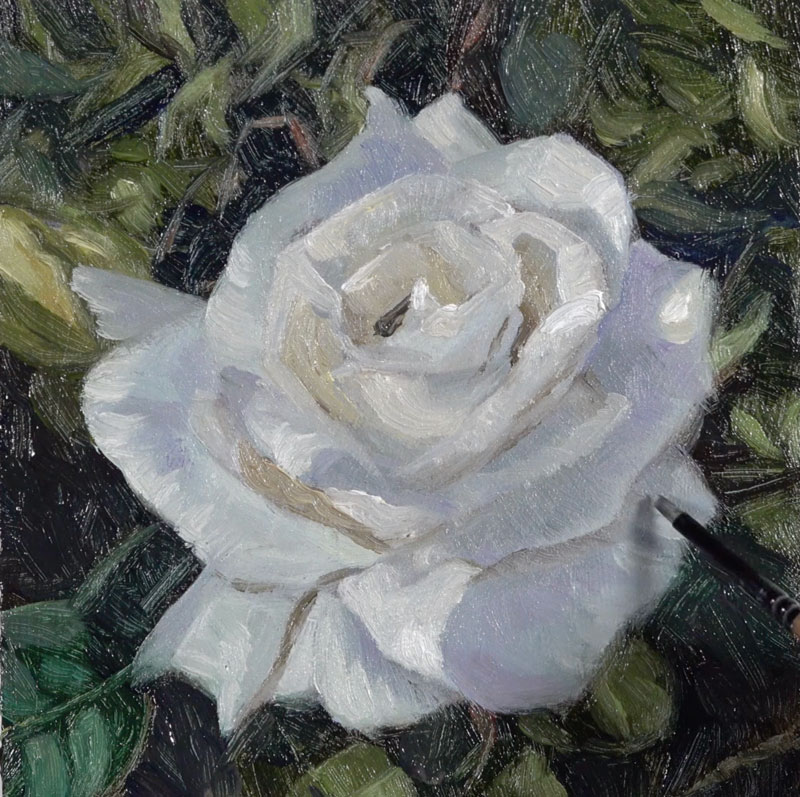
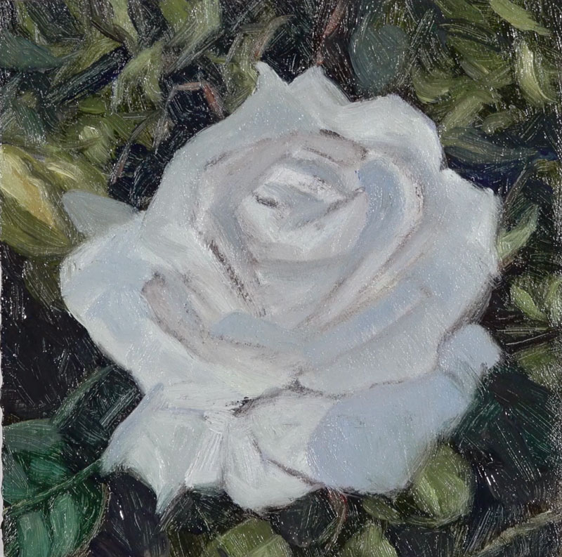
We’ll soften the strongest shadow near the center of the rose. Then we can add highlights that are close to white but still have a hint of color. These last touches of strong highlight pull the painting together and increase the contrast further.
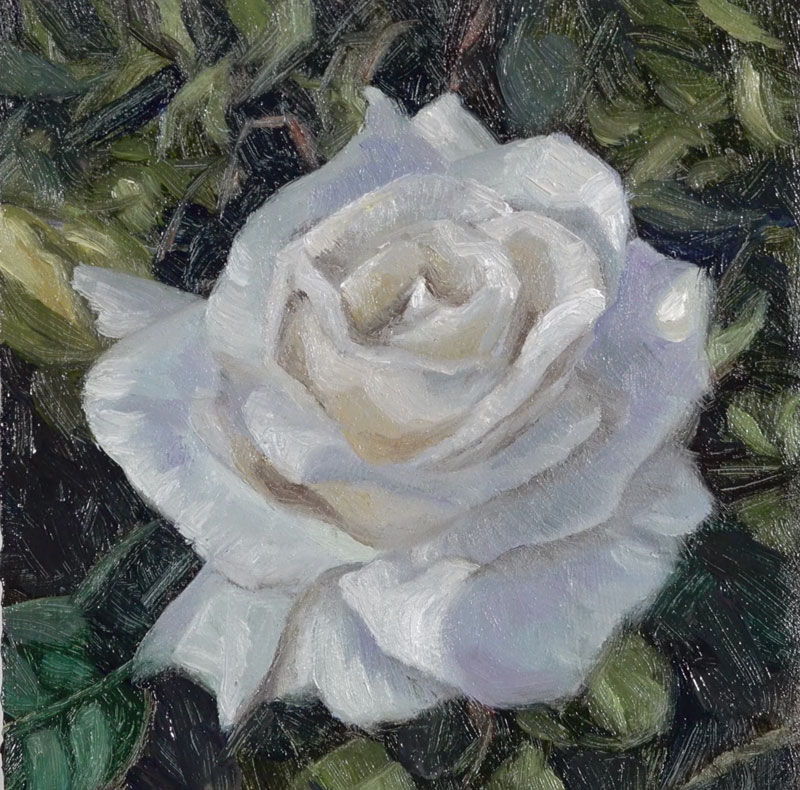
We’ll continue pushing the value range until we’re happy with the contrast and light. Now our quick study of rose painted with water-mixable oils is complete.
Conclusion
A painting doesn’t have to be large to capture a subject as complex as a rose. We can use brush strokes, subtle changes in value, and color temperature shifts to communicate any subject in an interesting way. As an added bonus, painting small saves time while still forcing us to practice the observational skills and painting techniques that will improve us as artists.
If so, join over 36,000 others that receive our newsletter with new drawing and painting lessons. Plus, check out three of our course videos and ebooks for free.
Brush Pen Techniques: How to Draw a Black Swan
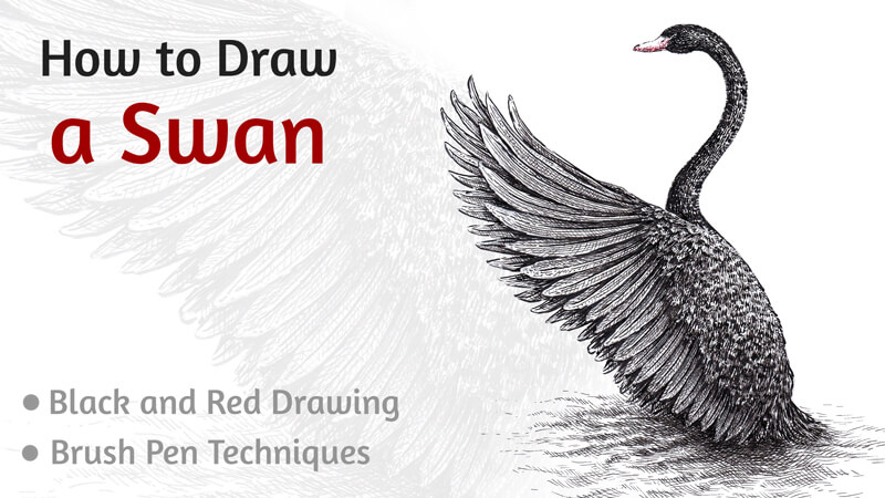
Before we dive into the drawing, did you know that these birds have their own constellation? Cygnus (the Latin word for “swan”) is a brightly visible constellation lying on the plane of the Milky Way. In Greek mythology, it represents Orpheus, who was transformed into a swan after death.
This project features both an extraordinary subject and a unique set of drawing supplies. Drawing the bird’s glossy plumage may be a challenge, but we’ll find an effective way to solve this puzzle.
Drawing Supplies For Drawing the Swan
The main art tool we’ll use for this project is a brush pen. There’s no need to dip its tip into ink to make marks making this characteristic extremely convenient for artists that like drawing on the move, outside of the studio.
Also, a brush pen allows for creating a variety of marks. The width of a line can be changed on the fly by pressing harder, resulting in a wider line.
I’ll be using two brush pens that contain black ink. The first one is Faber-Castell PITT artist pen, and the second is Copic Multiliner BS. (BS means Brush Small.) However, the tips of these pens are relatively close in size.
With the 0.1 black liner, we’ll create the finest details.
The final touches will be made with a Faber-Castell Grip finepen 0.4 of red color. This hue is closer to orange rather than to violet.
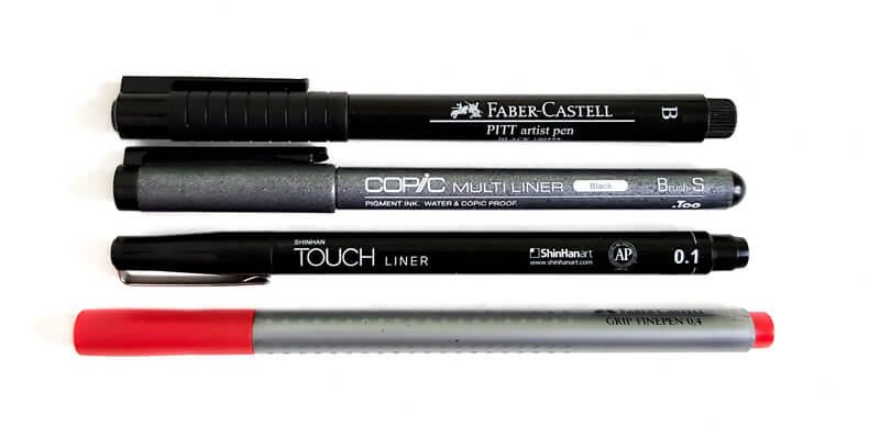
The size of the paper is A4. I’m using ordinary thick drawing paper and it has a smooth surface with no visible texture.
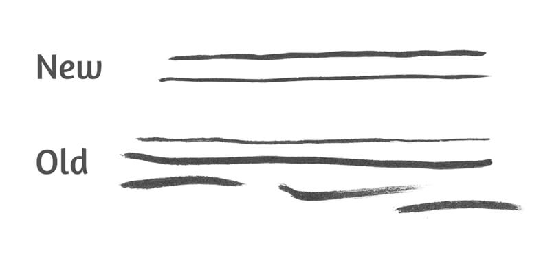
Why use two brush pens of approximately equal size? The difference lies in the degree of wear and tear. The Faber-Castell brush pen is brand new and I’ve never used it before. On the contrary, my Copic Multiliner has gone through a great number of art projects – no wonder that its tip is considerably worn out!
Let’s compare the tips of the brush pens.

To simplify the explanations, I’ll be referring to these brush pens as the old (or an older) and the new (newer) one.
I prefer using the worn-out brush pen to draw various textural marks. They may have a rough or dry look. Even though art supplies may have reached their optimal period of life doesn’t mean they can’t be used in creative ways.
Also, the tip of the used brush pen has become softer, so I have no fear of pressing harder while drawing. This pliability ensures a smooth transition from thin to thick line quality. As you can see in the image below, I’m still able to make tiny, thin marks.
The newer brush pen is great for adding the finer details. If you’re barely touching the paper with the brush pen’s tip, you’ll create some delicate marks.
The tip of the newer tool is still fresh, firm, and springy. That’s why I avoid pressing too hard. For that reason, the marks made with this brush pen demonstrate a smaller variance of width.
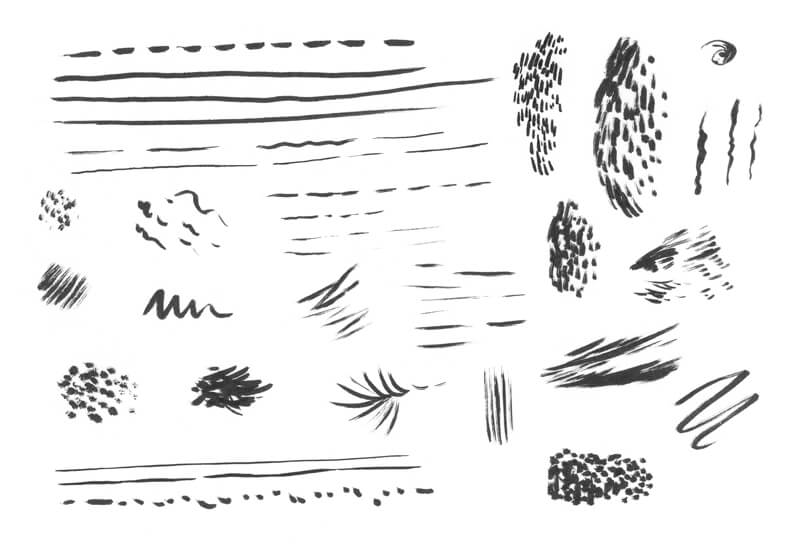
It’s always a great idea to try out your supplies beforehand. Every brush pen has a specific set of features: its size, softness, elasticity, and the character of marks. Some brush pens produce wet, juicy strokes. Others may give quite a different impression.
The better you know the possibilities and limitations of a particular tool, the easier it is to get the desired result.
I recommend creating all kinds of marks on a spare piece of paper. Feel free to experiment with hatching, cross hatching, or stippling. Invent some patterns or textures that may be applied in your future projects.
See also: Pen and Ink Drawing Techniques
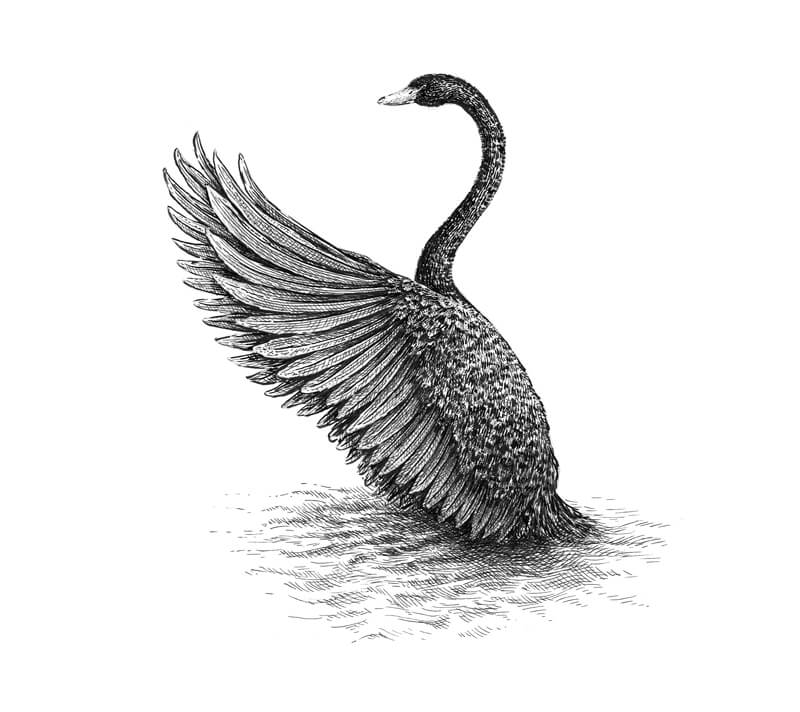
Drawing a Swan with a Graphite Pencil
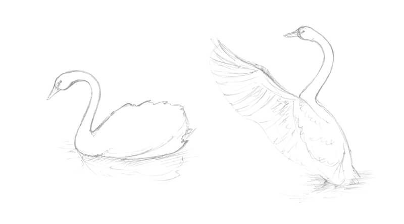
First, we should decide on the pose of our bird. It may be rather dynamic or static, depending on your idea. What kind of emotion or mood are you going to convey with your artwork? The good news is that swans look majestic in any pose and in all settings.
I sketch a couple of small miniatures that help me to make a decision regarding the composition and pose. Today I’m going for a dynamic pose. My swan is stretching its beautiful wings before the flight.
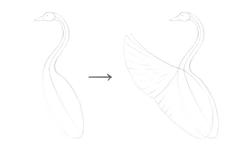
With the pose and composition determined, we can create the graphite pencil underdrawing on the final surface. I start by outlining some simple shapes that indicate the position of the head and body. A long curved line shows the direction of the swan’s neck.
Then I add a rough shape for the wing. For now, we’ll draw only the one that is closer to the viewer. The second wing will be added in the next step.
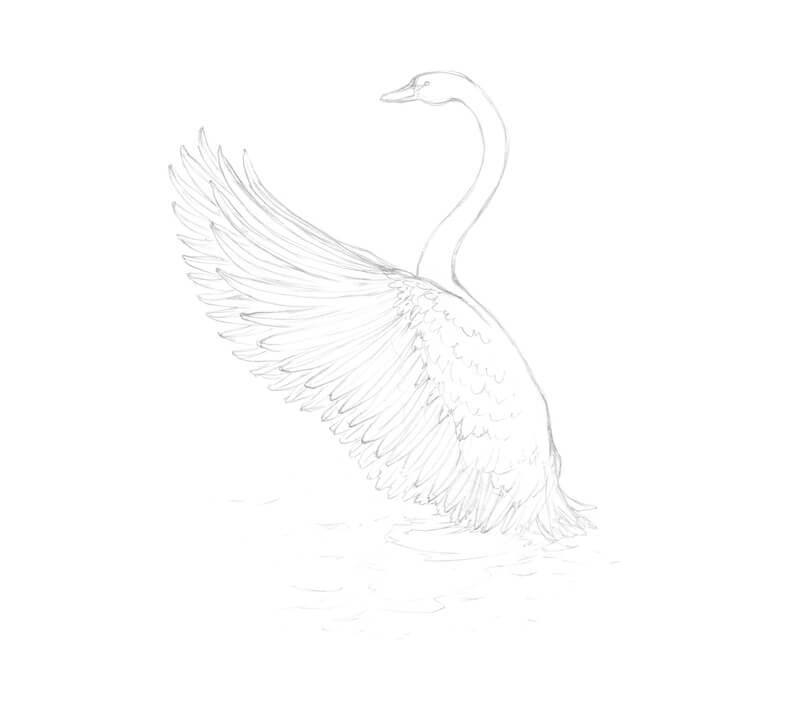
Next, I refine the sketch by adding the details and adjusting the contour lines. I mark the rows of shorter feathers. Then I draw the longer quills that are located near the wing’s edge.
After the first wing is complete, I add the second one that is hidden behind. Both wings have a similar silhouette.
I also mark the waves and the swan’s reflection on the water.
How to Draw a Black Swan with Brush Pens and an Ink Liner
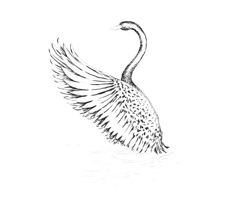
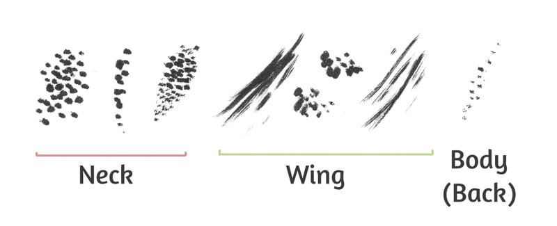
I start the ink applications with the older brush pen. I mark the contours of the neck and body by making a series of brief touches at medium pressure. The plumage of a real swan is a texture that is far from being even or uniform. Feathers of various lengths create an interesting relief.
The marks are very close together near the edges of the figure. I recommend avoiding any solid lines here – at least, at this stage. A swan with a continuous or wide contour line may seem unnatural.
The marks made with this brush pen have a rough and spontaneous look.
The light is diffused, originating somewhere behind the swan. I intensify the darker areas and the contours where appropriate, including the feathers of the farther wing.
The swan’s back remains light. I’m barely touching the paper in the area of the bird’s back.
In the image below, you’ll find the samples of marks that I’ve used.
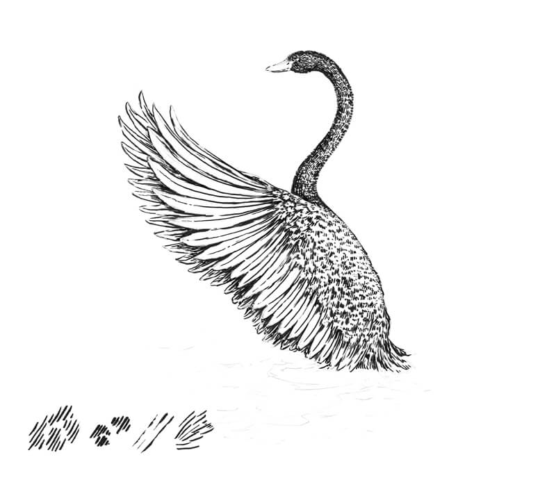
Now it’s time to add marks with the newer brush pen. I’m going to add some more accurate and precise lines with this pen. The goal is to complete the main contours, including those found on the beak and feathers.
The marks are following with the form of our object. I’m working mostly with the thinnest part of the pen’s tip.
The bird has black feathers, but it doesn’t mean that we should create a solid black application. Tiny spots of white paper are acceptable and even desired. They will help us to convey the glossiness of the plumage. Remember, contrast is important in creating the illusion of texture.
You’ll find the samples of strokes in the corner of the image.
With the 0.1 ink liner, I cover the swan with a layer of hatching. The lines that I use on the head, neck, and body areas may be slightly curved to accent the relief. Following the cross contour lines of an object is a great way to give your drawing more volume.
See also: Cross Contour Lines
The long quills on the wing closer to the viewer require straight lines.
On the wing behind the swan, cross hatching is used.
Another goal of this step is to reduce the amount of paper that is still showing through. The form of the swan starts to make sense as we develop the range of value.
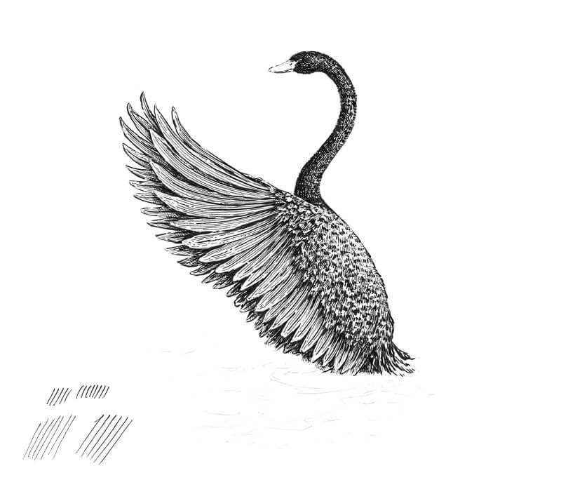
At this point, I can’t say that the swan is complete, but let’s leave it for now and work on the environment.
With a 0.1 liner, I add groups of horizontal hatches to the area below and near the swan. These lines are slightly curved. The alternation of lighter and darker areas creates the illusion of the water’s surface and the swan’s reflection on it. As the water is moving, the reflection becomes distorted and blurred.
I darken the area below the swan with additional layers of cross hatching.
I won’t elaborate on the water too much because it may distract the viewer’s attention from the subject. Just a hint at the waves and the swan’s reflection makes our drawing more believable and complete.
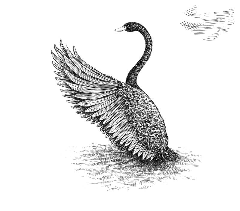
Now, let’s get back to the swan. With a 0.1 liner again, I add more hatches to mute the areas that still seem too light. I also darken the shadows, especially on the wing.
As the feathering is black, we should make the ink covering dark, while leaving some white specks. Those untouched areas create the illusion of a shiny surface in accordance with the direction of light.
The drawing is complete, but I have an idea of how to enhance it. Let’s add a hint of color.
I use a red pen to add some dots to the bird’s beak, mostly on its lower part where we see shadow. This inclusion of color is subtle, yet it makes a difference and adds some interest.
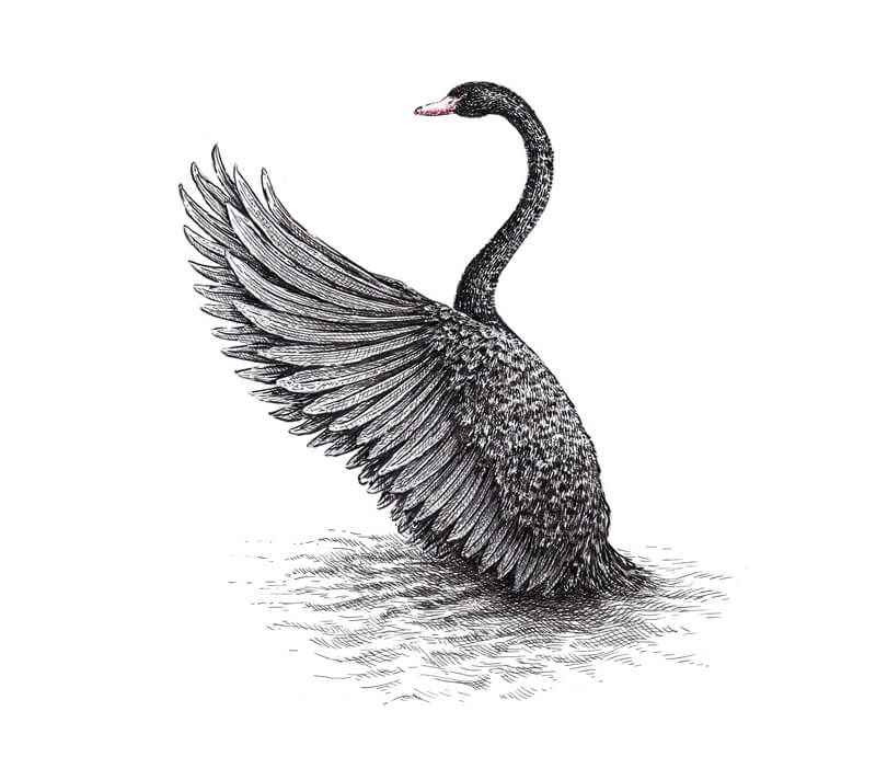
Drawing a Swan with Brush Pens – Conclusion
Congratulations – we’ve created a beautiful drawing!
I hope that you’ve enjoyed working with brush pens and playing with color. Thanks for being with me on this journey!
I wish you much inspiration on your way of mastering brush pen techniques and experimenting with various art supplies. Have fun!
If so, join over 36,000 others that receive our newsletter with new drawing and painting lessons. Plus, check out three of our course videos and ebooks for free.
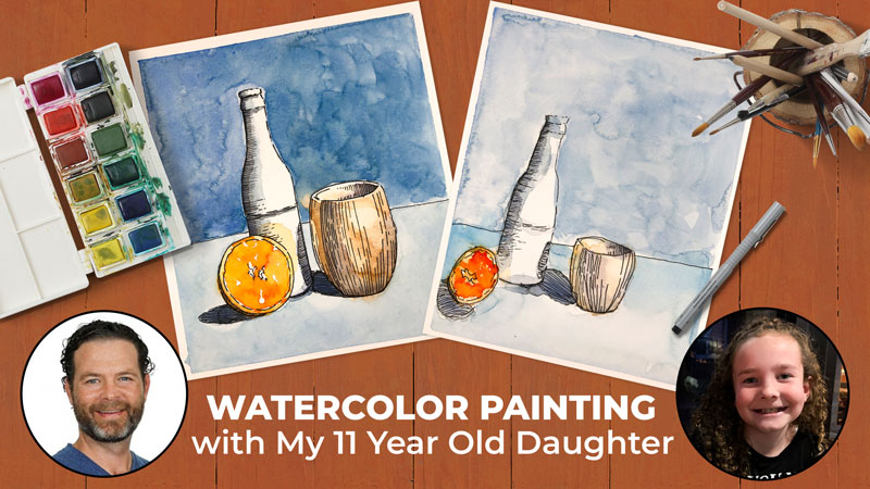
Watercolor Painting with My 11 Year Old Daughter
Let’s Have Some Fun
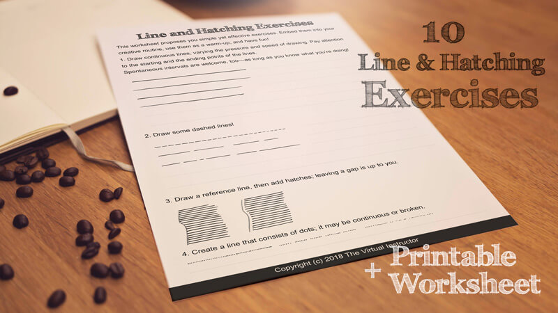
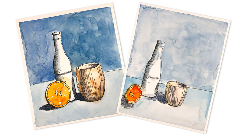
I decided to bring in my 11 year old daughter, Avery into the studio to create a painting with me. In this case, we decided to combine watercolor with pen and ink applications to create a line and wash image. In this lesson, you’ll watch Avery and I go through this entire process. So grab your pens and watercolor and join us in this adventure.
The Reference Photo
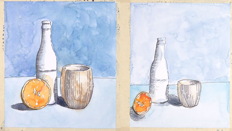
Let’s first discuss the photo reference that we’ll be using. In this case, I found a reference image on pixabay.com. This is a simple still life, featuring only a few objects. Since the subject is relatively simple, almost anyone can complete this project.
The original photo featured a small blue cup. But the since the cup was blue, it was getting lost in the background. I decided to add a bit of contrast to it by changing the color to a brown. This was easily accomplished using Photoshop. Changing the color of the cup made it stand out against the blue background.
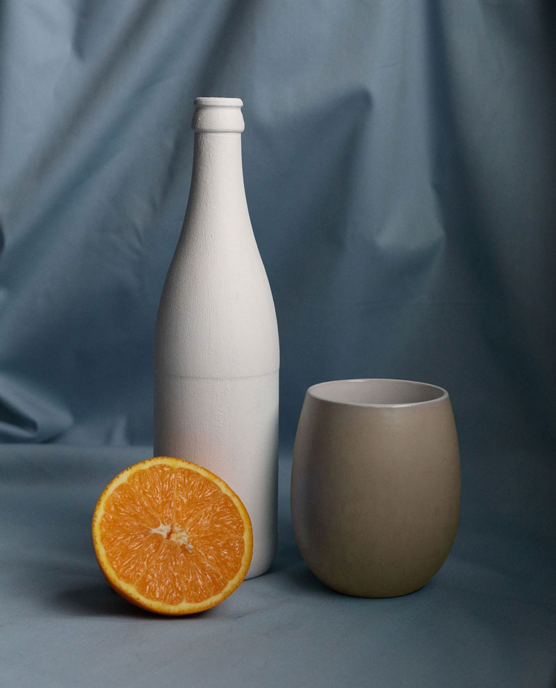
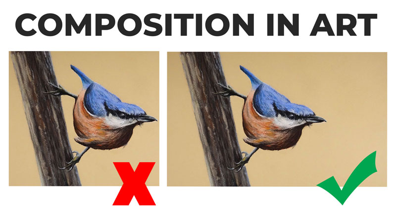
This particular layout features a triangular composition. A triangular composition, like the one we see here, encourages the viewer’s eye to move around the work. We also see that this particular layout features a variety of sizes and shapes, while still staying relatively simple.
I was also drawn to the color combination. As we can see, we’re dealing with mostly blues and oranges. Blue and orange are complementary colors. This means that they are opposites from each other on the color wheel. This provides a high level of contrast, while keeping our palette simple.
Materials That We’ll Use For This Painting
The materials we’re using for this project are fairly simple and most likely, you already have access to.
You’ll need a simple graphite pencil to create the initial sketch. I suggest using a lighter pencil, like an “H”, if you have access to one.
We’ll be working on hot press watercolor paper, which features a smoother surface compared to cold press watercolor paper. Since we’re combining pen and ink with watercolor, we want our lines to be smooth. Hot press paper provides a smoother surface and is better suited for pen and ink applications. If you don’t have hot press watercolor paper, you can substitute it with any thicker paper that will accept watercolor applications.
We’ll be using ink pens to create the pen and ink drawing over our graphite sketch. You can use any ink pens that are water resistant. Stay away from felt tip pens as they will bleed once watercolor is applied.
We’ll be applying color with watercolor paints. In this case, Avery and I will be using my Cotman watercolor set by Winsor and Newton. Feel free to substitute any watercolor paints that you wish.
Start With a Sketch
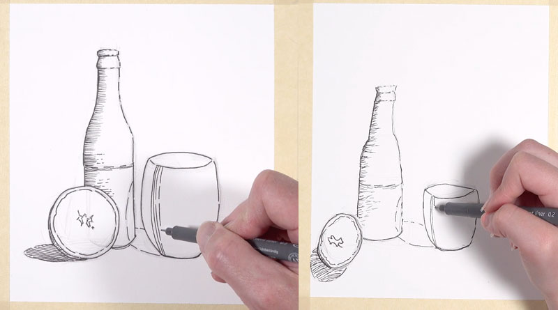
We’ll begin by first sketching out our subject with a graphite pencil on a watercolor paper. We’ll begin by first looking at the basic shapes that we see. In this case, we’ll start with a loose triangle. The top of the triangle can be found at the top of the bottle. The bottom edges are found at the bottom of the orange and the bottom of the cup.
Will also draw a line to indicate the top of the cup coming off of the triangle.
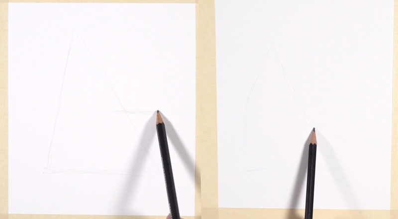
With our basic shapes in place, we can now concentrate on smaller shapes. Will begin with the basic shapes of the bottle. We can see that the bottle is made up of three basic shapes – a longer rectangle at the top, a trapezoid underneath that, and a larger rectangle at the bottom.
The orange is simply a circle. The cup consists of an ellipse at the top, and a rounded rectangular shape underneath. Be sure to draw loosely and lightly in these early stages.
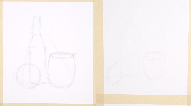
With our smaller shapes in place, we can begin drawing the contour lines. Contour lines are simply another name for outlines.
Using our smaller shapes as a guide, we’ll add the contour lines with a more deliberate mark.
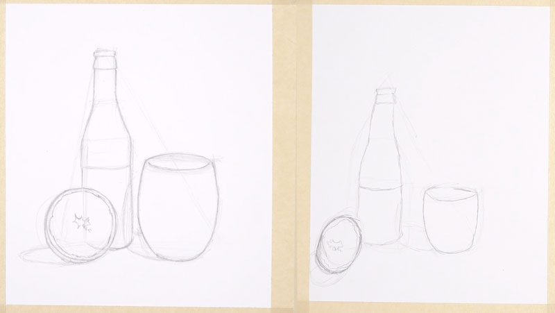
Adding Ink
Once the contour lines are in place, we can begin adding pen and ink applications over the top.
You can use any width of line that you prefer. Since this drawing is relatively simple, a thicker line is fine.
As you add the ink, be aware of the location of the light source. In this case, our light source originates from the upper right-hand corner. This means that we’ll use a broken line on the right side of our objects and a solid line on the left side of our objects.
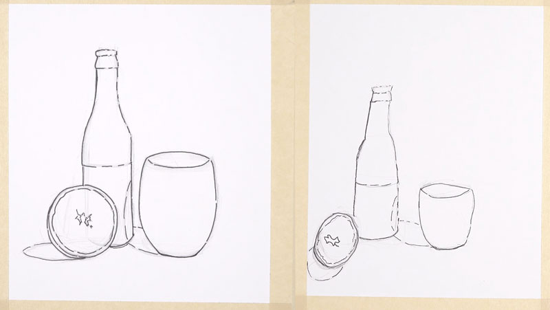
Once all of the contour lines have been established, we can begin adding shading using hatching.
Hatching is a method to add shading to a drawing using lines that do not cross over each other. The closer we place these lines together, the darker the value or shading. The more space that we allow between each line results in lighter values.
Since our light source originates from the upper right-hand corner, most of our shadows will exist on the left side of our objects.
We’ll begin adding shading to the bottle. Starting at the top of the bottle, we’ll add horizontal stroking to indicate the shadow on the left side.
On the orange, we’ll only add shading to the small part of the rind visible on the lower left portion. However, there is a cast shadow behind the orange. To address this area, we’ll add hatching within the shadow shape. Be sure to keep your lines flowing in the same direction.
On the cup, we see that the strongest shadow can be found on the outside, near the left side. We also see that there’s a strong shadow on the inside of the cup. But in this case, it’s on the right side which is closer to the light source.
To add the shading for the cup, will also use hatching. This time, we’ll use vertical hatching. Again, will concentrate marks where we see the darkest value. We can also use broken lines to indicate medium tones and transitions.
There’s a cast shadow behind the cup as well. This cast shadow also makes its way onto the bottle. Again, we’ll use hatching to create the shadow.
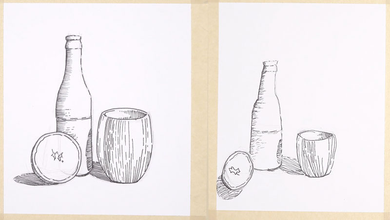
After we’ve addressed all of our pen and ink applications and let the ink dry, we can gently erase any remaining pencil marks with an eraser.
Now our pen and ink drawing is complete and we’re ready to begin with watercolor applications.
Adding Watercolor
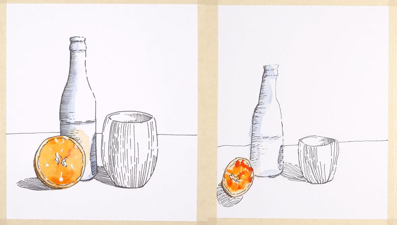
We’ll begin with our watercolor applications on the bottle. Since the bottle is mostly white, we’ll concentrate only on the area of shadow on the left side. Instead of using black, we’ll combine a blue and a brown. The blue we’ll use is Ultramarine and the brown is Burnt Umber. This combination of colors produces a more natural looking black.
See also: Watercolor Painting Tutorials
After adding a bit of color to the shadowed side of the bottle, we’ll move our way down to the orange. Carefully avoiding highlights, we’ll add orange, yellow, and red to the middle portion of the orange. We can let the colors bleed and mix together.
After letting this area dry, we can address the rind with a slightly lighter and more yellow mixture. The outside portion of the rind is addressed with Cadmium Orange.
There is also a little bit of orange that we can see on the bottle. This is light that is reflecting off of the orange onto the bottle. We’ll add it with quite a bit of water so that it remains light.
Now it’s on to the cup. We’ll start by addressing the darkest areas. In this case, we’ll use a bit of purple to add some color to the shadow. To make our purple, we’ll combine Purple Lake with Ultramarine. This color is added to the areas of darkest shadow.
Once this application has dried, we’ll add a bit of brown over the top of the entire cup. This brown is made by mixing Burnt Umber with a bit of Cadmium Orange and a touch of Yellow Ochre.
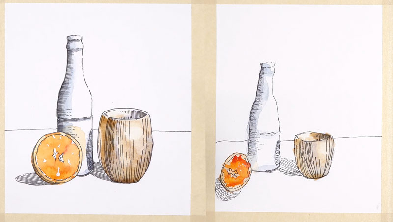
Now we’re ready to move on to the background. We’ll use a darker blue for the top and the lighter blue for the bottom. Using broad strokes, with a good amount of color on the brush, we’ll fill in both the top and bottom sections of the background with watercolor.
After letting the watercolor dry completely, we can remove the masking tape to reveal our line and wash image of a simple still life.
See also: How to Remove Tape From Your Art Without Tearing
Conclusion
I hope you enjoyed this simple demonstration of combining pen and ink with watercolor. Perhaps, you have a younger student in your house that you can share this lesson with and have a bit of fun together.
If so, join over 36,000 others that receive our newsletter with new drawing and painting lessons. Plus, check out three of our course videos and ebooks for free.

Art Lesson Plan Ideas for Teaching Remotely
Teaching Art Remotely
Teachers are scrambling to provide lessons to students that they now teach remotely. For some teachers, this shift is very challenging.
As art teachers, our job is a little harder than teachers of other subjects. Our students need special instruction, materials, and guidance. We are teaching skills, not just facts.
In light of our current world-wide situation, I decided to share a few lesson plan ideas to get you started. These lesson plan ideas can be completed by students where ever they may be. They require minimal materials and can be adjusted for different ages.
See also: Free Art Lessons During Pandemic
Lesson Plan Idea #1 – Art Museum Scavenger Hunt
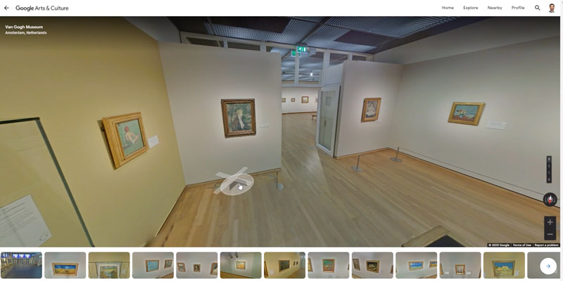
Several art museums around the world offer virtual tours. Why not take advantage of this?
As the teacher, you can create a list of works that students can find in these museums, like a scavenger hunt. Students can explore the museums of your choosing and find the works that you designate.
Instead of a scavenger hunt, you could just have students find 5 or 10 of the works that they like the best and list them or describe them.
While many of the museums offer a virtual tour, not all of them do. You’ll need to look for the small icon of a person in the lower right corner. If you see the small icon, clicking on it will take you to the virtual tour.
Here’s a link to the main hub that features the museum tours…
Lesson Plan Idea #2 – Futuristic Linear Perspective Drawing
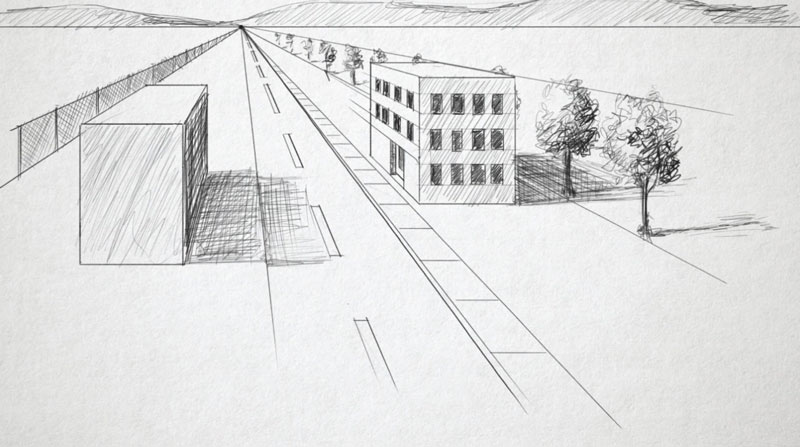
Linear perspective is a drawing technique used to create the illusion of space on a flat surface. This is a concept that should be taught by every art teacher.
Linear perspective comes in three different forms: one point perspective, two point perspective, and three point perspective.
One point perspective is the simplest form, while two point perspective is more challenging. Three point perspective is complex and is the most challenging form of perspective.
The assignment is for students to use one of the forms of perspective to create a scene of the future. When I assigned this lesson to my students, they used colored pencils on toned drawing paper to complete their drawings.
In our current situation, your students may not have access to colored pencils and certainly not toned drawing paper. You can adapt this lesson so that students only use graphite (pencil) or pen and ink on white drawing paper or even printer paper.
If you need help understanding perspective, or if you’d like to direct your students to instruction on this concept, please check out the following free lessons…
Lesson Plan Idea #3 – Community Mosaic Drawing
A mosaic drawing, in this case, is a large drawing made up of smaller drawings. In this lesson, students would each be assigned a small portion of the larger drawing to complete. They may use crayons, colored pencils, markers, etc. to complete their small portion of the drawing.
Now, in order to pull this off, the teacher must first find an image. I suggest using an image that is oriented to your community. You can find many free images at Pixabay.com.
The teacher will also need to sub-sect the image down into small squares and assign each square to a different student. This means that a graphic editing program may be required to do this. Using Photoshop, or another graphics program, the image can be broken down into smaller squares. Each square can be emailed or digitally shared with each student.
I suggest that each student complete their “square” on an 8″ by 8″ sheet of paper.
Here’s how you can do this in Photoshop…
This lesson is a great way to show students what can be done when we work together. It also gives the student the opportunity to feel a part of something that is bigger than themselves and encourages a sense of community.
Lesson Plan Idea #4 – Crayon Etching
A crayon etching is appropriate for students at various ages. You can assign this project to students from elementary to high school.
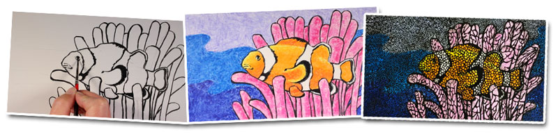
Here’s how the process works..
- Students first create a simple drawing of a colorful scene.
- The drawing is then outlined with a broad, black marker.
- Then using heavy applications, the drawing is colored with crayons.
- Over the top, ink or a black crayon is used to cover the entire image.
- Using a sharp tool, like the end of a paperclip, patterns are scratched out, revealing the colorful drawing underneath.
Here’s a lesson that outlines the entire process. You can share this lesson with your students…
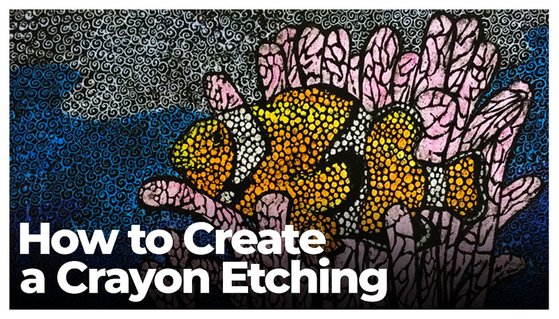
You can teach rhythm, repetition, motif, and pattern in this lesson. One of the great things about this lesson is that it’s time consuming. We don’t know how long we’ll be in this situation and lengthy assignments may be helpful.
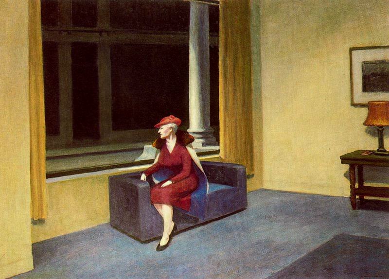
Lesson Plan Idea #5 – Isolation Drawings (Paintings)
Right now, we’re all dealing with isolation. This is great opportunity to encourage your students to express how they feel about this in their art.
You may assign your students to create a work(s) on this topic. Of course, this assignment is better suited for older students. You may leave the material open as older students will likely have paints, canvas, etc. at home. Of course, if they don’t, a graphite drawing will suffice.
Edward Hopper is a wonderful artist to use as an example as many of his works have an underlying theme of isolation.
Lesson Plan Idea #6 – Stop Motion Animations
Any student that has a phone or a tablet can create a stop motion animation movie. There are several apps that are free that students can use with ease.
Here are a few apps you may try…
You may assign a theme or just let your student’s imagination to go wild.
When this is all over, you may have a premiere and show all of the movies that students have made. Serve popcorn, invite the principal and vice principal. Make this fun.
Lesson Plan Idea #7 – Sketchbook Time
Hopefully, your students have a sketchbook and you encourage them to work in them. If not, now is a perfect time to start.
If a student doesn’t have a sketchbook, they can simply work on loose pieces of paper or use a program like Procreate on a tablet and create a digital sketchbook.
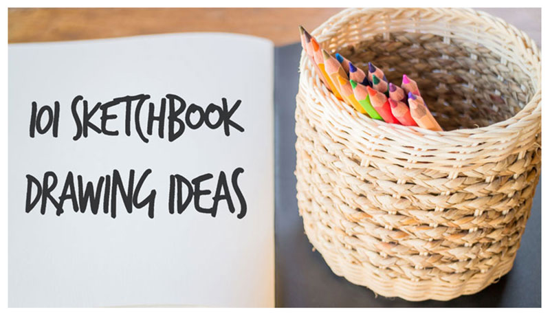
You may assign a theme or specific subjects for them to draw. If you need help coming up with ideas, here’s a post with 101 drawing ideas to get you started…
Conclusion
We WILL get through this. But, we need each other to do so. I’ll continue to be here to help as much as I can. Stay safe, heathy, and take care of each other. Good will prevail and life will return to normal.
If so, join over 36,000 others that receive our newsletter with new drawing and painting lessons. Plus, check out three of our course videos and ebooks for free.

Free Art Lessons During Coronavirus Pandemic
What We’re Doing…
The pandemic of the Coronavirus is affecting us all. To help art teachers and those who need a little positivity, we’ve opened the following recorded Live Lessons to everyone for free for at least the next 4 weeks. NOW EXTENDED UNTIL JULY 15. This represents over 25 hours of art lessons that is usually just for members. Teachers may link directly to these lessons so that students may access them without the need of logging in.
Please consider sharing this page with others who may benefit. To share, click on one of the icons above the video.
Here are the lesson series we’ve opened for free during this time…
- Rhinoceros with Graphite and White Charcoal – 10 Hours
- Ostrich with Charcoal – 4 Hours
- Oil Pastel Woodland Landscape – 4 Hours
- Color Theory and Mixing – 1 Hour
- Drawing Bootcamp – 5 Hours
(This collection of lessons is only a small portion of what is available to members. We hope that existing members understand why we are making some of our content available for free during this trying time.)
If so, join over 36,000 others that receive our newsletter with new drawing and painting lessons. Plus, check out three of our course videos and ebooks for free.