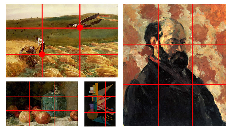
Lettering also presents a beautiful way to express an idea. You can give it a unique visual form and create a design that evokes emotion.
At the same time, this art is ancient. Some of us may recall the use of decorative capital letters in illustrated books of years past.
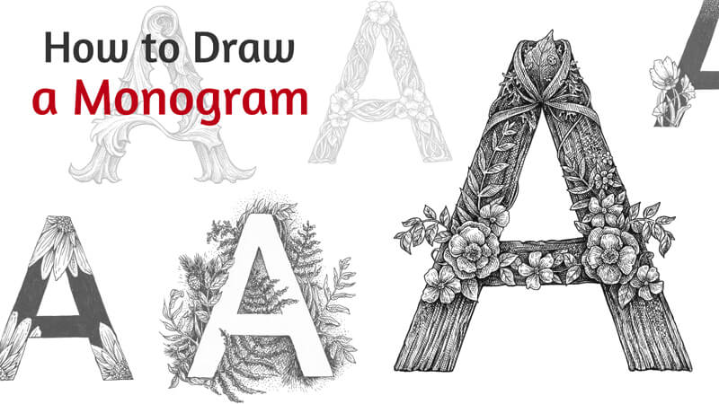
In this lesson, we’ll draw a single letter – a monogram. Usually, this word refers to a design consisting of two or more alphabetic letters that are combined or interlaced. However, a monogram can consist of a single emblematic or decorative letter too.
We’ll be using an HB graphite pencil, an eraser, and a couple of ink liners. The numbers of liners are 0.1 and 0.3. The size of the paper is A4.
You can use any drawing paper that you like. Ordinary printer paper is also an option. Access to a printer is a nice bonus, but it’s not required.
You don’t need any knowledge of typography terminology to follow along with this tutorial. I did my best to simplify the instructions so that anyone can do this project, even without previous experience in lettering.
I’ve chosen the letter “A” because it’s the first letter of the alphabet. If this project sparks your imagination, it may become the beginning of a wonderful art series!
However, feel free to depict any alphabetical symbol that you like. It can be the first letter of your name or just any capital letter that inspires you.

How to Draw a Letter – The Tracing Method
The easiest way to create an outline of a letter is through tracing. Beginners in lettering often prefer this way because it ensures that the result will have the right proportions. Tracing may be the first step that you take to practice drawing letters.
If you don’t have access to a printer or just don’t like to trace, feel free to skip this step. In the next part of the tutorial, I’ll show a way to draw a letter from observation.
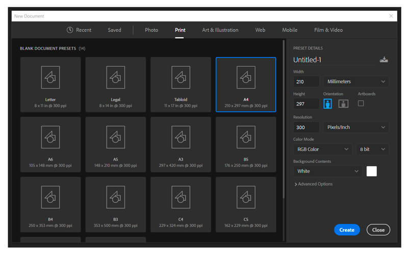
First, create a model for tracing using any graphic editor of your choice. I use Adobe Photoshop, so you’ll find some brief instructions for this program below. If you need more information on how to transform Photoshop into the greatest ally of your creative workflow, check out this course.
In Photoshop, create a new document. The print size of your file should conform to the size of your paper. In my case, it’s A4. Set the resolution at 300 pixels per inch which is an optimal resolution for print.
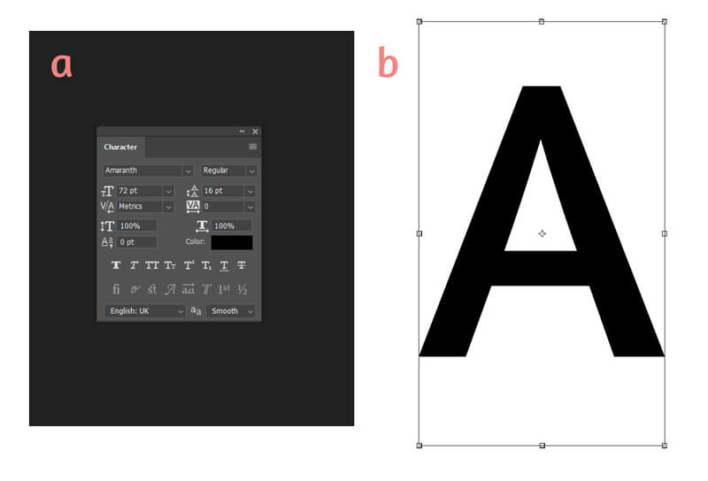
Then, add a letter, using the Type tool (the shortcut is T) on your keyboard.
In the Character palette, you’ll find numerous fonts to choose from, along with some other options. I like a font called Amaranth. If you can’t find that palette, go to Window menu – and select Character.
Don’t spend too much time searching for the “right” font. All we need is a nice silhouette as a starting point.
If necessary, move and resize the letter, using Free Transform (Ctrl+T). Press and hold Shift while resizing to keep the proportions in tact.
In the image below: a) Character palette, b) the letter with Free Transform bounding box.
Now you’re ready to print that document!
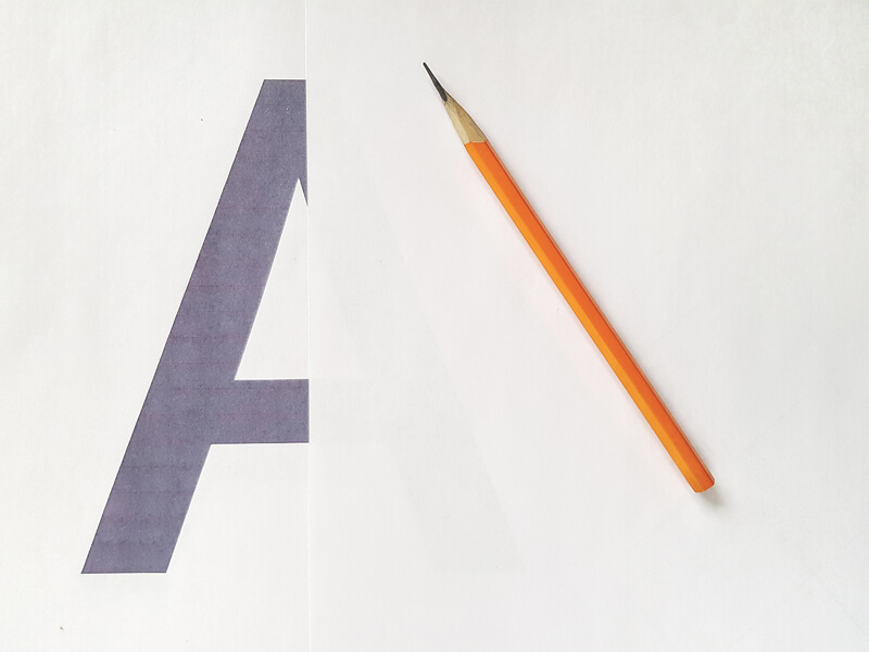
There are several ways to trace a letter. You can put a sheet of blank paper on top of your printout and trace it using a light table or a window pane during the day. If you use thin computer paper as a top layer, you won’t even need much additional light to see the silhouette of the printed letter.
Alternatively, you can use carbon paper. To do so, put a sheet of carbon paper between your printout (on top) and blank paper (below all) and trace the contours with a pencil.
Now trace your letter.
The next part of the tutorial is dedicated to another method of drawing a letter without a printed model, if you have decided that tracing is not the way you want to go.
How to Draw a Letter – Observational Method
Drawing anything freehand (without tracing) is more advanced and requires good observation skills. Of course, your results get better with practice. But, even if you don’t have experience in hand-lettering, drawing letters from observation is not rocket science. Below you’ll find some tips that make the process easier.
Analyze the Letter
You need a model of the letter that you’re going to draw. It may be a file on your computer, an image in the browser or a printed sample. Put it before your eyes.
Analyze this letter. Try to divide its shape into two, three or four parts. How do these parts interact?
Then, try to see the framework of the letter. The framework is located inside the letter’s shape. If the silhouette is “body” or “clothing”, what does its “skeleton” look like?
The image below illustrates my point.
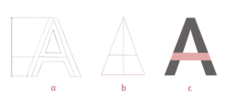
a) The height of my capital A letter can be divided into two parts. The central line of the letter’s crossbar indicates the border between these parts. The upper part is twice as long as the lower one. This note is useful – it’ll help me to keep the right proportions!
b) I can draw a vertical descending line from the top point of the letter’s framework. That’s how we get the lower point that helps us to check the symmetry. The distances on both sides should be equal.
c) Here’s how I see the pattern of shapes that is inherent to this letter. I’ve marked them with different colors for your convenience.
How to Draw the Letter
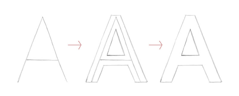
Start with the letter’s framework and draw it as you would write it. Look at your model and do your best to keep the initial proportions. Or, if your goal is to create a derivative version, feel free to distort them.
As you’re drawing freehand, your lines may be slightly uneven. You can strengthen them with a ruler later or leave them just as they are, embracing the imperfection.
The next step is adding weight and the contour lines of the letter. I see them as clothes wrapping around the framework, widening or expanding the letter.
And the last step is erasing the lines of the framework.
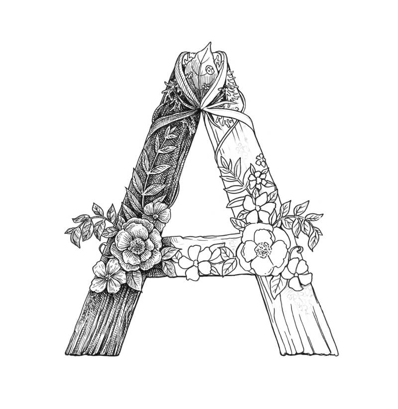
The Result of Our Work
It doesn’t matter what way – tracing or drawing from observation – you’ve chosen to create the letter’s outline. Now we have a template and are ready to add decorations.
Please note that this initial outline is just a starting point. We can change its shape in some areas, distort it, or add new elements in the next steps.

But before we dive into embellishing the monogram, let’s observe several examples. I hope they’ll inspire you and help you to generate some ideas for your artwork.
Silhouette, Contrast, and Decorations in Lettering
I’ll provide you with six examples that I’ve prepared for this tutorial. Brief explanations are here to indicate the important features of each monogram’s decorative style.
Organic, floral motifs are the common theme of this set of letters.
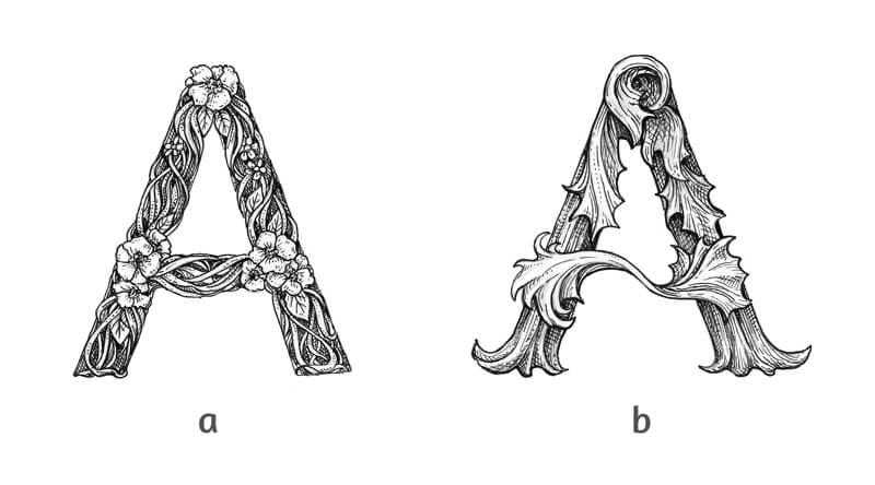
a) The groups of flowers serve as focal points here. Other elements are rather small – they accent the floral adornments. It’s important to find a balance between smaller and larger objects.
b) This letter somehow reminds me of a vintage style. At the same time, these whimsical elements look like crumpled fall leaves. The interplay of thinner and thicker lines give the monogram more volume. Fine hatching and cross-hatching are used to create shadows and relief.
See also: Line Weight (Quality) and Cross Contour Lines
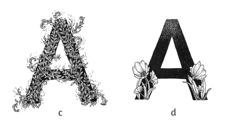
c) In this image, we won’t find a single element that draws our attention. Thin twigs intertwine, covering the whole shape of the letter, but we still can see it due to a contrasting black covering. Some twigs pass beyond the silhouette’s boundaries, but the letter is still legible.
d) The upper area of this example is created in a stippled manner, so the contours are blurred. The flowers look very contrasting against a solid ink background. They go beyond the silhouette of the letter, but the result looks accurate and easy to identify. In other words, we can clearly see that it’s an “A”.
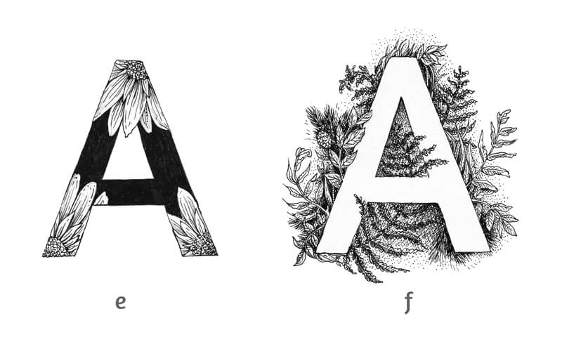
e) This example is contrasting and expressive. Some floral elements stay inside the shape of the letter. One petal breaks the silhouette.
f) This monogram is a clever use of negative space. The floral adornments decorate the artwork while the letter itself remains untouched, attracting the viewer’s attention.
See also: Positive and Negative Space
Let’s review:
- Define the general theme or style of your letter and its adornments.
- Keep the letter readable.
- Use contrast wisely.
- Balance the larger and smaller elements.
- Allow yourself to be creative.
Before we proceed to our finished artwork, it may be useful to make some rough miniature sketches. Play with various styles or themes of adornment.
Do your research, if necessary. Pinterest has an infinite number of stunning examples for your inspiration.
Adding Decorations with a Graphite Pencil
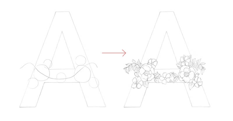
Let’s enhance our template. I decided to continue with the floral theme in my decorations.
First, I allocate the groups of flowers, marking them with rough shapes. The flowers will be the larger, eye-catching elements.
I draw a curved line that follows the crossbar to indicate where the flowers and leaves should go.
Then I draw the separate elements in detail.
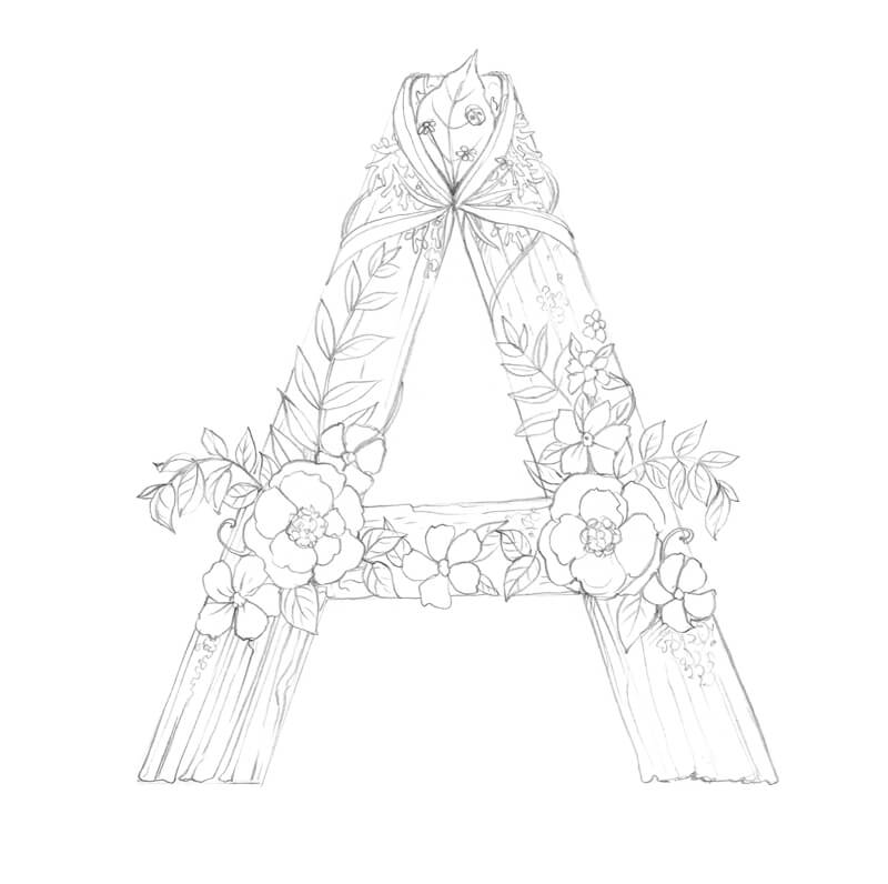
Now I add some ribbons, grass blades, a big leaf, and a ladybird to the top of the letter.
I decided to give my letter a wooden texture. This relief adds charm and fits within the natural theme. Small areas of moss are shown here and there to create variety and added interest.
I also add more leaves and small flowers to fill in the shape.
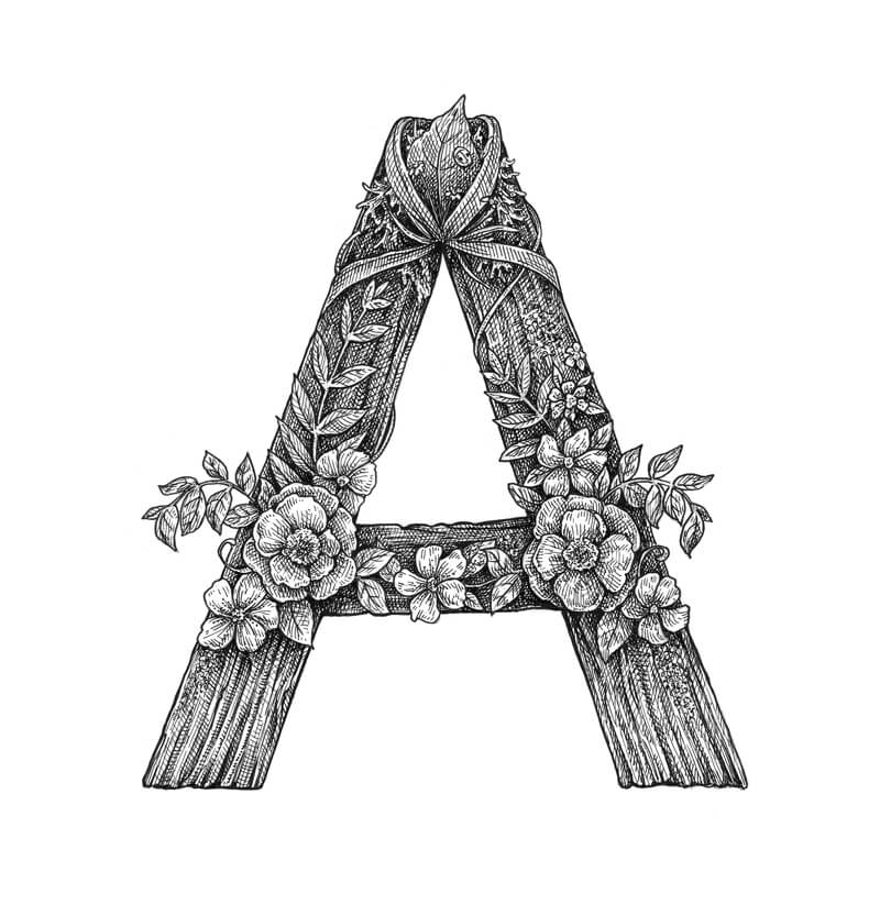
Adding Ink
I start the inking with a 0.3 liner, outlining the significant elements. The outer contours of the letter should be thicker. Let’s help them stand out!
I strengthen the lower contours of the monogram once again to give it some weight.
After the outline is complete, I erase the unnecessary graphite pencil marks.
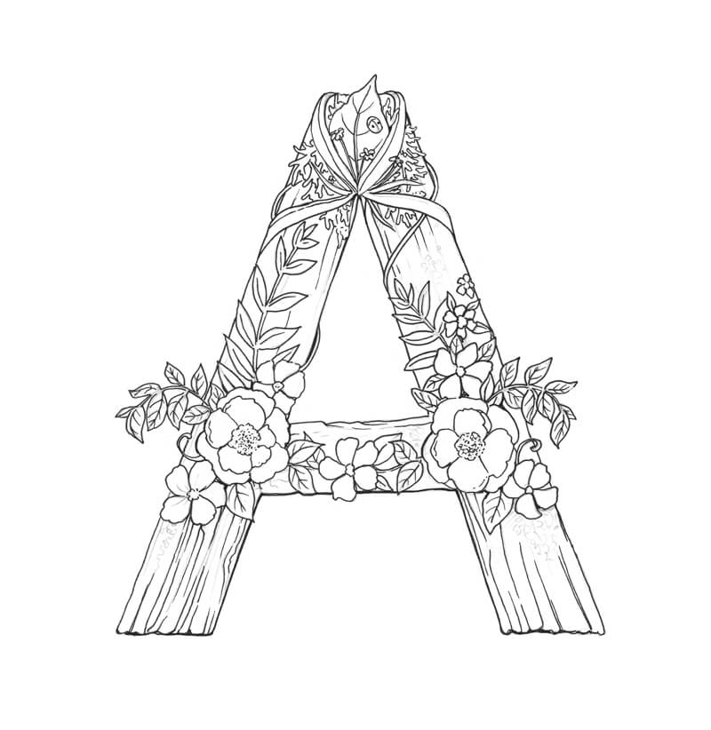
With a 0.1 liner, I add hatching to convey the relief of texture. Then I apply additional layers of hatching to deepen the shadows.
See also: Pen and Ink Drawing Techniques
The flowers remain relatively light. They look contrasting against the backdrop.
If you need more information on my approach to drawing a wooden texture with ink, this post may help you: Drawing with Ink Liners: Natural Textures
I complete the remaining half of the letter in the same manner.
I make sure that the artwork looks balanced in terms of contrast. The floral elements are lighter than the letter’s textured shape, but they aren’t too clear-cut.
Decorative Lettering – Conclusion
Congratulations – we’ve created a beautiful monogram! I hope that you enjoyed both the process and the result.
I wish you much inspiration on your way of mastering hand-lettering. Have fun!
If so, join over 36,000 others that receive our newsletter with new drawing and painting lessons. Plus, check out three of our course videos and ebooks for free.
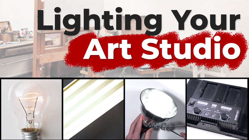
Lighting Your Art Studio
How to Light Your Art Studio
The light in your studio plays a huge role in the accuracy and potential success of your paintings and drawings. Often it is the last thing considered, but having the proper lighting can actually lead to better paintings and drawings.
Ideally, we would all love to have natural sunlight radiating into our studios both night and day. Obviously this isn’t possible and even if we do have the “holy grail” of a north facing window, the light will always be on the move as the sun makes its daily journey.
Not all of us can work during the day either and some of us actually prefer to work at night. So this means we have to look to artificial light to meet our needs.
It’s easy to assume that all we need to do is drench our studios with as many lights as possible to best replicate the natural light of the sun, but this would be a mistake. Too much light is just as bad a having too little.
In order to best light our art studio we must first understand a bit of the properties of light and how they affect the way we perceive color and value.
Let’s first discuss the temperature of light.
The Temperature of Light
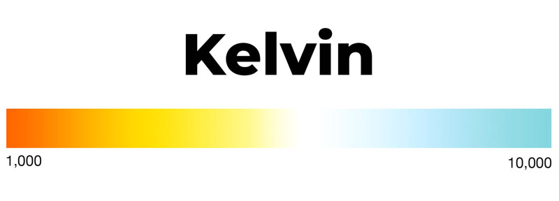
Not all light is created equal. Light can be cool or warm. The temperature of light is measured on a scale and is designated based on degrees of a measurement called Kelvin.
The temperature of light is measured on the Kelvin scale from 1000 to 10,000. Cooler light has a higher Kelvin degree while warmer light has a lower degree.
To make this scale a little easier to understand, let’s look at a few examples.
The embers in a smoldering fire may be around 1000K.
A burning candle is a little cooler, at around 1800K.
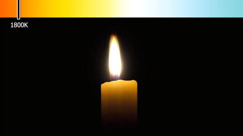
A standard incandescent light bulb may be around 2700K.
The sun at sunset may fall around 3400K.

The sun at noon is around 5000K and on a clear bright day may be as high as 6500K.
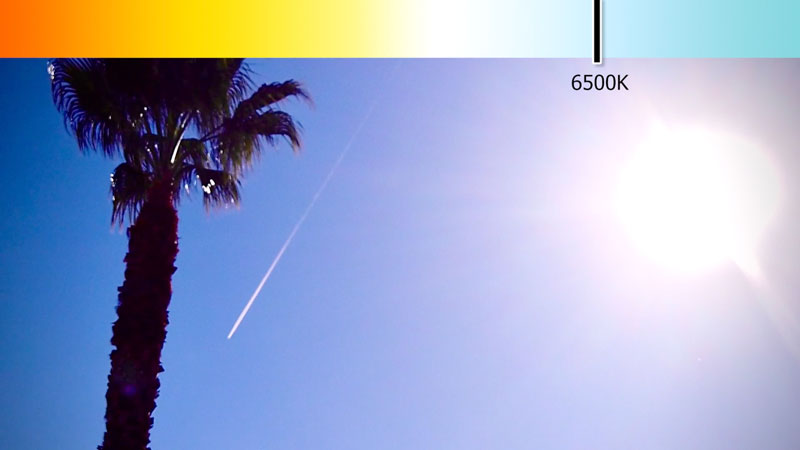
So, sunlight, the light we most want to replicate, is actually a cooler light.
This means that using a standard incandescent light bulb to light your art will make the colors that you choose less accurate. Since the colors you perceive will be warmer than they actually are, you’re likely to overcompensate and make the colors that you add to the drawing or painting a little cooler. This will likely result in “bluish art”.
Take a look at how the colors in these artworks change as the Kelvin is adjusted.
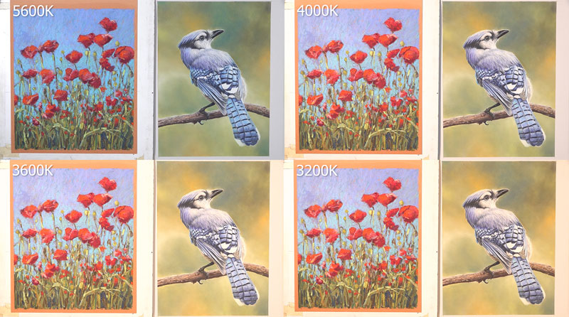
Notice how the colors change dramatically.
So in order to most accurately capture the colors in our paintings and drawings, we need to look for lights that are cooler. Any light around 5000K is most ideal, since it most accurately mimics the light produced by the sun.
A Kelvin degree higher than 5000K may make you force colors a little warmer, resulting in a drawing or painting that is actually to yellow or orange, so don’t go too far on the cooler end of things.
The Intensity of Light
Color temperature is obviously important, but the intensity of light in your studio is equally so. The intensity of light will affect how you perceive and develop the values in your drawings and paintings. Value, one of the seven elements of art, affects the illusion of light, form, and texture. It is the value, or darkness or lightness of color, that ultimately leads to success in creating these illusions.
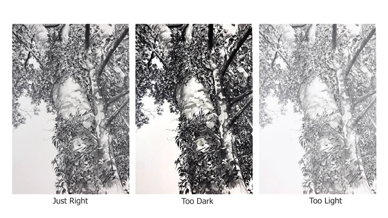
If your light is too intense, then you’re likely to overcompensate and create drawings and paintings that are too dark. If your light is too weak, then you’re likely to create drawings and paintings that are too light.
The intensity or brightness of light is most commonly measured in lumens. The higher the lumens, the brighter the light.

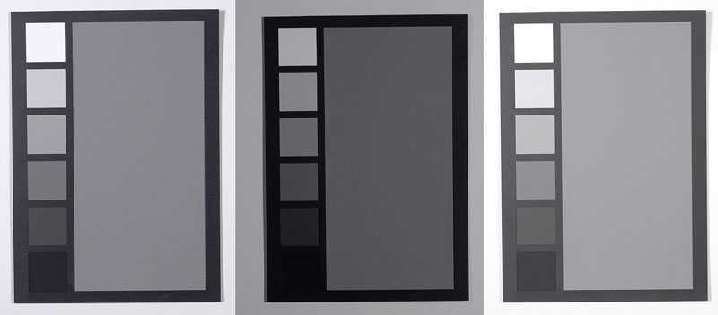
Ideally, we want to create an environment that has the right amount of light intensity directed at the drawing or painting surface. One way we can measure this is using a value scale.
After setting up your lights, use a value scale to evaluate the intensity of your lights. Pay special attention to white and black. If the white appears as a light gray, then you may need more intense light. If the black appears as a dark gray, then your lighting may be too intense.
Besides choosing bulbs of differing intensities, we can also adjust the distance between the art and the lights. Obviously, moving the light farther away from the art will lesson the intensity, while moving it closer with make the light more intense.
Having adjustable lighting in your studio is recommended so that you find the perfect intensity for your unique environment.
The Angle of Your Studio Lights
The angle of your lights is also important. We want our lights to be positioned in a way so that we minimize glare and create an even spreading of light across the drawing or painting surface.
The angle of your lighting depends on how you set up your work space. The ideal angle of your lights will depend on whether you work on a flat or tilted surface or if you work upright on an easel.
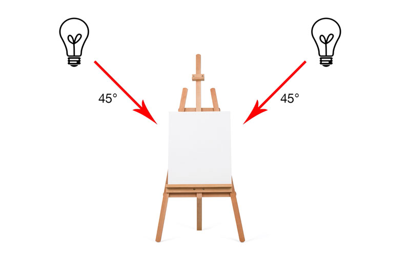
Lighting a Flat Surface
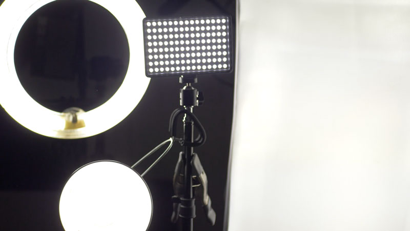
Let’s first look at the ideal lighting setup for working on a flat surface. Although my preferred setup for drawing is on a tilted surface, I typically work on a flat surface so that the camera is positioned directly above the art for filming.
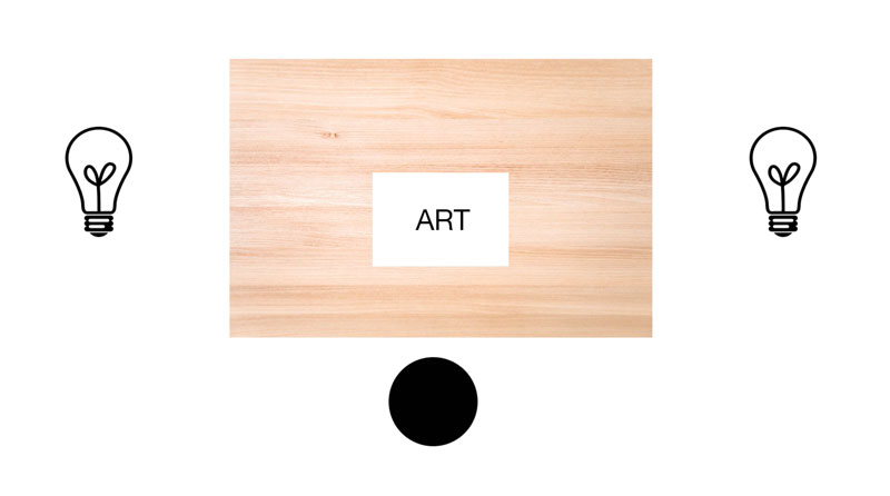
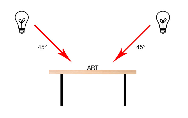
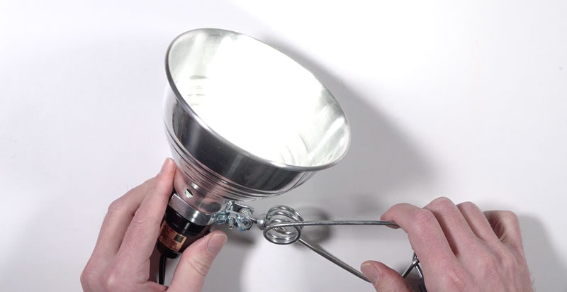
In my studio, I have two LED panel lights supported on light stands on either side of the drafting table. These lights are positioned so that light is directed at a 45 degree angle on the artwork from both sides. This allows for an even distribution of light and minimizes glare or reflection.
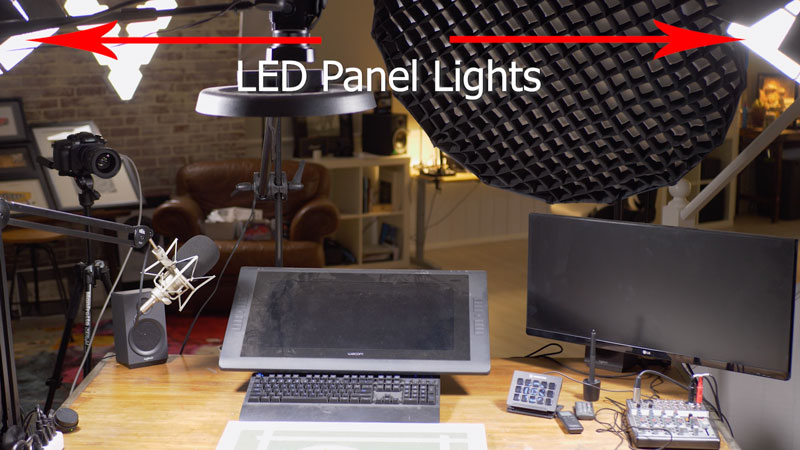
I also have a ring light directly above the art, but this light is only used for filming purposes or for photographing art.

Lighting a Tilted Surface
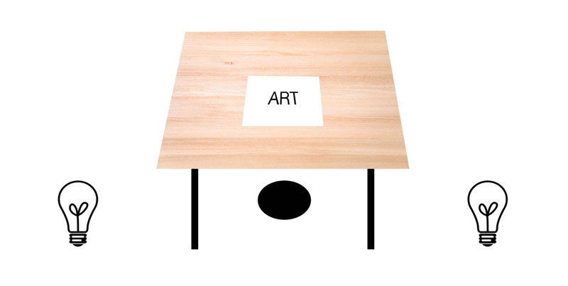
For a tilted surface, I recommend moving the lights slightly behind you, but keep the angle at 45 degrees. This will result in even distribution of light without glare.
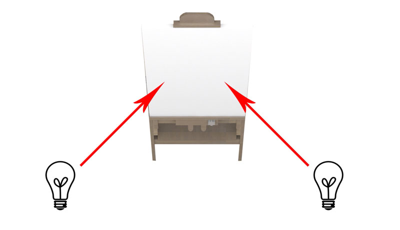
Lighting an Easel
Things change a bit when working on an easel. Since the art is directly facing the artist, glare is a bigger issue. If you were to light the art directly overhead, then the top of the painting would receive more intense light than the bottom and you would be fighting glare.
If using a singular light, it may be best to move the light or position yourself so that the light is behind you slightly and directed at the easel at a 45 degree angle.
This may require building a contraption or your own lighting rig to achieve the best light.
I have found however that using two lights, one on either side, works well without having to build anything. In this case, we can position lights on either side the of art and behind the artist, again positioned at a 45 degree angle to the easel.
You may have to move the lights around to find the ideal intensity and to eliminate glare, but this beats building a lighting solution that lacks adjustability.
Lighting Options and Bulbs
Incandescent Bulbs
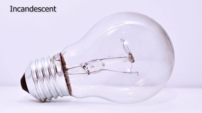
The first type of bulb is the standard incandescent light bulb. As we have discussed, these bulbs typically are found on the warmer end of the Kelvin scale and are generally not suited for lighting your art studio.
Fluorescent Bulbs
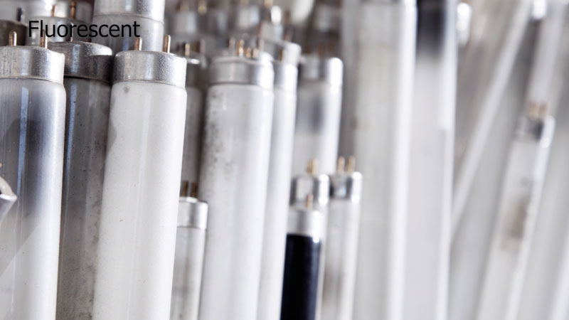
Fluorescent bulbs are typically long and slender and some artists prefer these because they spread light fairly evenly. Not all of us however have the fixtures needed for this type of lighting and don’t want to install them in our studio spaces. However, these bulbs do produce cooler light that is closer to natural sunlight.
Compact Fluorescent Bulbs

Compact fluorescent bulbs, or CFLs, work in the same way as standard fluorescent bulbs, but are coiled and their shape resembles that of an incandescent light bulb. These bulbs are available in a variety of temperatures and lumens making them ideal for use in a studio. They fit in standard incandescent fixtures and can be used in inexpensive clip on cans than can be purchased at most hardware stores.
LED Panels
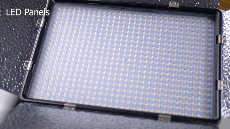
In my opinion, the best option for lighting your studio comes in the form of LED panels. This type of lighting has become extremely popular among photographers and videographers and these are the type of lights that I use in my studio.
Here’s where you can pick up LED light panels and light stands for your art studio (the following links are affiliate links which means we make a small commission if you purchase)…
These lights are adjustable based on both color temperature and intensity making them incredibly versatile.
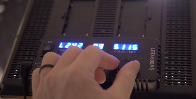
With a twist of the knob, these lights can output light with a warmer temperature or a cooler one based on your unique setup. The intensity of the light can be adjusted as well.
When supported on a light stand, these lights are easily placed wherever you need them. And if your home studio is also your dining room, they can easily be stored away until your next session.
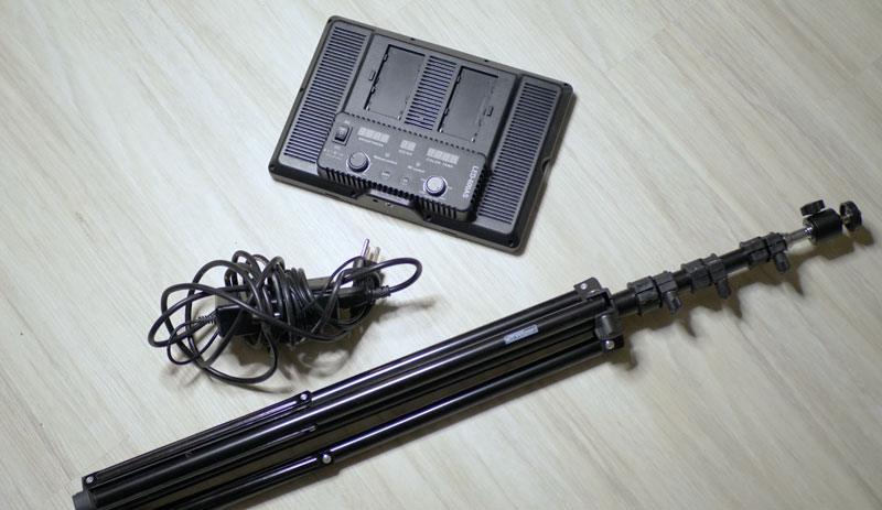
LED panels also last a very long time, so you won’t find yourself replacing them often. I have used these lights in my studio on a daily basis for well over two years without any issues.
Lighting Your Art Studio – Conclusion
So there you have it. Lighting your studio is not to be overlooked. Since we as artists are in the business of capturing light in our drawings and paintings, the light in our studio should be something that we consider. You definitely have some options, but none of the options that we discussed here are too expensive.
Keep in mind that your lighting needs will different based on your studio space and some adjustments will be necessary, but having the right light makes a huge difference in what you create.
If so, join over 36,000 others that receive our newsletter with new drawing and painting lessons. Plus, check out three of our course videos and ebooks for free.
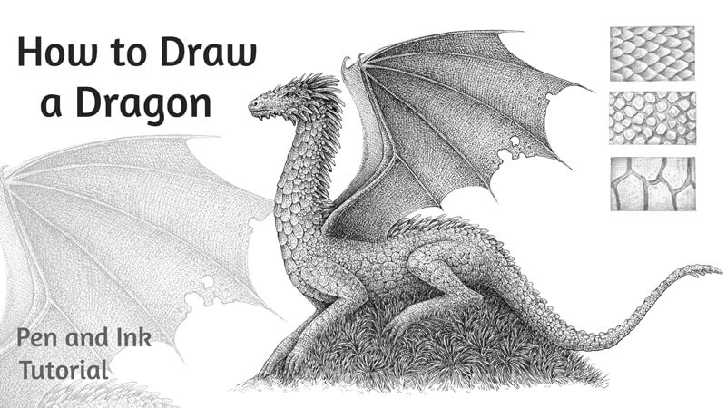
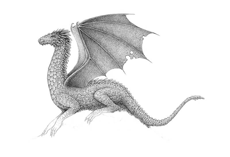
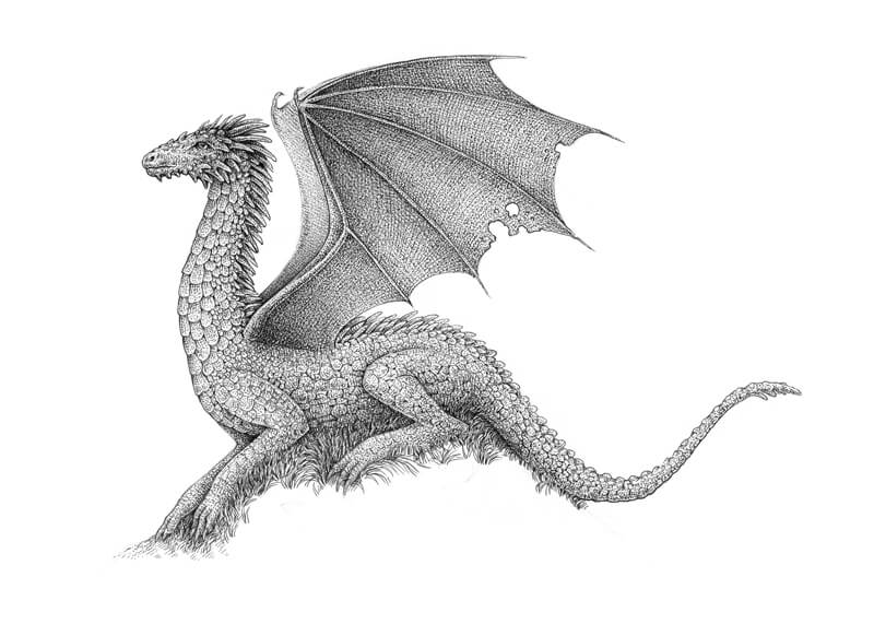
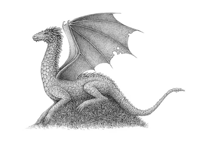
How to Draw a Dragon with Pen and Ink
Dragon motifs appear frequently in modern literature, particularly within the fantasy genre. The popular examples are:
- The Hobbit by J. R. R. Tolkien
- Harry Potter series by J. K. Rowling
- A Song of Ice and Fire by George R. R. Martin
Beliefs about appearance and characteristics of dragons vary from region to region.
The earliest dragons that are known today resemble giant snakes. In western cultures, since the High Middle Ages, dragons have been depicted as creatures that have four legs, wings, and horns – capable of breathing fire. Dragons in eastern cultures are usually portrayed as wingless serpentine creatures.
It’s necessary to emphasize that dragons are fictional and so are any assumptions about their anatomy. Nobody has ever seen a real dragon! This means that we enjoy a wide range of options while designing our creature. Feel free to use the tutorial to create a base for your own dragon, changing or adding the details according to your vision.
I’m going to keep my dragon’s appearance closer to the image found in western culture. My art will be rather stylized. The balance between a realistic look and stylization is always up to you.
For this project, we’ll need a graphite pencil, an eraser, an ink liner (my choice is 0.1 number), and drawing paper. I’ll be using just a single liner. However, if you prefer having a greater choice of line width options, feel free to use a variety of different pens. In this tutorial, I’m going to show you that it’s possible to get a moderate variation of the line width using the same pen.
How Many Legs Does a Dragon Have?
This question may seem strange, but we have to dwell on this topic just for a moment.
Originally, dragons could have any number of legs. However, since the sixteenth century, English, Scottish, and Irish heraldry began to distinguish between a “dragon” and a “wyvern”. It was believed that dragons have four limbs and wings, and wyverns have only two back legs and wings.
Other features that were commonly attributed to wyverns are the inability to breathe fire and strongly pronounced fierceness.
If we rely on the number of legs as the main distinguishing feature, it is possible to say that wyverns are more often represented in movies these days. (Just remember Game of Thrones television series.) That sometimes causes heated arguments whether a particular creature is a dragon or a wyvern.
However, wyverns are quite similar to dragons. In many languages, cultures, and contexts, we won’t find a clear distinction between the two creatures. For example, in the heraldry of other European countries, it is entirely acceptable to have dragon-like creatures with two legs being called dragons.
On the other hand, there is an opinion that a model of a dragon with two legs plus wings is more correct from a “biological” standpoint. No creature found in nature has four legs and wings at the same time. The layout of all vertebrates follows a simple principle: four limbs plus a head. Animals with the ability to fly have sacrificed two of their limbs that evolved into wings.
If we rely on examples of creatures that actually exist (or existed in the past), this point of view is quite sensible. As you probably see by now, there is no clear answer as to how many legs a dragon should have. Still, knowing about the nuances may be useful.
I’m going to depict a four-legged dragon. This layout seems more fitting to the pose and composition that I have in mind.
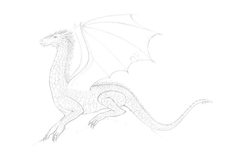
Sketching Dragon Poses
As long as I’m working with a relatively small A4 paper size, I won’t be able to depict a dragon in a monumental posture — flying or sitting with its wings outstretched. However, it’s still possible to find a pose that is both interesting and compact.
My dragon will be lying or sitting on a hill. Its wings will be unfolded. This will make the pose more dynamic. One wing will be almost hidden behind another.
I create some rough sketches, presenting the dragons’ figure in a simplified, stylized manner. At this stage, I don’t strive for perfection.
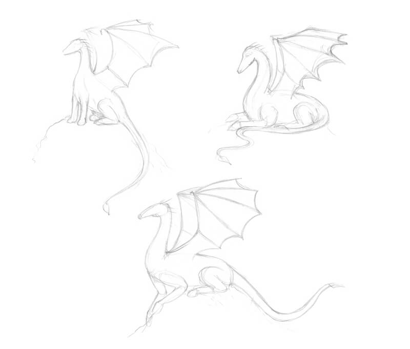
It’s difficult to choose a specific option, but we have to. Let’s say the lower one is my favorite. I feel like this dragon is up to something! Let’s proceed to the final surface with this pose as our choice.
How to Draw a Dragon with a Graphite Pencil
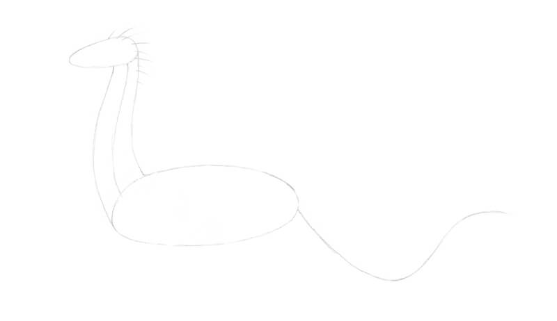
We’ll draw a dragon in the most simple way possible.
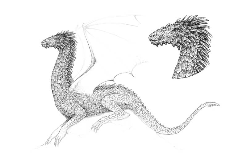
I outline the rough, rounded shapes of the dragon’s head and body. Then, I add a core line representing the neck and its general shape.
Several lines are drawn from the head and neck. They symbolize the future horn-like ridges I’m going to adorn the dragon’s body with.
A long, curved line marks the direction of the tail. Make sure that there’s enough space for the limbs as we’ll add them in the next step.
I add a simplified framework of limbs. The lower shapes are for the paws and the toes and claws. We don’t see the other hind leg because of the pose.
Then I draw a stylized framework of the wing that is closer to the viewer. Small circles mark the joints. Several long lines are going from the upper circle, indicating the direction of the wing fingers.
I also give some thickness to the tail, outlining its contours.
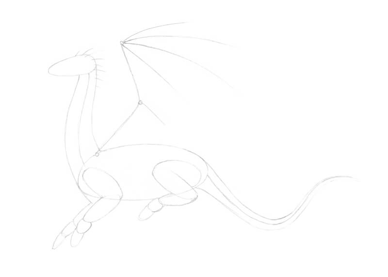
It’s time to refine the drawing. Feel free to remove the unnecessary pencil lines with an eraser as you go.
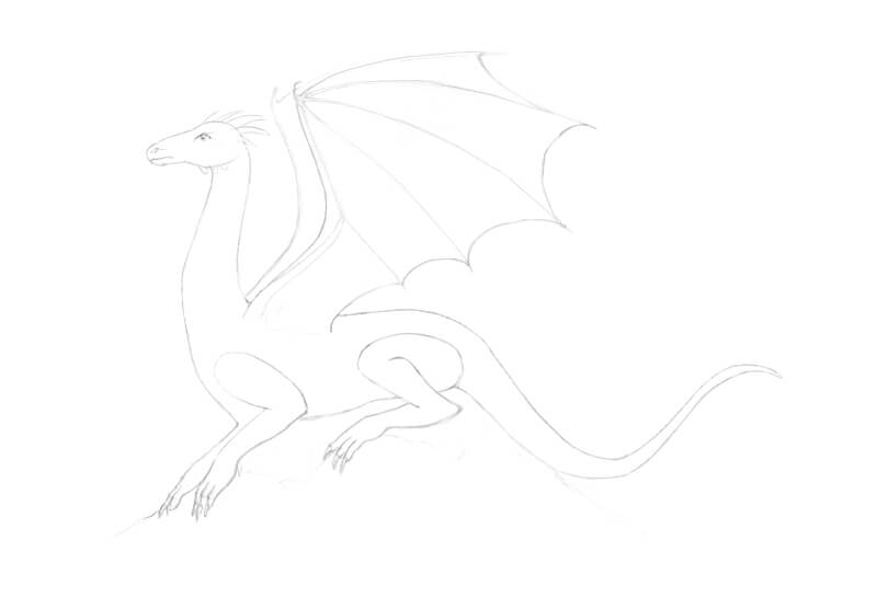
I make the head slightly narrower in the muzzle, then add the eye, nostril, and some ridges. It’s a good idea to make a couple of head ridges slightly wider and longer — they will become the “horns”.
The contours of the limbs evolve too. I accent the wrists and ankles and then draw the separate fingers and toes that end with long claws.
I add a small wing “thumb” and outline the contour of the membrane. The dragon looks quite unnatural with only one wing, so I mark the second one behind.
With light pencil lines, I draw the hill under the dragon.
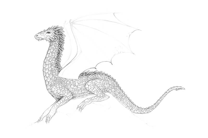
I’m going to add the details, such as scales and various ridges on the dragon’s body.
As we’re working on a fantasy creature, we can’t find a credible photo reference to rely on — only artworks that were created by other people or movie screenshots. When it comes to the body texture or other details of the dragon’s appearance, we have to be creative.
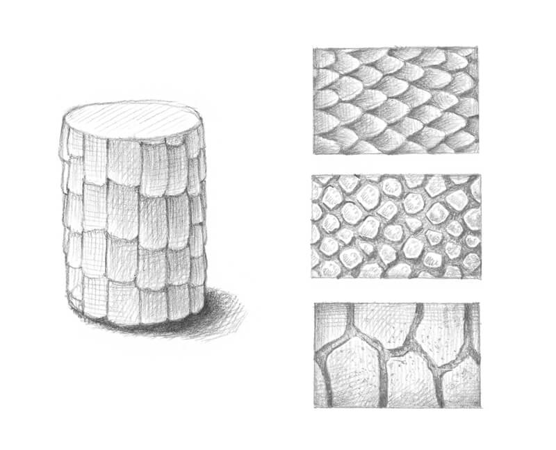
One of the options that may help is observing lizard’s skin on a real reptile or on a photo. It will suggest a variety of scale patterns. Pay attention to the rhythm of scales, their size, and shape.
Some of the texture examples are in the image below. It’s useful to create your own samples beforehand. Of course, we won’t see scales in detail in our final artwork, but having a clear vision helps in the process.
One thing to keep in mind is that scales should conform to the general shape of the object. This shape has volume. The principles of perspective will affect the pattern too. The cylinder in the image below is an illustration of this concept.
Feel free to invent your own patterns of scales or body adornments if you wish. The number of details is up to you. In many cases, a looser approach works great even with detailed images.
I add more ridges to the head and neck, gradually building rows of them. The dragon’s back and tail have various bumps and pointed spines. Again, the design is up to you.
I draw groups of bigger scales in the neck and limb areas. The size of scales will help to distinguish between larger and smaller body parts. The neck and legs of a dragon may be covered with larger and harder scales.
The scales will affect the silhouette, making its line slightly uneven. Take a look at the contours of the neck to see what I’m describing.
The groups of bigger scales alternate with gatherings of smaller scales. This makes the overall pattern more interesting and versatile.
To make our dragon’s character more interesting, I add some ragged holes in the wing membrane. How did this dragon get them? What do you think? These small details add a bit of story to our drawing.
See also: How to Draw a Rabbit with Pen and Ink
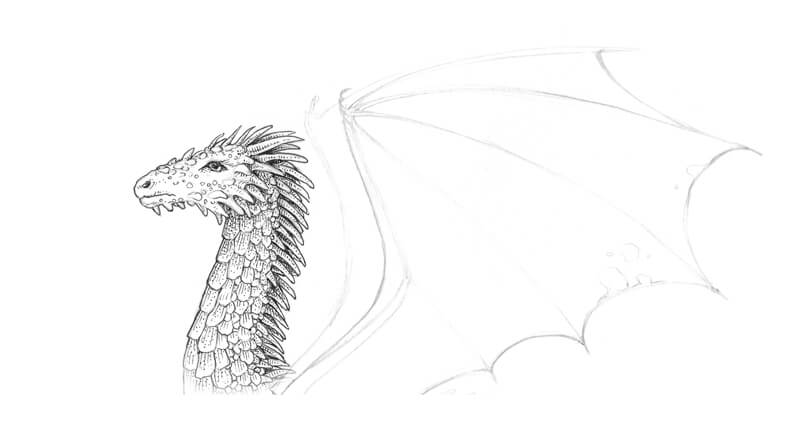
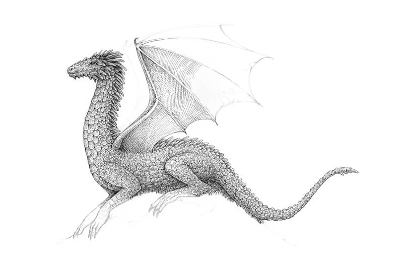
How to Draw a Dragon with Ink
With 0.1 ink liner, I outline the main contours and scales, starting with the head of our dragon. I use short hatches and dots to create soft shadows on the scales. They shouldn’t be too contrasting.
I assume that the light comes from above because it’s a natural environment. This means that the area just below the head will be in shadow. I slightly darken the areas between the neck ridges to distinguish them visually.
I continue working on the body. Smaller scales are drawn in a looser, “sketchier” manner.
I also apply hatching to the underside of the dragon’s body to give it more volume. There is a shadow in the chest area and on the front leg. With the shadow in place, the front leg that is closer to us stands out visually.
See also: Basic Pen and Ink Techniques
The creature is lying on a hill covered with tall grass, so I avoid creating any solid contours of the body here.
Next I’m going to add ink dots to the drawing, paying particular attention to the darker areas. Stippling allows us to create the illusion of beautiful texture that feels rough or bumpy. Vary the space between the dots to get interesting effects and to broaden the range of tone. The more dots, the darker the area will be.
I darken the area around the eye and at the underside of the muzzle, revealing the volume and relief.
I also strengthen the contours on the bottom part of the head. This area gets less light, and a broader contour indicates this. I use the same 0.1 ink liner to create a thicker contour. It is always possible to broaden the line with your existing tool.
In the image below, you’ll find the dragon’s head in detail.
With stippling and long lines, I start working on the wing that is closer to the viewer. This combination of techniques will allow us to create the illusion of texture that feels both smooth and organic.
I continue working on the wing. The hatches accent the form while dots convey the feel of the texture. We’ll see this process in detail in the next steps.
I also proceed with the bottom part of the art, increasing the contrast. I add more dots to the underside of the dragon and its limbs. At the same time, I draw the grass with long organic lines.
When it comes to the wing, I recommend starting with lines that show the direction and the general contours.
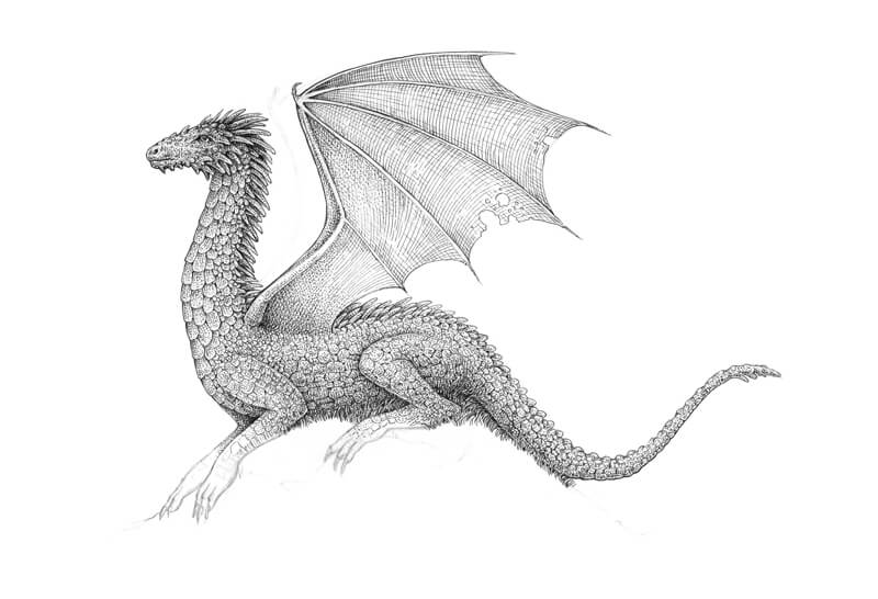
I cover the wing with dots, creating smooth transitions of value. The wing fingers remain relatively light to accent their relief. I just add a few dots to them.
If you feel like stippling is way too time-consuming, you can use cross hatching instead.
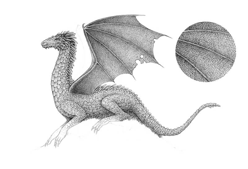
In the image below, you’ll find a fragment of the wing in detail.
I draw the second wing, using dots and light hatches. I aim for creating a hazy silhouette rather than a detailed element of the body.
Again, it’s possible to vary the width of the lines with the same ink liner. To create thinner lines, move your hand quicker and place a lighter pressure.
I work on the limbs in combination with the grass. We don’t have to draw individual blades. Instead, we can group lines together to create the illusion of texture. Then we can create shadows with an additional layer of hatching.
See also: Line Drawing Techniques
There is a cast shadow under the dragon, so I make sure that this area is dark and contrasting.
The lower parts of the dragon’s legs are relatively thin and have small sections, like the claws. For the most part, stippling is used here.
I complete the hill. The foreground can be slightly darker and more accented, so I draw groups of longer grass blades with more intense shadows.
It’s time to evaluate the drawing. Does everything feel right in terms of value, contrast, and texture? Is the silhouette clear? Are important details in place? Sometimes it’s necessary to take a break to see what needs improvement.
And as soon as you’re happy with the result, the artwork is finished!
Drawing a Dragon with Pen and Ink – Conclusion
Congratulations! We now have created a wonderful ink drawing of a majestic fantasy creature! I hope you enjoyed every step of the process. Even complex things don’t have to be too difficult, right?
Have fun as you explore the world of imaginary creatures and drawing them with ink!
If so, join over 36,000 others that receive our newsletter with new drawing and painting lessons. Plus, check out three of our course videos and ebooks for free.
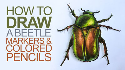
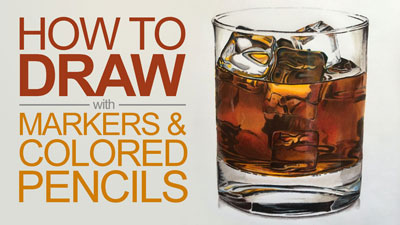
How to Draw a Sports Car with Colored Pencils and Markers
Drawing a Sports Car with Colored Pencils and Markers
In this colored pencil lesson, we’ll take a look at drawing a convertible sports car with colored pencils and markers. This combination of drawing media works extremely well together. The markers act as an underpainting, allowing us to cover broader areas in a shorter period of time. The colored pencils allow us to develop details and strong contrast. We’ll make the most of each medium as we develop the drawing.
Materials for this Lesson
The surface that we’ll work on for this drawing is especially important. In fact, the surface plays an important role in any drawing that you create. The surface we’ll use is marker paper by Canson. This surface is designed to accept marker applications while minimizing bleeding. Even though this surface is very smooth, it’s still suitable for accepting a few layers of colored pencil applications over the top.
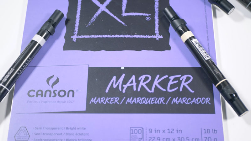
See also: All About Drawing Papers
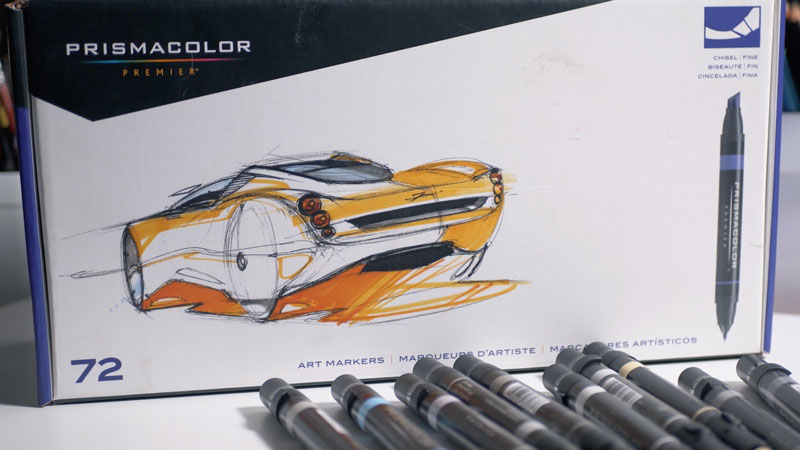
We’ll first develop an underpainting using alcohol-based markers. The alcohol-based markers we’ll use are by Prismacolor. There is a broad spectrum of markers available and you are welcome to substitute any brand that you wish. However, it’s important to work with alcohol-based markers since water-based markers will not behave in the same manner.
Alcohol-based markers are easily layered and are semi-transparent when applied. This characteristic allows us to gradually build up intensity in the color and gives us greater control over the values.
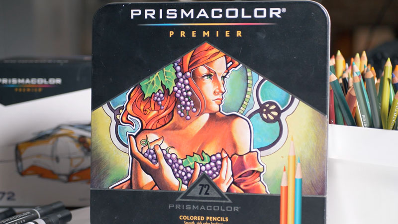
We’ll use wax-based Prismacolor Premier colored pencils to enhance the colors and develop the details. These soft and pigment-rich pencils are excellent for creating strong colors. They layer nicely and blend easily as well.
See also: Wax-based Colored Pencils vs. Oil-based Colored Pencils
Here’s a look at the specific materials used to create the art. (The following links are affiliate links which means that I make a small commission if you purchase without an additional cost to you)…
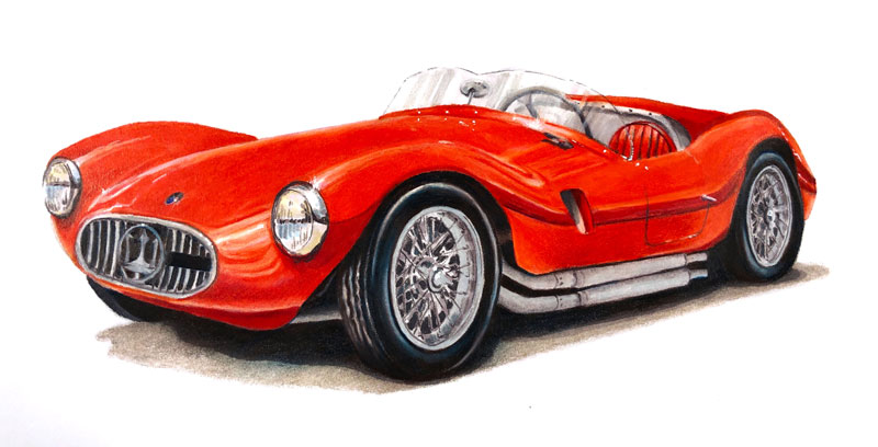
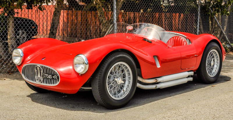
The Photo Reference
Since accuracy is very important, we’ll work from a photo reference to complete the drawing. Here’s a look at the photo reference that is used. You don’t have to work from this image. Instead, you can use what you learn from this lesson and apply it to your own drawing.
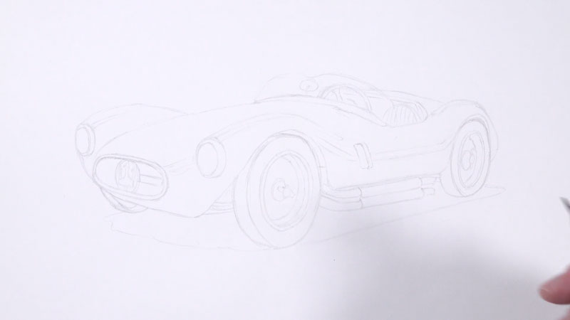
The Pencil Sketch – Transfer or Use a Light Board
With a drawing like this, accuracy is very important. For this reason, we’ll begin with a light board transfer. Marker paper is somewhat transparent making it an excellent surface for use with a light board. However, if a light board is not available, you may use a graphite transfer or the grid technique to ensure accuracy in your sketch.
A light H graphite pencil is used to create the transfer. The addition of values (or shading) is avoided. A very light touch is used in order to avoid indentations in the paper and to minimize the amount of graphite on the surface.
Marker Applications
Markers are great for covering larger areas in a drawing. They are quick but it’s difficult to develop details. For this reason, we’ll use the markers as an underpainting. Over the top, we’ll layer colored pencils to increase contrast, broaden the range of value, and develop the details.
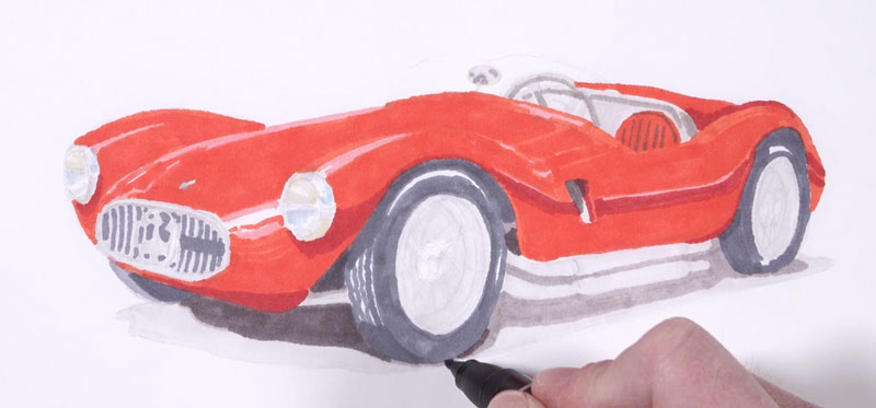
We’ll begin with our first marker applications on the body of the car. A bit of Poppy Red, Blush Pink, and Crimson Red is applied. Poppy Red is used for the bulk of the body of the car, while Blush Pink is used as a transition color near the highlights. Crimson Red is applied in the darkest areas of shadow.
Be sure to be mindful of the highlights. Leave open spaces for them since it is difficult to make these areas lighter later in the process.
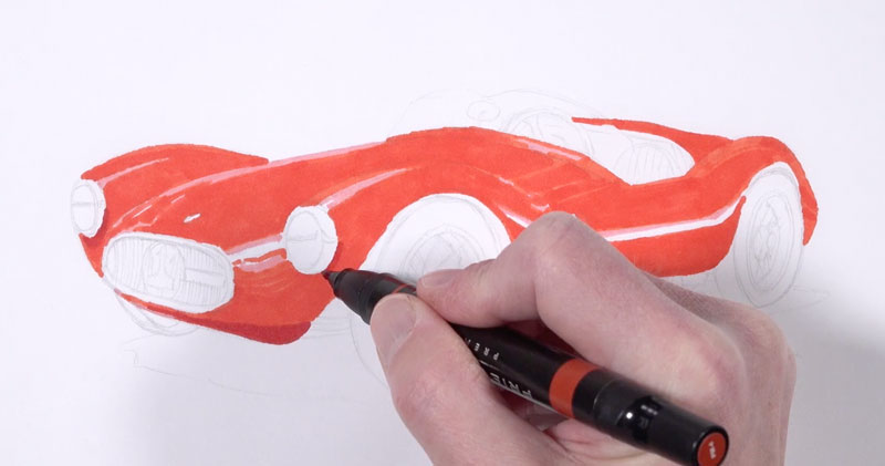
Next, we’ll layer a few grays. Warm grays are used mainly behind the seat, on the windshield, and the larger shadow under the car. Cooler grays are applied in the areas of darkest shadow right underneath the body and on the tires.
It’s a good idea to start with lighter grays and progressively layer darker versions. Remember, we’ll layer colored pencils over these applications which will make these areas darker later in the process.
See also: Warm vs. Cool Grays
Colored Pencil Applications
Once we have a suitable underpainting in place, we’re ready to begin with colored pencil applications. We’ll begin on the left side of the drawing and progressively work our way to the left and downward.
One of the advantages to working with the same brand of colored pencils and markers is that the same colors are found in both marker and pencil form.
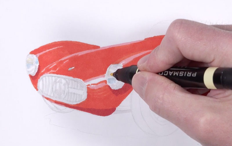
We’ll begin on the body with Poppy Red, intensifying the highlights with white. In the darker areas, we’ll use Scarlet Lake. A dark warm gray is applied around the headlight.
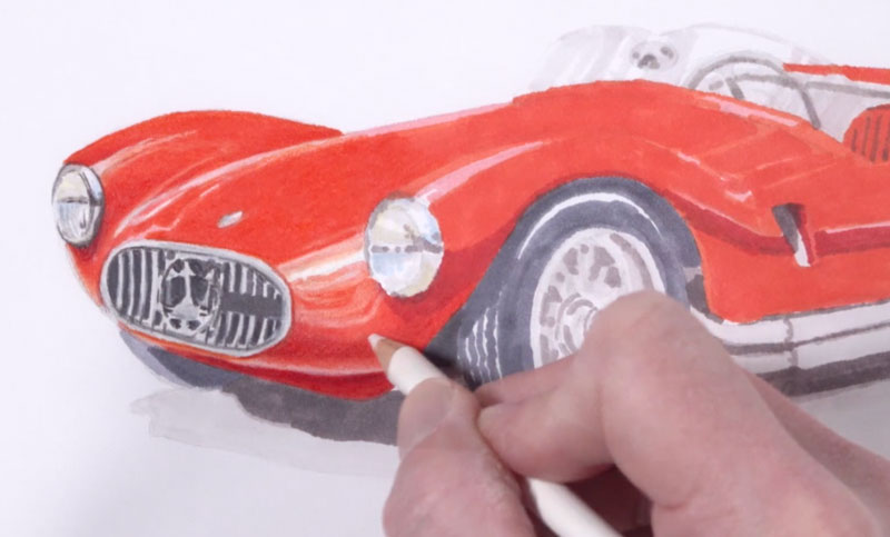
We’ll continue working our way down the body of the car, alternating between Poppy Red, white, and Scarlet Lake. We’ll also enhance the colors within the headlight.
After addressing the interior with a variety of grays, we’ll move down to the darker values underneath the car and around the tires. To create a more natural “black”, we’ll layer Dark Umber and Indigo Blue. This combination of colors gives us control over the temperature of the black that we create. For a cooler black, we can allow the Indigo Blue to dominate. For a warmer black, we can allow the Dark Umber to dominate.
In this case, we want the tires and the darkest shadows around them to have a cooler appearance. To achieve this, we’ll apply the Dark Umber first followed by the Indigo Blue.
We can then enhance the highlights on the tires with a light warm gray.
We’ll continue with this approach underneath the car where we see the strongest area of cast shadow. The color that we create here by layering Dark Umber and Indigo Blue should be slightly lighter than the tires. We want to create enough contrast so that the tires are not lost while keeping the value dark.
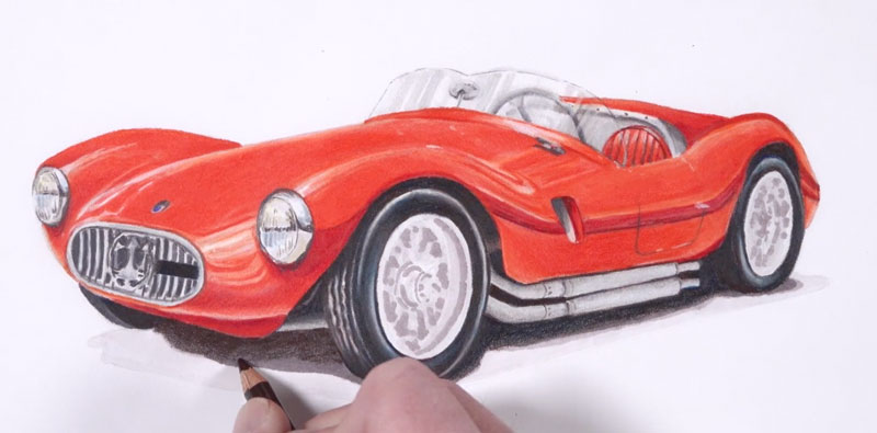
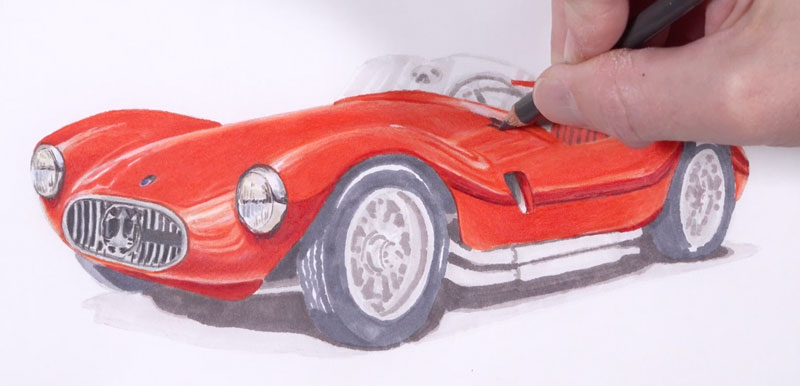
The wheels are quite intimidating. Fortunately, we don’t have spell everything out for our viewers. Instead, we can hint at the details using strategic lines and shapes of value.
Using a variety of grays, we’ll draw a few broken lines for the spokes. Then, we’ll fill in shapes of various grays to create shadows within the wheels.
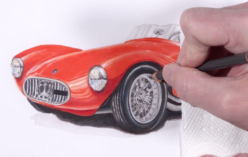
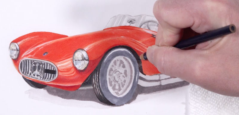
After the wheels are complete, we’ll add a warm gray to the remaining portions of the cast shadow using small circular strokes. Then we can use a colorless blender to burnish these applications, giving them a smoother appearance. Some faint coarse texture is encouraged here since it mimics the texture of the asphalt.
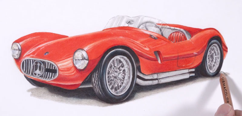
Our highlights are fairly strong but we can enhance them further. We’ll first take them as far as we can with a white colored pencil. But to make them even stronger, we’ll apply a bit of white gouache. Gouache is opaque watercolor and works well over marker and colored pencil applications.
See also: Realistic Painting with Gouache
Using a small round brush, we can apply undiluted white gouache in areas where want especially strong highlights. These highlights exist throughout the drawing, but are especially strong around the highlights, the glass, and on the body of the car. The addition of these highlights helps to create the illusion of a reflective surface that is shiny.
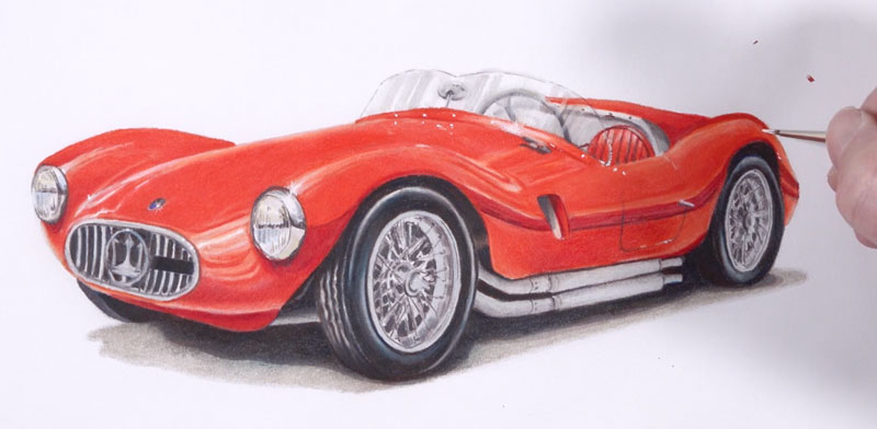
After the highlights have been enhanced, we can use a kneaded eraser to clean up any stray marks and carefully brush away any remaining fragments of colored pencil. Now, our drawing of a sports car with colored pencils and markers is complete…
Drawing a Sports Car with Colored Pencils and Markers – Conclusion
Drawing any car can be a challenge. Accuracy, of course, is extremely important. To ensure accuracy, use a transfer technique or a grid to get the contours in place.
Be sure to work on a surface that is suitable for this particular combination of media. This will make a big difference in the finished appearance.
Be patient as you add each layer of color with the markers and colored pencils. Your patience will pay off. Use a variety of different versions of the same color to gradually build up the intensity and the value range within the drawing.
Tackle subjects that challenge you and push your limits. Doing so will make you a better artist.
If so, join over 36,000 others that receive our newsletter with new drawing and painting lessons. Plus, check out three of our course videos and ebooks for free.
Watercolor Landscape – A Few Tips to Make the Process Easier
The Problems with Watercolor
Of course, the problem is not with watercolor but with us. What problems do we have with the medium?
- Watercolor paper buckles and wrinkles when it gets wet.
- We must carefully preserve white highlights from the start of a painting.
- Watercolor dries lighter that it looks when wet, so the darkest values never seem dark enough.
Do any of the statements above describe your feelings about the medium? Not to worry. The example painting that follows will offer a solution to each of these challenges.
Getting the Wrinkles Out of Watercolor Paper
Most watercolor paper does expand and wrinkle/buckle when wet. The simplest solution is to use the thickest, heaviest, watercolor paper available. Typically, watercolor paper is available in three weights (thicknesses) – 90 lb, 140 lb, and 300 lb. Each weight is progressively thicker. For example, 300 lb paper will not wrinkle or warp in the course of a normal painting. For that reason, it is the most expensive option and the simplest solution to the wrinkling problem.
See also: All About Drawing Papers
The two lighter weight options will buckle when wet and need stretching. Stretching a piece of watercolor paper will not prevent it from warping but it will prevent it from staying warped. Simply let a stretched painting dry between layers and it will return to perfectly flat.
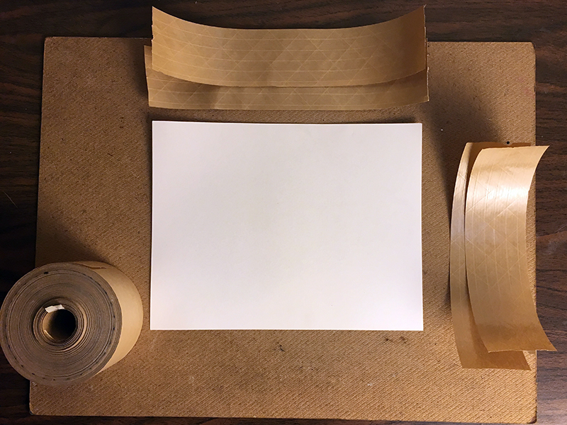
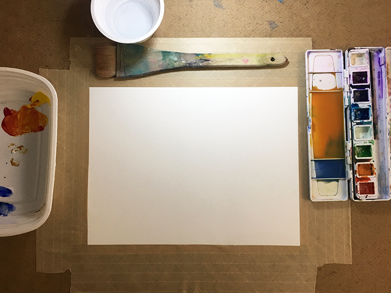
To stretch a sheet of watercolor paper you will need gummed tape, a rigid surface (hardboard, plywood, drawing-board, etc.), a sponge and some water. Begin by pre-cutting the gummed tape to match the dimensions of your watercolor paper. Using a sponge and wet the entire paper.
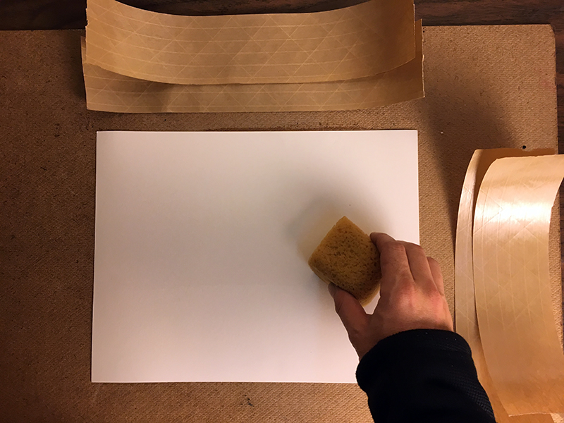
The paper will quickly expand. After a minute or so, tape the paper to a ridged support using the gummed tape. Wet the tape with the sponge and press it into place. As the paper and tape dry, they will form a bond. The paper shrinks as it dries, becoming taught across the surface of the board.
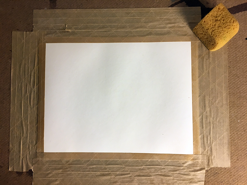
Now that our paper is prepared, we’re ready to begin with the painting process.
Applying a Wash
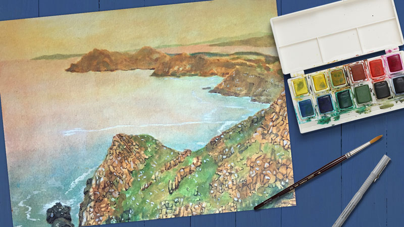
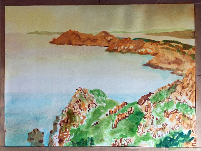
The example painting is based on the landscape photograph below if you are following along.
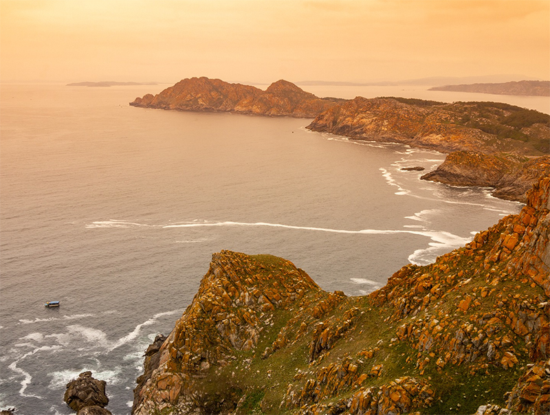
Since the subject includes large areas of a gradation of color, a wash is an appropriate first step. To create a wash of color, first “paint” the paper with clear water, then add the appropriate color to the wet paper. The strokes will melt together on the damp surface, leaving a smooth application of color.
Using a large, soft brush, I first applied a wash of orange transitioning to blue. This initial wash is so light that it will not present a problem when painting the darker islands on top. Of course, the white details in both the water and the land have not been preserved in the wash application. We must rediscover them in the later stages of the painting.
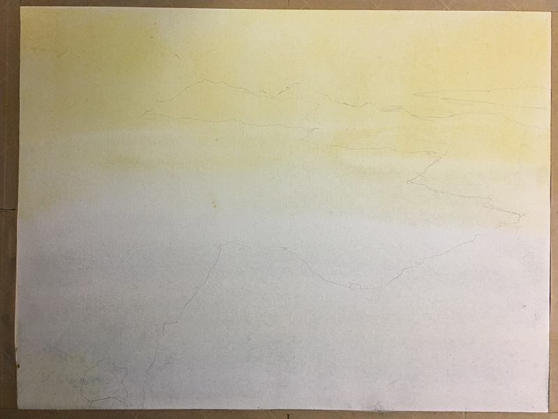
Since watercolor is transparent, any proportional mistakes are difficult to alter. Therefore, it is acceptable to lightly draw important contours with a pencil (see above).
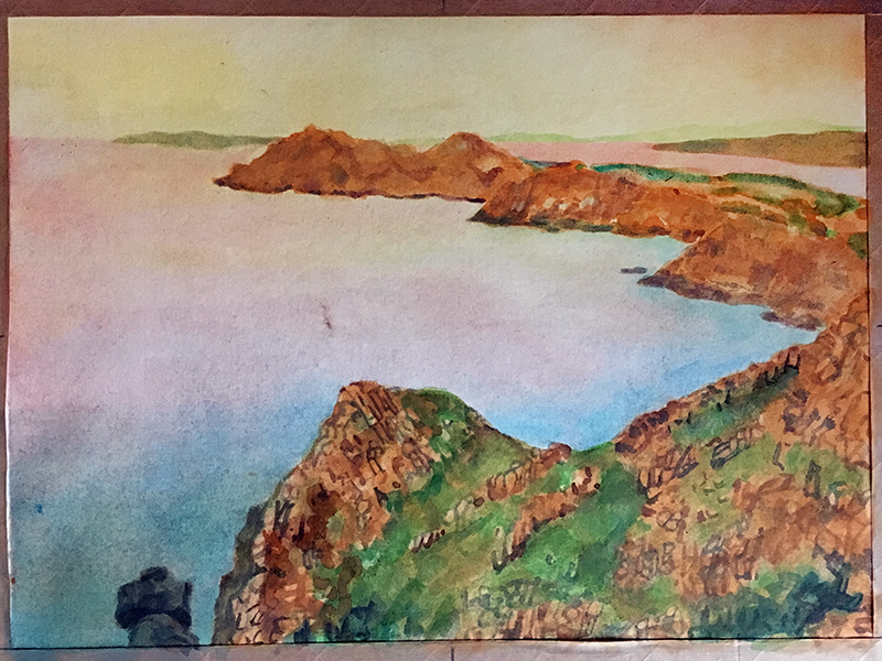
Adding Layers of Watercolor Washes
The islands are painted in using mostly orange, green and brown. Orange is used for the rocks and green for the grass. Though this painting will not include the same level of detail as the photo reference, an attempt is made from the beginning to describe the rough texture of the rocks.
Look at the foreground. At this point the white rocks in the grass have been ignored.
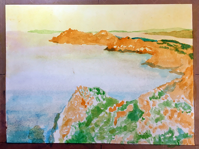
Allow the paper to dry to avoid bleeding. Then apply small marks of brown mixed with blue to start the process of carving-out individual rocks from the orange areas (see below). The brown and blue mixture will produce a natural dark value.
The colors and marks at this stage feel somewhat disconnected. A wash of orange over the entirety of the land will both dull the green and unify the composition.
I will continue developing the painting in several layers, alternating between broad washes of color and smaller marks meant to capture detail. This building up of layers should continue until the general colors and value desired are achieved. Don’t worry about having ignored the white details, we’ll add them in a moment.
Addressing White Areas with Watercolor
It’s now time to add white. Since we did not “preserve” the white of the paper we will need to use white paint. Some watercolor sets include an opaque white. Called Chinese White, it is a weak white and has a somewhat milky appearance. Gouache and modern-day tempera paint are suitable substitutes. The small white details in the foreground are painted with Chinese White.
Using white paint takes away the pressure of maintaining white detail from the beginning of the painting, but note that the white will not be as strong if these sections were preserved. If a strong white is desired, these sections must be preserved prior to the initial wash.
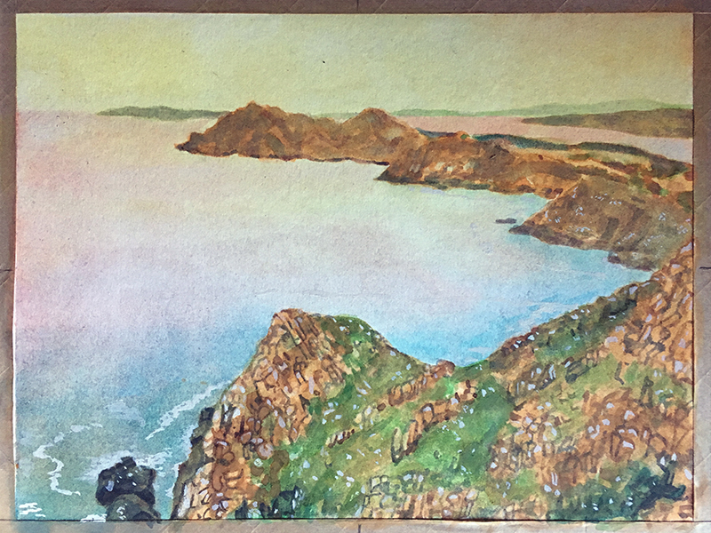
If the Chinese White or tempera paint is not strong enough then use white acrylic paint. The Chinese White was, in fact, not bold enough to capture the white details seen in the water. In these areas, acrylic paint is used instead. Acrylic white is permanent, allowing for the application of subsequent washes of color over it – a great benefit.
Adding Dark Accents for a Full Range of Value
The painting is nearly complete. The small, dark details in the rocks found in the foreground are missing the same level of contrast and sharpness as seen in the reference photo. Using a drawing pen (.03), marks are drawn over the painting to better describe the rocks. If a more painterly look is desired, a brush can be used instead.
When using a pen with watercolor, it is important to avoid complete contours. That is, do not outline everything. Doing so would give a painting a coloring book feel. Instead, apply dark accent marks in a disconnected, abbreviated manner.
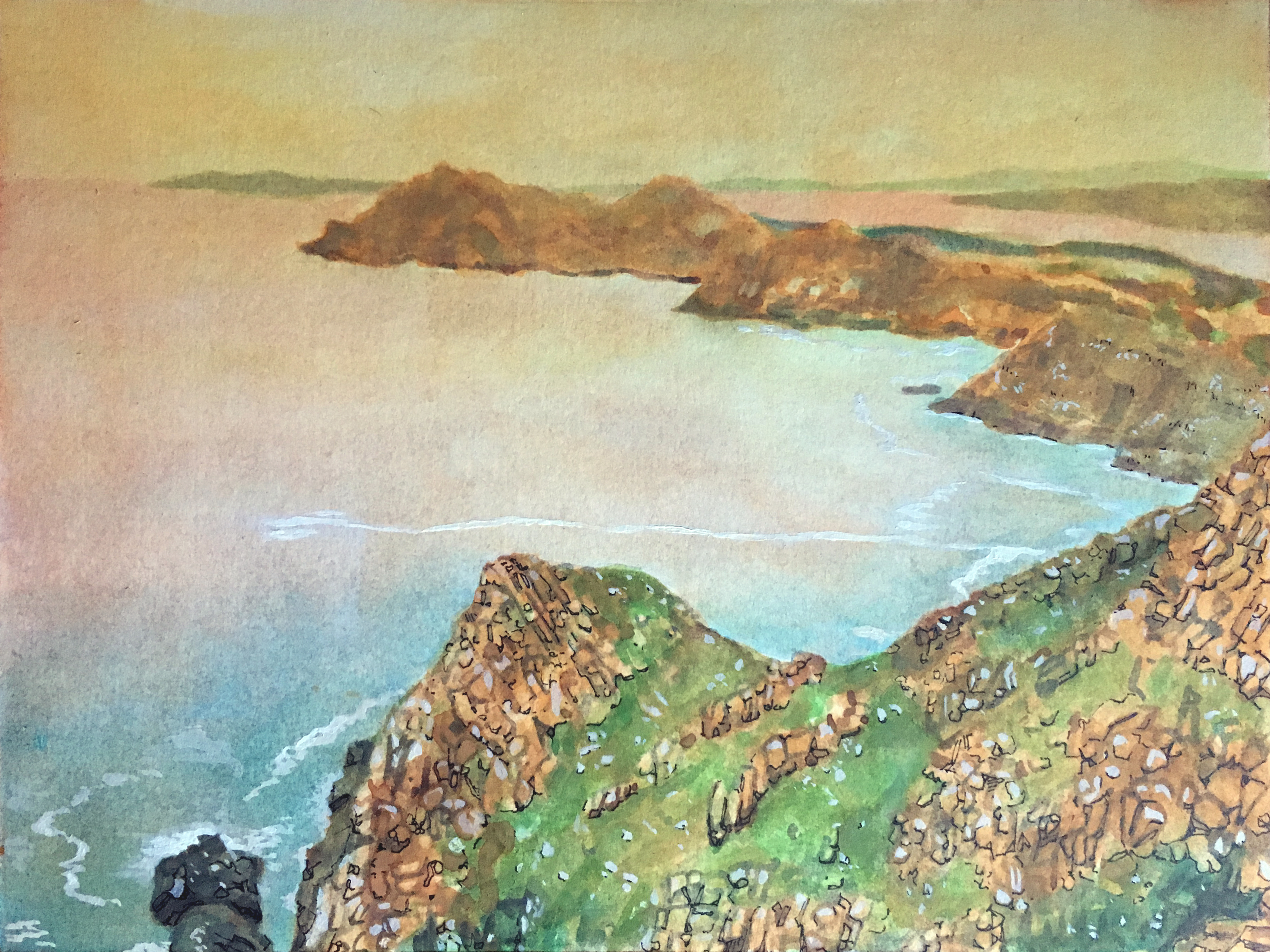
Remove the Tape
Once finished, it is time to either cut the painting away from the gummed tape, or remove the tape. I prefer to remove the tape by simply pulling it away from the painting. Having a border makes matting and framing easier. Be careful when removing the tape from the painting. It’s advised to pull the tape away slowly, at a 90 degree angle.
Place a ruler along the edges of the painting to hold it down while pulling up the tape. Some of gummed tape will remain on the border. Use some water to soften the glue and pick off the remaining tape scraps. Once the painting is in a mat the border will be entirely covered.
See also: How to Remove Artist Tape without Tearing the Paper
Conclusion
Watercolor is a challenging medium, but we don’t have to make it more difficult. You don’t have to paint on buckled paper – stretching the paper helps to keep it under control. You don’t have to preserve the white of your paper – can add white. You don’t have to settle for weak values – you can make them darker with ink. Don’t stress – art should be fun.
If so, join over 36,000 others that receive our newsletter with new drawing and painting lessons. Plus, check out three of our course videos and ebooks for free.
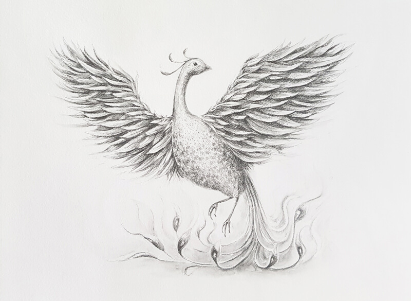
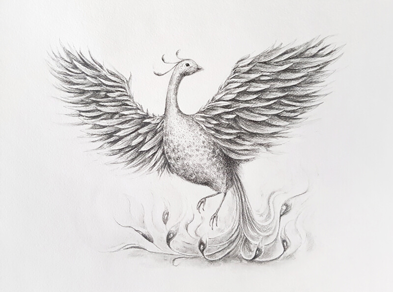
How to Draw a Phoenix with Water-Soluble Graphite Pencils
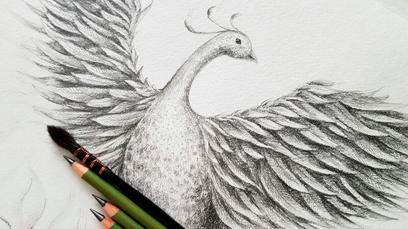
A phoenix is usually associated with the sun, fire, time, and long life. Some legends say that this creature may live for several hundred years before rebirth. A variety of cultures have stories of this fantastic bird.
Water-Soluble Graphite Supplies
For our project, I’ll be using three water-soluble graphite pencils from Daler Rowney Artists’ Sketching series. In the dry state, they behave just as ordinary graphite pencils, allowing you to hatch, layer, or blend the strokes.
See also: Graphite Drawing Techniques
Other than that, applications of water-soluble graphite pencils can be activated with water. This feature is quite unusual for pencils that represent a scale of gray tones. However, it’s possible to find water-soluble graphite pencils by other brands.
See also: How to Draw with Water-Soluble Graphite
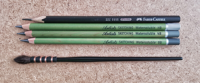
I’ll be using an ordinary non-water-soluble HB graphite pencil and an eraser to create sketches and the underdrawing for the final drawing. The initial lines should be water-resistant. This ensures that they’ll remain visible at every step of the process.
The size of the original artwork is A3. I’ll be drawing on a sheet of thick watercolor paper (140 lb) with a rough texture. Of course, the choice of the surface is personal, but you should consider paper that is water absorbent.
See also: All about Drawing Papers and Surfaces
We’ll need a container for water and a brush. Any soft watercolor brush that feels comfortable will be fine. Alternatively, you can use an aqua brush – a special tool with a reservoir for water.
See also: All About Artist Paint Brushes – Hair Types, Shapes, Marks, and Parts
Drawing an Imaginary Creature
There are various approaches to designing creatures that can’t be found in real life. I usually start with an idea and associations.
Obviously, a phoenix is a bird, but we know little about its appearance. Some sources describe it as having a crest of feathers on its head, or endowed with a halo, which emphasizes its connection with the sun.
There is no clear information about the creature’s coloration. We just know that the phoenix was generally believed to be colorful and vibrant.
I think that this lack of guidelines is a good thing. It leaves much room for us to fill in the gaps and use our imagination.
The prototype will have a contour that is characteristic of other birds. Said simply, it should have two wings, two feet, a head, a neck, and a body – with feathers of different types covering the creature.
You can give your phoenix any features that seem appropriate. At this step, it may be useful to research various species of existing birds. Ask yourself what features and details may fit the appearance of this fantastic creature.
For example, your phoenix may have a head that resembles the one of an eagle or a falcon. This will emphasize the majestic, even imperious air that is inherent to predatory birds.
Alternatively, the appearance of your phoenix may be close to a pheasant, a peacock, a rooster or even an ostrich. Why not? It’s possible to combine the features of different birds together. Everything comes down to the vision that you have in mind.
The Behavior of Water-Soluble Graphite Pencils
If you don’t have any experience with water-soluble graphite pencils (or at least pencils of the particular brand), it may be beneficial to try them beforehand.
In the image below, you’ll find three samples made with HB, 4B, and 8B water-soluble pencils. Each sample can be divided into three parts. In the image, these sections are ordered from left to right – their borders are marked with a red line.
- The first section is “dry” – no water was added.
- In the second section, a moderate amount of water was applied on top of the strokes using a brush.
- The third section was made by pulling the graphite with a wet brush over blank paper to the right.
Let’s compare the samples.
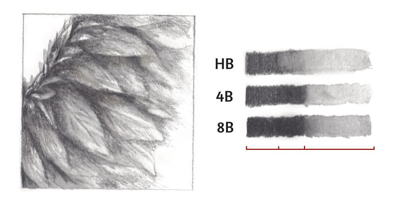
“Dry” parts of the samples look relatively close in value, which is unusual for graphite pencils – at least the common non-water-soluble ones. Usually, applications of an HB pencil are much lighter than that of a 4B or an 8B pencil.
Marks made with the HB water-soluble pencil become lighter after activation (after we’ve applied water). Other samples demonstrate an opposite variation – they become darker after activation.
And lastly, marks made with each pencil can be washed out, forming a semi-transparent “trail”. It’s possible to control the result by varying the amount of water on your brush.
With these pencils, you can lift graphite from one area and transfer it to another part of the drawing with a wet brush. It’s similar to working with watercolor pencils, but without colors.
Sketching a wing’s fragment may be a nice way to prepare for our drawing. (You can find my sketch in the image above.)
If you choose to do this exercise, don’t go deep into details – draw some abstract wing feathers. First, use your pencils like an ordinary pencil. Then, add water and see what happens. Observe how the pencils behave in both dry and wet states.
Sketching and the Underdrawing
As soon as you have a general vision of how your phoenix will look, it’s time to begin on the final drawing.
I recommend sketching a miniature first. Its purpose is to design a pose and decide on the composition. You’ll find my mini sketch in the image below, on the left side.
My creature will resemble a goose with its relatively small head and a long neck.
I’ve decided to give it some features that are characteristic of peacocks, including long tail feathers with interesting endings and a crest (feathery head adornments).
The tail feathers and feet will be arranged in a way to create an interesting effect, as if the phoenix is dancing in fire.
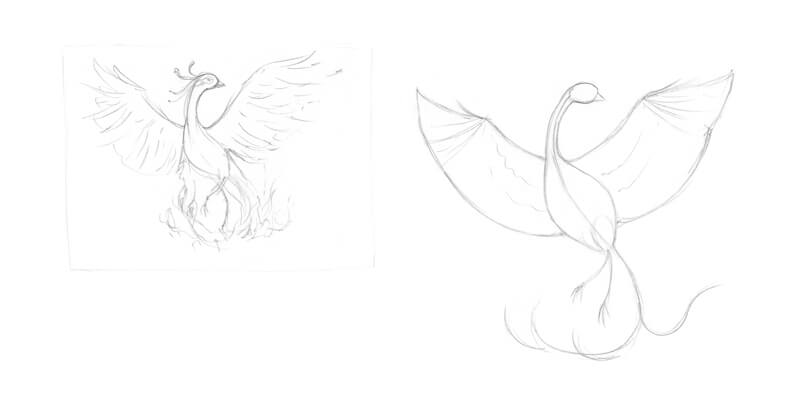
The drawing on the right side is a simplified scheme of the phoenix’s body, presented as a set of shapes and guidelines. In particular, a line that goes from the head shape to the bottom part of the body suggests the direction of the pose. It also conveys a sense of movement.
Feel free to use this scheme for your drawing or create a unique one.
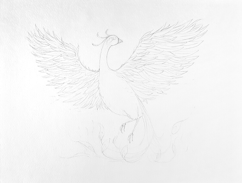
Now it’s time to create an underdrawing on the final sruface.
As the paper size is relatively large, it may take some time and effort to place the main shapes. I recommend marking out the masses first. Add the details only after you’ve set the figure in general terms and everything feels “right”.
At this step, make sure that the overall composition is harmonious. Pay attention to the negative space on the sides of the creature. It shouldn’t be too much here or there.
See also: Positive and Negative Space
The same is true for the wings. Add individual feathers only after the wings’ general shapes are in place.
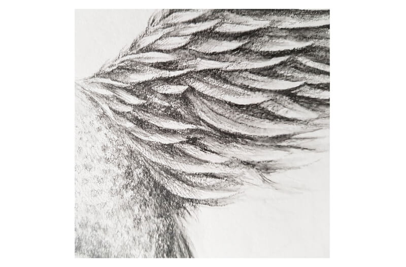
To simplify the process of drawing feathers, divide the wing’s space into rows or levels. In my case, feathers that are closer to the wing’s upper edge are shorter. The feathers in the lower rows are very long. Also, they are much wider than their upper neighbors.
To create the illusion of slight foreshortening, I make the left wing slightly smaller than the right one.
Drawing a Phoenix with Water-Soluble Graphite Pencils
With a 4B pencil, I mark the darker areas. They include the lower part of the body and the gaps between the wing feathers. Vary the level of pressure and quantity of layers to achieve the desired result.
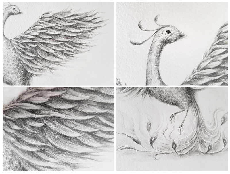
I lightly add a subtle spotty pattern to the sides of the phoenix’s body and near its eye. This pattern of the plumage is typical of pheasants. We can add any details to our imaginary creature!
I also mark the eye, leaving a small highlight.
As the strokes are applied onto a textured paper, they look quite rough and grainy. At this step, no water is added on top of graphite marks.
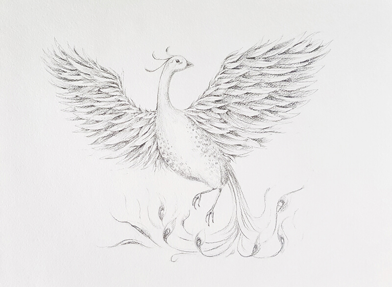
With the HB pencil, I add more strokes to suggest a wider variety of values. This variation will be more evident after we apply water. There should be enough graphite on the surface. Otherwise, we won’t be able to create beautiful washes in the next step.
I emphasize the tail feathers to make them stand out, then add some light shading nearby. The pencil barely touches the paper. I’m going to transform these marks into washes, too. They’ll be resemble stylized flames after we add water.
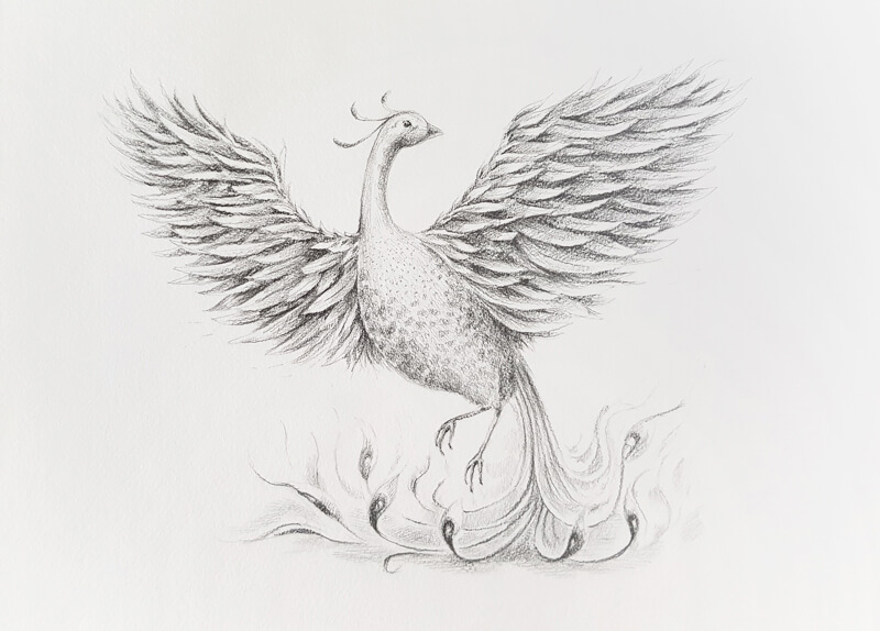
I dip my brush into the water and start creating washes. The darker the area, the less water I apply to it, working only with the tip of the brush. This careful approach ensures that I’ll get an accurate result.
I add more water to the lower part of the artwork, where the stylized flames are. Now the belly of the brush is involved, not just its tip.
Graphite applications may become significantly darker right after activation. This is especially true for the stokes made with a very soft pencil. However, they fade slightly after drying.
I gently touch the strokes with a brush, softening the transition between lighter and darker values. The texture becomes less rough, too.
Using a wet brush opens up some interesting options. For example, it’s possible to create small semi-transparent dots and lines. With this approach, you can easily add small details of texture.
I mute the lightest areas by covering them with graphite already on the wet brush. I also make soft “trail” marks that go from the outer tips of the wing feathers to the sides. They accentuate movement, making the scene more dynamic.
Here is a fragment of the wing. Look at the interplay of rough and washed textures. Isn’t it fascinating?
I recommend waiting until the drawing completely dries before adding any new lines.
With a sharp 8B pencil, I work on the final details, applying thin parallel hatches in groups.
I pay close attention to the wing feathers and to the lower area of the artwork, where the flames are. I touch the eye once again.
I give more depth to the darkest parts, intensifying them. Graphite marks may become lighter after washing, so the drawing loses contrast. That’s why it may be necessary to evaluate the artwork and restore the darker areas and details.
Here are some close-up fragments of the finished artwork:
Phoenix with Water-Soluble Graphite – Conclusion
Congratulations – the artwork is complete!
I hope that you’ve enjoyed working with water-soluble graphite pencils. They are an amazing tool! This art material is so versatile and fun to draw with. It allows creating painterly effects within a controlled graphic approach.
I wish you much inspiration for your future projects!
If so, join over 36,000 others that receive our newsletter with new drawing and painting lessons. Plus, check out three of our course videos and ebooks for free.
Wet into Wet – Mixing Paint on the Canvas
So many decisions. All a person can do is try the many different approaches to painting to see what works for them.
One technique all painters should try at some point is wet into wet. That is, intentionally mixing all colors on the canvas and none on a palette – essentially using the canvas as a palette.
Painting wet into wet has several benefits – speed, economy, variety and painterliness (yes, it is a word).
It’s important to note that while this technique can be used with any painting medium, it works best with paints that dry slowly. Oils are obviously a great choice, but acrylics can also be used if a slow drying medium or “Open” acrylics are utilized.
Now, let’s look at a few reasons why “wet into wet” may be attractive option for the artist.
Speed
First, art is not a sport but it can be a race. When a window or the sun is the primary light source, then painting is a race against time. Colors and values must be captured before the light has a chance to change and it changes faster than one might imagine. Wet into wet painting saves time. Instead of starting a painting session by mixing colors on a palette, one begins by immediately applying paint to the canvas, thus saving a step.
Speeding up the painting process gives us a better chance of capturing the fleeting effects of light across a form as we see it in the moment.
Even when a painter uses artificial light or photographs, speeding up the painting process is still advantageous.
Economy
A small palette is easy to carry and, when painting wet into wet, a small palette will do since no space is required to mix colors. That’s good news for those that paint outdoors or on location. Doing so can make an artist feel like a pack-mule sometimes. Paints, solvents, and canvases are already cumbersome enough to carry without a big, heavy palette.
If one is mixing on the canvas, then even a disposable plate is large enough to use and weighs next to nothing.
Variety
Perhaps the greatest benefit to wet into wet painting is variety. Variety is one of the principles of art and a recurring theme found in nature.
When mixing on a palette, colors are usually mixed thoroughly and completely. Mixing on a canvas adds variety by default because one is trying to mix colors while also creating and maintaining contours. Colors are sometimes less thoroughly mixed near the edges of those contours when mixed on the canvas. The results, intentional or otherwise, are areas of only partially mixed color, thus creating variety.
Furthermore, when mixing on a canvas, one typically uses a brush instead of a palette knife. The motion of mixing paint with a brush also adds a variety of strokes to a painting’s surface texture. This creates a feeling of energy and vigor when compared to a typical “mix-on-a-palette painting” which usually appears more controlled.
Painterliness
Many artists do not need help “loosening up” and still other artists work in a tight, hard-edged fashion by choice. However, for artist that wants to loosen up but struggles to do so, then painting wet into wet can be a breakthrough technique. In the spirit of wet into wet painting, one may also try to begin painting without a preliminary drawing.
A well defined drawing can unfortunately encourage the “coloring book effect”. That is, the inclination to simply fill in shapes with solid, homogenous colors and prevent these colors from mingling in any way. This is not how color and light works.
See also: Expressive Brushstrokes with Acrylics
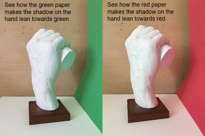
Color and light bounce around a bit. If you place something green next to an object of another color, the green color is likely to reflect into the second object.
Look at the images below. See how the color of the paper reflects back into the plaster hands. This effect has a better chance to happen incidentally when painting without an under drawing while using a wet into wet approach. This mingling of color actually feels more realistic and atmospheric.
Painting Wet Into Wet
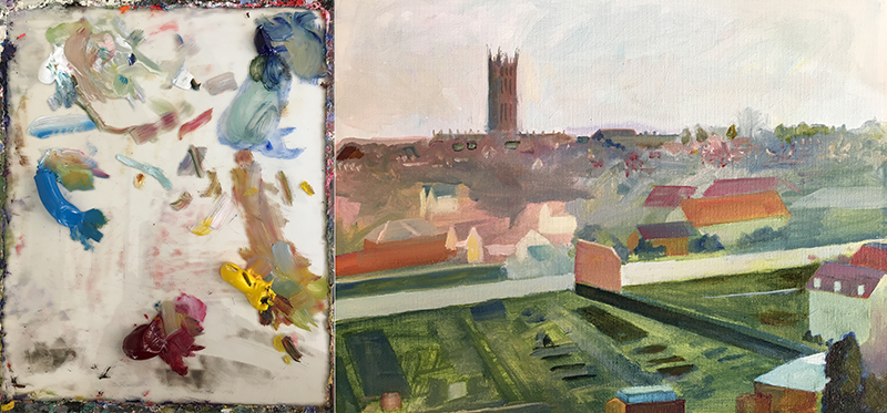
The following images and commentary chronicle the development of a wet into wet painting alongside the palette used for the art. The painting is based on the reference image directly below.
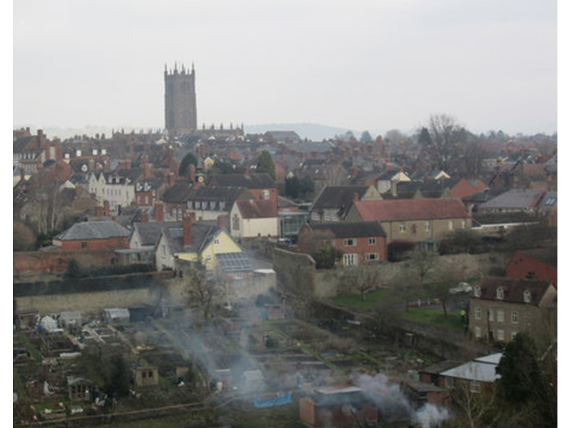
The following image shows a palette and also a first few minutes of painting. The colors on the palette are listed clockwise:
- Titanium White
- Ultramarine Blue
- Cadmium Yellow
- Alizarin Crimson
- Cerulean Blue
Additionally, a standard painting medium (50% linseed oil/50% solvent) is used thin the paint. The medium thins the paint making it easier to spread. It will also be used to make glazes, later in the painting process.
The first pigment applied to the sky was white since the sky is so light in value. At this stage, the palette looks unused even though half of the painting is already covered in color.
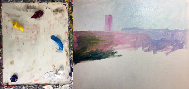
Now, see how bright the painting looks in the next step (below). The intense blue diagonal line will become a dark brown wall eventually.
A brick wall on the left of the reference image is, at present, just a bright red stripe. The house in the foreground currently has a purple roof.
Each additional color mixed into these areas will dull these colors. Of course, the goal is not exact color matching, but rather a harmonious final product.
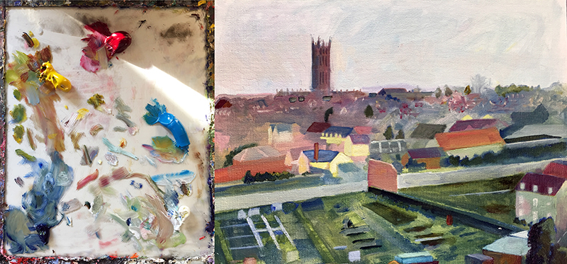
Once a wet into wet painting is “blocked-in”, it truly becomes a palette.
There are color mixtures all over the surface from which the artist may borrow. Look at the small light marks just below the horizon. Those marks are too small to mix from the primary colors on the actual palette. Instead, color was lifted from the lighter colored houses in the middle ground and redeposited in the background. When a single color is used in various locations throughout a composition, it contributes to the oneness or unity in a composition.
It is now time to develop the foreground. The additional buildings in the bottom right (see below) help to balance the tall tower in the top left quadrant of the composition. Also in the bottom right, adding a little yellow will transform that bright blue spot into a tree. The blue will mix with the yellow producing a natural green.
At this point the palette looks a little “messy” but no intentional mixing has taken place. Notice the light blue area in the top right corner of the palette. That is not a mixture of blue and white. It is a pure, ultramarine blue glaze. It appears light simply because the white palette is showing through.
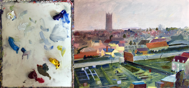
Glazing
Glazing is a technique in which paint is heavily thinned out with painting medium to the point of transparency. Applying a glaze over colors that have already dried will slightly alter those colors underneath. Glazes can be used for color correction and adding depth and complexity to the color.
Do not attempt to apply a glaze over wet paint. This painting was completed during three short painting sessions. Only after allowing some areas to dry was it possible to do any glazing.
See also: Glazing with Acrylics
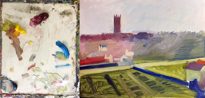
Additional trees are painted among the house in the next step. The dark green color was borrowed from the large tree in the lower left. Some darker rooftops were added as well.
Scumbling
At this point the painting is entering its final stages. It is allowed to dry, then the sky and tower are scumbled.
Scumbling is another painting technique that does not require mixing on the palette. Scumbling is the process of applying opaque color that is usually applied without any medium. Typically the strokes are broken, allowing some of the color underneath to show through.
Scumbling can be used to apply any color, but in this case, only a small amount of pure white is used. It is scrubbed out vigorously to create a translucent film, slightly lightening the dried color under it. In this case, it was done to add atmosphere to the painting, lightening and weakening the color of the tower in the distance. This sense of atmosphere was clearly missing when compared to the reference image.
After scumbling with white, a few small trees are added as well as the smoke in the foreground as observed in the reference photo.
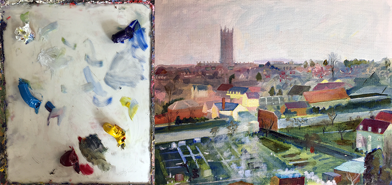
Again, the painting is allowed to dry. Then, to further dull colors and also to enhance the unity of the painting, a glaze of yellow was applied to the entire canvas.
Conclusion
Wet into wet is a wonderful painting technique that is sure to loosen up your paintings – making them more lively, unified, and interesting. While a palette is the traditional place for mixing colors, the canvas is also a location where this can happen.
Scumbling and glazing are techniques not usually associated with wet into wet painting since they are used over dried paint. However, they share a commonality with the wet into wet technique. While wet into wet is used to make physical mixtures on the canvas, scumbling and glazing create optical mixtures on the canvas. All three techniques are used to alter color directly on the canvas requiring very little palette space.
Try these methods yourself and find out what works for you.
If so, join over 36,000 others that receive our newsletter with new drawing and painting lessons. Plus, check out three of our course videos and ebooks for free.
Acrylic Painting Mediums
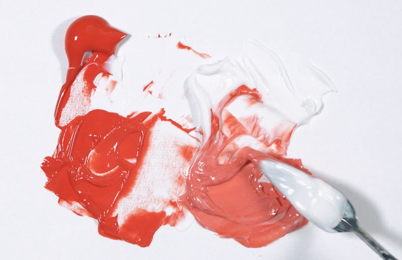
Painting with Mediums
Acrylics are one of the most versatile painting mediums that an artist can work with. They can be thinned to behave like watercolors or they can be applied thickly to create impasto effects.
They dry very quickly, allowing the artist to layer colors quickly. This quick drying time however can be viewed as a disadvantage. Blending colors, for example, must be done quickly before the paint has time to dry.
Another advantage of working with acrylics is the broad variety of mediums and additives that can be used with the paint to alter how it behaves and how it appears in the artwork.
In fact, there are so many products out there that change the behavior of acrylic paint, it’s quite overwhelming.
In this lesson, we’ll explore the differences between mediums and additives, what mediums you may need, the ones you can live without, and the differences between the mediums that are commonly used with acrylics.
The Difference Between Acrylic Mediums and Additives
Let’s start by first determining the differences between mediums and additives. In order to fully understand the difference, we must look at the basic ingredients found in acrylic paint.
Like all paints, acrylic paints are made up of three basic ingredients.
Pigment – Pigment is what gives paint its color. Pigment can be harvested from natural resources or it can be man-made. Pigment is fairly universal meaning that the same pigments are used in watercolor, oils, pastels, and acrylics.

Binder – Binder is the material that holds the pigment in place. The binder in acrylic paint is an acrylic polymer. When dry, the binder in acrylics also makes the paint water-proof – just like any other plastic – and ensures that it “sticks” to the surface in which it is applied.
Solvent (or Vehicle) – Solvent affects the fluidity of the paint. Solvents vary between different types of paint. The solvent for acrylics is water. When water is combined with the binder, it allows the paint to be spread over the painting surface.
As acrylics dry, the solvent (water) evaporates and the binder hardens resulting in the finished surface.
As you can see, the binder is very important. It controls many of the aspects of how the paint behaves, including how it “binds” to the surface in which it is applied.
And this is where we see the clear difference between acrylic mediums and additives. Acrylic mediums have an acrylic binder, but additives do not.
Acrylic Mediums
Paint manufacturers produce a broad range of medium products. And like all of the inventive colors that they create, the artist does need all of them. Most of the basic mediums often perform “double duties”, so having many different forms of acrylic mediums may be redundant.
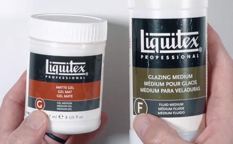
All acrylic mediums generally fall into one of two categories – fluid or gel. Many of the mediums we’ll discuss here can be had in both fluid and gel forms.
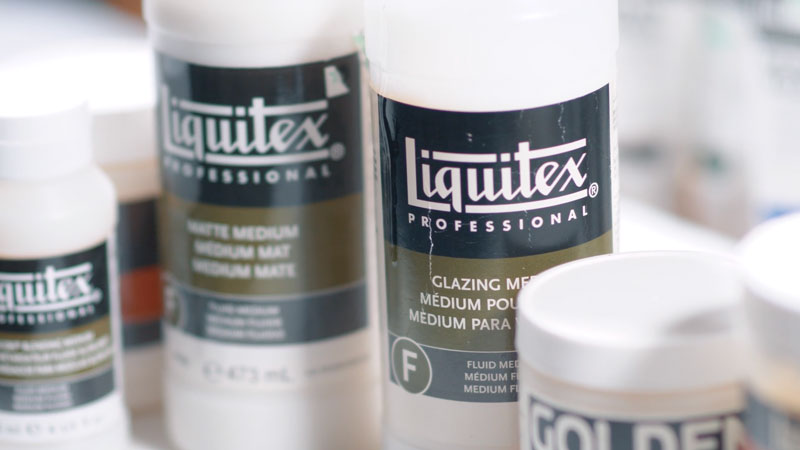
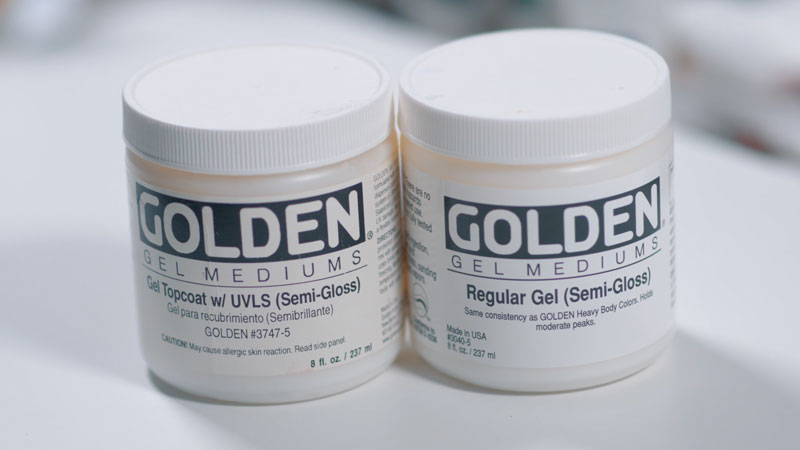
Gel Mediums
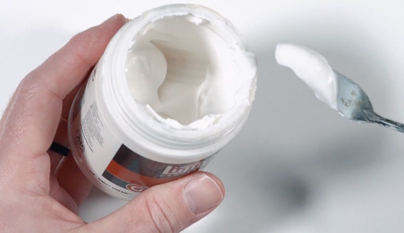
Gel mediums, as the name implies, are acrylic mediums that are thick in consistency. Often, these mediums are found in small tubs instead of containers that encourage the artist to squeeze out the medium. These mediums are best removed from their containers using a palette knife.
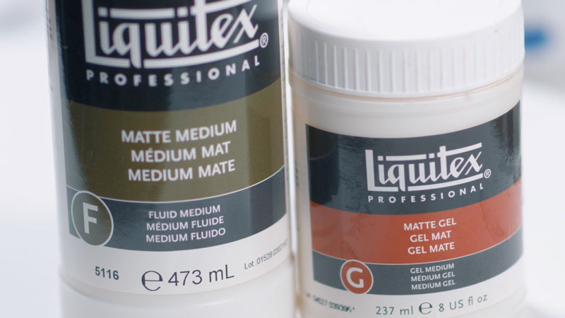
Some paint manufacturers, like Liquitex, include the type of medium on the label. A large “G” can be found on the label indicating that the medium in question is a “Gel” medium.
They also include a large “F” on their fluid mediums – but more fluid mediums in a moment.
Gel mediums can perform a variety of tasks and affect the way the paint behaves in different ways.
All gel mediums will extend the paint, while slightly affecting the intensity of the color. The more medium you add to the paint, the less intense the color becomes. With most mediums, the desaturation of color is barely visible.
However, if you add a lot of medium with very little paint, this lessened intensity is obvious. This is an advantage if you plan on creating a glaze to layer over colors.
See also: Acrylic Gel Transfers
Gloss Medium
When gloss medium is added to acrylic paint, the finish of the paint changes. As the name implies, gloss mediums make the resulting image shiny, as if a gloss varnish has been applied.
When to Use:
- Use this medium if you want a shiny appearance to the finished painting
- Subtle Impasto effects
- Increasing the life of your paints by altering the pigment to binder ratio
- As a shiny glue – (Decoupage)
- Acrylic transfers
Matte Medium
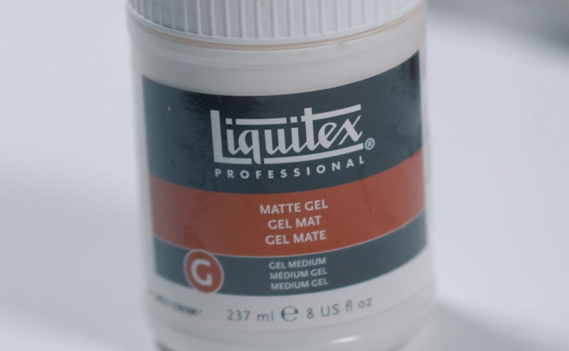
Matte medium tones down the natural sheen of acrylics, resulting in a duller appearance. This gel medium is the most versatile of the bunch.
When to Use:
- Use this medium if you want a duller appearance to the finished painting.
- Subtle Impasto effects
- Increasing the life of your paints by altering the pigment to binder ratio
- As a duller glue – (Decoupage)
- Acrylic transfers
Modeling Gel
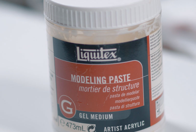
Modeling gel is a gel medium that greatly increases the body of the paint. It can be sculpted as it dries using a palette knife or a brush. This medium is best for creating pronounced impasto effects.
When to Use:
- Heavily textured paintings with pronounced impasto effects
Of course, there are plenty more gel mediums available, but having just these three is really more than you will ever need.
Now let’s have a look at fluid gel mediums…
Fluid Mediums
Fluid mediums are thinner than their gel counter-parts. Most fluid mediums are found in containers that are meant to be poured. While gel mediums make the paint a little thicker or do little to change the consistency of the paint, fluid mediums typically increase the fluidity.
As we discussed before, Liquitex labels fluid mediums with a large “F” on the label. Not all manufacturers label their mediums in this way, however.
Fluid mediums are available in the same sheens as their gel counter-parts. You can find fluid mediums in gloss, matte, and semi-gloss finishes.
When to Use:
- These generic fluid mediums are best used in situations in which you want to improve the flow of the paint without sacrificing saturation loss.
There are two other fluid mediums that are very beneficial to the acrylic painter since they seemingly change the behavior of the paint itself.
Glazing Fluid
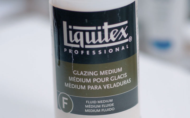
The first fluid medium we’ll discuss is glazing fluid. Glazing is the process of layering semi-transparent layers of color over previously applied colors. The color or value underneath shows through the translucent layers resulting in an optically mixed or perceived color.
We see glazing utilized most often when the process of indirect painting is used. In this process, a painting is developed by first creating an underpainting – perhaps consisting of values of gray.
Translucent colors are then glazed over the top in layers. The values established underneath still show through, but the glazed colors on top are also visible.
See also: Glazing with Acrylics
Glazing can be tricky and requires practice, but it gives the artist the highest level of control over the values and colors.
You can create a glaze by simply adding water to the paint. However, when you add any additive, including water, you weaken the binder. If the binder becomes too diluted, your paint will not adhere to the surface.
This is where glazing fluid steps in. Glazing fluid thins the paint, but since it has binder, it does not adversely affect the adhesion properties of the paint. This means that you can create very thin layers of color without worrying about each layer failing to stick to your surface.
When to Use:
- Use glazing fluid the you want to slightly alter the color with a layered translucent color
- Use glazing fluid with indirect painting where you want to add color without affecting the values established with an underpainting.
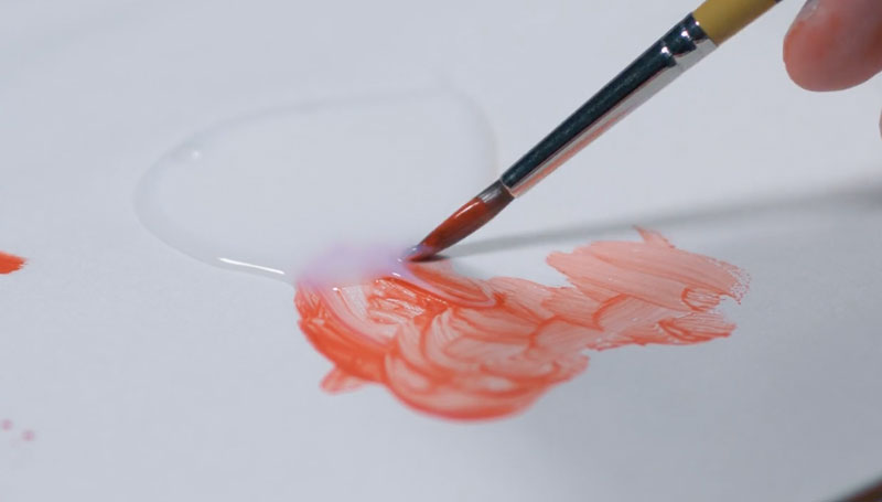
Slow Drying Medium (Retardant)
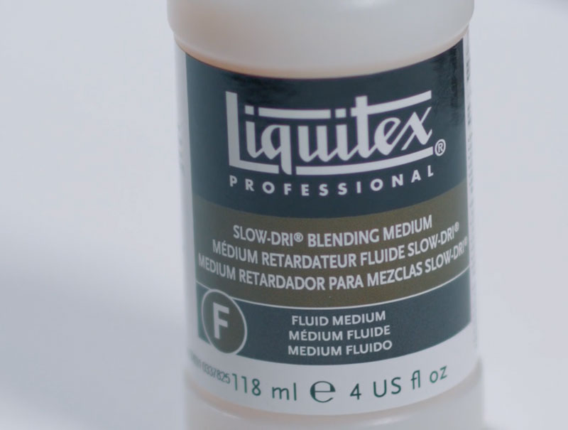
As you know, acrylics dry incredibly fast. There are clearly situations where this is an advantage, but many times it isn’t. One of the great things about oils, for example, is that you can manipulate them as they dry. This is because oils naturally dry very slowly. This allows you easily blend transitions between values and colors, working them until they are just right.
While acrylics can do this too, you have to work incredibly fast to pull it off.
Slow drying medium, as the name implies, slows the drying time of acrylic paint. This gives you a window of opportunity to make adjustments like blending or working in another color directly on the surface.
I when I say “a window of time” – I mean just a few minutes. Slow drying medium will not make acrylics behave just like oils, but they do give you a few more minutes of time to work those delicate and important transitions.
When to Use:
- Use slow drying medium when you need a few extra minutes of drying time to create smoother transitions between colors and values.
Some manufacturers produce Open Acrylics which dry at a much slower rate than traditional acrylics. These paints dry much slower than paint mixed with slow drying medium. Some colors may take a day or two to dry completely.
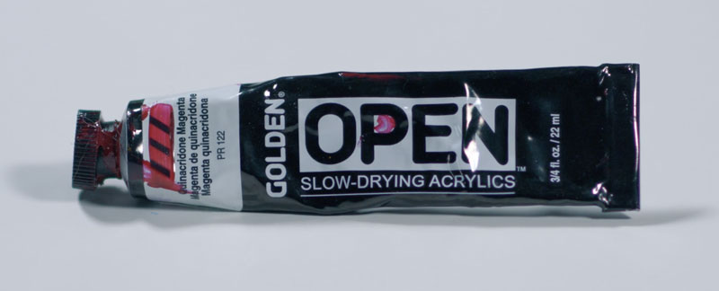
So if you’re doing a lot of blending and want your acrylics to behave more like oils, you may look into using these instead of using slow drying medium.
Acrylic Painting Mediums – Conclusion
So there you have it – a quick look at the acrylic mediums you will probably ever need. Of course, as I already mentioned, there are tons of them – each with their own benefit. But you don’t need them all. You may even find that you don’t need any at all. But if you wish to extend the versatility of this wonderful painting medium, then these mediums will do just that.
If so, join over 36,000 others that receive our newsletter with new drawing and painting lessons. Plus, check out three of our course videos and ebooks for free.