Cupcakes! What a delicious treat to draw. We'll take a look at two different approaches to drawing a cupcake with colored pencils.
Table of Contents
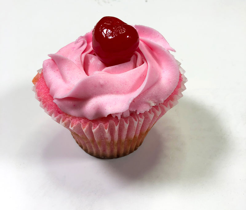
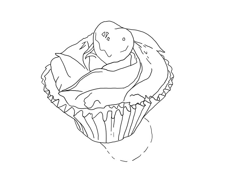
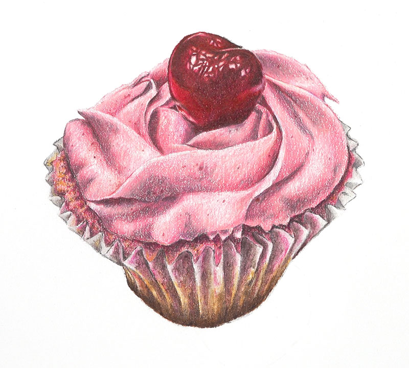
For this project, we’ll create a drawing of a delicious pink cupcake with Prismacolor Premier colored pencils on white Stonehenge paper. This subject features several contrasting textures which will create some variety in the drawing. Since the majority of the colors are variations of red, the finished result will be harmonious.
Materials Used...
Specific Prismacolor Pencils Used...
Each section of the cupcake features a different texture. The cherry on the top is smooth and reflective. The creamy icing is fluffy and spread with overlapping folds. The small bit of cake, visible just underneath the icing, is coarse. The wrapper is waxy and smooth.
Since we’re dealing with unique textures in each section of the subject, we’ll develop each section individually, working our way from the top to the bottom. For smoother textures, we’ll heavily layer colors and burnish with the colorless blender, eradicating much of the texture produced by the paper. For the icing and the cake, we’ll allow the texture of the paper to work in our favor, allowing some of the tooth of the paper to remain visible.
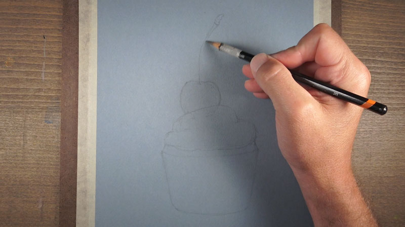
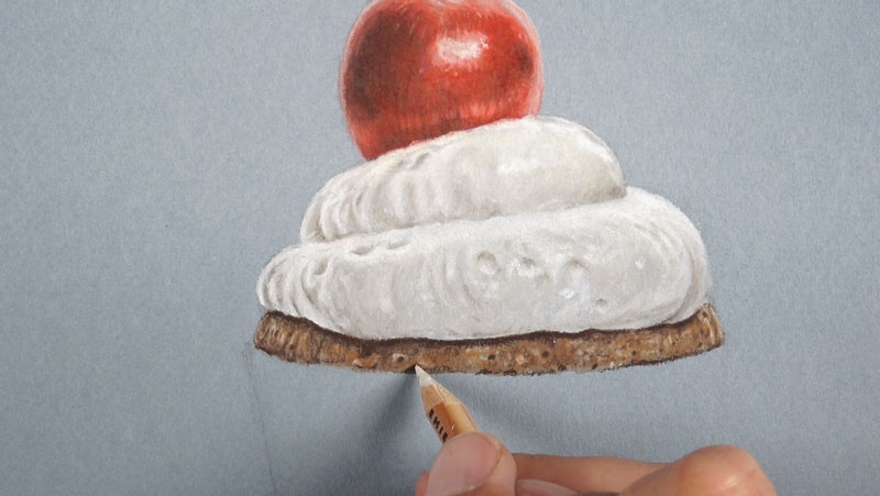
We’ll begin by transferring the contour lines (outlines) to the drawing paper. In this case, a graphite transfer is used. You’re welcome to draw the contour lines freehand, but transferring the contour lines saves time and ensures accuracy.
To transfer the lines using graphite, we’ll first cover the back of the reference photo or the provided outline template with soft graphite. In this case, a 6B graphite pencil is used. Be sure to cover the entire shape of the cupcake. You can ensure that you’ve covered the entire shape by holding the reference up to a light.
Once the back is covered, we can position the reference in place over the drawing paper. Gently tape the corners of the reference to keep the reference from moving.
Using a harder graphite pencil, such as an H pencil, patiently trace over all of the contour lines you wish to transfer. You may include the shapes of the shadows and highlights if you wish. Place moderate pressure on the pencil. It doesn’t take much to transfer the softer graphite on the back to the drawing surface. If you place too much pressure, you’ll create indentations in the drawing paper, which may prove difficult to cover with colored pencils.
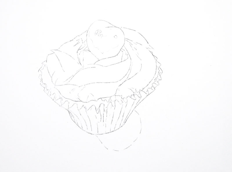
Once the contour lines have been traced, we’ll gently pull away the reference to reveal our contour line drawing. In most cases, the transferred line drawing will be fairly dark. Before applying colored pencils, we’ll gently lift up some of the graphite with a kneaded eraser, leaving a faint, but still visible, line drawing.
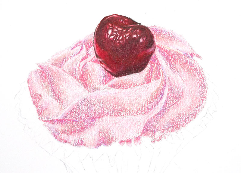
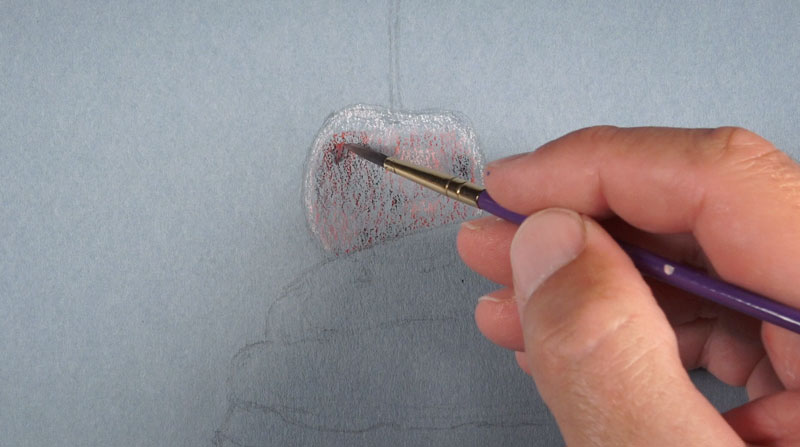
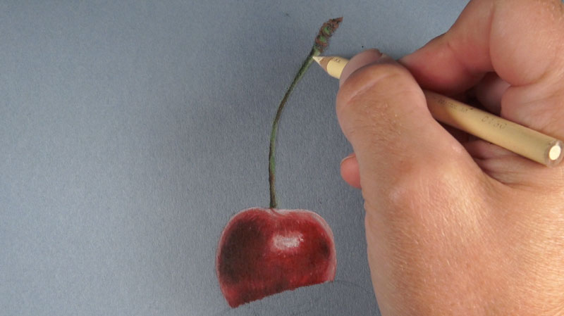
We’ll begin applying colored pencils to the cherry. Using a light to moderate touch, we’ll cover the entire shape with crimson red (924), leaving the highlights open. Much of the tooth of the paper is still visible after this initial application.
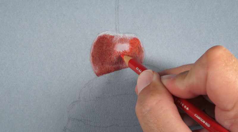
Subtle, darker tones are addressed by layering tuscan red (937) over the top. These darker values are found in the upper left quadrant of the cherry as well on the right side and center. Heavier pressure is used as this color is applied, filling more of the tooth of the paper.
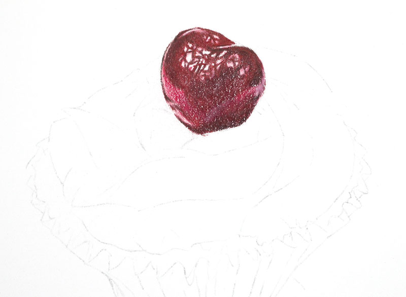
We’ll use white (938) over the highlights at the top of the cherry and on each side. On each side of the cherry, the white is layered directly over the crimson red, creating a pink.
To make some of the shadows a little darker, a bit of dark umber (947) is applied. This color is used minimally and is only used on locations where the shadows are at their darkest.
Crimson lake is next applied to the body of cherry and over the darkest shadows. This application makes the color more consistent and helps to unify the cherry.
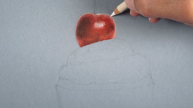
Next, we’ll apply the colorless blender (1077), using heavy pressure, over the entire body of the cherry to work even more of the medium into the texture of the paper. This creates a smoother appearance which more closely reflects the surface texture of the cherry.
See also: How to Blend Colored Pencils
To make the red a bit more intense, we’ll next apply crimson red (924), smoothing transitions from dark to light. This application makes the reds more intense than what we observe in the reference photo.
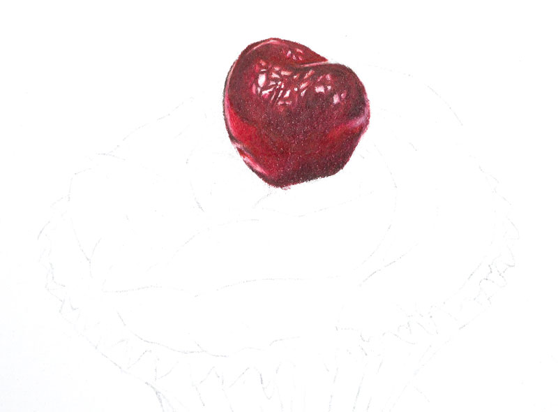
If the tooth of the paper is too evident after this color has been added, you may consider applying another heavy application of the colorless blender. We want to ensure that most, if not all, of the small specks of white from the paper are covered.
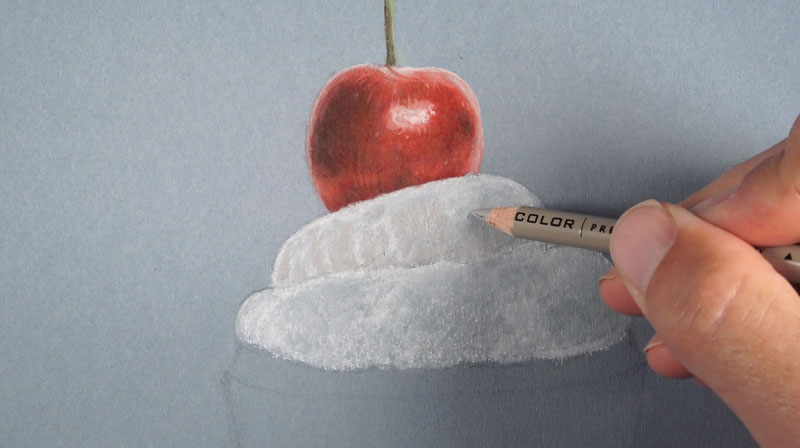
With the cherry complete, we’re ready to move on to the icing. We’ll bring out a bit of purple and peach in this section to increase contrast and add interest.
We’ll start by first applying pink (929) to the entire shape of the icing using light to moderate pressure. In the areas where the value is darker, we’ll apply slightly heaver pressure. This helps to differentiate the folds of the icing, which will be important when we develop the shadows.
In the shadowed locations, we’ll apply a bit of lilac (956) again with moderate to light pressure. This is followed by applications of peach (939) in areas where see a transition from shadow to highlight. Over the lighter areas, a light to moderate application of blush pink (928) is applied.
After these colors have been applied, we should still see quite a bit of the texture of the paper.
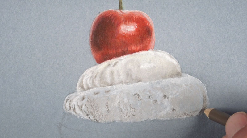
Now we’re ready to increase the contrast and bring out the highlights and the shadows. We’ll start by applying white (938) with heavy pressure over the lighter sections of the icing.
In the shadowed areas, we’ll first apply 90% cool grey (1067) with a very light touch. This color is strong, so light pressure is recommended. This color provides a nice dark tone for our shadows.
Over the areas that we applied the 90% cool grey (1067), we’ll layer a bit of tuscan red (937). This application brings back the red in the shadows.
Next, we’ll strengthen up the pinks in the areas of middle value with an additional application of blush pink (928). This time, moderate to heavy pressure is applied.
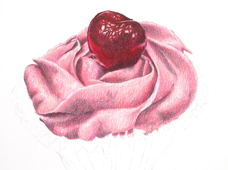
We’ll allow some of the texture of the paper to remain visible in this section in order to better reflect the surface texture observed on the icing. However, we still need to apply the colorless blender (1077) to smooth transitions of color and to work some of the medium into the tooth of the paper. So after our colors are in place, the colorless blender is applied to the entire body of the icing with heavy pressure.
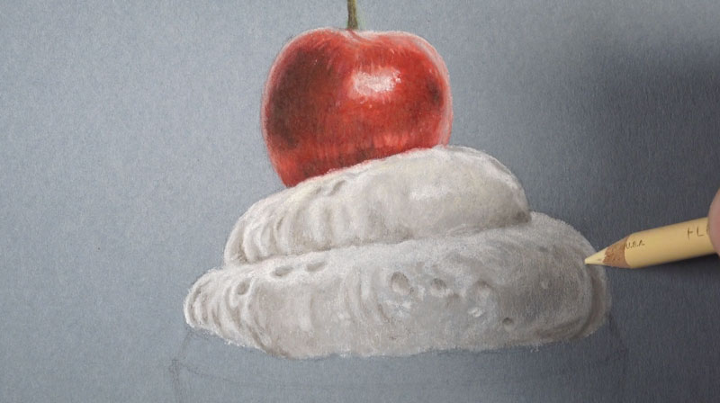
We’ll continue working our way down and next address the visible cake section under the icing. We’ll begin with a moderate application of magenta (930) and cover the entire shape.
This application is then followed by a moderate application of peach (939), blush pink (928), and a touch of cream (914), layered directly over the top. This adds a bit of warmth and creates a slightly different pink than that found on the icing.
We’ll also bring out a little more yellow by adding goldenrod in areas.
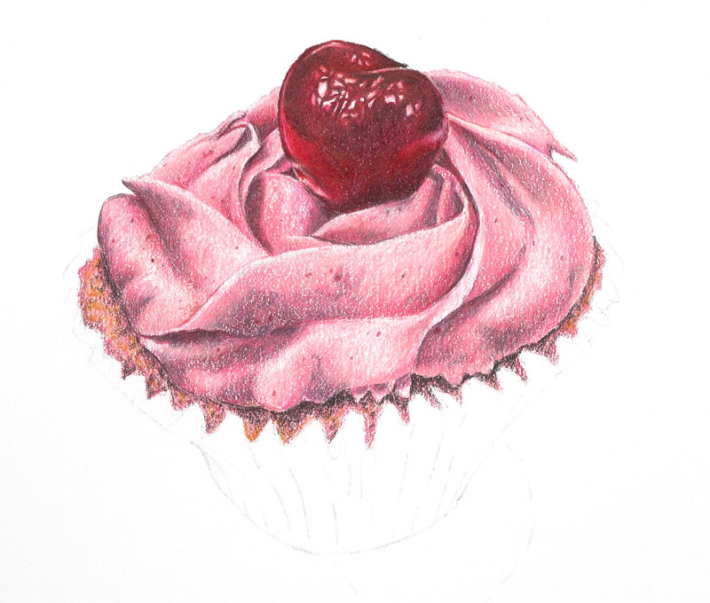
Once the base color is in place, we can work on darkening the values and add a bit of shadow. Most of the shadows are found right underneath the icing and around the edges of the wrapper. 90% warm grey (1058) is applied first with light pressure. This is followed by a light application of dark umber (947).
To finish off this section, we’ll again apply magenta (930) with heavy pressure, mostly over the areas of shadow.
The wrapper is partly translucent, allowing us to see some of the cake color behind it. We can see that it is much darker at the bottom and lighter at the top. We can also notice that the cake itself is pinker at the top and becomes yellow and brown at the bottom.
We’ll start by addressing the lighter tones that we notice at the top. Our first application is made with 20% French grey (1069) using moderate pressure. As this color is applied, heavier pressure is placed on the pencil in the shadowed areas.
Next, a bit 30% warm grey (1052) is lightly layered over the top. Magenta (930) is then applied to bring out some of the pinks that are visible through the wrapper.
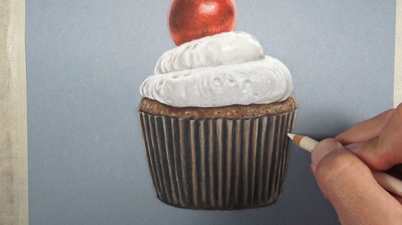
Then, goldenrod (1034) is used for the middle and lower portions of the wrapper before the entire shape is burnished with the colorless blender (1077). To help define the edges, a slight outline is added with 90% warm grey (1058).
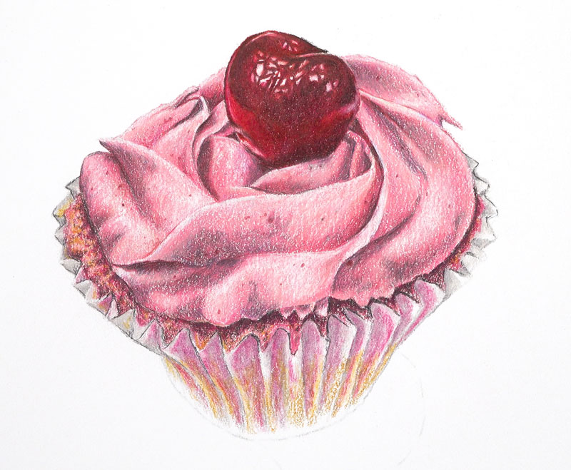
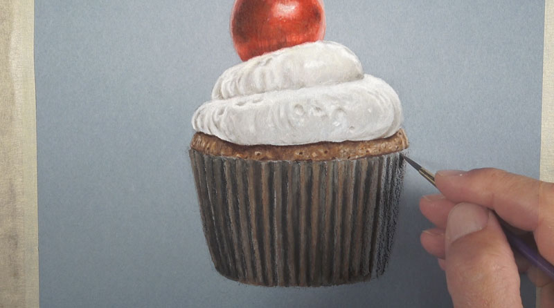
Now we’re ready to add colors to the bottom portion of the wrapper and strengthen the shadows in between each wrinkle.
We’ll start by adding a bit of burnt ochre (943) to the lower portion, allowing it to overlap parts of the goldenrod (1034) applications.
For the shadows in between each wrinkle, and for the darker lower potion at the base of the wrapper, a heavy application of dark umber (947) is applied.
Then, to smooth the texture, the entire wrapper is burnished using a heavy application of the colorless blender (1077).
Now that our cupcake is in place, let’s weigh it down by adding the cast shadow. The shadows are complex here since we’re dealing with multiple light sources. We can see that they overlap in areas, leaving a shape of darker value underneath and slightly right of the cupcake.
To address the shadow, a light application of 30% warm grey (1052) is applied, using heavier pressure in areas where the shadow is more intense. This is followed by a bit of 90% cool grey (1067) applied only in the areas of darkest tone.
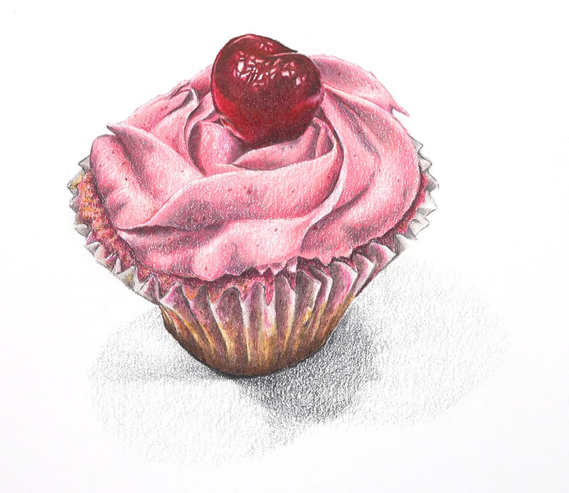
Since light applications were made in the previous step, the tooth of the paper is too strong and evident. To soften it, white (938) is applied over the secondary shadows and is pulled over the outer edge of the strongest part of the shadow.
A colorless blender (1077) is then used to burnish the darker sections of the shadow, completing the drawing.
In this lesson, we'll take a look combining Neocolor II wax pastels with colored pencils to create a realistic drawing of a cupcake. We'll discover that by layering wax pastels, we can save a bit of time with our colored pencil applications.
The process of layering colored pencils can be a time consuming endeavor. In order to build up depth in our color and create a rich and solid application, many applications of the pencils are required. But by creating a base application with water-soluble wax pastels, some of this effort can be saved without compromising the richness and depth of color.
The term "pastels" may be bit misleading here. A better description would be "wax crayons", even though they are described as "pastels". When we think of pastels, we typically consider oil pastels or soft pastels. But in the case of wax pastels, the binder is wax, instead of oil or gum arabic.
Wax pastels are very similar to a crayon, although more pigmented. The wax is also softer, allowing for heavy coverage without much pressure.
Not all wax pastels are created equal. Some are water-soluble, as is the case with Neocolor II, but others are not (Neocolor I). By adding a bit of water with a brush, the pigment left by water-soluble wax pastels can be easily spread over the surface.
Water-soluble wax pastels work well with wax-based colored pencils and can be used to cover large areas quickly or create a nice base for subsequent colored pencil applications. They can also be applied directly over the top of colored pencils without much loss of color intensity.
(Some of the following links are affiliate links which means we earn a small commission if you purchase at no additional cost to you.)
Specific Colors Used (Colored Pencils):
We'll start the process by drawing the contours of the cupcake with a "5H" graphite pencil. Any graphite pencil can be used, but a lighter pencil may prevent any of the colored pencil applications from mixing in, producing grays.
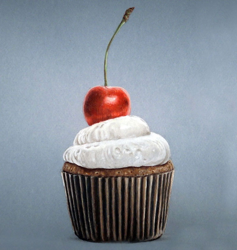
The drawing is created on Canson Mi-Tientes pastel paper, using the blue-gray tone. The less "toothy" (textured) side of the paper is used.
We'll start with the cherry and work our way outward. Scarlet (Neocolor II) is lightly applied to the body of the cherry, with a bit of white for the lightest areas. A touch of black is applied on the shadowed side.
Using a brush with a small amount of water, the colors are "activated" and spread to fill up the shape.
The area dries very quickly, allowing for colored pencil applications to be applied over the top. Crimson Lake and Crimson Red (Prismacolor Premiere) are applied over the body of the cherry. Tuscan Red is used to darken tones and white is applied in locations of highlight.
Colored pencil applications are then burnished with a colorless blender. The shadowed areas within the cherry are darkened further by applying Dark Umber and a bit of Indigo Blue. The reds are intensified with additional applications of Crimson Red and the highlights are enhanced with White.
The stem begins with an application of yellow-green wax pastel. This application is then activated and spread with water. The color is intensified with an application of Apple Green. Dark Umber is applied on the shadowed side of the stem, darkening the value. Terra Cotta is also applied to add a little variety, before applying Cream to the side of the stem closest to the light source. These applications are then burnished with the colorless blender.
The icing is addressed in the same manner as the other sections by applying an application of the wax pastel and then activating it with a small amount of water. Over the top, we'll begin to create a few areas of slightly darker value by applying 20% Warm Grey. French Grey is applied in areas to make the value a little darker. Highlights are strengthened with an additional application of white.
This process is repeated on the lower portion of the icing.

A touch of Cream is added to warm up the color and then burnished with the colorless blender.
The cake portion of the cupcake begins with an application of Brown with the wax pastels. This area is activated with a bit of water before applying textural marks with Cream, Terra Cotta, and Dark Umber. Darker values in this section exist mainly in the areas of shadow underneath the frosting and just above the paper. These areas are addressed with Dark Umber before being burnished with the colorless blender.
Then it's time to move on to the paper section. Alternating applications of brown and black are applied with the wax pastel and then activated with a small amount of water.
The darker shadows within the paper are darkened with a combination of Dark Umber and Indigo Blue. The highlights are addressed with Cream and White. Color pencil applications are then burnished with a colorless blender in order to smooth the texture.
A bit of cast shadow is added underneath the cupcake with a bit of compressed charcoal and then blended gently with a blending stump to complete the drawing.