In this acrylic painting lesson, we'll take a look at creating expressive brushstrokes. It's easy to believe that expressive brushstrokes are the result of working quickly and without much thought. However, it is a misconception that expressive brush work is developed quickly. Instead, the opposite is true. Looser, more deliberate brushstrokes are the result of thoughtful applications of bold colors and values.
Expressive brush work reveals what I like to call, "the hand of the artist". Because the brushstrokes are clearly visible, we have some insight on how the painting was developed. The brushstrokes almost tell us a story. I think that this why I am so drawn to paintings like these. In my own work, I tend to be controlling over the marks which can lead to overwork and stiffness. As an artist, I am always trying to loosen up and let the marks tell more of the story.
Many people look at looser paintings and naturally make the assumption that expressive strokes are the result of quicker mark making. While we can create a painting with fast marks, it often leads to muddiness.
Ironically, a looser, more expressive painting is the result of thoughtful brush work. Each stroke of the painting should have a purpose other than laying down color. The direction of the stroke should complement the subject. This means that you should contemplate the mark before you make it. Consider each stroke's purpose when it is applied.
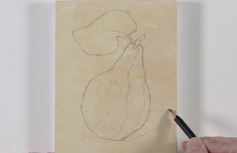
We'll begin the painting with a loose graphite sketch of the contour lines. It may also be helpful to plan out the different values and colors. If you have trouble seeing these shapes of color and value, try squinting at the subject. This helps to see the larger shapes and removes the details.
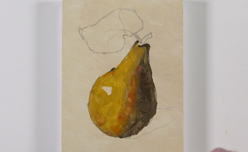
With our drawing in place, we can begin blocking in the basic shapes of color and value. You may start with the darker values and progressively add the lighter values over the top. In this lesson, we'll work with a larger flat brush for as long as we can. Using a larger brush also helps to make the brushstrokes more visible and dominate.

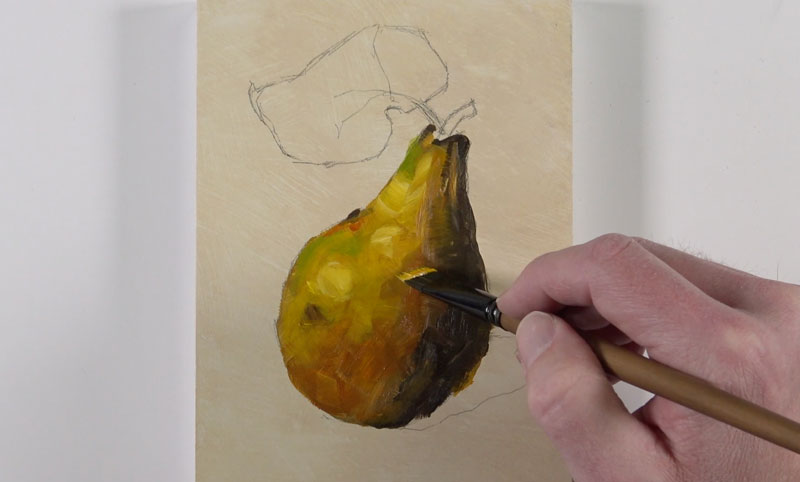
With the basic shapes of color in place on the pear, we can begin to develop the colors and color relationships. We'll pull out a few reds and greens to add interest and contrast. Earthier reds are added with a bit of Burnt Sienna and Cadmium Red. The greens are mixed with Cadmium Yellow and Ultramarine.
We'll also add some of the highlights on the left side of the pear using a lighter mixture of Cadmium Yellow and Titanium White.
After enhancing the colors on the pear, we can move on to the shapes of color and value on the stem and leaf. This green is mixed by adding Cadmium Yellow to Ultramarine. To make the color darker, more of the blue is used. To make the color lighter and warmer, more of the Cadmium Yellow is used.
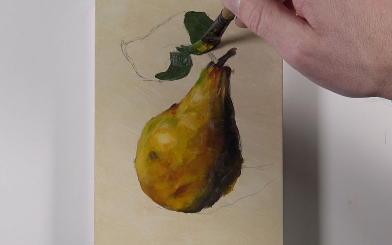
We'll finish of the top leaf with a few hints of red by adding Burnt Sienna. A few impressions of the veins of the stem are also added. A smaller brush is used to address the stem and a highlight is added.
We'll then move on the cast shadow. Prussian Blue, Burnt Umber, and a touch of Titanium White is mixed and added to the shape. Since the shadow is darker closer to the bottom of the pear, a bit more of the Prussian Blue and Burnt Umber is used.
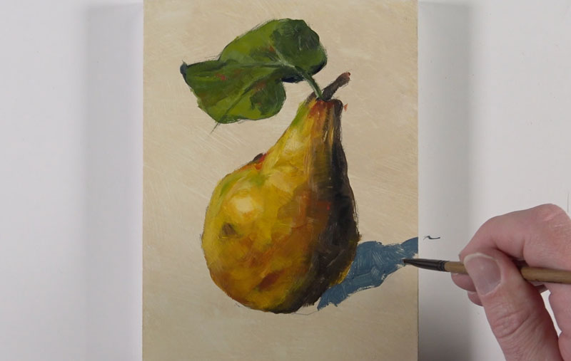
A neutral background color is added around the body of the pear and the stem. This color is mixed by combining Titanium White, Burnt Umber and a touch of Yellow Ochre. As the background is developed, we can alter the shape of the subject.
After the background has been developed, we can go back and enhance the shadow. A lighter version of a cooler gray is added to soften the strength of the shadow.
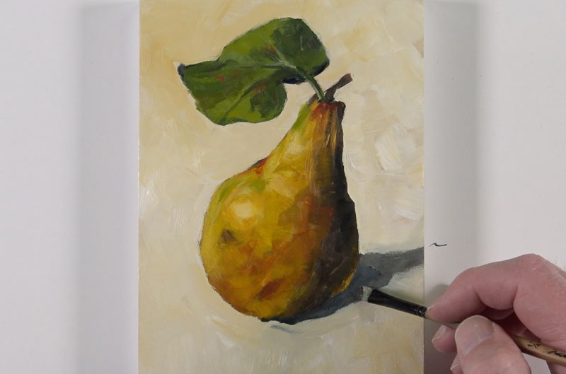
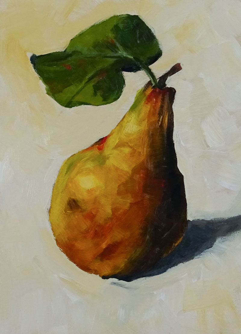
Now our small painting is complete. It just took one hour to complete but our deliberate and thoughtful brushstrokes add interest to an otherwise ordinary subject.