Drawing a Doughnut with Colored Pencils
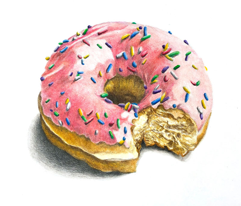
In this colored pencil lesson, we’ll take a look at drawing a delicious, frosting covered doughnut, sprinkled with colorful candies. We’ll work on smooth Bristol paper and use Faber-Castell’s oil-based Polychromos pencils to complete the drawing.
Materials for this Lesson
The colored pencils we’ll use for this lesson are the oil-based Polychromos colored pencils by Faber-Castell. These professional pencils are rich in pigmentation and are designed for layered applications. They are pricey when compared to lesser brands, but the difference in quality is clear when they are applied.
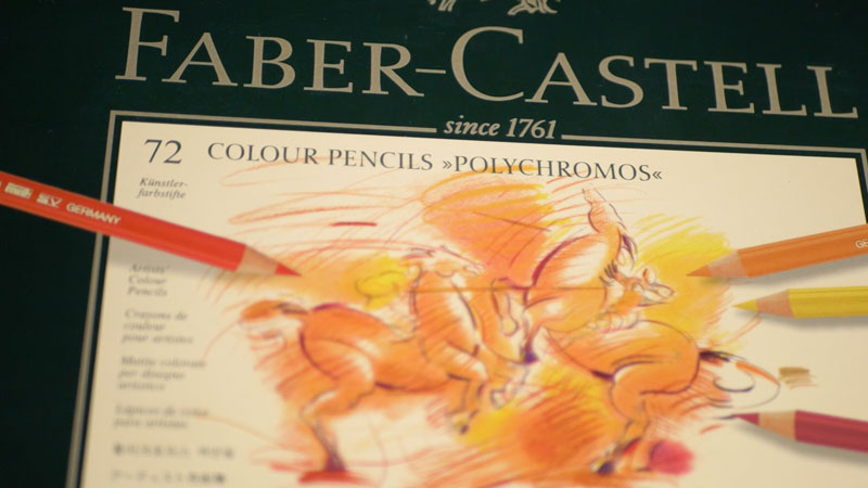
Oil-based colored pencils differ from wax-based colored pencils in the binder that is used. Oil-based colored pencils have an oil-based binder (which holds the pigment together), while wax-based colored pencils feature a wax-based binder. Most colored pencils on the market are wax-based.
Because the binder is oil-based, these pencils behave in a slightly different manner than their wax-based counterparts.
See also: Wax-based Colored Pencils vs. Oil-based Colored Pencils
The surface we’ll use is smooth Bristol paper by Strathmore. I love this particular surface and use it for a variety of media including pen and ink, graphite, and colored pencils.
The tooth (or texture) of this artist’s quality paper is very smooth. This is both and advantage and a disadvantage.
The advantage of this paper is the control that you have when applying colored pencils. Since the texture is less pronounced, you aren’t fighting against it to create intricate details. The pencil marks are smooth and well-controlled.
The drawback is the lack of tooth. More tooth on the paper means more layers of colored pencils can be applied. Layering colored pencils builds depth in color, which results in more natural, realistic imagery.
More on drawing papers…All About Drawing Papers
Here’s a look at the specific materials used to create the art. (The following links are affiliate links which means that I make a small commission if you purchase without an additional cost to you)…
The Photo Reference
We’ll work from a photo reference to complete the image. Keep in mind that we aren’t trying to create an exact copy of the reference. Instead, we’ll use the reference for shapes, contours, color, and texture. We can deviate from the reference as much as we like. Remember, it’s the finished art that matters – not how well you copied a photo.

Start with a Sketch
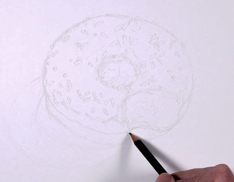
We’ll begin our drawing with a light sketch using a graphite pencil. A hard graphite pencil, such as an “H” or “2H” will do. Try to avoid using anything harder than “2H” as it may create unwanted indentations in the surface of the paper.
See also: Artist’s Graphite Pencils Explained
Avoid using a softer pencil, such as a “2B” or darker. Darker pencils may leave too much graphite on the surface which may result in muted colors and bits of gray showing through the colored pencil applications.
The image that follows has been darkened to allow you to see the sketch a little easier. Your sketch should be as light as possible.
Adding Colors to the Doughnut
We’ll begin with colored pencil applications on the doughy part of the doughnut. We’ll layer a few colors to build up depth.
The first color that we’ll layer is Raw Umber. This color is carefully applied using a circular stroking pattern. This is followed by Cream, Terra Cotta, and Van Dyke Brown. The Cream applications are made primarily in the areas of lighter tone, while the Van Dyke Brown is applied mainly in the areas of darker tone.
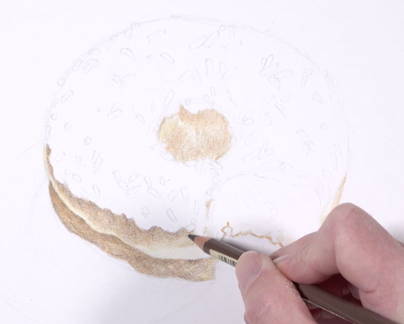
Wax-based pencils can be burnished using a colorless blender while oil-based pencils are less receptive to a colorless blender. For this reason, we’ll blend the applications using a solvent. The solvent used in this drawing is Turpenoid Natural.
Using a soft brush, just a touch of Turpenoid is applied to the applications. This dissolves the color slightly, resulting in a smoother, more even distribution of color.
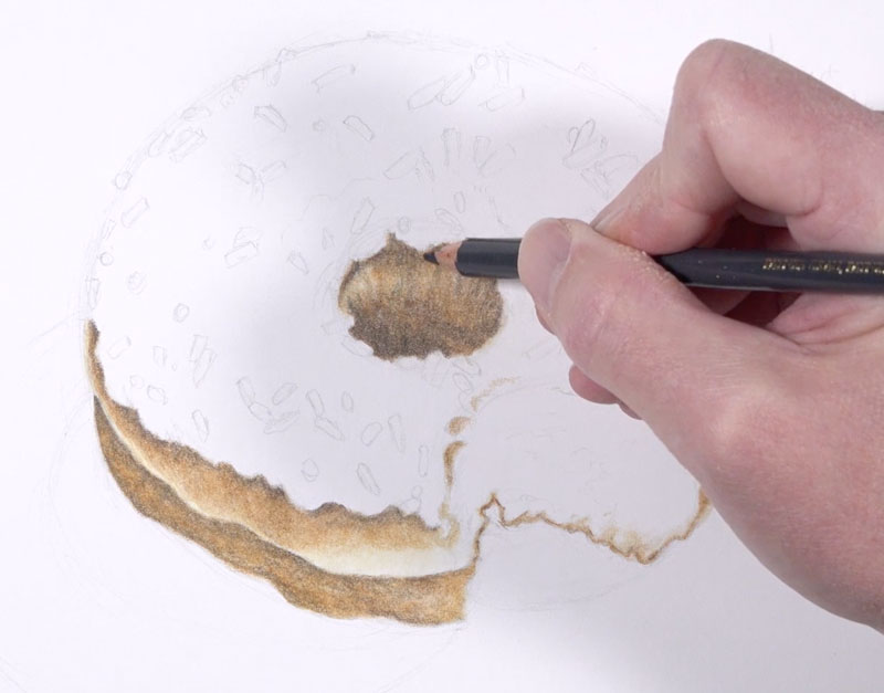
Next we’ll move on to the frosting. We’ll begin with a light application of Medium Flesh, taking care to preserve shapes of lighter value in areas where we see the strongest highlights.
To make the highlights slightly lighter, an application of White is applied.
To add to the complexity of the color, we’ll next layer a bit of Pink Madder Lake. This color is layered primarily over the areas where the values are darker.
This color is followed by Rose Carmine, adding a bit more to the complexity and intensity.
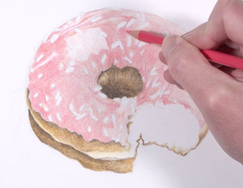
A few stronger shadows exist around the candies and the body of the frosting. Again, we’ll use Payne’s Grey to make the shadows a little darker. To warm up the shadows, we’ll layer Medium Flesh over the top.
As we did with the doughy sections, we’ll layer a bit of Turpenoid Natural with a soft brush to even the color.
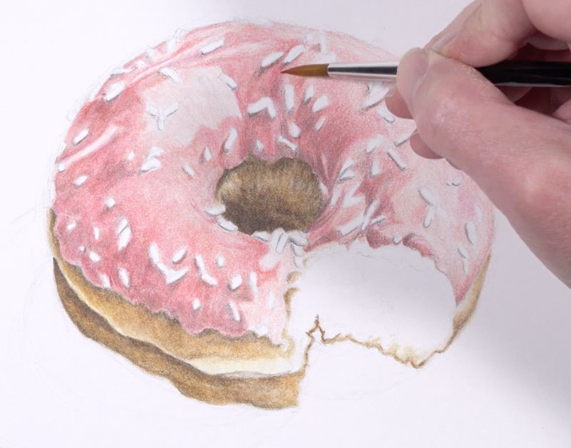
If needed, you may go back over portions of the frosting with any of the pinks that we applied initially to intensify the color.
Next, we’ll address the sprinkles. We’ll use a variety of colors, using both a dark and light version on each sprinkle. Highlights are intensified with White, while shadows are darkened with Payne’s Grey. Remember, each candy sprinkle is a small form, meaning that is has highlight, mid tone, and shadow. Be sure to keep your shadows and highlights consistent for each sprinkle that you draw.
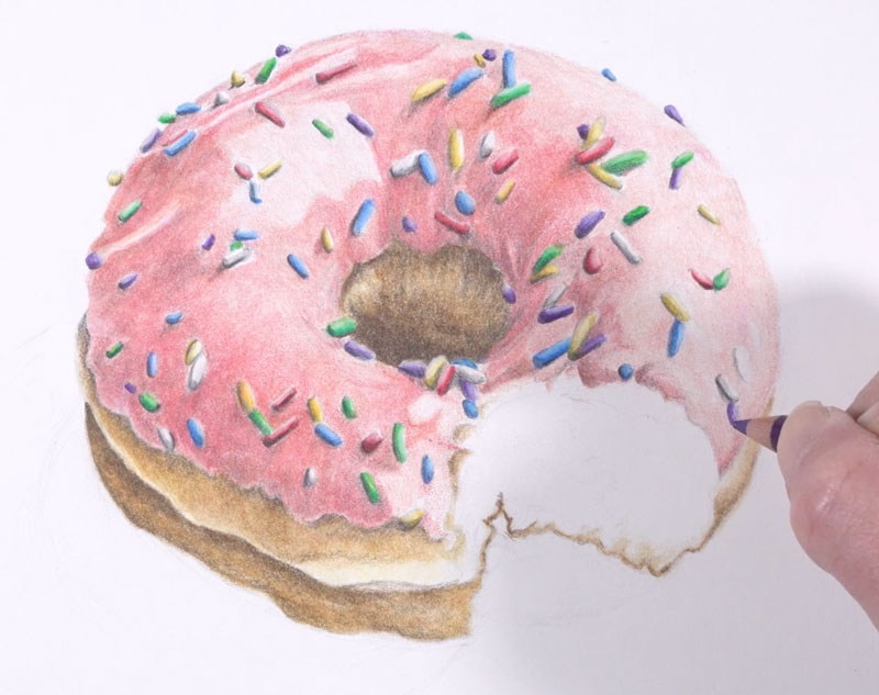
With the sprinkles in place, we’re now ready to address the bite mark in the doughnut.
We’ll begin by coloring in the entire shape of the bite mark with an application of Cream. This is followed with Raw Umber, drawing in textural marks to mimic the flakey dough. Strokes are mostly horizontal on the right side of the shape and are more circular on the left side. Be sure to leave bits of the Cream showing through – it’s the contrast that leads to the illusion of texture in a drawing.
We’ll then darken the shadows in this area with a bit of Van Dyke Brown. Walnut Brown can also be used if the value needs to be darker. The more that you push the darker tones, the more pronounced the illusion of texture becomes.
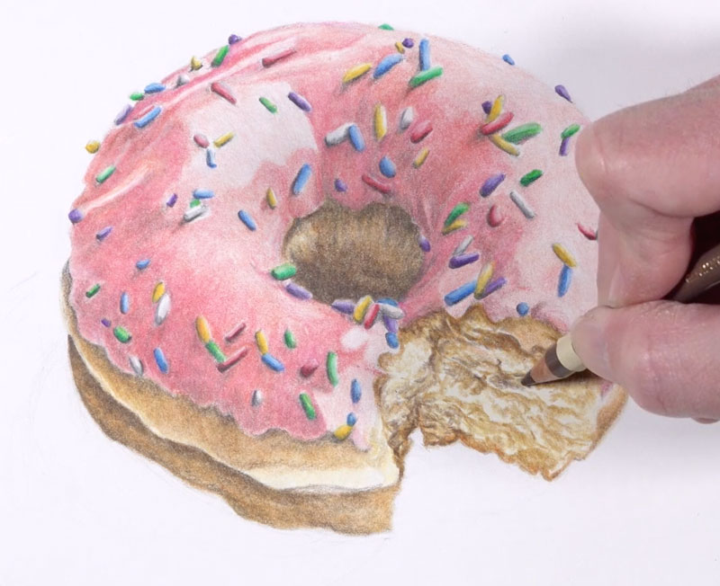
Next we’ll add a bit of cast shadow underneath the doughnut. Instead of using black, we’ll layer a couple of grays. First, Warm Grey V is applied, followed by Payne’s Grey. Cold Grey II is applied around the outer edge of the shadow to ease the transition to the white background.
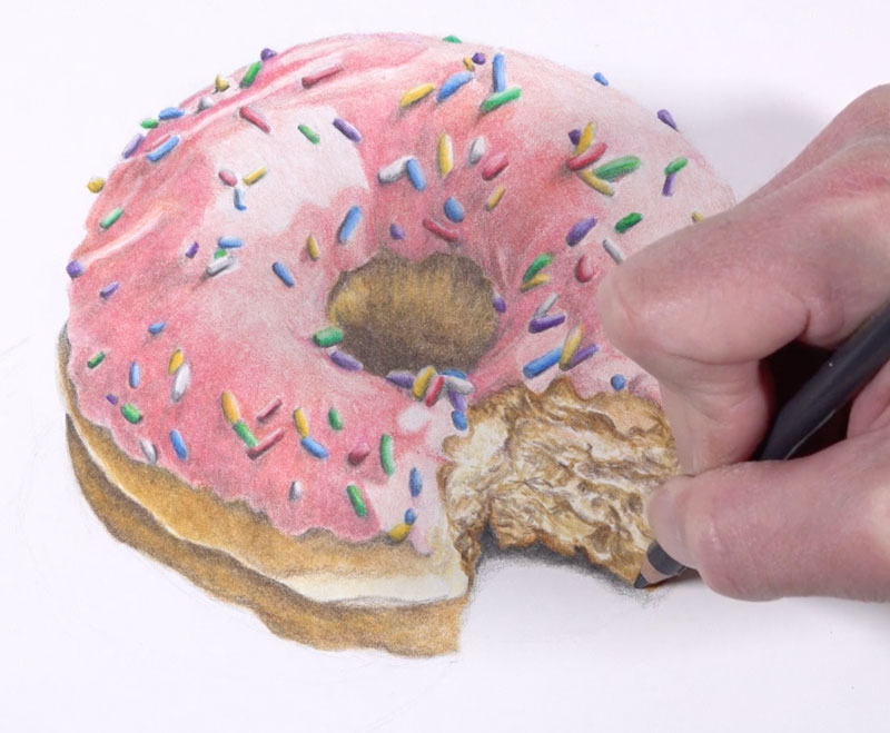
We’ll also extend a cast shadow on the left side, using the same combination of colors. The shadow is much larger on this side.
Sticking with Payne’s Grey, we can enhance some of the shadows inside of the doughnut hole and in areas where the icing overlaps the dough.
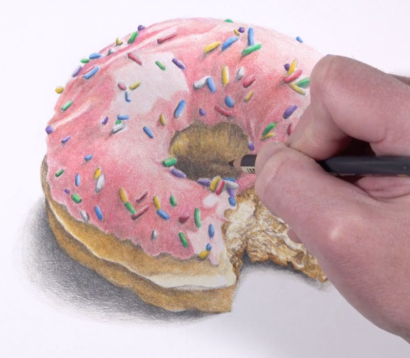
Now our drawing of a doughnut with colored pencils is complete…

Doughnut Drawing with Colored Pencils – Conclusion
Like is the case with any colored pencil drawing, patience is important. Take your time when developing each layer of color to build up depth in the color. Perhaps you’ll create a drawing that’s good enough to eat!
If so, join over 36,000 others that receive our newsletter with new drawing and painting lessons. Plus, check out three of our course videos and ebooks for free.
Managing an Art Classroom
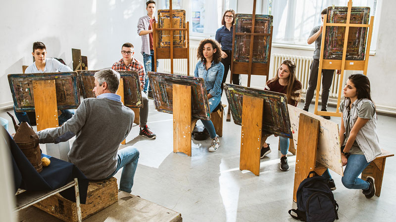
The formula for a well managed classroom has many variables. A few characteristics common to well managed art rooms are . . .
- A safe environment for learning and creating.
- Established studio procedures.
- Challenges students without discouraging them.
- Clear disciplinary procedures and expectations.
One way to ensure that these characteristics describe your classroom is to plan around S.O.S. – Safe, Orderly, and Specific. Use S.O.S as a checklist when planning for a project, for a unit, and even for an entire year. Unlike the Morse Code distress signal, this SOS won’t leave you feeling stranded.
Safety in the Art Classroom
The art classroom is one of the more dangerous classrooms in any school building. Solvents, cutting tools, and kilns are the stuff dreams are made of but can quickly turn a student’s dream into your nightmare if used improperly. What can a teacher do to decrease the likelihood of an accident?
Be conscientious and aware!
Most accidents are avoided by simply slowing down. In the fast paced course of the school day, things can get messy. Work deliberately and slowly enough to avoid creating dangerous situations. Simple things like keeping the kiln area clear or locking the paper cutter blade down make all the difference.
Take a look at the kiln area below. The first image is cluttered and filled with flammable objects right next to the kiln. This is an accident waiting to happen! Be sure your kiln room is free of clutter and fire hazards.
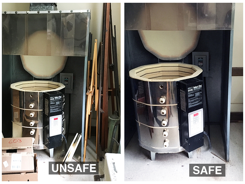
As an art teacher, you should always be one step ahead of any accidents. This means that you must foresee any potential accidents before they happen and take steps to ensure that they don’t.
Prepare for an emergency
Show students where the fire extinguisher is located. Have bandages and alcohol wipes on hand for minor cuts. Post important school phone numbers (school nurse, the main office, etc.) by the classroom phone. An emergency could involve the teacher, in which case a student may need to call for help.
Consider Safe Use of Tools and Equipment as Part of the Student’s Grade.
Most students are conscientious of their grade. Use this motivation to ensure safety by including safety procedures as part of their grade.
Many sculpture and printmaking tools are sharp. Demonstrating how to properly use saws, hobby knives, and carving tools is not enough. Give students a chance to demonstrate their understanding one at a time to ensure they proceed safely. This gives you the confidence that they are using the tools correctly. The time it takes to check each student is worth the peace of mind that no student will hurt themselves.
Keep the Art Classroom Orderly
An orderly and neatly organized classroom is essential. This organization not only applies to the materials the students are to use but also to the instruction that is delivered.
Supplies
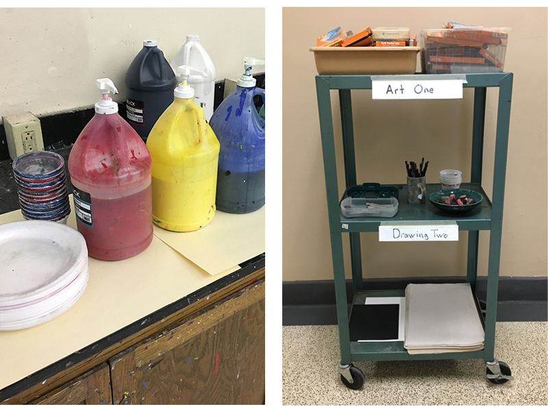
You can’t fly a plane while building it and you can’t teach students while you’re cutting paper, looking for erasers or any other task that should be done before instructional time begins. In upper level classes, a teacher can train students to retrieve and return supplies where they belong. The images below show art supplies grouped by class.
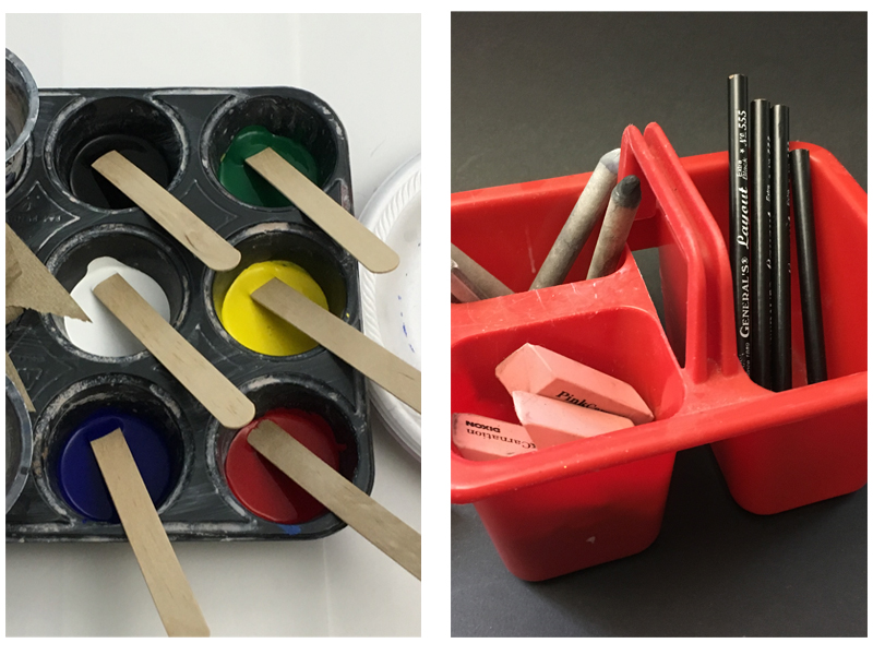
For younger children and lower level classes, all materials and tools should be available at each table. This will guarantee that students use the correct supplies and reduce the congestion in the classroom by keeping students in their seats. Containers with multiple sections are ideal for organizing supplies on each art table in a classroom. Collect as many containers as possible. Ask for containers from colleagues/faculty.
Organized Art Instruction
It goes without saying that lessons should be planned and the teacher should be fully prepared to deliver instruction. Making lesson plans isn’t always fun, but it’s essential. When presenting a lesson for the first time, make sure you have written down everything you want to communicate – perhaps even rehearse your delivery. Be sure to plan every minute of instruction – you cannot over plan.
Try to foresee any questions a student may have and include this in your presentation. Take note of questions that are asked when you deliver the lesson the first time. This way, you can refine your lessons so that they improve each time you present.
Be sure to include exemplary examples of the finished product. Three examples are optimal, while five or more is perhaps overwhelming. You may also include examples of what not to do, so that students are aware of any potential pitfalls.
When presenting a lesson for the first time, you may not have any student examples. This means that you must create one. In fact, every assignment you give students should be completed by you first. This gives you the chance to experience any challenges that a student may face in the process. When you present your lesson, you can address these challenges. The quality of the work your students create will be noticeably stronger.
In a perfect world, all students would listen to their teacher’s directions and then follow those direction without deviation. The world is, however, not perfect. Sometimes students are distracted, absent from school, or simply don’t understand the first time through. A written handout that restates the directions/process as demonstrated by the teacher is a great way to avoid answering the same questions over and over.
Sometimes written directions are enough for a previously absent student to get started until the teacher can carve out a moment for one-on-one instruction. Place written instructions that outline a project’s entire procedure available on each art table. If the classroom is equipped with the technology, cast the directions (along with examples) to a large screen or television.
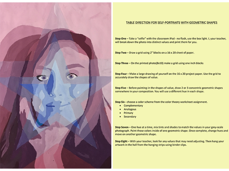
See also: Art Lesson Plans for Middle and High School Students
Consider A “Bell Ringer”
Without a procedure in place, the first few minutes of an art class can seem like chaos. Some students are finding their project. Some are getting supplies. A few are just staring into blank space. One or two are lost, having just returned from an absence. All of this is happening while the teacher is trying to call roll. These first few minutes set the tone for the entire period, so this initial period is critical. Organization should begin as soon as a student enters your classroom.
One way you can establish an organized and expected procedure is to use a “bell ringer” during those first few critical moments of class. This is a five to ten-minute task that only requires students to come in, sit down and work in their sketchbook according to a prompt. The prompt could ask for a sketch, a design even just a written response to a piece of art.
The bell ringer might lead into a classroom conversation or it can simply help to focus the class. It gives the teacher a chance to address the class as a whole and also take the roll quietly. During this time, the teacher can answer questions that he/she anticipates students will need answered.
Some teachers feel that a daily bell ringer takes too much time. Bell ringers should only be 5 – 10 minute tasks and could be spread out over several days (perhaps sketching a small still life arranged in the room). A short bell ringer will pay dividends in the form of an orderly, well managed transition into art-making.
Part of classroom management is establishing yourself as the leader in the room. Using table-directions and implementing bell ringers show students that you are thinking ahead, prepared, and organized. Students respect the teachers that work hard and care about what they do.
Be Specific with Your Instruction
The curriculum is the same for each student but how it is delivered is at the discretion of the teacher. If the curriculum is delivered through assignments that are too easy or too difficult then students begin to lose interest. As a result, classroom management breaks down. Tasks must be specific according to a student’s skill level, not their grade or course level.
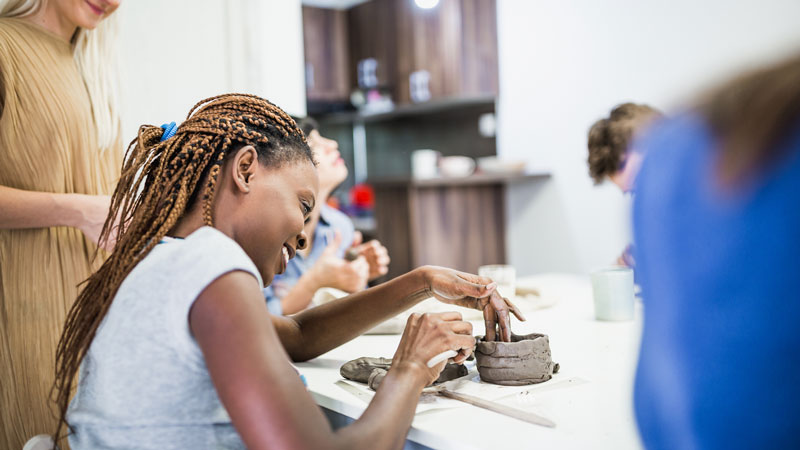
What does this mean and what does it look like?
Medical doctors prescribe medication specific to a patients’ illness. Students should have assignments tailored to their needs as well. In education, this tailoring is now called differentiation. Differentiation means having a few different options available for students within a specified learning goal.
For example, instead of assigning a non-objective, two point perspective drawing, a teacher could just assign a non-objective perspective drawing. The students could work towards completing a set of goals using either one, two, or three point perspective, depending on their experience and skill level. So instead of dictating that the drawing be completed using two point perspective only, the student has the option to use one point, two point, or three point perspective.
Not only does this ensure that most students find success, but it also allows them a bit of creative freedom.
Look at the images below. Both of the images meet a specific set of goals.
These goals and expectations were…
- 30+ individual planes.
- An arch or ellipse.
- A form with negative space.
- The use of linear perspective.
One student chose two point perspective while the other used the more challenging, three point perspective. Both projects were successful.
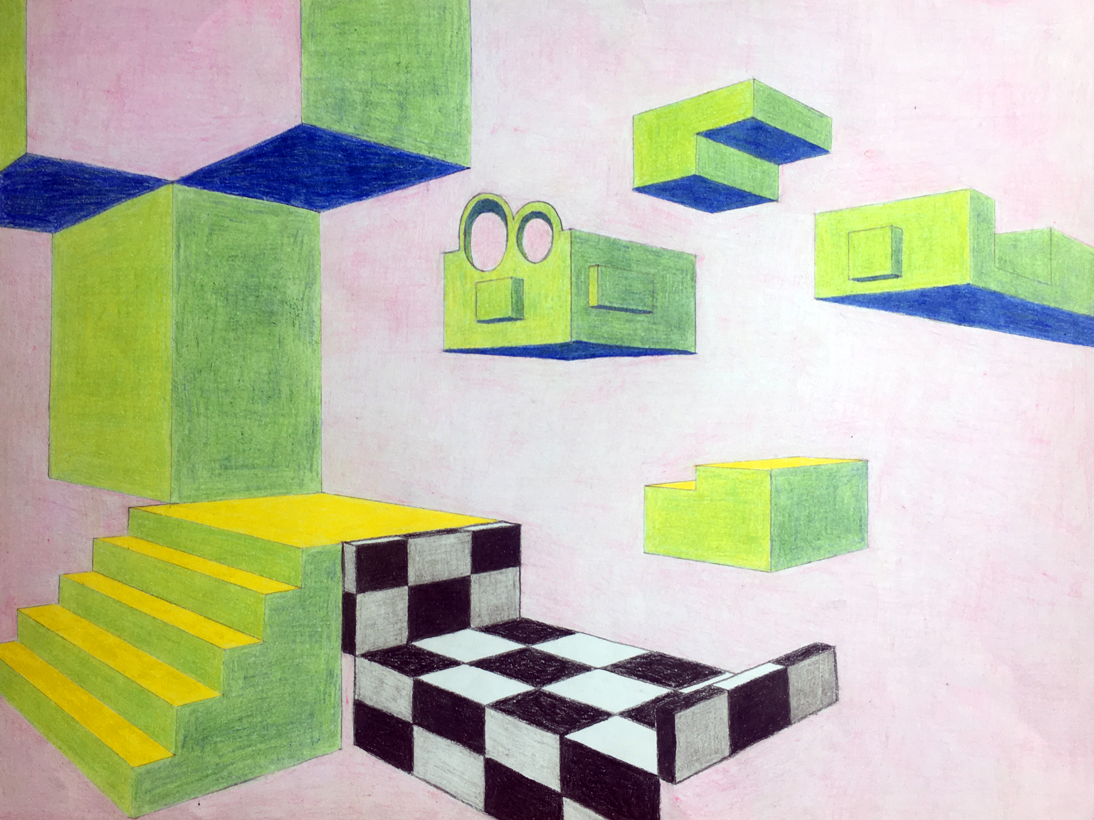
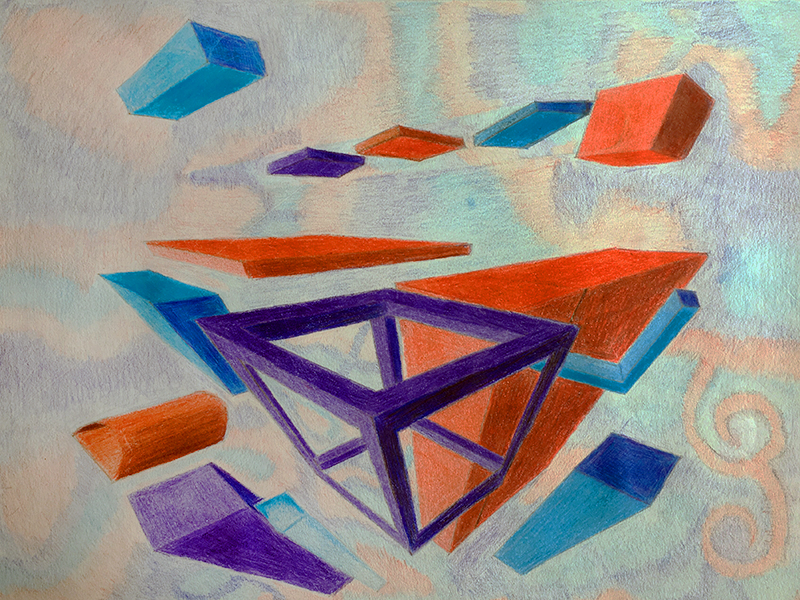
Successful projects are indicative of a well-managed classroom. Of course, the teacher needs to identify his/her students’ personal skill level before effectively differentiating instruction. Good news! There is a tried and true method for that.
The Pre-Test
A pre-test is a test given prior to instruction. A short pre-test will give the teacher a good idea of the scope of content knowledge and skill level in any particular class of students. The data collected through the pre-test will direct the teacher as to where and how lessons should be differentiated. Meeting the students “where they are at” is better than rigidly delivering a curriculum that is beyond some students’ grasp.
Discipline
Discipline should not be overlooked when discussing the management of an art class. A well-managed class is also a well-behaved class. We’ve all had those students – but even the most unruly student can be tamed when you are clear and consistent with your discipline.
Expectations of classroom behavior should be clearly communicated and posted. Procedures for enforcing your guidelines should be clearly communicated to students as well. For example, if a student breaks the rules, they should know exactly what is to follow.

Clear communication and established behavior expectations make it easier to enforce rules when they are broken. When the rules are broken, you can calmly remind students of the discipline that will follow. This takes any personality conflicts between you and your student out of the equation.
You must be prepared to discipline students when your expectations of behavior are not met. This applies to every student in the classroom – not just the ones that drive you nuts. When a student breaks the rules, the disciplinary action that follows should be swift, consistent, and calmly explained.
Students respect teachers that enforce the rules. And when the rules are followed in your classroom – managing your classroom is vastly easier.
Conclusion
As we’ve discussed, a well-managed art classroom is safe, orderly, well-behaved, and challenges students on their personal level. Proper management results in happy teachers, growing students, and quality artwork. Remember, you are the teacher – the management of your classroom is also a reflection on your effectiveness as a teacher.
If so, join over 36,000 others that receive our newsletter with new drawing and painting lessons. Plus, check out three of our course videos and ebooks for free.
How to Draw a Raven with Pen and Ink
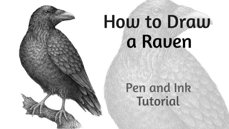
Over the centuries, ravens have been the subject of mythology, folklore, art, and literature. They’re a symbol of prophecy and insight. Also, there’s evidence that ravens are unusually intelligent.
This lesson is dedicated to these mysterious creatures. Ravens, with their all-black appearance and glossy feathering, provide an interesting challenge for any pen and ink artist. Let’s explore how to achieve the desired effects of contrast and texture in this drawing.
For this project. I’ll be using two black ink liners (technical drawing pens) – 0.1 and 0.05. Feel free to use a nib pen if you prefer. The principles we’ll discuss are quite flexible and apply to either type of pen.
We’ll begin with an ordinary graphite pencil to create our sketch. You’ll also need an eraser to remove the graphite marks once the ink has dried.
Sketching the Raven with a Graphite Pencil
Before we get in to the ink, let’s begin with a graphite sketch.
We’ll first decide on the pose and positioning of the raven. I create several small, rough sketches. They don’t have to be perfect – the goal is to convey the mood and lay out the general composition.
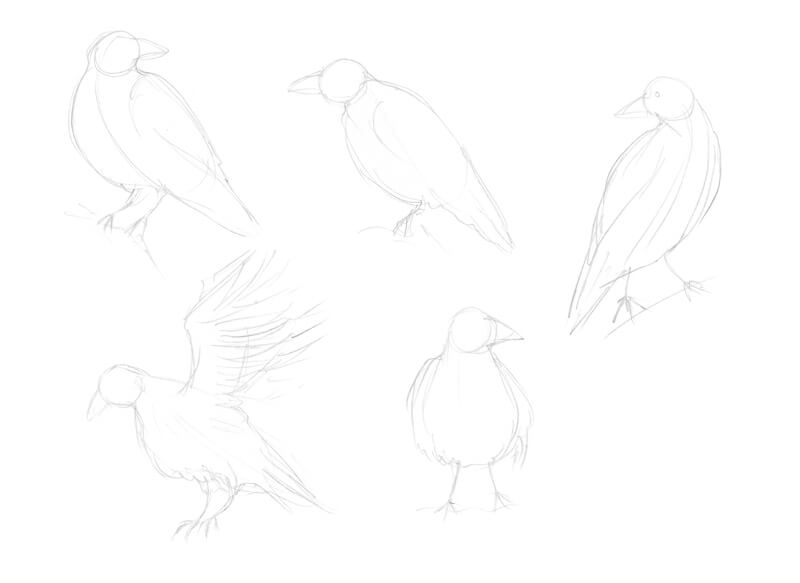
After making a few sketches, I decide to depict a raven that is sitting on a piece of wood, with its head turned to the side.
Now that we’ve decided on the composition and pose, let’s move on to our final surface.
I mark the general shape of the head using light marks with the graphite. Then I add the rough shapes of a massive beak and large body. The head and body are joined, forming the neck. The feet and tail feathering will be added in the next step, so leave some space for them.
An improvised core line that runs through the body helps to construct this basic framework.
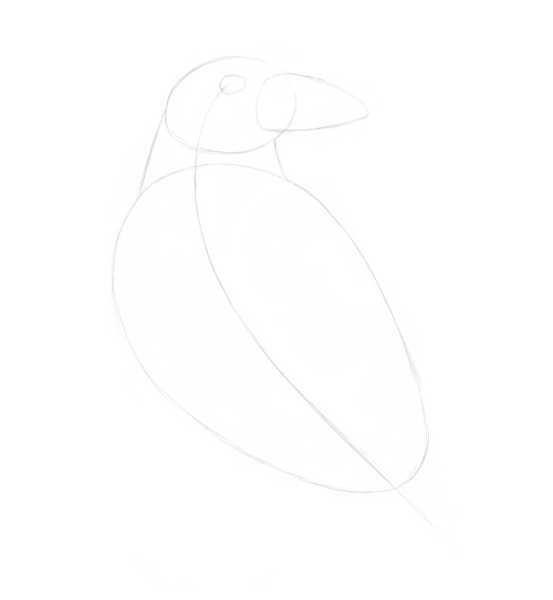
I add the shape of the wing, tail feathers, and the framework of feet. The small circles mark the joints. There are three front toes and one more toe is facing backwards.
I also add a line that indicates both the direction and position of the wooden piece on which the bird will be standing.
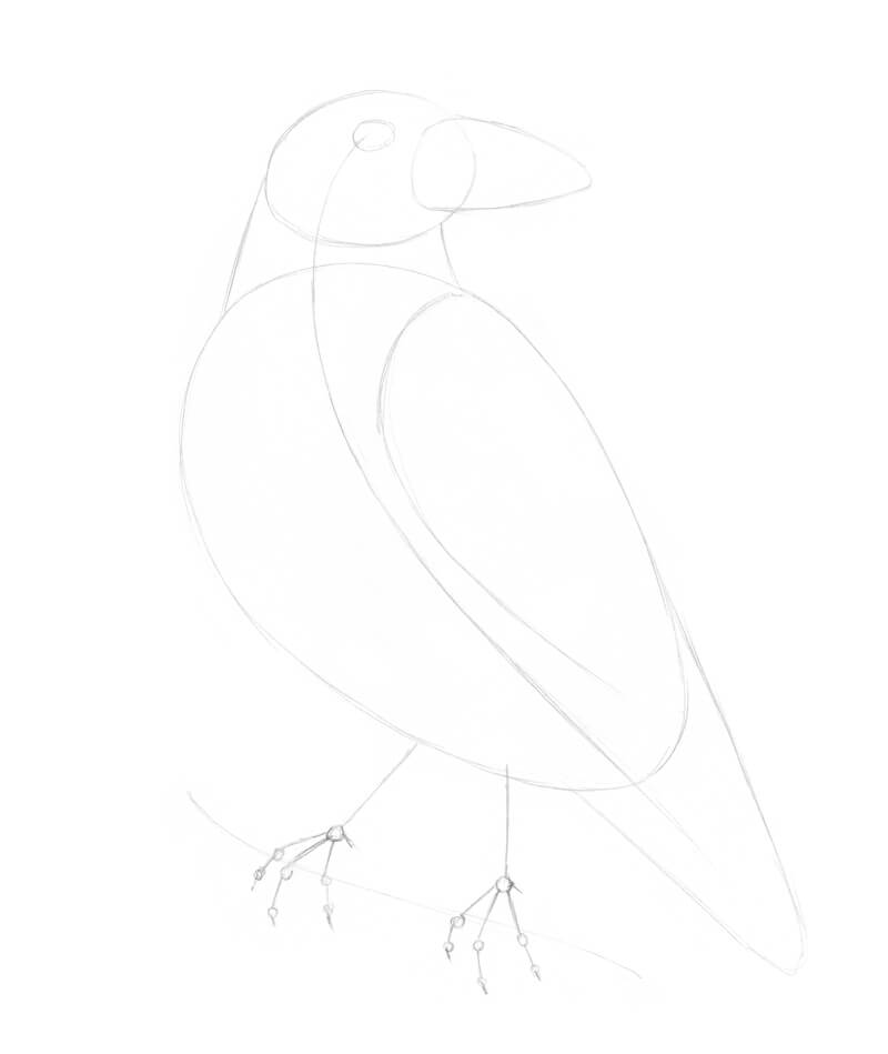
It’s time to refine the head of the raven. I change the contours of the eye and the beak, making it sharper, curving the line downwards.
I also mark some shaggy feathers around the throat and above the beak.
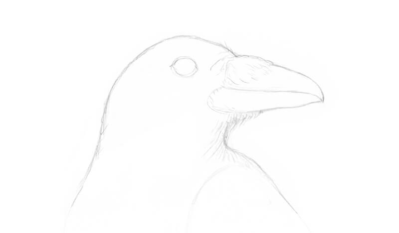
It’s time to refine the body. I draw the long tail feathers, taking note that they have a sharp and rigid look. The feathers on the body are softer. To communicate this in the drawing, I use curvy organic lines.
I refine the feet, adding long talons at the end of each toe. The contours of the branch under the bird are also added in this step.
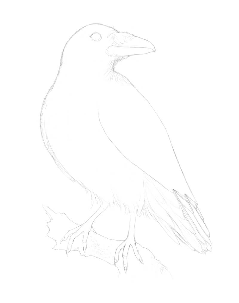
To finish the sketch, we’ll add the pattern of the wings. The feathers in the upper part of the wing are soft, short, and relatively small. The feathers in the middle of the wing are longer and have clear contours. Lastly, the feathers in the lower part of the wing are the longest with sharp tips.
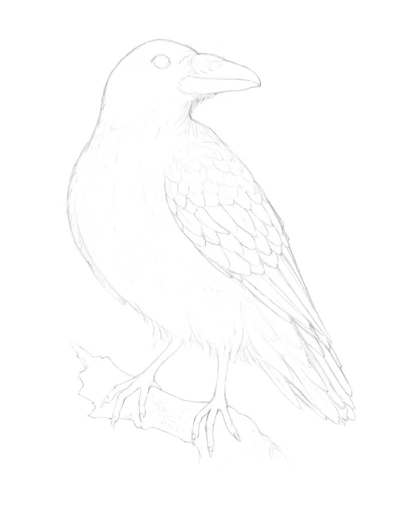
Adding Ink to the Drawing of a Raven
Sometimes I find it useful to make several sketches of texture before proceeding to the final artwork. Take your time and experiment with techniques to find the best fit for your subject. These exploratory sketches may be quite quick and rough.
In the image below, you’ll find my examples. I analyzed various types of raven feathers. In some ways, the softer feathers look just like short hair or fur — we can imitate this texture with a deliberate use of hatching.
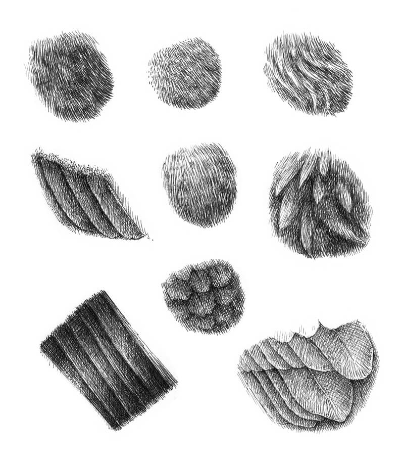
In this case, our raven is a subject that has a deep, dark color. How many layers of ink hatching do we need to achieve this density? The answer may be “quite many” depending on the tool that you use. Thicker pens will require less layering, but may sacrifice precision and complexity. Smaller pens will require more layers, but with an added level of control.
It will be easier to get a relatively solid black covering faster if we use a liner of medium width, like 0.3 or 0.5. But the result may look rough because of the thicker lines.
See also: Pen and Ink Drawing Techniques

We’re now prepared and ready to move forward. With a 0.1 ink liner, I mark the general contours of the raven. Just keep in mind that feathers create an uneven line of the silhouette, so be sure to replicate this in your drawing.
To achieve a more realistic look and to communicate form, the ink lines should correspond to the direction of feathers. When it comes to distinguishing the feathers, especially in the wing area, I find that groups of hatches work better than just a ‘border’ created by a single line.
I darken the eye with rounded hatches that give it more volume. Of course, there should be a small highlight in the eye, so preserve this as you add the ink.
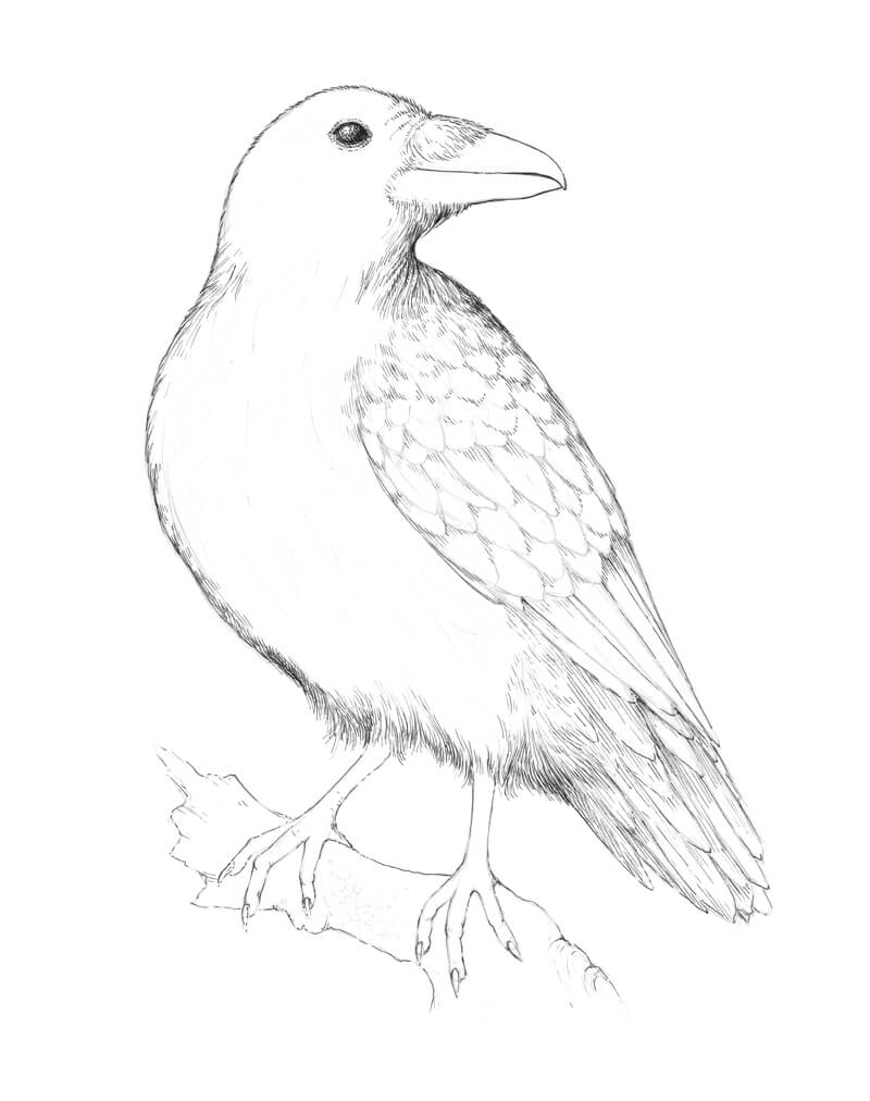
Let’s work on the basic texture. With a 0.05 ink liner, I apply hatching to the raven’s figure. There are long, soft, curly feathers in the neck and breast area — the character of lines accents this feature.
The feathers in the belly area are smoother, so groups of parallel hatches are a nice choice here. I add some cross-hatching to the darkest areas (for example, under the wing and to the tail feathers).
I apply more ink marks to the beak, darkening the whole area except the small spot in the upper portion, where the light is stronger.
I give more volume to the legs, adding rounded hatches to their sides. The raven’s legs usually are a bit lighter than the body, so don’t overdo them.
The reason why I recommend using a thinner liner for this step is that it creates fine marks that translate as a “gray”. They have a soft look that doesn’t overload the artwork. If you need higher contrast and more depth, you can always add more ink marks.
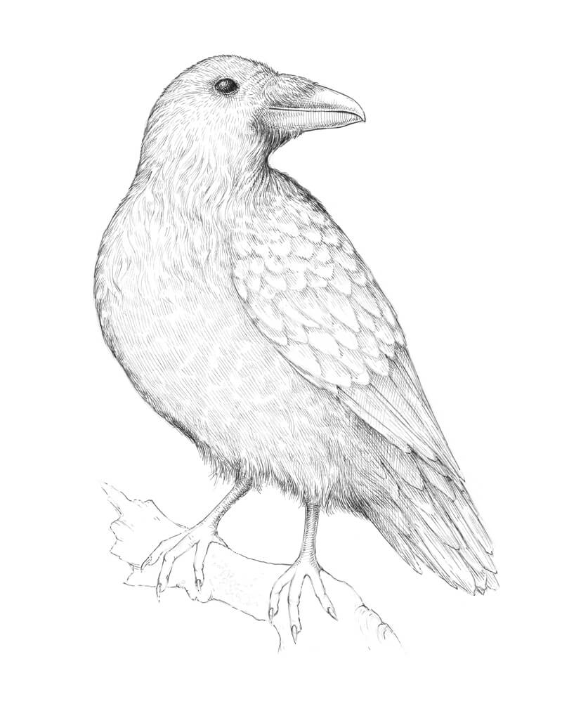
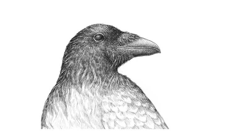
Now, it’s time to increase the contrast in the drawing. Let’s start with the raven’s head.
With a 0.1 liner, I add several layers of hatching on top of the existing ink lines. Stippling can be used as well if the goal is to create an illusion of soft, short feathering. Dots and smooth transitions of value definitely are friends.
The eye and the beak are as dark as the feathering. I use stippling here to darken the values.
The upper part of the head gets more light from above, so I use fewer ink lines there. The sides of the head receive special attention. I want them to be as dark as possible while still maintaining a sense of volume.
In a similar manner, I start darkening the body. The hatching is dense. The process of achieving this kind of depth and darkness with a liner or a nib can be time-consuming, but it’s worth the effort.
Pay attention where you place new marks. Aim for the gaps in between the existing lines.
Some areas, like the feathers in the neck area, remain lighter. Feathers of a raven have a glossy look when they catch the light. The lower part of the body is in shadow, so we can’t see many details there. Also, I make the core shadows in this area even deeper.
I add some long, streamlined hatches to the tail feathers to accent the texture.
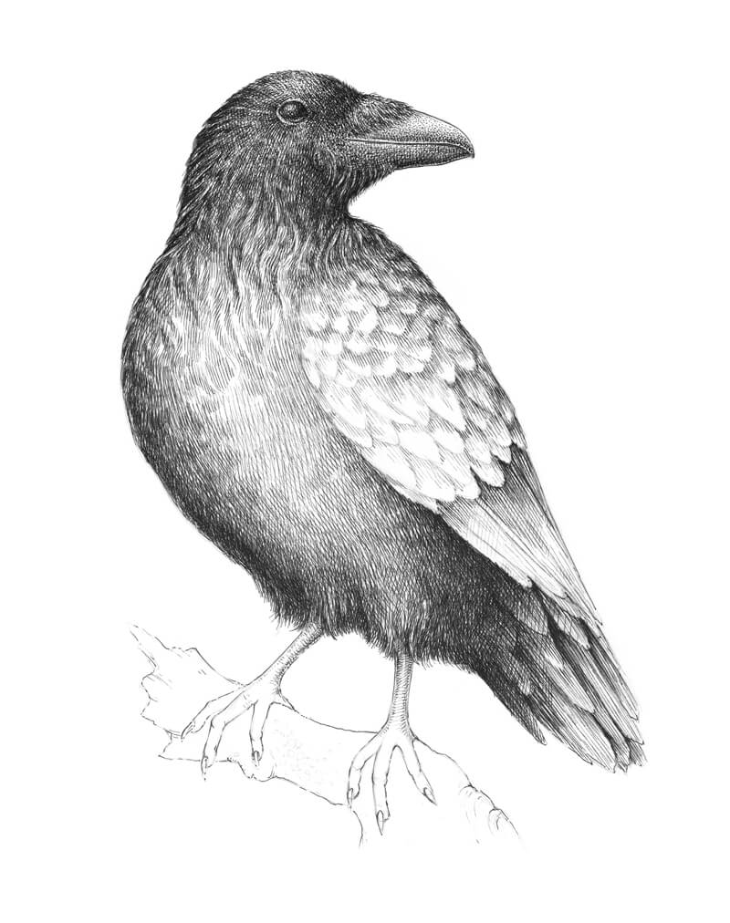
With a 0.1 liner, I add new layers of dense ink hatching to our raven. As I said, this process requires patience, so take your time.
I’d like to have more variation in the feathering, so I add a subtle pattern created by groups of short parallel hatches to the belly area.
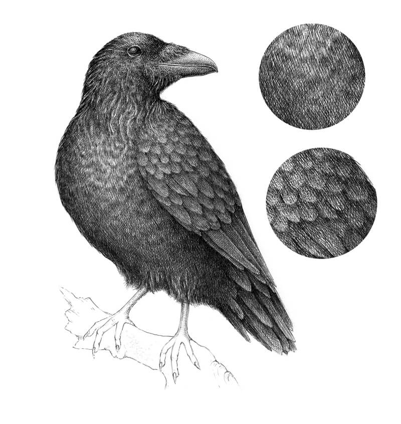
When it comes to the wing feathers, I leave the ‘bodies’ of visible feathers slightly lighter than the shadows that divide them. The upper parts of the wing get more light, so the feathers there will be slightly lighter in value.
In the image below, you’ll find two samples of texture. The upper one is from the belly, and the lower one represents the wing texture.
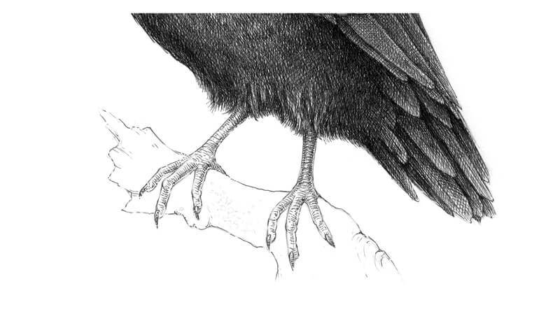
With a 0.1 ink liner, I work on the legs of our raven. They feature a unique ribbed texture. Rounded, horizontal hatches are used to replicate this texture.
The legs should be quite dark at the top (where they are joined with the body) since the large body of our raven casts a shadow on them.
Everything in our artwork is almost complete but the wooden support remains. I mark the main lines of texture and draw some lichen that grows on the bark. Then I darken the whole shape so it is harmonious with the bird.
See also: Drawing With Ink Liners: Natural Textures
Let’s not forget the shadow under the bird’s feet. I add some ink marks to the feet and a few more right underneath the talons.
It’s important to step aside from your artwork now and then. Take breaks. I find that this is especially important with dark, contrasting drawings.
Go for a walk or do something that has nothing to do with art. Then, come back with a fresh look. Chances are that you’ll notice something that needs additional touch.
Now, our drawing of a raven with pen and ink is complete…
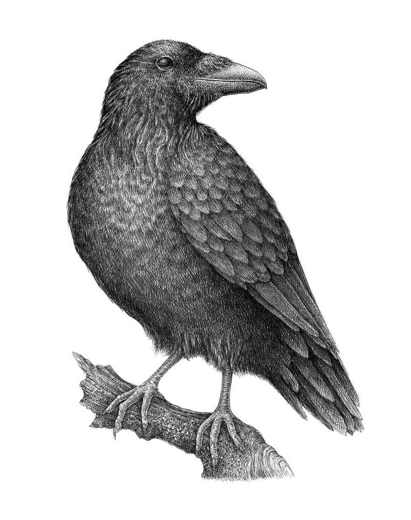
Conclusion
Like with any pen and ink drawing, it’s important to be patient. Be sure to take the time to prepare before starting on your drawing with preliminary sketches and texture studies. Work slowly as you add each layer of hatching, analyzing the texture and contrast as you go.
Remember, although we drew a raven in this lesson, the concepts that we explored apply to any pen and drawing that you create.
If so, join over 36,000 others that receive our newsletter with new drawing and painting lessons. Plus, check out three of our course videos and ebooks for free.
Draw and Paint Like You’re Writing a Story
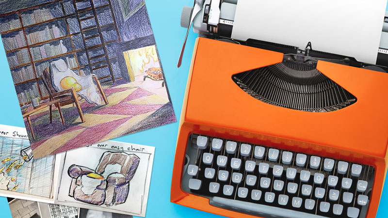
Each pictorial element is like a single paragraph – an idea that must tie in to the other ideas (pictorial element) around it. Let’s look at a successful work of art by a master painter, John Singer Sargent, and see how he developed his composition like a writer might develop a story. Then we will look at an art project idea that teaches art – made in stages.
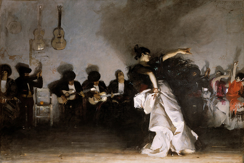
Entitled El Jaleo, this painting seems to capture a moment in time. The dancer’s posture tells us that she is in motion. The loose brushwork found in areas of the background give us the impression that Sargent was right there, painting furiously to keep up with the tempo of the dance itself. Therein lies the beauty of Sargent’s work. He has masked the careful planning that goes into creating such a riveting painting.
So how is painting a picture like writing a story?
The steps to writing a story may include some brainstorming, an outline, a rough draft, and a final draft. Of course, numerous revisions could take place between the rough draft and the final draft. So what do these stages look like when applied to visual art making? For the answer, we’ll go to John Singer Sargent’s’ sketchbook.
Brainstorming Your Composition
Brainstorming is the first step when deciding what to write about and what to paint. This stage could happen internally – just thoughts you may have. It could take the form of written expression – a list of ideas to choose from. In the case of “El Jaleo”, the first steps taken toward Sargent’s composition were some gesture drawings of a dancer. At this point he may have only known he wanted to make a painting of someone dancing.
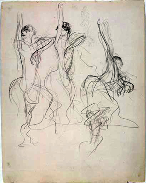
The Outline
In an outline, individual ideas or expressions are written down but they are not really linked together. There are no smooth transitions between ideas. When art-making, reference photos and/or sketchbook drawings act as the outline. They represent separate expressions that will eventually work together in a unified composition. Look at the sketchbook drawings below. Some of the visual “expressions” make it into the completed painting while others are intentionally left out.
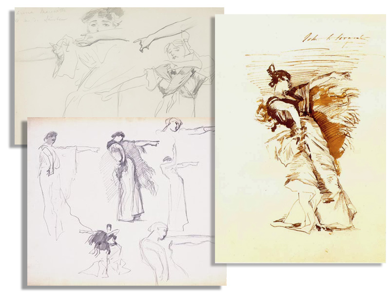
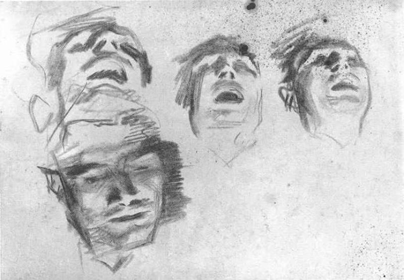
*Making preliminary drawing of your imagery in a sketchbook during this stage of development is, in many ways, better than working directly from photos because it gives the artist a chance to “practice”. Musicians practice their songs many times before performing in front of an audience. Our performance is the final draft of our completed artwork.
The Rough Draft
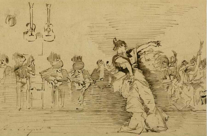
The rough draft is our first attempt at creating a unified composition from the individual elements collected/created during the outline stage. Sargent’s rough draft is an ink drawing.
Look at the men seated against the wall behind the dancer. Did Sargent use all of the preliminary sketches in his sketchbook? Which one(s) did he use?
The Final Draft
In the case of “El Jaleo”, Sargent made almost no compositional changes from the rough draft to the final draft. He simply executed his design in full color using oil paint.
Classroom Lesson on Developing A Work of Art
The following art project is meant to encourage juxtaposition, the use of multiple references, the use of a sketchbook, and the development of art in stages.
The concept was taken from a popular television game show in which contestants spin a wheel and guess letters to solve a puzzle (maybe you know the gameshow of which I write). One of the word puzzles on this gameshow consist of two phrases joined by a single word that each phrase has in common. Below are a few examples. The words that joins the phrases are in bold.
- Blow off some steam engine
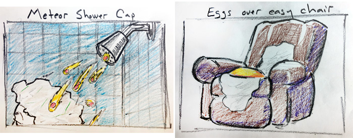
- Meteor shower cap
- Eggs over easy chair
The chances of finding a single image that includes both a meteor shower and a shower cap is zero. Therefore, to have a successful project the artist/student must first find or create multiple references, then put them together in an intelligible way.
The three phrases listed above make up the brainstorming stage for the artwork that follows. From those phrases, I chose to sketch out the second and third options. Here is a great example of why one shouldn’t always jump directly from brainstorming to the final draft. The chair in my sketch below is not an easy chair (I didn’t know that). I drew a chair from memory and had I not sought out references (in the next step) I would have misrepresented my phrases.
My Outline
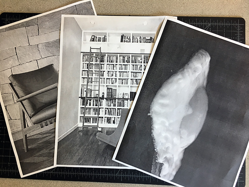
I found three images that I wanted to use and also made a couple of sketches. Of course, none of the images I am referencing were used in their entirety. Also, none of the images had anything to do with my concept so I am not infringing on any copyrights.
My Rough draft
My rough draft is small – only four by six inches. Small rough drafts help the artist avoid getting bogged-down in details. I deviated from the reference photos I collected in several ways. First, I drew the ladder to the right in my composition, different from the reference. I also decided to make the shelves dark instead of light. The addition of mounted hunting trophies at the top completed the mood I was going for.
At this stage, I have placed another egg in the picture frame over the fireplace (I’ll change that to a chicken in the final draft). I’ve also added a table next to the chair, just for visual weight. The table was a last minute compositional choice and would have been frustrating to add in a more carefully rendered drawing. The rough draft is a safe place to try ideas without fear of “messing it all up”.
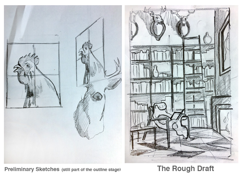
Notice that the chair is drawn from the same angle as the reference photo found during the outline stage, while the egg does not match its corresponding reference. References may be collected for a variety of reasons, point of view (the chair) being just one. The egg photo was collected to help with color, value, and texture.
My Final Draft
Here’s a look at the finished drawing, completed with colored pencils. The image is completely unique and tells a short, witty story to the viewer once they notice all of the elements.
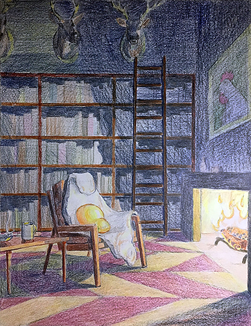
Ideas sometimes come to us in a flash, like lightning from above – a “eureka moment”. Other times, ideas seem to bubble up slowly from deep within. Developing a composition in stages allows our ideas to mature, often resulting in a more sophisticated expression with layers of meaning.
If so, join over 36,000 others that receive our newsletter with new drawing and painting lessons. Plus, check out three of our course videos and ebooks for free.
The Rule of Thirds in Art
What is the Rule of Thirds?
Composition is one of the most important factors in the success or failure of your art. You may create a work that is executed at the highest level of technical skill but if your composition is weak, then your art is too. In this lesson, we’ll explore a compositional theory that will help you make better decisions regarding your composition. This compositional theory is called “The Rule of Thirds”.
See also: Composition in Art
The Rule of Thirds is a derivative of the “Golden Ratio”, a mathematical relationship of proportion that can found in our natural world. This unique ratio has been studied by mathematicians for centuries and utilized by artists and architects such as Salvador Dali, Le Corbusier, and Leonardo da Vinci.
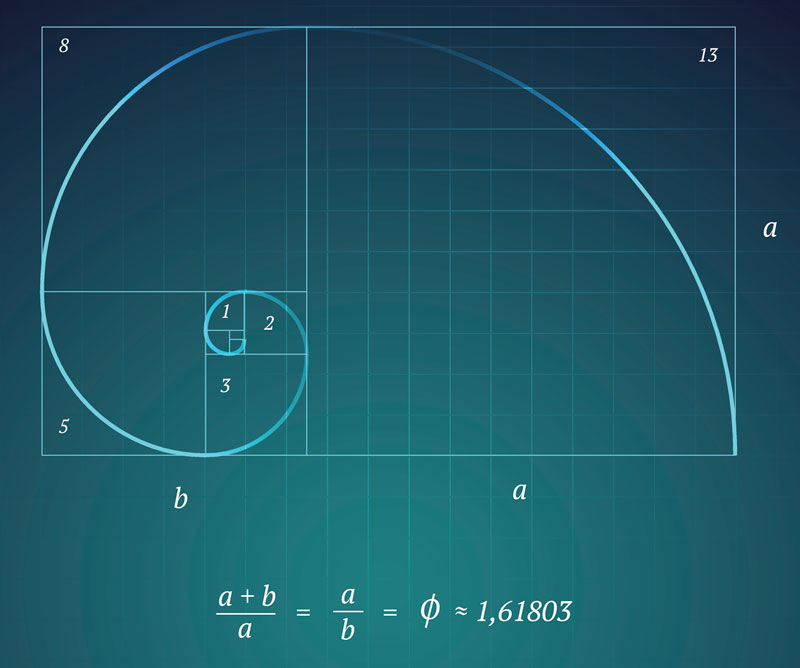
The Golden Ratio, visualized above, is a ratio in which a + b is to a as a is to b. This ratio can be simplified into a rectangle, which is referred to as “The Golden Rectangle”.

You’ll notice that when this ratio is applied to a rectangle, the line that divides section a and b is very close to 1/3 of the rectangular space.
The Rule of Thirds is a simplified version of the Golden Ratio. A ratio of 1/3 is very close to the same proportion that we would use with the Golden Ratio. So, instead of entangling ourselves in a complex mathematical formula, we can simply use The Rule of Thirds in its place and derive a similar aesthetic benefit.
Using The Rule of Thirds
The Rule of Thirds is best understood by analyzing a blank surface. This could be a sheet of drawing paper or your canvas. Basically, we’re considering the picture plane.
We can divide the picture plane into segments using vertical and horizontal lines. Each imaginary line falls on the edge of one of the thirds.
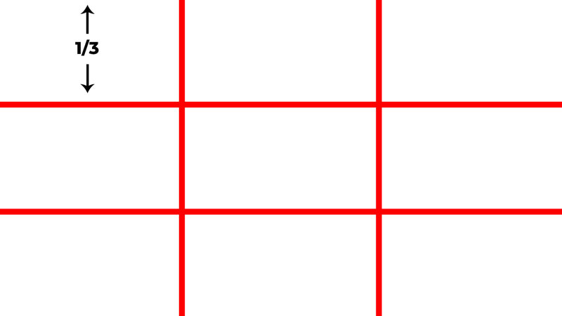
Placing important elements on any of these lines often leads to a more successful composition. For example, you may choose to place the horizon line in a landscape on either the upper horizontal line or the lower horizontal line.
But we can take this even further.
You’ll notice that the horizontal and vertical lines intersect. These locations of intersection are excellent places to position important elements within your composition. For example, you may place the focal point(s) on one of these intersecting points in order to create a more successful composition.

Applying This Concept to Potential Photo References
Before we look several examples of how artists have used The Rule of Thirds in their art, let’s examine a few practical examples. We can imagine that these examples are potential references we may use for a drawing or a painting. Let’s see if we can improve the composition using The Rule of Thirds.
Example 1 – Landscape
In our first example, we’ll take a look at a landscape. The composition of the unedited photo (below) is quite strong without any adjustments.

The lighthouse, which is clearly the focal point, is positioned close to the center of the picture plane. The pathway leads our eyes to this location. Let’s try to improve it.
Using The Rule of Thirds, we’ll crop the image and place a grid over the top.
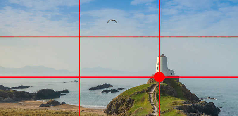
As you can see, we’ve now placed the lighthouse along the right vertical line. The base of the lighthouse is now positioned on one of the intersection points and the horizon line is in alignment with the lower horizontal line.
But, there is a clear problem with this composition. It feels very heavy at the bottom. By moving the line where the land meets the water down, the sky is emphasized. In this image, the sky is rather bland and lacking visual interest. This is why this composition feels visually heavy at the bottom of the picture plane.
This composition would work if there was more visual interest in the sky, but this image is lacking this. Let’s try again.
Again we’ll crop the image using The Rule of Thirds. But this time, we’ll consider the visual weight of both the sky (light) and the ground (heavy). To balance the visual weight of these elements, we’ll include more of the ground and less of the sky.
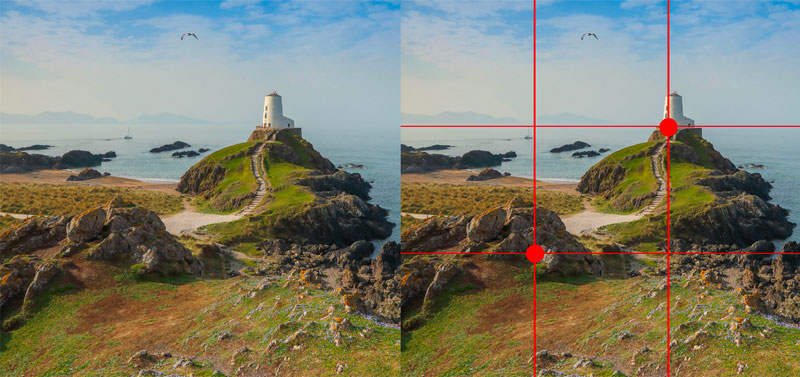
When we lay a grid over this composition, we can see that the lighthouse is in alignment with the right vertical line and meets the ground at one of the intersection points. We also see that the horizon line is alignment with the top horizontal line.
The mound of rocks in the foreground also plays an important role in the composition. We can see that the rocks are now in alignment with another intersection point. As an added bonus, we’ve included the path, which acts as a guiding line, leading us to the focal point (the lighthouse).
As a result, our second attempt at using The Rule of Thirds to improve our composition has succeeded.
We can learn two things from this first example. First, The Rule of Thirds can improve your compositions. Secondly, we must consider other compositional aspects in order for it to work.
Example 2 – Portrait
The Rule of Thirds works for any subject. In fact, the subject is mostly irrelevant to this compositional theory. Let’s look at applying The Rule of Thirds to a portrait. Again, we’ll consider this photo as a potential subject for a drawing or painting.
Here’s the original photo…

As you can see, the subject is placed directly in the center of the picture plane. The elements in the background are asymmetrical, but balanced. But since there is so much happening in the background, the subject (the young lady) is somewhat lost.
Let’s see if we can improve this composition using The Rule of Thirds. Again, we’ll crop the photo and lay a grid over the top.
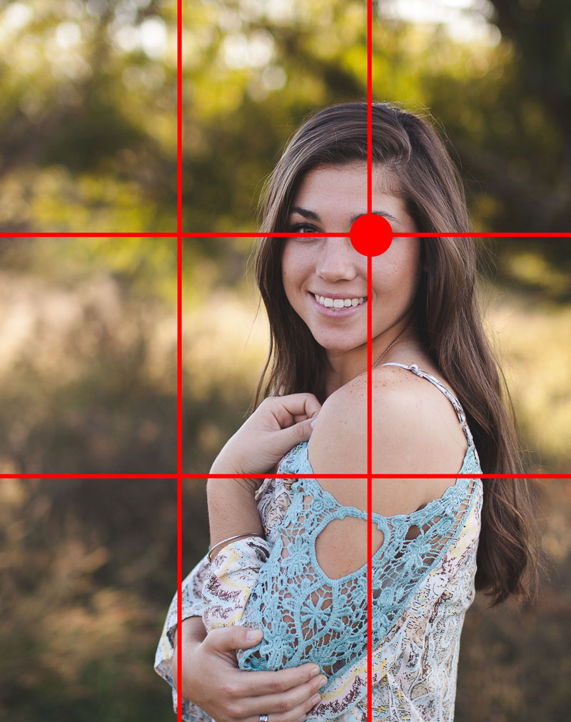
We’ve cropped the image down and by doing so, moved the subject so that she is in alignment with the vertical line on the right. On top of this, we’ve positioned her so that her eye (a natural focal point) lies on one of the intersection points.
In this case, we’ve improved the composition using The Rule of Thirds.
But, there are cases where The Rule of Thirds may not be the best option for your compositions.
Exceptions to the Rule
Just like everything else in art, there are exceptions to every rule. While this compositional theory works most of the time, there are circumstances where it may weaken a composition.
Example 3 – Another Portrait
Let’s take a look at another portrait and attempt to improve the composition based on The Rule of Thirds. Again, we’ll consider this photo as a potential subject for a drawing or painting.
Here’s a look at the original photo…

Here we can again see that the subject is positioned in the center of the picture plane. But pay special attention to the background and its effect on the subject.
Let’s try to improve this composition based on The Rule of Thirds. Again, we’ll crop the image down and lay a grid over the top.
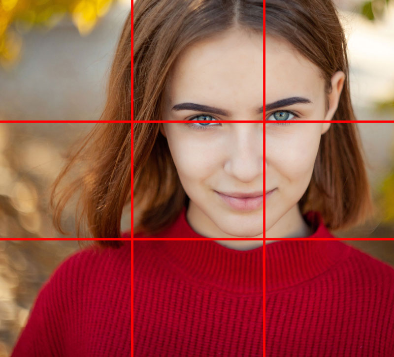
We’ve now cropped the image so that the bulk of the head is in alignment with the right vertical line and the eyes are in alignment with the top horizontal line. As a result, the subject is now positioned on the right side of the picture plane and the background is less important.
This new composition is strong, but is it better than the original?
If we revisit the original image, you’ll notice the background plays a role in creating focus on the subject. The background features a circular pattern of contrasting colors that acts to frame the face of the girl. This pattern emphasizes the face and works to move your eyes to the focal point.

Our edited photo is still a strong composition, but our original is better.
Examples of Artworks That Use The Rule of Thirds
Artists throughout history have clearly recognized the importance of aesthetically successful compositions. There are countless examples of works that have implored the use of The Rule of Thirds. Let’s take a look at few of them…
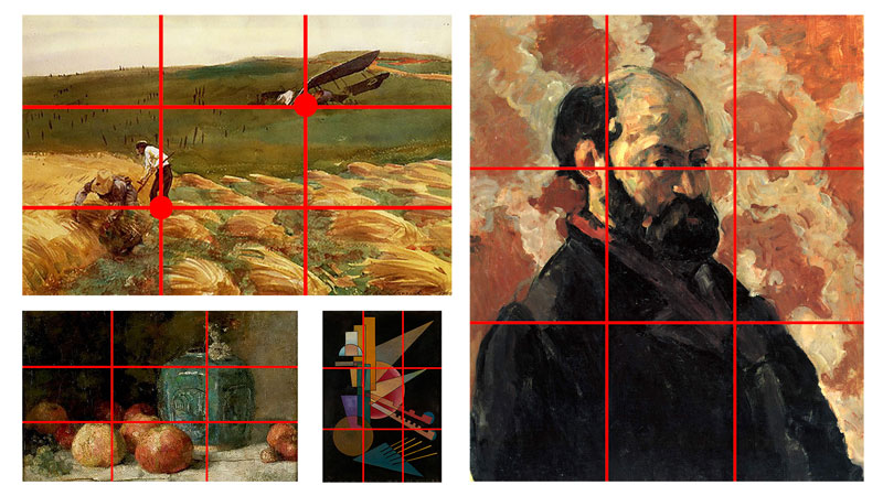
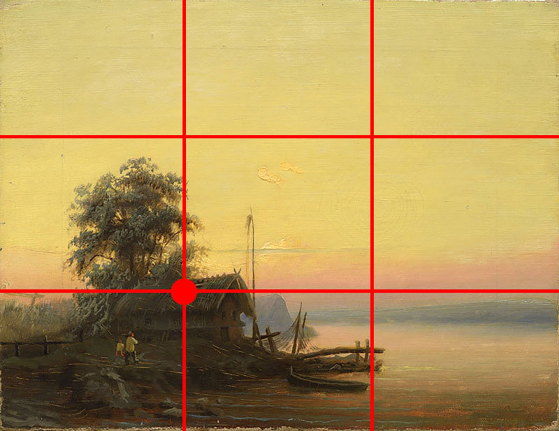
In this work by Albert Bredow, we see that he has positioned the main focal point using the intersection point in the lower left corner. The horizon line is also in alignment with the lower horizontal line.
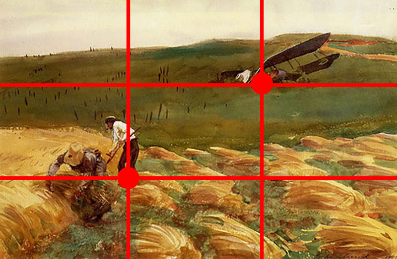
In this painting by John Singer Sargent, we can see that he has utilized The Rule of Thirds to position both of the main focal points within the scene. The crashed air plane has been placed on the intersection point in the upper right portion of the picture plane. The figures in the foreground are positioned on the intersection point in the lower left portion of the picture plane.
And in this painting by Delacroix, we see that the boat is in alignment with the lower horizontal line with Christ positioned very close to one of the intersection points.

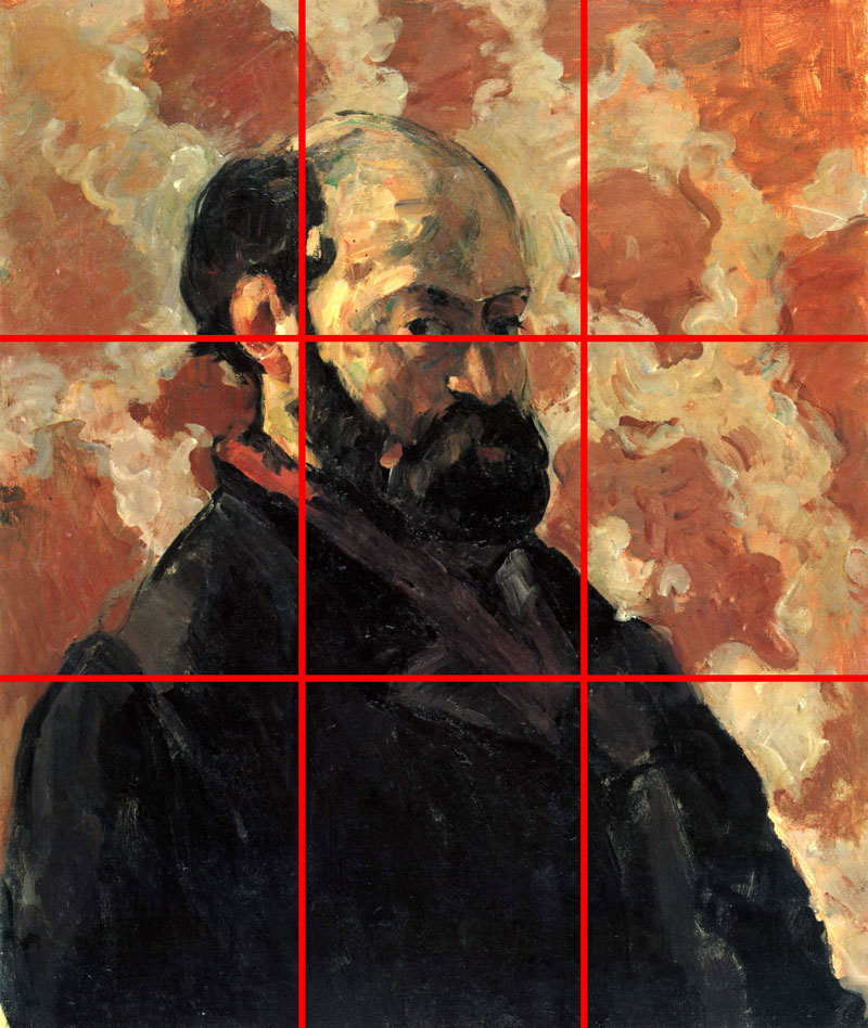
In this self portrait by Cézanne, we see that he has positioned the eyes in alignment with the top horizontal line and the bulk of the figure is in alignment with the left vertical line.
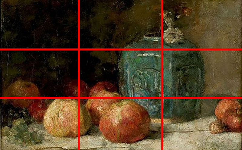
In this still life by Van Gogh, we see that the blue ginger container is in alignment with the right vertical line, while the bulk of the apples line up with the lower horizontal line.
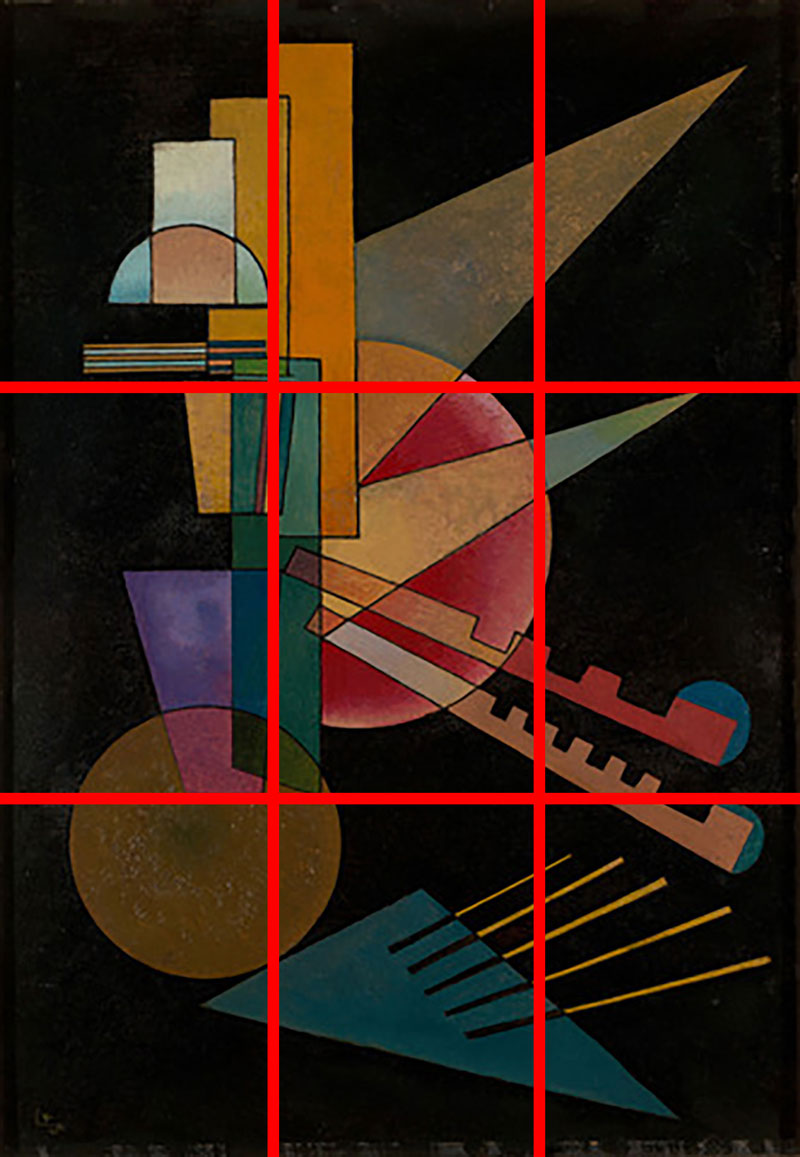
In this Non-Objective work by Kandinsky, we see that the visually heavy shapes are in alignment with the vertical line on the left side of the picture. The dominant circle at the bottom is also very close to an intersection point.
Conclusion
The Rule of Thirds is an excellent way to improve your art compositions. But keep in mind, we still need to consider other compositional strategies in order to create a successful composition. We should be careful that we don’t become too reliant on just one or two strategies when it comes to designing our artworks. Thumbnail or preliminary sketches will always be your best friend.
If so, join over 36,000 others that receive our newsletter with new drawing and painting lessons. Plus, check out three of our course videos and ebooks for free.
Beyond The Pinch Pot
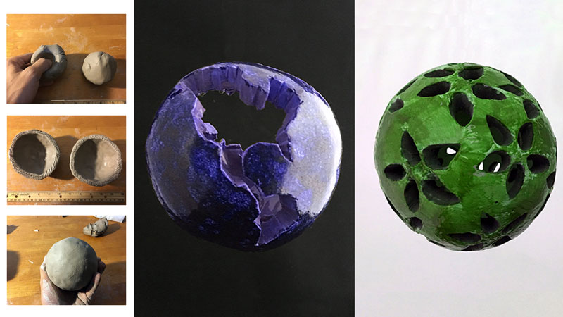
This lesson outlines the steps to create one of those exciting sculptures that begin with a pinch pot . . . or two. If you’ve never made a pinch pot, then now is a good time to give it a try.
This project is flexible in that there is plenty of room to “make it your own”.
Depending on the direction you choose to take your sculpture, the material you will use may vary. Below are both required and optional supplies:
- Earthenware clay
- A hobby knife
- Other clay tools (optional)
- A dish of water or clay slip
- Access to a kiln (or use air-dry clay)
- Ceramic Glazes (optional)
- Acrylic Paint (optional)
- A nylon brush (optional)
Step One – Roll Out Two Balls of Clay
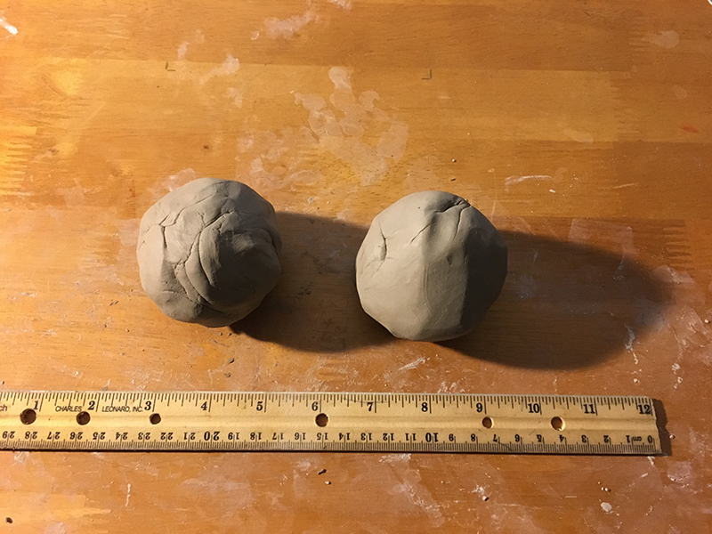
Without creating any air pockets, roll two balls of clay in your hand so that they are approximately the same size. The two solid clay balls below are about two and a half inches in diameter. They will make a sculpture that is between 4 and 5 inches wide. Your project could be larger or smaller.
Step Two – Pinch and Shape the Clay Balls
Begin pinching out two half-spheres by inserting your thumbs into the top of the clay balls. Gently squeeze while turning the spheres in your hands.
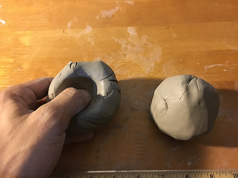
Continue doing so until the thickness of each pinch-pot is approximately one-fourth of an inch thick. Work and bend the clay so that the pinched-out forms are half spheres and not shallow bowls. Check one against the other to make sure they are close to the same size.
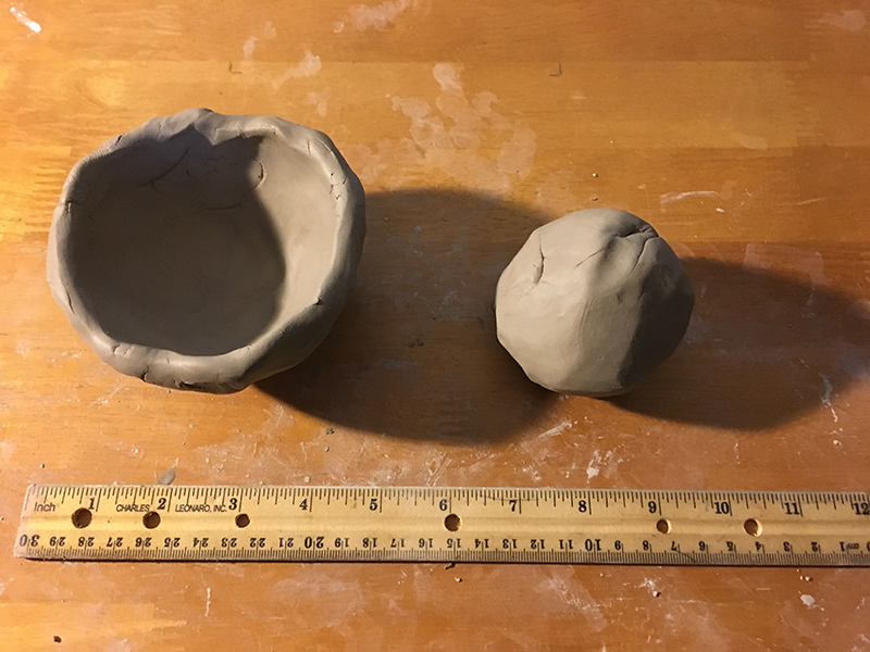
Step Three – Score and Slip Each Edge of the Clay
Gently press the rim of each bowl onto a table’s surface to flatten and level the rims of the bowls so that they will meet flush when put together. You don’t want drastically high and low spots along the rim. After doing so, it is time to “slip and score”.
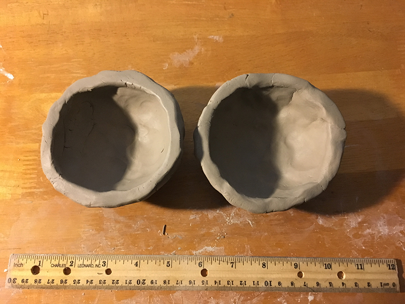
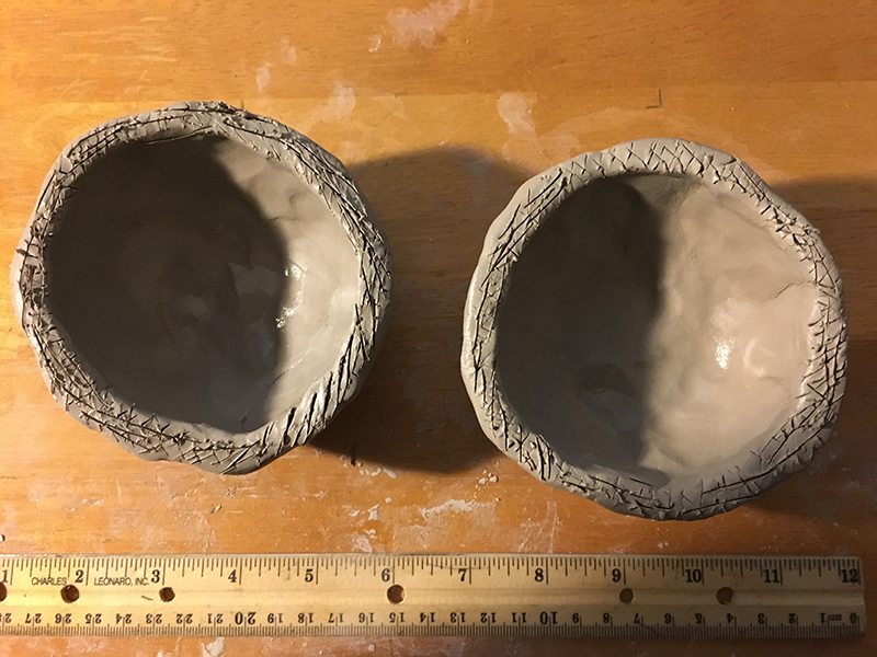
Use the hobby knife or another clay tool and score (rough up) the surface of the flattened rims. Do so by cross-hatching into the clay until your see a fine texture. The rough surface helps the two pieces to grab and hold one another.
Before pressing together, apply slip (liquid clay made with just clay and water) with your brush or, if your clay is very fresh and soft, you can just apply some water. If using only water, then score the clay again after applying water to the rims. Doing so essentially turns the surface of the rims to slip.
Step Four – Connect and Attach the Clay Bowls Together
Now put the two halves together to form a hollow ball. Chances are, the edges will line up pretty well but with some variation. This is a good thing.
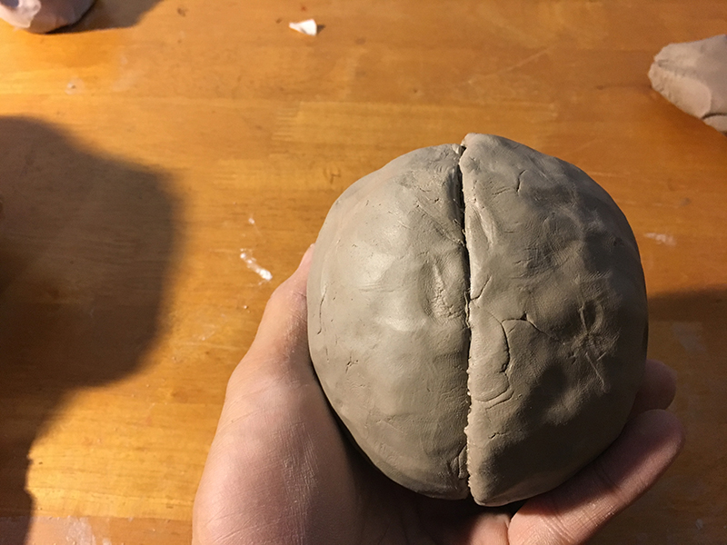
Wherever one pinch-pot extends slightly past the other, drag the high spots over the seam to permanently secure the two halves. Do this all the way around. You can use your fingers, a flat clay tool or a plastic credit card (I used a library card). Try not to squeeze the ball any more than necessary.
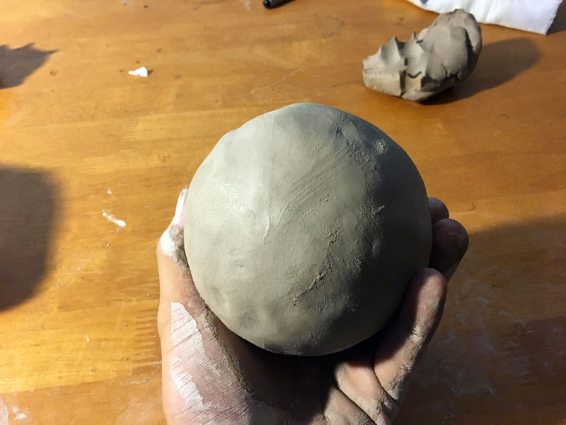
At this point, the clay needs to harden some. Leave it in the open air for a up to a day.
Step Five – Carve and Shape the Clay Ball
Once your clay ball is leather hard (cold to the touch but no longer flexible) you can scrape its surface to remove any noticeable bumps. Again, a plastic card works well if you do not have clay tools. I bent my card into a curve while scrapping (see image below). Once you’re satisfied, it’s time to begin carving. Leather hard clay cuts and carves easily.
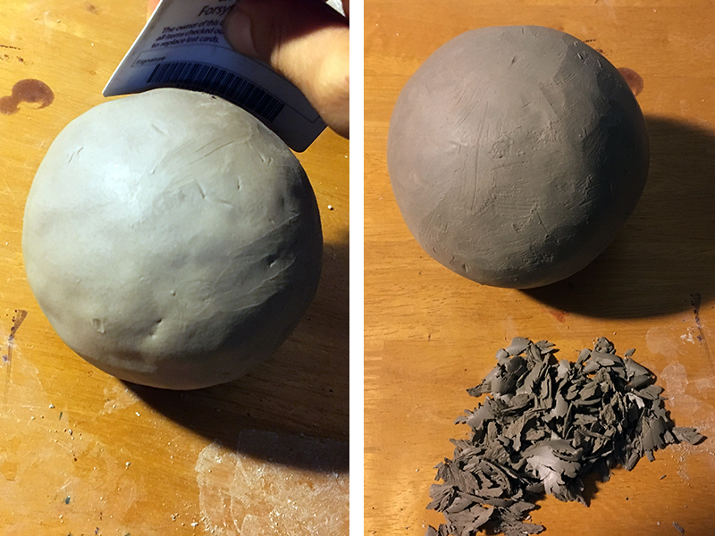
Step Six – Carve Out a Pattern or Design
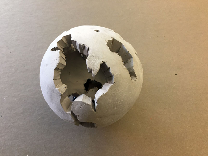
Any design or pattern is suitable for carving into and through the surface of your sphere. I chose to carve out a simplified version of the earth. I removed the shape of continents with a hobby knife, leaving only the oceans since the oceans are all connected.
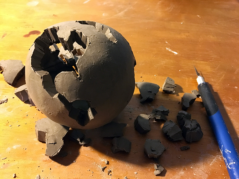
Though I used only a hobby knife to remove clay, you can use other tools. Be creative – drill bits work well too. You don’t even need a drill if your clay is in a leather hard state. Just twist the bare bit into your sphere.
Don’t forget to make a small hole either in the top or bottom of your piece. Doing so will give you the option to either hang your piece or mount it to a base once you’re finished.
Step Seven – Dry and Fire the Sculpture
Let the sphere dry out completely. Three days in the open air should suffice. Fire the ball in a kiln. Most schools have kilns so if you’re an art teacher, then it’s not a problem. If not, then you may be able to have your piece fired anywhere ceramic classes are offered or by a ceramic artist in your area.
Step Eight – Apply a Finish
Assuming the firing was successful, you have a few options. You can just leave your piece in a bisque fired state and paint it with acrylic paint. Or, you can glaze it and fire it a second time. I want to hang my sculpture outside in a tree so I’ll need a durable finish. The most durable finish is glaze. So, my sculpture will have to go into a kiln a second time.
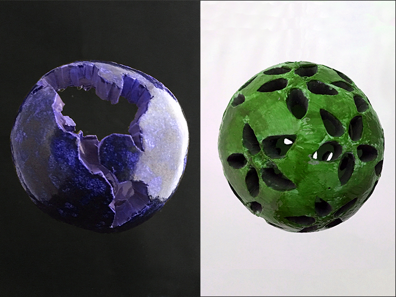
If you choose to glaze your piece, be sure to read the label of your glaze. Many low fire glazes require three coats while high fire glazes offer a variety of finished surfaces depending on the number of coats you apply. Don’t use both low fire and high fire glazes together.
Conclusion
This clay sculpture project idea is not limited to planets of course. You can carve geometric patterns and designs (see above). Be sure to carve into but not through your sphere. Paint imagery around your sphere, either with paint, ink or glazes instead of carving. Spheres can be any size. They display nicely alone or in a grouping. Hang them under a porch, from a tree or anywhere you choose. Get creative.
If so, join over 36,000 others that receive our newsletter with new drawing and painting lessons. Plus, check out three of our course videos and ebooks for free.
How to Draw a Pear with Colored Pencils
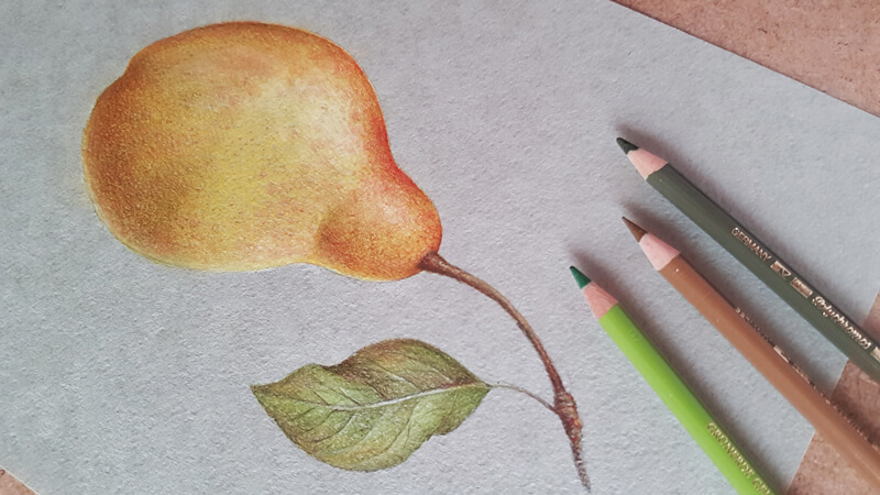
We’ll also discuss a few simple tips that lead to the illusion of volume and harmonizing the colors in your art. I’ll show you a way to speed up the process, achieving a dense covering of pencil applications in no time.
I’d say that this post is not just a step-by-step tutorial since it includes a concept that may be applied to various artworks.
For this project, I’ll be using a set of Faber-Castell Polychromos colored pencils. You’ll find the list below (in the image, from top to bottom):
- Cadmium Yellow
- Dark Naples Ochre
- Dark Chrome Yellow
- Earth Green Yellowish
- Deep Scarlet Red
- Olive Green Yellowish
- Raw Umber
- Walnut Brown
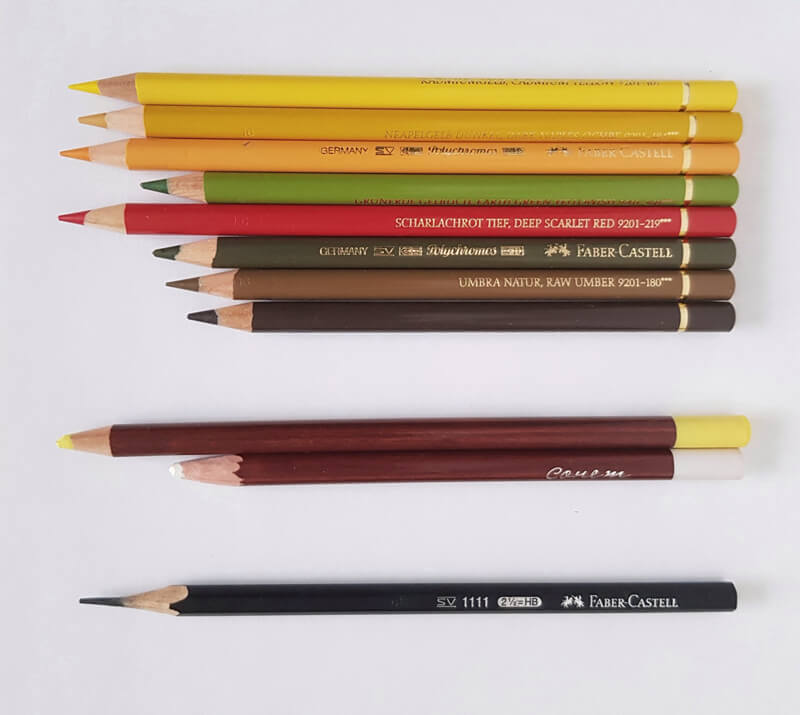
Need these pencils? Buy Polychromos Pencils
(This is an affiliate link – this means we make a small commission if you purchase.)
I’ll also be using a couple of pastel pencils. Color names aren’t designated, so let’s call them “Light Yellow” and “White”. If you don’t have pastel pencils, you can find a replacement (for example, soft pastel sticks) or you can use colored pencils instead.
For this drawing, I’ve chosen a sheet of pastel paper that’s a muted green color with a subtle texture. This tone will make the colored pencil applications stand out, yet keep the whole artwork harmonious. Also, the texture of the surface is advantageous since it will help us to create the illusion of spots on the pear’s skin.
See Also: All about Drawing Papers and Surfaces
We’ll also use a graphite pencil and an eraser to create a sketch before applying colored pencils.
Why Use Pastel Pencils
Drawing on toned paper has many advantages. However, sometimes this choice of surface leads to unexpected challenges. We should keep in mind that colored pencils produce translucent applications when applied with moderate to light pressure.
Our subject – the pear – is relatively light. However, it has some areas of darker, more saturated colors. The tone of the paper is somewhere in the middle of the value scale and fairly desaturated.
Since we want our applications to appear fairly solid, we should make sure that we can cover the paper completely. Otherwise, the color of the paper will be too strong and may show through the coverage.
In addition to that, we should be careful with the tooth of the paper – not every type of surface can accept dozens of layers of colored pencil applications.
Using a material that produces dense covering at one go may be the key to meet this challenge. In some cases, it can be watercolor or markers. For this particular project, pastel pencils are a great option. They can produce strokes of various widths, lengths, and character. They blend easily. Also, they work well with the toned paper that has an uneven surface.
Look at the image below and compare the colored pencil applications. The examples on the left side were made by applying a Polychromos pencil directly to the paper. The samples on the right have an underlying layer made with a light yellow pastel pencil.
(A Cream pencil from the Polychromos set isn’t listed in the initial material listing, but I think it’s good to include it here for a demonstration.)
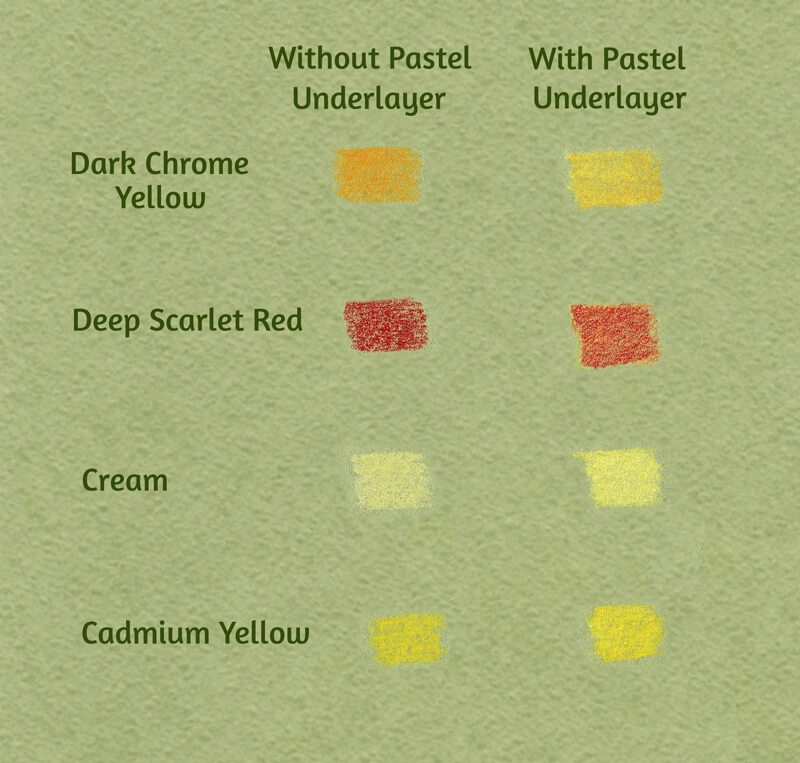
These examples show a significant difference in the intensity and saturation of the color. Make your own chart of samples to see what happens if you add the under layer.
If you don’t have pastel pencils, soft pastel sticks are a nice alternative. Using additional media like pastel pencils isn’t required, but as you can see – it helps.
You can use only colored pencils – you’ll just need more layers of applications. The intensity of covering differs from one brand of colored pencils to another, depending on the core’s composition.
See Also: Colored Pencil Comparison Chart
Create a Graphite Pencil Sketch
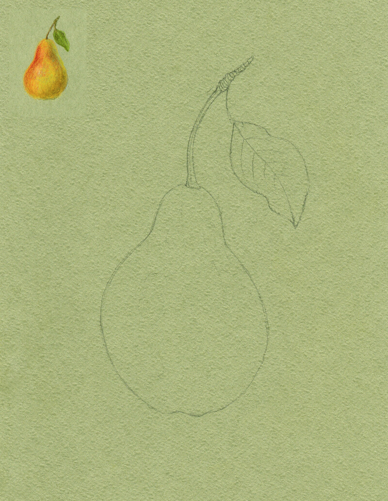
I draw the contours of the pear, using an HB graphite pencil. It’s possible to use a colored pencil instead – but draw lightly if you do. Colored pencils are difficult to erase once they’re on the surface. Graphite pencil marks may contaminate further applications, so we should be careful with them as well.
To make the art more interesting and balanced, I add a leaf to the stem. All lines are as smooth and curved as possible to accent the organic feel. Also, I make the pear slightly asymmetrical for the same reason.
Keep the underdrawing light and gently soften it with a kneaded eraser if needed. Mine is quite strong because I’d like it to be easily readable for demonstration purposes.
At this step, I also give myself time to think about values and colors. I see that the pear features variations of yellow with some red. It has a matte surface. The light is soft and is originating from the left. You can find a miniature practice sketch in the image below.
Applying Pastel Pencils
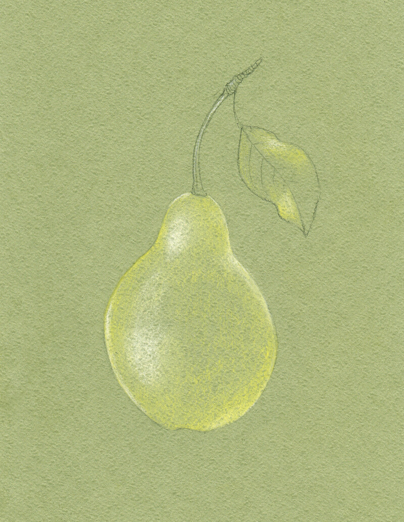
I add some strokes of the light yellow pastel pencil to the pear and the lighter areas of the leaf. Then, I add white to the lightest areas of the object and blend all the applications with my finger.
Normally, I’d avoid using pure white in the highlights, unless the light is extremely strong. Sometimes white can wash out the color. In our case, using white is justified because of the paper’s tone and the subsequent layers of colored pencils we’ll apply. The highlighted areas will have a hint of color, just at a lower saturation.
The light yellow pencil is chosen deliberately. Combined with the color of the paper, this color creates a harmonious yellow-green tone. It is more saturated than the color of the surface. I wouldn’t be able to achieve such an effect with an orange or red pencil, applied in one layer.
Adding the Colored Pencils Applications
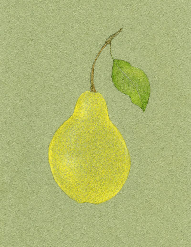
First, I apply Cadmium Yellow to the body of the pear. I keep the pencil moving using small circular strokes as this color is applied. This ensures a smooth and even coverage. To increase the effect of blending, I gently touch the layers of color with the tip of my finger, mixing them and softening the transitions.
I then cover the leaf with Earth Green Yellowish.
Raw Umber is then applied to the stem.
Next, I use Dark Naples Ochre to create a darker nuance in the pear’s body. I also include some Walnut Brown strokes to the stem, making its sides darker.
Olive Green Yellowish is great for deepening the green of the leaf.
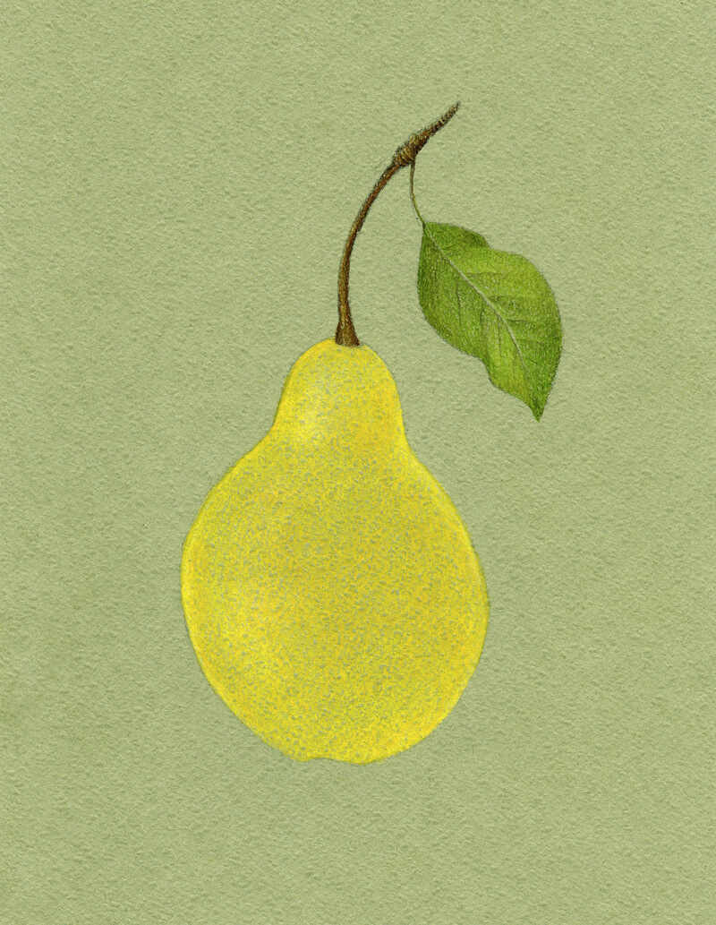
With Raw Umber, I work on the pear, adding some shadow and giving it more volume. The light is coming from the left, so the core shadow will be more evident on the right side of the object.
I leave a thin line of the reflected light near the edge of the pear. We’ll make it look a little duller in the next steps.
Raw Umber does a great job of muting the bright yellow applications. The art is beginning to appear more natural.
I also add some Raw Umber to the leaf and stem to unify the image in terms of color.
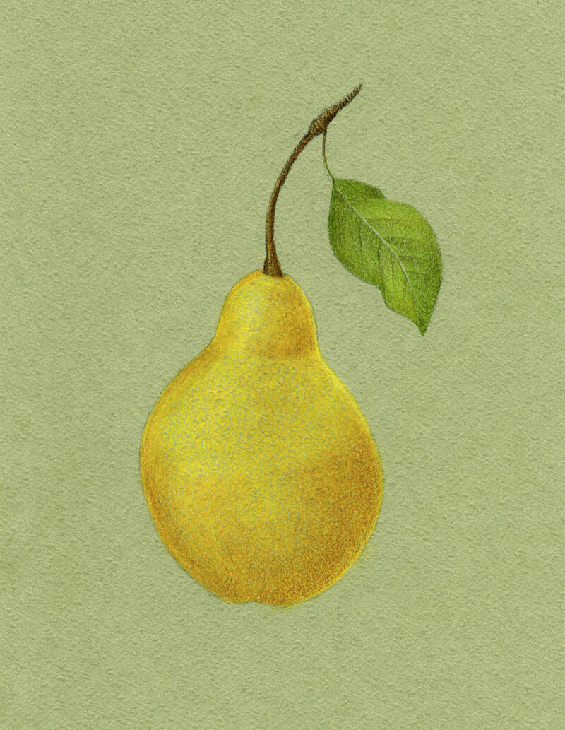
Let’s make the artwork a bit livelier. With Dark Chrome Yellow, I add an orangey nuance to the upper part of the pear’s body. I also leave a few areas open to communicate the texture.
Then I use Deep Scarlet Red, which creates a pleasant saturated accent in the upper part of the pear.
I add this hue selectively to other areas of the pear, and to the leaf. Green and red are complementary colors. The result of placing them next to each other results in rich, contrasting, vivid, and appealing color. Applied directly on top of each other, complementary colors easily create a deep desaturated color.
We mostly see highly saturated colors in areas of highlight. Shadows also have color, but the colors are less intense.
See also: How to Draw with Colored Pencils – 3 Techniques
The pear’s local color is mostly yellow with some areas closer to yellow-orange. I’m going to include orange and red to the darker midtones and core shadows. Alternatively, the lighter areas are developed with desaturated yellow with a hint of green. This creates the impression that the color temperature and saturation shifts alongside the values.
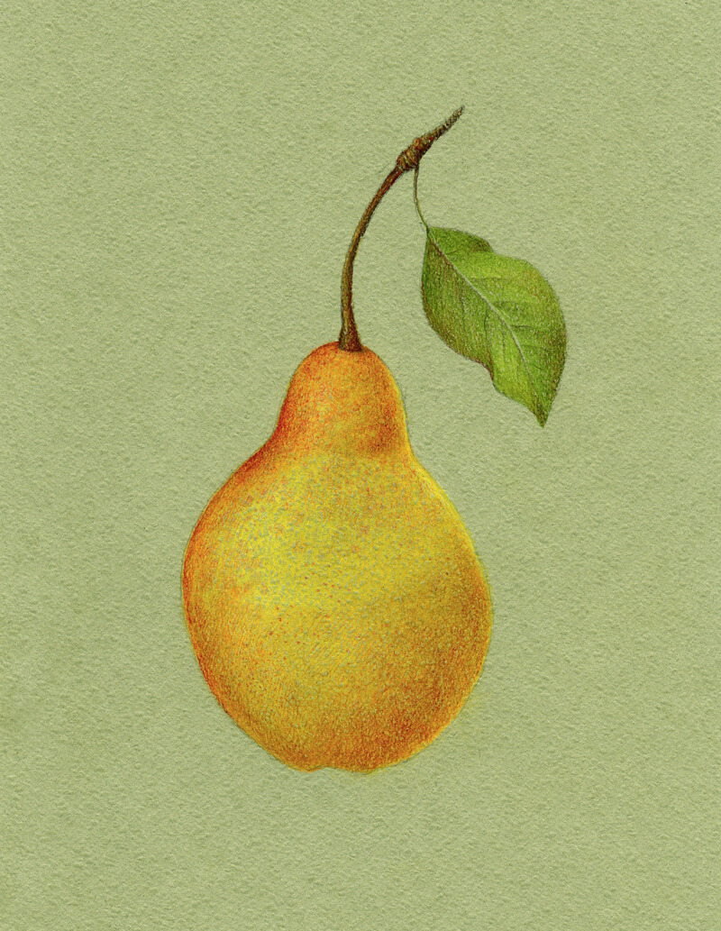
I add Earth Green Yellowish to the core shadow of the pear’s body, desaturating and slightly darkening the existing applications. The shadow looks more realistic now.
This green hue presents a beautiful contrast to the reddish nuance that we already have here. (Again, green and red are complementary colors on the color wheel.) Also, it works perfectly in combination with the yellows and the color of the paper.
I add just a little of Olive Green Yellowish to the darkest areas of the core shadow, closer to the edge of the pear. Use this shade wisely – it is quite intense! The leaf needs some of it, too.
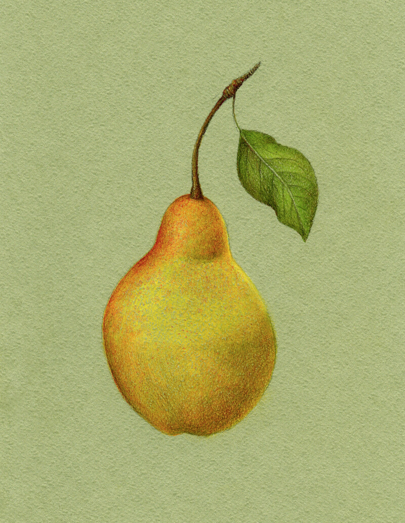
As a finishing touch, I’d like to make the color applications denser. The goal is to restore and strengthen the initial color of the pear’s body.
I apply Cadmium Yellow to the highlights and Dark Naples Ochre to the midtones with slightly heavier pressure. I touch the leaf and stem with those yellows as well.
If you need to accent the highlights, you can use a lighter pencil, like Cream from the Faber-Castell Polychromos set. Or, you can use your light yellow pastel pencil on top of colored pencils applications, then blend gently.
As discussed before, it’s best to make the highlight slightly less saturated than the midtones because lighter values wash away the intensity of the hue.
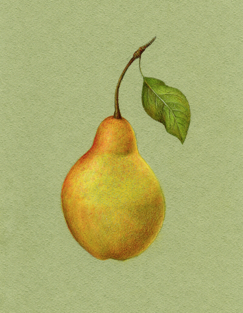
Conclusion
Congratulations – we’ve created a beautiful drawing! I hope that you’re happy with both the process and the result.
Let’s repeat the key principles of this tutorial.
- Creating an under layer for a colored pencil drawing may be a great way to start. It allows you to get a better result in a shorter period of time.
- Keep in mind that colored pencil applications are somewhat translucent. Think beforehand about the color of your paper and the colors you plan to include in your drawing.
- Using close variations of the object’s local color (lighter or darker, more or less saturated) will make your art more interesting.
- Value and color temperature are connected. For example, if the object is yellow-orange in the midtones, you can make the light areas yellow or even yellow-green (warmer). Orange or red-orange may be your choice for shadows.
- The most saturated colors usually appear in the midtones. Lights and shadows tend to be desaturated.
- To desaturate and deepen a color, add its complementary color on top.
Thanks for joining me on this creative journey!
If so, join over 36,000 others that receive our newsletter with new drawing and painting lessons. Plus, check out three of our course videos and ebooks for free.
A Special Baroque Painting Technique
Impressionists also worked in the open air, in an attempt to capture fleeting moments of light. For this reason, they did not build up their paintings by layering but instead attempted to put the “right” color in the “right” spot with each stroke.
Take a look at the Impressionist painting below and note how the light canvas affects the resulting image…
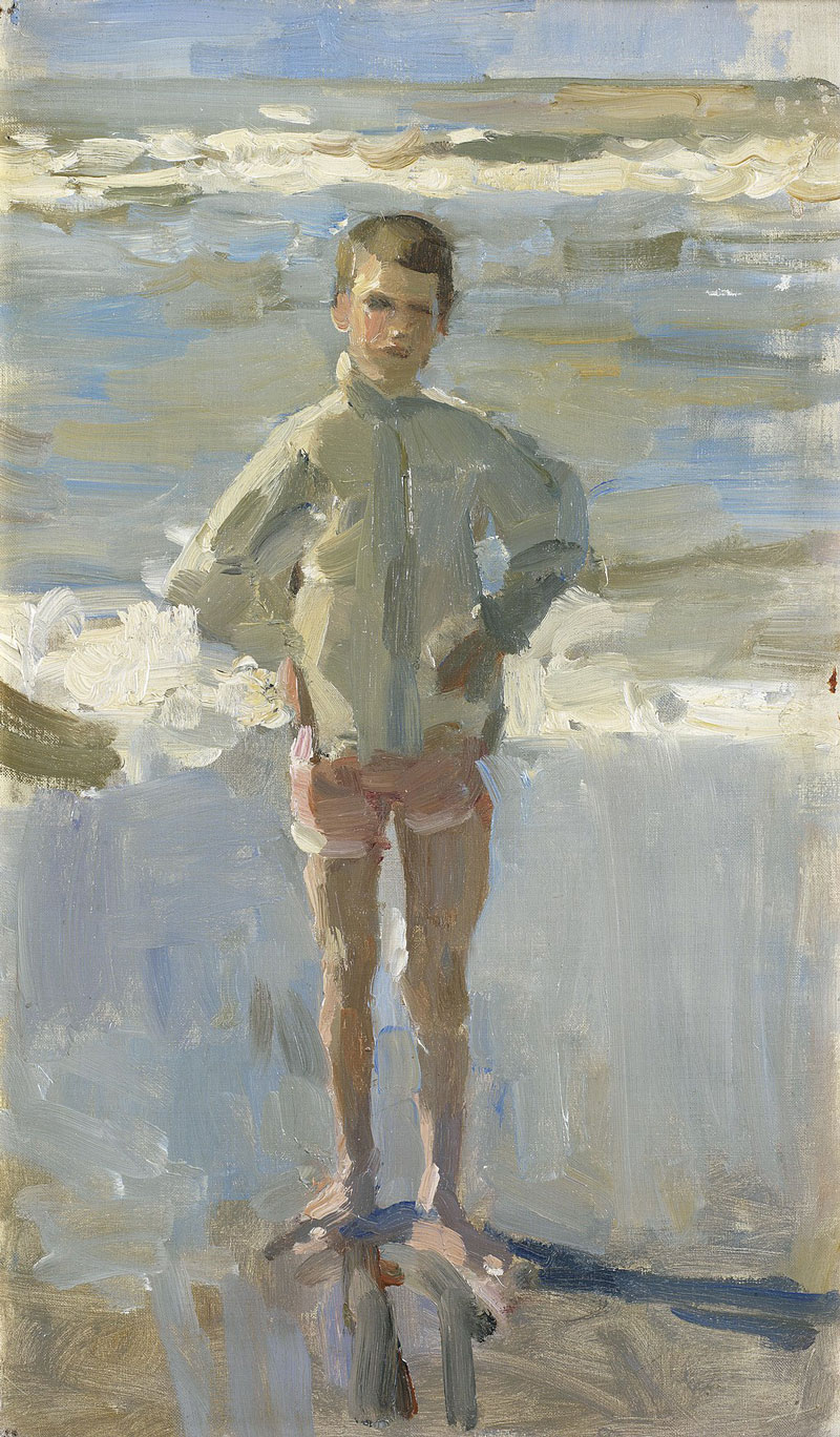
Image via Wikimedia Commons
Before the Impressionists, however, most artists approached painting in an entirely different way. They worked inside a studio and would often use color only after completing a fully rendered, monochromatic layer of paint called an underpainting. This approach to painting is often referred to as “indirect” painting.
See also: Indirect Painting with Acrylics
The Impressionists, of course, had no time to execute an underpainting as they were racing against the changing light of the ever-moving sun.
However, there was a wonderful period in the history of painting when artists neither worked over an underpainting nor on white canvases – the Baroque Period.
Paintings of the Baroque Period
During the Baroque period, most artists used canvases or panels that were toned dark brown and even black. There are some great advantages to working over a dark base layer which cannot be replicated by working on a light ground.
The greatest benefit to working on a dark canvas is that it saves effort. All of the shadows are already there. The artist simply needs to focus on the light values. This approach to painting is very similar to working on a black drawing surface with a white drawing medium.
See also: Drawing with White Media on Black Paper
The shadows are either ignored or completed using a technique called scumbling. Scumbling is a painting technique in which a thin, translucent application of paint is vigorously scrubbed into the canvas, while allowing part of the layer underneath to show through.
A finished Baroque painting feels sculptural because the light areas stand out in relief compared to the extremely thin application of paint in the shadows.
Since the shades are created through an optical mixture of translucent color over the dark, dull surface, the shadows are never that colorful. If you prefer brighter, high-key paintings then this characteristic of Baroque painting would be a drawback. However, because the shadows are so dull, the lights seem brighter by contrast.
Before walking through the process of Baroque painting, it’s worth looking at a few notable examples executed by some of the best known painters of all time.
Rembrandt
Look at the image below. Titled, The Philosopher in Meditation, this is a lesser known work by Rembrandt – but an excellent example of how Baroque painters let the dark canvas work in their favor.
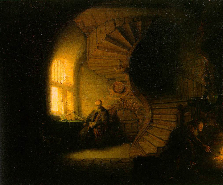
Consider the staircase. As the stairs disappear into the darkness, so does Rembrandt’s paint application.
He simply scrubbed-in lesser amounts of the same brown color from the bottom of the stair into middle, allowing the under layer of black to darken the value of each stair. Many of the small shadows between adjacent planks are just the black under layer peeking through. As Rembrandt worked toward the lightest values, he applied his paint more thickly.
Peter Paul Rubens
Peter Paul Rubens is best known for his large swirling compositions, featuring numerous people and wild beasts. However, in the painting of St. Peter (below), we can appreciate how he used the dark canvas to create the strong shadow on St. Peter’s head and clothing.
There is a complete gap between the hair in the shadow and the face. Well placed strokes of hair float in space, letting the viewer’s own imagination fill in the gap.

Diego Velazquez
Perhaps the greatest Baroque painter of all (in my opinion) was Diego Velazquez. He was a prolific court painter, serving Phillip IV, King of Spain and Portugal.
The following painting shows how effective Velazquez was at using the dark canvas in a number of ways. In this painting entitled La Aguador de Seville or The Water Carrier of Seville, Velazquez used the dark canvas to masterfully capture a clear glass, three people in varying intensities of light and clay vessels.
Look at the glass held by the old man and the boy. Beautifully painted, Velazquez used very little paint indeed.
An extremely small amount of white was scumbled from the edges of the glass toward the center of the glass. Disconnected dots at the bottom and strong highlights around the rim, give us a sense of detail with minimal work on the part of the artist. Velazquez’s economy of strokes is a testament to his mastery of painting – all that is needed and nothing more.
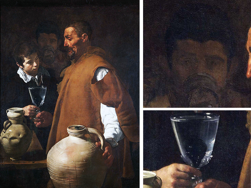
Now, look at the man in the center – the one drinking water behind the other two figures. His head was painted with only one color. The paint is thinnest where the values are darkest.
His hair isn’t painted at all but is suggested by the scumbling done in the background around his head – simple but effective.
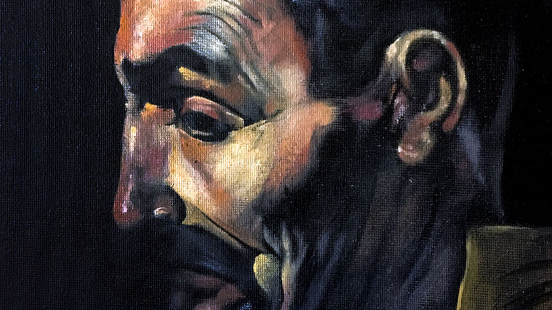
It is the man on the right, the water carrier, that is the subject of the example painting that follows below. His fleshy, time-worn face is a great example of how painting on a black canvas can save time and energy.
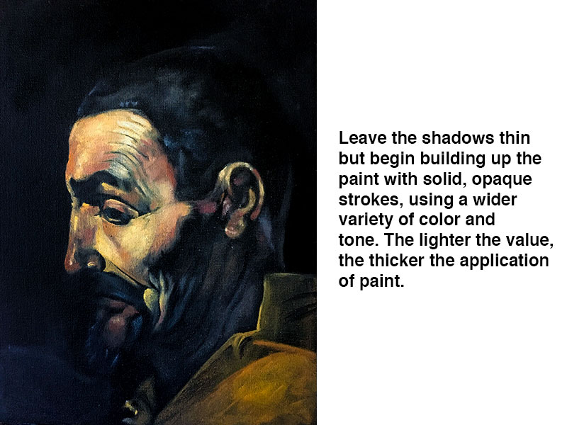
In fact, the copy of this head, shown below in stages, is the result of only one painting session. With that, let us walk through the stages by which a head such as this is painted.
Stages of Baroque Painting – An Example
Follow along or apply the follow concept to a subject that is more personal to you.
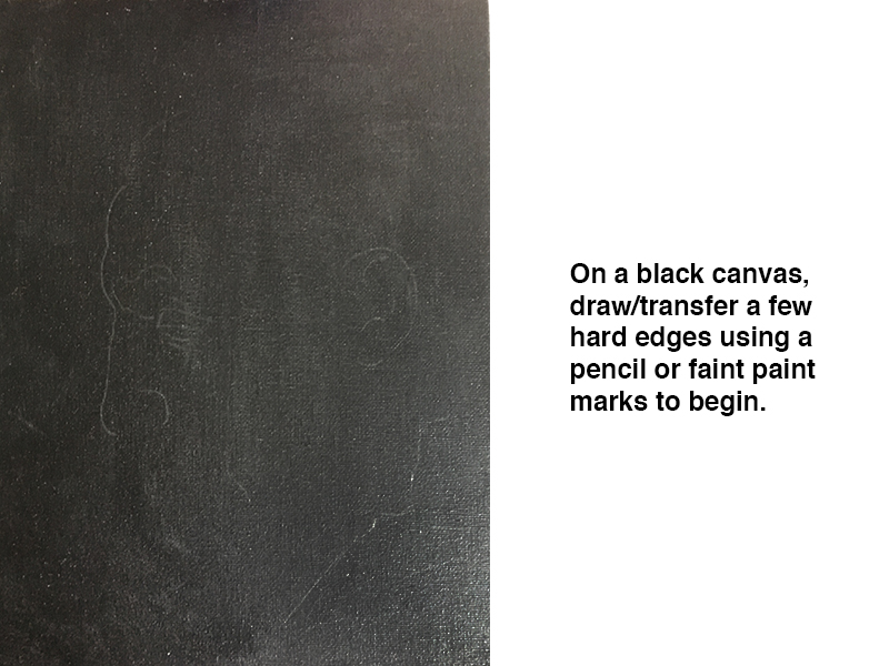
Step One – Sketch the Subject on a Black or Darkly Toned Surface
With a pencil or faint marks of paint, minimally draw a few hard edges of the subject. Since the example is a copy, I simply used the graphite transfer method to transfer some lines onto a canvas prepared with black acrylic paint.
Step Two – Layer Lighter Values
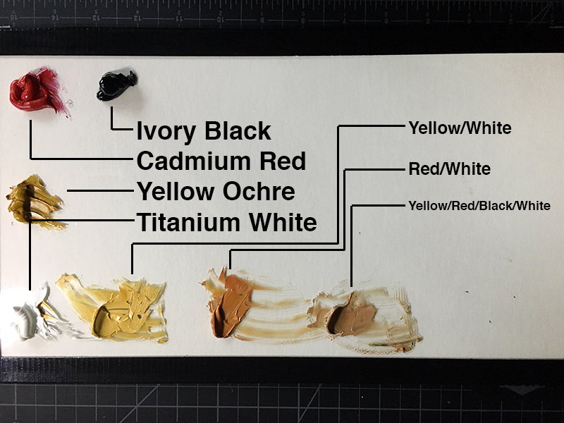
Using oil paint now, mix a few light values using colors that are classified as opaque or semi-opaque.
All oil paint pigments are classified as opaque, semi-opaque or transparent. The transparent pigments are ideal for glazing (a technique not described in this article) but should be avoided when scumbling. Be sure to use titanium white when mixing the colors.
Titanium white was not available to the Baroque painters but is the most opaque pigment of all and is the best choice available to artists today. (Remember to mix the white with a color – pure white will look unnatural.)
Step Three – Separate the Lights and the Darks
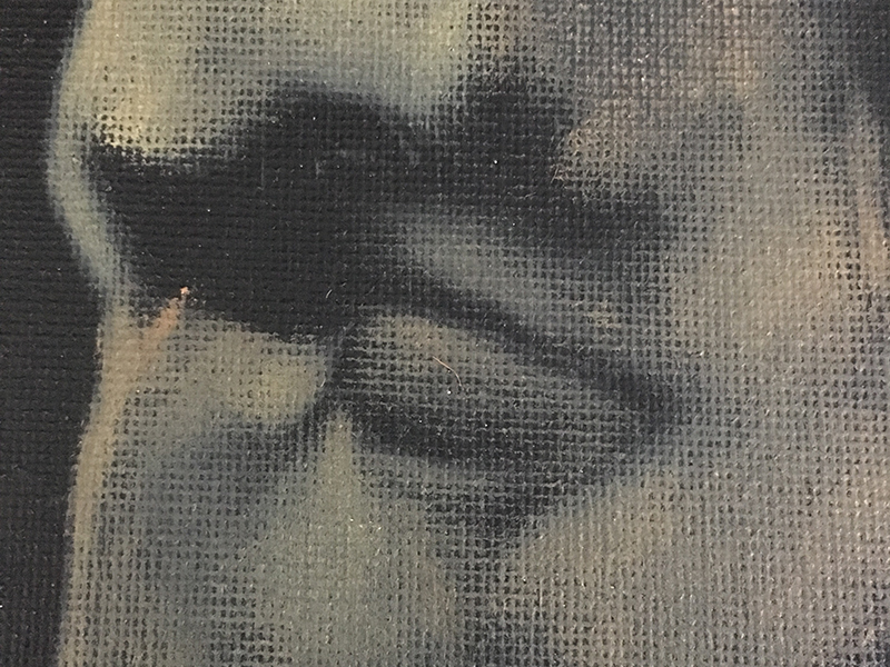
Using just one or two colors, separate the lights from the darks by first scumbling (scrubbing) the light values with an extremely small amount of paint on the brush.
One might begin by loading a stiff bristle brush with paint and then wiping it out with a rag or paper towel before applying what is left in the brush to the canvas. If the paint completely covers the under layer of black, then too much paint has been applied.
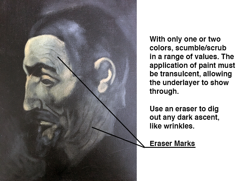
Use a Pink Pearl eraser (yes, you can erase thin applications of oil paint) to carve out the wrinkles in the flesh and accurately shape the shadows around the eye.
Step Four – Add Complexity to the Flesh
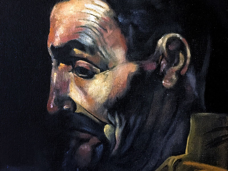
Mix a few more values of the fleshy color and begin painting directly and opaquely in the areas hit by the light only. Be careful with the transitions from tints to shades. If necessary, use a rag to wipe down the paint in these areas, making a transition, not just from light to dark but from thicker to thinner.
See also: How to Paint a Portrait with Oils
Step Five – Apply Darker Values if Necessary
Though not used in this example, feel free to apply dark marks of color as well. Looking closely at the coil-built vessel in the bottom of Velazquez’s The Water Carrier of Seville, one will notice that some of the shadows between coils are made by allowing the background to peek through while other dark accents are painted over the color of the vessel.
Conclusion
In your own journey through painting, you might choose to work on black canvases like the Baroque painters or simply borrow from them when it is most suitable. We can always learn from the masters that have come before us and apply their perfected techniques to our paintings.
If so, join over 36,000 others that receive our newsletter with new drawing and painting lessons. Plus, check out three of our course videos and ebooks for free.


