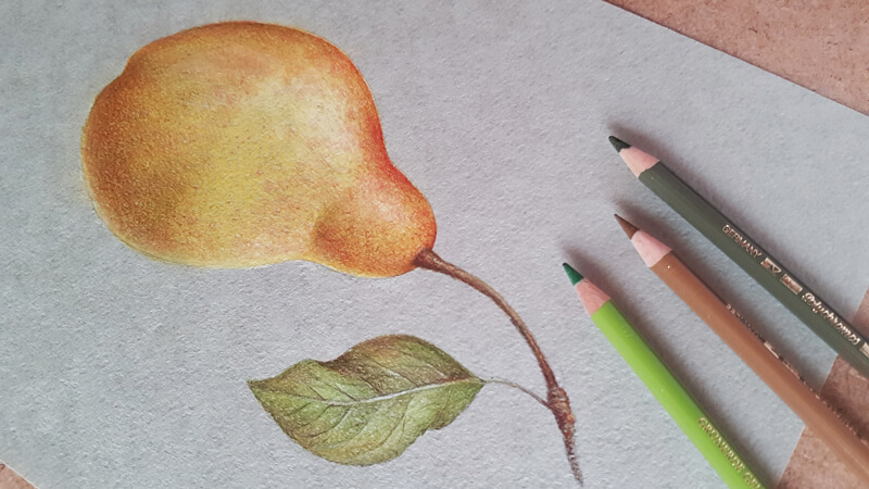
We’ll also discuss a few simple tips that lead to the illusion of volume and harmonizing the colors in your art. I’ll show you a way to speed up the process, achieving a dense covering of pencil applications in no time.
I’d say that this post is not just a step-by-step tutorial since it includes a concept that may be applied to various artworks.
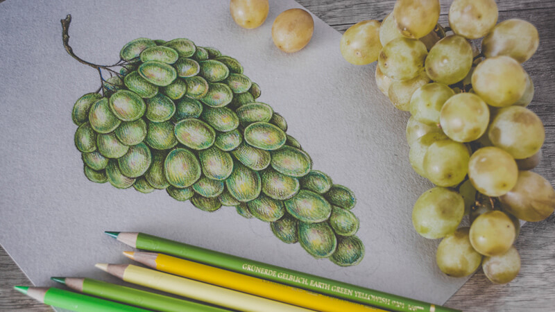
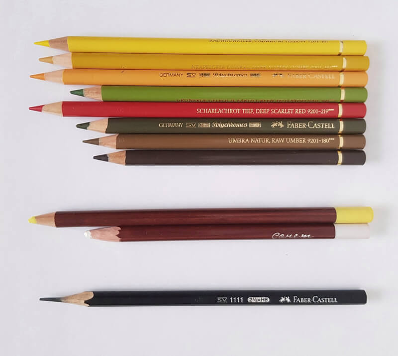
For this project, I’ll be using a set of Faber-Castell Polychromos colored pencils. You’ll find the list below (in the image, from top to bottom):
- Cadmium Yellow
- Dark Naples Ochre
- Dark Chrome Yellow
- Earth Green Yellowish
- Deep Scarlet Red
- Olive Green Yellowish
- Raw Umber
- Walnut Brown
Need these pencils? Buy Polychromos Pencils
(This is an affiliate link – this means we make a small commission if you purchase.)
I’ll also be using a couple of pastel pencils. Color names aren’t designated, so let’s call them “Light Yellow” and “White”. If you don’t have pastel pencils, you can find a replacement (for example, soft pastel sticks) or you can use colored pencils instead.
For this drawing, I’ve chosen a sheet of pastel paper that’s a muted green color with a subtle texture. This tone will make the colored pencil applications stand out, yet keep the whole artwork harmonious. Also, the texture of the surface is advantageous since it will help us to create the illusion of spots on the pear’s skin.
See Also: All about Drawing Papers and Surfaces
We’ll also use a graphite pencil and an eraser to create a sketch before applying colored pencils.
Why Use Pastel Pencils
Drawing on toned paper has many advantages. However, sometimes this choice of surface leads to unexpected challenges. We should keep in mind that colored pencils produce translucent applications when applied with moderate to light pressure.
Our subject – the pear – is relatively light. However, it has some areas of darker, more saturated colors. The tone of the paper is somewhere in the middle of the value scale and fairly desaturated.
Since we want our applications to appear fairly solid, we should make sure that we can cover the paper completely. Otherwise, the color of the paper will be too strong and may show through the coverage.
In addition to that, we should be careful with the tooth of the paper – not every type of surface can accept dozens of layers of colored pencil applications.
Using a material that produces dense covering at one go may be the key to meet this challenge. In some cases, it can be watercolor or markers. For this particular project, pastel pencils are a great option. They can produce strokes of various widths, lengths, and character. They blend easily. Also, they work well with the toned paper that has an uneven surface.
Look at the image below and compare the colored pencil applications. The examples on the left side were made by applying a Polychromos pencil directly to the paper. The samples on the right have an underlying layer made with a light yellow pastel pencil.
(A Cream pencil from the Polychromos set isn’t listed in the initial material listing, but I think it’s good to include it here for a demonstration.)
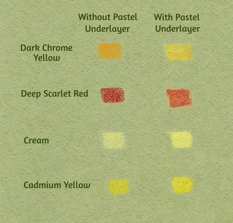
These examples show a significant difference in the intensity and saturation of the color. Make your own chart of samples to see what happens if you add the under layer.
If you don’t have pastel pencils, soft pastel sticks are a nice alternative. Using additional media like pastel pencils isn’t required, but as you can see – it helps.
You can use only colored pencils – you’ll just need more layers of applications. The intensity of covering differs from one brand of colored pencils to another, depending on the core’s composition.
See Also: Colored Pencil Comparison Chart
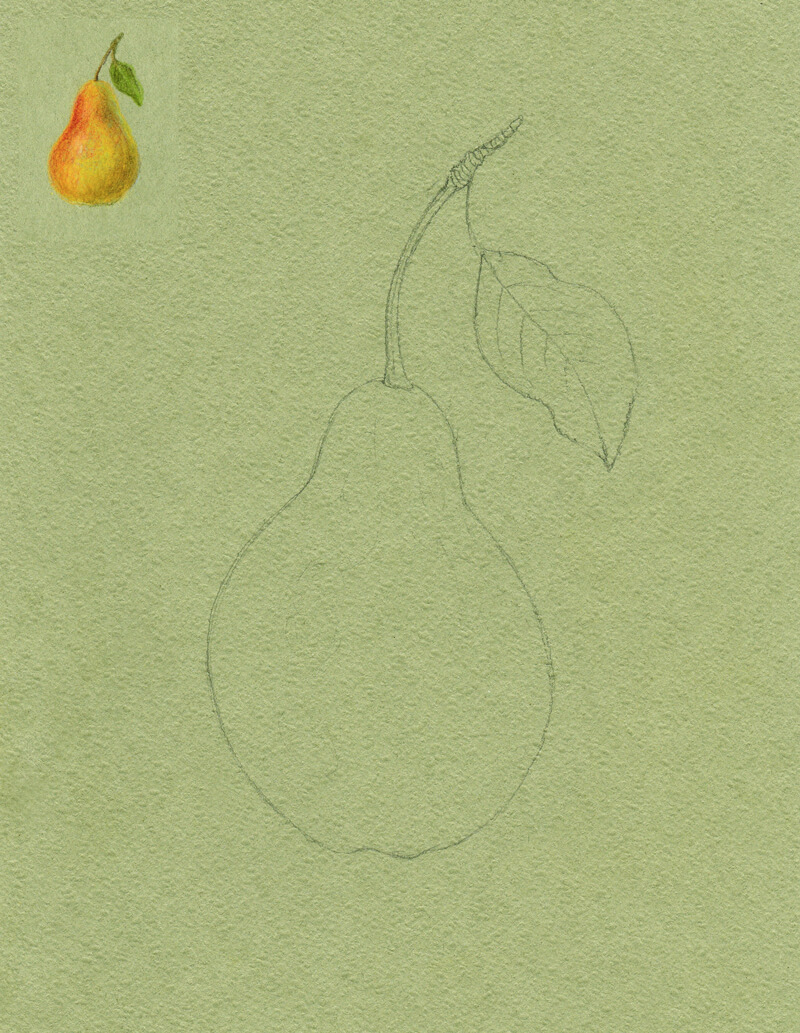
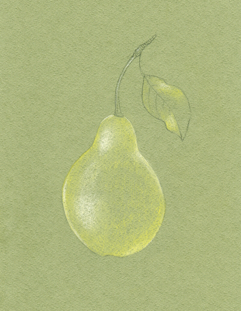
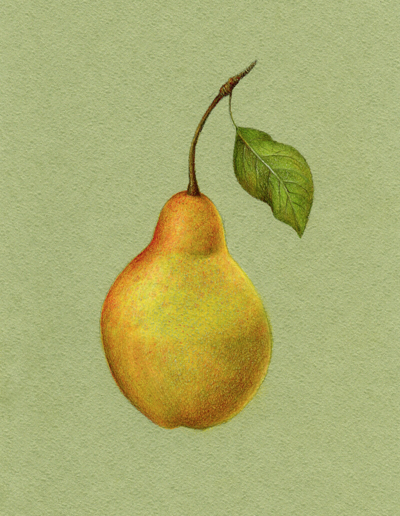
Create a Graphite Pencil Sketch
I draw the contours of the pear, using an HB graphite pencil. It’s possible to use a colored pencil instead – but draw lightly if you do. Colored pencils are difficult to erase once they’re on the surface. Graphite pencil marks may contaminate further applications, so we should be careful with them as well.
To make the art more interesting and balanced, I add a leaf to the stem. All lines are as smooth and curved as possible to accent the organic feel. Also, I make the pear slightly asymmetrical for the same reason.
Keep the underdrawing light and gently soften it with a kneaded eraser if needed. Mine is quite strong because I’d like it to be easily readable for demonstration purposes.
At this step, I also give myself time to think about values and colors. I see that the pear features variations of yellow with some red. It has a matte surface. The light is soft and is originating from the left. You can find a miniature practice sketch in the image below.
Applying Pastel Pencils
I add some strokes of the light yellow pastel pencil to the pear and the lighter areas of the leaf. Then, I add white to the lightest areas of the object and blend all the applications with my finger.
Normally, I’d avoid using pure white in the highlights, unless the light is extremely strong. Sometimes white can wash out the color. In our case, using white is justified because of the paper’s tone and the subsequent layers of colored pencils we’ll apply. The highlighted areas will have a hint of color, just at a lower saturation.
The light yellow pencil is chosen deliberately. Combined with the color of the paper, this color creates a harmonious yellow-green tone. It is more saturated than the color of the surface. I wouldn’t be able to achieve such an effect with an orange or red pencil, applied in one layer.
Adding the Colored Pencils Applications
First, I apply Cadmium Yellow to the body of the pear. I keep the pencil moving using small circular strokes as this color is applied. This ensures a smooth and even coverage. To increase the effect of blending, I gently touch the layers of color with the tip of my finger, mixing them and softening the transitions.
I then cover the leaf with Earth Green Yellowish.
Raw Umber is then applied to the stem.
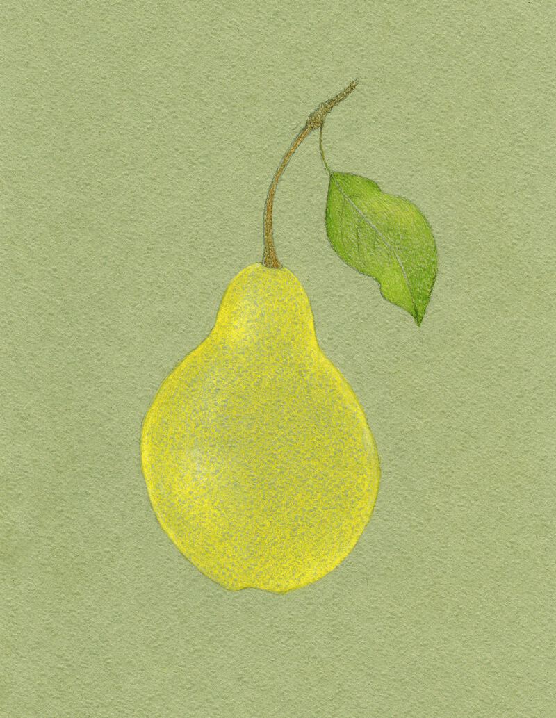
Next, I use Dark Naples Ochre to create a darker nuance in the pear’s body. I also include some Walnut Brown strokes to the stem, making its sides darker.
Olive Green Yellowish is great for deepening the green of the leaf.
With Raw Umber, I work on the pear, adding some shadow and giving it more volume. The light is coming from the left, so the core shadow will be more evident on the right side of the object.
I leave a thin line of the reflected light near the edge of the pear. We’ll make it look a little duller in the next steps.
Raw Umber does a great job of muting the bright yellow applications. The art is beginning to appear more natural.
I also add some Raw Umber to the leaf and stem to unify the image in terms of color.
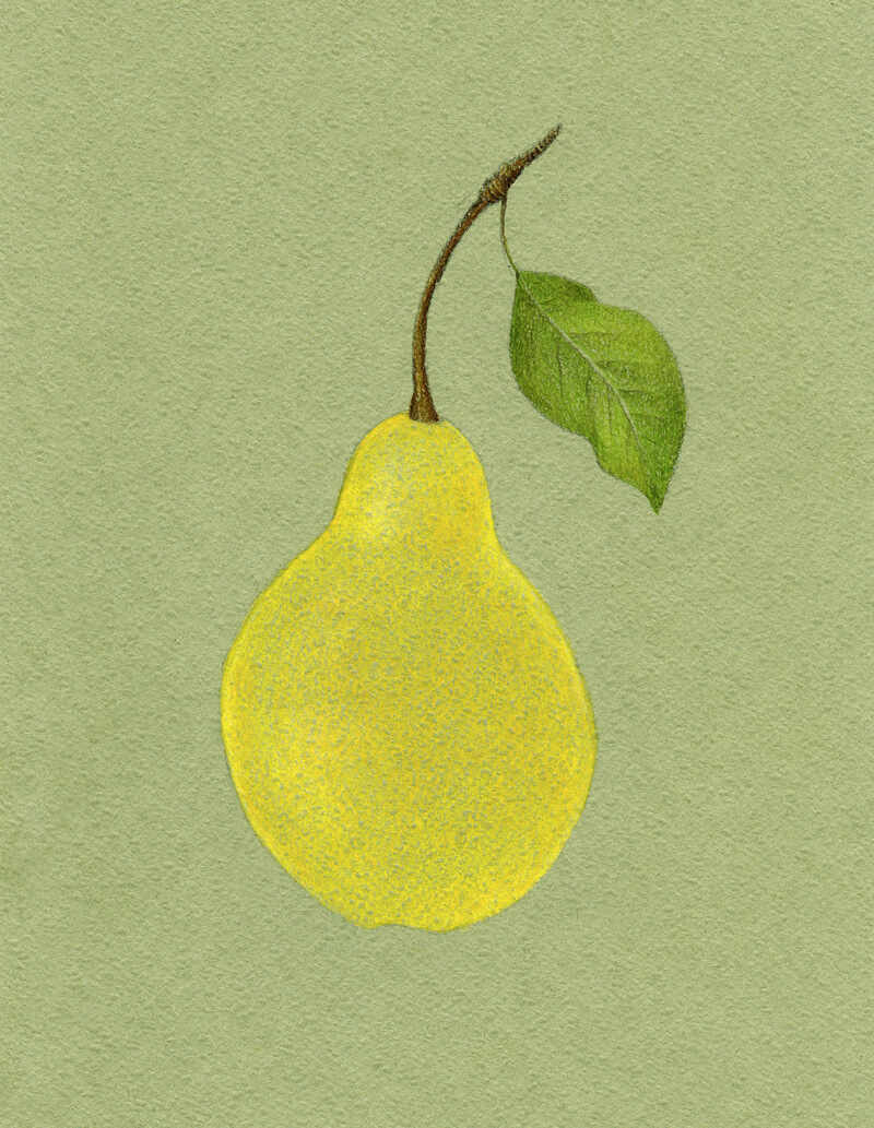
Let’s make the artwork a bit livelier. With Dark Chrome Yellow, I add an orangey nuance to the upper part of the pear’s body. I also leave a few areas open to communicate the texture.
Then I use Deep Scarlet Red, which creates a pleasant saturated accent in the upper part of the pear.
I add this hue selectively to other areas of the pear, and to the leaf. Green and red are complementary colors. The result of placing them next to each other results in rich, contrasting, vivid, and appealing color. Applied directly on top of each other, complementary colors easily create a deep desaturated color.
We mostly see highly saturated colors in areas of highlight. Shadows also have color, but the colors are less intense.
See also: How to Draw with Colored Pencils – 3 Techniques
The pear’s local color is mostly yellow with some areas closer to yellow-orange. I’m going to include orange and red to the darker midtones and core shadows. Alternatively, the lighter areas are developed with desaturated yellow with a hint of green. This creates the impression that the color temperature and saturation shifts alongside the values.
I add Earth Green Yellowish to the core shadow of the pear’s body, desaturating and slightly darkening the existing applications. The shadow looks more realistic now.
This green hue presents a beautiful contrast to the reddish nuance that we already have here. (Again, green and red are complementary colors on the color wheel.) Also, it works perfectly in combination with the yellows and the color of the paper.
I add just a little of Olive Green Yellowish to the darkest areas of the core shadow, closer to the edge of the pear. Use this shade wisely – it is quite intense! The leaf needs some of it, too.
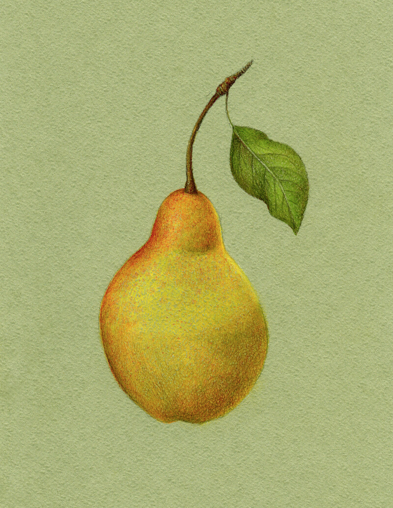
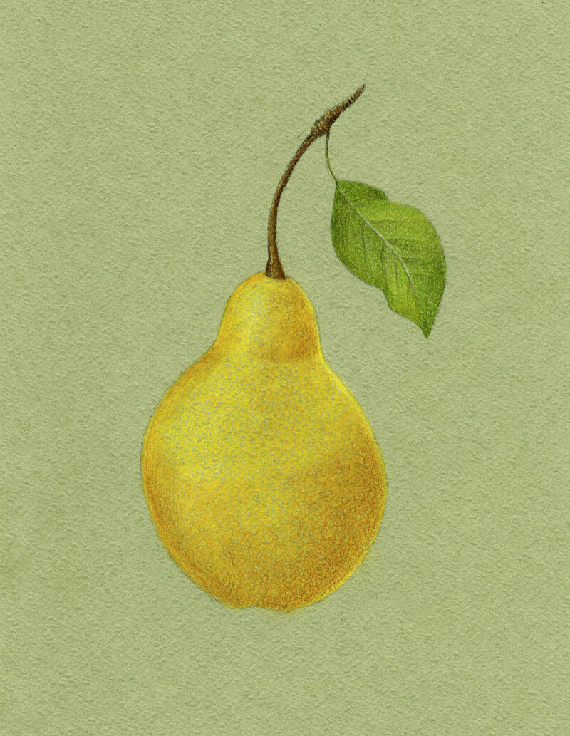
As a finishing touch, I’d like to make the color applications denser. The goal is to restore and strengthen the initial color of the pear’s body.
I apply Cadmium Yellow to the highlights and Dark Naples Ochre to the midtones with slightly heavier pressure. I touch the leaf and stem with those yellows as well.
If you need to accent the highlights, you can use a lighter pencil, like Cream from the Faber-Castell Polychromos set. Or, you can use your light yellow pastel pencil on top of colored pencils applications, then blend gently.
As discussed before, it’s best to make the highlight slightly less saturated than the midtones because lighter values wash away the intensity of the hue.
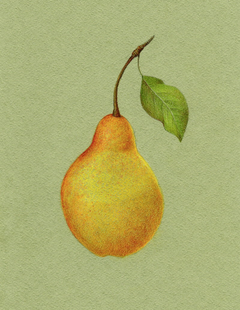
Conclusion
Congratulations – we’ve created a beautiful drawing! I hope that you’re happy with both the process and the result.
Let’s repeat the key principles of this tutorial.
- Creating an under layer for a colored pencil drawing may be a great way to start. It allows you to get a better result in a shorter period of time.
- Keep in mind that colored pencil applications are somewhat translucent. Think beforehand about the color of your paper and the colors you plan to include in your drawing.
- Using close variations of the object’s local color (lighter or darker, more or less saturated) will make your art more interesting.
- Value and color temperature are connected. For example, if the object is yellow-orange in the midtones, you can make the light areas yellow or even yellow-green (warmer). Orange or red-orange may be your choice for shadows.
- The most saturated colors usually appear in the midtones. Lights and shadows tend to be desaturated.
- To desaturate and deepen a color, add its complementary color on top.
Thanks for joining me on this creative journey!
If so, join over 36,000 others that receive our newsletter with new drawing and painting lessons. Plus, check out three of our course videos and ebooks for free.