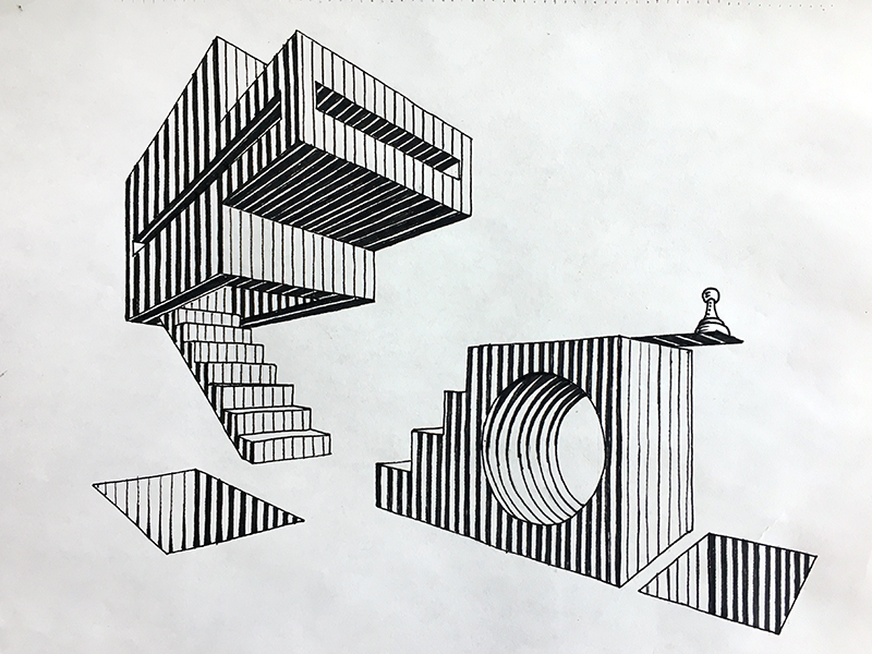
In this tutorial, we’ll focus on a calming drawing practice that is free of rules and limitations.
Every form of drawing or painting comes with its own set of challenges. Every pursuit has its own set of difficulties to overcome and skills to master. This takes time, patience, and perseverance.
Sometimes, however, all we need is a bit of spontaneity and, speaking metaphorically – a breath of fresh air. It may be just an hour of time just for ourselves – no challenging tasks, no principles to keep in mind.
Can drawing help us relax, deeply experience the moment, recharge our “inner batteries”, and develop self-awareness? Absolutely, it can!
It may be interesting to know that, according to research, only 45 minutes of making art can significantly reduce cortisol levels. Cortisol is a so-called “stress hormone”. It is the human body’s response to stress or danger.
The right amount of cortisol is essential to our health. However, if the hormone levels stay increased due to chronic stress, this may lead to serious health issues.
Also, that same research suggested that it doesn’t matter whether you’re an experienced artist or a beginner. The process of creation is equally beneficial, calming, and revitalizing for everyone.
Get Your Mind Ready For Drawing
To make the most out of your drawing session, begin it with a clear mind. Get rid of any rules or expectations of the result. Focus on the idea of self-expression through action.
You can set your own goals. For example, I use this approach to fight perfectionism. I allow the lines to be slightly uneven and accept all imperfections. There are no mistakes, only “happy accidents”.
This practice is a wonderful form of relaxation. Some art projects are complex – they require intense focus, time, and mental effort. Meditative doodling is a different story!
Also, this creative activity distracts attention from worrying thoughts. Sometimes, it brings unexpected – yet pleasant results. It may change your mood completely.
It’s possible to use any kind of artistic media for this activity. I prefer ink because it allows me to focus on lines, shapes, space, and contrast. Our attention shouldn’t be too spread out. Ink is straight-forward, deliberate and direct.
All artworks and samples in this tutorial were created with 0.2 and 0.3 ink liners.
Warm-Ups for Meditative Doodling
There are no rules – just some guidelines. Feel free to experiment with various lines and shapes. They are the building blocks of endless patterns that you can create.
I encourage you to invent your own patterns. Avoid copying. Your artwork is a reflection of your thoughts and emotions, so it will be unique – just as your fingerprints. Trust your hand. Focus on its movements and let your thoughts go away.
However, if you need some inspiration to get started, that’s fine, too. The art of creating patterns is ancient, so there are plenty of examples to be found. Every culture has its own set of patterns and symbols.
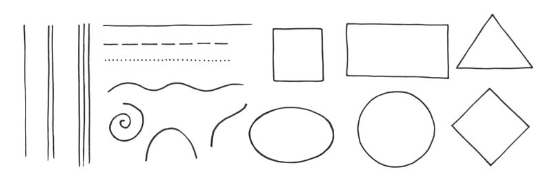
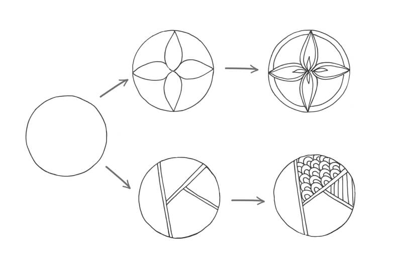
Shapes
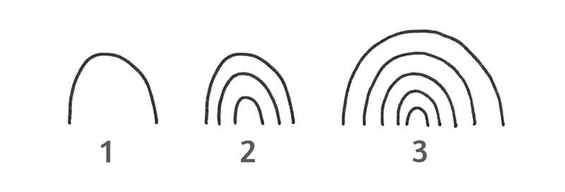
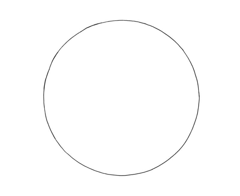
Let’s begin by exploring shapes. First, choose a simple shape. It may be a circle, a triangle, a square etc. Its purpose is to set the borders for your pattern.
Each pattern may have any number of elements inside (or even outside) the main shape. They don’t have to be symmetrical or follow any other principles of formal pattern making. Don’t overthink the process – your pattern can look like anything you imagine. Or, just let the lines flow and see what happens.
If you feel stuck, look around and pay attention to anything that resembles a pattern. It may be the surface of your wooden table, relief of cloth, or random tea leaves in your cup.
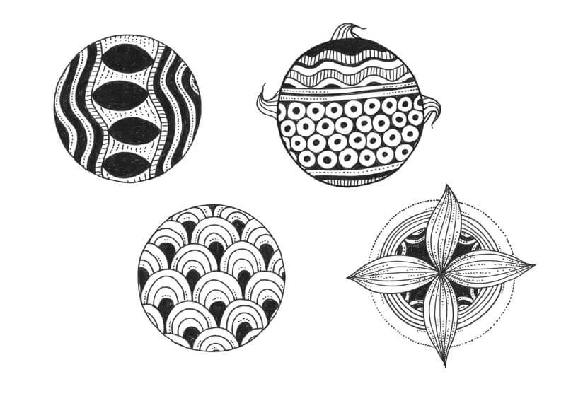
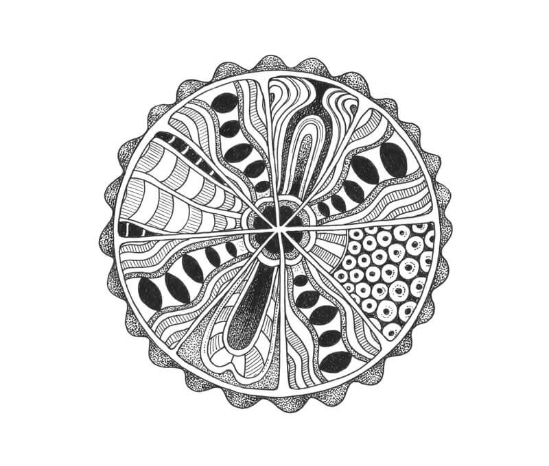
Below, you’ll find some of my examples. The basic shape is a circle. It’s difficult to describe how I designed these patterns because the process didn’t involve logic or conscious decision-making. I just let them happen. This is what meditative doodling is all about!
If your shape is also a circle and it’s difficult to outline the contour, you can use a compass. Any object with a round bottom (like a cup) may be helpful, too. Make the process as comfortable as you prefer.
See also: How to Draw a Circle
If you draw without a ruler or any tools, your lines may be slightly uneven or “shaky”. That is precisely the point! Will you allow this imperfection to exist?
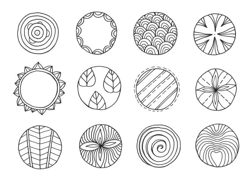
Let’s focus on shapes and space, without making any elements darker than others. We’ll look at several ways of developing variety a bit later.
I find it easier to fill the main shape, starting with bigger elements.
Alternatively, it’s possible to start by outlining the borders. They divide the inner space of your shape, so you’ll get separate areas for different patterns.
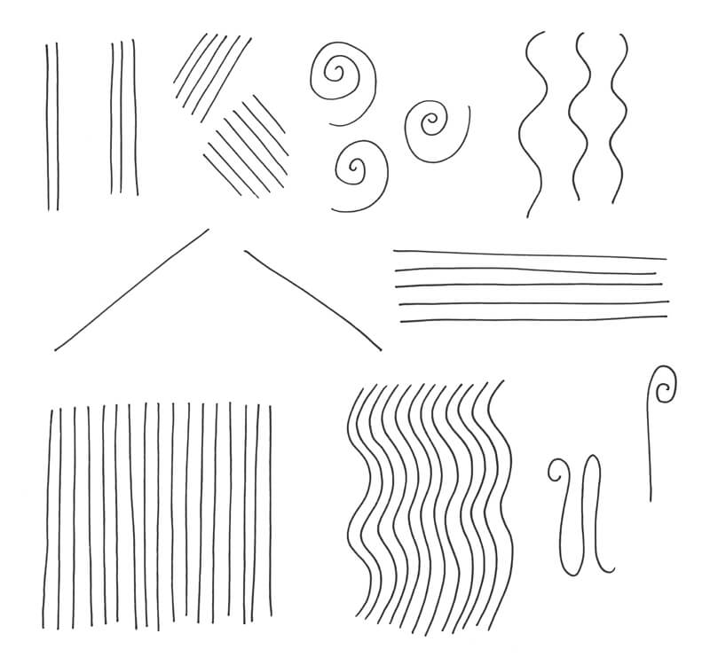
Lines
The next exercises are focused on warming up your hand rather than creative “muscles”.
First, draw some lines. (I do it freehand, without a ruler.) They may be of any length. Also, consider their character: straight, wavy, or curved.
If you wish, draw similar lines in sets. Keep them as spontaneous and organic. Do what feels right.
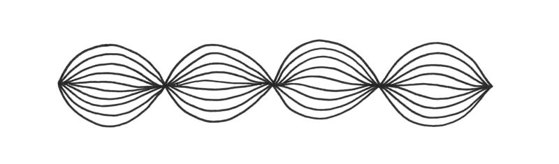
Now we’ll create a pattern of lines. The resulting elements resemble a woven pattern of fibers.
It may be easier to start by marking two dots at a short distance – or, you can mark them only in your mind.
Then, connect the dots with two lines. Theses lines will become the outer borders of the element.
Next, add more lines in between the existing ones, until the whole shape is filled with lines.
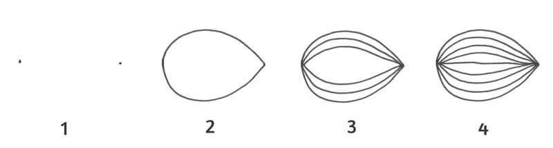
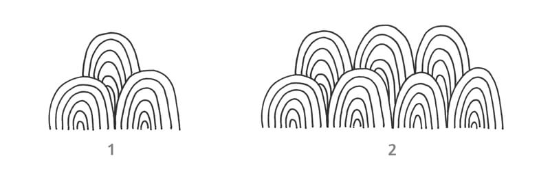
You can create chains of these patterns to adorn your doodle drawing.
In the next exercise, we’ll draw some curved lines. When organized in sets, they resemble arcs.
The principle is simple. Start with one curved line, then add new ones – creating a pattern.
You can create as many arc elements as you wish, forming chains and placing them in rows.
Shading and Contrast Exercises
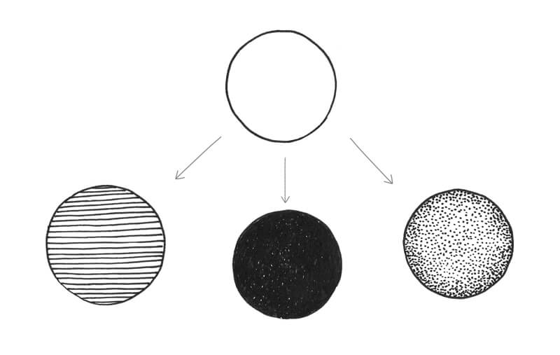
Let’s make our drawing more interesting by including some darker values. This will allow us to add depth and contrast to our stylized patterns.
Shading can be done in different ways. You can use lines (hatching) and dots (stippling). These techniques give control over tonal gradients, allowing you to increase the contrast gradually.
See also: Pen and Ink Drawing Techniques
Alternatively, it’s possible to cover the shape with dense lines. My hand performs circular motions, making a solid ink covering with small specks of paper showing through. The completed areas may look rather plain, but they definitely attract the viewer’s attention.
Of course, you can combine all those methods in a single artwork.
Stippling is a great way to create smooth gradations of tone, but keep your goal in mind. If your drawing session is aimed at relaxation, and lots of stippling annoys you – using this method won’t be the best option.
Try to create some patterns with pronounced lighter and darker areas to create variety. You can add some depth to the patterns that you made previously by broadening the range of value.
The Meditative Doodling Process
Let’s combine everything that we have learned and practiced in a new drawing.
I usually begin this type of project without any clear ideas of the expected outcome. This one is no exception. I’ll be using the 0.3 ink liner for the whole process.
First, I outline a circle. To ensure that this shape will be precise, I’ve used a compass. All other shapes and lines will be drawn without any tools.
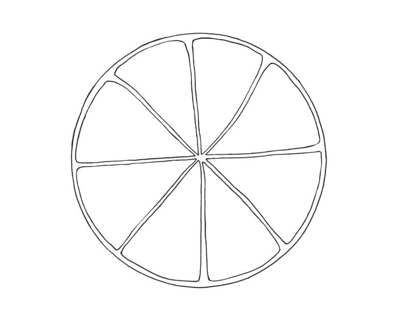
With the circle in place, the idea to draw a stylized slice of lemon enters my mind. I divide the shape into halves. Then I draw four elements in each half.
Their contours are slightly uneven, but this imperfection gives them a more natural look.
It is completely fine to use a graphite pencil to mark the important contours beforehand, especially during the initial steps of the drawing.
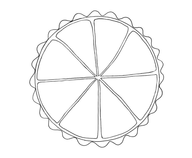
Next, I add a wavy line that is touching the outer edge of the main shape. It is a stylized suggestion of the irregular texture of a real lemon’s skin.
I add lines near the center of the pattern, inside the segments.
I draw a pattern, starting with the main elements.
My intention is to repeat this pattern in every other segment. The remaining sections will have unique patterns.
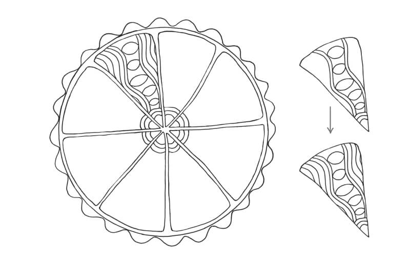
I draw a similar pattern inside every other segment of the pattern. Again, they don’t have to be perfectly even or symetrical.
Feel free to rotate your paper to make this process easier.
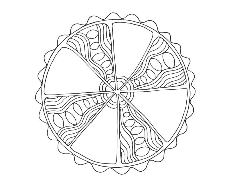
Now we have our repetitive patterns in place. Four segments remain empty.
I fill two sections with different patterns.
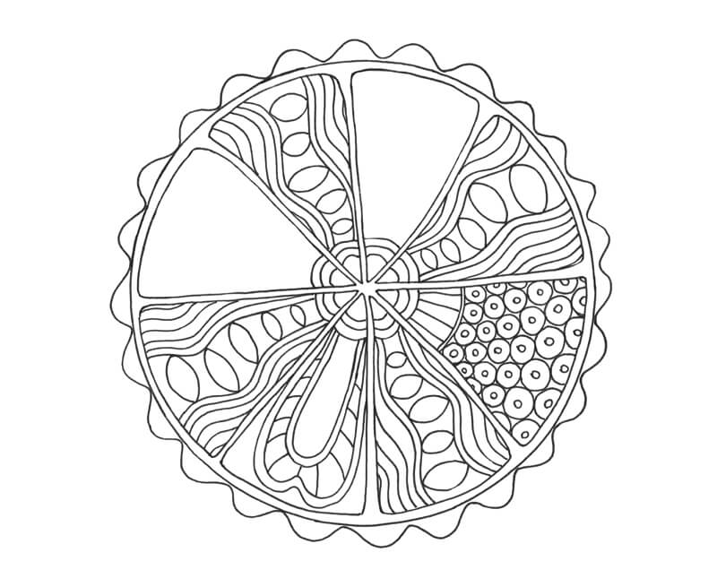
Repeat the same process with new unique patterns and the contour line drawing is complete!
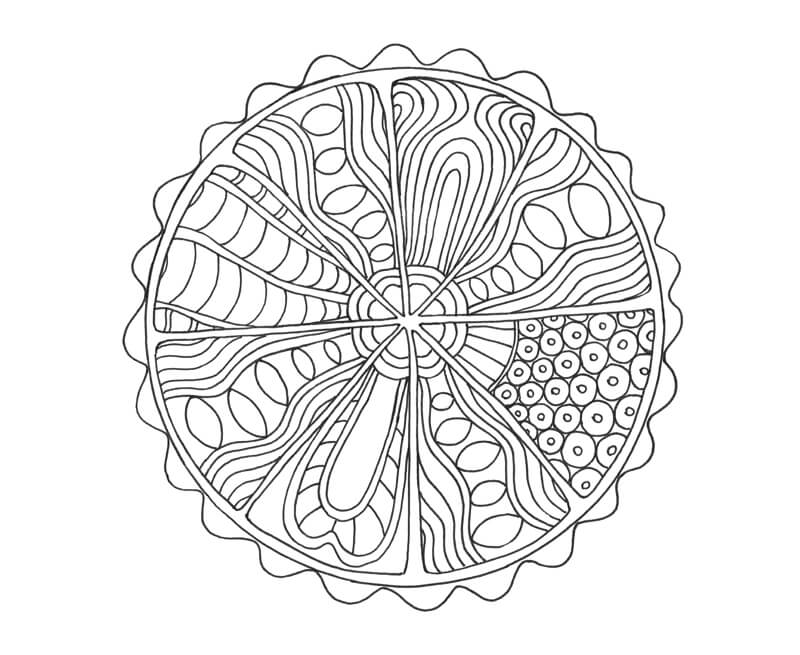
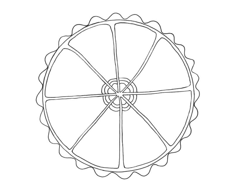
To add depth to the doodle, I darken some areas of the patterns. This not only develops depth, but it also creates contrast, balance, and variety.
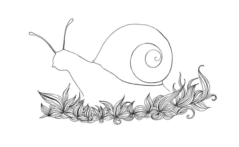
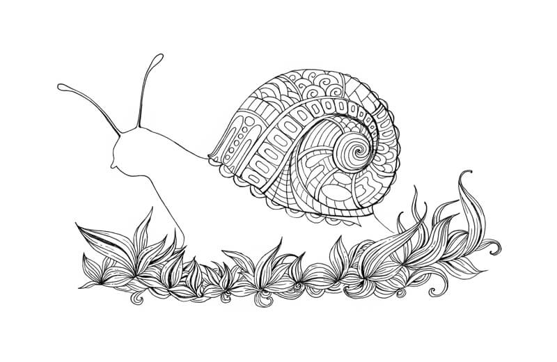
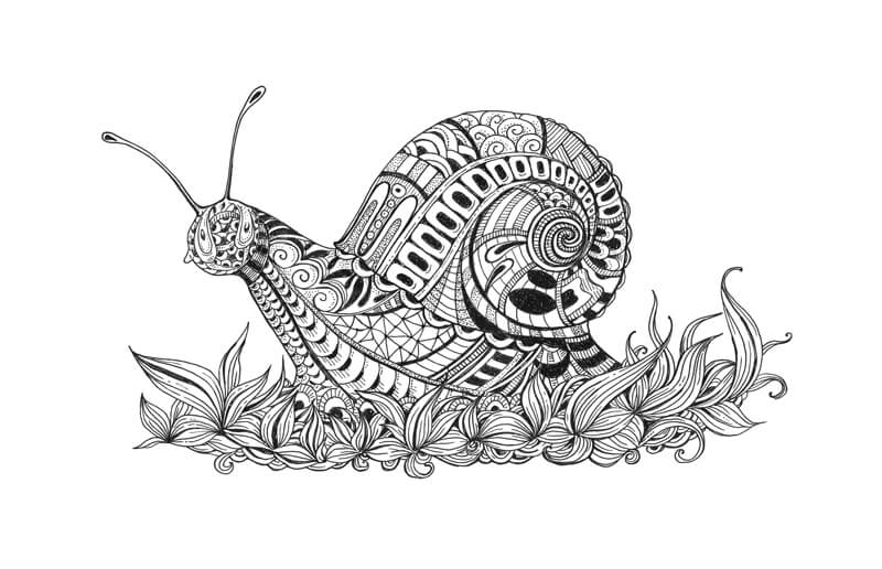
A Doodle Project: Drawing a Stylized Snail
If you are interested in taking your meditative doodles to the next level, then continue on.
We’ll create a stylized black and white drawing that is based on a specific, recognizable subject – a snail. The whole process will be just as fun and calming as it is with simpler warm-ups and non-objective doodles.
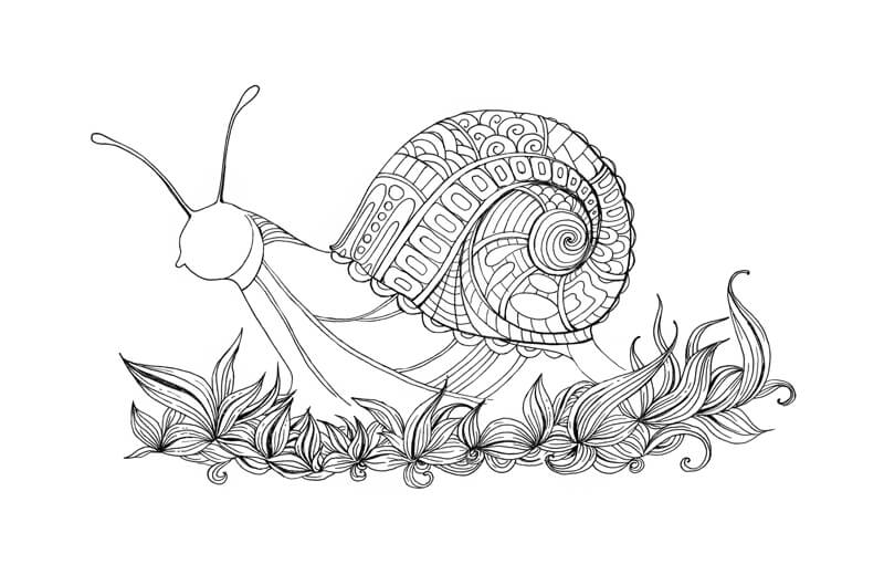
I begin with a quick pencil sketch in order to establish the main contours.
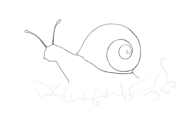
The entire artwork is developed with a 0.2 ink liner.
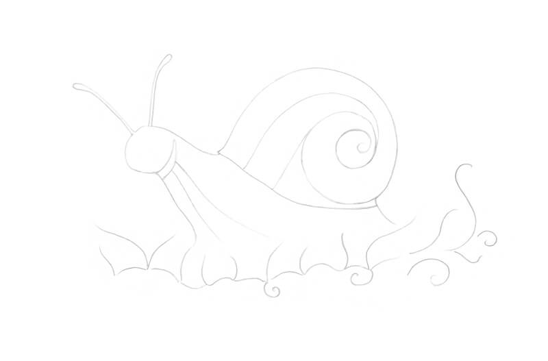
I sketch the contours of the snail, including its shell.
We can widen the lines with the same ink liner, if necessary. But for now, the primary goal is to get the main contours in place, so we can erase all graphite marks.
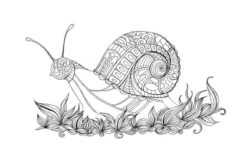
Let’s next proceed to the foreground. We’ll add some stylized grass blades. They overlap the snail, so it makes sense to draw them first.
Vary the size and direction of elements to achieve a nice organic look.
I darken the gaps between some lines to increase the contrast and create some depth.
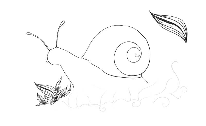
I add more grass blades, using the same approach. Each element has its own unique character.
I divide the snail’s shell into segments with single and double lines.
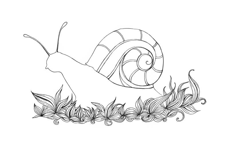
I fill one of the areas with a pattern. I allow the patterns to flow, without much thought or planning.
The pattern follows the curve of each segment, which accents the illusion of form.
I fill more segments of the shell, repeating the pattern.
I then continue to fill the rest of the shell with patterns.
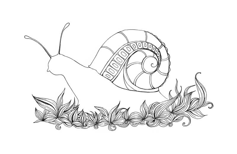
I add some lines to the head and body of the snail to create defined edges.
These lines end before they reach the grass blades. It’s important to leave some space for additional elements on the bottom part of the snail.
Next, I fill the head area with patterns. The majority of lines are curved, which accentuates the roundness of the form.
I fill the segments of the body with various patterns. Sometimes it’s helpful to take a break. Examine your work and new patterns will come to you!
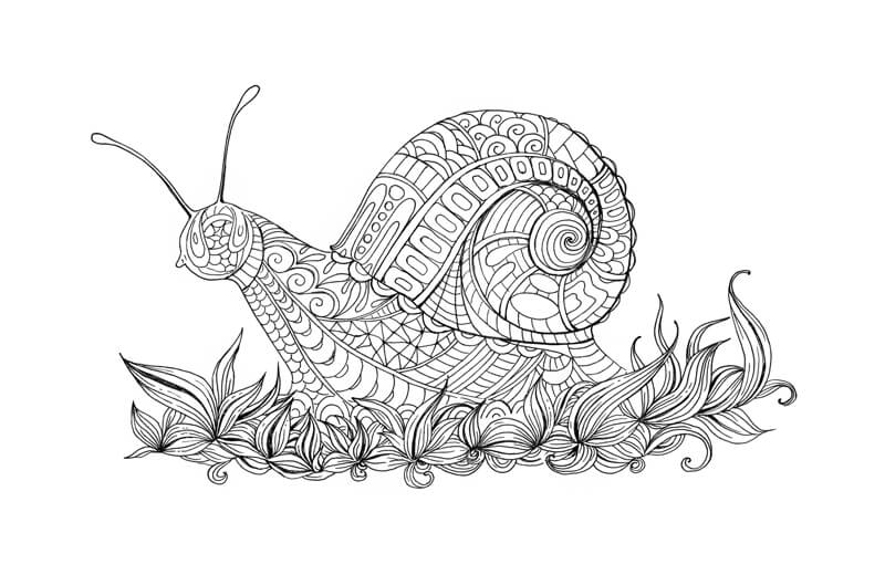
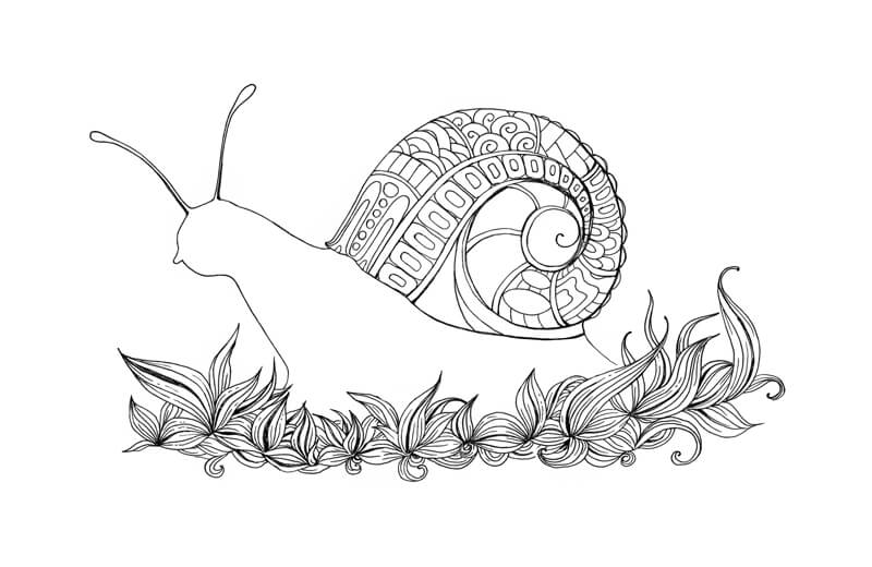
Now, we’ll develop some contrast by darkening some elements of the patterns.
It’s up to you to decide what shading techniques to use. The “plain black” approach creates the darkest spots.
Stippling and hatching is better for creating value gradations that look smoother or more delicate. This approach will create the impression of gray, rather than black.
See also: Optical Color Mixing
Conclusion
I hope that you enjoyed our doodling journey. The process is fun and relaxing and a great way to clear your mind and create at the same time.
Creating art opens up a whole world of possibilities for self-exploration and self-expression. It can help you become more happy and reduce stress. Meditative doodling doesn’t require a high degree of skill or expensive materials. You can do it anywhere and the results are often quite pleasing.
Happy doodling!
If so, join over 36,000 others that receive our newsletter with new drawing and painting lessons. Plus, check out three of our course videos and ebooks for free.

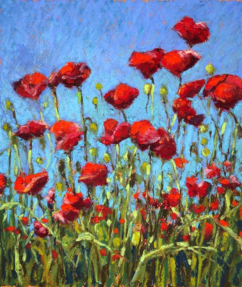
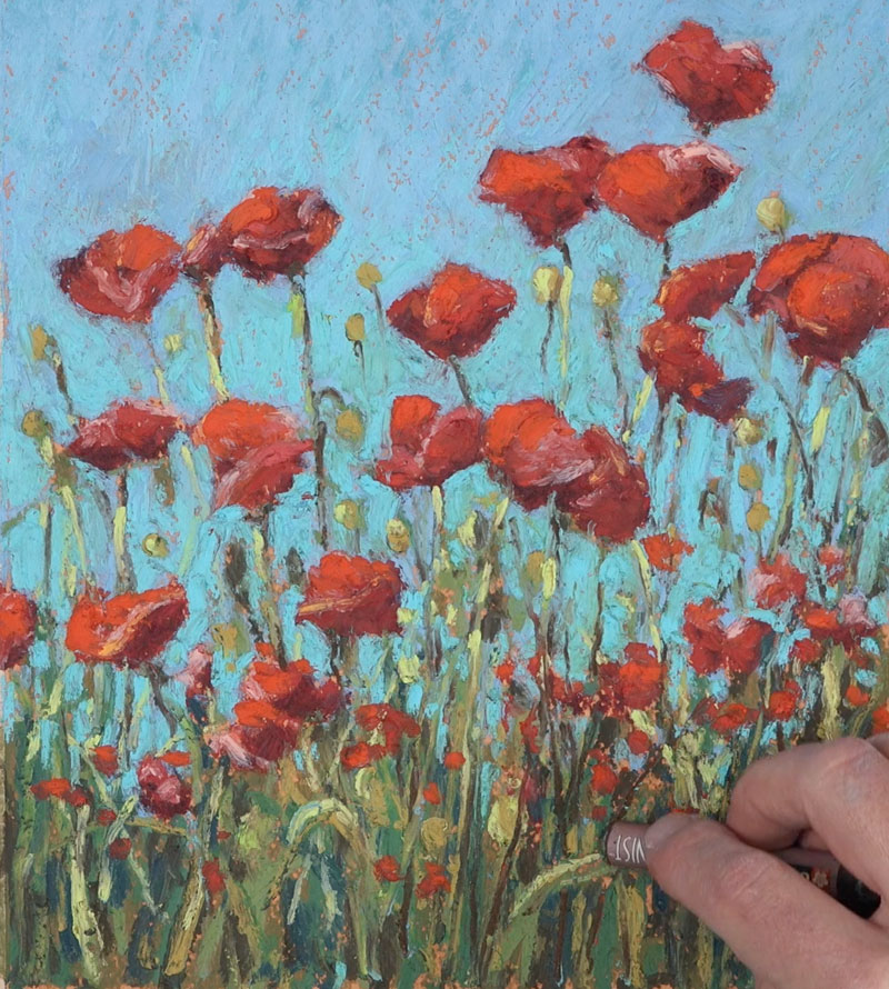
Oil Pastel – Landscape Drawing – Poppies
Impressionistic Landscape with Oil Pastels
In this lesson, we’ll draw a looser landscape of a field of Poppy flowers with oil pastels on Canson Mi-Teintes pastel paper. We’ll focus mainly on capturing shapes of color and value instead of developing details. All while developing thick, layered applications which translates as a painting, rather than a drawing.
Materials for this Lesson
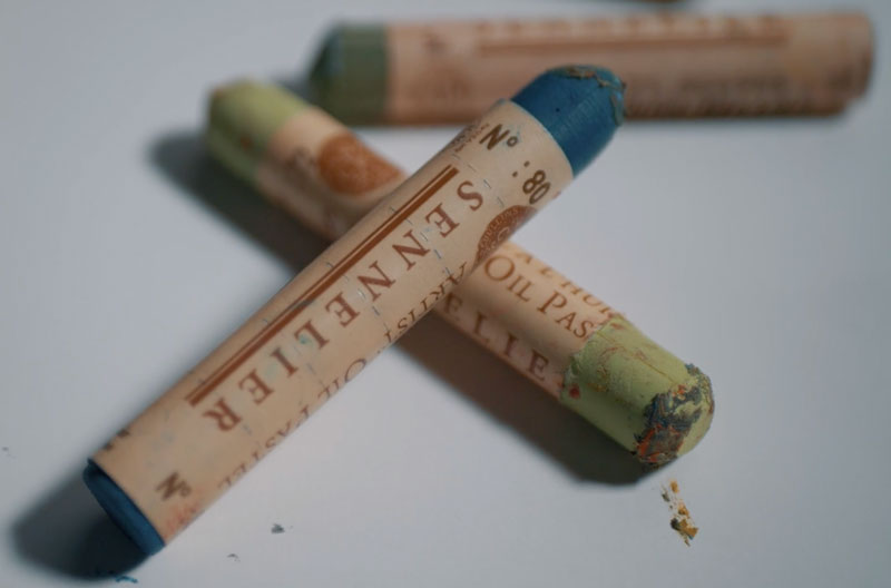
We’ll use two different brands of oil pastels for this drawing – Sennelier and Sakura “Cray Pas” Expressionist oil pastels. Sennelier oil pastels are very soft and buttery and are considered professional, artist quality oil pastels.
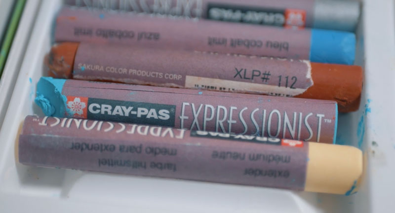
Expressionist oil pastels are also of high quality, but are less expensive, harder, and are considered a “step down” from “artist quality”. However, despite missing the label of “artist quality”, I have found these pastels to be suitable for professional work as well.
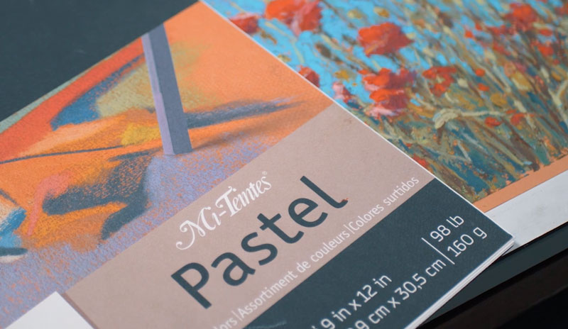
The surface used is Canson Mi-Teintes pastel paper. This paper is fantastic for many different forms of pastel – the heavier textured side being most suitable for oil pastels. (Since oil pastels are at their best when layered, the more tooth your surface has – the better.)
More on drawing papers…All About Drawing Papers
Here’s a look at the specific materials used to create the art. (The following links are affiliate links which means that I make a small commission if you purchase without an additional cost to you)…
The Photo Reference
We’ll work from a photo reference (from Pixabay.com) to complete the image. The reference is used purely as a “reference”, meaning that we aren’t creating an exact copy. We are using it only for color and value information. This allows us to stay looser, creative, and spontaneous with our mark making and color selections.
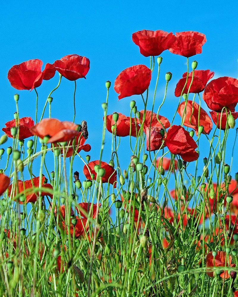 Image by
 Painting in the Shapes of the Flowers and Stems
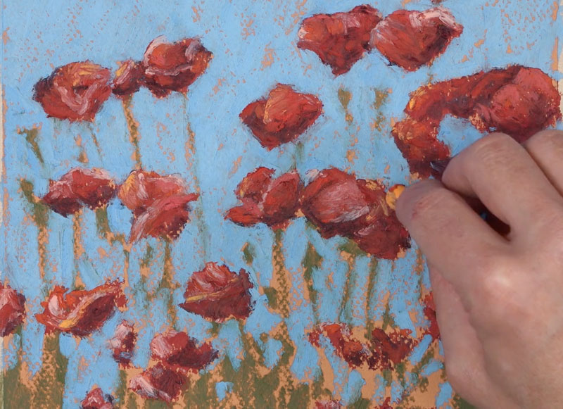
We’ll begin by painting in the shapes of the flowers and stems with broad, deliberate applications of a deep red and dark, yellow-green. Instead of working with background first, as we would with another opaque medium, we begin with the foreground and middle ground. This allows us to add the sky around these shapes later in the process. And as we add the sky, we define the shapes of the flowers and stems in the foreground.
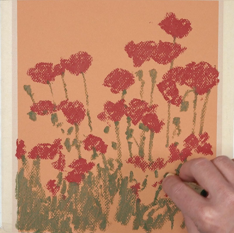
Painting in the Sky
With our basic shapes in place, we next add the first applications of light blue for the sky. We’ll work up to the edges of the flower shapes, defining the shapes with the blue.
We’ll also add specks of blue showing through the stems of the flowers in the foreground.
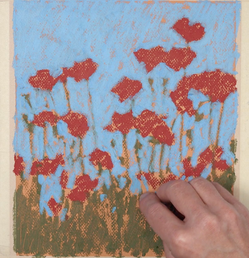
Adding Highlights and Shadows
Now we can focus on developing the illusion of form and space within the scene. We’ll do this by focusing on the shapes of light and dark values that are observed on the flowers and stems.
We’ll use a dark red, which leans close to brown, to develop the shadows on each flower. For the highlights, we’ll layer a variety of light reds, pinks, oranges, and red-oranges. Don’t get overwhelmed with the details. Instead, simplify what you see and concentrate only on the shapes of color and value. The viewer will fill in the details on their own.
We’ll add a bit of warmth to the highlights on each Poppy with a strong, warm yellow. This color is spread throughout the work to ensure harmony and unity.
We’ll then work down to the foreground, adding bits of shadow in between each of the stems. A dark, muted brown is layered over the greens, using vertical strokes. Bits of dark blue are also layered to create a more natural shadow in areas.
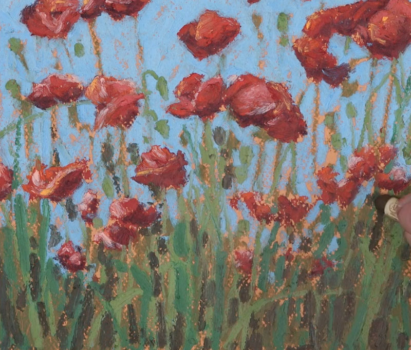
We’ll then go back to the sky and create a transition from dark to light. We’ll begin at the top of the picture plane with a slightly darker blue. At the bottom of the picture plane, we’ll use a lighter blue and bring this color up. To ease the transition, we’ll layer the original blue over the top.
Using a variety of lighter yellow-greens, we’ll add a few more hints of highlight on the pods and a few of the stems. We’ll progressively add lighter and lighter applications, allowing the middle values underneath to show through in areas.

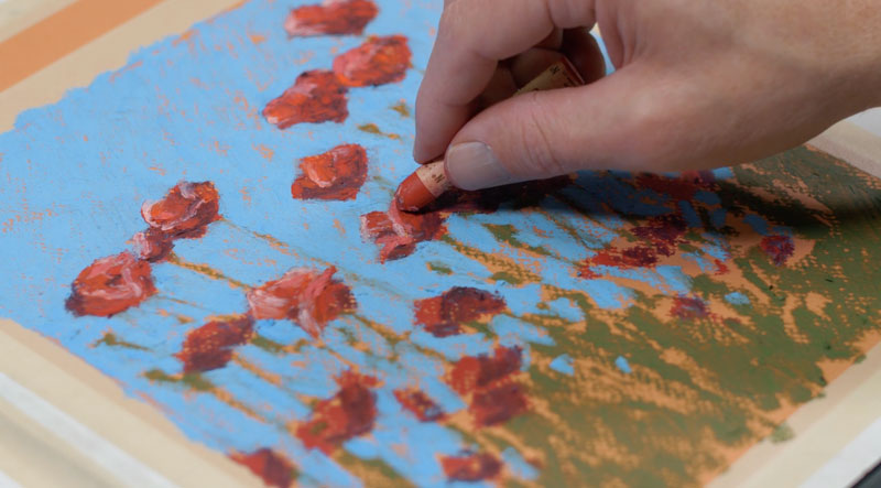
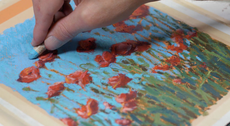
Then we’ll switch over to the harder, Expressionist pastels to add a few additional stems. Since this brand of oil pastel is much harder than the Sennelier oil pastels, these marks are easily applied. In some cases, these applications may dig into the softer applications underneath.
Using the edge of the pastel stick, defined lines are easily made. A dark brown is applied first, followed by a light yellow-green.
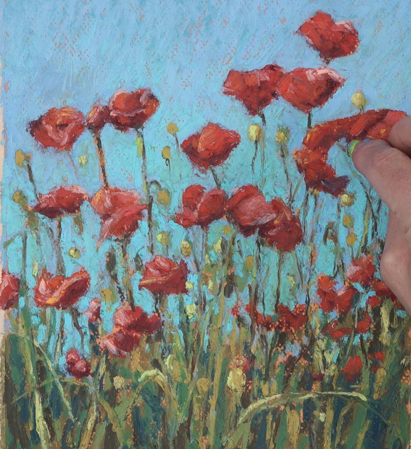
A few more hints of red Poppies are added, mainly to the lower portion of the picture plane. These flowers can be seen peaking through the stems of the flowers in areas.
A few final applications are made to the sky with light blue. These final applications clean up the image and further define the edges of each of the flowers and stems.
And after these final applications, the oil pastel landscape painting / drawing is now complete.
Landscape Painting with Oil Pastel – Conclusion
Oil pastels are a medium that fall somewhere between drawing and painting. Although the process is clearly drawing, the thought process we need to apply is clearly one of a painter. Details are implied in an image like this. Marks are loose and painterly. Allow yourself to let the values do the work and let your viewer fill in the details.
If so, join over 36,000 others that receive our newsletter with new drawing and painting lessons. Plus, check out three of our course videos and ebooks for free.

Basic Alcohol-Based Marker Techniques: Drawing a Banana
This tutorial is dedicated specifically to alcohol-based markers. As their name suggests, the color (dye) of these markers is suspended in alcohol, making it a fast evaporating solvent.
An advantage of alcohol-based markers is their ability to make smooth gradients of color. You don’t need to add water to blend colors, as would be necessary in the case with water-based markers. In today’s post, you’ll learn an easy way to create beautiful gradients, which can be a challenge for water-based markers.
Another plus of this medium is that you can use markers in a combination with other supplies – for example, colored pencils. It opens up a completely new world of possibilities!
The first part of this tutorial is theoretical. We’ll talk about choosing your first set of markers and explore some basic techniques. Then we’ll apply all the knowledge to a quick and fun project. If you’re interested in the practical part, feel free to skip down the page. Let’s begin!
Alcohol-Based Markers
Like all of the other forms of art media, there are many brands of alcohol-based markers to choose from. Here are some of them:
- Copic
- Touch
- Winsor&Newton
- Spectrum Noir
- Prismacolor Premier
- Finecolour
I bet you’ve heard of at least one of those names. However, the list of all existing brands, including the local ones, would be excessively long.
Perhaps the most popular question that beginner artists have is “what brand of markers should I choose?” There are so many different opinions. I’m afraid that there isn’t a perfect answer. Choosing any artistic tool requires doing some research and experimentation.
We won’t be conducting a comparative review of art products that exist on the market today. Instead, we’ll cover the basics of how alcohol-based markers are used, since most of the brands listed above all behave in a similar way.
The common rule of thumb is that investing in a qualitative product pays off. It allows you getting better results and having a more pleasant experience in general.
On one hand, the safest option may be choosing a well-known brand with a strong reputation. Most likely, the prices on their products are closer to the higher end. You can be sure that the components of their markers are safe and non-toxic. Such brands usually have a well-thought collection of colors. Moreover, they give you an option to buy refills, which is a nice thing.
However, the quality difference between very expensive and budget markers have significantly decreased in recent years. You can still create stunning works of art with inexpensive markers.
Many products that are moderately priced also have a wide range of colors. In addition, you can refill their markers – no need to buy new ones.
In contrast to watercolors or other paints, you can’t simply make a new color by blending applications of two markers. In most cases, mixing is limited, even if you layer several marker applications. This is especially true for light and vibrant colors.
In other words, if you need orange, it will be much easier to get a marker of the proper hue and saturation than to mix orange using red and yellow. This nuance may be an obstacle for some people. Not everyone feels ready to invest in a big set of expensive markers right from the start.
It’s important to find a happy medium between quality, price, and quantity, and this is different from person to person.
Regardless of the markers that you have at your disposal, I recommend focusing on the techniques. Master them using any brand of markers you have. If you understand the logic of using this medium, you’ll be able to produce nice results with any decent markers.
Also, many brands sell markers “open stock”. It may be a great opportunity to try different brands without a huge investment.
There’s no strict rule that you should use only markers of the same brand together. In most cases, products of different brands do blend and work well with each other.
(For this tutorial, I used Finecolour Brush and Double Line markers.)
Creating Your Basic Collection of Markers
When beginning your collection of markers, pay attention to inscriptions stamped on the cap or body of each marker. For some brands, there is a letter (or two letters) and some numbers.
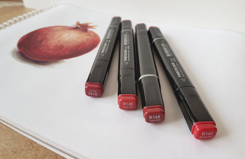
Letters indicate the color family. For example, B is for Blue, V is for Violet, and BV is Blue-Violet. You can easily continue the row by guessing other examples…
- R – Red
- Y – Yellow
- G – Green
- RV – Red-Violet
- YR – Yellow-Red
- YG – Yellow-Green
- BG – Blue-Green
Letter E may cause confusion, but the answer is quite simple. E is for the Earth tones.
Many brands provide a naming system that is logically sound. In this case, you can see the connection between the increasing or decreasing numbers and changes in the color’s saturation and brightness. In other cases, the given numbers seem rather random, so you have to rely on the swatches.
Always make color samples of your markers. The color that you see on the marker’s body or cap is usually not the same as the color of the mark that it makes.
Color charts make it easier to see what colors you have and will help you make the correct decision on what color to use in your drawings.
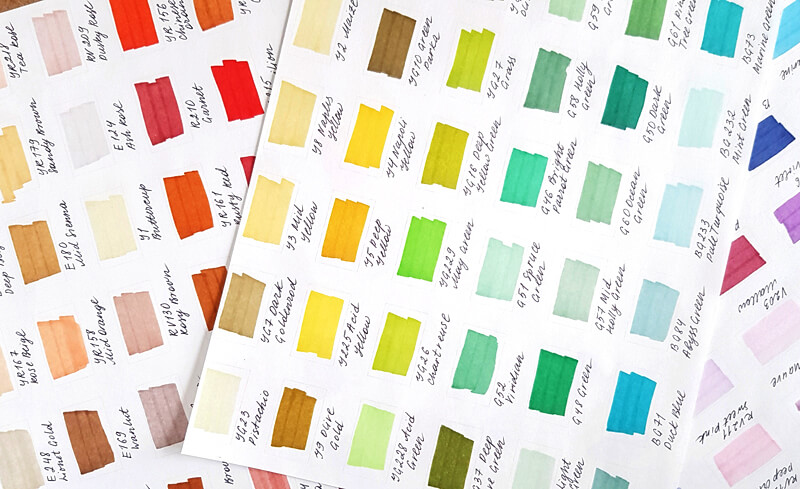
The choice of colors depends on the primary theme of your art. For example, botanical sketching requires an extended set of greens with the addition of reds, yellows, blues, and browns.
Take a moment to analyze your goals and favorite themes. You’ll get a basic understanding of what colors you use more often. This is a good place to start.
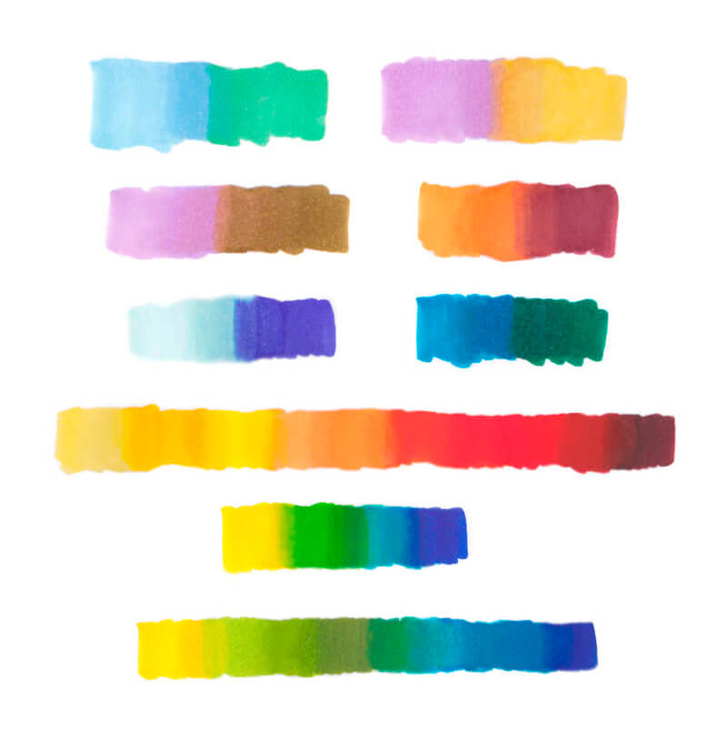
As mentioned above, the possibilities of mixing new colors with alcohol-based markers are limited. Therefore, it’s best to gather your set based on the following principle: get a lighter and a darker variant for every color that you plan to use.
These lighter and darker colors may be slightly warmer or cooler than the middle value.
The image below illustrates this principle.
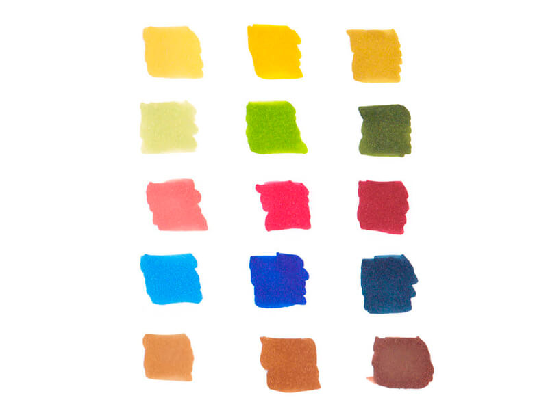
I didn’t add the indications of colors because those numbers mean something mainly within a specific brand’s naming system. You may be using any markers in the world, so only the actual colors matter.
Depending on your favorite themes, it may be that you don’t need three different reds or yellows (but need a couple of violets and a turquoise marker instead).
A set of grays is a must-have for any collection of alcohol-based markers. I recommend having at least three gray markers.
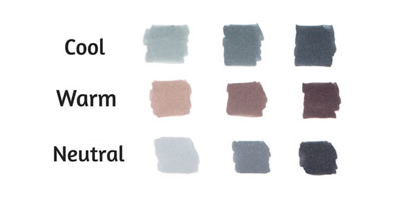
Each gray shade has its designated place in the color chart system. Take a closer look at the caps or body of your gray marker. You’ll find a letter – it indicates the hue. For example:
W – Warm Gray
C – Cool Gray
N – Neutral Gray
Cool Gray has a hint of blue; Warm Gray has some brown in it. Neutral Grey, which can be found in some brands, is neutral, as its name suggests.
See also: Warm vs. Cool Grays
Also, some manufacturers offer us another family of grays called “Toner Gray”. Usually, it is halfway between neutral and warm.
Compare the swatches in the image below to see the difference.
By the way, many manufacturers of markers use another spelling – “Grey”. I use the American English version throughout this post, but don’t be puzzled by this seeming difference.
After the letters comes a number. Usually, the higher the number, the darker the shade is. The image below illustrates this.
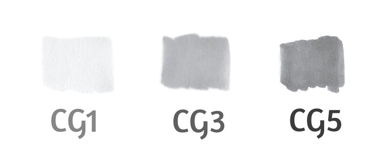
It is recommended to pick gray markers, skipping every other number in the row. For example, your set may include Cool Gray 1, Cool Gray 3, and Cool Gray 5.
The Tips of Alcohol-Based Markers
A marker usually has two tips, one at each side of the body. Here are some common types:
- Fine nib is pointed (it is the upper one in the image below.) It is best for drawing thin lines of approximately equal width and working with details.
- Brush nib is a soft and flexible tip that allows creating varied, organic lines.
- Chisel nib is relatively big and broad, so it can quickly cover large areas. However, it is still able to make thin marks with its edge.
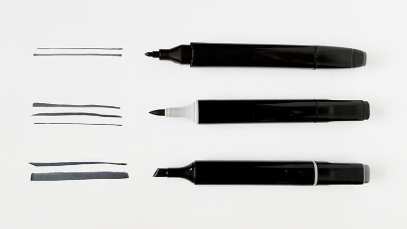
Again, it’s up to you to decide which combination will serve your goals best. In my experience, Brush tips perform blending substantially easier and quicker than Chisels. They allow for so many varieties of marks! So it’s worth giving Brush tips a try.
Basic Mark Making with Markers
In this part of the tutorial, we’ll explore several techniques that will enhance your skillset. They are simple yet effective.
First of all, the paper that you use matters.
I recommend working on a special paper that is designed for markers. It is smooth, allowing the tips of your markers to last longer. With that paper, you won’t run out of your markers too quickly. This paper doesn’t prevents the marker dye inks to soak into the paper fibers. Some papers have a coating that prevents inks from bleeding through.
It’s also easier to achieve smooth blending on special marker paper, which is very important.
See also: All About Drawing Papers and Surfaces
Quickly or Slowly – The Speed at Which You Make Your Mark
Look at the two samples below. They were made with the same Cool Gray 3 marker.

We can easily see that the sample “a” isn’t uniform. It consists of some horizontal strokes which are clearly visible. This sample was created by a series of relatively slow hand motions, so the inks had time to dry (at least, partially).
In contrast, sample “b” is uniform and smooth. We can see hints of separate strokes only near the outer edges of the sample. It was drawn quickly, so the paper was still wet during the process.
Remember – marker applications dry very fast! If you need a smooth covering, apply inks in a swift and confident manner. And vice versa: if you don’t need any blending between two colors, let the first layer dry completely.
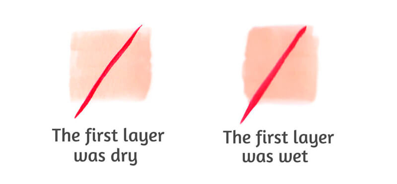
Layering with Markers
To put it simply, adding a new layer of the same color darkens the color. This value shift is subtle.
To achieve a smooth transition from a lighter to a darker value, we should make marks quickly, while the marker applications are wet.
Compare the two samples below.
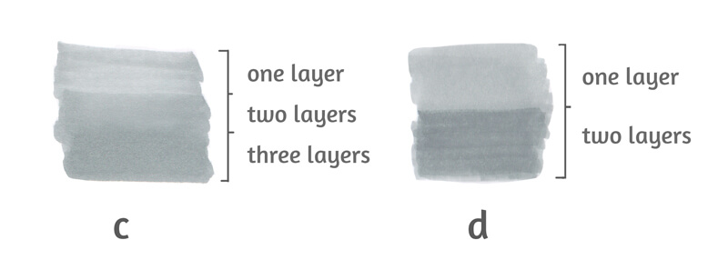
Sample “c” demonstrates a relatively smooth transition between layers. It’s fair to say that it was created using the “wet on wet” technique.
Sample “d” demonstrates a noticeable seam between lighter and darker shades. In this case, the second layer was applied after the first one had dried completely.
Both samples were created with one marker – Cool Gray 3. The difference in value was achieved only by layering.
Textural Marks
In some cases, we don’t need our marker applications to look smoothly blended. Sometimes, those visible strokes are our friends. They break the visual uniformity and create the illusion of texture.
In the image below, you’ll find some textural marks. They are spontaneous, even chaotic. Such marks can be created with swift hand motions.
While drawing, vary the angle and pressure on the marker. The wrist is active yet relaxed; the fingers may be involved if necessary.
Take a moment and consider all the possible ways to use these types of marks.
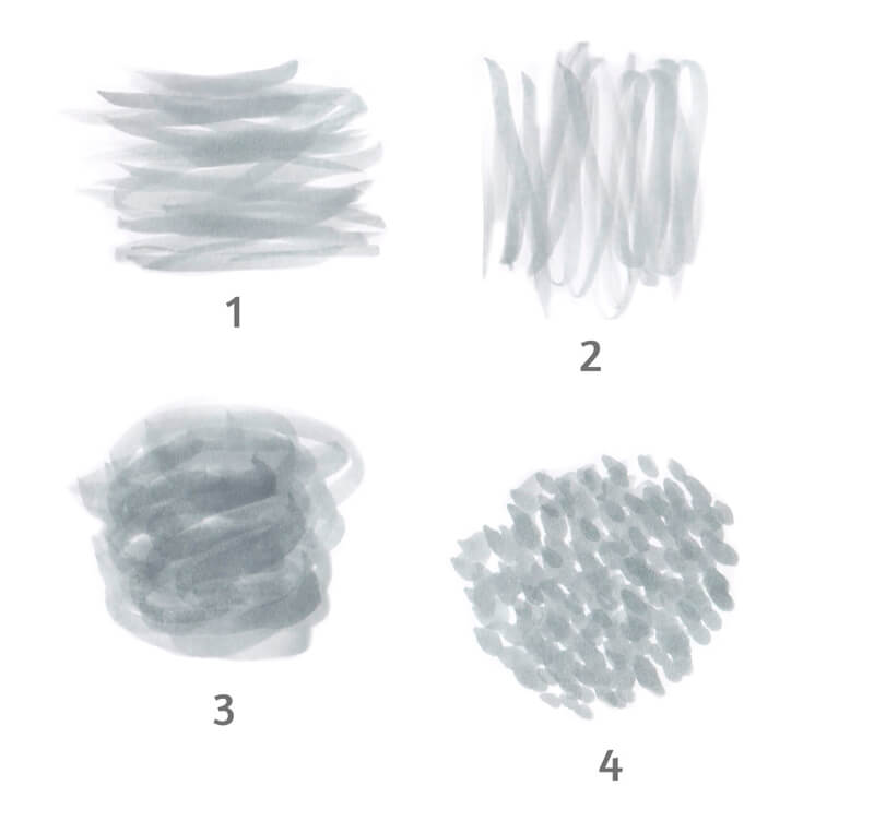
Samples “1” and “2” are perfect for wooden textures, while sample “3” is ideal for a variety of organic textures. Sample “4” looks like a tree’s crown from a distance.
How to Blend Markers
I hope that the amount of information that we’ve covered so far doesn’t overwhelm you. Blending markers is fairly straight-forward, we’ll be following just one sequence of actions.
- Start with the lighter color;
- Add the darker color (or any second color of your choice) with an overlapping layer;
- Add more strokes of the lighter color to the border between two colors, where the “seam” is visible.
Why is it recommended to keep this order? The lighter color is your guideline. With markers, you can’t go lighter once colors are in place. It’s very difficult to lighten the applications, so save the “airiness” in your works as long as possible.
Please note that the order of applications may change. There can be exceptions when it’s appropriate to apply the darker color first.
Creating Gradients with Markers
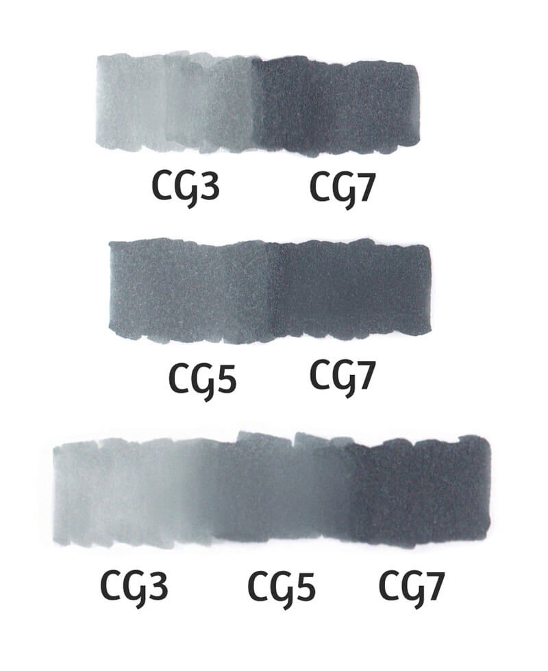
If your goal is a seamless blending of two colors, the best option will be picking two colors that are close in value.
Cool Gray 3 and Cool Gray 7 can’t form a smooth transition between shades, but Cool Gray 5 and Cool Gray 7 can.
I used CG5 as a middle link to make a smooth gradient between CG3 and CG7.
Blending Practice
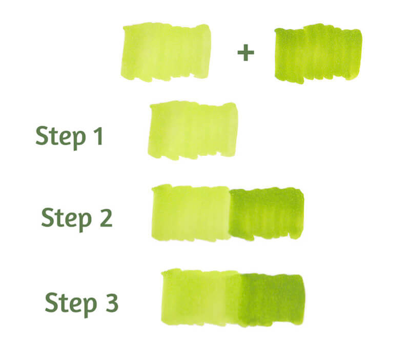
Let’s blend two green colors. To do this, I pick two colors that are relatively close in value, YG24 (left) and YG27 (right).
- I start with the lighter YG24;
- I add the darker YG27 with an overlapping layer;
- I add more strokes of the lighter YG24 to the visible “seam” area.
Does it mean that only colors of the same color family can be blended? Luckily, no. It’s possible to experiment with any of them! Some combinations blend in a nicer and smoother manner, but there are no limits.
Even contrasting colors can be blended to a certain extent.
Try different options – who knows, maybe you’ll find your next favorite color combination? In the process, pay attention to the value gap between the lighter and darker colors.
Making complex, challenging gradients may be a great exercise. Try to create a row of colors that consist of as many steps as possible.
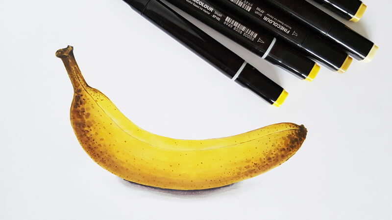
How to Draw a Banana with Markers
Let’s put to practice everything that we learned today. Our project will be quick and fun!
First, I prepare a set of markers that seem to be a good fit for the art. I refer to my pages of swatches. When in doubt, try the markers in a combination on a spare piece of paper.
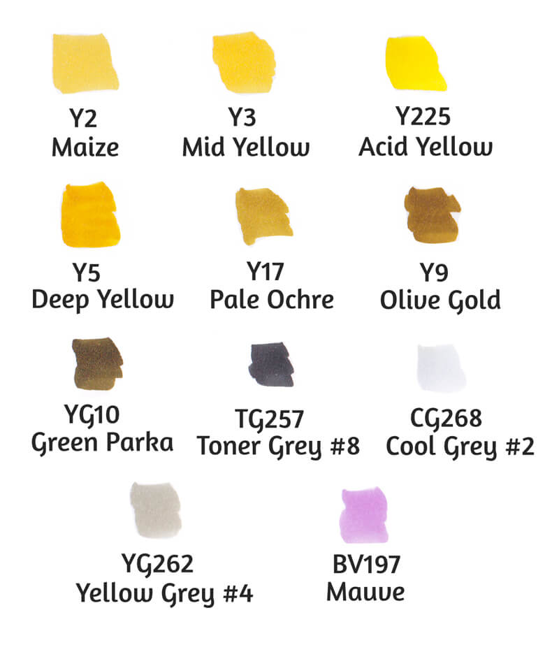
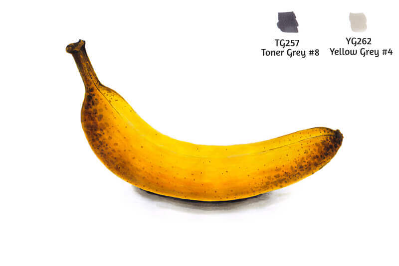
I’m going to draw a banana that has some brown spots on its peel. Therefore, I’ve chosen several variants of yellow and some browns. Also, we’ll need gray markers to change the tone and intensity.
I’m going to include a little bit of light violet, which is the opposite of yellow on the color wheel. This tint will make the sketch more realistic and interesting.
All markers are by Finecolour Brush.
As we already know, marker applications dry fast and that dictates the tempo of drawing. If you don’t have enough experience with alcohol-based markers, selecting colors on the fly may lead to frustration. Preparing the tools beforehand allows you to save time and mental energy.
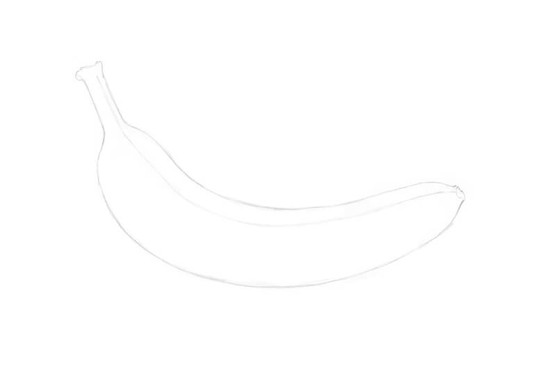
The Pencil Sketch
I’ve prepared a sheet of marker paper with the main contours of the banana. The object is sketched with an HB graphite pencil.
The lines should be light because excessive graphite may contaminate marker applications. Soften the contours with a kneaded eraser, if necessary.
Adding Color with Markers
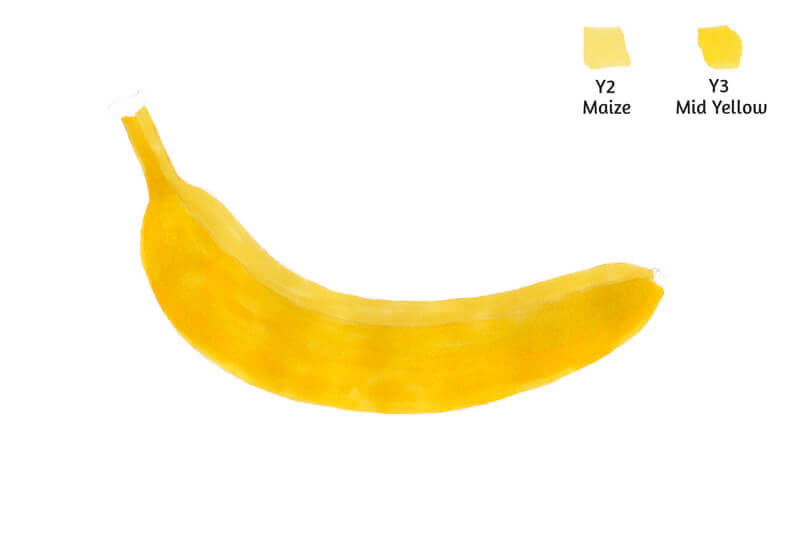
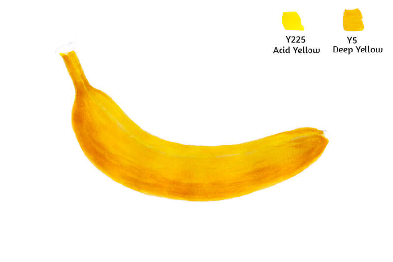
I start with lighter colors, Y2 Maize and Y3 Mid Yellow. The working tip for all of the steps that follow is a Brush.
I apply Y2 mostly to the upper part of the banana. It is assumed that this area gets more light from the environment. I cover the rest of the banana with Y3, which is more saturated.
Remember how to make seamless gradients? Apply the first color, then add the second one, and quickly blend the border between them with the first color. The same principle goes here – don’t let this new shape overwhelm you.
In this case, the lighter Y2 is our first color, and the darker Y3 is the second.
I’m holding both markers in my hands all the time. (When I’m drawing with Y2 in my right hand, Y3 stays ready in my left hand, and vice versa.) This allows for changing the tools as fast as possible, before the inks dry.
Now it’s time to add some yellows that are more vibrant. I add Y225 Acid Yellow mostly to the top of the banana. Y5 Deep Yellow is applied as its companion to the bottom part.
The border between both colors is blended with Y225.
If you still see separate strokes, it may be a sign that your art needs another layer of marker applications. Adding more inks of the lighter color is a way to create a smoother transition.
However, in this case, we can leave some visible strokes to accent the texture of the overripe peel.
With Y17 Pale Ochre, I work on the form of the banana, giving it more volume. I create some soft core shadows and mark the edges.
If we apply this color alone, it may create a harsh contrast with existing yellow layers. That’s why I blend Y17 with Y3 Mid Yellow. It will soften the brownish strokes.
Pay attention to the order of applications for this step! Sometimes we apply the darker color first, and then blend it with the lighter one. But this happens mostly after the base layers (formed with lighter colors) are already in place.

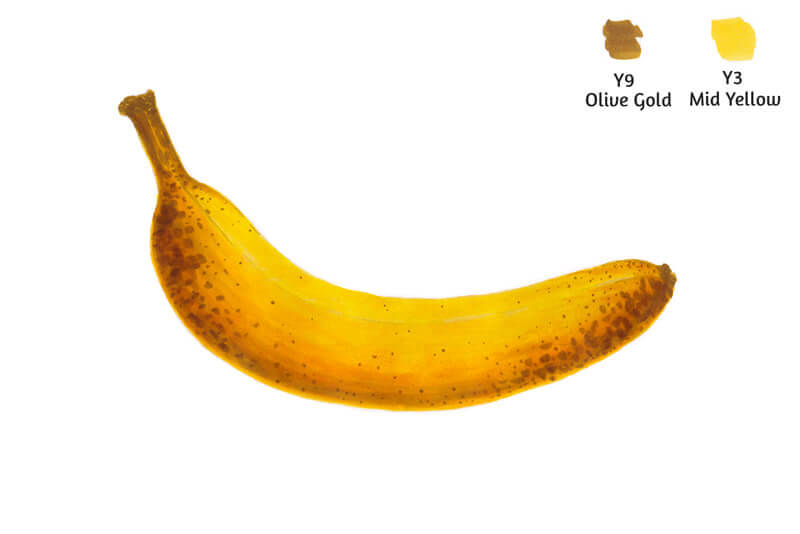
I add some spots on the banana peel, using Y9 Olive Gold. The Brush tip is great for creating such varied, spontaneous marks of various sizes.
I blend some of the spots with Y3 to make them softer and more blurry.
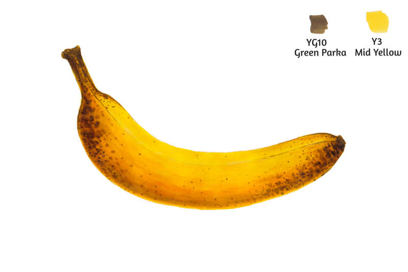
With YG10 Green Parka, I add darker spots. Y3 can be used again to blend them.
I use YG10 to outline the edge between the sides of the banana peel.
I use TG257 Toner Gray #8 to add a few more spots on the peel. (They are really dark!) I soften them with Y17 Pale Ochre. I also accent the stem.
If you don’t have any Toner Grays, it’s possible to use a marker from the Warm Gray or Neutral Gray family.
I used thin marker paper for this drawing (it’s 100 gsm), so this amount of inks makes it buckle a little. Luckily, we’ve completed the banana!

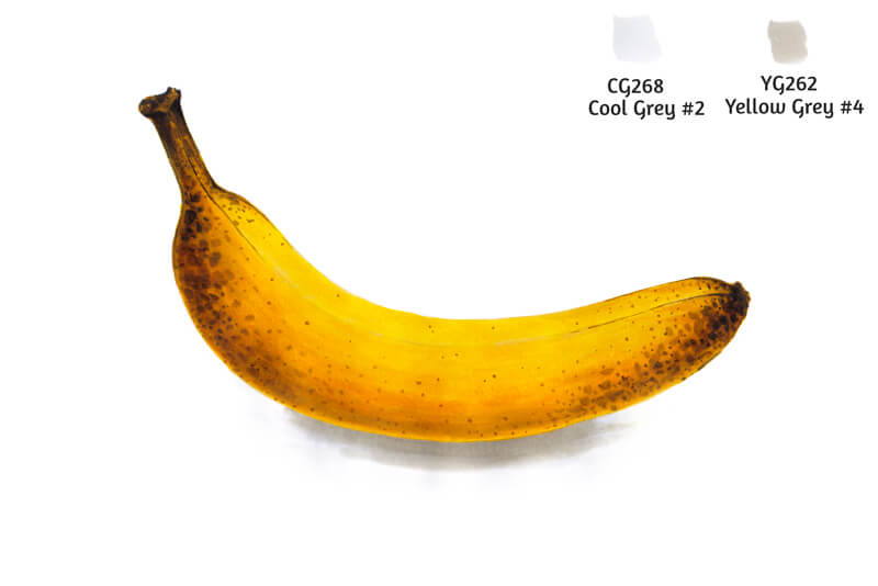
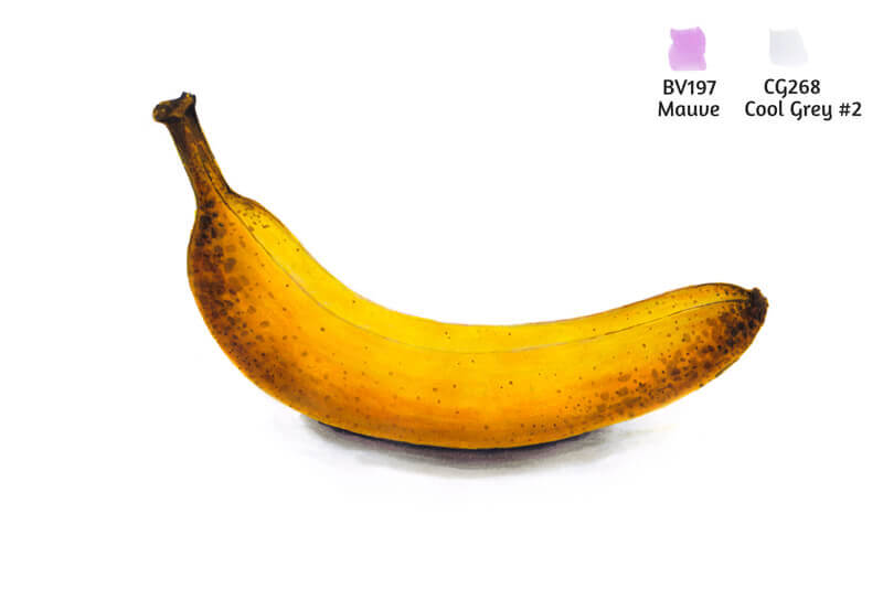
I add a cast shadow under the banana, using CG268 Cool Gray #2. This shade covers a relatively large area. Then I add some YG262 Yellow Gray #4 closer to the banana.
Then I blend the border between the two grays with the lighter marker.
With TG257 Toner Gray #8, I increase the contrast in the area where the banana touches its cast shadow.
I blend this shade with lots of YG262. There is a substantial gap in value between those grays. The surface of the paper should be wet with an alcohol solvent to make this gradient happen.
The sketch is almost complete. To make our banana more realistic, I add some BV197 Mauve to the lower part of the banana. I accent the core shadow and mute the area of reflected light. I also add this color to the cast shadow.
I use CG268 Cool Gray #2 to blend this color a bit more.
Light violet brings some depth and credibility to the sketch. Yellows look more vibrant due to this contrast.
Conclusion
Congratulations – we’ve come a long way from the very basics of using alcohol-based markers to a wonderful practical project! I hope that you enjoyed our journey.
Markers open up a big world of creative possibilities. I wish you much inspiration!
If so, join over 36,000 others that receive our newsletter with new drawing and painting lessons. Plus, check out three of our course videos and ebooks for free.
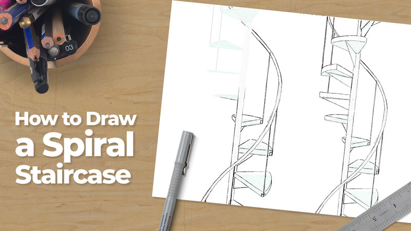
How To Draw A Spiral Staircase
Linear perspective can be used in different ways. For more the different forms of linear perspective, check out these lessons…
To draw most objects, one starts with either a flat rectangular plane or an actual rectilinear form, i.e., a box. Usually, at the scholastic level, most perspective projects reinforce the basic rules of linear perspective by using subject matter that remains box-like. Examples include city buildings, houses, interior spaces (rooms) and standard stair steps. Often, drawing stairs represents the height of complexity achieved in an introductory linear perspective project.
Of course, when using linear perspective, one can draw anything, even curvy things. Sometimes, while helping my students draw the aforementioned buildings and interior space, someone will invariably ask “How do I draw a spiral staircase?”. Such are the questions that art teachers love to hear. Nothing is more exciting that working through a drawing problem with an eager mind.
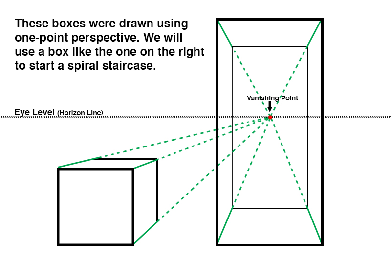
The following tutorial demonstrates how to draw a spiral staircase. As you might have guessed, we’ll start with a box.
Drawing a Spiral Staircase
Before we begin drawing the staircase, study the illustration below.
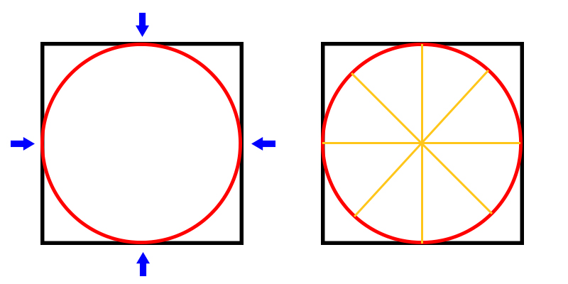
- If you can draw a square, then you can also draw a circle inside of that square by aiming a curved line at the center points of each of the squares sides.
- If you can divide a circle in half, then you can also continue dividing the circle until you have equal eighths.
The two bullet points above are fundamental to drawing a spiral staircase. Let’s begin.
Step One – Draw a Box
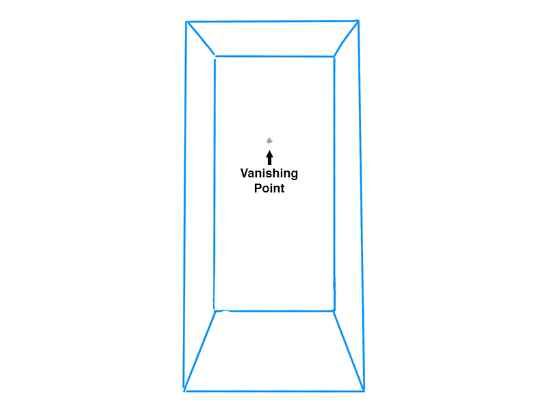
Note: The following drawing was created on a tablet using Procreate. One can use a pencil and paper to complete the tutorial just as well. Drawing on the tablet simply makes the tutorial easier to understand. I used different color lines for each steps. In your own drawing, you should draw very lightly since most of the first few steps will eventually be erased.

Draw a tall box using one point perspective (if you are unable to draw a box using one point perspective, then practice that first and return to this article). Here, the vanishing point is near the middle of the box.
Don’t worry about the proportions of your box too much if this is your first time drawing a spiral staircase. You can make adjustment to the proportions of your stairs in subsequent steps. In fact, I will change the proportions of my stairs later in the drawing.
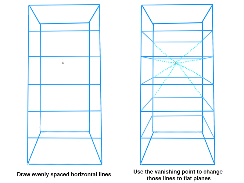
Step Two – Draw a Few Lines
Create a series of lines across the front of your box. The spacing of these lines determine the spacing between your steps, so be sure the distances between these lines are consistent.
Now, using the vanishing point, make a flat horizontal plane from each of the horizontal lines. Your drawing should look a bit like a book case.
These horizontal planes should feel as though they are squares and not rectangles. If necessary, adjust your original boxes proportions and refine the horizontal planes’ shapes.
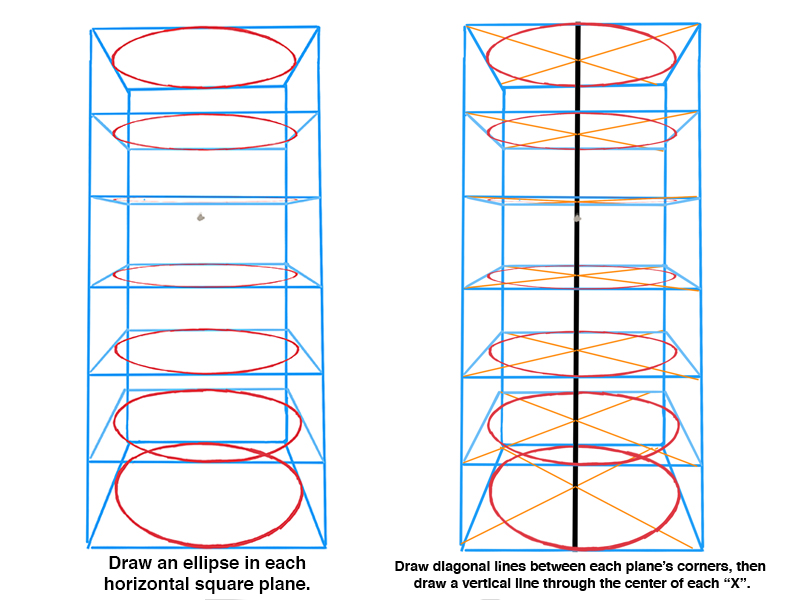
Step Three – Draw a Few Ellipses
Now draw an ellipse inside of each of these horizontal planes. An ellipse is simply a circle that is tilted in space. As mentioned before, aim at the middle of each horizontal plane’s four sides.
Need help drawing ellipses? How to Draw an Ellipse
Only a small segment of each of these ellipses will later become part of a step. You will have a chance to refine these curves edges later in the drawing.
Beginning at the corners, draw an “X” through each of the horizontal planes. Doing so pin-points the center of each plane. Now we can draw a long vertical line through these center points, creating an axis for our steps to rotate around.
Later, we’ll thicken this line so that it looks like a substantial support capable of bearing weight.
Step Four – Divide the Ellipses
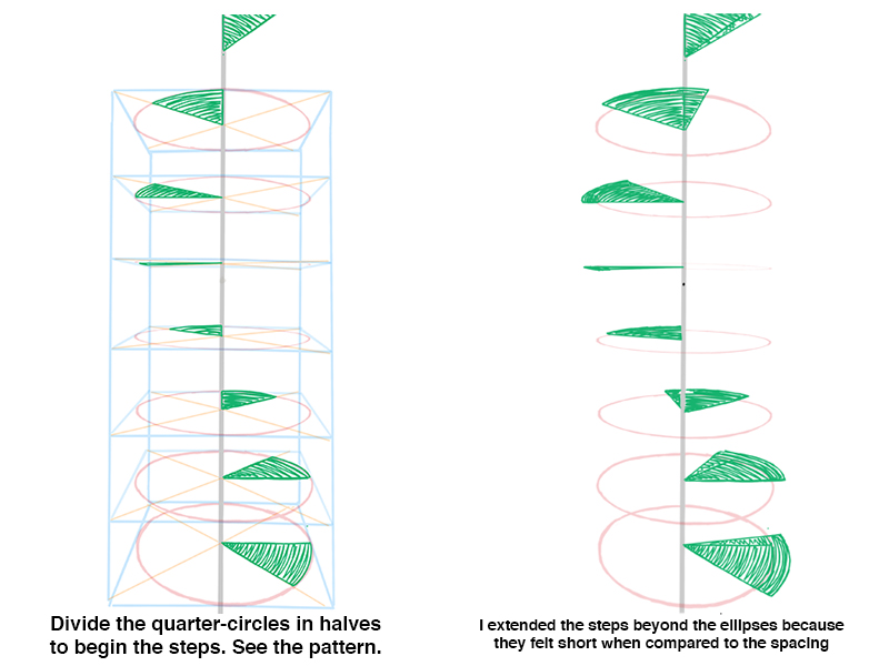
Divide one quarter of each ellipse in half. Shade in one of those halves. They should look like pizza slices.
Notice the pattern these triangular shapes follow as they rotate vertically around the axis of our staircase.
Let’s clean up our drawing some. Erase the original box now. It is no longer useful.
At this point in my own drawing, I felt as though the steps were too small when compared to the spacing between them, so I lengthened the two straight edges of each step and simply drew a new curved line for the end of each step, making sure that the new curved edge matched the degree of curvature of the original edge/ellipse.
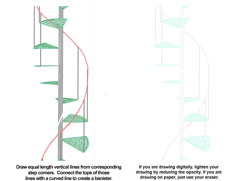
Step Five – Add a Banister
Every staircase needs a banister. On each stair step, draw a straight line upward. Place these lines on corresponding corners. Make sure these lines are equal in length.
Now connect the tips if these vertical lines with a smoothly curving line. The banister-line should mimic the turning of the stairs as long as the vertical lines are equal in length.
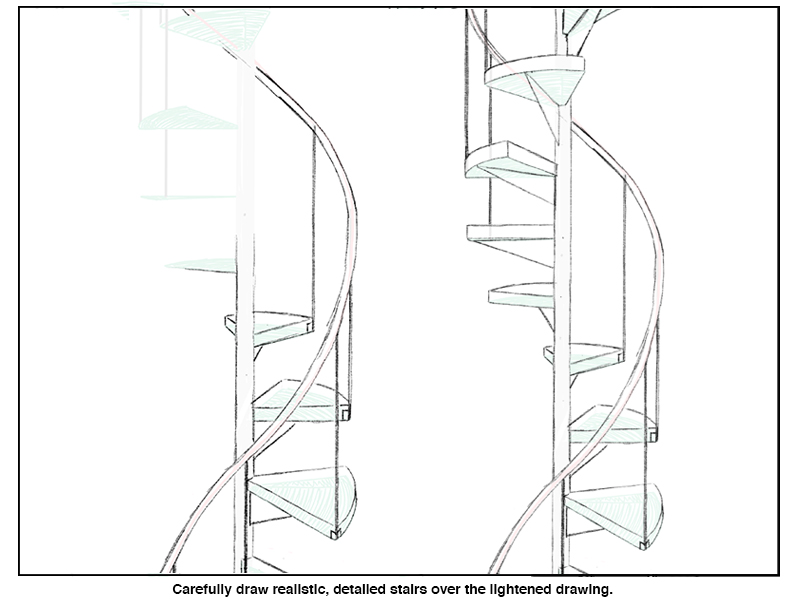
Step Six – Give Your Steps Some Form
The skeleton of our staircase is in place. The hard work is done. It’s time to give our stairs some bulk.
Widen the vertical axis to give it some width. Now it is a pole.
Also, change the flat, 2D steps into 3D forms by drawing short vertical lines upward from each corner and repeating the shape of each step at the top of those short lines (see the illustration below for clarification).
For believability’s sake, I added a support under each step by imagining a center point along the support pole between each pair of steps. From those center points, I drew a line towards the approximate center of each step’s curved edge.
Step Seven – Add Shading
When we use linear perspective, we’re using our imagination. To complete the stairs, whether they just are part of a larger composition of just a stand-alone exercise like my own drawing, we need to add value.
To create value, we will need a light source. Can you tell where the light is coming from on the completed staircase below?
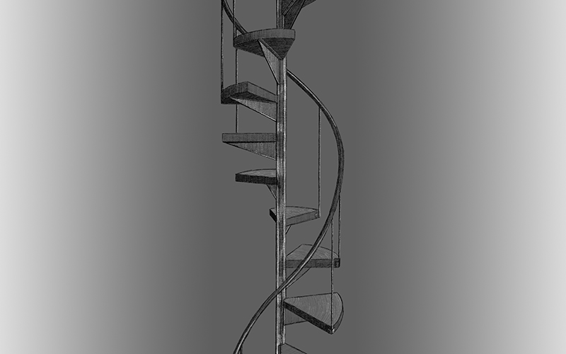
If you guessed that the light is from the top right, you are correct. Be sure to shade the steps according to a fixed light source instead of shading each stair exactly the same.
Unlike a standard staircase, each step in a spiral staircase is oriented in a different direction than those immediately above or below itself.
Congratulations. You have completed the spiral staircase tutorial. Remember, all round and curvy objects are drawable using linear perspective. Just start with a box.
If so, join over 36,000 others that receive our newsletter with new drawing and painting lessons. Plus, check out three of our course videos and ebooks for free.
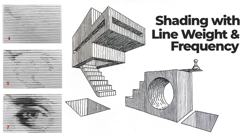
Shading with Line Weight vs. Line Frequency
Some art media are straight forward with regards to creating value. When working with graphite or charcoal, for instance, the artist uses pressure changes to adjust his/her values – light pressure creates light values while heavier pressure results in darker values. Therefore, shading with graphite and charcoal is intuitive.
However, not all drawing media is as straight forward as graphite and charcoal. A pen and ink drawing, for example, may use only black ink. Changing the pressure placed on the tool does not change the value. So how does one create a wide range with only black?
Fortunately, There are several well-established techniques used to create a range of value with ink. They are…
- Hatching
- Crosshatching
- Stippling
- Scribbling (or random lines)
See also: Pen and Ink Drawing Techniques
In this lesson, we’ll focus on only the first technique listed above – hatching. Hatching is perhaps the most difficult technique for developing values with black ink alone. So mastering the techniques of hatching will carry over to the other techniques you could use.
Hatching is shading with drawn lines, all traveling in the same general direction. These lines can be straight or curved. They can be close together or spaced apart from each other. When hatching, the artist has a couple of choices as to how he/she manipulates line to create a range of grays. These techniques are…
- Line frequency – the number/amount of repeating lines in a given space. Line frequency is sometimes referred to as line density.
- Line weight – the visual lightness or darkness of a single line. When using ink, line weight manifests through the thickness or thinness of the line. This is also sometimes referred to as line quality.
Both techniques rely on a visual phenomenon called optical mixing. Optical mixing occurs when colors appear to be a mix of two or more colors from a distance, but are actually two or more different colors. With hatching our “colors” are black and white. With a little distance, these colors appear to be mixed, creating the illusion of a gray.
Shading with Line Frequency
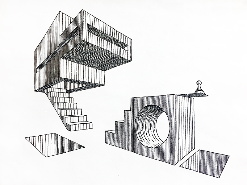
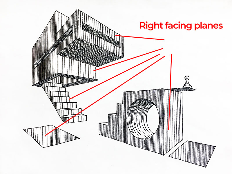
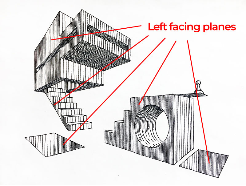
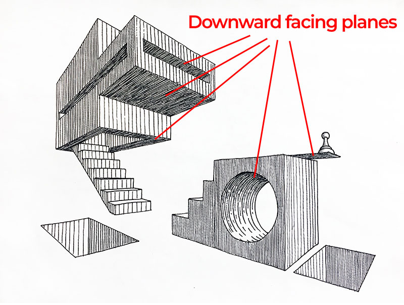
Look at the two point perspective image above. The forms in this image are made up of mostly flat planes that either face rightward, leftward, upward or downward.
Now look only at the planes that face to the right. Notice that the line frequency is the same for all planes that face this direction. In this case, the light is coming from the top-right, so these planes are lighter in value. Adequate space is left open between each of the hatching marks, allowing more of the paper to show through compared to the other planes.
The left facing planes are a medium value created by placing lines closer together. By placing the lines closer together, less of the white of the paper shows through, resulting in a darker tone.
The flat planes facing downward are in shadow. These planes are the darkest with the most densely packed hatching lines.
Planning a Drawing with Line Frequency in Mind
Using line frequency to develop values requires some planning. One must consider, before shading, how close together lines must be place in order to properly capture the desired contrast between planes. This is the case whether drawing simple, non-objective forms (as seen above) or complex, representational subject matter like cityscapes and portraits.
Hatching is not a forgiving technique. It is difficult to “correct” values once they are in place. Think about it. If the artist accidentally spaces his/her lines too far apart on a given plane, resulting in too light of a value, then the most intuitive solution would be to simply draw an extra line between each of those that were first put down. However, this solution would dramatically darken the value in question. That value now would now be twice as dark. So much for subtle adjustments.
See also: How to Correct Mistakes in a Pen and Ink Drawing
So, the question should never be, “How can I correct value created by hatching”. The better question is, “How can I avoid needing to correct my values in the first place”. The simple solution is to create a value scale and then assign values to individual planes before shading. Then, just follow the plan.
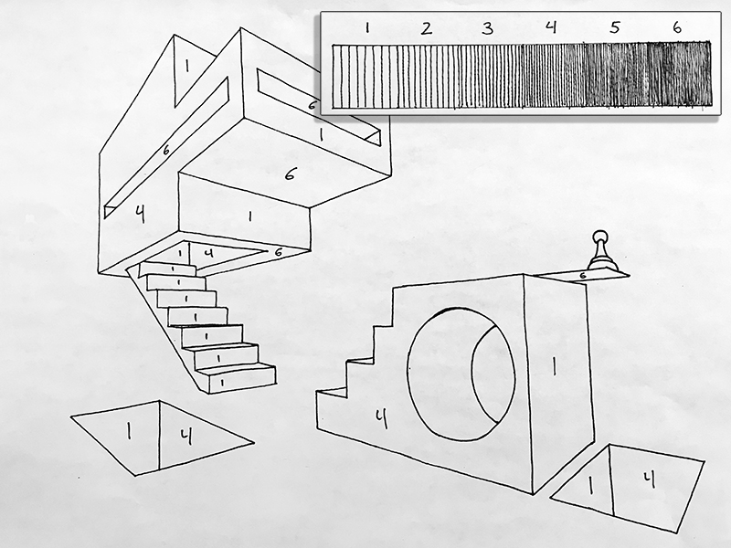
See how the value scale was used to plan where specific values belong. Assigning values to specific planes prior to shading prevents mistakes that might otherwise force an artist to start over.
Shading with Line Weight
Another approach to adjusting values with hatching includes varying the width of the line. The thickness or thinness of the line is called line weight and is sometimes referred to as “line quality”.
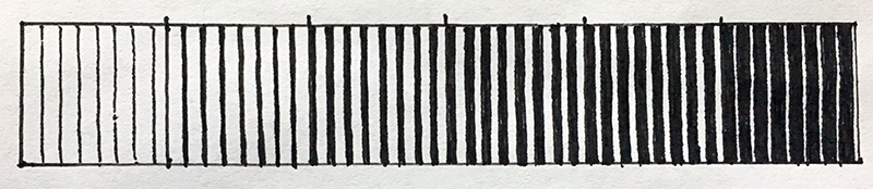
Take a look at the value scale above. See how the last block in the scale is an inversion of the first block. All of the squares that make up the value scale have the same number of lines per square. Therefore, each value has the same line frequency. The only change from block to block is the thickness and thinness of the lines.
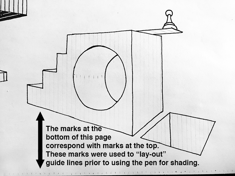
Once guidelines are in place, the artist should then use a values scale to assign appropriate values to specific planes. Inking each value one at a time is not a required part of the process but doing so does helps the artist to maintain consistency in the drawing.

Line Weight – The Next Level
Using line weight to render geometric forms is a great way to familiarize yourself with the concept. Taking the concept to the next level means applying it to organic forms – that is forms with irregular, natural contours. The process is the same as described above but with one clear distinction. Even a single line, itself, may have variable line weight. So planning ahead is even more important.
Look at the group of images below. The first image is, of course, a reference photograph. Image 2 is a light pencil drawing. The purpose of the initial drawing is to clearly define the shape of each distinct value that is observable from image 1. Four distinct values will be used to render the eye.

Both images 3 and 4 look just like the first steps used to start rendering the geometric forms from earlier in this lesson. See how, in the top left of image 4, the line segments inside of a single shape are slightly thickened. Those thicker segments represent the second lightest value in this drawing. All shapes that match that value should be thickened in the same way during this step.
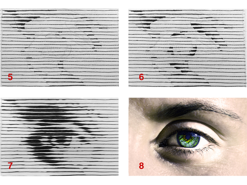
In image 5 (below), all shapes have the second to lightest value are complete and one shape in the top left has the third value in place. Notice that an attempt has been made to transition from one value to the next. In image 6, all values are in place except the darkest value.
Finally, image 7 shows the completed drawing of an eye rendered with only line weight. The drawing is small – possibly smaller than it may appear on a desktop or laptop computer. If you are viewing this image on a larger screen, then move farther back from the screen to see these lines work together to describe the undulating surface seen in and around an eye.
If so, join over 36,000 others that receive our newsletter with new drawing and painting lessons. Plus, check out three of our course videos and ebooks for free.
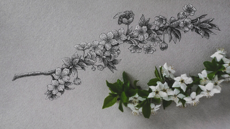
Drawing Flowers with Ink on Toned Paper
Let’s make the most of this wonderful time — it gives so many opportunities to observe, study, and hone our artistic skills. In this tutorial, I’ll show you my process of sketching cherry blossoms with ink on toned paper.
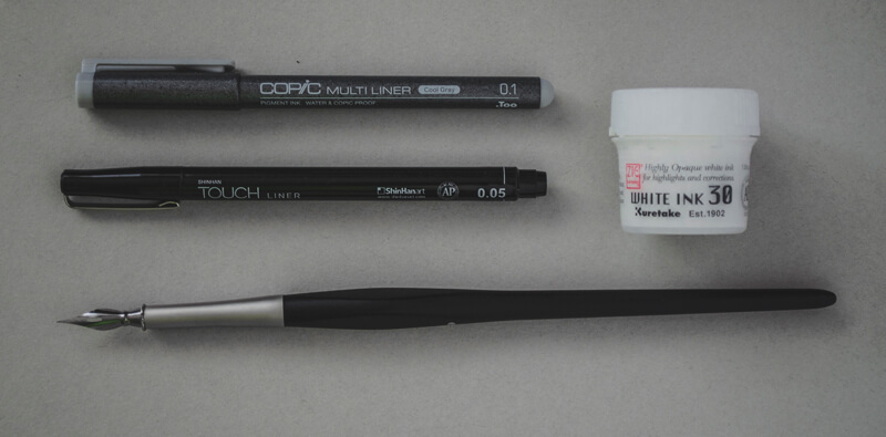
Supplies You’ll Need…
For this project, I’ll be using:
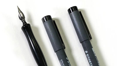
- A cool grey ink liner (0.1)
- A black ink liner (0.05)
- Liquid white ink
- A pointed nib pen for applying the white ink.
If you don’t have a grey liner, you can replace it with an ordinary HB or B graphite pencil. The pencil’s sharp point can create thin lines that imitate ink marks. Of course, the result will be slightly different, but still beautiful.
Likewise, it’s possible to replace white ink with a white gel pen. I prefer liquid ink because it allows for developing a dense, solid covering. If we combine it with a pointed nib used as an applicator, we’ll get sharp lines that are both crisp and thin. A gel pen’s lines will be wider, but sometimes this adds a more spontaneous feel to the sketch.
(The following links are affiliate links, which means we make a small commission if you purchase without additional cost to you.)
The underdrawing is created with a graphite pencil and an eraser.
Choosing a Toned Surface
When we consider drawing with ink, toned paper may not be first thing that comes to mind. However, for quick, expressive sketches, I recommend using toned paper. It creates a pre-made midtone base that saves time and effort, allowing us to complete the work faster.
Starting with a middle value for your “ground” allows us to push values outward from the center of the value scale. So instead of starting at one end, we begin in the center. This helps us to make evaluations regarding the value with more accuracy and helps us to create a drawing with wider variety of tone.
Many mixed media papers are suitable for this approach of working with black and white ink. These papers are thick enough to accept watery applications (if desired) without buckling and are also available in various tones.
(The following links are affiliate links, which means we make a small commission if you purchase without additional cost to you.)
See also: Six Reasons to Draw On Toned Paper
Find Your Flowery Inspiration
Unless you live in a place where no flowers are in bloom or if you’re allergic to pollen, I recommend that you go outside and take a close look at flowers. Do you see anything that sparks your creativity?
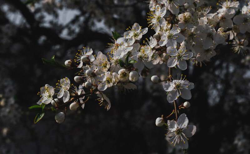
My inspiration was a twig covered with small white flowers. Cherry blossoms are a symbol that represents both the beauty and fragility of our life.
Of course, any type of flower (or even other objects) are suitable for this process. Floral motifs are a nice option because of their natural contrast and organic forms.
A tangible object provides more information than a photo. It’s possible to observe it from different angles, study in detail, rotate, or even smell this object. Drawing directly from a live object will improve your drawing skills faster than drawing from a photo.
See also: Is It OK to Draw and Paint From Photos?
After you’ve found your nature-inspired subject, pick a small fragment that is sufficient for drawing. Unsure of what type of flower you’ve chosen? There are apps that may help to determine the exact name of the flower based on a photo.
Observe and Sketch the Flowers with Graphite
Now the flowers are ready to be transformed into an artwork. Observe them carefully, find a position that you like and consider the composition.
While drawing, you can keep the flowers on the table, in a vase, or even hold them in your hand. While you observe the subject you may ask yourself a few questions…
- Can you simplify the object?
- Can you see the different values?
- Do you notice unique textures or shapes?
- What basic shapes are most prominent?
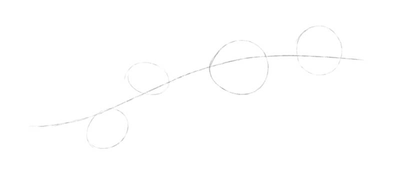
I create a quick graphite pencil sketch, based on a simplified framework of shapes. There are single flowers outside the clusters and groups of leaves as well.
At this stage, my goal is to position the elements as accurately as possible. However, their shapes remain rough and simplified.
I observe the physical cherry blossom twig as attentively as I can. Then I transfer some of the observations to the drawing. It is a constant back and forth process of observation and mark making.
It’s much easier to draw an object that is already familiar. A blank sheet of drawing paper may seem intimidating and puts additional pressure to get everything right on the first attempt. This is especially true if this paper has a pleasant texture and a pleasing or unusual color.
In this case, we’ll create a simple sketch of our subject with a graphite pencil on regular drawing paper or in a sketchbook. This preliminary step isn’t necessary, but it does help us become familiar with the subject.
Creating the Underdrawing
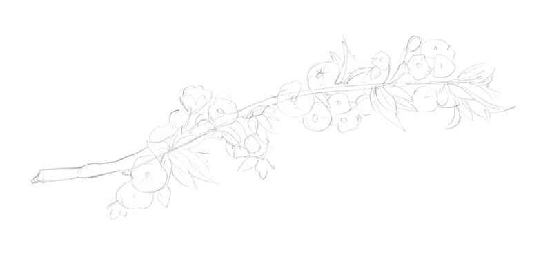
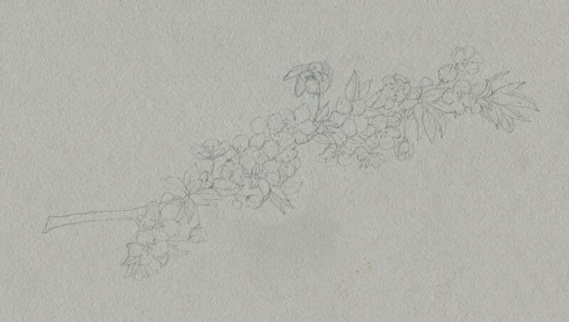
Now we’re ready to start our drawing on the toned surface. With a graphite pencil, I mark the contours of the cherry twig. It’s time to combine everything that I’ve learned about this object with fresh observations.
The outline of the twig and the main shapes of the flowers are drawn first. Once the basic shapes are in place, the details follow, resulting in a light contour line drawing. I pay attention to the direction of each shape of the flowers and the unique bending of the leaves.
Even though you may think there’s nothing more to see after creating a contour sketch, continue to observe the subject throughout the following steps.
It’s up to you how accurate to make your drawing. This drawing is a sketch where aesthetics are the goal, instead of a full-fledged botanical illustration. Feel free to exclude portions of excessive visual information and allow for some stylization.
To be honest, I felt that something is missing in this image. The flowers themselves are beautiful, but what if we add a hint of a story?
To make the drawing more interesting and to include a bit of story, I decide to include a small bee buzzing around the flowers.
See also: How to Draw a Bee with Pen and Ink
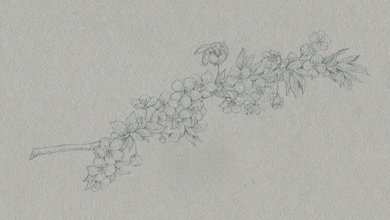
Drawing the Flowers with Ink and Liners
The color of our paper presents the middle of the value scale. The lines drawn with 0.1 grey liner are just a bit darker than the surface. This means that we can create a soft, subtle value transition in the midtones.
It is important to determine where the light comes from before starting the work. The light source will need to be defined by the positioning and strength of the values.
See also: Shading Basics
With fine lines, I mark the central areas of flowers, outline the contours of the twig, and give the flowers more volume by applying contour hatching. The petals are the lightest elements in the drawing, so I’m going to add fewer grey or black ink marks to them.
The leaves are darker — we can adjust the value and increase the contrast. I apply grey hatches to reveal the shadows here.
At this stage, our drawing has low contrast. Playing with values inside the midtone range allows us to develop the drawing gradually and push the contrast in values incrementally.
I start including darker lines made with 0.05 black liner.
I emphasize the contours, strengthen the shadows, and reveal the delicate textures of petals and leaves. Again, the flowers are the lightest elements in our sketch, so they should remain barely touched at this point.
For this step, I use both hatching and dots to create the desired effect of the petals’ soft texture. It’s important to be careful, work slowly, and not rush the process.
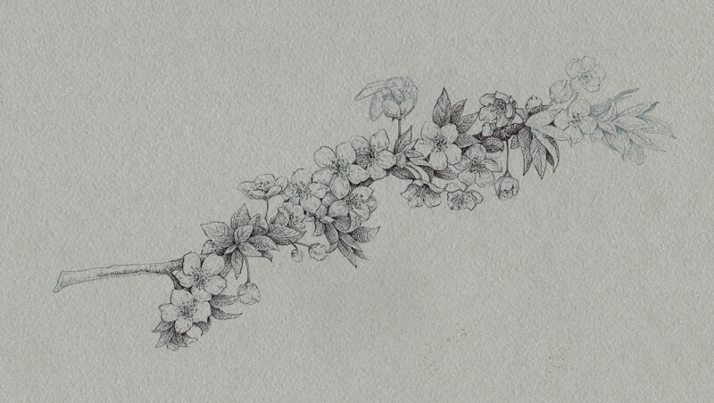
I continue working in the same manner, adding black marks to the sides of the twig (which were grey before now), and the core shadows.
I also increase the contrast on the bee by emphasizing the darker stripes on its body. The contours of the wings are marked with a minimum number of lines, keeping them light and transparent.
The sides of the twig (more precisely, the outer contours) still have lower contrast than the central part. This is done to attract the viewer’s attention to the most important elements, including the bee.
The sketch looks nice, but it lacks the lighter values and highlights.
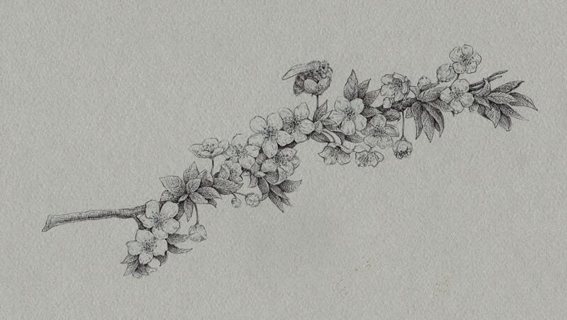
Adding Highlights with White Ink
I’ll mark the lightest areas with white ink, applied with a nib pen. The flowers will receive a heavier concentration of white marks in the drawing. White ink is applied to the tips of the flowers, accenting the soft folds.
I add some white ink to the upper part of the twig, to the leaves’ tips, and just a couple of thin lines to the wings of the bee. Keeping the relationships between the darks and lights in balance is important.
Sometimes, just a small dot of white is all you need. This is the case with the highlight in the eye of our bee.
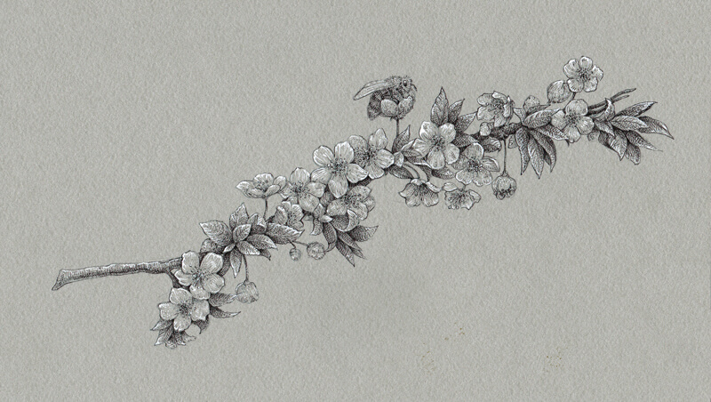
Finishing the Drawing of Cherry Blossoms
The sketch is almost complete, so let’s make a quick evaluation.
We can add more ink marks here and there if necessary. It’s up to you to decide which tool to use. You can include more grey, black, or white lines (or dots) to balance the values. The more midtones you include, the more subtle the light source will appear. Omitting midtones will result in higher contrast, which will make the light source appear stronger.
I decided to add just a bit more of black and grey to strengthen the shadows and create more variation in the midtones. The change is subtle, but it makes a difference.
Conclusion
Congratulations — we’ve completed our quick sketch! I hope you enjoyed working with inks of different values and toned paper.
Any season is full of inspiration and countless beautiful objects are waiting for you to draw. Let yourself be curious and draw everything and anything you like! Consider working on toned paper – even with ink. It speeds up the process and allows you to create a broad range of value.
If so, join over 36,000 others that receive our newsletter with new drawing and painting lessons. Plus, check out three of our course videos and ebooks for free.
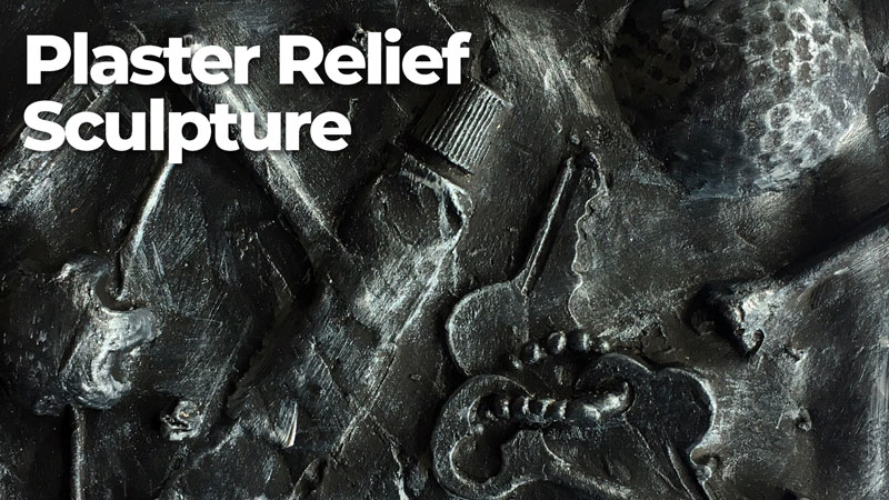
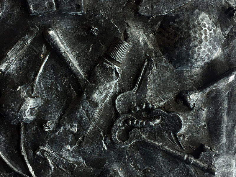
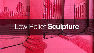
Plaster Relief Sculpture
Perhaps you’re an artist looking for a new way to express yourself. Or maybe you’re an art teacher looking for a project that practically guarantees success across multiple grade levels. A plaster relief sculpture is an excellent way to express yourself and a wonderful project for art students.
Drawing inspiration from found object sculptures made popular by artists such as Pablo Picasso and Marcel Duchamp, this process is both an introduction to relief sculpture and mold-making.
The process is very simple. Here’s a quick overview of the steps involved…
- The artist chooses several small objects as inspiration. (These objects need to be strong enough to be pressed into clay.)
- The objects are then pressed into a layer of earthenware clay to create a mold.
- Plaster is poured into the mold to create a cast.
- The clay is removed once the plaster hardens.
- The resulting plaster cast is painted, hung, and displayed flat on a wall.
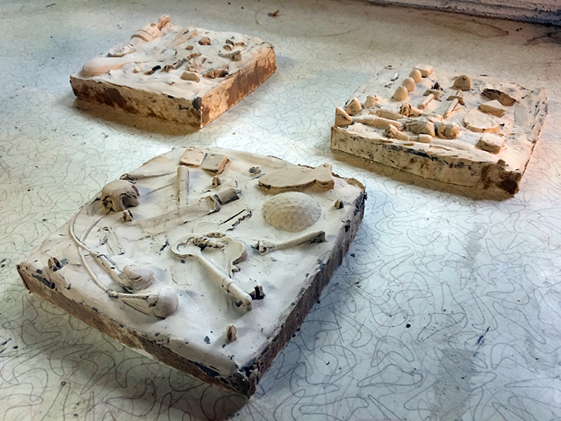
Here’s a look at the plaster relief sculpture that we’ll create in this tutorial…
Vocabulary
Before we go into the steps of this process in detail, let’s take a look at a few important terms…
Relief Sculpture – A type of sculpture in which forms project from a flat surface. This type of sculpture is usually viewed from the front, like a painting.
Mold – A hollow cavity that can be used to produce a cast. Molds are usually created by the impression of an object. Fluid mediums that harden can be poured into the mold. (molten metal, plaster, rubber, etc.).
Cast – The resulting form created by the use of a mold.
Found Object – a natural or man-made object that is found by an artist and kept because of some intrinsic interest the artist sees in it.
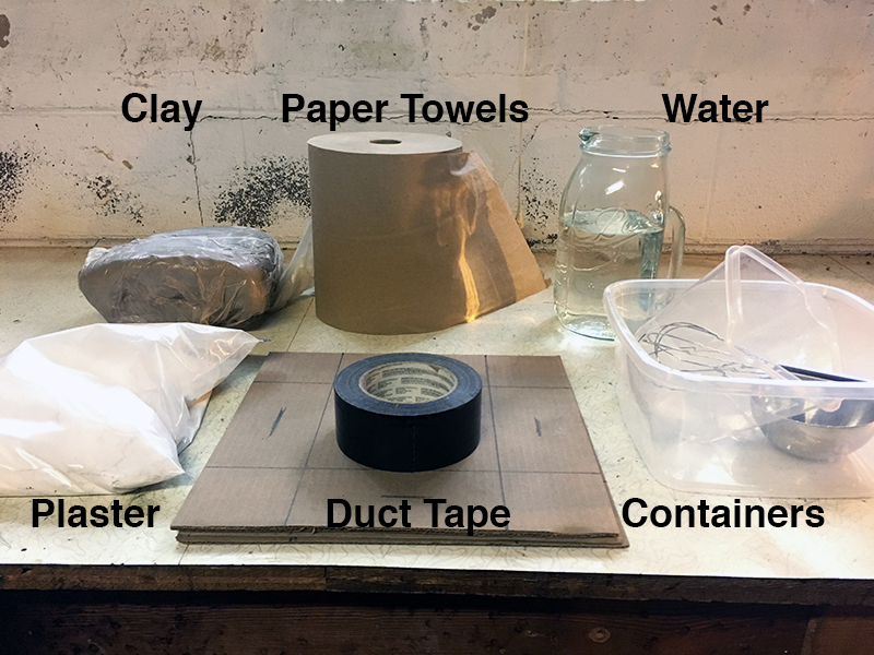
Materials Used to Create a Plaster Relief Sculpture
Next, let’s have a look at the suggested materials that you’ll need to create your own plaster relief sculpture…
- Cardboard or Foam Core (12″x12″, or another size)
- Clay (earthenware)
- Plaster of Paris
- Plastic container in which to mix plaster
- Water
- Scissors or a Hobby Knife
- Tape
- Found Objects
- Straw (optional)
- Black and metallic paint (optional)
- Rasp/file (optional)
Planning a Relief Sculpture with Plaster
As is the case with any work of art you create, planning is important. There are two important aspects to consider during the planning process.
The first thing to consider is a possible theme. The artist could explore a thematic concept by choosing related objects. Examples include self-identity, world hunger, family, immigration, etc. In this way, the objects tell the story.
Secondly, the artist may consider a principle of art to incorporate in their design. For example, the artist could demonstrate unity by choosing similarly shaped objects. The artist could demonstrate rhythm by repeating an object across the relief. Or, the artist could demonstrate emphasis by having one object in higher relief that the others.
It’s always a good idea to have a vision of your finished product in mind before you begin. Your sculpture will likely evolve as you create it, so allow yourself some creative freedom.
Creating a Plaster Relief Sculpture Step by Step
Now, we’ll take a closer look at each of the steps involved. There is a little prep work, so we’ll start here.
Step 1 – Create a Box to Hold the Mold
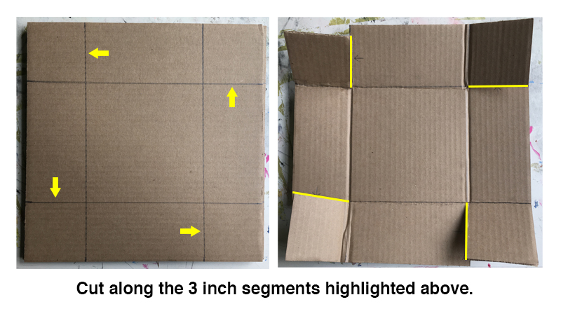
Determine the finished dimensions and cut cardboard to make a box. This box will hold the mold and the cast. The box will need 3″ tall sides at the very least. The example sculpture illustrated here is 6″ by 6″ each. The cardboard dimensions were, before folding into a box, 12″ by 12″. So, add 6″ to the desired finished dimensions. If a sculpture is meant to be 8″ by 10″, then a sheet of cardboard cut to 14″ by 16″ would suffice.
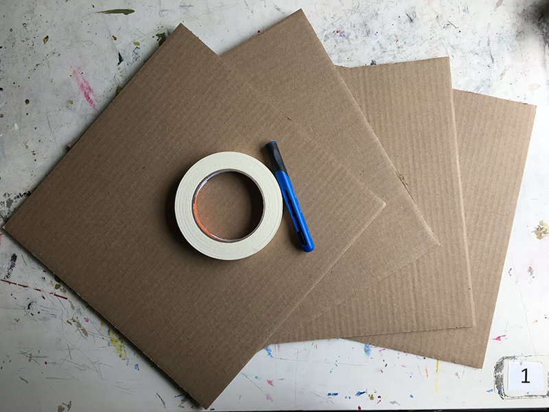
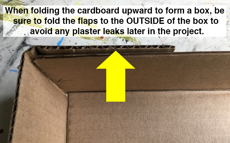
Once the cardboard has been cut to the correct size, we can build the box. Draw a line 3″ in from each side of the cardboard. Look at where the lines cross near the corners. Cut one 3″ segment near each of the four corners. Now bend or crease the cardboard along the drawn lines. Fold the sides upward and wrap the cut portions around the outside of each corner. Tape the flaps down well. It’s a good idea to wrap the tape around the entire outside of the box for added stability.
Step 2 – Add a Layer of Clay for the Mold
Pack the bottom half of the box with regular earthenware clay. Check that the clay fills the bottom 1.5″ of the 3″ deep box. Smooth and even the surface of the clay with clay tools or just use your fingers.
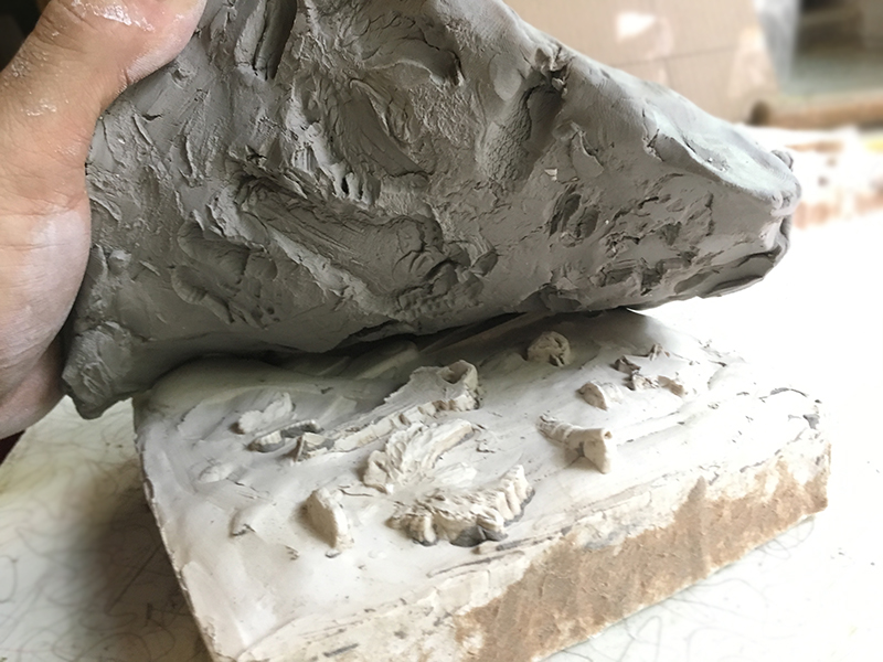
Step 3 – Press Found Objects into the Clay to Create a Mold
Now it’s time to press objects into the clay. Before doing so, decide if the artwork will hang on a wall or rest in a display stand. If the finished work will hang, then press a straw into the clay square about .5″ from one edge (see below). Be sure that the straw is taller than the top edge of the box. Once the cast is made, the straw can be removed, leaving a hole through the sculpture for hanging.
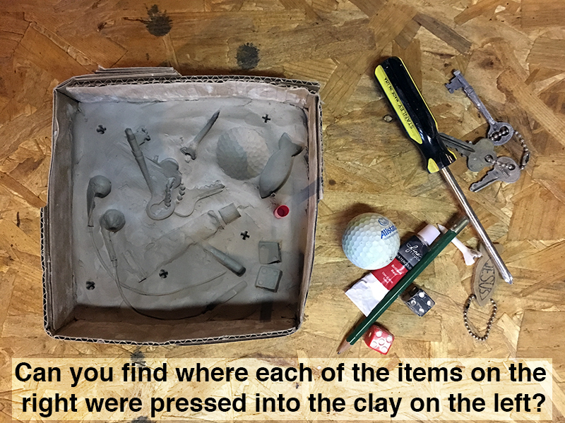
Now begin pressing objects into the clay. Consider the angle and depth of the impressions. Strive for variety – deep/shallow, complete/partial, level/tilted, etc.
Consider the negative space. Do you want emptiness between the objects or would you rather overlap objects to create a dense mesh of imagery?
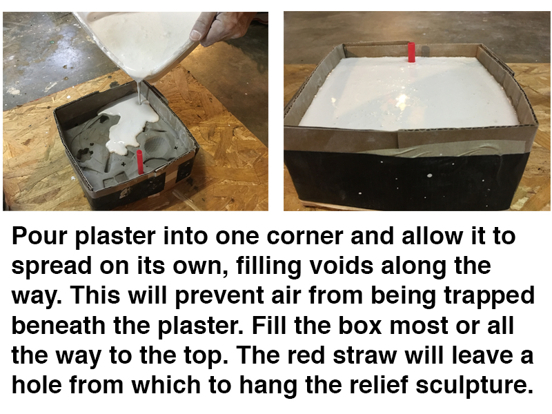
Step 4 – Pour Plaster in the Mold
Satisfied with the clay mold? Then it is time to mix the plaster.
Mix 2 parts plaster to 1 part water. Do so by first pouring water into a mixing container, then add the plaster. Adding plaster to water will result in less clumps. There will still be clumps, so get your hands in there and squeeze the clumps away. Don’t mix too long. The plaster will begin to thicken and must be poured into the box before it becomes a thick paste.
Starting in a corner, pour the plaster into the mold, allowing it to find its own level. By doing so, you will avoid creating any air pockets.
Fill most or all of the remaining 1.5 inches of the box with plaster. Let the plaster sit until the next day. The plaster will solidify in a short period of time but will harden completely over the course of about a week. Waiting a full day to remove the cast from the mold will ensure that the plaster is hard enough to retain the small details while removing the clay.
Step 5 – Remove the Cardboard and Clay
After a day has passed, simply remove the tape from the box and fold down the sides. Turn the block of clay and plaster on its side and peel away the clay. It easily separates from the plaster.
Step 6 – Finish the Sculpture with Paint or Leave a Natural Surface
The form is finished but the surface is not. Scrape away any cardboard that might have remained on the sides of the plaster cast. Use a tooth pick or other small, pointed tool to pick away any remaining clay if you would like to leave the sculpture in its “natural white”.
Finishing Options
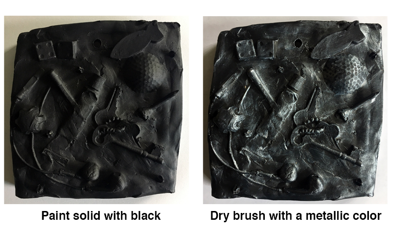
There are a few options for finishing the surface of the relief sculpture. You could leave the sculpture in its natural finish, but adding a little color will make the sculpture appear a bit more “polished” and add additional interest.
One option for finishing with paint is to create a metallic look with a two-step painting treatment. This is accomplished by first painting the entire sculpture with a thin coat of black paint. You can use tempera, poster, or acrylic paint. Acrylic paint is recommended since it is more permanent and water-resistant.
Once the first coat is dry, you can dry brush over the raised elements with a metallic color (silver, bronze, copper, etc.). By using a dry brush technique with metallic paint, the black layer will remain visible in the recesses, creating a pleasing, high contrast surface treatment.
Dry brush refers to the process of applying paint with a nearly dry brush. Paint is loaded on the brush, then wiped on a paper towel or cloth, removing most of the paint from the bristles. A small amount of paint still remains in the bristles. The brush is gently passed over the raised surface with a brisk motion. The raised surface catches the paint, accentuating the texture.
Once the surface of the sculpture has been treated, the artwork is complete and ready to hang or display. The possibilities are limitless with this form of relief sculpture, so have some fun and allow your creativity to go wild!
If so, join over 36,000 others that receive our newsletter with new drawing and painting lessons. Plus, check out three of our course videos and ebooks for free.
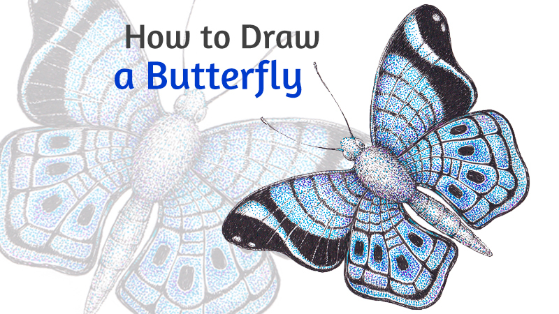
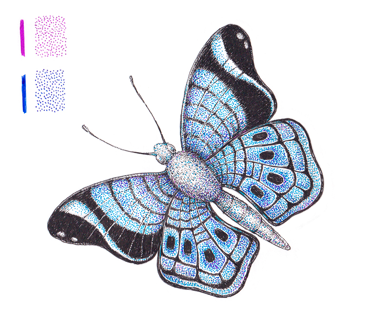
How to Draw a Butterfly with Black Lines and Colorful Stippling
Did you know that butterflies can be found everywhere in the world except Antarctica? I think this fact is just mind-blowing. Actually, these insects have some surprising features and abilities. Let’s learn more about them while drawing!
I’ll show you my process of creating a stylized artwork. By the way, this butterfly drawing can be used as a wonderful decoration for a greeting card. What do you think?
I’ll be using an ordinary an graphite pencil and a couple of black ink liners (mine have the numbers 0.1 and 0.2). A nib pen instead of liners is a nice option, too.
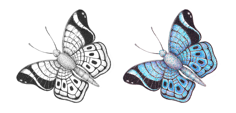
To be honest, I intended to keep this project within the traditional black and white style that presents a visual image in such an elegant manner. However, I found myself thinking about including some color in the middle of the process. That’s why you’ll see two versions of this butterfly drawing at the end of the post. It’s up to you to decide which one is closer to your personal preference!
If you like working with color and enjoy vividness in your art, arm yourself with some colorful tools like gel or ink pens. Anything of that kind will work, and the colors are up to you. My choice was bright blue, dark blue and violet.
Drawing a Butterfly with a Graphite Pencil
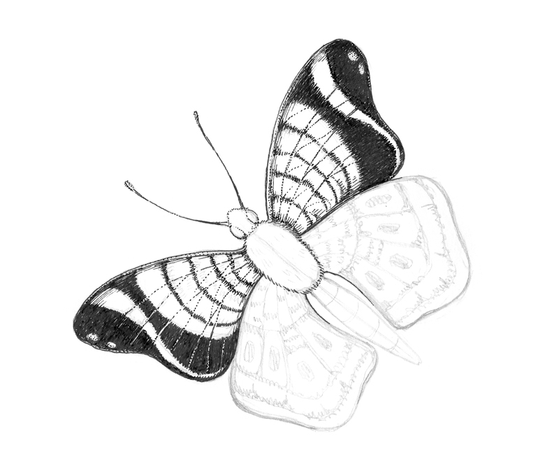
As usual, we’ll start with an underdrawing. This will make the inking process much easier and allows us to work with confidence. Feel free to take a moment and imagine the butterfly that you are going to draw. Think about its pose, pattern, and the composition. Don’t feel that you have to copy what I’m doing exactly. Use what you learn here and apply it to your own drawing.
If you’re going to depict a specific species, having a reference image is crucial. However, my goal is to draw rather a generic butterfly or a composite image.
The preparatory stage of the process can be creative. For example, you can sketch some miniature butterflies that have different wing shapes and patterns. Which one is your favorite?
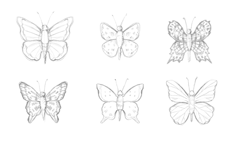
The figure of a butterfly, including the wings, can be divided into symmetrical halves. This symmetry is clearly visible if you observe a butterfly from above, when it is holding its wings flat.
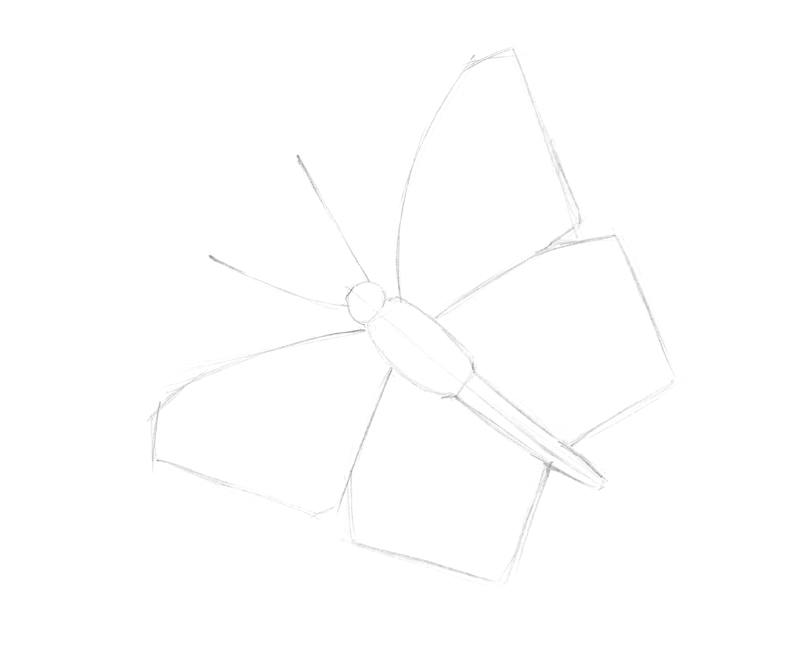
To ensure that we have this symmetry in our drawing, we’ll start with a lightly drawn center line. It will help to take measurements and check the symmetry. If you decide to go for a more complex position of your butterfly, you may still choose to draw a core line. Just note that this line may be drawn at a diagonal.
The butterfly’s body consists of a small head with antennae, a thorax, and an elongated abdomen. Butterflies have six legs but, in my case, we can’t see them because of the overlapping wings. By the way, butterflies taste with their feet – or, more precisely, with special receptors that are located there.
There are two fore wings (the upper ones) and the hind wings (the lower ones). Usually, butterflies hold their wings vertically above their bodies when they rest.
I roughly sketch all the listed body parts. This loose sketch doesn’t have to be perfect – we can refine it later. Actually, even symmetrical objects may have irregularities. A human face is an example of this. This is called approximate symmetry.
To make the drawing more interesting, I position the butterfly in a way so that one set of wings is directed towards the viewer.
I next refine the contours of the wings, making the lines smooth and organic.
The body parts need refinement and additional details too. There are two large compound eyes on the head. These eyes are capable of distinguishing flower shapes or motion. Color perception of a butterfly is exceptionally good, especially in the blue and violet range.
I next add some thickness to the antennae. Butterflies use them to test the air for wind and scents.
The thorax and abdomen usually have a number of segments, but I allow a touch of stylization here. My goal is a drawing of a simplified model of a butterfly, rather than an accurate representation of any real species.
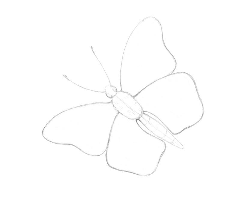
I add an improvised pattern of the wings, based on imagination and various patterns that I have seen on butterflies. This pattern should be more or less symmetrical, so the wings are mirroring each other. Of course, a complex pose may create minor distortions.
By the way, the colors and patterns we see on the wings are made by the reflection of the tiny, pigmented scales that are covering them.
With our pencil sketch complete, we’re ready to add ink to our drawing.
Drawing a Butterfly with Ink
As mentioned above, my goal is to create a stylized, decorative drawing. That’s why I’m going to simplify the drawing, filtering out the visual information that may be too excessive.
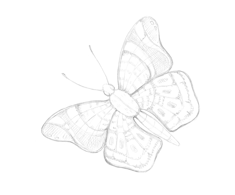
With a 0.2 ink liner, I outline the general contours of the upper part of our butterfly. The head and thorax have a “hairy” texture, so I draw their contours as a sequence of short hatches.
Moving the liner back and forth, I create the darker areas in the pattern of the wings. This application is quite dense. As you can see in the image below, these areas don’t have a solid, clear contour, which makes the pattern appear more natural.
Tiny gaps are left open between the ink marks. This creates the illusion of a texture that has a fleecy or velvety quality. I find this to be much more interesting than just a flat texture formed by an even, almost printed-like covering.
The veins on the wings are thin, so we have to be delicate with our applications. I use a dotted line to mark them.
Now it’s time to work on the hind wings and the abdomen.
Using the same approach, I outline the contours and darken some areas of the wings’ pattern. Both sets of wings, the upper and lower ones, should look like an congruent system.
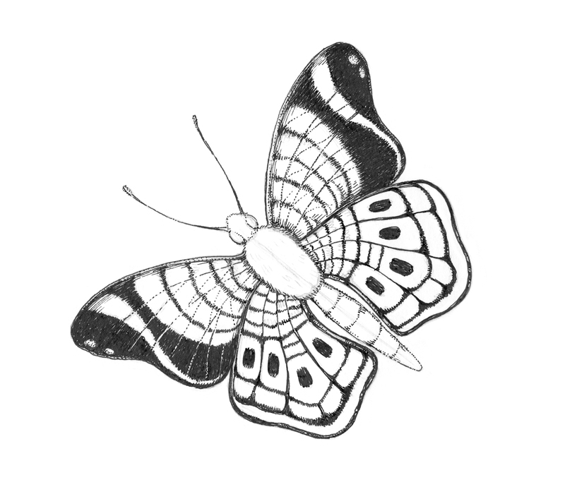
With a 0.1 liner, I add hatching to the wings. The goal is to make a visual connection between areas of strong contrast.
Also, I fill the body (the head, thorax, and abdomen) with short hatches and dots. The sides of the body become slightly darker to give the butterfly more volume. The head and abdomen of our insect have a rough texture, so the direction and length of hatches should reflect this.
It was at this stage that I got the idea to bring in some color. If I decided to complete this artwork with only black and white, I would add more fine hatching and dots to the wings, probably making them just a bit less flat and stylized.
However, as we turn to color, I put aside the black liners. When it comes to adding any type of color media to black ink art, balance is very important. This balance is achieved in a different way in artworks. But, leaving your drawing at a slightly unfinished state is much better than overdoing it right in the middle of the process. At least, this principle applies to traditional media in which you don’t have the “Undo” button.
So, are you excited to add some color? Let’s do it.
Adding Colorful Stippling to the Butterfly
With a bright blue pen, I add dots to the wings. Stippling is a great technique as it gives the artist control over the density of marks. The density of the marks gives us control over the value and intensity of the color.
For example, there is a wide curved shape in the fore wings’ pattern. I cover just one side of it with dots, creating a gradient from white to bright blue.
I also encircle the black spots found on the hind wings with a dense collection of dots to emphasize these areas.
Generally, I leave some gaps between the dots allowing the white paper to show through. This allows the drawing to “breathe”.
A moderate quantity of dots may be added to the body of our butterfly to create visual unity.
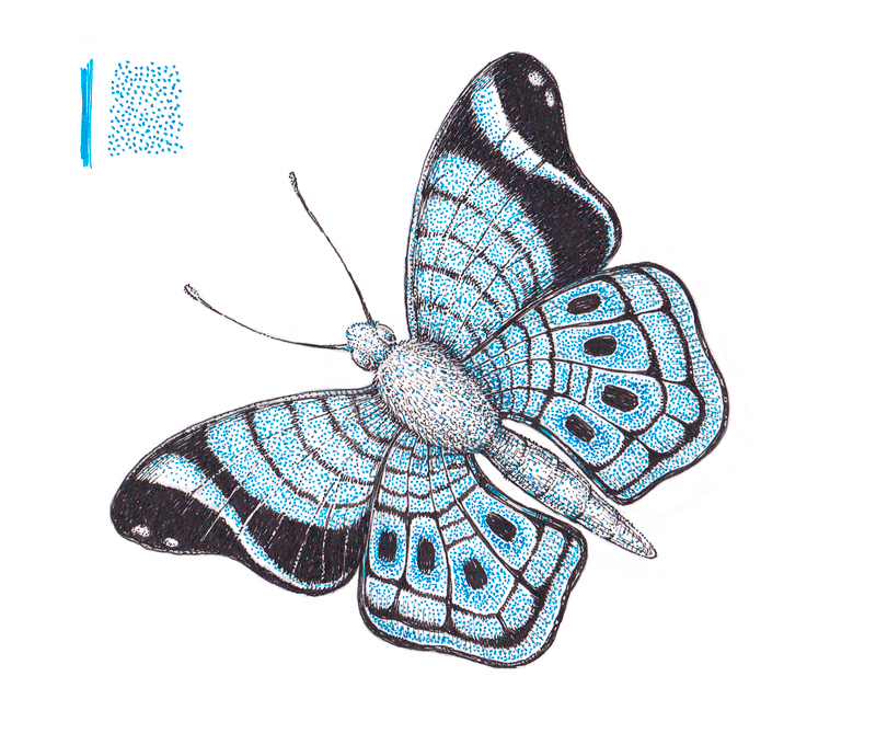
I add more dots with dark blue and violet. There aren’t any rules telling us the particular way or order of combining stippled marks of color. All the hues I picked are close to each other on the color wheel, so they harmonize with each other.
See also: Color Theory – The Elements of Art
I strengthen the inner edges of the wings (those closer to the body), alternating between dark blue and violet. The dark blue dots create an illusion of depth, replicating a soft shadow.
When it comes to the small segments of the wings’ pattern, I choose one side of each segment and insert new dots there. Again, the opposite wings should mirror this, so we’ll repeat this applications on the other side.
Colorful stippling may also be applied to the body parts of our butterfly if so desired.
The artwork is complete!
Conclusion
Thank you for being with me on this creative journey – I hope you had some fun in the process!
It is fair to say that we have two artworks as a result. Both of them have a stylized, decorative feel. However, there is a huge difference in perception, which depends on the presence or absence of color. I’d say, there is no “better option”. These artworks (or, more precisely, two stages of the same process) are just different. Some will prefer the black ink drawing, while others will prefer the colorful drawing.
Which variant do you prefer? Please let us know in the comments!
I wish you much inspiration and luck with your art projects and your pen and ink drawings!
If so, join over 36,000 others that receive our newsletter with new drawing and painting lessons. Plus, check out three of our course videos and ebooks for free.