- Less waste. Without a methodical approach to mixing neutral colors some mixture are sure to miss there mark. Unused colors are a wast of money, time and effort.
- Simplify the palette. Working with a smaller set of colors on the palette makes remixing colors simpler. It also imparts harmony among all the colors in a work of art. There is nothing wrong with purchasing a tube of paint brown paint. This author uses Raw Umber from time to time. Still yet, there is something quite right about developing the skills to mix specific browns.
- Become a better artist. Besides neutrals, the world is full of other dull colors. Being able to purposefully create colors of varying intensity is a required skill for representational artists. Those that are able to mix a range of browns can use the same approach to dull down other colors. Dull colors are important because they help the brighter ones to stand out in a work of art.
How to Mix Brown – The Short Answer
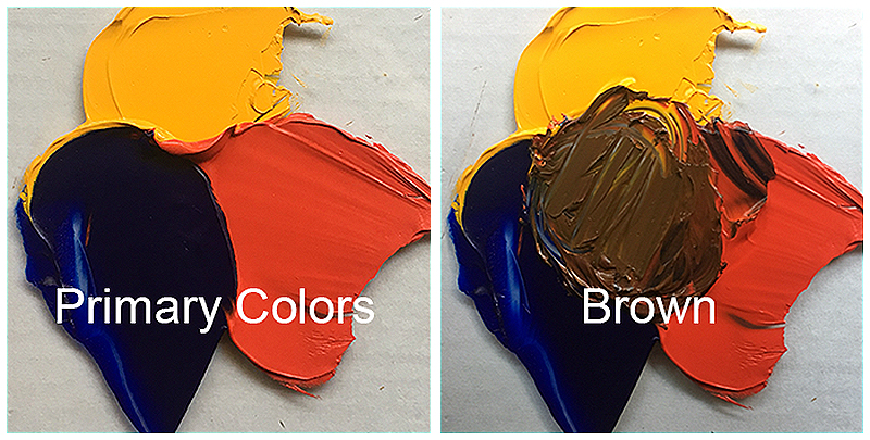
The three primary colors (red, yellow, blue), when mixed, make brown. It is the ratio, as well as the specific pigments used, that determine the specific neutral color these hues will make.
The Long Answer to Mixing Brown
The complete answer to mixing brown is complex and touches on several color theory concepts. Before diving into the rabbit hole that is color theory, let’s review a few terms…
VOCABULARY
- Primary colors are colors that can’t be mixed from any other colors. They are the reds, yellows, and blues.
- Secondary colors are the colors made by mixing pairs of primary hues. Oranges, greens, and purples are the secondary colors.
- Red and yellow make orange.
- Yellow and blue make green.
- Blue and red make purple.
- Complementary colors are pairs of colors across from each other on the colors wheel. Just as black and white are opposite values, complementary pairs are opposite colors. Side by side, complementary colors help each other to stand out and appear more intense. Conversely, when mixed, they are like positive and negative numbers, canceling each other out. They reduce the brightness (intensity) of one another. So, besides combining to make brown, complementary colors help the artist control intensity.
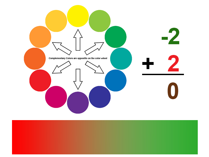
A variety of browns are made by mixing the different complementary pairs together. So, what are the complementary pairs:
- Blue and orange are the colors of the sky (blue sky and orange sunsets).
- Yellow are purple are the colors of royalty (kings wear gold crowns and purple robes).
- Red and green are the color of roses, strawberries, holly, tomatoes and yes, Christmas.
It is worth noting that the intermediate colors (also called tertiary) form three additional complementary pairs: red-orange/blue-green, yellow-orange/blue-violet and yellow-green/red-violet.
Think of brown as mixture of primaries and/or a combination of complements – two sides of the same coin. Since a secondary color is a combination of two primaries, and the complement to any secondary color is the primary color not used to make that secondary, then combining complementary colors is the same as mixing a third primary into the first two primaries.
The image below illustrates what happens when the three main complementary pairs are mixed together.
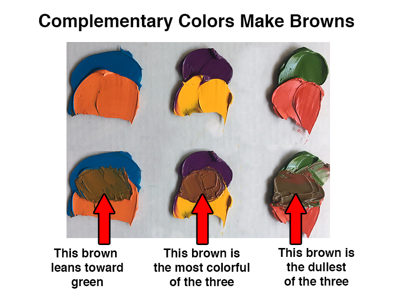
Notice that the complementary pairs above do not make the same brown. This is because the green, orange, and purple were not mixed from the same set of primaries.
See also: Color Theory
Using Warm and Cool Primary Colors
The palette below shows a set of primary colors only. Note that there are two reds and two blues – a warmer and cooler version of each hue.
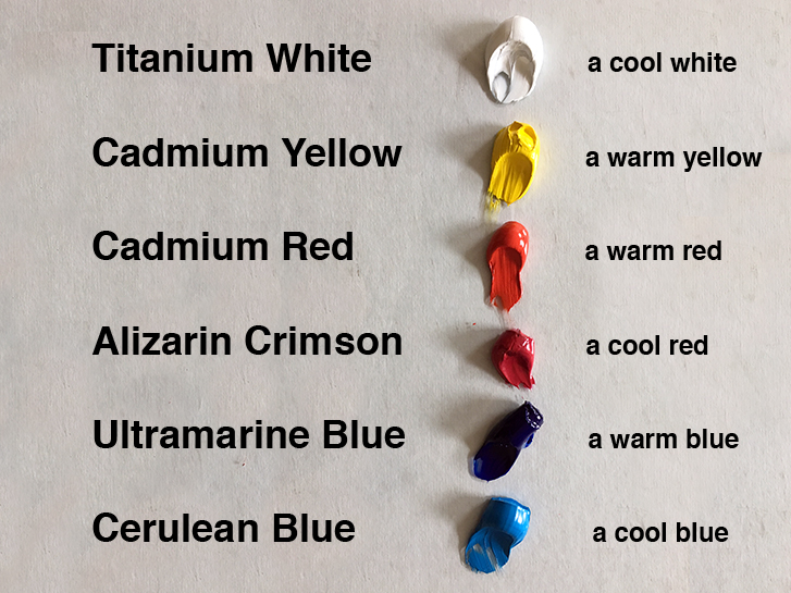
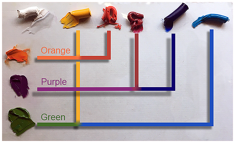
A cool red mixed with a warm blue make a brilliant purple. Here, Alizarin Crimson is the cooler red while Ultramarine Blue is the warmer blue. Color temperature is relative. Though blue is a cool color, within the family of blue hues, there are warm and cool variances.
Below are the pigment combinations used to create the secondary colors above.
Color Theory Bonus Knowledge
Brown and gray are close cousins. Just as brown can be thought of as the three primaries mixed together, so too, can gray. The color pencil illustration below demonstrates how a greater amount of blue in the mixture results in grey while a more equal combination of primaries makes brown.
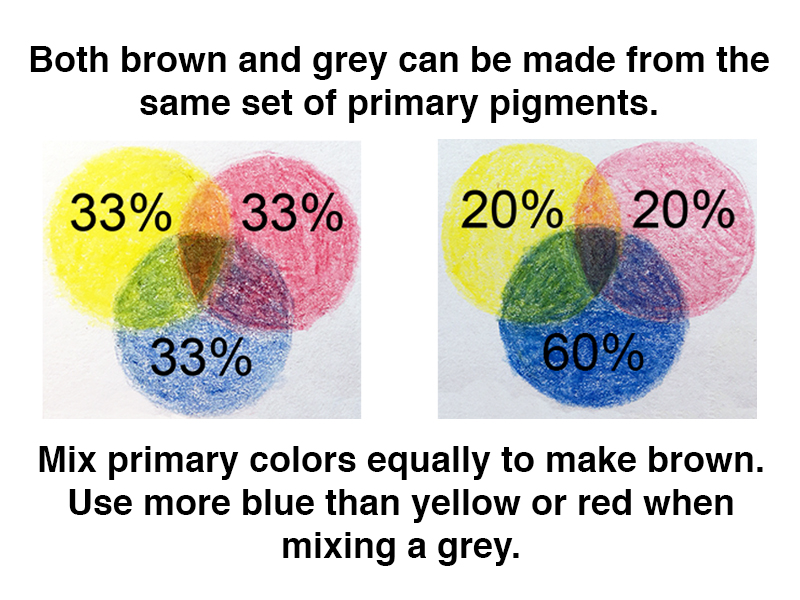
In a perfect world, all tubes of paint would have the same, predictable mixing power and equal amounts of primary colors. When mixed, these colors would always make brown.
See also: Warm vs. Cool Grays
Unfortunately, the color mixing world is not perfect.
Depending on the grade of paint, some pigments may overpower others, requiring an adjustment to the approximate ratio used when mixing brown. This is common for “student” grade paints.
Optical Color Mixtures
Some media is less forgiving than others. Watercolor comes to mind. Many watercolor artists mix color in their paintings instead of on their palettes. This type of mixture is called an optical mixture. To do so, one must know what ratio of colors to use when optically mixing neutral. The stakes are higher.
See also: Optical Color Mixing
If an oil painter makes a mistake with a physical mixture of paint, then the paint is wasted. If a watercolor artist makes a mistake with an optical mixture of paint, then the artwork itself is a failure.
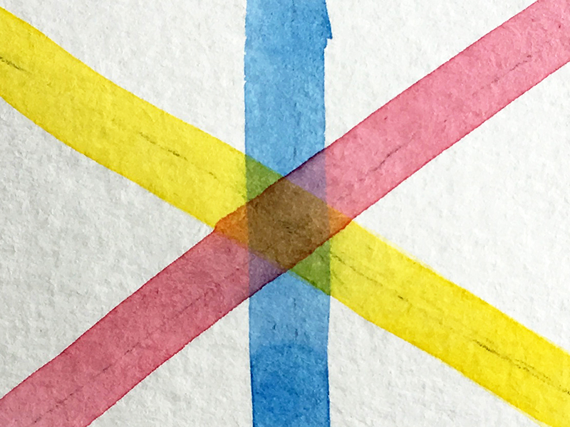
The watercolor illustration below is a great visual aid for understanding how these colors “add up” to brown. Can you see the small triangles of secondary colors around the brown hexagon in the center?
Conclusion
I have never heard anyone say, “My favorite color is brown”. But neutral colors like brown are clearly important. Much of the world is muted in color with only punctuations of intensity. Remember to use complementary relationships for better neutrals. Now get out there and paint the world brown!
If so, join over 36,000 others that receive our newsletter with new drawing and painting lessons. Plus, check out three of our course videos and ebooks for free.
Cow in a Field – Pen and Ink with Watercolor
A “Cow” in a Field
In this lesson, we’ll create a drawing / painting of a cow basking in the morning light by combining pen and ink with watercolor. The ink applications will work to define the contours, create textures, and develop much of the value relationships. The watercolor washes will introduce color, expand on the value relationships, and harmonize the image.
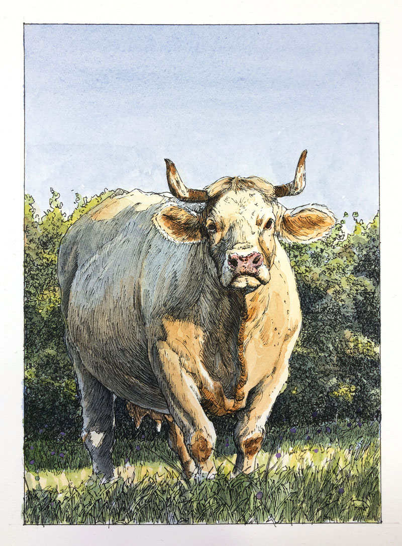
Drawing and Painting Materials Used in This Lesson
This image is created with very basic materials. You’ll need a graphite pencil, watercolor paper (hot press), a technical drawing pen, watercolor paints and brushes. Gouache (or opaque watercolor) is used sparingly and is optional.
Here’s a look at the specific materials used to create the art. (The following links are affiliate links which means that I make a small commission if you purchase without an additional cost to you)…
- Graphite Pencil (2H and 6B)
- 140 lb. Hot Press Watercolor Paper (Canson)
- Cotman Watercolors
- Grumbacher Goldenedge Nylon Brushes (All round brushes, sizes 00, 4, and 14)
- Staedtler Technical Drawing Pens (Size .05mm)
- Gouache Paints (optional)
The Photo Reference
We’ll work from a photo reference to complete the image. The reference image comes courtesy of the site, Pixabay.com. Although we’ll stay fairly true to the reference, some deviation is encouraged. In this case, the background is altered and the colors are exaggerated.
We should always strive to create a work of art that is not only different from the reference, but also more interesting.
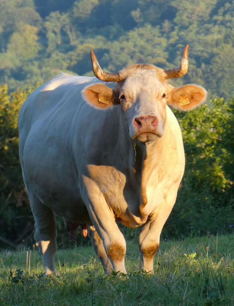 Image by Jan-martijn Verlaan from Pixabay
Transferring the Image
To save a bit of time and to ensure accuracy, we’ll use a graphite transfer to get the contour lines in place on the surface. This process is very easy to do and results in a faint reproduction of the contours on the watercolor paper.
To create a transfer:
- Apply soft graphite to the back of the printed photo reference. In this case, I covered the back of the paper with 6B graphite.
- Tape down the photo reference, facing upward, to the watercolor paper.
- Use a sharp tool, like a pencil or pen, to trace the contour lines on the front side of the photo reference. The pressure placed on the pencil transfers the soft graphite on the back to the watercolor paper.
- Once all of the contours have been traced, the photo reference is gently lifted, revealing a light reproduction on the watercolor paper.
After transferring the image, you’ll likely notice that you’ll need to do some additional drawing. You can refine the image and add details that were left out during transfer. If your transfer is too dark, you can use a kneaded eraser to gently lift some of the graphite. The pencil sketch should not be visible in the final image. The ink and watercolor applications should cover most of the graphite marks, but if they’re too dark, they may still be visible in the finished art.
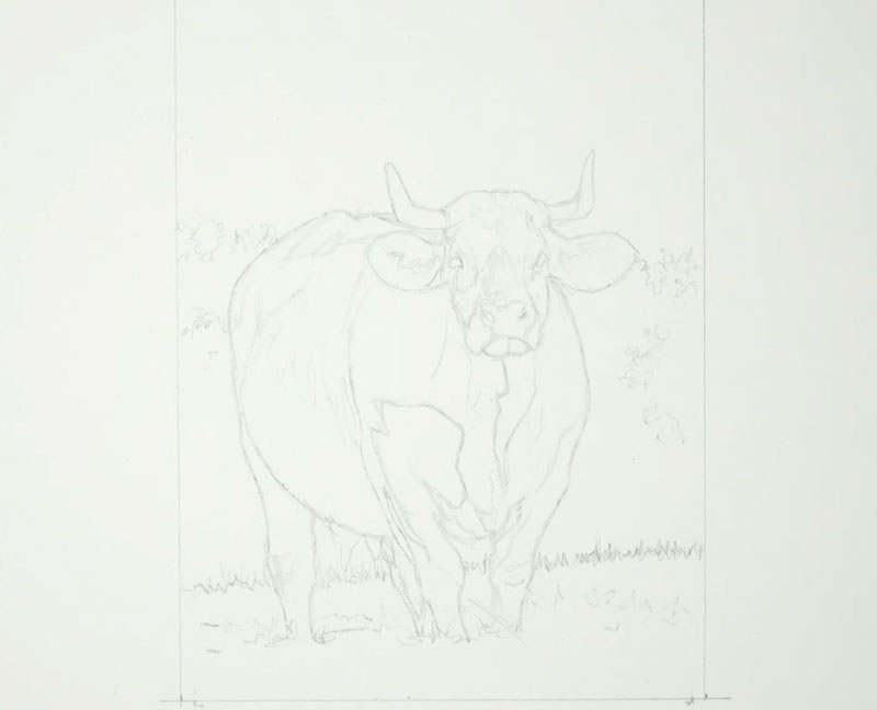
Drawing the Cow with Ink
With the pencil sketch in place, we can begin with applications of ink. We’ll concentrate on developing the contours, textures, and a bit of the value relationships during this stage of the process. For this drawing, a .05mm pen is used exclusively.
You may begin with ink applications anywhere that feels comfortable to you. In this case, we’ll begin with the head of the cow and work outward from there.
When working with pen and ink, the use of line is clearly important. Not only will we use line to create the outlines (contours), but also to develop the textures, values, and to communicate the form.
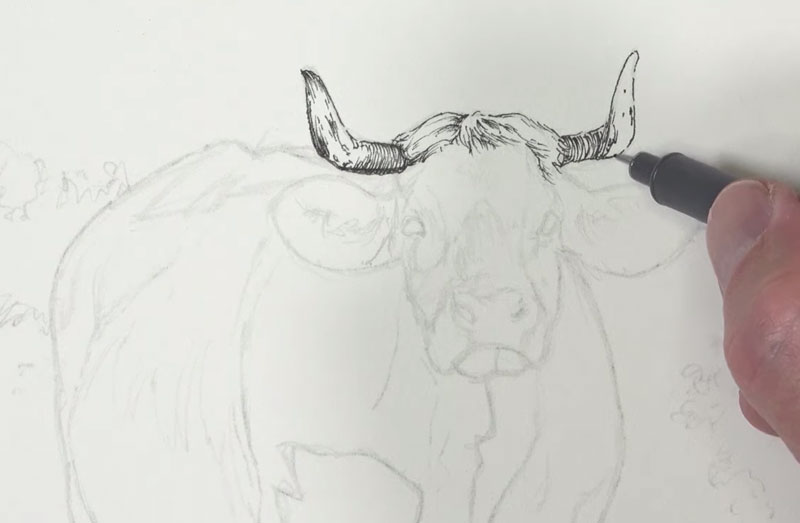
The directional strokes that are made with the pen can be used to communicate the form. Lines should flow around the form of the subject, changing direction as the form changes in space. We can see this concept at work on the horns. The line curves slightly since the horns also curve in space. This concept is referred to as “cross contour lines”.
See also: Cross Contour Lines
We’ll use mostly hatching in this drawing. Cross hatching is used only in a few areas to make the values slightly darker. Since watercolor applications are to follow, we should be careful not to push the values too dark, too quickly.
Working downward from the horns, we’ll next address the rest of the head. Again, directional stroking is important. Strokes are pulled in the same direction as the hair grows, changing direction according to the form of the face. Our goal here is to develop the shadows while communicating the textures and the form.
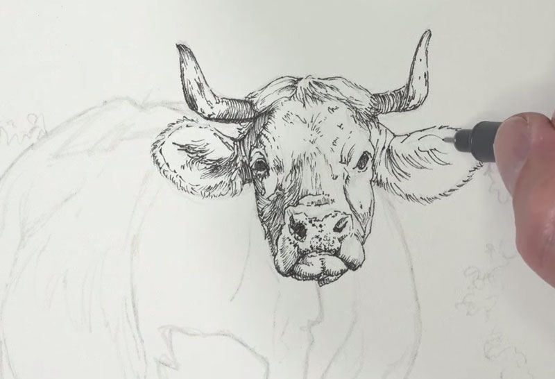
Even in the darkest areas of the eyes and the shadows within the nostrils, we’ll use hatching. Allowing a few specks of the paper to show through will create a more natural appearance as a flat area of black will make the drawing appear unnatural.
From the head, we’ll continue to work outward, next addressing the body. We’ll first define the contour lines before adding hatching for the shadows. In areas where the tones are darker, a denser concentration of marks are used. In areas where the values are lighter, more space is left between marks.
Again we’ll consider the direction of the strokes we make, allowing the stroke to curve around the body of the cow.
The light in this scene is strong, producing defined edges of light and dark. This strong light is reflected in our drawing.
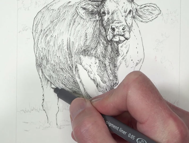
The light source originates from the right and from a low angle. This produces strong highlights on the right and upper portion of the cow and strong shadows on the left. Even with this considered, we’ll still see a few areas of darker tone on the right side of the body. In these locations, we’ll mostly concentrate on drawing the textures, but also include the smaller, less frequent areas of shadows.
Once the body is complete, we’ll next turn our attention to developing the background and grassy field. We’ll begin with the field. First we’ll define the contour and then begin the process of drawing in the texture.
For the upper portion, strokes are pulled upward as the grass grows. We should include variety in the mark here, changing the direction slightly with each stroke. We can also create a bit of variety in the value as well, concentrating the marks in areas.
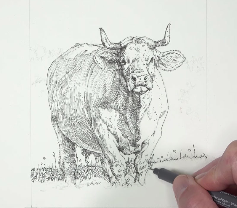
In the lower portion, underneath the highlight, the shapes of the grass blades are visible. For this section, we’ll define some of the grass blades with contour lines, instead of relying on the line alone. We’ll also include a few circular shapes for flowers.
Once we’ve filled in the textures of the grass in the foreground, we’ll next address the bushes in the background. Here again, we’ll define the contours first.
Then, using squiggly lines, we can begin creating the illusion of the textures of the bushes and distant trees. By concentrating these marks, we can develop areas of shadow while preserving the texture. For the lighter areas, less concentrated marks are applied.
See also: How to Draw Trees
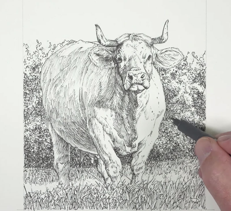
Once we’ve developed the textures of the background bushes and the grassy field of the foreground, our pen and ink drawing of the cow is complete.
We’re now ready to move on to the watercolor applications. But before doing so, you may erase any remaining graphite marks with a kneaded eraser.
Painting the Cow with Watercolor
While our pen and ink drawing could stand on its own as a completed image, we’ll now make it more interesting by introducing color. The watercolor applications that follow will not only add color, but also work to enhance the relationships between values.
We’ll begin by adding color to the sky and the shadows using the same mixed color. Ultramarine, with a hint of Payne’s Gray (to mute the intensity), is applied to the sky from the top down.
Consistent, horizontal strokes are applied to the sky to create an even application. A liberal amount of water is used in order to produce a less intense wash.
This same mixture is applied to the shadows in the background and foreground with the same intensity.
For the shadows on the body of the cow, we’ll use a slightly different blue. Instead of Ultramarine, we’ll apply a bit of Cobalt Blue.
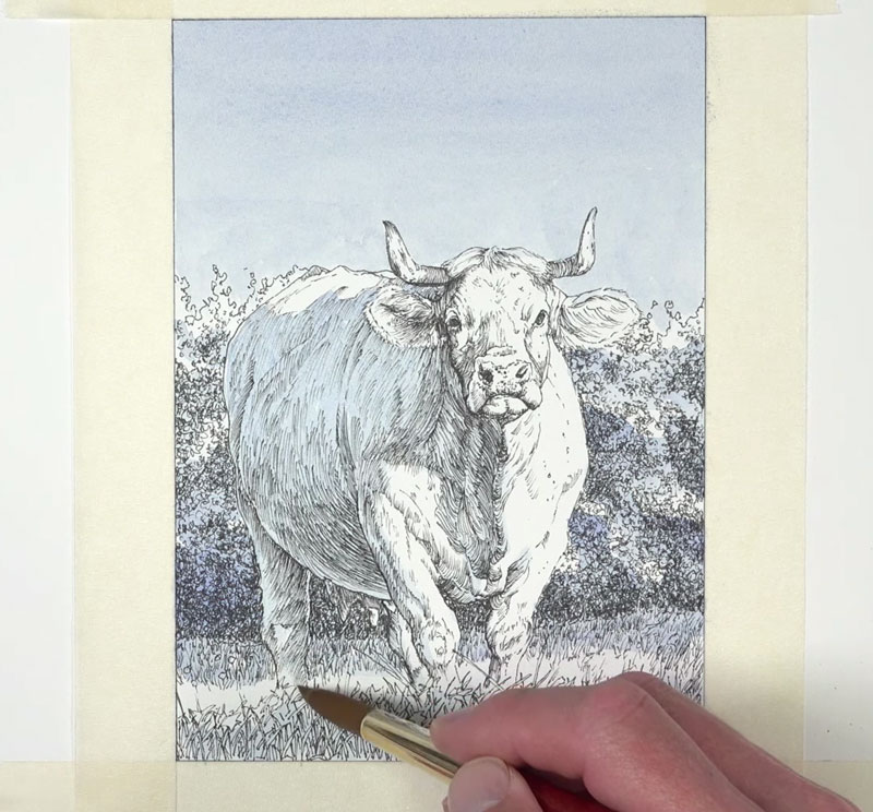
The shadows in this image are cool, but much of the scene is warm. So once we’ve established an underpainting of cooler undertones, we can begin adding some warmth.
A mixture of Yellow Ochre with a touch of Burnt Sienna and Burnt Umber is applied to much of the body as well as the highlighted sections of the background and foreground.
Then, with a heavier concentration of Burnt Sienna, we can begin adding the “oranges”, starting with the right ear.
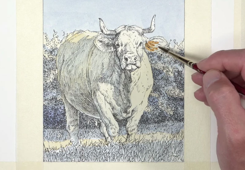
As we continue adding the warmer oranges, we’ll also start to introduce darker values. Values are slightly darkened by adding Burnt Umber to Burnt Sienna. For the darkest areas of shadow, Payne’s Gray is used.
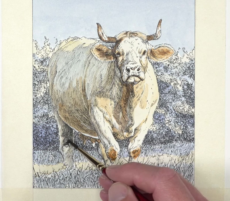
We’ll continue to gradually darken the value in the shadowed areas on the body. Multiple, translucent layers of progressively darker tones are added.
We can also add complexity to the color as needed. In this case, another layer of Cobalt Blue is added, strengthening the color in the shadow.
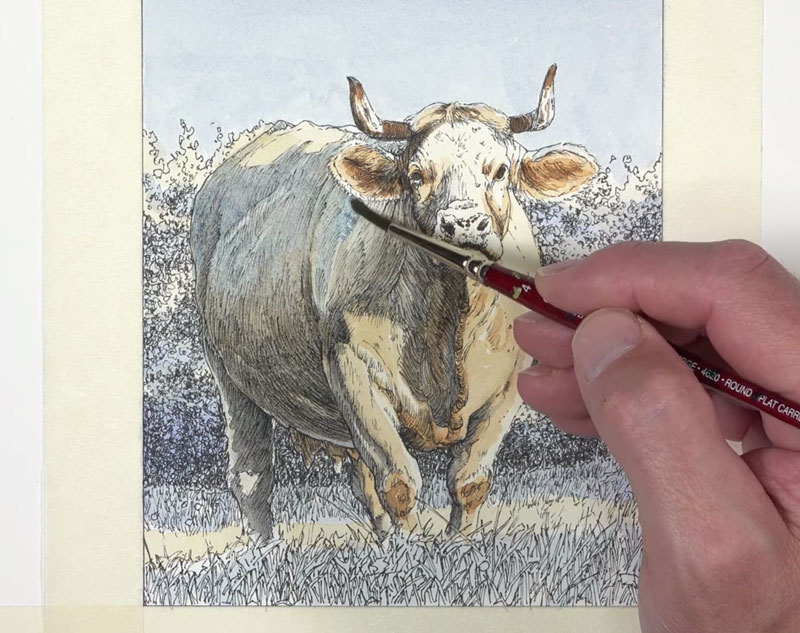
As the darker values are strengthened, the contrast increases. While we do want strong contrast in this image, we can push it too far, causing us to lose some of the color in the highlights. We can revisit these areas with a bit of Yellow Ochre and Burnt Sienna, slightly darkening the tone and increasing the color.
For the snout, a mixture of Cadmium Red Medium and Purple Lake is lightly washed.
Now we’re ready to add color to the distant trees, bushes, and grassy field. A light mixture of Sap Green, Cobalt Blue, Yellow Ochre, and Burnt Sienna is applied first.
Then to darken the shadows, Payne’s Gray is layered over the top.
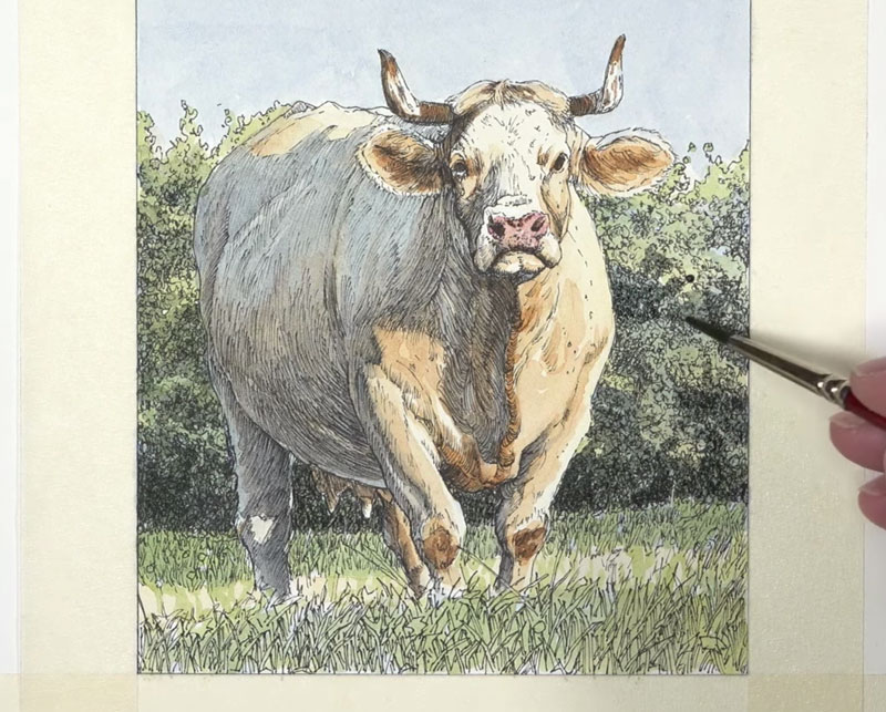
After the initial watercolor washes are applied to the background and foreground, we can enhance the colors. A bit of Cadmium Yellow is applied to the highlights along with touches of Burnt Sienna throughout.
Once the values and colors have been applied to the background and foreground, we see that we need to enhance the value relationships on the cow. We’ll return to the body, strengthening the shadows with a few translucent washes.
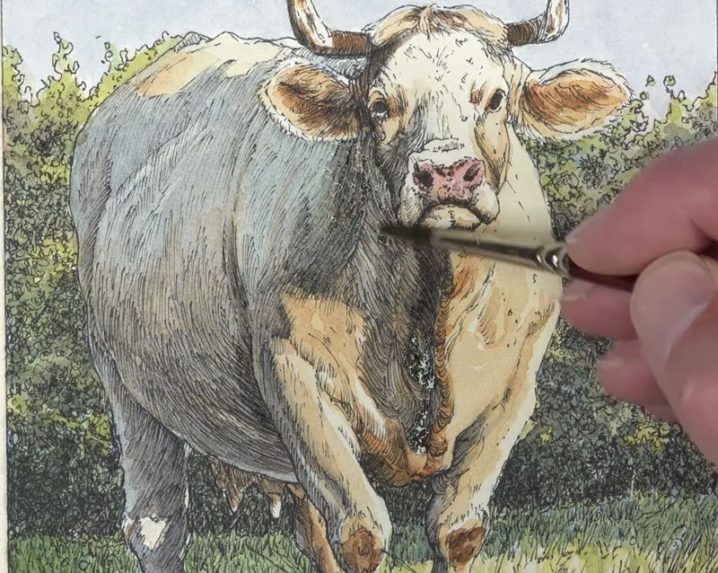
After adding a few purple flowers with gouache, the painting is now complete and we can remove the masking tape from the surface. To ensure that the tape doesn’t tear the paper, we can pull the tape away from the art at a 90˚ angle.
See also: Prevent Tape from Tearing Your Paper
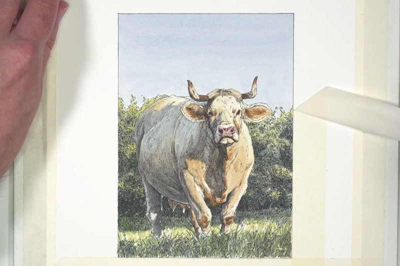
Here’s another look at our drawing / painting of a cow in a field with pen and ink and watercolor…

Conclusion
Although this painting is small, it still requires patience. You must trust the process and not get discouraged along the way. As you can see, the work goes through many stages. If you’re patient, and allow the work to mature, then you will be rewarded in the end with wonderful work of art.
If so, join over 36,000 others that receive our newsletter with new drawing and painting lessons. Plus, check out three of our course videos and ebooks for free.
Botanical Drawing with Markers and Colored Pencils
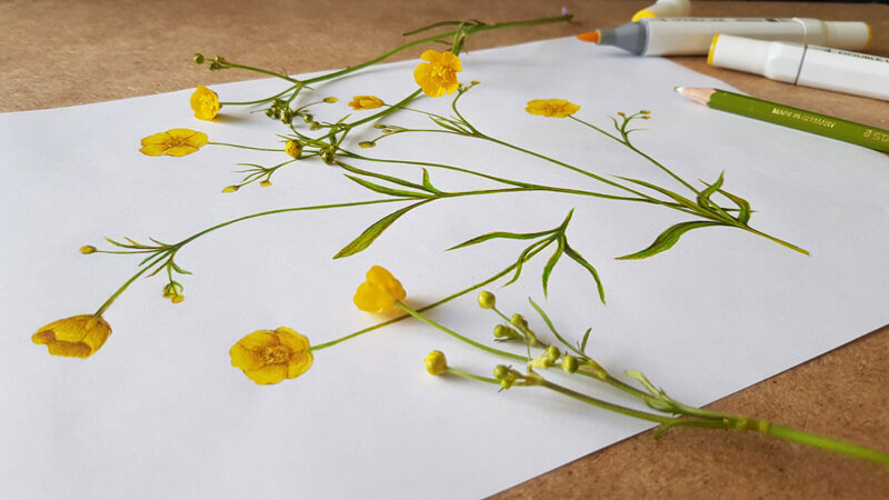
Today, we no longer rely on botanical drawings for scientific identification, but works of the past have inspired contemporary artists to carry on the tradition. Today, more and more artists are inspired by the natural world around them. Botanical drawing has once again become a popular genre for art-making.
In this lesson, we’ll take a look at the process of creating a botanical drawing of flowers with markers and colored pencils.
Botanical Drawing
In summer, we’re surrounded by beautiful examples of flora (fauna too). They’re a great source of inspiration. However, it’s easy to get lost in this abundance of subjects and run into another issue — lack of time to depict everything you want.
Combining the advantages of different artistic media is a way to solve this problem. It allows you to save time which means that you can capture more of the natural world around you.
We’ll draw some buttercup flowers with alcohol markers and colored pencils in this demonstration. Colored pencils are a great medium for details, which is what we need for this subject. However, when used on their own, colored pencils are time-intensive.
Markers are a much quicker medium. However, the drawback to working with markers is that can be difficult to develop details.
But thankfully, we can combine markers and colored pencils, which will allow us to exploit the positive characteristics of each medium. We’ll use the markers to fill in areas of color quickly and use the colored pencils to refine the details.
Materials for Our Botanical Illustration
I’ll be using my usual set of art supplies for quick sketching. These tools are not as expensive as some others of well-known professional-grade brands. For me, sketching is a way to study a subject, experiment, and broaden my visual library.
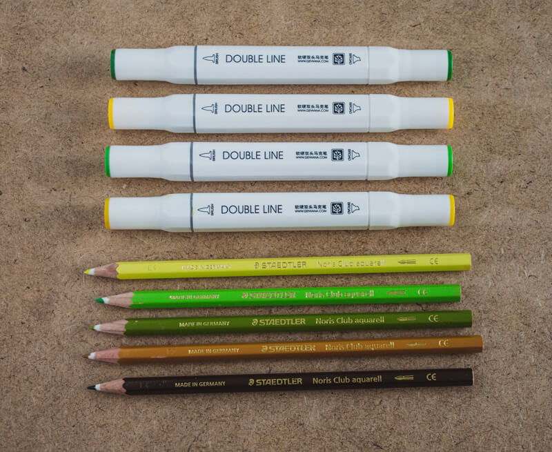
It’s also useful to keep an ordinary graphite pencil, a sharpener, and an eraser at hand.
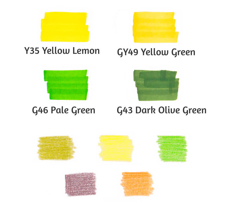
In the image below, you’ll find the color samples of alcohol markers (above) and colored pencils (below) chosen for this artwork. It’s just four markers and five pencils.
Technically, Staedtler Noris Club pencils are watercolor pencils. I won’t activate their applications with water, but instead use them as ordinary colored pencils.
The paper used is designed specifically for applications made with alcohol markers. It is sleek and has a special underlayer that prevents bleeding.
If you don’t have marker paper, you’re welcome to use ordinary drawing paper. Just remember that thicker paper tends to absorb more pigment, so the life of your markers will be shortened. You’re also likely to notice some bleeding.
Some beginning artists believe that you need a full set of colors to create a great work of art. I hope that this tutorial will be a reminder that it’s possible to create wonderful sketches with a limited number of supplies.
Find Your Drawing Inspiration in Nature
I believe that nothing beats drawing objects from direct observation. When you have a tangible subject in hand, you can rotate it to see it from multiple views. You’ll notice more of the details. You can even smell it if you wish. When you’re drawing from life, it’s easier to build an emotional connection with your subject.
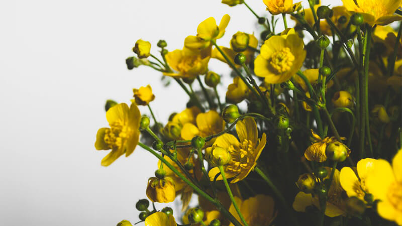
For this drawing, I’ve gathered a bunch of yellow buttercup flowers. They’re quite common where I live. Go outdoors and find something to draw that inspires you.
The first step involves only observation. Take a close look at your subject. If it’s a flower, pay attention to the shape and number of petals. What do you notice about the stem and leaves?
Experiment positioning your flower in different ways. Look for any natural lines and shapes that you find interesting and arrange your flowers to create an aesthetic composition.
Sketching Your Flowers
To begin the sketch, I choose one stem that seems interesting to draw, and sketch it with light graphite lines.
As I draw, I like to hold the flower in my hand. This approach isn’t comfortable for everybody since it makes getting an accurate depiction slightly more difficult. Another approach is to lay the flower on the table arranged in the manner that you wish to draw it.
There will be a couple of other stems, so it’s necessary to leave some space within the picture plane for them to be added. Usually, I don’t spend too much time thinking over the composition for a quick sketch. However, it is useful to have a general idea of it before starting the work.
To learn more about composition, see: Composition in Art
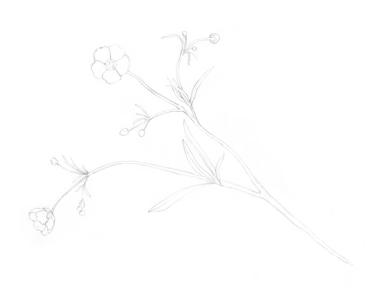
Next, I add another stem. It is overlapping the existing one, filling in the space on the right side of the paper.
Then, I add a flower on a shorter stem in the lower portion of the picture plane. This helps to balance the composition.
Depicting small flowers that have long stems and miniature leaves can be an advantage. This type of layout allows you to be creative with your use of the paper. If you need to fill in the blanks here and there, it’s easy to add additional stems and flowers.
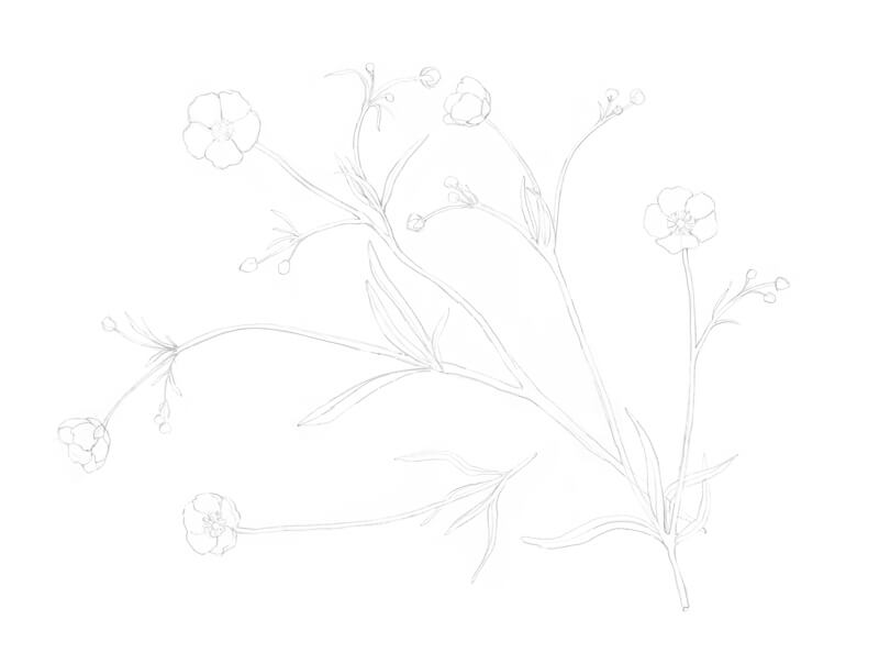
Adding Color to the Flowers with Markers
Now we’re ready to work with color! The purpose of this step is to create a colorful base for subsequent colored pencil applications. As you may know, building a dense colored pencil covering usually requires many layers of pigment. With an under painting created with markers, we can speed up the process.
First, make sure that the pencil lines aren’t too dark. If there is too much graphite left from your sketch, it may make the drawing look dull or the graphite may smear when you apply the markers. It’s a good idea to remove excess graphite marks with a kneaded eraser before touching the sketch with a marker.
I begin applying markers to the flowers with Yellow Lemon. The markers I’m using feature two different tips: a brush tip for finer details and a broader tip for covering larger areas. I prefer the brush tip because it is quite soft and flexible. It allows making various marks, from thin and accurate to wide and organic.
However, you can get similar results with a tip of any kind. You may want to experiment get an idea of how your tool works if you aren’t familiar with it.
After covering the flowers, I next fill in the stems and leaves with Pale Green. This hue is the closest one to the natural green observed among my set of markers. But, when compared with the green of the actual flowers, it’s not quite accurate. The hue of natural green is more yellowish. We’ll correct the color with a colored pencil later in the process.
I leave small gaps between the marker strokes, especially in the leaves. They feature a noticeable texture of thin lines or veins. I’m going to create the illusion of this texture by leaving these gaps of untouched paper. Later we’ll cover these open spaces with new layers of color.
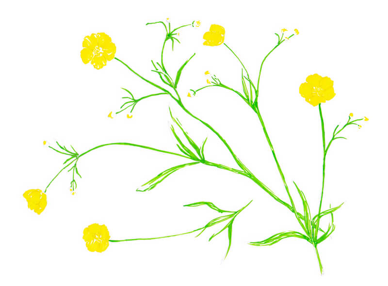
Next, I add Yellow Green to the flowers and partially to the stems and leaves. This step helps to unify the drawing.
I also add Dark Olive Green to the green areas, accenting the stems and leaves. This shade is relatively dark, so it’s important to use it sparsely and with accuracy.
Of course, we could add more layers with alcohol markers, but our color palette is limited and much of the complexity of color will be developed with colored pencils.
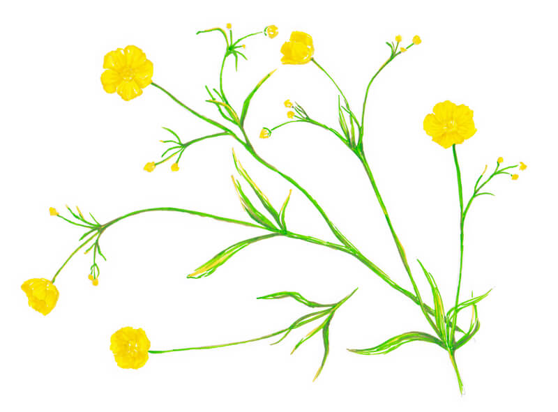
Applying Colored Pencils to the Drawing
As the pencils I use don’t bear the names of colors on their casings, we have to invent them on our own. I’m going to place small samples of colors that I use in the following steps in the top right corner of each image. That way, you can match them with your own pencils if you’re following along.
I add some yellow-green pencil strokes to the stems and leaves. This makes the greens appear more natural and makes the color more consistent.
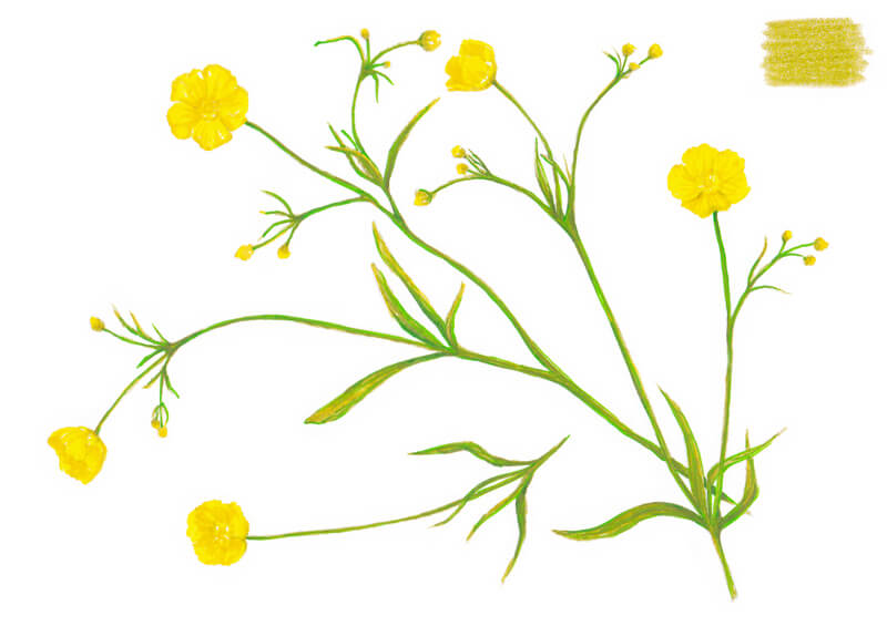
I add light yellow strokes to the lightest parts of the petals and to green areas. The pressure is quite heavy, but the surface of this paper can endure it.
I also include some bright green to the sketch. This adds some variety and richness to the color.
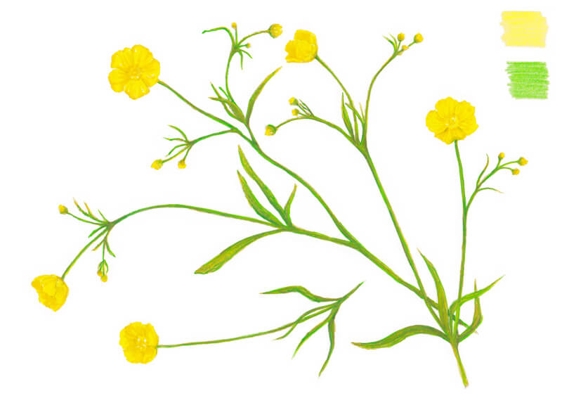
After taking a closer look at the stems, we can see a brownish hue. I add some dark reddish brown to the green areas. The tip of the pencil is sharp, allowing for thin, controlled lines. I carefully accent the contours with this pencil.
The addition of the reddish brown increases the contrast and leads to a broader range of value in the drawing.
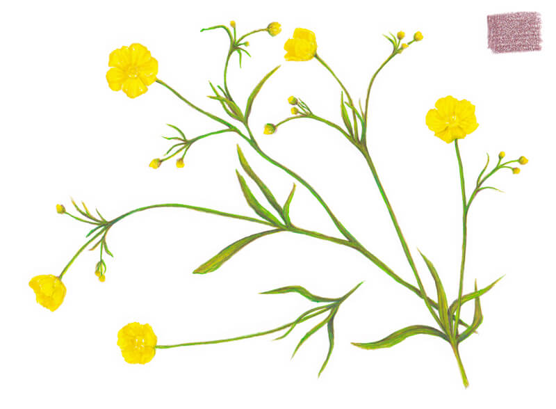
The stems and leaves are now complete, but the flowers are still almost untouched. I add some rust brown strokes to the flowers, creating soft shadows in the center portions and between the petals.
I also strengthen the undersides of the small bud-like segments.
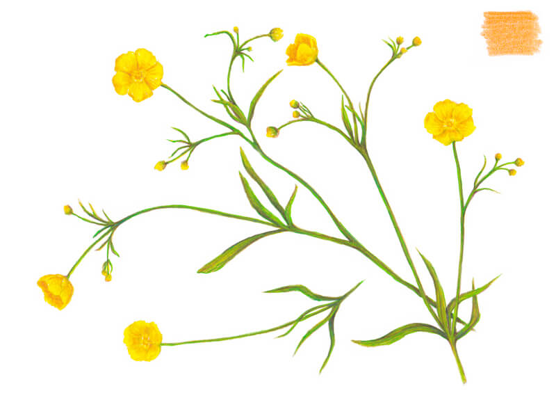
Our drawing is almost complete. After taking a moment to evaluate the art, I see that the centers of the flowers still need additional details and contrast.
With a very sharp pencil, I add some depth to the flowers using the same dark reddish brown that we used before. Be careful – too much of it will darken the flowers and they’ll lose saturation.
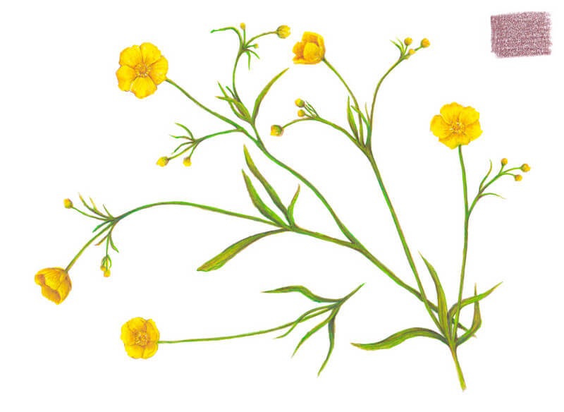
Conclusion
Great work! We’ve completed this quick botanical sketch.
I hope you’ve enjoyed the process of using both markers and colored pencils. This combination of media definitely has its advantages and works great for drawing botanical subjects.
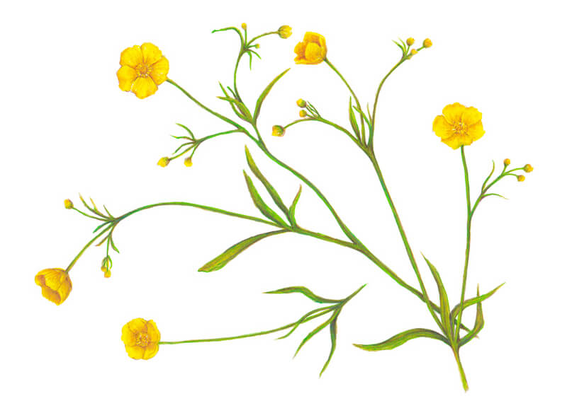
More Drawings of Flowers Created by Combining Markers and Colored Pencils
Let me share with you a couple of drawings I created. These botanical sketches were created in the same manner as the one we’ve worked on today. The art supplies and colors were also limited in these examples.
Hopefully, these examples inspire you to create your own botanical series and explore the possibilities of mixed media techniques!
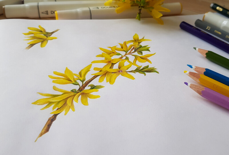
It’s possible to create relatively complex and detailed sketches in a short period of time. You could even create your own drawings on location if you like.
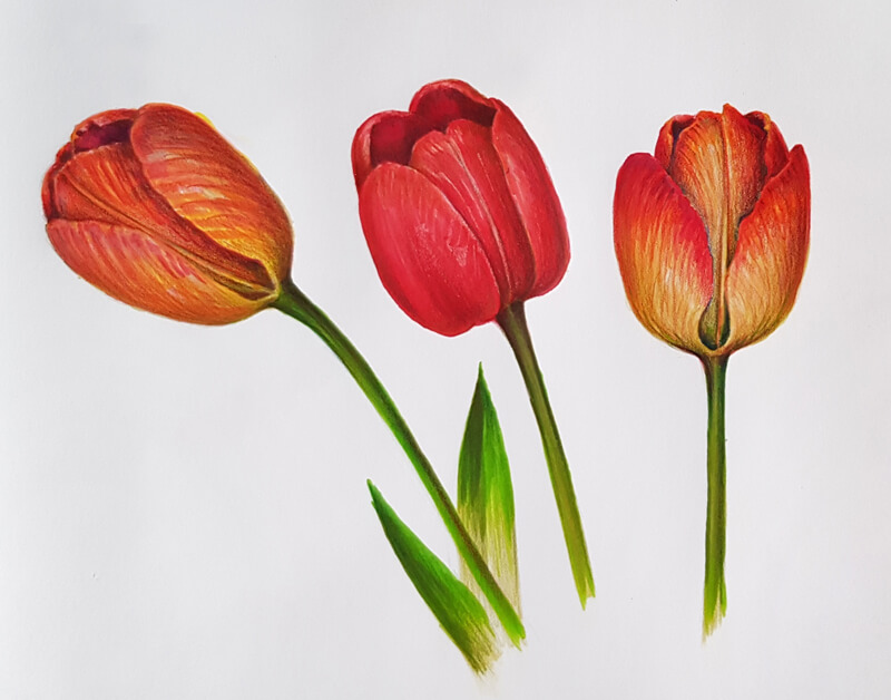
Thank you for joining me on this journey. I hope that you’ve enjoyed our look at the process.
If so, join over 36,000 others that receive our newsletter with new drawing and painting lessons. Plus, check out three of our course videos and ebooks for free.
How to Draw a Rabbit with Pen and Ink
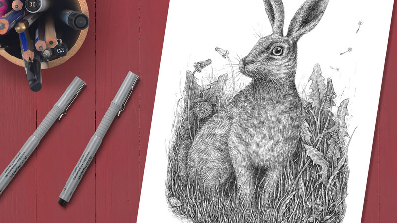
We’ll draw a rabbit in a natural environment, paying particular attention to the texture of the fur.
To complete this project, you’ll need an ordinary HB graphite pencil and an eraser for creating the underdrawing, and some ink liners. I’ll use the 0.05, 0.1, and 0.2 line widths on a smaller sheet of paper (the standard A4 format). A nib pen and liquid black ink can be used instead of liners.
Step 1 – Creating a Pencil Sketch of the Rabbit
I prefer staring an ink drawing with a pencil sketch, outlining the main details of the subject. This step ensures that I’ll be confident enough while adding the ink. This takes a lot of the “guesswork” out of the inking process.
I decided to go for a relatively complex layout of the rabbit. We’ll position the rabbit at a three-quarter angle to make the drawing more interesting and to aid in creating the illusion of depth.
Don’t feel obligated to get all the anatomical features of the rabbit precisely in place. The animal in our drawing is sitting in tall grass and its limbs will be partially covered with the foreground elements.
Also, if you’re completely unfamiliar with the general appearance of a rabbit, I strongly recommend doing some research by looking at photos of rabbits on the web or in a book. You’ll may find another pose that you like better or gain some insights on the patterning of the fur.
To simplify the task of designing the figure, I start by outlining the general shape of the head along with the eye and ears. Then I add the shape of the body.
A long curved line inside the larger shape marks the direction of the rabbit’s spine.
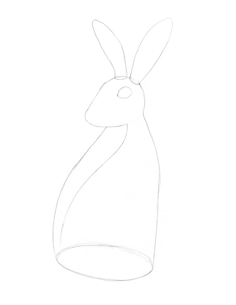
Now I add some stylized features, working rather with blocks than with small details. Now that we have the shape masses in place, let’s carve out the most significant features.
First, I refine the shape of the head, making a strongly pronounced slope and a short muzzle. The eyes (in our case, one eye that is visible) are placed quite high on the head.
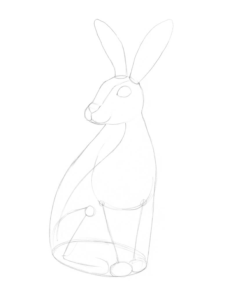
I refine the drawing by adding the details of the eye (including a small spot of highlight), the ear openings, and elaborate a bit more on the rabbit’s “face”.
I imagine that the limbs in my sketch are three-dimensional objects. The current outline is very basic and stylized. Feel free to erase any unnecessary pencil lines as you go.
Rabbits have from four to five toes. Even if the paws will be mostly overlapped with the grass in the foreground, it’s still useful to keep those minor details in mind – they will make the drawing more believable.
I add a bushy tail, then change the contour line of the figure to suggest the graceful flow of the body and its textured fur covering.
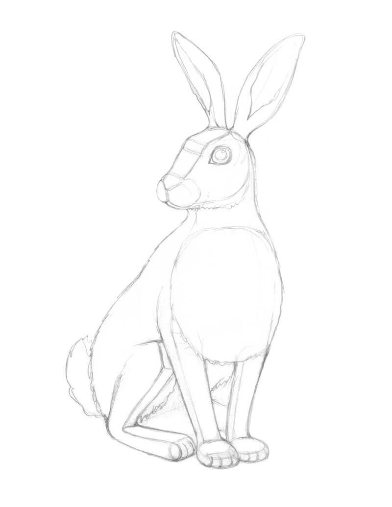
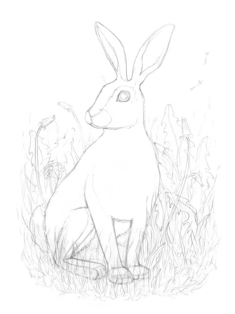
I add the details of the environment – the thin grass blades, the dandelion leaves, and the flowers on the long stems. The addition of clover leaves in the foreground creates a bit of variety to this floral mass.
Don’t let the number of details overwhelm you. The elements you see in my drawing are created in a sketchy and loose manner. The goal is to grasp the rhythm and direction. I just create marks that help me remember my design decisions when I’m ready to begin adding ink. It’s easy to become so immersed in the process that later on, some significant details may be lost.
Some pencil lines look rather thick and dark at this point, but I’m not worried about it. The type of paper I’m using absorbs ink well and allows erasing, so I’ll remove all the unnecessary marks of graphite in the next steps. On the other hand, sometimes a graphite under layer that shows through an ink artwork adds interesting tonal nuances.
Step 2 – Adding Ink to the Drawing
With our pencil sketch in place, we’re now ready to add the ink over the top. In the inking process, we’ll develop a range of value, describe the texture, and create the illusion of form and light.
The Texture of Fur
Before we dive into the inking part, let’s talk about creating a credible illusion of fur or hair texture. Visually studying your subject is an important part of mastering the skill of drawing. That’s why I recommend observing as many examples of texture as you can and doing small exercises regularly.
To put it simply, the texture of fur can be easily imitated with hatching. The direction of lines is fairly constant, consistent and is dependent on the direction of hairs that we find on the subject. But, be mindful that there may be a slight variation in that direction.
See also: How to Draw Animal Fur / Hair – Two Approaches
Relax your hand and try drawing such hair-like lines, gathering them in groups. Then layer those groups on top of each other. As soon as you feel the rhythm that is comfortable for you, we’re ready to move forward.
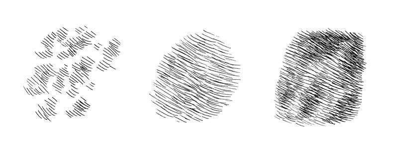
The approach we just discussed may seem simplified. Of course, it’s possible to create a more detailed example of texture if you like.
If we deal with a relatively small paper format and the subject isn’t too close to the viewer, including too much visual information may lead to a visually “busy” result. Don’t overcrowd your marks.
I start with the eye. It is one of the most important parts of the drawing because of its power to convey the mood and character. The pupil and the eyelid’s rims are dark and contrasting so I accent this feature, using the 0.1 ink liner. Don’t forget about the highlight in the pupil!
Now it’s time to sketch the fur in around the eye. The fur here is relatively short and forms a pattern of darker stripes.
The hatches follow the contours of the head and the direction of hair growth. Creating strokes that flow in this direction not only describes the texture and value but also helps to communicate the form.
As for the liners, I generally use the 0.05 for lighter and longer hairs, and the 0.1 is for areas that require additional contrast. Fine hatching will look similar to gradated graphite shading from a distance.
In the case with animals that have fur, avoid outlining the contours with a solid ink line. Even if you overlap it with a set of hair-like hatches later, this line will be still noticeable. Unfortunately, it may spoil the entire drawing. Instead, allow your marks to be “broken” or as a continuation of the fur pattern.

The fur on the nose is very short, so the marks here are short as well. Feel free to create a hint of a pattern on the head and nose. You can do this by simply concentrating marks in areas.
The fur gets longer closer to the neck, so I use longer lines there. I also increase the contrast between lighter and darker areas of fur, using the 0.1 liner.
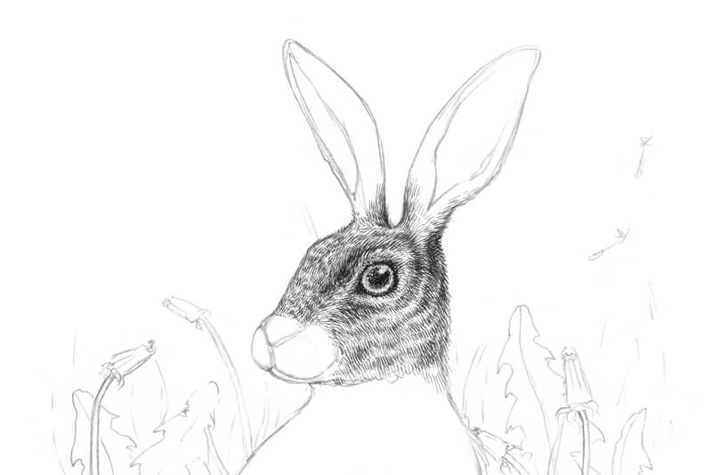
I add the whiskers with thin broken lines applied with 0.05 pen.
The whiskers should be in place and clearly visible before beginning work on the muzzle. However, if you accidentally cover the whiskers with black ink, there is the option to recreate a light line with a white gel pen.
See also: How to Correct Mistakes in Pen and Ink Drawings
I cover the front side of the rabbit’s head with short hatching made with the 0.1 liner. I also create a subtle pattern on the muzzle by concentrating marks.
The nose is rather dark and has a velvety texture. I apply short hatching here and darken the lower side of the nose.
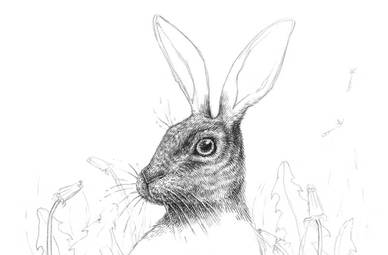
I work on the ears next. The ears usually have long, light hairs near their openings. I sketch these hairs first, using the 0.05 ink liner, then darken the inner sides of the ears.
The back side of the ears can be quite dark. Varying the pattern of values adds interest and variety to the drawing.
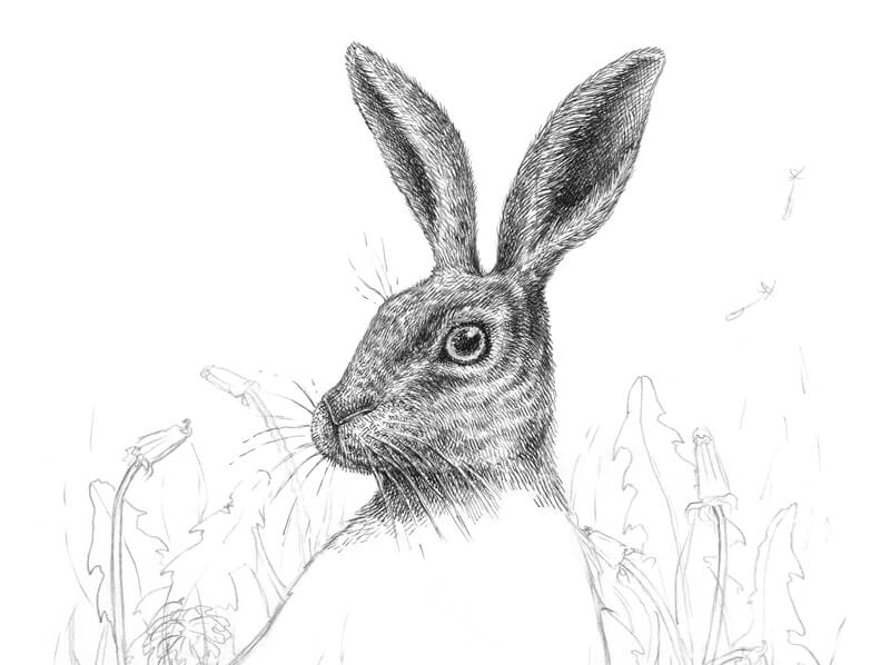
It’s time to work on the fur of the body, so I apply hatching in the manner that is already familiar to us using directional stroking with the pen.
Switching from 0.05 to 0.1 liner, I layer the groups of hatching. Some areas become darker. This creates an interesting spotty pattern and adds depth to the artwork. The direction of lines continues to follow the contours of the body.
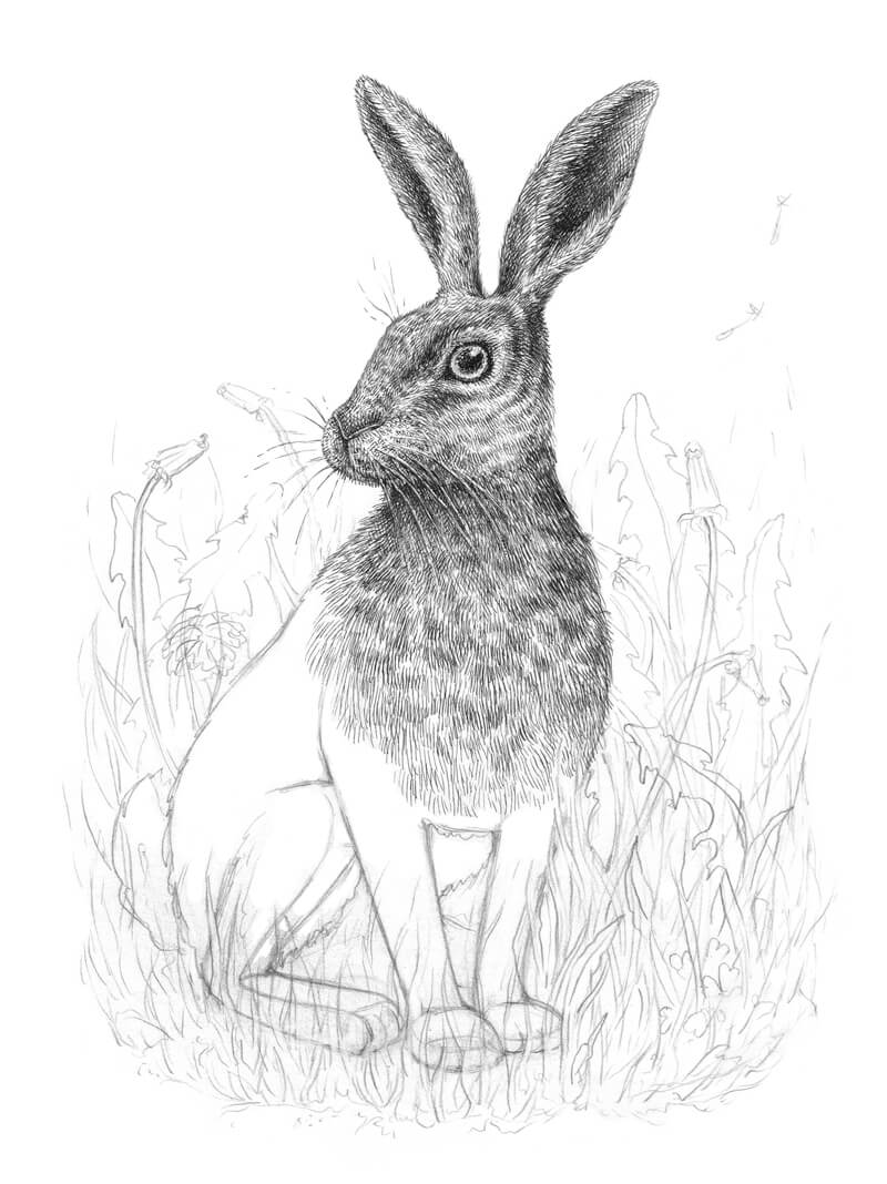
Let’s digress from the rabbit and pay attention to the environment that surrounds it. The best approach is to develop the elements in the foreground before proceeding to the limbs since these elements overlap the body of the rabbit.
With the 0.2 ink liner, I outline the contours of the grass blades, leaving some gaps between the lines. I also darken the areas between the blades and leaves. Objects that are closer to the viewer are typically higher in contrast, so we can allow some of the values here to be much darker.

With the 0.1 ink liner, I add groups of parallel hatches to the flowers and grass elements in the foreground. The goal is to suggest the middle values and create the illusion of depth.
I also add some lines to the bottom portion of the artwork. This simple trick helps to transition the marks into the blank spaces of the paper.
As we add the elements in the background, we need to take care to leave some open areas for the remaining sections of fur that are to be added.
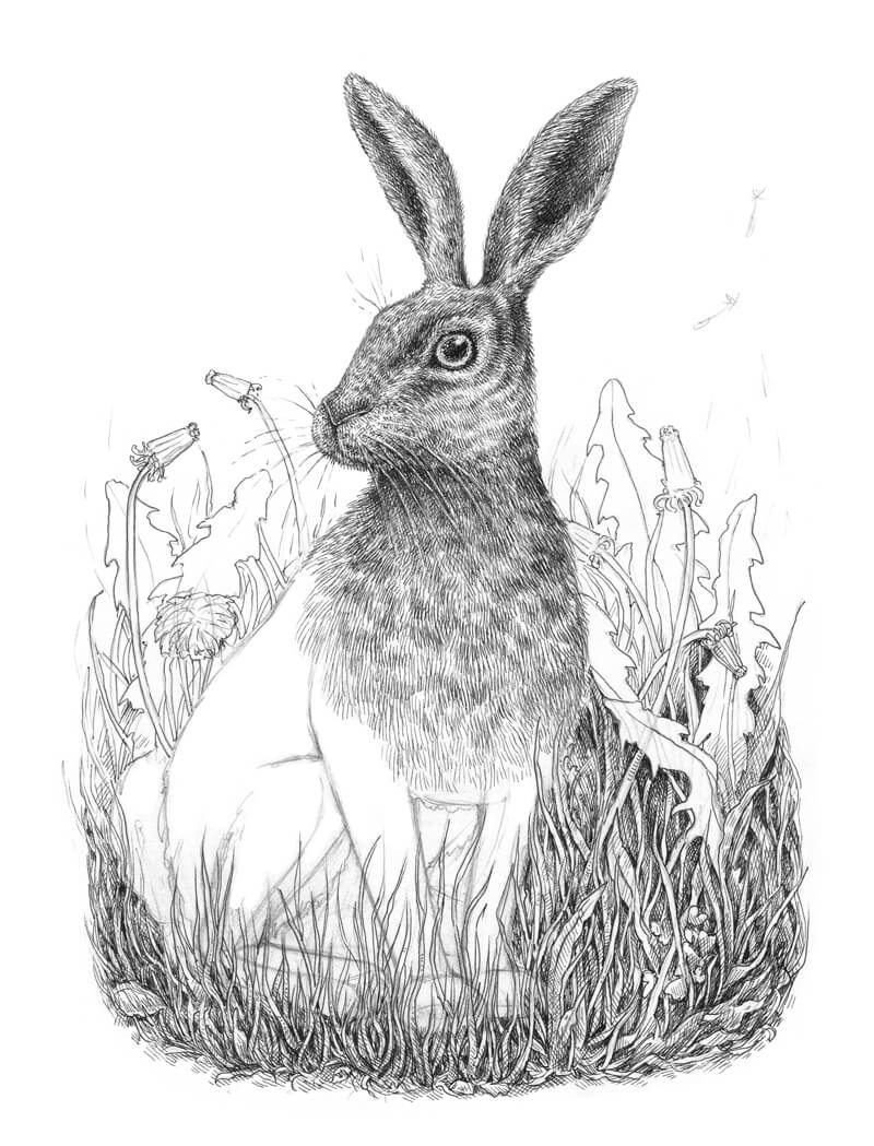
It’s time to complete the fur using the 0.05 and 0.1 liners. With a looser, more relaxed motion, I draw relatively long lines that imitate hairs.
Layering groups of hatches, it’s possible to create interesting effects that look like spots or stripes. They also help to communicate the illusion of texture.
The areas between the limbs are shaded, so I apply as many ink layers as needed to make them very dark. This creates the illusion of depth, while broadening the range of value.
On the bottom portion of the picture plane, where the foreground elements overlap our rabbit, I carefully blend the animal’s figure into its surroundings. “Blending” here refers to the process of creating a natural transition with the marks.
The limbs and the back side of our animal require such “blending”. The keys to achieving this transition are:
- Using a fine liner.
- Applying lines or dots that create a uniform pattern
- Avoiding extremes such as having areas that are too dark or too light.
As a finishing touch, I erase the remaining pencil contours of the hare.
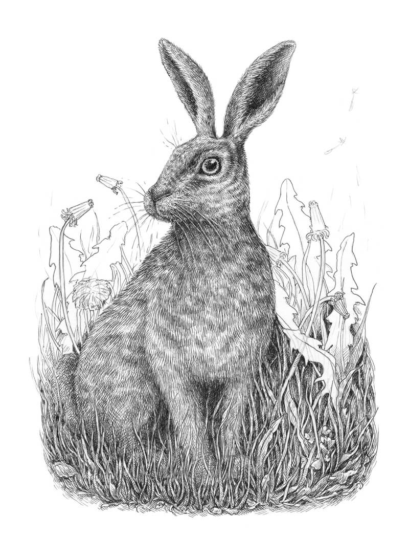
With the 0.05 liner, I add additional hatching to some of the background elements. To distinguish the leaves from the back of the rabbit, I darken the area behind the animal slightly.
It’s now time to evaluate the drawing. Some grass blades are too light, so I darken them slightly with the 0.1 liner. Also, I add some dots to the background, right above the leaves, to suggest burry silhouettes of something that is far away.
Three flying dandelion seeds near the corner of the artwork are a romantic symbol of the spring’s warmth. I mark them with the 0.05 liner.
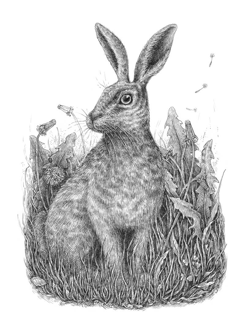
Conclusion
Depicting animals and nature is fascinating, isn’t it? I always feel like there is something alive and tangible behind just a piece of paper.
Hopefully, you enjoyed this tutorial – thanks for being with me on this journey. I wish you much inspiration!
If so, join over 36,000 others that receive our newsletter with new drawing and painting lessons. Plus, check out three of our course videos and ebooks for free.
Pen and Watercolor Wash – Seagull
Combine Pen and Ink with Watercolor
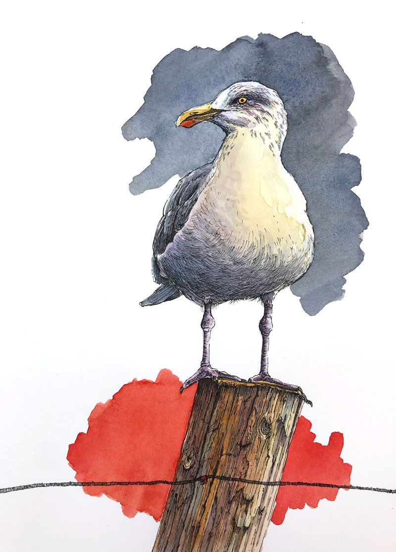
In this lesson, we’ll combine pen and ink applications with watercolor washes to develop a colorful image of a seagull. We’ll keep the pen and ink applications rather minimal in this drawing and allow the watercolor washes to add pops of color and interest. We’ll also add a few design elements for additional interest and color contrast.
Materials For This Lesson
One of the more attractive benefits of working with line and wash is that you don’t need a lot of materials. A pen (with ink), a surface to work on, a few brushes, watercolor paints, and water is really all you need. All of the these materials fit neatly inside of a drawer and are easy to take with you and use on location.
This painting was created in the studio, but the same basic materials were used. Here are the specific materials that were used to complete the painting (the following links are affiliate links which means that I make a small commission if you purchase without an additional cost to you)…
- 2H Graphite Pencil
- 140 lb. Hot Press Watercolor Paper (Canson)
- Cotman Watercolors
- Grumbacher Goldenedge Nylon Brushes (All round brushes, sizes 00, 4, and 14)
- Staedtler Technical Drawing Pens (Size .05mm)
The Photo Reference
Like is the case with most drawings or paintings of animals, a photo reference was used to complete the image. In this case, the photo reference comes from Pixabay.com.
Many times, I will edit or alter the photo reference before creating the drawing. In this case, I used the photo reference as it is without any alteration. But as you can see from the finished painting, I did take some artistic liberties during the painting process.
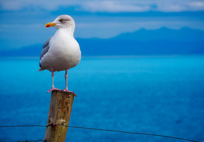 Image by David Mark from Pixabay
The Pencil Sketch
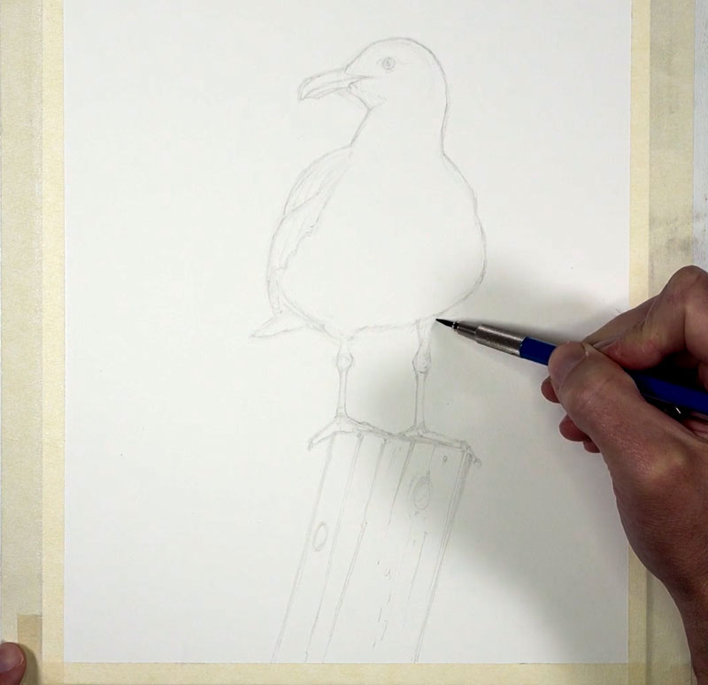
We’ll begin with a light pencil sketch of the seagull using a harder, but lighter 2H graphite pencil on 140 lb. watercolor paper. Be careful not to apply too much pressure on the pencil in these early stages. Placing heavy pressure on the pencil may result in small indentations in the soft paper which could be visible in the completed painting.
Our initial sketch is created by first concentrating on basic shapes. We can break down any subject that we wish to draw by identifying and drawing the most basic shapes that we see. This approach to drawing is called construction.
See also: Drawing Basics – Construction
When we approach drawing in this manner, we can draw any subject that we wish. In this case, our seagull is quite simple and the shapes used to draw it are simple as well. As these shapes are drawn, several loose, light lines are used.
After our initial shapes are in place, we can refine the contour lines and add a few details. Here’s a look at the pencil sketch (the image has been darkened to see the lines)…
Drawing with Ink
When combining pen and ink with watercolor, there are two approaches you can take. The first option is to develop the pen and ink drawing first and then apply the watercolor over the drawing. The second approach is to develop the watercolor painting first and then create the pen and ink drawing over the top.
Either approach is acceptable and both approaches can lead to a successful result. Experiment with both approaches and go with the one that feels the most comfortable to you.
In most cases, I prefer to develop the ink drawing before adding the watercolor. This allows me to focus on the edges, textures, and values in one stage and the color in the second stage. This is the approach I took when developing this painting.
You can begin anywhere on the surface with your ink applications. In this case, we’ll begin with the head and work our way down. Using looser lines, we’ll define the contours of the head and a few of the details with a .05mm pen. In the locations of darkest value around the eye, a few textural marks are applied. Strokes are pulled in this section so that they flow with the direction that the feathers are growing. This helps to describe the texture as well as darken the tone.
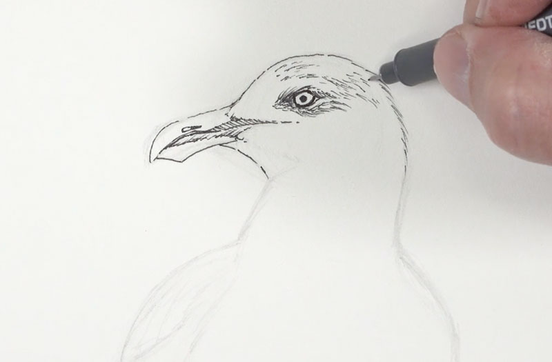
From the head, we’ll simply begin working our way down to the body. In areas where the values are darker, a heavier concentration of marks are applied. We can see this happening on the darker feathers on the left side of the body.
See also: Pen and Ink Techniques
Here, mostly hatching is applied using strokes that flow in the same direction. These lines are fairly loose. It’s okay to make marks that aren’t overly controlled since this adds character and interest to your drawing.
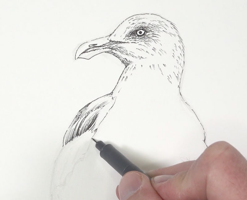
Value is the darkness or lightness of color. It is the value relationships in a drawing or painting that describe the form and texture of the subject to the viewer. In this scene, our light source originates from the upper right. This produces an area of core shadow on the belly of the bird that is slightly stronger on the left side.
To communicate this shadow, we’ll use a series of cross hatched marks. These strokes curve slightly around the form of the body. So, not only do these strokes define the shadow, but they also help to communicate the texture of the feathers.
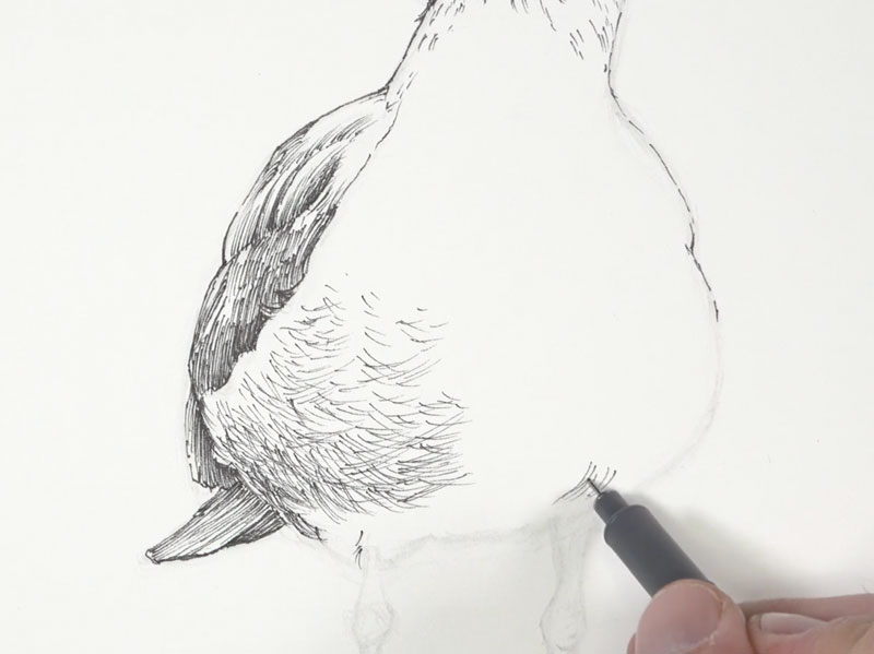
After gradually darkening the areas of shadow under the body with additional strokes, we’ll work our way down to the legs.
Here, we’ll apply mostly horizontal strokes that flow around the form of the each leg, concentrating the strokes where the shadows are stronger on the left side and right underneath the body.
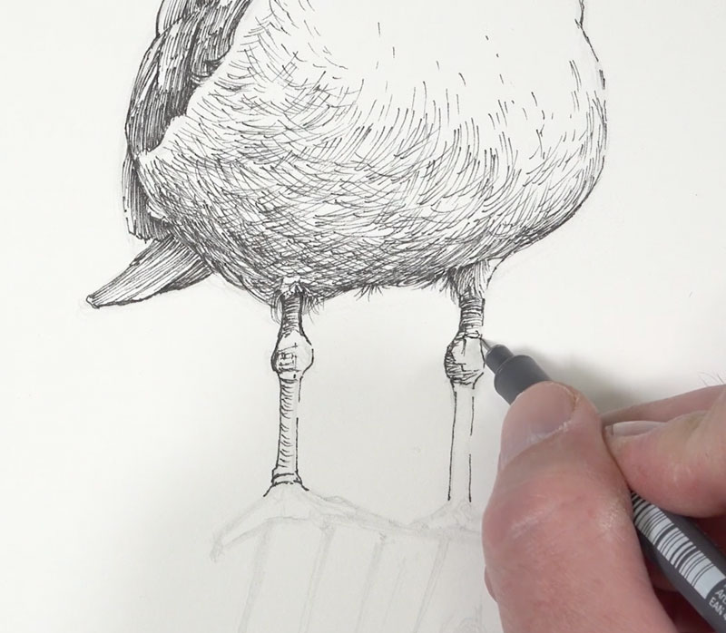
After adding a bit of texture to the feet and talons, we’ll continue working down the picture plane to the wooden post. Just as before, we’ll start by defining the contours and then dive into the texture and value.
To create the illusion of the texture of wood, a variety of strokes are pulled downward at the same angle of the contours. However, some of the these lines are allowed to meander and a few are applied horizontally. Details, such as open cracks and knots, are also developed using a variety of directional stroking.
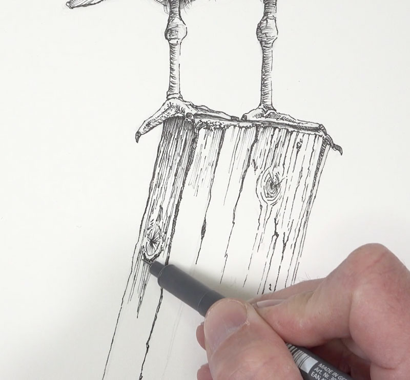
We’ll continue to add strokes to indicate small imperfections and details in the texture. Concentrated marks are added throughout, especially right underneath the top edge of the post and underneath the feet.
To complete the pen and ink drawing, a portion of the fence wire is added. This element helps to break up and contrast the vertical nature of the composition.
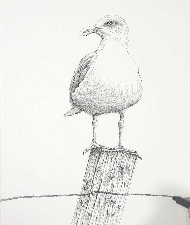
Watercolor Washes
With our pen and ink drawing in place, it’s time to add our color with watercolor. We’ll bring out a little more color than what is observed in photo reference.
We’ll start with a light wash of a Yellow Ochre with Cadmium Yellow Pale Hue over the breast, portions of the head, and the entire fence post. Even though the breast of the seagull is “white”, this color adds warmth and makes the white feel more natural.
While this application is still wet, a bit of blue-purple, mixed by combining Purple Lake and Intense Blue is applied to the shadowed locations on the underside of the body and around the eye.
Since these applications are applied wet, some blending occurs. This results in a natural transition from the cooler shadows and the warmer highlights.
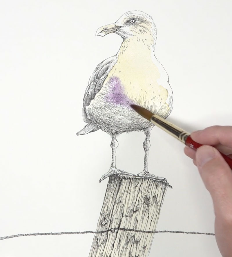
Using this same blue-purple, we can gradually darken the shadows on the head and the body. With the smaller, 00 round brush, we can add a few hints of the darker patterns on the back of the head.
With a touch of Payne’s Gray added to the mixture, we can also darken the colors on the feathers visible on the left side of the body. This darker value is also added to the underside of the body with very light washes, slowly darkening the value and strengthening the shadow.
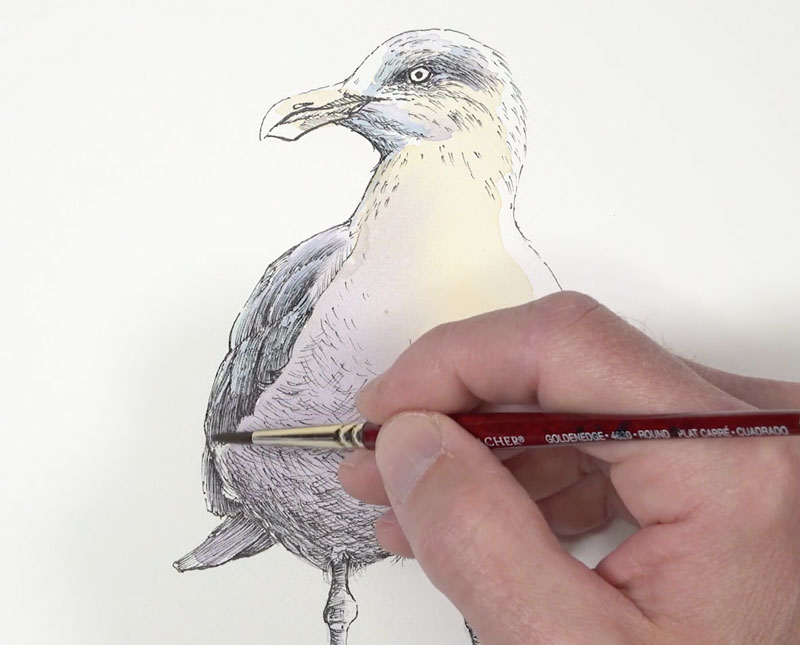
We’ll go back to the head and add a more intense yellow to the eye and the beak. An application of Cadmium Red Deep is added to the small red section of the beak. This color is washed on lightly at first. After allowing it to dry slightly, an additional application is made to intensify the color.
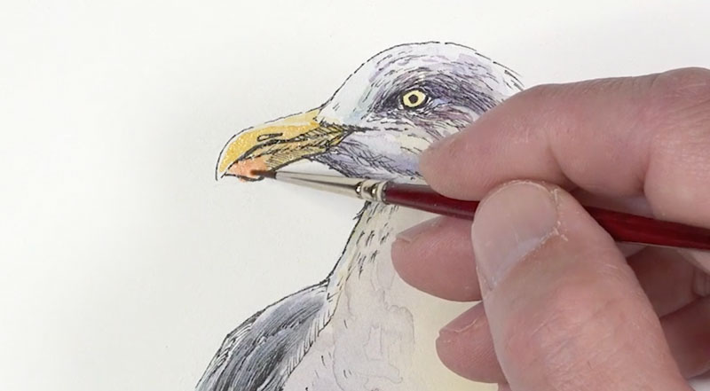
As we continue to work down the picture plane, we’ll next address the legs. A mixture of the mixed blue-purple with a touch of Cadmium Red Pale Hue is applied to the legs. A heavier concentration of this color is applied to the left side, where the shadow is strongest. The right side of the leg is mostly in light, so a lighter wash is used.
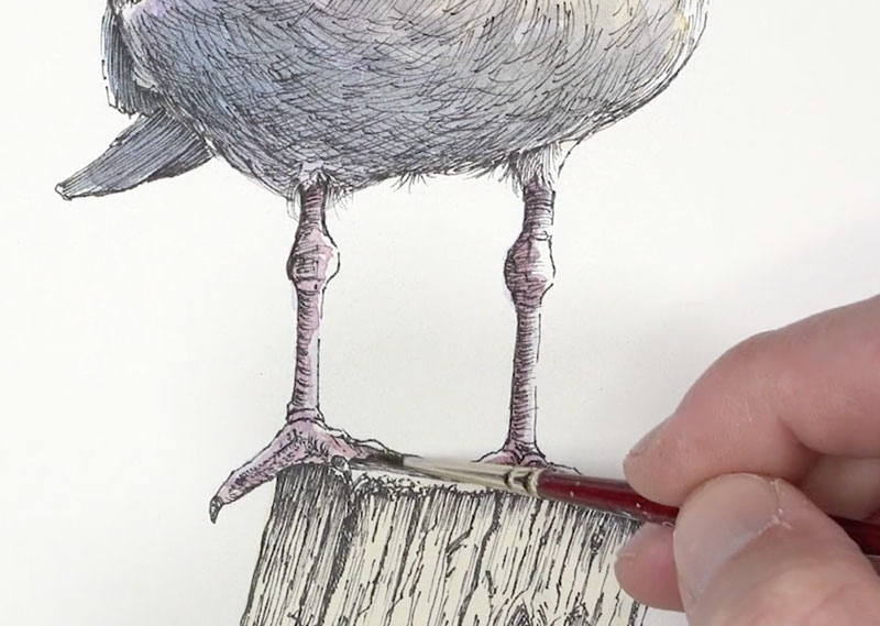
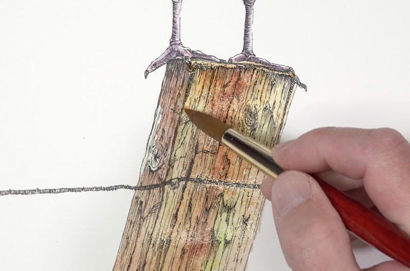
With the legs complete, it’s time to address the watercolor applications on the wooden post. We’ll start with a bit of Sap Green and Burnt Sienna. The green is applied first in areas, followed by the Burnt Sienna.
Since these colors are applied with watery washes, the colors blend together, creating nice transitions. We’ll continue to add colors while this section is still damp. Yellow Ochre, Burnt Umber, and Payne’s Gray are all layered in sections, creating variety in the color.
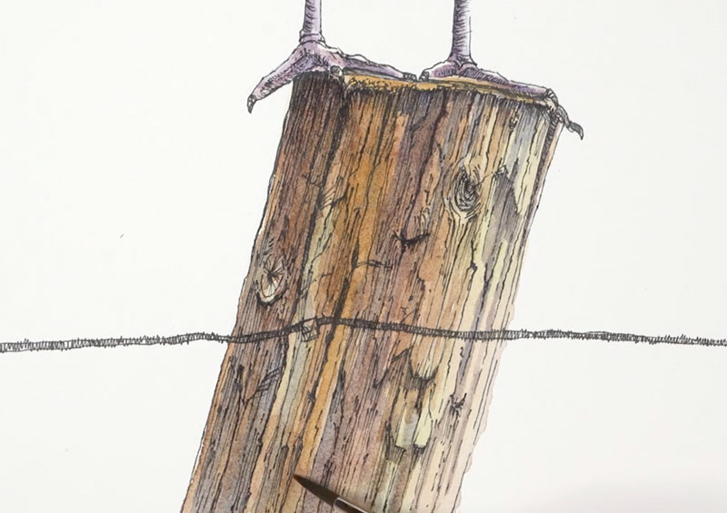
After allowing our initial watercolor washes to dry (or by drying with a hair dryer), we can add a few hints of shadow with additional applications of Burnt Umber and Payne’s Gray. We’ll also use a bit of Intense Blue to add some color to the shadows in areas.
Since our light source originates from the right, our colors are darker and more intense on the left side of the post.
Now we need to add a bit of contrast behind the highlighted side of the seagull’s head. By adding a darker value here, we can make the highlights appear lighter and pull additional focus to the head.
For this darker tone, I chose to use a mixture of Payne’s Gray with just a touch of blue. This created a cooler gray that contrasts not only the value of the head but also the color temperature.
Using the larger 14 round brush, we can fill in an abstract shape with a heavily concentrated application.
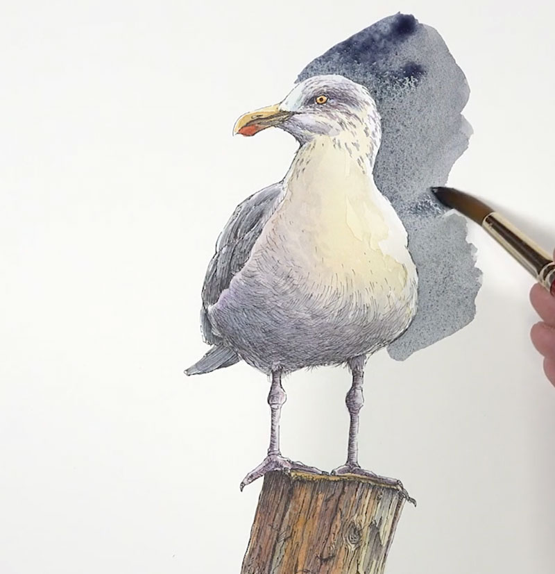
After filling in the darker shade behind the seagull, the composition felt too heavily weighted at the top. I decided to take an artistic risk and bring down some of the color from the beak and frame the wooden post. And with this last pop of color, the painting was complete.

Conclusion
As artists, we should never feel as though we are a slave to our reference photos or our subject. Photographs don’t usually produce the colors that we need to create an interesting painting. We often need to push colors or invent them entirely in order to produce an image that is successful. In this painting, we deviated quite a bit from the photo reference in order to make the subject more interesting.
If so, join over 36,000 others that receive our newsletter with new drawing and painting lessons. Plus, check out three of our course videos and ebooks for free.
Timed Sketching Exercise – Eagle
Practice Makes Perfect
Drawing is a skill that anyone can develop. Once you have a strong foundation of the fundamentals of observational drawing, then practice is what should follow. The more that you practice, the better you will get at drawing.
Unfortunately too many people believe that drawing mastery requires talent. But if you ask any accomplished artist what makes them great, they’ll likely tell you that it’s a combination of knowledge and practice.
Making time for practice can be the real challenge for most of us. That’s why it’s important to make drawing practice a part of your daily routine. Even just a few minutes each day will make a big difference.
In this timed sketching exercise, we’ll create a sketch of an eagle on toned drawing paper.
Materials for this Sketching Exercise
For this exercise, we’ll use graphite and white charcoal on toned drawing paper. There’s nothing fancy about this paper. It’s simply toned recycled sketch paper by Strathmore. You’re welcome to use any drawing media that you wish and any surface that you prefer.
The graphite applications are made using a combination of 2B and 4B graphite. The 2B pencil is used for most of the applications, while the 4B is used to darken the shadows and broaden the range of value. The white charcoal is used for the highlights and lighter mid tones. We’ll allow the gray tone of the paper to show through in areas, working to help us create a full range of value in a short period of time.
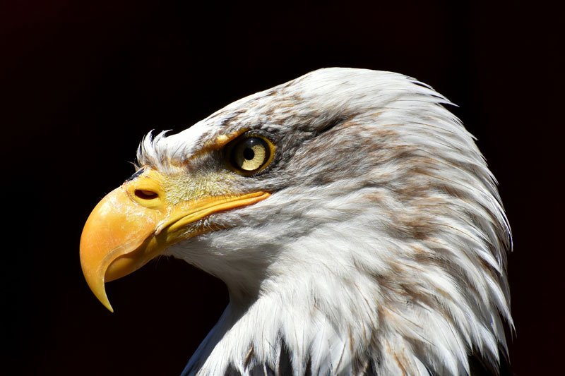
Photo Reference
The photo reference that we’re working from comes from pixabay.com.
Here’s a look at the photo reference of the eagle…
How to Sketch an Eagle – Step by Step
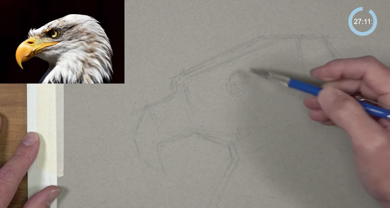
We’ll begin the drawing with the 2B graphite pencil, sketching in the basic shapes. We’re simplifying the form of the eagle down into the most basic shapes. We can piece these geometric shapes together to describe the overall larger shape of the eagle. This approach to drawing is called construction.
See also: Drawing Basics – Construction
Looser, light lines are used to develop each of the shapes. As we become confident with the shapes that we’ve pieced together, we can develop some of the details and define the contours (outlines) with a little heavier pressure placed on the pencil.
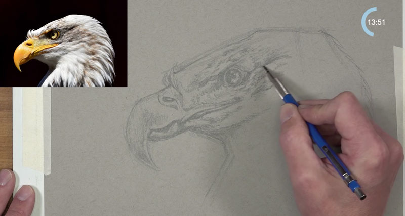
With the contour lines in place, we can begin developing the darker values. Sticking with the 2B pencil, we’ll begin adding the darker tones using directional strokes that mimic the form of each section. For the beak, circular strokes are applied. For the head, strokes are pulled in the direction that the feathers grow.
By darkening the values with directional stroking, we begin to develop a sense of the texture.
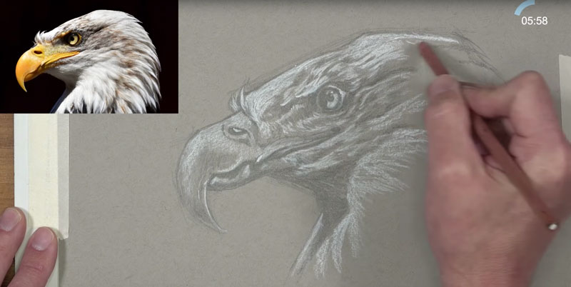
Once we have developed the locations of darkest value, we can begin addressing the lighter values and the highlights. Since we’re working on gray toned paper, we can allow some of the tone of the paper to work as midtones.
The gray paper also allows us to add the lightest values with a white drawing medium. If we were working on white paper, we would have to preserve these areas, working around them with our graphite. In this case, white charcoal is added. If you don’t have white charcoal, you can substitute a white colored pencil or pastel pencil.
See also: 6 Reasons to Draw on Toned Paper
Since our light source in this scene originates from the upper left, most of these lighter values are found on the top and left sides of the eagle. However, a strong area of cast shadow exists right underneath the beak where a shadow is cast.
With most of our light values in place, we can begin to darken up some of the areas of strongest shadow. We’ll switch over to the darker and softer, 4B graphite pencil to do this. We don’t want to cover all of the applications made with the 2B pencil. We simply want to make the darkest shadows a little darker.
As this pencil is applied, we broaden the range of tone and increase the contrast. By increasing the contrast, we bring out more of the textures and make the light a little stronger.
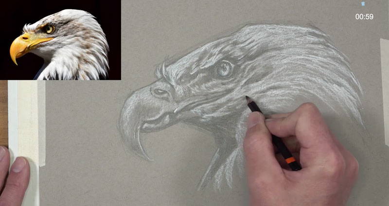
We can then go back and forth with the 4B pencil and the white charcoal to broaden the range of value even further. We can make refinements to the drawing as our 30 minute time constraint is nearly up.
Using a kneaded eraser, we can now erase any remaining stray pencil lines and clean up the sketch.
Here’s a look at the completed sketch of an eagle, completed in just under 30 minutes…
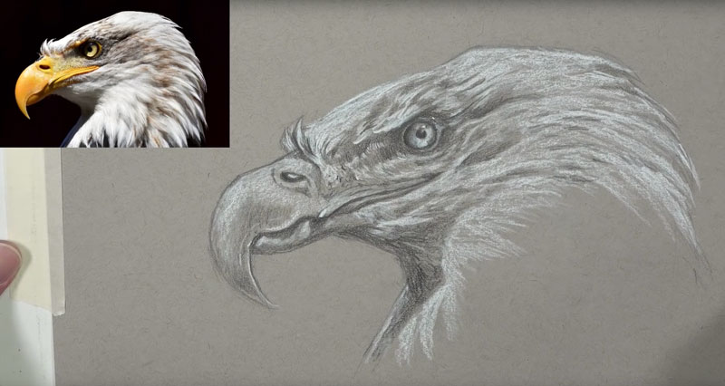
Conclusion
I hope that you tried this exercise and were pleased with the results. Remember, as artists, we’ll all see things a little differently. We’ll also apply the mediums that we use differently as well. It’s ok if your drawing looks a little different. The point of this exercise is practice. And although we want our drawings, even our sketches, to be as accurate as possible, it’s ok to notice inaccuracies. If we were creating a finished drawing, we wouldn’t be working under a time constraint and we would correct any mistakes as we worked. It’s fine to leave those little “mistakes” in your sketches. This is all about practice. And the more that you practice, the better you will get.
If so, join over 36,000 others that receive our newsletter with new drawing and painting lessons. Plus, check out three of our course videos and ebooks for free.
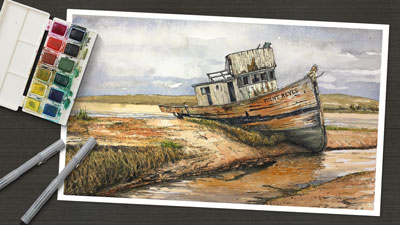
Ink and Watercolor – Line and Wash – Old Boat
Materials for Drawing
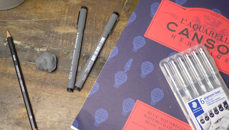
Before we get into the drawing, let’s first have a look at the materials we’ll use for the first stage. For this drawing, we’ll work on hot press 140 lb. watercolor paper. This paper is smoother than its cold press counterpart which will allow us greater control over the ink applications. Canson paper is used.
Our light graphite drawing is created with a light 2H graphite pencil. This pencil will produce a very light – barely visible – sketch of the subject. Since this pencil is hard, we’ll take care not to place too much pressure, which could create grooves in the paper.
Our ink applications are made entirely with a .05 mm pen by Steadtler. Although this pen produces a very thin line, we’ll adjust the thickness as we apply it to develop a bit of variety.
Creating the Drawing
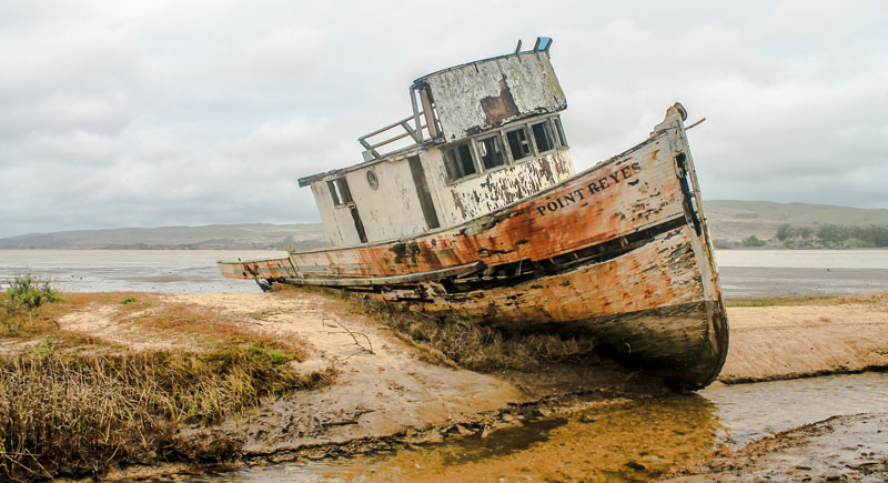
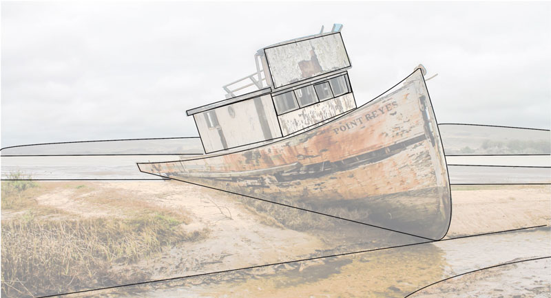
We’ll first take a look at the photo reference that we’re working from. In this case, the photo reference comes from pixabay.com. We’ll begin by analyzing the shapes and lines that we see and break the subject down into the most basic ones.
Here’s a look at the reference photo…
We’ll all see different shapes in the subjects that we draw and paint. These are some of the shapes that I see…
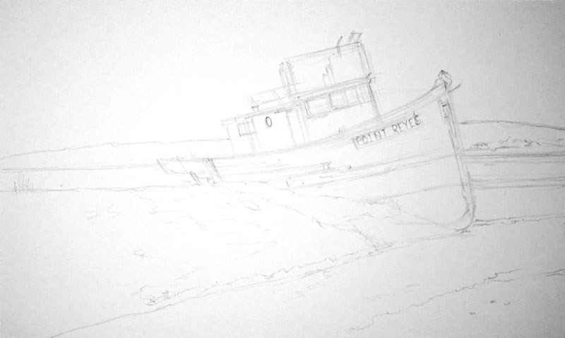
Using the 2H graphite pencil, we’ll draw the basic shapes that we’ve identified, paying close attention to the proportions and the positioning of the subject on the surface of the paper. We can draw using multiple, light lines. As we become more confident with our sketch, we can gradually add details such as the windows, doors, and some of the open shapes on the hull.
Here’s a look at the graphite sketch. (I’ve adjusted the contrast to make the sketch visible, since it was so light.)
Adding Pen and Ink
With our graphite sketch in place, we can begin adding the ink with the .05 mm pen. You are free to start anywhere that you wish. Since the boat is clearly the focal point in this image, I decided to begin here.
We’ll take the inking portion of the drawing in sections, working to completion in areas before moving on to the next section. For the most part, the contour lines (outlines) are defined first before adding shading and texture.
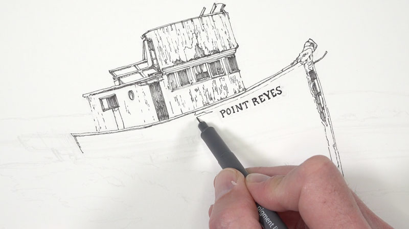
As we fill in some of the darker values, we’ll consider a couple of things. The first is the direction of the strokes. We’ll keep them fairly consistent, using hatching only. (Cross hatching may make the drawing too busy.)
We’ll also keep in mind that watercolor applications are to follow. This means that we need to be careful that we don’t make the ink drawing too dark. Adding too many lines at this stage would lead to a dark image and may look busy. We can always add ink to the image after the watercolor washes if we wish.
For these reasons, we’ll keep the ink applications to minimum. We want enough information to describe the texture, form, and some of the value, but we also need to keep in mind that the watercolor will do some of this work for us as well.
As we work our way outward from the top of the boat, we’ll add in the details on the hull. You’ll notice that the directional lines have changed here. Instead of vertical lines, the lines now flow along the form the hull, curving slightly as they make their way to back end.
For the openings however, we’ll return to vertical strokes to fill in the shadows. This change in direction will add some contrast to the mostly horizontal lines added around the hull. Even though these areas are very dark, we’ll still leave some of the paper showing through. Again, we’ll use the watercolor to complete the shadows later.
Then we’ll simply continue working outward and down into the middle and foreground. Looser, more organic lines are used here to mimic the textures of the grass, rocks, and water. Hatching is used sparingly along the bank. But even here, we still allow these lines to curve with the form of the shore. Directional lines not only inform us of the texture and value, but can also be used to describe the form.
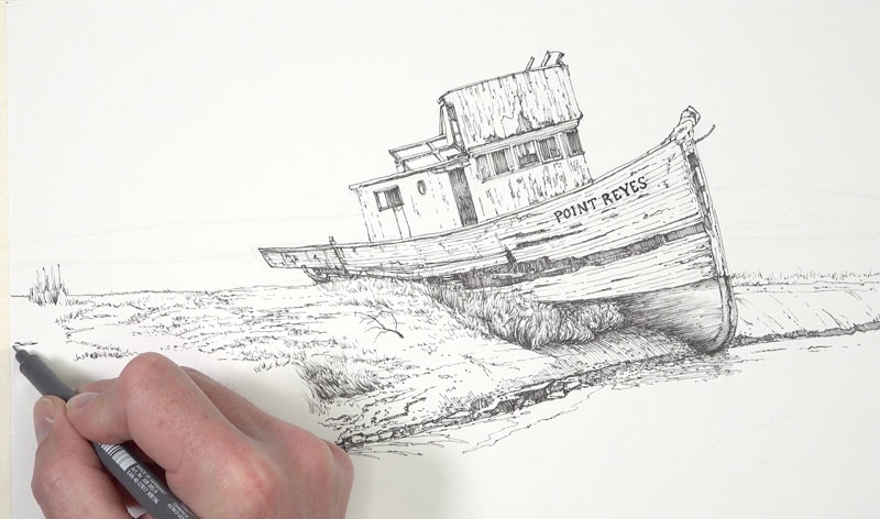
Many people mistakenly believe that pen and ink is a medium that requires you to stay stiff and deliberate. But by loosening up a little, you can add life and interest to a drawing. It’s okay to make lines that are a little squiggly or suggestive. Allow your marks to be your own and embrace the unique mark that you naturally make without trying to control it too much.
We’ll allow for some of these looser marks as we work down the bank. We’re using our reference as a reference only, instead of relying on it exactly. As we see little shapes and values we can add them to our drawing or leave them out. Be careful that you don’t become too reliant on the photo. You’re making a work of art and you’re not a photo copier.
Since the distant shore and hill are far off in the distance, we’ll only use a few broken lines to define them. Objects that are farther from the viewer are lighter in value and have less contrast.
We’ll work our way to the small patch of ground in the extreme foreground. Here again, we’ll rely on the texture that we observe for the directional strokes that we use. Grassy patches are defined with horizontal strokes, while the ground itself is developed with mostly horizontal marks.
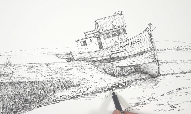
As we continue to work our way down the bank and into the water, we add a heavier concentration of marks where the values are darker. In areas where the value is lighter, we’ll still add marks but leave more space between them. The marks that we add for each section of the drawing is dictated by the textures that we see there.
For example, for the grassy area in the lower left corner, vertical and diagonal strokes are applied with the pen. But along the shore, the marks are more horizontal and shorter.
The water is also addressed with ink. A few subtle ripples are added and the shapes for the reflections and shadows are also defined. In the darkest areas, a few loose horizontal hatch marks are made. The hatch marks used here are more fluid and less controlled. Looser marks help to better communicate the fluidity and movement of water.
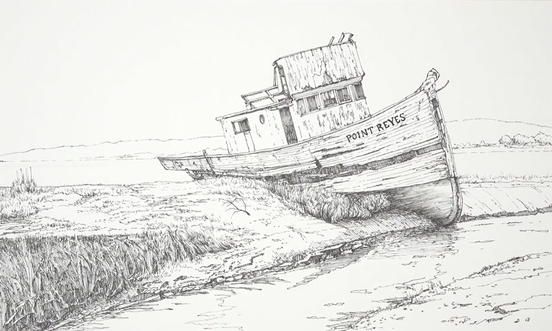
After adding a few last marks to the water, our pen and ink sketch is in place and we’re ready to move on to the watercolor washes. Here’s a look at the pen and ink drawing…
Watercolor Applications
Before we begin with our watercolor applications, we need to analyze the colors in our reference and decide what colors we should pull out. Of course, we can always just paint the colors that we see (local color) and not consider a color scheme. This image already has a nice color relationship, we’ll just need to make a slight alteration to make the painting more harmonious.
Just as we analyzed the shapes before we began drawing, we’ll also take a closer look at the colors. We’ll all see things differently here as well. (This is just one of the things that make us unique as artists.)
I see the strong red-oranges that are spread consistently throughout the image. Along with the red-oranges, we also have quite a bit of green. Orange and green are secondary colors and if we had a little purple to pull out, we could decide to go this direction for a color scheme. However, there isn’t any purple to be found and the oranges are leaning heavily towards red.
So instead of pulling out a secondary color scheme, it makes more sense to push our colors towards a complementary color scheme. To do this, we can allow our greens to lean towards blue, creating blue-greens in areas. We’ll accentuate the red-oranges and bring out a little more of the red. This will give us a near complementary color scheme of blue-green and red-orange.
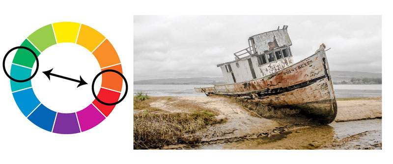
It’s important to note here that even though we are pulling out contrasting colors, our resulting painting will not be a complementary painting in the truest sense. We’re just using our knowledge of color theory to make the painting more interesting and to create additional “pop”. There are blues and yellows that will be incorporated in the image as well as some yellow-greens.
Materials for the Watercolor Painting
We’ll use a limited palette for the painting. This means that we won’t use all of the colors at our disposal. Instead we’ll mix colors from a limited few. Working with a limited palette helps to unify a painting. Sometimes there’s a little magic in simplicity.
For this painting, I’m working with my field watercolor set by Winsor and Newton. I’ve had this set of Cotman watercolors for several years and I love it. Although Cotman watercolors are considered “student grade”, they are of a very high quality and the pigment quality is “top notch”.
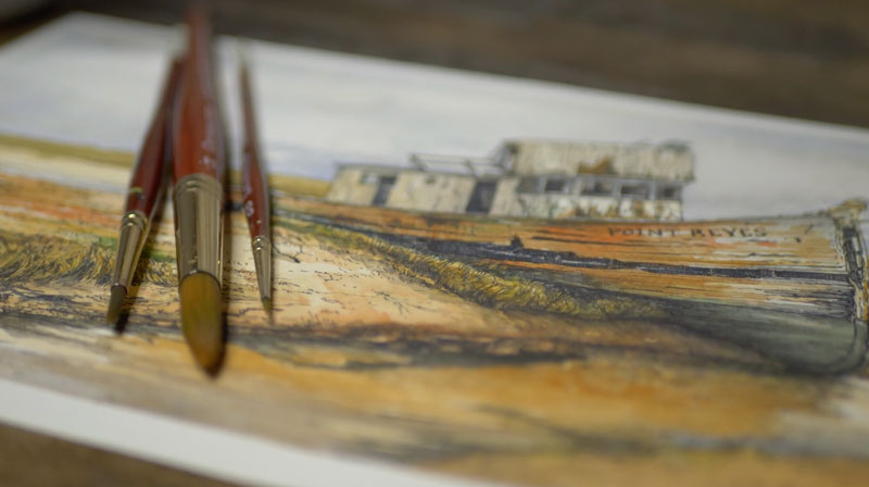
The brushes that are used are Grumbacher Golden Edge watercolor brushes. These brushes are my favorites for watercolor and gouache. The synthetic bristles are stiff, but flexible, and provide you with a ton of control. They are a little pricey, but well worth the investment. These brushes have lasted me for years and they’re still in great shape. (Part of this is because I take care of them.)
Even though three brushes are pictured above, only two of them were used. A #14 and #4, both rounds, are used in this demonstration.
Applying Watercolor Washes
A watercolor painting is best approached by starting with light, translucent applications. As additional layers of colors are added, the values become gradually darker and the colors become more intense.
We’ll start with a light wash in the sky using a combination of Cobalt Blue with a touch of Burnt Umber (to mute the color). Leaving a few open spaces to indicate a few clouds, we’ll bring this wash down to the distant hillside adding a bit more blue close to the bottom.
Next a light wash of Yellow Ochre and Burnt Sienna is applied to a large portion of the remaining picture plane. A few open areas are left untouched in the water and the boat is completely avoided.
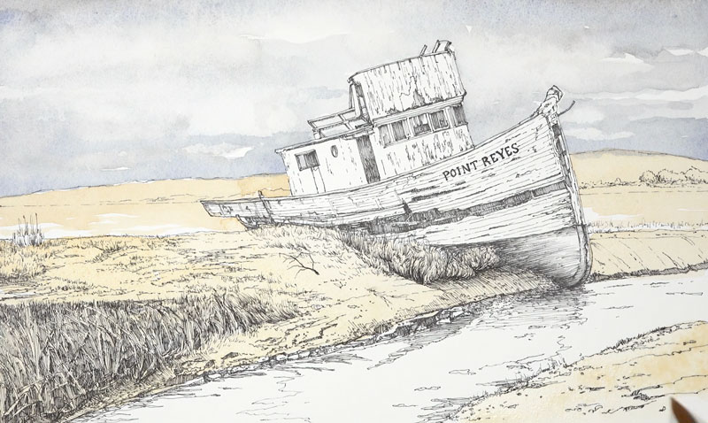
Next we’ll begin adding additional colors and begin the process of working darker. Burnt Sienna and Sap green are the major players in this next step.
We’ll add Burnt Sienna over portions of the shore and Sap Green to the grassy areas. These colors aren’t applied purely. Some Burnt Umber and Cobalt Blue is used to alter the value of these colors and to add variety. Yellow Ochre is also mixed and layered at times to gradually intensify the colors on the shore.
To make values darker, we can layer a combination of Cobalt Blue and Burnt Umber. For the grassy areas, the Cobalt Blue is allowed to dominate the mixture producing a cooler shadow. For the warmer areas, the brown is dominate resulting in a warmer shadow.
We’ll also pull some of the muted Yellow Ochre (mixed slightly with Burnt Umber) down into the water.
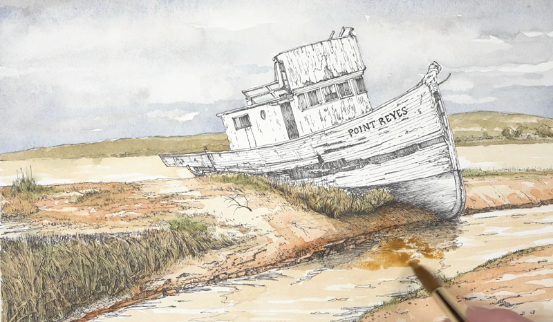
After we have layered a few washes over the distant hillside, middle ground and foreground, we can turn our attention to our main subject – the boat.
The boat can be described as “white”. However, when we look a little closer, we can see some subtle color. We’ll bring out some warmth on the planes of the boat that are receiving light and cool down the shadows.
A light wash of Cadmium Yellow Pale Hue with a touch of Burnt Umber is applied to entire body of the boat.
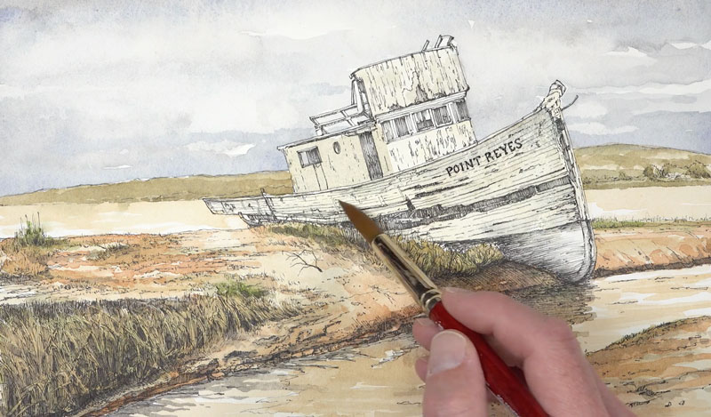
While the surface is still wet, we’ll begin adding some of the stronger colors. Burnt Sienna is applied as well as Viridian. A bit of Sap Green is added to the Viridian, just to make this green appear a little more natural.
We’ll allow these colors to flow into one another, creating interesting transitions and patterns.
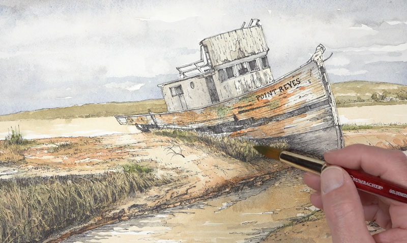
We’ll add a bit of our darker mixture of Cobalt Blue and Burnt Umber to the open spaces on the hull and continue the process of intensifying the relationships of red-orange and blue-green. We’ll also apply our blue-green to the bottom of the hull.
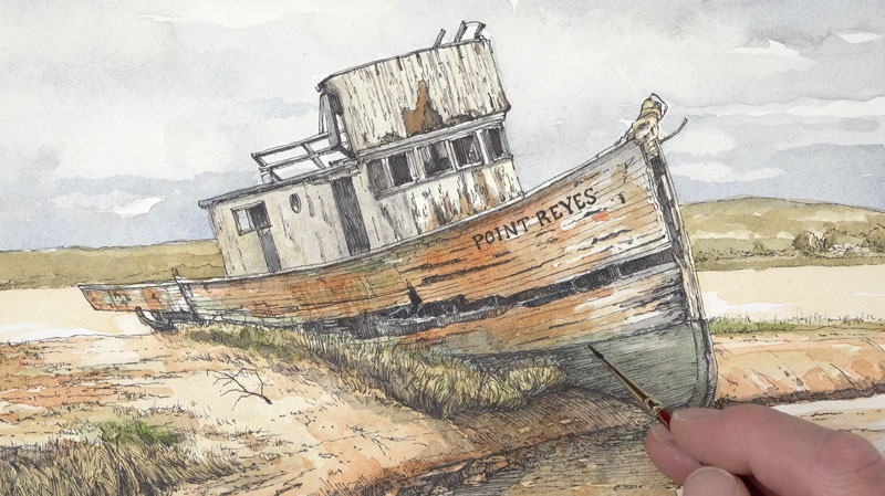
Once we’ve established a full range of value on the boat and we’re satisfied with the relationship of colors, we’ll finish off the water by adding a few shadows and reflections. A bit of muted blue is also added to the edge of the shadow and pulled upward into the yellow-orange right above it. A bit of our blue-green is added to the edge of the water to indicate the reflection produced by the color at the bottom of the hull.
Then it’s back to pushing the values darker in the shadows along the bank.
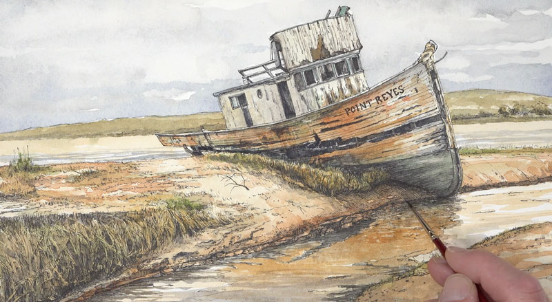
We’ll continue to push the value relationships in the painting, finding opportunities to make values darker where necessary. We’ll also add a cast shadow under the small twig growing up in the center of the picture plane.
Conclusion
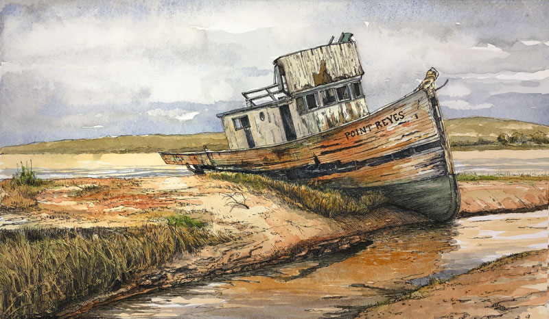
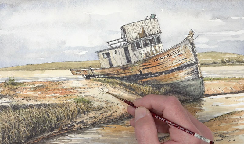
Now our painting is complete and we can gently pull the tape away, revealing our completed image. This one was a fun adventure and I’m happy with the results. Here’s another look at the completed painting…

If so, join over 36,000 others that receive our newsletter with new drawing and painting lessons. Plus, check out three of our course videos and ebooks for free.
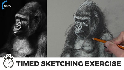
Timed Sketching Exercise – Gorilla with Charcoal
Sketching Practice with Charcoal
Many people mistakenly believe that you must have talent in order to draw well. While there are people out there that can sit down and create drawings with relative ease, the truth is that drawing is a skill. And just like with any other skill, it requires practice. Daily practice is best, but we all know that finding time to practice is often difficult.
Sometimes it’s helpful to set a time constraint on your practice. If you know that you’re only going to spend a set amount of time on your practice, you’re more likely to start. And starting, as you may know, is the hardest part. But once you’ve started, and you know that your drawing practice has a set end time, then you’re more likely to see the sketch through to completion.
So, grab your drawing materials and let’s get into a little practice. In this timed sketching exercise, we’ll create a quick and loose drawing of a gorilla with charcoal. If you don’t want to work with charcoal or if you don’t have any at your disposal, you can still draw along side with any drawing medium that you wish.
Materials for this Sketching Exercise
In this drawing, we’ll use vine and compressed charcoal. Vine charcoal is softer and lighter and is used for the beginning stages of the sketch. Compressed charcoal is harder, but creates a darker mark. It is best suited for the finishing touches and for making the values darker. The “white charcoal” that is used isn’t really charcoal at all. It’s called white charcoal, but it’s more closely related to a material called “conte”.
For more on the different forms of charcoal and the basics of drawing with charcoal see: How to Draw with Charcoal
The surface we’ll use for this exercise is gray charcoal paper by Strathmore. This paper features a laid textured pattern. The texture of this surface helps to keep the powdery charcoal in place on the paper, but also aids in any blending that we decide to do. All of the blending in this drawing is accomplished with a finger, but you’re also welcome to use a blending stump.
Of course, the surface that you choose to work on affects the results that you achieve. Drawing mediums behave differently on different surfaces. It’s important to have a good understanding of how the medium will behave on the surface that you choose for any drawing that you create.
Learn more about drawing surfaces: All About Drawing Papers
We’ll also have at the ready a kneaded eraser. A kneaded eraser is soft and pliable and works by lifting the material off of the surface, rather than removing through friction. This means that we can preserve the texture of the drawing without marring it with a rubber eraser. (I don’t use the eraser in this quick sketch, but it was sitting at the ready in case I kneaded needed it.)
Photo Reference
The photo reference that we’re working from comes from pixabay.com. This site features tons of reference material submitted by wonderful photographers from all over the world. In this case, I edited the photo only slightly, reversing the pose with Photoshop.
Here’s a look at the photo reference of the gorilla…
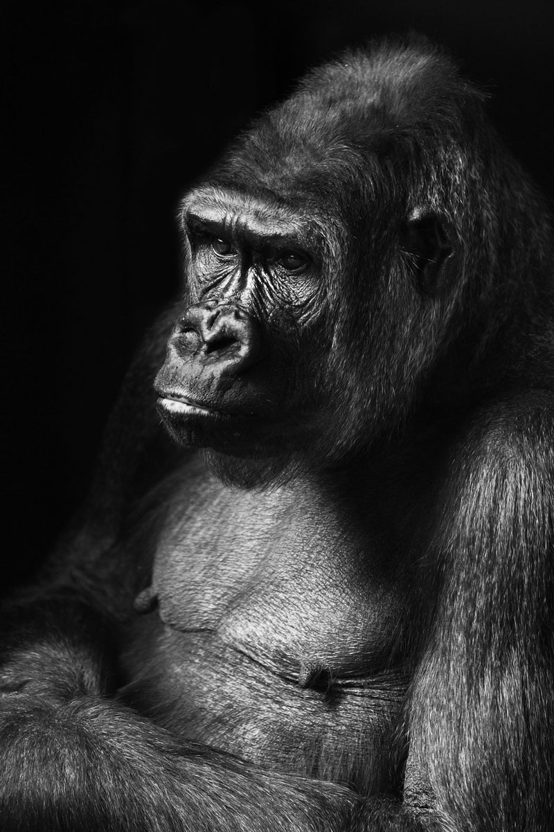
How to Sketch a Gorilla – Step by Step
We’ll begin with loose shapes that define the form of the gorilla using the softer, vine charcoal. It be helpful to keep your arm moving while you make these marks. Don’t worry about making the drawing perfect. This is only a sketch and is designed for practice. Try to get the proportions as accurate as possible, but don’t obsess over them. Remember, we’re working against the clock.
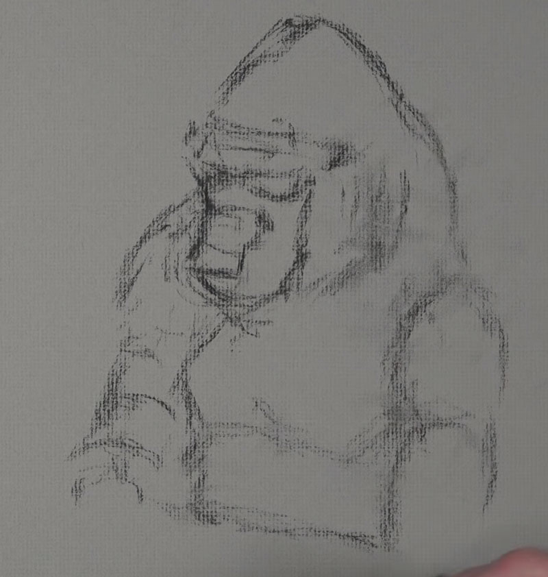
Once our basics shapes are in place, we can begin adding some of the darker values. We’ll continue with the vine charcoal stick to do this. Look for the basic shapes that the darker values make and try to draw those shapes.
This image is high in contrast, so it should be fairly easy to see them, but if you find it difficult, you may try squinting at the reference. This can make it easier to discern the darks and the lights.
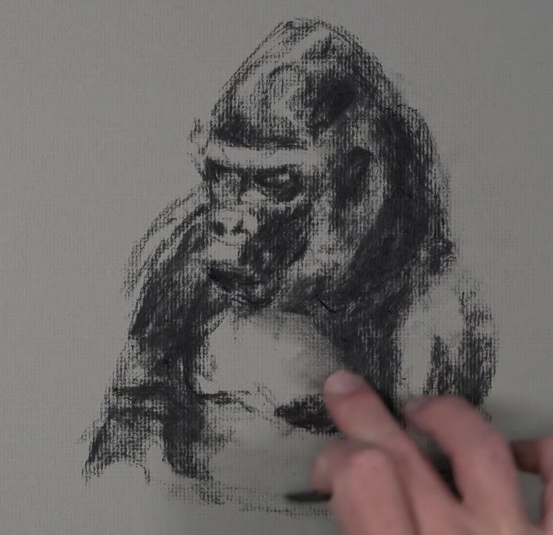
You may use your finger or a blending stump to work some of the material into the surface texture of the paper. You don’t have to do this, but it helps keep the powdery vine charcoal in place on the surface.
Then we’ll grab our compressed charcoal pencil and begin darkening the darkest values even further. While we do this, we’ll also define a bit of the texture, fur, details, and contour lines. Keep your lines loose and gestural.
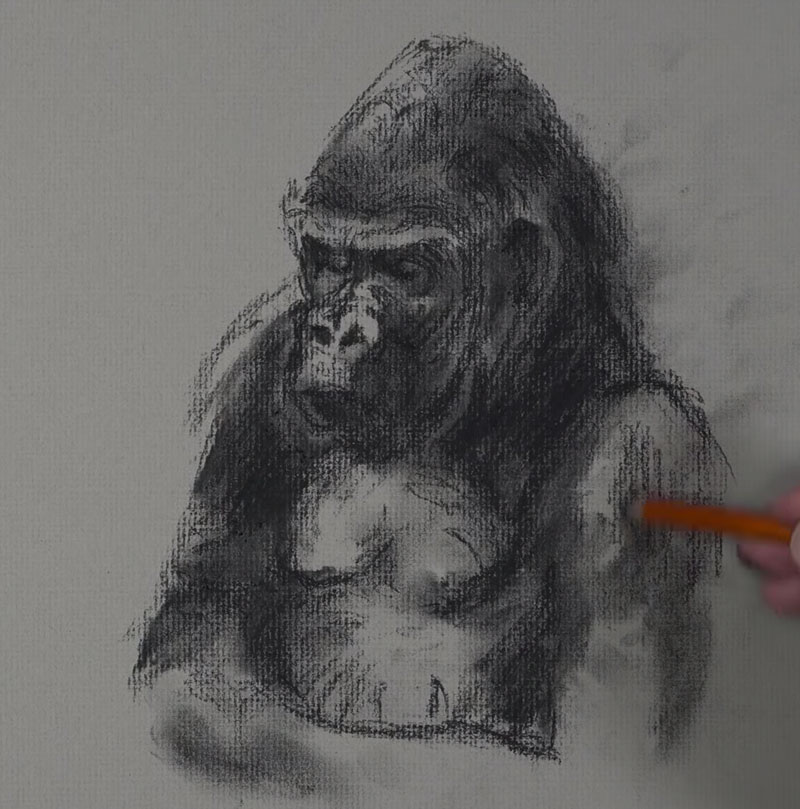
Now we can begin to address some of the lighter values. Since we’re working on gray paper, we can add the highlights and lighter tones with the “white charcoal” pencil. The light source in this scene originates from the left side. This means that most of our highlights exist on the left side of the body of the gorilla.
Using strong defined lines, we’ll add the highlights that we observe, starting with the head and face.
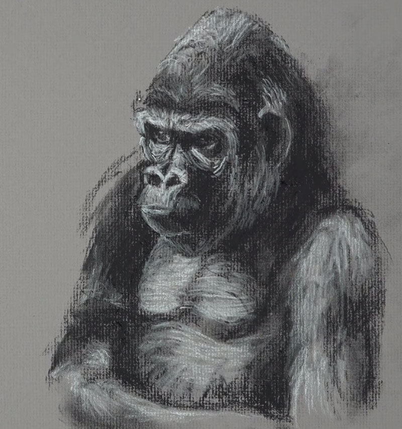
As these highlights are added, we start to develop a full range of value and tone. This increases the contrast, makes the textures more believable, and adds to the illusion of form.
At this point, we could leave the sketch as it is since the gray of paper works well to frame the subject. But, we’ll go ahead and add the dark background and refine the edges of the gorilla further.
Using compressed charcoal, we’ll add the darkest tones in the background and blend the applications with a finger (or blending stump) to complete the background.
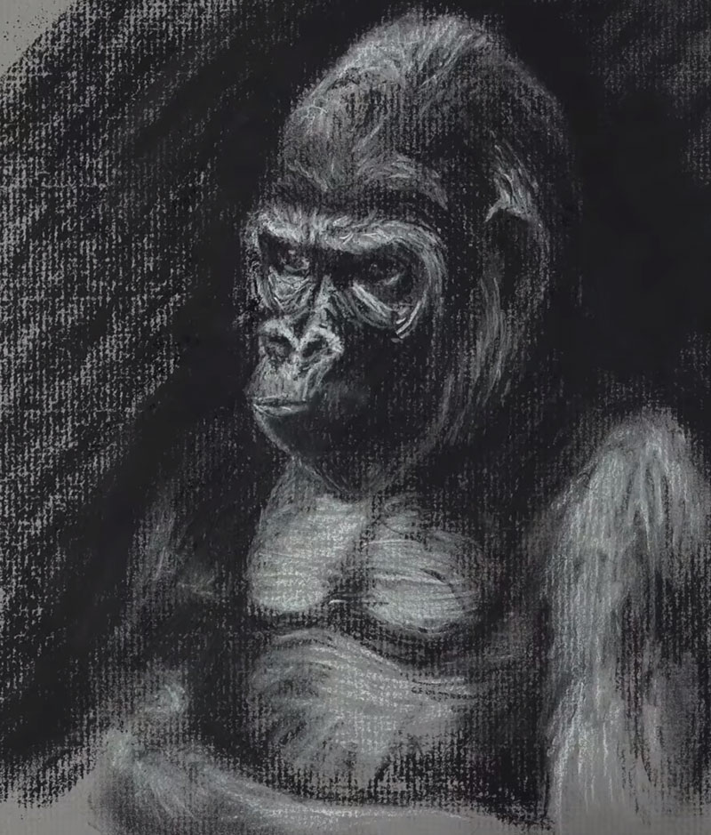
Then it’s back to the white charcoal, adding a few finishing touches. We can also revisit areas with the compressed charcoal to strengthen shadows and add additional hints of texture.
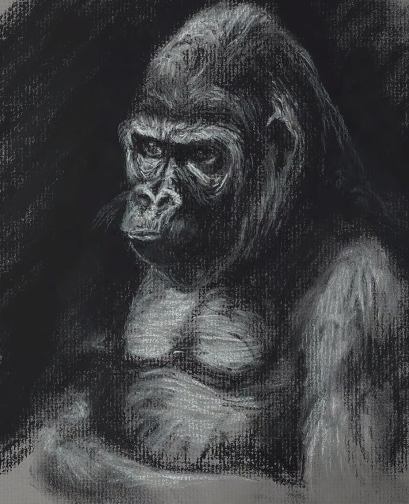
Conclusion
It’s okay if you didn’t finish this drawing exercise within the time constraint. Any type of practice will contribute to your drawing improvement. Remember, this is not a completed drawing. This is a sketch and an exercise. If you attempted this exercise, your drawing won’t look just like the photo and this is okay. Sketching exercises are designed for practice. Drawing is a skill and most of it is mental. The more that you practice training your brain to see, the better you will get at drawing.
If so, join over 36,000 others that receive our newsletter with new drawing and painting lessons. Plus, check out three of our course videos and ebooks for free.

