Drawing Basics – Construction


JOIN THE VIRTUAL INSTRUCTOR
Get ALL of our courses, ebooks, live lessons, critiques, lesson plans and more today.
In this drawing lesson, we’ll take a look at one of the most important fundamentals of drawing. This fundamental concept is called “construction.”

Construction refers to the practice of breaking complex objects down into basic shapes. The artist then pieces these basics shapes together to form the more complex shape of the object that they wish to draw.

Understanding the Concept of Construction in a Drawing

We can compare the process of drawing construction with that of constructing a house. A house needs a foundation and a structure before the finishing touches are added. Of course, all we see are the finishes, but a complex structure exists underneath. Without the underlying structure, the house would not stand.

Drawing construction compared to building

Our drawings also need an underlying structure. And by starting with the structure, we can ensure that our drawings are more accurate.

Looking For Basic Shapes

The first step in construction is to identify the basic shapes that comprise our subject. This is a subjective process. You may see different shapes than someone else and this is perfectly acceptable. You can break subjects down in any manner that makes sense to you. But remember, simple shapes are easier to draw and easier to piece together, so it’s advised to look for the most basic shapes if possible.

Let’s see how this works with three different examples…

Example 1 – A Ketchup Bottle

We’ll start with a very simple example – a basic bottle of ketchup. This bottle is presented from a straight on view, so our shapes will be easy to discern.

Take a look at the bottle and see what basic shapes you may be able to pick out.

Drawing construction example 1 - a ketchup bottle

The most basic shapes are a couple of rectangles. These shapes are easy to see and it’s fine to start with these. But if we look a little closer, we’ll find that we can break this object down even further. We can still use rectangles for this.

Once we’ve drawn the basic shapes, we can draw additional elements. For example, we can add the slight diagonals that happen at the bottom and top of a few of the rectangles.

Drawing the basic shapes using construction

We can also draw the label using basic shapes as well.

Then, once we have the construction drawing in place, we draw the contour lines right over the top. If you wish, you can carefully erase any of the remaining lines to clean up the sketch.

Drawing the contour lines of the ketchup bottle

Our drawing is clearly not a refined or finished drawing, but the overall shape is in place. If we wanted to, we could complete the sketch by adding shading or color and refine it further.

Let’s take a look at another example…

Example 2 – A Shoe

One of my favorite objects to use when discussing construction is a shoe. A shoe can be broken down into basic shapes relatively easily, but the shapes are slightly different from each other.

Let’s look at how to draw this shoe with basic shapes. First, take a look at the show and try to pick out a few basic shapes. Remember, we’ll all see things a little bit differently so the shapes that you see may different from the ones that I see.

A red shoe - drawing construction example 2

When I look at the shoe, these are the shapes that I see…

Drawing the basic shapes of a shoe

We’ll draw the basic shapes first using light sketchy lines. It may be helpful to draw several loose lines instead of trying to draw the perfect lines with just one mark. Remember, this is just the underlayment. No one will see the lines that we draw at this stage, as long as we draw them lightly and erase any remaining marks.

With our loose sketch in place, we can add the contour lines. And since we have a nice foundation in place, we can draw these contour lines with a bit more confidence.

Drawing the contour lines of the shoe

25 Days to Better Drawings
Learn a new drawing concept and skill every day for 25 days. Each drawing concept taught includes a short drawing exercise (less than one hour) that reinforces the concept taught.

VIEW COURSE

Now, let’s look at one more example…

Example 3 – A Bird

Next, we’ll look at a subject that is little more complex – a bird. Even though this subject is a little more complex, we can still break it down into easy to draw shapes.

Drawing construction example 3 - a bird

We’ll start with head, drawing a simple oval. From there we can draw a shape for the main portion of the body, the tail feather, the legs and talons, the eye, and the beak.

Drawing the basic shapes of the bird

Then, just as we did with the other examples, we can add the contour lines over the top.

Drawing the contour lines of the bird

Again, our sketch here is not a completed drawing, but it’s a good start. If we wanted, we could add shading to develop the texture and the illusion of form to complete the drawing.

Conclusion

Construction is basic principle of drawing. It helps us to plan out the subjects that we wish to draw and provides a framework for developing the rest of the image. Not only that, it also helps to ensure accuracy and increases our drawing speed.

The more that you practice this skill, the better you’ll become at deconstructing the objects that you draw. Pretty soon, you’ll be seeing shapes in everything.

Like This Lesson?
If so, join over 36,000 others that receive our newsletter with new drawing and painting lessons. Plus, check out three of our course videos and ebooks for free.
More Lessons You’ll Love…

How to Draw an Owl with Pen and Ink


How to Draw an Owl with Pen and Ink
Do you like owls? I believe these birds are truly amazing. Just think of majestic eagle owls with their serious look, cute little elf owls, or snowy owls. All of them belong to the order Strigiformes which includes a mind blowing, 200 species.

In this tutorial, we’ll walk through the process of drawing a barn owl. Hopefully, we’ll also learn a couple of fun facts about owls along the way!

First, we’ll sketch our bird with a graphite pencil to create an underdrawing. Then, we’ll complete the artwork with ink liners. I’ll be using three ink liners (numbers are 0.05, 0.1 and 0.2) on a relatively small, A4 paper size. You may use nib or dip pens, if you prefer.

Research and Sketching

I usually suggest doing some preparatory work before proceeding to the final art. Learning more about the subject of your drawing often helps to get a more realistic and credible result. Moreover, it allows you to be more relaxed in the process because you’ve already gathered some important information and know exactly how this subject should look.

However, if you are confident enough or prefer being spontaneous, feel free to skip this part.

Quick research allows me to refresh everything that I know about owls – and common barn owls in particular. Here is a brief summary…

There is a considerable variation between the sizes and color of the approximately 28 subspecies of barn owls, but we can see some common features. The barn owl is a medium-sized bird with a slender body, long wings, and a short tail.

The plumage on the head and back is a speckled shade of grey or brown. The underparts vary from white to brown and are sometimes spotted with dark markings. The face is characteristically heart-shaped, resembling a flat mask, and is white in most subspecies.

I also examine many photos and watch some videos, observing the most popular poses and general behavior of the bird’s body.

I always like to see owls when I visit a zoo – a nice habit for somebody who spends a lot of time drawing animals. By the way, if you try to hoot near a real owl, chances are that it will answer you.

The more you observe owls, the more details you’ll notice. You’ll see that every individual bird, even inside one subspecies, is unique. That’s why this tutorial is an invitation to study owls, develop a genuine interest for them – and not a “one answer to all problems” on drawing an owl.

See also: How Step-By-Step Drawing Tutorials Can Lead You Astray

At this preparatory step, just learn anything about your subject that you feel is necessary. Also, you may find it useful to sketch whatever you like: poses, patterns, faces, eyes, feet, etc. Allow yourself to be curious, without any strict rules or expectations. If you make any preparatory drawings, there’s no need to show them to anybody – unless you want to.

My research was relatively extensive. It included various species of owls, not just barn owls. Some results are in the image below. When I’m drawing, I pay close attention to the face of an owl. It’s helpful to try and capture an expression, even the mood of the bird – in addition to the accurate facial features.

Pencil sketch of an owl

Drawing the Owl with a Graphite Pencil

I outline the general shape of the head. Its width and height are nearly equal. The height of the head shape fits into the height of the body approximately 2.5 times.

With the same rough lines, I add the body and the framework of the leg that is closer to the viewer. There are four toes, but one of them is facing backwards.

Sketching the body of the owl

I refine the head, adding the characteristic heart-like outline. To draw the eyes and the beak, I help myself by marking a center line that divides the owl’s face into two halves. Later, we’ll add feathers around and above the beak, making it resemble a nose.

I also add the eyes. The distance between them is slightly greater than the width of a single eye.

Barn owls don’t have ear tufts. By the way, all owls have excellent hearing, but barn owls have even bigger advantage.

The heart-shaped facial disk, created by the feathers, form a hollow disk around the entire face. It operates as a satellite dish – capturing and locating the sound. Two ear openings are located at both sides of the disk. As it is for other owls, the ear openings are positioned slightly asymmetrically, which allows for greater accuracy in pinpointing the exact location of a sound.

Draw the head of an owl

I change the contour line of the body, making it smoother and more organic. Now we have graceful curves in the breast and leg areas.

This pose, with the accent on the long owl’s wing, is chosen deliberately. I mark out some feathers to emphasize the beautiful relief, which we’ll develop in future steps. Elongated feather segments, at the wing’s lower part, make the whole shape even more eye-catching.

The legs are long and slender. They’re covered with feathers, except for the lowest parts. I also draw the long toes with talons at the ends.

The toes on the leg that is hidden are still partially visible – so I include them in this step.

Of course, we could add some hints of the second wing and a short tail, but I decided to go for a simpler pose. The goal is to accent the distinctive face and the texture of the wing that is closer to the viewer.

Let’s proceed to the inking part.

Refining the shape of the owl's body

How to Draw an Owl with Ink

The eyes are important. If drawn with care and attention, they can communicate the expression and convey the mood. This is true for portraits of all creatures – not only those of people.

With 0.1 liner, I darken the eyes, layering the ink hatches. There is a highlight at the upper part of both eyes, so I leave a small spot of untouched paper there. Also, I leave a thin, blurry line of reflexed light at the edges of the eyes. Varying the density of ink layers creates these slight variations of tone.

An owl’s eye color is an indicator of what time of day this bird prefers to be active. Most owls with orange eyes are active around dawn and dusk. Owls that have dark brown or black eyes (like our barn owl) typically are nocturnal – they prefer to hunt at night. The dark eyes allow the bird to camouflage themselves much easier than brighter-colored eyes.

Begin drawing with ink on the face of the owl

I also mark the feathers around the eyes and the beak, using directional strokes to indicate the form. The direction and roundness of the longer ink hatches creates the illusion that the head is three-dimensional. Using short hatches and dots, I border the facial disk.

The barn owl’s face is white or very light in color, so don’t rush to cover it with ink marks right away. Let’s proceed to the bird’s body.

With 0.1 ink liner, I mark the darker spots on the wing and a subtle shadow on the leg.

Small groups of short hatches, applied to the body, lay the foundation for the texture. Again, the body, including the legs, is usually pale, so we have to be as delicate as possible here.

I also cover the snag under the owl with layers of hatching. The direction of lines helps to differentiate the horizontal and vertical planes.

First hatching marks added to the body of the owl

With a 0.2 ink liner, I make the darker areas of the feathering darker, adding a bit of contrast. Both hatching and stippling are suitable for this texture. When separating and detailing the feathers, we should be mindful that the wing consists of small elements, but it is still a visually unified unit.

Wing feathers of a barn owl feature a peculiar pattern of small, white, slightly elongated spots that are bordered with dark color. These small spots are included as the texture is developed.

The Pen and Ink Experience
“The Pen and Ink Experience” is a comprehensive drawing course designed to guide absolute beginners to a level of producing professional quality pen and ink drawings.

VIEW COURSE

In the image below, you’ll see a close-up of the wing texture.

Texture on the wings of the owl

I continue working on the wing, using the same process of layering ink applications.

Avoid making the texture too monotonous. There should be irregularity since this better reflects reality.

I leave the upper part of the wing slightly lighter to indicate the light source.

Completing the owl wing with pen and ink

With the thinnest 0.05 liner, I work on the white feathering of the owl’s facial disk. I want this area to be as eye-catching as possible, so I leave a large area of untouched paper here.

The head itself is usually darker than the facial disk, so we can apply more ink marks to this area.

I use short hatches and stippling. Both techniques can successfully imitate soft, short, fluffy feathers that look unified from a distance. At the sides of the neck, I add some cross contour hatching to give the bird more volume and accentuate its form.

See also: Improve Your Drawing and Painting with Cross Contour Lines

The wing will be our “measuring stick” in terms of value. We don’t want the face or the body to be as dark as the wing.

I accentuate the shadow under the lower part of the facial disk to suggest some relief. I also erase the pencil outline of the facial disk after the ink has dried. If you feel that any graphite marks are now unnecessary, feel free to erase them.

Adding pen and ink applications to the head and neck of the owl

With a 0.05 liner, I work on the texture found on the body of our barn owl. Just as we did on the wing, we’ll gradually layer ink applications to slowly build up a range of value.

Hatching may be denser here and there, just to break the monotony of the texture. I use stippling for the lightest areas, particularly on the owl’s chest.

Ink marks made with a thin liner resemble a graphite pencil drawing from a distance. By switching from wider to thinner lines deliberately, we open a variety of possibilities and artistic effects.

It’s important to keep the edges of the owl’s body slightly ‘fluffy’ or ‘hairy’, without any solid contour. That’s why we didn’t start the work by outlining the contours. However, the wing usually has a sleeker texture than the rest of the body, so having a clear, readable contour here is justified.

There are small black spots on the underside of the barn owl, so I add them, using the 0.2 liner.

Drawing the subtle textures of the body of the owl

The drawing is close to completion, but we still have to work on the talons of the owl. Or, to be precise, one foot and a part of another. I use the 0.1 liner for this step.

Rounded contour hatches that go from one side of the talon to another help to accent the form. The same principle applies to individual claws – with the exception that lines are shorter. I add some stippling to vary the pattern of ink marks and strengthen the core shadows.

In general, the feet are darker than the plumage found on the legs.

As a finishing touch, I work on the wooden texture of the snag, revealing the organic pattern of the bark and darkening the cracks. I also add some moss with spontaneous circular motions of the ink liner.

We’ll also add a hint of shadow on the top of the wood, strengthening the illusion of the light source within the scene.

See also: Drawing With Ink Liners: Natural Textures

Pen and ink drawing of a barn owl

Conclusion

Congratulations – we’ve done a great job! I’m happy with the result. Hopefully, you enjoyed every moment of this creative journey, too.

What do you think – maybe we should expand this feathery topic by creating an additional tutorial on drawing an owl of another species?

Again, thanks so much for joining me through the whole process. I wish you much inspiration and luck in your journey of mastering ink techniques and drawing in general.

Like This Lesson?
If so, join over 36,000 others that receive our newsletter with new drawing and painting lessons. Plus, check out three of our course videos and ebooks for free.
More Lessons You’ll Love…

Watercolor, Pencils and a Pen: Drawing a Stag Beetle


Watercolor, Pencils and a Pen: Drawing a Stag Beetle
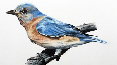
Have you ever tried to combine different artistic media? If yes, you probably know how exciting it is. Every material has its particular advantages. That’s why mixing different media may be a fun and exciting thing to do.

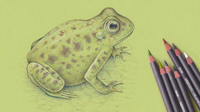
For example, watercolor can be fluid and vividly spontaneous. An ink pen gives a sense of control, allowing to add the necessary details. Together, they make a powerful combination. It’s possible to ‘mix’ graphite or colored pencils, markers, pastel, gouache or even apply digital tools to get a unique result.

By the way, there is a great course on combining ink with watercolor here on The Virtual Instructor: Line and Wash

What is especially great for beginners, the first modules of this course show the ink and watercolor techniques separately. There is also a demonstration of different approaches to combining and balancing both media. If you’re interested in this topic, I definitely recommend checking out this course.

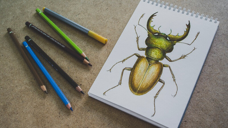
In today’s project, we’ll create a mixed media drawing of a beetle. Lately, I became greatly inspired by stag beetles, which are also called pinching bugs. The males of these insects have large and distinctive mandibles that resemble the antlers of stags.

Stag beetles are a group of about 1,200 species. In some of them, the whimsically branched and toothed mandibles may be as long as the insect itself. Most stag beetles are black or brown, but there are also examples of brightly colored species, like green or red with metallic shine.

It’s a great idea to do your own research before starting a drawing, especially if you don’t have a clue what these beetles look like. One of the options is looking at the images on any of the popular photography websites.

Of course, if the goal is to create an accurate scientific illustration, having a detailed reference is crucial. However, I’m going to depict rather a general concept of a stag beetle; the main purpose is to observe how specific artistic media work together.

The Art Supplies for This Project

I’ll be using three watercolor colors:

  • Burnt Sienna
  • Yellow Ochre
  • Olive Green

Watercolor swatches

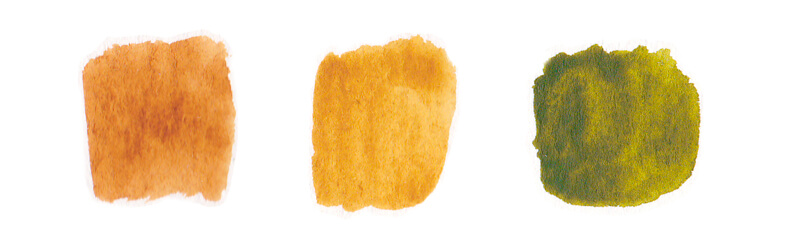
My watercolor paints are “White Nights” by Nevskaya Palitra. This brand is quite popular in the region where I live. However, the brand of watercolors is not that important in our case. We’ll use the paints only as a subsidiary medium. I’d recommend choosing the colors in accordance with the concept of your drawing.

As we’re going to deal with watercolor, it’s necessary to pick up a thicker type of paper that can accept applications of water. I’ll be drawing in a sketchbook of A5 size with 280 gr/m² watercolor paper that has a subtle texture.

Of course, we’ll need some basic supplies like a container for water, a palette, and a brush; I’ll be using the ordinary squirrel brushes of the round type, sizes 5 and 3.

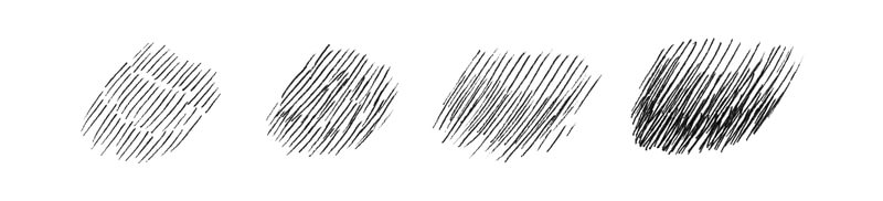
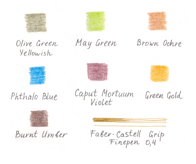
Also, I’ve selected seven watercolor pencils from my Faber-Castell Albrecht Dürer set (the samples of strokes are in the image below). Here is the list of my pencils:

  • Olive Green Yellowish
  • May Green
  • Brown Ochre
  • Phthalo Blue
  • Caput Mortuum Violet
  • Green Gold
  • Burnt Umber

Limiting your colors may be useful – in this case, keep the end result in mind and stay focused.  Maybe I’ll be adding water to the pencil applications, maybe I won’t – sometimes it is best to make decisions like this along the way.

See also: How to Use Watercolor Pencils – Watercolor Pencil Techniques

If you don’t have watercolor pencils, don’t be upset. Chances are that you have colored pencils instead – then you use them instead. You won’t be able to activate them with water, but sometimes it isn’t that necessary. Moreover, it’s possible to create stunning artworks by combining watercolor paints as an underlayer with colored pencils on top.

In the final part of the process, I’m going to use Faber-Castell Grip Finepen 0.4 in color Brown Ochre to add details and texture. It is a fibre-tip pen with ink based on food dyes (caution, it is not waterproof). You don’t have to use this particular pen to get a nice result. There is a variety of similar pens that create brownish lines; they often are marked with the label “Sepia”.

Pen and Ink with watercolor example

Also, you’ll need a graphite pencil and an eraser. A kneaded eraser will be a great addition to your supplies set, especially if you tend to leave heavy marks on paper.

Creating a Pencil Underdrawing of the Beetle

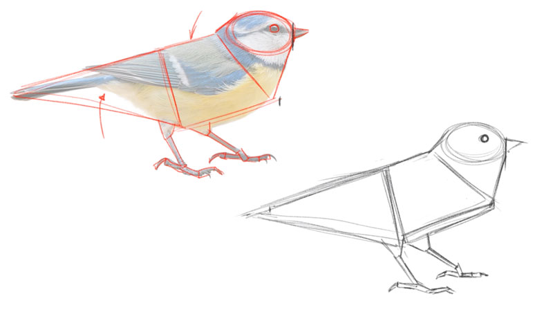
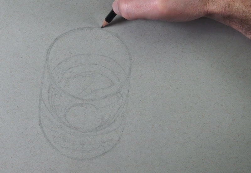
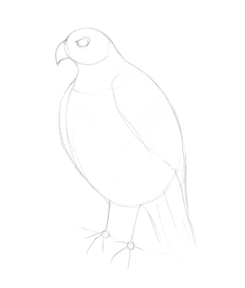
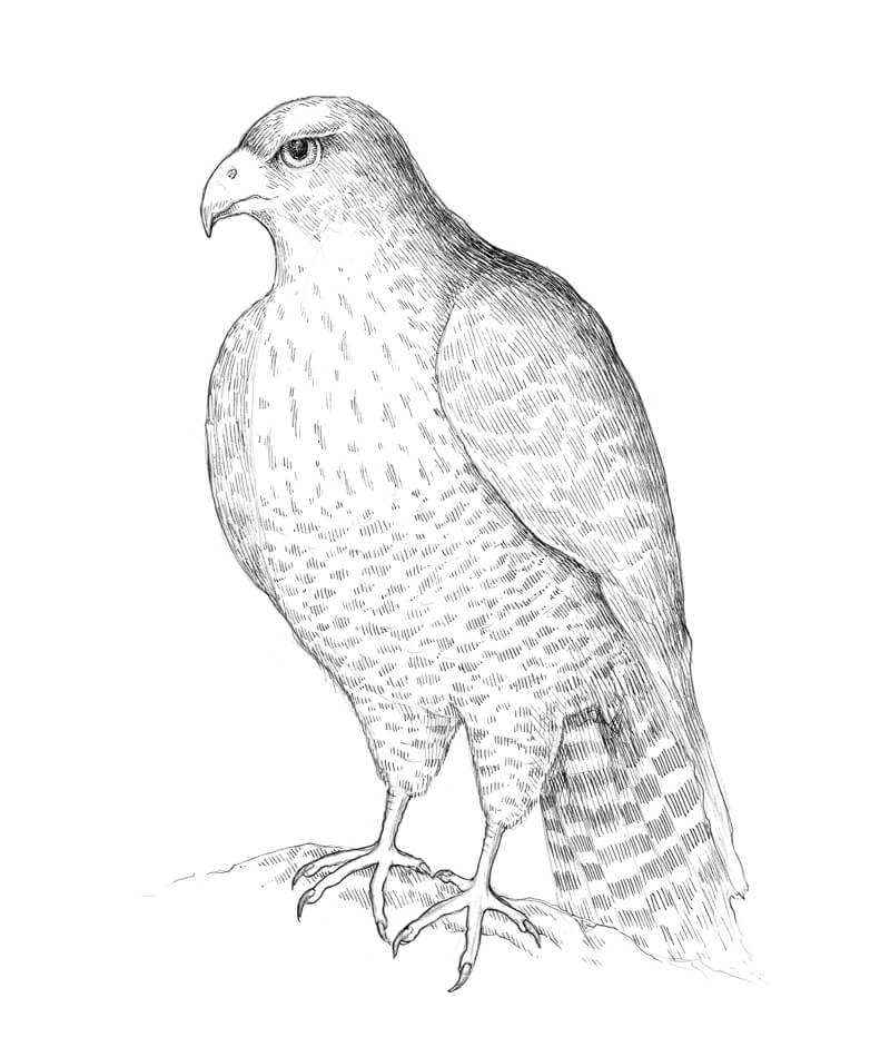
Before we dive into the fascinating world of color, we need to get an outline in place. A stag beetle has a relatively complex structure; however, anything complex can be presented as a set of simpler shapes.

The body of the beetle can be divided into several parts: head with the mandibles, thorax (the middle section of the body), and abdomen with the wing cases. Thin antennae and shorter palps grow from the head of the insect. There are also three pairs of long, thin legs.

A rough model of the insect can be presented as in the image below. The legs will be added later. At this stage, I just mark their foundations. 

Drawing a stag beetle with basic shapes

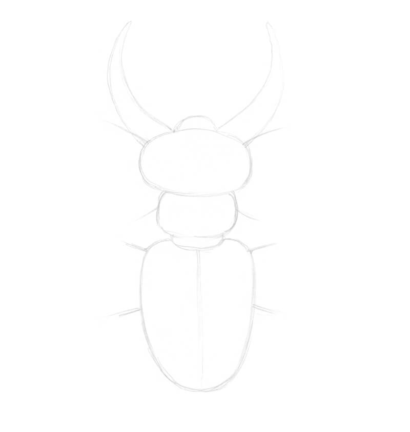
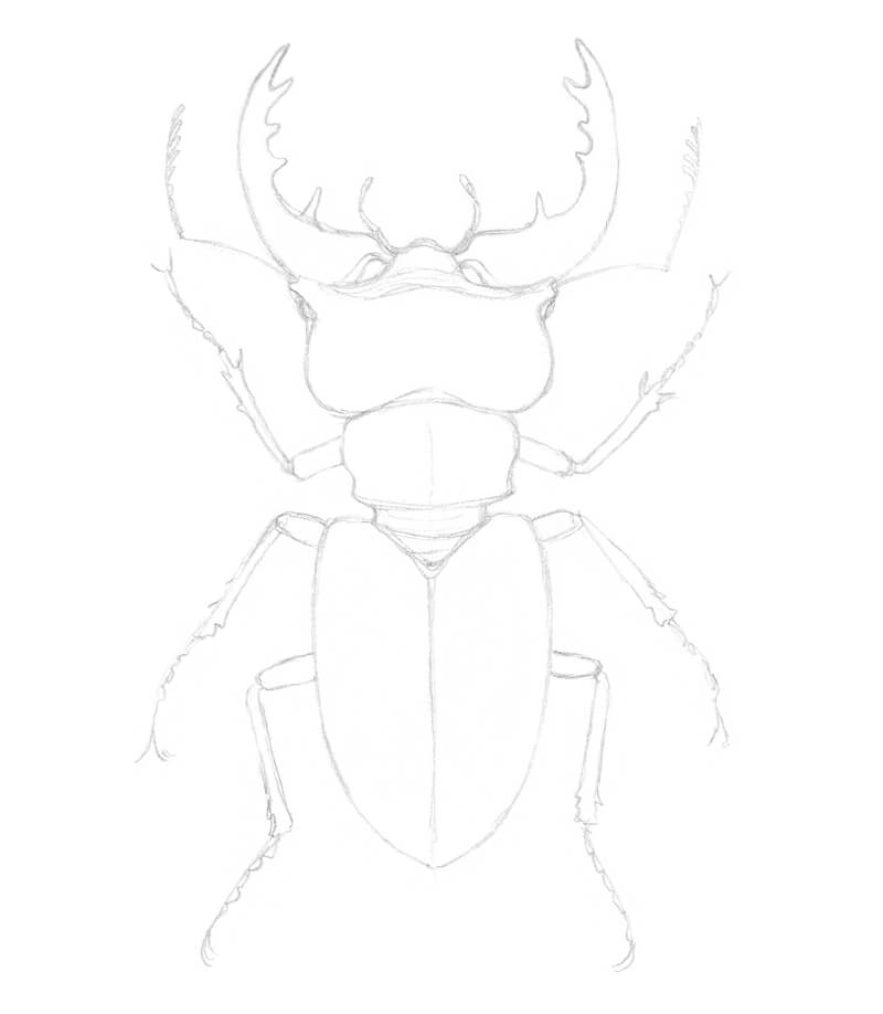
Now I refine the sketch. The lines should be as light as possible. Erase the unnecessary pencil marks as you go.

It’s necessary to remember that the mandibles are attached to the head. The eyes are located at the sides of the head.

When it comes to drawing natural creatures, the best option is to rely on your observational skills and do research beforehand. However, as long as the goal doesn’t involve creating an accurate scientific illustration, we can allow some stylization. For example, I simplify the legs quite a bit. 

Simplifying the legs of the beetle

The Watercolor Applications

You may ask, why even bother starting this artwork with watercolor applications? We have watercolor pencils. Their strokes can be transformed into beautiful paint washes – just activate them with water.

Of course, we could get away only with pencils. Even the ochre-colored pen is rather a fine addition than a real necessity.

On the other hand, art and being creative is about the process full of experimentation and exploration, isn’t it? And this is another reason why mixed media projects are so wonderful.

Sometimes we buy a specific item at an art supplies store. We may not know yet how and for what kind of art we’ll use it. Often, we leave this item in our desk for a while. But one day a new idea strikes, and suddenly everything about a new project falls into place! How great it is that we already have this item waiting for us in our desk.

By the way, when I got that ochre-colored pen, I had absolutely no idea how exactly I would use it. I just trusted that secret impulse that told me to buy it. But look, we got distracted from the main point here.

A practical reason to use watercolor washes as an underlayer is that paints can create a light, soft, and relatively even covering on the paper. I find it more difficult to achieve this effect with watercolor pencils, although their behavior, once activated, is similar to that of watercolor.

This light covering allows starting from a subtle tint, which saves a lot of time in further stages of the process. If you have any experience with colored pencils, you know how much effort is required to get rid of small specks of white paper showing through the colorful applications. A prior watercolor layer can be the solution.

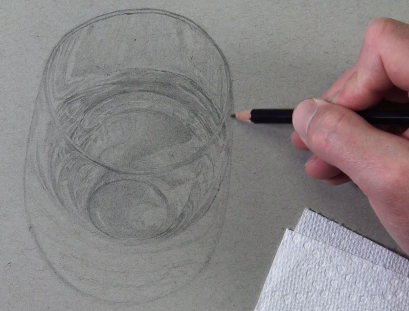
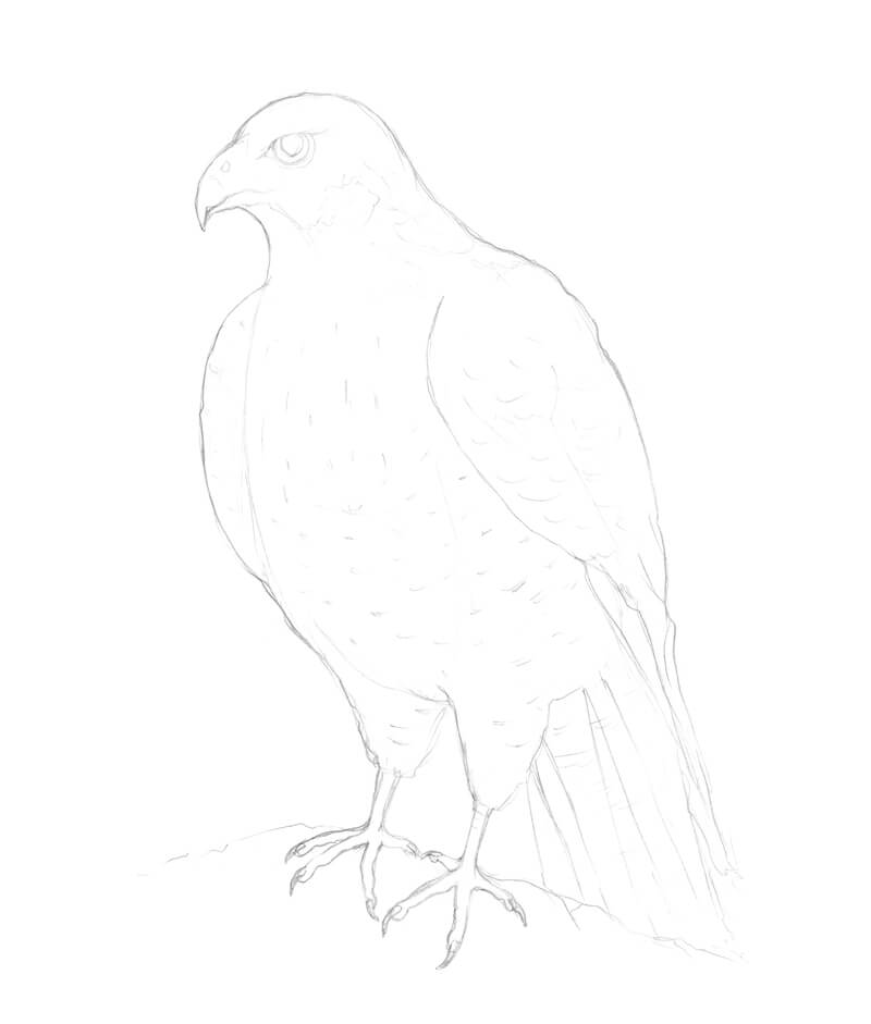
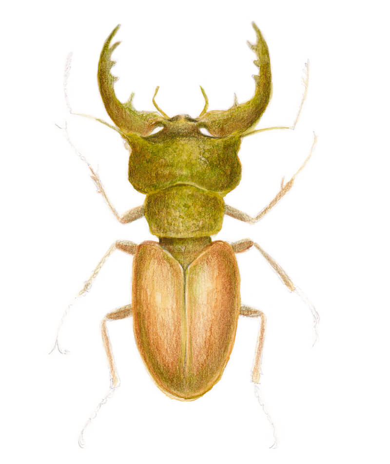
Before adding any paint, I soften the graphite marks with the kneaded eraser. Then, I start with Yellow Ochre, applying the diluted paint with my larger brush (the image on the left side below). This layer of paint should be pale.

When the wash is dry, I carefully add Olive Green, mostly to the upper part of the beetle’s body. I also include some applications of Burnt Sienna, this time – in the abdomen section. This step is presented on the right side of the image below. 

Creating an underpainting with watercolor

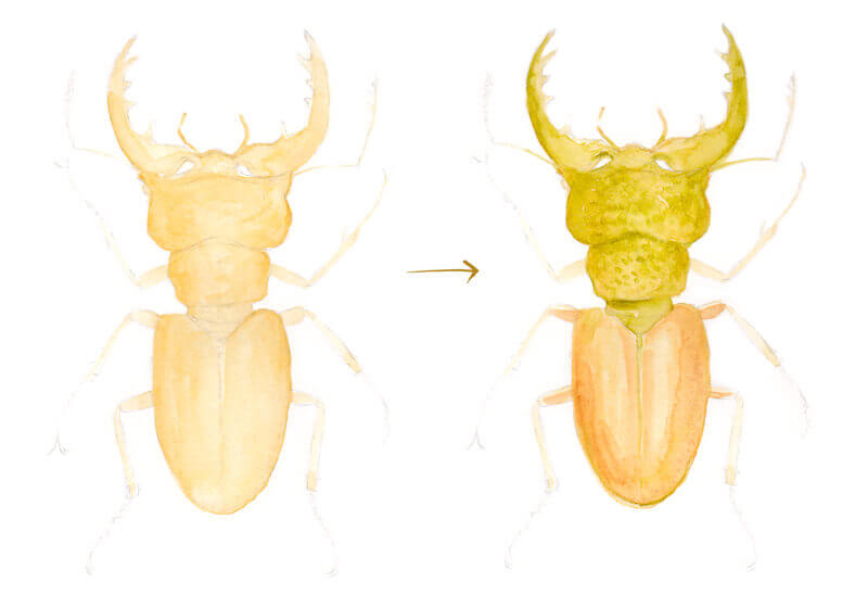
If I need more control over my paint strokes, I use the smaller brush. Avoid rubbing the paper with a brush too intensely, it can damage the tooth of the paper.

Obviously, the artwork doesn’t look fantastic, but it’s a perfect underlayer for further applications.

I leave the thin parts like the legs or antennae almost untouched – we can elaborate on them later, with pencils. Don’t worry if the paint goes slightly beyond the contours, it may create a more spontaneous look.

As soon as watercolor layers dry completely, we can proceed to the next part of the process.

Drawing the Beetle with Watercolor Pencils

One of the reasons why I admire watercolor pencils so much is the flexibility of this medium – it provides options. Sometimes I wash the colorful applications to achieve a painterly look, sometimes just leave them as they are, creating a more graphic feel.

Please note that you absolutely can follow along with colored pencils instead of watercolor ones.

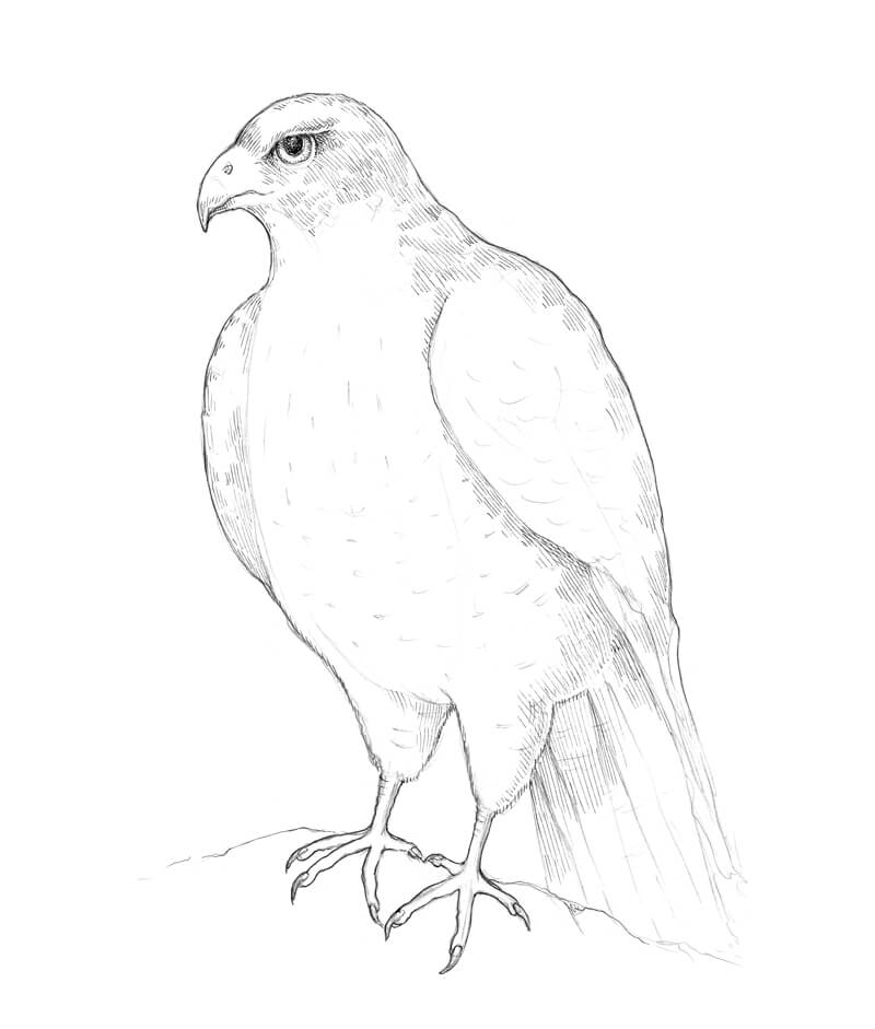
I start with Olive Green Yellowish, applying strokes with soft circular motions at medium pressure on the pencil.

The texture of the paper will interact with the colorful layers. Right now, the surface feels rough and grainy, but soon it’ll become smoother, more accurate.

The abdomen will be brownish, so I avoid making it too green at this stage. A subtle inclusion is enough. 

Applying watercolor pencils to a drawing of a stag beetle

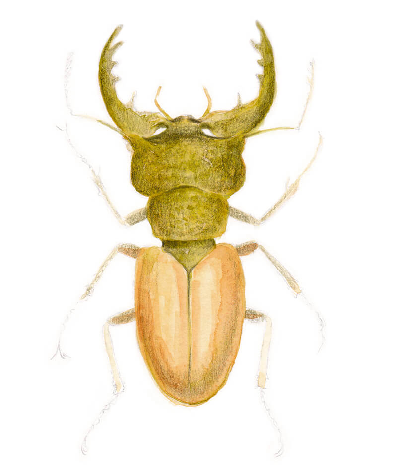
I use May Green to add some vivid nuances to the upper half of the body. Applied to an already tinted base, this relatively bright color seems rather restrained.

Also, I work on the abdomen area with the Brown Ochre. The upper parts of the wing cases remain lighter, creating an illusion of highlight. I add this shade to the head and legs, too – it will balance the artwork. 

Adding greens and browns to the drawing of a stag beetle

I think that a moderate addition of Phthalo Blue will create an interesting contrast, accenting the main colors of the beetle. I apply this vibrant blueish hue here and there, almost randomly. The upper part and sides of the head may get more of it. This is done to mark the core shadows and strengthen the illusion of volume.

Adding some Caput Mortuum Violet strokes is another way to make the artwork more dynamic. This hue works great both with the greens and browns. It’s possible to apply it on top of blue strokes, too.

Just look – this pair of colors do make a difference!

See also: Color Theory – The Elements of Art

Adding bright accents to our drawing of a stag beetle

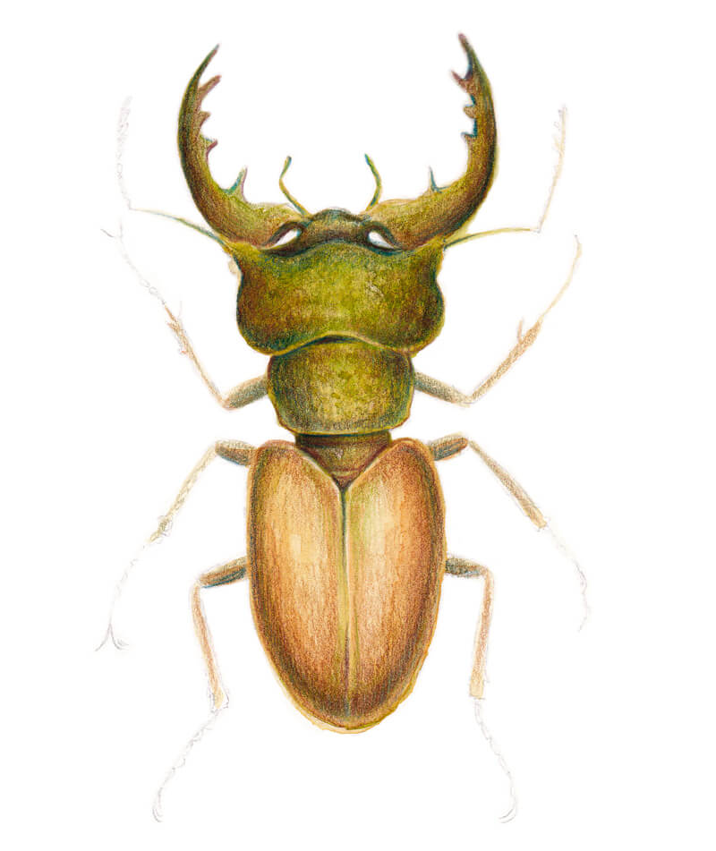
I pick up a Green Gold pencil. It is applied mostly the abdomen area, creating a pleasant warm result and a denser covering.

The Colored Pencil Course
Learn how to use colored pencils like a pro. Learn a variety of techniques and explore several different subjects through concise and “easy to digest” modules.

VIEW COURSE

I also touch head, thorax, and legs to unite the artwork visually. 

Adding color to the thorax of the beetle

I add Burnt Umber to the core shadows. The upper parts of the mandibles usually are quite dark, so this shade is a perfect fit for accenting them.

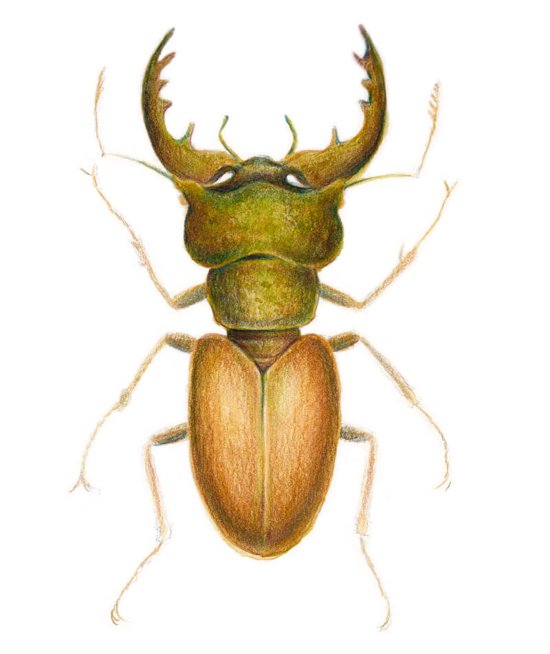
Also, I outline the smaller details, like the crisp borders between the body parts, and the legs. The tip of the pencil should be sharp.

It’s a good idea to strengthen the contours of the beetle. But avoid making them monotonous. Vary the line slightly.

All the previous color applications beautifully show through now and the artwork is almost complete.

I deliberately leave the legs, especially their parts on the periphery, relatively light. The goal is to guide the viewer’s eye to the beetle’s body. 

Completing watercolor pencil applications

I really admire the result of our work! Although no water was added to our watercolor pencil applications, the artwork has rich colors and liveliness. This is another reason to admire working with quality watercolor pencils!

However, if you’re curious about how your creation may look with water applied, I encourage you to try it out. A safe option is to pick up a brush of a small size with a moderate amount of water. The colors may become slightly brighter after you activate them.

Generally, it’s possible to add a new ‘dry’ layer of pencil strokes after the wash is dried.

Adding Some Crisp Ink Lines to the Artwork

We have one more tool to try – the pen. I’ve left it for the last step deliberately.

As was mentioned above, ink loaded in Faber-Castell Grip Finepen is not waterproof. It just washes out if water is applied, so there is no sense to use it before you’re completely sure that no dilution or washing remains.

However, there are waterproof pens of various colors. If your pen has waterproof inks, you can easily change the order of actions in your process – drawing the ink outline first, then adding watercolor (or any other water-soluble media).

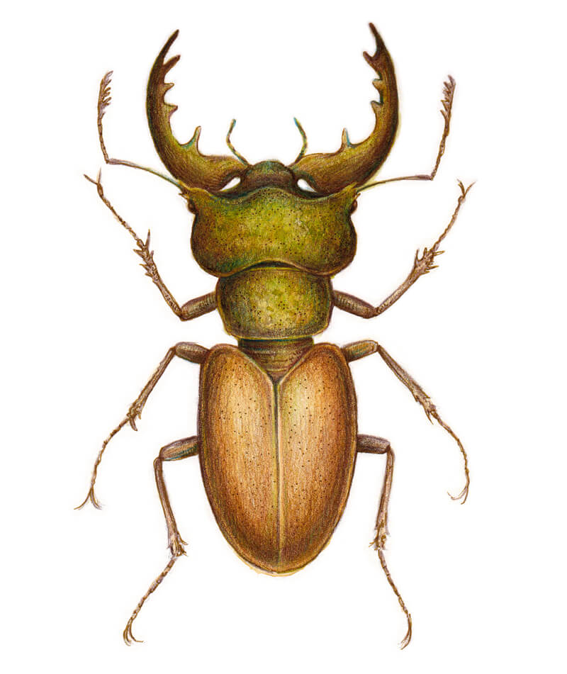
I add lines with my Brown Ochre finepen, making the contours of the body more accurate and filling in the details, especially those of the legs. Also, I darken the eyes and the upper parts of the mandibles just a bit.

If we compare the color of the pen lines with the existent artwork, we’ll notice how harmoniously they work together, almost blending into each other. The artwork has a soft, pleasant look.

Of course, it’s possible to use an ordinary black ink liner for this type of mixed media art. Black lines just would be much more contrasting, and this would affect the overall feel. Something worth trying!

I create an illusion of the rough texture of the head and thorax, leaving groups of small dots there. The surface of the abdomen (the wings) tends to be smoother, glossier, so that area doesn’t need too many marks.

Including the crisp lines and dots make a subtle change in our sketchy artwork, but this change makes it even more interesting. Details matter! 

How to draw a stag beetle with mixed media

Conclusion

Congratulations – the artwork is complete. Thank you for being with me on this artistic journey!

I hope you liked both the process and the result. Did you enjoy combining various media? Do you have any ideas on how to apply similar principles to your own projects?

I wish you creative flexibility and endless inspiration!

Like This Lesson?
If so, join over 36,000 others that receive our newsletter with new drawing and painting lessons. Plus, check out three of our course videos and ebooks for free.
More Lessons You’ll Love…

How to Draw a Glass of Water


JOIN THE VIRTUAL INSTRUCTOR
Get ALL of our courses, ebooks, live lessons, critiques, lesson plans and more today.
In this drawing lesson, we’ll take a look at creating a realistic drawing of a glass of water. This is a great exercise for recognizing value relationships and creating the texture of reflective and transparent objects. It’s also a great study of light and how it reacts when it passes through glass and water.
How to Draw a Glass of Water

Materials for Drawing a Glass of Water

Value is important to consider in any drawing that we create. Value is the darkness or lightness of a color and is one of the seven elements of art. Creating a full range of value in a drawing is easier when we work on a toned surface.

Toned Drawing Paper

Working on toned drawing paper allows us to begin with a middle value or mid tone and “push” the values outward. We can add lighter values and darker tones while relying on the surface tone to help with the mid tones. For this reason, we’ll work on toned gray paper.

Graphite Pencils

Graphite pencils are applied to develop the dark values as well as some of the mid tones. The graphite pencils used in this drawing include:

  • H
  • HB
  • 2B
  • 4B

We’ll start with the lighter pencils and progressively work towards the darker pencils, gradually broadening the range of value and contrast in the drawing. (The H pencil is the lightest pencil, while the 4B pencil is the darkest.)

You may find that the 4B pencil is not quite dark enough for your drawing. This may be the case if you naturally place less pressure on the pencil. If this applies to you, then you may choose a darker pencil for the darkest shadows. A 6B pencil may be a good substitute.

A White Charcoal Pencil

Highlights are especially important in a drawing that features a highly reflective surface like glass. In a typical drawing on white paper, highlights must be preserved or avoided while graphite is added. But since we’re working on toned paper, we can add the highlights with a white medium. In this case, white charcoal is used to develop the highlights and lighter values.

Although graphite and charcoal are different mediums, we can still use them together with success. But, the order in which we apply the media is important. White charcoal doesn’t cover heavy graphite applications easily. Graphite can be applied over white charcoal applications with better success, but the reverse of this is not suggested. For this reason, we’ll address many of the highlights early in the drawing process, before darkening the areas of darkest shadow.

If you don’t have a white charcoal pencil, a white colored pencil can be substituted. It should be noted, however, that we use blending stumps to blend the white charcoal applications. Since colored pencils do not blend in the same way as a powdery material like charcoal, you’re likely to see different results in your drawing.

Blending Stumps

We also use a blending stump to blend applications. Using a blending stump allows use to smooth transitions of tone and value which often leads to a more representational result. However, not all of the applications are blended. The blending stump is reserved for areas where there is a clear transition of value, which happens frequently in this particular subject.

It is advised to use a blending stump or even a rolled up piece of paper instead of using your fingers. Using your fingers to blend doesn’t provide enough control or precision. It can also make you drawing appear dirty, since the oils from your fingers mix with the graphite and charcoal. This leads to inconsistencies and areas that are difficult to erase and clean up.

25 Days to Better Drawings
Learn a new drawing concept and skill every day for 25 days. Each drawing concept taught includes a short drawing exercise (less than one hour) that reinforces the concept taught.

VIEW COURSE

The Photo Reference

I’ve created a photo reference for this drawing by setting up one defined light source, originating from the upper left corner. A singular light source is chosen for simplicity. Multiple light sources would produce two different areas of cast shadow, which would affect our composition.

Here’s a look at the photo reference…

Glas of water photo reference

It’s important to study the reference photo before making any marks. Analyze the light and dark shapes and consider how you’ll depict them in the drawing.

How to Draw a Realistic Glass of Water

Here are the basic steps that we’ll take to create our realistic drawing of a glass of water. Remember, since we’re combining graphite with charcoal, the order in which we apply the mediums is important.

  1. Draw a contour line drawing.
  2. Add light mid tones.
  3. Develop the strongest highlights and light values with white charcoal.
  4. Develop the darker tones and shadows.
  5. Refine the drawing and add a cast shadow.

Draw a Contour Line Drawing

We’ll begin the drawing with a contour line drawing using the H graphite pencil. This means that we’ll concentrate only the outlines that we observe from the subject. These contours not only include the lines that define the boundaries of the glass, but also the shapes of different values that we see.

To ensure accuracy, we can use measuring techniques. Using your pencil as a measuring tool, you can make comparisons between different areas of the drawing. Look for opportunities by comparing larger shapes first.

Measuring with a pencil for accurate drawings

In this case, the drawing that’s created is the same size as the printed reference photo. This means that we can measure on the photo reference and use the exact measurement on the drawing surface.

Using measuring we can draw the basic shape of the glass, including the ellipse that represents the opening at the top. Ellipses are a distortion of a circle. In many cases, an ellipse is simply an oval. But depending on the angle, an ellipse can be more complicated.

We’ll also add the shapes of value that we observe within the glass and the water. Look for contrast when you draw these shapes. If you find it difficult to see these shapes of value, try squinting at the subject. By squinting, we simplify the details and often easily recognize the larger shapes of darks and lights.

Draw the contours of the glass and water

Add Light Mid Tones

Sticking with the H graphite pencil, we’ll begin developing the lighter mid tones. As we do so, we’ll also add this lighter graphite application over the areas that will eventually be the darkest areas on the glass and within the water.

To create an even application, moderate pressure is added. A circular stroking pattern is used as the pencil is applied. This does not mean that small circles are visible on the surface. Instead, the pencil is lightly pressed while your hand moves in a circular direction.

Be sure to preserve the areas where you see the lightest values. We’ll apply white charcoal in these locations in the next step.

Drawing light mid tones

Develop the Strongest Highlights and Light Values with White Charcoal

Next, we’ll concentrate on developing the lighter values and highlights with white charcoal. Make sure that your pencil is nice and sharp and begin making applications where you see the lightest values.

Since glass is both transparent and reflective, you’ll notice that some of these highlights are found in areas that you may not expect. We’ll see the highlights in standard locations, like on the side of the glass that is closest to the light source. But we’ll also see them on the opposite side, within the glass, and in areas within the water.

The best practice is to simply observe the reference photo and note the shape and locations of these lighter values and place them in the same locations in your drawing.

Add highlights to the glass and water

After the highlights have been added with the white charcoal pencil, we can use the blending stump to smooth some of the applications. The blending stump can also be used to tone down the intensity of the highlights if necessary.

Develop the Darker Tones and Shadows

With the highlights in place, we can begin darkening the values with softer graphite pencils. We’ll start with an HB pencil with moderate pressure. As the values become darker, the contrast also increases, making the highlights appear lighter.

Developing the darker tones requires additional applications over areas that were covered with the H pencil previously. We don’t cover all of these areas again, however. Some areas of the lighter graphite are allowed to remain visible.

This is a process that requires patience and since we’re making several passes with different graphite pencils and white charcoal, it may feel as if you’re drawing the subject several times. This is to our advantage since each time we add a slightly darker application, we may find errors that should be fixed or opportunities to make the drawing more accurate. Take your time and be patient. This slow and layered approach is essential for developing realism in drawings.

Drawing darker mid tones on the glass and water

After the HB pencil has been applied, we can use the blending stump to smooth transitions of value. Here again, the blending stump is not used everywhere. It is just used in areas that have a transition or in locations where the tooth or texture of the paper is a distraction.

Now it’s time to push the values even darker, broadening the range of value and contrast. We’ll switch over to the 2B pencil and again make another pass over the drawing. Here again, we’ll allow some of the H and HB pencil applications to remain visible. This creates more variety in the values.

Drawing in the darkest values on the glass and water

Again, this application is gently blended in areas with the blending stump.

We’ll now concentrate on the darkest values on the value scale and develop the remaining areas of darkest tone and shadow. Using our darkest pencil, 4B, we’ll go back into the drawing and darken the areas of darkest shadow in the glass and within the water.

Adding the darkest shadow in the glass

Refine the Drawing and Add a Cast Shadow

The glass and water are nearly complete. We’ll now need to add a cast shadow underneath and behind the glass. But as you’ll notice from the reference photo, we’re not dealing with an ordinary cast shadow.

The glass and the water are transparent objects. Light passes through them, instead of being reflected back towards the light source. The light actually becomes more intense as it’s refracted, resulting in an area of very light value where we’d expect to see the darkest shadow.

Before we develop the darkest areas of cast shadow, we’ll first need to define the shape of this strong light. We’ll first define the outer edges of the shape with a 2B pencil.

Then we’ll use the white charcoal pencil to fill in the shape with a heavy application.

Adding a cast shadow and area of refracted light

A blending stump is used to smooth this application and work the material into the texture of the paper. This results in a more natural and consistent shadow.

We can then extend the area of darkest tone to fill in the remainder of the largest area within the core shadow. You’ll notice that there is primary area of cast shadow. This is a shape that resembles a skewed version of the shape of the glass. This area of darkest value is called the occlusion shadow.

But the cast shadow itself extends outward a little further. This area is slightly lighter, but still considered part of the cast shadow. Since this area is lighter, the HB pencil is applied and gently blended with the blending stump.

Blending the cast shadow

The occlusion shadow is not a uniform value. While it’s quite dark, some areas are slightly darker than others. To address these areas of the darkest value, we’ll revisit the shadow with our 4B pencil in areas.

The location of darkest value within a cast shadow is often found right underneath and just behind the object. As the shadow extends away from the subject, the shadow may become slightly lighter. This is true for our subject as well. The area of darkest tone within the cast shadow is found right underneath the glass, where it makes contact with the surface.

Darkest area of cast shadow behind the glass

Again, this application is blended with the blending stump to eradicate any visible texture produced by paper.

Lastly, any last touch ups are handled with graphite and/or white charcoal to complete the drawing. Here’s the completed drawing…

Realistic drawing of a glass of water

Conclusion

It may seem difficult to create the illusion of transparency and reflection in a drawing, as we see with our glass of water. But this illusion is not as difficult as it may seem. We simply need to remember to start with general shapes and their relationships, develop the contours, and then patiently develop a full range of value with our drawing medium of choice. It does require patience and of course – close observation. But this is true for any subject we wish to draw in a realistic manner.

Like This Lesson?
If so, join over 36,000 others that receive our newsletter with new drawing and painting lessons. Plus, check out three of our course videos and ebooks for free.
More Lessons You’ll Love…

Painting with Egg Tempera


Painting with Egg Tempera
Egg tempera, once the standard painting medium in Western Art, became less popular during and after the fifteen-century with the advent of oil paint. Oil paint seemed to have clear advantages over tempera – deeper intensity of colors and much slower drying times.

The slow drying time meant less waste. An artist could prepare paint and use it for several days. Egg tempera, on the other hand, must be mixed each day since the egg-based vehicle dries quickly. Middle-age and Renaissance artists had no way of preserving their tempera paint from day to day.

Of course, egg tempera paints were never abandoned all together. In fact, the paintings of famed artist, Andrew Wyeth, are a testament to the medium. In the hands of a skilled artist, egg-tempera can rival oil paint in terms of representational descriptiveness.

What is Tempera Paint?

Modern day tempera paint goes by different names. You may find it called “poster paint” or simply “tempera paint”. It’s very popular in art classes from elementary through high school since it’s inexpensive and easily cleaned up. But this type of paint is very different from true tempera paint.

True tempera paint is made from ground up pigments mixed with an egg binder. The yolk of the egg is used and the white of the egg is discarded. But since the yolk dries very quickly and is susceptible to cracking over time, other agents are added to the mixture.

True tempera paint is long lasting and many of the paintings created with egg tempera centuries ago still exist today. Modern day “tempera paint” or poster paint is not long lasting and is easily removed from the surface with water.

Most egg tempera paintings from centuries past were created on wood panel. Poplar wood was most commonly used. But since this wood warped over time, panels were constructed by combining several slats together. A high level of craftsmanship and skill was required just to prepare the surface. Fortunately today, we can simply purchase prepared masonite – also referred to as “Clayboard”.

But the artist could not simply paint directly on the wood panel since the paint would be absorbed into the wood. Instead, the surface had to be prepared by applying a layer of gesso. This layer of gesso not only provided a suitable foundation for the painting, but also removed any textural inconsistencies in the surface. The result was an ultra smooth surface, suitable for developing fine details.

Techniques for Painting with Egg Tempera

Understanding the characteristics of the medium that you use is very important and every medium is different. For example, we shouldn’t approach a watercolor painting in the same manner that we approach oil painting. Egg tempera is no different. We shouldn’t assume to use the same techniques for tempera painting that we use for oil painting. In fact, the process of painting with tempera is so different from painting with oils and acrylics that many artists consider it to be more closely related to drawing.

Egg tempera is best applied with thin, linear washes. The paint itself is somewhat transparent and should be layered to build up rich color. If tempera paint is applied too heavily and quickly, it can crack over time.

Instead, it’s best to apply the paint with layers. Cross-hatching your applications eventually leads to solid areas of color.

Thin marks made with egg tempera

Tempera paint doesn’t blend well like oils and acrylics do. Instead, complexity in the color and gradations are best created by layering the applications.

Glazing with Tempera

Because of the nature of tempera, it is suited for glazing. Glazing is the process of layering translucent applications of color over other areas of color. Each glaze slightly alters the color. This allows the artist to make subtle changes in the value, intensity, and hue. Glazing is also a poplar technique with oil painting, watercolor, and acrylics.

Developing a Range of Value

In every drawing or painting that we create, we should strive for a full range of value and tone. With tempera painting, developing this range of value is best approached through patient layering of the medium. We can gradually “push” the darker values by layering progressively darker tones of color where appropriate. This approach is not unlike watercolor painting.

For lighter values, the same approach is taken. By glazing progressively lighter values over areas, we can gradually create areas of lighter tone. We can’t take this same approach with watercolor, but you may compare it with the process of layering colored pencils or pastels in a drawing.

Now that we have a basic understanding of the history of tempera paint and its characteristics, you may be thinking about trying this medium out for yourself. You can purchase pre-made tubes of egg tempera if you prefer, or you can make your own. Pre-made tempera tubes are expensive, but save you the trouble of making your own paints each time you want you want to paint.

But if you’re up for an easy project and a little nostalgia, you may find mixing your own paints a pleasant adventure. But, it should be pointed out that you’ll need to mix the paint for each painting session. As the yolk dries, which happens fairly quickly, it gradually becomes unusable.

Below we’ll cover:

  • How to make the egg tempera vehicle.
  • How to make egg tempera paint.
  • A description of the egg tempera painting process.
  • A sample painting, photographed in stages, completed in egg tempera.

Materials for Making Egg Tempera Paint

The supplies needed to get started using egg tempera are:

  • Eggs
  • Powdered pigments
  • Distilled water
  • Illustration board or another smooth surface on which to paint
  • Watercolor brushes – a small round brush and a flat brush
  • A palette, a few small containers, and paper towels

Materials for making egg tempera paint

How to Make Egg Tempera Vehicle

A paint’s vehicle makes the paint move. It is or includes the binder, which makes the paint stick and holds the pigment together. The vehicle for egg tempera is a combination of egg yolk and distilled water. The egg yolk is the binder.

Fresh eggs are supposedly best but in the modern world, most people do not have access to a hen house. Using store bought eggs is fine.

Step 1 – Separate the yolk of an egg from the white (the clear part). Do so using a slotted spoon or by passing the yolk back-and-forth between the shell’s two halves until the white of the egg falls away. Try to remove as much of the white as possible since the white of the egg may hinder the adhesion qualities of the paint.

Step 2 – Now dry the egg’s yolk by rolling it on a paper towel or pass it between your hands until it is dry. Ideally, the egg yolk sack should be strong enough to lift between the thumb and forefinger.

Step 3 – Puncture the yolk sack and collect the contents in a small dish or jar. Some egg’s yolk sacks will rupture prematurely. If you can still collect the contents then do so.

Step 4 – Discard the yolk sack.

Step 5 – Add a teaspoon of distilled water to the yolk. Stir it in.

Congratulations – the vehicle is ready. Now we’re ready to make the actual paint.

How to Make Egg Tempera Paint

All paints are made by combining a binder with pigment. Most paints will also include some of the solvent to aid in the viscosity. Egg tempera paint is made by combining pigments with the vehicle described above. The solvent, in this case is distilled water while the binder is the egg yolk (as mentioned before). So now we just need to add the pigment.

Pigment is the color. Throughout the years, pigments have been acquired from various resources including plants, naturally occurring minerals, and even insects. But before we go looking for an insect to extract color from, we may just purchase powdered pigments. Pure pigments are available through most online art supply retailers. The pigments used in the example painting below are processed by Gamblin.

Gamblin Artists Pigments

We’ll make a paste that is not dissimilar to raw oil paint. On a palette, add a few drops of water to a small pile of pigment. Use a palette knife to mix the water and pigment until it is a paste similar to the consistency of oil paint. The paste is ready.

Some artists will mix the vehicle with the paste just before painting. Do so on a watercolor palette that has depressions along the sides. These depressions will hold the premixed paint. Other artists (including myself), mix the vehicle with the paste on a flat palette during the painting process.

Egg tempera paste on a glass palette

Making an Egg Tempera Painting

There are many approaches to applying tempera paint. There is, however, a traditional, well-documented approach to applying egg tempera. It involves building up layers of small, translucent strokes over an underpainting. Underpaintings are often made using colors that compliment the subject’s natural colors. Since the example painting is a portrait, the underpainting is green. Green compliments the flesh colors which include red in their mixtures. (Complimentary colors are colors that are opposite from each other on the color wheel. Green is directly across from red, making it the compliment of red.)

As we discussed before, tempera artists during the middle ages usually painted on wooden panels. In addition to wood, illustration board is a good alternative. The example painting was made on illustration board. Priming with gesso is not required in this case, but it is a good idea. Illustration board can still absorb some of the applications. Preparing the surface with gesso provides a better surface on which to work.

Step One – Create a Drawing and Seal It

Make a contour line drawing on a separate sheet of paper. Be sure that your drawing is the right size for your illustration board or panel. Make sure that the drawing is accurate. Mistakes are difficult to cover when using egg tempera since the paint is only translucent and not fully opaque.

Use graphite transfer paper to transfer the drawing onto the painting support. Do not use carbon paper as the carbon will work its way through the paint layers over time. If graphite transfer paper is not available then simply cover the back of the drawing with a soft pencil. Trace the drawing to make a transfer.

The Watercolor Workshop
“The Watercolor Workshop” video course is a comprehensive learning experience designed to provide the student with the most comprehensive approach to watercolor painting.

VIEW COURSE

Acrylic medium is a good primer in this case. It looks white, but dries clear. When dry, the transferred drawing is visible, but also sealed (see below). Now the graphite will not mix into the paint colors, which would result in darker and duller colors.

Sealed contour line drawing

Step Two – Create an Underpainting

The green underpainting was made like a watercolor painting. The values were lightened by adding both water and egg yolk to the paint, instead of adding white. The underpainting was not made by building up layers of small strokes as previously described, instead broad strokes were used. We’ll approach the strokes differently as we develop the colors over the underpainting.

Contour line drawing of the portrait and initial egg tempera applications

Add Natural Colors Over the Underpainting

Next, small strokes of natural color are applied over the underpainting. The direction of these hatching marks follows the contours of the subject. In doing so, they help describe the subject’s form. You’ll notice in the image below that there is still a great deal of underpainting peeking out from behind the first layer of hatch marks. The green will contribute to subtle temperature changes, a hallmark of flesh tones.

It’s a good idea to keep a scrap of paper handy. Blot you brush tip on the paper before making your strokes. Otherwise the first few strokes of a loaded brush may become opaque blobs. Many tempera artists do this before making any strokes on the final surface.

The light marks in the beard were created with a specific painting technique – dry brush. To use the dry brush method, load a brush with color, then blot most of the paint away. With only a bit of color left in the brush, each bristle is likely to make its own tiny mark, giving the impression of super-fine detail. Dry brush also leaves bits of the under layer exposed. In this case, the dark underpainting and the light dry-brush marks work together to create the impression of texture.

Layering egg tempera paint

Step Four – Continue Layering Flesh Tones and Adjust Color Temperature

Continue building up the layers of flesh tones. Be sure not to lose contrast while doing so. Near the end of the painting process, a warm brown was used in the shadows. Look at the side of the face next to the ear. See how the green underpainting is still evident. It is responsible for the cool, dull color in this area as compared to the warmer shadows around the eyes. Contrast in value is important, but we can also create contrast in color temperature as well.

Step Five – Add a Contrasting Background

This painting is nearly complete. Many medieval tempera paintings made use of gold leaf in the negative space around the subject, particularly Byzantine iconography. So, in keeping with that tradition, a gold leaf substitute was used in the background. This particular product, called Rub-n-Buff, is smeared on and spread to a thin layer. It dries in minutes and can be buffed to a metallic sheen.

Choosing Background Colors

Background colors can be chosen to either contrast or harmonize with the subject. If you want to make your subject stand out from the background, you may chose a color that is the compliment of the subject. If you want the background to be more subtle, you may chose a color that is analogous to the subject.

Some experimentation may be required to find the best background from your subject and technology can help with that. To learn more about experimenting with background colors, take a look at this article…Experimenting with Background Colors

Now our egg tempera painting is complete. Upon close inspection, we can see the short strokes that were added by hatching as well as the work that the underpainting does for us.

Portrait with Egg Tempera

The shiny metallic gold visually separates from the flat egg tempera, seemingly bringing the subject forward. However, if a more unified surface is desired, one can also buff the egg tempera to a dull sheen. It is advisable to wait a few days before doing so, so that the yolk vehicle can cure and harden first.

A Final Note

Perhaps it’s clear that painting with egg tempera is quite different from other painting mediums like acrylics and oils. While the process shares some techniques with its modern cousins, it’s not the same and should be approached differently.

When you’re finished with your painting, the best way to protect it is to frame the work behind glass. I would suggest avoiding applying fixatives or varnish which may alter the color and values of the painting. Although it may feel dry to the touch, it’s best to wait a few months to allow the painting to become fully dry before framing.

So if you’re up to trying out a new medium that’s one of the oldest around, then why not give egg tempera a shot. You may find that this “blast from the past” becomes your newest obsession.

Like This Lesson?
If so, join over 36,000 others that receive our newsletter with new drawing and painting lessons. Plus, check out three of our course videos and ebooks for free.
More Lessons You’ll Love…

How to Draw a Falcon with Pen and Ink


How to Draw a Falcon with Pen and Ink
This project is dedicated to falcons – majestic predatory birds that are known for their strength, maneuverability, and speed – in addition to incredible intelligence. Our culture has a special place for falcons. Just as an example, these birds work at the airports. Their task is to drive nuisance birds away from landing and departing airplanes.

Interesting to know: a falcon is any species in the genus Falco. There are about 40 species of falcons worldwide. The Latin word, falco is believed to derive from the Latin, falx (“sickle”) because of the shape of the birds’ wings.

The feathering of falcons features a peculiar combination of light and dark areas, so it’s a great chance for us as artists, to study the values and textures on a truly beautiful specimen.

I’ll be using three ink liners (the numbers are 0.05, 0.1 and 0.2) for a relatively small drawing. A nib pen, instead of liners, is a great option for this drawing, too. A graphite pencil and an eraser will be helpful for creating an underdrawing.

Researching a Falcon

Before diving into the process of making marks on paper, it’s useful to do some research. Learn more about falcons by reading several articles or watching videos! Additional knowledge about anatomy, special characteristics, and the life of the bird may help to make your art more realistic.

For example, it’s quite difficult to draw a flying bird without understanding how its wings work. Of course, you don’t have to go too deep into specifics. Being familiar with the general structure is often sufficient. But, researching your subject may give you some inspiration.

Here’s one of my exploratory sketches. I focused on the eye, with a thin ring of bare skin around it, and its position on the head.

By the way, falcons can see up to 8 times more clearly than the sharpest human eye.

Falcon sketch

I believe that nothing compares with drawing from life. But, observing a live falcon is likely not a possibility. A quick image search may help you to better understand the structure of this bird. I’d recommend looking at many photos from different angles.

Creating Miniature Sketches

At this stage, I draw several quick mini sketches. The purpose of this exercise is to help me decide which angle and composition will work best for this particular drawing.

These sketches are rather stylized schemes so they don’t have to be absolutely correct from an anatomical standpoint.

Let’s treat this concept as not just a generic falcon, but as one with its own emotions and unique features.

Please keep in mind that a miniature sketch is just a guideline for your final artwork. The process is flexible, so change your initial concept as many times as you feel necessary. 

Deciding on the composition of the drawing

In the very beginning of the process, I was leaning towards a dynamic pose where the wings are open, taking up a relatively large portion of the paper.

But, after observing my quick sketches, I decided to go for a more static option. First of all, the size of paper for our final artwork feels too small for a dynamic, expansive pose. We could fit the wings into this format, but sacrificing details isn’t something I really want to do.

Another reason for this decision is the impression created by the pose. A “calm” pose, where the falcon is sitting on a piece of wood, with its head in profile, accents the attentiveness of the bird’s look and presents the falcon in all its majesty. I feel like the bird is ready to dart off at any moment!

Creating a Pencil Underdrawing of the Falcon

I sketch the falcon with light pencil lines, presenting the figure as a set of simple shapes, also marking the wings and tail feathers. The talons are just a framework of lines. 

Drawing the basic shapes of the body of the falcon

I refine the contours of the falcon’s head and mark out the contrasting pattern of dark and light areas. Some species of falcons, like Peregrine Falcons, usually have a black malar area (so-called ‘cheeks’) and a black ‘cap’.

I also mark the pattern on the bird’s body. There are small dark spots on the belly and thin stripes on the chest. The falcon’s tail feathers also feature lateral stripes.

The beak is relatively short, sharp, and strongly hooked. Falcons’ beaks are equipped with a tooth, which is a sharp triangular-shaped ridge on the outer edges of the beak.

Falcons have three forward claws and one back claw. The claws are long and sharp. 

Refining the pencil drawing of a falcon

How to Draw a Falcon with Ink

Now we’re ready to move forward with ink. I start inking with the 0.05 liner, gently outlining the main contours of the bird. It’s necessary to be careful with the contours, especially where the lighter parts of the body are – for example, in the neck area. The lines should be thin. Make gaps in the contour line, if necessary, or replace it with a set of short hatches.

Also, I darken the pupil, leaving a small area of bright highlight, and touch a few marks on the area near the eye.

I feel like developing the eye to an almost complete stage at the beginning of the work is important. The eye will become a focal point, so it often makes sense to start here.

With groups of hatches, I mark the darker areas and create a subtle differentiation between the wings and the body. 

Outlining contour lines with ink

Now we’re ready to start developing the texture of the wings. But how should we do this? When it comes to hatching, there are some options to choose from.

Hatches can be parallel – or almost parallel. Or, there can be some variation in their direction. When used alone, parallel hatches look somewhat unified, like a pattern. That’s why I’ll be using mostly parallel hatching to create patterns of the falcon’s feathering.

In some cases, this technique may accent the distance between the depicted subject and its viewer. Or, make the artwork rather schematic or stylized.

The Pen and Ink Experience
“The Pen and Ink Experience” is a comprehensive drawing course designed to guide absolute beginners to a level of producing professional quality pen and ink drawings.

VIEW COURSE

The variation in direction makes the hatches feel more spontaneous and natural. By varying the stroke, we can work an area of thinner and softer feathers. Leave open gaps between hatches deliberately. This open space can create the illusion of spots or stripes.

I recommend experimenting with speed and pressure while drawing. Try to create lines, varying their length, layering new lines on top.

Hatching examples

With the 0.1 ink liner, I create the pattern on the falcon’s body. The small spots on the belly and chest and the wide stripes on the tail feathers are addressed. I vary the pressure placed on the pen from light to medium. The lines accent the ‘flow’ of the bird’s body, conforming to the cross contours.

Also, I mark the most prominent features of the texture underneath the bird.

See also: Drawing With Ink Liners: Natural Textures

Adding textures to the drawing of a falcon

I increase the contrast in value, using the 0.2 ink liner. The darker areas, including the wings, become even darker. Since we’re placing light pressure on the liner – new hatches, especially their ends, look fine and harmonious. Changing the direction of the hatching slightly also adds variety.

I continue adding hatching, using the 0.1 liner, gradually layering ink hatches to create a uniform, dense, and smooth covering. In the image below, you’ll find a close-up of such hatching.

To give the falcon more volume, I use contour hatching in the head and neck areas. The upper part of the head should be a little lighter to reflect the light source, so I make sure that there are not too many ink marks.

See also: Hatching and Cross Hatching

I darken the tip of the beak, using thin hatches and dots.

The wings have a subtle pattern of relatively large darker spots. I develop this pattern with groups of parallel lines. The relief is created by thick feathers on the wings. Creating some diversity here by including both denser and less dense areas of ink marks.

Some areas of our falcon’s body are in shadow. For example, the legs and the belly are areas of core shadow. At the same time, those parts are white or light gray with a contrasting pattern of dark spots.

To darken the “light” areas without losing the impression that they are actually light, I’ll use the finest 0.05 liner at minimal pressure. If necessary, I strengthen the dark spots in the feathers to keep the pattern clearly visible. As a result, we get a beautiful contrast between the thinner and wider lines.

Working with fine hatching has an advantage. It can unite the drawing visually, making it look more harmonious. Also, thin hatches can appear as graphite shading from a distance.

Pay attention to the contrast of the pattern on the body. The more shadow, the lower the contrast will be. Usually, we don’t notice many contrasting details if there is insufficient light.

I add some curved contour hatching to the sides of the bird’s figure to give it more volume. 

Adding shading to light areas on the falcon

The artwork is close to completion. But now it’s time to work on the falcon’s talons. With the 0.1 ink liner, I create the illusion of relief and volume, accenting the sides of the feet and toes with contour hatching. Don’t overdo them – the talons are relatively light.

I add a cast shadow under the feet, so the falcon appears grounded.

There is a shadow on the tail, behind the legs. I accentuate it with several layers of ink hatching. The striped pattern on the feathers should still be clearly visible.

However, I let the bottom part of the tail fade as it extends outward, so it blends smoothly into the surrounding space. The same principle applies to the surface under the bird.

We could add more details to the feathering, but as our artwork doesn’t have a background, I think it’s time to stop and call it finished. Sometimes a slight stylization is a great thing! 

Falcon Drawing with Pen and Ink

Conclusion

Congratulations – the drawing is complete! I hope that you enjoyed both the process and the result of our work. Thanks for being with me on this creative journey!

The world of birds is huge and full of wonders. There are endless possibilities to explore and be inspired.

Like This Lesson?
If so, join over 36,000 others that receive our newsletter with new drawing and painting lessons. Plus, check out three of our course videos and ebooks for free.
More Lessons You’ll Love…

Simple and Easy Pastel Landscape


JOIN THE VIRTUAL INSTRUCTOR
Get ALL of our courses, ebooks, live lessons, critiques, lesson plans and more today.
In this pastel lesson, we’ll take a look at creating a simple and easy pastel landscape drawing. We’ll develop the sky and background first and then progressively work our way down the picture plane to the middle and foreground. Lastly, we’ll add a few details and finishing touches to complete the drawing.
Simple and Easy Pastel Landscape

Materials for Our Pastel Landscape

We’ll work on the heavily textured side of Canson Mi-Teintes pastel paper. This versatile paper is great for accepting multiple, layered applications of pastel. The orange toned paper provides strong contrast against the blues used for the sky, but harmonizes with the dominant yellows and reds in the foreground.

Stick or traditional soft pastels are used for the bulk of the drawing, but details are added with pastel pencils. An assortment of Rembrandt soft pastels are applied to most of the drawing. You are free to use any brand that you prefer, but you’re likely to see better results with higher quality soft pastels.

The pastel pencils used in this demonstration are the harder pastel chalk pencils by General’s. These pastel pencils sharpen easily in a traditional pencil sharpener and produce sharp lines suitable for detail work. Because they are so hard compared to other brands, they are best suited for finishing touches rather than covering large areas.

The Photo Reference

We’ll work from a photo reference from Pixabay.com. As you can see, the reference on its own is rather simple. We’ll pull out and exaggerate colors and use directional stroking to make our drawing more interesting than the reference.

Pastel landscape reference photo

You’ll also notice that this is a winter scene with a few bits of snow visible in the foreground. We’ll leave out the snow in this case since it may not translate well in the finished work.

See also: Pastel Landscape Painting – Winter Scene

Begin with the Background

When applying pastels, the thought process is very similar to that of applying opaque paint. Colors can be applied directly over previous applications without the colors underneath showing through. This means that we can work the background, in this case – the sky, completely before moving on to the middle ground and foreground. Doing this prevents us from having to go back and fill in areas around the dominant trees which could lead to inconsistencies in the color of the sky.

We’ll begin by applying a base application of a light blue to the entire sky, bringing the application down past the horizon line. We’ll then blend this initial application with a finger or chamois.

The top of the sky is slightly darker, while the bottom portion is slightly lighter and warmer. To make the top of the sky slightly darker, we’ll apply a darker blue. We’ll bring this application to the middle of the sky, lessening pressure as we go. This application is also blended gently.

Painting a sky with pastels

Using a much lighter blue, we’ll bring an application up to the middle of the sky, again lessening pressure as we work upward. A bit of a very light yellow is also applied to add a little warmth. Again, this application is gently blended to create a gradation.

Drawing the Clouds

The clouds are rather muted in this image and we’ll reflect this in our drawing. The upper right cloud has the most color associated with it, so we’ll start here.

A series of colors are added to gradually build up depth. Light pinks, grayish purples, light yellows, oranges, and grays are layered and gently blended. At this point, some experimentation is at play as we try to find the right colors for the work.

Painting clouds in a pastel landscape

Keep in mind that clouds have volume. This means that we’ll see highlights on the side of the clouds that face the light source and areas of core shadow on the opposite side. Highlights are developed using the warmer yellows and oranges, while darker purples and grays are used for the shadows.

As we begin to define the shapes of these clouds, we can go back and refine the edges with the light blue that we used for the bulk of the sky.

With the clouds on the right side of the picture plane defined, we’ll work our way to the clouds on the left side. These clouds are very muted with very little contrast between them and the sky.

A middle gray is used to define the initial shape of each of the clouds. To create a sense of volume, we’ll add a slight highlight with a light yellow and a subtle shadow with a dark grayish purple.

Refining the clouds in the sky with pastels

Then, we’ll revisit the clouds on the right side of the image and strengthen the highlight with a light orange.

After the shape of the clouds have been defined, we can go back to the sky and apply additional applications of light blue to refine the edges of the clouds. A light application is used here without much blending.

Pastel Landscape Mastery
The “Pastel Landscape Mastery” video course is a comprehensive learning experience designed to provide the student with the most comprehensive approach to drawing landscapes with pastels.

VIEW COURSE

Drawing the Middle Ground

With the sky in place, we’ll move on to developing the middle ground. We’ll begin by first defining the horizon line with Burnt Sienna. Using this same color, we’ll fill in the entire middle ground and foreground to create a base application. This entire area is then blended.

Over the top, we’ll begin applying a variety of Yellow-Ochre, oranges, browns, and earthy reds and yellows.

Along the horizon line, we’ll define the shapes for some of the distant trees. A dark earthy green is used for the basic shape of each of the trees. A slight shadow is added on the right side of each of the shapes with a touch of black.

Drawing distant trees in a pastel landscape

We’ll continue to work our way down the picture plane, adding additional yellows, browns, reds, and oranges. Vertical strokes are used for grass blades that are closer to the viewer, while horizontal strokes are used for the grass far off in the distance.

Once we’ve worked our way down a little, we can add the basic shapes for the two dominant trees in the middle ground. A dark brown is used to develop the trunk and larger branches of each of the trees. The side of the stick is used to pull up the strokes from the grassy field. We’ll hold off on the details for now and develop them later with a pastel pencil.

Drawing the middle ground - pastel landscape

Considering a Color Scheme

When working with any color medium, the colors that you include in your work should be considered. Often, this begins by simply analyzing your subject. You may choose to use the colors that are observed without changing them at all. This is an acceptable approach.

Sometimes you may want to pull out certain colors, exaggerate them, or even change them completely. If you decide to do this, you may want to consider color theory and the relationships of the colors that you include.

Colors have relationships based on their positions on the color wheel. These color relationships, when used in a color drawing or painting, are referred to as color schemes.

I was first drawn to this subject because of its simplicity, but the color relationships were also important. This particular scene had nice contrast between the blues of the sky and the strong oranges in the foreground. On the color wheel, orange and blue are direct opposites. Colors that are opposite from each other on the color wheel are considered compliments. A complimentary color scheme provides high contrast and quite a bit of “pop”.

Initially, I thought that I would play up this color relationship. But as I worked, I began to notice the subtle reds and yellows in the foreground. As I chose stronger reds and yellows to exaggerate in the drawing, it became clear that altering the color scheme may lead to a stronger result with more interest.

I altered my approach and began to favor a color triad of primary colors instead of a strict complimentary scheme.

Primary color scheme in a landscape painting

A color triad is a color scheme made up of three colors that are equidistant from each other on the color wheel. For example, the secondary colors of orange, purple, and green can be considered a color triad. The primary colors of red, yellow, and blue is another example of a color triad and this is the direction that I decided go with this work.

By using stronger reds and yellows in the middle ground, I could pull out a color triad without sacrificing the strong contrast provided by a complimentary scheme, thanks to optical mixing. With a little distance from the work, the reds and yellows have the appearance of being orange, which contrasts against the blue of the sky.

Drawing the Foreground

As we work our way closer to the viewer and into the foreground, we can begin to incorporate more of those reds and yellows. Darker values are added with dark browns while highlights are developed with light yellows and Yellow-Ochre.

Drawing grass with pastels in the foreground

As we add these colors and develop the grassy field, we should also consider the directional stroking that we use. To create additional interest, strokes are pulled upward and to the right. Not only does this create a sense of movement, but it also helps to create visual rhythm.

Creating Visual Rhythm

Rhythm is created in a visual work through repetition. By repeating marks, colors, shapes, etc., we create a more interesting work. Rhythm is a principle of art.

In this case, by pulling up strokes and tilting them slightly to the right, a sense of visual rhythm is created. When analyzing subjects, we can often find opportunities to exploit rhythm and include it in our works. Simply look for any elements that repeat. When you see a pattern, you may chose to exploit it and exaggerate it in your drawing.

Adding the Fence Posts

The remnants of an old fence are present in the composition. To add the posts, we’ll draw in the basic shape using the same dark brown that we used for the initial structure of the trees. To add a sense of form, we’ll add a light grayish brown on the left side to indicate a highlight.

Underneath the posts, we can continue to pull up strokes for grass blades that overlap.

Detailing the Trees

We’ll begin by adding a few highlights the left side of the dominant tree with the same light grayish brown that we used for the highlights on the fence posts.

Then, we’re ready to develop the details. Since control is very important here, we’ll switch over to using pastel pencils.

With a sharp black pastel pencil, we’ll patiently add the tree branches. These marks are pulled outward from the larger branches and trunk that we developed earlier.

Drawing trees with pastel pencils

When drawing tree branches like these, it’s suggested to add more than you may think you need, but less than what is observed. If you add too few, the drawing may feel cartoonish, but if you add too many – the drawing may become too busy. It’s suggested to work in batches. Stop and analyze as you go. Remember, you can always add more branches, but removing branches may prove to be difficult.

See also: Painting Small Details – Tree Branches

Not all of the branches that we add are solid black. We’ll also add a few highlights with a white pastel pencil.

Finishing the Landscape With Patels

Our landscape is now almost complete, we just need to add a few finishing touches. We’ll add a few more indications of the trees along the distant horizon line using a Van Dyke Brown pastel pencil. We’ll also add a touch of shadow with the black pastel pencil.

A third tree is added on the right side of the composition. This additional tree helps to anchor the composition and adds a bit of balance. The black pastel pencil is used for its structure and a touch of white is added for a highlight.

Contrast is enhanced on the fence post by using the black pastel pencil to strengthen the shadows. Using just a few lines, a hint of the barbed wire is added with the black pastel pencil, connecting a few of the fence posts.

Adding details to the fence posts

Conclusion

Now our simple pastel landscape is complete. Even with a simple subject as we have here, there are plenty of opportunities to create an interesting pastel drawing. In this case, we exaggerated colors in order to create a harmonious, primary color scheme. We also developed rhythm and movement by repeating strokes in the grassy field. Our completed image is bright, lively, and full of interest.

Simple and Easy Pastel Landscape

Like This Lesson?
If so, join over 36,000 others that receive our newsletter with new drawing and painting lessons. Plus, check out three of our course videos and ebooks for free.
More Lessons You’ll Love…

The Anatomy of an Ink Drawing


The anatomy of an ink drawing
Sometimes we see a completed artwork and can’t figure out how it was created. When it comes to deconstructing complex drawings, things can become quite complicated.

This lesson is designed mostly for beginners that want to get started with ink. I’ll share a sequence of digestible steps. You may consider them as the “building blocks” of an ink drawing.

We’ll observe an ink drawing in “layers”. Each new layer adds significant information to the whole artwork. By building upon each layer, the drawing slowly develops into the finished work.

Anything that seems complex becomes easier to understand if we see it as a process, not just as the finished product.

I’ve chosen a slice of a delicious cake with berries as a subject for our drawing. It is relatively easy to draw, even if you’re a total beginner. It has everything we need to look for in a subject – an interesting shape, beautiful value transitions, and varied textures.

I recommend considering this lesson as more than an ordinary drawing tutorial. Instead of just focusing on the steps involved, let’s focus on the principles that stand behind those steps. Once we have a strong understanding of the concepts and principles, we can apply them to any subject that we choose to draw.

It’s worth pointing out that the example shared here isn’t the one and only way to work on an ink drawing. It’s rather a single way to arrange your process that may help you be successful.

Art Supplies for This Project

I’ll be using an ordinary HB graphite pencil and an eraser to create sketches and an underdrawing. Several ink liners (0.05, 0.1, 0.2 and 0.3) and a brush pen are used for the inking process.

If you don’t have an access to all those width variations, it’s possible to get by just with the 0.1 and 0.3 pens and perhaps a brush pen. A brush pen could also be replaced with a nib pen.

Drawing supplies for ink drawing

Drawing a Piece of Cake with a Graphite Pencil

Before we dive into constructing the shape of the cake, it’s necessary to decide on the composition. In this case, our composition is rather simple and static with just one piece of cake. The interest will be developed in the textures and the complexity of the cake itself.

Developing the Idea

With a graphite pencil, I draw several models of a slice of cake, presenting it as a simple shape. The sketch in the second row, on the right side, is my favorite. It’s always good practice to draw several sketches. Your first idea is not always your best.

Sketches of a piece of cake

Create an Underdrawing

I’m ready to move forward now. With a graphite pencil, I sketch the basic form of the slice, constructing its sides and the top plane. Notice that the back side is slightly curved.

It’s helpful to draw an object with the structure in mind. You may choose to think of the object as a transparent subject, as if you can see through it. This helps you to better understand the form of the object.

Pencil drawing of the framework of a piece of cake

Now it’s time to mark the borders between the cake’s layers. Let your imagination go wild – your cake may have seven layers or be completely solid! 

Sketching details on the cake

I add several shapes to indicate the places where the berries will be located. Pay attention to where you place them. Each berry needs enough space on the cake’s top plane.

I’ve chosen to include currants, bilberries, blackberries, and raspberries for the cake’s decoration. We’ll elaborate on their details in the next step. Several small leaves will also adorn the cake’s top.

I’m going to add a delicious berry filling to the middle layer of the cake, so some stylized berry shapes are welcome there, too.
 
Drawing basic shapes for berries

I draw the rows of shapes within each of the berries. The blackberries are made up of smaller shapes that are “squarish”, while the smaller shapes in the raspberries are more elongated.

I also add some sprinkles on top of the cake and accent some inner areas with a pattern of semicircles. When it comes to creating an underdrawing, a balance between detailing and simplicity is up to you.

At the end of this part of the process, it’s necessary to ‘see’ the artwork in your mind. Decide what objects are the darkest or lightest and how you’re going to handle the values. 

Finished pencil sketch of the piece of cake

Adding Ink to the Drawing

We’ll begin the inking process by first defining the contours or outlines.

Outlining the Contours

Contours are an important part of the drawing. They provide the external borders of the subject and the boundaries of each of the details.

Contours can be rigid or fluid, mechanical or organic, thick or thin, uniform or varied.

In other words, a contour is an expressive artistic tool just by itself. That’s why we should pay particular attention to the contours in our drawing.

To outline the main contours, I use a brush pen. This instrument is great for creating organic, varied lines! If you’ve never used a brush pen, take your time and explore all of the different ways it can be used to create variety in the line. Using a brush pen freely and naturally requires some practice, but it can be a great tool for developing variety in your stroke. Some brush pens can produce a thinner minimal line width than some technical pens.

I accentuate the bottom contour of the cake, making it slightly wider than upper contours. This creates the impression of a shadow underneath the subject.

Outlining contour lines with an ink pen

As you can see, some contours, especially those belonging to the smaller objects, remained untouched. I’m going to cover them, using the 0.2 ink liner. If you feel like some contours need an extra accent, it’s always possible to broaden them with additional marks.

The Pen and Ink Experience
“The Pen and Ink Experience” is a comprehensive drawing course designed to guide absolute beginners to a level of producing professional quality pen and ink drawings.

VIEW COURSE

Tiny gaps in the contour lines or broken lines are perfectly acceptable. Broken lines can create the impression of light or highlights.

Ink liners produce marks of a relatively constant width. It’s important to include both thin and thick lines in your drawing to create variety and added interest.  

Drawing thin contour lines with ink

Creating Values – Adding Hatching and Contour Hatching

Now that we have all of the objects in place and clearly visible, it’s time to develop the lighter and darker values. Values are important because they define the form of an object, the light source within the scene, and the textures. They also create a sense of contrast.

I add hatching to the cake, following the direction of its planes. A deliberate hatch direction will help the viewer’s eyes in differentiating the sides and the top of the object.

See also: Pen and Ink Drawing Techniques

The details of the berries require a slightly different approach – I use short, rounded hatches that accent the character of each detail. This approach helps to create the illusion that our berries are three-dimensional.

For this step, I work with 0.05 and 0.1 ink liners. Thinner hatches are a better option for lighter or highlighted areas. In this case, the light source originates from above, so the top plane of the cake is catching more light than its vertically oriented sides.

The thinner 0.05 liner is a great tool if you like creating subtle value transitions. Hatching made with a fine liner may look like gradated shading from a distance.

Any form of hatching (cross-hatching, cross-contour hatching) that you feel necessary can be used in this step.

Adding hatching with pen and ink

With the 0.05 and 0.1 liners again, I add some cross-hatching, deepening the shadows and increasing the contrast. Also, I add a cast shadow under the cake.

The blackberries and bilberries are the darkest elements of the drawing, so I apply more hatches there. Make sure to leave the highlights on the glossy berries!

It’s important to give some volume to the details, but each berry should be recognized as a whole object. To create this effect, I cover the individual berries with a layer of thin hatching, accenting the darker areas.

This step may take some time, depending on your style and the desired outcome so it’s important to be patient. It’s also useful to take breaks regularly – this way, you’ll have a chance to analyze your artwork and see what needs extra improvement.

Adding additional hatching and cross hatching

Defining the Textures

At this stage, the contours and the majority of values are in place. To make the drawing more believable and join all the visual information into a complete image, we need to develop the textures. Without them, our cake will look like a plastic, artificial model.

With the 0.3 ink liner, I create a pattern of semicircles inside the upper and bottom layers of the cake. Pastry usually has a rough, porous texture.

The texture of the cake’s middle layer is smoother, but I still add groups of small 0.1 dots here, too – just to create a bit of visual harmony.

Raspberries and bilberries have a velvety texture (compared to blackberries), so I accent this texture by adding small 0.05 dots to them.

Hopefully, the close-up image of the cake’s layers and berries below will help you to better understand the previous steps.

Close up ink drawing textures

Conclusion

Congratulations! The drawing is complete. I hope that you enjoyed our creative (and delicious!) journey.

My goal was to show you that almost any ink project can be divided into steps. These steps include…

  1. Sketching out the subject.
  2. Outlining and developing the contours.
  3. Developing the values and contrast.
  4. Defining the textures.

This is just one approach. This is simply a guideline that may help you to get started with ink techniques, making the process clearer. You can work on all aspects simultaneously, invent your own “rules” and your own unique approach – you’re the creator!

I’ve gathered the process images of this lesson into one image. Feel free to pin it!

The anatomy of an ink drawing

Thanks for joining me on this ink adventure. Happy creating!

Like This Lesson?
If so, join over 36,000 others that receive our newsletter with new drawing and painting lessons. Plus, check out three of our course videos and ebooks for free.
More Lessons You’ll Love…