
Materials for this Drawing
For this lesson, we’ll use technical drawing pens by Staedtler. These pens are a little more expensive than the popular Micron pens by Sakura. However, they last a little longer and the tips are less likely to bend under pressure.
We’ll work on Bristol paper with the vellum surface. Smooth Bristol paper is also acceptable and some may find it a better surface to work on.
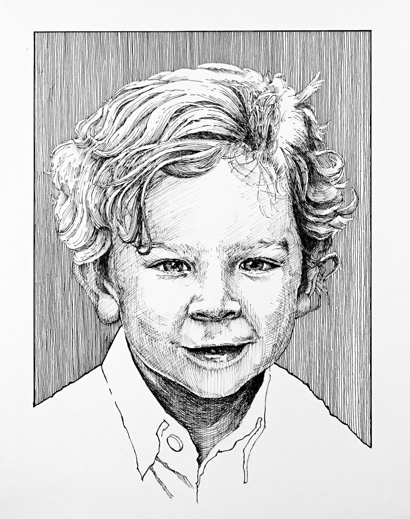
Using Line to Communicate Form and Value
As mentioned before, we’ll be using line to develop the light and form in the drawing. There are a variety of different techniques that can be used to accomplish this. In this case, we’ll stay consistent with our technique and use hatching and cross hatching to develop the image.
We can develop darker tones and values by crossing the lines and placing them closer together. This means that we’ll also need to leave some areas open, allowing the white of the paper to show through to create areas of lighter value.
To help communicate the form of the face, we’ll allow some of our lines to flow over the form of the face. This means that the lines may curve as the form of the face changes in space. These types of lines are called cross contour lines. It is essential to use them in a pen and ink drawing in order to fully communicate the form of the subject.
Here’s a look at the photo reference…

Since we’re creating a black and white drawing with black ink on white paper, the color has been removed from the photo reference. When creating any drawing or painting that is void of color, it’s a good idea to remove the color from the photo reference. This allows us to focus on the values and removes any distraction of color.
Create a Light Sketch of the Subject
We’ll begin with a light contour sketch of the subject with an “H” graphite pencil. Some pen and ink purists may frown upon starting with a graphite sketch. However, when accuracy is important, there’s nothing wrong with starting with a light sketch. Remember, the end result is what is most important.
If the thought of drawing the subject freehand (or with the aid of a grid) intimidates you, you may use a graphite transfer or light board to transfer the drawing.
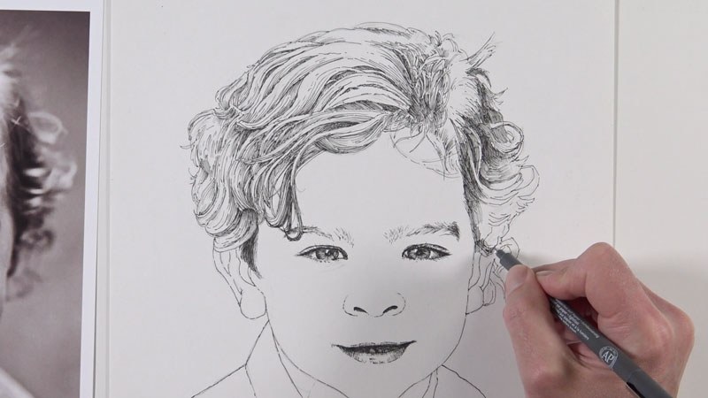
Start with the Eyes
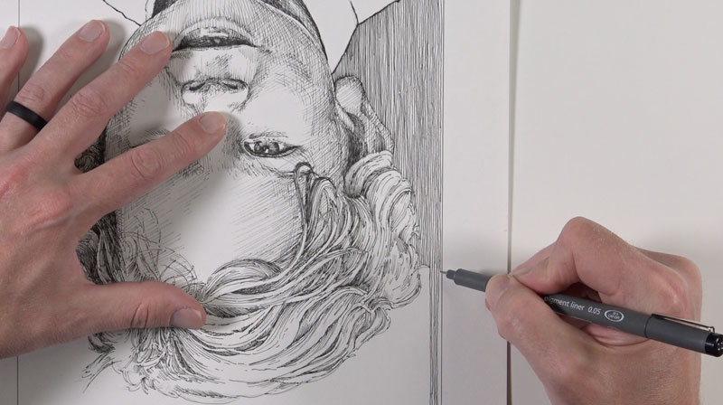
The eyes will naturally become the focal point in any portrait that you draw. In many cases, it is a good idea to start the development of a drawing with the focal points. For this reason, we’ll start with our ink applications with the eyes.
With a .05 mm pen, we’ll slowly begin the process of developing the relationships of dark and light value. The pupils are dark, but care is taken to preserve a strong highlight. Instead of filling in the pupil with a solid application of ink, we’ll use a bit of hatching and cross hatching to build up to a darker tone. This will ensure some consistency in the drawing.

For the iris, lines are drawn extending outward from the pupil. This will help to communicate the pattern of the iris while developing the necessary tone.
From the pupil and iris, we’ll progressively work our way outward, addressing the eyelids and the eyelashes.
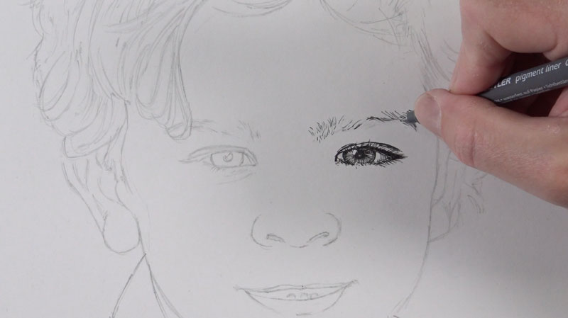
The eyebrows are simply addressed with small marks that extend out in the manner that the hair grows. Each mark tapers as it extends outward from the head. Remember, we can always add additional marks if necessary so it’s best to add a few at first and slowly build up applications. You can always go back and add more if needed but removing lines is not really an option.
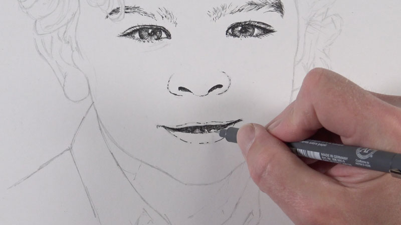
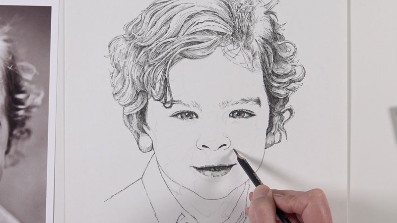
Addressing the Nose and Mouth
Next, we’ll work our way down the face and address the nose and the mouth. Broken lines are used to strengthen the contours of the nostrils and the lips. The shadowed areas are darkened with hatching and cross hatching.
Even though we think of teeth of being white, in most cases they are in shadow. This means we’ll need to create a slightly darker value with a bit hatching. The top lip is usually darker in tone since it protrudes outward from the face. The bottom lip usually features a highlight and is generally lighter in value than the top lip.
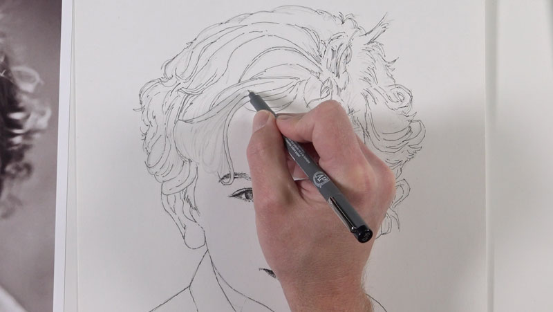
Outlining the Hair
With the features of the face in place and outlined, we’ll turn our attention to the hair. Instead of drawing a million tiny lines for the hair, we’ll think of it in terms of form. This means that we’ll first establish groupings of hair and then add hatching and cross hatching to create the impression of form. This will lead to a more representational look.
We’ll start by first establishing the forms within the overall shape of the hair with contour lines.
Develop the Form of the Hair
With the collections of hair defined, we can go back and develop the value and texture. We’ll use mostly hatching to accomplish this. The lines that we create here should flow over the form of each collection of hair. These lines may not flow over the entire length of each collection. Instead, they should be concentrated at each end, indicating a bit of shadow.
In most cases, the values in the hair are darker around the sides of the face and in locations where the hair “parts” or changes direction.
See also: How to Draw Hair
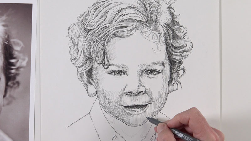
Planning the Values on the Face
Now we’re ready to begin adding the tones on the face and neck. Before diving right into this step with the pen and ink, we’ll first plan the shapes of darker values with a graphite pencil. Using a light pencil (“H”), we’ll draw light shapes to indicate the areas of shadow.
In most cases, the areas that protrude outward are lighter in value while the areas that recede are darker. This means that the bridge of the nose, the cheeks, chin and forehead are typically lighter in tone. The sides of the face, areas underneath the nose, the recesses around the eyes, and underneath the chin are usually darker in tone.
Developing Values on the Face
With the shapes of darker value planned, we can begin developing these sections with the ink. We’ll start with loose diagonal strokes to begin the process.
We can then slowly begin crossing lines to make the value slightly darker. These additional lines that are added may curve and change direction based on the form of the face. Essentially, we are adding cross contour lines to further develop the tone but also to communicate the form of the face. Here again, we’ll keep in mind that additional lines are easily added, but removing marks is nearly impossible. It’s OK to be cautious as we develop the value.
Darkening the Shadows Under the Neck
Since the face protrudes, we’ll find some of the darkest tones on the neck under the chin. Here again, we’ll use a combination of diagonal lines and cross contour lines to develop the shadows. In this case, the cross contour lines begin downward before curving back up around the form of the neck.
The darkest tones in this area are found right below the chin and close to the edges of the clothing.
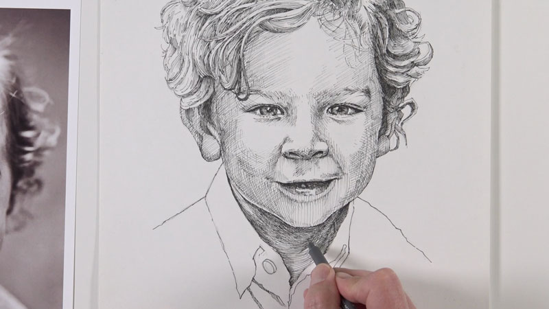
Instead of developing any of the shadows on the shirt, we’ll simply reinforce the contour line here. This is simply a “design decision”. If we were to develop all of the values of the shirt, it could take focus away from the face and hair.
Addressing the Bakground
We’ll now address the background and add a design element. We’ll first create a border around the area above the clothing that frames the face and head using the graphite pencil.
To add a bit of tone, we’ll use vertical, parallel lines to fill in the space. I’ve chosen not to use a ruler here to preserve an organic feeling. This is time consuming and requires quite a bit of patience and attention. However, this bit of tone helps to balance the values of the face, creates contrast with the white shirt, and makes the drawing more interesting.
Finishing the Portrait with Pen and Ink
Lastly, with the background tone in place, we can go back to the hair and face and darken any areas to increase contrast and balance the image.
The outer line of the framed background is also reinforced using a thicker pen and connected to the contour of the shirt.
Now our pen and ink portrait is complete. We can allow the ink to dry completely and erase any remaining graphite lines with a kneaded eraser.
If so, join over 36,000 others that receive our newsletter with new drawing and painting lessons. Plus, check out three of our course videos and ebooks for free.
Lesson Discussion
Comments are closed.
Dear Mr. Fussell,
Thank you for an exceptionally detailed lesson of a Portrait with Pen & Ink. Though you created your picture in pen & ink, I needed practice with my graphite pencils & I followed along using the same hatching & crosshatching techniques as you did. I only wish that you had stated in the beginning in which direction the light was coming from. It appears that it is coming from above. It would have made it easier to know where the shadow would be, making conscious decisions about highlights & shadows, rather than just following you along…
Again, thank you, so love your work.
Regards,
Jean Marie