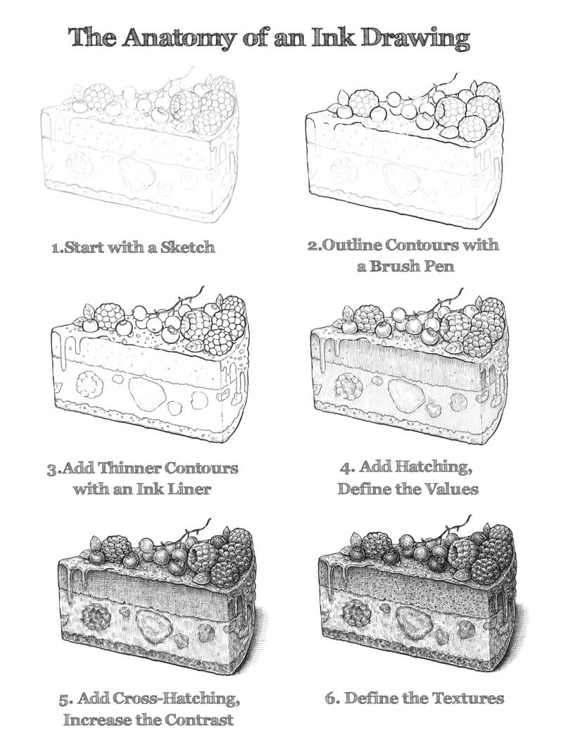
This lesson is designed mostly for beginners that want to get started with ink. I’ll share a sequence of digestible steps. You may consider them as the “building blocks” of an ink drawing.
We’ll observe an ink drawing in “layers”. Each new layer adds significant information to the whole artwork. By building upon each layer, the drawing slowly develops into the finished work.
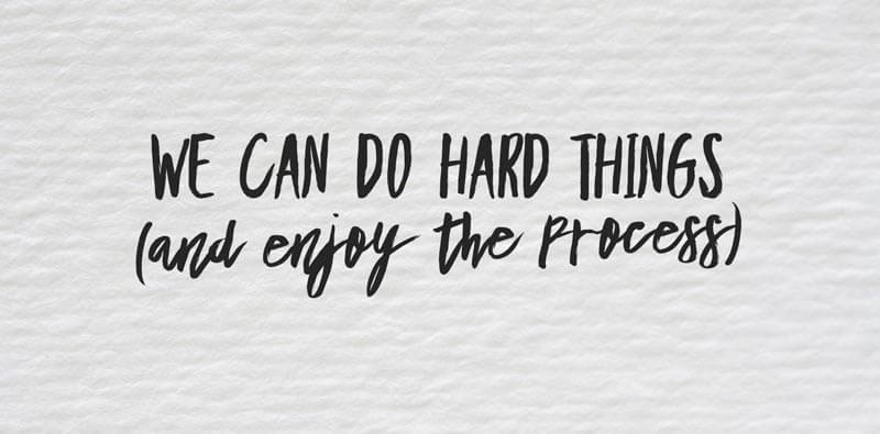
Anything that seems complex becomes easier to understand if we see it as a process, not just as the finished product.
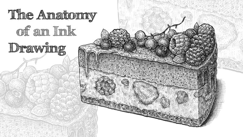
I’ve chosen a slice of a delicious cake with berries as a subject for our drawing. It is relatively easy to draw, even if you’re a total beginner. It has everything we need to look for in a subject – an interesting shape, beautiful value transitions, and varied textures.
I recommend considering this lesson as more than an ordinary drawing tutorial. Instead of just focusing on the steps involved, let’s focus on the principles that stand behind those steps. Once we have a strong understanding of the concepts and principles, we can apply them to any subject that we choose to draw.
It’s worth pointing out that the example shared here isn’t the one and only way to work on an ink drawing. It’s rather a single way to arrange your process that may help you be successful.
Art Supplies for This Project
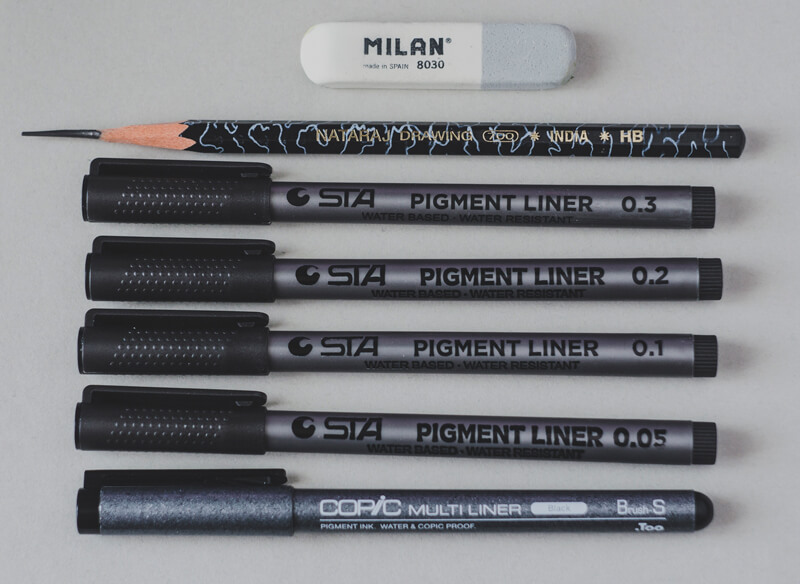
I’ll be using an ordinary HB graphite pencil and an eraser to create sketches and an underdrawing. Several ink liners (0.05, 0.1, 0.2 and 0.3) and a brush pen are used for the inking process.
If you don’t have an access to all those width variations, it’s possible to get by just with the 0.1 and 0.3 pens and perhaps a brush pen. A brush pen could also be replaced with a nib pen.
Drawing a Piece of Cake with a Graphite Pencil
Before we dive into constructing the shape of the cake, it’s necessary to decide on the composition. In this case, our composition is rather simple and static with just one piece of cake. The interest will be developed in the textures and the complexity of the cake itself.
Developing the Idea
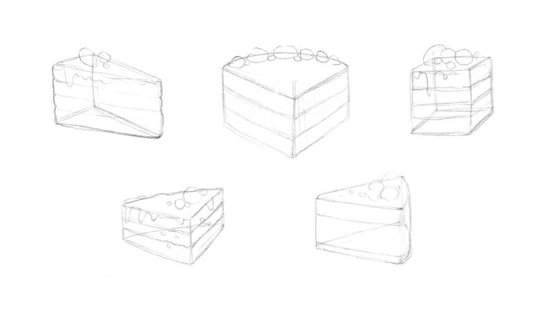
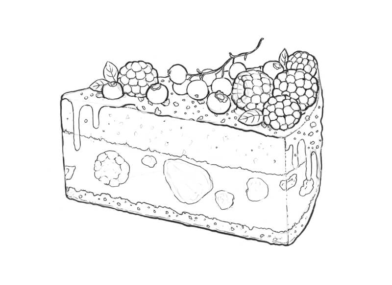
With a graphite pencil, I draw several models of a slice of cake, presenting it as a simple shape. The sketch in the second row, on the right side, is my favorite. It’s always good practice to draw several sketches. Your first idea is not always your best.
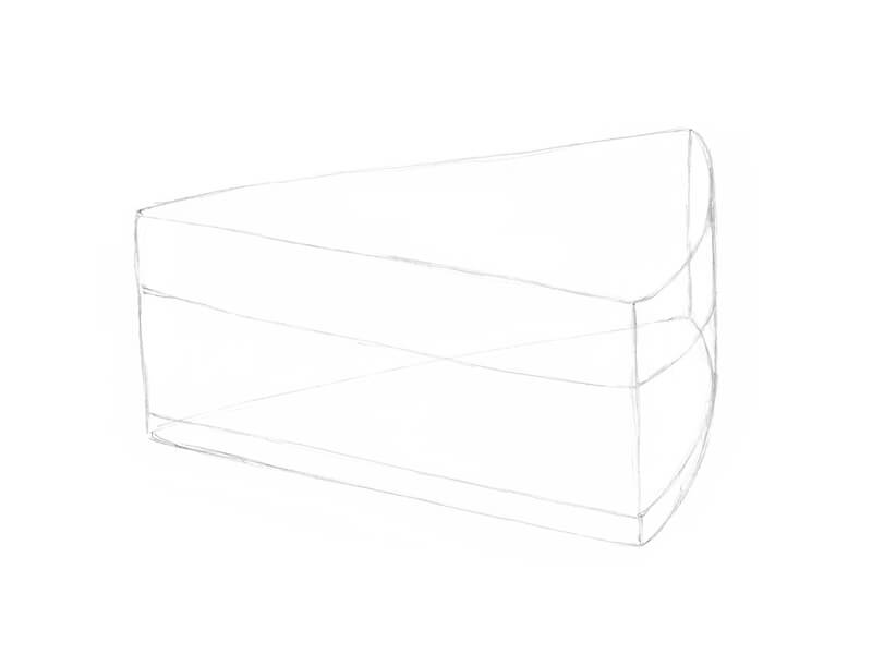
Create an Underdrawing
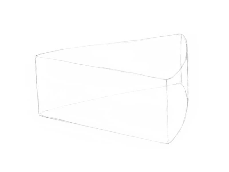
I’m ready to move forward now. With a graphite pencil, I sketch the basic form of the slice, constructing its sides and the top plane. Notice that the back side is slightly curved.
It’s helpful to draw an object with the structure in mind. You may choose to think of the object as a transparent subject, as if you can see through it. This helps you to better understand the form of the object.
Now it’s time to mark the borders between the cake’s layers. Let your imagination go wild – your cake may have seven layers or be completely solid!
I add several shapes to indicate the places where the berries will be located. Pay attention to where you place them. Each berry needs enough space on the cake’s top plane.

I’ve chosen to include currants, bilberries, blackberries, and raspberries for the cake’s decoration. We’ll elaborate on their details in the next step. Several small leaves will also adorn the cake’s top.
I’m going to add a delicious berry filling to the middle layer of the cake, so some stylized berry shapes are welcome there, too.
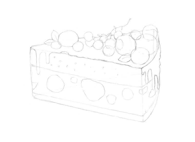
I draw the rows of shapes within each of the berries. The blackberries are made up of smaller shapes that are “squarish”, while the smaller shapes in the raspberries are more elongated.
I also add some sprinkles on top of the cake and accent some inner areas with a pattern of semicircles. When it comes to creating an underdrawing, a balance between detailing and simplicity is up to you.
At the end of this part of the process, it’s necessary to ‘see’ the artwork in your mind. Decide what objects are the darkest or lightest and how you’re going to handle the values.
Adding Ink to the Drawing
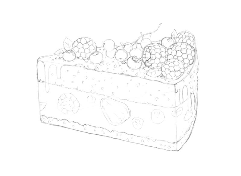
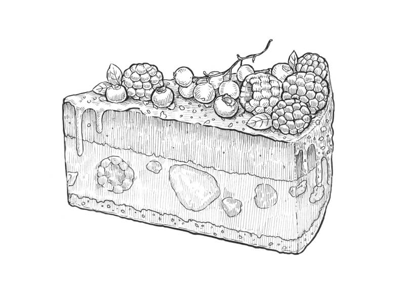
We’ll begin the inking process by first defining the contours or outlines.
Outlining the Contours
Contours are an important part of the drawing. They provide the external borders of the subject and the boundaries of each of the details.
Contours can be rigid or fluid, mechanical or organic, thick or thin, uniform or varied.
In other words, a contour is an expressive artistic tool just by itself. That’s why we should pay particular attention to the contours in our drawing.
To outline the main contours, I use a brush pen. This instrument is great for creating organic, varied lines! If you’ve never used a brush pen, take your time and explore all of the different ways it can be used to create variety in the line. Using a brush pen freely and naturally requires some practice, but it can be a great tool for developing variety in your stroke. Some brush pens can produce a thinner minimal line width than some technical pens.
I accentuate the bottom contour of the cake, making it slightly wider than upper contours. This creates the impression of a shadow underneath the subject.
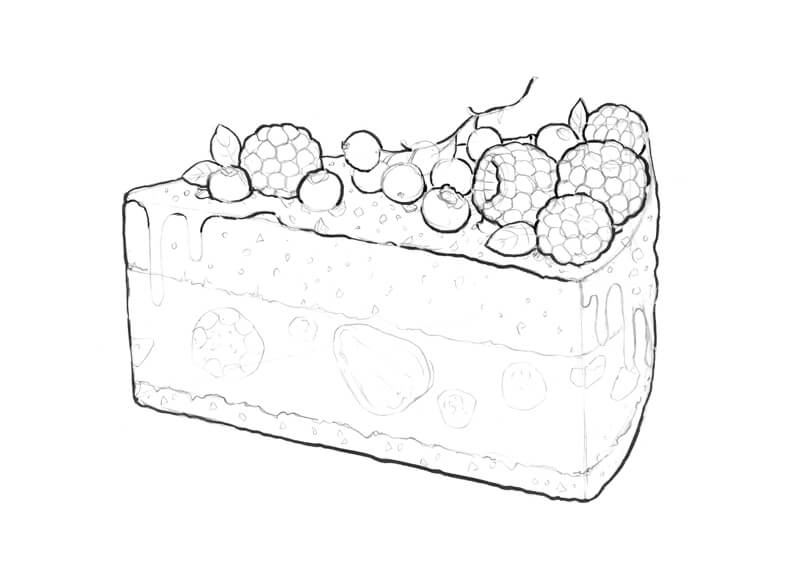
As you can see, some contours, especially those belonging to the smaller objects, remained untouched. I’m going to cover them, using the 0.2 ink liner. If you feel like some contours need an extra accent, it’s always possible to broaden them with additional marks.
Tiny gaps in the contour lines or broken lines are perfectly acceptable. Broken lines can create the impression of light or highlights.
Ink liners produce marks of a relatively constant width. It’s important to include both thin and thick lines in your drawing to create variety and added interest.
Creating Values – Adding Hatching and Contour Hatching
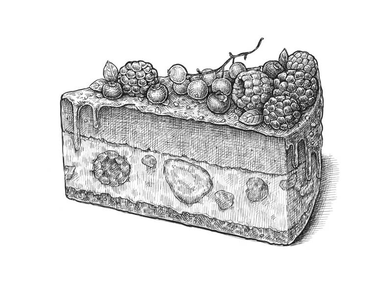
Now that we have all of the objects in place and clearly visible, it’s time to develop the lighter and darker values. Values are important because they define the form of an object, the light source within the scene, and the textures. They also create a sense of contrast.
I add hatching to the cake, following the direction of its planes. A deliberate hatch direction will help the viewer’s eyes in differentiating the sides and the top of the object.
See also: Pen and Ink Drawing Techniques
The details of the berries require a slightly different approach – I use short, rounded hatches that accent the character of each detail. This approach helps to create the illusion that our berries are three-dimensional.
For this step, I work with 0.05 and 0.1 ink liners. Thinner hatches are a better option for lighter or highlighted areas. In this case, the light source originates from above, so the top plane of the cake is catching more light than its vertically oriented sides.
The thinner 0.05 liner is a great tool if you like creating subtle value transitions. Hatching made with a fine liner may look like gradated shading from a distance.
Any form of hatching (cross-hatching, cross-contour hatching) that you feel necessary can be used in this step.
With the 0.05 and 0.1 liners again, I add some cross-hatching, deepening the shadows and increasing the contrast. Also, I add a cast shadow under the cake.
The blackberries and bilberries are the darkest elements of the drawing, so I apply more hatches there. Make sure to leave the highlights on the glossy berries!
It’s important to give some volume to the details, but each berry should be recognized as a whole object. To create this effect, I cover the individual berries with a layer of thin hatching, accenting the darker areas.
This step may take some time, depending on your style and the desired outcome so it’s important to be patient. It’s also useful to take breaks regularly – this way, you’ll have a chance to analyze your artwork and see what needs extra improvement.
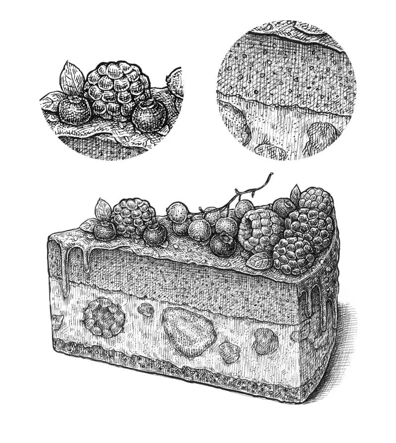
Defining the Textures
At this stage, the contours and the majority of values are in place. To make the drawing more believable and join all the visual information into a complete image, we need to develop the textures. Without them, our cake will look like a plastic, artificial model.
With the 0.3 ink liner, I create a pattern of semicircles inside the upper and bottom layers of the cake. Pastry usually has a rough, porous texture.
The texture of the cake’s middle layer is smoother, but I still add groups of small 0.1 dots here, too – just to create a bit of visual harmony.
Raspberries and bilberries have a velvety texture (compared to blackberries), so I accent this texture by adding small 0.05 dots to them.
Hopefully, the close-up image of the cake’s layers and berries below will help you to better understand the previous steps.
Conclusion
Congratulations! The drawing is complete. I hope that you enjoyed our creative (and delicious!) journey.
My goal was to show you that almost any ink project can be divided into steps. These steps include…
- Sketching out the subject.
- Outlining and developing the contours.
- Developing the values and contrast.
- Defining the textures.
This is just one approach. This is simply a guideline that may help you to get started with ink techniques, making the process clearer. You can work on all aspects simultaneously, invent your own “rules” and your own unique approach – you’re the creator!
I’ve gathered the process images of this lesson into one image. Feel free to pin it!
Thanks for joining me on this ink adventure. Happy creating!
If so, join over 36,000 others that receive our newsletter with new drawing and painting lessons. Plus, check out three of our course videos and ebooks for free.
Carving Clay
Using otherwise ruined supplies saves money and teaches creativity, both in the classroom and beyond.
A medium that always produces waste is clay. There are always left over pieces of clay that have begun to harden. Some artists will “reclaim” clay by working water back into the hardened clay, either by hand or using a machine. Reclaiming clay is a fine way to reduce waste.
Another way to reduce clay waste is to use the clay in a different way. Squeeze these left over pieces of clay into lumps and simply let them dry. Once these lumps have thoroughly dried out, they are perfect for carving. This article outlines a procedure used to make beautiful sculptures from dried out clay lumps.
Carving vs. Modeling – Sculpture Processes Compared
Carving is a traditional sculpting process. Carving is usually associated with materials such as wood and stone. Clay, on the other hand, is typically associated with modeling. Modeling is easier than carving because, when modeling, the artist can both remove and add material. When carving, sculpture material is only removed cannot be added.
For example, if an artist is carving a stone head and removes too much material from the nose, the sculpture is ruined. If the artist were modeling clay, he/she could just add some clay back onto the nose and continue working.
Though clay is usually modeled, it is an excellent material to use when learning to carve. It’s not hard in the same way stone and wood are hard. Dry clay chips and scrapes away quite easily. One does not need specially designed tools to carve clay nor does it require a great amount of effort.
Non-Objective Forms in Clay
Like all other forms of art like painting and drawing, a clay sculpture doesn’t have to represent an actual object from reality. Instead, a sculpture can also be created to be a non-objective or an abstract representation. This approach lends itself well to carving left over, hardened chunks of clay.
See also: The Difference Between Non-Objective and Abstract Art
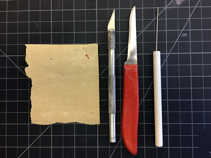
Materials for Clay Carving
Below, you’ll find the materials required for carving clay…
- A lump of dry clay
- Carving tools (almost any rigid tool will carve clay)
- Exact-o knife (dull blades work fine)
- Paper clips
- Peering knife (an old, dull peering knife was the only tool used on the example sculpture)
- Needle tool
- Sand paper
- Acrylic paint or ceramic glaze (optional)
- Access to a kiln
Finished pieces can stand or rest on their own or on a base. Making a base requires an extra step and a few more materials.
Materials For Making a Wooden Base for Clay Carving
If you decide to create a wooden base for your clay sculpture, here are the materials you’ll need…
- A small block of wood
- A metal coat hanger
- A drill with a bit that is the same diameter as the coat hanger.
- A wood file or rasp (optional)
Carving Clay – Step by Step
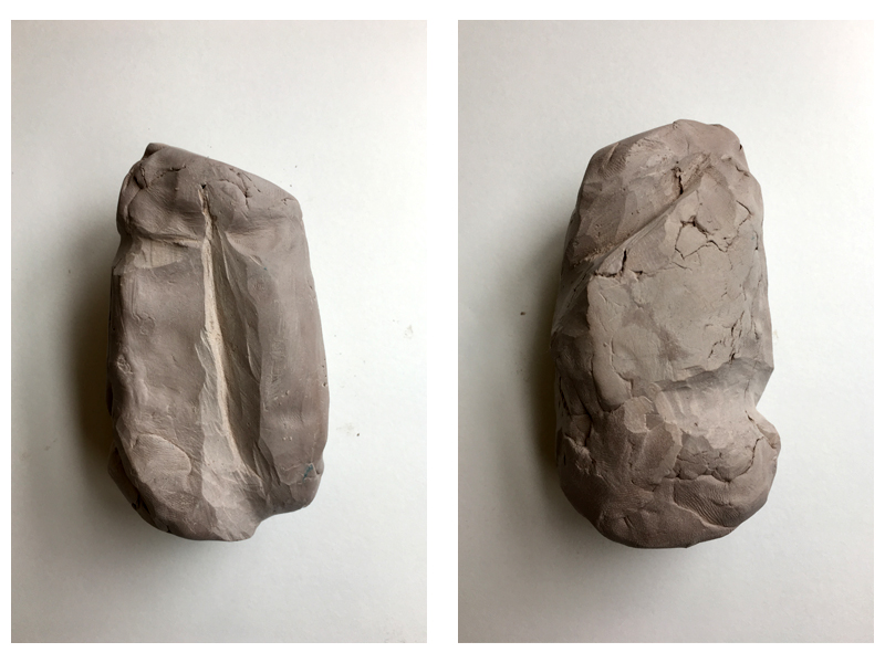
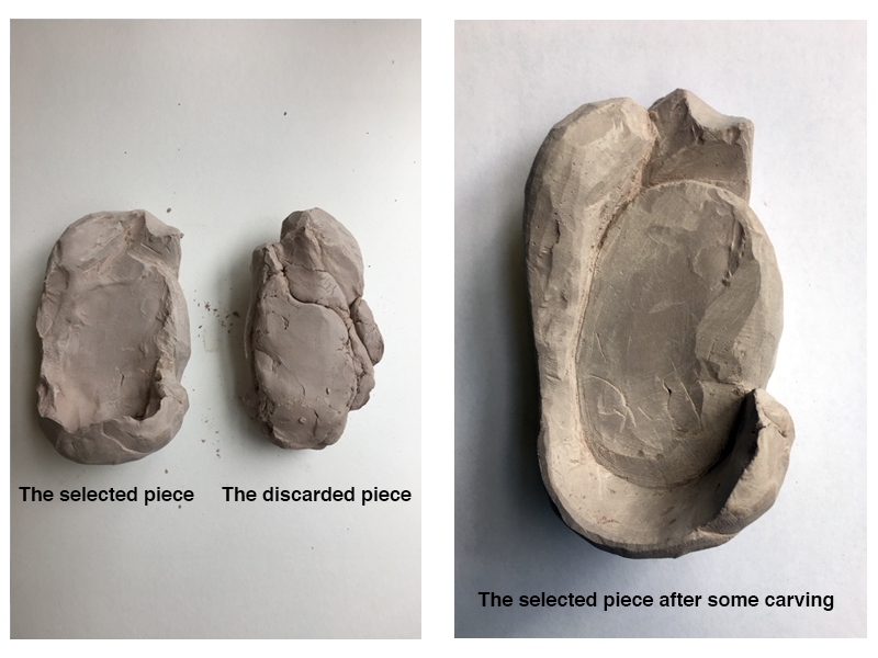
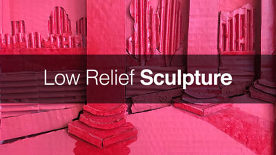
Start the non-objective clay carving by simply looking at the clay lump.
Does it have any slight concavities? Are there any ridges that cross the surface?
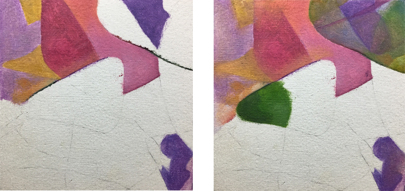
Begin by refining and clarifying any indication of form that the clay already has. In the image below (right), the example shows a concavity at the bottom and the early development of a ridge at the top. Look at the reverse side (below left). The valley down the center of the clay started as a slight depression.
By analyzing the raw clay piece, we can began to formulate some ideas.
With a general idea in mind, we can begin the carving process. While doing so, turn the sculpture over repeatedly. Look for ways to bring the developing ridges and valleys together. Try to dramatically change the original shape of the lump. Sometimes parts of the original lump may break off. This happens for two reasons – pressure and fissures (small cracks).
Scraping away too much material at a time causes breakage due to heavy pressure, especially in the latter stages when parts of the sculpture are thinner. The clay can also separate along a fissure where the previously wet lump was first squeezed together. There is no way to prevent breakage along a fissure.
The example lump that we’re working with here had such a fissure. This fissure actually split the piece in half. This is fine as the sculpture is non-objective.
Be willing to respond to the unexpected in a creative way.
Think of this process as a partnership between the clay and the artist. The artist makes some decisions but the clay may make a few decisions as well. So, if it splits, just choose the most interesting, aesthetically attractive half and continue carving. The image below shows a split in the example sculpture.
Continue carving. Besides altering the original contours of the clay lump, creating empty shapes or negative spaces is a great way to add interest to form.
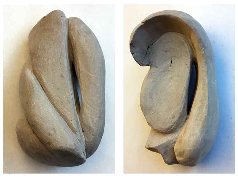
Once the desired form is roughed out, use sand paper to remove the tool marks in the sculpture. Refine with sand paper until you are satisfied with the surface texture. The sculpture is now prepared and ready to fire in a kiln.
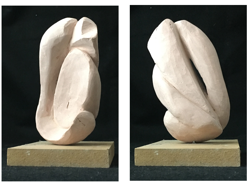
If the sculpture needs a base then a hole must be added before firing. Use the drill bit, but do not use a drill. Hand-drill a hole about a half inch into the bottom of the sculpture. Spin the bit against the clay by rolling it between the fingers. Blow away excess clay dust while doing so. The clay is so brittle that hand-drilling into the clay will greatly reduce the chances of breaking the work before firing. The example sculpture was bisque fired to about 1500 degrees. The images below show the fired clay sculpture on a preliminary base.
Finishing and Presentation
At this stage, you must decide how to finish the surface. It can stay as is (bisque ware), be painted or be glazed. The example sculpture was glazed and then fired again in a kiln, according to the directions found on the glaze label. In this case, three coats of glaze were applied, then the piece was fired to 1850 degrees.
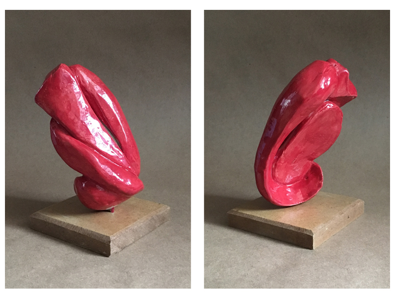
Not all sculpture needs a base. However, some sculptures look best in position that do not look naturally balanced. This creates a bit of tension and makes the sculpture more dynamic and interesting. Such is the case with the our example.
Adding a Wooden Base to the Clay Sculpture
To start, the wooden block needs a hole that is the same diameter as the whole made in the sculpture. Use the same drill bit for both. Cut a small piece of metal (from a coat hanger) about one inch long to fix the sculpture to the base. Insert the small metal rod into both the sculpture and the base. If the rod is at all loose, then wrap tape around the rod until the fit is snug.
Like the sculpture itself, one must decide how to finish the wooden base. Does it need paint or stain? Does it need sanding, is it to large or small for the sculpture? What about the shape? Should it be rounded or square?
In this case, I decided to go for a simple, square base. This helped to create contrast between the organic sculpture and the geometric base.
A rasp was used to bevel the edges. Finally, a coat of polyurethane gave it a mild sheen. Nice!
Conclusion
This sculptural process is not only a wonderful way to avoid wasting art materials, it is also a fun introduction to carving. Though it requires access to a kiln, no special tools or expensive materials are needed, making it an accessible project for most students and accomplished artists alike.
If so, join over 36,000 others that receive our newsletter with new drawing and painting lessons. Plus, check out three of our course videos and ebooks for free.
How to Paint Small Details with Acrylics
For many of us, these details can present a challenge that seems insurmountable. A challenge that is best avoided – at all costs! In fact, some of us may even choose to forgo a subject completely when these tiny details present themselves.
This doesn’t have to be the case. Even the smallest of details can be accurately captured in a painting. It’s simply a matter of surface choice, brush choice, and understanding how to manipulate the paint to conform to your demands.
The Problem with Painting Details
When we encounter small details in a subject, our first response is usually reaching for a smaller brush. Many times, this works out just fine. Smaller brushes are, of course, essential. But a smaller brush is not the only factor we should consider. Even with a smaller brush, if the consistency of the paint is too thick and/or the surface is too textured, then the mark we may create is flawed and may not translate into those intricate details that we’re after.
We therefore, have to consider the consistency of the paint, along with the surface texture in order to have full control over the marks that we can make. There’s more to it than just using a small brush.
Factors to Consider When Painting Small Details
We’ll first quickly take a look at the factors we should consider when tackling small details in an acrylic painting. Then, we’ll take a look at each of these factors a little closer.
Here’s what we should consider…
- The Surface – Using a smoother surface, like gessoed masonite or illustration board, will give us greater control over tiny details compared to that of canvas. Canvas is simply a coarser surface. While small details can absolutely be developed on a canvas surface, they’re easier to achieve on a smoother one.
- Brush Size / Type – Although a small brush is preferred, you may find that your smallest brush doesn’t produce the results that you’re after. Experiment with your smaller brushes to find which one will make the marks that you need to recreate in your painting. While any brush type can be used for detail work, most artists prefer one with a round tip. This type of brush can produce both small dots and clean lines.
- Viscosity – Viscosity refers to the fluidity of the paint. We’ll need to adjust the viscosity in order to create fine details in a painting. Often, heavy body acrylics are too thick to produce clean details. We’ll need the paint to be fluid enough to be spread, but remain opaque enough to be visible.
The Painting Surface
When many us think of creating an acrylic painting, we automatically think of canvas as our surface. While canvas is a great option, it’s far from the only choice we have. In fact, any surface that accepts acrylics can be used as a painting surface.
The texture of canvas is naturally coarse. Because it is so coarse, it easily accepts multiple layers of paint. It’s great for blending transitions or gradations of color and value and applying paint with thick applications. One drawback to working on canvas however, is how difficult it can be to create intricate details. They can be developed on canvas, it’s just a little more difficult. Other “canvas-esque” surfaces such as canvas board or canvas paper are even more challenging surfaces to create details.
Other smoother, more-viable, surface solutions exist. These surfaces make painting details a little easier, but lack some of the advantages of working on canvas. Let’s take a look at a few options…
Surface Option #1 – Watercolor Paper
Watercolor paper on its own, without any treatment, can be a suitable surface for acrylics. Both the cold press and hot press papers can be used. But if we want a little more rigidity, a light coat or two of gesso does the trick. This surface provides a smoother surface than canvas, but still does a fine job of accepting acrylic applications.
Surface Option #2 – Illustration Board
Illustration board is a heavier option over watercolor paper. The surface of the more popular, cold press illustration board, is similar to that of Bristol paper. Illustration board is quite a bit thicker than Bristol paper and it’s this rigidity that makes it a good choice for detail work with acrylics. One drawback of this surface is that it lacks much texture at all, but if your subject requires crisp, sharp details, this surface may be worth looking into.
Surface Option #3 – Gessoed Masonite
Masonite is an engineered wood that is rather light, but strong. When gesso is applied to the surface, it becomes an exceptional surface for painting with opaque paints like acrylics. Masonite can be purchased at a local hardware store and cut to any size you wish. You can apply gesso to the surface yourself with a sponge or large brush.
Because this surface is so popular among artists, it can be purchased as a manufactured product. The manufactured version can be purchased at most art stores. Most surfaces you’ll find are super smooth, but some companies have started to create versions with a faint tooth. The smoother version is fantastic for detail work, but will show obvious brush strokes. The slightly textured surface (used in the video above) allows for precise detailing, but also has enough tooth for gradations of value and color when the paint is applied with a thicker consistency.
Brush Size / Type
Clearly, if small details are what you’re after, you’ll need to consider the brush that you use to create them. Brushes are produced in a multitude of sizes and shapes. For tiny details, I recommend using a round brush. Round brushes are capable of producing both small dots and defined lines.
In some cases, a flat brush may be a better option. If you need to create rectangular shapes or very thin straight lines, a flat brush may work better.
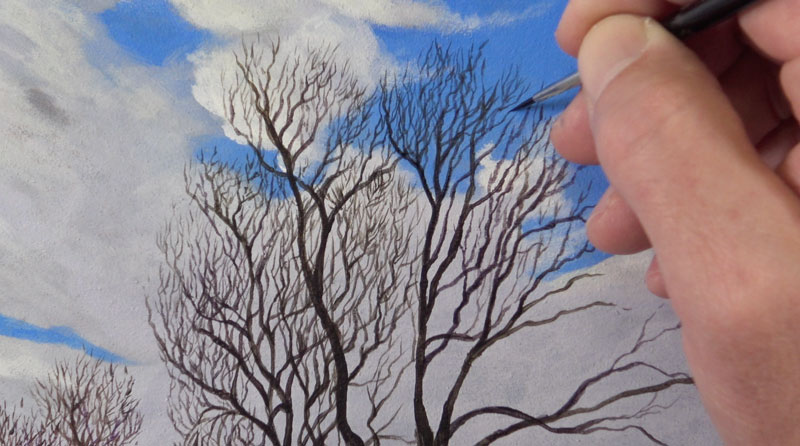
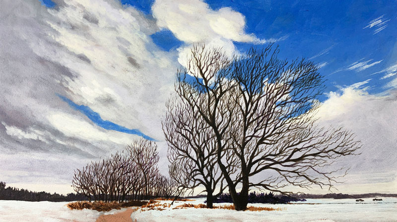
The small, detailed tree branches in our example are best tackled with a round brush. We can vary the stroke with a round brush easily. With more pressure, our line is a little thicker. With less pressure, the line is thinner.
As we mentioned before, the smallest brush in your collection may not be the very best option. You’ll need to experiment with the brushes that you have in order to decide which is best for your details. In my case, my smallest brush simply did not hold enough paint and did not provide enough variety in the mark. The brush I used to create the tree branches in our example was still very small (size 0), but not the smallest round brush I own (size 18/0).
See also: Brush Types
Viscosity
Heavy body acrylics are great for solid coverage of color when used without any thinning. However, for details, these acrylics are hard to control and precision is difficult. If we are to have the upmost control over the details that we create in a painting, then we must adjust the viscosity of the paint.
By adding a little solvent (in this case, water) to our paint, we can adjust the viscosity and make the paint a little easier to spread and control. But we must be careful. If we thin the paint too much, it can become translucent. If we go even further than this, we can remove the adhesion properties of the paint all together. If this happens, the paint may not stick to the surface and may even pull up some of the applications underneath.
We need to find a balance. We need the paint to be fluid enough to be spread, but also opaque enough to be visible. Finding this balance can be tricky and requires a little practice and experimentation. But once you find the right balance, it can be a real “game changer”.
Painting Tiny Tree Branches
Let me conclude here by leaving you with a few tips for painting tiny tree branches, since this is what initially served as the inspiration for this lesson.
Tip #1 – Pull Strokes as the Tree Grows
Begin with the basic structure, or skeleton, of the tree by painting the trunk and largest branches. Pull strokes upward, just as the tree grows. Allow the strokes to taper as the larger branches and trunk becomes thinner.
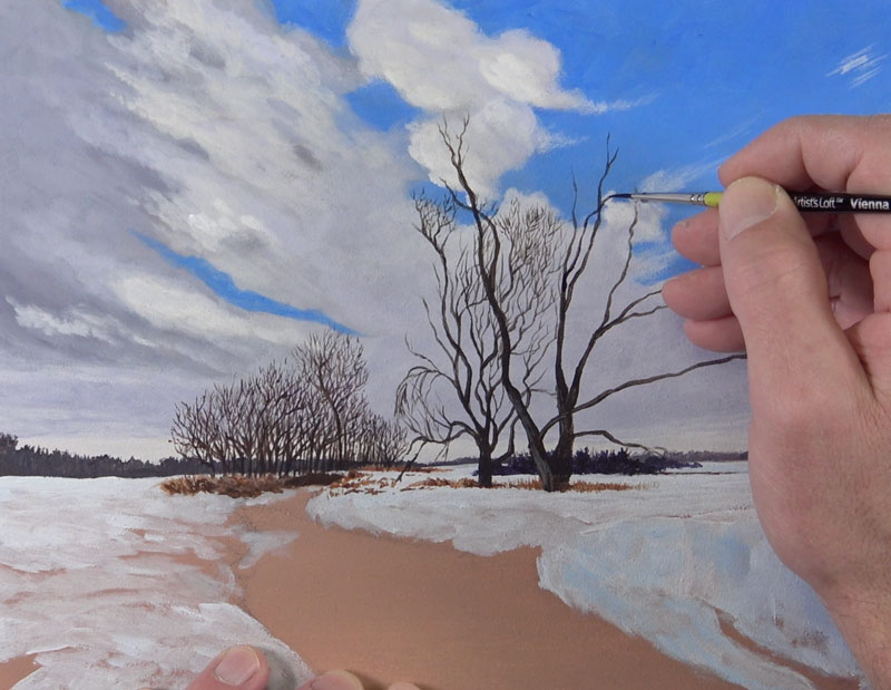
This same approach can be taken for even the smallest of branches. For the smaller branches, start your stroke from the trunk or larger branch and pull outward.
Tip #2 – Avoid “Scrubbing”
Scrubbing refers to the action of moving the brush back and forth to apply the paint. Scrubbing is best reserved for creating textures or covering larger areas. The branches on a tree are best developed using a deliberate stroke that flows in one direction. Resist the urge to move the brush back and forth.
Tip #3 – Create Organic Lines
A tree is a living, organic subject. Organic subjects are best depicted in a painting with organic marks. Your strokes should move and change direction in an unpredictable manner. Perfect, straight lines should be avoided. A little “wiggle” in the stroke will lead to a more realistic appearance.
Tip #4 – Don’t Paint Every Branch, But Include More Than You Think
A mistake that some beginners make is including too few branches. This doesn’t mean that you need to include every single branch that you observe. Including every branch may make the painting look confusing or busy. Instead, we nee to find a balance between what we observe and what we include in the painting. Many times, we need to include more branches than we think, but be careful not to include too many. Evaluate your painting as you work to find that perfect balance.
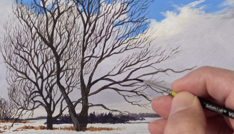
Tip #5 – Branches Are More Concentrated Closer to the Outer Edges
If we closely observe a tree, we’ll notice that the branches are more heavily concentrated near the outer edges. This should also be reflected in our painting. The core of the tree will likely have a lesser concentration of smaller branches and may even be completely open.
Conclusion
Hopefully, you can see that tiny details are completely achievable in a painting. We just need to consider a few things if we are to find success. The surface, brush size and type, along with the viscosity of the paint makes all the difference.
If so, join over 36,000 others that receive our newsletter with new drawing and painting lessons. Plus, check out three of our course videos and ebooks for free.
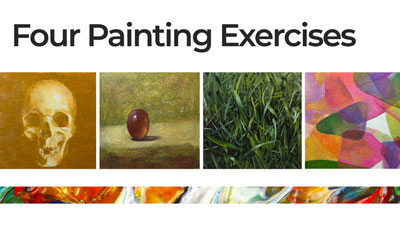

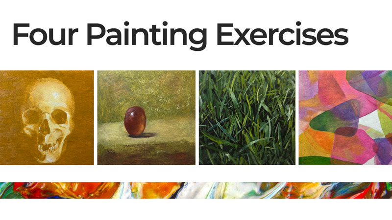
Four Painting Exercises
The Importance of “Art” Exercise
Exercise makes a person’s body strong. Painting exercises make your artwork strong.
When we exercise, we train our minds and bodies to perform when it’s time to perform. By practicing our art, we train our minds to see and understand the world as an artist should and we gain more experience with the medium of our choice. An added benefit comes in the form of experimentation. We are likely to be more open to experimentation when we know that what we are creating is meant for practice.
Exercise, or practice, should be a regular part of any artist’s routine. Most will agree that practice is important, but many folks simply don’t know how to go about practicing without creating a finished work. In this lesson, I’ll share four painting exercises that are meant specifically for practice.
Below are four exercises meant to strengthen the skills of painters at any level. The exercises target various skills and elements of art (line, shape, form, value, space, texture). Oil paint was used to complete the examples below but any opaque paint is suitable for these exercises.
The specific pigments used include:
- Titanium White
- Cadmium Yellow Medium
- Yellow Ochre
- Cadmium Red Medium (only used for the watercolor copy)
- Alizarin Crimson (only used for the watercolor copy)
- Indian Red
- Ultramarine Blue
- Phthalo Blue (only used for the watercolor copy)
- Ivory Black
All four painting exercises are small, measuring just 4 x 4 inches. They were completed on illustration board prepared with two thin coats of gesso. Each exercise took 1-2 hours to complete.
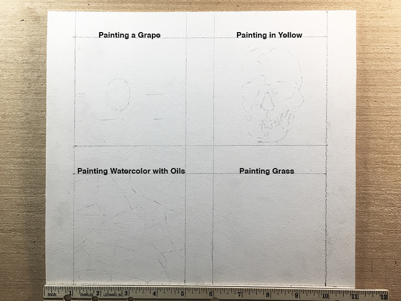
Painting Exercise #1 – Painting From Yellow to White
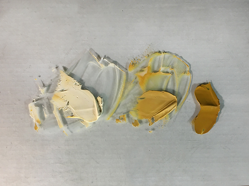
I remember the first exercise from when I was a student. My painting professor assigned our class a painting in yellow and white – yellow serving as a “black”. Yellow is the lightest of all hues. Using it in place of black requires the artist to squeeze the entire value scale into a narrow range.
How does this exercise benefit the painter? Creating realistic form in a narrow range of value requires accurately arranged values. This exercise teaches an artist to distinguish the smallest changes in value across a surface.
I chose to paint a skull for this exercise. Here’s a look at the reference photo…

Any object or image with a full range of value (black to white) is suitable. Select a subject that is appropriate for your current drawing skills. Also, I chose to use Yellow Ochre instead of Cadmium Yellow. Yellow Ochre is the darkest yellow. Use Cadmium Yellow or Lemon Yellow to really challenge yourself.
Begin with three values – pure yellow, yellow lightened with white and white with only a touch of yellow. We will not use pure white until near the end of the painting exercise.
The first step is to simplify. Block in the darker values (not just black) with pure yellow. Next, paint all of the mid tones with the middle value shown on the palette above. Finish blocking in the painting with the lightest value, the one that is close to white. Three values are enough to start a three dimensional form.
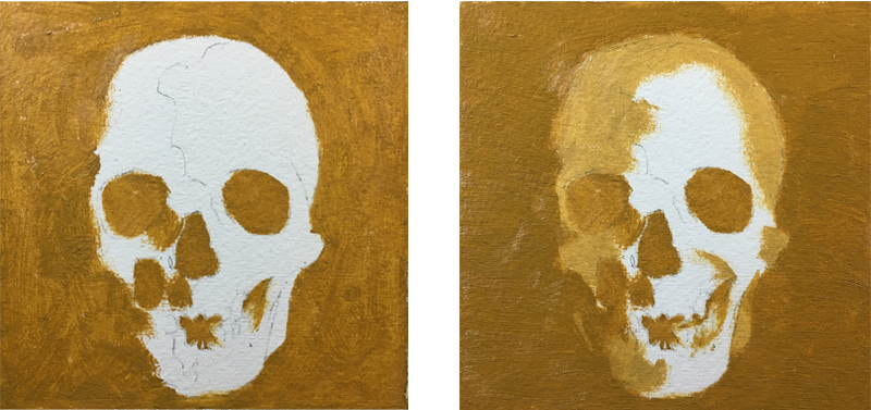
Once the painting is blocked-in, it’s time to reintroduce the complexity of the subject. Discover new values by blending the edges of the painted shapes together. To fine tune a color, paint the premixed values into one another. This is called wet-into-wet.
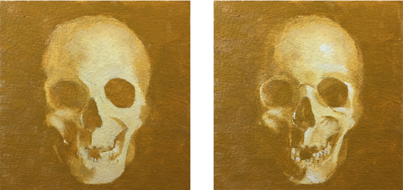
Finally, add pure white strokes only where you observe the lightest of values in your subject. On the skull, those places were in the forehead, around the eye on the right and on some of the teeth.
Painting Exercise #2 – Painting a Grape
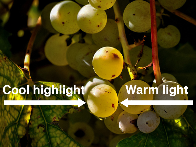
I first saw this next exercise in an old art book when I was a teenager. Painting a grape is less about a specific element of art and more about the mysterious illusion of translucency. This exercise is meant to take away some of that mystery. Additionally, this exercise gives the learner a chance to observe how using multiple hues on a monochromatic object can create a greater sense of light and realism.
Look at the photograph of grapes (below). Notice that there is light on both sides of the grapes. The light source is from the left, presumably the sun. The light produced by the sun is a cool white. The grapes are also light on the right side. Were these olives, the right sides would appear dark due the opacity of olives. Grapes, however, are subtly translucent. To create this illusion, one must replace the shadow with light. In the case of grapes, that light should be a warm instead of cool.
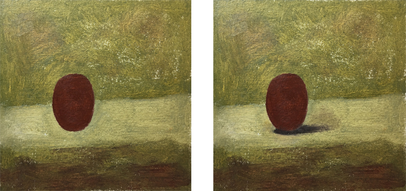
Begin by painting a loose environment, such as table top, for your grape. Paint the shape of a grape over your background using Indian Red. Alternatively, you can use Cadmium Red Medium with a touch of black. Add a cast shadow next to the grape. The shadow will eventually contribute to the illusion of transparency.
On the grape and next to the cast shadow, apply cadmium yellow where a shadow would ordinarily be located. Work the yellow into the red so that it is soft. Mix a small amount of blue with white and float a stroke along the top left of the grape. The cool light on the grape and the warm light in the grape capture the translucent quality that define grapes. Next, add the white highlight and use the end of your brush to loosen up its bottom.
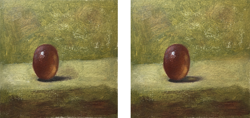
Now finish the cast shadow. Mix some of the background color into the center of the shadow to complete the illusion of light passing through the grape.
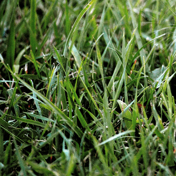
Painting Exercise #3 – Painting Grass
The third exercise gives painters an indirect approach to creating textures like grass, hair, tree bark, etc. Instead of trying to create realistic looking grass from the very first brush stroke, take the preliminary step of toning the background with a dark color first. Then, lighter values are used over the dark layer once it’s dry.
Here’s a look at the photo reference we’ll use for the third painting exercise…
The dark color used for the background (mixed with black, brown, and deep green) will become the small irregular shadows created by the negative space between grass blades. I am using oil paint for these exercises, but the background color is acrylic because I wanted to paint over a dry layer of color and did not want to wait three days to do so (oil can go on top of acrylic but not the reverse).
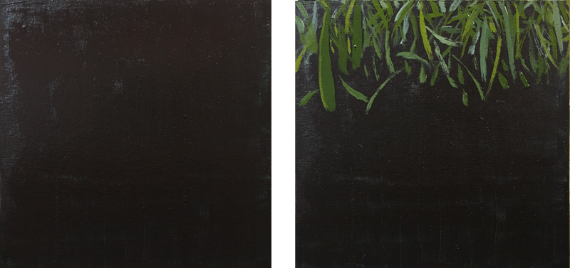
Next, begin in the top of the square (the area furthest away) and lay in strokes of green. Use medium to thin your paint as necessary. Be sure your marks vary in width, direction and color. Use white and yellow to vary the value and temperature of your grass blades. Before moving down in the composition, I used a soft, dry mop brush to soften and blur these brush strokes.
Continue to work in the bottom two thirds of the composition in the same way but only soften the brush strokes at the very bottom of the square with the mop brush.
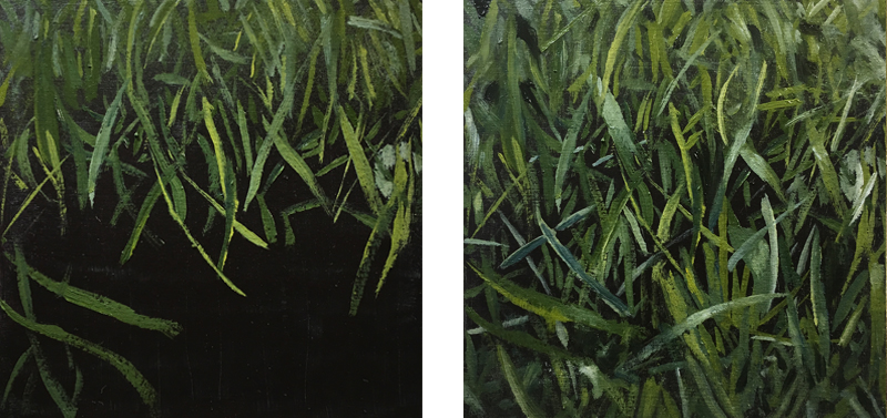
Once all of the grass blades are in place, pick out a few blades for highlights. Mix a small amount of white into the middle of those blades to create a quick gradation (see the blade in the lower center). You may also want to add or sharpen a few of the dark areas between the blades. I used ivory black to recapture some of those shapes.
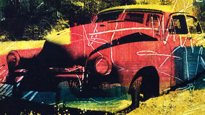
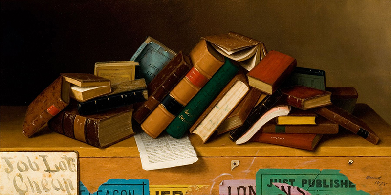
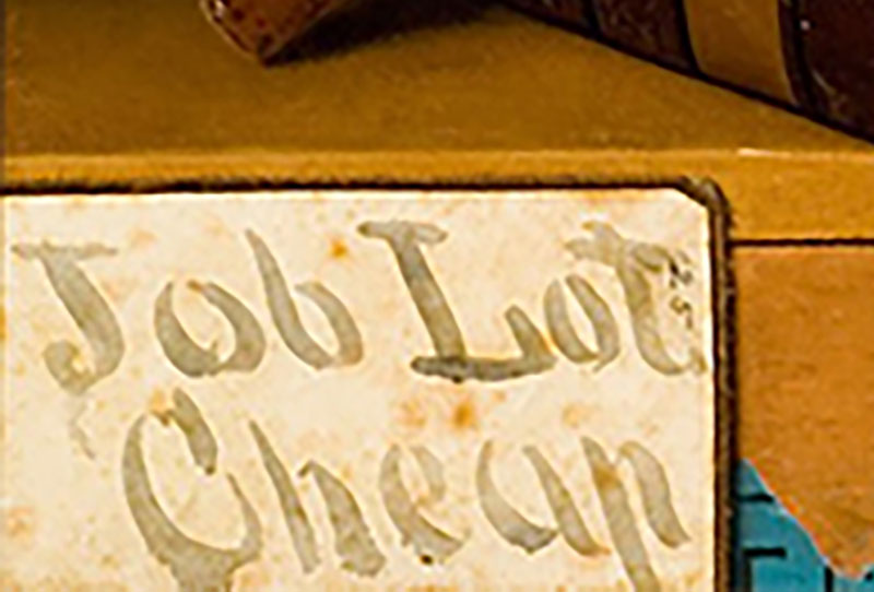
Painting Exercise #4 – Mimic Another Medium
I have used the previously described painting exercises in the past but this last exercise is brand new to me. It was inspired by a painting by William Michael Harnett titled, Job Lot Cheap. Painted in 1878, the still-life depicts a grouping of books that are for sale. In the lower left of the painting is a sign that appears to be made from either a wash of ink or watercolor. Of course, this is an oil painting, but Harnett has masterfully manipulated his opaque paints to create a strong illusion. The ability to manipulate one’s medium to the extent that it appears a different medium is a mark of true mastery.
Here’s a look at the entire painting…
And here’s a closer look at the area discussed above…
This exercise is beneficial to the painter in several ways. Critical observational skills are strengthened by this exercise. The illusion of transparency requires an accurate arrangement of value and color. Also, the painter must focus on edge quality. Watercolor strokes can have extremely sharp edges and they can bleed themselves into oblivion when painted over a saturated surface. The painter must manipulate his/her strokes to recreate the mingling quality that defines the look of watercolor.
Here’s a look at the reference photo we’ll use for this exercise…
Start by mixing colors that are similar to those in your watercolor reference. My reference consists of non-objective color shapes. I began painting the shapes of color as they might have looked had they not bled together. Before beginning a shape, notice whether or not its edges are dark. One defining characteristic of watercolor is dark edges where pigment settles while drying. Paint those edges dark before painting the rest of the shape. This way, you can use the lighter color to sculpt and thin those dark edges so that they resemble watercolor.
When using watercolor, one color painted over another produces an optical mixture – a third color. To produce the same effect with oil paint you must, on your palette, physically mix the third color that two watercolor layers create. Then, paint that third, mixed color directly into the shape created by the first two overlapping colors.
As you paint, use your brush to soften edges that are blurry and blend colors to create gradation in color and value where appropriate.
Note: For this exercise, I did not use any medium to thin the paint. By using no medium, the paint’s viscosity remained consistent throughout. This helps me to blend the colors into one another predictably, with each color matching the strength of the next.
Conclusion
Small painting exercises give a painter the same experience and practice as a larger, more complex artwork, but in less time and under less pressure. Strive to complete each square in one sitting. Use the references provided or enjoy finding your own. Most importantly, make the effort to incorporate practice time in your artistic journey. The benefits of doing so will pay off in your art and you’ll see improvement in your work in a much shorter period of time.
If so, join over 36,000 others that receive our newsletter with new drawing and painting lessons. Plus, check out three of our course videos and ebooks for free.
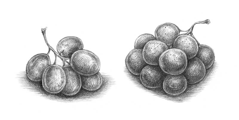
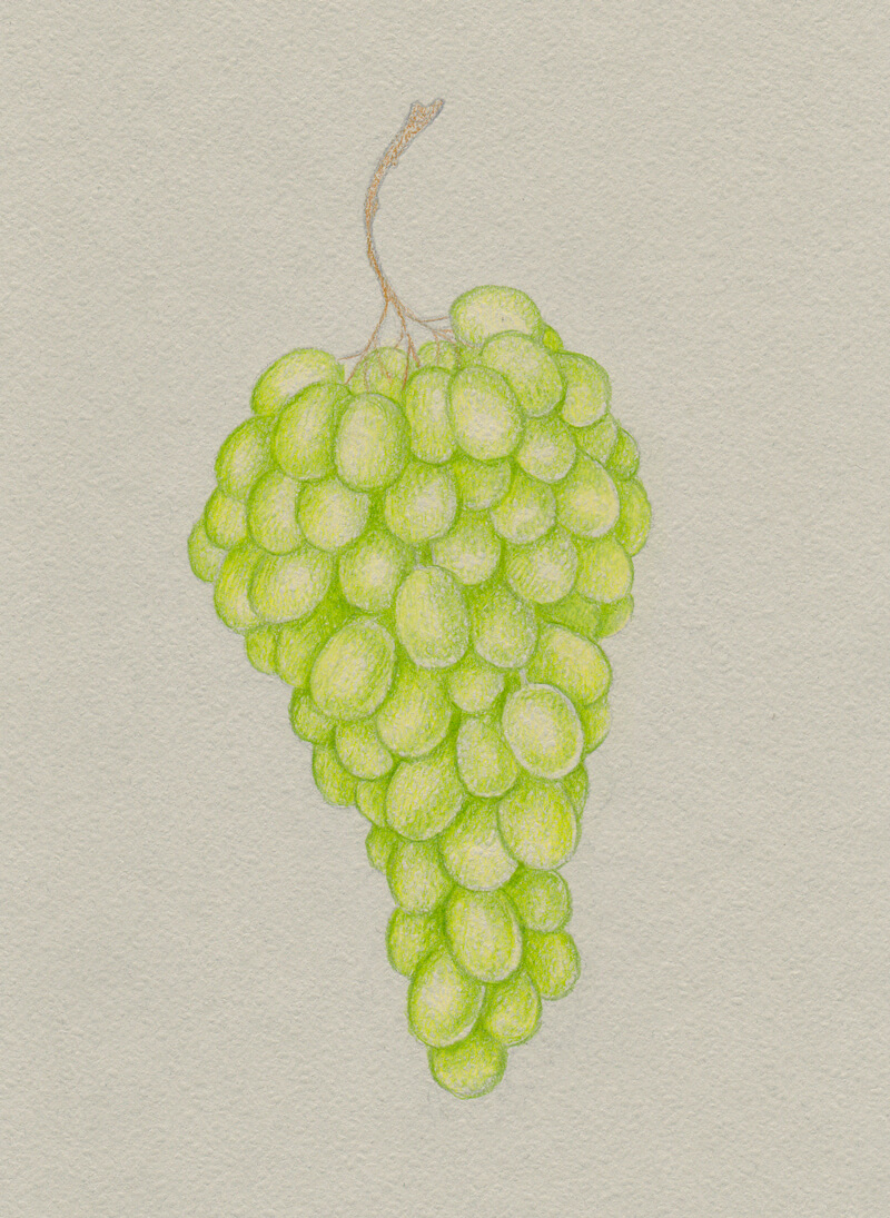
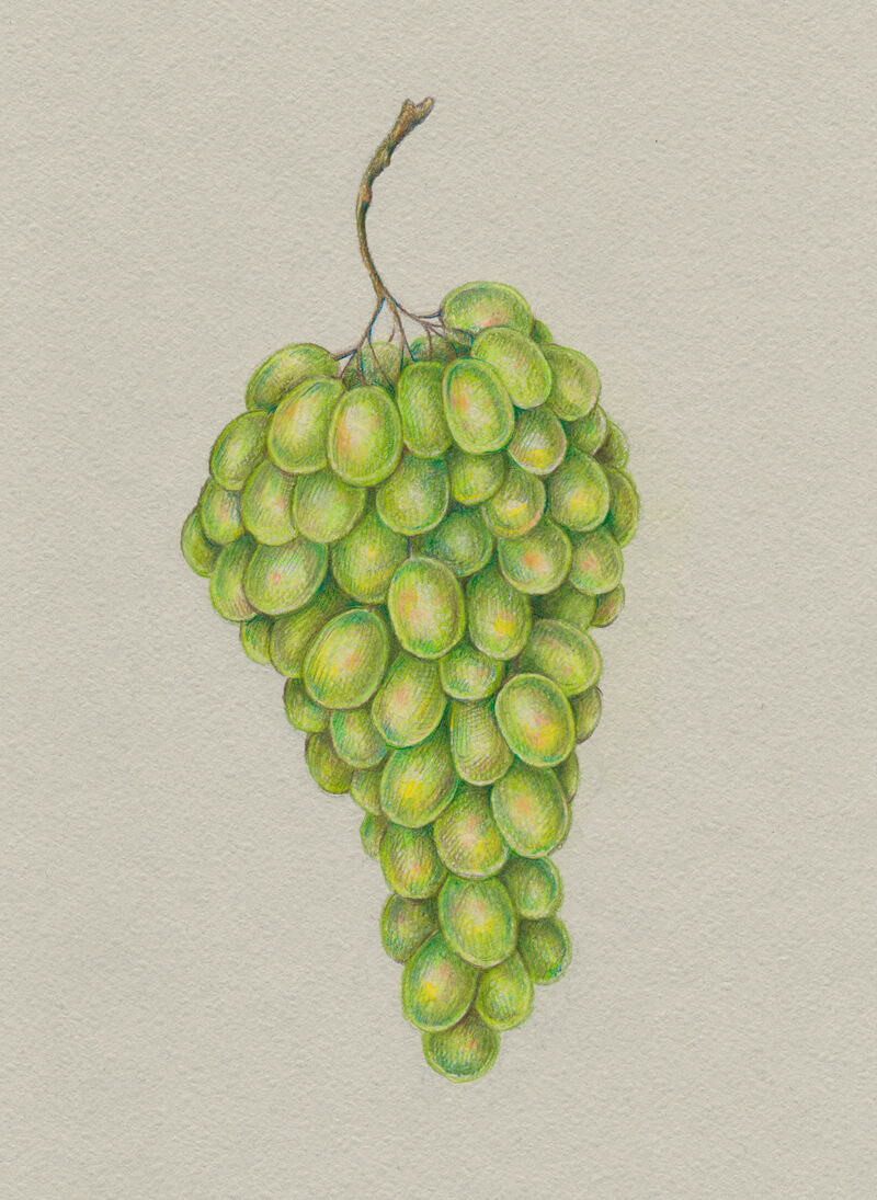
How to Draw a Bunch of Grapes with Colored Pencils
It would be no exaggeration to say that when we think about paper, most likely we have white paper in mind. It is a well-known, basic option. But there is a full range of other options. For example, muted beige, cool grey, midnight black, salad green or dusty pink colored paper. Our paper doesn’t have to be white. It may be any color we imagine. There is a whole world of paper tones, each full of creative potential!
A toned surface has its advantages. At minimum, it helps the artist to save a little time, broaden their horizons, and diversify their skill set. If you’re interested to learn more about the advantages of drawing on toned paper, check out this wonderful article:
Six Reasons to Draw On Toned Paper
The Art Supplies for This Project
I’ll be using grey pastel paper with a subtle texture and Faber-Castell Polychromos colored pencils.
Before starting the drawing, I pick a limited range of colors to limit my palette and relieve my mind of excess thinking in the process. The selected pencils are:
- Walnut Brown
- Raw Umber
- Cold Grey IV
- Medium Flesh
- Light Flesh
- Chromium Green Opaque
- Earth Green Yellowish
- May Green
- Light Green
- Naples Yellow
- Cream
- Phthalo Blue
The applications made with this brand of colored pencil are often semi-transparent. Of course, some pencils provide denser marks and others produce applications that are almost translucent on paper. This depends on a variety of factors, including the quality of pencils, the binder used, and the color itself.
See also: Oil-Based VS. Wax-Based Colored Pencils
As long as we’re going to use a toned paper, it’s useful to try out the pencils beforehand.
The more layers of pigment we apply, the denser the covering will be. The paper can become a limitation and we’ll need to consider this. As soon as we run out of tooth, no further applications can be made.
Of course, the choice of colors depends on your subject and idea. I’m going to draw grapes that have a green hue as a base. If your subject involves depicting purple or black grapes, your set of pencils will obviously be different.
I also add some colors that will help to create visual harmony and beautiful, contrasting nuances – we’ll have a good look at those tips during the drawing process.
The choice of the brand (Faber-Castell Polychromos) is just my personal preference. Feel free to use any colored pencils you have or like.
Also, I recommend having a kneaded eraser and a pencil sharpener at hand and some supplies for sketching (ordinary white paper, a graphite pencil – or a couple of them, and an eraser).
This project is closer to a sketch rather than to a fully complete colored pencil painting. I’m limiting myself deliberately because the goal is to complete the drawing in a reasonable period of time, enjoy the process, and learn something new.
Observing the Grapes
This chapter of the tutorial is optional. If you aren’t in the mood to do any preparatory work or feel confident enough, please skip it and proceed right to the colored pencil portion below.
There are different approaches to drawing. Some artists prefer depicting objects from life (even if it means spending days or weeks in attempts to find a perfect specimen), others enjoy using qualitative reference photos. There is also a way that involves combining both approaches and seasoning it with imagination. Which method is more attractive to you? Remember, you are the artist, and the choices that you make are yours!
I decided to go for an eclectic approach.
There are many wonderful, inspiring photos on the web – they allow us to observe grape bunches of different shapes and colors. While conducting this research, it’s helpful to ask yourself various questions.
- What peculiar features are inherent to a bunch of grapes as an object?
- What structure should it have to look realistic and recognizable?
- How does light behave on grapes?
- What size and shape of grapes will I choose for my drawing?
An attentive analysis will give you more answers and useful information than any instructions.
If you struggle to see the darker and lighter values, transform a colorful photo into a black and white one, using any computer software or mobile application.
Another step I undertook was to observe a real, tangible bunch of grapes. Sometimes, finding a model to study is just a matter of visiting a local shop or market! It’s so great to have the option to rotate the object, see it at different angles, and even smell it.
As the next step of this process, I made a couple of graphite pencil sketches. They can be rather quick and rough. The goal is to gather everything you learned from observing and transform it into a study.
Now it’s time to decide on the layout and composition. I made several miniature sketches, playing with different options.
I mark the masses of grapes with ovals, keeping the silhouette and the negative space in mind.
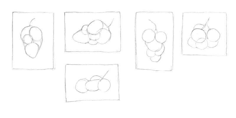
It’s also possible to go further and develop the sketch you like the most, adding the individual grapes and any details you find necessary. Try to find a rhythm within the bunches of grapes.
You’ll see my final concept at the beginning of the next chapter (in the corner of the first image). Consider this sketch as a preliminary version of the larger, finished version of the artwork.
Now we can proceed to the most fun part!
How to Draw Grapes with Colored Pencils
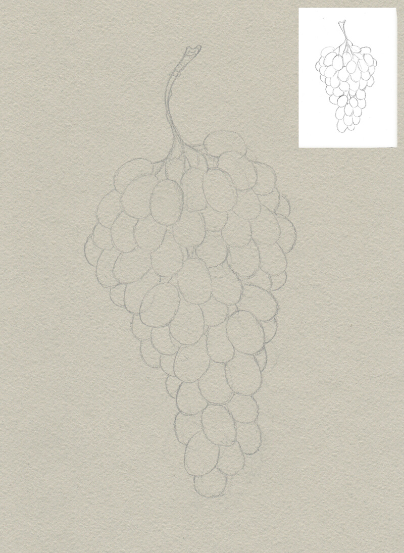
With Cold Grey IV, I outline the contours of the drawing. I use a pencil from the colored pencil set. Mixing marks made with an ordinary graphite pencil and colored pencils in one drawing may result in a muddy, unattractive image.
Keeping pressure on the pencil light saves the tooth of the paper. If your lines are too dark, soften them with a kneaded eraser.
We can see some of the grapes quite well, others are hidden under and behind their neighbors. This overlapping creates the illusion of volume and space to the drawing.
I ensure that the bunch looks harmonious on the paper and that no parts seem too “heavy” or monotonous. I also make sure that there is an interesting variation in the silhouette.
With Cream, I lay the foundation for the subsequent color applications. I apply the pencil with minor circular motions, which creates a soft covering without any clear linear marks. However, the paper is quite textured, so some of the roughness still shows through.
See also: 12 Colored Pencil Tips
I also touch the twig with Raw Umber. There are small parts of the twig visible within the grapes’ bulk.
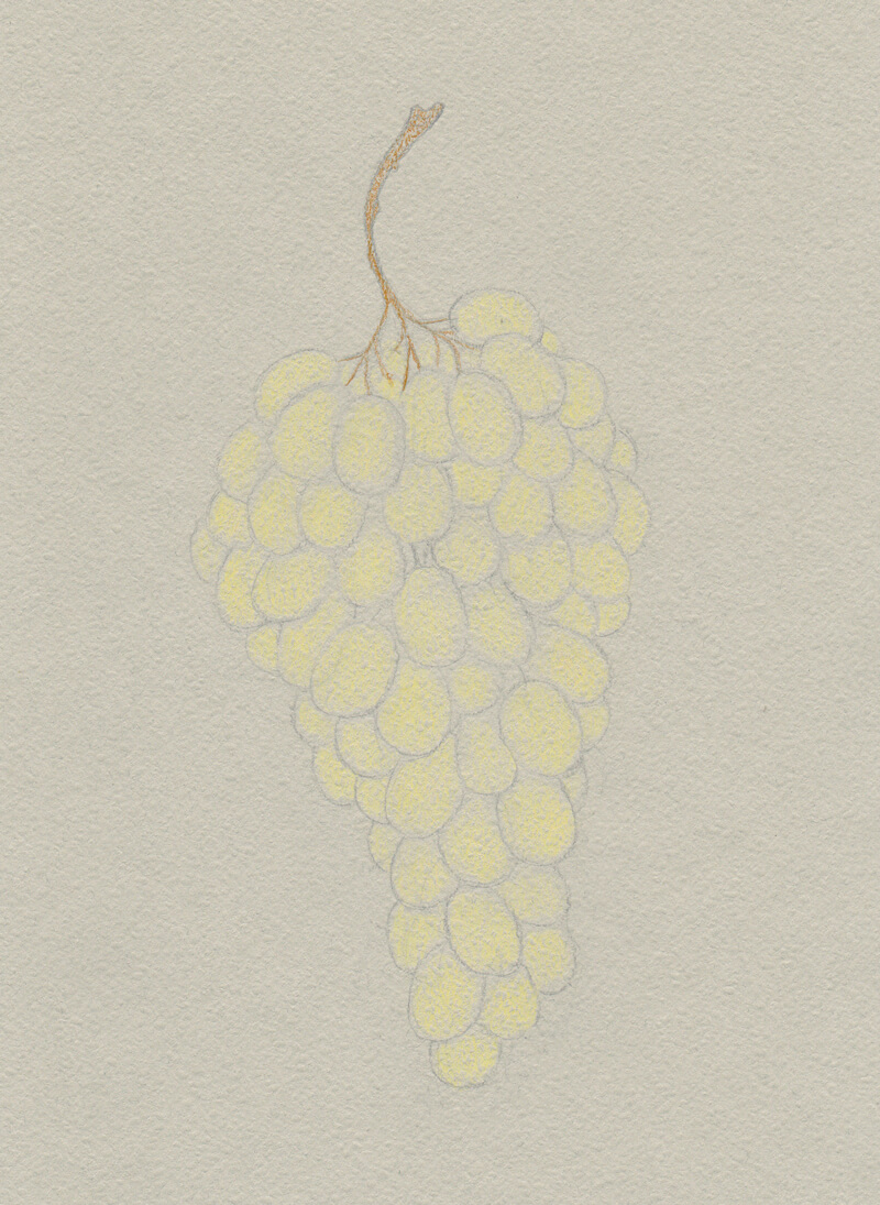
It’s time to add some green hues. With May Green and Earth Green Yellowish, I work on each grape, paying attention to the contours and the central areas of the grapes’ shapes.
A sharp tip of the pencil allows creating fine details. That’s why keeping a sharpener at hand is useful.
Both pencils are close in terms of color, but the subtle difference makes the artwork interesting, even in the early stages of the process.
With Chromium Green Opaque, I increase the contrast, accenting the darker parts of the grapes. To make some grapes stand out, I mute their neighbors.
As we said, the surface of the paper is rough, but working with a sharp pencil is the key to creating accurate details. However, some texture showing through the pencil applications may give a charming feel to the artwork.
I also use Walnut Brown to accentuate the contour of the twig. It’s appropriate to apply this shade to the grapes, keeping a light pressure. It varies the uniformity of the greenish base.
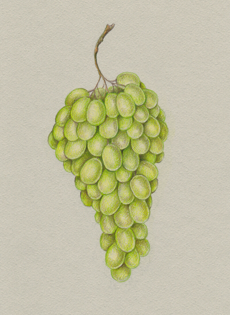
Next, I add the brighter nuances with Phthalo Blue and Light Green, echoing colorful reflections on the grapes. Including a blue hue makes the shadows deeper.
Along with applications of uniform, soft covering, I create hatches using the sharp tip of the pencil. Those separate marks are quite noticeable, but it’s possible to blend (or polish) them later.
The artwork becomes vibrant!
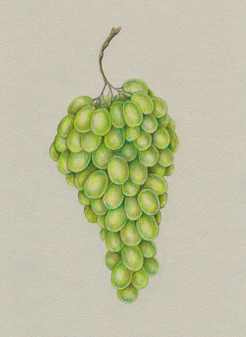
With Medium Flesh, I add nuances to some of the grapes, creating small spots on their surfaces. Then, I burnish the applications with Light Flesh to achieve a softer color transition. The pinkish areas now appear contrasting, yet still harmonious.
See also: Colored Pencil Course – The Magic of Burnishing (Membership Required)
With Cold Grey IV and light pressure on the pencil, I slightly mute the grapes found on the periphery of the bunch. Our paper is grey, so adding a close greyish tint to the existing colored pencil applications will balance the artwork.
Next, I add a subtle yellow hue to some of the grapes, using Naples Yellow.
I burnish the grapes with Cream. The goal is to soften the transition between the hues. The reflections are just a bit too strong, so I need to blend them as well.
Burnishing is a wonderful technique and after a couple of burnishing sessions, a colored pencil drawing may have a similar appearance to that of an oil painting!
Some contours have lost their strength after the previous step. So I use Chromium Green Opaque to revisit them.
The drawing is now complete!
Conclusion
Congratulations! I hope you enjoyed the process of drawing with colored pencils on grey paper and thank you for being with me on this journey!
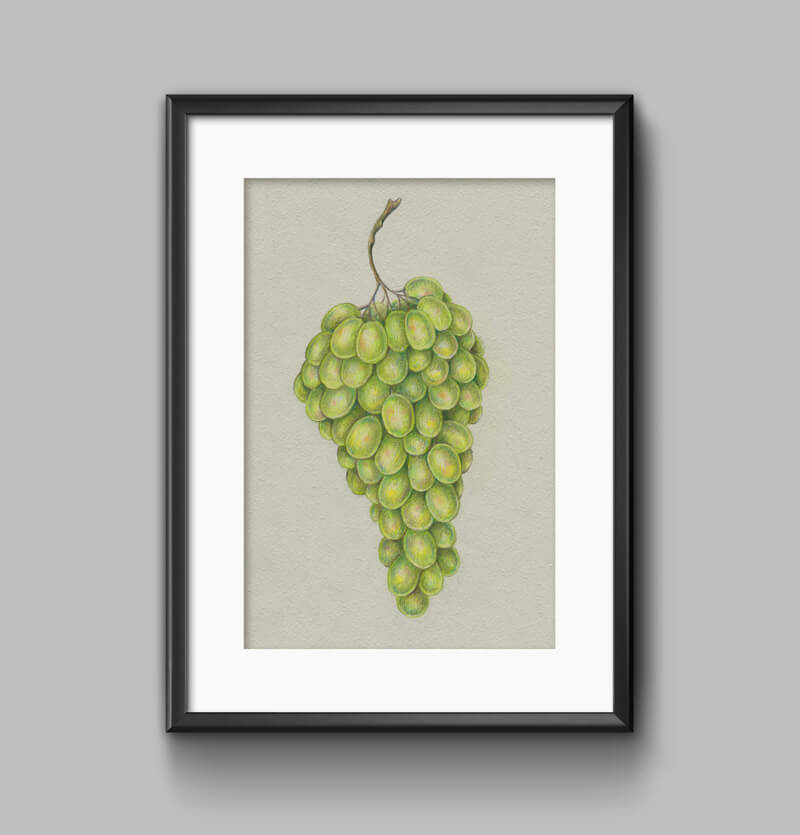
Let me suggest a final touch. Let’s frame it.
Sometimes we wait for some opportune moment to come (it almost never does, right?). Or perhaps we convince ourselves that only some special artworks deserve decorating our walls.
The truth is every artwork is unique and precious. The more we appreciate every step we take towards artistic growth, the easier it will be to build confidence and make time to practice in the future. This leads to new pieces of art, conquering new summits, and, of course, joy and inspiration in the process.
If you notice that some techniques presented in this tutorial aren’t familiar to you or you need an extra information on drawing with colored pencils, please check out the colored pencil course.
It has everything a beginner needs to know to get started with colored pencils! Also, this course reveals tips that may be a real asset even to an experienced artist. In many cases, we need to see or hear something three or seven times before we actually start implementing approaches in our workflow.
If so, join over 36,000 others that receive our newsletter with new drawing and painting lessons. Plus, check out three of our course videos and ebooks for free.
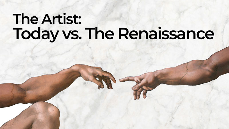
The Artist: Today vs. The Renaissance
The Perception of the “Artist”
Ask anyone today what an artist does and you’re likely to get a response that includes something about “expressing themselves or their feelings”. To be sure, many artists today do use their art to express their own personal feelings and opinions. Self-expression has become a valued personal characteristic in western society over the centuries.
Many artists use their art to explore political and social issues that they feel strongly about. Other artists use their skills to reveal the beauty in life as they see it.
See also: How to Create a Political Cartoon with Procreate
Whether showcasing a political issue or a search for beauty in life, the artist of today is part of their artwork. They choose their subject. The artist of today must bring something of his/her self to the table. In a sense, art has become more personal. The artist’s voice is louder today and the public is interested in hearing it. By contrast, Renaissance art was less of a reflection of the artist’s own concerns and desires.
Why is that?
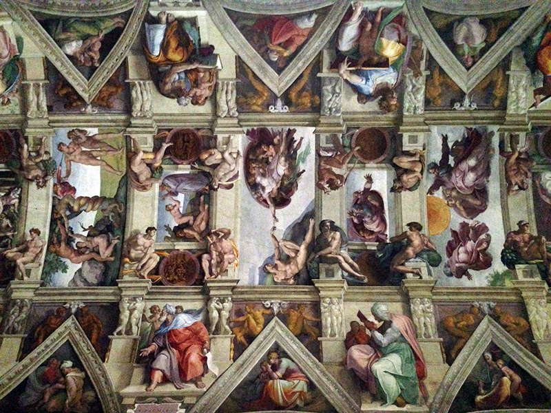
During the Renaissance, artists were more likely to paint on a commission basis. A person or organization would simply hire an art studio to paint or sculpt a predetermined subject. For example, when Michelangelo was hired to paint the Sistine Chapel, he did not choose to illustrate the Bible. Instead, he was hired to illustrate the Bible. Of course, the manner in which he illustrated the Bible was his own. It was his design.
Today, the Renaissance artist better fits our contemporary concept of an illustrator. As an example, think about a children’s book. A children’s book illustrator creates pictures that correspond with a writer’s words. That is exactly what Michelangelo was doing with the Sistine Chapel – painting imagery that someone else had written first.
For this reason, artists were, during the Renaissance and before, perceived more as craft persons than as intellectuals. Of course, it was the high level of artwork produced during the Renaissance that began to challenge that very perception. Michelangelo himself contributed to the evolution of how artists are the perceived. His often-quoted utterance, “A man paints with his brains and not with his hands”, was a proclaimed that art-making was, in fact, intellectual in nature. Today’s society has embraced that notion.
Artists still take commissions today; usually portraits and murals. Many, however, create artwork first, according to their own inclinations, and then take it to the marketplace to sell. Some sell original artwork through galleries and websites. Others license the use of their artwork for uses on other products.
Education and Training
How does one become an artist? Successful artists today may be highly educated or entirely self-taught. Art has become unique in that way. Many art collectors today see added value in self-taught artists. In fact, there is more opportunity for self-directed learning that ever before thanks to online resources. The Virtual Instructor is a fine example.
Most artists learn their craft in secondary and post-secondary schools. These days, some art students become serious at the high school level, increasing their intensity in college (university). For most, the bulk of serious art instruction is received at the ages of 17-23.
What kind of educational experience should one expect today?
College level art students learn about drawing, painting, sculpture, printmaking and design – often concurrently. They may also work with video and sound in some of today’s art programs. Art has become so varied (realistic, abstract, conceptual) that the school one attends determines the focus of one’s learning. Some art schools today may not even agree on what good art is.
See also: 5 Things I learned in Art School
Once a student completes his/her course work (with passing grades), a diploma or degree is issued and the student is now an artist. The newly-minted artist might then pursue gallery shows, participate in art festivals or use a website and social media to increase their level of public exposure. If the artist’s work is well received (which means it sells), the artist increases his/her chances of securing an agent. An agent will look for broader market opportunities by licensing the artist’s work for reproduction. Success!
Art Education During the Renaissance
The education of a budding Renaissance artist looked different in some ways. Artists, like metal smiths and stone workers, were part of the apprentice system during the Renaissance. If a child showed aptitude for drawing his family would, around the age of 10, look for an artist to take him as an apprentice.
The apprentice would most likely move in with the artist’s family, becoming part of the household. During the first year or so, the new apprentice would grind pigments for making paint. He would also make brushes, apply grounds, cut stone, and otherwise prepare the materials used to make art. There were no art stores as we know them today. Artist literally learned their craft from the ground up.
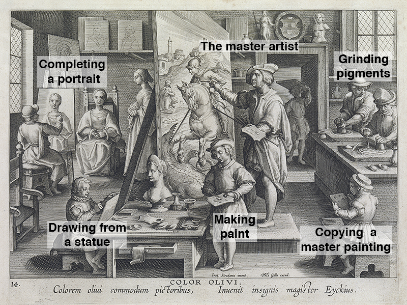
Once an apprentice mastered the preparation of materials, it was time to begin developing his observational skills. During the Renaissance, drawings were not exhibited. Instead, drawings were made to solve drawing problems (proportional issues, foreshortening, etc.) before a painting was made. The best of these drawings was kept for reference. Apprentices would learn to draw by copying these “master drawings” (or other high-quality drawings completed by advanced apprentices).
Copying a drawing is easier than drawing from life because the subject has already been translated from three dimensions to two. The young apprentice was, during this time, absorbing how more advanced artists had solved common drawing problems.
See also: Improve Your Drawing Skills in 6 Days
Once the master artist felt good about the skill level of his young apprentice, he would allow him to draw from ancient statues. Drawing from a statue was more challenging than copying a drawing because the artist had to flatten the statue in his own mind in order to translate it to a two-dimensional surface.
Of course, ancient statues are also great works of art in their own right, so the assumption was that the young apprentice would still absorb the knowledge of a greater artists through this exercise. Knowledge about anatomy, proportion and pose was learned by making drawings of statues.
Only after an apprentice had shown an advancement in skill level from drawing statues was he allowed to draw from live models. Unlike statues, models cannot pose indefinitely. So, at this point, the apprentice is training for speed. Drawing well was only one part of the recipe for success as an artist. One had to also draw efficiently or quickly.
The Career of an Artist
Today, artists are specialists by in large. Artists are either painters or sculptors or printmakers or architects. Almost no one does all of those things.
During the Renaissance, a wide variety of creative endeavors were the purview of an artist. So much so that the term, “Renaissance Man”, came to describe a person who is successful in a wide range of skilled disciplines.
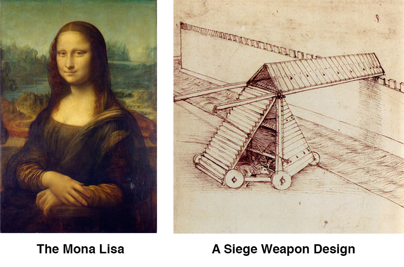
Leonardo Da Vinci is often cited as the quintessential renaissance man. He made paintings and sculptures. He designed buildings and machines. He even explored natural sciences at a high level.
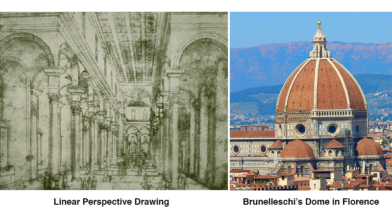
Brunelleschi, a great Florentine sculptor, was originally a gold smith. He is credited with discovering a drawing system called linear perspective. It revolutionized an artist’s ability to manage depth in a 2D composition.
Later, he designed a dome for the Florentine Cathedral. It was an architectural wonder – the first dome built since antiquity and the largest in the world at that time. Brunelleschi was an artist according to the Renaissance definition.
Today, Brunelleschi would have been an engineer, an artist, a designer, a metal worker, a sculptor and an architect. Quite a lot to master. Of course, most artists were not as successful as Brunelleschi.
Some artists never left their master’s studio at all, but stayed beyond their apprenticeship as a “hired artist”. Even still, the scope of work for which such an artist was expected to master was more varied than today.
Conclusion
Although the experience of an artist has evolved from the Renaissance to today, for most, the purpose of art remains the same – to bring imagery and ideas into the world with as high a level of skill as is personally achievable.
If so, join over 36,000 others that receive our newsletter with new drawing and painting lessons. Plus, check out three of our course videos and ebooks for free.

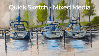
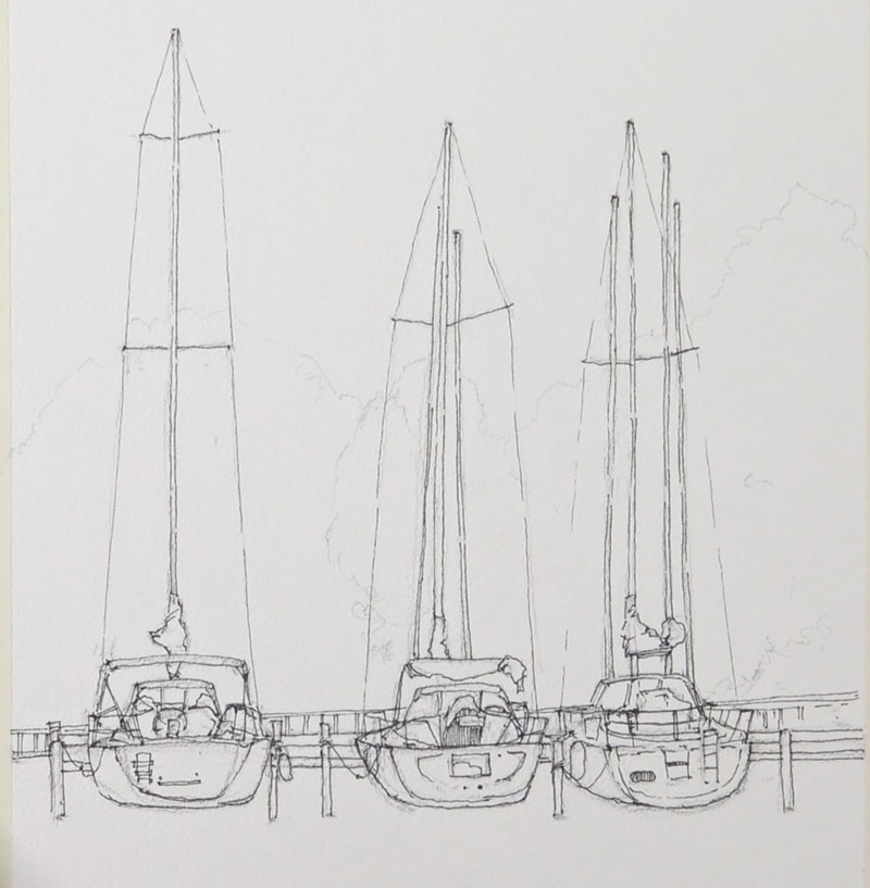
Mixed Media Quick Sketch – Sailboats
Here’s the order in which we’ll apply the various mediums…
- We’ll first create a loose graphite sketch with a “F” graphite pencil.
- We’ll then create a minimal pen and ink drawing defining mostly the contour lines.
- Next, we’ll apply a few watercolor washes.
- We’ll then enhance the color with a bit of gouache (opaque watercolor).
- Lastly, we’ll ad a few loose marks with colored pencils.
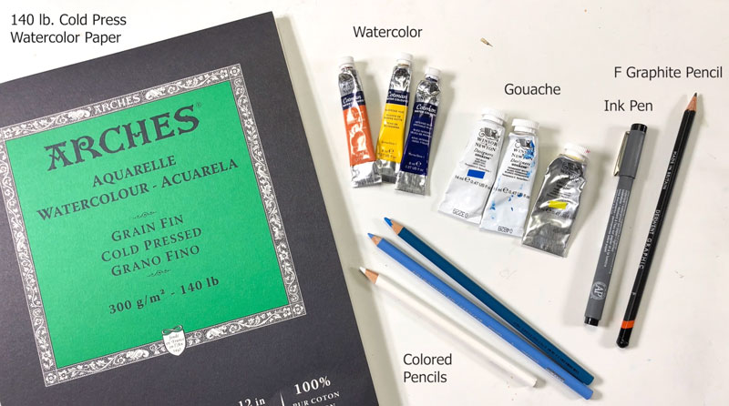
Materials Used in this Lesson
Some of the mediums that we’re using require some absorbency from the surface – namely the watercolor and gouache. For this reason, we’ll work on 140 lb. cold press watercolor paper. This paper will absorb much of the water from the applications without much buckling. (Some wrinkling of the paper is expected while the surface is wet, but once dry – the surface should return to being mostly flat.)
The Graphite Pencil
In some works, graphite marks may be welcome in the final image. In this case however, we’ll cover the graphite marks completely with the subsequent applications of media. For this reason, we’ll choose a pencil that is dark enough for it to be visible as the work progresses, but light enough to not be a distraction in the finished work. Any pencil in the range of “H” to “B” will work. This includes “H”, “HB”, “F”, and “B”. In this case, we’ll use an “F”.
See also: Graphite Pencils Explained
The Ink Pen
The coarse surface of the cold press watercolor paper affects the marks that are made with an ink pen. This rough surface produces a somewhat jagged mark. On coarse surfaces, a slightly thicker pen may be chosen to counteract this. If working on a smoother surface, a pen with a smaller tip may provide better control, but since our surface is not smooth, we’ll work with a .2 mm pen – still small, but larger than many pens at our disposal.
Watercolor Paints
We’ll use a simple palette of colors. The colors we’ll use here include…
- Burnt Umber
- Yellow Ochre
- Burnt Sienna
- Cadmium Red
- Sap Green
- Cadmium Yellow
- Ultramarine
Tube watercolors are used in this demonstration, but pan or cake watercolors will also work.
Gouache
Gouache is opaque watercolor. It can be used in a similar manner as watercolor with translucent washes or as a solid layer of color. In this case, we’ll apply it with solid applications and enhance the strength and intensity of color in areas.
Designer’s Gouache by Winsor and Newton is used with just a few basic colors…
- Primary Blue
- Titanium White
- Primary Red
- Primary Yellow
If you don’t have any gouache, you can still increase the intensity of colors by applying more opaque applications of watercolor. If this applies to you, you can also mix the color with Chinese White to create tints (lighter values) of the colors.
Colored Pencils
Wax-based colored pencils are used to enhance some of the colors within the image, but oil-based pencils will produce the same effect. Colored pencils can be applied directly over watercolor and gouache applications. Since the surface of the paper is coarse, the colored pencil applications also bring a bit of texture to the drawing as well.
Primsacolor Premiere colored pencils are used. The following colors are used in this demonstration…
- 10% French Gray
- Copenhagen Blue
- Chartreuse
- White
- 90% Warm Grey
- Sky Blue Light
- Moss Green
- Yellowed Orange
- Colorless Blender
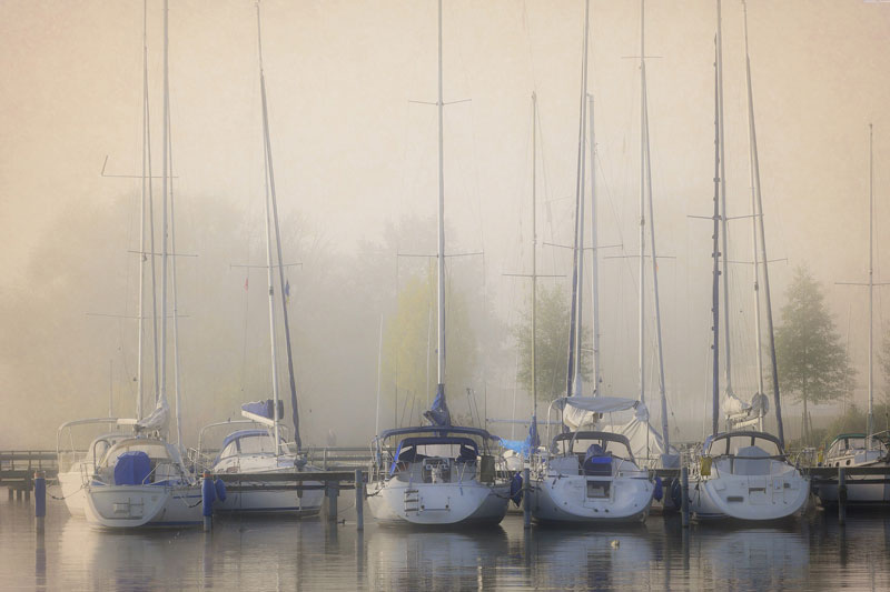
The Photo Reference
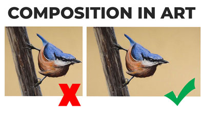
The photo reference we’ll use here is from the site, Pixabay.com. The reference is horizontal, but the decision is made to create a vertical composition in order the accentuate the vertical nature of the sailboats. Here’s a look at the reference photo…
See also: Composition in Art
Step By Step – Mixed Media
We’ll first define the horizon line, placing it in the lower half of the picture plane. Although it’s not visible in the reference photo, we still have a good idea of where it should be located. Once the horizon line is in place, we can begin to develop the graphite sketch using basic shapes for the boats.
Over the graphite sketch, we can develop a loose pen and ink sketch with a .2 mm ink pen. Mostly, the contour lines are defined since the development of the values and shading will fall on the watercolor, gouache, and colored pencils.
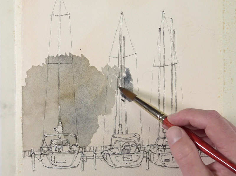
With our pen and ink sketch in place, we can proceed to applying the watercolor washes. We’ll first saturate the entire background with water using a large flat brush. In this case, a hake brush is used.
See also: All About Paint Brushes
A mixture of Burnt Umber, Yellow Ochre, Burnt Sienna, and a touch of Cadmium Red is applied the entire surface with a very translucent applications. The top and lower edges receive a second application, making the color slightly more intense in these locations.
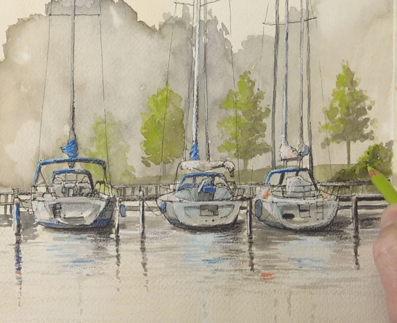
While the surface is damp, we’ll begin developing the distant line of trees. A light mixture of Burnt Umber, Ultramarine, and a touch of Sap Green is applied initially.
We can then blot a few of the applications on the left side, closer to the light source to lighten some of the color. This creates a slight indication of highlights. We can enhance them by applying a light application of the “orange” that we mixed for the background. This creates a warmer indication of light.
We’ll then add a few of the trees and bushes that are slightly closer to the viewer with a mixture of Sap Green and Cadmium Yellow. While these shapes are wet, we can add a bit of shadow with a mixture of Burnt Umber and Ultramarine.
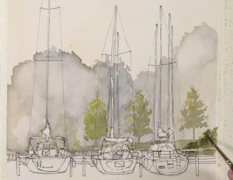
Then it’s time to move on to the boats and the pier. We’ll use the same mixture of Burnt Umber and Ultramarine to develop the shadows on each of the boats. This time, however, our mixture is dominated by the Ultramarine. This creates a cooler gray and translates as a cooler shadow.
Using this same mixture, we’ll add a few shadows to the posts, the masts, and fill in a bit of color on the distant pier. We’ll also begin to add a few of the reflections in the water using horizontal strokes.
We can then begin adding pops of color to the boats and posts with Ultramarine.
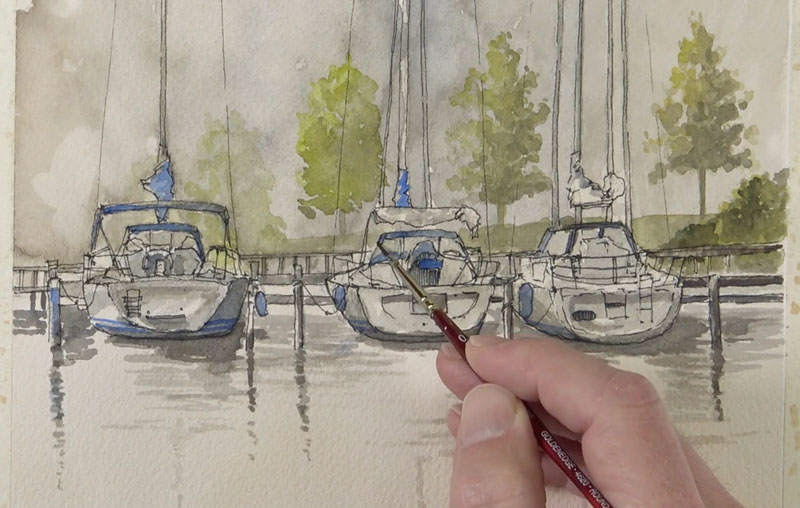
We could leave the watercolor applications as they are, but in this case, the color needs a bit more strength. To strengthen the color and to increase the contrast, we’ll layer a bit of gouache in areas. Gouache dries slightly darker, so several applications may be necessary to push the values lighter.
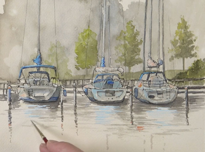
The gouache adds a bit more “punch” to the image, but let’s push it further with colored pencils. Copenhagen blue is used to enhance the blues on the boat. Bits of Yellowed Orange is also applied. White is used to strengthen the highlights along with 10% French Grey. Shadows are darkened with 90% Warm Grey. The intermediate trees also receive a few colored pencil applications – Chartreuse for the highlights, and Moss Green for the shadows. Some of the light blues are enhanced with Sky Blue Light.
Many of these colors are also echoed in the reflections of the water.
The colored pencils bring in a bit of texture because the surface of the paper is rather coarse. This additional texture is welcomed and adds a bit of variety to the image. In some areas, however, the texture is too strong, so a colorless blender is used to weaken it slightly.
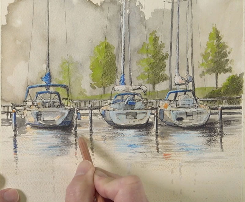
Lastly, a few paint faint paint splatters are added, mainly to the corners of the picture plane, to create a bit of additional interest.
If so, join over 36,000 others that receive our newsletter with new drawing and painting lessons. Plus, check out three of our course videos and ebooks for free.

How Step-By-Step Drawing Tutorials Can Lead You Astray

Are Step-By-Step Drawing Tutorials Holding You Back?
There are many resources out there on drawing. There are various schools and courses, both online and offline classes, books and magazines. It seems that these days, we have everything to improve at our disposal, right at our fingertips.
Step-by-step tutorials are a habitual part of this system – we see them everywhere, especially on blogs and websites about visual art techniques and creativity. To be honest, some tutorials are stellar – their in-depth approach and attention to detail is amazing! It’s possible to learn a lot of great tips just by observing how an artist has created his/her art.
As an educational resource, drawing tutorials seem fascinating. They usually are quite easy to understand due to the small portions of information for each step. Also, they are visually consumable. They use a notable feature of the human mind – the ability to learn through repetition of someone else’s actions.
Many beginning artists start their creative journey by following numerous tutorials, focusing on this activity of consuming information and practicing. It seems that there is nothing wrong with this way, but it may lead an artist into a trap.
Do you feel like copying the step-by-step process of other artists keeps you from making a real progress?
In this article, we’ll explore the pros and cons of step-by-step tutorials. I’ll also share several keys to an effective and balanced practice.
See also: 5 Reasons Why You Can’t Draw
It’s worth mentioning that the topic of this article is controversial. There are many nuances and every situation is unique. The point of this article is to provoke thought, and hopefully, make your learning process faster and more effective.
The Pitfalls of Drawing Tutorials
“It’s the One and Only Way”
To put it simply, a tutorial is a set of instructions on how to perform a task. Its purpose is to give us a basic understanding of how to transform something complex into a set of smaller and simpler chunks. This sequence of steps should be presented both visually and logically. In doing so, the learner is confident that following the process is…
- an attainable task,
- will bring the desired outcome.
In the case with drawing, this method presents both an advantage and the drawback: tutorials are specific.
This means that we have a specific topic/object that we are going to study, a specific arrangement, light and shadow pattern, color combinations, textures, etc. Even the art supplies are quite specific for each tutorial!
There are always many possible ways to draw this thing or that, depending on the lighting conditions, the environment, the positioning, posture, and other variables.
In other words, we can see how a specific person demonstrates their specific way to draw something through a tutorial. But is it the only way? Is it the most effective way?
The danger of tutorials is that following them exactly as they are may create an isolated, limited style of thinking – just as if every subject required a separate set of unique actions. However, is it true that, for example, drawing a fish is totally different than drawing a flower?
This risk is real because an artist may have a perception of practice, which in reality, is only a waste of time without much real progress.
The most effective form of tutorials teaches an artist a system that includes the techniques, their connection to the core principles of drawing, and the way of making certain decisions based on that connection. This system can then be applied to any subject that you wish.
If an artist is too attached to the step-by-step method, simply changing the pose of an object may leave them without any clue as to how to draw it.
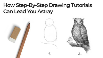
In the image below, you’ll find an illustration of this idea: let’s say a beginning artist used a tutorial to find out how to draw a duck, but couldn’t figure out how to apply any changes to the bird. The result is a repetition of the same duck, with the same pose, shading, etc.
Also, this image lacks compositional balance and atmospheric perspective, which might be fixed quite easily just by practicing the fundamentals.
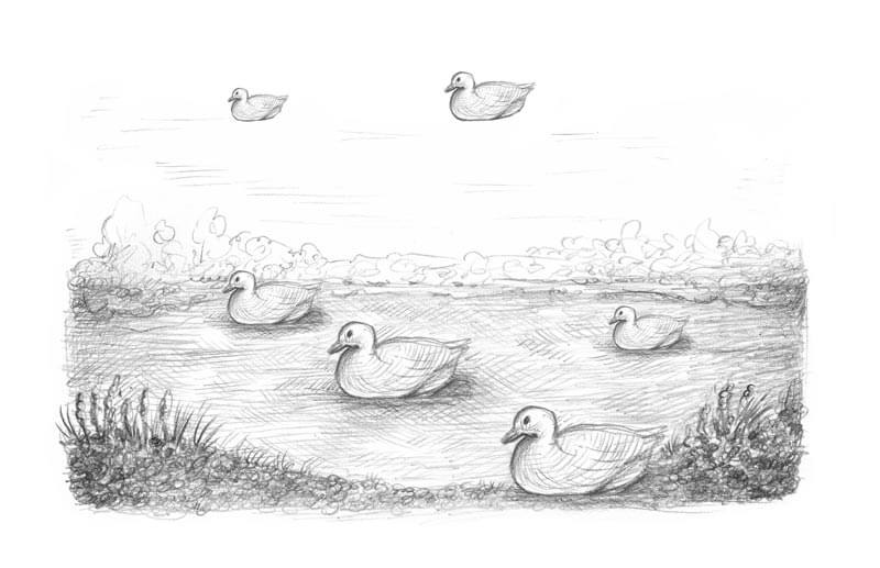
Does this image look believable?
Of course, this example is extreme, so don’t take it too seriously. However, an unbalanced attachment to step-by-step tutorials may lead to similar results.
How do we avoid this pitfall?
Firstly, the best way to learn drawing is to start with the fundamentals. They are the basis for true artistic development.
Learn about line, shape, form, value – and how to use this knowledge in your practice. It’s also important to get the basics of perspective and composition. Drawing is a complex skill, so be prepared to study several ‘disciplines’ that are interconnected.
Secondly, draw from life, do simple exercises, train your skills of observation and analysis. This will get you much further than solely copying tutorials that talk only about tips and tricks.
See also: Improve Your Drawing Skills in 6 Days
I’ve been told that 80% of success is the artist’s observations skills and the technical ability to draw is only 20%. Although we can’t prove the reliability of this percentage, it may be useful to think about this concept.
A practice centered on observation will help you build a skill of seeing the inner and outer structure of various objects. You’ll find overlaps and similarities between many things that didn’t seem connected in any way before. Following this path, you’ll gradually become independent. By practicing your observation skills, you’ll also improve your ability to draw from imagination.
See also: How to Draw From Memory
“I Can’t Understand It!”
Let’s be objective, not every tutorial explains the process clearly enough. Some instructions are approximate or rough. They don’t offer any clues to the core principles of drawing. They only provide an illusion of knowledge that can’t be understood and fully transformed into a personal experience.
Below is my variation of the famous “how to draw an owl” meme. It is amusing in a way, but the basic idea is quite practical – we start with the basic shapes. However, after the first step, something goes wrong…
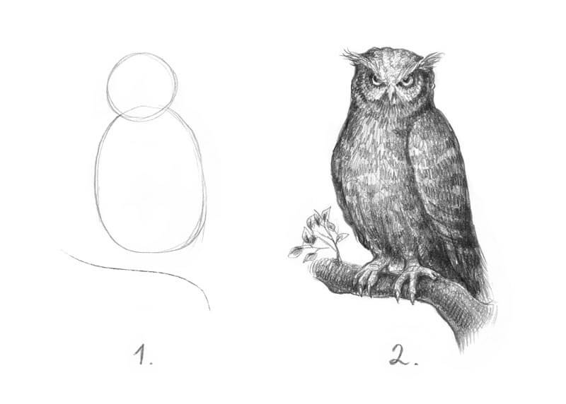
Just remember if you can’t understand instructions or they don’t seem to be working properly, it doesn’t mean that the problem is 100% with you.
“I Can’t Find the Exact Tutorial I Need”
There is another concern with step-by-step tutorials. Sometimes we’re looking for a tutorial on a specific subject, but can’t find exactly what we need.
For example, if an artist searches for instruction on how to draw an owl, keeping a long-eared owl in mind, and finds only lessons on drawing a snowy owl, solving this problem without the skill of drawing from observation may be quite difficult.
This situation is somewhat overwhelming; both birds technically are owls, but their appearances differ.
Without the necessary skills, an artist remains dependent on someone who may be kind enough to produce the necessary tutorial. However, what’s the point in learning to draw this way if it doesn’t provide any real room for creative freedom?
The good news is that we can become confident and truly independent with our drawing skills without relying on step-step-drawing tutorials!
One Subject, Different Approaches
We are each unique as human beings. A method that may be great for one person may seem absolutely unnatural to someone else. We all have different approaches to the drawing process.
For example, someone may prefer to draw from light to dark and from left to right on the surface, but another artist may prefer working from the midtones and edges inward. Both artists may be successful with each approach. Does this mean that the first artist is right and the second one is wrong? Of course, the answer is “no”.
Here’s another example. Let’s say one artist has a strong inclination to create tedious details, but another is more expressive and attracted to looser mark-making. Both artists are capable of producing unique and equally interesting works of art. Neither approach is “wrong”, and both artists can be successful.
It’s just a matter of our uniqueness, but copying a process that is outside of your “artistic personality” may prove to be challenging, uncomfortable, and disappointing.
The key to avoiding this pitfall is self-awareness. Embrace your style and don’t try to be too similar to anyone else (even if you admire them).
See also: Embrace Your Own Artistic Style
The Parade of Mistakes
But there is another pitfall to be wary of. There is a chance that you may copy another artist’s mistakes without knowing it. Especially, if you’re a beginner.
The key to escaping this pitfall is choosing your teachers and resources of information wisely. Some artists that create tutorials are more knowledgeable and skilled when compared to others and some are simply better at explaining concepts.
Of course, we can learn something useful from anyone, without any regard to his or her skill level – but learning concepts that are incorrect can be hard to reverse.
Finding your tutors is crucial for success. Don’t be afraid of investing money in quality information.
There are even examples of mistakes found in famous, best-selling books on drawing. We are just humans, after all. No matter how skilled and experienced we are, there is still room for improvement.
That’s why an independent style of thinking should become a habit for any artist. Learn from others, but apply what you learn in your own way.
Hard Work Pays Off
A tutorial allows you to create a drawing that is close to the original. You see both the process and the result. Having a clear step-by-step process is helpful, because you don’t have to think about the sequence of actions and techniques. It’s easy. However, too much dependance on this approach won’t help you to develop your own skills of visual analysis.
It’s important to do the hard things because they actually work – if you repeat them regularly enough.
Try to analyze the artworks you like.
What techniques (color combinations, line characteristics) are attractive to you? Can you see an artwork in “layers”, imagining how it was created? Can you repeat or copy it? What makes this artwork successful?
Another great tip is to redraw the same subject many times.
For example, let’s say that you learned to draw something from a tutorial and followed it step by step. After you completed the first drawing, redraw this thing without referencing instruction. This may seem harder, but now you can evaluate what you’ve learned from the instruction.
The Keys to Balanced and Effective Artistic Growth
Let’s summarize everything we’ve discussed.
Although we focused more so on the drawbacks of step-by-step tutorials rather than on the advantages, please understand that step-by-step tutorials are not evil. On the contrary, they can be a very helpful resource of information, displaying to us a world of skill, experience, and techniques that other artists have accumulated over time.
In other words, step-by-step tutorials are simply a tool to educate ourselves. But like with any tool, it may become something that hinders our progress if we use it the wrong way. It can become a crutch, if we let it.
So what’s a good strategy for truly effective growth?
- Make the time for other forms of drawing practice other than solely following instructions. Study drawing fundamentals and do simple exercises on drawing from life.
- Learn more about every object you draw. Study structure and how it functions. Details matter!
- Develop your skills of observation and analysis by studying the world around you and the artworks of other creators.
- Diversify your educational resources: find a teacher, take a class, read more books on drawing topics. And, by the way, the option of getting a feedback on your work is a huge advantage.
- Filter out the resources that seem to be just a waste of your time and attention.
- Practice regularly. Knowledge needs action to become practical!
Please let us know what you think! Do you use step-by-step tutorials in your learning routine? What’s your experience?
If you’re interested in the faster growth of your skills, please make sure that you check out The Secrets to Drawing course – it has all the necessary information on drawing fundamentals, drawing objects from life and building solid skills!
If so, join over 36,000 others that receive our newsletter with new drawing and painting lessons. Plus, check out three of our course videos and ebooks for free.