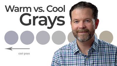
Understanding Warm and Cool Grays
What makes a gray “warm” and what makes a gray “cool”? To understand this fully, we must first take a quick look at color theory.
Color is such a vast subject. Because it is so vast, it can cause confusion for some. It doesn’t help that some manufacturers of art materials name colors in a manner that makes things more complex than it should be.
I receive many questions about color theory in general and with good reason. There is a lot of confusing information out there. Color theory, however, is not as complex as it may seem. It is actually quite simple if we understand colors as simple hues rather than pigments.
Warm and Cool Colors
Let’s first look at the color wheel and identify the “warm” colors and the “cool” colors. Perhaps you’re already familiar with warm and cool colors, but if not, let’s review.
The color wheel is the color spectrum bent into a circle. Certain color relationships occur as a result of this bending.
The warm colors are colors that we associate with things that are hot. For example, the sun is hot and we know that’s its color is yellow or orange. Fire is also hot and again its color is yellow or orange. Therefore, yellow and orange are warm colors.
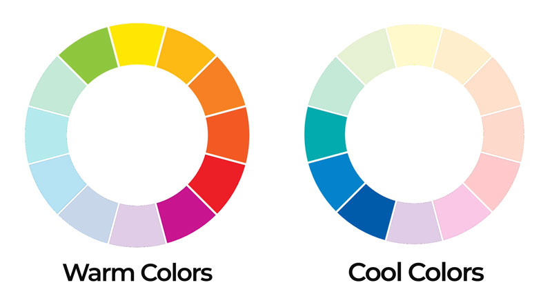
Cool colors are colors that we associate with things that are cold. For example, ice and snow is cold and the color of the shadows found in ice or snow is blue. Therefore, blue is a cool color.
This concept is referred to as color temperature.
Cool colors range from blue-green to blue-purple. Warm colors range from yellow-green to red-purple.
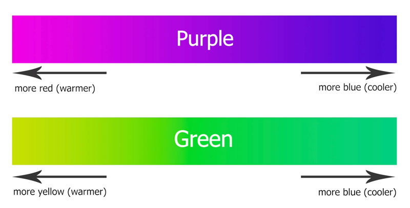
Green and purple can be considered transition colors. If the purple has more red in it, then it may be considered a warm color. If it has more blue in it, it can be considered a cool color.
Green is another transition color. If it has more blue in it, then it can be considered a cool color. But if it has more yellow in it, then it can be considered a warm color.
Ok, now that we’ve got that out of the way, let’s next look at how this information ties in with the color gray.
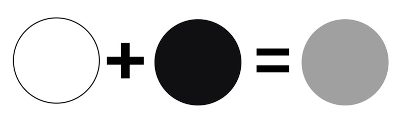
Gray is considered a neutral color. But as you’ll see in a moment – it may not be a neutral as you expect. Neutral colors are not found on the color wheel. Other neutral colors include black, white, and some browns (although most browns lean towards a color such as orange.)
Gray is mixed by combining white and black. White is not mixed – it is absolutely pure. But many blacks are mixed or can be mixed and this is how we manipulate the gray that is produced. The key is in the black.
How Black is Mixed
Black is a strong color. It is so strong that many artists decide to mix their own. By mixing a black, we have control over the color temperature and also the intensity. This often leads to a more natural looking black that doesn’t overpower an image.

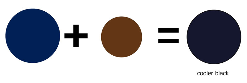
Black is most easily mixed by combining a blue with a brown. Darker browns and darker blues clearly work the best.
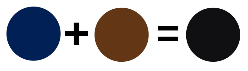
For example, when mixing colored pencils (Prismacolor), Indigo Blue and Dark Umber create a wonderful black.
If you mix a black with a heavier concentration of blue, the result is a cooler black.
If you mix a black with a heavier concentration of brown, the result is warmer black.
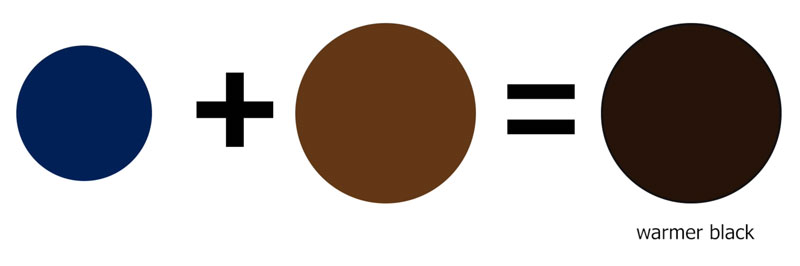
Blue is clearly a cool color, while brown leans towards orange – a warm color. Brown can almost be considered as a dark value (shade) of orange.
Mixing Warm and Cool Grays
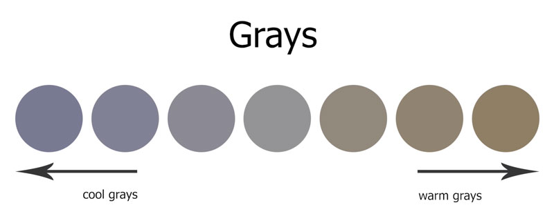
Now, if we mix the cooler black with white, the result is – you guessed it – a cooler gray.
If we mix the warmer black with white, the result is a warmer gray.
You can create a whole multitude of grays by using various pigments of blue and brown and mixing that mixture with white. Here’s a look at several different grays based on their color temperature…
This works with any medium that you choose to work with. Here’s a look at warm and cool grays mixed with watercolor.
In this case, Prussian Blue has been combined with Burnt Umber. In the first example, Prussian Blue dominates the mixture, resulting in a cooler gray.
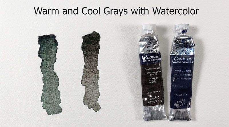
In the second example, Burnt Umber dominates the mixture, resulting in a warmer gray.
Here’s a look at warm and cool grays mixed with pastels. In this case, a darker blue is layered over a darker brown. This mixture is gently blended before layering a light layer of white over the top. The result is a cool gray.
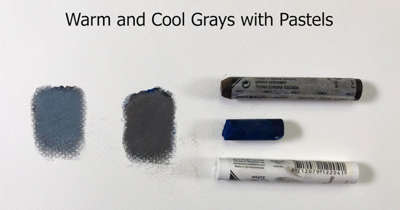
In the second example, the darker brown is layered over the dark blue, blended, and then layered over with a light application of white. The result is a warm gray.
Intensities of Warm and Cool Grays
Color intensity is affected when gray is mixed with a hue. For example, if we mix a gray with a blue, we get a less intense version of the blue. The color becomes duller as gray is mixed with it.
Some colored pencil manufacturers, like Prismacolor, produce gray colored pencils of warm and cool varieties of various intensities. They also do this with their markers. The intensity of the gray is expressed as a percentage.
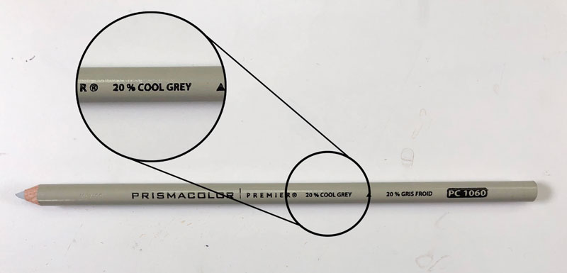
Here are the cool grays that Prismacolor produces…
- Cool Grey 10%
- Cool Grey 20%
- Cool Grey 30%
- Cool Grey 50%
- Cool Grey 70%
- Cool Grey 90%
They also produce the same intensities of grays as warm grays as well.
Here’s a comparison of some of the cool grays…
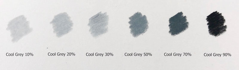
As you can see, the intensity of the gray increases based on the percentage designated.
When to use Warm and Cool Grays
You may be wondering when you should use cool grays and when you should use warm grays. There are no “rules” for this. Instead, you should first closely evaluate the gray that you’re seeing on your subject.
If the gray appears warmer, then it makes sense to use a warmer gray. If the gray appears cooler, then it logically makes sense to use a cooler gray.
Grays can clearly be combined within an image. For example, both warm and cool grays were used in this colored pencil drawing of an elephant…
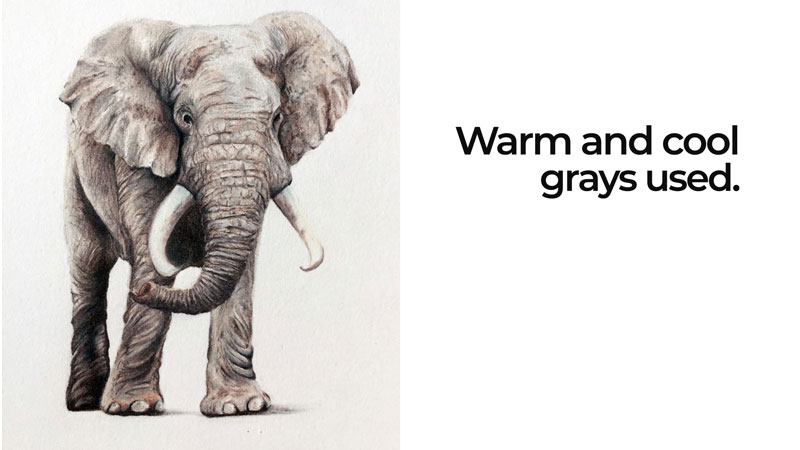
Want to see how it’s done? How to Draw an Elephant with Colored Pencils.
Sometimes, it makes more sense to use a cooler gray for shadows. In this colored pencil drawing of a frog, warm grays were used on the body, but cool grays were used for the cast shadow underneath. This simply creates more contrast between the subject and its cast shadow.
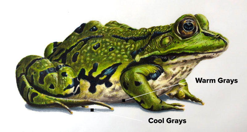
Want to see how it’s done? How to Draw a Frog with Colored Pencils (Membership required).
So now you hopefully understand the difference between warm and cool grays and have a better idea of when it’s appropriate to use them. Remember, don’t overthink things too much. If it feels right for your image – it probably is. Have fun, be creative, and just make art.
If so, join over 36,000 others that receive our newsletter with new drawing and painting lessons. Plus, check out three of our course videos and ebooks for free.

Oil Painting Supplies – Everything You Need to Get Started

I remember my first experience oil painting. I was twelve years old and a family friend invited me to her house to make a painting. She had a lot of supplies. In fact, she had invested in an oil painting kit that is still available for purchase all these years later. It was a large Bob Ross painting kit. I had a great experience with the Bob Ross kit which included many more supplies than I used that day. That was thirty years ago. I’ve purchased and used countless oil painting supplies since then.
I would not discourage anyone from buying a comprehensive oil painting kit. However, you do not need to buy a kit just to get started. You can instead invest in some essentials and add to your supplies as you gain experience.
With some no-nonsense advice, you’ll be ready to choose individually sold supplies without buying what you will not use. First let’s consider the benefits of both painting-kits and also individually purchased supplies. Then we will identify some good options that are available in the marketplace.
Why buy an oil painting kit?
Kits are attractive. They’re easy, but often overpriced. Many times, they include materials or colors that you just won’t use. Some are better than others and some are worth the investment.
Here are a few reasons to buy a kit…
- It’s easy. The best thing about going with a kit is that you only need to make one decision – which kit to buy?
- The kit may include an attractive box or case that you can use for years.
- The extras – sometimes a kit will include basic information on techniques or a color wheel to assist in mixing colors.
Why buy oil painting supplies individually?
Although kits are easy and many have attractive extras, you may find that you save money and actually get more if you purchase your supplies individually. You also have more control over your “palette”.
Here are a few reasons to buy oil painting supplies individually…
- Sometimes kits include supplies that are not necessary.
- Better quality materials. Beginner kits are often stocked with lower quality materials.
- If you already have some experience painting with acrylic or watercolor, then you can choose pigments (paint colors) that you have experience using.
- It may be cheaper. The initial cost of individually selected supplies may be more than going with a small kit, but buyer beware. Many kits include smaller tubes of paint. Individually purchased tubes of paint may be cheaper by volume. You are also less likely to end up with colors you don’t really want.
Essential Supplies for Oil Painting
So, what are the essentials? What do you need to get started with oils? Let’s take a look…
To get started oil painting you need four things:
- Paint (and something to put it on and mix it with)
- Brushes
- A support
- A way to clean up
Let’s consider both a good option and the best option for each of these essentials. My recommendations are based on personal experience with the supplies mentioned hereafter.
Oil Paint
Oil paint, like all paints, is made up three main parts. These three parts work to make paint function in the manner we expect.
These three parts are…
- Pigment – This is the color. Pigment can be manufactured or come from natural resources. Often the concentration of pigment compared to the other parts directly relates to the overall quality of the paint brand. More pigment often means higher quality paint.
- Binder – Binder is the material that holds the pigment together. Most often, the binder is linseed oil.
- Solvent and other additives – Solvent is the material that thins paint and makes it viscous enough to be spread over a surface. A variety of solvents can be used including turpentine, mineral spirits, and other solutions of similar characteristics. Other additives are often added to improve lightfastness and the usability of the paint.
Lightfastness
Another thing to consider when choosing oil paints in the lightfastness of the brand. Lightfastness refers to the ability of the paint to resist fading when exposed to ultra violet. If the lightfastness is weak, then the colors will fade over time and won’t be true to the original painting. Since we want our paintings to last as long as possible, we look for paints with a high lightfastness rating.
You can find the lightfastness rating on the paint label. Look for the letters “ASTM”, which stands for American Society for Testing and Materials Standard. There are three levels…
- ASTM Level I – Excellent
- ASTM Level II – Very good
- ASTM Level III – Not considered acceptable as artist’s quality
Clearly, we want to avoid brands and colors with a rating of III. Levels I and II are more than suitable.
Permanence
Some brands, like Winsor and Newton, go a step further and include a permanence rating. This rating considers the lightfastness of the color but also the “chemical stability” of the paint. In other words, some colors are more permanent than others. Here’s how Winsor and Newton evaluates a color’s permanence…
- AA – Extremely Permanent
- A – Permanent
- B – Moderately Durable
Let’s look at a couple of options as far as brands go…
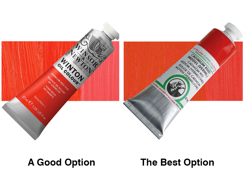
A Good Option – A good quality, cost conscious oil paint is the Winton Oil Colour line by Winsor and Newton. This line of paint keeps the price down by using “hues” in place of the more expensive pigments. For example, two of the pigments recommended are made from the metal, cadmium. Cadmium is expensive. Winton paint uses a substitute for those pigments. For this reason, Winton is categorized as a student grade paint. It is not, however, a low-grade paint. The various colors are consistent in both viscosity and mixing strength. They feel dense like top quality oil paints. Lightfastness and permanence ratings vary in this line, but all colors receive a lightfastness rating of I or II, with most having a rating of I. All permanence ratings are A or AA.
The Best Option – The best oil paint I have used is Old Holland Paint. It is pricey but it is amazing. Each tube is so full of pure pigment that you can almost hear it grind under the palette knife. All Old Holland oil paints are lightfast rated at level I or II.
Choosing Colors for Your Palette
If you are just getting started and are not sure what colors to buy, I recommend starting with only five pigments:
- Titanium White
- Ivory Black
- Cadmium Yellow Medium
- Cadmium Red Medium
- Ultramarine Blue
These colors will keep your palette simple while giving you the ability to mix a broad range of natural colors. Add pigments as you discover you need them.
A Palette
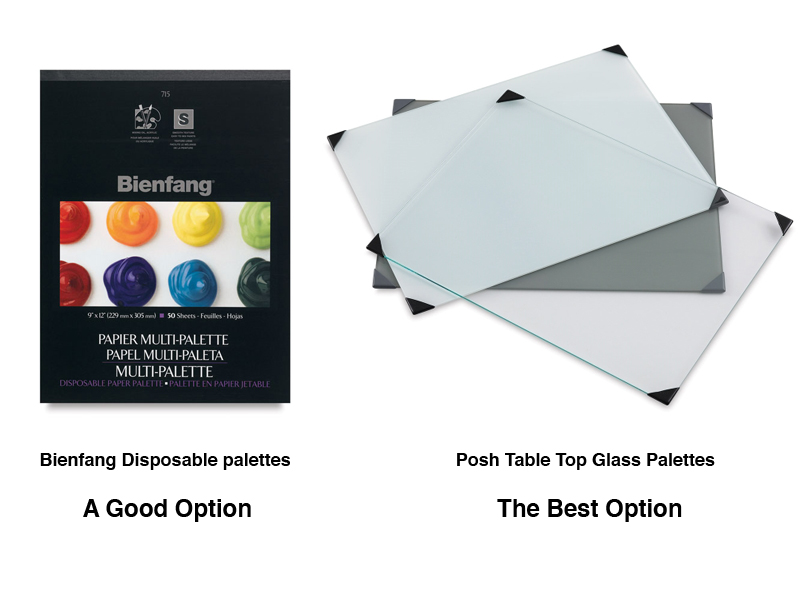
Besides paint, you will also need a palette. A good option for a palette is disposable palette paper. This makes clean up a breeze. The best option is a glass palette that you can wipe clean and even scrap with a razor blade should your paint dry.
Mixing Knives
Some artists prefer to mix colors on their palette with a knife. This is an optional accessory, but very useful for mixing large qualities of color.

Oil paint is thick and more easily mixed with a palette knife than a brush. Never buy a plastic palette knife. They do not bend enough and dried paint is too difficult to remove. Instead use a metal palette knife. I like the style that is wider at the end.
Brushes for Oil Painting
Use bristle brushes for oil paint. A small nylon brush or sable brush is fine for details but you should apply the bulk of your paint with bristle brushes. They are quite stiff. Too soft a brush will not spread oil paint, which is like a dense paste.
Bushes come in several shapes; round, flat, bright and filbert being the main four. You should eventually try them all but this article is about getting started oil painting. For this reason, I recommend the filbert shape. Like the spork, it is a combination of two instruments – the flat and round brush shapes. Unlike the spork, it does a good job imitating both shapes. Use it like a flat or turn it sideways and use its profile like a round brush.
See also: All about painting brushes
Three bristle brushes are enough to start painting. Wipe them out with a dry rag or paper towel when changing colors. Choose sizes that are approximately 1/8th inch (5.5mm), ½ inch (11 mm) and 1 inch wide (25mm).
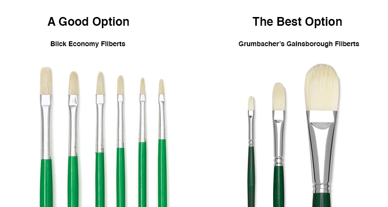
A Good Option – Blick Economy bristle brushes are a good option. The metal ferrule that fastens the bristles to the handle is a thinner gauge metal. More expensive brushes use higher quality materials but the bristles are likely to wear down from regular use before the metal ferrule fails anyway.
The Best Option – I’ve never been picky about my brushes. More important that buying the best brushes is taking care to clean them well. Doing so will ensure consistent performance for the life of the brush.
A high-quality brush that I’ve had the pleasure of using is from the Gainsborough line of brushes made by Grumbacher. These brushes last longer and are less likely to drop bristles onto your canvas while you paint.
A Support
We could all use some support from time to time. That kind of support, however, is not the kind we need to make a painting. In art, the support is the surface on which you paint. Oil painters use canvas, paper and wood supports; canvas being the more popular choice in this day and age. Canvas is a fine option but it is neither my “good” or “best” recommendation.
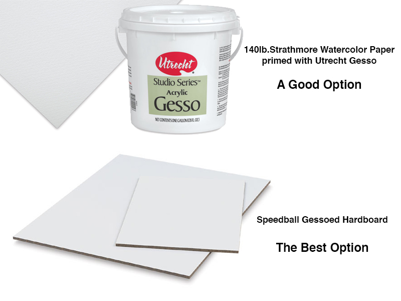
A Good Option – Eventually, you should try all types of support surfaces but to get started oil painting, I recommend using watercolor paper prepared with a layer of gesso. Gesso is a thick white acrylic primer that will protect the watercolor paper from the oil in your paint. I use Utrecht Gesso and Strathmore 140lb. watercolor paper. Once the primed paper is dry, just tape it to a drawing board or piece of Masonite and begin painting.
Gessoed watercolor paper is a common support in art schools because it is less expensive than canvas. Don’t think that oil painting on paper is meant for beginners only. Many experienced oil painters prefer gessoed paper over the alternatives.
The Best Option – In my opinion, the best surface to paint on is wood that has been gessoed. Wood is more durable that either paper or canvas. Over the years, I’ve had a few accidents in the studio resulting in punctures to paintings on both canvas and paper. In each case, a painting on wood would have survived. I usually gesso my own wood supports, sanding lightly between layers but some art supply companies are getting in on the trend. Speedball sells prepared hardboard supports in most standard sized.
Painting on wood supports has not been as popular since the Renaissance (Da Vinci painted on wood).
A Way To Clean Up
Oil and water do not mix, so stronger solvents are used to clean oil brushes and such. For this reason, some beginning painters avoid oil paint all together. That’s too bad because cleaning up with a solvent is not harder that using water. For those that are still hesitant, you can clean oil brushes in cooking oil (canola oil is fine) and then use a bar of soap to remove the cooking oil – no solvent required. This is a good option if you are hyper-sensitive to solvents but not my recommendation, though I’ve used cooking oil many times.
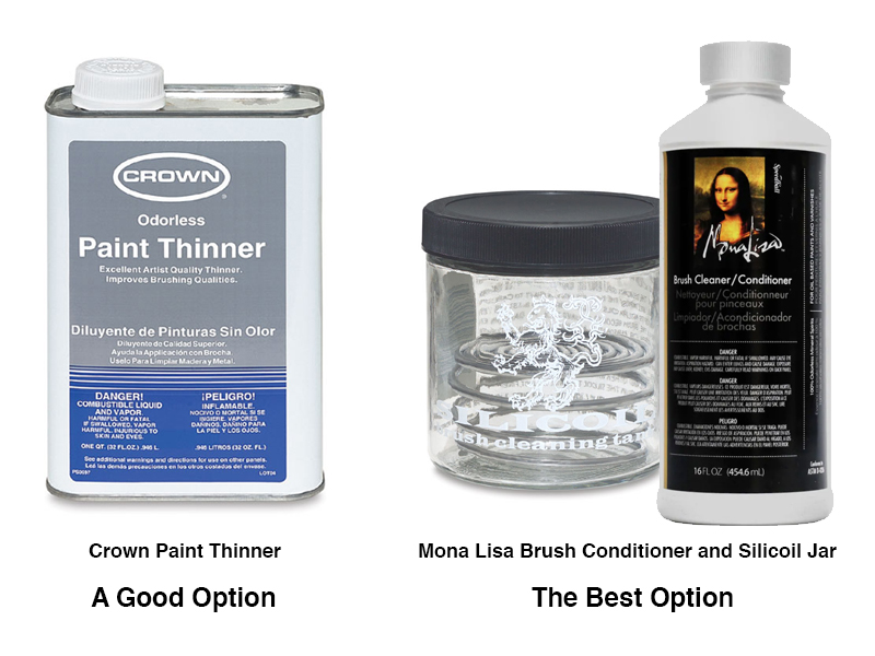
A Good Option – Crown odorless paint thinner, available from both art supply vendors and big-box hardware stores is a good option. It is cheap and has less fumes than either mineral spirits or turpentine (your grandparent’s solvents).
The Best Option – The best brush cleaner that I have used is Mona Lisa silicone brush cleaner in a glass brush-cleaning jar. This brush cleaner does not dissolve the paint but slides it right off of the bristles. It even has a pleasant odor.
Bonus Oil Painting Supply – Medium
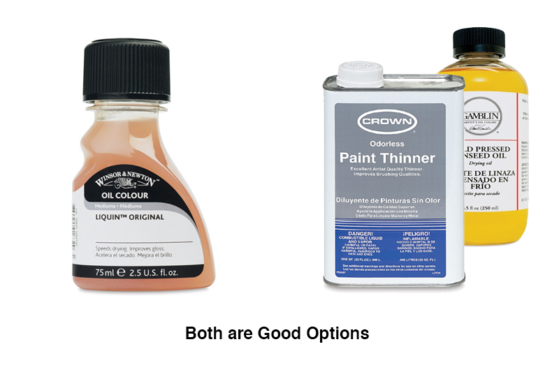
Many oil painters use medium (part linseed oil, part solvent) to thin their paints so that it is easier to spread. I am not including medium as an essential supply because I usually paint without medium. You should try painting with and without medium to see if you like having the option to alter your paints viscosity. When I do use medium I either use Liquin By Winsor and Newton, or I mix my own at a 50/50 ratio, linseed oil to solvent. Gamblin’s cold pressed linseed oil is a good choice.
There are so many art supplies out there that it is hard to know what to buy. If you are getting started oil painting then save yourself some grief and give my recommendations a try. They work for me and I’ll bet they’ll work for you too.
If you’re looking for lessons to get you started, be sure to check out all of our oil painting lessons.
If so, join over 36,000 others that receive our newsletter with new drawing and painting lessons. Plus, check out three of our course videos and ebooks for free.

Christmas Inspiration: Drawing a Holiday Wreath
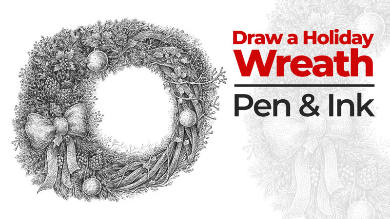
The complete artwork will resemble an illustration from a vintage book. This style is charming, regardless of the time of year.
Looking ahead, it is worth mentioning that drawings of this kind are quite versatile. For example, you can decorate a greeting card with your art and share it with your friends and family! A gift that was created with love is always sincere and warm.
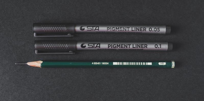
The Materials You’ll Need
For this project, I’ll be using an ordinary HB graphite pencil and two ink liners (0.1 and 0.05). Also, you’ll likely need a soft eraser to remove the unnecessary graphite marks.
The approximate size of the paper is relatively small, 21×20 cm (8.2 × 7.9 inches).
If you prefer a looser, more spontaneous approach to drawing with ink, feel free to use liners that create a wider line (for example, 0.3).
Choosing Your Christmas Subject
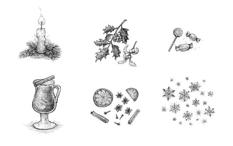
We have a lot of choices here. We can easily develop a long list of various objects and characters that are associated with winter holidays. Here are a few ideas…
- A decorated Christmas tree
- Candles
- Candies, chocolate, and sweets
- A gingerbread man
- Mulled wine
- Gift boxes with various patterns, bows, and other decorations
- Spices like cinnamon or cloves
- Tangerines and other citrus fruits
- Garlands
- Mistletoe, winterberry, and other Christmas plants
- Bells
- Snowflakes
- A Christmas deer
- A snowman
Of course, there are many more things we could add. Perhaps you could include something that is specific to the culture of your country or some local traditions. The more individual your concept is, the more interesting your drawing will be!
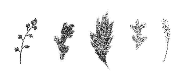
I have decided to draw a wreath, so the next task is to imagine its components.
The floral elements are a significant part of this subject since they make the wreath recognizable. In preparation, I draw several examples of plants. They may be quite stylized and small in size. This sketch is only for your reference.
You may choose to draw these floral elements as you see them or you may choose to add a bit of imagination.
If you aren’t sure how to ‘adorn’ your wreath, a quick Pinterest or Google search will help (there are so many options). I prefer creating a couple of miniature sketches, just to put my ideas in order. At this stage, I decide to make my wreath slightly asymmetrical – the left side will be wider, more massive.
A graphite underdrawing is the starting point for our finished artwork. First, I draw a circle with light lines. It’s fine if it’s slightly uneven. This circle will be the core line of our wreath.
Be sure to leave enough space on the periphery of the circle if your plans include creating a larger wreath with lots of prominent elements.
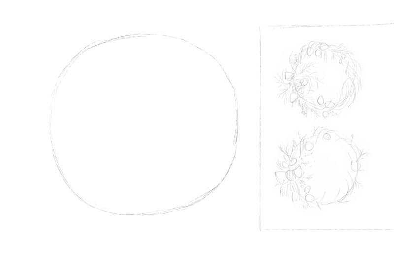
I block out several areas where the groups of larger objects (like cones and other decorations) should be, according to my idea.
My lines are quite heavy in the image below, just for demonstration purposes. It’s better to keep your pencil marks light.
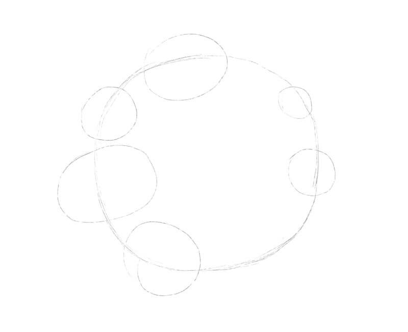
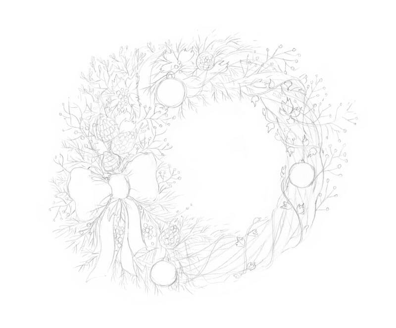
I fill the general shape of the wreath with the elements I wish to include – the cones, winterberries, various twigs with leaves, and small decorative balls.
The conifer branches fill the space around the ‘islets’ of the objects. The botanical elements add to the drawing and create additional interesting details!
A big bow at the left side is the largest element. Its function here is to attract the viewer’s attention. The wreath looks voluminous, yet still balanced.
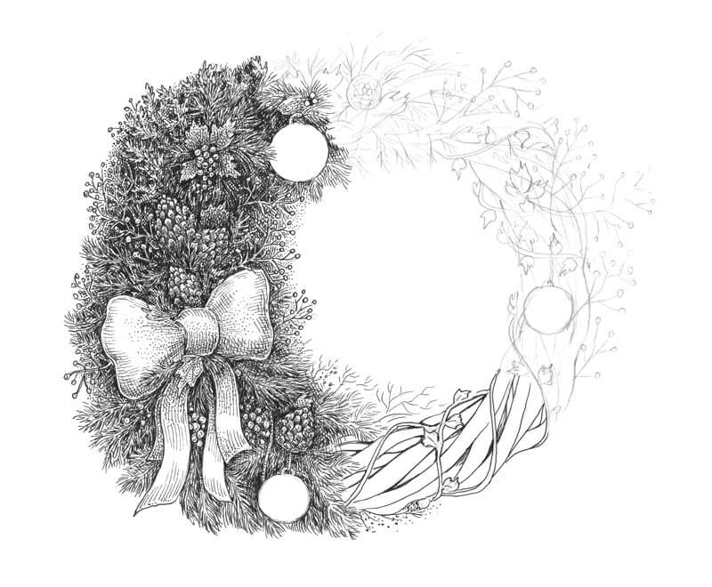
Drawing the Christmas Wreath with Ink Liners
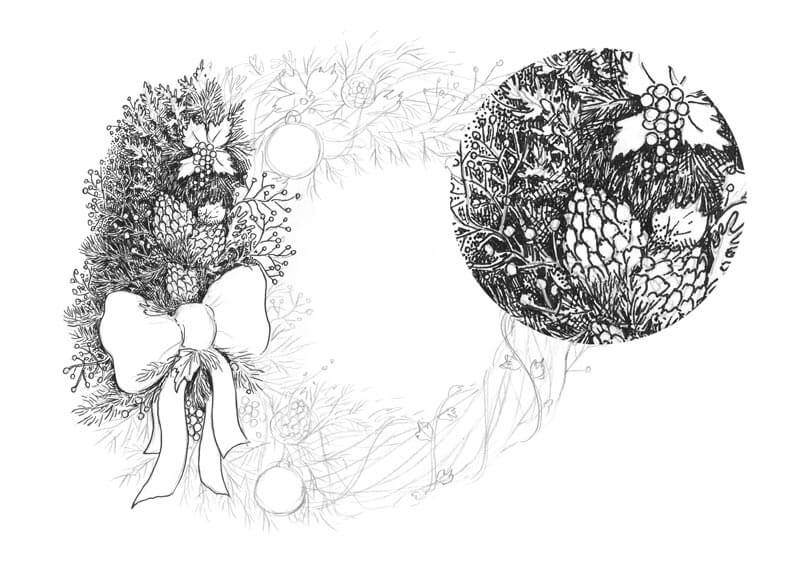
I start the inking with the 0.1 ink liner, marking the main contours and developing the areas of darker value. These areas add depth to the drawing and increase the contrast.
Be aware of the highlights and areas of lighter value. These areas will look like fir needles from a distance. Hopefully, the close-up fragment in the image below helps to illustrate this concept.
This part of the wreath will be our reference point in terms of values and details. We could work gradually by first outlining the contours and then add some hatching to accentuate the shadows and reveal the texture. There is nothing wrong with this method! In this case, however, I decided to complete the areas one by one. It’s completely up to you as to how you decide to complete the drawing.
With the 0.1 and 0.05 ink liners, I continue inking the wreath. Don’t be afraid to change your initial pencil sketch or erase the unnecessary graphite marks as you go. However, you may also choose to leave the pencil drawing to remain in place. If you choose to do this, it will add subtle gray areas to the image.
A line is a powerful tool! With short lines, I create a sense of direction and even a slight illusion of movement for the conifer branches. Some spots are basically patches of dense ink hatching but we understand them as areas filled with fir needles.
The key to an attractive result is finding a balance between careful detailing and spontaneous mark making. It’s important not to overthink the artwork. Let the process guide you and your decision making along the way.
I also add dots to create an illusion of soft blur near the inner edge of the wreath. The holly leaves and the bow have a smoother texture, so I use stippling to create the desired effect here as well.
Then, I outline the twigs in the bottom part of the wreath.
I continue outlining the contours, using the 0.1 ink liner. I imagine that the twigs have an interesting rough texture, so I add dots and small circles to reveal it. The groups of hatches accentuate the direction and shape of the twigs.
At this stage, the contours are almost complete. We’ll use them as a basis for developing the value with hatching and cross hatching.
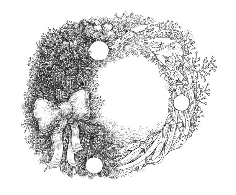
With the 0.1 liner, I accent the shape of the objects by varying the direction and character of the hatches. Contour and cross-contour hatching is a great method of creating the illusion of volume, especially in the case of rounded objects.
See also: Hatching and Cross Hatching
To make the texture of the balls more interesting, I add a pattern of small circles to their surface.
I apply thin hatches to the twigs, accenting their subtle relief. Then, I fill the areas around them with dense hatching. The climbing ivy is on top of the wreath, intertwined with the twisted twigs, so we need to create an indication of subtle cast shadow here.
If you have many intertwining elements in your drawing, it’s important to be attentive and careful while inking. However, if you make a mistake, there are ways to fix it.
See also: How to Correct Mistakes in Pen and Ink Drawings
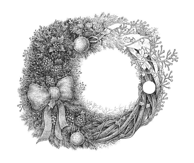
I complete the rest of the drawing, using the same principles as in the previous steps.
As a finishing touch, I make the contours more varied by widening the lines near the outer edge of the wreath with additional applications of ink. I also balance the image by adding new elements like thin fluffy twigs to its right side.
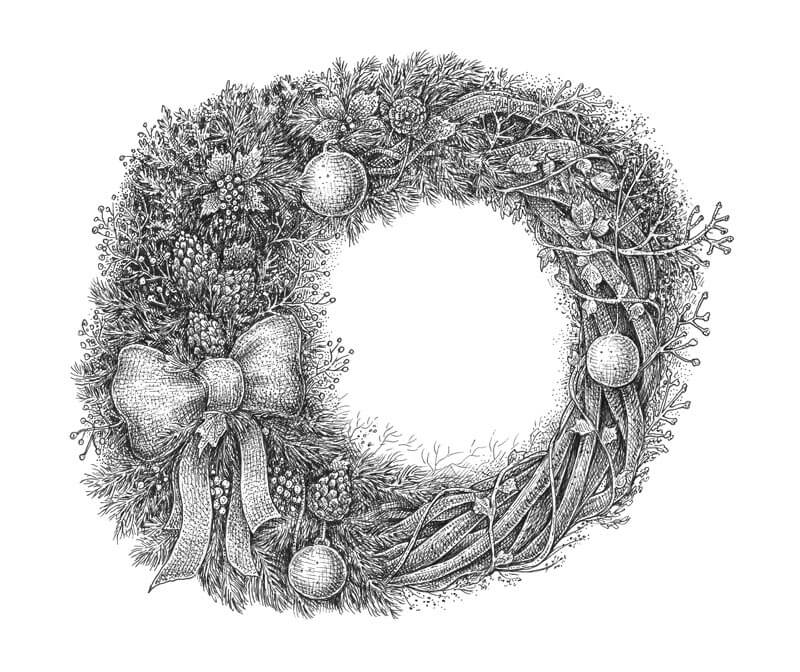
The drawing is complete!
I decided to draw a wreath in this lesson, however there are many more possibilities to continue your holiday series. Remember the list of ideas that I shared earlier and use it as inspiration for your next work.
If you’re looking for more inspiration, the image below may help. By the way, creating small, quick drawings is an excellent way to discover a great concept for your next drawing!
I hope you liked the lesson and thanks for being with me on this creative journey! I wish you all the happiest of Holidays!
If so, join over 36,000 others that receive our newsletter with new drawing and painting lessons. Plus, check out three of our course videos and ebooks for free.
Create a Herbarium – Nature Drawing with Ink
What is a Herbarium?
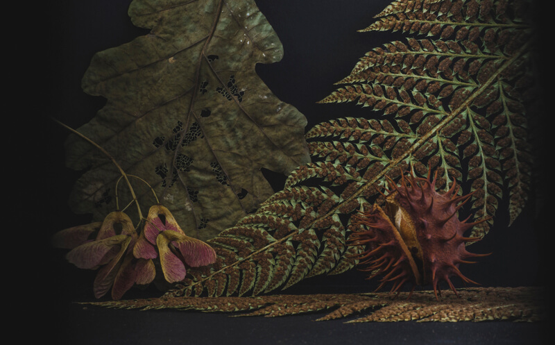
A herbarium is simply a collection of botanical specimens found in nature. These specimens are often collected and preserved in the pages of books or mounted on large sheets of paper. They are flattened and dried. As a result, they maintain their structure. In most cases, a herbarium is created for scientific study. As artists however, we can create them for reference and inspiration.
Chances are that at sometime in the past you gathered various leaves, flowers, cones, twigs, and other natural curiosities. Materials of this kind could be stacked in a box, like a precious treasure in a chest. Others might find their place in books – or under anything flat and heavy enough to create pressure.
Dried leaves fade in color but keep their shape. They become a silent reminder of seasons that were long gone. There is something nostalgic and magical about them in their frozen state.
Perhaps you still like gathering these wonderful gifts of nature and collecting them. In this post, I’ll show you the benefits of having a herbarium and how we can use those special “botanical treasure chests” to create ink drawings from nature.
We’ll transform your raw materials into drawings, which leads to new possibilities for your art.
So let’s find inspiration and create a drawing from nature!
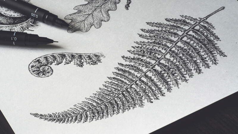
Using a Herbarium for Nature Drawing
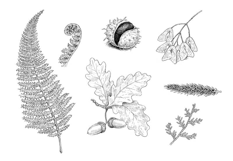
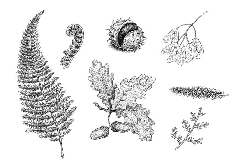
We’ll create a drawing of fern leaves, acorns, maple catkins, a chestnut, and small parts of coniferous twigs. The objects are quite varied, which makes this project more interesting.
I’m not striving for a precise representation of one specific leaf or chestnut. Professional botanical/scientific illustrators do this when they work on an illustration. Here we’re simply creating a drawing from nature where our concerns for aesthetics outweigh exact accuracy.
However, if you wish to make an exact copy of any subject, feel free to do so. You may also choose to deviate from the subjects that I demonstrate below. Perhaps you’ll prefer drawing a maple leaf instead of fern or a fir cone instead of acorns.
My goal is to capture the distinctive features of each specimen and translate my observations into a pen and ink drawing. I recommend collecting several specimens of the same kind so that you have a few to compare. If you don’t have access to any real materials, try finding several photos to work from.
The sketches that we create are aimed at broadening the artist’s visual library and gaining more confidence when creating new drawings. At the end of this post, I’ll share a couple of examples of drawings created from imagination. These drawings were created only after having some experience drawing from direct observation.
Pen and Ink Supplies for This Drawing
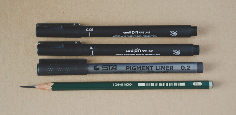
For this project, I’ll be using:
- Three ink liners; the width numbers are 0.05, 0.1 and 0.2.
- An HB graphite pencil;
- A sheet of thick paper (the standard A4 size).
Also, if you have a tendency to redraw your initial lines, which is completely fine, keeping an eraser at your disposal will be quite useful.
Any brand of the liners will work just fine. If you prefer a sketchier, looser approach, feel free to work with liners that provide wider lines – like 0.3 or even 0.5.
If you’re more comfortable with other tools or media like a nib pen or graphite pencils, please use them. For this project, the idea and principles are more important than the technical details of media application.
Sketching the Natural Subjects
We’ll first arrange the subjects on a sheet of paper. It may be useful to create a mini version of the sketch, marking the borders of paper and blocking the areas where each object should be.
I decided to draw the main fern leaf a bit smaller than it is in reality, just to fit it into the composition.
With the graphite pencil, I create a rough outline, paying attention to the contour lines of our subjects. The contour line determines the character of an object and makes it more recognizable.
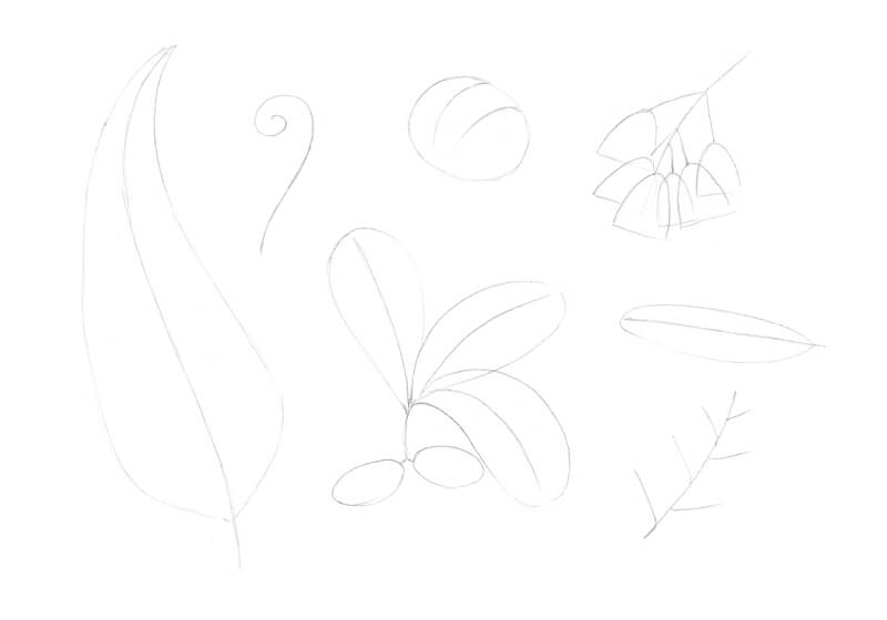
Drawing the fern leaves is time-consuming, so I use a spontaneous line to imitate the flow of their contours. I decided to add a fragment of another fern leaf – this time, a twisted one.
Note that many natural objects, such as fern or oak leaves, may have slightly asymmetrical features. Again, flora varies from region to region and from species to species.
For example, ferns can be found nearly worldwide. In fact, there are more than 10,000 species of them and there is a visual difference among each one of them! If your goal is to draw the exact species, having a several specimens or references is crucial.
A chestnut fruit (also called “burr”) is basically a sphere. To draw the thorns, take a close look – you’ll notice how their pattern behaves. As thorns point towards the viewer, the become shortened. This is called foreshortening.
The maple catkins present a special challenge. It’s necessary to mark not only the top elements, but also the visible parts of those underneath.
The fir and thuja (it’s the one at the bottom) twigs are different in terms of shape. The first one is voluminous, with all the needles forming a cylinder. The second one is flat.
How you arrange the objects is completely up to you. For example, you could place objects that you find more interesting towards the front, allowing them to overlap the others.
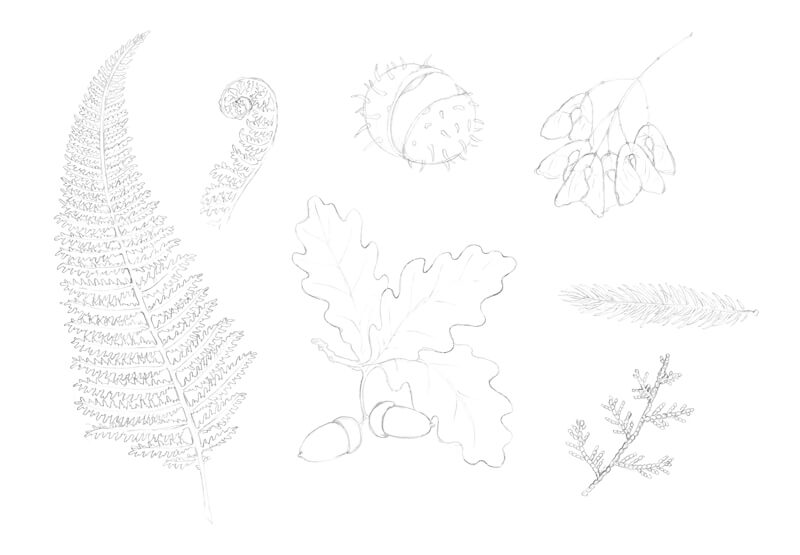
Adding Ink to the Drawing
I outline the main contours, using the 0.2 ink liner. I’d recommend avoiding a continuous outline with no gaps – it will make your drawing too stylized, similar to that of a page from a coloring book. Using broken lines in areas makes the drawing more interesting and creates a bit of variety.
Feel free to change your drawing as you go – add new elements or ignore details that you don’t find important anymore.
Keeping a sheet of blank paper between your hand and the drawing is a good idea – this prevents any smearing of the graphite marks and the fresh ink lines.
With the 0.1 liner, I add some hatching to emphasize the darker values. The chestnut fruit is the darkest object in my drawing, so I cover it with layers of contour and cross contour hatching right away. Now I can use this object to develop the rest of the values in the scene. We can make comparisons between it and the other objects.
The direction of hatches is important because it can create the illusion of a three-dimensional form. The lines that we add should flow over the form of each object.
The fir twig is relatively dark. I pay special attention to the gaps between the needles, leaving the tops untouched.
The ‘cap’ and the ‘body’ of an acorn have a different texture. Dots are added to the top where the texture is coarse.
At this step, we can add important details. Veins are added to the leaves while small spots are added on the chestnut.
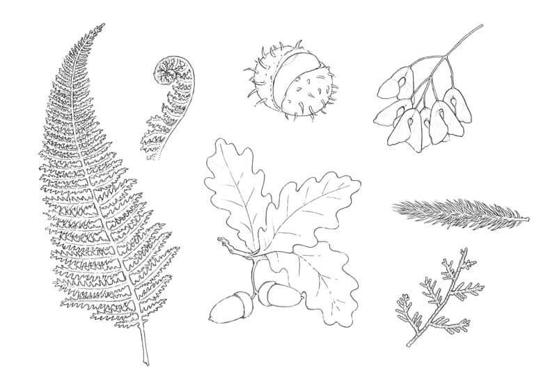
With 0.2 and 0.1 ink liners, I add some more hatching to the fern leaves. The leaves have both core shadows and cast shadows (cast by the upper objects).
To make the chestnut look more realistic, I add a cast shadow under it.
The ‘bodies’ of the acorns have a subtle pattern. I draw thin lengthwise lines with the 0.05 liner to develop this pattern.
I increase the contrast and develop the texture of the chestnut and the oak leaves, covering them with 0.1 stippling. The pattern of dots may have some gaps. The density of dots depends on the darkness or lightness of that area.
We’ll work on other elements (the maple catkins and the conifer needles) in the next step.
It’s time for some refined, delicate work. With a 0.05 ink liner, I add groups of hatch marks to darken the core shadows of the objects, especially on the leaves.
The maple catkins have a subtle relief. This illusion is created with short hatches that look like subtle folds from a distance.
The fir needles are slightly touched with fine hatching, too. This creates a smooth transition of value from dark to light. However, the tips should remain relatively light to create the illusion that the needles are spread apart.
The thuja twig is flat (as we noticed before) but its tiny segments have a subtle relief. I darken the periphery of each segment, then cover the whole twig with hatches.
The drawing is complete!
Another Option for Your Sketches
Digitizing ink sketches and enhancing them in a graphics program is outside the scope of this tutorial, but I thought that showing you a transformed version might be interesting.
I removed the white pixels in Adobe Photoshop, added a tinted background with a grungy texture, and here it is – a stylized vintage drawing!
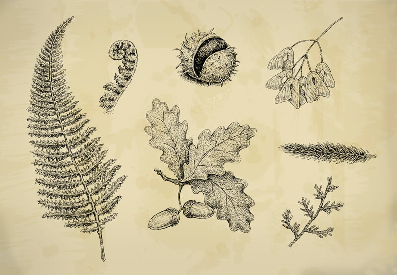
Which version do you prefer – a strict black and white or a warm brownish one?
To learn more about editing your drawings in Photoshop and making creative transformations, please check out this tutorial:
Draw a Fish: Pen and Ink Drawing with Digital Painting
Conclusion
I hope you enjoyed this creative journey! Just imagine the possibilities with real botanical elements that you may find.
Earlier, I promised to show you an example of how you can use your studies to enlarge your visual library and create new works.
Here are a couple of sketches. If you look at them closely, you’ll notice several objects from our tutorial. Can you tell what they are?
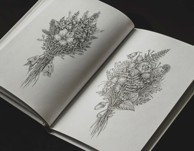
These sketches were drawn without using any reference material. I just imagined a bouquet and gradually transferred an image to the paper. It’s quite simple if you have dozens of flowers, leaves and other elements, stored away in your memory! But they’ll only be there if you take the time to practice drawing from observation first.
I wish you much fun and luck on your artistic journey!
If so, join over 36,000 others that receive our newsletter with new drawing and painting lessons. Plus, check out three of our course videos and ebooks for free.
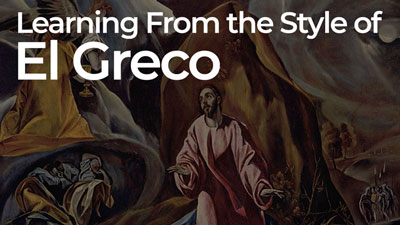
The Unusual Style of El Greco
Today, we’ll take a look at the artist, El Greco, and examine his unique style. Perhaps, you’ll take away a few things in regards to your own style and see that sometimes we can throw out conventional wisdom in order to create something truly unique.
On occasion an artist will stretch the conventions of his/her own time and produce work that is undeniably unique. El Greco was such an artist. His work bridged the gap between artistic periods, and even between worlds. El Greco’s mystical paintings inspired devotion to God in his own time. Later, in the Twentieth century, Cubists and Expressionists found his painting inspiring in a different way. The abstract artists of the Twentieth century drew their own inspiration from the way El Greco freely manipulated color and proportion. Though El Greco’s artwork speaks for itself, some context may help one to appreciate how he came to develop the distinct style for which he is known.
Who was El Greco?
El Greco was born Doménikos Theotokópoulos. Hailing from the Island of Crete, he moved, as a young man, to Venice and eventually Rome. Nothing is known about his early education on Crete. It is assumed, however, that he was receiving an education since he continued studying art after moving to Italy. El Greco was known to read both philosophy and religious commentary in his mother-tongue, Greek.
If El Greco was educated as a boy on Crete he would have learned in a monastery. Monasteries were the educational centers on Crete at that time. There he would have seen and studied the Byzantine style of painting that persisted in Greece, being somewhat insulated from the ground breaking artistic innovations happening just next door, in Italy, during their Renaissance.
Of course, upon moving to Venice, El Greco was thrust into that explosive world of artistic skill and expression. It was at this time, in El Greco’s early adulthood, that he first came to occupy a place between two things.
El Greco came under the influence of Titian while studying in Venice. Titian was perhaps the greatest representational artist in the world at that time (Michelangelo had just died). He left his stamp on El Greco. Taking the opportunity to travel, however, El Greco headed north toward Florence. In doing so, he saw and incorporated ideas common to the Mannerist artists that ushered out the Renaissance.
Eventually, some would call El Greco the greatest Mannerist of all. His art, however, utilizes Byzantine, Renaissance, and Mannerist concepts, all the while pointing to the Baroque period that would blossom after his death.
What is Mannerism?
Mannerism is the name given to art that seemed more of a rebellion against the complex naturalism of the Renaissance, instead of a distinct, cohesive style of its own. The unrelenting preoccupation with human proportions and mathematically accurate perspective common to Renaissance art gave way to exaggerated proportions, stylized facial features and utterly impossible, flat spaces. Some Mannerists used unnatural colors for expression, fighting the inclination to simply copy the observable colors of a subject. In short, Mannerism was interested in style over accuracy. It challenged accepted Renaissance solutions to artistic problems.
El Greco in Toledo
El Greco eventually moved on to Spain where he would remain for the rest of his life. It was here, of course, that he received the “nickname”, El Greco, which simply means the “the Greek” in Spanish. It was in Spain where Byzantine symbolism and Mannerist ideas would synthesize into the style that set El Greco apart.
El Greco’s Proportions
El Greco was a pious individual living in Toledo, the spiritual center of Spain. His artwork meant to show both the earthly and the heavenly, at once. These are the two worlds El Greco sought to reconcile in his art. Exaggerated proportion was a convention used in Byzantine art to solve such a problem as it related to, Jesus, being both God and Man at once.
Look at the examples below. See how Jesus’ proportions are not that of a baby but a man. The head is too small for a baby and the limbs seem long in relation to the torso. This stylization meant to convey the otherworldly or heavenly nature of Jesus. El Greco may have remembered how Jesus was represented in Byzantine art as he was trying to find a way to communicate his own subjects’ closeness to God.
See how El Greco elongated the body of John the Baptist. Did El Greco extend this Byzantine stylization to include saints and even earthy subjects, as an expression of their piety?
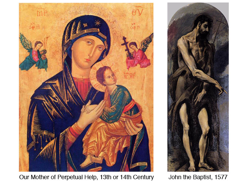
Whether El Greco found inspiration in the Byzantine version of Baby Jesus or not, his figures do appear out-of-this-world. Their stretched proportions and fluid poses make them human like, but not merely human. Beyond human. Spiritual.
El Greco’s Space
Look at The Agony in the Garden at Gethsemane (below). This painting illustrates Jesus praying in the Garden just before he is arrested. On the right, the land and sky in the background seem to merge in to one solid shape, light in value. The abrupt change from light to dark in the sky seems to serve a compositional purpose more than a representational one – an example of style over accuracy.
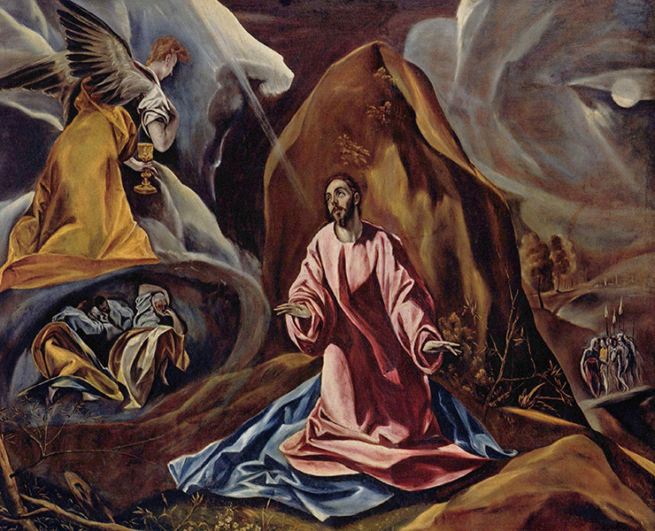
On the left side of the canvas the space is even more uncertain. The angel in yellow seems to be both in the foreground and background at once. The size or scale of the angel matches Jesus, leading one to believe that he, the angel, is next to Jesus. The placement of the angel, however, says otherwise. The yellow garment matches the contour of the grotto in which the disciples sleep, leads one the believe that he, the angel, is resting over the disciples and is just larger than the other figures.
The imagery on the left beyond the angel is open to interpretation as well. Do the lighter values describe land or are there clouds as well? Again, the values in the negative space seem to have more of a compositional purpose that a representational one. The uncertain space in the background gives the painting a flat quality. In this way, El Greco leans hard toward Mannerism.
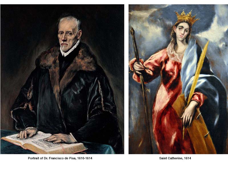
El Greco’s Color
El Greco thought of color as a means to differentiate between the earthy and the heavenly. He used high intensity colors when depicting saints and angels, but low-intensity colors for his subjects still bound to this earth. Compare the portrait of Dr. de Pisa with the representation of St. Catherine. The primary color scheme El Greco used in the painting on the right, along with the dynamic, high contrast background are from of a different realm altogether when juxtaposed against the portrait of Dr. de Pisa.
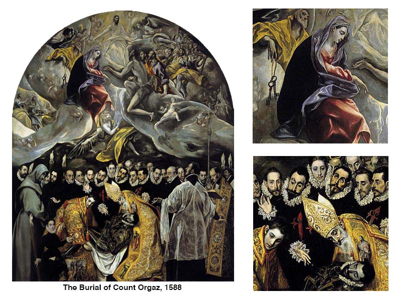
El Greco used intensity of color to distinguish between the two worlds, even in the same artwork, on occasion. The Burial of Count Orgaz (below), perhaps his greatest work of art, is a fine example. The difference between how color is used in the lower and upper halves is stark. Here again, El Greco used a primary color scheme to describe the heavenly.
Perhaps he loved applying this scheme to heavenly imagery because one cannot make primary colors by mixing any other pair of colors together. El Greco might have described the primary pigments as those that only God could make, qualifying them to represent the holy.
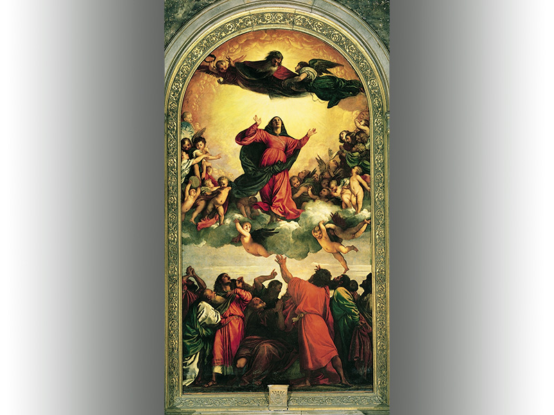
Of course, El Greco was, while in Venice, a student of Titian, the High Renaissance Master. He would have known the painting, Assunção de Nossa Senhora (below), By Titian. Titian’s use of color and tonal contrast is more subtle that El Greco. Still yet, the generally dark mass of figures at the bottom, and also the red and blue clad figures set against the intense yellow background in the heavens, must have played a part in the stylistic decisions made in The Burial of Count Orgaz.
Conclusion
El Greco, like Byzantine painters, used unnatural proportions for effect. He employed intense color relationships and flat spaces common to Mannerists. He used the natural, authentic color mixtures and color schemes mastered by Renaissance artists. Then, when one considers the general darkness of his compositions and painterly brushwork, one can see a foreshadowing of the coming Baroque period. Here again, El Greco’s style rides the fine line between definable periods – a man between worlds.
We can learn quite a lot when we look to artists from the past that have made a significant impact. Many times, we can see that our own personal styles can emerge when we reject conventional opinions on what art should look like or be. El Greco is fine example of this.
Sources:
Hamlyn, Paul. El Greco. London: Paul Hamlyn Limited, 1967.
Tansey, Richard G. and Kleiner, Fred S. Gardner’s Art Through the Ages, tenth edition. Orlando: Ted Buchholz, 1996
If so, join over 36,000 others that receive our newsletter with new drawing and painting lessons. Plus, check out three of our course videos and ebooks for free.
Try Something New with Colored Pencils: Colored Paper
But sometimes our thoughts about what we want to do and our actions are completely different. Expanding our “comfort zone” isn’t always easy, no matter what it is – art, learning, or anything that relates to our everyday life.
There are several reasons for this:
- We don’t know what to undertake or how to divide the task into smaller, digestible parts.
- We don’t assign a specific time to the new pursuit and may end up forgetting about the whole thing.
- We just aren’t sure that we’ll succeed, and this prevents us from starting (or continuing).
I’ve fallen into these pitfalls many times with various tasks, habits, and pursuits. For example, this past year I have been thinking about new techniques or artistic media that I wanted to try, and the weaker points in my skill set that needed my attention. Unfortunately, those three pesky reasons above kept me from actually doing anything – especially, the time reason excuse.
What’s the solution? How do we overcome these obstacles? We know that we need to expand our artistic experiences, but we keep finding excuses and end up not taking action. I’d like to share a few strategies for overcoming these excuses. I’ll also share a simple colored pencil drawing lesson that will help to ease you into something that may be brand new to you.
Become More Disciplined with Your Art
First of all, it’s necessary to make a list of everything that you are interested in (or what needs improvement).
The second step is classifying the interests, depending on the priority. In other words, if you are eager to “level-up” with a certain skill or feel like something holds you from creating better art – this should be your top priority.
Then, make the time for this thing. The best approach is to practice on a daily basis – but if this is not possible, once or twice a week is the minimum. Need a reminder? Set up a notification on your phone or write a note and keep it visible to remind you of your decision to improve.
Usually, we have so much to do every day that it’s almost impossible to carve out a whole hour to devote yourself to anything else. If that sounds like you, take a closer look at everything you do regularly and track your time. Chances are that you’ll find a block of time. You may see that some routine tasks or entertainment can be abandoned and replaced with a new pursuit (if that’s really the thing you want to be doing).
Also, we often waste so much time just waiting. It may be waiting at the doctor’s office, for the bus, or for someone we’re meeting to arrive. Of course, this time can’t be 100% focused but it’s better than nothing. Keeping a sketchbook near you provides a little opportunity for a some drawing practice.
I recommend starting with short blocks of time, like 15 minutes for sketching. Our brain has a fear of lengthy, complex tasks. It knows that we may be tired and annoyed at the end. But 15 minutes is not that big of a deal!
The fear of getting poor results can be eliminated through awareness. It’s true that our results become better with time and practice. There is nothing wrong with the process of practice – it can be messy, with a touch of uncertainty and improvisation.
Let yourself be a beginner and transform your fears into a resource. Nothing happens if you don’t try! Chances are that your results will be even better than you expected.
Or, try to expect nothing – any outcome is good just as it is.
These thoughts allowed me to inject studies and various experiments into my creative routine – and I hope they’ll help you, if you’re in a similar situation.
The Idea Behind This Project
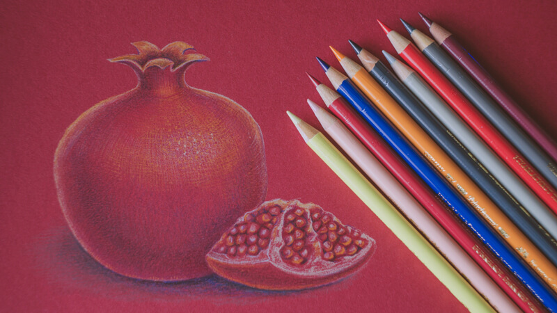
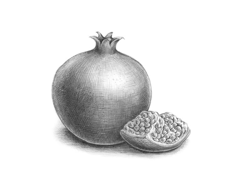
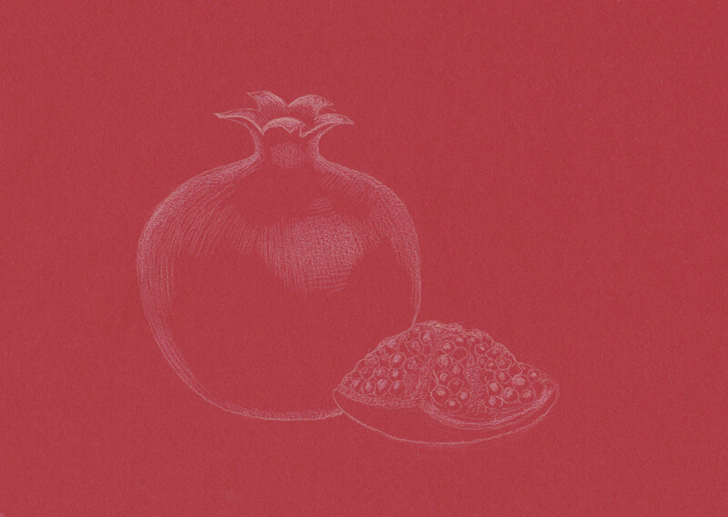
This demonstration is an example of such an artistic quest. One day, I caught a sudden idea of drawing a pomegranate on a red paper. I found a proper surface. It’s color seemed somehow bright and dark at the same time.
It also is similar to the overall color of a pomegranate, which makes this concept interesting and challenging.
On the other hand, this closeness of colors may be an advantage because we don’t have to build up the layers of pigment to create a solid covering, as we have to with ordinary white paper.
I wanted to limit the time dedicated to this project. What can be done within 45 minutes? Even though my goal is to complete the drawing in 45 minutes, it doesn’t mean that I will stop there if the drawing is incomplete.
Of course, this limitation isn’t obligatory if you decide to follow along. Having a clear deadline – with a good attitude – may help you to reach a more focused state of mind. We also know how much time we are going to commit to this – it is not entirely open-ended.
Creating the Pencil Sketch
I’m working with no particular expectation. The overall set up, including the materials, is new to me. That’s why I decided to create a pencil sketch to test the concept and make notes on the positioning of values.
Creating a sketch is a great way to think through your artwork beforehand and become better prepared (especially if you feel slightly uncomfortable with red paper). This step isn’t required – if you prefer a more spontaneous approach, it’s completely fine. This preparatory sketch is also not included within the 45 minute time constraint that I’ve placed on myself.
As you can see, the sketch is far from perfect; it’s teetering on the edge of accuracy and roughness. If this was a separate project, I would soften the contours and add some more hatching here and there. However, since this is preparatory sketch, it’s more than enough.
Choosing the Supplies
The paper for this drawing is thick and rather smooth, but has a subtle texture – it becomes visible after some applications of color. However, it doesn’t allow many layers of color and we should be aware of this.
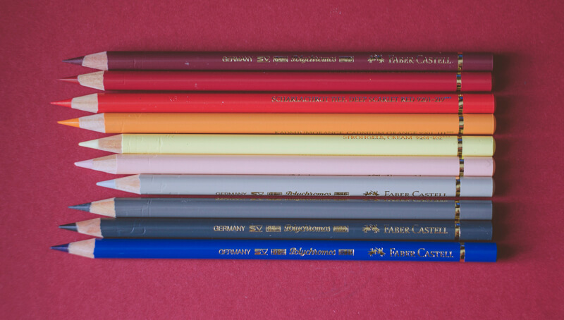
I picked a limited color palette for this sketch. There are ten pencils from the Faber-Castell Polychromos line (pictured above – from top to bottom):
- Red-Violet
- Dark Red
- Deep Scarlet Red
- Cadmium Orange
- Cream
- Light Flesh
- Warm Grey II
- Warm Grey V
- Payne’s Grey
- Helio Blue Reddish
Please note that the photo distorts the actual colors of pencils and paper!
It seems that Polychromos colored pencils work great on this kind of paper. When I was preparing this post, my first attempt included Prismacolor Premier pencils, but the result was less successful. I ran out of tooth very quickly and there were difficulties with creating details. However, your paper might behave differently, so don’t hesitate to try things out beforehand. And, if the first attempt isn’t successful, you always can create another one!
As a side note, Polychromos pencils are oil-based, while Prismacolor pencils are wax-based. These pencils behave differently becaue their binders are different. For more on the differences between these types of pencils, check out this lesson…Oil-based vs. Wax-based Colored Pencils.
This is what the pencil strokes look like on the red paper:
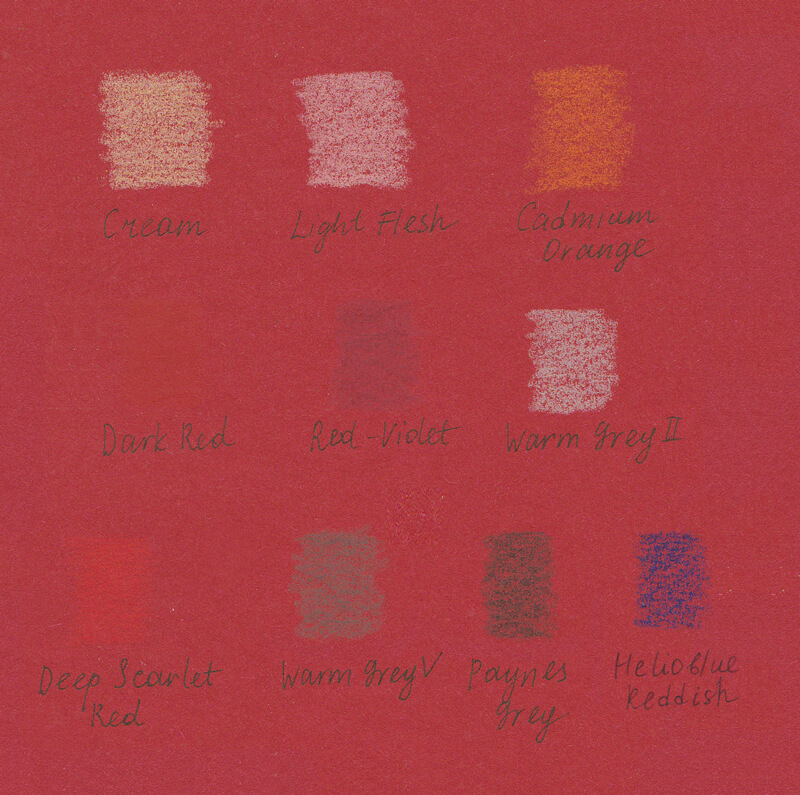
As you can see, the color of the paper influences the result greatly.
By the way, it’s possible to add fine liners to this set of tools – it will quickly and easily mark out the contours, but your sketch will become even more stylized.
Drawing the Pomegranate with the Colored Pencils
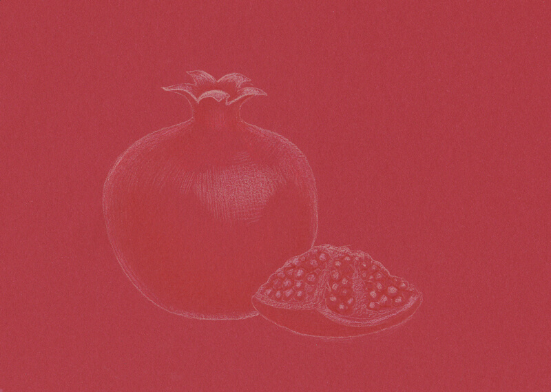
I outline the main contours, using the Cream pencil. It’s important to use light lines – we don’t want to create furrows on the surface.
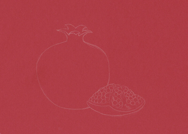
Then, I use both Cream and Light Flesh to mark the lightest areas of the drawing. As I need to work quickly, my hatches are rather long and not as polished as they would be in a realistic botanical illustration.
The color of the paper is very strong, so both pencils create similar marks.
With the Dark Red pencil, I create a base for the core shadow of the pomegranate and accent the seeds. I also add some subtle brightness with Deep Scarlet Red, emphasizing the lighter parts of the fruit.
These colors are very close to the paper’s color, but this subtle difference makes the object a bit more clear.
I add some orange marks, mostly to the lighter areas, using the Cadmium Orange. It’s important to brighten the seeds, but avoid creating a monotonous pattern.
A pomegranate has an uneven texture, so I use dots to accent this feature.
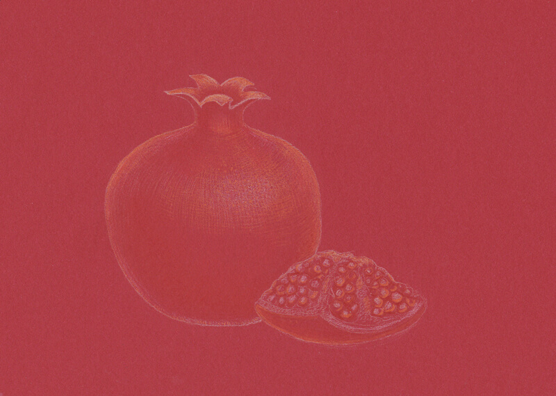
I emphasize the core shadow of the fruit, using the Helio Blue Reddish. Just a soft touch with this pencil is enough! To mute the intensity of color, I apply Dark Red right on top of blue strokes.
The upper part of the pomegranate needs some darker tones too, so I repeat the process there.
To create a cast shadow under the subjects, I mix the strokes made with the Helio Blue Reddish, Dark Red, and Warm Grey V.
It’s time to increase the contrast in value, so I add some Red-Violet strokes to the darker areas, including the cast shadow.
Then, I emphasize the lighter spots with Cream. Again, dots in the center of the highlight create a nice illusion of texture.
The sketch becomes more stylized, but that’s the effect I was going for.
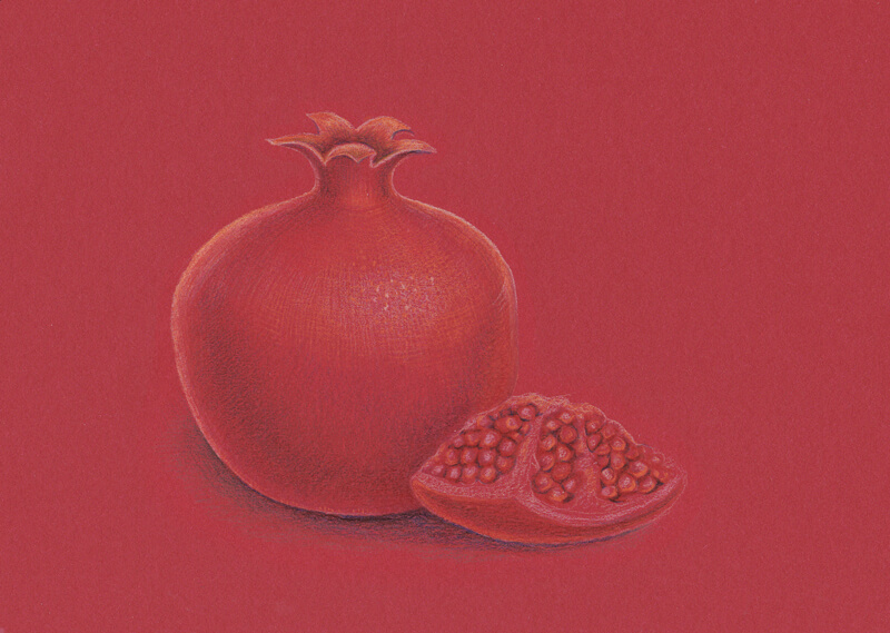
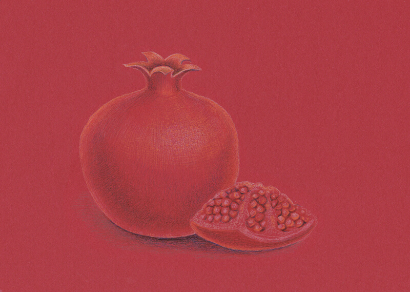
With Cream and Warm Grey II, I work on the relief details of the isolated piece of the fruit. Deciding which color to use depends on the side of the piece that’s visible and the amount of light it catches. I see its left side as a more neutral tone.
It’s time for the final hatches. I evaluate my sketch and add colorful strokes here and there.
For example, I complete the shadow using the Payne’s Grey pencil and define the contours of the pomegranate a little more with Cream. However, allowing the sides of the fruit to be a bit soft will make your sketch more natural – so avoid outlining everything.
The work is now complete and we’ve met our time limits! The sketch was completed within 45 minutes, thanks in part to the choice of paper color.
Conclusion
I hope you liked this experiment and it inspired you to set your own goals and challenges. Let’s be brave and make something that we have put off for a while – and do it today!
I wish you much luck and inspiration on your journey!
If so, join over 36,000 others that receive our newsletter with new drawing and painting lessons. Plus, check out three of our course videos and ebooks for free.
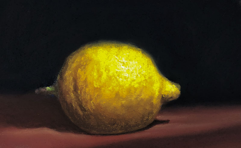
How to Draw a Lemon with Pastels – Timed Drawing Exercise
Drawing a Lemon with Pastels
In this timed drawing exercise and challenge, we’ll create a sketch of a lemon with pastels. We’ll work quickly and attempt to complete the drawing within a 30 minute time constraint. Even though we’re only devoting a few minutes to this exercise, we’re still exercising the same visual “muscles” as we do when we create a more finished and complete drawing.
The key to developing your drawing skills lies in repetition and practice. As little as a few minutes each day in practice will lead to stronger drawing skills. Grab your pastel materials and let’s dive in.
One of the wonderful aspects of pastels is that we can layer colors quickly. This means that we can build up an image in a short period of time. Even though the process of working with pastels is clearly one of drawing, the thought process is more closely related to that of painting.
When we paint with an opaque painting medium like acrylics or oils, we block in shapes with a base color. We can then develop the values and textures over the shape, which leads to a representational illusion. Pastels function in a similar way. We’ll start with blocks of color and develop them with additional applications over the top to develop the form and texture of the subject – in this case – a simple lemon.
Materials for this Drawing Exercise
In this drawing, we’ll use just a few basic colors and a pastel surface suitable for multiple, layered applications. Any brand of soft pastels will work – you can even use pastel pencils if you prefer. In this lesson, Rembrandt pastels are used. These are considered professional-quality pastels and are very rich in pigmentation. Having used many different brands over the years, these pastels are my favorite – in fact, I own just about every color you can.
The surface is Mi-Teintes pastel paper. A warmer gray is chosen since most of the colors on the lemon and surrounding areas are warmer. However, you could chose a surface that is cooler to produce contrast if you wish. The paper is mostly covered up with pastel applications in this case, so the paper has a minimal effect on the final image.
Mi-Teintes pastel paper is a high quality paper for pastels, but it’s priced fairly low. It features two distinct sides. One side of the paper is coarse and heavily textured. The other side is smoother, but still provides ample tooth for multiple, layered applications. We’re working on the smoother side of the paper here.
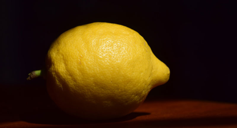
Photo Reference
The photo reference that we’re working from comes from pixabay.com. This is a wonderful site for finding photo references. Finding suitable photo references has always been difficult in the past. But with new websites like pixabay.com popping up, it’s becoming a lot easier to find great images that are appropriate for practice.
Here’s a look at the photo reference of the lemon…
How to Draw a Lemon with Pastels – Step by Step
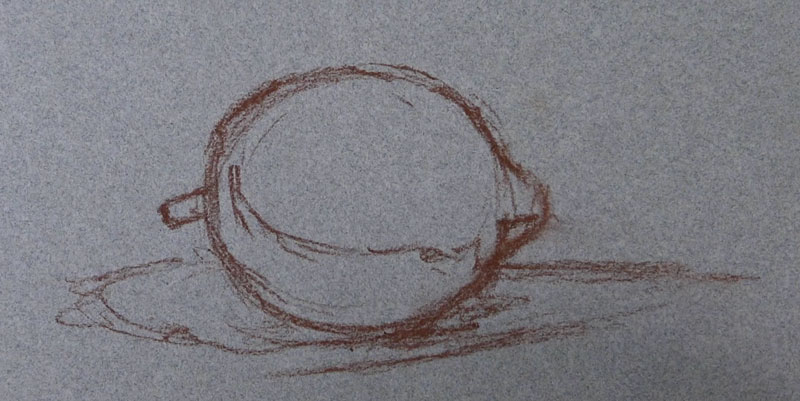
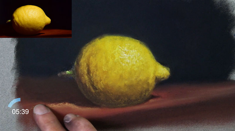
Now let’s break down the process into to easy to understand chunks. We’ll start with a simple and loose sketch using a light brown pastel pencil. We’ll avoid using black since it’s such a strong color and would undoubtably overpower the yellows that we’ll add later. You can use any warmer color that you wish here, but I’d suggest staying away from cooler colors, like blue.
Since pastels can be applied opaquely, we’ll start blocking in colors in sections that are further away from the viewer and work forward. This means that we’ll address the background first and then move to the middle ground, and lastly – the foreground.
The background appears to be black in our reference. Black is an incredibly strong color. On its own, black can make an image appear flat and unnatural. For this reason, we’ll add a bit of color. Since most of the colors in the foreground are warm, we can use a cooler color to create a subtle contrast in color temperature. We’ll first lay down some blue and smudge the application with our finger. Over the top, we’ll add black and continue to smudge the pastels. This will produce a very dark background, but one that is slightly tinted with color. This prevents the dark, “black” background from overwhelming the drawing.
We’ll also address the table in which the lemon is sitting at this stage. Remember, the lemon overlaps the table as well, so it makes sense to address it before developing the lemon. A reddish-brown, or burnt sienna, is used to address the basic shape.
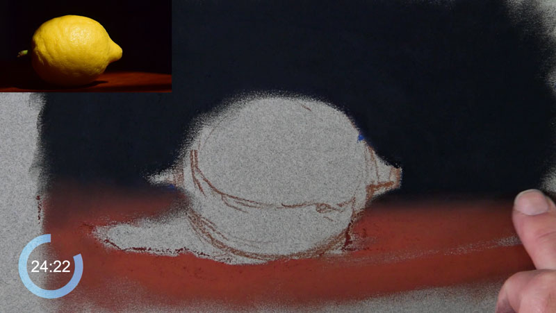
Cast shadows are then added over the top of the table and underneath the shape of the lemon with a black pastel pencil. These black applications naturally mix with the color added for the table, toning down the strength of black.
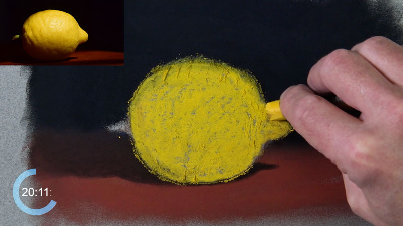
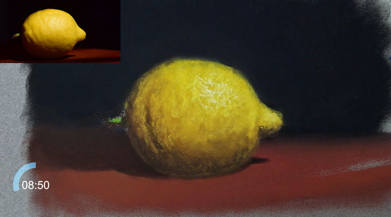
With the background in place, we can turn our attention to the lemon. We’ll start with a medium yellow, which serves as our base color. The entire shape of the lemon is blocked in using this color.
Now we can begin to adjust the values to develop the form and texture of the lemon. We’ll start with the darker tones in the area of core shadow on the body of the lemon. A medium brown is applied first. Brown is used since it is warm like the base color of the lemon, but darker in value. As this brown is added, it is blended with the yellow already in place.
A bit of color is also added in the shadow. First a touch of red is applied, followed by a little orange. This adds a bit more depth to the color and additional interest.
To address the darkest areas of shadow, found near the base of the lemon, a darker brown is applied. Again, this color is blended to create a gradation.
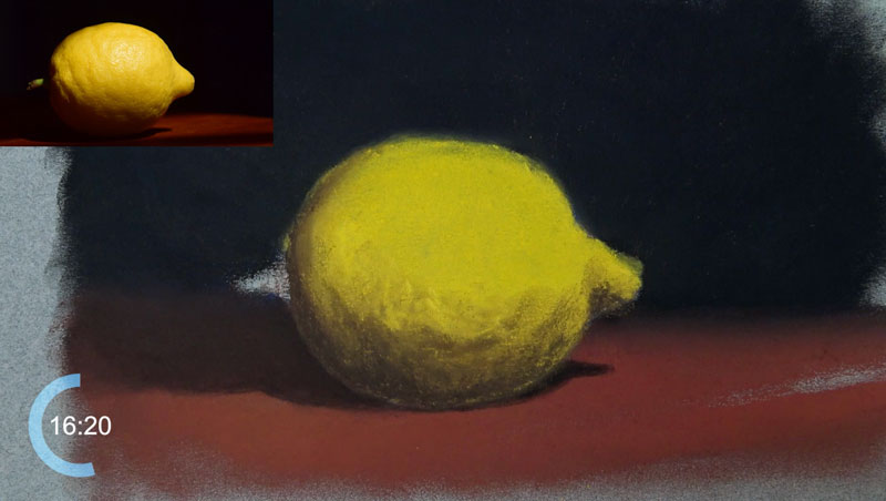
Now we’ll begin developing some of the lighter values. Since the light source originates from the upper right corner, most of these lighter tones will exist on the upper right portion of the lemon. We’ll start with a slightly lighter yellow than our base color. Marks are made with a light touch with circular stroking to mimic the coarse texture of the lemon.
Next, we’ll add a strong highlight in the upper right quadrant of the lemon with a very light yellow, again using circular strokes. This color may appear white but there is a slight tint of yellow.
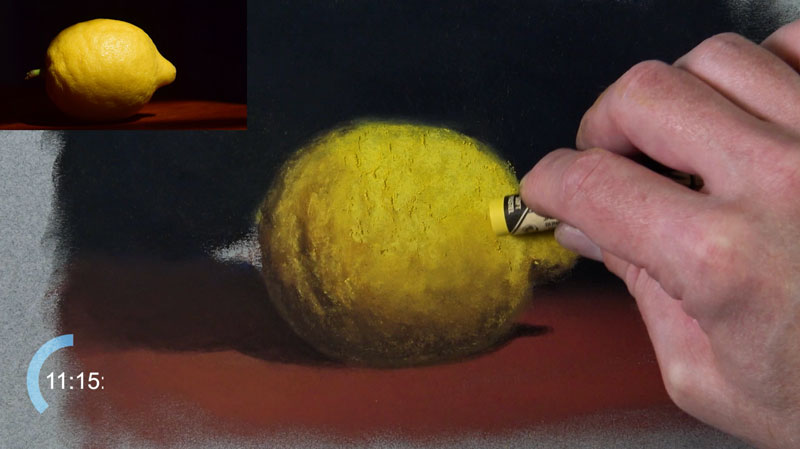
We’ll add a base application of yellow-green for the stem. Then, as we did with the body of the lemon, we’ll begin developing the lighter and darker values. A dark brown is used for the shadow on the underside of the stem and a gray is applied on the tip.
A lighter yellow-green is applied on the stem to act as the highlight. Since this area is quite small, a blending stump is used to blend the applications.
At this point, much of the drawing is complete. We’ll now enhance the illusion of light and clean up the drawing.
A touch of light yellow-orange is added to the table for added variety. As an added benefit, the addition of this color increases the contrast between the cast shadow produced by the lemon and the light on the table.
Pastels naturally produce colored dust. During the drawing process, this dust finds its way into areas that you may not intend. Periodically, we’ll clean these bits of dust by blending. Now that we’re at the end of the drawing, we’ll need to conduct a final “tidying up” of this dust that still remains on the surface. In this case, we’ll simply use our finger to work any of the colored dust into the paper, restoring the intensity of the color and completing the drawing.
If so, join over 36,000 others that receive our newsletter with new drawing and painting lessons. Plus, check out three of our course videos and ebooks for free.
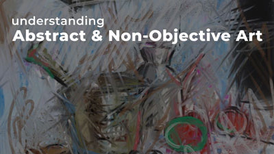
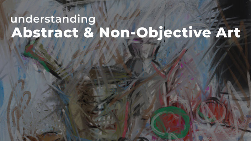
Abstract and Non-objective Art
What Is Abstract Art?
Maybe you’ve taken a look at a work of abstract or non-objective art and gotten confused. Maybe you said to yourself, “How is this art?” or “Why is this art?”
Maybe abstract art or non-objective art has even angered you. Perhaps you’ve thought to yourself, “Anyone can do that!” Or perhaps, “That’s not art!”
The problem with abstract art is that most people simply don’t take the time to understand it or appreciate it. They simply look at the skill required to physically paint and draw the image and that’s how they evaluate it.
The truth is that the skill involved in abstraction is not in the application of the medium. The true skill is in the vision of the artist and how they communicate through the works they produce.
It’s easy to miss the skill that exists in abstraction and non-objective art if you don’t understand what’s going on. So let’s dive a little deeper with an open mind.
Different Forms of Art
The world of art is vast – with many different styles, movements, mediums, and artists. It’s rather easy to become overwhelmed and confused. But fortunately, this expansive world can be simplified. All works of art will fall into one of three categories. An artwork is either representational, abstract, or non-objective.
Representational Art
As the name implies, representational art seeks to replicate the observed world. When the intent is to create a representational work of art, the artist is concerned with proportion, the light source, depth and space, perspective, realistic textures and so on. The artist uses the elements of art to fool the eye of the viewer and to create a convincing illusion in a drawing or painting.
There are various degrees of representational art – but for now – let’s consider it as one category. (For some people, this is the ONLY form of art in their mind, but there is more to discover and appreciate.)
Abstract Art
The most misunderstood form of art is abstraction. Abstraction occurs when the intent of the artist is to create an altered depiction of the subject or concept. The rules of representational art may be thrown out completely, if so desired by the abstract artist. In this form of art, the artist uses the elements of art to distort how we see the object in reality. This can be accomplished in a number of ways – simplification, color alteration, altered views and so on.
With abstract art, the artist starts with a concrete subject from reality, even though the subject may not be fully recognizable in the finished work.
Non-Objective Art
The third category of art is termed “non-objective”. This form of art differs from representational art and abstract art in that it takes nothing from reality. The sole intent is to produce a piece of visual work that is created purely for aesthetics. While an abstract work may appear similar to a non-objective one, the starting point and the intent of the artist is different. For this reason, non-objective art gets its own category.
The Earliest Forms of Abstract Art
To understand abstract art, we must first look at the history of how it came to be.
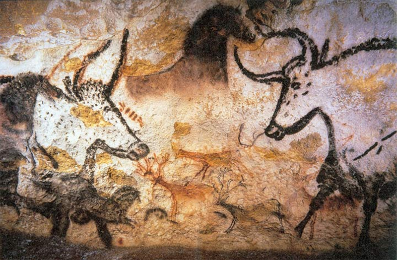
Abstract and non-objective art have existed as long as art itself. Cave paintings like those from Lascaux, France are abstract. These flat, simplified animal shapes would inspire artists thousands of years later, during the twentieth century. The abstraction lies in the simplicity. This means that the earliest and oldest forms of art are works of abstraction.
Abstract and non-objective art later dominated the early twentieth century. In the preceding centuries however, most artists worked toward a representational depiction of their subject.
To understand abstract and non-objective art, one must first consider representational art. Often referred to as realism, representational art attempts to copy the natural experience of seeing. The prefix, “re”, means again. The root word, “present” can mean to show. So, one is “showing again” what was first seen when working representationally – a copy of nature.
In the early twentieth century, abstract art was a response to representational art. Abstraction is changing the natural way of seeing something. Distorted proportions, unnatural colors and the simplification of shapes are just a few ways an artist might change how a certain subject is depicted.
A Painting is a Painting
In 1929, Magritte completed his influential and controversial painting, “The Treachery Of Images”. In this painting, Magritte presented a realistic painting of a pipe with the words underneath, “Ceci n’est pas une pipe.” Translated from French, these words read, “This is not a pipe.”
For those of us stuck in the world of realism, this statement may be extremely confusing. After all, we can clearly see that it is a pipe in the painting – right?
But is it a pipe? Can you stuff tobacco in it and smoke it? Can you hold it in your hand?
You can’t do any of these things because it is NOT a pipe. Instead, it is a painting of a pipe.
This painting can help us better understand and appreciate any form of art created outside the realm of realism. A painting is a painting. A painting is not the reality it attempts to copy. It doesn’t have to be derived from reality in order to be a successful painting. A painting can be anything we want it to be. It doesn’t have to mimic reality.
With this concept in mind, we can open ourselves up to the world of abstraction and non-objective art. We must remove ourselves from the fact that a painting or drawing must be representational to have merit. Let’s first dive a little deeper into abstract art.
Abstract Art Definition
Change is at the center of abstract art. Abstraction is a form of a changing the subject in a manner that is different than how it is viewed in reality. It can be as simple as changing the color; or as complex as changing the subject so that it is completely unrecognizable.
The merit found in abstract art is two-fold. One can appreciate how the artist has changed the subject, but also the formal qualities of the resulting work.
In some cases, we may not know the thought process behind the abstraction, but we can appreciate the resulting work – the color relationships, the composition, the use of the elements and principles of art, etc. But in some cases, we may know the intent of the artist and how they have decided to change the subject – which gives us another way to evaluate the piece.
For people that do not understand the purpose of abstraction, it’s easy for them to dismiss it as a lesser form of art – especially if they judge it based on how representational an artist makes their work. However, once you dive deeper into the meaning and purpose of abstraction, we can better appreciate it. You may even find that you have an even greater appreciation for it when you try to do it yourself.
Comparing the Various Forms of Abstraction
As mentioned before, there are various degrees of abstraction in art. Visual abstraction is best understood as existing on a continuum. Imagine a line. At one end of the line is photorealistic artwork. At the other end is non-objective artwork with no recognizable, nameable subject matter. Abstract art lies in the middle, somewhere between representational art and non-objective art.
There are points along this line representing varying degrees of abstraction. Take your favorite cartoon. Does the cartoon include black outlines? Lines are abstract. Think about it. There are no lines in “real life”. There are only edges of color and value. Using a line to define a contour is actually a change from the natural way of seeing.
Does that mean that a cartoon is abstract art? Not exactly, but it does mean that cartoons are stylized. Think of stylization as the first stop along the way to abstraction.
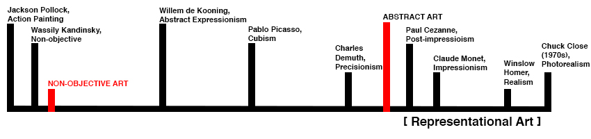
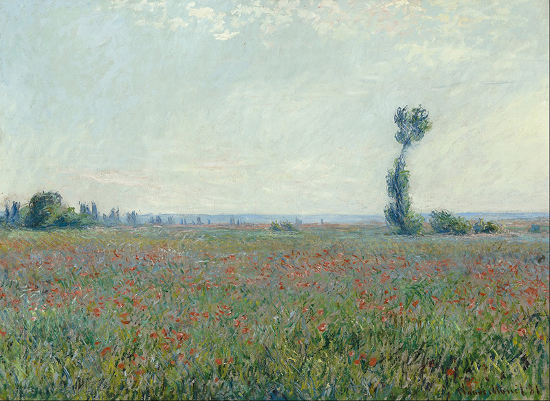
The continuum above is an attempt to organize a few artistic movements according to their degrees of abstraction. The artists and Movements on the line are not in chronological order. Farthest to the right is Chuck Close, a photorealist. His artwork has evolved over time but the work he was producing in the late sixties and early seventies defined photorealism, the most representational art thus far. Both Winslow Homer and Claude Monet represent movements in the 1800s, during which time artists worked representationally. The following painting by Monet used value and color to create a believable, realistic space.
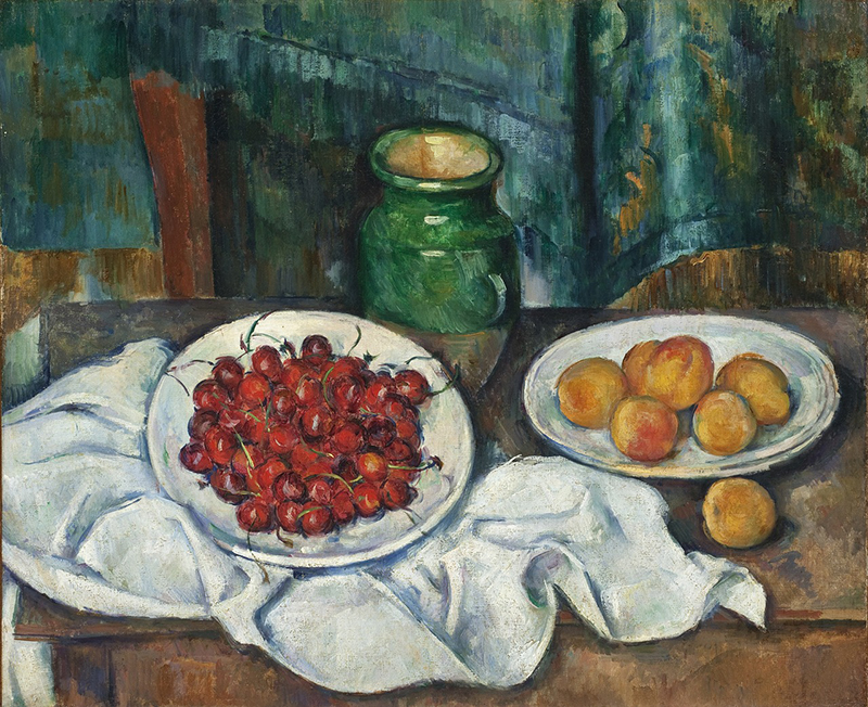
The point at which Paul Cezanne appears on the continuum marks a turning point in art history. Paul Cezanne is often referred to as the “Father of Modern art”. Cezanne’s art (seen below) has a flat quality that artists that followed would emphasize. See how the plate on the left looks more round than the plate on the right. They do not appear to belong in the same space together.
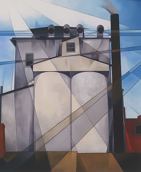
Moving leftward on the continuum, Precisionist artists such as Charles Demuth and, to a lesser degree Georgia O’ Keefe, painted easily recognizable abstract imagery. Both would “zoom-in” to their subjects, reducing the distinction between foreground, middle-ground and background.
Instead, their subjects seem crammed up against the surface of their picture plane, again, created a sense of flatness. Additionally, Demuth would draw long straight lines right through his compositions to make new shapes (see below). In this way, he was taking something from reality and changing it.
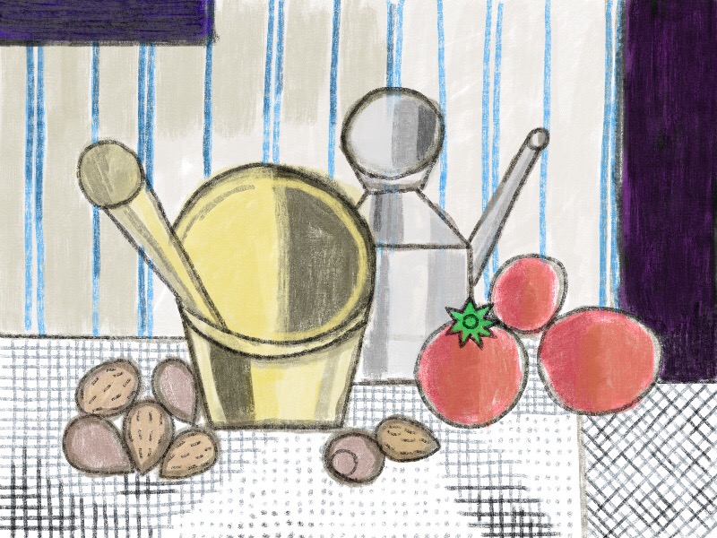
Deeper into the world of abstraction is Pablo Picasso. A cofounder of Cubism, Picasso would paint his subject from several points-of-view at once. Think of a cube. It has six sides but one can only see, at most, three at a time. Knowing that the other three sides exist, Picasso might have painted some of them. Picasso’s way of changing reality was to paint more than what is visible from a single point of view.
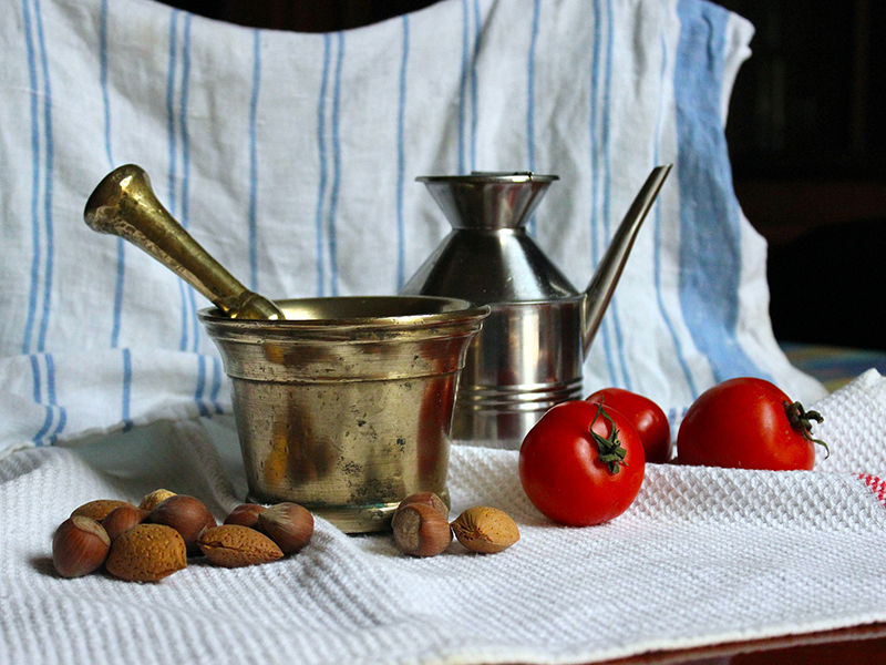
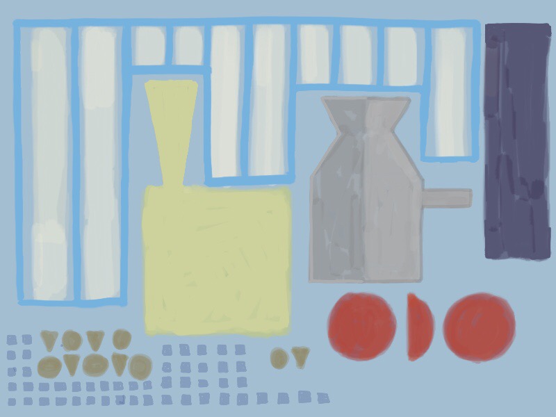
Look at the image below. It is a still life painted in the cubist style. The yellow vessel is round on top but flat on its bottom. The top of the vessel represents the view from above while the bottom is a view from the side, all at once. Also, the tomatoes are painted from points-of-view that eliminate the overlapping seen in the reference photograph. Less overlapping adds to the flat quality of the image. Compare the painting to the reference photograph.
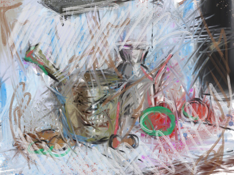
Still further left on the continuum we find Willem de Kooning and other abstract impressionists. These artists are more interested in the quality of their paint strokes than the depiction of their subject. These artists are really painting their emotional response to a subject.
Below is an example of an artwork that emulates de Kooning’s approach to abstraction. The reference photograph used for the cubist example was used again for the example below. Having already painted two abstractions of the same still-life, I was beginning to feel as certain disdain for the arrangement. Therefore, the emotion expressed in this artwork is, in fact, disdain. Can you see it?
Non-Objective Art
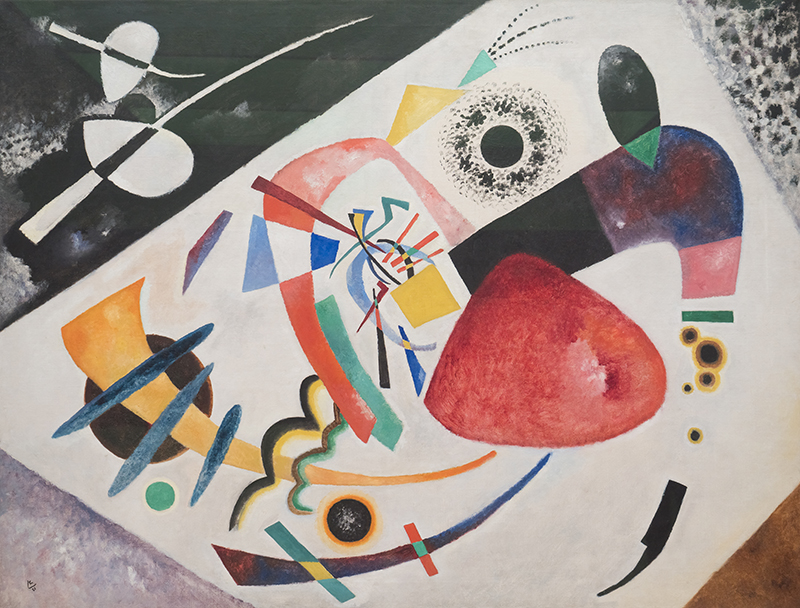
Non-objective art is defined as having no recognizable subject matter. The starting point takes nothing from visual reality. Instead of drawing people, trees, buildings or any other observable things, non-objective artists use the elements of art as their subject; lines, shapes, forms, values, colors and textures. See these elements are used by Kandinsky in the painting below.
Non-objective art can be difficult to classify. Without ancillary information, the next image may appear to be non-objective as well. It is based on the same reference photo used for the cubist example. However, this artwork is only highly abstract and not non-objective. Having been reduced to flat, disconnected shapes one cannot, with certainty, identify any of the objects depicted.
Conversely, a viewer may see an artwork that is non-objective but believe it to be abstract due to the imposition of their own creativity. All people are creative to varying degrees when compared with other animals.
Think about it. Have you ever seen a cloud that looked like something else? That’s creativity. The same thing happens with non-objective art, to the chagrin of non-objective artists. People believe they see things that are not intended by the artist. For this reason, non-objective art is challenging to discern from abstract art.
Is the following artwork abstract or non-objective? How can you be sure?
It is, in fact, meant as a non-objective artwork. Is it successful? Does it look like something you have seen before? If the image above is unique to the viewer, then it is a successful non-objective artwork.
In cases where we don’t know the intent of the artist, it may be impossible to tell the difference between an abstract work or a non-objective one. But this isn’t the point. We don’t have to know to enjoy and appreciate the work.
No matter where the artist started, the goal of the end result is the same – to create an aesthetically successful work of art.
Conclusion
And this is the goal of any work that we create – to create something that didn’t exist before that is beautiful, thought-provoking, or enriching in some way. It may be representational, abstract, or non-objective. But it’s all art, and it can all be appreciated.
This should give us freedom. Freedom to create what we want and freedom from the critics that live within our minds. What are you going to create today?
If so, join over 36,000 others that receive our newsletter with new drawing and painting lessons. Plus, check out three of our course videos and ebooks for free.