This first lesson describes the process of drawing a rose with pastels. A second lesson is included on this page on drawing a rose with colored pencils. You can skip to this lesson using the following link…
Let’s dive in…
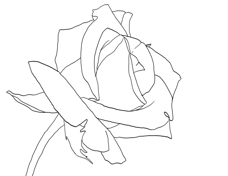
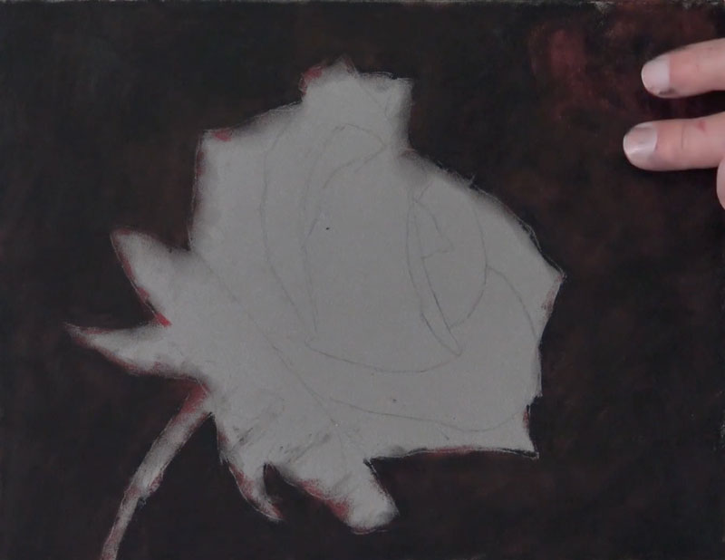
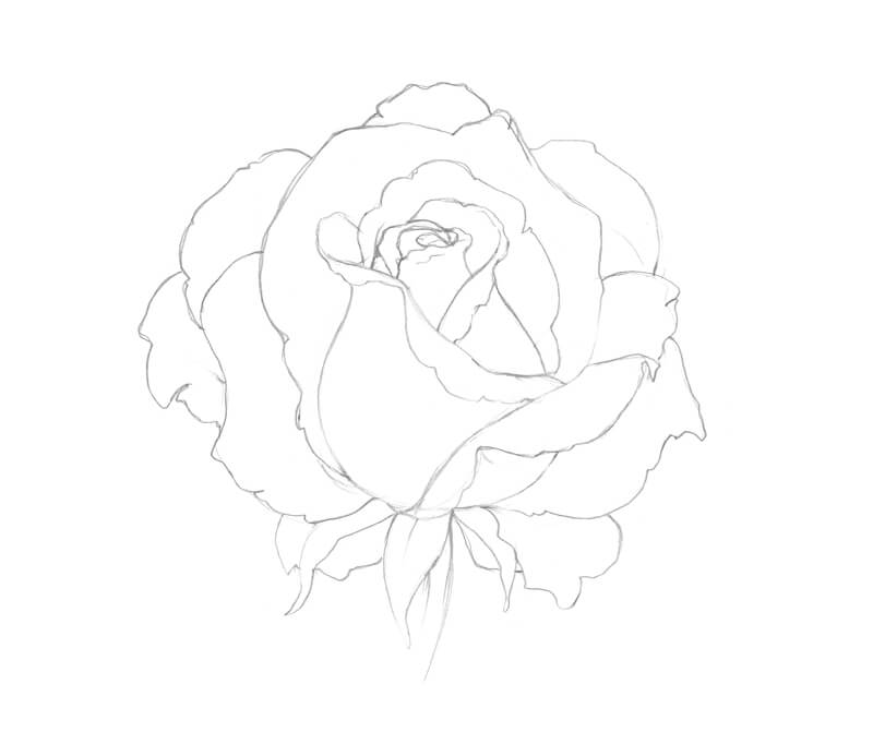
Rose Outline
For this demonstration, we begin with a simple contour line drawing of the rose. This line drawing can be drawn freehand or you may choose to transfer the outline of the rose directly to the drawing surface.
If you want to begin with the same contour line drawing that was used for this lesson, I’ve provided a template of the rose outline for you to use below.
If you want to learn how to draw a rose from imagination, you will need to practice drawing it from observation. So if this applies to use, it’s best to skip using the outline.
You may also draw directly from observation using this template if you prefer…
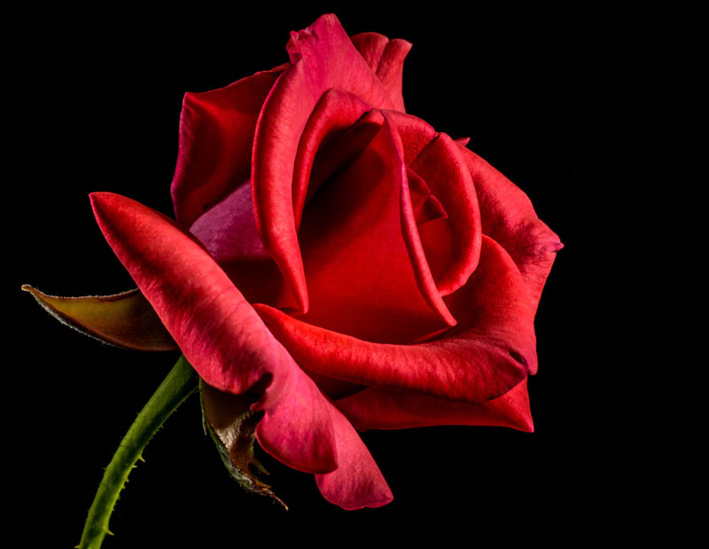
Rose Photo Reference
The photo reference we’re using for this lesson is from pixabay.com, a wonderful resource for royalty-free images submitted by users. I have manipulated the photo slightly by reversing the image and played around a bit with the contrast. Here’s the reference photo…
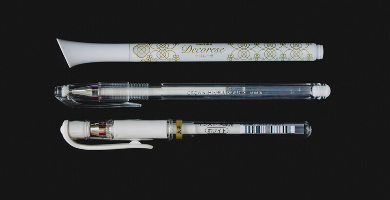
Suggested Materials
This lesson features the use of several forms of pastels as well as several different brands. You may, of course, use any medium that you wish. The concepts that we explore here are fairly universal and can be applied to any drawing medium that you wish. But, before dive into those concepts and take a look at the step by step approach, let’s discuss the materials used here.
PastelMat Paper
The surface we’re using is PastelMat paper (See my review of this paper). This paper is specifically branded and designed for pastel applications, but any drawing medium can be applied to it. The surface is relatively smooth compared to other pastel surfaces. This makes it suitable for subjects where smooth gradations of tone and value are a must. Even though the surface is fairly smooth, it still has enough grit to accept multiple, layered applications of pastel – which is important for any pastel drawing that you create. It is available in various tones.
The paper features one side suitable for mark-making and is supported on the backside with a waxy, thick backing. Each sheet includes its own cover sheet which also doubles nicely as a protective barrier while working on the art.
Rembrandt Pastels
Rembrandt pastels are artist-grade pastels that are used by professionals. They are quite rich in pigmentation and are available in just about any color you can imagine. The pigmentation does affect the behavior of the pastels. Some colors are more difficult to layer over, while others are covered with ease. This characteristic steers some artists away from this brand. However, after using several different brands of pastels over the years, these are still my favorite.
Conte a Paris Pastel Pencils
These artist-grade pastels are very pigment-rich. They are extra-soft, spreading strong color as they are applied. They easily cover applications underneath and are blended with ease. They are a bit pricey, and their life is relatively short (since they are so soft). The pencils are thicker than ordinary pencils, so a larger pencil sharpener may be used. They can also be sharpened with blade (which is how I prefer to sharpen them). They are so soft that they are easily broken during use. However, this trade-off is relatively minor since the quality of the mark is exceptional.
CarbOthello Pastel Pencils
While the softer Conte a Paris pastel pencils are great for coverage and some of the details, the CarbOthello chalk pastel pencils handle the details with more precision. These pencils provide excellent control, which can be difficult to achieve with pastels in general. They are harder than some of the pastel pencil options, but this characteristic is also what makes them great for precision. They are the size of a regular pencil, so sharpening them is a breeze with a regular pencil sharpener.
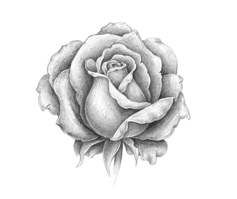
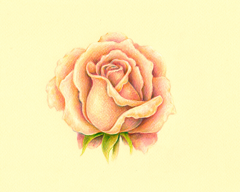
How to Draw a Rose Step by Step
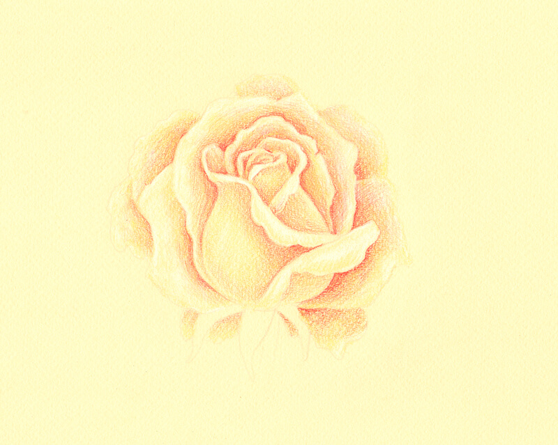
Now, we’ll look at the step by step process and how to draw a rose with pastels. As mentioned before, we begin with a simple contour line drawing (or graphite transfer). It’s important to avoid placing too much pressure on the tip of the graphite pencil when creating the line drawing. It’s easy to create indentations in the PastelMat paper which will be visible when applying the softer pastels.
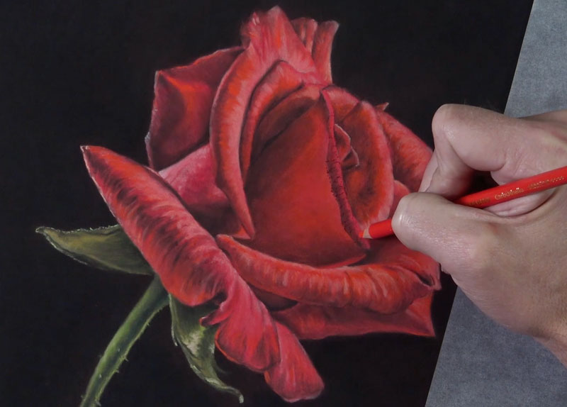
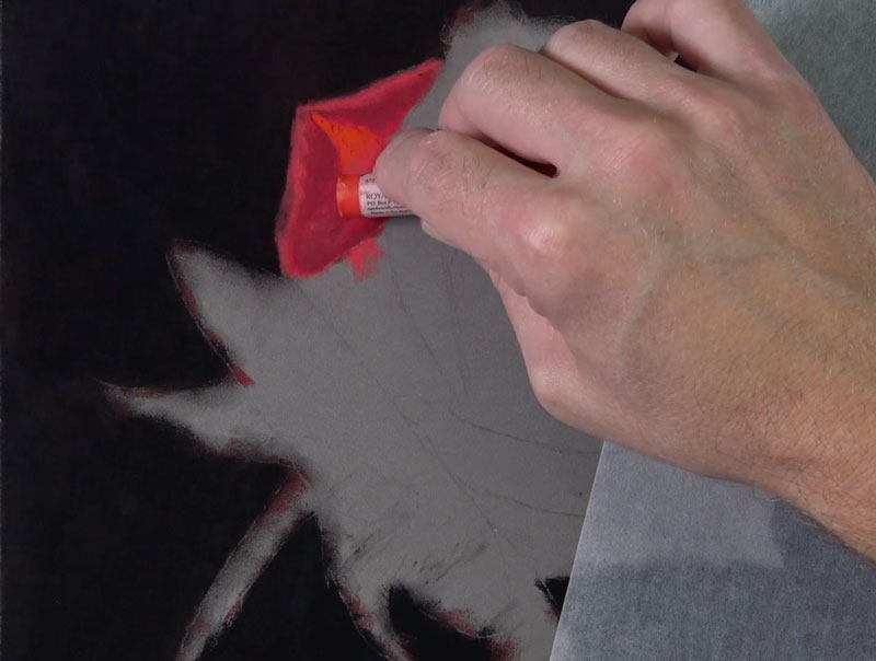
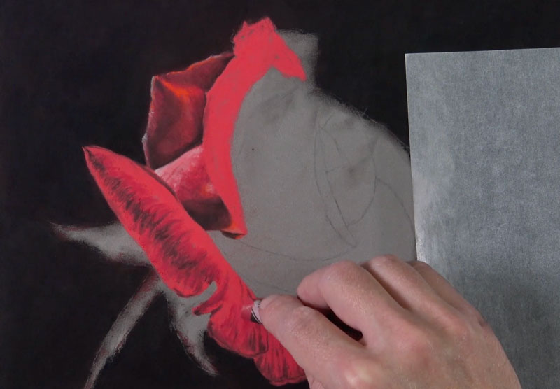
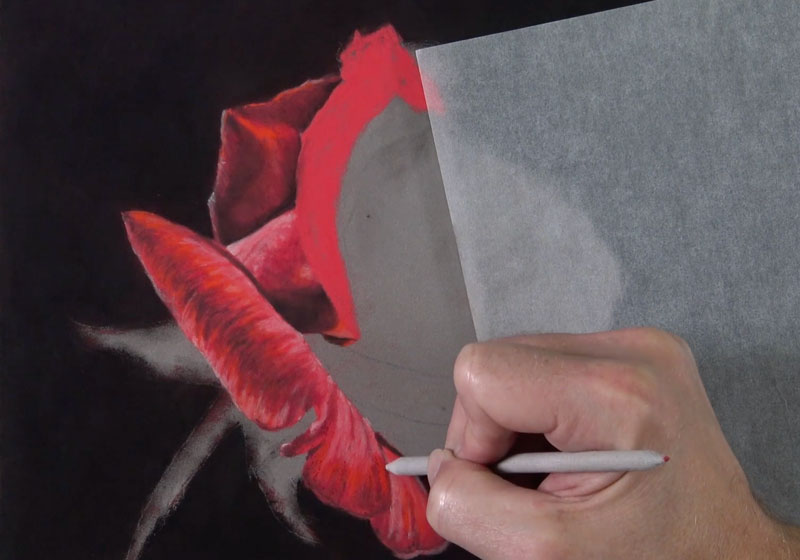
After the line drawing is in place, we’ll start addressing the background. Since we can cover pastel applications with additional pastels, it makes sense to work from the areas farthest away from the viewer to the foreground. We’ll begin with an application of black and cover the entire background space. Black on its own, however, is very strong and can make a color drawing or painting appear flat and unnatural. In this case, we want to create strong contrast between the rose and the background, but we still need the image to appear natural.
To preserve a strong contrasting background while keeping a natural appearance, we’ll apply a dark red over the black applications and blend them with a finger or blending cloth. After applying the dark red, an additional application of black is applied and blended. The result is a dark background that maintains a hint of color.
Drawing the Rose Petals
For this image, we’ll address each petal of the rose individually. You could address the rose as whole if you prefer, but since we’ll address each petal with the same set of colors we’ll still create a sense of unity approaching the subject in this manner.
Just as we considered the background as the area that is farthest from the viewer, we’ll approach the petals in the same way. We’ll begin with the petals that are the farthest away and work forward. The only caveat to this is the positioning of your hand. If possible, we want to avoid laying the palm of our hand over areas of the drawing that we have already addressed. This means that you may have to skip around in the drawing, and abandon the “front to back” approach for some the petals.

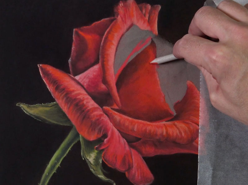
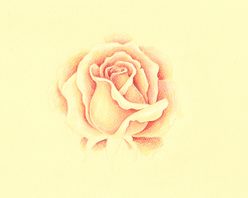
We’ll begin our first petal with a solid application of a base red. It’s a good idea to choose a base color that is close to a middle value. This allows us to “push” the values for each of the petals either darker or lighter to create the illusion of form and texture. By using the same base color throughout the drawing, we also ensure a bit of harmony.
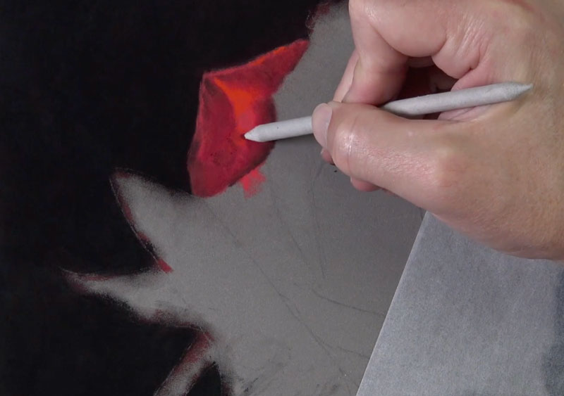
After the base color is in place, we can layer both warm and cool reds of slightly different values over the top.
We can add a bit of black with a pastel pencil to push the darker values and subtle shadows on our first petal. These applications are then blended with a blending stump. Be sure to blend the applications using directional stroking that matches the texture of the petal. The PastelMat paper provides a great surface for work with blending tools, providing a bit more precision.
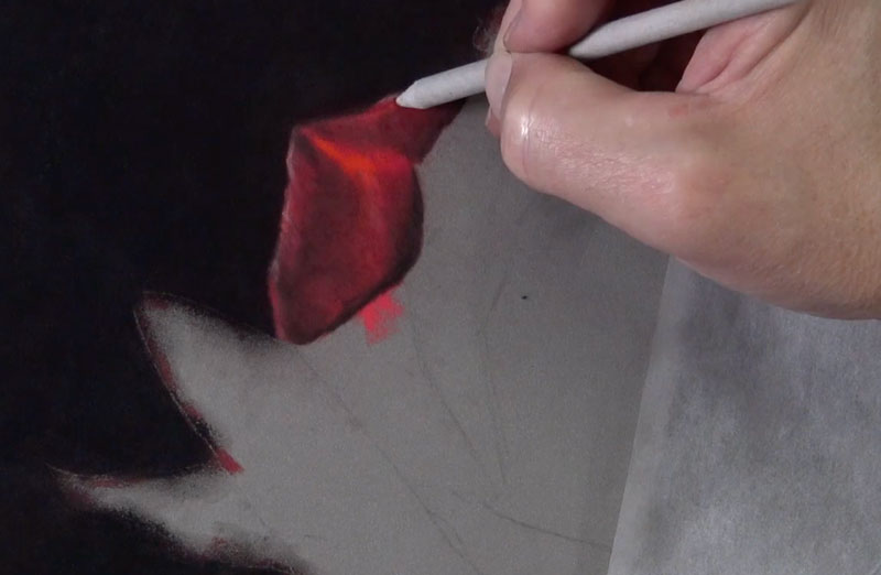
We’ll continue to gradually push the value range and increase the contrast with additional applications of black over the red underlayment. We’ll also add a few strong highlights with a pink and light peach pastel pencil, before blending again with the blending stump.
With our first petal in place, we have a set of colors and a repeatable technique that we can use on the remaining rose petals. By using the same colors and the same approach for each of the petals, we ensure consistency and create harmony in the drawing.
We’ll next continue to the next set of rose petals that overlap the first. Remember, we’re also considering the placement of our hand as well. Since I’m right-handed, I’ll stay primarily on the left side of the drawing as long as I can to prevent any unwanted smudging.
Again, this is the process that we’ve developed…
- Lay down the base red with a solid application.
- Apply cool and warm reds of various values.
- Adjust dark values by applying black.
- Add highlights with lighter red (pinks and red-oranges).
- Blend layered applications with a blending tool.
As we progress through these steps, we’ll also continue to consider the directional strokes that we make. These strokes, often referred to as “cross contour lines“, should flow over the form of the petal. This means that the directional strokes will change direction for each new petal and most circumstances, change direction within each petal.
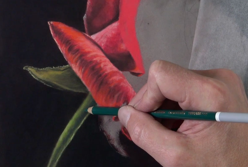
Drawing the Stem and Leaves
We’ll take a break from drawing the rose petals for a moment and address the stem and the leaves. Even though this section is different in color, we’ll still use the same technique for developing the form and texture.
We’ll start with a base application of yellow-green using a pastel pencil. I would suggest staying away from greens that are dominated by blue for the base application. (Blue-dominated greens can appear unnatural when used for leaves and stems, although we’ll still use a blue-green for portions of the core shadow on the stem.)
Once the base application of yellow-green is in place, we can develop the darker values with black and the lighter tones with a lighter, earthy yellow-green. Each layered application is blended with the blending stump.
On the stem, the same colors are used with the exception of a darker, blue-green which is added in the area of core shadow. Notice that since we have two light sources, the core shadow is found near the center of the stem. We see highlights, addressed with light yellow-green, on either side of the body of the stem.
Continuing with the Rose Petals
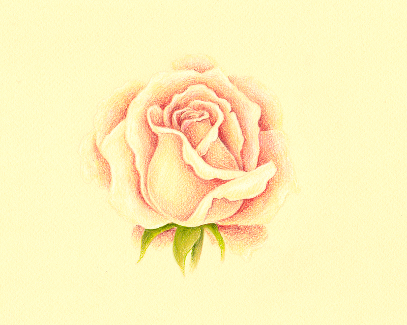
With the leaves and stem in place, we’ll go back to developing the rose petals. As we work closer to the dominant light source, on the right side of the picture plane, we’ll begin adding more of the warmer reds and less of the cooler ones. Most of the cooler reds exist mainly on the left side of the rose.
We’ll also use more of the lighter red-oranges (peach) to address the highlights.
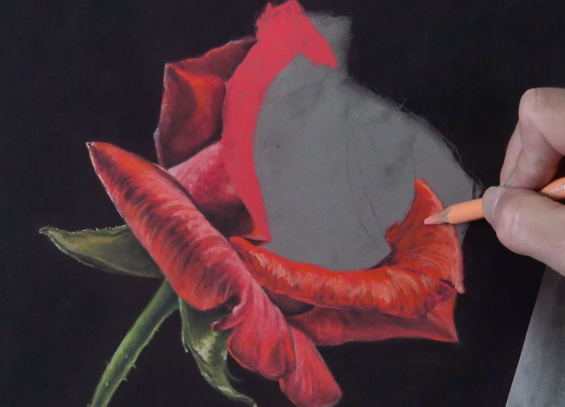
As we develop each petal, we’ll gradually work our way to the center. Take note of how the large, exposed side of the petal pictured below is rather smooth in surface texture. Instead of leaving defined strokes, as we have thus far, we’ll smooth these applications with the blending tool to reflect the texture observed.
At this point, only a few rose petals remain. But before addressing the very center of the rose, we’ll add the petals on the extreme right side of the flower. These petals are developed first, since the center of the rose overlaps them.
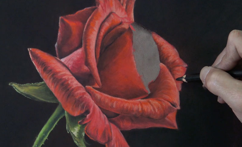
We’ve finally made it to the center of the rose. Now we’ll just draw in the last remaining petals. We’ll continue to follow the same approach – using the same technique with the same order of colors.
The drawing is almost complete. Just a few finishing touches remain. We’ll next address the small portion of the petal that overlaps near the center. This area is rather small, so after the base color is applied, only pastel pencils are used to develop the value.
Cleaning Up the Drawing
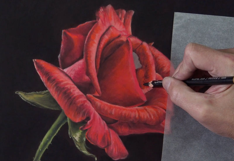
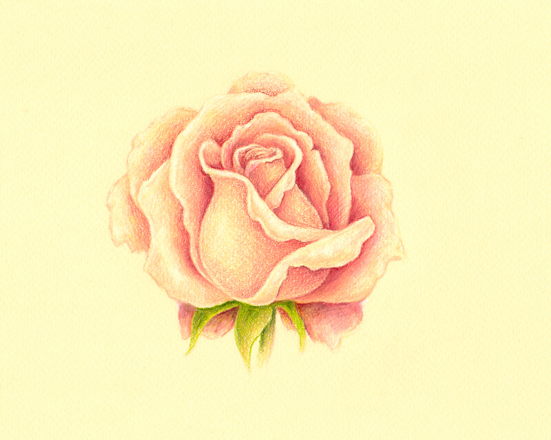
Like with any pastel drawing, some excess dust will inevitably find its way into areas that you did not intend. While we make efforts to clean things up as we go, we may find that we need to tidy up the drawing further when we’re complete. In this case, quite a bit of pastel dust has made its way into the darker background. In order to preserve the strong contrast, we can use a finger or a blending cloth to blend this excess dust away.
To refine the edges of the rose, a black pastel pencil is used where a finger would do more harm than good.
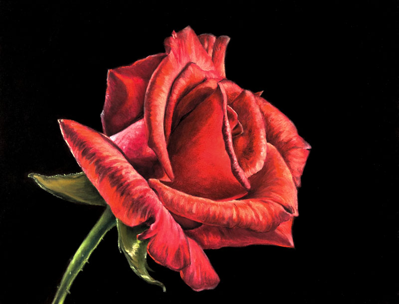
Now, our drawing of a rose with pastels and pastel pencils is complete.
Next we’ll take a look at a step by step break down of drawing a rose with colored pencils…
This lesson has been prepared by artist, Eugenia Hauss.
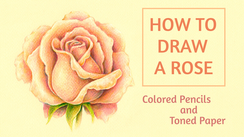
In this lesson, we’ll take a look at how to draw a rose with colored pencils.
We’ll explore the possibilities of toned paper. If you’re new to this theme, here’s a great article that will guide you through the advantages of drawing on toned paper…
Six Reasons to Draw On Toned Paper
For this drawing, I’ve chosen a sheet of pastel paper. It has a delicate yellowish tint and a subtle texture. The selected colored pencils will harmonize with the color of the paper.
The goal of my project is to create a beautiful drawing (or, if we put it more precisely, a sketch) of a rose. Such experiments can be a fun thing to do – and they don’t require much time to complete. Also, it’s possible to consider this project as preparation for a larger and more ambitious artwork on toned paper, if you like.
The Materials for Drawing a Rose on Toned Paper
My drawing is small. I’ll use about a half of a standard A4 paper size for it. The color of paper is called “Vanilla” and this name is quite appropriate for this light yellowish tint.
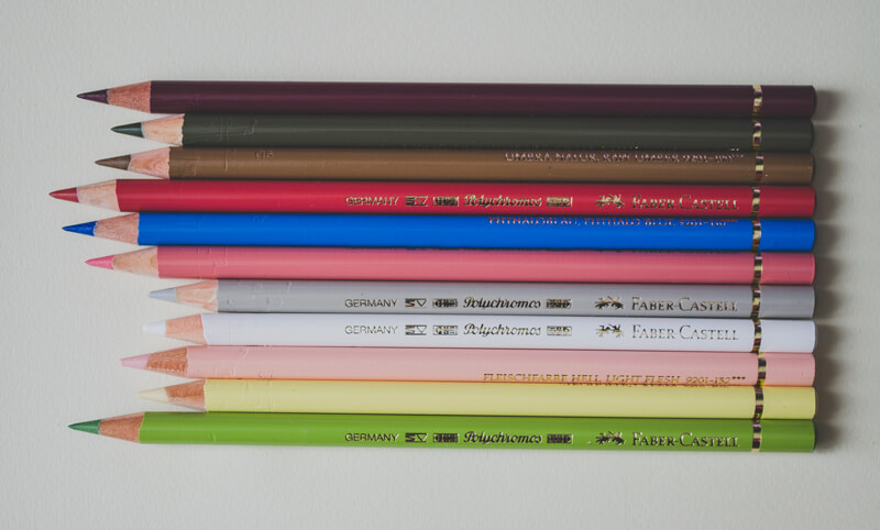
The colored pencils I’ll use are from the Faber-Castell Polychromos set (please feel free to use any pencils you like). I usually preselect a range of colored pencils that seem to be a nice fit to the idea in my mind. This limitation helps to unify the drawing.
The pencils for this project are:
- Red-Violet
- Olive Green Yellowish
- Raw Umber
- Pompeian Red
- Phthalo Blue
- Medium Flesh
- Warm Grey II
- White
- Light Flesh
- Cream
- May Green
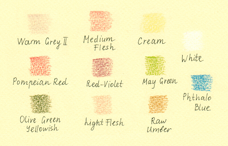
It’s useful to try out the selected pencils on a piece of paper that is the same or very similar to the one you’ve chosen for your project. Colored pencils create a semi-transparent covering, so the color of paper influences the result greatly.
Plus, keep in mind the texture of our paper. Since the paper is textured, it will play a role in the finished result.
Also, I recommend keeping a sharpener at hand. Sometimes having a sharp tip of the pencil is crucial, especially if you’re working on the fine details or outlining any contours.
For the graphite sketching part, which is the next step below, we’ll need a pencil – or a couple of them, for example, HB and 3B – and an eraser.
Drawing a Rose with Graphite Pencils
Completing this step isn’t required of course. Feel free to skip it if you prefer to start drawing with colored pencils right away. But keep in mind, it’s helpful to “study” your subject with a quick sketch before committing to colored pencil applications.
I’ve decided to create an improvised guideline that will help me in the creation process. I’m going to create the general design of petals and allocate values before picking up a colored pencil.
A rose may seem intimidating to draw – it has many bending petals that curve slightly and fold in different directions. However, this task is not that complex. Just remember that the petals are organized around the center of the flower.
It’s useful to study a live rose to grasp the subtle value transitions and structure of this subject. In the case with roses, studying nature may work more efficiently than trying to figure out the important nuances through a photo reference.
To simplify the task, you may decide to begin with a stylized outline. First, I mark the shape of the rose’s inner portion, which looks solid and resembles the top part of a wine glass. With this central element in place, we can arrange single petals around it.
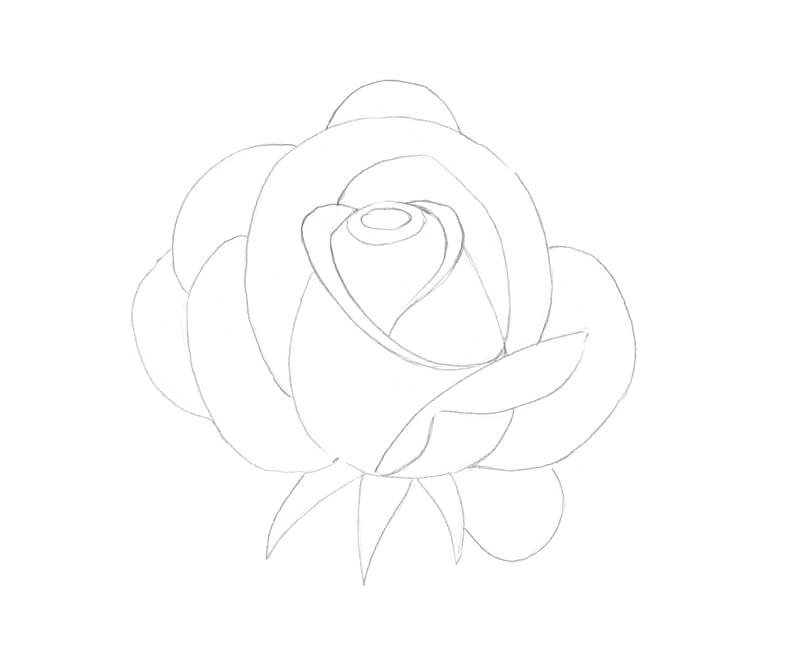
Now let’s refine the outline by changing the contours of the petals and erase any unnecessary lines.
Feel free to change the initial sketch or add new elements. As I made refinements to the sketch, the petals of my rose became more angular.
With an HB pencil, I start allocating the values. I use both hatching and soft pencils marks, which are made with circular motions of my hand. If lines repeat the contours of an object, it gives the drawing more volume. The circular strokes are especially great for conveying the beautiful, velvety texture of the petals.

I increase the contrast gradually, working with both HB and 3B pencils. The areas between petals, where the cast shadows are found, become noticeably darker.
The bending parts of the petals remain lighter in value. I leave the tips of the petals almost untouched.
Now, as the tonal sketch is complete, I feel confident in my vision of the future colored pencil work I’ll create. However, this part of the process is simply preparation.
Drawing a Rose with Colored Pencils
I transfer the main contours of the rose to the pastel paper sheet, using the window as a light board. The daylight is our friend!
The lines are very light, made with Warm Grey II. I avoid applying any graphite pencil marks to the pastel paper because it may smear and contaminate the subsequent colored pencil applications.
Also, I mark the darker areas of the flower, using Medium Flesh. I continue to refer to the graphite sketch to make decisions regarding the locations of the values.
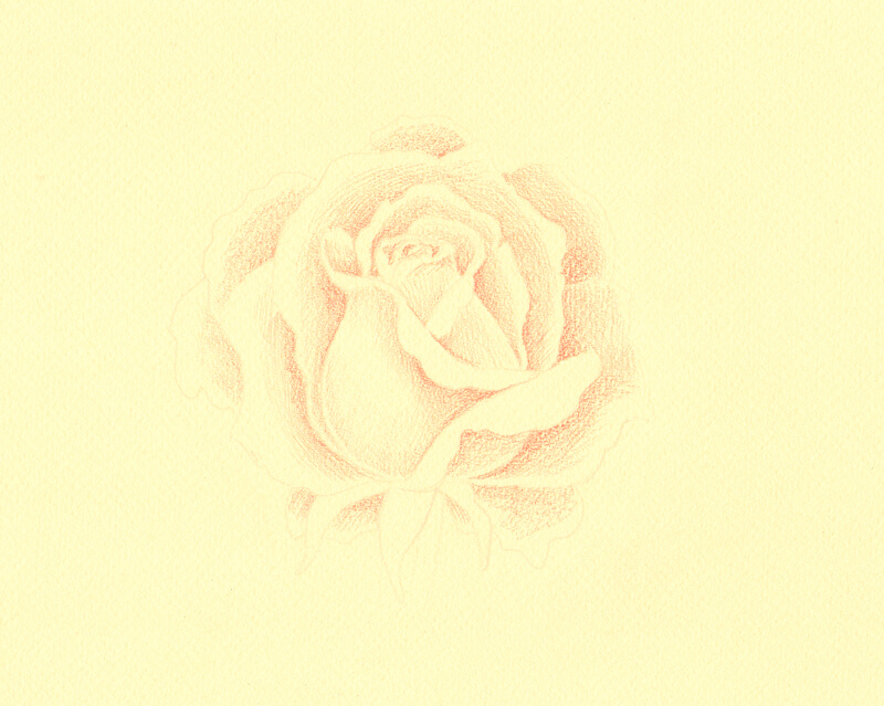
With Cream, I create a base of the light yellowish tint. It also softens the transition between the existing pencil applications and the color of the paper itself.
However, I leave some gaps of untouched paper here and there, especially on the tips of the petals.
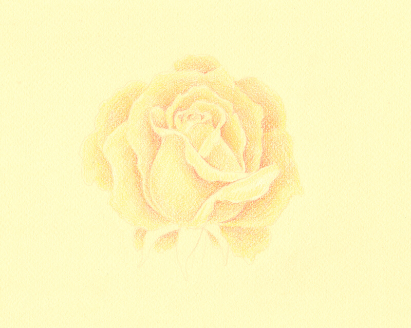
With White, I lighten the tips and the bent portions of the petals. I keep a medium pressure on the pencil, but avoid pushing too hard as it may damage the tooth of the paper.
Also, I increase the contrast just a little by applying Pompeian Red to the darker parts of the rose. These applications are soft and light, but add a touch of color.
I add some Red-Violet strokes, which is a darker color. I use only the tip of the pencil which is very sharp, only to the darkest areas of the drawing.
It’s time to work on the green sections of the rose. I develop them with May Green as a base color and use Olive Green Yellowish to accent shadows.
I carefully burnish the petals with Light Flesh, applying the light color on top of existing pencil marks with circular motions with medium pressure. I also add a bit of this color to the green elements to create visual harmony.
If any details are lost while burnishing, it’s possible to restore them with Red-Violet or Pompeian Red.
I evaluate my drawing. It looks nice, but I’d like to give some more warmth to the petals. So I add natural brownish touches with Raw Umber, keeping light pressure on the pencil.
My intent is to suggest a warmer hue in the areas that are close to the shadows. I also add this hue to the greens.
If any applications of Raw Umber become too strong for our delicate drawing, I dilute them with Medium Flesh. Or, if there is a need to lighten them a bit, burnishing with a light tint (for example, Light Flesh or Cream) does the trick.

To deepen the shadows, I carefully add just a bit of Phthalo Blue to the darkest areas of the drawing. This creates more contrast and makes the drawing vivid!
Summing it Up
I’m happy with the result of my rose drawing. I think it’s a beautiful colored pencil sketch and reminds me of vintage floral postcards. And, completing this piece took little time, thanks to the tint of the paper that provided us with the base color and saved us a lot of effort.
Conclusion
Now we’ve had a look at how to draw a rose with pastels and colored pencils. The process is similar with any medium that you choose to use. Just remember to avoid getting overwhelmed with all of the folds and details. Take the process slowly and you’re likely to be successful.
If so, join over 36,000 others that receive our newsletter with new drawing and painting lessons. Plus, check out three of our course videos and ebooks for free.
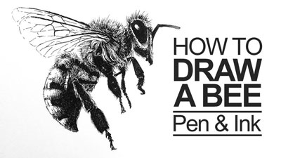
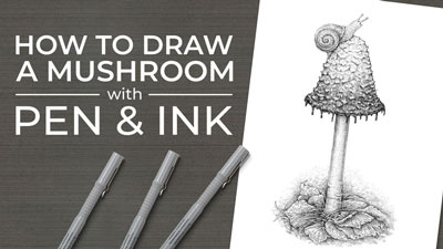
How to Draw a Mushroom – Pen and Ink
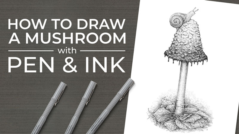
Today, we’ll create a nature-inspired drawing. Our tools will be an ordinary graphite pencil and three ink liners. This set of supplies is a great choice for capturing the general shapes and textural details of the objects we’re depicting.
If you’re going to follow along, please feel free to draw any mushroom you like. It may have an completely different shape or texture from my example. You can draw from a reference photo or find a real, tangible mushroom (or even imagine one that probably doesn’t exist). The point of this tutorial is to apply the basic principles, sharpen our artistic skills, and have fun.
So let’s skip the long introductions and dive right into the process!
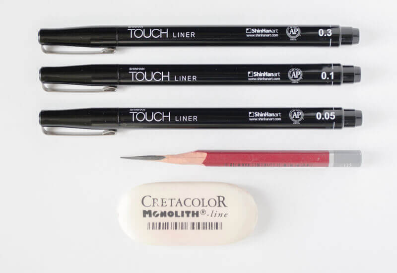
Art Supplies For Our Mushroom Drawing
As I said, you don’t need anything fancy for this project; just a graphite pencil, an eraser, and some ink liners from a very thin (0.05) to a rather thick (0.3) line width.
Also, you can choose a nib pen instead of ink liners.
I recommend using a heavier paper – just in case you decide later on that your drawing will be even better with a subtle inclusion of watercolor or some other media.
Create a Pencil Sketch of the Shape of The Mushroom
If your goal is to create a spontaneous, quick ink drawing, feel free to skip this part. However, having a graphite sketch allows thinking the artwork through beforehand and may provide you with a little confidence.
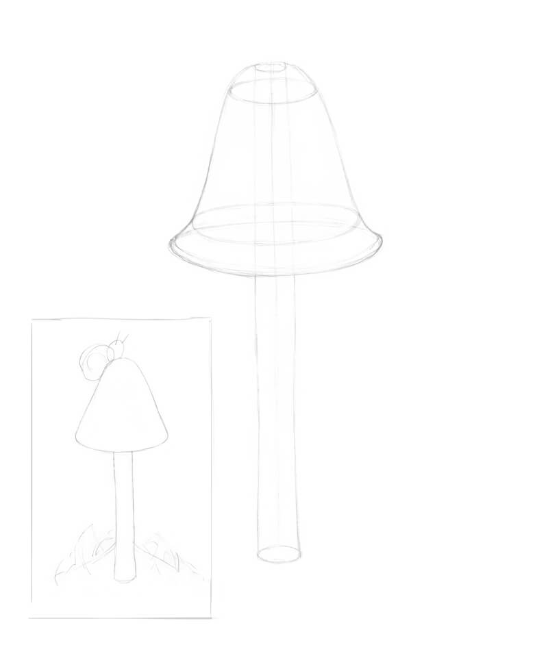
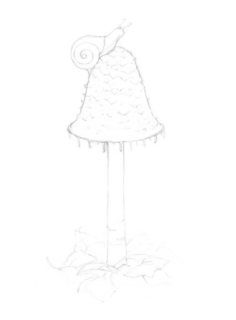
I start with a miniature sketch. The goal is to lay down the proportions and the silhouettes of the shape.
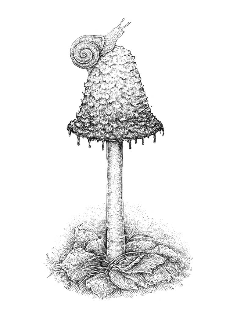
I decided to draw a mushroom with a triangular, elongated cap and a long stem. I’ll also place a small snail on top of the cap, just to make the drawing more interesting and add a bit of narrative.
I begin directly on the final paper, drafting the general shape of the mushroom.
I imagine that I can see through the object, like it’s transparent. A subsidiary core line and ovals help me to visualize that my model is three-dimensional.
Don’t strive for perfection here – a mushroom is an organic object, so it can’t be absolutely even or symmetrical.
In the image below, you’ll find our mushroom sketch alongside the miniature.
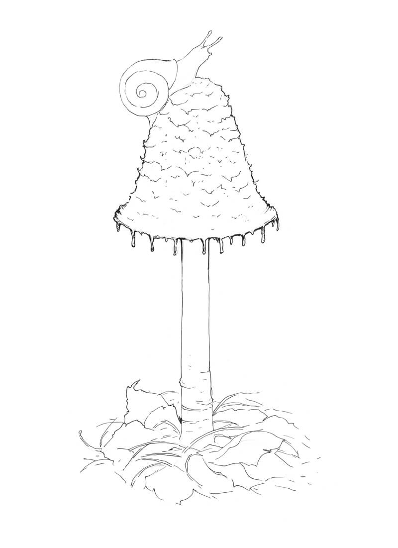
I refine the sketch, adding some details of the cap’s texture and outlining the spiral of the snail’s shell. Snails have two longer tentacles (those with the eyes at the tips) and two shorter ones. The latter usually point to the ground. They are used for olfactory orientation and help the snail in searching for food.
To fill the bottom part of the drawing, I add some fallen leaves, grass blades, and coniferous needles. For now, we’ll leave out some of the details in this area.
I’m happy with this pencil sketch – it has all the necessary elements, so we can proceed to the next part.
Let’s Add Ink To The Mushroom
I use both 0.1 and 0.3 ink liners to outline the contours. A thinner line is better for the lighter objects (or the lighter parts of the objects). I’m going to create a tonal gradient at the mushroom’s cap, so its bottom part needs a thicker contour.
I try to find a visual rhythm in the lower part of the drawing, where we have all the leaves and grass. The elements should look like a uniform system and redirect the viewer’s attention to the mushroom.
With the 0.05 liner, I work on the lighter areas of the drawing, such as the cap’s top and the body of the snail. Groups of short hatches and dots are a great way to create a basic texture and give a hint at core shadows.
In the bottom part of the drawing, I use mostly relaxed hatches to plan the darker values.
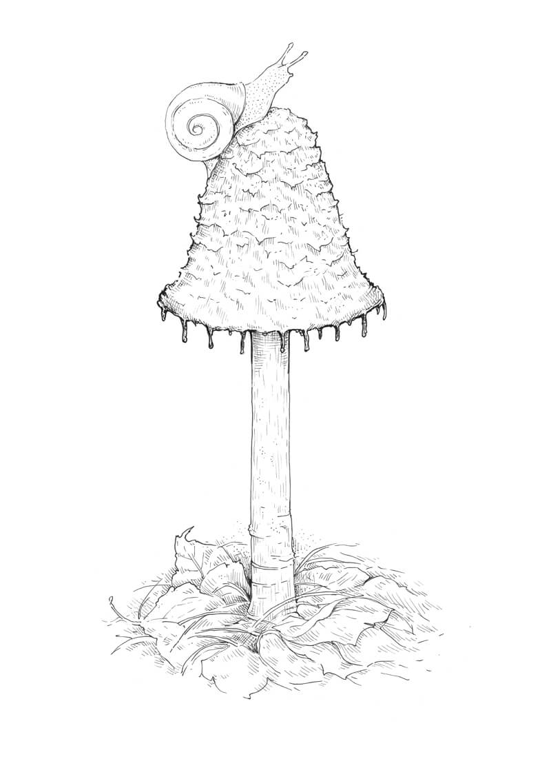
With the 0.3 ink liner, I darken the lower part of the cap, accenting the lower portion. I use cross hatching and stippling to describe the value and the texture. Combining these techniques allows me to achieve the sense of texture and volume at the same time. The cap has some prominent, relief parts – they should remain light for now.
We need a smooth, soft transition from nearly white at the cap’s top to almost black in the bottom portion. The sides of the cap become slightly darker to create the illusion that this element is three-dimensional.
I also increase the contrast in the lower part of the drawing.
In the image below, you’ll find a close-up fragment of the mushroom’s cap.
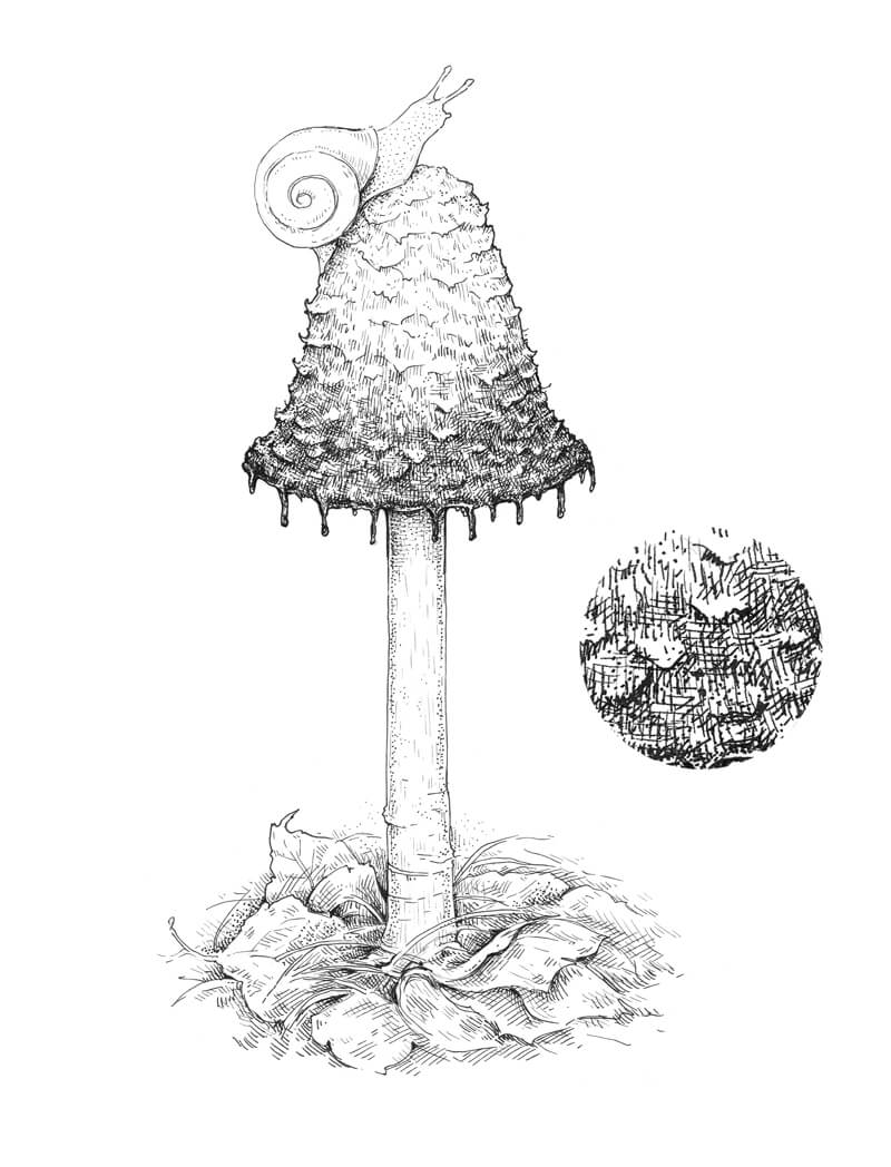
With the 0.05 ink liner, I add the details. The short hatches create the texture of the snail’s body and the long contour lines accent the volume of its shell.
I also add some hatching to the mushroom’s cap to soften the transition from lighter to darker values.
The stem has a smooth texture, so I apply very fine contour hatching and stippling to reflect this texture.
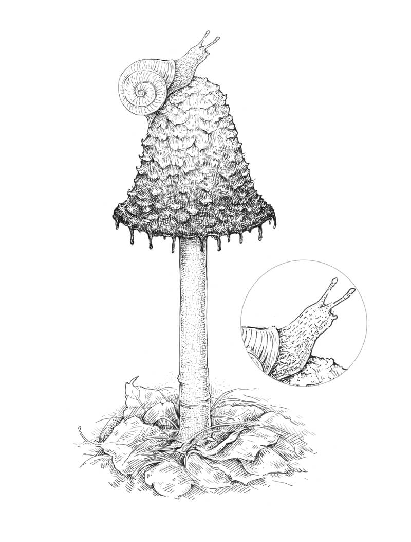
With the 0.05 liner again, I darken the shell with the long, curved hatches.
I’m going to make the shell rather dark to balance the lightness at the top of the mushroom. Don’t forget about the cast shadow under the snail. The cast shadow here should be darker than the snail’s core shadows!
I also accent the sides of the stem and darken the cast shadow that is created by the massive cap. The leaves underneath require some additional hatching, too – we need to balance the light stem and the leafy foundation.
The drawing looks quite believable at this step, but to add to its realism, I add some thin veins of the leaves. Small spots on the leaves’ surface reflect the Fall season and help to convey the mood.
As a finishing touch, I add some dots to the background in the lower part of the drawing, so the natural elements blend into it.
Conclusion
Congratulations – we’ve made it to the end! I hope that this creative journey was fascinating.
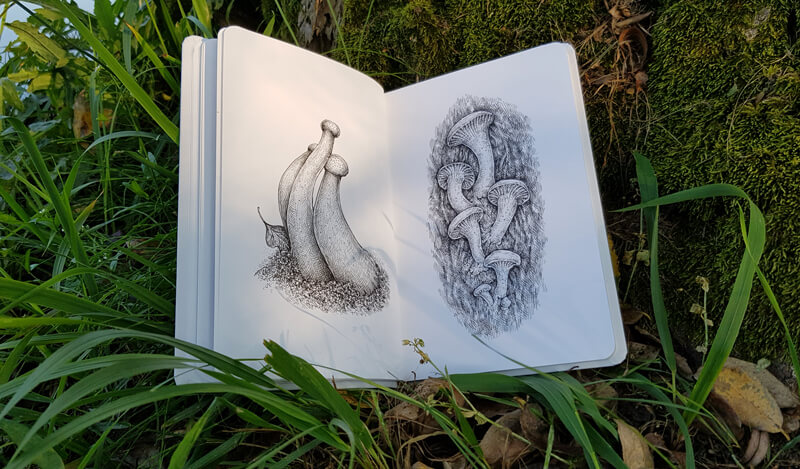
The world of mushrooms is an endless opportunity to be inspired. Just think of those dozens or even hundreds of possible shapes, textures, and colors.
I became so excited about this theme that mushrooms of all kinds started filling the pages of my sketchbook. Here is an example:
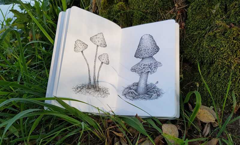
Luckily, mushrooms perfectly fit the size and orientation of many sketchbooks. One mushroom sketch a day for a week, two weeks, or a month is a nice artistic challenge, isn’t it?
If so, join over 36,000 others that receive our newsletter with new drawing and painting lessons. Plus, check out three of our course videos and ebooks for free.

Composition in Art
Thankfully, composition is one of those things that we can get right with a little planning and knowledge. It doesn’t require “talent” and it definitely isn’t about “guesswork”. There are a few “rules” we can consider when we plan our works so that we can be successful every time.
What is Composition in Art?
There’s obviously more to creating a successful work of art outside of mark-making and medium mastery. Our composition plays an important role in how our works are viewed and experienced by our audience.
But before we define composition in terms of art, let’s look at a related subject.
If you’re a musician, then you know that musical works can also be referred to as “compositions”. There is a structure to a song. Each musician plays “their part”. If a musician plays at the wrong time or plays the wrong notes, then the song becomes a mess. Each part is carefully crafted so that the song is the best that it can be. In some songs, the guitar may have more parts and dominate the song. In others, it may be the piano.
We can compare this musical analogy to art-making. Just like a song, each work of art that we create has a structure (or should have a structure). As artists, we plan this structure and execute it as we create the art.
If we don’t carefully plan the elements that we include, our art can become a real mess.
So when it comes to art, composition is the arrangement of elements within the pictorial space (or three-dimensional space with a sculpture). The positioning and arrangement of elements within a work affect how a viewer interacts with what we create.
Just like with a song, the possibilities are endless. We have total creative freedom regarding how we arrange the elements within our works. But even though the possibilities are endless, it doesn’t mean that we can approach composition with a haphazard approach without planning. We must craft our compositions, just as a skilled composer would.
In some works, a specific element may dominate. In others, a different element may dominate. However, we should always make sure that we don’t have too many elements competing for attention. In a song, we wouldn’t expect to have a guitar solo, a piano solo, and a drum solo all taking place at the same time. In a work of art, we also wouldn’t expect to have all of the elements we include competing for attention.
Instead, we should focus the attention of our viewer on one or two elements within the scene. These elements become the focal point(s). All of the other elements within the work then become the supporting cast members.
Creating Focal Points
A focal point is the area or areas within a scene that command the visual attention of the viewer. In most cases, focal points include the main subject. Every work of art should have at least one focal point.
Focal points should be limited. In many cases, only one focal point is required. You can have more than one focal point, but any number beyond three will be difficult to pull off. If your work has more than one focal point, then there should be one that dominates the others. In other words, there should be one main focal point and perhaps a supporting or secondary focal point.
Focal points can be created in a work using a variety of techniques. These techniques include…
- Contrast
- Isolation
- Placement
- Convergence
- The Unusal
Although we’ll briefly cover each of these techniques here, we cover them in more depth in these lessons…
Now, let’s briefly look at each technique for creating a focal point.
Contrast
Contrast deals with difference. This could be difference in value, color, texture, size, etc. When we include an area of strong contrast, it pulls the viewer’s eye to that location in the work and creates a focal point.
Isolation
If you ever got in trouble as a kid and the teacher put you in the corner, then you know what isolation is all about. When you’re sent to the corner, every other kid in the classroom stares at you. What a terrible punishment!
When we isolate a subject or an element in a drawing or painting, then this element naturally commands attention and becomes a focal point.
Placement
We are visually pulled to the center of shapes. If we think of the picture plane of our work as a shape such as rectangle, then we can expect our viewer to be pulled to the center. If we place a subject close to or exactly in the center of our picture plane, then this subject becomes a focal point.
Although this technique works to create a strong focal point, it’s usually not the best technique to create a visually stimulating composition. When we place subjects in the center of the work, the result is typically static and boring. It’s better to place the subject slightly off center, or better yet – on one of the thirds. More on that in a moment.
Convergence
Convergence refers to the act of guiding a viewer’s eye within a work using visual cues. These may be lines, shapes, contrasting colors, etc. Each element that we include may guide a viewer’s gaze to the focal point. Sometimes, we are drawn to an area within a work simply because the artist has manipulated elements to force our attention to a specific area. We can do this too!
The Unusual
Anything out of the ordinary commands our attention. In the same way, anything that we include in our work that isn’t expected or is drastically different from the other elements within the scene will become a focal point.
Creating a defined focal point is important in creating a strong composition, but there’s more to it than that. We also should consider a few of the principles of design.
The Principles of Design in Artistic Composition
The principles of design deal with the arrangement of the elements of art in work. The elements of art are the basic components or building blocks of art creation.
You can learn more about both the elements of art and principles of design here…
The eight principles of design are…
- Balance
- Proportion
- Movement
- Rhythm
- Harmony
- Unity
- Emphasis
- Variety
(Some art specialists also include contrast as a principle. But since contrast can create emphasis, most people leave it off of the list of eight.)
Not all of the principles of design directly affect our compositions, but most of them do. Here’s a closer look at the ones that do…
Balance
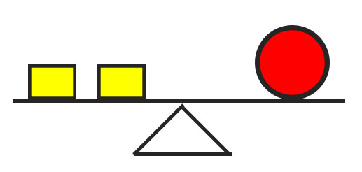
In terms of art, balance refers to the overall distribution of visual weight in a composition. Each object that we include in a work carries with it a visual weight. When we add an element to one side of our composition, we’ll like need to add another or several elements to balance the visual weight on the other side.
Visual balance can be achieved by adding elements or by using negative space. (More on negative and positive space in a moment.)
We can compare balance to a teeter totter or a seesaw. Imagine we have one large object (or person) on one side of the seesaw. The seesaw won’t be balanced.
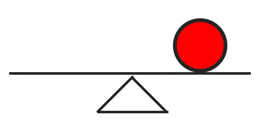
But, if we add a couple of medium sized objects (or people) to the other side of the seesaw, we achieve an equilibrium. The seesaw is now balanced.
If a work is not balanced visually, it may feel “heavy”. For example, if we include too much visual weight at the bottom of a composition, the weight will pull a viewer’s eye to the bottom. The composition will feel unsettling.
But if we counter-act this weight with an element or two at the top of the composition, then it becomes more balanced.
We should also be aware of how our composition is cropped as this can also influence balance.
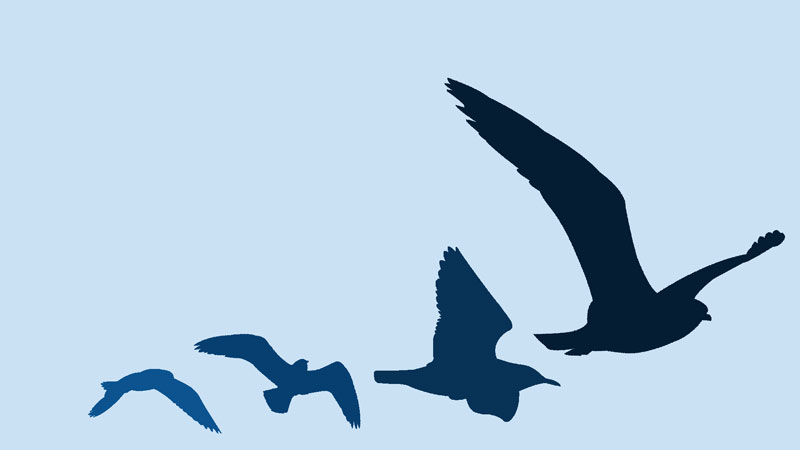
Many times, we’ll have elements that extend beyond the confines of the picture plane. If the edges of these elements are positioned in a way so they are close to the edges of the picture plane, this will create added visual weight and perhaps unwanted attention.
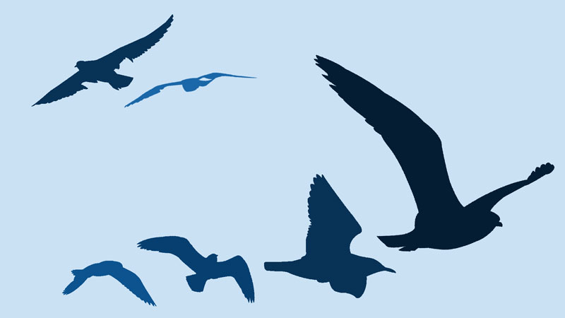
Take a look at the images below. In the image on the left, notice how the bird is positioned too close to the edge of the picture plane. The edge of the branch at the top is also too close to the left side of the picture plane.
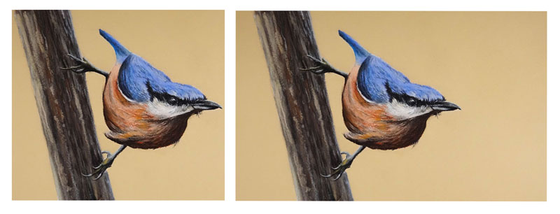
In the second image, there is enough space provided on both sides of the picture plane to provide a bit of balance resulting in a better composition.
If we position the subjects in our works so that their edges either end a bit further from the edges of the picture plane or extend well beyond the confines of the picture plane, then this visual weight is minimized.
We should also consider each one of the edges of the picture plane. If we have elements that extend off the picture plane on two sides, we may create too much visual weight on those two sides. But, if we allow the subjects to extend off the picture plane on all four sides, we may create a more balanced composition.
Movement
Movement can refer to the illusion of actual movement in a drawing or painting; or it can refer to the movement that a viewer’s eye takes when experiencing your art. In terms of composition, we are most concerned with the latter.
When a viewer interacts with your art, their eyes move from one element to the next. Usually the most commanding element demands immediate attention. After that, the viewer may move on to other supporting elements within the scene.
As artists, we can control this “eye movement” based on how we plan our composition. We can guide the viewer to the most important elements and many times, control how most people will “ingest” our creation. In most cases, we want the viewer’s eye to flow through the work in a certain oder.
Depending on the subject, the order may look something like this…
- The viewer is drawn into the work.
- The viewer is guided to the focal point(s).
- The viewer is guided to supporting elements.
- The viewer is guided out of the work or back to the focal point.
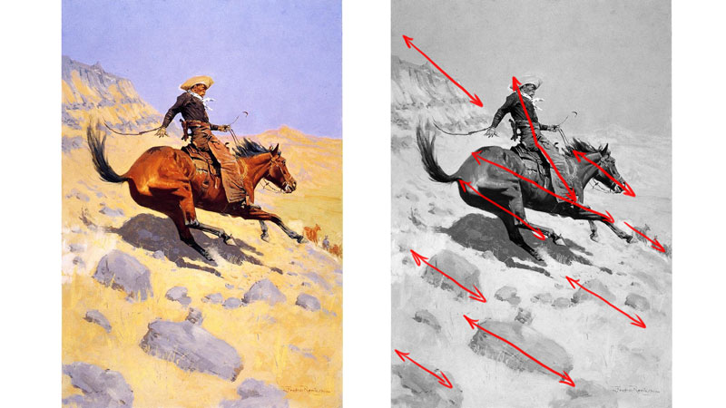
This visual movement is usually achieved by creating contrast, guiding lines, diagonals, and overlapping elements.
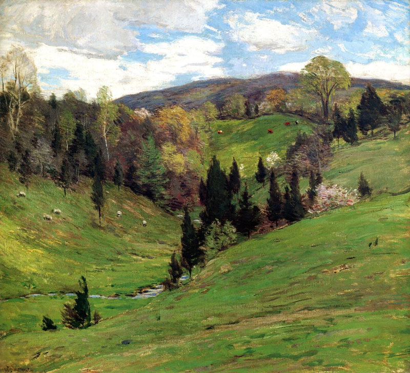
Take a look at the work below. When you examine it, take note of how your eyes move through the work.
Perhaps your eye followed a similar route as mine. I entered the work at the bottom of the valley, near the stream. I was guided by the line of darker trees to the center of the pictorial space, then back into the forest. I then followed the line of trees, just in front of the distant mountains. From there, I was guided back to the center.
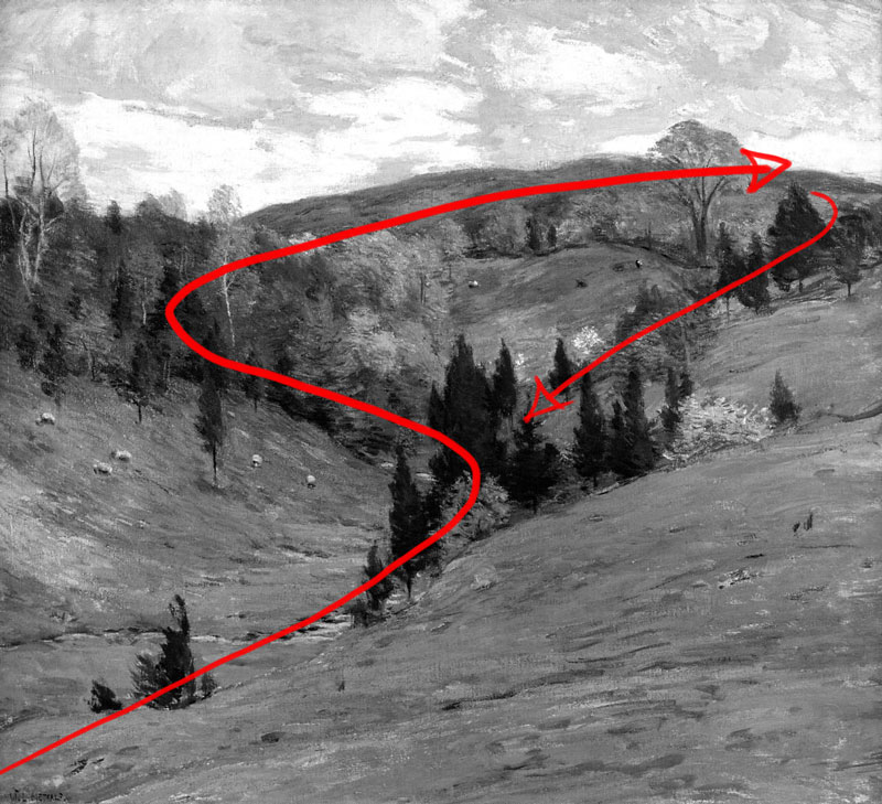
The positioning of these elements allowed me to see all of the important parts within the work, while appreciating each section of the painting on its own.
We can use the same techniques to have a bit of control on how a viewer interacts with our art. Although we can’t fully control how people will view our art, we can have some influence over their visual experience.
Rhythm
We understand rhythm through repetition. For example, we can hear the beat of a song and its rhythm because it repeats – many times in predictable way. Without repetition, there is no rhythm.
In art, the same is true. We must have repetition in order have rhythm. Visually, rhythm is created by repeating elements. This could be a regular or irregular pattern of repeating shapes or it could be a repetition of a specific subject. Either way, repeating elements produce a rhythm.
Take a look at the painting below. Notice how it has a sense of rhythm.
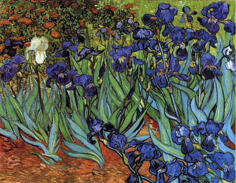
This rhythm is created through repetition. We can see here how the shapes created for the blades of the flowers are repeated…
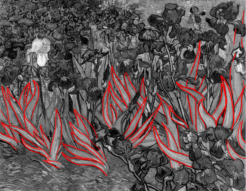
And also the shapes for the smaller flowers in the upper left corner…
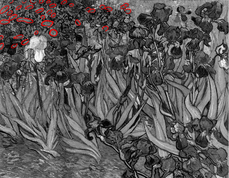
The shapes created for the irises are no different. They also repeat…
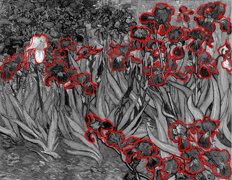
A repeating element within a work is often referred to as a “motif”. Including a motif in your work can often lead to a sense of harmony and unity.
Let’s go back to the music analogy. Most popular songs feature a consistent rhythm throughout the song. The dynamics of the song may change, but the time signature rarely does. And even though the notes may change drastically, the consistent rhythm unifies the song from start to finish.
Our artworks should have this consistency, which leads us to the next principles – harmony and unity.
Harmony and Unity
Our art compositions should also be harmonious and unified. Harmony and unity are so closely related that it’s easy to assume that they’re the same thing. They are very similar, but each should be considered separately in our compositions.
Unity deals with a feeling of “oneness”. This is usually accomplished in a work of art by using the medium in a consistent manner and to a level of completion. We can also think of unity in terms of artistic style. If the style and use of media are consistently used in a work and the work feels complete and finished, we usually can say that the work is unified.
Unity can also be created in a work through simplification. This can be achieved by simplifying shapes, subjects, or color schemes.
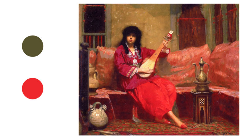
The work below is unified and harmonious for a number of reasons. The most obvious way it’s unified is through its use of color.
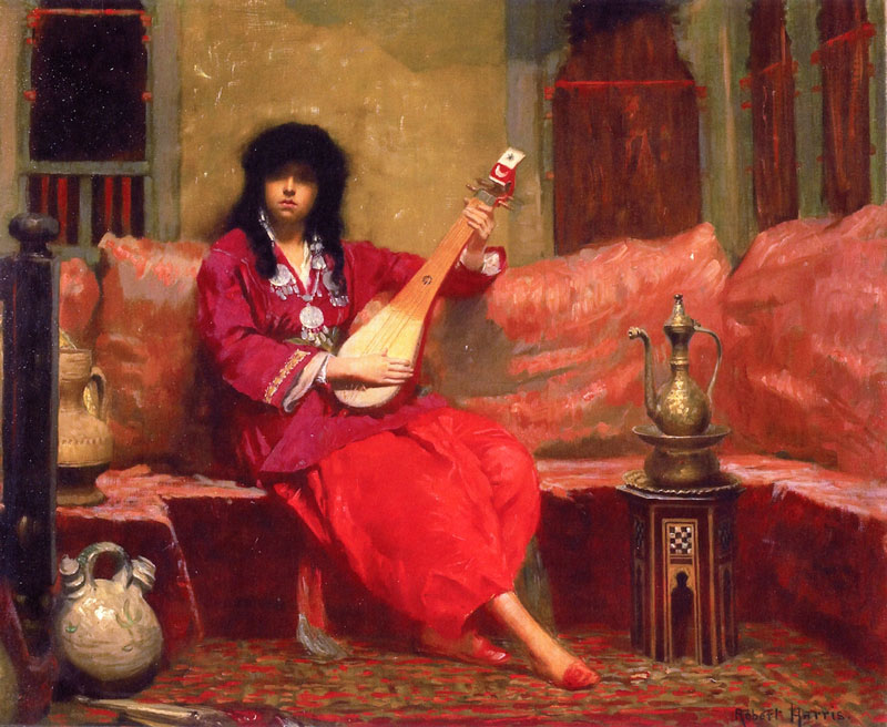
Harris has simplified the color scheme and used mostly the complementary colors of red and green. The green is very earthy, but still present.
Harmony helps to create unity in a work. While unity deals with the work of art as a whole, harmony deals more so with the individual parts of the work. If the individual parts of the piece all work together, then the art could be considered harmonious.
Another way to think of this is to consider a family. A family is made up of different members. Let’s look at a family in a traditional sense for this analogy. A family may have a father, a mother, a son, and a daughter. Each family member is different and is their own unique person – but the family is still a unit. Some families get along well with one another, while others don’t.
We can create harmony and unity in our compositions by…
- Using the medium in a consistent manner throughout the work.
- Simplifying shapes, subjects, or color schemes.
- Using a consistent style throughout the work.
- Making sure the work appears finished.
- Ensuring that each individual part of the piece works (and makes sense) with the other parts.
Emphasis
We often use emphasis to define the focal point or points within a composition. We’ve already discussed several ways an artist can create a focal point within a work. Each one of these methods relies on emphasis for its success. Emphasis is usually created in a work through some form of contrast.
Take a look at the work below. What do you think is emphasized?
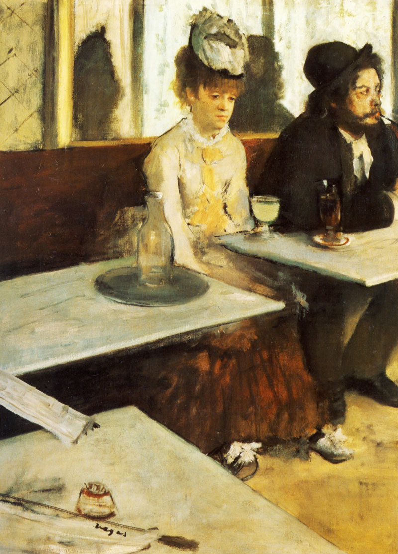
Most of us are drawn to the woman in the scene, more specifically – to her face. Degas has pulled our attention to her using several methods. For starters, she’s centrally located within the picture plane. There’s also strong value contrast around her. Notice how the man next to her is dressed in black, while she wears white. There’s even a dark cast shadow on the wall right next to her light face.
Then there’s the lines of convergence created by the tables and the back edge of the bench.
You’ll also notice that the face of the woman has more details compared to the other elements within the scene. This also helps to pull the viewer’s eye.
All of these characteristics help to influence how we interact with the subject.
Variety
Like emphasis, variety also deals with difference. Our drawings and paintings should include some variety.
Consider your favorite food for a moment. Now consider what life would be like if you had to eat your favorite food for every meal for the rest of your life. For breakfast, lunch, and dinner – you have your favorite food and nothing else. It may be great the first day – but after that, you’d grow very tired of your favorite food.
We can think of our artworks in the same way. We don’t want to bore our viewer’s with the same visual information. Instead, we should include some variety to keep them engaged and make our artworks more interesting.
The trick here is balancing both harmony and variety. If we take variety too far, the work will likely not be harmonious. If we take harmony too far, the work may be lacking variety.
Take a look at the image below. Notice how much variety is present…
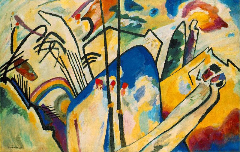
Kandinsky has created variety by using a broad range of color, but kept the painting unified through simplification.
Positive and Negative Space
Space is one of the seven elements of art. When we think of space, we often consider it in terms of depth or the illusion of depth in a drawing or painting. However, when it comes to composition, we can think of space in terms of the actual pictorial space on the drawing or painting surface.
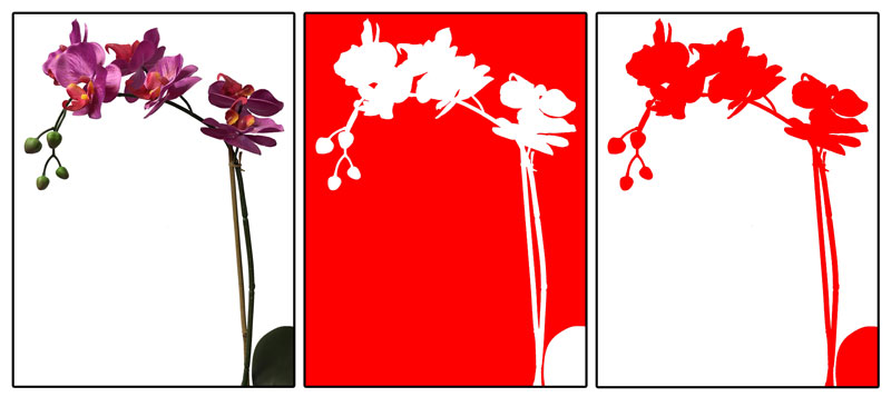
The space that is taken up by important subjects or design elements is considered positive space. The areas that surround these locations are considered negative space. Often, it is the negative space that provides an area of “rest” for the viewer.
Take a look at the images below. We first see the original image on the left. In the middle image, the negative space is highlighted with red. In the third, we see the positive space highlighted with red.
Positive and negative space work together to create the composition. A composition can be made up of mostly positive space, an even balance of the two, or mostly negative space.
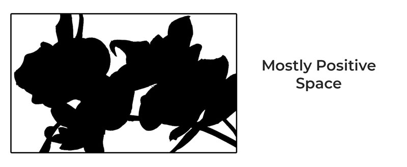
The following image illustrates a composition made of mostly positive space…
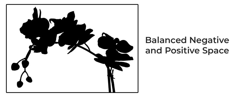
Here’s an example of a composition made of equal parts of positive and negative space…
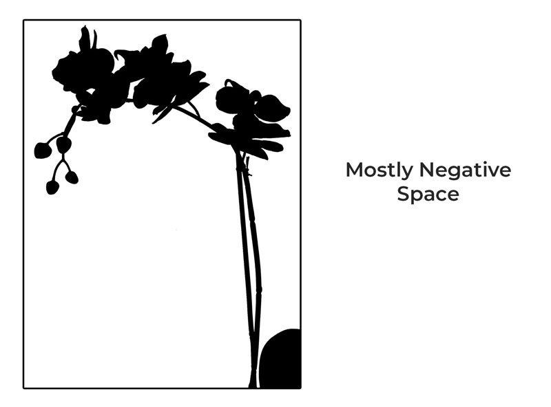
And here’s one made of mostly negative space…
Each one of these compositions is derived from the same subject and each could be considered “successful”.
Successful use of positive and negative space within a composition is dependent on balance. How this balance is achieved will depend on the subject, the use of the medium, the level of detail included, contrast, and other visual factors.
The best way to craft a balance in a work and ensure that the positive and negative space works for the good of the composition is through careful planning.
Planning Your Composition
Planning is perhaps the most important aspect of finding success with your compositions. Unfortunately, it’s the step that most people skip completely.
Let’s say you decide to go on road trip to a place you’ve never been before. It wouldn’t make sense to just pack your bags, hop in the car, and leave without knowing how to get to your destination. You’d likely take a look at a map or enter your destination into your navigation system. You’ll never arrive at your destination without some form of preparation and guidance.
In the same way, we should plan our compositions before we attempt to execute them. We need to know “where we’re going” with our artworks. We should plan the final result before we set out to create it. We can change our ideas as we work if we wish, but we should have a general idea of what we want the finished work to look like before we dive in.
By planning, we can work out all of the compositional puzzles that go into making a strong piece of art. When we do this, we can focus on the actual process of drawing and painting since most of our decisions regarding composition have already been made.
In most cases, planning a composition involves creating small drawings that lack details. These small drawings are often called thumbnails or preliminary sketches. Thumbnails should be created quickly and should be approached with an attitude of experimentation. The more thumbnails that you create before starting on the final surface, the better your chances are at creating a successful composition.
As you create your thumbnails, be open to trying different things. Experiment with the positioning of subjects and with the balance of positive and negative space. Consider how a viewer’s eye may move through the work. Try vertical-based compositions and compare them with horizontal ones. Experiment with different colors. Keep your mind open.
Many times, we have a vision in our minds of what we want to create and naturally assume that it is this vision that is the most successful. However in most cases, our initial vision is just the “tip of the iceberg”. With a little more “digging”, our original vision evolves into something much more successful. This only happens when we are open to experimentation and we take the time to plan.
The Rule of Thirds
The rule of thirds is a compositional theory that is based on the placement of subjects within a composition. It is based on The Golden Mean, which is a mathematical formula that deals with proportional relationships. Since the Golden Mean is quite complex, most artists and photographers rely on the rule of thirds to create a similar effect.
Here’s how it works…
Let’s take a composition and divide it by thirds – both horizontally and vertically. We can imagine lines that run along each of the thirds. These lines intersect in four locations within the picture plane. By placing important subjects or focal points on or near these locations of intersection, we create a more aesthetically successful composition.
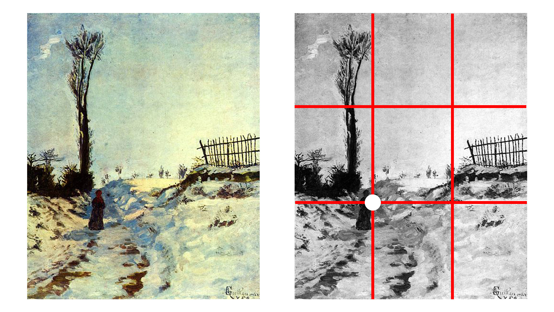
Notice how Guillaumin has positioned the figure almost directly on one of these points.
We can also create more dynamic and interesting compositions by placing subjects directly on these lines.
Creating Diagonals
Compositions can be dynamic or static. Static compositions are fairly straight-forward and direct. A static composition makes sense for an informational image – like a scientific illustration. In contrast, a dynamic composition creates a greater sense of story and engages a viewer. In most cases, we want our compositions to be dynamic.
Dynamic compositions can be created by incorporating diagonals into the work. These diagonals may be created with actual lines and shapes or implied lines. They can also be used to help guide a viewer’s eye through the work, as we discussed before.
Look for interesting ways to include diagonals in your work. This may mean that you change the angle of the vantage point of the viewer. Instead of drawing or painting the subjects from a standard point of view, consider the view from above or below, or even from a tilted angle.
Odd Numbers Are Better
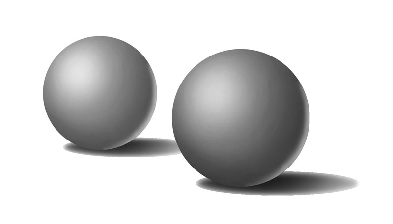
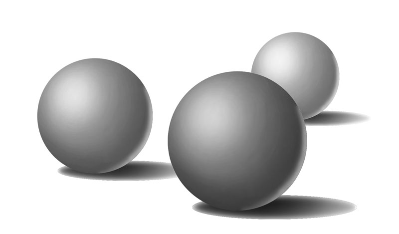
When we compose our artworks, we should also consider the number of subjects or elements that we include. The human mind finds balance in odd numbers. The most optimal number to use is 3. This means that if you are composing a still life, it’s best to use 3 objects. This doesn’t mean that we are limited to 3 objects. We can, of course, include more if we wish. But if we do include more, odd numbers are best.
Let’s consider an image with two objects. With two objects, there seems to be a sort of visual competition between the two. It’s difficult to decide which subject is the focal point.
However, when we include a third, the other two subjects act to frame the third, resulting in a more balanced composition.
Conclusion
Composition is not “guesswork”. A great composition is not the result of luck and it’s certainly not about talent. It’s about understanding how a viewer will visually interact with what we create and careful planning.
We’ve covered quite a bit here. It’s a lot of information to soak in. But by practicing these concepts and incorporating them into your artworks, they will gradually become intuitive and your compositions will improve.
If so, join over 36,000 others that receive our newsletter with new drawing and painting lessons. Plus, check out three of our course videos and ebooks for free.
How to Correct Mistakes in Pen and Ink Drawings
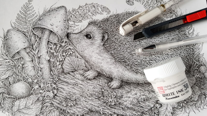
A wrong motion can leave an unpleasant blob or smear on your paper. It’s also possible to lose focus or make an erroneous decision. Anything of this kind may lead to the question: “How do I correct this disappointing mistake?”
Ink has a reputation of being an unforgiving medium. This idea may be holding many artists back from entering the world of ink drawing. It’s true that in some cases we may have to start over, but such cases are not as frequent as you might think.
In this article, we’ll discuss various tools and techniques that we can use to correct mistakes made with pen and ink. Perhaps you’ll see that you may not have to start over after all.
Related reading: 7 Must Have Pen and Ink Supplies
But before we dive into our solutions, let’s take a look at preventing the mistakes in the first place and the meaning of imperfection.
What Is a Mistake in a Pen and Ink Drawing?
There is a belief that ink as a medium attracts artists that love the sense of control. Some art media, like watercolor, doesn’t give us that kind of feeling and requires a different mindset.
If you like to be in control, anything that differs from your initial plan may be considered as a mistake. Sometimes we become so attached to our vision that any accidental deviation – even the lucky ones – should be rejected and considered a mistake. It’s unfortunate that some approach art in this manner since our “mistakes” may make our art even more interesting or feel more spontaneous.
So what if those little things that we call “mistakes” aren’t actually mistakes?
What if their purpose is to enhance our work – only if we allow them to? And what if it’s rather a matter of individual perspective than an objective thing?
Of course, real mistakes do happen and they should be addressed and not ignored.
For example, if we consider a drawing from life that should be realistic but the values are incorrect – chances are that the result will look neither believable nor attractive. Our eyes are naturally trained to notice the imperfections. If we notice them, then our viewers will too.
The best cure for this type of mistake is practice. The more you draw from observation and train your eyes, the better your drawings will become. This type of mistake is skill-based and will only be rectified by improving your skill – which requires practice.
Even still, I strongly recommend that you keep an accepting and positive attitude to any form of imperfection. If you did something wrong because you lack skill, don’t beat yourself up – as long as you’re moving forward, there is progress. Everyone, even people that we view as masters, face difficulties along the way.
The last thing to mention before we continue is time. Always take a break before deciding that a “mistake” needs correcting! Chances are that you’ll come back to your drawing in a couple of days and see its beauty and charm.
For me and many other artists, a time gap is crucial. Right after I’ve finished a new piece, I see all of the “problems”. At this point, the mind is still too focused on details – it can’t see the picture as a whole! But after a bit of time, I can see all of the things I’ve done correctly and I can appreciate the finished work – “mistakes” and all.
The Power of Prevention
Let’s remember the old truism that prevention is better than a cure. How does prevention look in the context of art made with ink?
When I was preparing this article, I had to think about my own creative process. To be honest, I make things that can be called mistakes quite rarely, therefore there is no frequent need to correct them. Why?
First, I avoid distractions while drawing and make sure that I’m as focused and observant as possible. This allows me to reach a state of “flow” and, paradoxically, feeling relaxed. The process becomes easier and more fun!
Second, I do my preliminary work. It may include searching for the necessary reference photos and examining them, studying the objects, creating sketches and so on.
Having a pencil underdrawing for your finished artwork helps a lot. When you start a new ink artwork, it’s easy to get caught up in the “fear of blank paper” trap. Careful thinking through the work with a pencil in hand eliminates the fear. No more guesswork while inking!
Before taking to your nib pen or liner, make sure that you have everything you need at hand (for example, the supplies and reference photos). Take a deep breath, clear your mind, and surrender yourself to the process of creation.
Be Aware of Smearing
While drawing with ink, watch carefully if your newly drawn lines are steady and dry enough. If your ink isn’t dry, it can easily smear. This especially applies to slick, glossy types of paper because inks dry slower on them.
After completing the artwork, let the ink dry completely before erasing any pencil marks that you used as guidelines.
Smears are perhaps the most common mistake when drawing with ink, but also the easiest to avoid with a little patience.
A quick tip: working with a waterproof ink ensures that your beautiful lines won’t be washed away with an accidental drop of liquid like water or tea.
Seven Ways to Correct Mistakes in Ink Drawings
1. Make the Mistake a Part of Your Drawing
Sometimes it’s possible to incorporate an accidental imperfection into the artwork, so no one will even notice it. No matter what kind of mistake it is – a blob of ink, a smear or an irregular line, try to approach it creatively.
A few options to transform your drawing are:
- Add more ink dots or lines to ‘blend’ the imperfection.
- Draw a new element/object, based on the “mistake”.
- Create a background or pattern.
- Apply some watercolor washes or colored pencil/marker covering.
Chances are that your imperfection, big or small, can be worked around.
Consider your surface when deciding how to “fix” a mistake. Thicker paper is more adaptable to watercolor additions and other methods that are effective for hiding or blending.
2. Cover the Mistake with White
Inks, Gouache, and Acrylics
Chances are that you’re drawing with black ink on white paper. In this case, you can paint over the unwanted ink strokes with white, using any artistic medium at your disposal.
After the white covering is completely dry, you can draw with ink on top or just leave the area as it is.
Here are some supplies I use:
- A white acrylic marker.
- White ink (make sure that its covering is opaque enough).
- White gouache.
Of course, you’ll need a brush to apply ink or gouache.
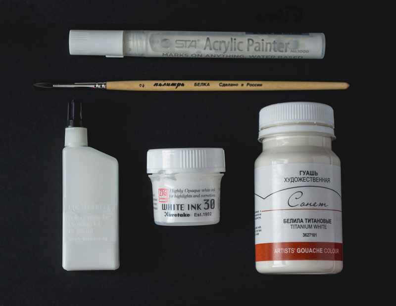
All these supplies can be used to cover a relatively large area. However, keep in mind that larger areas will draw more attention.
The potential drawback of this method is that white paper is rarely pure white, though it may appear so. Your paper and any white covering may seem slightly different visually and may actually draw attention to the mistake rather than hide it.
For example, it’s a common issue that the painted covering looks cooler in hue than the paper. That’s why it’s a great idea to add a little bit of yellow (or another color, depending on the situation) to your white base covering.
Another potential flaw of this method is that the painted area will have a different sheen from the paper. Of course, you have to examine the artwork closely to see that difference, but in some cases this contrast in texture can be very distracting. This effect can be hidden under glass however – if you decide to put the artwork in a frame.
There are also various correcting fluids that are used mainly to cover handwriting mistakes. It’s possible to give them a try, but I don’t recommend relying on this option. Such fluids may create a rather coarse, textured covering and the tint is very different from that of your paper.
If your paper isn’t white, you may have to mix paints to match the colors. It’s a tricky and relatively demanding method, but it may pay off.
Gel Pens
Gel pens are handy when it comes to correcting small areas in the drawing.
Since all pens have their own distinctive features, it’s important to choose a brand that fits your needs. I prefer the tools that provide a dense white covering on the first attempt. This means that you don’t have to layer the stokes to get the desired result.
Keep in mind that gel pen strokes, placed on top of ink marks, usually create a relief. The thicker lines require more effort to cover.
In the image below, you’ll find some examples of such coverings. Note the difference between the paper and the corrected areas.
This method works for most types of paper. In some cases, it’s the only way to fix the artwork (for example, if thin paper is used).
3. Remove the Mistake with Blades
A variety of knives and blades, including ordinary office knives or an X-Acto knife, may be used to cut off the upper layer of paper that holds the unwanted ink marks.
To remove a mistake, apply the tip of the knife to the paper’s surface with light pressure. It’s better to slice the paper bit by bit because you could go too deep and create a hole.
This method works especially great with coated paper – the type of paper that has a slick feel and a subtle glossy sheen. Coated paper has a peculiar structure, which makes the ink stay on the surface, so you can remove the top layer of the paper and the correction will be almost invisible.
Any heavier paper type is compatible with blades for this method. Success often depends on how deeply the pigment permeated into the paper.
The smaller an area is that needs correcting, the better your chances are at fixing it with a blade.
4. Use an Eraser with a Rough Surface, a Sand Eraser or a Piece of Sandpaper
An eraser or sandpaper can also be used to remove the portions of the top surface of the paper. A rough eraser can rub the paper layers off until there is a hole.
In the image below, you’ll find an example – the eraser has two ends, the reddish one is softer, for cleaning graphite marks, and the blueish one is very rough – it can erase inks.
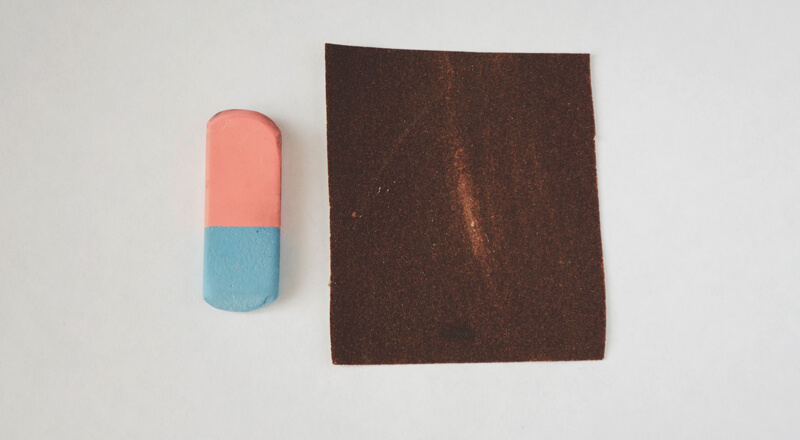
This method works perfectly on heavier paper with some tooth.
Sometimes after using an eraser or sandpaper, the tooth of the paper looks too rugged and damaged. However, there is a secret to make it smoother and neater!
Take a sheet of thick paper and place it above the corrected area of your drawing. Press the paper sheets with your hand and apply pressure. Apply a soft eraser on top of the blank buffer paper (and the damaged area below it), and use it as though you’re trying to erase something. The paper’s tooth underneath will be all smoothed out like magic!
5. Creating a Paper “Patch”
The principle is simple: cut a piece of blank paper, which shape and size are similar to the problem area. Then adhere the paper cut-out with a small amount of glue. After the “patch” is steady, feel free to modify the selected area.
I personally don’t ever use this method because the result is too obvious. However, some folks find great success with this approach, especially if the ink drawing is produced for reproduction such as an illustration.
6. Use Digital Tools to Fix Mistakes
If you don’t have to show the original artwork to anyone, it’s possible to complete it just as it is, then scan it and make some corrections in an editing program, like Adobe Photoshop.
You may be interested in the course: Basic Photoshop for Artists
If you use Photoshop, there are basically three tools that you might need: the eyedropper tool (the hot key I), the brush tool (B) and, occasionally, the clone stamp (S).
Digital tools work wonders. You can remove any ink marks that you don’t like. In the image below, you can see the result of this approach. I removed the shortest lines of the sample completely.
By the way, this sample is from the article on exercises for accurate lines and hatching. (Remember, practicing the basics reduces the number of mistakes and sloppy ink marks.)
Alternatively, some artists scan the artworks right at the stage after the mistake has occurred, get rid of it in the editing program and print it. The work can be continued, but without the hassle of starting over.
7. Redraw
If you tried the methods we’ve discussed and they didn’t work, or the mistake is too overwhelming, the only way to fix this issue is to start over.
Sometimes you can lighten the work by tracing over the original drawing using a light box or a well-lit window. This allows you to keep the elements that you consider successful and redraw only the elements that need to be altered.
Starting over should be your last resort. And although it may be disappointing, it’s actually not that bad. Remember, we always get better through practice, and approaching the same subject a second time may lead to better results.
Conclusion
Although there is no perfect and trouble-free way to correct something in an ink drawing, there are many ways to save your artwork. I hope that this post gives you some helpful ideas!
The closing advice is this: think about your process and enjoy your experience while drawing. Imperfections are just a part of life and will be there in every work you create. Everybody makes mistakes from time to time. The less we think about them, the rarer they become.
I wish you much inspiration, and let no fear of mistakes stop you!
If so, join over 36,000 others that receive our newsletter with new drawing and painting lessons. Plus, check out three of our course videos and ebooks for free.
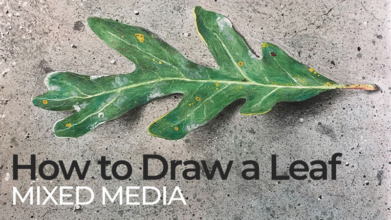
How to Draw a Leaf with Watercolor and Colored Pencils
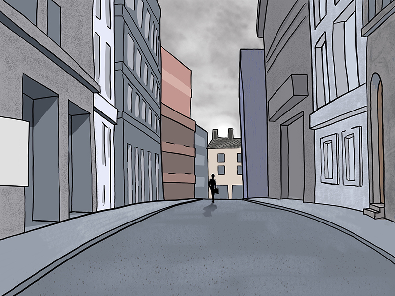
As winter passes, a single leaf remains on the vine. The young artist’s health improves, but her friend has stopped visiting. When the winter snow melts, he is found in the alley. He had passed away in the cold after painting, next to the vine with a single leaf.
As I write this, Autumn is setting in and the leaves are beginning to fall. These wonderful creations are each a masterpiece of their own. In this lesson, we’ll combine watercolor and colored pencils to create a drawing of a leaf with watercolor and colored pencils.
How to Draw a Leaf with Mixed Media
You will need the following materials…
Surface – Bristol Board (or illustration board, Bristol paper, or another smooth paper). This surface is rigid enough to support a variety of different mediums and strong enough to accept light watercolor applications.
Colored Pencils (I use Prismacolor pencils, but any other brands are fine.) General colors that are used…
- White
- Yellow-Green
- Green
- Dark Green
- Yellow
- Black
- Brown
- Red-Orange
- A Colorless Blender
We’ll use a bit of black watercolor paint to splatter a bit of texture along with tempera paint or gouache to add a few finishing touches. You’ll need a few basic colors of tempera or gouache…
- White
- Yellow
- Red
- Blue
We’ll also use a few different brushes…
- Small round watercolor brush (size 0 – 2)
- Flat atercolor wash brush (¾ inch or larger)
- Flat acrylic or oil painting brush (1/2 – 1 inch)
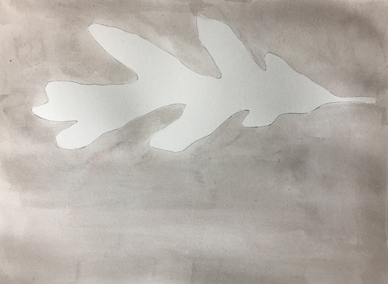
Step 1 – Tone the Paper with A Watercolor Wash
To follow along, print the reference photo from the link below. You can also take your own photo of a leaf.
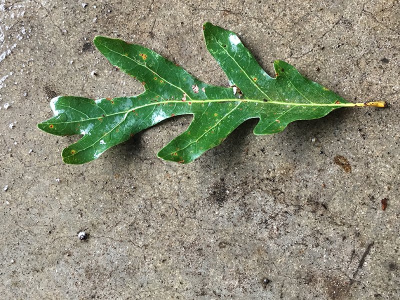
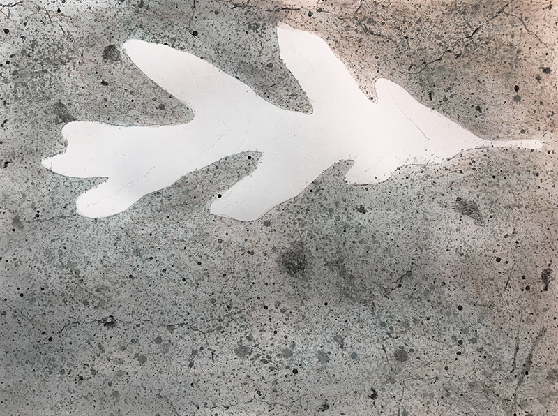
For both steps one and two, you will need a cut-out of your leaf shape. To create a cut-out, draw your leaf shape on a separate sheet of paper. It isn’t crucial that your leaf match the reference exactly. Focus on the character of the contours (smooth, jagged, straight, wavy, etc.). After cutting out the leaf shape, trace it onto your project paper. For this mixed media piece, we will paint most of the background and draw most of the leaf.
Let’s begin in the background with a watercolor wash.
Step 2 – Watercolor Wash
Moisten the paper by painting around the leaf with clear water. Don’t wet the leaf shape. With the paper moist, brush strokes will bleed/blend together, creating an even layer of color. Dilute the black paint with enough water to make a very light grey.
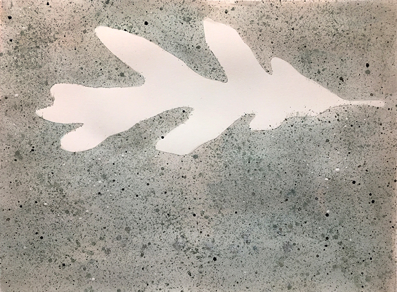
Step 3 – Add Some Texture
The surface of an oak leaf is smooth. I like how the gritty, rough surface of the concrete juxtaposes with the leaf. Using the cut-out from step one, cover and mask the leaf shape in the drawing. This will protect the white of the paper. Use tape to hold the cut-out in place. Splatter and flick tiny flecks of watercolor paint onto the painting. Use the flat oil or acrylic brush for this. You can also use a toothbrush which also creates a nice splatter pattern.
Splatter the watercolor paint from different directions to avoid creating a distinct pattern. Vary the amount of water in the paint to create different values. Try more that one spatter technique (thumb over the bristles, wrist flicks, etc.). Have paper towels on hand to blot away any splatters that are too large or otherwise undesirable.
Once the paper has been covered, you may remove the mask from the leaf shape. The leaf shape is nearly free from speckles.
Step 4 – Debossing the leaf’s Veins
The small veins of the leaf are a challenging detail. Usually, I save details for last but in this case, addressing the leaf’s veins now will save some work in the end.
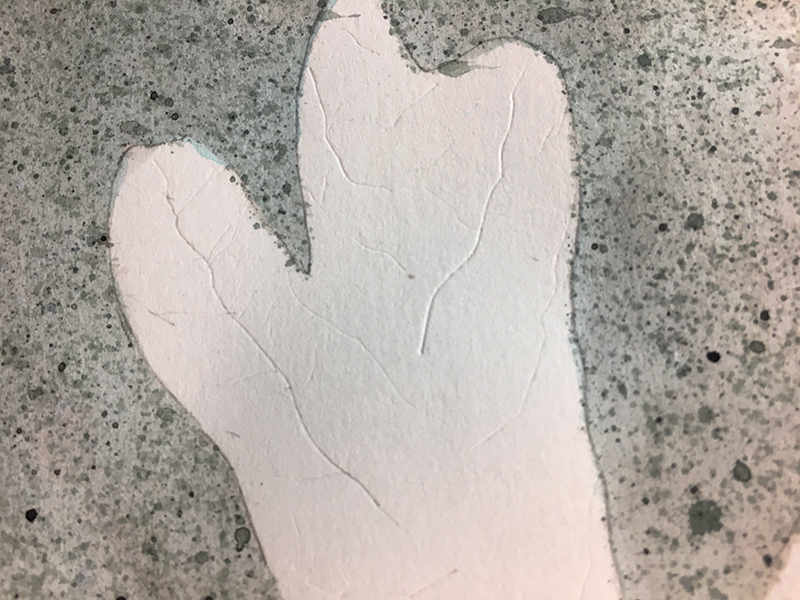
Debossing is stamping or pressing down into a surface. Using a hard point, (awl, compass tip, scissor tip, etc.) draw in the smaller veins. They will not show up well now, but after layering color pencil over these marks, the light-colored veins will emerge.
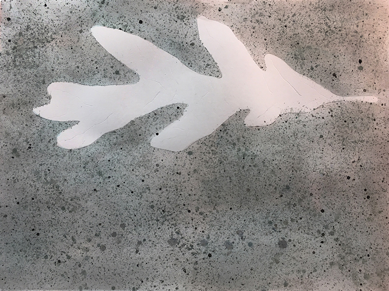
Here’s a closer look at the debossed veins of the leaf…
Step 5 – Add Details with Colored Pencils
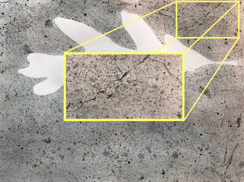
The background speckles are a great start but some purposeful marks made with a black colored pencil will make them more convincing. The dark patch in the center of the composition and faint surface cracks add character and specificity to the image. Add small marks that are less circular and mire irregular than the watercolor splatters with the black colored pencil.
Look at the detail below. Can you distinguish the watercolor marks from the color pencil marks?
Step 6 – Adding Color and Value to the Leaf
Most leaves are flat with subtle surface undulations. This means that the value changes that create in the drawing will be subtle.
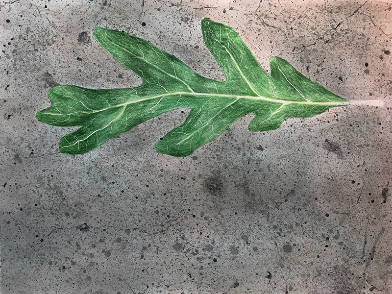
Starting with the yellow-green pencil, lightly shade near the central axis of the leaf. Develop the thick stem that runs through the middle by adding color along both of its sides. Switch to the green pencil and cover the entire leaf with a base coat of color. (Be sure to choose a natural green for this. Greens that lean closer to yellow-green will produce better results.)
Use pressure changes to control value. Heavier pressure will produce darker applications. The leaf is not the same value everywhere. Keep your values a little lighter than those you observe in the reference photograph, you can always make them darker if you need to.
During this step, I also added an imperceptibly small amount of brown over the background using color pencil. This created a more natural appearance. Use only the weight of the pencil with no additional pressure to add this light application.
Step 7 – Using Black and White
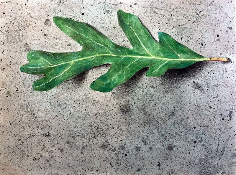
Gradually add black colored pencil to the darkest areas on the leaf. This will darken the value and lessen the intensity in these areas. Use the black pencil to create the cast shadows under one side if the leaf as well. Notice how soft the edges of the cast shadows are. Begin in the darkest areas of shadow and gradually lighten your pressure. Be sure to keep your strokes together to avoid a “scribbly” look.
Use the white colored pencil to blend the pencil strokes out of some areas on the leaf. See how some areas (near the stem) of the leaf look smoother while other areas remain rough (below).

Both the white pencil and the colorless blender will smooth the speckled quality of your colored pencil stokes. However, the white pencil weakens the color’s intensity and will lighten it as well. The colorless blender will not weaken the intensity and may actually darken the colors.
Of course, the blender pencil is not really darkening the color. It is, however, smudging color into the tiny white speckles that show through our colored pencil strokes. Eliminating the white speckles optically darkens the color.
Use the yellow pencil on the stem at the end of the leaf followed by some shading along its bottom edge with the red-orange pencil. A few speckles are added with the black pencil and the stem is done.
Step 9 – Using The Colorless Blender
Now it’s time to blend and smooth any remaining areas of the leaf that did not receive the white pencil. This will give the leaf a uniform surface that contrasts well with the rough background. We’ll avoid using the blender pencil on the cast shadow though. The unblended pencil helps to further describe the fine bumps of the gritty surface.

Step 9 – Subtle Adjustments
The bulk of the artwork is finished. Now it’s time to take a hard look at our piece and make some adjustments if necessary. I feel as though my leaf needs to be darker in value. I can still add some green over the blended leaf, making some areas darker.
Step 10 – Finishing Touches to Our Drawing of a Leaf
Time for the tempera (or gouache or poster paint). Sometimes these paints are referred to as opaque watercolor because the binder (also called vehicle) is the same as watercolor – gum arabic. Gum arabic is soluble and can removed with a damp sponge if you don’t like what you have done. It is forgiving as a binder.
Tempera can also work as a semi-transparent paint. The milky blue/grey reflections in the leaf are created with semi-transparent applications of tempera (see below). Add a little water to a light blue mixture to create this effect. The white reflections and yellow speckles do not have extra water in their mixture so these marks remain opaque.
You can also add some extra detail to the background with white and black tempera paint as well. This will help to unify the whole composition since the medium is used throughout the work.

That’s it. We’re done. This leaf may or may not have have given hope to the woman from the O’ Henry story, but it sure was fun to create.
If so, join over 36,000 others that receive our newsletter with new drawing and painting lessons. Plus, check out three of our course videos and ebooks for free.
The Sketchbook Medley
For my students, sketchbook prompts are just the first step in the development of a project titled, “Sketchbook Medley”. I tell my students that they will, later in the year, combine imagery from their sketchbooks to create a more complete piece. This gives students time to consider what sketches they might combine. By the end of the year, they have a well-developed concept.
Below is the project information that I share with students at the beginning of the year when discussing sketchbooks and again near the end of the year when they actually begin the “Sketchbook Medley”. If you’re a teacher, you may give this assignment a try with your students. If you’re not a teacher, you can still do this exercise using the sketches you may already have in your sketchbook.
Sketchbook Medley Student Handout
Link to Handout (same as image below.)
Sketchbook Prompts
Let’s face it. Sometimes it can be a little difficult to come up with ideas for your sketchbook. There are subjects everywhere, but sometimes too many options leads to indecision. It doesn’t hurt to have a list for some drawing inspiration.
The sketchbook prompts that I use with students differ from year to year. Below are ninety-nine sketchbook prompts you can use with your students or for use in your own sketchbook.
- Draw what you ate for breakfast.
- Draw an elephant dancing ballet.
- Draw a corner of the room you are in now.
- Using only numbers, draw a bicycle.
- Make a rubbing of a leaf, then draw a copy of the rubbing.
- Design an insignia ring.
- Take out what is in your pocket, set it up and make a drawing.
- Draw the following facial expressions; confused, confident.
- Draw a cube with a hole in it.
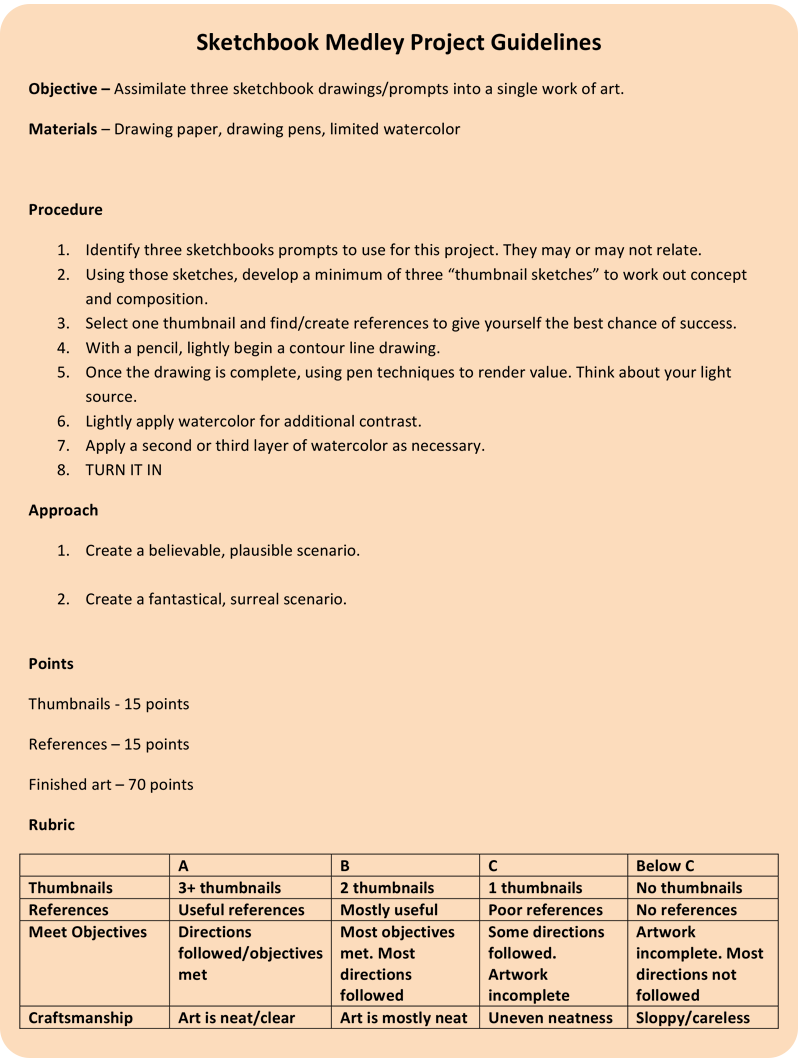
- Sketch a page of roosters.
- Mrs. Claus accidentally shrunk the Santa suit. Draw him trying to fit into it.
- Draw a dog using only triangles (12 or more triangles).
- Draw a map of the world from memory.
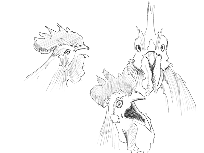
- Draw a ball bouncing down stairs.
- Superman needs a new logo. Design one for him.
- Illustrate the sense of hearing.
- Draw a person climbing over/digging under a wall.
- Sketch a house of cards.
- Draw a map to your home (or if you are home, a map to your school/work).
- Compare your drawing to a real map. How did you do?
- Copy a Da Vinci sketch into your own sketchbook.
- What does the eye of a hurricane look like. Sketch it!
- Sketch a tattered tophat.
- Draw a scarecrow and crows.
- Sketch a cloud that also looks a little bit like something else.
- Draw a person coming out of a picture frame.
- Sketch a tree being blown by the wind.
- What does frustration look like?
- What does success look like?
- Sketch a bundle of pencils.
- Design your own compass rose.
- Design the most comfortable chair.
- Draw the illusion of a hole/tear in your page.
- Draw something that is bumpy.
- Sketch a thin person with big pants held up by suspenders.
- Draw a baby in a suit with a briefcase.
- Draw a family of worms in their underground living room.
- If you are right-handed, draw your right hand with your left hand. If you’re left-handed, do the opposite.
- Imagine and draw the room you are in from above (include yourself).
- Draw an enlarged finger print.
- Draw lightning in a black sky.
- Draw a melting ice cube.
- Sketch two bees drinking coffee.
- Make-up a random, organic shape, then make it a form using value and shading.
- Draw a cow in a chef’s hat cooking little people on a grill.
- Fold an origami animal form (your choice), then draw it from a ¾ view (partly from the front/partly from the side).
- Draw a meteor streaking through space over the earth.
- Using your first and last initials only, design a personal logo.
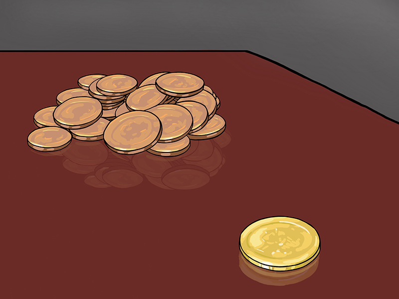
- Balance a coin on its edge. Draw it AND the shadow it casts.
- Sketch a line of ants marching through the grass. Draw the view from their level.
- Combine a bull and a bee.
- Cartoon yourself.
- Doodle with your eyes closed for a few minutes, then open your eyes and try to make something of your doodle.
- Draw a giraffe in the city.
- Sketch palm trees.
- Design retro/old-fashioned lettering.
- Create your own mythical creature.
- Draw a cornucopia of things that are important to you.
- Draw a scary face with dramatic shading (high contrast).
- Sketch a sloth in a foot race. (headband, running shoes, a race number).
- Draw dinosaurs’ bones.
- Make a portrait of a lightbulb in in a striped sweater.
- Draw a landscape with a lake.
- Draw a pattern based on an animal with a patterned coat/skin.
- Sketch your favorite food.
- Draw something you enjoy doing.
- Draw a flock birds from above.
- Sketch a tulip.
- Design a futuristic shoe.
- Happiness is . . .
- Draw a person named Tom. (If your name is Tom, sketch a “John”.)
- Draw a Vortex.
- Make-up a pattern using shapes and lines.
- Draw blind contour drawings for 10 minutes.
- Draw a huge crater in the suburbs.
- Sketch a Fiddler’s Crab.
- Draw memory or dream. It’s OK if parts are foggy or disconnected.
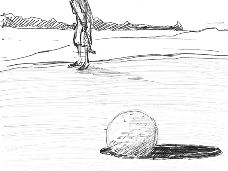
- Draw stacks of money from a low angle.
- Draw something that is empty.
- Sketch the closest hallway.
- Draw a cat that is not sleeping.
- Design a flag. What does the flag represent or stand for?
- Sketch your favorite childhood toy.
- Sketch one of your relatives.
- Draw hot air balloons, some close and some far away.
- Set-up a still life of three objects in the room you are in and draw that.
- Draw a zodiac symbol in 3D.
- Draw with only value, don’t start with lines.
- Sketch an unusual mode of transportation. You can make it up.
- Illustrate the sense of touch.
- Make a rubbing of a coin and then draw from that rubbing. Try to redraw your rubbing as exactly as possible.
- Sketch a view from the closest window.
- Draw water in a glass.
- Draw a key – double the scale (size).
- Draw Julius Caesar.
- Design a door knocker for a large wooden door.
- Hold a coin in your non-dominant hand. Sketch that.
- Draw a person from life while they sleep. (They’ll never know if you’re sneaky.)
- Sketch a representation of a summer activity.
- Make a sketch of yourself from a mirror, shade as you go.
Now you have lots of ideas, get sketching. If you need more, here’s 101 more drawing ideas.
Now, it’s time for the assignment or project. We’ll combine a few of the sketches together to create a finished work of art. You can use any medium or combination of mediums that you wish. The result should be quite interesting.
The sketchbook medley below is the resulting image from the prompts: “Happiness is…”, “Sketch a page of roosters”, and “Draw stacks of money from a low angle”.
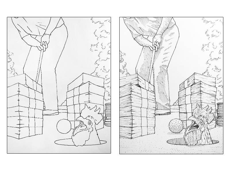
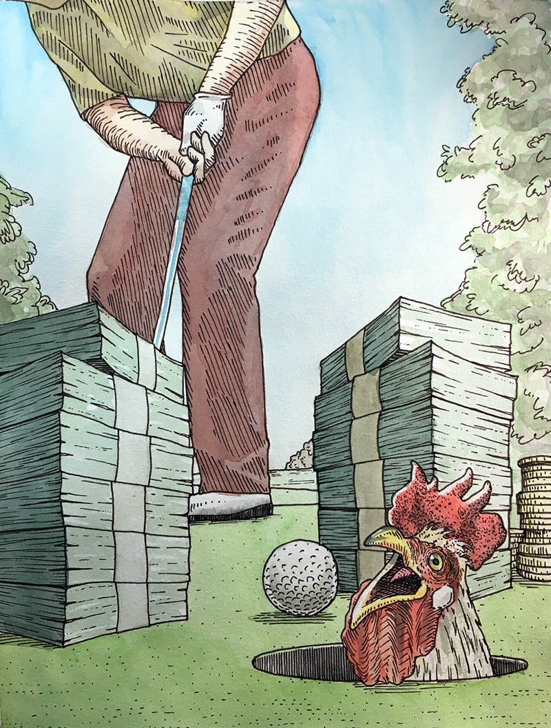
The Sketchbook Medley is a wonderful exercise to stretch one’s creativity and re-engage with old sketches. Use it with you students, or try it yourself!
If so, join over 36,000 others that receive our newsletter with new drawing and painting lessons. Plus, check out three of our course videos and ebooks for free.
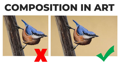
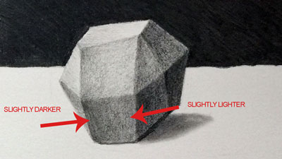
Do You Really Need Blending Stumps?
Some people are so dependent on blending stumps (and tortillions) that they won’t even attempt a drawing without them. Many beginning artists simply overuse them and in many situations – they aren’t even necessary at all. When blending stumps are overused – or used when they’re not needed – the resulting drawing can look dirty and unfinished.
But, when blending stumps are used correctly and in the right situations, the result can be very life-like and realistic.
So do you need them? The answer is “yes” and “no”. It basically depends on two important factors:
- The surface of the paper.
- The texture of the subject.
When You Should Use a Blending Stump
There are many times when you need to use a blending stump. For example, if the surface of the subject is smooth and the texture of the paper simply can’t create the necessary texture, then a blending stump should be used. In the drawing below, a blending stump is used to create a smooth texture that mimics the surface of skin.
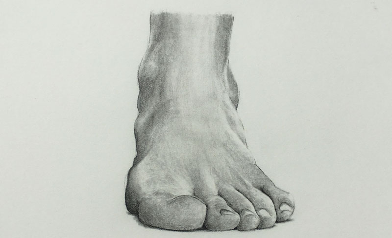
A blending stump was also helpful in creating the illusion of the texture of skin in this portrait drawing…
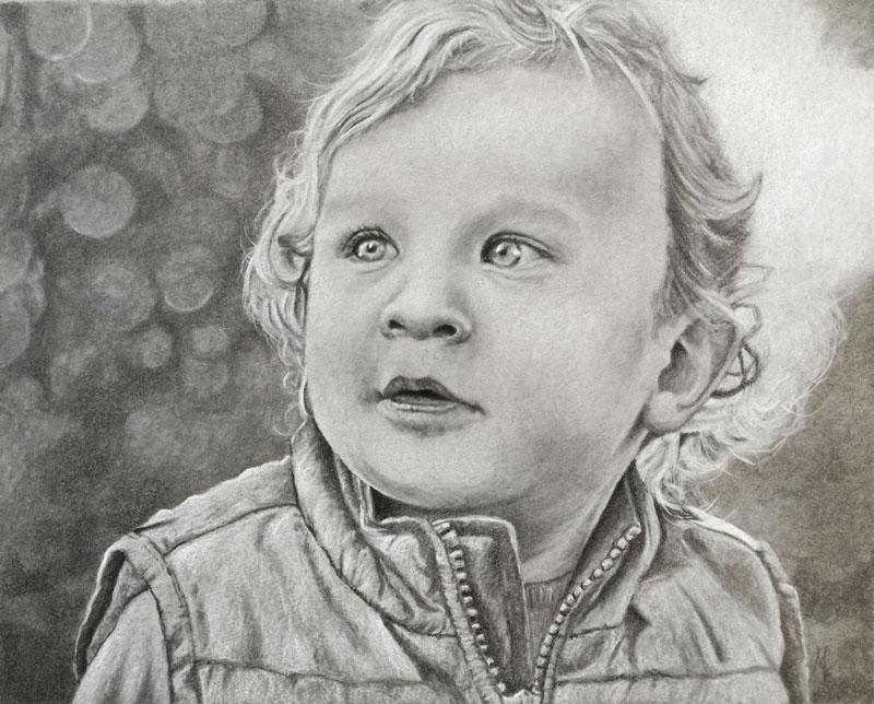
In both of these cases, the texture of the skin determined whether or not a blending stump was required. We didn’t decide to use a blending stump until we saw that it was necessary.
But we also shouldn’t assume that just because we are drawing a portrait or an image that includes skin, we should automatically reach for a blending tool.
In the drawing below, we created a portrait. But because the paper was so smooth – a blending stump wasn’t necessary. We were able to create smooth transitions of tone simply by adjusting the pressure placed on the pencil.
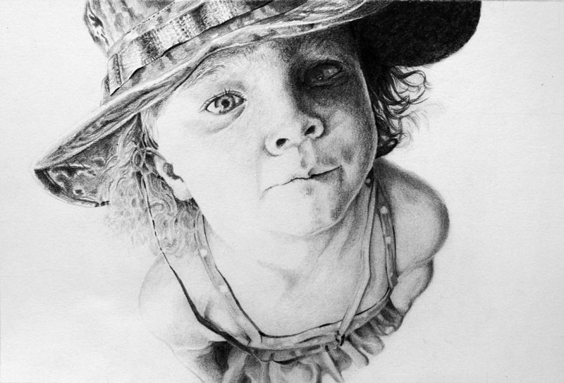
Considering the Texture of the Paper
As we can see, the texture of the subject plays an important role in deciding whether a blending stump is necessary or not.
But, the texture of the paper plays an important role in our decision making process as well. In fact, we often decide what papers to work on based on the textures of the subject that we are planning on depicting.
For example, in the first image below (on the left), we worked on charcoal paper, which features a coarse laid pattern. The texture of the paper helped us to create the illusion of the texture of bushes and trees. Clearly, no blending stumps were necessary.
The same is true for the second drawing below (on the right). Here again, the texture of the paper helped us to achieve the textures that we were after. It wouldn’t have made much sense to use blending stumps on either of these drawings.
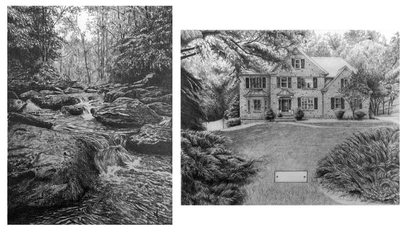
In most cases, it is a combination of both the texture of the subject and the texture of the paper that determines whether to use blending stumps or not.
In our recent Live Lesson series, we created a drawing of an elephant in the jungle. Here again, we had trees and bushes within the scene, but charcoal paper would have been a poor surface choice because of all of the details in the texture of the elephant.
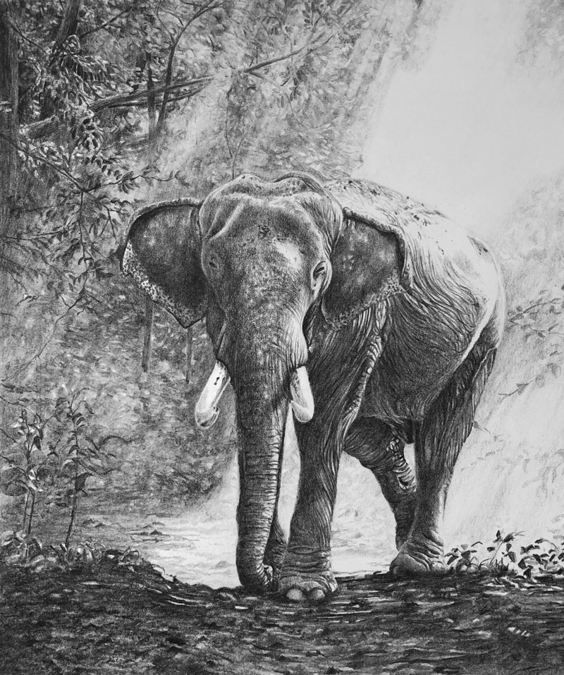
Instead, we worked on a softer and smoother surface. In this case, we worked on Stonehenge paper, which is 100% cotton.
The image featured distant trees covered with a smokey haze. We could have created this effect by using a blending stump. But because the paper was so soft, we could control the texture that we created simply by adjusting the pressure placed on the pencil. We created the “rays of light” using a kneaded eraser.
By avoiding the use of a blending stump, we kept our drawing clean and consistent. We were still able to create the necessary textures however.
How to Control Graphite without a Blending Stump
The truth is that there is a technique that we can use to achieve smooth transitions of value without using a blending stump. Keep in mind, that even though this techniques is helpful, there will still be times when a blending tool will be necessary to capture the texture of your subject.
We’ll call this technique “circling”. This technique is simply a way to control the application of the graphite on a drawing surface. When used properly, it can help you create a smooth transition and even application of tone in a drawing. If the paper is smooth enough, this technique mimics the results we get with a blending stump. But unlike a blending stump, this technique gives you total control over the value and resulting texture.
Here’s how it works…
The process is very simple. We’ll use the side of the tip of the pencil to make light, smooth circular strokes on the drawing surface. Make sure that you’re not making actual circles. It’s a circular stroke – not a bunch of actual circles.
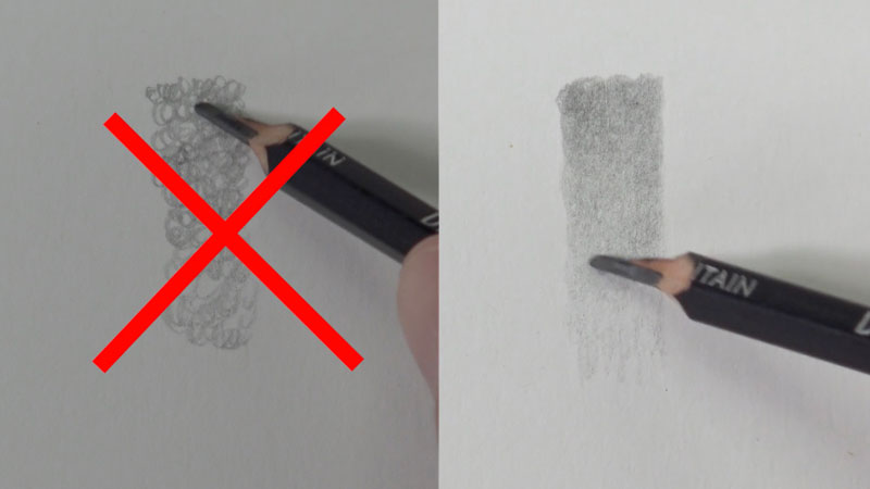
When done correctly, an even application of graphite is the result.
Should You Throw Out Your Blending Stumps?
Absolutely not! Blending stumps have their place in the world of graphite drawing. There are times when they’re useful and perhaps even required.
Are they overused? Yes, they are.
Just remember, the texture of the subject and the texture of the paper should determine if they are to be used or left in the drawer.
If so, join over 36,000 others that receive our newsletter with new drawing and painting lessons. Plus, check out three of our course videos and ebooks for free.
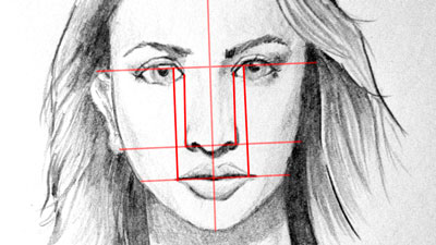
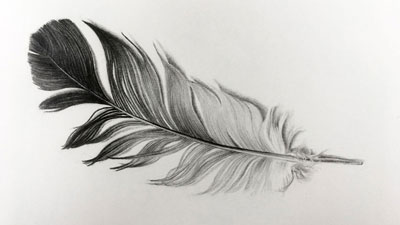
Plein Air Painting on a Tablet
Today, many successful landscape artists still work in the open air while others hike into nature with only a digital camera, returning to the comfort of their studios to paint from high-resolution photographs. After all, lugging heavy paint tubes, solvents and easels into the great outdoors is not for the faint of heart. So why go to all the trouble? What’s so great about painting in the open air in the first place?
Benefit to Plein Air Painting
Plein air painting forces the artist to work quickly. As the sun moves across the sky, there is a notable change to the intensity and direction of light. Even colors change as time passes. Many artists feel that working on location helps them capture a “moment-in-time” experience with their subject. Since plein air painters do not use sketches or photographs, they paint an unfiltered version of what they see. Plein air painters use their own eyes, in the moment, to mix colors as they perceive them.
Photos are a great and powerful tool for visual artists. However, they often differ from our own visual experiences. See for yourself. Photograph a sunset with your digital camera or phone. Then compare that photo to what your eyes actually see. You will notice a difference. My own post-secondary painting teachers forbade the use of photographs as a reference tool in an effort to improve our color mixing skills.
Plein air painting is often characterized by loose, painterly brush strokes that create excitement and a feeling of immediacy. There is no time to pretentiously noodle the canvas with a detail brush when the shadows are shifting before your eyes.
Who Did It Best?
The artist, Monet, is famous for taking several canvases to a single location, changing canvases as the day passed. In this way, he would capture the light and colors of morning and also the afternoon and also the evening. His subject would remain the same but each painting was quite different. Monet would return each day, painting on the same canvases at the same times of day until they were all complete.
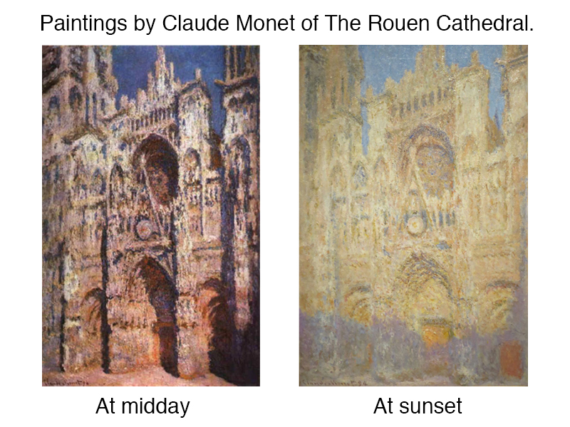
Plein Air Painting on a Tablet
Inspired by Monet, I made a plein air painting on a tablet. Drawing tablets and applications are self-contained studios. So your couch is a studio; the waiting room at your doctor’s office is a studio; nature itself is your studio.
The mobility of a tablet makes it convenient for the artists to paint on location. The tablet I am using is a 13 inch iPad Pro and the application I am using is Procreate. Most drawing applications are fine for plein air painting since few features are required.
See also: Procreate – Create Digital Paintings on your iPad Pro
Do’s and Don’ts of Digital Plein Air Painting
Orson Wells, a famous actor, once said, “The enemy of art is the absence of limitations.” Therefore, I recommend the following limitations in this instance.
First, don’t use a digital photograph for color selection. I have “sampled” pixels directly from photographs before when making a digital painting. Instead, use only your eyes to select colors from the application’s color palette.
Second, don’t use multiple layers. The benefits of layers are numerous but in this instance, toggling between them will interrupt the direct painting process that defines plein air painting. Also, the loose, painterly look will happen more naturally if you work on only one layer. A physical canvas is, itself, only one layer.
Third, try and limit how much you “zoom in” while working on location. Enlarging your painting is great for fine details but plein air painting is about capturing the light and mood of a subject, not the tiny details. Also, zooming in can unintentionally cause areas of a painting to become comparatively overworked. So, only zoom in a little and try not to lose sight of the whole picture for too long while painting.
For my subject, I chose a few beach houses along the North Carolina coast. I painted for forty-five minutes at a time, beginning at 3:30 each day for 3 days.
*NOTE* – Tablet screens make images with light. No tablet can compete against the light of the sun. In order to see my screen, I worked in the shade. If natural shade is not available then use an umbrella. Also, increase the screen brightness to the maximum. (Make sure your battery is fully charged and/or carry an external battery.)
The Plein Air Digital Painting Process
DAY ONE
Using a pencil tool, I made a brief drawing on my digital canvas, defining the major compositional elements but avoiding details. After switching to a brush tool, I began “blocking in” the colors as quickly as possible. I pushed the intensity colors a little bit here.
DAY TWO
Working on location is unpredictable. Fortunately, today’s weather was nearly the same as the day before. Less clouds but the same intensity of light.
I continued blocking in the general colors of my subject matter. In doing so, I noticed a few colors from the previous painting session that should be darker, the green shadowy color on the taller house being one of them.
I also found drawing issues that needed correcting. Never hesitate to correct scale or proportion problems. Don’t worry about wasting time in this instance. No amount of color or contrast will help save a picture with drawing problems. My problem was the corner of the house on the far left. It was too far to the right and did not leave room for the steps leading up to the centrally located house.
DAY THREE
After checking my color choices, I darkened some for the shadows on the houses again. When working on location over time you will observe day-to-day differences in color. Only make changes if you like what you see more that what you observed the days before. I liked the contrast that I saw on DAY 3 better than what I observed before so I made the change.
Once all of my colors were in place, I began using more distinct strokes in the sky and on the houses. The large, smooth shapes of color did not harmonize well with the busy texture of the shrubbery.
Conclusion
Painting on a tablet has made it easier than ever to leave the studio. If you struggle carrying heavy supplies or are bothered by the fumes of traditional paints, then try painting on a tablet. With some shade and a full battery, you can get to know your subject face to face.
If so, join over 36,000 others that receive our newsletter with new drawing and painting lessons. Plus, check out three of our course videos and ebooks for free.