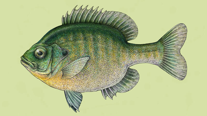
In this tutorial, we’ll create a special artwork. We’ll combine the advantages of traditional and digital tools. Hopefully, at the end of this post, you’ll be inspired by this wonderful combination!
My goal for this project is to practice ink drawing and digital painting skill and create a harmonious mixture of colors to develop a pleasant vintage look. If the result resembles an antique scientific illustration, it’s the kind of stylization I was looking for.
A fish (more precisely, a Bluegill) is the main subject because it’s relatively simple to draw and features a variety of beautiful colors. Our art is usually more successful if we depict that something we truly like and find interesting!
For this project, you’ll need some basic art supplies – a graphite pencil, an eraser, and drawing paper of a size that is comfortable for you (mine is a standard A4).
For the inking part, I’ll be using the ink liners. The widths of the pens I’ll use are 0.05, 0.1 and 0.2. Feel free to use any liners you have or even replace them with a nib pen.
Adobe Photoshop will help me in creating the colorful underpainting. You can use any version of this software or download a trial if you don’t have one.
As far as I know, many programs for graphics support digital layers and allow you to create wonderful digital paintings. As long as you understand the principles, any software will do this job for you.
I highly recommend using a graphics tablet with a stylus for painting in Photoshop. The main advantage of this device is the pressure sensitivity – the wonderful possibility to change the width of your digital paint strokes on the fly. Some other useful options are available when using a tablet too – so it’s an extremely helpful artist’s friend.
We have so much to explore, so let’s begin!
Understanding the Shape and Sketching the Fish
The first step of our work is dedicated to ink and creating the texture of scales. But before we dive into the inking part, we should outline a sketch that represents the shape of the Bluegill.
However, if you prefer to start the work with the inking tools right away, there is nothing wrong with that. Having a graphite sketch just gives us an opportunity to consider your art beforehand and become more familiar with the subject.
If you aren’t familiar with the appearance of a Bluegill, a quick Pinterest or Google Images search will give you an idea of what the fish looks like.
Unfortunately, this fish isn’t the inhabitant of lakes and rivers where I live, so there’s no chance to catch it – I have to rely on images. To grasp the main shape and anatomic features, I examined some photos on the web. The goal is to find the common features and capture them in a drawing.
At this stage, feel free to make any measurements to capture the proportions accurately. A fish is a wonderful subject that makes the observation process easy, thanks to its relatively simple and flat structure.
For example, it would be useful to observe the balance between the lengths of the head or tail compared to the overall length of the fish. Also, detect where the fins ‘start’ and ‘end’. Observation is key to a great representational drawing!
See also: 7 Drawing Techniques For Accuracy
A Bluegill has a rounded body that is close to an oval in the shape and a tail of a medium length.
- A dorsal fin is found on the back of the Bluegill. A fish uses it for balance in the water and sudden movements.
- A caudal fin, also known as a tail fin.
- An anal fin is on the bottom side of the fish. A Bluegill uses it for stability while swimming.
- Pectoral fins are located on each side of the fish, around where the head meets the body. These fins are often thought of as the fish’s “arms”.
- Pelvic fins are located on each side of the fish, near its bottom middle. These help the fish go up and down or turn in the water.
All these fin names can be overwhelming at first sight, but don’t worry – everything will be clear on the actual drawing.
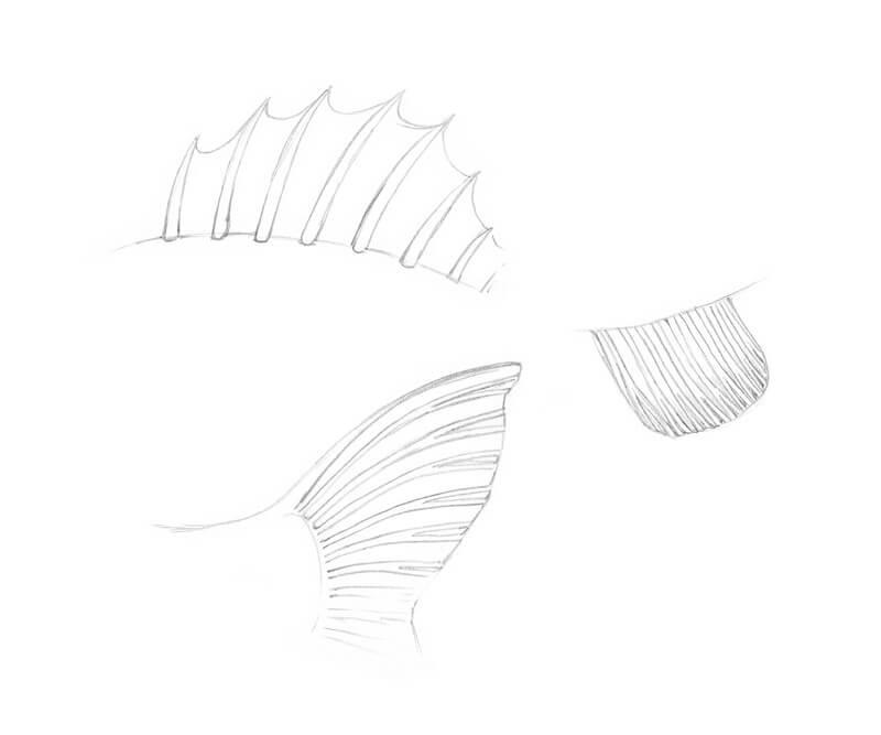
For now, just remember that fish fins may have a slightly different structure. Some of them have bony spines and some – rays. Spines resemble spikes. Rays look softer and usually fork near their ends.
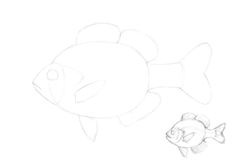
With a graphite pencil, I outline the general shape of the fish. I block in the body, head, tail, and fin segments. The simpler, the better. We don’t need a great number of details right now – only the right proportions.
If starting on the final surface of the artwork right away makes you uncomfortable, there is a solution. Draw a small sketch beforehand to familiarize yourself with everything you learned about the subject’s features and see what turns out. Chances are that your first small sketch won’t be perfect, but it will definitely give you a clue on what should be changed in the final sketch.
In the image below, you’ll find my sketch that represents the general shapes, and a preparatory mini-sketch in the corner of the image.
It’s time to add the details. My primary goal is to convey the character (or the mood) of the fish. Then, I’ll focus on the details. To achieve this, I pay attention to the head and the eyes of the Bluegill, asking myself various questions:
Where does this fish live?
It is native to North America. Bluegills live in streams, rivers, lakes, and ponds.
What food does it like?
Bluegills are omnivores. Our fish eats anything that can fit in its mouth (mostly small aquatic insects or fish).
Does it have many ‘friends’?
Bluegills are relatively gregarious and tend to be in a group. The more social individuals play an important role, helping the group to find food, locate a habitat, and avoid predators. The more sociable and less aggressive Bluegills take fishing bait more readily – quite an interesting fact, isn’t it?
What is it thinking about right now?
While the answers to the previous questions were discovered through the careful research, now it’s up to the artist to make a few decisions.
The answers help to form an impression of the personality of the fish. I conclude that my fish is careful, friendly, modest, and intelligent. Right now, it is in a calm mood. A wonderful picture!
Maybe these questions seem quite paradoxical, but this method really works. The great power of an artist lies in the ability to add perceptible nuances, convey attitude, and tell a story.
I add the following features: the large eye, gill covers, the rays and spines of the fins, and a lateral line (it’s the visible line along the side of a fish). If you wish, you can also mark some relief sections near the fish’s mouth and the prominent “lips”.
Feel free to erase the unnecessary pencil lines as you go, but keep them as light as possible.
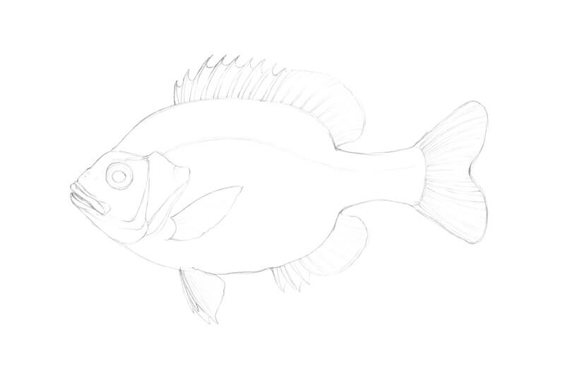
This set of details is sufficient – now we can proceed to the inking part.
Drawing The Texture of Fish Scales
There are different patterns of fish scales. The scales can be relatively big or small and their shape can be quite versatile.
To look harmonious, all scales within a pattern should work together, as a system. This means that the scales that we’re drawing should be unified – any divergent element can be distracting. The direction of each row of scales is also important and adds to the believeability of the drawing.
Before we start developing the details, it’s great to create some samples of scale texture. Of course, we usually don’t see the scales of a fish as a real whole object, but understanding the “nuts and bolts” of this texture will help to stylize it and exclude the unnecessary information.
I used 0.05 and 0.1 ink liners to draw the samples in the image below. Actually, feel free to use any tool you like. Ink liners may be an optimal choice because we’ll be drawing the Bluegill with them.
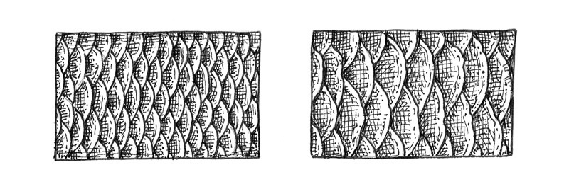
Here is an example process of building the texture of the fish scales.
- Create the contours of the scales.
The scales should be uniform in size and shape, but avoid making them perfectly even or equal – this won’t look natural. The contours may have some gaps for the same reason. Some scales may have slightly uneven edges.
- Add a hint at a darker value.
There are some shadows between the close-fitting scales. I used hatching to create the darker accents. You can also mark the external sides of the scales to make them more three-dimensional.
- Add more hatches and possibly, dots to increase the contrast and achieve the look you like and are striving for.

Now let’s apply our skills to the final artwork!
A Quick Note on Drawing the Texture of the Scales
In this tutorial, I’ll show you a detailed approach, which allows creating a refined texture of scales and requires layering the hatching and occasionally, stippling.
Of course, this manner of drawing scales isn’t the one and only. If you feel like you don’t have recourses to create something this detailed (and time-consuming), or it’s just not a part of your artistic style, you can always simplify the approach.
Sometimes increasing the size of an average scale in the pattern is a way to complete the artwork faster and with less effort.
Below you’ll find an illustration of how fish scale texture can be simplified by reducing the quality of hatching and dots. This is an old artwork of mine, which I had drawn with ink initially, then added a digital painting layer.
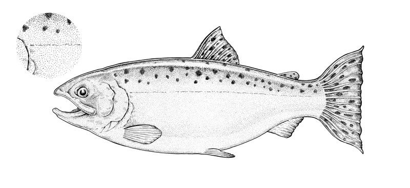
In the corner of the image, you’ll find an enlarged fragment showing the texture. It’s just stippling plus some hatches to accent the shape of the fish.
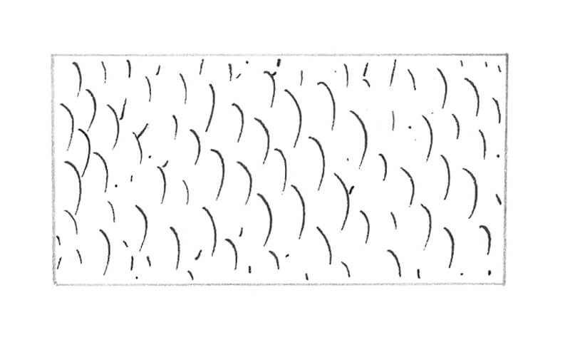
Actually, the texture of scales can be represented in a variety of forms. They can be very simple, like in the image below, or quite complex. Different manners of drawing form different perceptions of the finished artwork. It’s up to you to decide which kind of appearance and set of techniques fit your preferences.
How to Draw a Fish with Ink Liners
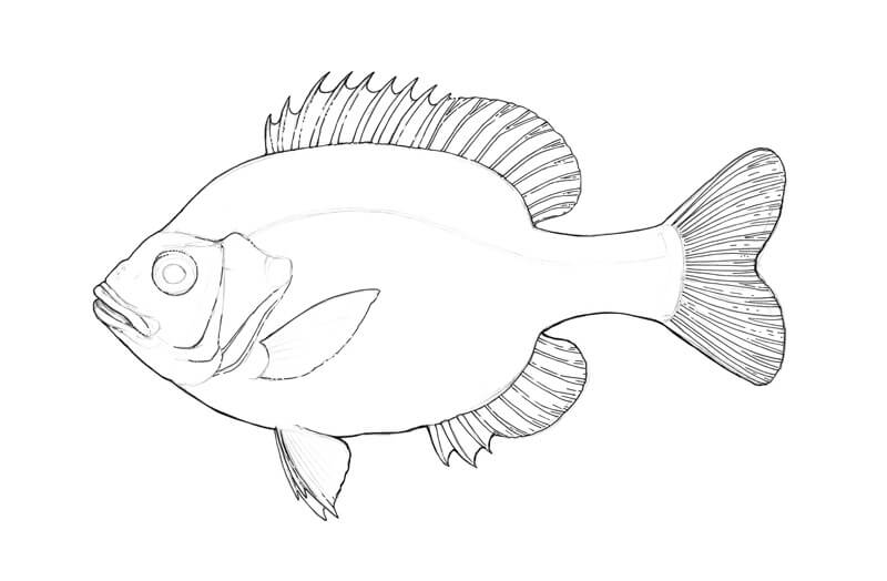
First, I outline the main contours of the Bluegill, using the 0.2 ink liner. The contour in the bottom part of the fish figure is slightly thicker – this is done to add some visual weight and create an illusion that the light source is from above.
Creating too thick of a contour may create a cartoony look, so increase the thickness gradually.
The lines inside the shape of the fish mark the relief (the rays and spines of the fins, the details near the head). These lines may be quite bold. To make them fit in the whole picture, I leave some gaps in the subsidiary contours.
I work on the eye. It is not an exaggeration to say that the eye is the most important part of our fish because it adds so much to the mood of the artwork.
I darken the pupil and the sides of the eye, carefully repeating its shape with thin hatches made with the 0.1 liner.
The pupil has a thin lighter rim around it – it’s a great idea to keep that detail in the drawing. And, of course, no credible eye can be drawn without a highlight! I also add a smaller, subdued reflection in the bottom part of the eye.
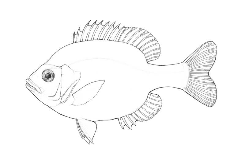
The head of the Bluegill has a subtle texture. I create its illusion with groups of short hatches and dots made with the 0.05 ink liner.
I mark the relief around the eye and darken the ‘folds’ near the mouth of the fish.
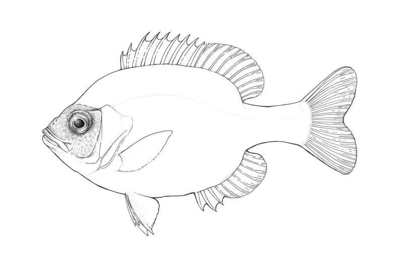
I add more hatches to the head, increasing the contrast with the 0.05 liner. The upper part of the head catches more light, so don’t overdo this area.
I also darken the opening of the fish’s mouth and accent the prominent details of the head. The goal here is to create an interesting relief.
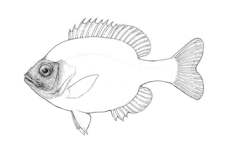
I work on the gills and the bottom part of the fish’s head, using the 0.05 ink liner – in the same manner as in the previous steps. Then I start drawing the scales.
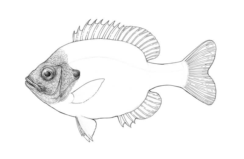
Bluegills have black spots on the hind edge of the gills, and our fish is no exception. I darken the area behind the fish’s head, approximately at the eye’s level, using long, rounded hatches.
This spot is supposed to be black, but I avoid making it completely solid. If we need more solidity, we can add it later, in the digital part of the process.
I continue drawing the scales with the 0.05 liner. The secret is simple: don’t outline the contours of every single scale, just mark them. Then apply hatching to create an illusion of light and shadow.
Stippling is a great addition to the groups of short hatches. It helps to vary the texture and make it look more organic.
The scales near the lateral line should be more accented, so I apply an additional layer of thin hatching on top of them and make the contours of the scales slightly thicker.
In the image below, you’ll find a fragment of scales texture in close-up alongside the actual drawing.
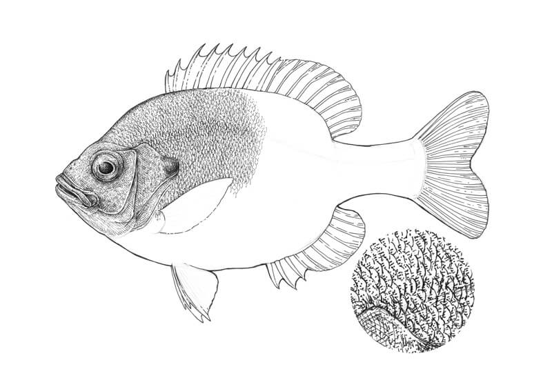
I continue the work in the same manner. This is quite a monotonous, yet meditative process. At this step, the texture looks somewhat flat because we haven’t applied any hatching to create an illusion of the Bluegill’s volume.
A Bluegill usually has 5-9 vertical stripes on its body, but since we’re going to add the colors digitally (which is faster than creating such nuances with ink), let’s leave the pattern relatively uniform now.
The bottom part of the Bluegill’s body is slightly lighter, so I use fewer ink marks there.
It’s quite easy to become too immersed in the drawing process while working on the textures. That’s why I recommend taking short breaks regularly, even if you don’t feel like you need one.
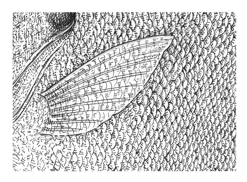
Hopefully, an enlarged fragment of the fish’s body texture (including the lateral line) will be a useful visual demonstration of my approach.
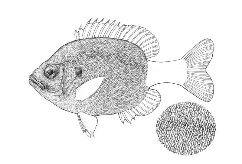
It’s time to cover the tail with scales, making sure that the direction of the new rows conform to the shape of the Bluegill’s body. In other words, don’t be afraid to make some changes!
The tail scales usually are smaller than the scales on the body.
To make sure that your texture is uniform enough, try to squint your eyes a bit and look at your artwork. If there are no weird light/dark spots or unexpected gaps, everything is just right.
However, if there is a moderate lack of uniformity, it is probably best to improve your texture. Or, feel free to leave the drawing as it is, if you like it – we shouldn’t strive for absolute perfection here.
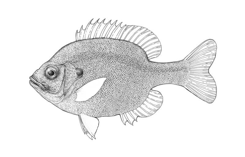
Let’s draw the fins. We’ll start with the dorsal one. I darken the areas right near the spines and rays, using the 0.05 ink liner.
The spines and rays themselves remain relatively light. I use short contour hatches and dots to create an illusion of their volume.
There are some darker spots on the dorsal fin as well. I add them with several layers of thin hatches.
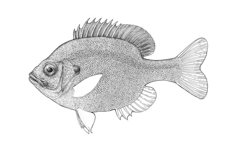
Now I work on the fins that are located on the bottom part of the Bluegill’s body. The anal fin may seem slightly darker than other fins because of the spots and three relief spines that create a considerable variety of value.
I accentuate the direction of the pelvic fins (they are closer to the head in the bottom part) with the deliberate use of long, inclined lines. This creates an illusion of ‘folds’.
The pectoral fin is semi-transparent, so we can easily create a hint of scales that are visible here. This fin is slightly darker at the place where it is attached to the body.
And here is the result of our work at this step:
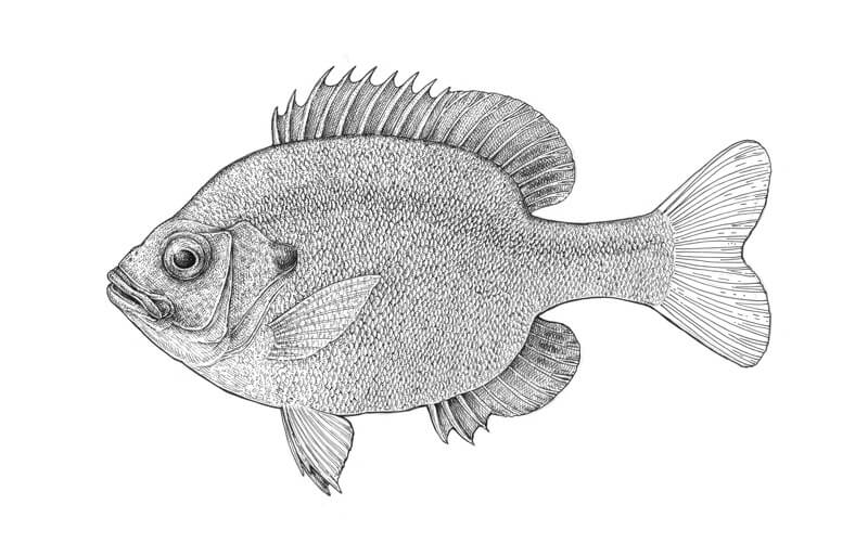
The caudal fin is a tricky one. I cover the gaps between the rays with simple vertical hatching, leaving the rays untouched.
The ‘base’ of the fin is darker. Increasing the contrast here makes the beautiful pattern of rays clearly visible. I also accent the end of the caudal fin, so its middle part becomes lighter in comparison.
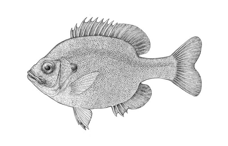
It’s time to give our fish more volume. With the 0.05 ink liner, I add rounded hatches to the back and the underside of the fish. These repeat the contours of the body. The hatching in the upper part should end at the lateral line.
I also leave a subtle highlight in the upper part of the fish to accent its three-dimensional look.
A Bluegill has a flattened body, so we don’t have to make the value here much darker or increase the contrast dramatically.
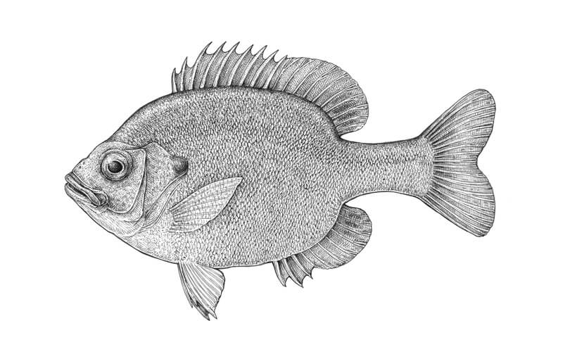
If I were going to leave this artwork as just an ink drawing, I would add more hatches to the back of the fish. But since we’re going to color it, I’ll leave the Bluegill just as it is now. Having too much ink may overload the artwork and the painted result won’t be as impressive.
Adding Color Digitally
Scanning and Editing the Ink Artwork in Photoshop
First, we need to get a digital version of our drawing. I prefer scanning because this method gives us more control over the result. It is probably easier than making a great photo (which requires special equipment and the right lighting conditions)
It’s important to have a large file with a high resolution – I scan the drawing at 300 dpi; a higher value is appropriate but not necessary in this case. The high resolution allows transferring a great number of visual details to a digital form.
There are three main modes of scanning an image: black and white, greyscale, and color. I usually choose greyscale when I prepare images for the tutorials, and black and white – for scanning the artworks that are intended to become art or apparel prints.
Images scanned in black and white mode are very contrasting. Just compare two fragments of a fish in the image below. The one on the left side was scanned in greyscale, and the right one – in black and white.
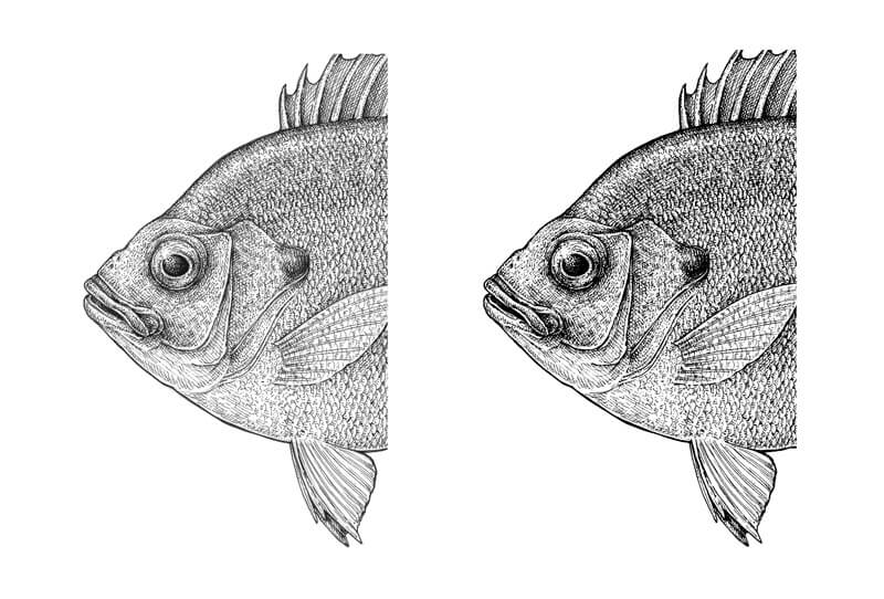
Sometimes your scanner allows for individual preferences. For example, a higher/lower brightness or contrast for a particular image. Using advanced settings may be quite useful, especially if your scanner tends to make a scanned image slightly too bright by default.
A scanned image may have various file formats – for example, JPEG or PNG. In our case, this option is not so important.
Here is my scan; a JPEG scanned in black and white mode. Its size is 3508 x 2552 px, the resolution is 300 dpi, and the color model is RGB.
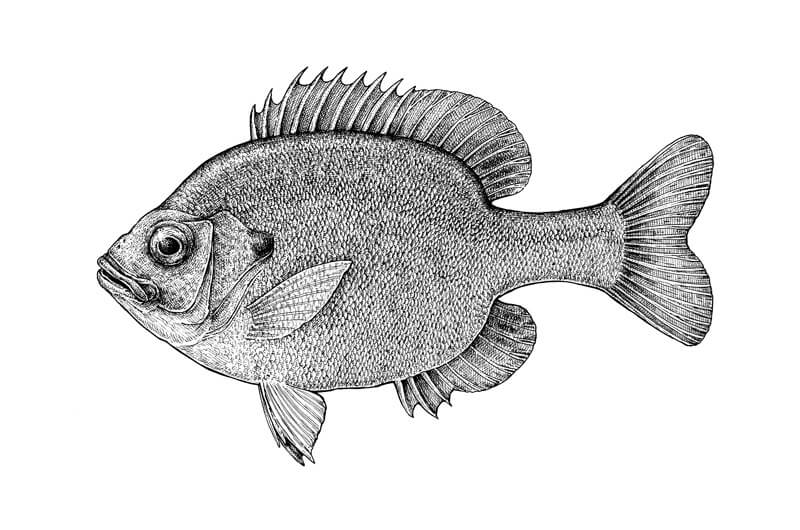
I open the file in Adobe Photoshop.
I assume that you may already be familiar with the interface of this program, so we won’t be taking a close look at its features and the abundant variety of tools.
Just in case if you need an easy-to-understand knowledge about Photoshop tools and editing possibilities, please check out this course: Basic Photoshop for Artists.
Before we dive into the coloring part, we go through an editing process.
First, zoom in and examine the image. If there are some “greyish” pixels around your black ink lines, go to Image > Adjustments > Brightness/Contrast and increase the values, dragging the handles to the right side and observing the changes. We need only contrasting black lines on white as a result.
Note: pressing Ctrl+space bar allows to zoom in and out in an easy way.
I change Brightness to 28 and Contrast to 4. How much adjustment you add depends on your image; there is no perfect answer for every situation.
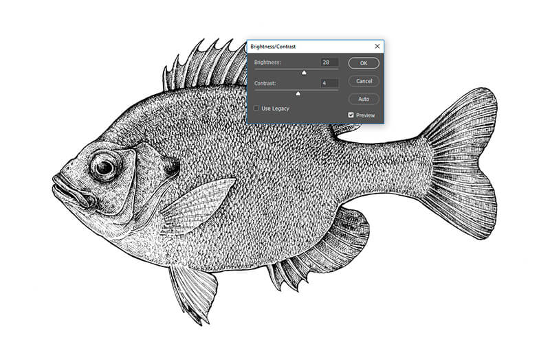
Now take a closer look at the drawing itself. Are there any weird marks near the fish, stray points or traces of pencil marks? My image has some, but in general, it’s quite clean.
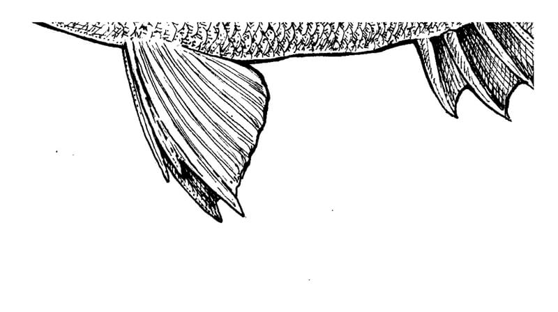
With the Brush tool (The Hard Round type, 100% opacity, #ffffff white color) I cover all the unnecessary marks. Now it’s perfect!
Useful to remember: the hot key for the Brush tool is B.
Removing the visual garbage is important. A clean drawing is important. Such ‘cleaning’ is especially necessary if you’re going to transform your traditional drawing into a digital design for the printing purposes.
How to Remove a White Background in Photoshop
Now we have a digital version of your hand-drawn Bluegill. But how do we add color it and change the color of the background?
There are some important steps, preceding the fun painting part. First, click on the Background in the Layers panel with the Right Mouse Button, and choose Layer from Background.
If you don’t see the Layers panel, go to Window > Layers.
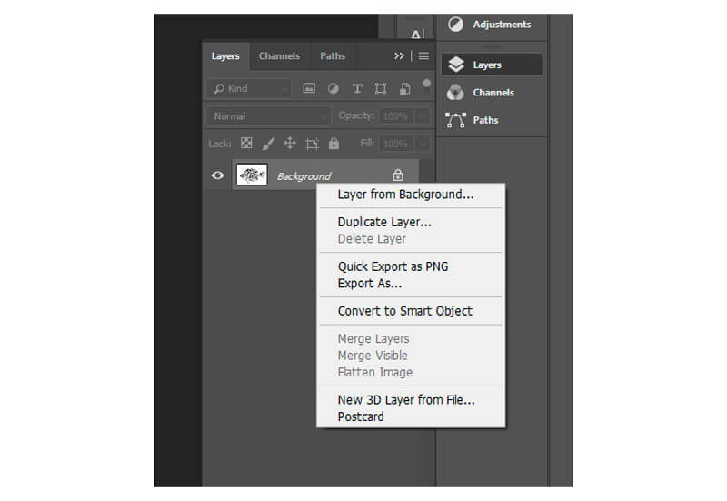
Now, with the Magic Wand tool selected (hot key W), click anywhere on the white space around the fish. The Contiguous checkbox on the Options bar should be off – it ensures that you’ll select not only the touching white pixels but all of them.
Note: The Options bar is above, right under the main menu of the program.
You’ll get the following picture:
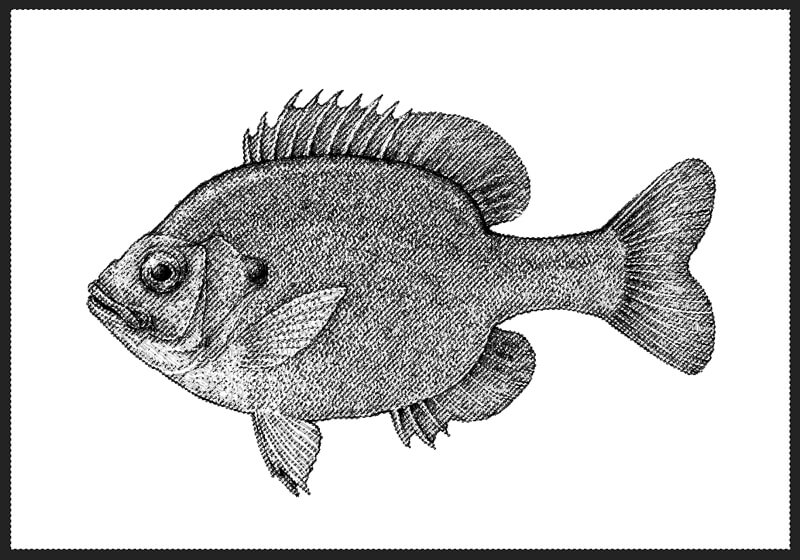
I’ve made the screenshot above with some dark space of the program’s interface around the artboard, so you can easily see the borders of selection on the perimeter. The Magic Wand tool selected all white pixels in the image.
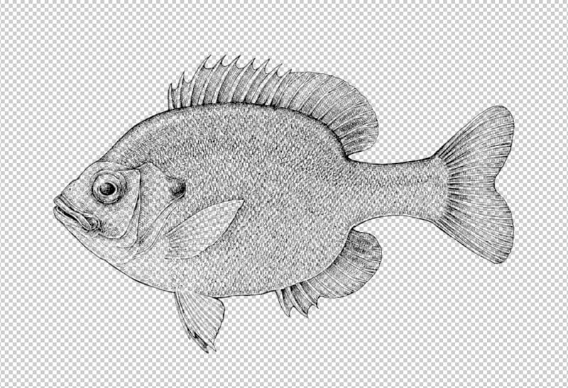
Now hit Delete button (this will remove the selected pixels), then go to Select > Deselect or just hit Ctrl+D.
Now you’ll see something like this – black marks on a ‘transparent’ background of checked grey squares.
How to Create a Shape for Digital Painting
We removed the original background. Now it’s time to create a shape that is repeating the silhouette of the fish to paint on it. This shape should also be solid, so we can’t see any patches of the background.
I examine the artwork once again, looking for any visible gaps in the main contour (the silhouette of the fish). My drawing doesn’t have such gaps, but if yours does, enclose it using the Brush tool at 100% opacity and #000000 black color picked.
Gaps will affect the selections we get with the digital tools and may cause difficulties in the next steps. If you have a complex ink drawing with a broken contour line that can’t be joined, this method of creating a shape for underpainting won’t work as effectively. Maybe one of the future tutorials will be dedicated to such challenges!
After you closed the contour, click with the Magic Wand tool selected anywhere in the space around the fish. The Contiguous checkbox should be on!
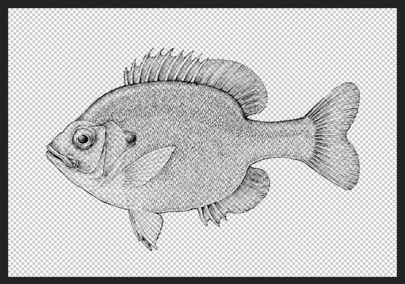
Hit Ctrl+Shift+I or go to Select > Inverse. The selection will change from “around the fish” to “inside the fish”.
Create a new layer, for example, hitting Ctrl+Shift+N.
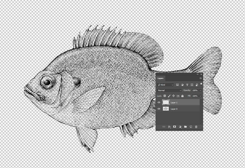
With the Paint Bucket tool (the hot key G), click anywhere in the selected area. The layer that we’ve created just now should be selected in the Layers panel.
The white color was set as the foreground color, so the shape was filled with it.
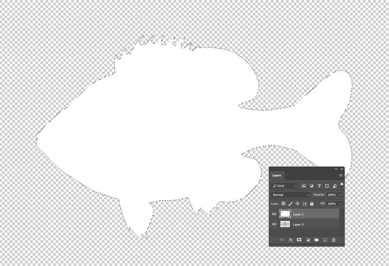
I press Ctrl+D to deselect the shape, then reorder and rename the layers in the Layers panel. Let’s agree that the layer with the black lines will be “Ink” and located on top, and the layer with the new white shape will be “Shape for coloring” and located underneath.
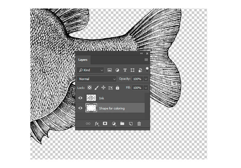
We are almost ready for painting. Select the “Ink” layer in the Layers panel, reduce its opacity and change the blending mode to Multiply.
The opacity of a layer is changed by sight; you can always adjust it later. I’ve set it to a value of 73%. The ink lines became somewhat lighter and subdued.
It’s also a good idea to lock the layer by clicking on a small padlock icon. This will ensure that we won’t draw something on this layer later on or won’t damage it any other way.
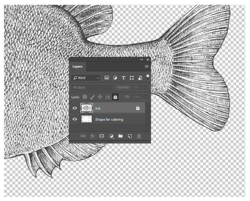
As a finishing touch, select the “Shape for coloring” layer and click on the Lock transparent pixels icon (I’ve marked it with a red line in the image below).
The great advantage of this function is that now we can apply any brush strokes to this layer, and nothing that goes beyond the shape’s borders will be visible – the transparent pixels will remain untouched.
![]()
Just a note: always watch your layers! It’s easy to become distracted and add colorful strokes to the wrong layer, which in this case, will bring a bit of chaos and uncertainty to your file. Especially, if you have more than just a couple of layers.
The Auto-Select function (you’ll find it on the Options bar of the Move tool) may be extremely useful because it allows jumping from a layer to a layer with a single click. At the same time, it requires to be as attentive with your brush strokes and selections as possible.
Great job! Now we are completely ready to move on to the painting part.
How to Paint the Fish in Adobe Photoshop
A Bluegill has a distinctive coloring, with deep blue and purple on the head, dark olive-colored stripes down the side, and a fiery orange to yellow belly. I imagine the colors that I’m going to use as separate elements.
Using the Brush tool and the Color Picker, I add samples of each color to a new layer called “Colors”.
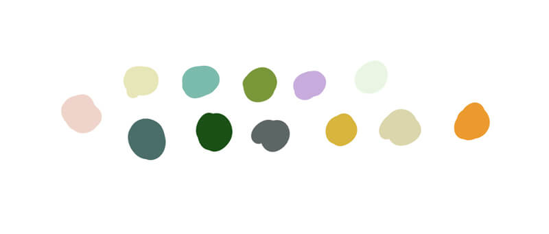
This simple action helps to set some guidelines. This color palette is here not to limit your actions but to form an integral picture (or color scheme) beforehand. You can switch the visibility of this layer off later on if you notice that it becomes distracting.
I also add a new layer – let’s call it “Background” and fill it with white. Of course, this layer should be located underneath, or it’ll cover your artwork.
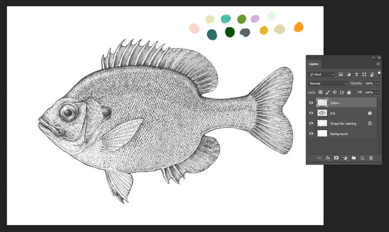
With the Paint Bucket tool, I change the color of the shape that we’ve created for the coloring purposes. Now it’s #f3f3db, a pale tint of yellow.
Then, with the Brush tool, I cover the upper part of the fish with a #1a5016 dark green color. A great way to get beautiful color transitions is to use a brush with soft edges at a reduced opacity. The diameter of the brush is quite large.
The more strokes you lay on top of each other, the more intense the color becomes – until it’s 100% opacity.
Again, pay attention to the Layers panel – are you painting on the right layer?
To make the demonstration more comprehensive, I’m going to insert a sample of each brush color I’ll be using into the screenshots. Note that the opacity of these samples will be 100%; usually, we don’t use such concentrated color in the painting process.
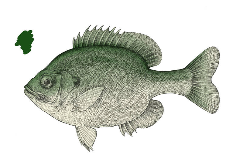
There are some important technical details about the Brush tool; they’re worth reminding you of even if you are not a complete beginner in Adobe Photoshop.
You can choose the type of brush and its opacity using the Options bar.
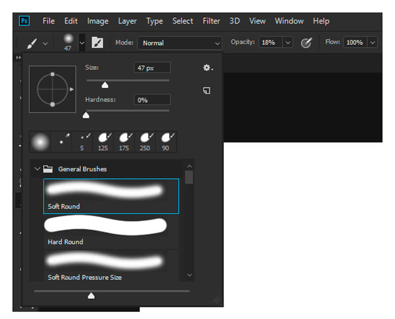
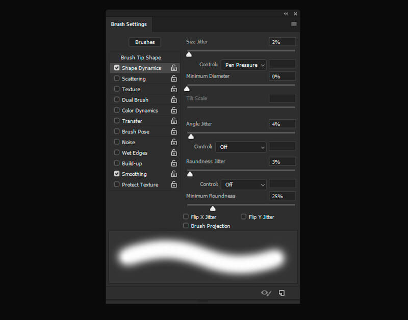
To make sure that you can vary the width of your digital lines, using a graphic tablet, go to the Brush Settings panel, find the Shape Dynamics, and set the Pen Pressure in the Size Jitter parameter.
Feel free to play with other parameters and check out the result.
And the last tip for now: the fastest way to change the size of your brush is to press keys with the square brackets on your keyboard:
[ makes the diameter of your brush smaller, and ] enlarges it.
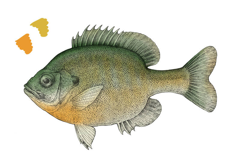
Let’s get back to our artwork. I’ve chosen a couple of oranges, such as #eb9b2d and #d7b53d with the Brush opacity of 14% to create some brighter color nuances in the middle and bottom parts of the Bluegill.
It’s a great idea to imitate the stripes on the body and also touch the fins with these warm colors.
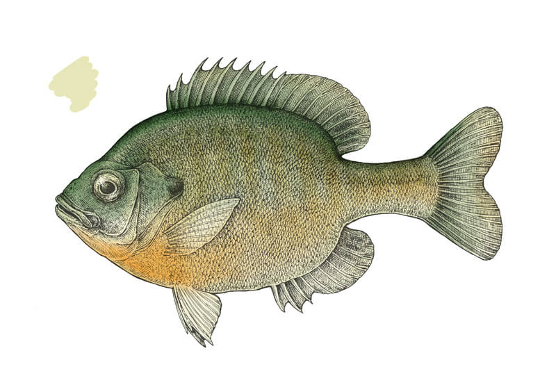
With a light beige #e6e6b7 and 26% opacity, I accent the eye and the prominent details of the head. I add a stroke of this tint to the belly of the fish to emphasize its lightness.
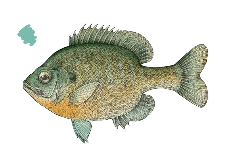
With the greenish blue tint #7bbbad and opacity of 18-26%, I touch the gill area, the body, and fins.
At this stage of work, be careful with opacity and don’t add too heavy strokes of color.
I evaluate the result and reduce the opacity of the “Ink” layer to 70% (remember to switch back to the color shape layer after such actions).
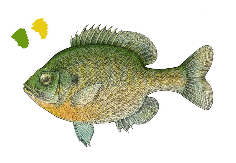
Let’s add some brightness with the green #699910 and yellow-orange #e7cc13. The opacity value is 19%.
I add the green strokes mostly to the upper part of the fish, and orange ones – to its bottom part. The diameter of the brush is still quite large, but I reduce it to create some playful nuances on the fins.
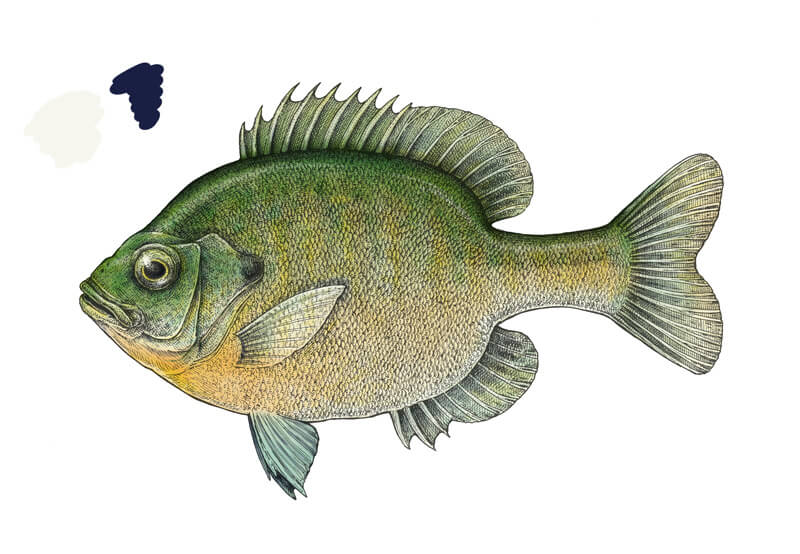
It’s time to increase the contrast. With the light #f7f6ee, which is close to white, I accent the belly of our fish, lighten the stripes on the body and the upper part of its head.
Then I pick a deep shade of blue, #191f43, and create an expressive shadow that repeats the upper contour of the fish. I extend the shadow to the lateral line, making a soft transition from a relatively intense color to just a hint at it. Remember that the back should have a soft line of the highlight!
The eye needs some darker strokes too. I darken the pupil and create a deep shadow under the eye, then accent the spot on the posterior edge of the gills.
I’ve chosen the dark blue for two reasons. First of all, it’s one of the main colors that are natural for Bluegills. Another important reason is that the blue color is so great in conveying the sense of volume in paintings. Our case is no exception – the fish looks much better now!
I vary the opacity of the Brush tool in this step; the maximum value for the lighter color is 30%, and 50% is for the darker strokes.
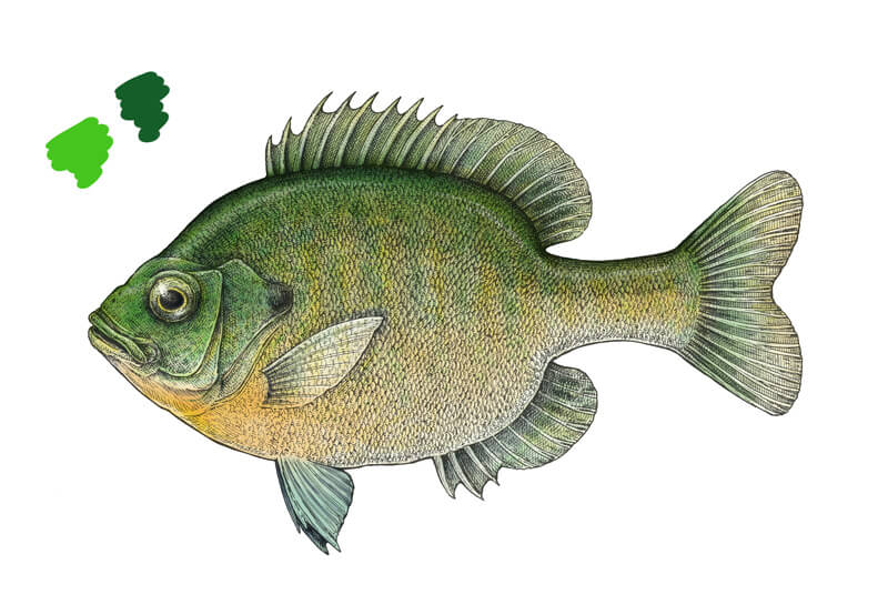
I use the bright green #46c51f and the dark green #155d29, both at 12% opacity, to accent the stripes and make them more varied in terms of color. The fins also require a subtle touch of green.
I pay special attention to the head and the caudal fin. It’s important to work on the whole fish, not just the body.
Here the painting process becomes more detailed, so feel free to zoom in and reduce the size of your brush.
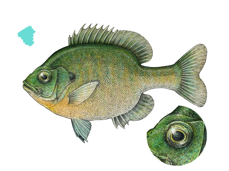
I pick a turquoise (or it’s aquamarine?) color #69dcd5 at 36% opacity and change the type of the brush to the Hard Round Pressure Size. Actually, any brush type with the clear stroke edges will be a great choice.
I zoom in and add colorful strokes to the head, including the gills, and the body of the Bluegill. The best option is to listen to your artistic voice; sometimes it’s difficult to determine when it’s enough.
I add some strokes to the eye. In the image below, you’ll find a fragment close-up.
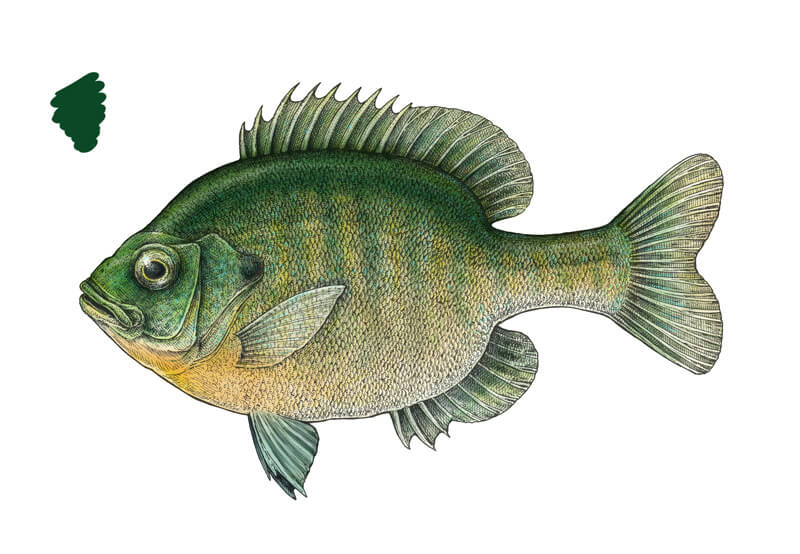
With the dark green #0b4925, I accent the back of the bluegill, the vertical stripes, and the darker areas of the fins. The opacity value is varied depending on the desired result.
As a nice addition, I lay some strokes near the lateral line to make it more visible. This simple action makes our artwork more interesting.
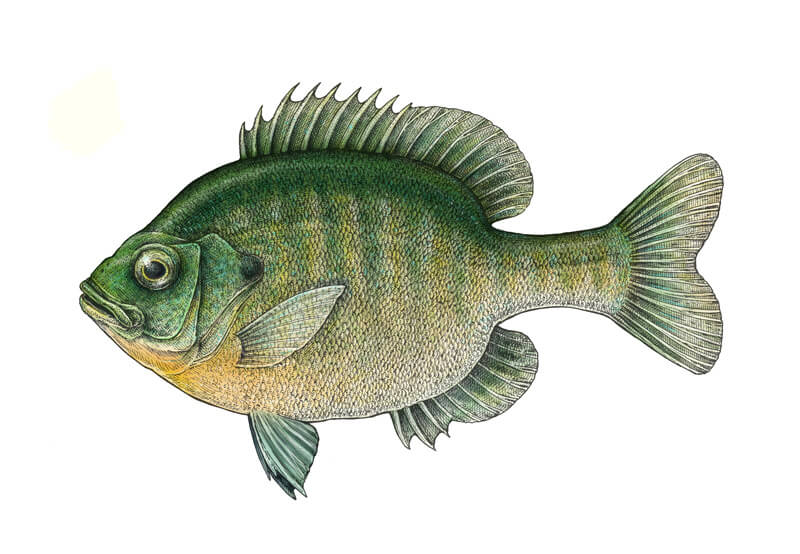
I use the light #fffff3 color to emphasize the gaps between the dark green stripes and slightly touch the lighter areas in general. The relief details of the head need some accents, too.
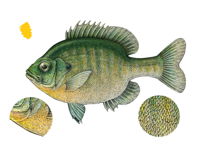
Using a brush of a small diameter allows imitating single scales that are reflecting light. The opacity value changes from 10% to 50%.
I add some yellow-orange #ffca11 nuances at 90% opacity, imitating single scales, as in the previous step. The most concentration of this color is on the ‘breast’ of the fish, and some splashes of it can be found on the body in the stripes.
To make the bright spots even more vibrant, I adjust the color closer to the yellow hue.
Sometimes you can’t say if the artwork you’re working on is close to completion or not. This is especially true for anything that relates to detailed digital painting. If you feel somewhat tired and uncertain, the best option is to take a break and come back to your creation later, with fresh eyes.
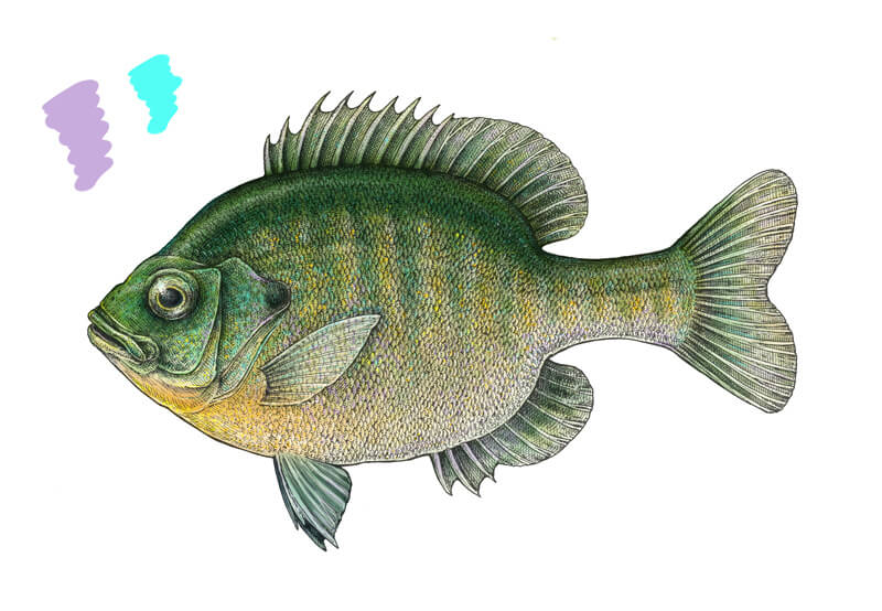
I add some muted lilac #c8acdd and bright aquamarine #53fff5 strokes to create a true play of nuances in the scales. The gill cover is a great place to put some vibrant colors together.
The opacity varies from 20% to 30%.
The artwork is almost complete, but it still lacks some contrast. With a soft brush of a relatively large diameter, I cover the back of the fish with the dark blue #0b1a54 color, emphasizing the pattern and everything that should be darker in my opinion.
Just look at your painting and observe your feelings. If this artwork is believable enough?
As far as I can say, mine is ready. Of course, we could add more and more details, but that we could go on with that forever. Let’s strive for interest and artistic expression, not for an absolute perfection!
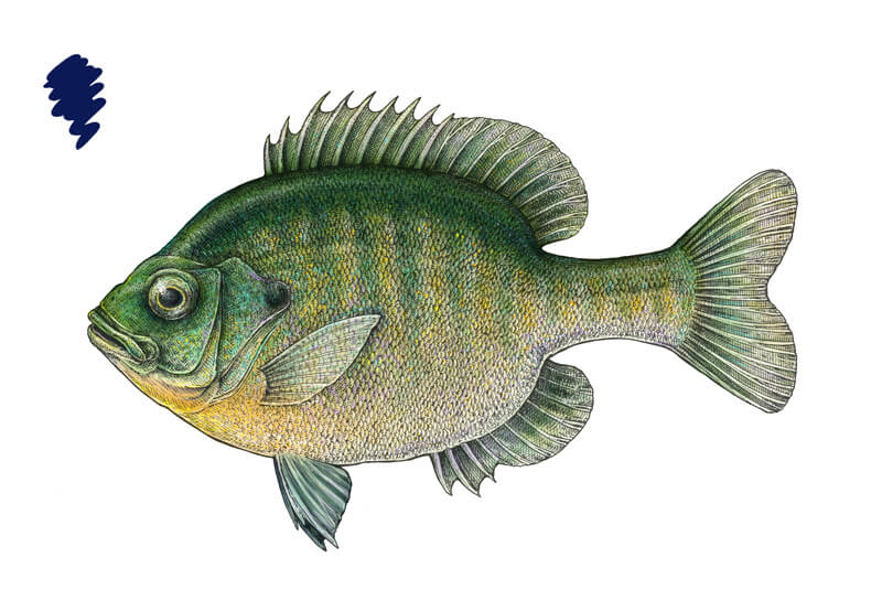
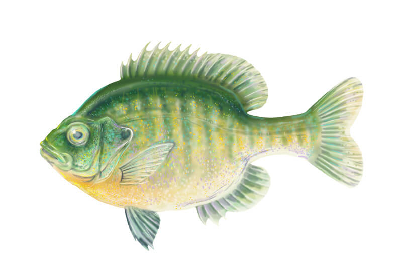
Are you curious how this digital painting layer looks just by itself, without the ink lines? Here it is:
However, our work isn’t 100% finished. I’d say the Bluegill might look better on a tinted background. Let’s experiment with some options!
To change the color of the background, select the “Background” layer on the Layers panel, pick a color you like, and use the Paint Bucket tool to cover the whole area with one click.
If you like a textured look, you can place a texture (for example, some stains) on a separate layer, reduce its visibility and change the blending mode to anything that looks appropriate. I decided to use a texture from my collection. The Blending mode of the layer is set to Soft Light and the opacity is 7%.
I’ve created several version. The fish is the same, but with each colored background, it looks slightly different. Color is a relative thing!
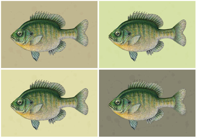
Which one do you like best? To be honest, it was extremely difficult for me to decide, particularly because I need all of my painted artworks to be “seasoned”. I often lay aside the files and come back to them after weeks or months to complete them or change something.
Now this version is my favorite, probably because this greenish background is so fresh and harmonious:
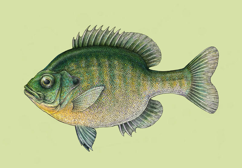
The other variants with brownish backgrounds are perceived as more vintage or antique, which also makes them interesting and appealing.
Pros and Cons of Combining Ink and Digital Painting
I’d say that the biggest advantage of this artistic approach is its creative power. Just think of all the possible artworks you can create, using the strengths of both media!
While ink is so great at conveying a sense of a texture and creating stunning details, digital tools such as Adobe Photoshop, allow us to experiment with color in an easy way. You’re not limited to any set of colors as happens sometimes with traditional paints!
Plus, a digital workspace provides a remarkable range of various effects, adjustments, and instruments to play with. Just remember how we changed the blending mode of the layer and got a nice subdued result.
You can also save a copy of your artwork or a separate layer in the process, making sure that you can go in a different direction if there is anything you want to change in the future. Another way to “undo” is to cancel the steps in the History panel. The Ctrl+Z combination is something that many traditional artists wish they had!
But at the same time, your drawing skills must remain strong. We began with an ink drawing using a traditional approach, without the help of technology.
Also, this low-pressure technique is for anyone who is interested in digital painting but feels slightly intimidated by it. This is a great way to become familiar with the tools Photoshop offers for traditional artists.
As for the cons, this mixed media approach is time-consuming. It’s like creating two artworks in one, plus the time for research and making sketches. However, I bet this won’t scare the artists who are curious and open to the new interesting options. Of course, there is no need to complete the artwork at one sitting! Just take your time and enjoy the process.
The Conclusion
A remarkable feature of this mixed media approach is that sometimes the result becomes unpredictable. You’re just working, adding new strokes here and there, changing something, adjusting the parameters and… suddenly notice that the artwork becomes really beautiful as if this has happened by itself.
Probably everything that relates to art and creativity has a portion of spontaneity and miracle – it doesn’t matter if it’s traditional or digital media.
Do you feel that this method is worth trying? I hope so. Please share your creations with us! By the way, a great option to start with this mixed media approach is to add color to your existing ink artworks.
Remember: we learn when we do take action!
Thank you for being with me on this artistic journey. I wish you much inspiration and creative joy!
If so, join over 36,000 others that receive our newsletter with new drawing and painting lessons. Plus, check out three of our course videos and ebooks for free.
Lesson Discussion
Comments are closed.


Fascinating and very beautiful! Thank you!
Glad that you like it, Ginny! Thanks!
Very simple way to draw an amazing and beautiful picture..
Thank you, Kashinath! 🙂
Thank you Eugenia, for this lesson! I always was drawn to ink drawing but found it to difficult, but now I am passed the treshold, as we say in Dutch and now I can explore this medium more freely. Plus a lesson in digital coloring!
Although your work is outsstanding I am amazed by my own result.
Thank you for the kind words, Debby! I’m so glad 🙂
Hi Eugenia,
One question now I am working on the coloring, when you start the coloring do you work in the layer, colors of shape for coloring?
Hope to hear from you egards, Debby
Hello Debby, thanks for your question! 🙂 I’m afraid I didn’t understand the question… Do you mean what colors did I use first? Or in what layer did I work? Please give me more details, I’d love to help.