What is the Rule of Thirds?
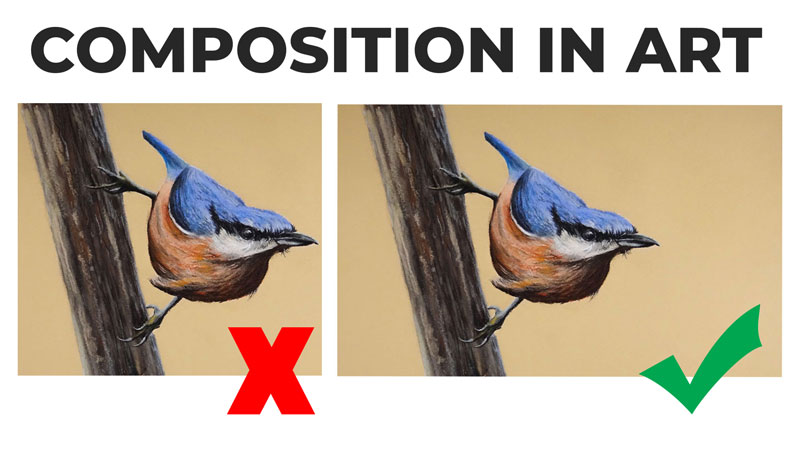
Composition is one of the most important factors in the success or failure of your art. You may create a work that is executed at the highest level of technical skill but if your composition is weak, then your art is too. In this lesson, we’ll explore a compositional theory that will help you make better decisions regarding your composition. This compositional theory is called “The Rule of Thirds”.
See also: Composition in Art
The Rule of Thirds is a derivative of the “Golden Ratio”, a mathematical relationship of proportion that can found in our natural world. This unique ratio has been studied by mathematicians for centuries and utilized by artists and architects such as Salvador Dali, Le Corbusier, and Leonardo da Vinci.
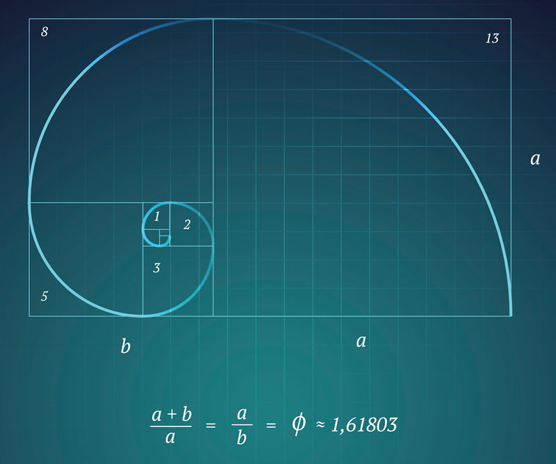
The Golden Ratio, visualized above, is a ratio in which a + b is to a as a is to b. This ratio can be simplified into a rectangle, which is referred to as “The Golden Rectangle”.

You’ll notice that when this ratio is applied to a rectangle, the line that divides section a and b is very close to 1/3 of the rectangular space.
The Rule of Thirds is a simplified version of the Golden Ratio. A ratio of 1/3 is very close to the same proportion that we would use with the Golden Ratio. So, instead of entangling ourselves in a complex mathematical formula, we can simply use The Rule of Thirds in its place and derive a similar aesthetic benefit.
Using The Rule of Thirds
The Rule of Thirds is best understood by analyzing a blank surface. This could be a sheet of drawing paper or your canvas. Basically, we’re considering the picture plane.
We can divide the picture plane into segments using vertical and horizontal lines. Each imaginary line falls on the edge of one of the thirds.
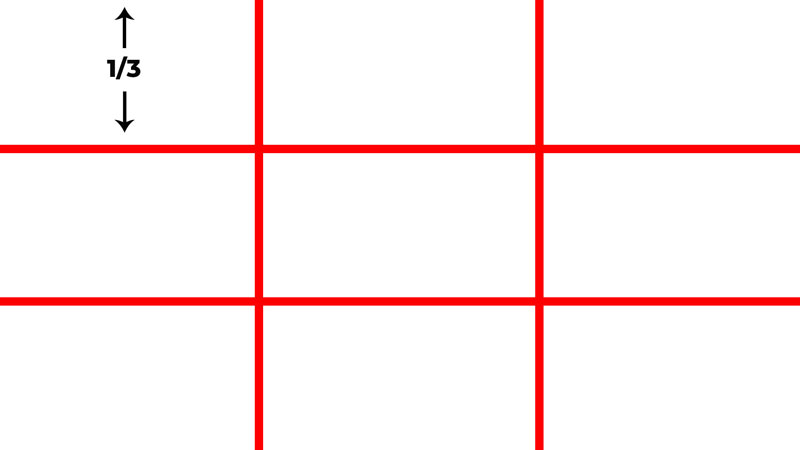
Placing important elements on any of these lines often leads to a more successful composition. For example, you may choose to place the horizon line in a landscape on either the upper horizontal line or the lower horizontal line.
But we can take this even further.
You’ll notice that the horizontal and vertical lines intersect. These locations of intersection are excellent places to position important elements within your composition. For example, you may place the focal point(s) on one of these intersecting points in order to create a more successful composition.

Applying This Concept to Potential Photo References
Before we look several examples of how artists have used The Rule of Thirds in their art, let’s examine a few practical examples. We can imagine that these examples are potential references we may use for a drawing or a painting. Let’s see if we can improve the composition using The Rule of Thirds.
Example 1 – Landscape
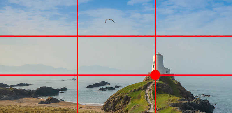
In our first example, we’ll take a look at a landscape. The composition of the unedited photo (below) is quite strong without any adjustments.

The lighthouse, which is clearly the focal point, is positioned close to the center of the picture plane. The pathway leads our eyes to this location. Let’s try to improve it.
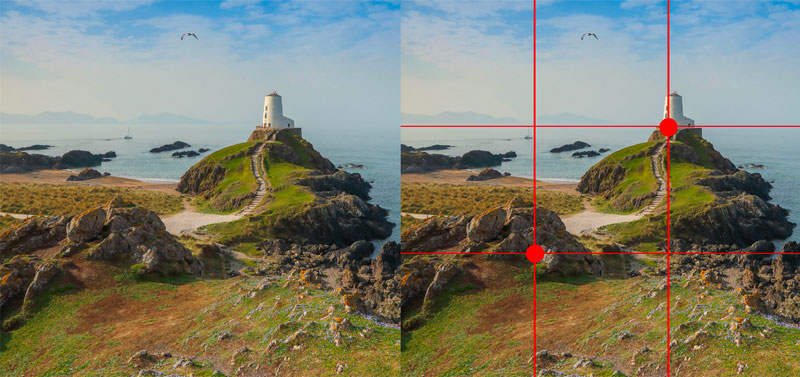
Using The Rule of Thirds, we’ll crop the image and place a grid over the top.
As you can see, we’ve now placed the lighthouse along the right vertical line. The base of the lighthouse is now positioned on one of the intersection points and the horizon line is in alignment with the lower horizontal line.
But, there is a clear problem with this composition. It feels very heavy at the bottom. By moving the line where the land meets the water down, the sky is emphasized. In this image, the sky is rather bland and lacking visual interest. This is why this composition feels visually heavy at the bottom of the picture plane.
This composition would work if there was more visual interest in the sky, but this image is lacking this. Let’s try again.
Again we’ll crop the image using The Rule of Thirds. But this time, we’ll consider the visual weight of both the sky (light) and the ground (heavy). To balance the visual weight of these elements, we’ll include more of the ground and less of the sky.
When we lay a grid over this composition, we can see that the lighthouse is in alignment with the right vertical line and meets the ground at one of the intersection points. We also see that the horizon line is alignment with the top horizontal line.
The mound of rocks in the foreground also plays an important role in the composition. We can see that the rocks are now in alignment with another intersection point. As an added bonus, we’ve included the path, which acts as a guiding line, leading us to the focal point (the lighthouse).
As a result, our second attempt at using The Rule of Thirds to improve our composition has succeeded.
We can learn two things from this first example. First, The Rule of Thirds can improve your compositions. Secondly, we must consider other compositional aspects in order for it to work.
Example 2 – Portrait
The Rule of Thirds works for any subject. In fact, the subject is mostly irrelevant to this compositional theory. Let’s look at applying The Rule of Thirds to a portrait. Again, we’ll consider this photo as a potential subject for a drawing or painting.
Here’s the original photo…

As you can see, the subject is placed directly in the center of the picture plane. The elements in the background are asymmetrical, but balanced. But since there is so much happening in the background, the subject (the young lady) is somewhat lost.
Let’s see if we can improve this composition using The Rule of Thirds. Again, we’ll crop the photo and lay a grid over the top.
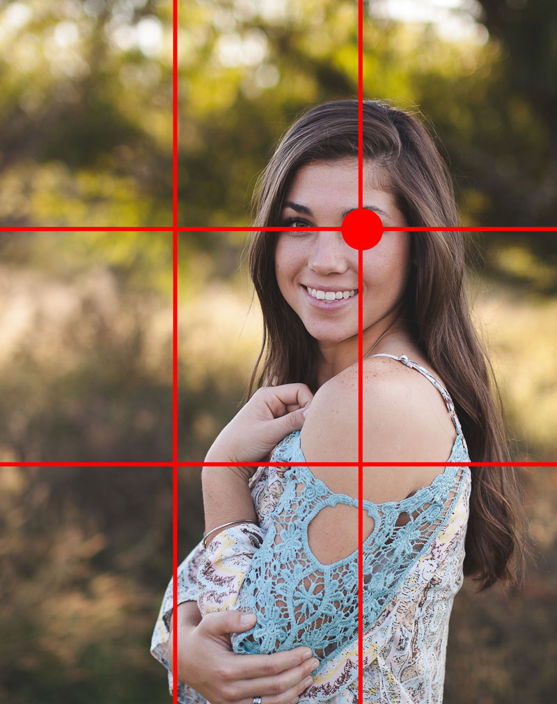
We’ve cropped the image down and by doing so, moved the subject so that she is in alignment with the vertical line on the right. On top of this, we’ve positioned her so that her eye (a natural focal point) lies on one of the intersection points.
In this case, we’ve improved the composition using The Rule of Thirds.
But, there are cases where The Rule of Thirds may not be the best option for your compositions.
Exceptions to the Rule
Just like everything else in art, there are exceptions to every rule. While this compositional theory works most of the time, there are circumstances where it may weaken a composition.
Example 3 – Another Portrait
Let’s take a look at another portrait and attempt to improve the composition based on The Rule of Thirds. Again, we’ll consider this photo as a potential subject for a drawing or painting.
Here’s a look at the original photo…

Here we can again see that the subject is positioned in the center of the picture plane. But pay special attention to the background and its effect on the subject.
Let’s try to improve this composition based on The Rule of Thirds. Again, we’ll crop the image down and lay a grid over the top.
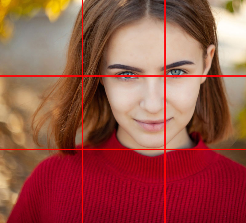
We’ve now cropped the image so that the bulk of the head is in alignment with the right vertical line and the eyes are in alignment with the top horizontal line. As a result, the subject is now positioned on the right side of the picture plane and the background is less important.
This new composition is strong, but is it better than the original?
If we revisit the original image, you’ll notice the background plays a role in creating focus on the subject. The background features a circular pattern of contrasting colors that acts to frame the face of the girl. This pattern emphasizes the face and works to move your eyes to the focal point.

Our edited photo is still a strong composition, but our original is better.

Examples of Artworks That Use The Rule of Thirds
Artists throughout history have clearly recognized the importance of aesthetically successful compositions. There are countless examples of works that have implored the use of The Rule of Thirds. Let’s take a look at few of them…
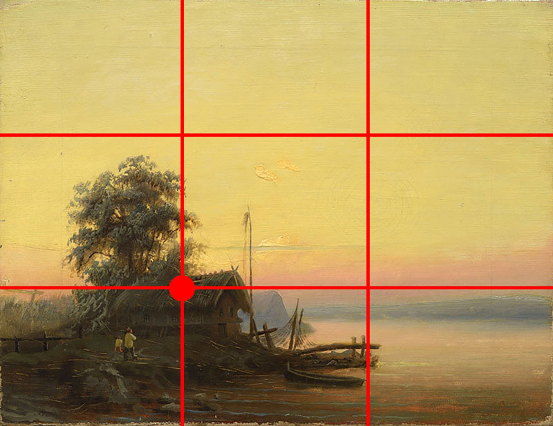
In this work by Albert Bredow, we see that he has positioned the main focal point using the intersection point in the lower left corner. The horizon line is also in alignment with the lower horizontal line.
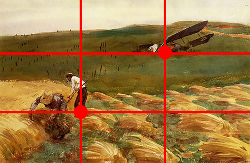
In this painting by John Singer Sargent, we can see that he has utilized The Rule of Thirds to position both of the main focal points within the scene. The crashed air plane has been placed on the intersection point in the upper right portion of the picture plane. The figures in the foreground are positioned on the intersection point in the lower left portion of the picture plane.
And in this painting by Delacroix, we see that the boat is in alignment with the lower horizontal line with Christ positioned very close to one of the intersection points.

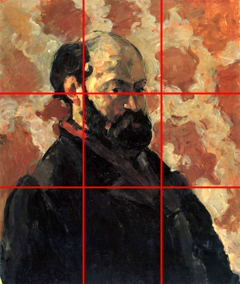
In this self portrait by Cézanne, we see that he has positioned the eyes in alignment with the top horizontal line and the bulk of the figure is in alignment with the left vertical line.
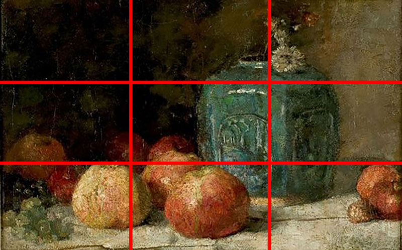
In this still life by Van Gogh, we see that the blue ginger container is in alignment with the right vertical line, while the bulk of the apples line up with the lower horizontal line.
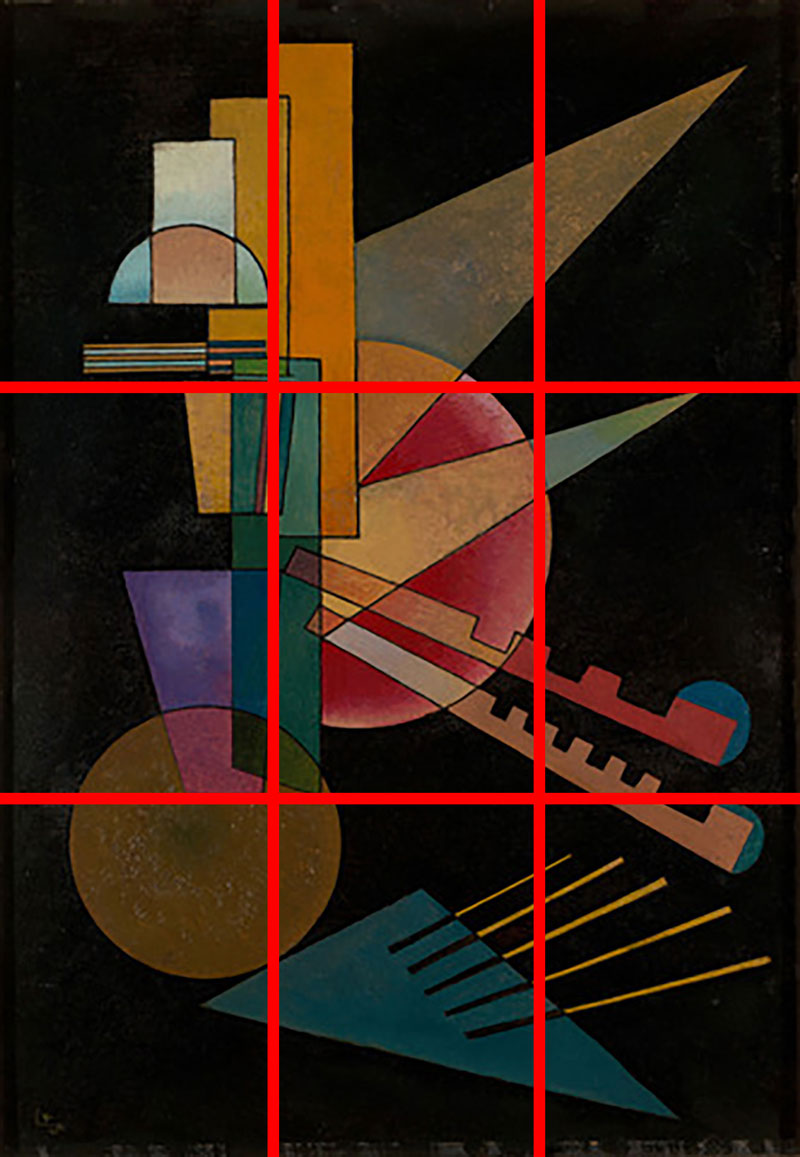
In this Non-Objective work by Kandinsky, we see that the visually heavy shapes are in alignment with the vertical line on the left side of the picture. The dominant circle at the bottom is also very close to an intersection point.
Conclusion
The Rule of Thirds is an excellent way to improve your art compositions. But keep in mind, we still need to consider other compositional strategies in order to create a successful composition. We should be careful that we don’t become too reliant on just one or two strategies when it comes to designing our artworks. Thumbnail or preliminary sketches will always be your best friend.
If so, join over 36,000 others that receive our newsletter with new drawing and painting lessons. Plus, check out three of our course videos and ebooks for free.