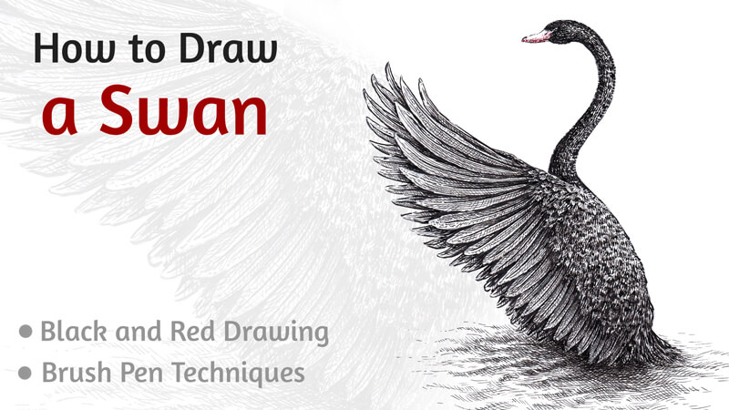
Before we dive into the drawing, did you know that these birds have their own constellation? Cygnus (the Latin word for “swan”) is a brightly visible constellation lying on the plane of the Milky Way. In Greek mythology, it represents Orpheus, who was transformed into a swan after death.
This project features both an extraordinary subject and a unique set of drawing supplies. Drawing the bird’s glossy plumage may be a challenge, but we’ll find an effective way to solve this puzzle.
Drawing Supplies For Drawing the Swan
The main art tool we’ll use for this project is a brush pen. There’s no need to dip its tip into ink to make marks making this characteristic extremely convenient for artists that like drawing on the move, outside of the studio.
Also, a brush pen allows for creating a variety of marks. The width of a line can be changed on the fly by pressing harder, resulting in a wider line.
I’ll be using two brush pens that contain black ink. The first one is Faber-Castell PITT artist pen, and the second is Copic Multiliner BS. (BS means Brush Small.) However, the tips of these pens are relatively close in size.
With the 0.1 black liner, we’ll create the finest details.
The final touches will be made with a Faber-Castell Grip finepen 0.4 of red color. This hue is closer to orange rather than to violet.
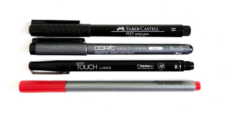
The size of the paper is A4. I’m using ordinary thick drawing paper and it has a smooth surface with no visible texture.
Why use two brush pens of approximately equal size? The difference lies in the degree of wear and tear. The Faber-Castell brush pen is brand new and I’ve never used it before. On the contrary, my Copic Multiliner has gone through a great number of art projects – no wonder that its tip is considerably worn out!
Let’s compare the tips of the brush pens.
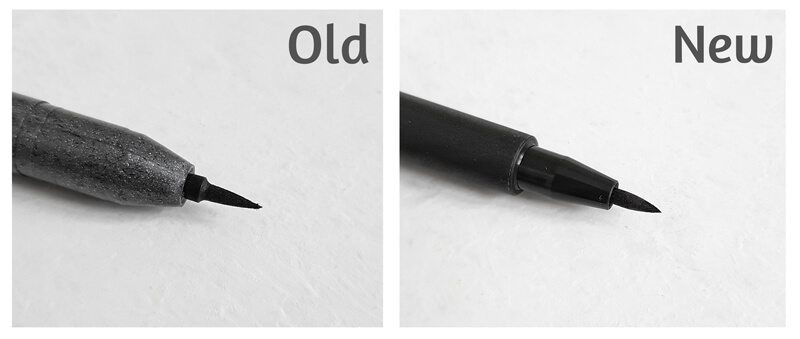
To simplify the explanations, I’ll be referring to these brush pens as the old (or an older) and the new (newer) one.
I prefer using the worn-out brush pen to draw various textural marks. They may have a rough or dry look. Even though art supplies may have reached their optimal period of life doesn’t mean they can’t be used in creative ways.
Also, the tip of the used brush pen has become softer, so I have no fear of pressing harder while drawing. This pliability ensures a smooth transition from thin to thick line quality. As you can see in the image below, I’m still able to make tiny, thin marks.
The newer brush pen is great for adding the finer details. If you’re barely touching the paper with the brush pen’s tip, you’ll create some delicate marks.
The tip of the newer tool is still fresh, firm, and springy. That’s why I avoid pressing too hard. For that reason, the marks made with this brush pen demonstrate a smaller variance of width.
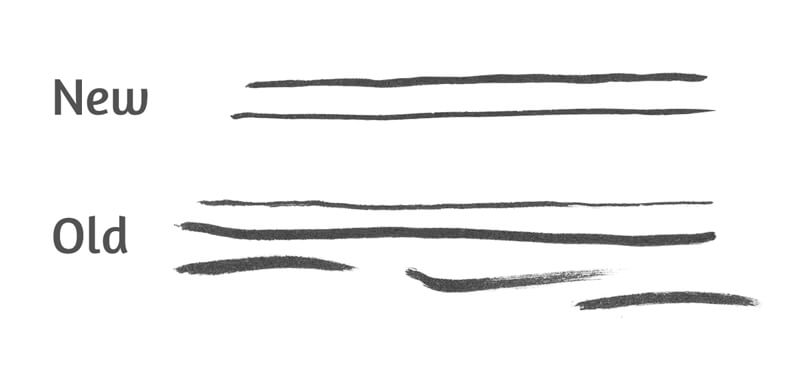
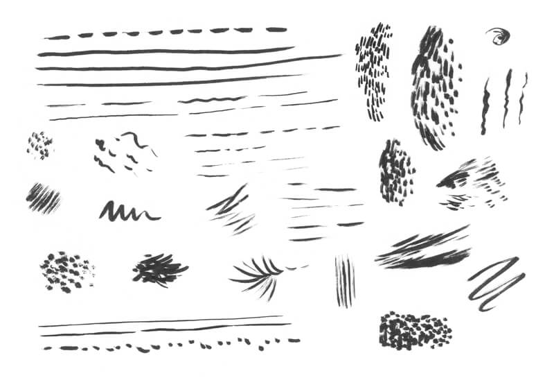
It’s always a great idea to try out your supplies beforehand. Every brush pen has a specific set of features: its size, softness, elasticity, and the character of marks. Some brush pens produce wet, juicy strokes. Others may give quite a different impression.
The better you know the possibilities and limitations of a particular tool, the easier it is to get the desired result.
I recommend creating all kinds of marks on a spare piece of paper. Feel free to experiment with hatching, cross hatching, or stippling. Invent some patterns or textures that may be applied in your future projects.
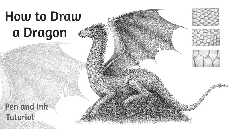
See also: Pen and Ink Drawing Techniques
Drawing a Swan with a Graphite Pencil
First, we should decide on the pose of our bird. It may be rather dynamic or static, depending on your idea. What kind of emotion or mood are you going to convey with your artwork? The good news is that swans look majestic in any pose and in all settings.
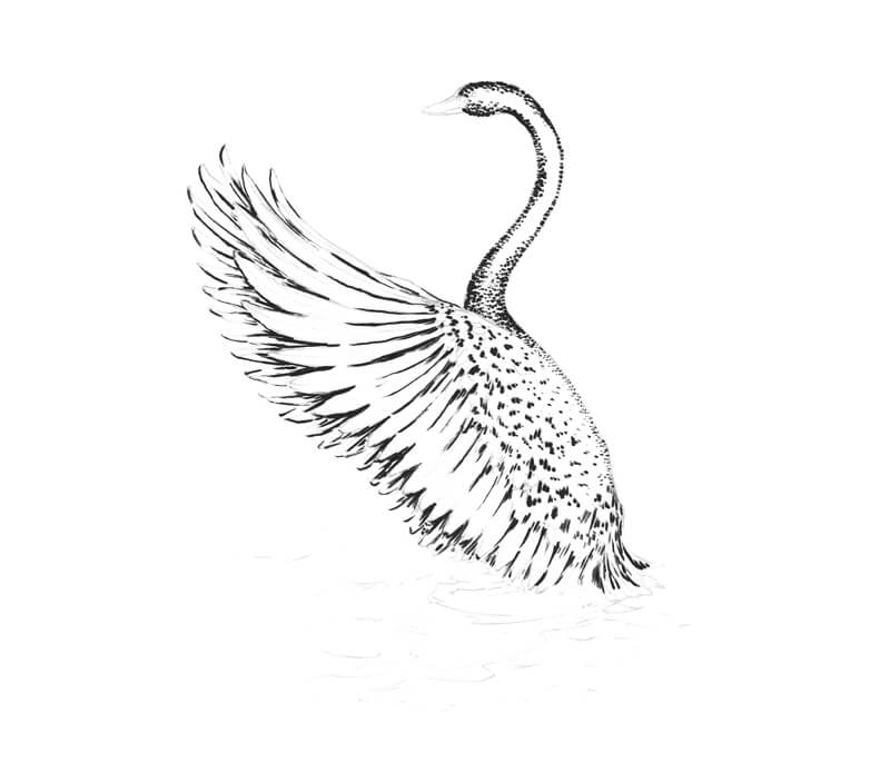
I sketch a couple of small miniatures that help me to make a decision regarding the composition and pose. Today I’m going for a dynamic pose. My swan is stretching its beautiful wings before the flight.
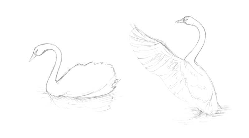
With the pose and composition determined, we can create the graphite pencil underdrawing on the final surface. I start by outlining some simple shapes that indicate the position of the head and body. A long curved line shows the direction of the swan’s neck.
Then I add a rough shape for the wing. For now, we’ll draw only the one that is closer to the viewer. The second wing will be added in the next step.
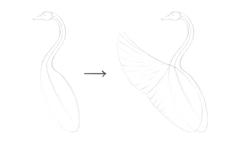
Next, I refine the sketch by adding the details and adjusting the contour lines. I mark the rows of shorter feathers. Then I draw the longer quills that are located near the wing’s edge.
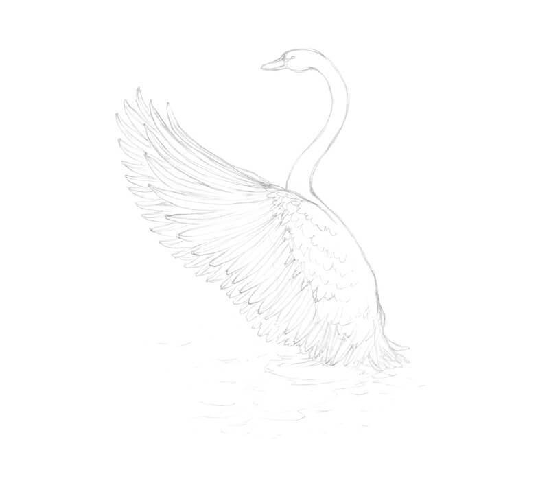
After the first wing is complete, I add the second one that is hidden behind. Both wings have a similar silhouette.
I also mark the waves and the swan’s reflection on the water.
How to Draw a Black Swan with Brush Pens and an Ink Liner
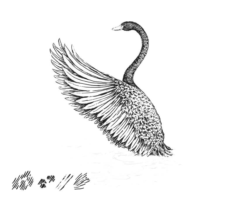
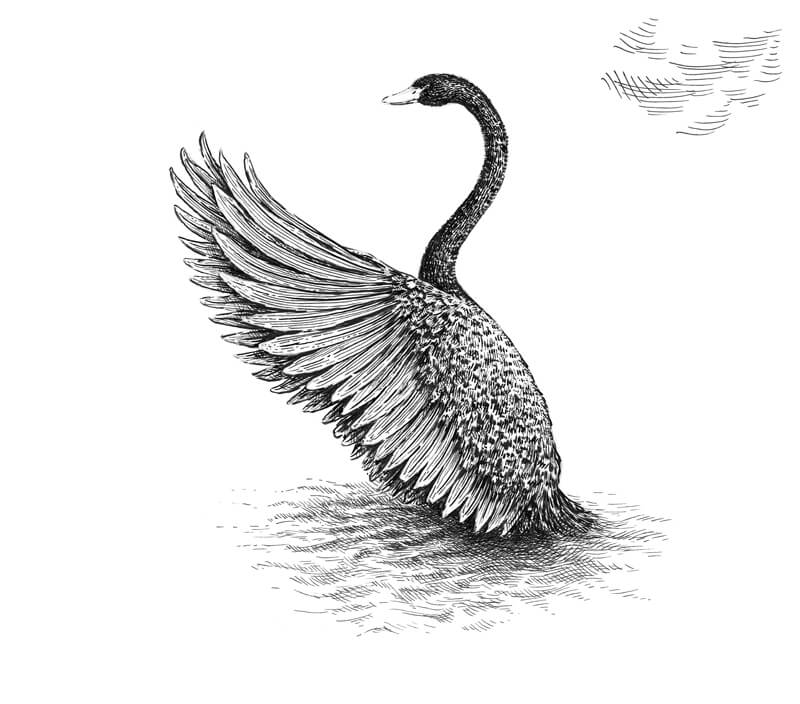
I start the ink applications with the older brush pen. I mark the contours of the neck and body by making a series of brief touches at medium pressure. The plumage of a real swan is a texture that is far from being even or uniform. Feathers of various lengths create an interesting relief.
The marks are very close together near the edges of the figure. I recommend avoiding any solid lines here – at least, at this stage. A swan with a continuous or wide contour line may seem unnatural.
The marks made with this brush pen have a rough and spontaneous look.
The light is diffused, originating somewhere behind the swan. I intensify the darker areas and the contours where appropriate, including the feathers of the farther wing.
The swan’s back remains light. I’m barely touching the paper in the area of the bird’s back.
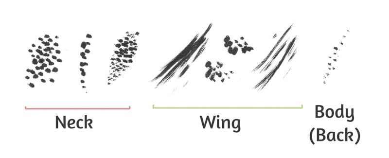
In the image below, you’ll find the samples of marks that I’ve used.
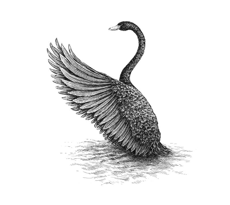
Now it’s time to add marks with the newer brush pen. I’m going to add some more accurate and precise lines with this pen. The goal is to complete the main contours, including those found on the beak and feathers.
The marks are following with the form of our object. I’m working mostly with the thinnest part of the pen’s tip.
The bird has black feathers, but it doesn’t mean that we should create a solid black application. Tiny spots of white paper are acceptable and even desired. They will help us to convey the glossiness of the plumage. Remember, contrast is important in creating the illusion of texture.
You’ll find the samples of strokes in the corner of the image.
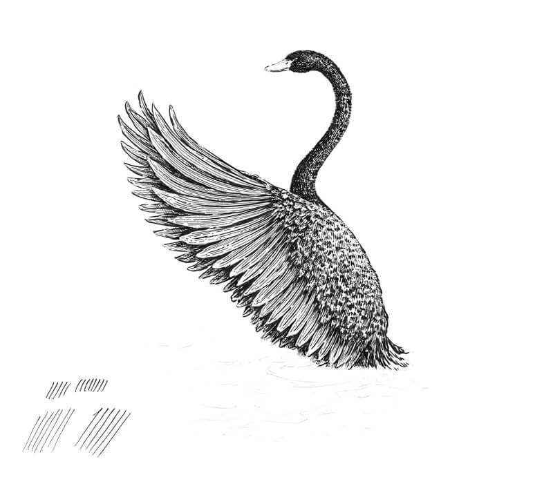
With the 0.1 ink liner, I cover the swan with a layer of hatching. The lines that I use on the head, neck, and body areas may be slightly curved to accent the relief. Following the cross contour lines of an object is a great way to give your drawing more volume.
See also: Cross Contour Lines
The long quills on the wing closer to the viewer require straight lines.
On the wing behind the swan, cross hatching is used.
Another goal of this step is to reduce the amount of paper that is still showing through. The form of the swan starts to make sense as we develop the range of value.
At this point, I can’t say that the swan is complete, but let’s leave it for now and work on the environment.
With a 0.1 liner, I add groups of horizontal hatches to the area below and near the swan. These lines are slightly curved. The alternation of lighter and darker areas creates the illusion of the water’s surface and the swan’s reflection on it. As the water is moving, the reflection becomes distorted and blurred.
I darken the area below the swan with additional layers of cross hatching.
I won’t elaborate on the water too much because it may distract the viewer’s attention from the subject. Just a hint at the waves and the swan’s reflection makes our drawing more believable and complete.
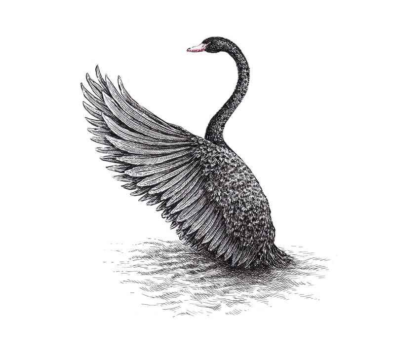
Now, let’s get back to the swan. With a 0.1 liner again, I add more hatches to mute the areas that still seem too light. I also darken the shadows, especially on the wing.
As the feathering is black, we should make the ink covering dark, while leaving some white specks. Those untouched areas create the illusion of a shiny surface in accordance with the direction of light.
The drawing is complete, but I have an idea of how to enhance it. Let’s add a hint of color.
I use a red pen to add some dots to the bird’s beak, mostly on its lower part where we see shadow. This inclusion of color is subtle, yet it makes a difference and adds some interest.
Drawing a Swan with Brush Pens – Conclusion
Congratulations – we’ve created a beautiful drawing!
I hope that you’ve enjoyed working with brush pens and playing with color. Thanks for being with me on this journey!
I wish you much inspiration on your way of mastering brush pen techniques and experimenting with various art supplies. Have fun!
If so, join over 36,000 others that receive our newsletter with new drawing and painting lessons. Plus, check out three of our course videos and ebooks for free.