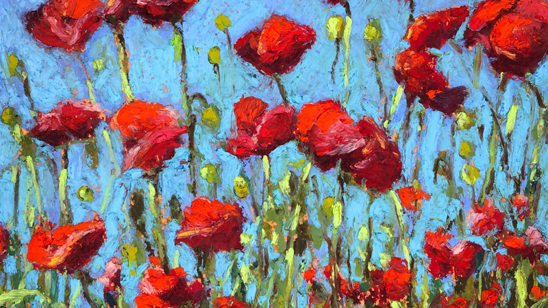
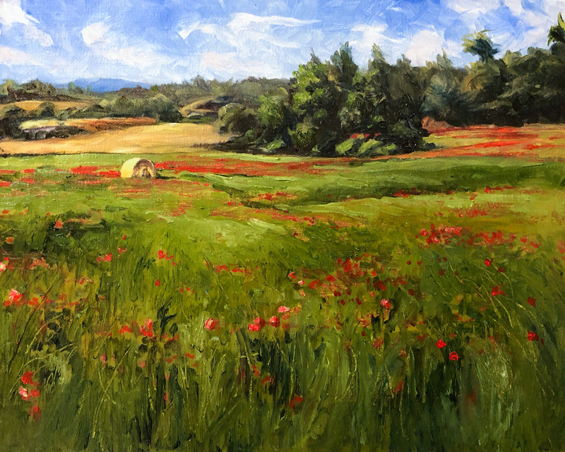
Painting a Small Landscape of a Field of Flowers with Oils
In this painting lesson, we’ll use water mixable oil paints to create a painting of a landscape that features a field of red flowers and a lone hay bale.
In this lesson, we’ll use expressive brushstrokes, relying on the relationships of color and value to communicate the subject. We’ll incorporate guiding lines in the composition to pull our viewer’s eye to the focal point and we’ll exploit the complementary colors of red and green to create contrast and “pop”.
Materials for this Painting
Of all of the painting mediums, oils are perhaps the most forgiving. Due to it’s slow drying time, oils can be manipulated on the surface until the desired color and value relationships have been achieved. However, one deterrent to working with oils are the fumes produced by thinning solvents like turpentine. When used in small spaces without adequate ventilation, this can be a major problem.
Thankfully, an alternative to traditional oils is available in the form of water mixable oils. Water mixable oils, as the name suggests, do not require harsh solvents for cleaning brushes and thinning of the paint. Instead, when water mixable oils are used, the artist benefits from the slow drying times of traditional oil paints, but instead of harsh solvents, water can be used for cleaning brushes and thinning paints.
Traditional solvents and mediums can still be used with water mixable oil paints. In this lesson, I use Winsor and Newton Artist’s Painting Medium to enhance the fluidity of the paint.
These days, I almost never use traditional oils to paint in the studio since water mixable oils are such a great alternative. In this lesson, Artisan Water Mixable Oils by Winsor and Newton are used to complete the painting.
Water mixable oils can be used on any painting surface that traditional oil paints are used. This includes gessoed masonite panel, canvas, cardboard, heavy papers, etc. In this lesson, a 10″ by 8″ oil-primed linen board is used.
(The following links are affiliate links which means that I make a small commission if you purchase without an additional cost to you)…
Palette of Colors
I probably could have used less pigments for this painting. Olive Green and Sap Green could have been mixed and Yellow Ochre could have been the only yellow I used. However, the colors I ended up using to complete this painting include…
- Sap Green
- Olive Green
- Titanium White
- Burnt Umber
- French Ultramarine
- Cadmium Red Medium
- Cadmium Yellow Pale Hue
- Yellow Ochre
- Burnt Sienna
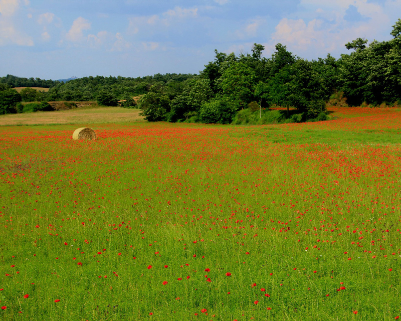
The Photo Reference
A photo was used as a reference for the painting. In this case, the reference image comes from Pixabay.com.
Here’s a look at the photo reference used in this painting…
Blocking in Darker Values
We’ll begin the painting by loosely blocking in some of the darker tones for elements around the horizon. If dominant elements existed in the foreground, these objects would have been addressed in the same manner.
These initial shapes are addressed using a mixture of French Ultramarine and Burnt Umber. This mixture creates a deep, dark tone that can be manipulated to “lean” either cooler or warmer. If a warmer mix is desired, the Burnt Umber should dominate. If a cooler mixture is desired, then the Ultramarine should dominate.
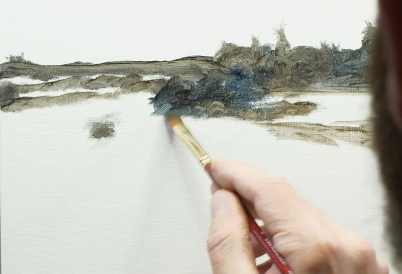
Although this is not a complete underpainting, it helps the artist to better understand the composition and lays the groundwork for layers of color to follow.
See also: Composition in Art
Starting with the Background Sky
Since we’re working with an opaque painting medium, where colors can be over laid, we’ll begin with the background. Our background, in this case, is the sky. And since the emphasis of the composition is on the foreground and elements of the middle ground, our sky is a supporting element, rather than a dominate one.
We’ll use a mixture of French Ultramarine and Titanium White for the sky, allowing the French Ultramarine to be more intense at the top and transition down to a less intense version, dominated by white, at the bottom.
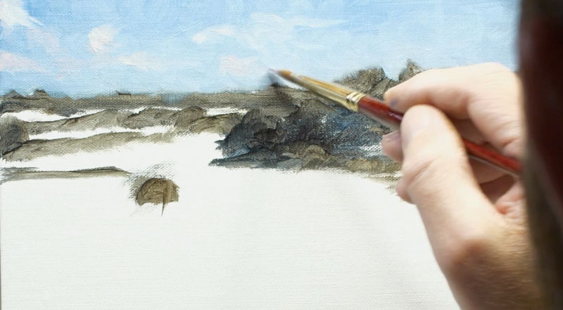
Loose shapes are added for the clouds over the top using a mixture of Titanium White with touches of Yellow Ochre and Cadmium Red Medium.

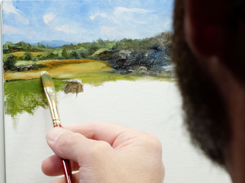
Working Down to the Middle Ground and Foreground
After the sky is complete, we can progress down to the middle ground. We’ll begin with the distant trees and field on the left side of the picture plane, layering applications directly over the underpainting we created in the previous step.
Since these elements are father away from the viewer, we see less contrast in value and colors that are desaturated. White is used to desaturate and lighten the values. A variety of mixed greens are used for the trees while earthy yellows are used for the fields. French Ultramarine and Olive Green are used for the shadow shapes on the trees while lighter, warmer colors are used for the highlights.
Brushstrokes used to describe the fields are pulled in a horizontal motion contrasting the strokes used for the trees.
I continue to play with dark and light values to develop the form of the trees in the middle ground. We are relying on the contrast of value and color temperature to communicate the trees instead of defining specific details.
At this point, I decide to bring in a bit of Cadmium Yellow Pale Hue in order to brighten some of the greens. When this color is introduced by mixing with Sap Green, the light within the scene changes. In order to ensure harmony, this color is used throughout and incorporated in the greens used for the field.
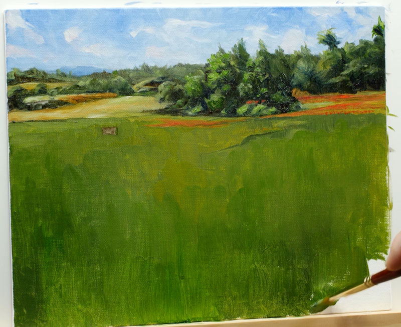
A variety of greens are mixed and applied to the foreground, filling up the remaining bits of canvas that are still visible.
Painting the Flowers and the Hay Bale
With a base layer of green applied to the field, we can add the more exciting elements. This includes the bright red flowers and the lone hay bale, which will eventually become our focal point.
The lone hay bale is fairly simple. First, a dark shape for the shadowed side of the hay is added using a mixture of Burnt Umber and Yellow Ochre, dominated by the Burnt Umber. The same combination of colors with the addition of Titanium White and dominated by Yellow Ochre, is applied to the highlighted side of the hay bale.
These colors are moved around and manipulated until a rough version of the hey bale is in place. A cast shadow of darker green is pulled out with a horizontal stroke behind the right side of the hay.
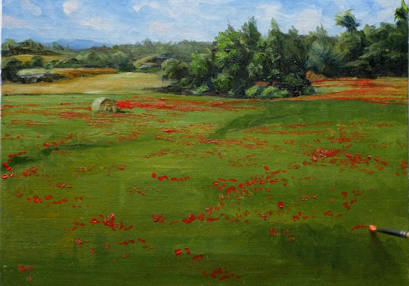
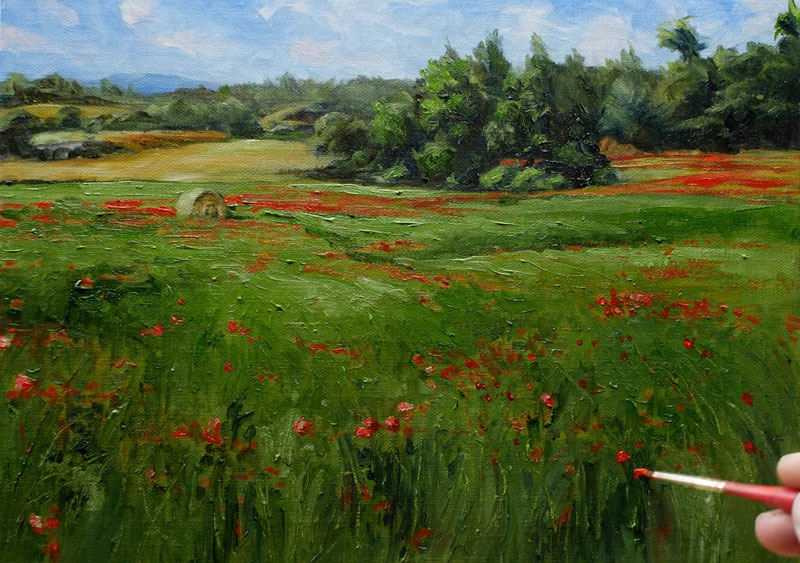
Even though our flowers will appear as red specks within a sea of green, we still need to develop a range of value. Even though these flowers are small in the painting, they still need to communicate a sense of form. To do this, we’ll create a variety of reds using Cadmium Red Medium, Burnt Umber (for darker tones), Titanium White (for lighter tones), and Yellow Ochre (for variety in color). Using a small round brush, or a small flat brush, we’ll begin dotting the landscape with a variety of reds.
The flowers that are closer to the viewer in the foreground are more spread out, but as we work up towards the horizon, the individual flowers become streaks of horizontal strokes.
Developing a Strong Focal Point in the Landscape
Our field is now speckled with red and our hay bale stands out only because it is alone. We can now begin developing the texture of the grass and in the process, make our focal point stronger. A nice side effect is the feeling of movement that will result.
We’ll begin this process by mixing a variety of greens for our field. Green can be manipulated in a many ways to create variety. Warmer greens can be created by adding yellows. Cooler greens can be mixed by adding blues, which also darkens the color. Greens can be darkened by adding colors such as Payne’s Gray or Burnt Umber and lightened with white and bright yellows like Lemon Yellow. In this case, we’ll use the blues and greens on our palette to adjust the greens.
Keep in mind that we see more contrast in value closer to the viewer, so more variety in the color is developed for these locations. Using looser strokes, colors are pulled upward as the grass grows in the extreme foreground. Higher up on the picture plane, these strokes transition and become horizontal.
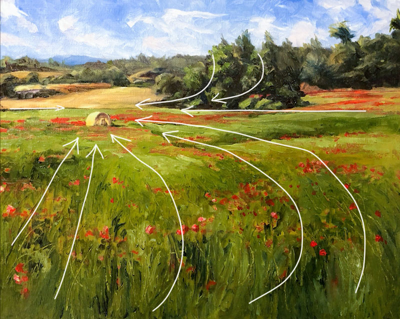
As we develop the texture of the grass, we can begin to place emphasis on our focal point, the lone hay bale. One of the ways we can do this is through guiding lines (or implied lines) within the scene. These guiding lines can be created through brushstrokes, textural marks, contrast or shapes. In this painting, we’ll try to pull the viewer’s eye to the focal point mostly through textural marks and brushstrokes.
Once the texture of the field is complete and we’re happy with the result, we can return with a variety of reds to re-establish some of the flowers in the field.
Painting a Field of Red Flowers – Conclusion
The finish the painting, we’ll return to our focal point – the lone hay bale. A few adjustments are made to the light side – making the light stronger and a touch more colorful. A bit of Burnt Sienna is added to the shadowed side for more variety in color and the highlights are enhanced.
Once these final adjustments are made to the hay bale, the painting is complete.
If so, join over 36,000 others that receive our newsletter with new drawing and painting lessons. Plus, check out three of our course videos and ebooks for free.